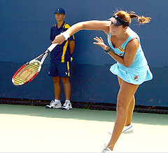
We’ve been so busy with team sports over the past month or so (stretch-run baseball, the start of the NFL and college football seasons, the relentless flood of new NHL designs) that I completely ignored the U.S. Open tennis tourney. And that’s a shame, because we happen to have a bona fide Open operative right here in our midst: Gabe Ganot, who’s been working as a ballboy — okay, ballperson — at the Open since 1999, giving him an ideal vantage point for uni-watching. That’s him in the photo shown above.
Gabe sent me a good rundown of observations a few weeks ago, which I’m finally getting around to sharing with the rest of you. Check it out:
- Almost all players wear one outfit per tournament. But Federer this year had two — a “day” and “night” selection. The night attire featured the “Man in Black” look with a black headband, black shirt, shorts, socks and sneakers. This as opposed to the day outfit, with a blue shirt, white shorts, white sneakers, and a blue headband. People were wondering what he was going to do for the final, because it was scheduled to start in the late afternoon and it was still light out. I think he was quoted as saying since the lights would eventually be on, he would go with the Johnny Cash look. Note that his sneakers have the three Swiss flags commemorating his three U.S. Open wins the last three years (I think it also says something on the tongue). Roger also has the tendency to constantly brush imaginary hair from his forehead and adjust his headband.
Nadal, I’m pretty sure, has the worst OCD of anyone on the tour, and not just uni related. Before he serves, just about every point, he has the David Wright-esque habit of picking his wedgie. The other ballpersons and I wonder why he continues to wear the capris if he has to adjust his pants every point. He also adjusts his hair/headband with the same frequency. Other examples of his OCD include placing his drink on the same exact spot during every changeover, and sprinting out to the baseline for warm-ups.
You’d think that the folks at Lacoste would make Andy Roddick a nice-fitting shirt. Instead he has to constantly adjust it, nearly every point, to make the shoulders drape correctly (similar to the way most volleyball players do). This has been happening for several years now. He also has taken a liking to wearing his hat a little sideways, Ã la Pokey Reese or Mike Cameron. It’s not an accident — I’ve seen him take it off and be very particular about the way he puts it back on.
Its also interesting see how doubles teams dress. Sometimes, teams go all out and match every single part of their outfits, down to the sneakers, like the Bryan brothers. Other teams wear what they would normally wear if they were playing singles, while others come up with a completely different outfit, like Justin Gimelstob in his mixed doubles team with Ashely Harkleroad. Speaking of Gimelstob, he apparently sweats like there’s no tomorrow, so he tends to change shirts around five or six times a match. And speaking of sweating, some players are obsessed with the towel. Nadal, for instance, asks for it pretty frequently on a hot day, and Roddick can be the worst. This ballboy would like to see some sort of integrated towel technology, like certain wide receivers have.
The women have different issues than the men. For starters, many of them wear makeup and jewelry while on the court. I think Jelena Jenkovic even puts her watch on before playing.
It’s also been interesting to note the ball-holding technology for women over the last decade (insert sex joke here). When I first started being a ballboy, most women just asked for one ball to serve instead of two like the men (men have pockets, so they usually ask for two and put one in their pocket in case they fault on their first serve). Some women would ask for two and just shove one of them into the bottom of their underwear, and after a game I’d have to go pick up a slightly damp ball. Others went with the plastic ball holder (famous example: Arantxa Sanchez Vicario), which was essentially a belt that had a little plastic thingie that sat right on top of the butt. These days, the women have slightly longer undergarments, kind of like the compression shorts basketball players wear. These have pockets, so that makes my job a little easier.
When I first started, almost all women wore the simple tennis skirt and some sort of top. Then Serena hit the scene, and now we get horror stories, like look at Bethanie Mattek’s outfit from this year’s Open. She does something like this at every tournament. It also seems like the ladies have a contest to see who can wear the shortest skirt and the like.
It’s also kind of weird to see some players who aren’t sponsored and end up having different parts of their outfits from several manufacturers. I forget who, but someone this year had something like an Adidas shirt, Nike shorts, and Champion socks.
With regards to equipment, there’s nothing too crazy, but some funny stuff. For instance, instead of the traditional shock absorber that most players have on their racket, some players use an ordinary rubber band. Not sure why. No player I saw wore regular glasses, only a handful had sunglasses on (Arnaud Clement and Alexa Glatch come to mind), and a few went with the bright sunscreen on the nose. Also, while most players bring at least five or six rackets with them to the court, I noticed that Mark Knowles liked to just tape on a new grip instead of going with a new racket. Not sure the reasoning for that.
As for our Polo-brand ballperson uniforms, they’re a welcome change from the Fila garbage we had several years ago, which were in outlandish colors and make us look ridiculous (plus you try running around in 90-degree heat in a thick cotton polo that’s too large, shorts that are too tight, and sneakers that can literally blow up if you plant too hard). The new ones are a nice moisture-wicking material with a good form-fitting shape (we don’t have to tuck in anymore!). But we are essentially walking advertisements — in addition to the 6-inch Polo logo on the chest area, we have a full 12-inch logo on the back, making us look like real product whores. Additionally, with around five days to go in the tournament we were mandated to begin wearing Polo wristbands, which was odd, because they never told us to where on the arm to wear them, unlike everything else which is by the book. The only change the Polo unis have had over the years is that they change the color of the vertical striping on the shirt and and shorts (this year it was yellow; in the past it’s been red and white).
Big thanks to Gabe for all that info. Still want more? Vince (who provided several of the photos links above) notes that this tennis blog has lots of fashion coverage.
Research Reqeust Request: I’m working on a column devoted to uni-related typos. I’ve got all the classics covered (Angees, Torotno, Nayv, Nigger Ilsand, etc.), along with the assorted nameplate misspellings that have periodically been called out here on the blog. If you know of any others, old or now, that we haven’t discussed, please let me know. Thanks.
Fall Back (into bed): The annual moving of the clocks is still a month away, but Uni Watch likes to be ahead of the curve, so”¦. As those of you in the Eastern Time Zone are well aware, I usually get the day’s entry up by 9 a.m., which is an arbitrary deadline that I set back in the site’s early days. Well, not completely arbitrary — I was trying to (a) motivate myself and (b) get you folks used to the idea that you could depend on fresh content being ready for you at the start of each day.
After a year and a half of this, during which it’s now become routine for me to be eating my breakfast in front of the computer while frantically making last-minute changes to the Ticker, I’d like to reclaim a bit of breathing room for my mornings (and, by extension, for my late-night hours). So beginning next week, my new arbitrary self-imposed daily deadline will be 10:15 a.m. Among other things, this should make it much easier for me to catch up on the previous night’s comments, deal with Ticker contributions that come in overnight, and so on.
I know some of you eastern folks have grown accustomed to starting your day (read: goofing off at work) with Uni Watch, but I have faith in your abilities to find other productive uses for the 75-minute window that fate has just handed you. Just pretend I moved to Chicago or something, OK? OK.
Uni Watch News Ticker: Lots of good stuff currently available on eBay, including this patch, this ad, this uniform, and this jersey. ”¦ Latest schools to go with the System of Dress: Maryland and Miami (with thanks to Jose Frontanes and Mike Alper, respectively). ”¦ Another new NHL mask: Marc Andre Fleury. ”¦ Good overview of the NFL captains’ patches — including a shout-out to Uni Watch — here. ”¦ Interesting article here about the Rochester Amerks new uniforms. Key quote, from team prexy Steve Donner: “RBK is integrating vertical striping into the jersey, and they wanted to do away with all horizontal striping. It wasn’t our suggestion to remove the stripes.” ”¦ Bizarre purple/green/yellow color scheme exhibited by Waukegan High in Illinois (with thanks to AJ Brandt). ”¦ Ouch. ”¦ Tons of old high school team photos, from a wide range of sports, here (with thanks to Brendon Yarian). ”¦ Reprinted from yesterday’s comments: The LPGA has changed its logo from this to this, which strikes me as a major improvement. Details here. ”¦ Also from yesterday: The NHL and Reebok held a conference call on Tuesday to address the growing chorus of player complaints about the new uniforms (the latest of which can be found in the middle of this article). Details here. ”¦ Good article here about the Sharks’ goalie masks. ”¦ Still more All Blacks soap operatics (with thanks to Caleb Borchers). ”¦ Reprinted from last night’s comments: The people at New Era are really, uh, outdoing themselves. ”¦ Dan Schulman, who’s doing ESPN Radio’s play-by-play for the Bosox/Angels series, mistakenly stated during last night’s game that Jason Varitek is the only current MLB captain to wear a “C.” Schulman forgot about Mike Sweeney.
What does the green dot on the back of the NFL players helmets mean?
Has anybody seen that Julio Logo has a brown stain on his jersey???
I wonder what it means???
Could he be thwarting counter fitters???
I also saw a player in the Reds-Cubs series wearing a red batting glove on his right hand and a blue one on his left.
I wonder what it means???
I really wish more players would dress like Manny Ramirez. He is the epitome of MLB fashion.
err Lugo
[Looks pretty straight to me, but I didn’t do an exhaustive photo search. – PL]
Paul, I don’t think that’s Roddick, which could explain why his hat looks so straight.
Paul, the photo that you’ve included with your editorial comment about the straightness of Roddick’s hat is most definitely not Roddick.
[quote][Looks pretty link, but I didn’t do an exhaustive photo search. – PL][/quote]
I don’t know who that is with the nicely placed cap… but it’s not Andy Roddick.
[quote comment=”152252″][quote][Looks pretty link, but I didn’t do an exhaustive photo search. – PL][/quote]
I don’t know who that is with the nicely placed cap… but it’s not Andy Roddick.[/quote]
OK, OK — fixing now.
I read an article about Bethanie Mattek and her explanations for what she wears on the court. Basically she will go with whatever strikes her at the moment, sometimes picking stuff up at vintage shops the day before. She sounds like a space-cadet, not someone who is necessarily going through some antics for press, but is just an odd-ball being herself. I think we need more of them in sports.
Since Indiana is in pretty much “time zone hell” the later posting is going to hit us pretty hard. My county used to be one of the few that didn’t observe DST, but for the last year we’ve been on Central. Now, we just found out we’re moving to Eastern when everone else resets their clocks.
UniWatch implecation (with Paul’s new schedule added in) … a sudden two hour time change! Moving from 8 to 10 am! Ouch.
Obligatory Boo … Hiss… for the new 10:15 start.
Final note on the mets … as great as it was to see the blue caps this weekend, i think they are jinxed. Curious to see see what the mets record was this season when they wore them. I know for one thing they had a better record on the road, games in which they alwaus wore a black hat.
Rockies pitcher Manny Corpus apparently doing something he shouldn’t be doing.
Hey, the Stars look pretty decent on the road. Just needs some bottom striping.
What was in Josh Beckett’s back pocket last night? Looked like a tin of mints or chewing tobacco or something..
What’s up with TBS’ Ernie Johnson’s dark glasses?
[quote comment=”152257″]Rockies pitcher Manny Corpus apparently doing something he shouldn’t be doing. link
Waukegan High School is not in Minnesota. Waukegan is a Chicago suburb. I played against them in high school every year, and we always thought they had to be embarrassed to suit up with all of those colors at once.
link
One of the readers spotted this, but good catch on the follow-up article.
I don’t know if Mike Sweeney should be considered a current captain (although he was at the end of the season). His days in KC are pretty much over, and its doubtful if he hooks on as a DH somewhere that he would be made the captain.
[quote comment=”152255″]Since Indiana is in pretty much “time zone hell” the later posting is going to hit us pretty hard. My county used to be one of the few that didn’t observe DST, but for the last year we’ve been on Central. Now, we just found out we’re moving to Eastern when everone else resets their clocks.
UniWatch implecation (with Paul’s new schedule added in) … a sudden two hour time change! Moving from 8 to 10 am! Ouch.[/quote]
Every time I go to Indiana on business, they’re in a different time zone. Why is it so hard to pick one for the entire state and stick with it?
Paul,
I understand your need to push your self imposed deadline back…but damn…I like to get my uni-fix before my 10 a.m. meetings….oh well. I will having something to look forward to at lunch now.
I am liking Fleury’s new mask…as a Pens fan I can’t wait for this season! What are the 4 letters on the back of the mask? (E F G T)
[quote comment=”152244″]What does the green dot on the back of the NFL players helmets mean?[/quote]
It means somewhere a manila folder stands naked of its sticker and is being misfiled. (Really, am I the only one who thinks this?)
King Kaufman has something about a link.
I love that footiemap.com site from yesterday. So there’s 24 teams in London. How many baseball teams in New York? Yankees, Mets, SIYanks, Cyclones, Newark Bears, Bridgeport Bluefish… MLB certainly loves that anti-trust exemption, dunnit?
I was watching the stars/avs game, and it looked to me like both teams had a small decal on the back of the helmet, looked like an Austrian flag or something. Does anyone know what that was?
[quote comment=”152091″][quote comment=”152089″][quote comment=”152088″][quote comment=”152044″][quote comment=”152041″][quote comment=”152035″][quote comment=”152017″][quote comment=”152014″]A-Rod started wearing his uniform link this year – any wonder that he’s tearing it up?[/quote]
huh? properly? He NEVER wears stirrups. Just black or midnight blue or whatever ugly color that is the Yankees wear.[/quote]
Yes, properly – pants hiked to the knee. You can see the beautiful blue socks. As God intended. ;)[/quote]
So why no stirrups?[/quote]
link or link…but not link[/quote]
While I wish every player wore their pants legs up, I do not see what the fuss is over wearing full socks or stirrups. As long as the pants are up, who cares? Whether it’s socks or stirrups, both date back to different points in the game’s history.[/quote]
Agreed. That’s my take on it: stirrups or full socks, so long as they show a lot of the team color I don’t care. Anything’s better than the pajama look.[/quote]
I wore full socks in college, and wear them now in my adult league. In college most of our games were played in 30 degrees or less (no joke, one was even -3!), so I guess I chose full socks since it was easier to double up and keep warm. But yeah, no problem with either look since both are “traditional”. If anything, I definitely prefer the lower stirrup look to the upper (70’s style).[/quote]
MLBPDX – my post was directed more towards the style of pants not the socks/stirrups…i’m all for solid socks as long as the pants are up, but a little baggy…not biker shorts like Soriano
[quote comment=”152253″][quote comment=”152252″][quote][Looks pretty link, but I didn’t do an exhaustive photo search. – PL][/quote]
I don’t know who that is with the nicely placed cap… but it’s not Andy Roddick.[/quote]
OK, OK — fixing now.[/quote]
My bad, when I posted there was no other mention of it. But it link link to be link.
And then there’s link. Looks a little link to me.
Maybe he does it both ways.
[quote comment=”152256″]Obligatory Boo … Hiss… for the new 10:15 start.
Final note on the mets … as great as it was to see the blue caps this weekend, i think they are jinxed. Curious to see see what the mets record was this season when they wore them. I know for one thing they had a better record on the road, games in which they alwaus wore a black hat.[/quote]
I second the “boo”. I like to start my goofing off early in the day.
On the Met’s Blues. I don’t believe they had a great record in them, but if you recall, they only broke them out when the HAD to win. And the Mets never win anything they HAVE to. They only win games that aren’t important.
Interesting Decal on the Senators helmets
link
But man, are those socks horrible, especially when compared to the Leafs socks!
link
Lugo’s brown spot is excess pine tar.
[quote comment=”152258″]Hey, the Stars look pretty decent on the road. Just needs some bottom striping.
[/quote]
There actually IS bottom striping on the Stars road jersey — gold then green, like the sleeve stripes, as you can see link.
[quote comment=”152276″]Interesting Decal on the Senators helmets
link
But man, are those socks horrible, especially when compared to the Leafs socks!
link
On the socks…I agree. I don’t really care for the angled look, but if you are going to angle it, why not make the stripes go completely around? Why have that big white space on the back of the leg?
This probably doesn’t help much, but at some point in the early 90s (I seem to recall that it was one of the first games at New Comiskey Park, but I could be wrong), a Tigers player had “Detriot” on his uniform.
Just to chime in, AZ doesnt observe that wacky fun that is daylight savings time, so i just got hit with a two hour change (from 6am to 8am).
But my feeling is as long as Paul continues to provide free content, he can post whenever he needs to!
Try link for the Stars hemline striping.
Also: not sure if I just wasn’t paying attention when those Sens jerseys came out, but I love the number typeface and think the rear-view of those shirts looks pretty damn good.
Roddick probably wears his hat pointed slightly to the left to conceals his eyes from his opponent’s view in his service games. Being right-handed, his left shoulder will be pointed in the direction of his opponent before every serve, so it’s actually a pretty shrewd move.
As a former tennis player myself, I could go on for hours about how superstitious and ritualistic they can be. The quirkiest was probably Art “Tappy” Larsen, a (possibly post-traumatic) WWII vet who tapped his racket compulsively on just about anything, even his opponent during changeovers. One legend has it that one opponent crossed on the opposite side of the net, and Larsen chased him all over the court trying to tap him. Another time he showed up at a match with the wire hanger from his shirt still sticking out the back.
I did some quick research regarding the mets blues, and based on the photo on each game page (some did not appear), record in some form of black hat was at least 30-22, and the record in the blues was 9-16 (missed 4 games).
A follow up from yesterday. This comment may have been directed towards me (I wrote that teams would do well to drop “club” from their monikers):
Many English football organizations are called “clubs” because they are more than one team. You might have your top Pro side, but you’ll also have any number of junior teams as well under the same umbrella. Also, look at the dictionary definition of club: a group of persons organized for a social, literary, athletic, political, or other purpose.
Agreed 100%. I was referring to North American major league outfits. Football Club Barcelona is a club, with a voting membership, etc. The “Milwaukee Brewers Baseball Club, Inc.” is not.
mmmmm, a slightly damp, women’s-underwear tennis ball..hello, eBay?
Aside from shrinking the logo to fit the new jersey make-up, it looks like the Ducks shrunk the link and link designations (link. Take this from link and this from link. Part of me says that it’s an illusion because Scott Niedermayer is an average height human and Chris Pronger is link.
Check out the link. I guess when the Kings switched their logos around they also thinned the shoulder yoke striping.
Jason Labarbera has a link (at least from the link I checked).
[quote comment=”152286″]A follow up from yesterday. This comment may have been directed towards me (I wrote that teams would do well to drop “club” from their monikers):
Many English football organizations are called “clubs” because they are more than one team. You might have your top Pro side, but you’ll also have any number of junior teams as well under the same umbrella. Also, look at the dictionary definition of club: a group of persons organized for a social, literary, athletic, political, or other purpose.
Agreed 100%. I was referring to North American major league outfits. Football Club Barcelona is a club, with a voting membership, etc. The “Milwaukee Brewers Baseball Club, Inc.” is not.[/quote]
True, I suppose, but it’s traditional.
“Ballclub” is a great way to refer to our aggregations. Then there’s “clubhouse.”
Besides, the Milwaukee Brewers is “a group of persons organized for a(n) social, literary, athletic, political, or other purpose”….
man…
between yesterday and this morning a major sports talk radio topic has been mlb division series start times and how they dont accomodate everyone. i think id go crazy if mike and mike, colin, tirico and van pelt (that should be van pelts show by himself), et al, were to talk about the new start time for uniwatchblog.com…
i still think PL should have a weekly segment on the network, i mean, they put sage steele on the air (nice to look at, but my god, does she have any talent?) and jason krause (im sorry that your sister has cancer, but that doesnt qualify you for shit). PL has relevant content, contacts within the genre, and has been writing for years…
wake up espn…
People always talk about naming a team to appeal to a regional fanbase (i.e. yesterday’s “Golden State” discussion). Out of curiosity has anyone here ever been attracted or deterred from a team for the reason? Has anyone in Walla Walla decided “I just can’t watch the Mariners, because I am excluded, offended, and obviously the regional fanbase is not important to the team!”? Do Inland Empire folks refuse to watch the Angees or the Dodgers?
In my mind Minnesota teams have good reason to be named for a state — & the Twins have done a great job of showing us why with their nickname — but other than that. . .
OK, maybe the Texas Rangers and Colorado Rockies, because their team names are combos of words that already existed before the teams.
Prexy? PREXY?
Hey Paul, have you been writing for Variety?
[quote comment=”152286″]A follow up from yesterday. This comment may have been directed towards me (I wrote that teams would do well to drop “club” from their monikers):
Many English football organizations are called “clubs” because they are more than one team. You might have your top Pro side, but you’ll also have any number of junior teams as well under the same umbrella. Also, look at the dictionary definition of club: a group of persons organized for a social, literary, athletic, political, or other purpose.
Agreed 100%. I was referring to North American major league outfits. Football Club Barcelona is a club, with a voting membership, etc. The “Milwaukee Brewers Baseball Club, Inc.” is not.[/quote]I guess the major difference with American and, for the lack of a better descriptor, “European” leagues and teams is that the former is a top-down structure, with the league granting entrance to “franchises”, while with the latter, hundreds of “clubs” of various sizes and import form an association, and leagues are just a way of organizing those disparate clubs.
So in American sports, each franchise is the representative of a single market, and the league would avoid putting multiple teams in a single market lest they cannibalize each other’s share (obvious exceptions being larger cities like NY or LA). Soccer clubs basically represent only themselves, and exist independent of the league.
Also, it’s important to note that many clubs play multiple sports – Real Madrid and FC Barcelona both have successful basketball teams, and Bayer Leverkusen is just one out of teams in many sports supported by the Bayer pharmaceuticals.
[quote comment=”152269″]I am liking Fleury’s new mask…as a Pens fan I can’t wait for this season! What are the 4 letters on the back of the mask? (E F G T)[/quote]
They are the initals of his grandparents – a nice tribute to family.
[quote comment=”152299″][quote comment=”152269″]I am liking Fleury’s new mask…as a Pens fan I can’t wait for this season! What are the 4 letters on the back of the mask? (E F G T)[/quote]
They are the initals of his grandparents – a nice tribute to family.[/quote]
As a followup, they stand for Estelle, Francois, Gaston and Therese. If I’m gonna answer a question, I need to answer it in full to get full marks. :o)
If Paul originally posted that Waukegan was in Wisconsin rather than Illinois (it is correct now), then he must have just temporarily forgotten that Waukegan, Ill. is well-known as the hometown of link.
As to those uniforms: as the man himself would say, “Well!”
I didn’t see anything in Beckett’s back pocket last night, but if it was round, most likely a smokeless tobacco tin. Anyone know the story on the triangular ivory pendant he wears that stays glued to the right side of his chest, never moves when he does?
[quote comment=”152298″]I guess the major difference with American and, for the lack of a better descriptor, “European” leagues and teams is that the former is a top-down structure, with the league granting entrance to “franchises”, while with the latter, hundreds of “clubs” of various sizes and import form an association, and leagues are just a way of organizing those disparate clubs.[/quote]
That’s the same way the various American sports leagues started. I guess I don’t see the difference there.
[quote comment=”152296″]People always talk about naming a team to appeal to a regional fanbase (i.e. yesterday’s “Golden State” discussion). Out of curiosity has anyone here ever been attracted or deterred from a team for the reason? Has anyone in Walla Walla decided “I just can’t watch the Mariners, because I am excluded, offended, and obviously the regional fanbase is not important to the team!”? Do Inland Empire folks refuse to watch the Angees or the Dodgers?
In my mind Minnesota teams have good reason to be named for a state — & the Twins have done a great job of showing us why with their nickname — but other than that. . .
OK, maybe the Texas Rangers and Colorado Rockies, because their team names are combos of words that already existed before the teams.[/quote]
I live in New Jersey and will not root for the Rangers, Knicks or Icelanders. And if the Nets move to Brooklyn I will no longer root for them.
I am a Mets fan but if we were to ever get a team in NJ that called themselves the New Jersey Whatevers, I would probably root for them.
[quote comment=”152275″][quote comment=”152256″]Obligatory Boo … Hiss… for the new 10:15 start.
Final note on the mets … as great as it was to see the blue caps this weekend, i think they are jinxed. Curious to see see what the mets record was this season when they wore them. I know for one thing they had a better record on the road, games in which they alwaus wore a black hat.[/quote]
I second the “boo”. I like to start my goofing off early in the day.
On the Met’s Blues. I don’t believe they had a great record in them, but if you recall, they only broke them out when the HAD to win. And the Mets never win anything they HAVE to. They only win games that aren’t important.[/quote]
That may be so (poor record in blue caps), but one should also bear in mind that they wore the blue caps significantly less often this year than they did last year. Not that I’ve been counting, but last year we saw the blue caps on almost every home stand, and often in consecutive games; more than any other season since ’97. I remember thinking that they may have finally been phasing out the road-cap-at-home travesty and would return the blue cap to home prominence. They even announced that they’d be wearing black less often, or something to that effect. But alas, frustratingly, it was not to be; in 2007 they went right back to wearing the road (black/blue) cap over the solid white uniform in practically every home game.
If this team wants to make a positive change, and wash away the disgrace of this season, a step in the right direction would be to get the uniform fixed, i.e., revert to the 1995-97 design both home and away. Aesthetics aside, this absurd smorgasbord of uniform combinations (7 at home, 2 on the road) is an inefficient and unnecessary distraction for an organization which clearly needs to eliminate distractions and concentrate on winning. Even the de minimis time, effort, energy and thought that goes into selecting a uniform combination from night to night is something this suddenly-dysfunctional team cannot afford.
Enough of this nonsense. No more choreographed celebrations, no more dancing, no more radio shows, no more multiple caps and alternate uniforms. One home uniform (either the pinstripes or solid whites, I don’t care, just PICK ONE), one road uniform (grey), one cap (blue). Period.
USA Today has a round-up of the link.
link finds new logo creep:
I missed that part of the game.
NOOOOOOOOOOOOOOOOOOOOOOO!!!!!!!!!!!!!!!!!!! How could you do it Maryland?! My heart is broken!
Getting into the AHL, I’m really disappointed with the link, especially compared to what Boston’s wearing this year, and also with the great third sweater Providence wore last year (at the bottom of the link).
Thanks for pointing out the striping on Dallas’ aways, guys. Really subtle. I would’ve never noticed that.
Looks like some kind of nightmarish, Halloween Mardi Gras in Waukegan.
Miami Hurricanes are sporting the link
The captain “C” has gone the way of the dinosaur. Isn’t Paul Konerko of the White Sox a team captain who refuses to wear the “C?”
[quote comment=”152258″]Hey, the Stars look pretty decent on the road. Just needs some bottom striping.
What was in Josh Beckett’s back pocket last night? Looked like a tin of mints or chewing tobacco or something..[/quote]
obilgatory boo, hiss – bleh, although I kind of like the funny elbow stripes. Oh,and I guess maybe Turco should go with gold pads… he sucked ass in the green ones! A hat trick from a toothless rookie type,really???
You have to cut Schulman some slack, since being given the “C” Sweeney has spent more time on the DL than on the field. My office had a pool on when he would make his first trip to the DL this past year. A few predicted before Opening Day.
The Waukegan colors are hideous. They are the Bulldogs, but they Bulldog seems to have an link. Vision problems might be the reason for the color scheme.
[quote comment=”152306″][quote comment=”152296″]People always talk about naming a team to appeal to a regional fanbase (i.e. yesterday’s “Golden State” discussion). Out of curiosity has anyone here ever been attracted or deterred from a team for the reason? Has anyone in Walla Walla decided “I just can’t watch the Mariners, because I am excluded, offended, and obviously the regional fanbase is not important to the team!”? Do Inland Empire folks refuse to watch the Angees or the Dodgers?
In my mind Minnesota teams have good reason to be named for a state — & the Twins have done a great job of showing us why with their nickname — but other than that. . .
OK, maybe the Texas Rangers and Colorado Rockies, because their team names are combos of words that already existed before the teams.[/quote]
I live in New Jersey and will not root for the Rangers, Knicks or Icelanders. And if the Nets move to Brooklyn I will no longer root for them.
I am a Mets fan but if we were to ever get a team in NJ that called themselves the New Jersey Whatevers, I would probably root for them.[/quote]
Good point. But, that jives becasue there are so many teams in the area, that they need to distinguish themselves. But a NJ/NYC distiction is different from a AZ/Phx one. The former actually has a lot to do with location, while the latter does not NJ/NYC is a natural rivalry. AZ/Phx is not. Do the Lightning and Panthers have specific fabases because of place names?
One of my favorite things about hockey is the hockey masks. The personality and intimidation factor of the masks always interests me
[quote comment=”152271″]I was watching the stars/avs game, and it looked to me like both teams had a small decal on the back of the helmet, looked like an Austrian flag or something. Does anyone know what that was?[/quote]
It means all the players’ helmets are wired for radio communication.
I remember reading long ago that Eric Davis, former Reds’ centerfielder, came to bat sometime during his rookie year with “CINCINNATI” misspelled on his road uniform. I don’t remember the spelling, and I’ve never seen a pic.
I did, however, see the pic back in 2005 when Reds’ pitcher Aaron Harang had “CINCINNATI” misspelled on his uniform. I can’t find it…any help?
Never mind…found the Harang misspelling link.
[quote comment=”152319″]The Waukegan colors are hideous. They are the Bulldogs, but they Bulldog seems to have an link. Vision problems might be the reason for the color scheme.[/quote]
Waukegan’s color scheme is the result of the merging of two schools. Waukegan West (Green and Gold) and Waukegan East (Purple and Gold). What a hideous compromise!
[quote comment=”152316″] A hat trick from a toothless rookie type,really???[/quote]
I think when you’re Peter Stastny’s kid, you’re supposed to score tons of goals.
“Enough of this nonsense. No more choreographed celebrations, no more dancing, no more radio shows, no more multiple caps and alternate uniforms. One home uniform (either the pinstripes or solid whites, I don’t care, just PICK ONE), one road uniform (grey), one cap (blue). Period.”
Can I get an “Amen”?….”AMEN”!!!
[quote comment=”152271″]I was watching the stars/avs game, and it looked to me like both teams had a small decal on the back of the helmet, looked like an Austrian flag or something. Does anyone know what that was?[/quote]
That’s a Hockey Fights Cancer sticker that all the players were wearing.
link
[quote comment=”152315″]The captain “C” has gone the way of the dinosaur. Isn’t Paul Konerko of the White Sox a team captain who refuses to wear the “C?”[/quote]
“Captain Clutch”, Derek Jeter, too.
That New Zealand article is a complete non-story. The problems with Scotland were to do with one side in grey with black bits, and the other in dark blue with white bits.
The link is Dark blue with a curvy blue sash. The away is white with the same. Wish I could find decent pictures of both kits – might have to settle for taking a screenshot of Rugby ’08…
hmm
Can’t believe this wasn’t mentioned yet.
Actually – It might have been in yesterday’s comments, but I was too lazy to check.
Cole Hamels started the Rox vs. Phils game w/long sleeves and then came back into the 3rd w/a short sleeve undershirt.
Article link.
[quote comment=”152315″]The captain “C” has gone the way of the dinosaur. Isn’t Paul Konerko of the White Sox a team captain who refuses to wear the “C?”[/quote]
I’m not sure we know exactly what went on with that. He didn’t want to wear the “C”, but Ozzie Guillen said that he would make him wear it. But then, no “C”. I don’t know if it ever came out who decided that.
Another pink jersey auction.
And a fix for the comments, I hope.
Well, I screwed up the story link, but the more important part worked.
After watching last night’s NHL doubleheader, I thought the “Ree-box” unis didn’t look as bad as I had feared… Of course, part of the reason for that may have been that the Wings and Ducks stayed with the basic designs they wore last year; and the Stars’ road unis harken back to the days before they went to that beautiful “Star” design.
The link, however, looks as B-A-D as I was afraid it would…
I’ll not be a-buyin’ any new “sweaters” until the “Bettman Bib” goes away; now my Blues “replica” is a “vintage” sweater! (wink)
Hey everyone. My link was pretty stagnant yesterday, so I’m guessing everyone has voted that is going to. Just in case anyone missed it before, this is your final warning: GO VOTE! We’ll be moving on to the next round some time this weekend (unlike PL, I do not hold myself to arbitrary deadlines, so no guarantee exactly when).
Thanks to everyone who voted!
Waukegan High School was originally one school like it is now. The reason why Waukegan High has a weird color scheme (Yellow, Purple, Green) is that Waukegan High spilt unto two schools for a while. One was Waukegan East High School Bulldogs their colors were Yellow and Purple, that one was the original high school and it is located where Waukegan High’s Ninth Grade Center is now. The other was called Waukegan West High School Raiders and their colors were yellow and green. West is where the 10th through 12th grades are held. Around 1991 the schools merged back together. They couldn’t eliminate the purple without upsetting the East students and the same for the green with the West students. So they kept all three colors. But they dropped the Raiders nickname and kept Bulldogs but they added an eyepatch to the bulldog. My mother graduated from East and my dad graduated from West, but I went to the high school in the next town Warren Township High School in Gurnee.
Major League Soccer’s reborn San Jose Earthquakes link. Ironic that the home shirt says “SAN JOSE” when they’re unlikely to actually PLAY a game in San Jose for the next two years while they try to get a stadium built. They’re supposedly going to play at various venues around the Bay Area, but not Spartan Stadium in San Jose, their ancestral home.
[quote comment=”152347″]The reason why Waukegan High has a weird color scheme (Yellow, Purple, Green) is …[/quote]
That is an interesting story. It just makes me wonder though, now that there are no more students that went to either East or West (hopefully they’ve all graduated by now!), why don’t they adjust their color scheme? I guess I can imagine the attachment the students had when they first re-merged, but I can’t imagine that all the current students are really that attached to yellow, green and purple.
Also, why not go to green and purple when they merged? Ugly, yes, but does throwing yellow into the mix really help.
Final thought, the bulldog with the eyepatch is a really cool way to mix the mascots. I think they should have just done that and picked some decent colors.
Also, MLS’ Columbus Crew will unveil a shirt sponsor today, becoming the sixth/seventh team in the league to do so (depending on whether you consider Red Bull’s ownership of the team and the placing of their logo on the jersey to be a similar enough deal to count).
link to the Darren Dreger NHL uniform column.
[quote comment=”152311″]NOOOOOOOOOOOOOOOOOOOOOOO!!!!!!!!!!!!!!!!!!! How could you do it Maryland?! My heart is broken![/quote]
As someone who normally hates Maryland, i am surprised to see the change. The System of Dress is a decent look for them, but they should’ve stuck with the older look. That’s more than I can say for Miami’s look. the wordmark on the shorts throw me off.
I know there have been a lot of complaints about the Senators’ and Lightning’s socks, but has anyone seen the new Milwaukee Admiral socks? They have an actual virtical stripe. I only know from playing NHL 08.
“The guy who designed the jerseys hasn’t played hockey,” – Chris Chelios
[quote comment=”152312″]Getting into the AHL, I’m really disappointed with the link, especially compared to what Boston’s wearing this year, and also with the great third sweater Providence wore last year (at the bottom of the link).
Thanks for pointing out the striping on Dallas’ aways, guys. Really subtle. I would’ve never noticed that.[/quote]
I commented on this a few weeks ago, and I was thinking that this morning seeing the new Rochester sweaters. I would think the P-Bruins would pick up the clasiness of their big team’s jersey…. just change the logo, and maybe make the shoulder patches say “Providence” instead. A shame….
Had to mention it again since it was cited in the Ticker:
Florida’s version of the System of Dress uniform is one of Paul’s so-called “One-Hit Wonders.” The #4 Gators unveiled their horrific Blue-Gatorskin SoD link during an equally horrific performance against Tennessee (infamous for a more horrific Pat-Summitt-as-Cheerleader incident). The unis were summarily canned, and the Gators rolled to a second straight national title wearing the same NikeWorld-design link they’d worn the entire season.
However, Eastbay is already selling the Gators System of Dress 2.0 shorts on their site: link
and P.S.
I think the new Nike “System of Dress” looks pretty sharp, but that’s just me.
[quote comment=”152345″]Hey everyone. My link was pretty stagnant yesterday, so I’m guessing everyone has voted that is going to. Just in case anyone missed it before, this is your final warning: GO VOTE! We’ll be moving on to the next round some time this weekend (unlike PL, I do not hold myself to arbitrary deadlines, so no guarantee exactly when).
Thanks to everyone who voted![/quote]
As a sign of courtesy to Paul, can you not hijack his blog with your advertisements for your own blog? Would you appreciate someone advertising on yours in the comment section?
In last night’s Cubs D’Backs game, relief pitcher Carlos Marmol for the Cubs had something on his pant, right under his belt on the upper left side. Anybody catch a screen shot. Just wondering if it was a pin or something sewn on..
[quote comment=”152364″][quote comment=”152345″]Hey everyone. My link was pretty stagnant yesterday, so I’m guessing everyone has voted that is going to. Just in case anyone missed it before, this is your final warning: GO VOTE! We’ll be moving on to the next round some time this weekend (unlike PL, I do not hold myself to arbitrary deadlines, so no guarantee exactly when).
Thanks to everyone who voted![/quote]
As a sign of courtesy to Paul, can you not hijack his blog with your advertisements for your own blog? Would you appreciate someone advertising on yours in the comment section?[/quote]
Teebz, you’re being a hypocrite. You do that all the time. Plus your name links to your blog, how is that any different.
[quote comment=”152334″][quote comment=”152315″]The captain “C” has gone the way of the dinosaur. Isn’t Paul Konerko of the White Sox a team captain who refuses to wear the “C?”[/quote]
“Captain Clutch”, Derek Jeter, too.[/quote]
Jeter doesnt wear a “C” b/c the Yankees Uniforms are as simple as they were the day they debuted in 1936…no crappy patches, just pinstripes, numbers and the original NY interlocking. Unless of course a team / organization member has passed)
Penn State link change their logo because it is too similar
[quote comment=”152366″][quote comment=”152364″][quote comment=”152345″]Hey everyone. My link was pretty stagnant yesterday, so I’m guessing everyone has voted that is going to. Just in case anyone missed it before, this is your final warning: GO VOTE! We’ll be moving on to the next round some time this weekend (unlike PL, I do not hold myself to arbitrary deadlines, so no guarantee exactly when).
Thanks to everyone who voted![/quote]
As a sign of courtesy to Paul, can you not hijack his blog with your advertisements for your own blog? Would you appreciate someone advertising on yours in the comment section?[/quote]
Teebz, you’re being a hypocrite. You do that all the time. Plus your name links to your blog, how is that any different.[/quote]
My name does link, but I do not comment specifically on “go to my blog” nor do I refer to it constantly with updates and “GO VOTE” options.
Can you point out the last time I said “go to my blog”? If someone is looking for something hockey-related, I’ll send them that way so they can find the information. Otherwise, I do not post each and everyday with the “GO HERE” message.
Big difference.
[quote comment=”152364″][quote comment=”152345″]Hey everyone. My link was pretty stagnant yesterday, so I’m guessing everyone has voted that is going to. Just in case anyone missed it before, this is your final warning: GO VOTE! We’ll be moving on to the next round some time this weekend (unlike PL, I do not hold myself to arbitrary deadlines, so no guarantee exactly when).
Thanks to everyone who voted![/quote]
As a sign of courtesy to Paul, can you not hijack his blog with your advertisements for your own blog? Would you appreciate someone advertising on yours in the comment section?[/quote]
Teebz, I’m not speaking for PL but in my opinion, Joe S. was informing us of a site which most people on this board would appreciate. It happens to be his own and you see a conflict in that. You have, on occasion, linked to your site in the same manner when speaking about hockey and I appreciate the fact that you do. I would never have been to your site without you linking to it.
I also think that PL is a big boy and never seems to have an issue telling people when they are wrong. So let’s leave it up to PL to decide what should and shouldn’t be appropriate.
Still love ya Teebz, even if you do love the link.
At first I thought the uni poll was borderline spam, because it seemed to go on forever. But some people seemed to enjoy discussing it.
[quote comment=”152370″]Penn State link change their logo because it is too similar[/quote]
“Too similar”? Try a direct ripoff. Good for Penn State.
[quote comment=”152375″]At first I thought the uni poll was borderline spam, because it seemed to go on forever. But some people seemed to enjoy discussing it.[/quote]
I actually thought some of the choices were kind of difficult to make. For instance they had “Jets vs Colts” [which are both very good uni’s] and “Cardinals vs Viking” [both of which are very bad uni’s].
[quote comment=”152372″]
Still love ya Teebz, even if you do love the link.[/quote]
Rightly so, and I’m not disagreeing with the content on the site. I’ve even voted on his site.
What I am saying is to tack it on at the end of a comment or something, like “NFL Uniform Tournament still running… vote here”. Technically, what he has done is spammed for his own site.
I’m all for people having their own blogs with cool stuff on them. He has a great idea and is running with it. However, the advertisements aren’t necessary.
The Fishsticks jerseys rule, too. :o)
Um, not exactly. The NCAA limits Nike to only one logo on basketball uniforms by rule. Does anyone believe the Nike really thinks that it is the Maryland brand that has to stand out?
[quote comment=”152379″][quote comment=”152372″]
Still love ya Teebz, even if you do love the link.[/quote]
Rightly so, and I’m not disagreeing with the content on the site. I’ve even voted on his site.
What I am saying is to tack it on at the end of a comment or something, like “NFL Uniform Tournament still running… vote here”. Technically, what he has done is spammed for his own site.
I’m all for people having their own blogs with cool stuff on them. He has a great idea and is running with it. However, the advertisements aren’t necessary.
The Fishsticks jerseys rule, too. :o)[/quote]
I guess I feel that you are just nitpicking. Is he in the link? Maybe. But it’s not like he’s “advertising” his poker site. He’s keeping everything relevant.
[quote comment=”152263″]Waukegan High School is not in Minnesota. Waukegan is a Chicago suburb. I played against them in high school every year, and we always thought they had to be embarrassed to suit up with all of those colors at once.[/quote]
Being from New Orleans, it reminds me of link.
[quote comment=”152364″][quote comment=”152345″]Hey everyone. My link was pretty stagnant yesterday, so I’m guessing everyone has voted that is going to. Just in case anyone missed it before, this is your final warning: GO VOTE! We’ll be moving on to the next round some time this weekend (unlike PL, I do not hold myself to arbitrary deadlines, so no guarantee exactly when).
Thanks to everyone who voted![/quote]
As a sign of courtesy to Paul, can you not hijack his blog with your advertisements for your own blog? Would you appreciate someone advertising on yours in the comment section?[/quote]
C’mon now, that’s what bloggers do, right? I have no problem with it. How else would I learn of other blogs to check out?
[quote comment=”152381″]
I guess I feel that you are just nitpicking. Is he in the link? Maybe. But it’s not like he’s “advertising” his poker site. He’s keeping everything relevant.[/quote]
Perhaps I am. Again, I voted so it’s not like I’m complaining about the site or anything on it. Just the everyday “GO VOTE” message.
Love the comic by the way. And I’m not even getting into the realm of poker being a sport. ;o)
[quote comment=”152383″][quote comment=”152364″][quote comment=”152345″]Hey everyone. My link was pretty stagnant yesterday, so I’m guessing everyone has voted that is going to. Just in case anyone missed it before, this is your final warning: GO VOTE! We’ll be moving on to the next round some time this weekend (unlike PL, I do not hold myself to arbitrary deadlines, so no guarantee exactly when).
Thanks to everyone who voted![/quote]
As a sign of courtesy to Paul, can you not hijack his blog with your advertisements for your own blog? Would you appreciate someone advertising on yours in the comment section?[/quote]
C’mon now, that’s what bloggers do, right? I have no problem with it. How else would I learn of other blogs to check out?[/quote]
For the record: I’ve been OK with it so far, because it’s totally uni-related. But I would appreciate it if we could please stop with the daily updates, because that gets to be a bit much. Thanks.
[quote comment=”152379″]Don’t spam.
[quote comment=”152379″]
Hypocrite.
[quote comment=”152379″]
Jerk.
[quote comment=”152379″]
Fishsticks suck.
[/quote][/quote][/quote][/quote]
Ok, guys I didn’t mean to start any kind of controversy. First of all, I made the “blog” specifically for the people on uniwatch. I simply thought of it as a game that people here would enjoy and could go vote and have fun.
Second, the only reason it is on blogger is because it was easy to use and update. I am not using it as an actual blog nor am I making any money from advertisements. I actually plan on taking it down after the tournament.
I don’t want anyone to think I am spamming Paul’s website and I don’t want to do anything that is against web-etiquette (before uniwatch, I have never been actively involved in any kind of blog or web discussion, so I might not be familiar with all aspects of blog etiquette).
So anyway, I just wanted to have some fun and I’m not trying to offend or annoy anyone.
I’ve just whipped up a little piece about Torpas and his Gatorade cup, which should be up on the Page 2 index page momentarily.
[quote comment=”152386″][quote comment=”152381″]
I guess I feel that you are just nitpicking. Is he in the link? Maybe. But it’s not like he’s “advertising” his poker site. He’s keeping everything relevant.[/quote]
Perhaps I am. Again, I voted so it’s not like I’m complaining about the site or anything on it. Just the everyday “GO VOTE” message.
Love the comic by the way. And I’m not even getting into the realm of poker being a sport. ;o)[/quote]
No way is poker a sport. I was just making an analogy.
Getting back on topic…I can’t wait for round 2.
[quote comment=”152387″] please stop with the daily updates, because that gets to be a bit much. Thanks.[/quote]
Duely noted. Thanks.
[quote comment=”152393″][quote comment=”152387″] please stop with the daily updates, because that gets to be a bit much. Thanks.[/quote]
Duely noted. Thanks.[/quote]
Just as a personal note, Joe, I’m still going to vote. Like I said, I have no problem with the site or its content. :o)
[quote comment=”152391″]I’ve just whipped up a little piece about Torpas and his Gatorade cup, which should be up on the Page 2 index page momentarily.[/quote]
I hope in the article is was edited to read, “Corpas”…
You can also take a look at organizations like the Chicago Fire, who have their MLS team as well as one or 2 lower level sides. There is also a trend in the NBA towards organizations (I love that word) with not only an NBA team, but also a D-League or WNBA team (and in the case of San Antonio, all of the above).
[quote comment=”152273″]MLBPDX – my post was directed more towards the style of pants not the socks/stirrups…i’m all for solid socks as long as the pants are up, but a little baggy…not biker shorts like Soriano[/quote]
Ahh, got ya. There’s been so much talk of players wearing solid socks vs stirrups that I just assumed it was being talked about again. Sorry. I’d still take Soriano’s look over Manny’s! :-)
[quote comment=”152398″][quote comment=”152273″]MLBPDX – my post was directed more towards the style of pants not the socks/stirrups…i’m all for solid socks as long as the pants are up, but a little baggy…not biker shorts like Soriano[/quote]
Ahh, got ya. There’s been so much talk of players wearing solid socks vs stirrups that I just assumed it was being talked about again. Sorry. I’d still take Soriano’s look over Manny’s! :-)[/quote]
So would I, but imagine if Manny wore baggy high pants…
[quote comment=”152350″]Major League Soccer’s reborn San Jose Earthquakes link. Ironic that the home shirt says “SAN JOSE” when they’re unlikely to actually PLAY a game in San Jose for the next two years while they try to get a stadium built. They’re supposedly going to play at various venues around the Bay Area, but not Spartan Stadium in San Jose, their ancestral home.[/quote]
nice to see that the rather CULT concept of homeless clubs has safely crossed the Atlantic :*)
USF is switching from Nike to Under Armor next year. Its on the last paragraph of the article.
link
I was watching the Leafs/Senators game last night and noticed that Martin Gerber had a link on during the game. It makes me wonder if his gamer was delayed getting its paint job for the season – maybe some Sens fans can tell me if he’s ever done this before. All the pics I can find on the internet include link link of link
[quote comment=”152396″][quote comment=”152391″]I’ve just whipped up a little piece about Torpas and his Gatorade cup, which should be up on the Page 2 index page momentarily.[/quote]
I hope in the article is was edited to read, “Corpas”…[/quote]
Yes. Piece is now up link.
[quote comment=”152407″]I was watching the Leafs/Senators game last night and noticed that Martin Gerber had a link on during the game. It makes me wonder if his gamer was delayed getting its paint job for the season – maybe some Sens fans can tell me if he’s ever done this before. All the pics I can find on the internet include link link of link[/quote]
He’s unhappy in Ottawa as the backup and has repeatedly asked for a trade. He’s not painting his mask in case he is traded to a team that wants him as a starter.
[quote comment=”152350″]Major League Soccer’s reborn San Jose Earthquakes link. Ironic that the home shirt says “SAN JOSE” when they’re unlikely to actually PLAY a game in San Jose for the next two years while they try to get a stadium built. They’re supposedly going to play at various venues around the Bay Area, but not Spartan Stadium in San Jose, their ancestral home.[/quote]
Seeing their new kit just gets me thinking about the new “Rays” unis, boring. I wish more teams followed the lead of FC Dallas(hoops) or the Chicago Fire with their white stripe, or Chivas, they just look amazing all around.(insert gay joke) Yeah, they’re not tradition here in America, but they do add some spice to an otherwise bland league uni-wise. On a side note, I finally saw chivas in action the other day, for Gods sake why can’t the national team folks just adopt that exact kit as our own. It’s beautiful, it just makes sense for a country with red and white stripes on its flag, to have red and white stripes on its jersey. Ok, I’m off the subject and rambling.
[quote comment=”152376″][quote comment=”152370″]Penn State link change their logo because it is too similar[/quote]
“Too similar”? Try a direct ripoff. Good for Penn State.[/quote]
I am getting pretty sick of copyright issues with high school and now ELEMENTARY schools. Are you kidding? It is a time honored tradition for high schools and younger football teams to use college and pro logos. Jeeeeeeezzzzzzz……
Re. System of Dress. The jerseys in those photos don’t look skin tight. Thought that was what made them unique?
119 comments and NO ONE notes the new LPGA logo’s rainbow color scheme? It’s like no one cares about the LPGA or something…
Do I smell sarcasm
[quote comment=”152412″][quote comment=”152376″][quote comment=”152370″]Penn State link change their logo because it is too similar[/quote]
“Too similar”? Try a direct ripoff. Good for Penn State.[/quote]
I am getting pretty sick of copyright issues with high school and now ELEMENTARY schools. Are you kidding? It is a time honored tradition for high schools and younger football teams to use college and pro logos. Jeeeeeeezzzzzzz……[/quote]
The problem is that if a business (read: university) owns a trademarked logo, they have to defend their trademark, or they can lose it. Then they couldn’t make any money selling it.
From yesterday: I am glad that Scott Skiles came to his senses and put the headband back onto Ben Wallace. Big Ben just doesn’t look right, otherwise.
Rafa Nadal does have a lot of tics, but he is still link.
Good story link about Vikings WR Robert Ferguson and his shoe collection.
In reference to the Corpas situation, this is a comment from Rotoworld: “A stunning turn of events, if only because TBS actually was back in time for the first pitch of that inning”.
No shit. How annoying was that?! I counted three times in the day that they weren’t back in time for the first pitch. In addition, TBS shows the same 5 commercials (all 4 months old) over and over. Come on people…
[quote comment=”152320″]
But a NJ/NYC distiction is different from a AZ/Phx one. The former actually has a lot to do with location, while the latter does not NJ/NYC is a natural rivalry. AZ/Phx is not. [/quote]
As one person who lived in Tucson, AZ for three years, I can assure you that the AZ vs. PHX distinction is necessary. When the NFL team went from the Phoenix Cardinals to the Arizona Cardinals, most people around Tucson said, “Could you change it back?”
[quote comment=”152417″][quote comment=”152412″][quote comment=”152376″][quote comment=”152370″]Penn State link change their logo because it is too similar[/quote]
“Too similar”? Try a direct ripoff. Good for Penn State.[/quote]
I am getting pretty sick of copyright issues with high school and now ELEMENTARY schools. Are you kidding? It is a time honored tradition for high schools and younger football teams to use college and pro logos. Jeeeeeeezzzzzzz……[/quote]
The problem is that if a business (read: university) owns a trademarked logo, they have to defend their trademark, or they can lose it. Then they couldn’t make any money selling it.[/quote]
I still love how K-State does business: $1 a year from every school who uses it. Not too expensive, I’d say. The school doesn’t have to change logos. and I’m sure that theres quite a few schools that pay them that annual cost.
link if you scroll down a little bit Thrashers goalie Johan “Moose” Hedberg has gone with a Pirates of the “Moose”-ibean theme for his mask this year
[quote comment=”152350″]Major League Soccer’s reborn San Jose Earthquakes link. Ironic that the home shirt says “SAN JOSE” when they’re unlikely to actually PLAY a game in San Jose for the next two years while they try to get a stadium built. They’re supposedly going to play at various venues around the Bay Area, but not Spartan Stadium in San Jose, their ancestral home.[/quote]
The problem with MLS jerseys is that its all addidas, so they ALL have to have those striped shoulders. Plus like the Wizards, for example, have uni’s that are just too link to care about. If they went back to link at least it would be a distinctive look.
Dan Schulman, who’s doing ESPN Radio’s play-by-play for the Bosox/Angels series, mistakenly stated during last night’s game that Jason Varitek is the only current MLB captain to wear a “C.”
I’m guessing that unless Sweeney is walking around the golf course wearing his Royals jersey, Veritek probably IS the only MLB player CURRENTLY wearing the “C” (save for the Cubs, of course! 25 captains, all wearing it on their caps).
[quote comment=”152338″]Can’t believe this wasn’t mentioned yet.
Actually – It might have been in yesterday’s comments, but I was too lazy to check.
Cole Hamels started the Rox vs. Phils game w/long sleeves and then came back into the 3rd w/a short sleeve undershirt.
Article link.[/quote]
MLB article about his wardrobe malfunction.
link
I saw two Red-Sox related jerseys this morning, and one was more head scratching than the next. First, I saw someone wearing a home jersey, which looked like it was made for about 4 dollars. Plus it had the last name on the jersey, when we all know they don’t have names. Then, I saw someone wearing an Ortiz T-shirt, in GOLD AND BLACK!! I did about 24 double takes. If I knew nothing about sports, I would assume that David Ortiz played for the New Orleans Saints.
[quote comment=”152430″][quote comment=”152350″]Major League Soccer’s reborn San Jose Earthquakes link. Ironic that the home shirt says “SAN JOSE” when they’re unlikely to actually PLAY a game in San Jose for the next two years while they try to get a stadium built. They’re supposedly going to play at various venues around the Bay Area, but not Spartan Stadium in San Jose, their ancestral home.[/quote]
The problem with MLS jerseys is that its all addidas, so they ALL have to have those striped shoulders. Plus like the Wizards, for example, have uni’s that are just too link to care about. If they went back to link at least it would be a distinctive look.[/quote]
I actually really like the current KC unis. Simple, not flashy and over the top. The old unis made them look like the clowns of the league
[quote comment=”152423″]In reference to the Corpas situation, this is a comment from Rotoworld: “A stunning turn of events, if only because TBS actually was back in time for the first pitch of that inning”.
No shit. How annoying was that?! I counted three times in the day that they weren’t back in time for the first pitch. In addition, TBS shows the same 5 commercials (all 4 months old) over and over. Come on people…[/quote]
Speaking of TBS, at a point I was only half paying attention, I swear they had a commercial break for a routine coaching visit to the mound. Am I crazy, or did this really happen? If it did, is it the first time, or have I just been lucky to miss this concept in the history of over-advertising of sports?
I’m glad to see (from a couple days ago) that Paul likes a purple jersey, the Vikings throwback they wore on Sunday. My question is, would it be weird to buy one, they are selling them on their site, since they really only wore them for one game? But I really despise their normal jerseys
[quote comment=”152438″][quote comment=”152423″]In reference to the Corpas situation, this is a comment from Rotoworld: “A stunning turn of events, if only because TBS actually was back in time for the first pitch of that inning”.
No shit. How annoying was that?! I counted three times in the day that they weren’t back in time for the first pitch. In addition, TBS shows the same 5 commercials (all 4 months old) over and over. Come on people…[/quote]
Speaking of TBS, at a point I was only half paying attention, I swear they had a commercial break for a routine coaching visit to the mound. Am I crazy, or did this really happen? If it did, is it the first time, or have I just been lucky to miss this concept in the history of over-advertising of sports?[/quote]
It did happen. I was confused as well.
There is a good article from a couple of weeks ago on it link.
[quote comment=”152442″][quote comment=”152438″][quote comment=”152423″]In reference to the Corpas situation, this is a comment from Rotoworld: “A stunning turn of events, if only because TBS actually was back in time for the first pitch of that inning”.
No shit. How annoying was that?! I counted three times in the day that they weren’t back in time for the first pitch. In addition, TBS shows the same 5 commercials (all 4 months old) over and over. Come on people…[/quote]
Speaking of TBS, at a point I was only half paying attention, I swear they had a commercial break for a routine coaching visit to the mound. Am I crazy, or did this really happen? If it did, is it the first time, or have I just been lucky to miss this concept in the history of over-advertising of sports?[/quote]
It did happen. I was confused as well.[/quote]
Yeah, it happened. However, if I recall, it was Pineilla that came out so I assume TBS thought he was going to make a pitching change. Either way, the broadcasts have been pretty bad so far.
Maryland new uniforms don’t have the key thing that made them stand out and look classy and that is the M logo with the state flag over it on the side of the shorts. Maryland sold out and i hate to say that because I love the Terps
re: Corpas
Who doesn’t like to pitch with a wet chest?
[quote comment=”152412″] It is a time honored tradition for high schools and younger football teams to use college and pro logos. Jeeeeeeezzzzzzz……[/quote]
its tradition? or is it theft that was accepted for too long?
[quote comment=”152423″]In addition, TBS shows the same 5 commercials (all 4 months old) over and over. Come on people…[/quote]
i couldnt take the “avis now with gps” commercials featuring “total eclipse of the heart” any longer yesterday. that commercial was on almost 2 dozen times.
Any other soccer fans here think this design or somethign similar would be a huge improvemnet over anything the US men’s national team has worn,ever. Maybe I’m crazy. link
[quote comment=”152305″][quote comment=”152298″]I guess the major difference with American and, for the lack of a better descriptor, “European” leagues and teams is that the former is a top-down structure, with the league granting entrance to “franchises”, while with the latter, hundreds of “clubs” of various sizes and import form an association, and leagues are just a way of organizing those disparate clubs.[/quote]
That’s the same way the various American sports leagues started. I guess I don’t see the difference there.[/quote]Right, but that’s not the case any more.
If you want to create a team and join the NFL, say
(1) the NFL has to be willing to expand
(2) the NFL has to be willing to expand in the particular market that you represent
(3) the super-majority of NFL owners approve you as an owner
With European soccer,
(1) You start a club, get certified by the association
(2) You win your division, move one level up
(3) Repeat Step 2 until you’re in the top division
While the difference might seem superficial, it really affects the way fans and localities relate to a club.
[quote comment=”152350″]Major League Soccer’s reborn San Jose Earthquakes link. Ironic that the home shirt says “SAN JOSE” when they’re unlikely to actually PLAY a game in San Jose for the next two years while they try to get a stadium built. They’re supposedly going to play at various venues around the Bay Area, but not Spartan Stadium in San Jose, their ancestral home.[/quote]
I’m just guessing here, but the “SAN JOSE” script could just be a placeholder until they get a shirt sponsor.
That said, it would make sense that they’d try to represent San Jose as much as possible during their nomadic period, as a reminder that they’ll eventually be back in SJ (again).
[quote comment=”152456″]While the difference might seem superficial, it really affects the way fans and localities relate to a club.[/quote]
I have wondered for a while about Soccer club names, so I have found this conversation over the last couple days fascinating. So now I wonder, with 24 teams in London, how does one choose a favorite? I would imagine that it has a lot to do with who your parents cheer for. Any other factors?
[quote comment=”152456″][quote comment=”152305″][quote comment=”152298″]I guess the major difference with American and, for the lack of a better descriptor, “European” leagues and teams is that the former is a top-down structure, with the league granting entrance to “franchises”, while with the latter, hundreds of “clubs” of various sizes and import form an association, and leagues are just a way of organizing those disparate clubs.[/quote]
That’s the same way the various American sports leagues started. I guess I don’t see the difference there.[/quote]Right, but that’s not the case any more.
If you want to create a team and join the NFL, say
(1) the NFL has to be willing to expand
(2) the NFL has to be willing to expand in the particular market that you represent
(3) the super-majority of NFL owners approve you as an owner
With European soccer,
(1) You start a club, get certified by the association
(2) You win your division, move one level up
(3) Repeat Step 2 until you’re in the top division
While the difference might seem superficial, it really affects the way fans and localities relate to a club.[/quote]
Well put. Gotta love the “European” system for the homw grown, cradle-to-grave fan support. But at the same time that kind of tradition seems to lead to an even more top-heavy brand of sport than we have in the US. It’s one thing to be a redheaded step child new expansion team and work your way to respectability. It’s anotehr to try and beat the Chelsea’s of the world; might take 50 years. But as a sports fan you gotta love all of it. What a fantastic time of year almost every major sport is rolling along and yet I can’t get enough, end up arguing for hours on end about ugly uni’s. Good night nurse, I’m spent.
[quote comment=”152451″]i couldnt take the “avis now with gps” commercials featuring “total eclipse of the heart” any longer yesterday. that commercial was on almost 2 dozen times.[/quote]
That one was the final straw for me. I don’t know how many times I muted the TV. Avis, Captain Morgan pizza delivery, Frank TV, etc. Can’t take it.
But, that being said, at least so far I have been able to avoid link link
[quote comment=”152461″]So now I wonder, with 24 teams in London, how does one choose a favorite? I would imagine that it has a lot to do with who your parents cheer for. Any other factors?[/quote]
When I was a little kid, my parents came across a box of Football League trading cards. I looked through them, and in true Uni Watch spirit, decided to root for Manchester United because I liked their shirts the best.
Had no clue they were winning everything in sight (and still are).
[quote comment=”152347″]Waukegan High School was originally one school like it is now. The reason why Waukegan High has a weird color scheme (Yellow, Purple, Green) is that Waukegan High spilt unto two schools for a while. One was Waukegan East High School Bulldogs their colors were Yellow and Purple, that one was the original high school and it is located where Waukegan High’s Ninth Grade Center is now. The other was called Waukegan West High School Raiders and their colors were yellow and green. West is where the 10th through 12th grades are held. Around 1991 the schools merged back together. They couldn’t eliminate the purple without upsetting the East students and the same for the green with the West students. So they kept all three colors. But they dropped the Raiders nickname and kept Bulldogs but they added an eyepatch to the bulldog. My mother graduated from East and my dad graduated from West, but I went to the high school in the next town Warren Township High School in Gurnee.[/quote]
Ah, consolidation. There’s a classic story from Indiana where three schools were being consolidated, and they couldn’t settle on keeping one of the 3 nicknames: the Blazers, Blue Devils and Burros. Finally, a genius got up and said “I’ve got it! We’ll call them the “Blazing Blue Asses!”
Not uni-related, but possibly the worst tattoo, ever.
link
Golden State Warrior Stephen Jackson
[quote comment=”152461″][quote comment=”152456″]While the difference might seem superficial, it really affects the way fans and localities relate to a club.[/quote]
I have wondered for a while about Soccer club names, so I have found this conversation over the last couple days fascinating. So now I wonder, with 24 teams in London, how does one choose a favorite? I would imagine that it has a lot to do with who your parents cheer for. Any other factors?[/quote]
Many fans are born into their allegiances. Soccer/football scarves are passed from father to son. Some teams represent social and political differences that fans associate with. A great example of this would be Celtic and the Rangers in the Scottish Premiership. Celtic fans tend to be Catholic while Rangers fans tend to be Protestant. ‘The Old Firm’ is a pretty fierce rivalry: link
So fierce that you can see the police have to create a buffer zone between their fan sections when the two sides meet: link
[quote comment=”152408″][quote comment=”152396″][quote comment=”152391″]I’ve just whipped up a little piece about Torpas and his Gatorade cup, which should be up on the Page 2 index page momentarily.[/quote]
I hope in the article is was edited to read, “Corpas”…[/quote]
Yes. Piece is now up link.[/quote]
You should’ve used link for your link showing the advent of the victory dunk.
I assume this means Hamilton, Ontario still has a shot to lure the Preditors up above the border. They would become the second major sports tenant in Hamilton after the CFL Tiger Cats. Which by the way is an odd name. They should name the NHL team the Monkey Apes.
link
According to the The Kansas City Star,
A Nashville group’s bid to purchase the Nashville Predators appears to be unraveling, and that could put Kansas City back in the picture for an NHL club as soon as next year.
The group, which had reached an agreement to buy the club from Craig Leipold, sought about $4.6 million of tax money and seat-use fees annually from the city of Nashville from Predators games and other events at the Sommet Center, as well as nine changes to the club’s lease.
I assume this means Hamilton, Ontario (the town of my birth) still has a shot to lure the Preditors up above the border. (fingers crossed) They would become the second major sports tenant in Hamilton after the CFL Tiger Cats. Which by the way is an odd name. They should name the NHL team the Monkey Apes.
[quote comment=”152461″][quote comment=”152456″]While the difference might seem superficial, it really affects the way fans and localities relate to a club.[/quote]
I have wondered for a while about Soccer club names, so I have found this conversation over the last couple days fascinating. So now I wonder, with 24 teams in London, how does one choose a favorite? I would imagine that it has a lot to do with who your parents cheer for. Any other factors?[/quote]It’s generally the club that’s closest to you. When I lived in London, I lived in the northern area, and most kids around me were Arsenal or Tottenham supporters (both North London clubs). I was a bit contrarian and supported Liverpool, but I supported Barnet, a club in the Conference (four divisions below the top) because their stadium was two Tube stops away, so they really were my local club (alas, I moved from London a season before they earned a promotion to Division 4).
Think of it this way – in England, there are 20 top flight clubs in an area that’s smaller than Texas. Then there are dozens more clubs that aren’t quite major league but not minor league either. So you can see how supporter bases are pretty tight knit – traditional soccer stadiums are built within residential neighborhoods, and fans generally live within walking distance of the stadium.
[quote comment=”152409″][quote comment=”152407″]I was watching the Leafs/Senators game last night and noticed that Martin Gerber had a link on during the game. It makes me wonder if his gamer was delayed getting its paint job for the season – maybe some Sens fans can tell me if he’s ever done this before. All the pics I can find on the internet include link link of link[/quote]
He’s unhappy in Ottawa as the backup and has repeatedly asked for a trade. He’s not painting his mask in case he is traded to a team that wants him as a starter.[/quote]
He actually stated that he is just trying out a new model (it does look a little different), but reading between the lines says what you said.
OMG I think I just threw up in my mouth a little bit….
link
Why am I a Giants fan again? Go Arsenal
[quote comment=”152473″][quote comment=”152409″][quote comment=”152407″]I was watching the Leafs/Senators game last night and noticed that Martin Gerber had a link on during the game. It makes me wonder if his gamer was delayed getting its paint job for the season – maybe some Sens fans can tell me if he’s ever done this before. All the pics I can find on the internet include link link of link[/quote]
He’s unhappy in Ottawa as the backup and has repeatedly asked for a trade. He’s not painting his mask in case he is traded to a team that wants him as a starter.[/quote]
He actually stated that he is just trying out a new model (it does look a little different), but reading between the lines says what you said.[/quote]
I never knew about the new model, but I wasn’t really examining it last night either. Good addition, Brent. :o)
This is the best link in sports.
check this out- how exactly do you make that mistake, esp. considering it a houston vs atlanta game?
link
[quote comment=”152468″][quote comment=”152408″][quote comment=”152396″][quote comment=”152391″]I’ve just whipped up a little piece about Torpas and his Gatorade cup, which should be up on the Page 2 index page momentarily.[/quote]
I hope in the article is was edited to read, “Corpas”…[/quote]
Yes. Piece is now up link.[/quote]
You should’ve used link for your link showing the advent of the victory dunk.[/quote]
I agree. The Giants started it all!
[quote comment=”152465″][quote comment=”152347″]Waukegan High School was originally one school like it is now. The reason why Waukegan High has a weird color scheme (Yellow, Purple, Green) is that Waukegan High spilt unto two schools for a while. One was Waukegan East High School Bulldogs their colors were Yellow and Purple, that one was the original high school and it is located where Waukegan High’s Ninth Grade Center is now. The other was called Waukegan West High School Raiders and their colors were yellow and green. West is where the 10th through 12th grades are held. Around 1991 the schools merged back together. They couldn’t eliminate the purple without upsetting the East students and the same for the green with the West students. So they kept all three colors. But they dropped the Raiders nickname and kept Bulldogs but they added an eyepatch to the bulldog. My mother graduated from East and my dad graduated from West, but I went to the high school in the next town Warren Township High School in Gurnee.[/quote]
Ah, consolidation. There’s a classic story from Indiana where three schools were being consolidated, and they couldn’t settle on keeping one of the 3 nicknames: the Blazers, Blue Devils and Burros. Finally, a genius got up and said “I’ve got it! We’ll call them the “Blazing Blue Asses!”[/quote]
I wonder if they’d ever play the Effingham Flaming Hearts?
link
That said, I’m very thankful that when my high school (Buffalo Grove High School – again Chicago’s northwest suburbs) was being built and colors being decided, they took SOME of the colors from the two main “feeder” schools and combinded them. Hersey’s ORANGE and brown and Wheelings’ BLUE and yellow became the Bison’s blue and orange (think Bear colors). So glad they didn’t take brown and yellow. That would have been gross.
Paul-
I have a topic idea for you. With the start of the NHL season doing a quick overview of some of the artwork seen on NHL Goalie masks might be a pretty interesting topic. Let me know what you think.
On a side note, I finally saw chivas in action the other day, for Gods sake why can’t the national team folks just adopt that exact kit as our own. It’s beautiful, it just makes sense for a country with red and white stripes on its flag, to have red and white stripes on its jersey.
For the 1994 World Cup, the U.S. had adidas uniforms that were called “Stars” and “Stripes”. (Real creative, I know). The “Stripes” uniform was a red-and-white striped jersey and shorts with a blue-denim-like pattern. The “Stars” uniform was a blue-denim jersey with a white star pattern and red shorts.
Paul, could we look into getting an auto-refresh button for the comments section? I’m probably just incredibly lazy, but I refresh alot to see the ne comments, so suto-refresh would be nice.
[quote comment=”152484″]On a side note, I finally saw chivas in action the other day, for Gods sake why can’t the national team folks just adopt that exact kit as our own. It’s beautiful, it just makes sense for a country with red and white stripes on its flag, to have red and white stripes on its jersey.
For the 1994 World Cup, the U.S. had adidas uniforms that were called “Stars” and “Stripes”. (Real creative, I know). The “Stripes” uniform was a red-and-white striped jersey and shorts with a blue-denim-like pattern. The “Stars” uniform was a blue-denim jersey with a white star pattern and red shorts.[/quote]
Ugh, I was nine and I remember thinking those were the ugliest uniforms ever. Talk about buying into early nineties style- yuck.
[quote comment=”152443″]
There is a good article from a couple of weeks ago on it link.[/quote]
Of course, that article conmtains inaccurate statements by some of the people interviewed:
[quote]The Broncos decal used by Amherst differs from Denver’s in the horse’s eye and mane.
“The company we went through … changed it enough not to infringe on the copyright,” Evans said.[/quote]
That’s not the standard.
Anybody else watching the Phillies vs. Rockies game?
Clint Hurdle appears to be wearing one short sleeve on his left arm, and a long sleeve on his right arm.
They played some of the World Cup in Pontiac, which is near me. My dad got a couple of free tickets and came to the store where I was working to see if I could get out of work. My manager wouldn’t let me go, so he and my brother went without me. The next day, the other manager told me I should have just left. Anyways, they got me one of those blue-denim pattern star jerseys, which I still have somewhere. I don’t think I have ever worn it.
Depending on what you are using, ctrl+R will usually refresh your page.
I don’t like auto-refresh, especially on something as long as this comments page gets. You’d be half-way down, catching up and the thing would suddenly refresh and you’d have to find your spot again.
[quote comment=”152491″]Anybody else watching the Phillies vs. Rockies game?
Clint Hurdle appears to be wearing one short sleeve on his left arm, and a long sleeve on his right arm.[/quote]
That’s a violation of MLB rules – heck, you can’t even vary sleeve length from player to player much less right to left.
[quote comment=”152461″][quote comment=”152456″]While the difference might seem superficial, it really affects the way fans and localities relate to a club.[/quote]
I have wondered for a while about Soccer club names, so I have found this conversation over the last couple days fascinating. So now I wonder, with 24 teams in London, how does one choose a favorite? I would imagine that it has a lot to do with who your parents cheer for. Any other factors?[/quote]
I’m American, but my girlfriend’s from London, so I’ll take a crack. Yes, family tradition is big. Geography is big — your root for the closest team (Charlton in the case of my girlfriend’s dad). Class or religion or politics, I suppose, can play a role (Although these considerations seem to play a bigger role in other countries than in England. For example, in Glasgow Rangers are Protestant and Celtic are Catholic.) And just like in the US, sometimes people get hooked on a team because of a big game or championship that happens when they’re at a vulnerable age, or because they like the uniforms, or the style of play, or a particular player, or myriad other reasons. Sometimes it’s like falling in love, there’s no reason to it and it can feel like your team picked you. Go Arsenal!
[quote comment=”152493″]
Depending on what you are using, ctrl+R will usually refresh your page.
I don’t like auto-refresh, especially on something as long as this comments page gets. You’d be half-way down, catching up and the thing would suddenly refresh and you’d have to find your spot again.[/quote]
Yeah that would def. be annoying, but you can usually have an option for turning auto-refresh on or off. Anyway, it was just a thouhgt. I’m not gonna be upset if it doesn’t happen, I just thought it would be handy :).
The Crew’s jersey sponsor is Ohio-based Glidden.
link
[quote comment=”152494″][quote comment=”152491″]Anybody else watching the Phillies vs. Rockies game?
Clint Hurdle appears to be wearing one short sleeve on his left arm, and a long sleeve on his right arm.[/quote]
That’s a violation of MLB rules – heck, you can’t even vary sleeve length from player to player much less right to left.[/quote]
Well, being that he’s a manager, maybe nobody cares?
[quote comment=”152499″][quote comment=”152494″][quote comment=”152491″]Anybody else watching the Phillies vs. Rockies game?
Clint Hurdle appears to be wearing one short sleeve on his left arm, and a long sleeve on his right arm.[/quote]
That’s a violation of MLB rules – heck, you can’t even vary sleeve length from player to player much less right to left.[/quote]
Well, being that he’s a manager, maybe nobody cares?[/quote]
Don’t you remember the flap over “You got a jersey on under that smock?”
[quote comment=”152492″]
They played some of the World Cup in Pontiac, which is near me. My dad got a couple of free tickets and came to the store where I was working to see if I could get out of work. My manager wouldn’t let me go, so he and my brother went without me. The next day, the other manager told me I should have just left. Anyways, they got me one of those blue-denim pattern star jerseys, which I still have somewhere. I don’t think I have ever worn it.[/quote]
I had a buddy that had one of those jerseys, I believe he got it at the Silverdome game as well. He even brought it out for a 90’s theme party we had a couple years back. It was beyond skin tight, which made the jersey even more laughable than it was on the field. those things were hidious.
[quote comment=”152414″]119 comments and NO ONE notes the new LPGA logo’s rainbow color scheme? It’s like no one cares about the LPGA or something…[/quote]
Coming from a golf pro… i really hate it. It’s too “fun”. I much rather have simplicity, streamlined, and smooth instead of colorful, fun, and “exciting”. Granted, the old one wasn’t very good either, but I think they could have done a lot better job.
[quote comment=”152485″]Paul, could we look into getting an auto-refresh button for the comments section? I’m probably just incredibly lazy, but I refresh alot to see the ne comments, so suto-refresh would be nice.[/quote]
That is lazy :-)
And I fully support the NHL goalie mask column. I’m surprised no one has started a website devoted strictly to that yet…hmmmm.
[quote comment=”152496″][quote comment=”152493″]
Depending on what you are using, ctrl+R will usually refresh your page.
I don’t like auto-refresh, especially on something as long as this comments page gets. You’d be half-way down, catching up and the thing would suddenly refresh and you’d have to find your spot again.[/quote]
Yeah that would def. be annoying, but you can usually have an option for turning auto-refresh on or off. Anyway, it was just a thouhgt. I’m not gonna be upset if it doesn’t happen, I just thought it would be handy :).[/quote]
Just use F5. That saves you half the keys. ;)
[quote comment=”152411″][quote comment=”152350″]Major League Soccer’s reborn San Jose Earthquakes link. Ironic that the home shirt says “SAN JOSE” when they’re unlikely to actually PLAY a game in San Jose for the next two years while they try to get a stadium built. They’re supposedly going to play at various venues around the Bay Area, but not Spartan Stadium in San Jose, their ancestral home.[/quote]
Seeing their new kit just gets me thinking about the new “Rays” unis, boring. I wish more teams followed the lead of FC Dallas(hoops) or the Chicago Fire with their white stripe, or Chivas, they just look amazing all around.(insert gay joke) Yeah, they’re not tradition here in America, but they do add some spice to an otherwise bland league uni-wise. On a side note, I finally saw chivas in action the other day, for Gods sake why can’t the national team folks just adopt that exact kit as our own. It’s beautiful, it just makes sense for a country with red and white stripes on its flag, to have red and white stripes on its jersey. Ok, I’m off the subject and rambling.[/quote]I kinda like the current US unis – simple, but still distinct. I can’t say the same for the Chivas uniform, which is a little too busy or my taste, and it looks too much like Paraguay’s.
And remember that Mexico is moving away from its traditional El Tri colors to an all-white kit.
The current member of the Philllies…Kyle Kendrick.
[quote comment=”152494″][quote comment=”152491″]Anybody else watching the Phillies vs. Rockies game?
Clint Hurdle appears to be wearing one short sleeve on his left arm, and a long sleeve on his right arm.[/quote]
That’s a violation of MLB rules – heck, you can’t even vary sleeve length from player to player much less right to left.[/quote]
All you have to do is look at Manny Ramirez and see that MLB doesn’t care about their uniform “rules”.
[quote comment=”152399″][quote comment=”152398″][quote comment=”152273″]MLBPDX – my post was directed more towards the style of pants not the socks/stirrups…i’m all for solid socks as long as the pants are up, but a little baggy…not biker shorts like Soriano[/quote]
Ahh, got ya. There’s been so much talk of players wearing solid socks vs stirrups that I just assumed it was being talked about again. Sorry. I’d still take Soriano’s look over Manny’s! :-)[/quote]
So would I, but imagine if Manny wore baggy high pants…[/quote]
He has broken it out a few times…
link
Not sure if its been said, but Mike Sweeney is NOT a current major league baseball captain… as his contract with the royals has expired and it is still up in the air as to whether he is going to play baseball next year… sorry if thats a repeat comment, I didn’t feel like reading all 182.
Out of the blue question of the day:
How cool would it be if some player from Arizona were to come out with a snakeskin glove???
[quote comment=”152414″]119 comments and NO ONE notes the new LPGA logo’s rainbow color scheme? It’s like no one cares about the LPGA or something…[/quote]
What’s the LPGA? Is that poker?
[quote comment=”152511″][quote comment=”152399″][quote comment=”152398″][quote comment=”152273″]MLBPDX – my post was directed more towards the style of pants not the socks/stirrups…i’m all for solid socks as long as the pants are up, but a little baggy…not biker shorts like Soriano[/quote]
Ahh, got ya. There’s been so much talk of players wearing solid socks vs stirrups that I just assumed it was being talked about again. Sorry. I’d still take Soriano’s look over Manny’s! :-)[/quote]
So would I, but imagine if Manny wore baggy high pants…[/quote]
He has broken it out a few times…
link
strike one… let’s try it again.
link
[quote comment=”152492″]
They played some of the World Cup in Pontiac, which is near me. My dad got a couple of free tickets and came to the store where I was working to see if I could get out of work. My manager wouldn’t let me go, so he and my brother went without me. The next day, the other manager told me I should have just left. Anyways, they got me one of those blue-denim pattern star jerseys, which I still have somewhere. I don’t think I have ever worn it.[/quote]
What…you didn’t like link ;)…The link that year was not bad.
[quote comment=”152502″][quote comment=”152414″]119 comments and NO ONE notes the new LPGA logo’s rainbow color scheme? It’s like no one cares about the LPGA or something…[/quote]
Coming from a golf pro… i really hate it. It’s too “fun”. I much rather have simplicity, streamlined, and smooth instead of colorful, fun, and “exciting”. Granted, the old one wasn’t very good either, but I think they could have done a lot better job.[/quote]
OK, now I’m curious…I had edited my comment because I was trying to make an allusion to the rainbow and homosexuals and that lesbians are probably a good portion of the people the LPGA market to, but I didn’t think I needed to because I thought EVERYBODY knew that. Does “everybody” NOT know that? I don’t think it is a coincidence.
(Or, as I previously theorized, does no one care? I don’t really care, either, but if the WNBA logo had all of the colors of the rainbow after being rebranded I’d have made the same assumption.)
That is what I thought of when I saw the colorful logo. But then that filter in my head that tells me I am thinking too much like my dad kicked in, so I didn’t remark on it.
Paul,
FWIW, the ESPN broadcaster covering the Red Sox-Angels on ESPN Radion is Dan SHULMAN, not “Schulman”.
Dan Schulman is the CEO for Virgin Mobile USA. . .
[quote comment=”152512″]Not sure if its been said, but Mike Sweeney is NOT a current major league baseball captain… as his contract with the royals has expired and it is still up in the air as to whether he is going to play baseball next year… sorry if thats a repeat comment, I didn’t feel like reading all 182.[/quote]
Not that it matters, but don’t baseball contracts technically not expire until the end of the World Series? He’s still listed on the Royals roster page.
[quote comment=”152519″][quote comment=”152492″]
They played some of the World Cup in Pontiac, which is near me. My dad got a couple of free tickets and came to the store where I was working to see if I could get out of work. My manager wouldn’t let me go, so he and my brother went without me. The next day, the other manager told me I should have just left. Anyways, they got me one of those blue-denim pattern star jerseys, which I still have somewhere. I don’t think I have ever worn it.[/quote]
What…you didn’t like link ;)…The link that year was not bad.[/quote]Yeah, but the shorts that went with that shirt? link.
But really, I see nothing wrong with the link, and the link from a couple of years back wasn’t bad either.
[quote comment=”152524″]
That is what I thought of when I saw the colorful logo. But then that filter in my head that tells me I am thinking too much like my dad kicked in, so I didn’t remark on it.[/quote]
To say lesbians are a good portion of the people the LPGA aims at I think is kinda ridiculous. Do they aim at WOMEN in general? Definitely. But lesbians? Seems kinda ignorant. I think they just went with a colorful logo…and I mean it’s not any more colorful then link.
Everything old is powder blue again.
link
Not an entirely new concept, but one that echoes the M’s designs of the 80s and the Pilots to boot. I’d upload these over at Sportslogos.net’s Concepts forum if I didn’t get an error every time. So I’m putting them here so you can critique the heck out of them. Thanks.
[quote comment=”152530″]Everything old is powder blue again.
link
Not an entirely new concept, but one that echoes the M’s designs of the 80s and the Pilots to boot. I’d upload these over at Sportslogos.net’s Concepts forum if I didn’t get an error every time. So I’m putting them here so you can critique the heck out of them. Thanks.[/quote]
It’s nice enough, but I think that the current M’s unis are some of the best in the league so why bother changing?
Those new Polo ballperson uniforms have a ridiculous case of logo creep! The horse and rider logo takesa up half of the shirt. And Paul, I thought you were against logo creep.
Those new Miami unis are total duds.
Waukegan is a shithole, logically their jerseys would match the area.
[quote comment=”152529″][quote comment=”152524″]
That is what I thought of when I saw the colorful logo. But then that filter in my head that tells me I am thinking too much like my dad kicked in, so I didn’t remark on it.[/quote]
To say lesbians are a good portion of the people the LPGA aims at I think is kinda ridiculous. Do they aim at WOMEN in general? Definitely. But lesbians? Seems kinda ignorant. I think they just went with a colorful logo…and I mean it’s not any more colorful then link.[/quote]LPGA has actually been one of the first major sports organizations to recognize the lesbian demographics, and if you look at sponsors at LPGA events, you’ll see lesbian-targeted marketing. American Airlines and Subaru, among others, have made headways simply because they have gone after the lesbian demo, and much of that is through the LPGA.
What is the shortest name to ever appear on a jersey??
link
[quote comment=”152540″]What is the shortest name to ever appear on a jersey??
link
Yi do you ask?
[quote comment=”152540″]What is the shortest name to ever appear on a jersey??
link
I think Ha Seung-Jin beat him to it, but then again, has anyone actually seen a Ha jersey in person?
link Just scroll down a bit.
I hate them. Why would they change to a black shirt when they’ve been wearing a blue shirt ever since they changed their name from the Clash? The new logo isn’t too bad (they smoothed out some of the sharp angles and got rid of the seismograph lines in the letters). The big “San Jose” and centered adidas logo make them look like practice jerseys. Hopefully the colors on the away jerseys look better.
[quote comment=”152551″]link Just scroll down a bit.
I hate them. Why would they change to a black shirt when they’ve been wearing a blue shirt ever since they changed their name from the Clash? The new logo isn’t too bad (they smoothed out some of the sharp angles and got rid of the seismograph lines in the letters). The big “San Jose” and centered adidas logo make them look like practice jerseys. Hopefully the colors on the away jerseys look better.[/quote]
Well, here is that link.
Paul, thought you shold know we’ve got a pink night in the planning process right now.
Mark your calendars:
Feburary 16, 2008 University of the Pacific Women’s Basketball vs UC Irvine will feature the Pacific team wearing pink jerseys, with a pink basketball. Pink t-shirts will be the givaway itme and the jersey’s will be auctioned during the game with all the money going back to Breast Cancer Charities.
And the Quakes took a page from the Stars, with their link, and the link.
This may be because they won’t actually be playing in the city of San Jose for a while, as they have no stadium. They’ll be playing in Oakland and Santa Clara until the stadium is done.
On another note, does anyone know of any other stadium hosting three different teams? Next year, the Coliseum is slated to be the home of the A’s, Raiders, and (for a few games) Earthquakes.
Sounds like how I pick my high school football teams. I cheer for my alma mater, Bondurant-Farrar, because it’s the one school I’ve known my whole life. I also cheer for the really big schools that are around me, Southeast Polk and Ankeny, because I know a lot of people from those places and nthey cheer for us as well. I also cheer for my father’s alma mater way out in the western part of the state because I still have a lot of family out there.
Ridiculous that we should have to be subjected to the log creep in this photo gallery, but it is Oregon.
link
link
[quote comment=”152560″]
Sounds like how I pick my high school football teams. I cheer for my alma mater, Bondurant-Farrar, because it’s the one school I’ve known my whole life. I also cheer for the really big schools that are around me, Southeast Polk and Ankeny, because I know a lot of people from those places and nthey cheer for us as well. I also cheer for my father’s alma mater way out in the western part of the state because I still have a lot of family out there.[/quote]
How can you cheer for Ankeny?
In England, schools don’t have sports teams, so people grow up with their club. Watch the movie Green Street Hooligans if you want a good idea of how it works.
The Metrodome hosts the Twins, Vikes, and Golden Gophers football. If you want to move indoors there are a whole lot of arenas that host NBA, NHL, WNBA, Arena Football, indoor lacrosse, indoor soccer, etc.
Any town that happily lets us refer to them as West Bondurant is OK in my book. I also like their Gym, and their girls won a State Basketball Tournament the same year I did.
[quote comment=”152570″]
Any town that happily lets us refer to them as West Bondurant is OK in my book. I also like their Gym, and their girls won a State Basketball Tournament the same year I did.[/quote]
Ya, I went to Dowling so I naturally hate Ankeny.
[quote comment=”152482″][quote comment=”152465″][quote comment=”152347″]Waukegan High School was originally one school like it is now. The reason why Waukegan High has a weird color scheme (Yellow, Purple, Green) is that Waukegan High spilt unto two schools for a while. One was Waukegan East High School Bulldogs their colors were Yellow and Purple, that one was the original high school and it is located where Waukegan High’s Ninth Grade Center is now. The other was called Waukegan West High School Raiders and their colors were yellow and green. West is where the 10th through 12th grades are held. Around 1991 the schools merged back together. They couldn’t eliminate the purple without upsetting the East students and the same for the green with the West students. So they kept all three colors. But they dropped the Raiders nickname and kept Bulldogs but they added an eyepatch to the bulldog. My mother graduated from East and my dad graduated from West, but I went to the high school in the next town Warren Township High School in Gurnee.[/quote]
Ah, consolidation. There’s a classic story from Indiana where three schools were being consolidated, and they couldn’t settle on keeping one of the 3 nicknames: the Blazers, Blue Devils and Burros. Finally, a genius got up and said “I’ve got it! We’ll call them the “Blazing Blue Asses!”[/quote]
I wonder if they’d ever play the Effingham Flaming Hearts?
link
That said, I’m very thankful that when my high school (Buffalo Grove High School – again Chicago’s northwest suburbs) was being built and colors being decided, they took SOME of the colors from the two main “feeder” schools and combinded them. Hersey’s ORANGE and brown and Wheelings’ BLUE and yellow became the Bison’s blue and orange (think Bear colors). So glad they didn’t take brown and yellow. That would have been gross.[/quote]
HA! BISON SUCK!!! GO PATRIOTS!! i love that i can smack talk crosstown rivals on a national board.
but i will put in my two cents: the green and gold stevenson patriots. makes no sense to me
And I live in the Des Moines metro, which means I natually hate Dowling.
[quote comment=”152438″][quote comment=”152423″]In reference to the Corpas situation, this is a comment from Rotoworld: “A stunning turn of events, if only because TBS actually was back in time for the first pitch of that inning”.
No shit. How annoying was that?! I counted three times in the day that they weren’t back in time for the first pitch. In addition, TBS shows the same 5 commercials (all 4 months old) over and over. Come on people…[/quote]
Speaking of TBS, at a point I was only half paying attention, I swear they had a commercial break for a routine coaching visit to the mound. Am I crazy, or did this really happen? If it did, is it the first time, or have I just been lucky to miss this concept in the history of over-advertising of sports?[/quote]
It happened during the cubs game. It seemed like they thought it was going to be a pitching change, but came back real quick from the commercial
Brandon Ore wears 757 on his eye black.
link
The 757 is Richmond’s area code.
Correction, it’s Norfolk/Hampton/Eastern VA.
The other day someone mentioned that my alma mater (St. Norbert College in De Pere, Wisconsin) has recently updated their Green Knight logo. I have recently discovered their Identity guide online. I really like their updates and would like my fellow uni-watchers to critique the job of a great D-III school in North East Wisconsin.
link
P.S. Does every college have one of these? I think it is absolutely brilliant.
link
I really like the current US men’s soccer jerseys. They are both pretty simple and pleasing to the eye. The Chivas jerseys are way too busy and frankly, the three-color look generally has ended up looking sort of bad in execution.
The current two plus the faux-1950 “beating England” alternate are all pretty awesome in my book. I can live without that stupid pinstripe blue one, though.
[quote comment=”152310″]link finds new logo creep:
I missed that part of the game.[/quote]
It seems to me that CBC has done this for quite a while on Hockey Night in Canada. You’d think a Detroit paper would have noticed that by now.
[quote comment=”152565″]Ridiculous that we should have to be subjected to the log creep in this photo gallery, but it is Oregon.
[/quote]
log creep..
is that like when you really really really have to use the toilet?
[quote comment=”152606″][quote comment=”152565″]Ridiculous that we should have to be subjected to the log creep in this photo gallery, but it is Oregon.
[/quote]
log creep..
is that like when you really really really have to use the toilet?[/quote]
Nice one.
[quote comment=”152580″]
And I live in the Des Moines metro, which means I natually hate Dowling.[/quote]
I went to Johnston, so I naturally hate Urbanadale, Dowling, and Skankeny. Then again, people loved to hate us. I love the CIML representation on the Uni-Watch boards, though.
they just made mention of Martin Gerber’s plain helmet in the sens/leafs game.
“He’s waiting to get it painted. People shouldn’t read anything into it.”
I was able to find a style guide for link, covering everything from the ISU nameplate to suggestions for how to write any text you might have.
My favorite excerpt, from the “Color” section: “Colors associated with other public institutions in the state should not be used. Even though gold is one of Iowa State’s primary colors, use of black and gold together should be avoided. Purple is not within any of Iowa State’s color palettes and should never be used.”
I have nothing but love for the Dragons, one of the best moments of my high school life happened in your Gym.
[quote comment=”152474″]OMG I think I just threw up in my mouth a little bit….
link
Why am I a Giants fan again? Go Arsenal[/quote]
Go Gunners, indeed!
[quote comment=”152616″]
I have nothing but love for the Dragons, one of the best moments of my high school life happened in your Gym.[/quote]
I’m willing to bet that I was there. Was it when you beat Ogden to go to state? and I love that gym…especially with our purple and gold arch and the old-school, no mid-court logo floor with the bright gold seats.
I was there for that one, but as a passionate fan and alumnus. My moment happened back in 1997, when we beat the Audubon Wheelers on our way to the State Championship.
I love the architecture of your Gym, but it feels too big for me. When you spend half the season playing link everywhere else feels like Hilton. Too bad we’re moving into something bigger in a few years, the place wreacks havoc on visiting volleyball teams.
the teal (or whatever shade it might technically be) on the new Sharks’ uniform looks different than their old color. more green is the best way to describe how it looks to me.
[quote comment=”152313″]Looks like some kind of nightmarish, Halloween Mardi Gras in Waukegan.[/quote]
Oddly enough, there used to be two Waukegan high schools (East and West), and one school’s colors were green and white and the other’s were purple and yellow. When enrollment declined, the school board combined the tw oschools into one, and combined the colors as well. So much for higher education
Another Philip Hughes sighting, and another sighting of last year’s hat with the grey underbrim. I don’t believe he’s worn the new hat once this year.
A number of soccer responses! Brilliant!
[quote comment=”152498″]The Crew’s jersey sponsor is Ohio-based Glidden.
link
Glidden, as in teh paint compnay? They really should have hopped on the oldlink!
The USA unis are currently good. The diagonal stripe ones were good. A red / white stripe with blue shorts and blue socks would look good, but I always had a beef with stripes – namely, youlink and names very well.
You need a link for your number and name. Not like link– link regardless of who ordered it. link on the other hand is classy and effective.
SB
Graphics typo on the Cubs-Backs game, they said that Reynolds had a “Solor HR” yesterday.
[quote comment=”152591″]
The 757 is Richmond’s area code.[/quote]
Sometimes don’t you just want to go up and shake one of these guys and yell “That’s not original! Reggie Bush did it three years ago!”
link
The Titans are expected to sport navy blue uniforms and powder blue pants on Sunday, a combination they have never worn.
[quote comment=”152656″]Graphics typo on the Cubs-Backs game, they said that Reynolds had a “Solor HR” yesterday.[/quote]
TBS is awful. They accidentally called the guy on the Yankees “Kaz Matsui” instead of Hideki Matsui.
[quote comment=”152498″]The Crew’s jersey sponsor is Ohio-based Glidden.
link
I wish the logo was better integrated into the uniform. I mean, they’re a paint company – they can match the logo to the team colors, right?
Aesthetics aside, nice to see MLS teams selling those ad spaces.
[quote comment=”152502″][quote comment=”152414″]119 comments and NO ONE notes the new LPGA logo’s rainbow color scheme? It’s like no one cares about the LPGA or something…[/quote]
Coming from a golf pro… i really hate it. It’s too “fun”. I much rather have simplicity, streamlined, and smooth instead of colorful, fun, and “exciting”. Granted, the old one wasn’t very good either, but I think they could have done a lot better job.[/quote]
Was this new link logo possibly inspired by the link???
[quote comment=”152681″][quote comment=”152498″]The Crew’s jersey sponsor is Ohio-based Glidden.
link
I wish the logo was better integrated into the uniform. I mean, they’re a paint company – they can match the logo to the team colors, right?
Aesthetics aside, nice to see MLS teams selling those ad spaces.[/quote]
Wouldn’t a paint company want contrasting colors, highly visible against a yellow shirt, so that the logo can be seen more clearly? I think you made my point for me.
I think Glidden cares more about the fact that their logo is an established trademark, easily recognized in its current form. It’d be like saying, “UPS, your brown logo doesn’t stand out enough, why don’t you go with lime green?”
[quote comment=”152691″][quote comment=”152502″][quote comment=”152414″]119 comments and NO ONE notes the new LPGA logo’s rainbow color scheme? It’s like no one cares about the LPGA or something…[/quote]
Coming from a golf pro… i really hate it. It’s too “fun”. I much rather have simplicity, streamlined, and smooth instead of colorful, fun, and “exciting”. Granted, the old one wasn’t very good either, but I think they could have done a lot better job.[/quote]
Was this new link logo possibly inspired by the link???[/quote]
Someone pointed out yesterday that it resembles Greg Norman’s link logo.
Add me to the list of CIML graduates. I went to Newton and graduated two years before they moved down out of the CIML. For the record, we hate Valley the most. By far…
[quote comment=”152569″]
The Metrodome hosts the Twins, Vikes, and Golden Gophers football. If you want to move indoors there are a whole lot of arenas that host NBA, NHL, WNBA, Arena Football, indoor lacrosse, indoor soccer, etc.[/quote]
Giants Stadium in the swamps of Jersey hosts the NY Giants, NY Jets and for another couple years NY Red Bulls soccer.
And yes, indoors has lots, and you can add smelly things like the circus, rodeo … and back in the day, the Greatful Dead.
Anyone out there from the East Bay Athletic League (CA), circa 1985? I’m feeling left out.
Reminds me of a story I heard once about a Pink Floyd concert at the Pittsburgh arena. It was during the Energy Crisis, so the City did its part by never opening the roof of the arena. When Floyd played the arena, they wrote a check to the City so they could open the roof halfway through the show. When the roof opened, there was a mushroom cloud of smoke that poured out of the opening, and most of it was from sources other than tobacco ;)
Can we use the collective power of Uniwatch to restore the Rangers jerseys to their original state? I knew it was going to be off when the new jerseys were released, but seeing them tonight was much much worse. IMO the Rangers have the worst jersey change and its the most subtle.
link
Its coming out of his neck.
[quote comment=”152627″]
I was there for that one, but as a passionate fan and alumnus. My moment happened back in 1997, when we beat the Audubon Wheelers on our way to the State Championship.
I love the architecture of your Gym, but it feels too big for me. When you spend half the season playing link everywhere else feels like Hilton. Too bad we’re moving into something bigger in a few years, the place wreacks havoc on visiting volleyball teams.[/quote]
I wasn’t there then(however, I was admittedly in the middle of the Ogden student section for the more recent game, my buddies and I led just about every cheer that game – even though nobody knew who we were). Actually our gym is relatively small given that were 4A, and that basketball is our #1 sport, but the small space and the student section side being right on top of the court provided a great atmosphere. I just loved the irony in calling that gym “the dungeon” when it was the brightest lit place I’ve ever been(thanks in large part to our yellow ventilation tubes in the ceiling). Bondu…didn’t you guys have that weird football stadium where theres a large space between the stands and the press box?
Speaking of gyms in Iowa and Newton, you guys have an awesome old school gym that I’m guessing is more geared for wrestling meets.
[quote comment=”152724″]Can we use the collective power of Uniwatch to restore the Rangers jerseys to their original state? I knew it was going to be off when the new jerseys were released, but seeing them tonight was much much worse. IMO the Rangers have the worst jersey change and its the most subtle.
link
Its coming out of his neck.[/quote]
nope, worst change is what they did to my Blues. Those things look hideous compared to the great ones they used to have.
I’ve never considered it weird, but we do have a concourse between the home stands and the tower, makes a convenient place to put the consessions. I guess it’s just another case of not knowing any different.
the link dbacks jersey has more space between the D and backs then the alternate red. seen at link bellow.
link
why?
Could be an optical illusion caused by the black background on the red jersey and/or different positioning of the sample for the photo. That’s just my guess.
It isn’t really logo creep, but this graphics creep is getting annoying. First we had the first down line and that was ok (although the early versions would ghost over the players sometimes). Then the line of scrimmage was ok too. Then came the Foxtail puck tracker, which died a quick death.
Now Fox will show a wide shot of the stadium and a fake robotic screen will pop up over it with ads. Some of the new down & yardage on-field graphics in NFL games are HUGE and unnecessarily rendered in team colors. Then tonight comes a ridiculous and weird graphic. This shows how far a runner is off the base, in relation to 9 feet. I guess. What is the point? It is visual clutter that adds information we do not really need.
[quote comment=”152579″]
HA! BISON SUCK!!! GO PATRIOTS!! i love that i can smack talk crosstown rivals on a national board.
but i will put in my two cents: the green and gold stevenson patriots. makes no sense to me[/quote]
Another Stevenson person? Small world. Anyway, I always heard the colors were Green and Gold because one of the first administrators was a Packers fan, but that might not be true.
From the game notes at niuhuskies.com for the NIU at Temple game:
“ON THE RISE: Members of the Huskie football team posted the squad’s highest cumulative semester grade point average ever last spring with a combined G.P.A. of 2.797. In addition, 39 Northern Illinois players earned recognition as “Scholar Ballers” indicative of a cumulative grade point average of 3.000. They are recognized with a “Thinking Man” patch on the front of their uniform jersey. to recognize their classroom achievements.”
[quote comment=”152566″]link[/quote]
nice to see the ducks unis put to good use, and sad to think i went to college 15 yrs too early.
I am a longtime orioles fan and here in the city we are tired of not having “Baltimore” on the road jerseys. not that having Baltimore on the jerseys would fix our horrible sub .500 streak, but our team has to have the blandest uniforms in the mlb
[quote comment=”152449″]Maryland new uniforms don’t have the key thing that made them stand out and look classy and that is the M logo with the state flag over it on the side of the shorts. Maryland sold out and i hate to say that because I love the Terps[/quote]
The link have the exact same “M” logo, don’t worry. The only difference I see in the jersey is the yellow and black checkered trim is in a different location. Its hardly a dramatic change like some of the other schools.