Uni Watch reader Matt Whittock has undertaken what I believe is a UW first — a redesign of one of MLB’s worst City Connect (CC) uniforms — that belonging to the San Francisco Giants.
The Giants were one of the first of seven teams to get a CC uniform back in 2021, so their three-year “requirement” to wear them has now ended. Nine teams will be getting CC uniforms in 2024 (eight of those will be new to the team, with the Dodgers getting a second CC, having debuted their original set in 2021 as well — the Yankees and Athletics will remain the only teams without CC’s going forward). Some teams (Washington) will be retiring their set after 3 years, while others, like the Red Sox, will keep theirs longer than the three-year minimum. Whether or not the Giants will continue to wear their CC’s this year is not known, as they have already worn their current set the mandatory three seasons.
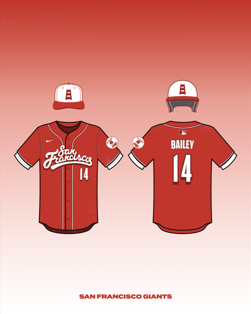
Here is Matt with his new SFG CC uniform:
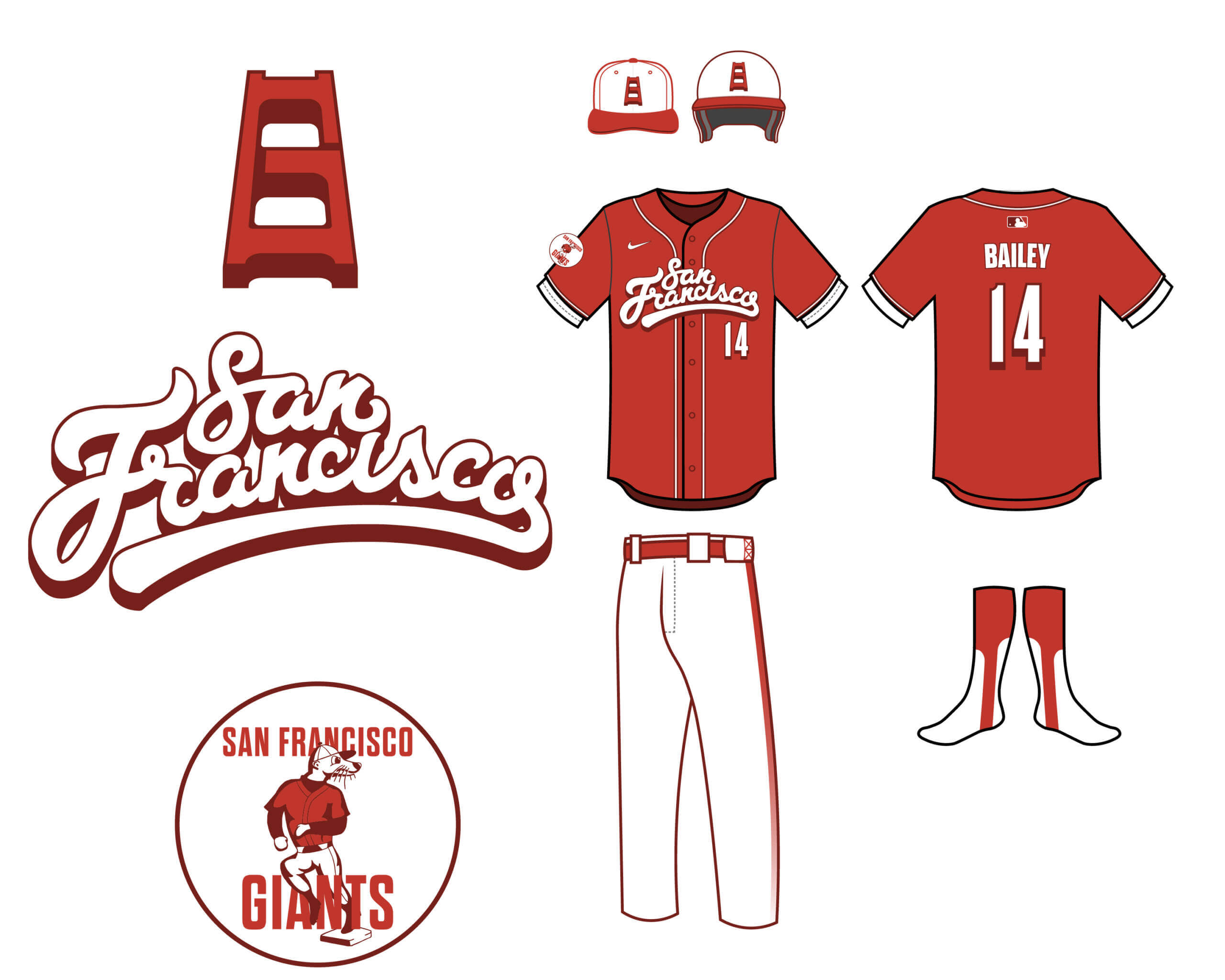
San Francisco Giants City Connect Concept
by Matt Whittock
Hi there! Long time reader, first time caller. I’m a graphic designer in the CrossFit world, but I’ve always had an affinity for baseball and its uniforms. As part of my effort to break into that world as well, I decided to create a city connect concept for my favorite team, the San Francisco Giants. I know many readers groan at the idea of the city connect program, but I happen to really enjoy it, even though some of the uniforms have been subpar. I think it’s a great initiative to tell the story of a place that many people might not know about. Unlike the NBA, the teams keep these alternates for multiple seasons to offer the fans an opportunity to “connect” to these stories and uniforms and to create memories with them. My favorites happen to be Joc Pederson’s walk off homer against the Mets in 2021, and his walk off walk against the Padres in 2023.
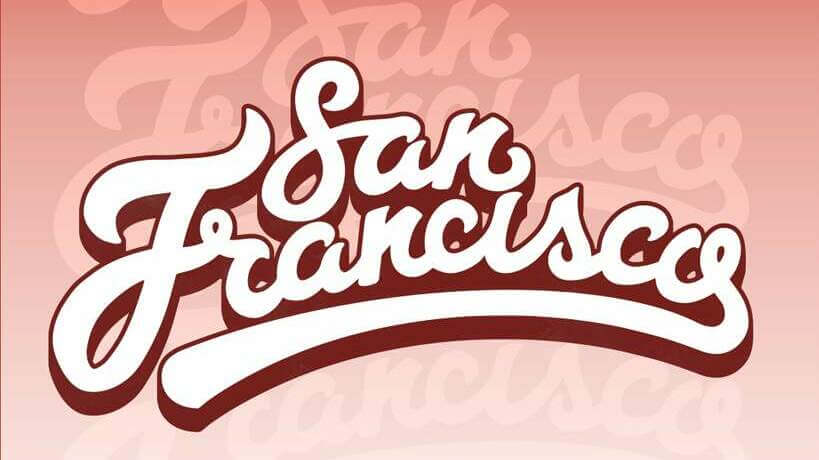
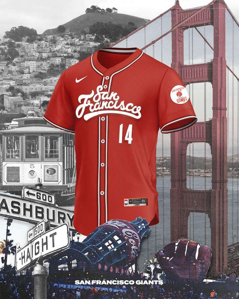
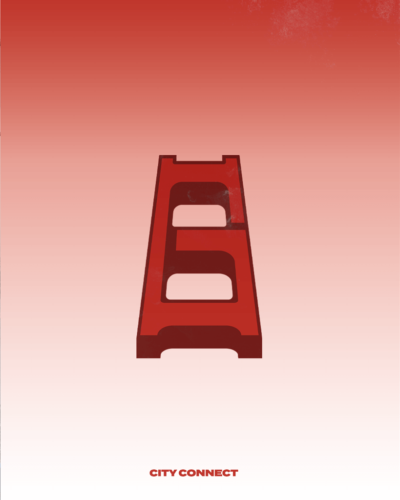
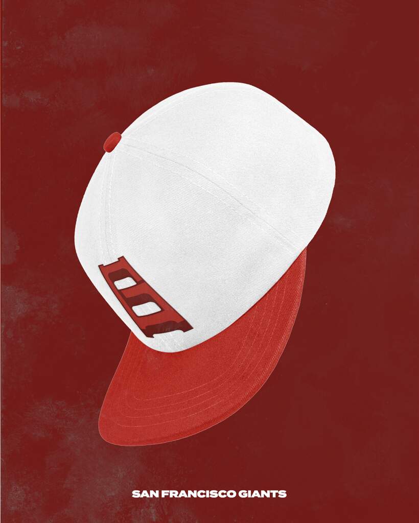
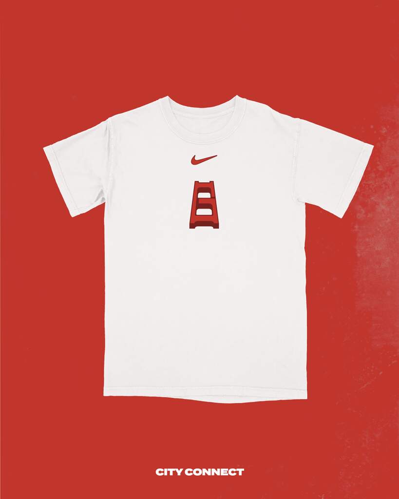
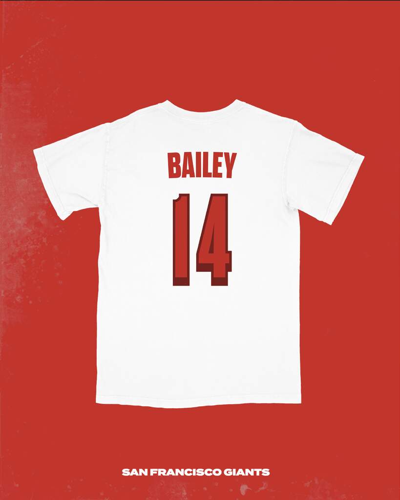
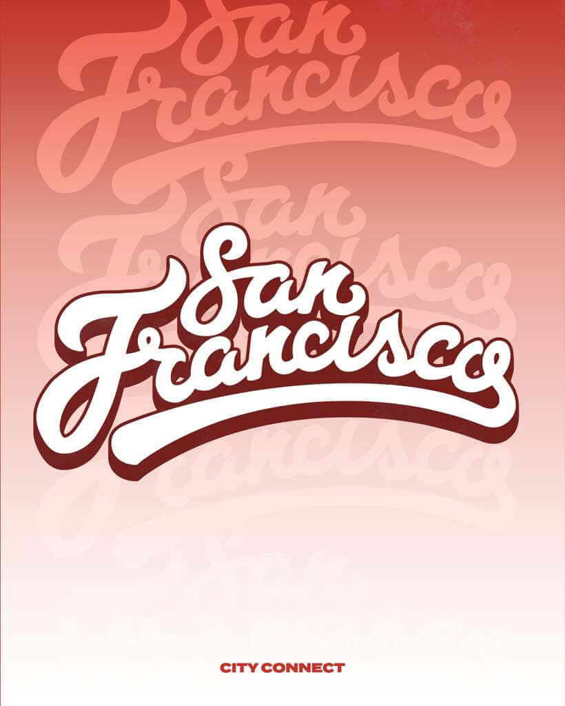
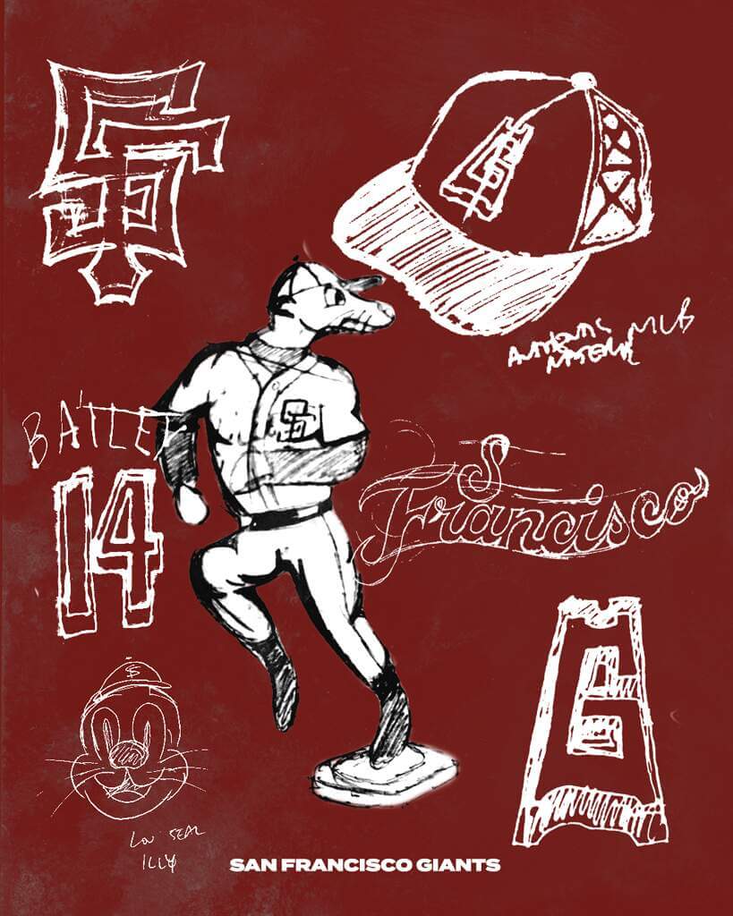
My concept evolves on the current set, but instead of focusing on the city’s fog, it focuses on the iconic Golden Gate bridge. I always thought it was funny that the current set doesn’t have the words “San Francisco” anywhere, so I made that detail front and center with a script that alludes to the hippies on Haight and Ashbury in the 60s. The jersey is the same deep red as the bridge, and when paired with crisp white pants, will give the illusion of the bridge peaking out above the fog. The logo featured on the cap is a stylized bridge made to look like a “G” for Giants, and the sleeve patch features Lou Seal for the first time in I don’t know how long, if ever. I believe our mascot is unique enough to be featured on the uniforms full time! Lastly, the numerals match with the logo to give the illusion of staring up at the bridge from underneath, which is how many people experience this icon, by either walking or driving on the bridge.
Thanks, Matt! Fantastic presentation — clearly a LOT of work has gone into this design.
Readers? What say you?
Better than the crap Nike created. Like the t-shirt and cap.
this is absolutely beautiful
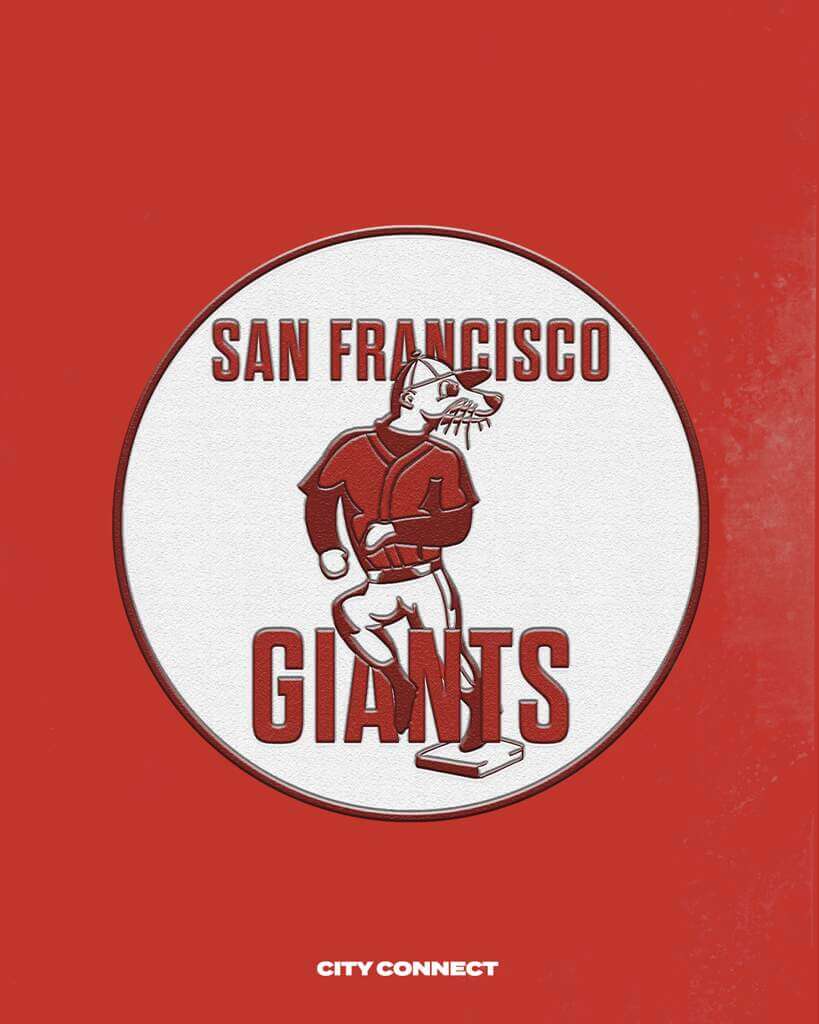
You should acknowledge that the seal logo was taken from the old San Francisco Seals of the Pacific Coast League:
link
I Dig it! Its got a San Francisco vibe that tells a story so much interesting than the present CC. A Droste of Lou would have been nutz…..m
Great designs, Matt! I especially like the two line San Francisco – not an easy thing to get right. And getting a G from the Golden Gate Bridge tower is inspired! One thing I’m curious about though, and this isn’t meant to be a criticism of your work, is this: During the design process did you ever consider how San Francisco lettering would break across the placket? On your flat rendering it looks like it would break cleanly, but on the 3D rendering it’s clearly split. I’m sure you’re aware of the current furor about the new Nike vapor jerseys and their odd letter breaks? Again, this isn’t meant to be a downer on your excellent designs, I’m just wondering if the whole letter placket breaking just isn’t in modern designer’s DNA now?
I agree, the shirt in particular is fantastic. I may have missed it in the description, but my eye can draw an “S” and and “F” out of the bridge graphic. Also, is it my imagination but are the stirrups also meant to suggest the bridge? Great effort, Matt.
Every time I cross the Whitestone Bridge, I think the towers resemble a pair of stirrups.
Much better than what will actually see the field.
It looks perfect and beautiful. Honestly, Giants should not only use this as a city connect, but a full rebrand. The connection to the seal and bridge should be adopted. It’s the perfect jersey too.
That cap rules. Great work.
I guess I’m in the extreme minority that really like the Giants city connect uniform. For starters, orange is a criminally underused color in baseball, and as far as I can tell, had never been used as the primary color on a cap before. And while the fog aspect has been criticized for making things to difficult to see, it perfectly encapsulates what the CC program is supposed to be about, making this just about the only CC uniform that requires no explanation to understand its connection to the city.
I always find it amazing how much better reader created concepts are than what that is actually put out.
I totally agree with this.
The Giants is one of the few CC I actually like. But this is much, much better. Great job!
Outstanding design, Matt. Better than all of the CC stuff out there. I would buy the cap and I’m not even a Giants fan!
Love your concept! I think you need a darker background color though it’s hard to see the G. But very innovative!
Awesome work, Matt! Brilliant!
But be careful…the Tennessee Titans and the NFL might cease-and-desist you over that cap logo!
; )
Great work, Matt!
It’s really good.
The Giants’ uniforms were great, the year they introduced the cream home uniforms. But they have fallen victim to “Committee Creep”, adding piecemeal bits of crap that have sullied the whole. I’d like to see them forsake the headspoon, and vertically-arch all their lettering.
Is it me or does the F look a bit like a J?
Not sold on the white hat/helmet, and the G logo is a little forced, but I love everything else about this. Nice work.
I agree, better than Nike but that is a low bar to meet. Sorry, unless my browser didn’t render the colors correctly, this looks to be red. That is not an SF uniform color. Even the Orange Julius uni’s from past few years are unattractive to many fans. The Giants look best with home white accented by minimal orange and dominant back piping. The classic “SF” mixed logo belongs on the cap. MLB should to return to visiting teams wearing team piping on gray uni’s. This is baseball, not the NBA.
I believe it’s based off of the color of the Golden Gate Bridge, which is “Orange Vermillion/International Orange.” I love the classic uniforms as well, but it’s fun to see fans get creative. :-)
Apparently there are variations of International Orange, which can be seen on Wikipedia.
link
International Orange
(Golden Gate Bridge)
#C0362C
Red 192, Green 54, Blue 44
I was gonna say something about that, the Golden Gate Bridge technically is painted orange but looks red to most people myself included
Would love to see the bridge tower run up the placket ….
Love the G in the bridge tower, and the stacked San Francisco, such a long name can be a pain.
Is this some kind of joke?
Like most of these city unies..
Horrible!
Just a MLB $$$$ Grab
Not a joke, a concept. Not a cashgrab, since nobody at Nike is producing this AFAIK. (Unless they buy this from its creator.)
You got that right.
Really nice. Technically the bridge isn’t “deep red”, it’s “International Orange”. I’ve also seen it called “orange vermilion”. This color orange does lean towards the red spectrum.
Can you do a Texas rangers one? Their city connect unis aren’t that great either.
Looks like crap. Just my opinion.
Obviously it’s your opinion, which you don’t always need to share.
These are outstanding. I’d pay $50 for that hat.
I’d buy the crap outta this.
The San Francisco Reds?
The Nationals CC uniform was one of the best. I sorry to hear that it’s going to be retired at the end of the season, but mostly I’m afraid of what ridiculous horror they’ll come up with to replace it.
I like it(I’d change the red color but I dig it otherwise) Much better then what they have now.
Take my money! Where can I get this merch!
Red is not a Giants color and the bridge part reminds me of the Hellas Verona ladder (but that is my euro soccer background playing up) but I like the seal and I like the wordmark a lot.