[Editor’s Note: Paul is on his annual August break from site (although he’s still writing his weekly Substack column). Deputy editor Phil Hecken is in charge from now through the end of the month.]
Good morning, Uni Watch readers. I hope everyone had a good Tuesday.
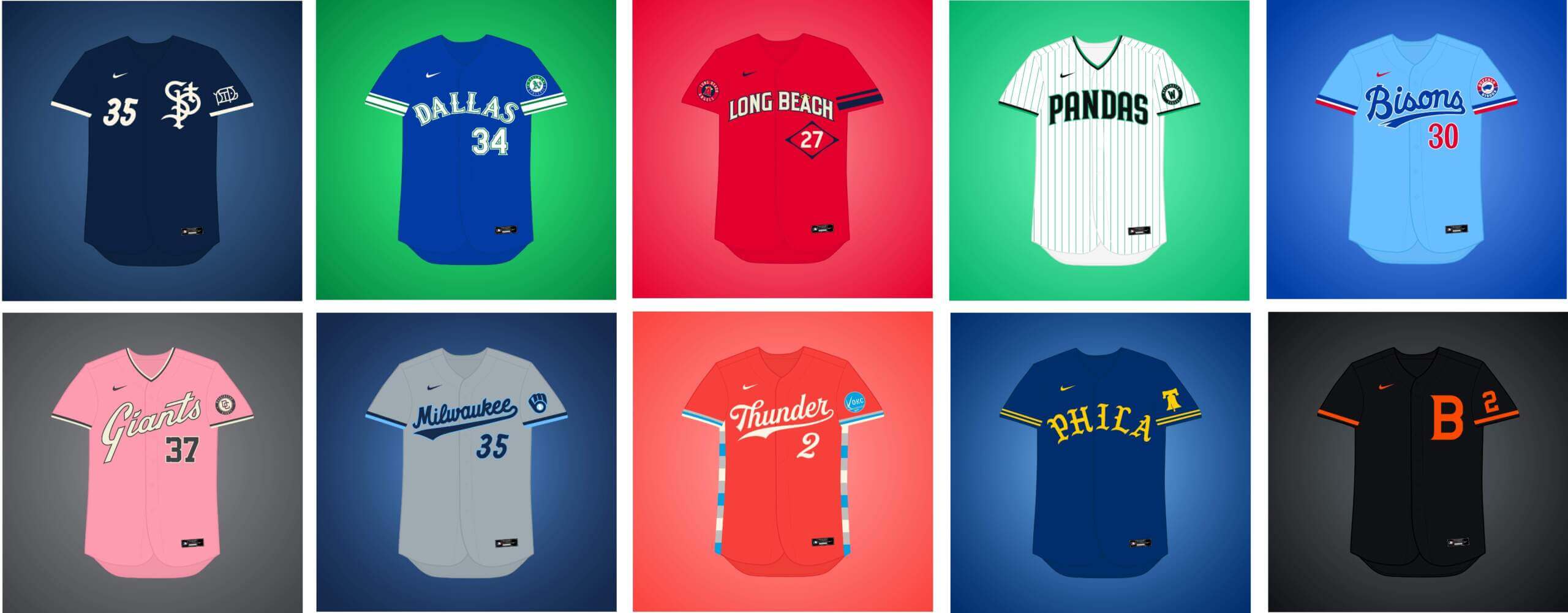
I’m joined once again by Matthew Drake, who has embarked on a project he’s calling the “MLB Multiverse,” which is now entering its fifth part. If you missed any of the first four posts, you can click here for Volume I, click here for Volume II, click here for Volume III, and click here for Volume IV. As in previous posts, I’ve included Matthew’s introduction from his introductory post below, so you don’t have to click on Volume I, II or III for an explainer. And as in previous volumes, for each “what if” I’ve included the new “home” jersey inline, with road and additional alternates in the gallery beneath. Enjoy!
You can follow Matthew @MJD7Design on the Twitter, and check out his progress on this project as well!
Here’s Matthew:
by Matthew Drake
I call this series “MLB Multiverse,” it’s essentially a collection of “what-ifs”: either relocations of MLB teams that very nearly happened, or what certain teams would possibly look like if they never relocated in the first place.
Obviously referential of Marvel’s recent cinematic dealings with the concept of the “multiverse,” another way of thinking about this is that these teams do in fact exist in an alternate universe, where their respective relocation deals followed through to completion.
The series was heavily inspired by user @SFGiants58’s legendary “MLB: The Defunct Saga” series on the sportslogos.net boards, as well as logo/uniform legend Todd Radom’s “Phantom Franchise” segment on Buster Olney’s podcast.
I created over 60 (!) different alternate-universe teams in this series, my biggest series ever by far. It was fun and exciting to try and flex my creative muscles a bit more beyond simply fixing up the 30 big league teams. I hope you enjoy seeing these designs as much as I enjoyed creating them!
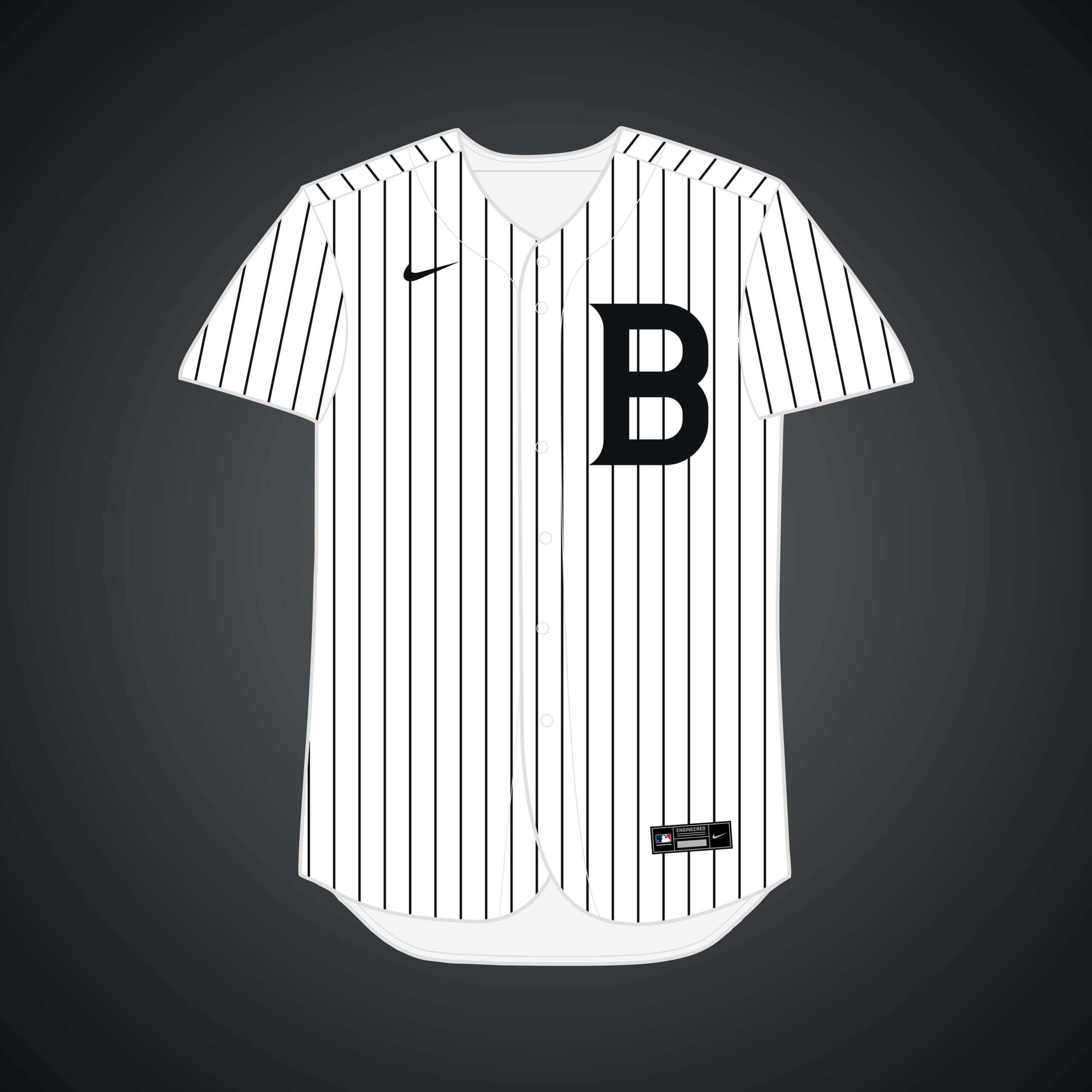
A team named the Baltimore Orioles existed from 1901-1902 before they moved to New York and eventually became the Yankees, but what if they never did? I combined the original O’s block “B” with the Yankees’ style “NY.”


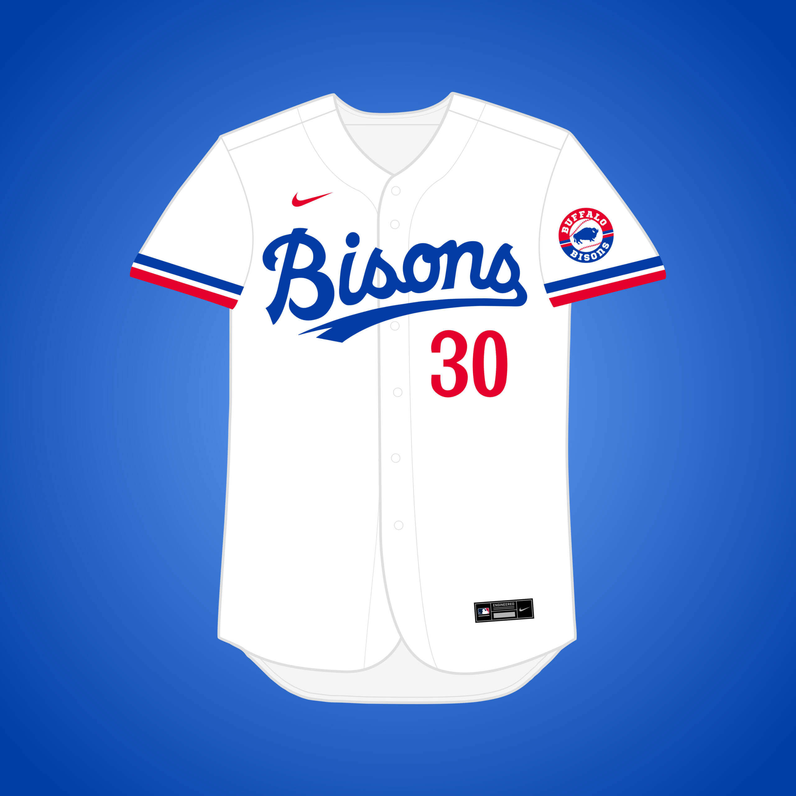
This one would *technically* count as a relocation, as Montreal’s bid for an expansion franchise nearly fell through before they even played a game, and Buffalo was one of the cities interested if it did. I went with the name “Bisons.”


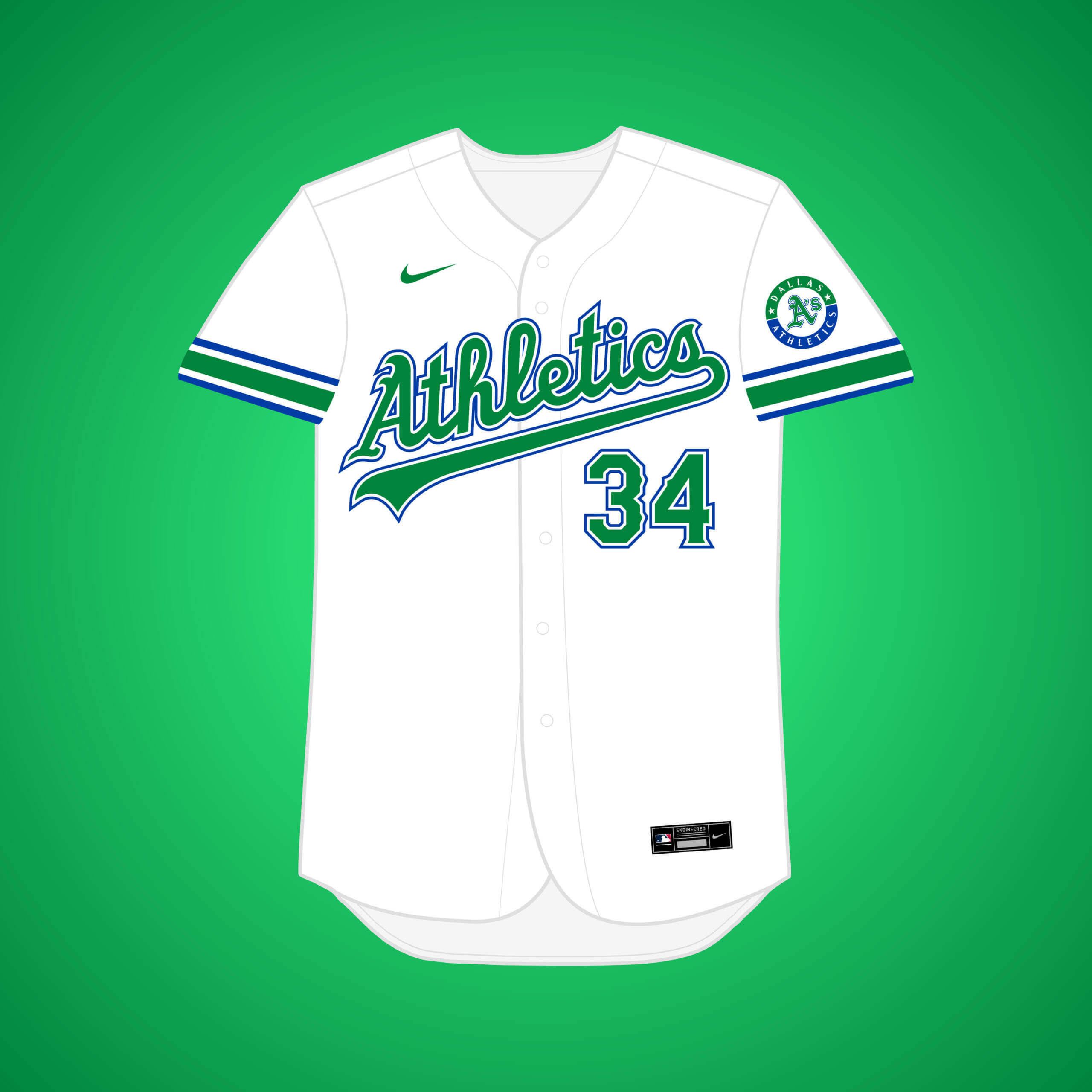
Charlie O. tried to move the team in 1962, but it was rejected by other AL owners. I went with a kelly green & royal blue color scheme, modeled after the city’s NBA team’s former colors.


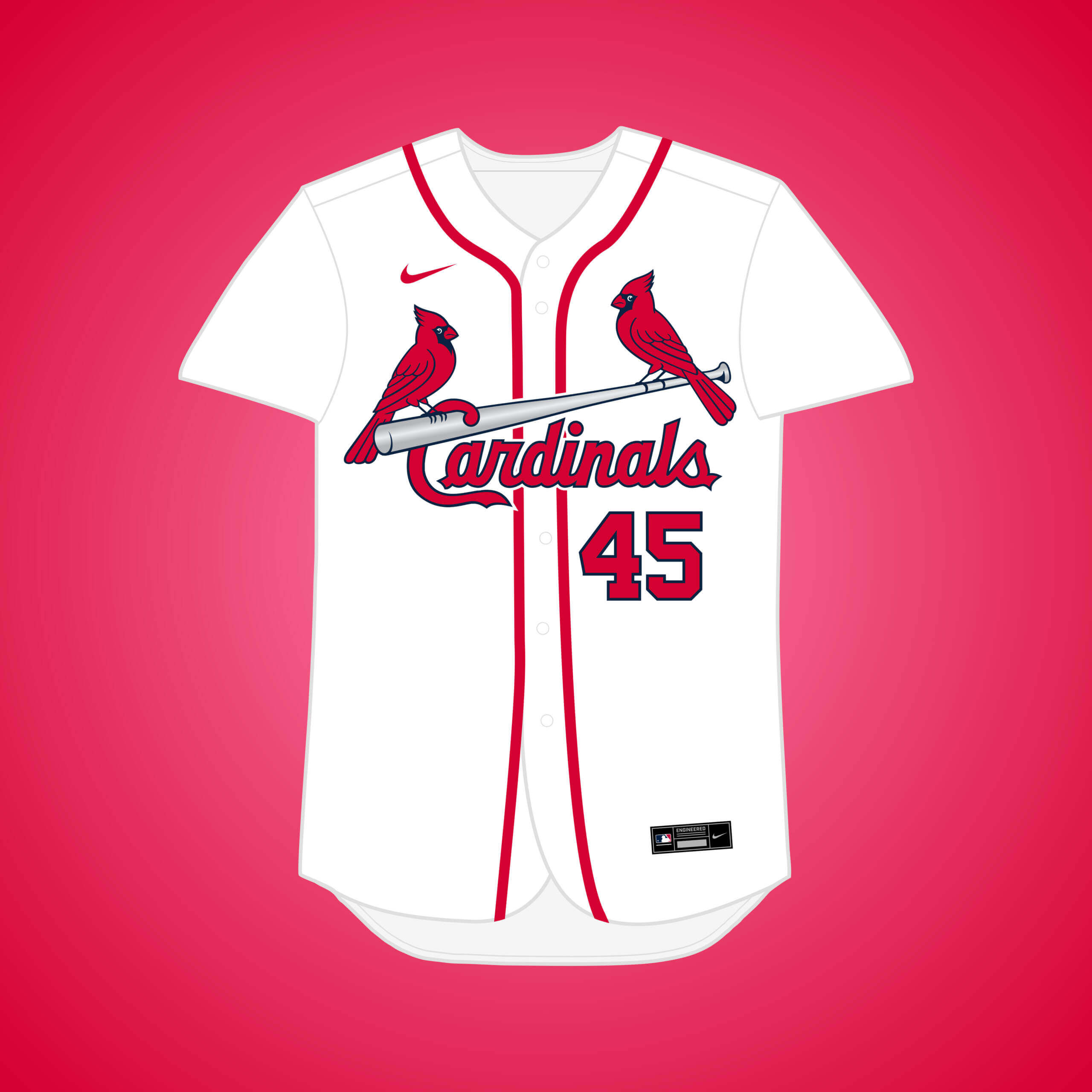
In 1934, the Cards were rumored to be on the move to Detroit, as the owner publicly said it would be “ideal,” but the Tigers would’ve never allowed it. The silver bat is inspired by Detroit’s famous automotive industry.

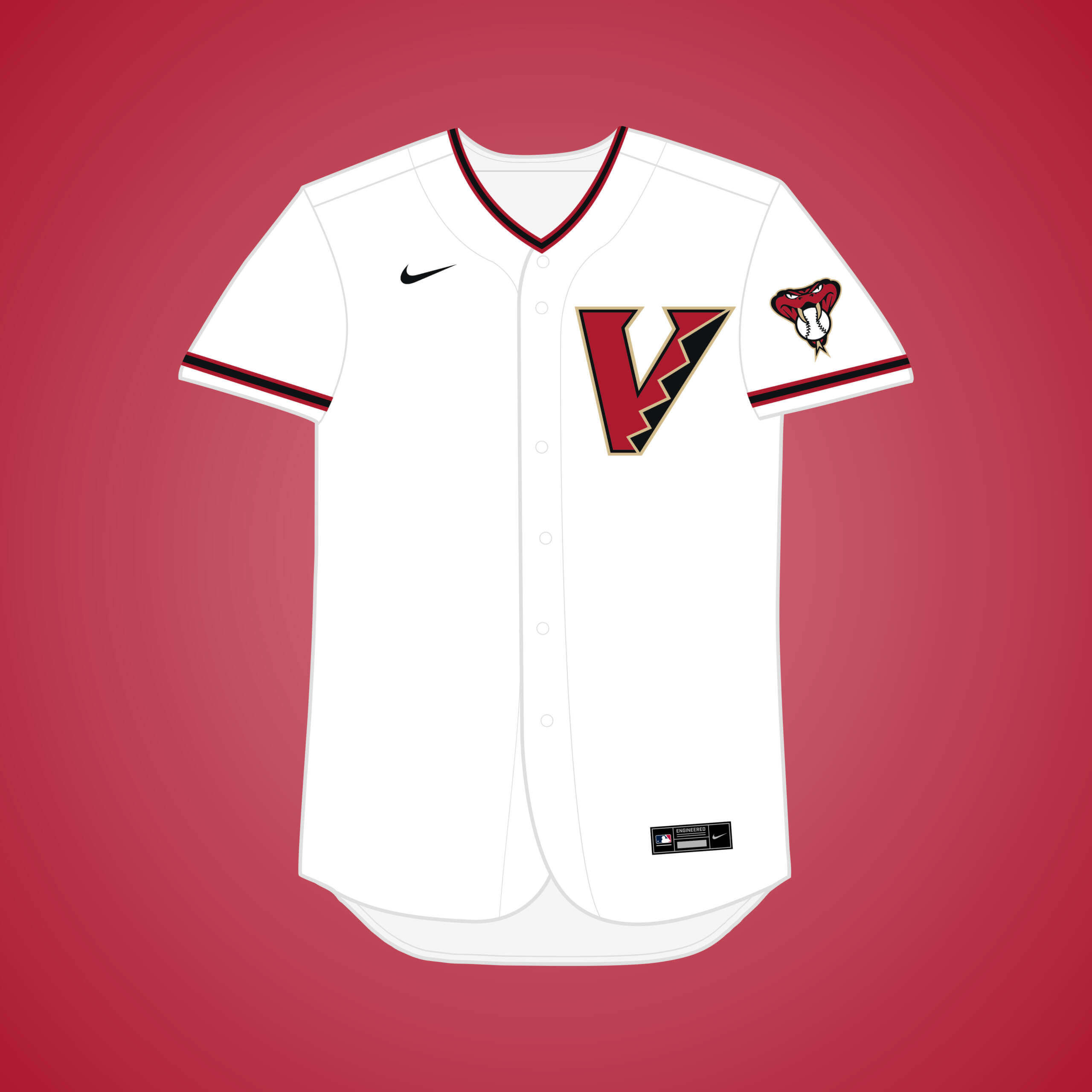
The D-Backs signed a nondisclosure agreement with the city of Las Vegas in 2018, suggesting there were at least talks about a potential move. The black, red, & sand color scheme already works perfectly for Vegas.


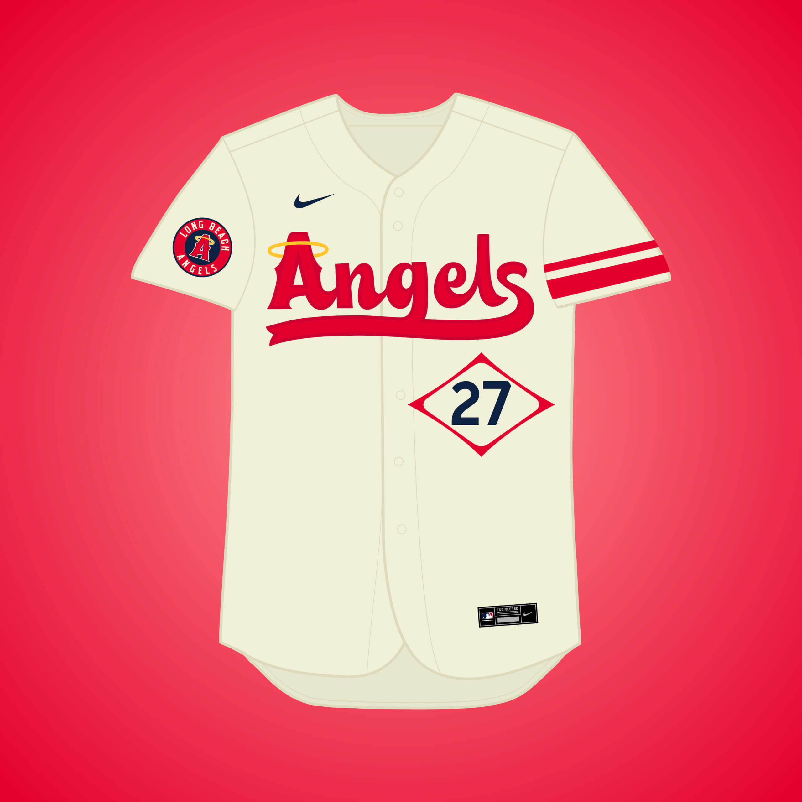
The Angels met with Long Beach officials in 2019 about relocating to a new stadium at an undeveloped plot of land near Long Beach Convention Center. For this iteration I went all-in on the City Connect surfer aesthetic.


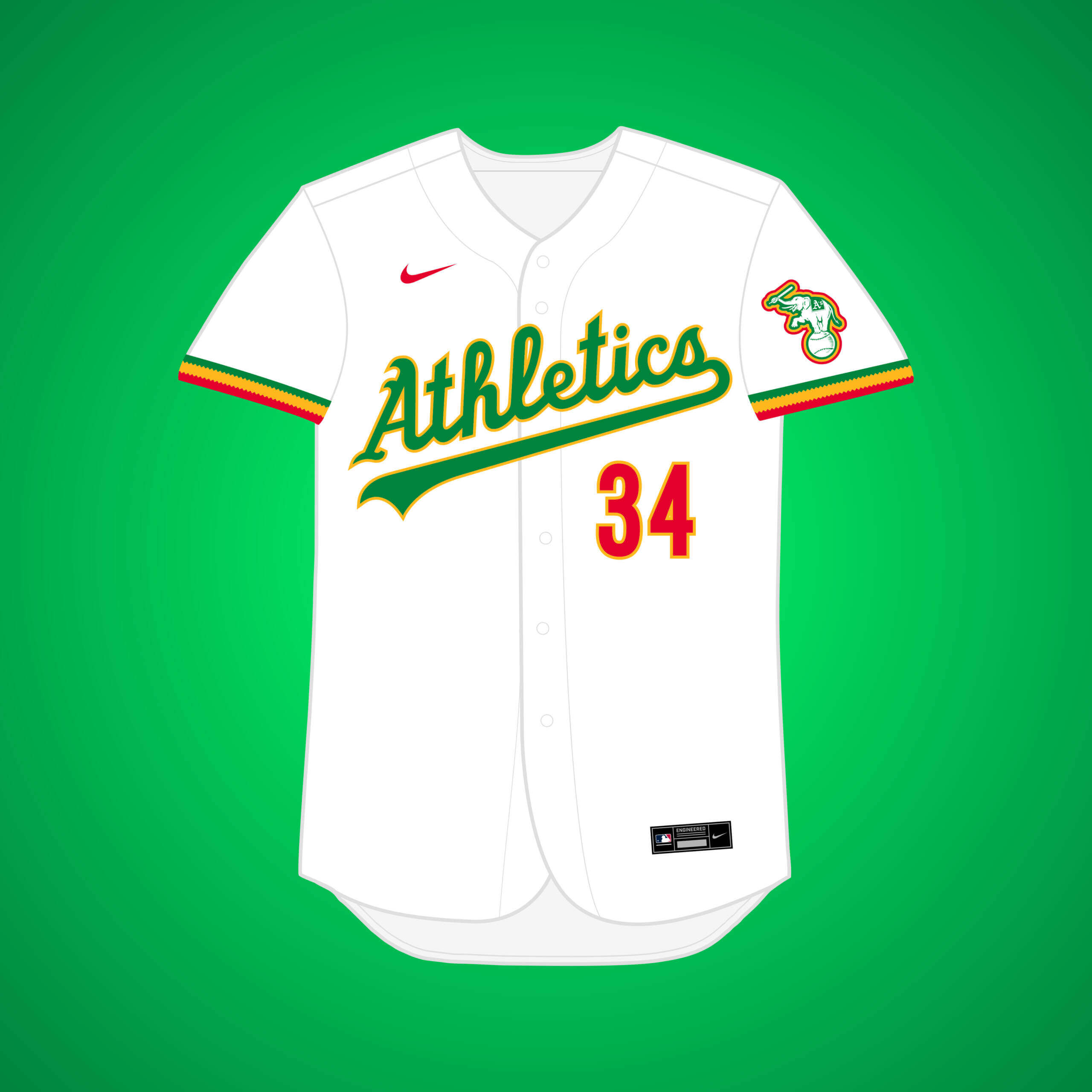
The A’s in Kansas City seemed doomed from the start, as their owner quickly set his eyes on LA, possibly coordinating with the Senators to go to San Francisco. Red accents are added and the city flag adorns the sleeve stripes.


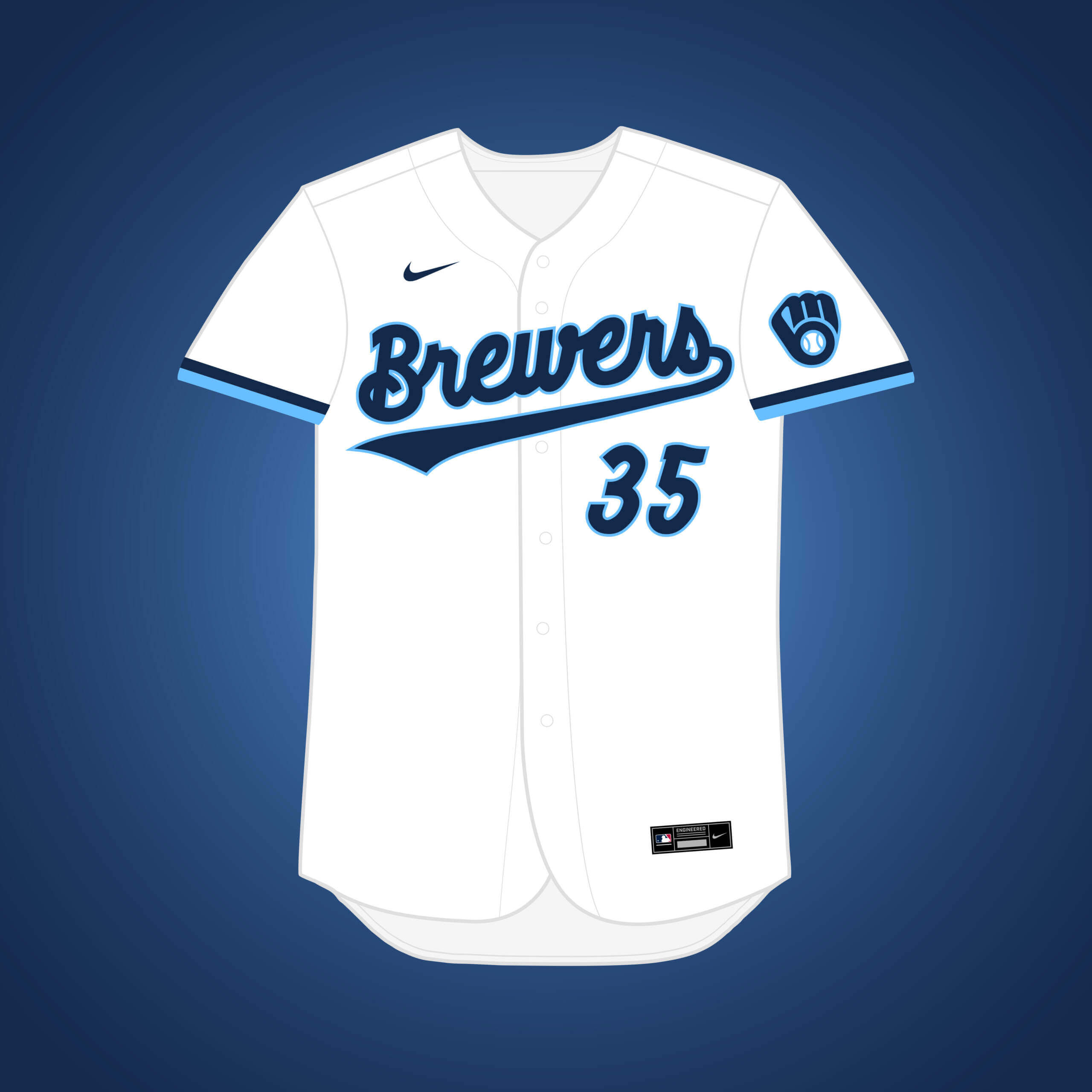
This is the same premise as my original White Sox → Milwaukee design, but if they changed their name to the “Brewers.” Navy & light blue are both colors the Sox have worn in their past.


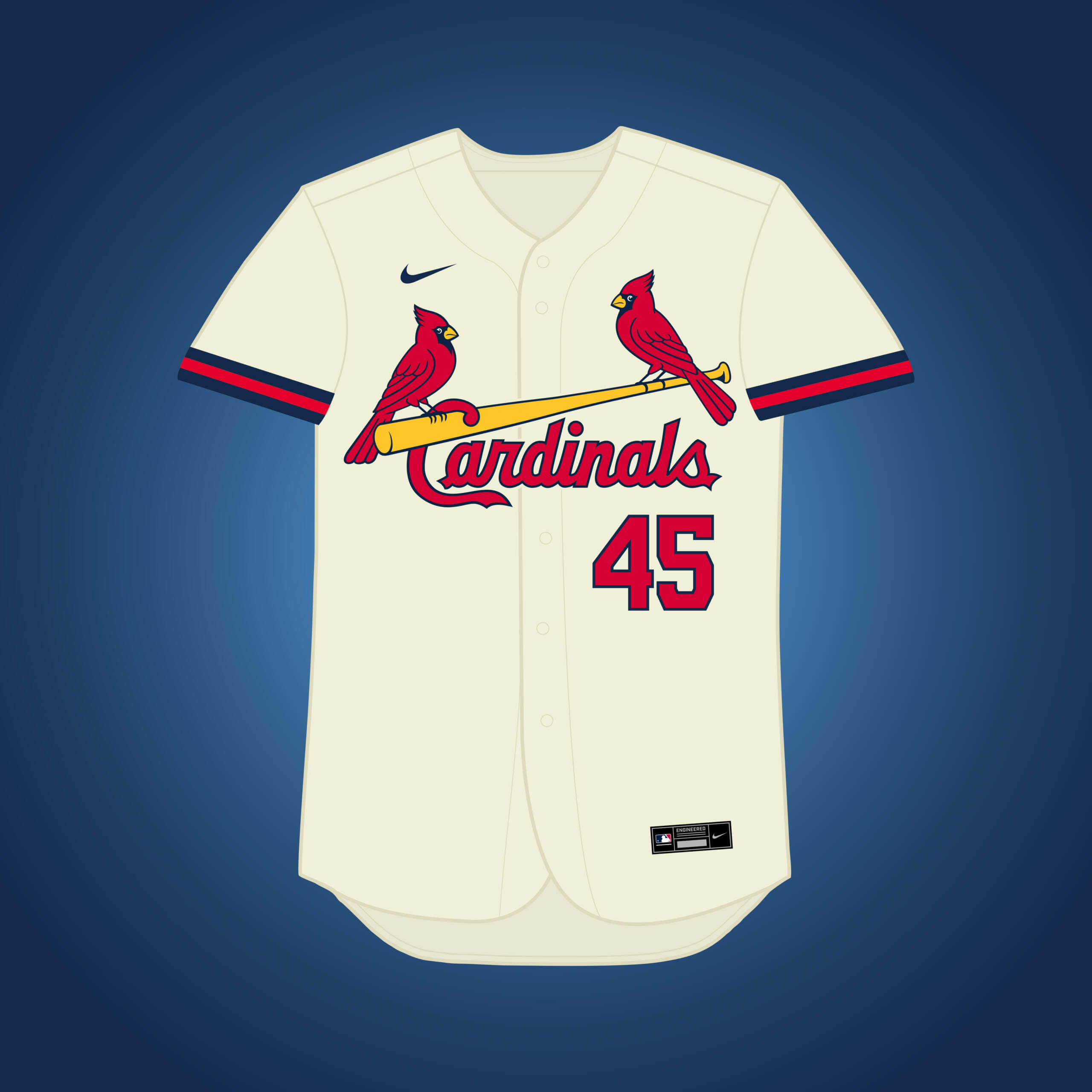
When Cards’ owner Fred Saigh had to sell the team due to tax evasion, he also looked at Fred Miller and Milwaukee. Navy takes a heavier presence in this version of the Cardinals’ set.


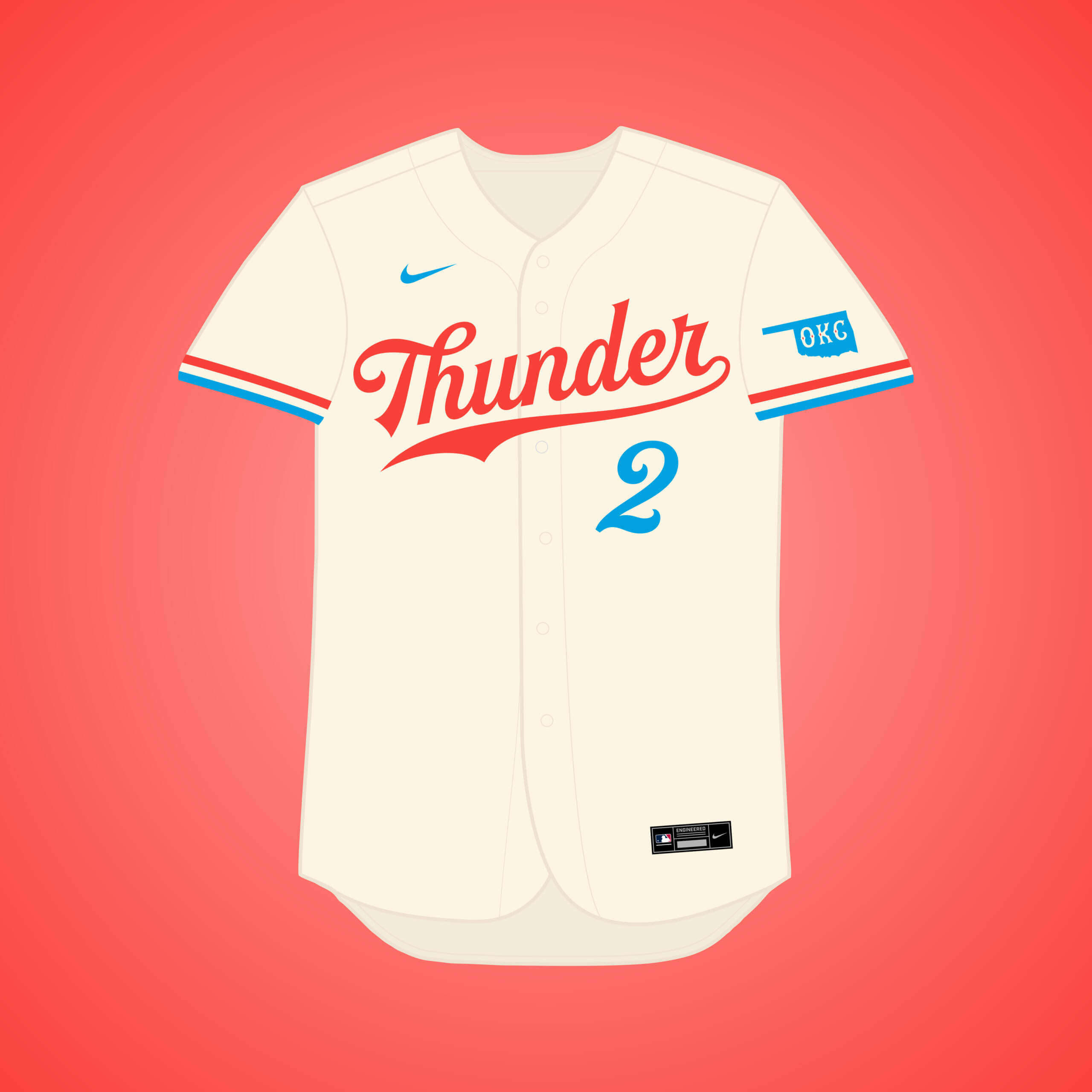
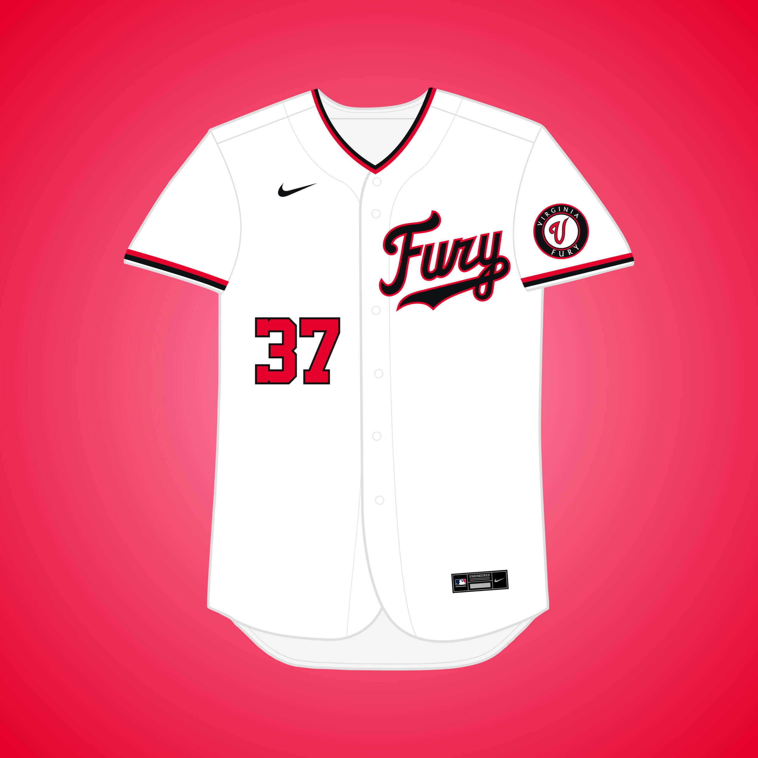
Lt. Gov. Mary Fallin said in 2006 that she had several talks with the then Florida Marlins about possibly moving to OKC. I figured if it went through, they’d be able to snatch up the “Thunder” name before the NBA got to it.


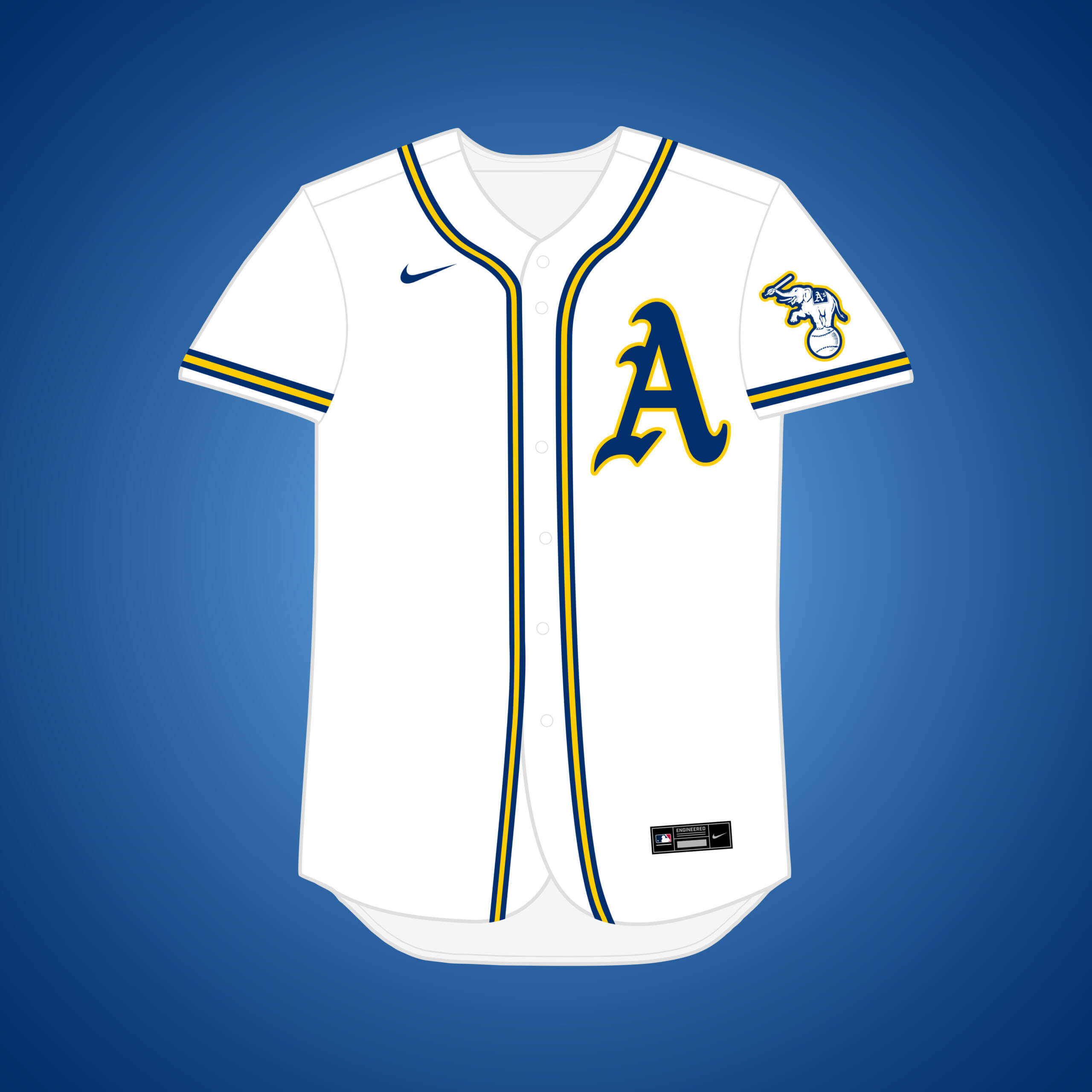
The Athletics left Philly for Kansas City in 1955, but what if they stayed? Gold is paired with blue for a scheme resembling the Philadelphia flag.


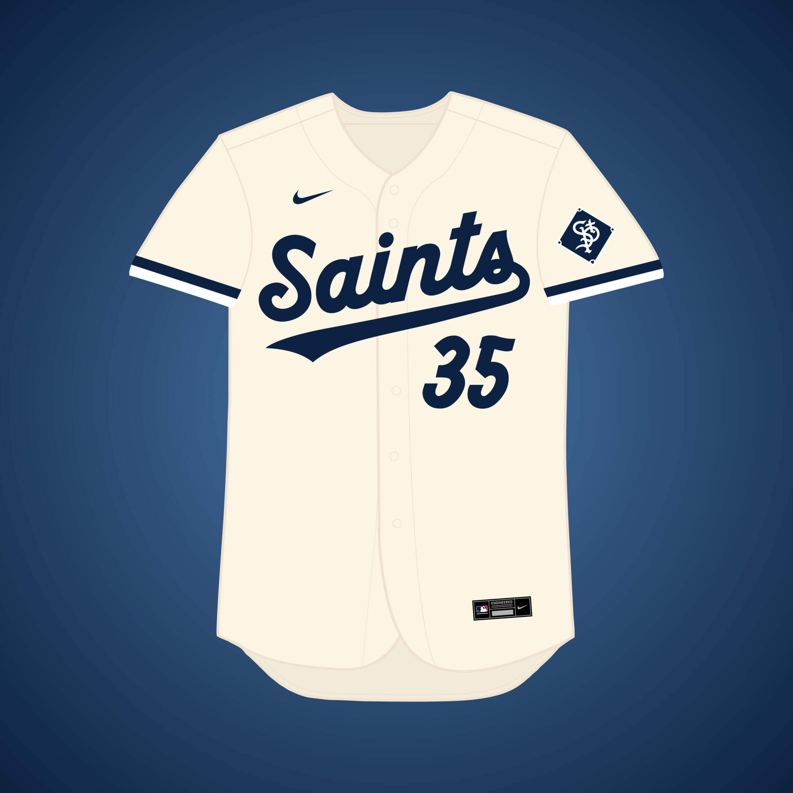
Charles Comiskey moved the Saints to Chicago in 1900 and renamed them the “White Sox,” but what if he never did? I took inspiration from the color scheme of the Twins’ current “Twin Cities” jersey.


Bill Collins III, who also tried to buy the Astros, tried to do the same with the Expos and move them to northern Virginia, but DC proper won out. This set takes a Nationals approach but with red & black.


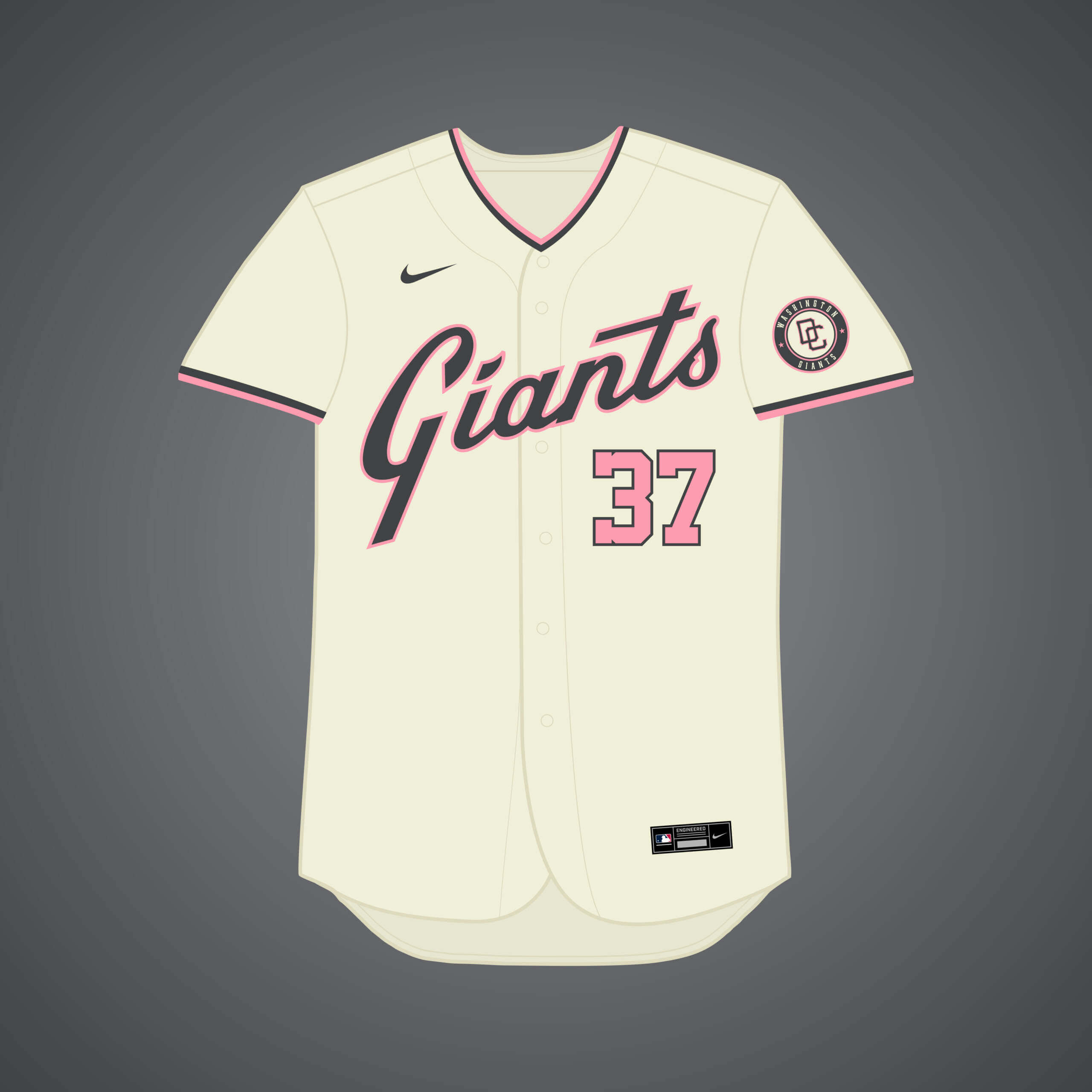
A group of DC investors attempted to buy the team and move them in time for the 1978 season, but it never materialized. I went with a color scheme inspired by the cherry blossoms of the Nats’ City Connect uniform.


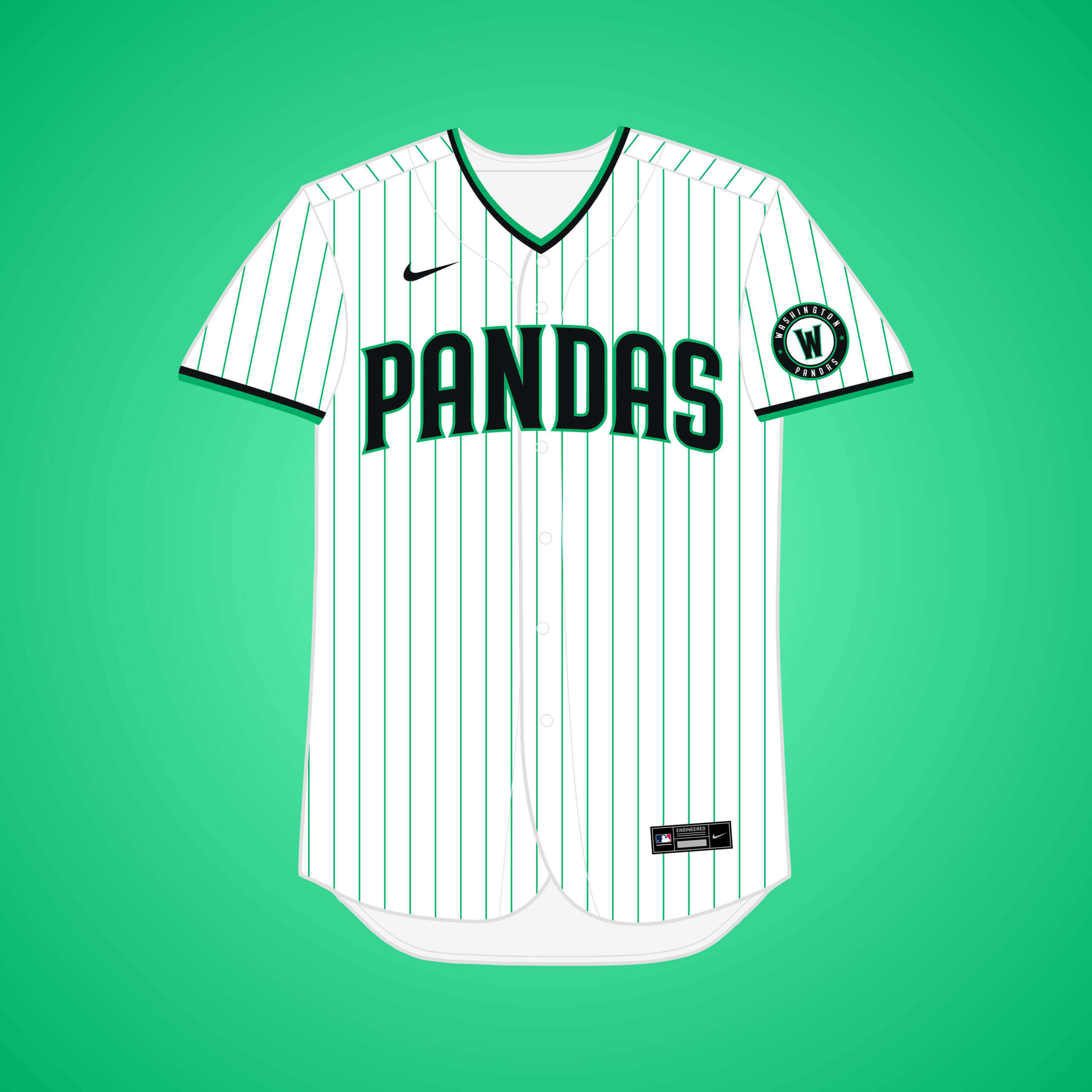
This is the same premise as my original Padres → DC design, just if they changed their name to another one they considered if they moved: the “Pandas,” a reference to the pandas at the National Zoo.


Readers? What say you?

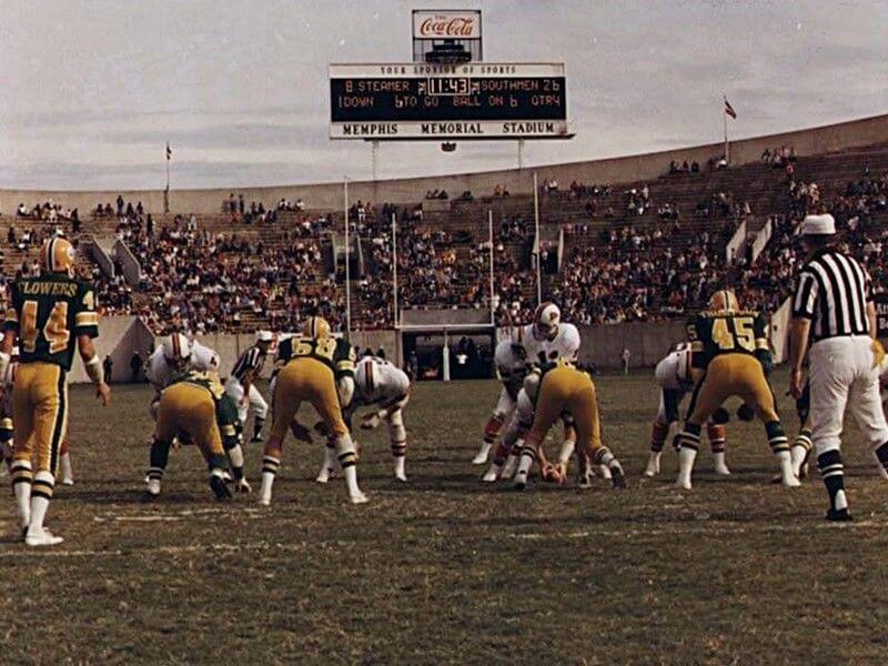


GTGFTS 9/14/75 WFL Memphis Southmen 34 Shreveport Steamer 23. I was a little Jacksonville Sharks fan back then!
When the Bell beat Memphis 46-15 on Aug 7. 1974, my father threw 4 TD passes against them and got WFL player of the week. They took him out early and he was furious, he wanted to throw 6 TD passes against them. Their Head coach McVay said, yea, the King did a good job throwing short passes against us as a cheap shot. But Memphis got dominated by the Bell offense, they got embarrassed out there.
They replaced John Huarte with Danny White and White threw 2 quick TD passes, he was a big guy with a strong arm, and no one knew who he was. My father was using that as an excuse to have Waller put him back in the game, he kept saying this kid White is going to bring them back if you don’t put me back in. Ronny said if they score another TD I will put you back in but that never happened. After the game the guys were talking about Danny White, John Land said I don’t know who #11 was but he had a strong arm, he was better than Huarte. I guess John was right, Danny White went on to have a pretty good career with the Dallas Cowboys.
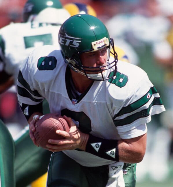
9/27/92. Jets vs Rams. Browning Nagle @ QB.
Nice going, Scott!
Not my favorite Jets set, certainly not their best either.
I know ‘everyone’ wants the Namath-era uniforms to come back (and hats off to Aaron Rodgers – keeping #12 retired was the correct thing to do!)…but I’d rather see these Nagle’s instead of SB3’s return/re-tread.
With the return of the Sack Exchange throwbacks, perhaps Jersey B will come to their senses and return to something inspired by them.
GTGBTS – September 14, 1975 – Memphis Southmen (34) vs Shreveport Steamer (23)
The interlocked “LA” for Athletics in Los Angeles should be used by some team who calls LA home…but lives in Anaheim.
Re: Giants move to DC
I think Ted Lerner was trying to buy the Giants and move them to DC in the 1970s. He’d have to wait another 30 years before he could buy the Nationals.
When we did get the Nats, I thought they might go with a panda mascot, but we got “Screech the Eagle” instead. The WNBA’s Mystics finally picked a panda after almost every other team went Eagle. The pandas are due to leave the National Zoo in December.
Still no Indianapolis Arrows from when the Pirates were threatening to move?
I like how 75% of these are “what if the Athletics moved to _____?” I feel bad for Oakland, don’t get me wrong, but it’s not a surprise when a team that has already moved twice and threatened to move to every other city in the United States actually does move again.
Wow, lots to take in here.
1. I love that Thunder look! Great script and color scheme.
2. As a native Virginian and die-hard O’s fan, it’d be really hard not to have a soft spot for the Pandas. I’m imagining a nice cap logo with good use of negative space.
3. That St. Paul Saints “StP Pig” logo should be in a museum. Even though it’s pre-existing, I’d never seen it before and it blew me away. Love at first sight.
I had never seen that pig logo either. I could see a gigantic, jersey-covering version of it being St. Paul’s City Connect uniform after decades of staid logos with just the city name and team nickname. Super-plain and then bust out the century-old pig that half the fans have never heard of, kind of like what the A’s did with the elephant in the ’80s.
Hate to do this for you. Although I know the MiLB team in Buffalo is the Bisons, I would assume the Majors would “recommend” the proper plural of Bisons be Bison. During my freshman year of High School all of our jerseys had to change when the district “fixed” our plural issue.
They should have done that when Florida got a team, but for whatever reason, we got the “Marlins”.
Even the Hiroshima Carp know how to handle fish that don’t have an -s for the plural!
Just as green and red makes most think of Xmas, green, yellow, and red (LA A’s) makes me think of Rastas.
Go Bad Brains!
Another great series Matt. I actually learned of one or two failed attempts to move teams!
So much to say about this installment:
Too bad Buffalo was not an option for the Expos. Those uniforms would have fit so well in their new home and honor the franchise history too.
The Angels CC is deserving of full-time status – the navy alt is a welcome addition.
The script and colors on the Thunder jersey is beautiful – I would still miss the Marlins teal if they had left Florida, but this is a great replacement.
I really like the stay-put Philadelphia A’s powder blue road, though I’d maybe like it more if the navy and yellow were flopped(?). The wrong team left town!
“The silver bat (Motor City Cardinals) is inspired by Detroit’s famous automotive industry.” I’m Calling It Chrome. And I’m puzzled by the red beaks.
Marvelous artwork, Matthew!
Great work again, Matthew! I especially like the Philadelphia A’s and St. Paul Saints mockups.
Not all beach towns in SoCal have surfing or a surfing culture. And Long Beach definitely isn’t a surfing town. It doesn’t have the waves for it. Also, if you’re staying in the LA area, you’re keeping the LA name for the same reason an Anaheim team goes by LA.
With all the potential and hypothetical Athletics moves, how about a full feature showing the A’s uniform in all the 29 other MLB team colors!
Wow, that Dallas Athletics uni set would be great for a Cascadia regional baseball team!
As for OKC – is there a particular local connection with the name Thunder that would prompt an MLB team to “snatch it up” before the Sonics moved there?
It would have to be Thunders or Thunderx.
If they ever remake the 1979 classic the Warriors, I want the Baseball Furies in those Fury uniforms, it would be a huge upgrade from those plain on the front dirty looking pinstripe jerseys they wore.
Can someone make a sell an actual version of the interlocking STP, pig-on-the-sleeve Saints jersey?
That’s fantastic.
I love all of these concepts but for me the winner is the navy Saint Paul jersey indeed.