Greetings and a good Saturday morning. I hope everyone had a good week, and you’re not too wiped out from this past week’s uni-bonanza.
You guys will recall reader/pal Leo Strawn, Jr. recently took a deep dive into the similarities between the caps worn by the Hiroshima Carp and Cleveland, which took him down a bit of a rabbit hole in his research. Turns out that rabbit hole was a bit deeper than even he expected, as Leo has now combined two of his passions — the “Wishbone C” and quizzes — and has another very fun piece in store for all of us for today. If you’re like most of us, you’d probably know that the Chicago Cubs, Cincy Reds and Cleveland Guardians have all used (or still use) the Wishbone C as a logo — but that’s an incomplete list, as we’ll soon see.
I’ll just turn it over now, as Leo brings you …

The Mighty Wishbone C Quiz (& Debate)
by Leo Strawn, Jr.
I’m Leo…welcome to my world!
It’s that time of year again, so buy me some peanuts and Cracker Jack!
This started as a broader cap and uniform quiz, but one question just got more and more complicated the deeper I researched, so I decided to turn that one question into a quiz of its own…which will surely open the floor up for debate.
This edition will focus on that wonder that is the wishbone C!! Just give it your best and have fun with it, okay?
Ready…?
You might ask, “Leo, why the hell do you seem so obsessed with the wishbone C?”
My answer is “It’s my heritage, I guess.”
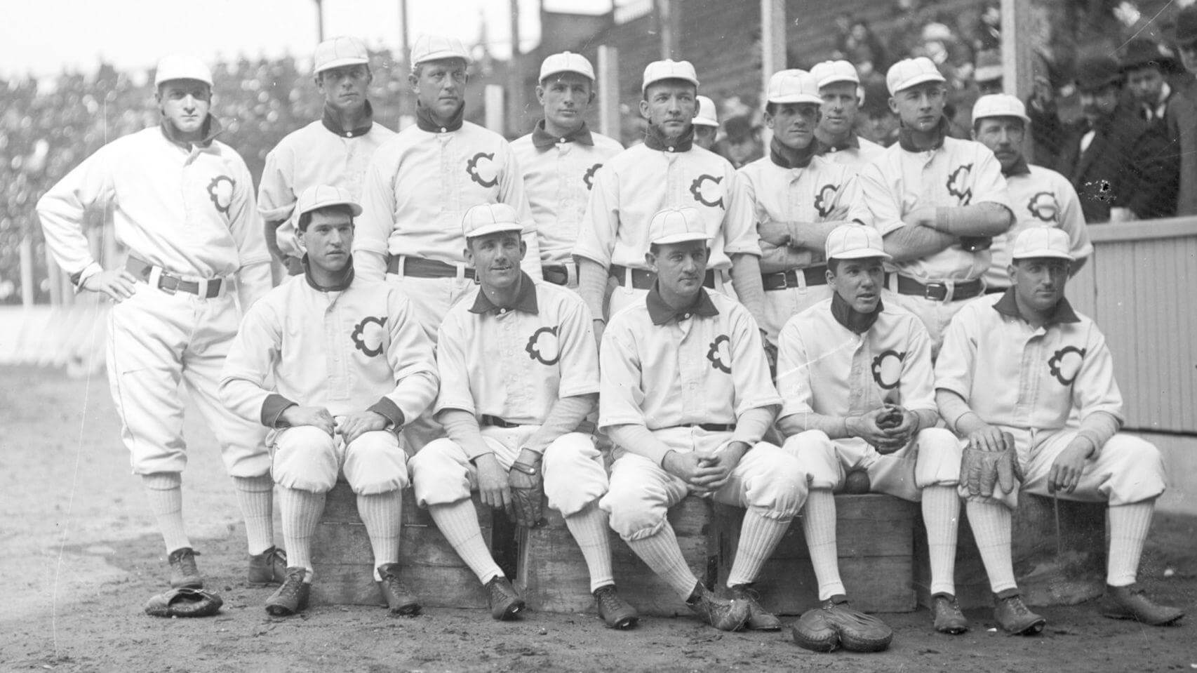
The first ballgame my dad ever took me to was to see our local Minor League team that wore these beauties. Now, I can barely remember even being there, but I must have wanted my dad to buy me one of those blue caps with the white wishbone C. If you read UW regularly, you know that, as it turned out, I got my first cap sometime later, and it was a red Tribe cap with the blue wishbone C in white outline that my grandpa bought for me. My dad was a Reds fan, and I was, of course, a lover of the Big Red Machine in my youth, as well. So, I developed a personal attachment to one of the most iconic sports logos of all time, very early in life.
Now, on to the question that began my venture into this wishbone shaped rabbit hole…
What Major League clubs have worn a wishbone C?
That’s it, that single question has become the entire quiz.
How many can you think of and who are they?
My answers are below and let me add that I have included the Negro Leagues as Major Leagues in this quiz, as MLB has (relatively) recently done. That being said, there is one Negro League team that may or may not have worn a wishbone C while in the NAL, but definitely did wear one, though possibly as an independent team prior to joining that league. However, it appears they may have used a wishbone C in their logo in their only season as a Negro American League club, so, while I can’t say for certain whether or not they wore a jersey featuring a wishbone C as a Major League team, I decided, nevertheless, to include them as one of my answers.
I realized my personal list of (11!) answers was going to be up for debate as I was trying to come up with all of the “correct” answers and that it was going to depend upon the strictness of one’s definition of “wishbone C”. The only definition I could find online is on Wikipedia, which defines it as “a standard letter ‘C’ that is pinched off in the middle to make it look like a sideways wishbone.” The link to that source of that definition is a 404, unfortunately.
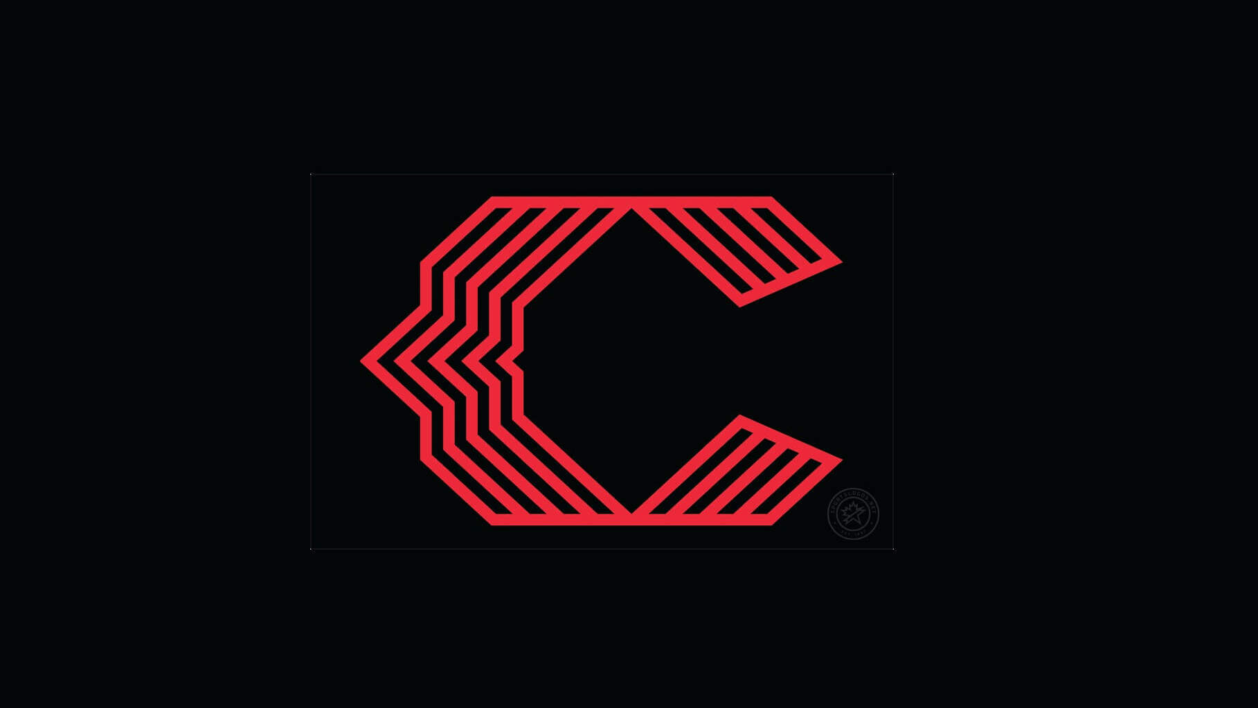
Let me pick your brain before you start: We all know what a classically defined wishbone C looks like, but in 2023, the Reds came out with a modernized version for their City Connect uniforms that is obviously based upon Cincinnati’s everyday cap logo. Perhaps the Reds wanted to sidestep this debate because the club’s website doesn’t actually call it a “wishbone C”, describing it this way, “The classic “C” logo receives a modernized look and appears on the cap and sleeve.” Nevertheless, the Reds’ classic C logo is a wishbone C, even if it has been subsequently “modernized”.
So, do you consider the Reds City Connect version or any of the other versions in my answers that do not strictly resemble the Reds classic C logo as a wishbone C?
Additionally, does the C have to be elongated or can it be rounded? Does the addition of other elements on the logo disqualify it?
How many clubs did you come up with for this edition, who are they, and, more importantly, how broad or narrow do you think the definition should be?
Now, get a cup of java and cogitate for a bit.
Until next time…
Cheers!


It’s always surprised me how commonly the wishbone C is used given its distinctive character. However, I would hasten to add the Tuscan font is a different beast (the lettering on the California Angels’ hat) and is distinguished by a burr on both sides and tulip-shaped serifs.
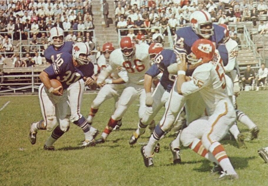
GTGFTU: 09/22/1963 Kansas City Chiefs (27) vs. Buffalo Bills (27); War Memorial Stadium, Buffalo NY.
I love tie games.
I don’t love the Chiefs in white road pants, though.