[Editor’s Note: Paul is on his annual August break from site (although he’s still writing his weekly Substack column). Deputy editor Phil Hecken is in charge from now through the end of the month.]
Good morning!
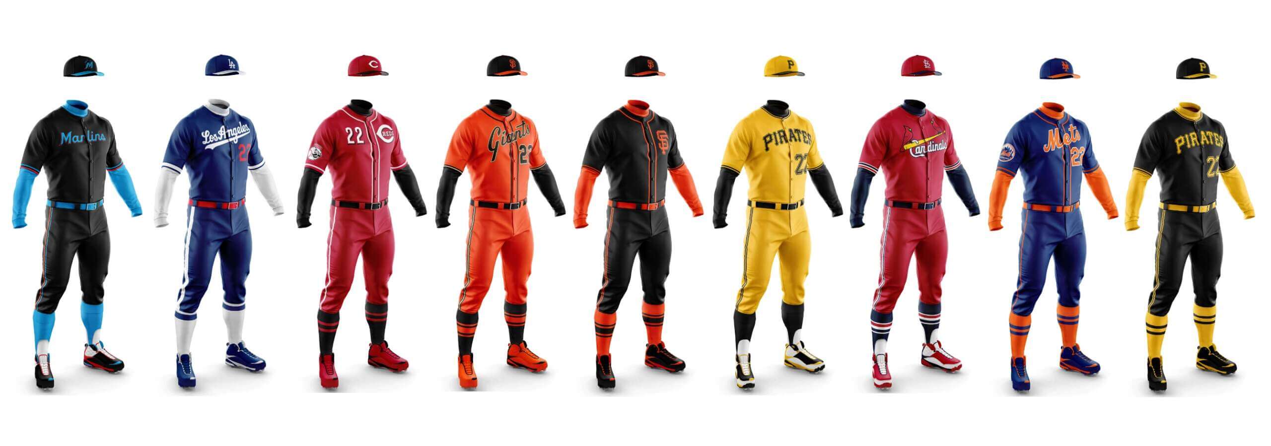
Weekend readers will be familiar with the work of Chris Diamond, who I recently teamed up with to create a series of articles examining the possibility of monochrome “dark” uniforms in baseball. The entire premise of the exercise is summed up in Part I, Phase I, in which we examine mono dark alternate uniforms for NL and AL East teams. The series continued with our look at the Central Divisions and we concluded Part I with the Western Divisions.
Without getting too into the weeds of the premise (read the first link for the full description), basically what we were trying to do is to see how MLB teams who wear dark alternate tops (and there are a LOT of them) would look if instead of pairing them with white, gray, tan, cream, etc. bottoms, they were rendered in the same colors as the jerseys.
This wasn’t necessarily to advocate for all (or any) teams to have a dark mono uniform — rather to see what teams might be able to pair their dark alternate tops with matching color pants. In some cases, we thought some teams could pull such a look off; in other cases, mono dark uniforms were so stupid/silly/excessive looking they were rejected out of hand. Every team who currently wears at least one alternate jersey was concepted with dark pants, leaving four teams who don’t currently have a dark alternate jersey out of Part I (Dodgers, Cardinals, Tigers, Yankees).
With Phase I now complete, we’re back with Phase II. In this phase, we’ll advocate for a few of the mono-dark uniforms (some of which have a few tweaks) identified in Phase I, argue for a few mono-dark uniforms that weren’t included in Part I (because those teams don’t currently wear a dark jersey we’ve selected for Phase II), and take a look at how the four teams who don’t have any alternate dark jerseys would look if a dark mono were created.
Today we’re going to look at the National League. I’ve identified below whether Chris (“CD”) or Phil (“PH”) selected the uniforms we’ve chosen below.
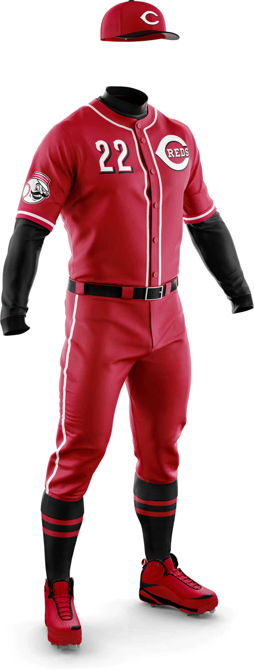
Phil Hecken: Chris’ original graphic featured the Reds in their current alternate, with three choices for sleeves/socks. I actually liked both the black and white, but white sleeves might not be allowed on pitchers (and the Reds continue to dabble with black accents on their jerseys); what I didn’t like about that jersey was the giant “Reds” script wordmark. For Phase II, I asked Chris to use the “Wishbone C” logo instead.
Chris Diamond: For the Reds I actually preferred the all-red mono before to the red/black look. But I think both looks are improved by the substitution of the oversize Reds wordmark by the wishbone C.
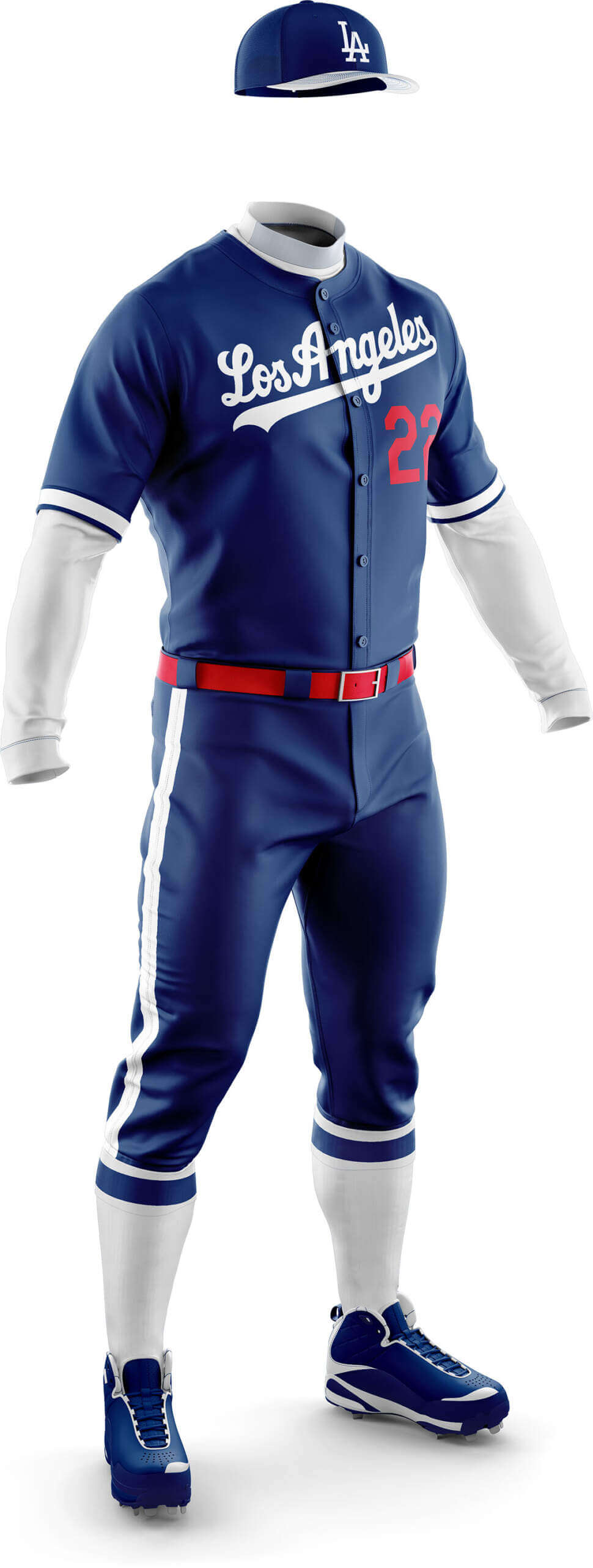
PH: Not “counting” their CC uniform (which used to be full mono blue), the Dodgers don’t have a dark alternate, so Chris created this one. Can’t say I’m a fan although it looks better than the CC.
CD: The first of the teams who don’t actually have a softball top. I feel the Los Angeles wordmark is underused by the Dodgers so I’ve used it here. I’ve not gone too fussy like the team’s 1999 effort but have tried to keep it simple apart from the broad striping to break up the mono look.
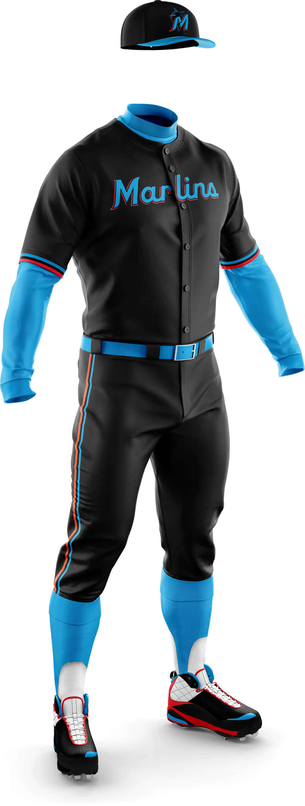
CD: This one was ohhh so close to being good the first time I felt it had to have a second go. I wanted to keep the neon-on-black feel but make it more legible.
PH: Yeah, I know the Marlins have a history with black, but I just can’t get behind a mono-black for the team that plays in Miami. In a way, I liked it, but in a “so bad it’s good” way. IF the Marlins must have a mono dark alt, let them base it off a blue or tealish-blue jersey, not black.
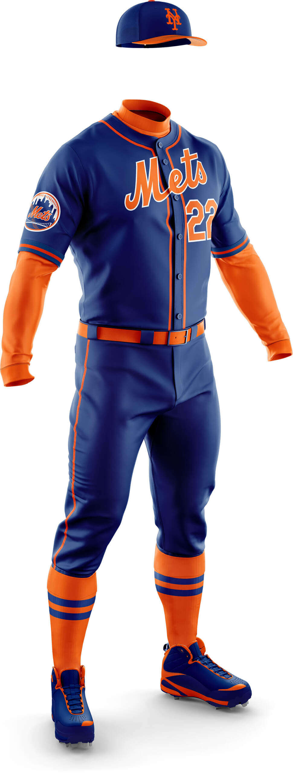
CD: This was a triumph the first time but adding an orange brim to the cap is the cherry on the icing. I do actually prefer the cap with the NY outlined in white to match the jersey wordmark, but the regular cap orange NY is almost as good.
PH: As Chris mentioned, I asked him to change the cap to the blue crown/orange bill, which I think works better than their current alternate cap (which has the “NY” outlined in white) and a blue brim. Personally, I detest that outlining — it’s just an excuse to sell more caps, but I do like the classic blue with an orange brim. I really like this one, and the Mets do have a history of going mono-royal when they sported Brooklyn Royal Giants throwbacks; that had a bit too much royal, but wearing a blue/orange cap, and orange sleeves/socks looks good! I’d love if they’d wear this at home on Friday nights (dumping the BFBS cap & jersey), and possibly as an away night game uni.
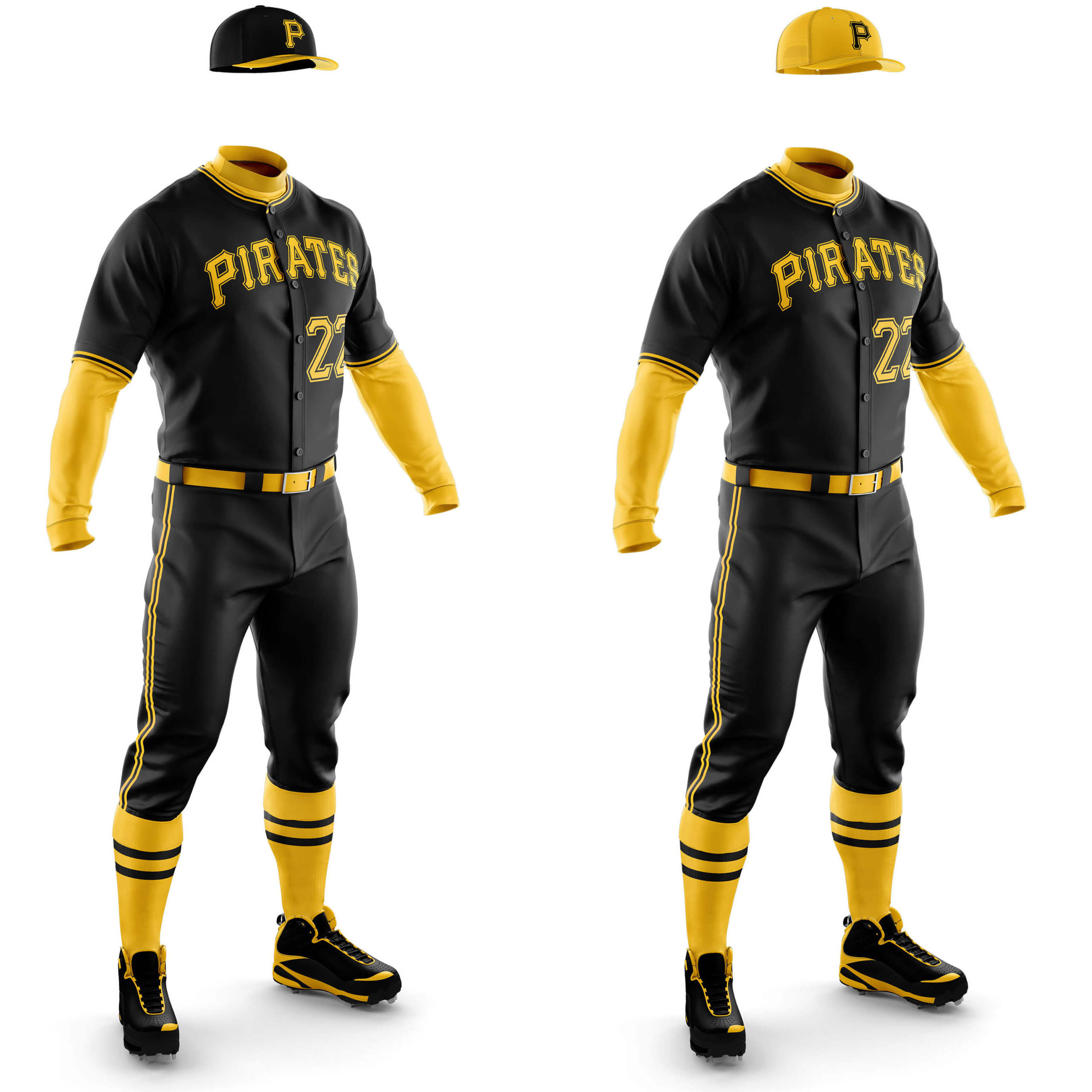
CD: I’m on record at UW as disliking the Pirates home alt with the P, but I really love this and wish it was their actual home alt! I prefer the black cap with the yellow bill (another case of matching the jersey wordmark) but the all yellow cap is great too.
PH: This is one I had Chris make a lot of minor tweaks to before we settled on what you see above (I may do a separate post sometime showing the incremental changes — and patience of a Saint — Chris had working with me on this one). As many (most?) of you know, I was a big fan of the “We Are Family” uniforms, and this one brings back memories for me. I’d rather see this one as a road alternate than a home alternate, but really, I’d be happy either way. And although it’s not shown, I think a gold crown with a black brim would work as a cap as well.
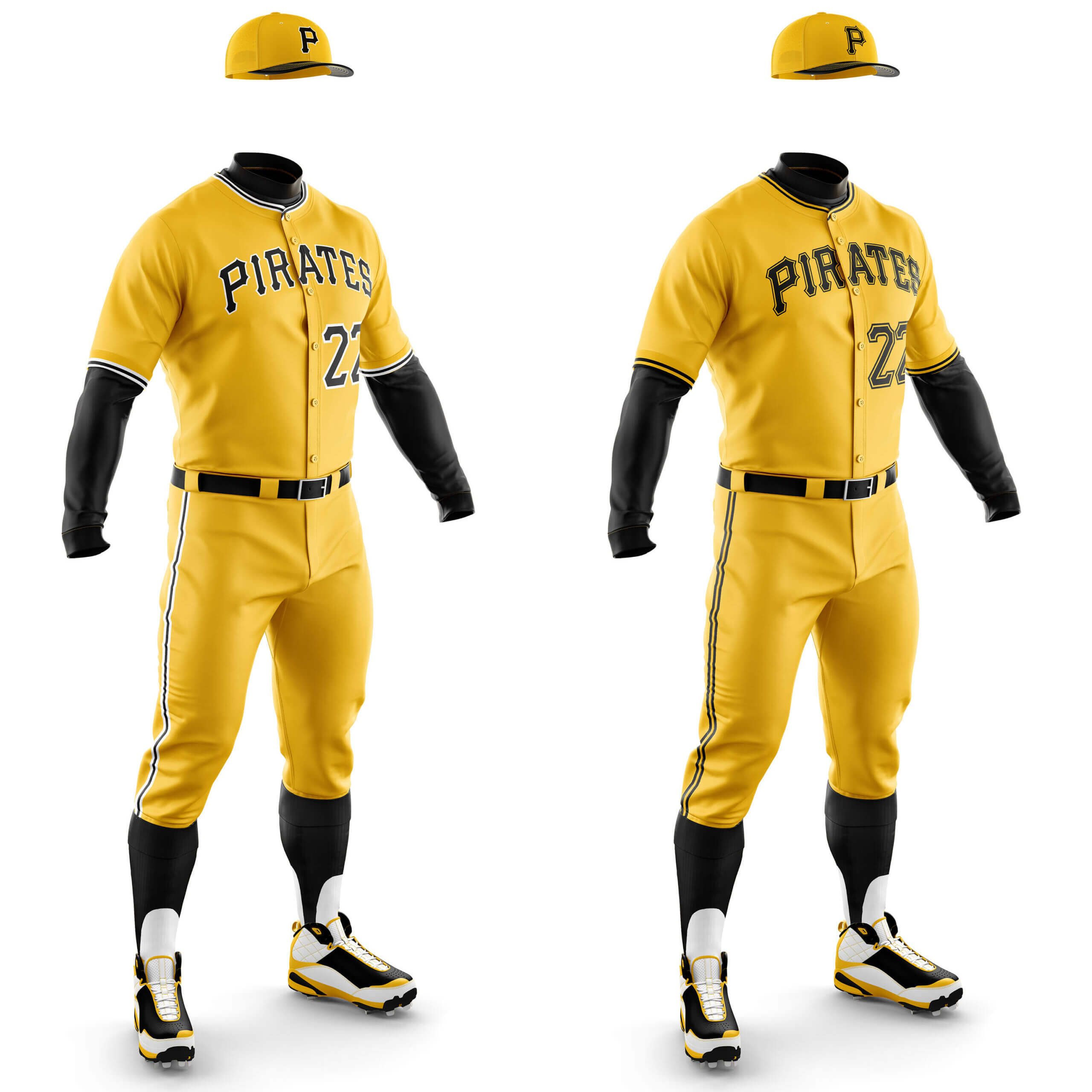
CD: (Gold I, on left) This is basically a colour swap of their regular home whites. I think the idea has legs, but it would make it the only (regular) uniform without the gold/black/gold piping which doesn’t feel quite right. (Gold II, on right) This feels more like it would fit in with the other uniforms as all the elements are already present on other ones. I like their new CC which is also yellow, but given the choice I prefer this design.
PH: Technically this one is Chris’ but I wanted it as well. And I prefer the one on the left to the one on the right, although I might like it even better without the white piping around the wordmark, numbers, sleeve hem and pants. The second one I like, sleeve and pants striping-wise, but don’t like the black outline around the number and wordmark. If the “PIRATES” were a bit thicker (and solid black), it’s a total home run.
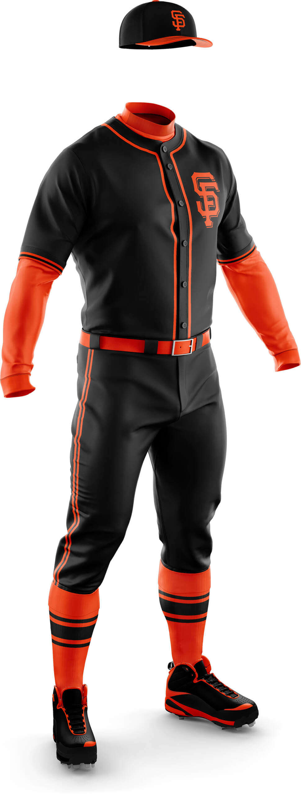
PH: I think there is a place in MLB for a couple black monos — the Pirates, the Orioles … and the Giants?. Sure, why not. But this one I’d completely reserve for road games on say, a Friday night. I’d definitely prefer this one be used sparsely, but it has potential
CD: I didn’t like this one before (for the same reason I don’t like the Pirates home alt) and removing the logo from the socks isn’t going to save it!
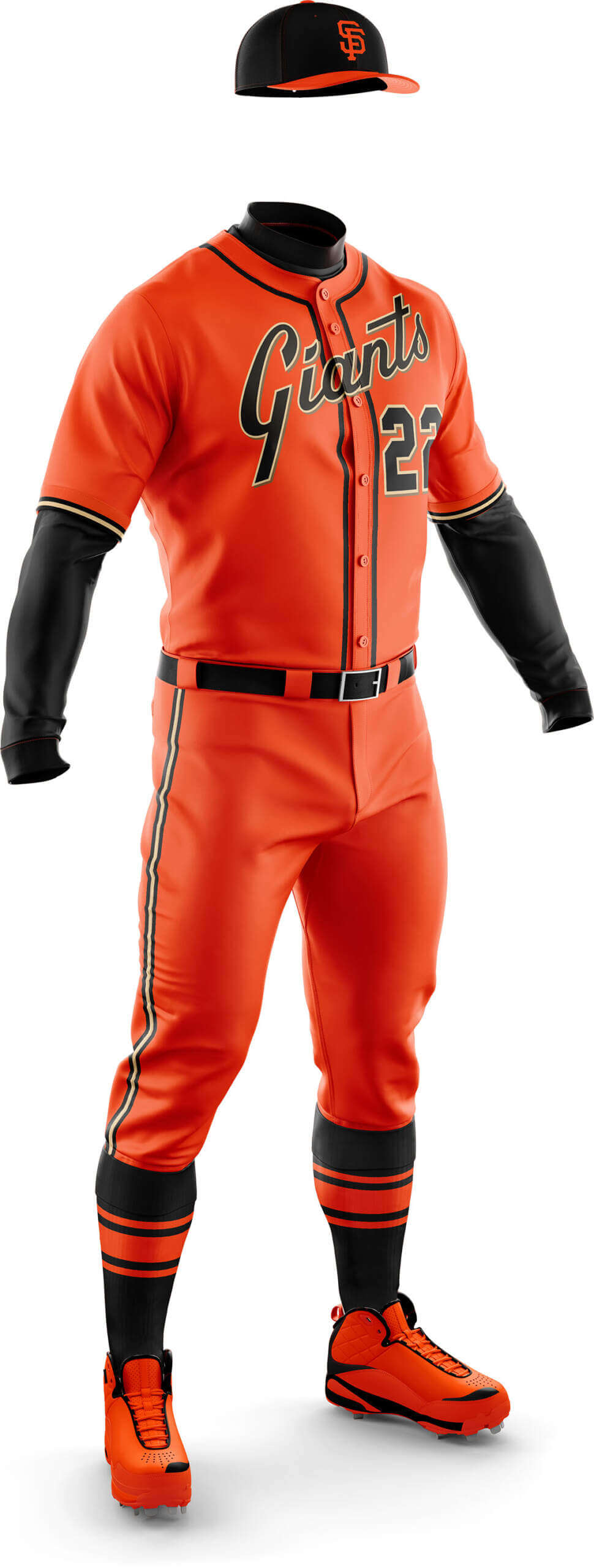
PH: This one brings back visions of the Giants’ orange alternate — only with orange pants. Normally I’d say the concept mono has too much orange, but with all the black elements, it’s balanced out nicely. As Jack Clark showed, it can look good over white pants too, but this isn’t about mix/match jersey & pants (yet!). One of the reasons I asked Chris for both mono-black and mono-orange (and you’ll see this with the Pirates and Orioles as well) will become more clear as we enter our next Phase.
CD: First time around the lack of gold/beige from the wordmark in the rest of the uni spoiled it for me, but with a subtle tweak to the stripes it now looks great!

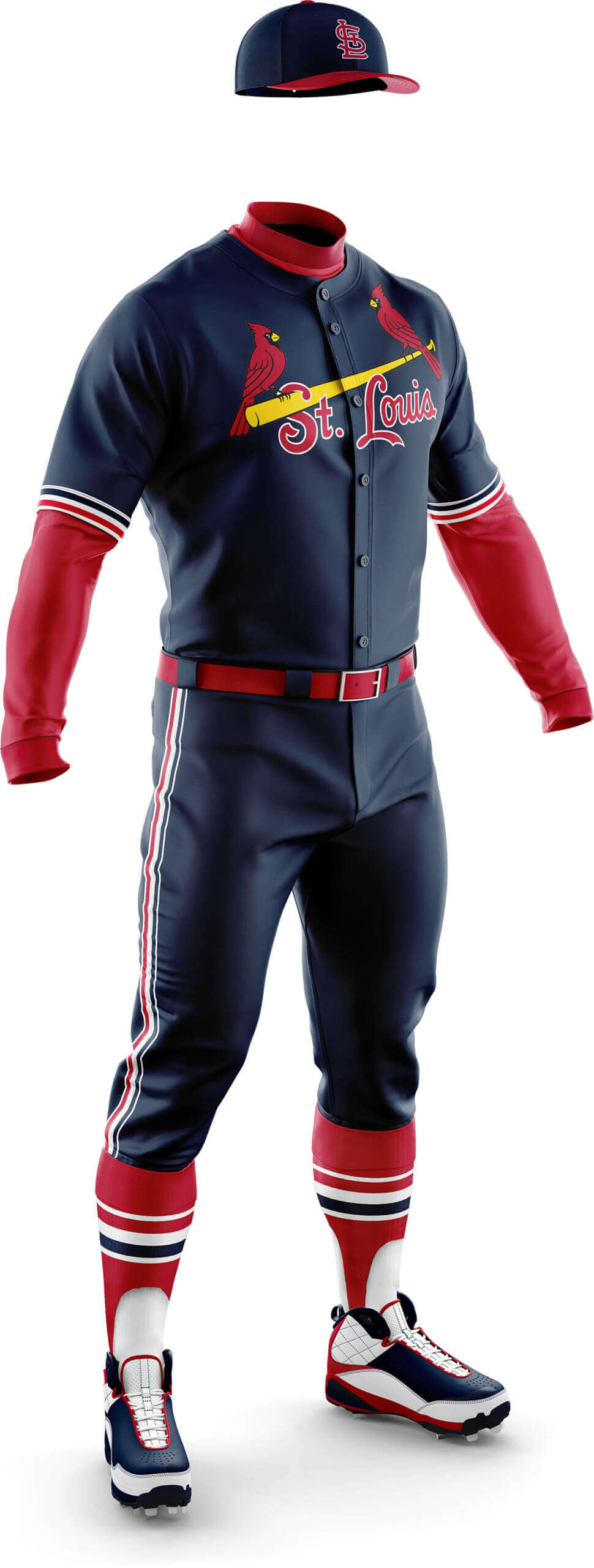
CD: The second of the teams missed in Phase I due to no current softball tops. The Cards have a red spring training jersey, but it feels a bit clumsy to me looking a bit like someone has coloured in a home jersey with a red pen going around the wordmark! I wanted to do something that felt more designed so I changed the word mark to white with navy edge to match the cap logo. I also added sleeve stripes to echo the ones on the old pullovers which is also on the pants.
PH: Unlike the Yankees, Dodgers and Tigers (who have no alternate uniforms*), the Cardinals already have two mono-alternates: the cream alt (worn on home Saturdays) and the powder blue alt (worn on road Saturdays), so to me, there’s no need for a fifth mono uniform. And with this one, the red cardinals in the logo (the birds, not the wordmark) blend into the jersey, rendering them ghosted. Not a fan.
*(Yes the Dodgers technically have an alternate “Los Angeles” road jersey, and a City Connect uniform, but they’re not true dark alts in terms of this project.)
CD: The matching road to the red home alt with St. Louis wordmark and the wordmark colours matching the road cap.
PH: No for the same reasons I don’t like the mono-red; however, in a weird way, I kinda like the mono-navy. Still, no.
Let us know what you think: should teams explore any of these mono-dark uniforms as alternates (eliminating the ‘softball’ effect of dark jersey over light pants)? Which of today’s concepts would you like to see on the field?

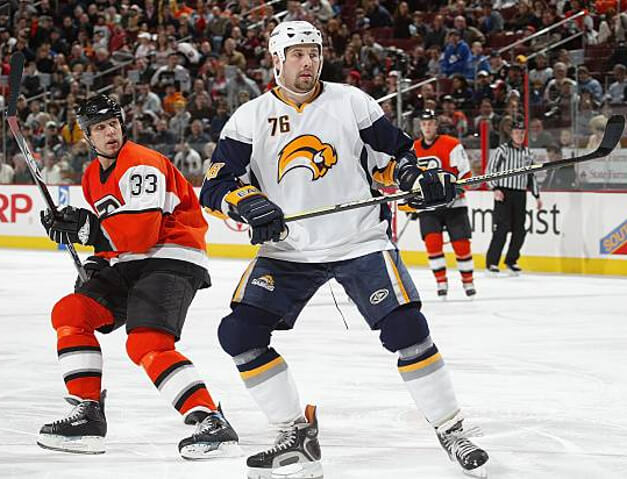


GTGFTU: 04/08/2007 Buffalo Sabres (3) at Philadelphia Flyers (4); Wachovia Center.
Two teams with normally-excellent uniforms wearing their worst looks ever in the same game. Yikes.
BuffaSlug > GoatHead.
Ya got it, Morris!
I often state that the Flyers live in the past like no other team (in the NHL at least) but when you consider what they did to modernize their look, maybe that’s a good thing.
This was the last game for Riley Cote in #33…the 1st and only non-net-minder to wear that number for the FlyGuys…and thankfully the final game for those orange alternates!
1000X yes on the gold Pirates’ uniforms with the white trim. It is a letter-perfect update of their 1977 Wilson getup. Also, an A+ on the red Cincinnati uniforms. I’d make them in a heartbeat. A good grouping all around.
I like all the Pirates options here.
Except for the solid gold cap. It sorely needs a black brim.
In fact, with very few exceptions (Yankees, Dodgers, Giants, Cardinals, Reds, Tigers, Royals), all caps should have contrasting bills.
Anyway, great stuff today, gentlemen!
Thanks Jimmer :) I don’t know if it is my cricket background but in general I prefer solid caps for all teams! Exceptions for the A’s and maybe the Braves. And I really dislike contrasting front panels – always feels too “trucker cap” for me!
You say “trucker cap” as if it’s a bad thing… ;)
Yeah, for cricket I’d stick with one color. Baseball, on the other hand… maybe it’s because I grew up in the glorious polyester pullover jersey era, but I like the contrasting colors. Especially when Boston and Minnesota had the red caps with navy bills.
Problem with the red Cardinals uniform is that you can’t make out the birds.
Yes that is the big problem with a red Cards jersey – I added extra dark edging to help it. But without changing the birds colour it’s that or a white edging which graphically punches a hole in the jersey and gives the “coloured around” look I mentioned.
Navy jersey and pants, red cap.
That’s my fix for the Cards.
GTGFTS: 13 October 1960. Forbes Field, Pittsburgh, PA. Pirates 10, Yankees 9. Shortly after Bill Mazeroski hit the walkoff.
I don’t doubt for a moment that this is true. I’m also curious about the existence of out of town scores. Can you (or another informed source) explain the Pirates’ policy on the matter?
GTGFTS is from 6/28/70 – the final games at Forbes Field. Pirates take a doubleheader from the Cubs, 3-2 and 4-1.
GTGFTS: Looks like the brawl from the Cleveland-Chicago game a couple days ago.
To all those below: I STAND CORRECTED. Oops, those who correctly identified the game are correct, and the out-of-town scores are a good tip-off. I assumed too much.
Nope. GTGFTS is June 28, 1970 – the last game at Forbes Field. It was the second game of a doubleheader with the Cubs. The Pirates won, 4-1.
Yep… my bad.
Eh… the Red Sox shouldn’t be wearing alternate uniforms with completely bonkers colors 26 times.
Chris I am not a fan either, but the 26 games stat is all time. The uniforms came out in April of 2021, so that is over 2.5 seasons. Meaning they are on pace for about 30 by year end or approx 10x per season. Which is not really outrageous.
People were out of control back in the day tearing apart stadiums – Shea after the ’69 World Series, Connie Mack Stadium in ’70 and this. Must have been a combination of cultural phenomenon to riot and a total lack of meaningful security staff.
Pirates in gold could work, be it the left option with the gold cap with black bill. Cardinals in navy maybe but with a red hat with a navy bill. Mets could work the best out of these options: orange bill is a must but so is the white outline of the NY to match the Mets script. The orange monogram NY without the outline on royal blue with navy bill should be the current cap with their gray away uniform anyway. But all in all I am still not a mono color fan. Prefer the softball top with white or gray pants. My current favorite is Rays powder blue with gray pants. Great look. And the Blue Jays royal blue with white pants.
Ingmar, I’m surprised you’d want a red cap with the navy Cards jersey (where the logo wouldn’t then match the jersey) but you prefer the Mets cap with a white outline to make it match the jersey?
Those Navy Cards uniforms look AMAZING.
On a City Connect note – the Sawx should NOT be wearing the yellow with their regular caps…yecch
Thanks John! I was really pleased with how it came out too.
Good work, Chris!
Your Dodgers treatment gives me vibes of the old Brooklyn night-game satins…I liked the shoulder stripes on those, and kinda wish you’d incorporated them onto your concept.
While I long for the Pirates to one day return to mustard, if they adopted the all-‘gold’ model on the left-hand side for away games that would be fine by me.
I’m OK with a mono-black Giants squad rather than all-orange (though neither should ever happen), but the striping on the socks don’t work on either – solid stirrups with contrasting sannies, perhaps?
Thanks Chris :) You are spot on with the Brooklyn night-game satins – that is exactly where I got the inspiration for the broad striping! I did think about shoulder stripes, but I chickened out in the end, hehe! You are not the only person who wants to see the Pirates return to more of a mustard yellow. But unless the Steelers and Penguins all do it at the same time it would seriously distress me!