View this post on Instagram
After the Rangers’ World Series victory last week, the flagship MLB Shop in Manhattan posted a photo on Instagram of a Rangers jersey with championship sleeve patch. Twitter-er @keyvon212 noted that the jersey appeared to be rendered in Nike’s new template, which was used in the 2023 All-Star Game and will be rolled out MLB-wide next season.
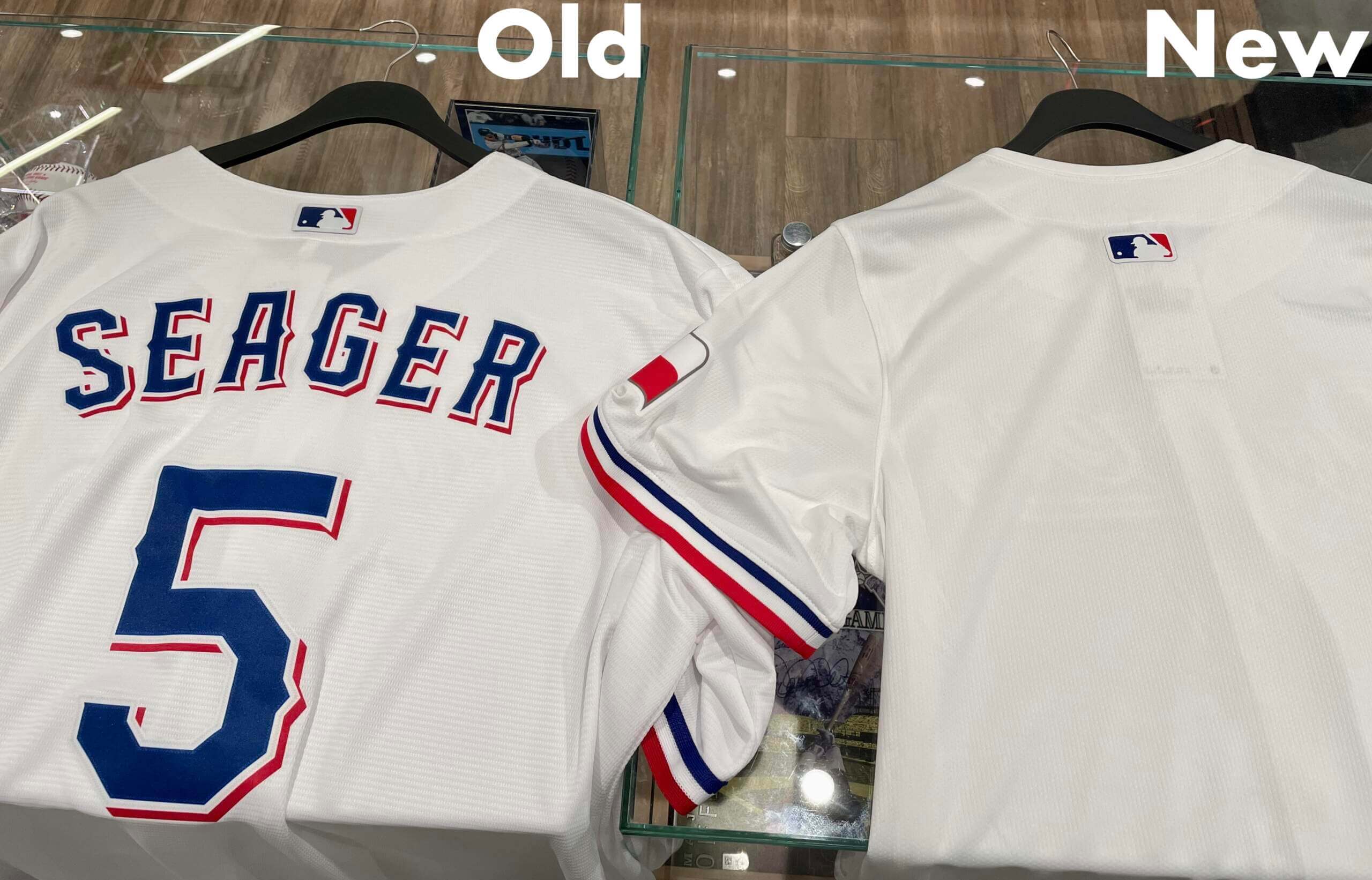
Since this was the first regular team jersey we’ve seen in the new template, I wanted to get a closer look. So on Saturday I went up to the MLB Shop to check out the Rangers jersey for myself.
As soon as I walked in, a staffer welcomed me and asked if he could help me find anything. I showed him the Instagram post on my phone, and he said, “Oh, that’s right over here. They’re selling out fast.”
He brought me a rack of the championship-patched Rangers jerseys. Before I could even say anything, he said, “This is the new jersey style that everyone’ll be wearing next year.” I pretended to be surprised and said, “What’s different about it?” He said, in an authoritative-seeming tone, “The fabric is lighter.”
Unfortunately, these were replica jerseys, not authentics, so there’s only so much we can learn from them. I took one of them and then went off to get a normal Rangers replica jersey for comparison. Then I tried to find a spot where I could photograph both jerseys side-by-side without attracting too much attention.

Here’s what I observed (again, keeping in mind that these are replicas, not authentics):
- The new collar has an extra seam.
- The new placket is slightly narrower.
- The application of the script is exactly the same on each jersey — same fabric, same stitching.
- The new fabric is indeed different, but the difference is super-subtle and hard to notice. I felt like I was comparing two different brands of paper towels:

- The new sleeve has a ribbed seam just above the colored trim at the cuff (as you can see, the new sleeve is also narrower/tighter, but that’s because I foolishly compared two different sizes — has nothing to do with the new template):

- What I really wanted to see was the new mesh fabric for the uni numbers. But the Rangers don’t use front numbers, and the new jersey didn’t have a back number:

- As you can see in that last photo — and as we’ve known for a while about this new template — the MLB logo now sits below the collar/placket seam, instead of above it.
- I was confused by the patches on the new jersey. The championship patch was embroidered, but the Texas flag patch was more like a flat, heat-pressed decal:

I thought the plan was that they wouldn’t use embroidered patches anymore with the new template. But maybe the championship patch was just a quick one-off for these retail jerseys, plus it’s just a replica — hard to draw any conclusions from that.
Overall: Not as fruitful a field trip as I would have liked, but still interesting. I imagine we’ll start seeing all sorts of merch rendered in the new template soon.
Moving the MLB patch down looks awful, especially after names and numbers are added.
What is the point?
Possibly a place to either add a new sponsor or to move the Nike swoosh from the front?
Hahahahaha, Nike paid a lot of money for their ad on the front of the jersey, it isn’t moving.
Could see another ad going on the back neckline, but could also see it being moved just because, and explained by some marketing speak nonsense from Nike about performance increase from the change in position.
Speculating, but I would imagine it has to do with the manufacturing process / double layer of material on the collar. The patch might have been adhering awkwardly there, who knows. I realize it’s Nike and you’d think they wouldn’t be limited in that way, but from some experience in manufacturing I wouldn’t be shocked if it was something like that as opposed to a branding / aesthetic decision.
Agreed; it looks horrible, particularly for NOB-using teams. Now it sits right at the midpoint between the collar and the top of the NOB, but in the new position, it will be sitting right on the NOB (which will have to go downward an inch or so, minimum), looking like a diacritical mark over the middle letter in the player’s name, or (more likely, alas), the NOB and number will be moved downward even further that they have to be.
Maybe this awkward little rectangle will get more teams to ditch the NOBs and have only numbers on the backs; it doesn’t look as bad that way. With only a number, positioned the (now-rarely-seen) standard 4-to-5 inches below the top of the collar, the logo would sit right in the middle.
Are the stripes a band of ribbon like the old jerseys or is it a full insert.
I don’t understand the question, Tom. Can you rephrase?
Tom may be asking if the sleeve trim is applied onto the sleeve or if it’s a separate thing, perhaps similar to elastic ribbed cuffs?
Yeah, it looks like a proper set-in cuff and not the sewn-on ribbon, same as how they used to do it before Nike. This may be the one single positive from the new template.
I actually walked into the MLB store yesterday but I don’t follow their Instagram, if I had, I would have been interested in taking a peek at the new authentic jersey, if any were available.
Moving Jerry Dior’s MLB logo down below the placket serves no purpose (IMO) but it will force all NOBs that much further down, and, I’d assume, numbers on the back as well.
Has anyone been able to explain why this change happened with Nike’s template?
I suspect it’s to make the logo/name on back more legible as baseball has transitioned into a higher-flow era.
The loss of stitched patches is very sad. They’ve always been my favorite part.
“the difference is super-subtle and hard to notice. I felt like I was comparing two different brands of paper towels.”
Great writing, Paul! This will be lodged in my brain the rest is the day.
“As soon as I walked in, a staffer welcomed me and asked if he could help me find anything.”
– I assumed a staffer would have escorted you to a private area and asked if you wanted bottle service. He must not have realized he was talking to uniform royalty.
You’re forgetting that MLB (and particularly Manfred) despises Paul for daring to ask questions about how much of the profit from special merch (Stars & Stripes, camo, etc.) goes to charity vs. MLB and generally calling them out on their BS. He’s basically persona non grata around the league offices.
Comparing retail replica jersey to another retail replica jersey as if that gives insight to the what the authentic jerseys will be. Fabrics aren’t even close between the replicas and authentics.
I don’t know about the new jerseys, but the cut of the jerseys between replica and authentic are nowhere the same with the side panels and “diaper” effect of the authentic compared, to a straight forward cut of replicas.
Comparing retail replica jersey to another retail replica jersey as if that gives insight to the what the authentic jerseys will be.
Actually, I specifically stated that the insights were limited for precisely that reason. Why would you mischaracterize something that I spelled out so plainly?
The Texas flag sleeve patch wasn’t on the old replica template. Interesting they’re adding those to the new replica jerseys.
Texas Rangers host the All-Star game. Where is that patch going to go? Can they do both the World Series in I’ll start patch at the same time? No gold unis??
1) They will definitely do the gold uni thing.
2) The championship patch is probably just for retail, not on-field. That’s what most other WS champs have done.
3) Since they’ll probably add a sleeve advertiser, and since they already have the Texas flag on one sleeve, the ASG patch will likely go on the chest.
Thanks. I’ll just have to wait for the authentics- and for the blue ones to come back. Here in Arlington at the ballpark, they had zero WS authentics for sale. And zero blue replicas!!
“I took one of them and then went off to get a normal Rangers replica jersey for comparison. Then I tried to find a spot where I could photograph both jerseys side-by-side without attracting too much attention.”
Hilarious…..reminds me of Chistopher Reeve in Superman, he needs to change into Supes and he glances over at a phone booth…but it was one of those half-booths and he sighed and went to an alley….
So, what is this “phone booth” that you talk about?
: – )…If it weren’t for old movies, I probably wouldn’t remember…
I think a lot of the current designs are going to have to be modified to cope with the elasticated cuffs and collar insert. For example how will teams like the Orioles or Braves where the cuff stripes are currently braid set back from the edge be handled? Will the stripes effectively be moved to the end of the sleeve like the Rangers are? How will collar braid be handled? The insert is small so it’s hard to see how that could be adapted. So will be collar braid sit below that? Or will it be removed altogether?
Is it just me or is the front script different between the two? The script on the new jersey seems more… upright? Compressed? Maybe this is a side effect to the different sizes. And yes, understanding that these aren’t authentic jerseys. Still curious though if a larger Ranger player has a different looking script than a smaller Ranger player, if it is due to the size differences.
The night they won Fanatics had these up for sale highlighting the change “early access to next years upgraded jersey”. They have a graphic showing all the changes along with the higher price.
I expect the new version to cut corners on materials, selling the cheaper quality as ‘lightweight athletic performance material’ (hence the printed Texas flag) and Nike/ MLB not caring about loss of quality. More profit and fans will buy it anyway.
Cool, another sport succumbs to a convoluted collar design. I’m completely convinced that jersey construction today is driven by a desire to ‘brand’ the uniform in an additional way to the maker’s mark, and that it’s not about performance at all. That extra little strip of fabric around the collar isn’t going to make anyone better at baseball, it’s just another thing that will visually interrupt pinstripes and look bad. But someone in a conference room thought it looked cool and futuristic and over-designed, so here we are. Same deal as the pointless shiny dot pattern on the Adidas NHL jersey shoulders, or their ‘lace-up’ collars that don’t actually lace up, or all the different variants of silly NFL collars we see. None of it helps the athlete.