Although MLB’s City Connect program is apparently pretty popular and a jersey/cap merch dump, not every team is buying into the full uniform concept, and the Baltimore Orioles have become the fourth team to change their CC uniforms after just one season.
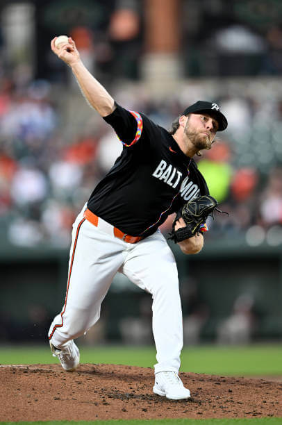
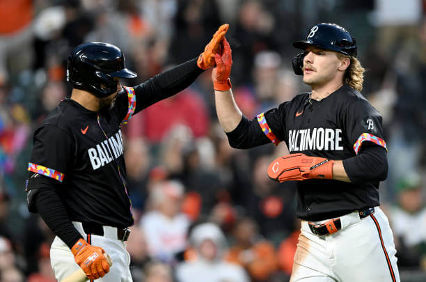
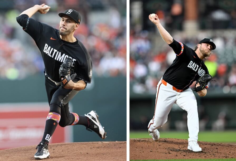
As you’re no doubt aware, the Orioles debuted their CC uniforms last season, and at the time (and for all of last year), the team wore black pants with their black caps and jerseys. Last evening, however, the team wore their CC jerseys and caps, but paired them with their regular white uniform pants.
And some video:
Our friend Will, who is an aspiring broadcaster, got to call Ceddy’s home run on radio tonight 🥹 pic.twitter.com/3xeb5LqCF2
— Orioles Community (@OsCommunity) April 27, 2024
The Orioles are actually the fourth team to make changes to their CC uniforms, so the move is far from unprecedented. Whether or not this has anything to do with supply chain issues or the new MLB uniform templates wasn’t immediately clear. But the change makes a noticeable difference in the overall look of the CC.
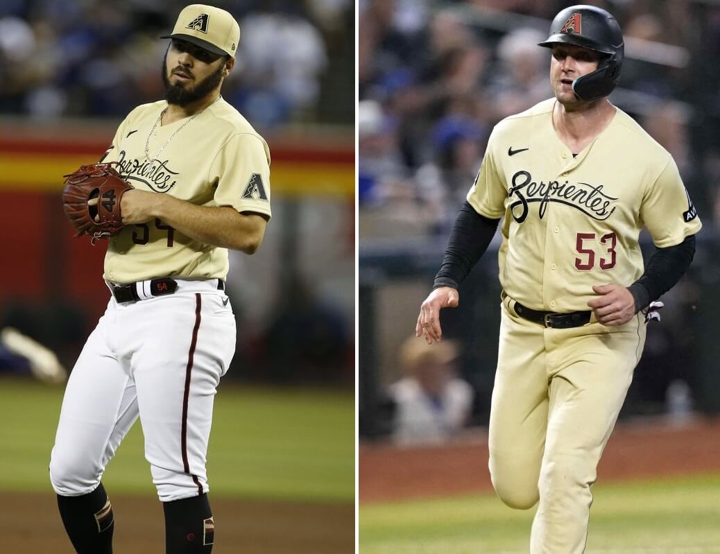
The first team to alter their CC appearance was the Arizona Diamondbacks, who were outfitted with their CC’s in 2021 — for that entire season, the Diamondbacks wore their “sonora sand” caps and jerseys with white pants. A season later, the team added a matching pair of sand pants, for a more cohesive look.
The Los Angeles Dodgers were also given a CC uniform in 2021, and they actually altered their look twice. Their original CC featured blue caps, shirts and pants, with the caps and jerseys both reading “Los Dodgers.” In 2022, the team changed their caps to restore their classic interlocking “LA” and added a black bill. Last year, the team ditched the blue pants for white.
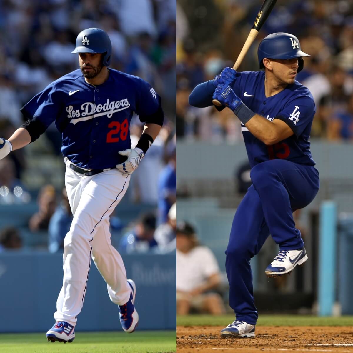
As you may be aware, the Dodgers — having worn their CC the requisite three years — will be ditching this CC entirely — and will be getting a new CC later this year.
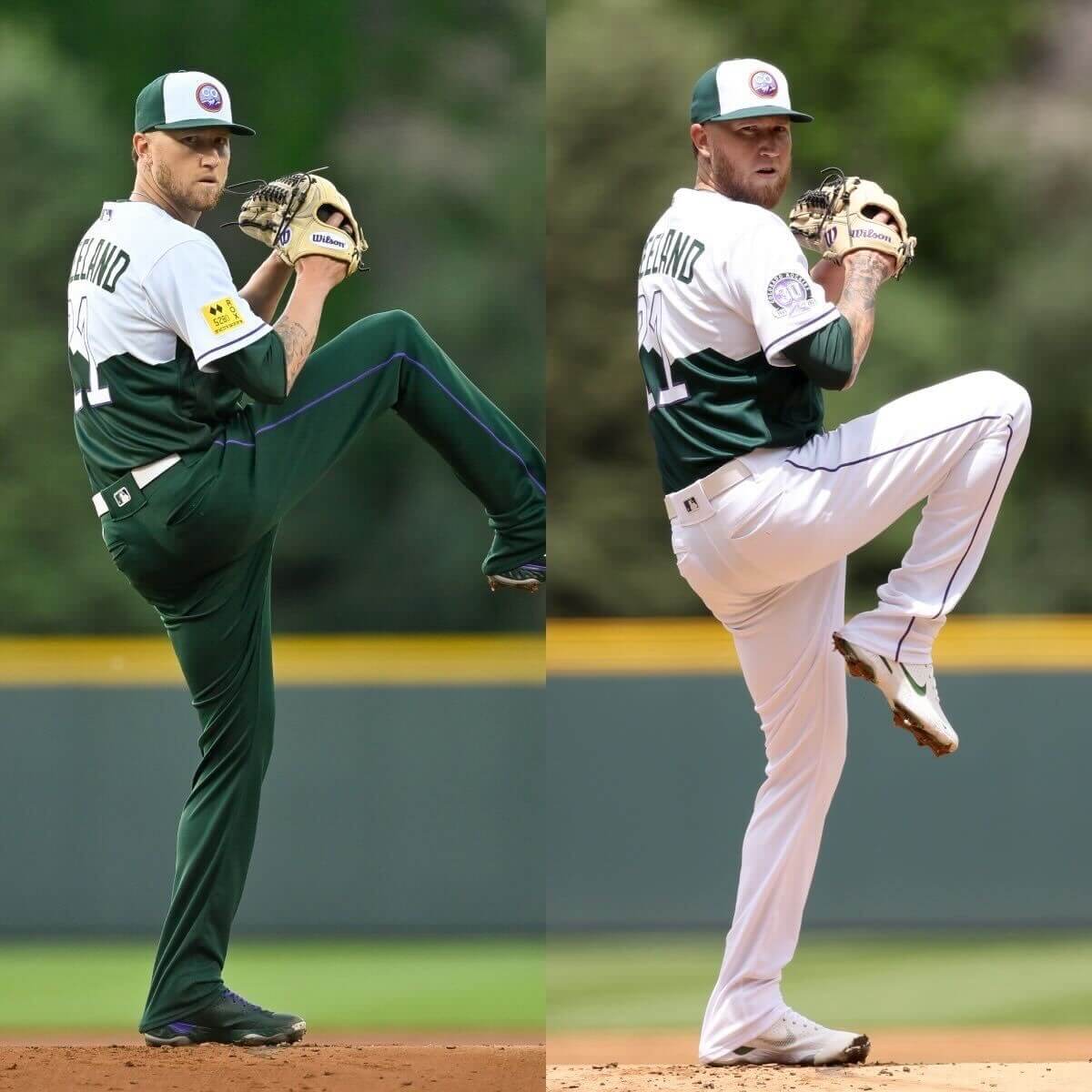
Finally, the Colorado Rockies, who debuted their CC uniforms in 2022, were given green pants to pair with their green/white caps and jerseys. After a full season wearing that look, last year the team began mixing in white pants — but not for every game. The protocol last year dictated white pants with the CC for day games, and green pants for evening games.
In all cases, the different pants paired with the CC caps and jerseys substantially altered the look (almost always for the better). Whether the Orioles are making the white pants a permanent change to their CC remains to be seen (and it may be the only one for which the pants swap seems like a lateral move). It appears MLB is content with allowing teams to alter their original CC uniforms, at least after a team has worn them for a full season — all the changes occurred in the second year of the program (in the Dodgers’ case, they went through two stages of change, adding the white pants in the third year).
Will any other five teams who introduced CC’s last year seek to make changes? Only one team (Atlanta) has a CC with white pants, while Texas (midnight blue), Cincy, Seattle and Pittsburgh (black pants) all seem to be cohesive in their designs. Although the same could be said for Baltimore, and they ditched their black pants (for at least one game). Will this be just a one-off or a permanent change to white britches? We’ll just have to wait and see.
And the Orioles also seem to have either changed the cuff on the sleeve or many players folded back their sleeves to reveal the colorful neighborhood map. It was unclear from the telecast.
The Orioles changed the sleeves last year to augment the interior pattern.
link
When the CC uni was first unveiled the cuffs were down, but Nike realized part of the design feature was not being shown so the Os had to tack the sleeves up to reveal the “neighborhood motif.”
The Mariners would look better with white pants. Yeah, the blue top has some black elements (like the drop shadow), but the pants are too dark for a blue-centric team.
The Mariners would look a lot better if they went (at least) high cuffed, rather than the pajama look.
High Cuffed
link
Pajamas
link
Every team, from MLB all the way down to little kids playing t-ball, look better high cuffed.
Interesting that with the exception of the D-backs, all these teams have ditched the mono look. You’d think Nike or MLB or whoever is designing these unis would take the hint.
Yeah the pants for a lot of these are a problem. Baltimore looks a lot better with light pants while the Dbacks having a “sand” jersey throughout makes a lot of sense. Heck for the Mets one I still don’t get the lack of matching pants.
Mets fan here, and I actually thought they did a reasonable job with their CC’s, but, yes, matching pants would have really been nice…
The Orioles wore the prescribed black pants with their CC uniform on April 12 against the Brewers, so I’m not ready to say they’ve given up on the normal City Connect look, as this was only their second City Connect Friday night. They’ve switched some other stuff up, like wearing their black jerseys on the road more frequently and not just on Fridays (as they’ve historically done, then doing orange on Saturdays) and switching up the hat pairing with the black jersey from the black O’s hat to the normal white panel home hat
so much better.
The Astros wear navy pants. It would with the same gradient striping the jersey has.
100% better! Each example shown is much better! The dark pants are terrible
O’s fan here. While the CC jersey itself grew on me quite a bit (I have a Mullins CC jersey because, yes, I’m a sucker) I’ve been saying since they released them that the overall uni would be better with white or even dark grey pants. Was glad to see the white last night and think it’s a definite improvement. But I kinda hope they get new white pants with just black striping down the leg instead of the standard orange. I feel like their standard orange pants stripe contrasts a bit with the black jersey. Otherwise though, I think the white makes the uni more interesting. I never personally thought the uni was ugly, just kinda “meh” overall with the black monochrome. The white helps a lot, imo.
White pants is just a look we’re more accustomed to. Since they’re not selling the pants, teams just revert to what looks better (normal) to them.
It’s hard to escape the indictment of the whole CC program here. If a uni ain’t ugly, why change it?
Arizona also changed their caps to the Serpientes S this season, yes?
Baltimore is much improved with the white pants (maybe make the orange stripe black as noted above) but it’s still so generic looking.
Helmets, not hats, but yes
The white pants look better for all of these except the Rockies. I really dig the green pants quite a bit. Honestly, I’d love to see them incorporate a bit more green into their overall look.
MLB’s totally cool with swapping the pants, because it doesn’t affect the retail side in any way.
The Orioles wore the black CC pants 2 weeks ago.
I think the Rockies and the D backs looked better with the all solid unis
I’ve never been a fan of the Orioles City Connect look (sans the hat), but I actually like the black pants more.
With that being said, I much prefer the old Friday combo: the “O’s” apostrophe catastrophe hat and the black jersey with orange script.
The Rockies are the ones here that actually look better with the solid color pants, because their look is based on the classic Colorado licence plate, which has solid green mountain with a white sky. It’s looks wrong with white pants. I actually like the DBacks better with sand pants too, it’s too close a shade to white otherwise, just looks like the jerseys were washed with a yellow sweater otherwise.
I was giddy last night when I turned the game on and saw the pants. They went from being horrifically bad to just normal bad! Hopefully it’s permanent and not a one-time thing.
Baltimore’s CC is still the worst for me. It has one good element (the cap monogram) buried under several “less-good” elements. At that point, it doesn’t even matter what pants they wear.
I liked the Rockies’ green pants as a concept, but when I saw them in person and on TV they looked too much like park rangers. I think the white pants was a good change. Those all-dark styles work better for me as special night-game alternates. I loved the ChiSox black “Southsiders” pinnies, but it seems like a strange choice for a humid 98-degree afternoon game in August.
The think I like most about the Colorado CC is that it could conceivably start the process of the Rockies incorporating more green into their color identity, which I think would look amazing.
Don’t forget that random series @ Cardinals in 2022 where the Brewers wore their city connects on the road with grey pants
Padres have a white top with white pants for CC.
Looks better with white pants but still ugly. They should try an orange jersey with orange cap.
The Red Sox changed the hat after one season. The first season the B matched the jersey. Now it’s like the traditional hat in the marathon colors
The constant shitting on the Orioles about these uniforms is comical. But not as funny as the self-appointed people who think they’re somehow experts on what does and doesn’t look good in sports. Thanks for publicly sharing your horrible opinion and takes for everyone to see, I guess.