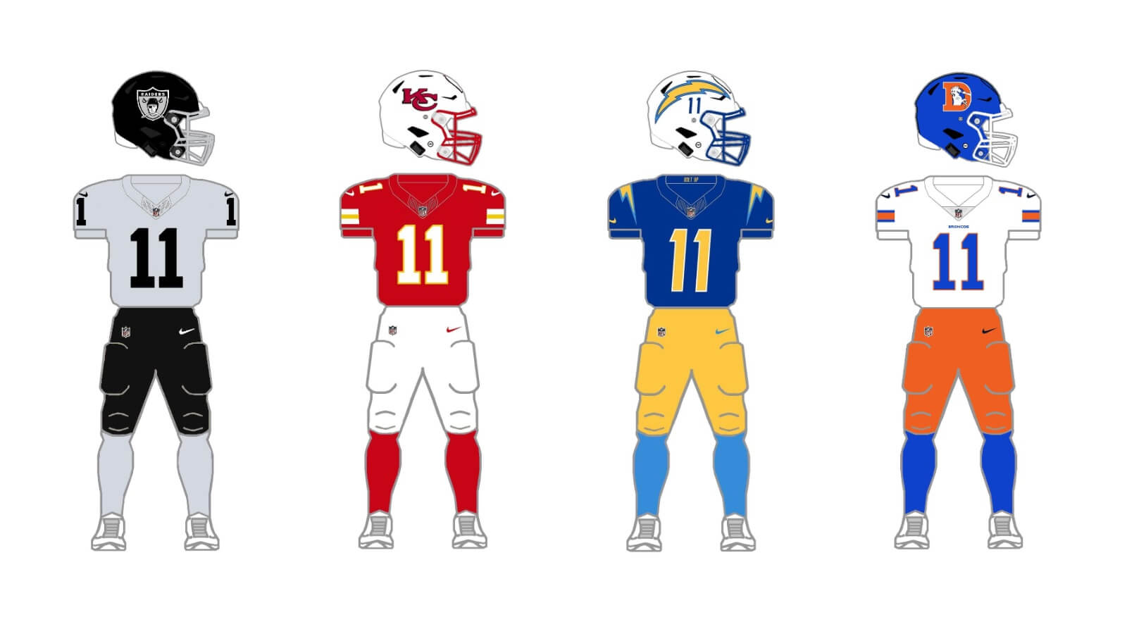
Welcome back to the “2+3+2 (+2)” project.
Click to see: AFC East
Today we’ll tackle the AFC West.
If you want to see the genesis of how this project came about, please refer to the AFC East post.
To sum up, the project parameters are the following:
• All teams will have 2 helmets, 3 jerseys, 2 pants and 3 socks
• All uniform elements will be “interchangeable” (any combinations can be worn)
• Some teams will be given two options: current uniform and throwback (or fauxback/alternate)
• Opposing teams will wear different color elements (helmet/jersey/pant/socks)
• Home team will select its color combo, and away team will then select its combos. No elements can match opposing team
• To the extent possible, uniforms will be based on a team’s current available options. Where no such options exist, they will be created such that every team has 2/3/2/3 options.
• Where present home and road (and/or alternate) uniform template designs differ, they will be “streamlined” to have one single format/style in the 2/3/2/3 parameters
• Color vs. color will be permitted. The only exception is only one team can wear its “dark” jersey (the opponent can pair their color “medium” jersey vs. opponent’s “dark” jersey)
AFC West
LAS VEGAS RAIDERS
Along with a very few other teams, the Raiders — despite multiple moves over the years — have basically worn the same set of uniforms since 1963. While they kinda-sorta have a throwback with their white alternate jersey, the Raiders silver and black are as classic and timeless as uniforms go. They have one helmet (silver), three jerseys (one black, two white) and one set of pants (silver). For the 2/3/2/3 we’ll need to add an additional helmet and jersey color.
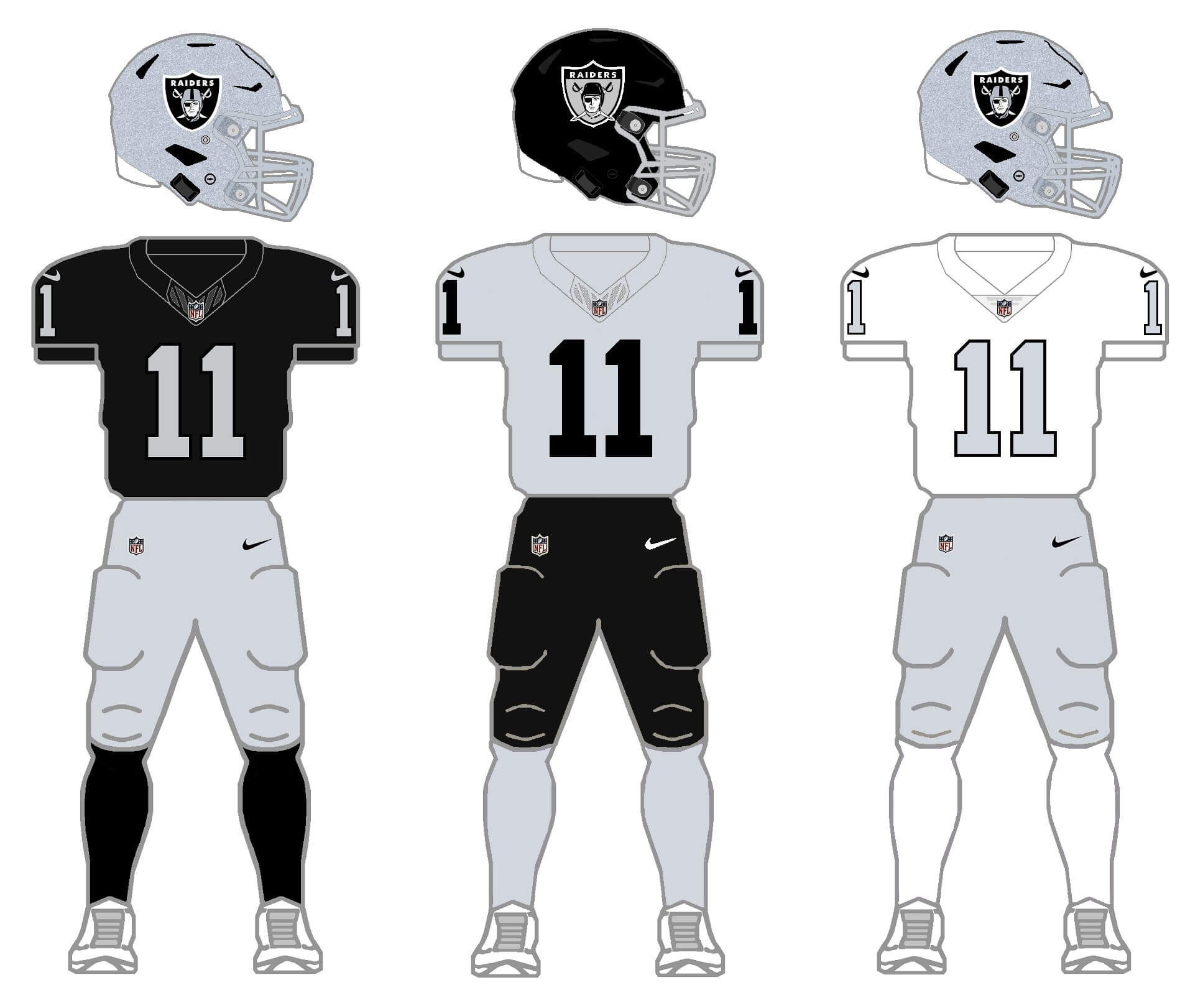
Despite their limited wardrobe, the options are pretty obvious: add a black shell and a silver jersey, which is what I’ve done here. The team has never worn black pants, but those are also the obvious choice here. I’ve changed their current primary white road jersey to silver, and basically keep their alternate white jersey as their new third. And while the Raiders do not currently have a black shell, they were born with one, which they wore from 1960 through 1962. For their black helmet’s logo, I used the original logo from their 1963 helmets.
KANSAS CITY
If you thought the Raiders were constant with their uniforms, Kansas City has also retained their same basic look since the team moved from Dallas to Kansas City for the 1963 season. They too have only one shell — red in color — which has been the only color the team’s helmets have ever been. They basically shunned the NFL’s “Color Rush” edict, instead pairing their red jerseys and pants with red socks to “create” a CR uniform. They’ve never had a alternate/third jersey, so for the 2/3/2/3 project, a third color jersey (and sock) and an alternate helmet must be created.
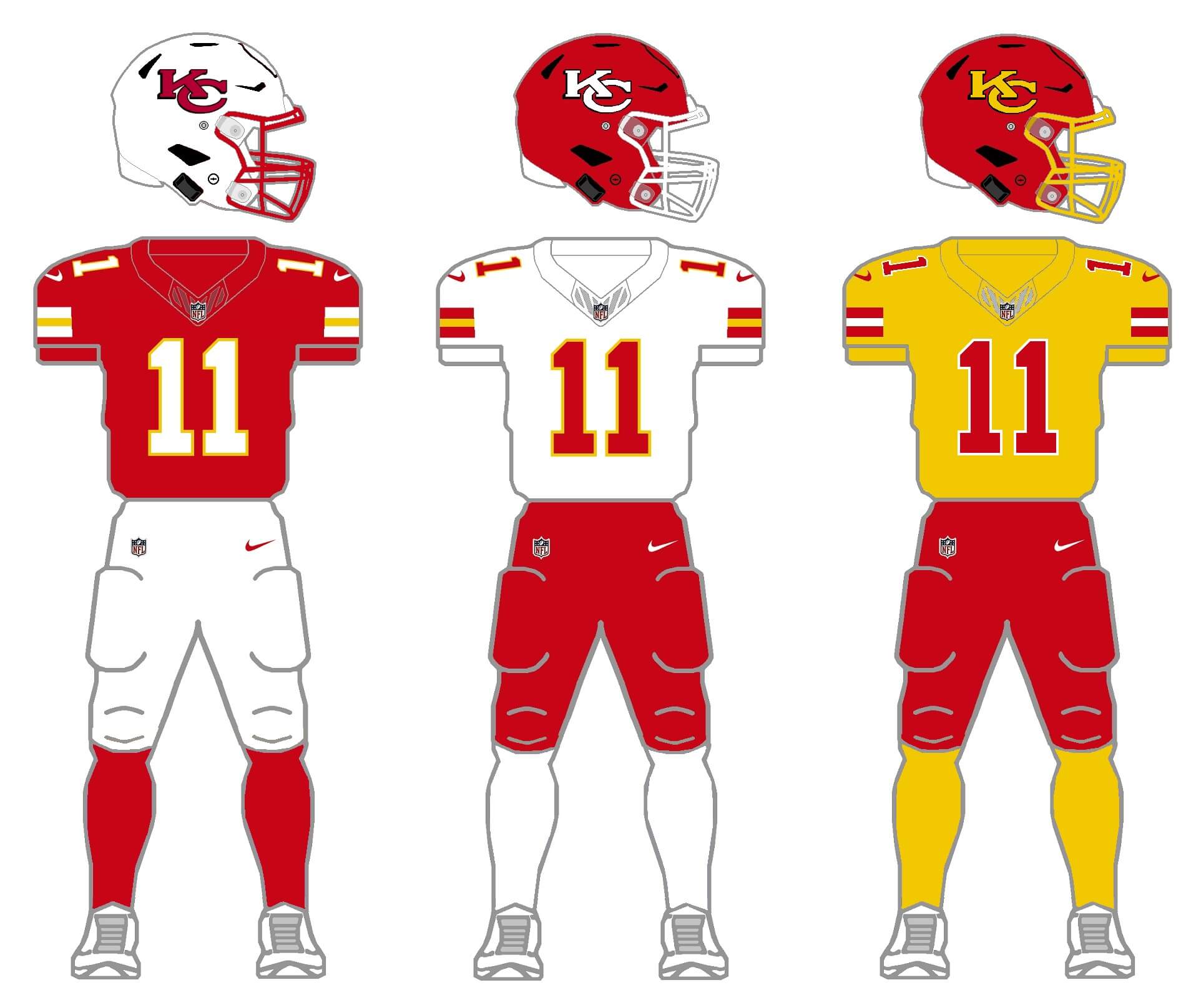
Not only have the team’s uniforms basically remained unchanged for 60ish years, they’re basically almost entirely red and white. So for a second shell, a white helmet is the obvious option. The team does have some athletic gold — found on their jersey and pants stripes, as well as on the outlines of the numbers — so that will be their third jersey/sock color. Finally, I removed the arrowhead imagery from the helmets, opting for a larger “KC” logo. As an option to pair with the gold jersey and socks, I changed the white “KC” helmet decal to gold, and gave the team a gold facemask option. I’m not sure I’d ever like to see KC in the gold jersey or socks, but in order to fit the 2/3/2/3 protocol, I did give them those options.
LOS ANGELES CHARGERS
Unlike Vegas and KC, the Chargers have a rich uniform history over their lifetime. In 2020, the team introduced a modern update, with a white helmet, and primary uniforms that mix and match light blue and white jereys, and gold and white pants. Somewhat surprisingly, those new uniforms also included a new mono-royal alternate, AND a mono-navy CR uniform, neither of which pairs with their primary home and road uniforms. Not only do they not pair with the other uniforms, the team swaps helmet decals (royal and navy), depending on the alternate uniform. So the challenge here is to create one cohesive uniform to fit the 2/3/2/3 parameters.
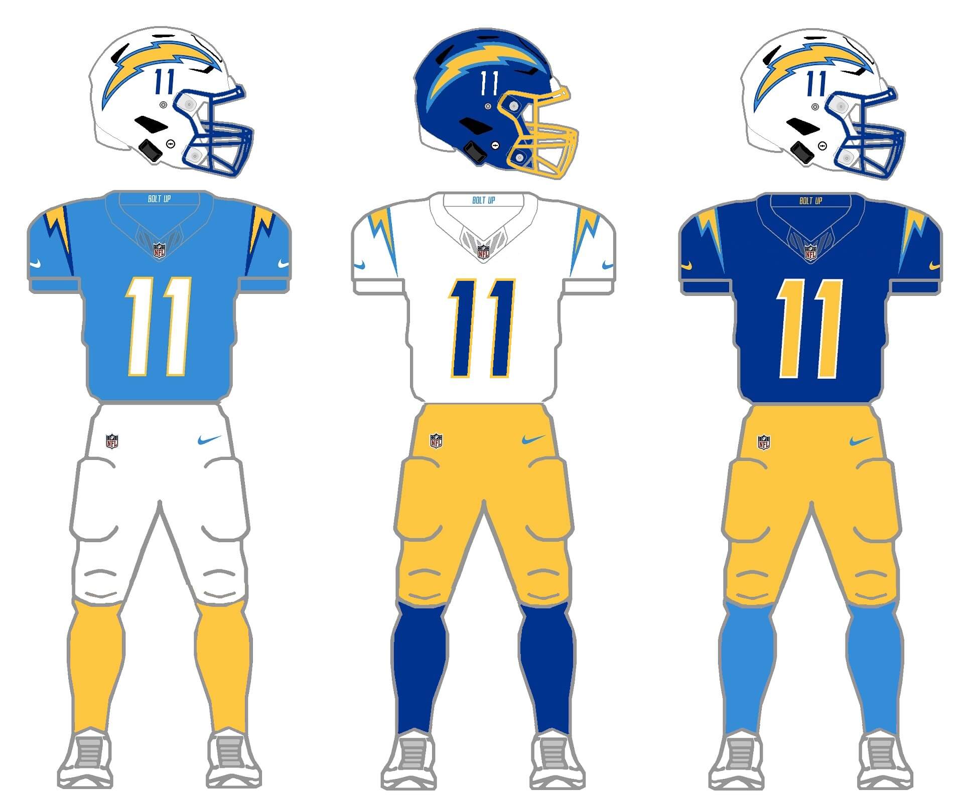
The first thing I need to do is create an alternate helmet — and the Chargers have a history of wearing royal helmets — so that’s the choice here. We’ll drop the navy jersey and pants (as well as the royal pants), leaving us with the classic white and gold options. But the challenge of having the elements mesh remains. Therefore, I’ve given the light blue jersey royal accents (on the shoulder bolts), and changed the helmet numbers to royal. Royal numbers are used on the white jersey, and royal socks have been added as an option. Finally, the royal jersey is given light blue bolt accents. The white helmets will also have royal blue masks. Gold socks will also be an option. These tweaks will allow any jersey, pants, helmets or socks to be seamlessly mixed and matched across all possible uniform options.
DENVER BRONCOS
The Broncos current uniforms may have been groundbreaking way back in 1997, but became dated quickly. When Nike gave the team their CR alternates in 2016, the uniforms were decidedly retro in design — so we will use that for our 2/3/2/3 project. Their current primary shell is navy blue, and this season the team introduced a white helmet, which uses the team’s throwback logo (as was also previously worn on the navy shell when paired with the CR uniform). It’s thought that when Denver finally redesigns its uniforms (possibly as early as the 2024 season), they’ll use the throwback style currently used for the CR uniform.
New uniform with current colors
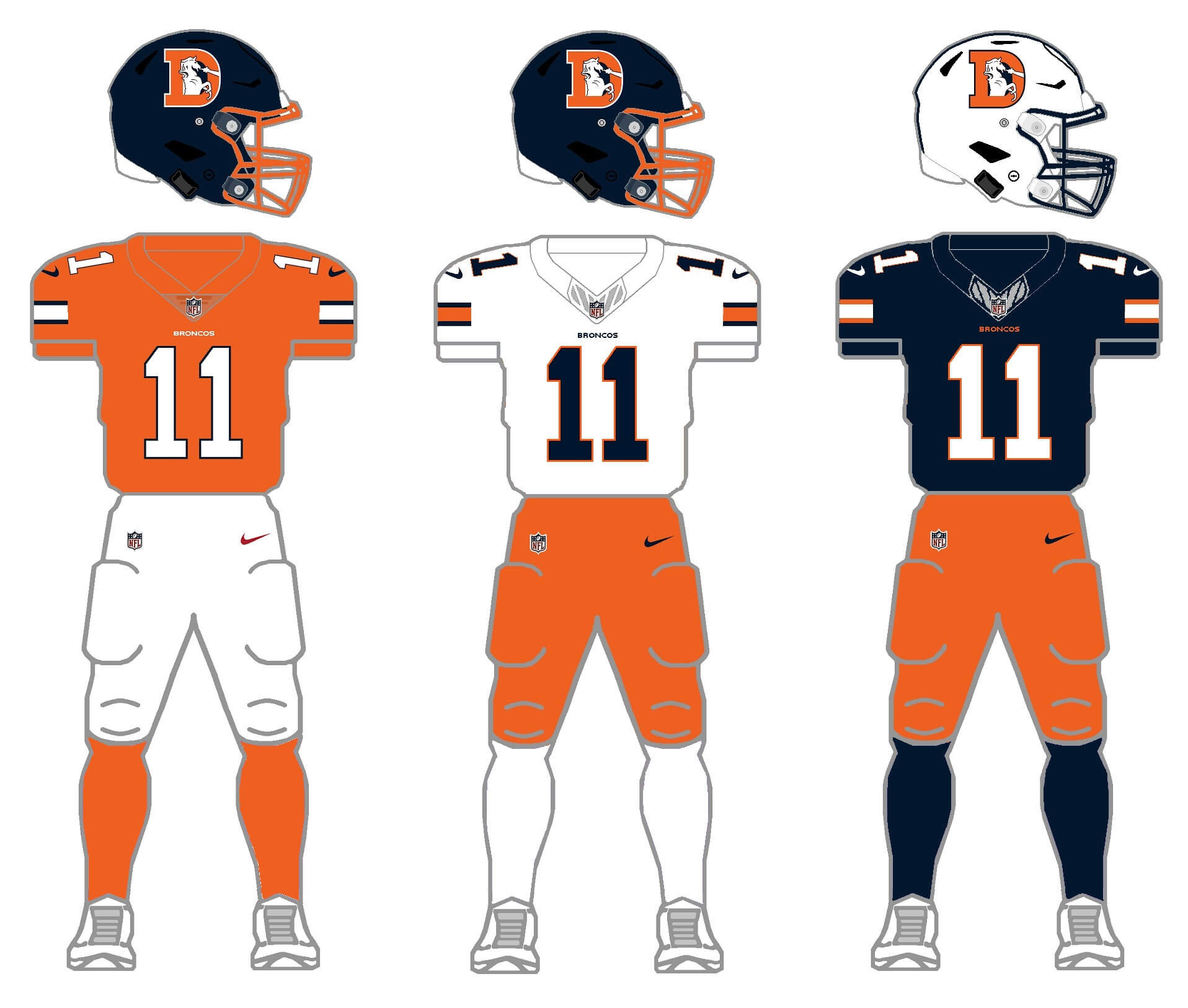
For this exercise, I’m keeping the team’s current navy blue and orange colors, with a navy or white helmet options. Each jersey (orange, white, navy) would follow the same striping pattern as the CR uniform, as will the pants. Sock options will be orange, white and navy. But let’s face it: if the team is going to go retro with their helmet and uniforms, they may as well go all the way back to the royal blue and orange that were the hallmark of the John Elway era.
New uniform with classic colors
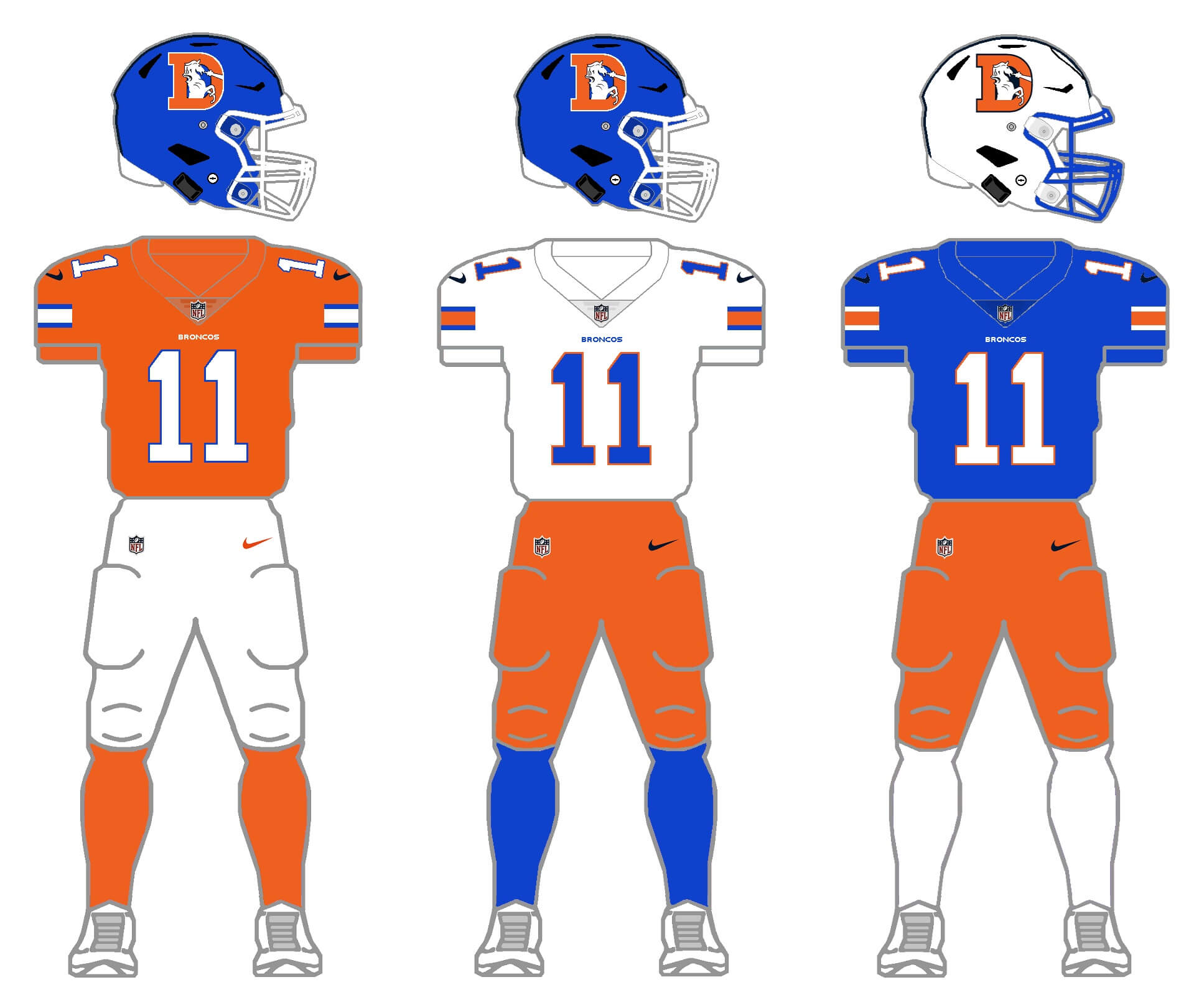
That’s more like it! The Broncos may not have had the same on-field success in these beauties as they have had with their current set, but it’s time to bring back the royal and orange! I kept the “new” white helmet in this example to use as their alternate, and jersey (and sock) options are royal, white and orange. Pants options will be white and orange. But aside from this season, the Broncos have never had a white helmet as an option. They have, however, worn orange helmets previously, so for shits and giggles, I removed the white helmet as an option, and gave them an orange option for the royal/white/orange set.
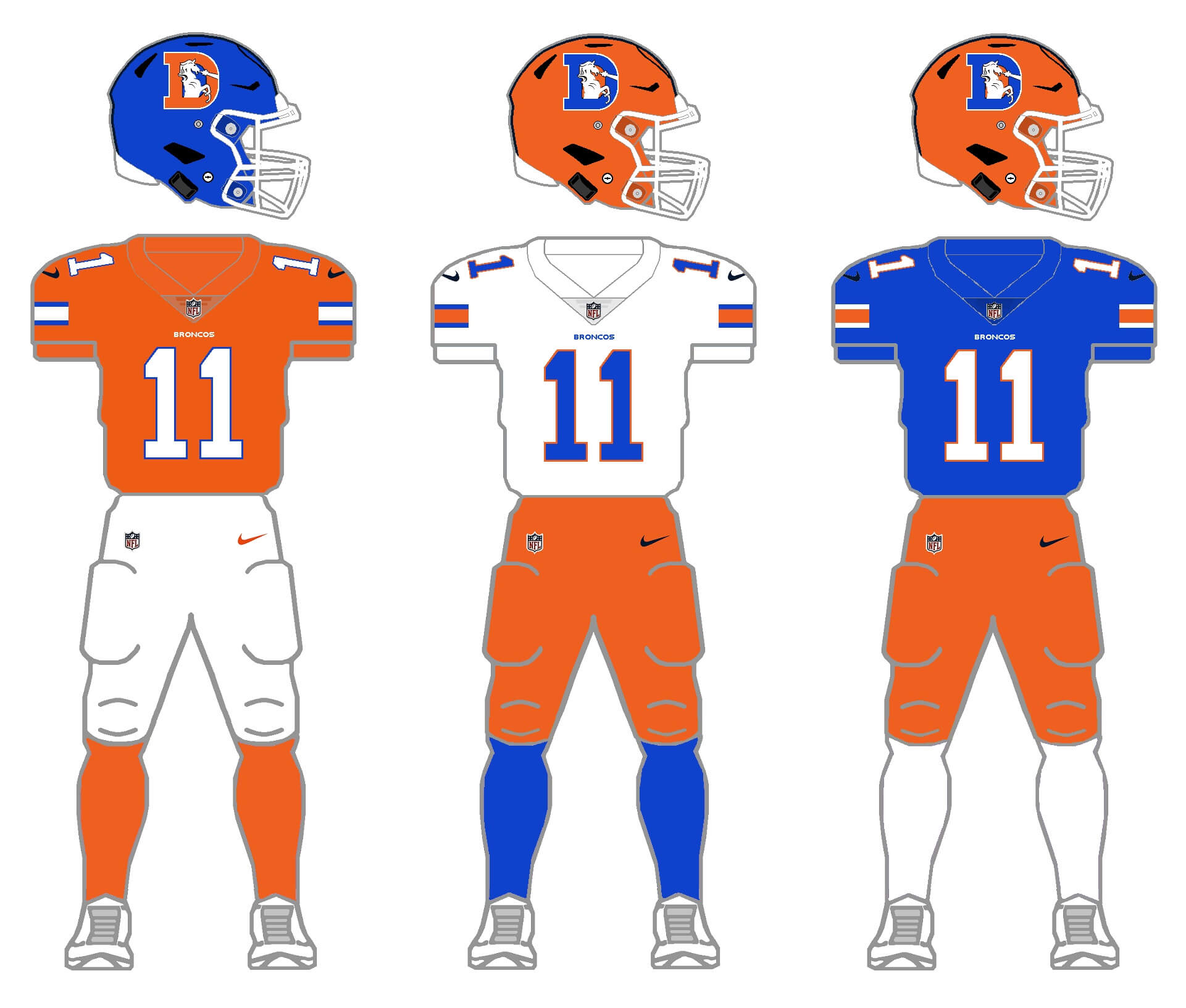
Maybe the orange helmet is “too much,” but I think very few of us can argue that returning the team to their classic royal/orange look, modernized for 2024, is the direction this team should go, uni-wise.
Thanks for indulging me, and I hope you at least enjoy the concept of 2/3/2/3. I’ll tackle the remaining division (NFC West) tomorrow. Please leave any comments/suggestions/critiques in the comments below!
You removed the arrowhead from the Chiefs helmet, not a tomahawk.
Yep. Changed the wording to arrowhead.
Really been enjoying these! Not to nitpick, but the Raiders only have 2 socks, maybe white were meant to be paired w the white jersey?
D’OH!
You’re absolutely correct. I used an older image. Now fixed (and thanks for catching that)!
Love this final round. That had to be difficult to get the aesthetic for the Chargers correct. Had to wade into Dallas territory to negotiate through all those blues.
This is one of the more historically significant divisions in the NFL. But the variances you created were fun. I, like most other old heads would love to see Denver go back to the Elway era look. That just looks like playoff football. But your offerings popped and look tremendously better than anything the Broncos have offered in years.
You made KC maintain their stalwart classic feel but added just enough flair to keep them interesting.
The Raiders. What can you really say? Uniforms have been perfect since before I was born (‘76). If they added some black what would it hurt if it was once or twice a year? It fits perfectly with their image. And I am a genuine hater of teams throwing black in the mix. Really enjoyed the choice of the original logo for the black helmet to create more contrast. And I for one would love it if they reverted to the silver numbered white jerseys.
I throughly enjoyed this entire project. Thanks, Phil!
Thanks Jason!
I had probably the hardest time with how to handle the Chargers. I’m not sure this “look” succeeds, but I think it makes for a few different retro-looking combos, especially with the royal helmet. And yes, KC and Oakland/LA/Oakland/LV were two of the combos that were tough, since both have been wearing basically the same uniforms for 60 years. I’m definitely not in love with anything but red/white for KC, but I think the black helmet and pants, and silver jersey would work for the Raiders while still keeping their traditional look possible.
I forgot to mention the detail to all the hosiery really brought it all home. I agree KC is a red/white team. But I’d be more than willing to watch them play red/yellow/red/yellow once a year!
Maybe the orange helmet is “too much,”
Not at all.
I don’t know why, but some teams just don’t look right to me with a white helmet. Denver and KC are two of them. I’d prefer orange and yellow, respectively.
Continued kudos on a fine piece of work, Phil.
Thanks Jimmer!
I knew you’d love the orange helmet!
YVVM
Almost as much as the orange pants!
This has been a fun series. I’ve been waiting for the AFC West since it came out. Did not disappoint. Just please KC, never go to yellow anything other than what you currently do. Too much ketchup and mustard vibes.
Nice. Another great set.
The navy on for the Broncos almost looks too dark (nearly black) on my monitor compared to the color they usually wear, but otherwise great for all teams in the division
Thanks, Matt.
I think it’s pretty dark as well, but I used the blue the team uses; Because of all the “other” color on the blue jersey (orange side panels, piping, white numbers) perhaps it doesn’t appear as dark to our eyes, but it really is that dark.
link
I hope the NFL never does something like this. But given their merchandising arm, I’m sure someone at the NFL and Nike are looking at this going “we could make another 20 million on this in sales”.
Nicely done. However, not a fan of light blue socks with royal blue jersey. Actually don’t like the royal with light blue. The Chargers also have a history of navy blue, and I’d rather see navy with light blue instead of royal with light blue. Also as a side note, the Changers and Broncos would then both not have royal blue in the same division. That’s of course with the Broncos going with the royal rather than navy blue, which for them is better.
Thanks Rick.
Yeah, I struggled with the Chargers and I agree, the royal and powder blue don’t mix as well as I’d have liked. And I agree, let’s get the Broncos back in royal blue and the Chargers can keep the light blue and gold.
The Chiefs’ jerseys are missing the AFL/Hunt patch. Otherwise, these are solid and the KC helmets look great.
Yes, I purposely removed the permamemorial (as I also did with William Clay Ford on the Lions 2/3/2/3). For some reason I kept the Bears’ GSH, but maybe that should go too.
Lifelong Broncos fan here. The royal and orange Broncos uniforms, in any of those combinations, should be the team’s new uniforms next year.
A day late…but these were worth the wait!
Raiders: Now THAT is a fine-looking silver jersey! The black hat would look better with a matching (instead of contrasting) mask.
KC: Agreed with Jim Vilk about the yellow helmet being > white. The red pants are just one of those things I have to begrudgingly accept.
Chargers: Beautiful – almost perfect. I’d like to see the helmet numbers go bye-bye… and the Bolts have an electric blue grill alternate.
Broncos: My stance on the orange pants still stands…though I kinda like the RB/W/O/B. However, the royal tops make the Broncos look like the Florida Gators and the navy top and white helmet is much too Auburn-esque. Another orange helmet in the NFL? Enough already!
Good job again, Phil!
Thanks Cheis!
: )
Probably in the minority here but i prefer the Broncos with navy and orange over the royal blue. But yeah, the throwback logo and color rush inspired unis are the way to go. Wish they could make the horse in the D look like the modern cyber horse to tie it all together