Good Sunday morning, Uni Watchers. I hope everyone had a good Saturday, and you’re staying warm and dry! In case you missed it, last evening the NHL unveiled the 2024 All-Star Game jerseys. So you may want to check that out after reading today’s lede.
I’m back today with UW designer/concepter/stalwart Chris Diamond, whose work over the past several years should be familiar to most of you. Whether it was his helmet maps, or giving every city’s uniforms the “Pittsburgh treatment”, or his NFL/AFL think pieces, and more recently, helping me with graphics for monochrome unis in MLB (amongst others), he’s produced some outstanding work!
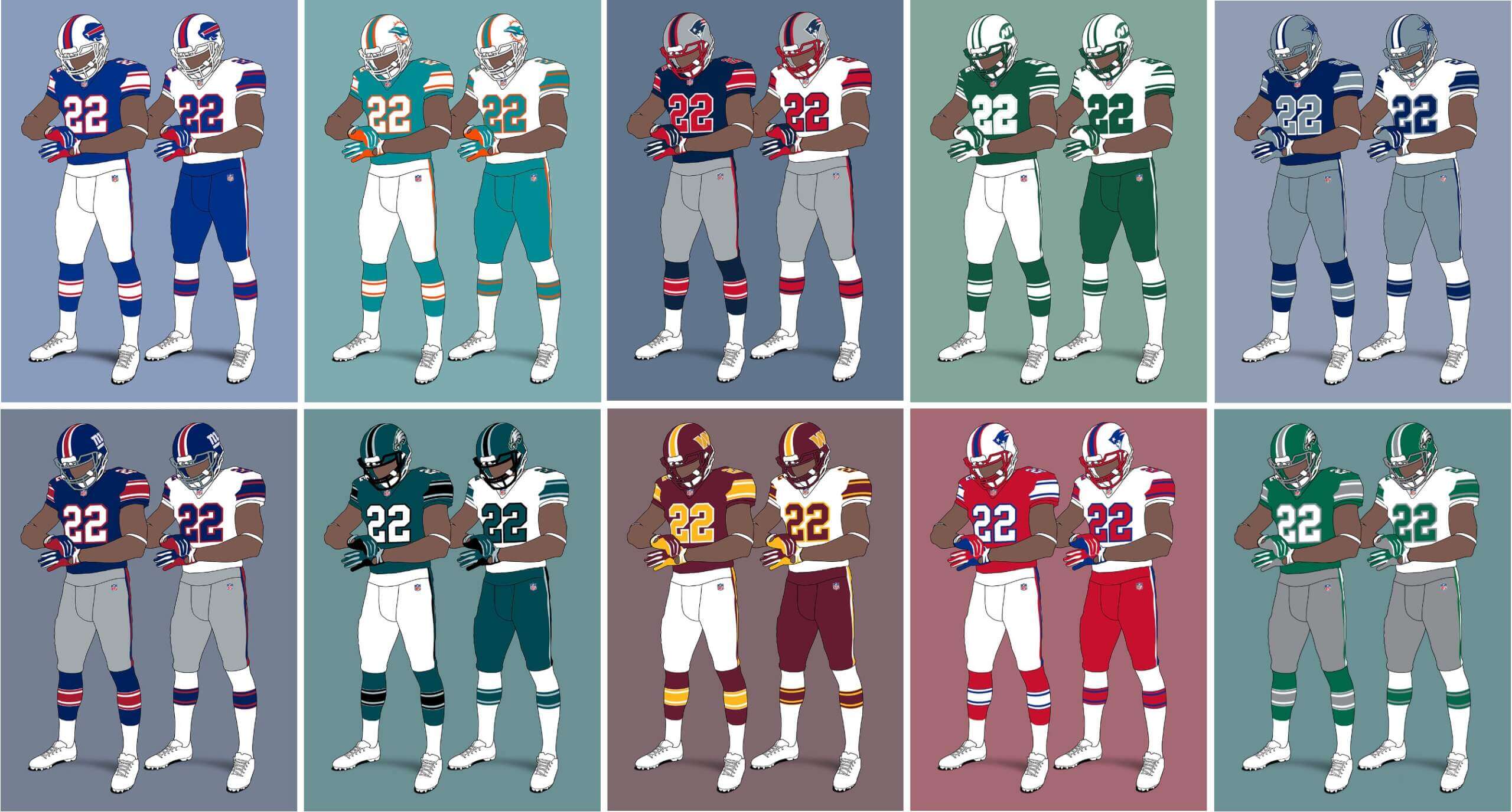
Chris returns with his latest project this morning, in which he envisions a more “uniform” NFL — a much more uniform NFL. This will be another multi-part project, and today we’ll look at Chris’ Eastern Division concepts for the AFC and NFC.
Click on images to enlarge.
Uniform on 11 – Just How Much More Uniform Could it Be? (Vol. 1)
by Chris Diamond
This site is Uni Watch and we are all UWers obsessed with sports uniforms. Currently the NFL’s uniform standards feel like they are in a fairly lamentable state with the “sock shit show” and untucked shirts for individual players and mono-mania, icy-whites, BFBS for teams (to name but the worst) ruining things for a lot of people. Often we hear “why can’t the NFL be stricter over uniform standards?”. I think people are mostly thinking about making existing uniforms more… well, uniform! But what if the NFL had a much stricter set of rules that it enforced on all teams? And here I don’t just mean enforcing uniform deportment, but mandating style in the same way that some soccer leagues enforce a common number and name font or rules on contrast between team uniform elements. Setting Uniform to 11!
Back in the 50s style was much more uniform between teams, with either plain jerseys or a few different stripe styles and college block numbers almost ubiquitous. So I came up with a “What If?” scenario based on a set of uniform rules being devised at that time and enforced ever since. What might that look like for the NFL teams now? These are the rules I have come up with for this project:
- All jerseys, pants and socks must be the same for all players on a team (apart from number digits)
- Teams must have a colour home and a white road jersey
- Jersey and pants must be different colours
- Pants and socks must be different colours
- Helmet must have central stripe in 1-2-1 pattern
- Helmet must have a team logo or wordmark on both sides
- Face mask must be in team colours
- Jersey sleeves must have stripes in Northwestern pattern in a single contrasting colour to the sleeve
- Jersey stripes may be outlined in a different colour
- Uniform must be unique within the league
- Numbers must be college block, 10” front, 12” back and 4” TV numbers on shoulders
- Number must be edged in contrasting colour unless team uniform is two colour only in which case edging can be the same colour
- Pants must have side stripe in 1-2-1 pattern
- Socks must have stripes in Northwestern pattern in a single contrasting colour to the sock
- Sock stripes may be outlined in a different colour
- Jerseys must be tucked into pants
I have created graphics for each team based on these rules using a simplified version of my usual template for the sake of clarity. For some teams I have done more than one version as the rules means the current colourway doesn’t work that well, or the team has several different looks I want to try. Before we crack on, some of you may remember that the WFL had a uniform ethos known as The Corporate Look that was along these lines. But the Birmingham Americans decided to get their uniforms made locally and messed the whole thing up, but still the idea was sound :)
So just how much uniformity is enough? Is this too much? I must admit it tickles my colours+sets OCD (in a good way) to see the NFL uniforms like this. Rather like the satisfaction you get from a good set of pool balls or the London Underground Map! But I can imagine it’s going to drive some UWers crazy, especially fans of teams with long-standing looks that this violates like the Cowboys or Bears.
AFC East
Buffalo Bills
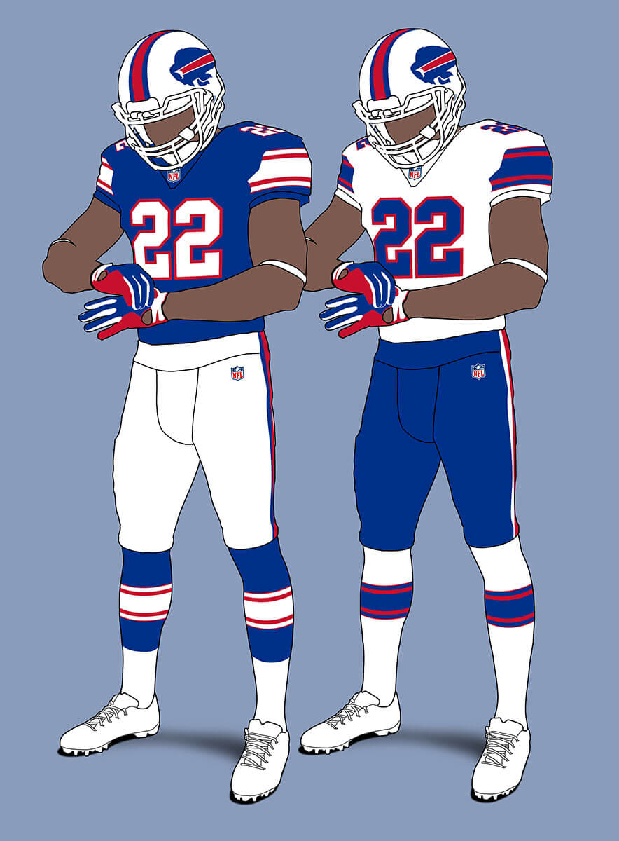
The Bills current set is quite easily converted to the template. I feel it’s an improvement as the current unis are a bit over fussy due to the inconsistent navy edging on the stripes and numbers.
Miami Dolphins
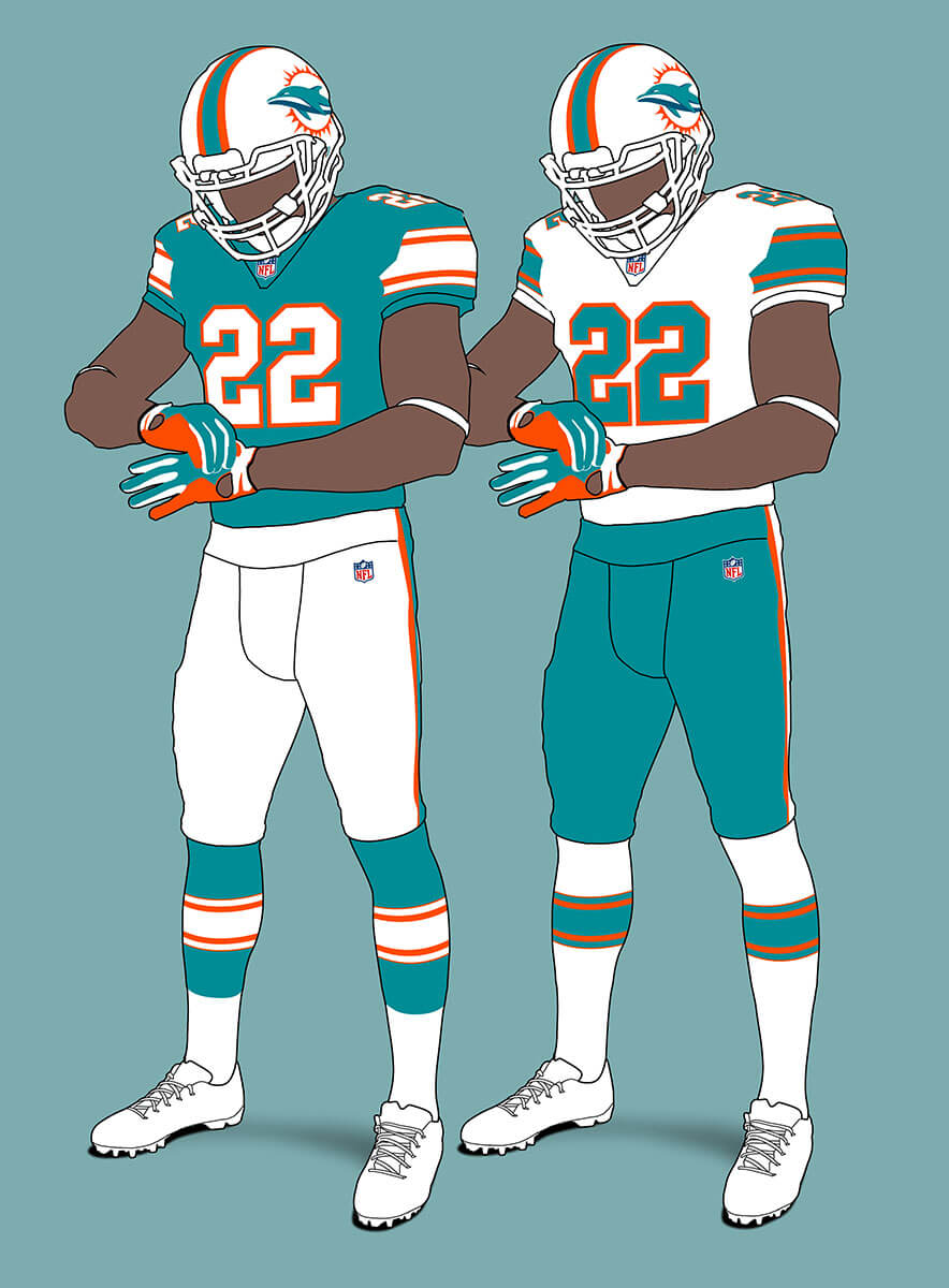
These feel like a merger between the current unis and the much loved pre-86 unis. I like both so think this is a real looker.
New England Patriots V1
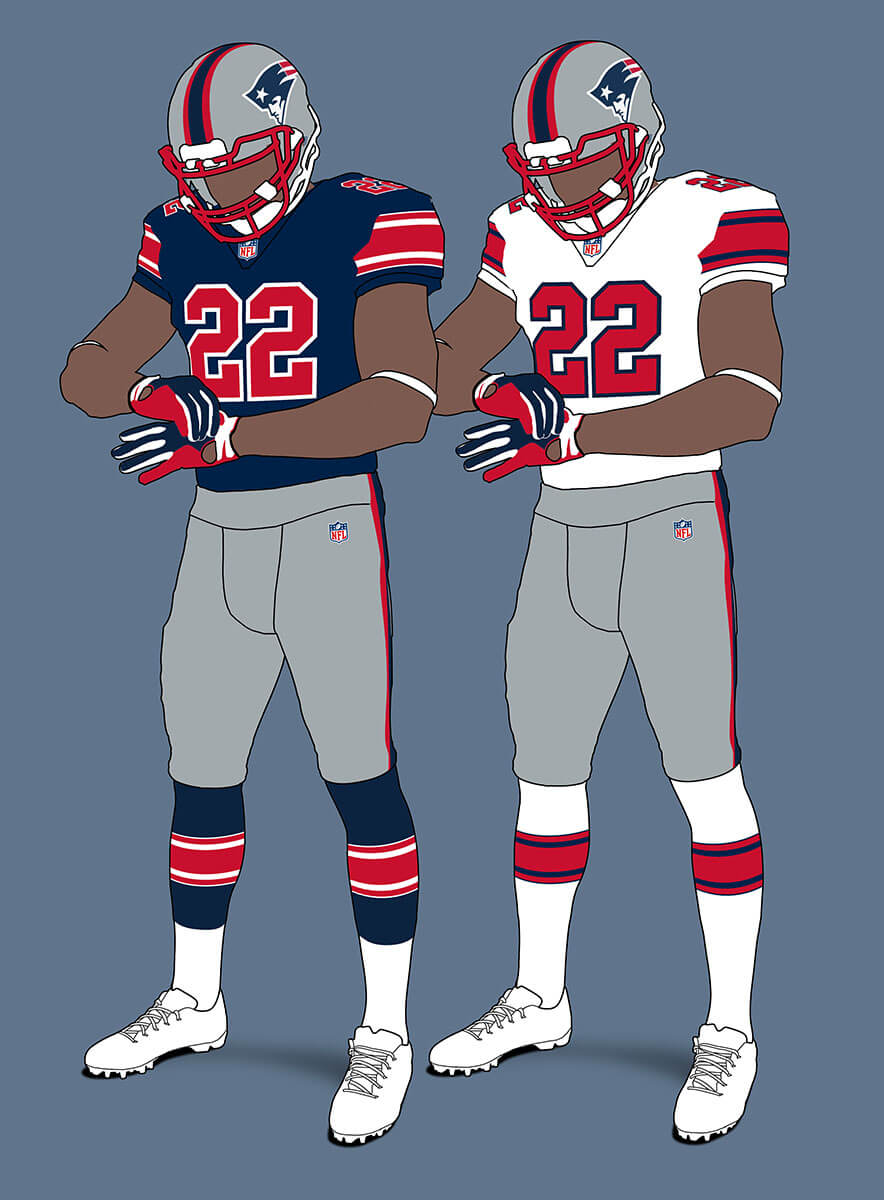
The similarity between the Bills and Patriots colours mean they need a different colour permutation for their jersey, so I’ve gone for something inspired by the 1993 uniforms.
New England Patriots V2
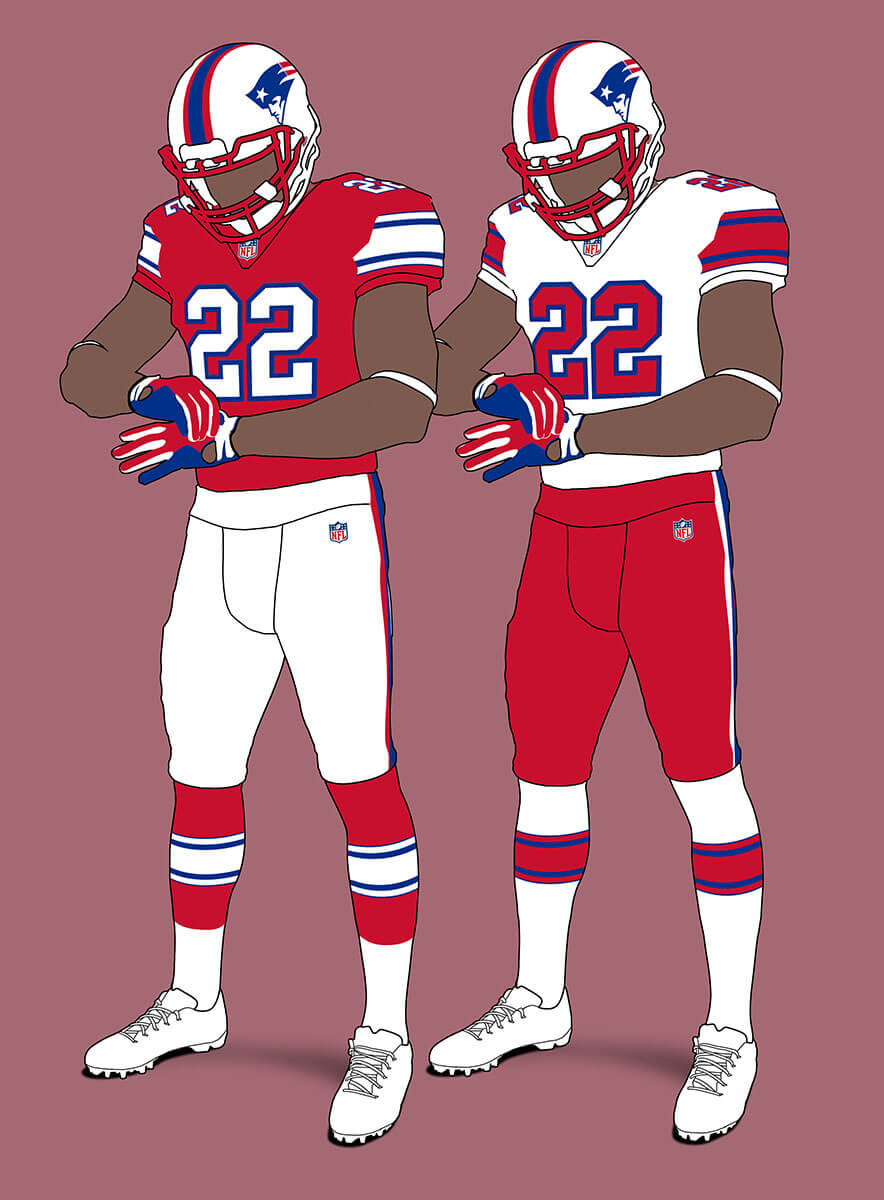
Of course they could just have stuck with the classic red uniforms, but I still think they would have updated Pat to Elvis!
New York Jets V1
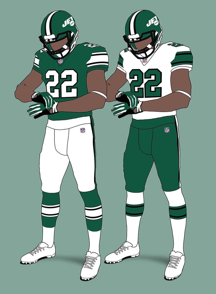
The current Jets unis are generally unloved, but these look pretty good to me which shows it isn’t the Gotham Green, White and Black colours that are the problem.
New York Jets V2
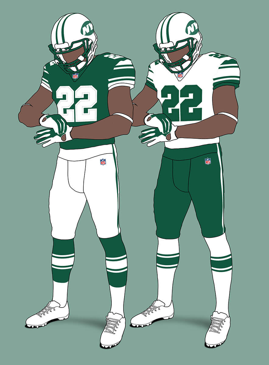
But what if they had stuck with the Namath Era unis? Here’s how that could look in this system. The old logo feels very 60s so I think they might have updated that. I’ve gone with the alt “NY” here instead. I think these look pretty sharp!
NFC East
Dallas Cowboys
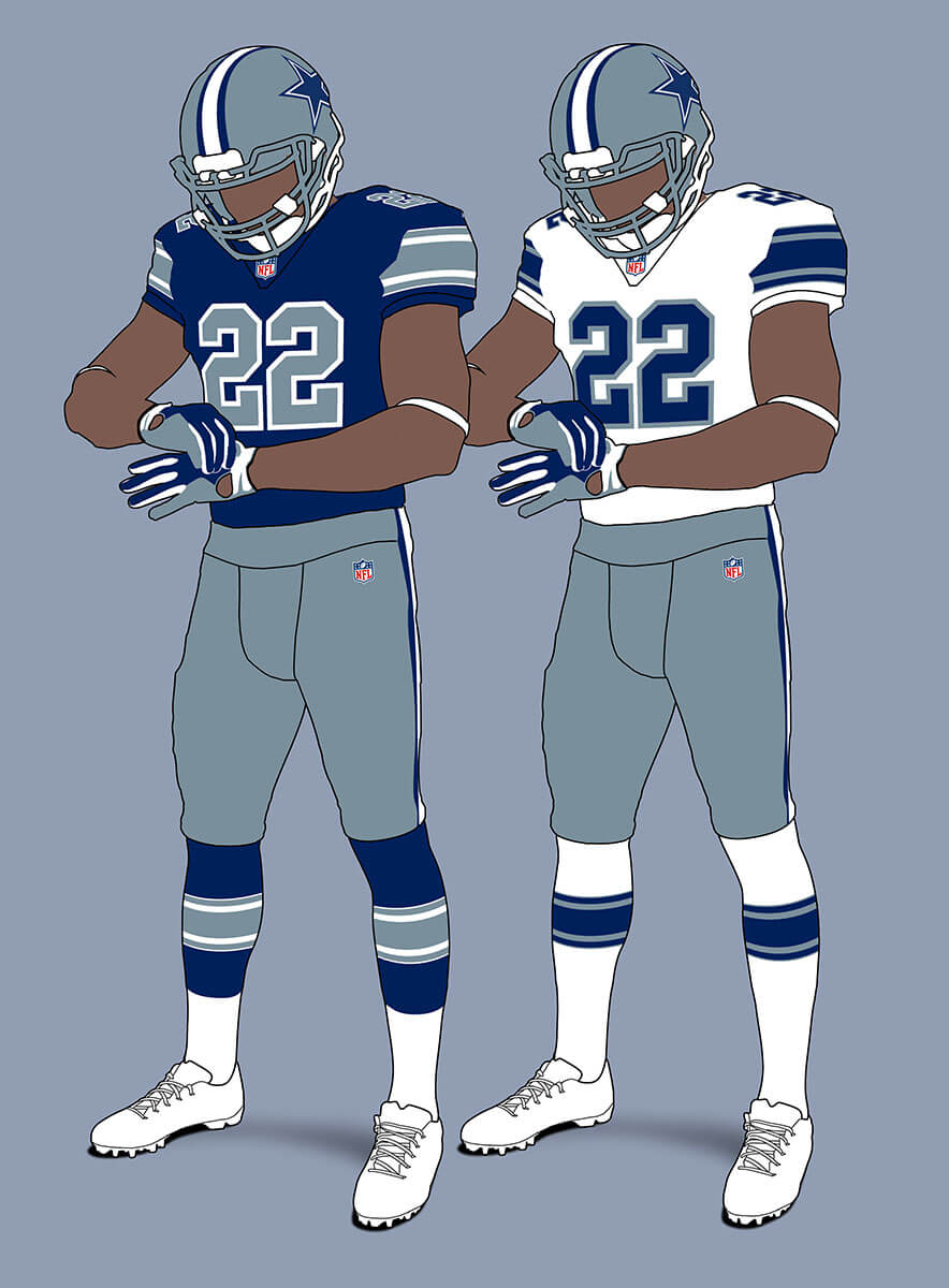
The Cowboys current set are probably the most un-uniform in the NFL with inconsistent templates, two shades of blue and three shades of silver! That sort of thing is OUT here so I’ve reverted to the royal and steel blue colours they had from 1964-80. The dark jersey looks closest to what they have worn, but I like the white jersey too. Cowboys fans YMMV!
New York Giants
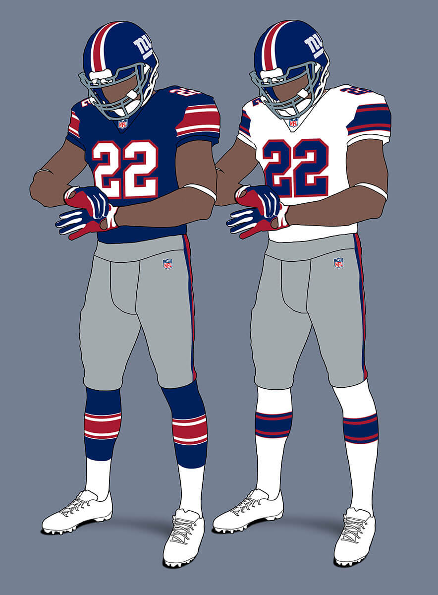
The Giants set feels a bit like the Disco NY uniforms crossed with their ’64 look. I’ve kept the grey facemask as the grey pants bring it within the rules. Note the white number differentiate it from the Pats jerseys.
Philadelphia Eagles V1
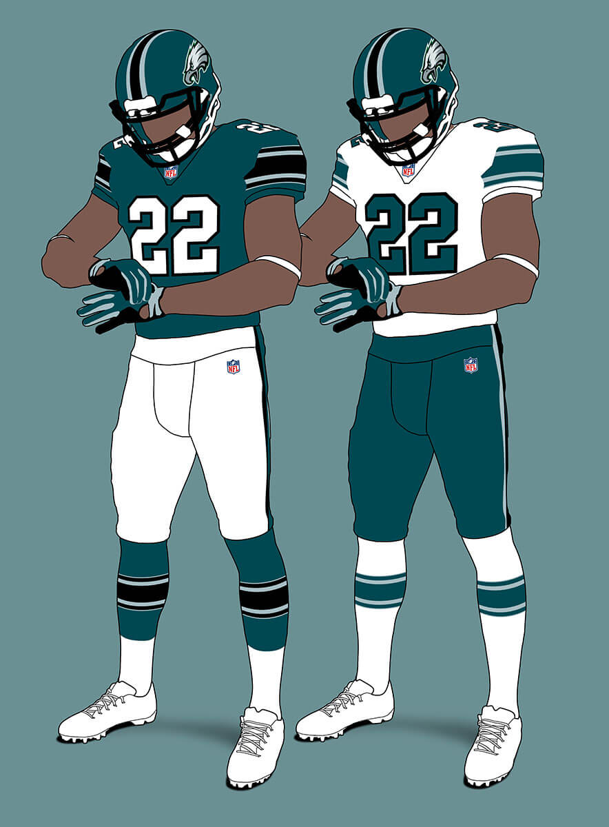
The Eagles are the first team with a major helmet change because the wings don’t fit the logo rules. I think the design looks good and could be an alternate helmet design for the real world Eagles. With the real unis the black disappears, but here it works much better and seems a distinct element.
Philadelphia Eagles V2
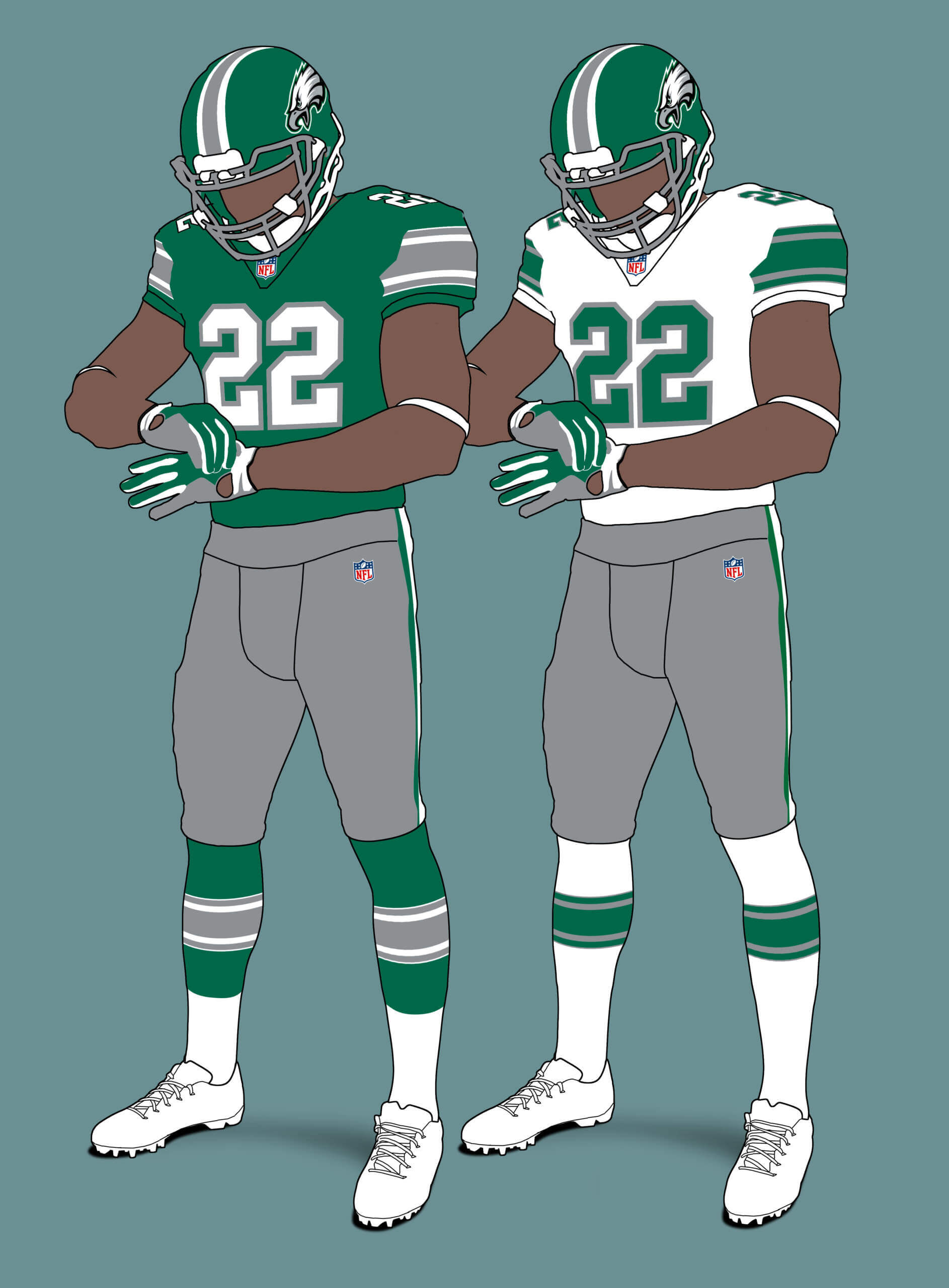
I also wanted to try the pre-85 look in case they stuck with that (no owner’s wife colour changes). I think it looks pretty sharp and because there is no black it can’t clash with the Jets design.
Washington Commanders
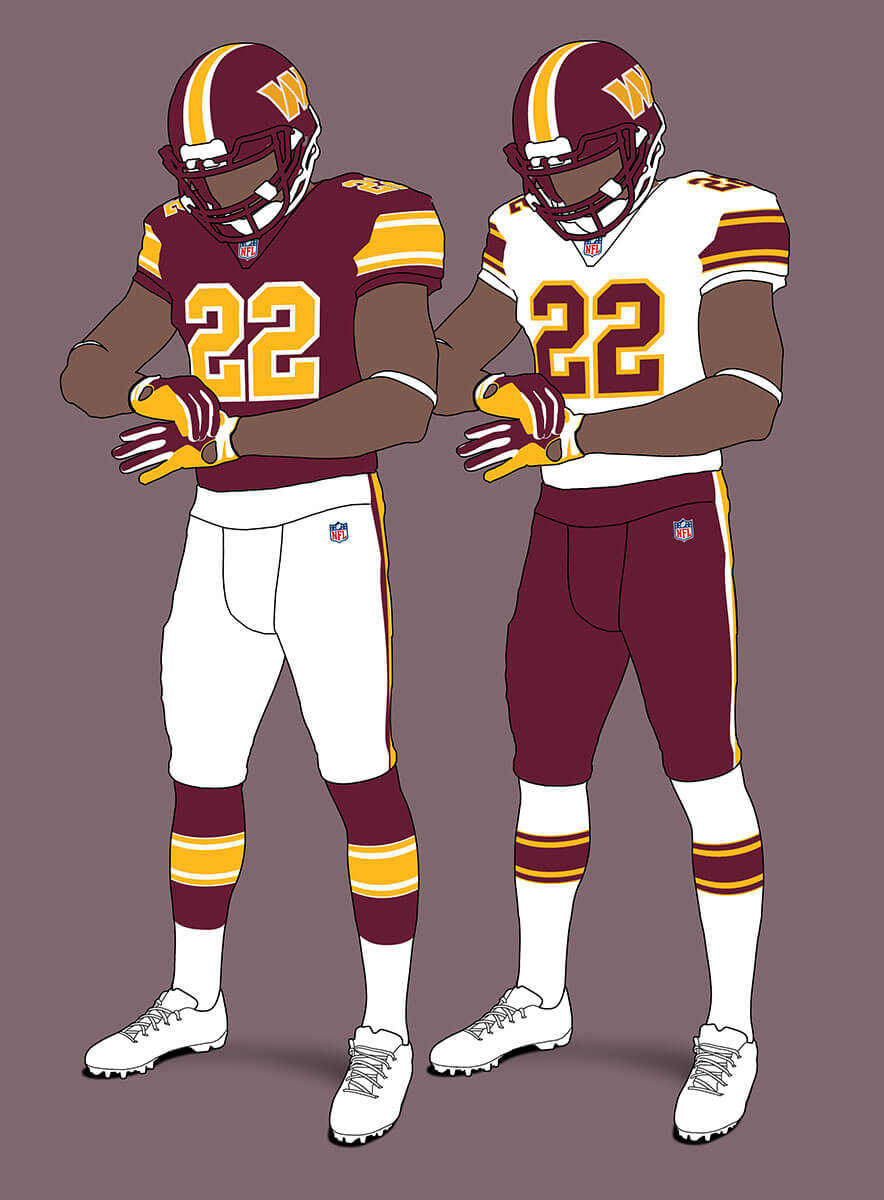
I think this shows the actual unis could look pretty good with some fairly minor tweaks.
Thanks, Chris! Another interesting project. We’ll be back with additional divisional concepts over the next couple of weeks!
Readers? What say you…


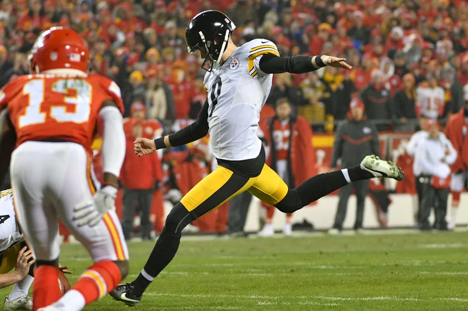
GTGFTU – 1/15/17 Steelers most recent playoff win (after the game was rescheduled due to weather)
Pittsburgh 18 – KC 16 on six Boswell field goals
I love the bit about Jeffrey luries ex wife who changed the Kelly green to the now midnight green. Also I will say the eagles Kelly mock is awesome although I don’t know how I feel about the eagle head on the helmet instead of the wings. For the jets I like the home uniform of v1 and the road uniform of v2 as the uniform for the jets
Yes the Eagles without wings looks odd for sure – the same will be true for the other non-standard teams like the Bengals, Chargers, Vikings and Rams.
I hate the word ‘iconic’, but the helmet rings are just that…in just about every version the Eagles have used. That said, removing the logos from the sleeves and repositioning them onto the lid looks nice. And I’ll say it – the former Mrs. Lurie should be cut some slack.
Wings…not rings.
Nice work, Chris! I’m a big fan of more traditional football uniform styles, so your examples definitely make my ocular jocular.
I’m a Patriots fan, and while I like V1 just fine (especially the red numbers on blue), V2 definitely makes my corneas hornier.
I can’t wait to see the rest!
Thanks jf! Plenty more to come and I hope some of them will surprise and exceed expectations as to what you can do with such a restricted template.
I’m not going to like the Chargers losing their Bolts or the Rams losing their horns.
Maybe…. maybe not. I think you might be surprised :)
Cool idea Chris, but strict templates bother me. Would you consider doing this project but with a few more options? For example, any sleeve striping, such as UCLA, is acceptable. One helmet stripe is ok. Cowboys could have seriffed numbers again.
Thanks Steve, your idea would be another version of this. But I wanted to make it as extreme as possible to see how much uniformity people can handle :)
Is this too much?
WAY too much.
Granted, they look good, but I would be joining others in saying “No Fun League” if this happened.
It was one thing when they made the fields all uniform back in ’72. Making the uniforms all uniform is an overreaction to the current sloppiness.
As always, there’s a happy medium. You can have a variety of styles, just make them all legible and neat, and uniform *within the team.*
Even for me who loves “uniform” uniforms, this is too much. The appeal of this is it negates the horrible uniforms some teams have gone with. However, I want a team to look good, and players to not deviate from the uniform look, but I don’t want all the teams to have the same uniform except for the colors and logo.
I like this approach for tournaments, such as Olympic ice hockey. In that space a common look across all teams works, with just the colors differing and maybe other very slight differences. League-wide I don’t like it, such as the same numbers used across all of MLS. Teams should be allowed to forge their own identities (as long as Nike is not involved).
I expected this reaction from some UWers Rick, this kind of extreme scenario is always going to be polarising! If you can’t stand it, try just looking at each uniform in isolation and rate it like that. After all, should how much you like a uniform depend on what other teams wear? In theory no if you are rating it purely on its aesthetics, but of course it’s very hard to do that. I have noticed, especially from people rating soccer “kits” that some are almost allergic to any graphical feature or ever color combo that is on another team’s uniform. For this kind of fan, they prefer everything about a uniform to be unique.
GTGFTS
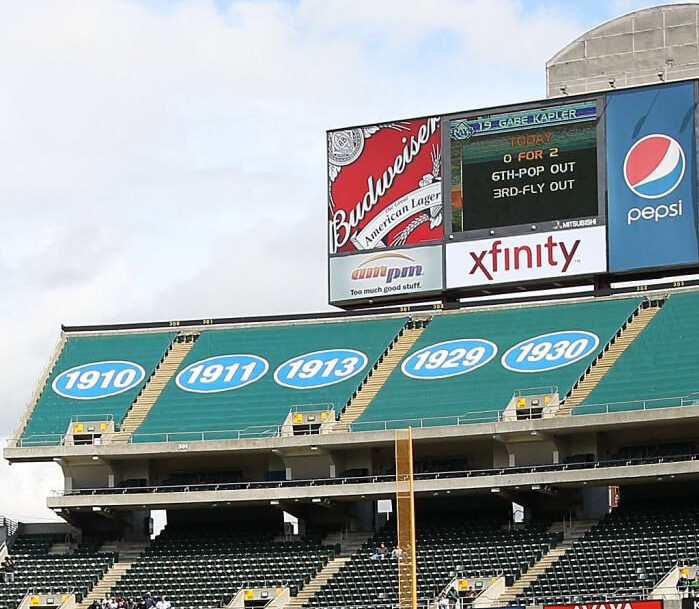
9 May 2010
Gabe Kapler about to ground out to become the last out of Dallas Braden’s perfect game in front of 12,228 OAKLAND A’s fans.
link
You hit the mark, Marc!
Too easy to show a board with all those zeroes, so I edited it a bit. Kap’s last career at-bat at the Coliseum.
Gotta admire that the A’s acknowledge their time in Philly…still say the wrong team left town. Best of luck to ‘em in Vegas!
love the uniforms but I agree with others, I think each team should have a “signature” stripe pattern, no duplicates throughout the league.
Thanks Claude! You seem to be one of the fans I talked about in my reply to RICKAZ that like a team uniform to be unique in every way. Can you say why? Is difference in colour not enough? In the early days of “template” soccer uniforms in the late ’70s literally the only difference between teams was colour (plus team badge) as there was generally only one (or maybe two) templates. I don’t remember fans being upset by this at the time, but I was quite young.
Wonderful work, Chris!
I gotta say this just made me pine for sock stripes that much more.
Miami looks fantastic. I could barely sit through the game last night because their current set is a travesty.
Unpopular opinion: 1993 New England was a bold look and maybe not quite NFL standards, there was something really charming about them. Almost like uniforms from a football movie. And I think they stand the test of time especially considering what a lot of clubs are waltzing out in these days.
Jets give off that Boomer/Ronnie Lott era look. Far better than what they currently wear.
Cowboys look proper. I know their inconsistency is classic to most people. But their current navy jersey looks like a knock off dollar store find.
Washington looks like Washington! Whooda thunk?
Can’t wait for the future sets!
Thanks Jason! Yes, even if teams do play nice with socks, so few teams have them these days which is such a shame. I don’t think it’s just a “classicist” view to like stripes on socks (and pants), they do add something visually to a uniform which makes watching the game easier somehow. In a large group of players in a scrimmage, pants and socks without stripes just tend to blend together (especially black) so it just looks like a writhing centipede rather than a football game!
Interesting thought experiment and well-executed illustrations, Chris! I appreciate your classicist design sensibilities. As a baseline from which to build in some variety, I don’t mind this concept. I agree, however, with those readers who have express concern about using this as a mandated league-wide template. There are some great striping patterns and helmet designs that would get left by the wayside if this level of uniformity were implemented.
Thanks Kary! I think from the feedback it’s becoming clear that most people like the classicist features but don’t want to see every team forced to wear Northwestern stripes. It might be interesting to have a poll where the two options were; A) Keep unregulated uniforms we have now B) Have totally regulated uniforms like in this concept. I know these are two extremes but I wonder which way people would jump if forced to choose?
“ 6. Helmet must have a team logo or wordmark on both sides.”
*angry Pittsburgh Steelers/Cleveland Browns fan noises
Now I’m a Steelers fan, but I can’t say I would be upset if they decided to put a logo on the left side. Having a missing logo is quirky and part of who they are but it isn’t good design. But then I like the futura jersey numbers :)
I know I’m probably in the minority here, but as someone that first started paying attention to sports in the mid-90’s, I thought the NFL uniforms of that era kind of sucked. In the NBA at that time you had the Grizzlies, Raptors, Hawks, Suns, etc. with these wild, over the top designs with cartoon graphics that were so fun and whimsical to see as a kid. Meanwhile in the NFL, seemingly every team followed the same generic, dull template. While they haven’t exactly aged well, I was always thankful that the soon-to-be retired Broncos duds blew the lid off what was considered an acceptable uniform. With all that being said, I think these redesigns do look rather fantastic!
I have always thought there was an “NFL way of doing things”, not that far removed from the Yankees’ policy. No change for change’s sake, no cartoonish helmet logos, a solemn attitude for an often-brutal game. The NBA is more free-wheeling, and encourages showing off. The upshot is that the NFL ages better, just compare the upstart football leagues’ imagery to the NFL and this should be clear. By contrast, some ’90s NBA uniforms look downright stupid.
Thanks AK! It’s an interesting point you make about how tastes can change as you get older.
Chris, let me lead off by saying I get what you are doing here, and I won’t rip you with the old saw regarding “a foolish consistency”. The samples you provided look nice. In fact, I’ve anticipated what you are going to do with the Packers, and can’t wait to see it.
That being said, the baby’s been thrown away along with the bathwater. I don’t see how this approach improves the Raiders, Steelers, Bears, or Browns. The helmets of the Eagles, Rams, and Vikings looked great in 1983 and that’s what they should be wearing. Washington perfected their uniforms in 1979 and I’d reinstate those (only with the new helmet decal).
You *did* hit a home run with the tidy socks and beautiful two-color numbers.
Thanks Walter always especially interested in comments from a fellow artist :) I wasn’t intending this to be a neo-classicist manifesto, just a thought experiment to see what people’s reactions were and it’s generated some really great discussion. So I fully agree some teams unis are not improved!
BTW, I really like your NBA concepts. I used to draw in your style pre-computer era and looking at your intricate hand-drawn illustrations now I can almost still smell the pens I used to use :)
I think that when a league gets up to 32 teams, you need all the variety you can get.
But you definitely have my vote for the striped socks.
I give you an A-, Chris. Love the overall idea, although I haven’t seen what your Browns version looks like yet.
But I would let each team wear whatever helmet design and striping pattern they wish (including the UCLA stripes), except for the pants; I wouldn’t allow any of that swoopy garbage like the Panthers and Broncos wear and that broken-up junk that the Bengals and Titans wear.
All in all, a very enjoyable read.
Thanks Marty, stay tuned for the Browns… Interesting that it’s just the pants “swoopy garbage” that you don’t like!
Ha haaa, yeah, I hate the swoopy, pointy stuff.
Looking forward to your next batch.
Beautiful work and interesting concept yet again, Chris!
“Jersey and pants must be different colours” – Grrrr!
“Face mask must be in team colours” – Yay!
DC is mostly restored to uni-greatness (bring back the yellow bottoms!) and the V2 Birds > “Kelly”. Giants and Pats V1 are loud and sorta samers…gimme NYG without the gray (hang the rules!). Can deal with NE in red coats, but not red pants! Dolphins and NYJ without white-over-whites is a sad sight.
Thanks Chris! I was torn with DC whether to give them yellow pants or not. But the most loved set for them doesn’t have yellow pants so I decided not to. And the loss of white-over-white is the one real downside for this concept.
“But the most loved set for them doesn’t have yellow pants so I decided not to.”
Loved by who exactly ? ; )
The burgundy britches are a good example of the “we won in those, so let’s keep wearing them” mentality. Say what you’d like about the Shanahan era – he knew what the ‘Skins looked best in!
YVVM of course.
Wow! seeing all the jerseys done with the same exact design reminded me of the WFL. All of the 1974 teams that had their jerseys made by Sand Knit had the exact same design with the colors changed. When the Patriots went with new jerseys in 1973 and the Buccaneers in 1976, those jerseys were made by Sand Knit and the same template was used as with the WFL Sand Knit jerseys. Nice work on those uniforms.
Thanks Jimmy – yes the WFL Corporate Look! But I hadn’t realised that the ’73 Pats and ’76 Bucs are exactly the same Sand Knit template as the WFL – good spot!
Was that adopted by the Broncos during Elway’s tenure?
The Broncos wore Russell athletic jerseys during Elways era, except he wore a Champion jersey against the Giants in 1986. The sleeve stripes were different from the WFL jerseys. But I know what you are talking about, later in Elways era the white and blue sleeve stripes met but the blue part looked a little thinner than what was worn in the WFL. Long after the WFL folded in 1975, the Patriots were still wearing their 1973 style jerseys in 1983 and the Bucs also used that sleeve tyle up until the 1996 season.
I have seen the tags on those NFL jerseys, the same ones that the WFL had except they don’t have the WFL logo on them. But the 1973 Patriots were the first team to have that template, then the Wheels, Bell, Storm, Sun, Hawaiians, Texans, and Blazers wore the same jersey with the same Sand Knit template. The Sharks wore that sleeve style, but the number fonts were different, they were Russell athletic, The Stars had the same sleeve stripes, but their numbers were different because the jerseys were made by Red Fox and The Southmen had the same sleeve stripes, but their numbers had a different font because they were made by Rawlings.
OK class, next week the WFL helmet stripes!
Jimmy, I think we need you to do an article on just this very topic!
Just call me the Sand Knit kid! somewhere Bob Colonna is smiling down on me saying “kid I taught you well. I will start gathering photos, it would take me a while to put it all together
Although I have never paid attention to socks and occasionally like a white jersey/pants combo; I absolutely love these uniforms. Really like silver pants on Giants! Very good work!
This is a neat idea! I really wish the pant stripes were more visible though, they’re baaarely showing. Maybe a slightly different pose can be used for future concept art that more clearly shows the full uniform?
THE Ohio State Patriots
This is an interesting concept, and some of the unis are certainly improved so far. I think I’d get sick of all block fonts all the time first before any other alike element haha. I saw in an earlier comment of yours that you like the Steelers futura numbers over their blocks (me too, though it took me a few years to get there), so I’m happy to understand that this project is an exercise and not a recommendation haha. Can’t wait to see the others!
Another awesome, OCD pleasing project, Chris. This is one of those things that, while I wouldn’t wish for it to happen because it would kill some of the uniqueness of each city/team , it probably wouldn’t bother me as much as it would most…(and it would 100% cure my anxiety over what the Texans are about to do to themselves in April uni-wise).
Very neat idea and well-executed.
HOWEVER, it is probably overly uniform when applied this strictly. Too many good uniform designs are excluded. Single-stripe helmets, no stripe helmets, wings/horns in place of logos, UCLA stripes. What makes the uniformity work in European soccer is that they made only one element – NOB/number font – uniform.
I like the idea of every team getting a distinctive stripe pattern.
Is this too much? Maybe.
Does every team look good? Yes.