Good Sunday morning, Uni Watchers. I hope everyone had a great Saturday. Big thanks to Paul for pinch-hitting for me yesterday while I dealt with various family and personal mini-crises. Things aren’t nearly 100% copacetic, but getting better.
Now then.
I’m back once again with the prolific Chris Diamond, who has another “What if?” segment for our reading pleasure. You recall Chris recently produced four similar “What if?” pieces, wherein he explored giving the “Eagles treatment” to the NFL’s bird teams, with his next article giving the “Michigan Panthers treatment” to “cat-themed” team helmets, “Jacksonville Bulls treatment” to ‘hooved’ teams, and finally, the “Boston Breakers treatment” to all ‘fluid-based’ teams. Those formed Parts I though IV of a series Chris is calling “Iconic Uniforms Re-Imagined.”
In the latest version of his ongoing think pieces, today Chris sets his sights on a new look: taking the Montreal Machine’s template (the “key features here are the beautiful use of consistent stripes throughout the uniform and the rectangular city name letter based team logo on the helmet”) and adapting it to NFL teams not falling under the criteria for the first four parts of this series. Chris not only gives the NFL helmets the “Montreal Machine treatment,” he has also tweaked the uniforms of his chosen squads using the Machine’s uni template. The Machine were the sole Canadian (and non-U.S. based North American) team in the World League of American Football (WLAF), a springtime developmental professional league set up by the National Football League that played in 1991 and 1992.
Here’s Chris. Enjoy (click on all images to enlarge)!
by Chris Diamond
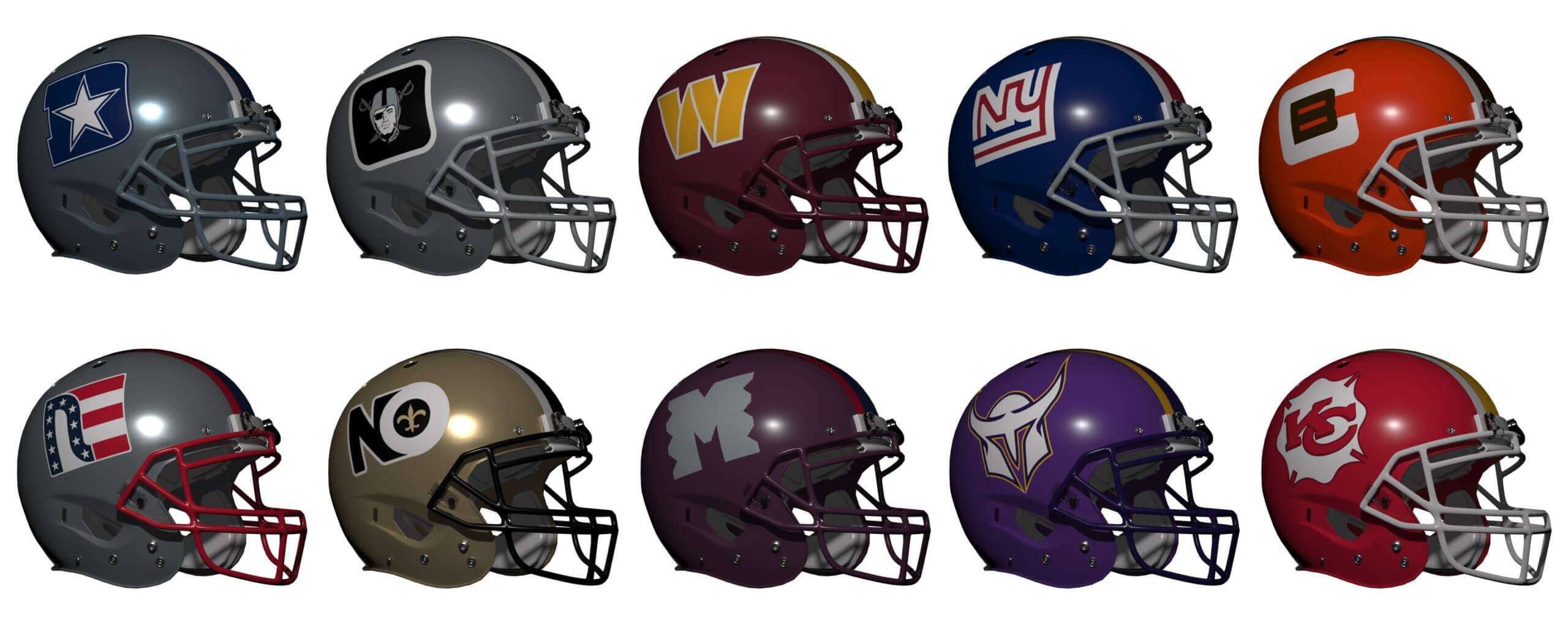
The first four parts of this series looked at NFL ‘Bird’ Teams if they emulated the Eagles, ‘Cat’ Teams if they emulated the USFL Michigan Panthers, ‘Hoof’ Teams if they emulated the USFL Jacksonville Bulls and ‘Fluid’ Teams if they emulated the USFL Boston Breakers. For this final part we are looking at the NFL ‘Person’ Teams. My initial choice for iconic uniform to use was the New England Patriots in particular the ‘Flying Elvis’ logo helmet. However, after doing a few I abandoned the idea for two reasons. Firstly the logos just looked too generic-three-quarter-heroic-
Montreal Machine
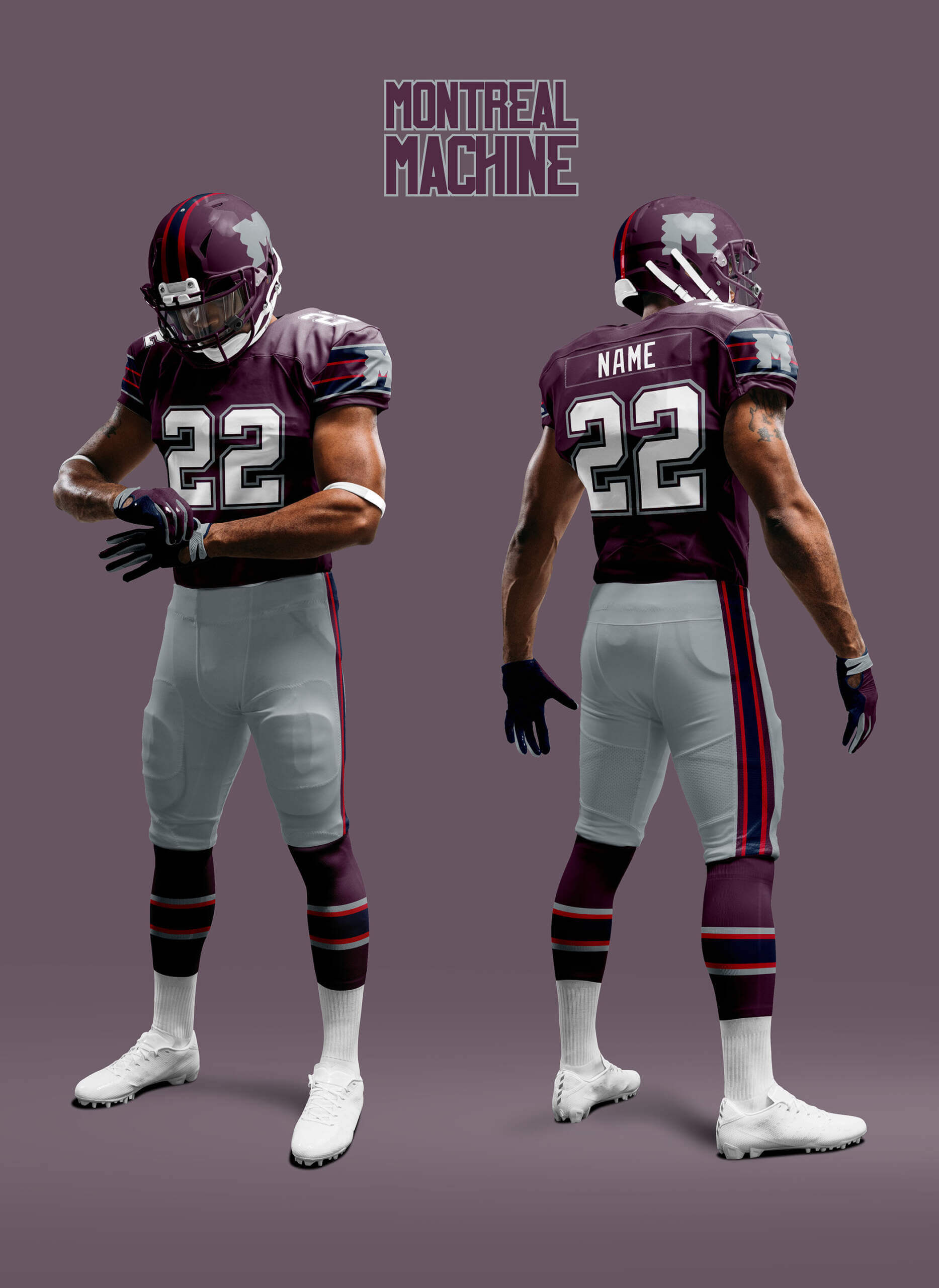
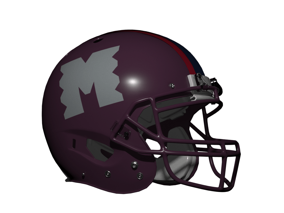
The original team, as I’m sure many of you will only vaguely aware of their uniform. At first glance it could be too many colours, but the whole thing just goes together perfectly without any colour being lost or dominating the others.
New England Patriots
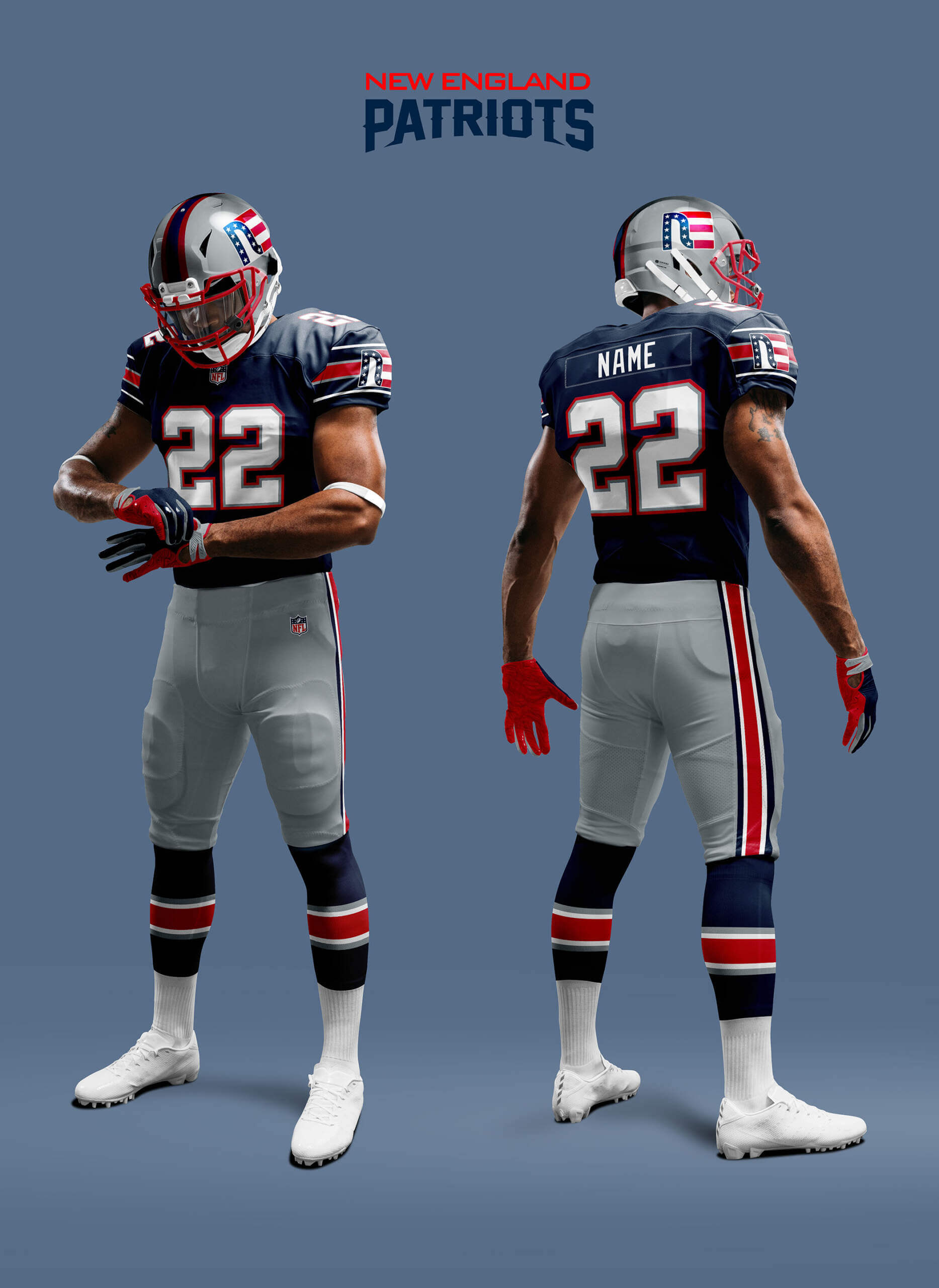
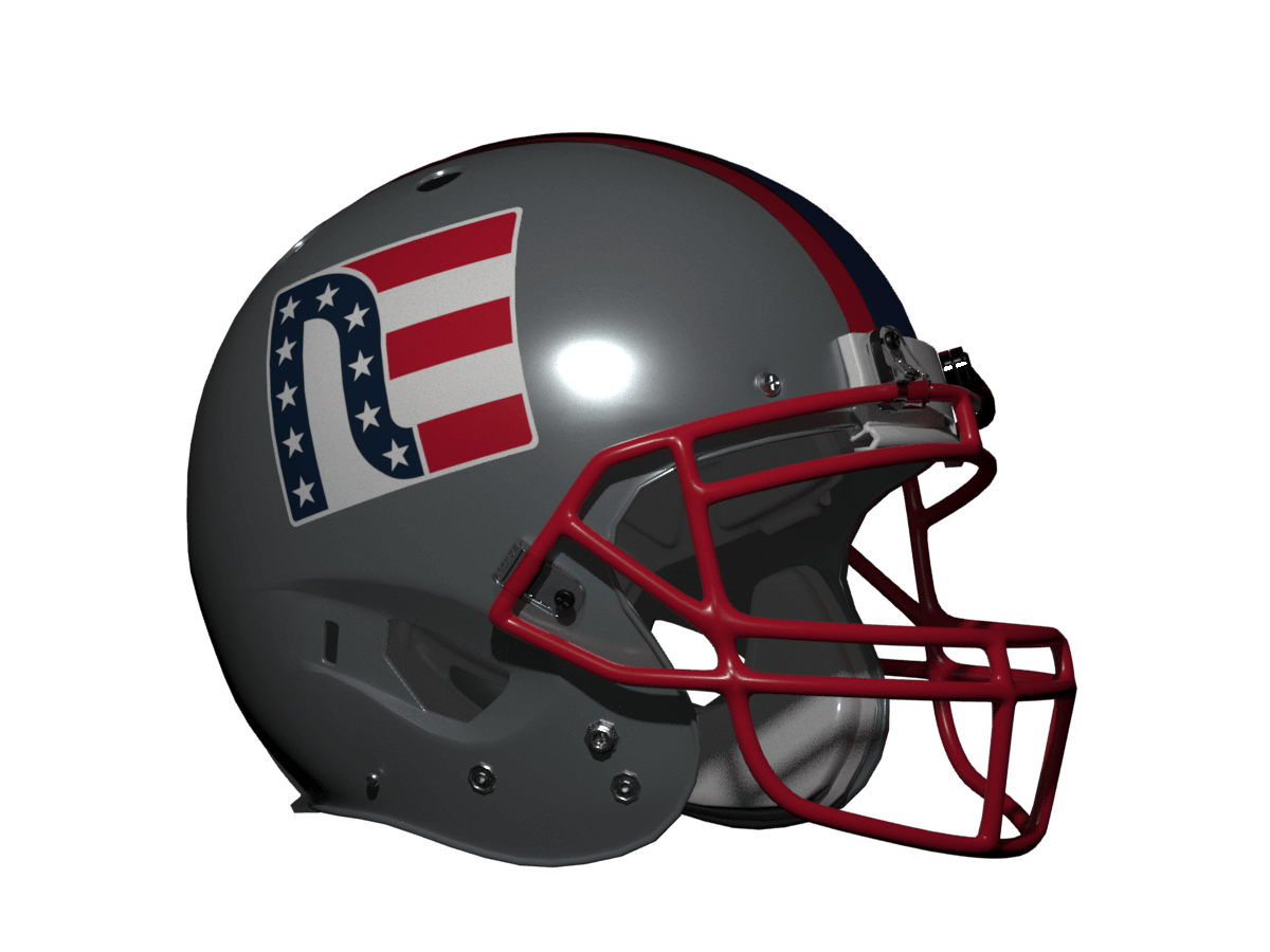
Demoted from iconic uniform, the Pats look pretty good in this template, especially with silver/grey pants. The new logo does have a slight “New Era” feel to it, but that wasn’t intentional!
Cleveland Browns
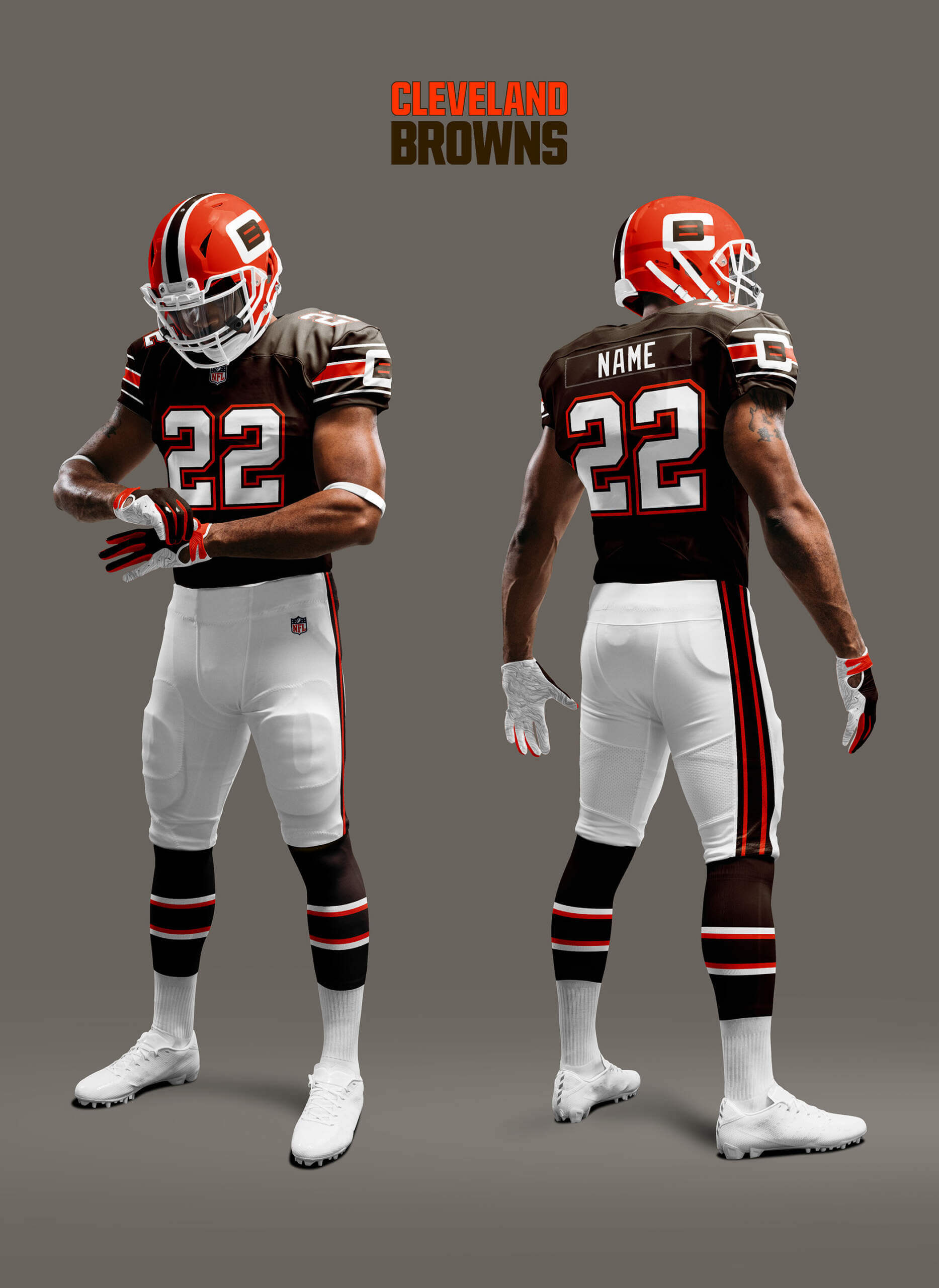
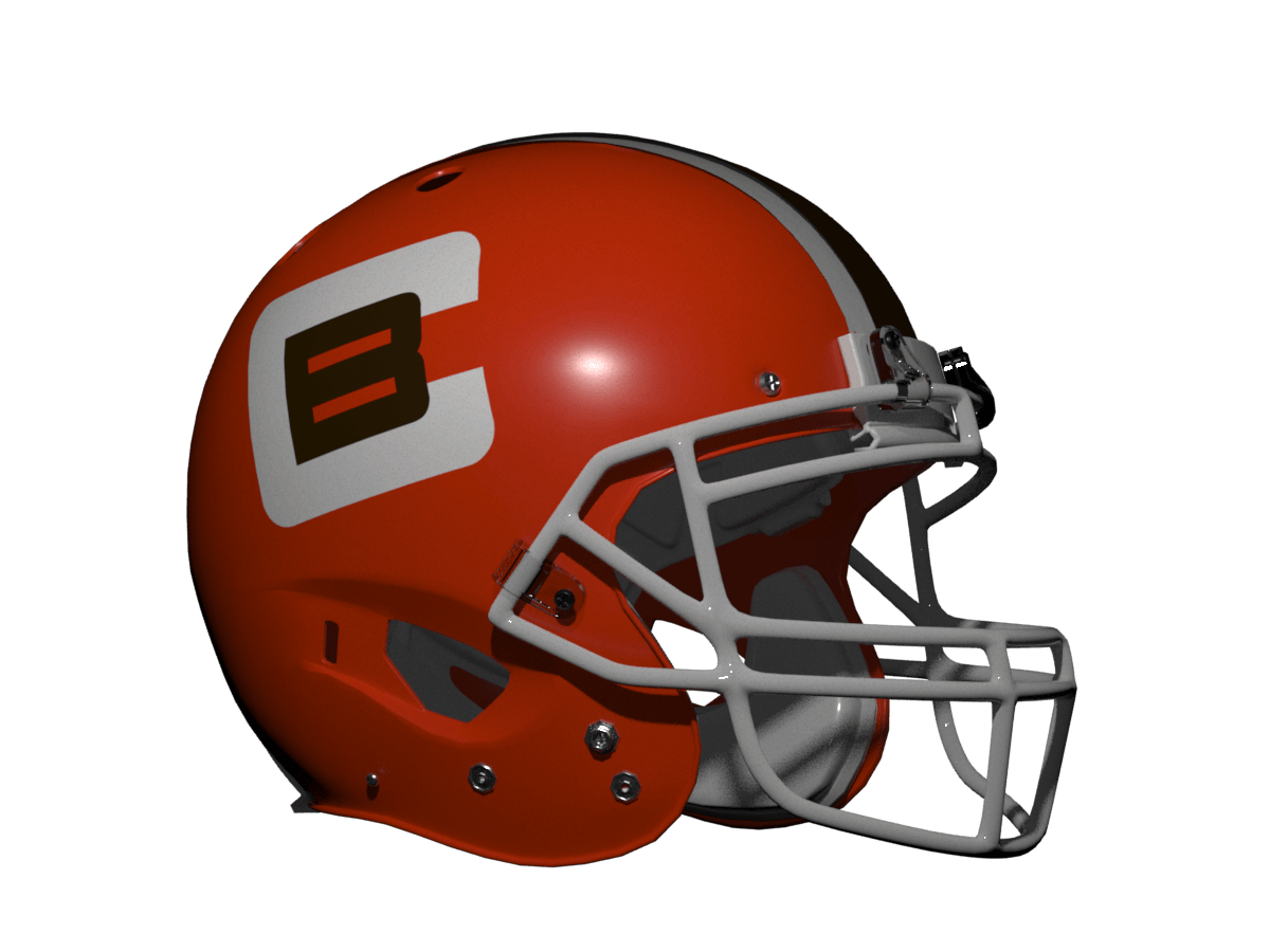
The Browns are a person team as they are named after Paul Brown rather than the colour. Adding a logo to their helmet is bordering on sacrilege, but I rather like the bold block font. Another good look and would also be great with orange pants.
New York Giants
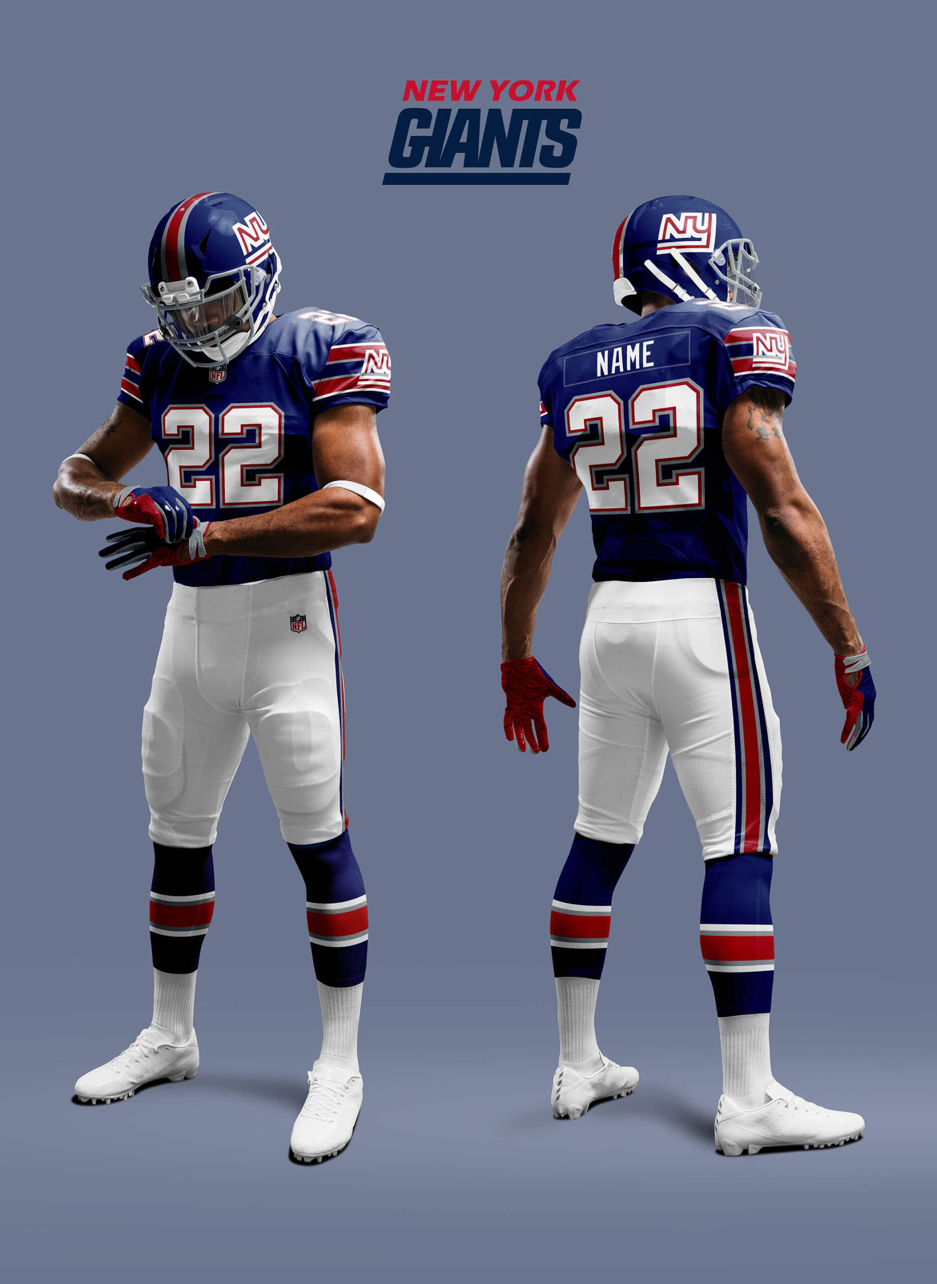
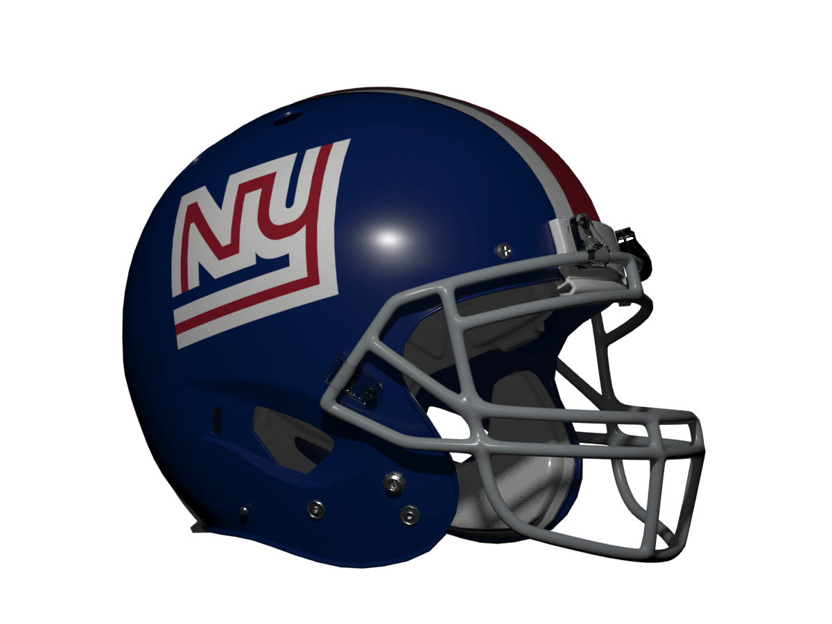
The Giants’ current logo would work, but instead I’ve decided to resurrect the infamous “disco NY” logo as I feel it fits better in the scheme as it’s closer to their 1975 unis.
Minnesota Vikings
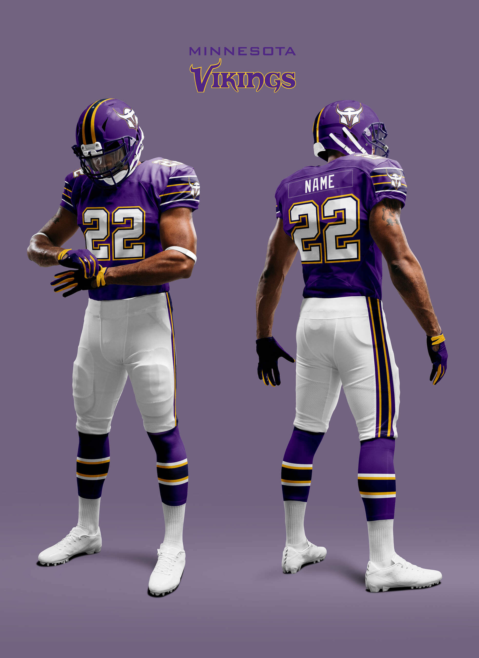
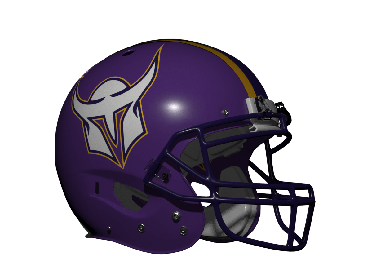
For the Vikings, I’ve got rid of black and replaced it with the darker shade of purple they wore before 1980. The helmet is meant to represent a stylised M with the negative space in the visor being a ‘V’ rather like the Vegas Golden Knights logo.
New Orleans Saints
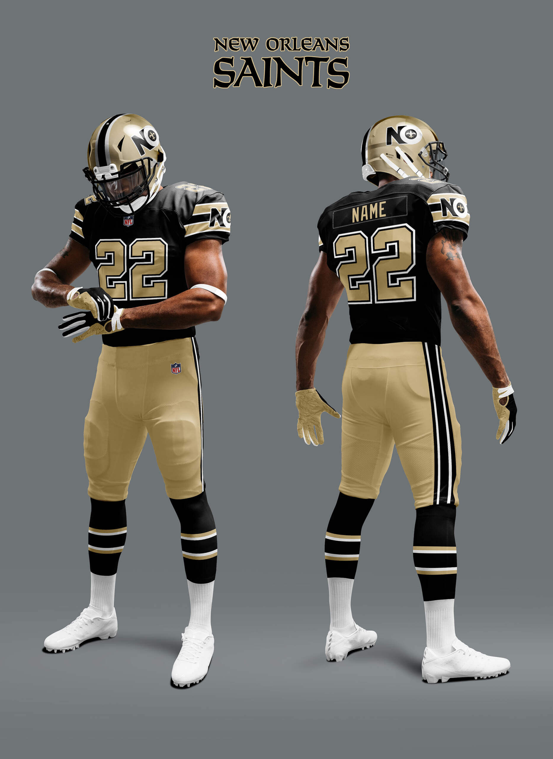
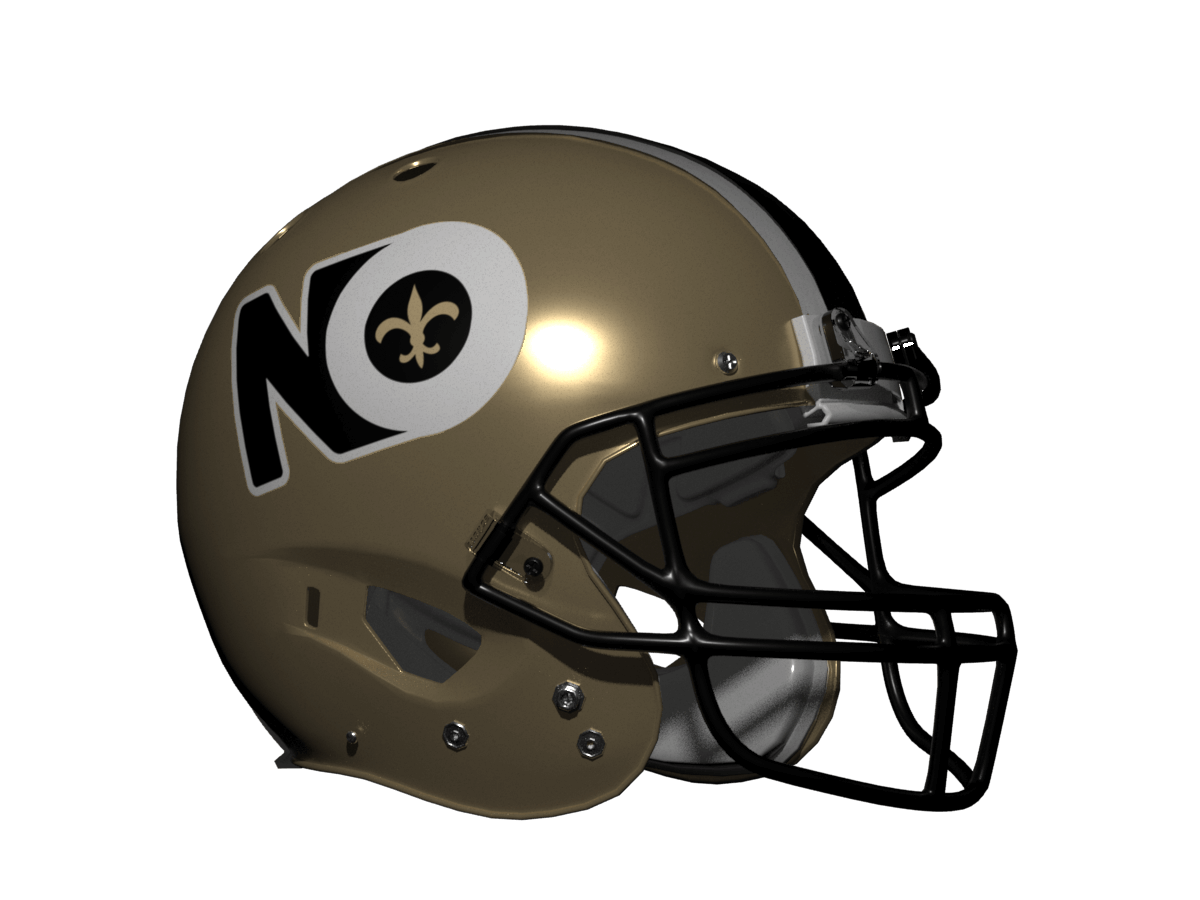
I’ve kept the logo simple for the Saints and with the gold pants it’s a nice looking uni reminiscent of their more classic look.
Kansas City (Fire) Chiefs
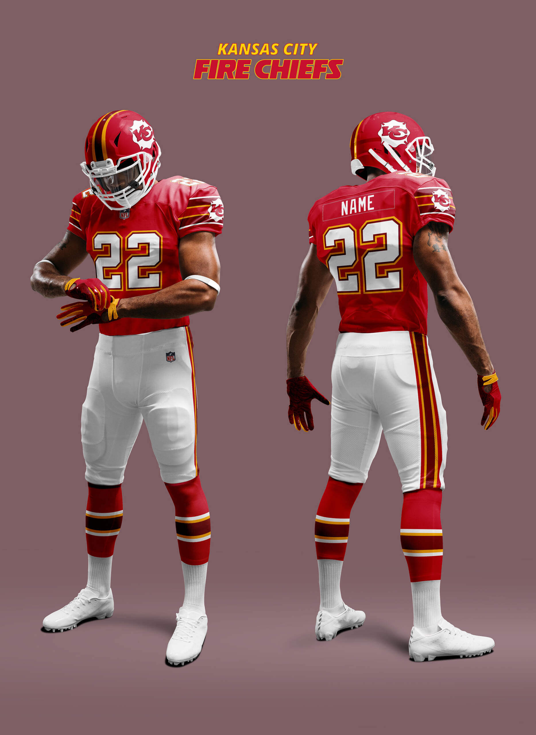
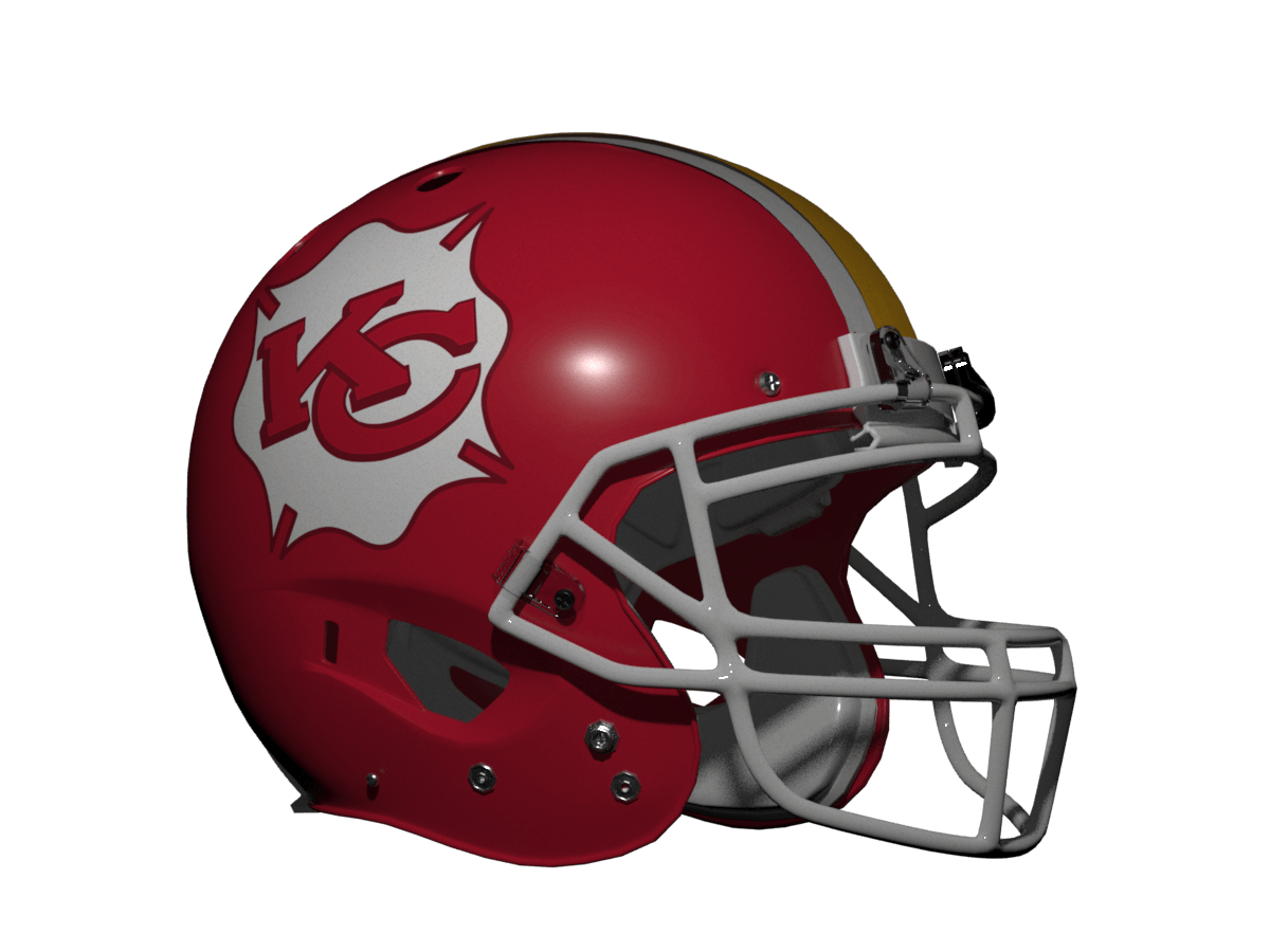
I’ve re-used my Fire Chiefs concept for KC to get away from the issues with their current logo, plus the new logo is squarer and fits the scheme better! I’ve also ditched black and used a dark red instead.
Oakland Raiders
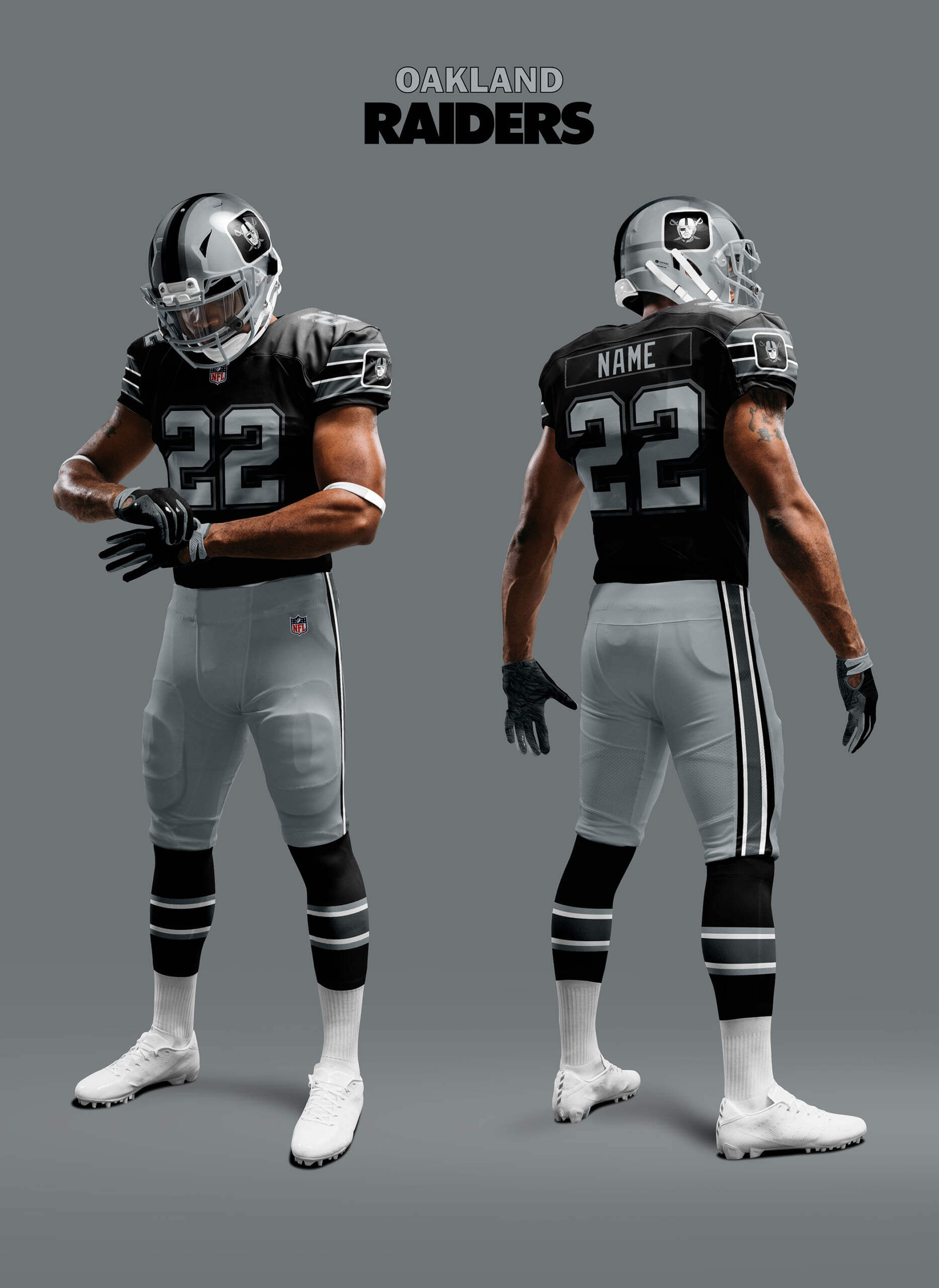
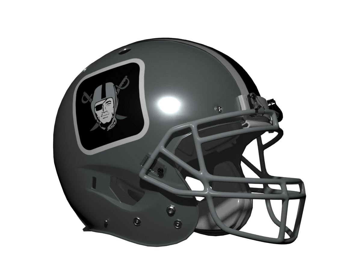
Whoa! Hang on Chris, the Raiders left Oakland in 2020! Well… yeah! But it was too good a opportunity as I could make the logo look like a squared letter ‘O’ with the Raider being the inside. Just wouldn’t work with ‘LV’ instead! I’ve also added a graphite shade of grey as the template needs more than two colours to work properly.
Dallas Cowboys
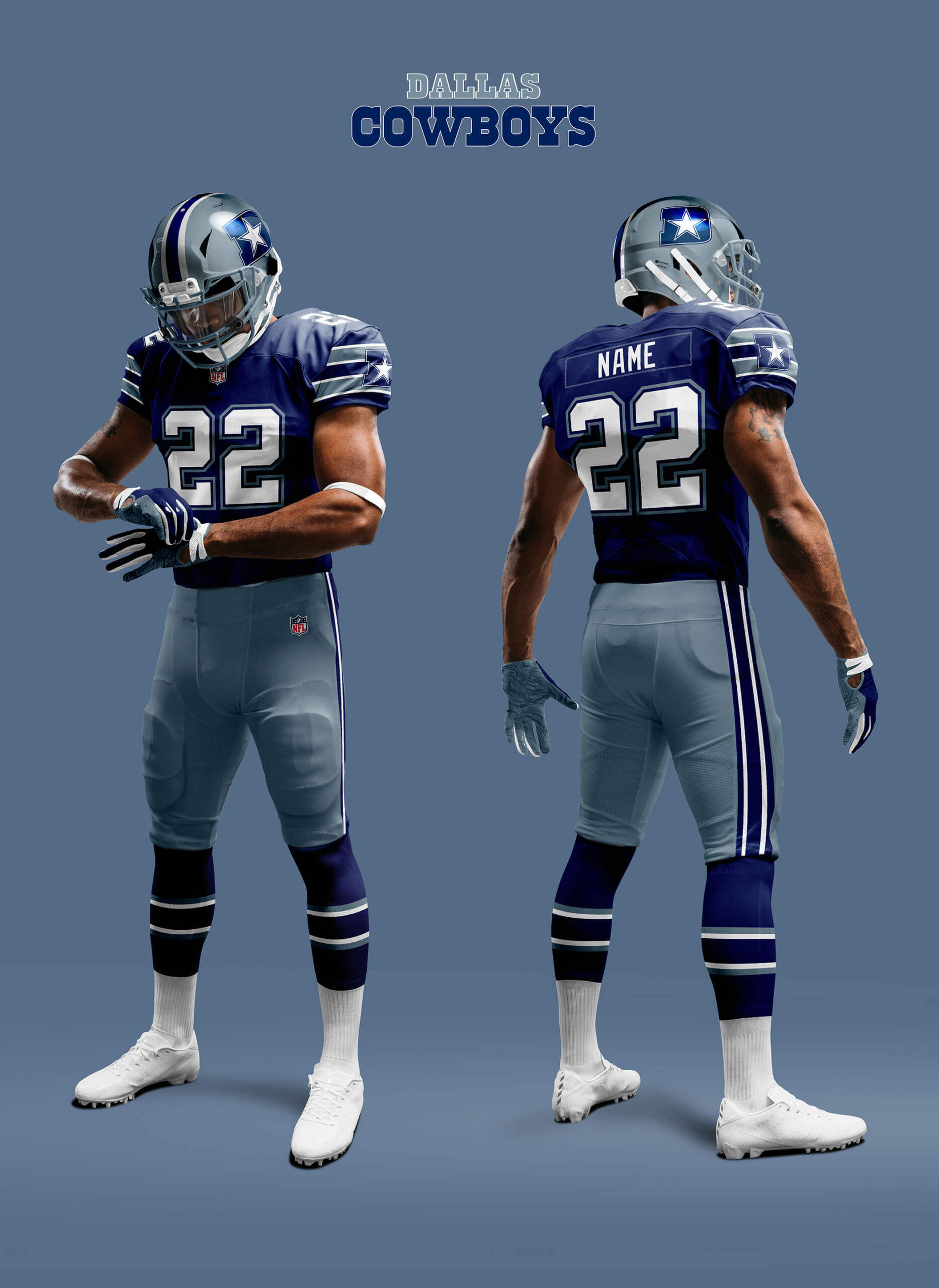
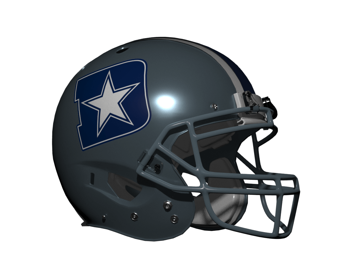
I’ve done my usual trick and gone back to the royal blue and silver blue from the 1970s. The logo is obviously a D with the lone star inside as negative space.
Washington Commanders
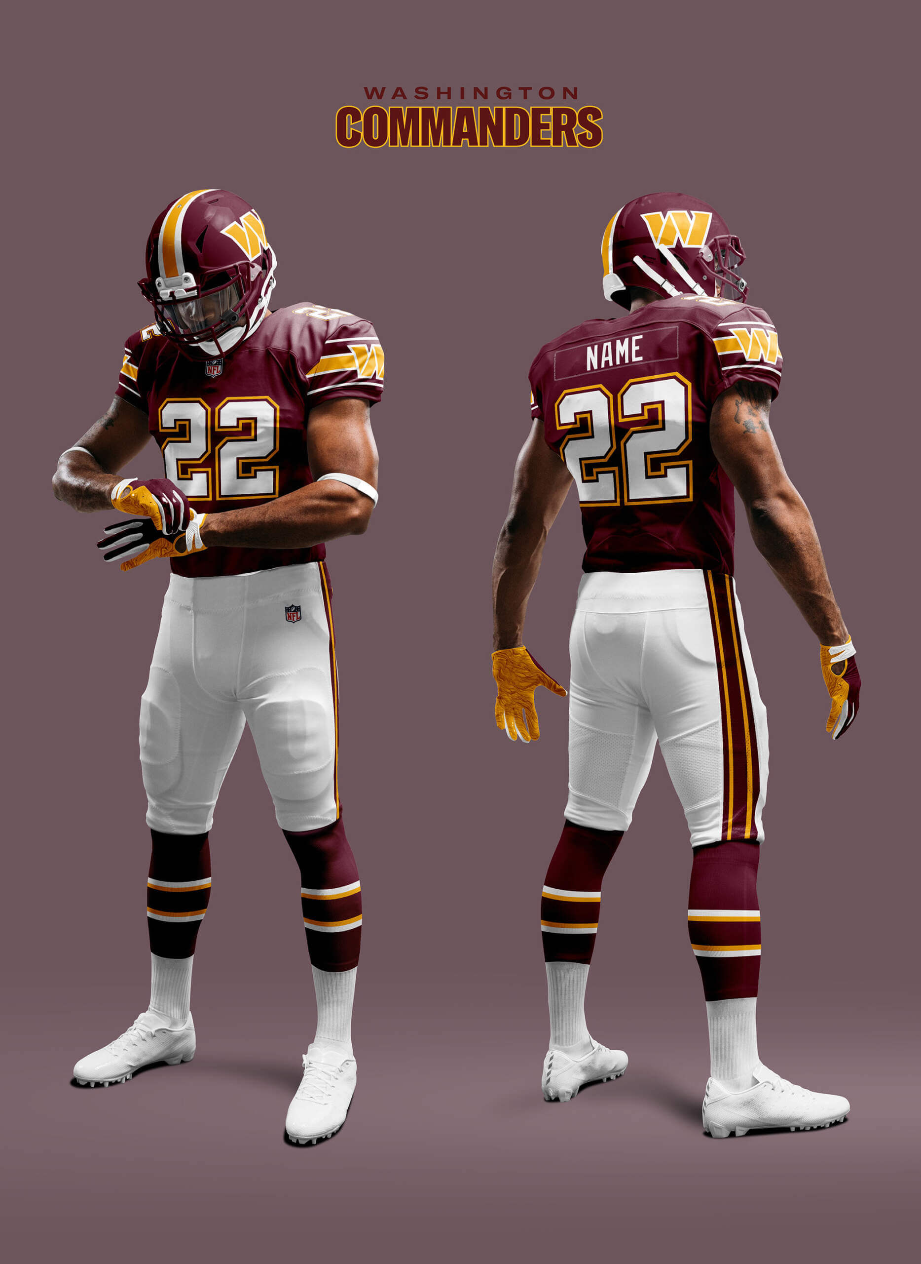
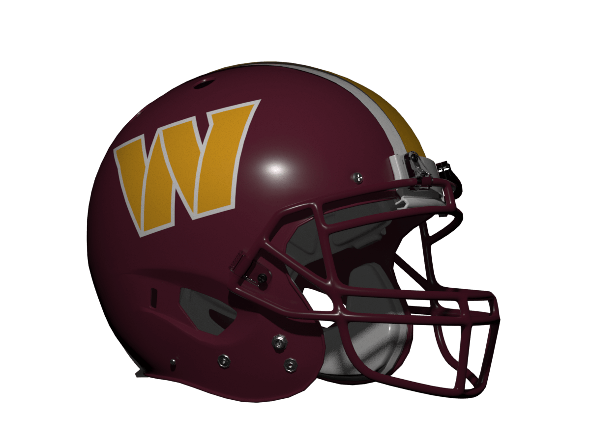
Finally the Commanders. Their logo is already the right kind and size so I just swapped the colours to make it more visible. I really like how this one came out and it’s miles better than their current duds.
That’s it for this series, I really hope you enjoyed it as much as I did creating the designs! There are more What-If? concept series to come and I think the next one will be popular with those of you who like ‘Old-Skool’ Unis 😊
Thanks, Chris! I have to say, this has been one fantastic series! As usual, some of these “out of the box” designs really work well — surprisingly so — and of course, you know I’m a gigantic fan of consistent stripe design, so of course that’s appealing to me on that basis alone. And I’m sure Jimmer Vilk (and probably Walter Helfer among others) will love what you did with my NY Giants.
Readers? What say you?


That Vikings logo is outstanding!
Thanks Matty!
Came here to say the same thing
It pretty hood…If the Vikes wore that logo, would they demand to be brought a shrubbery?
link
: )
I like these, mainly because I like the striping schemes on each uniform element, the pants in particular. The KC “Fire Chiefs” logo is something I’ve been thinking they should consider switching to for years (but lack the skills to graphically mock up), although I’ve always imagined the initials being somewhat smaller and inside a circle, mimicking the actual Kansas City, MO Fire Department logo (link).
Thanks GZ! I considered something like what you suggest, but felt that it made the KC too small to be seen at a distance so failed the ‘good logo’ test.
On a more national level, the shape of this KC logo immediately screams “fire department”,” which is great.
Great concepts as always, Chris. Being a Giants fan in my late 60s, I certainly was in a small minority in thinking that the disco Giants logo was not as awful as most fans believed it was. Logo aside, I would not be heartbroken if this became the Giants uniform, although I’m enough of a realist to know the steeped-in-tradition Giants would never adopt it.
Regarding other designs: I wonder if the Patriots fans who have long despised the “flying Elvis” logo could be somewhat appeased by this design. Also, it’s hard to wrap my head around the Saints logo; the word “NO” is all I can see when I look at that.
Regarding New Orleans, I always thought the town should have a tourism campaign like “Rowdy music, 24/7 cocktails, bodacious food? Just say “N.O.”
C.O.T.D!
Thanks Jeffrey! I am a fan of the current Giants logo, I think it is every bit as iconic as the Yankees and Mets NY logos. But I do feel the disco NY doesn’t get as much love as it deserves. It goes perfectly with the new 70s style uniforms the Giants adopted in 1975. When they replaced it with the GIANTS helmet wordmark in 1976 that looked so out of place with the rest of the uniform. It wasn’t until they changed to new uniforms in 1980 that it looked like a coherent design again.
This exercise by far yields the most plausible and attractive helmet designs. A lot of original thought and design here. Several of them look like they could easily have been designed decades ago (Pats, Saints, Browns, Cowboys) and the Chiefs solve their “problem” elegantly. I can’t abide by the Chiefs having center stripes though.
Thanks Ron! I did put a lot of thought into the new logos to make them feel era appropriate for the rest of the uniform. It always difficult adding (or removing) stripes from a long-lived helmet like KC so I feel your pain!
I really liked the Patriots and Cowboys concepts.
Great job. The only logo that I didn’t care for was New England, since I’m not a fan of using lower case lettering, let alone mixing a lower case with a capital letter. By the way, the KC picture with the entire uniform has white face masks, and the helmet picture has gray.
Thanks RICKAZ! I just checked and the KC helmet has a white face mask – you can see by comparing it with the Raiders underneath. It’s funny because last week Phil thought the Dolphins helmet had a grey mask when it was also white! The helmet are renders of 3D models and I think sometimes white can look a bit grey because of that.
Great series!
Thanks Kevin!
Commanders prototype is definitely an improvement over the current helmet and uniforms. I also dig the Browns look. While they’ll never add an emblem to their helmet; this would be a pretty good look.
Thanks Rob! Cleveland is always tricky in these concept pieces because of that. I think the weirdest one I did was an logo of Paul Brown’s hat!
I found myself wishing to see the white uniforms. And even though consistency was the goal, I don’t need to see the team logo on every sleeve. You are 100% right about the Giants, but with two classic looks, the neon NY always gets the shaft.
Yes, the Machine road uni is just as nice so I agree it would have been good to do those too, but although I’m ‘The Prolific Chris Diamond’, I’m only human ;)
Cool and creative, Chris!
The Commies could use your improvements…and yellow pants!
I’d love for Jersey A to add this an alt.
If your KC away set avoids the red pants, then I’m all for the changes you made.
Save NE and DC, There’s a lot of ‘untouchable’ helmet designs on this go-‘round…they all turned out ok, but not so great that they should replace this currents.
Can’t wait to see what you come up with next!
White or yellow for the Commies was a tough call. I like KC with either red or white pants, but I know this is heresy in some quarters ;)
Great series, Chris! Thanks for all the time and effort you put into this. It certainly paid off for those of us who enjoy seeing your takes on uniform design.
I’m surprised at how well this treatment works for the Vikings, the Cowboys, and the Commanders. Washington, in particular, should just scrap whatever idiocy they’re currently wearing and adopt your concept in total as soon as possible!
Thanks Kary, I appreciate the kind words :)
I cannot be the only one seeing / remembering “Batman” in the negative space of the Montreal Machine logo
I hadn’t seen that until you pointed it out PK!
Montreal WLAF had a decent look and a solid-yet-boring logo…but the name was terrible and continues to remind me of the old food processor branding:
link
That Commanders concept is definitely an upgrade in my eyes. Ultimately, I hope they someday go back to their “old” (I’m thinking 90s era) colors and striping, just without the old nickname or logo. Other than the symbolism, they had a nearly perfect football look.
Sometimes people say that when you watch a really great actor, you don’t really see them acting, you just see the character and the action. I feel the same way about sports uniforms. The really great ones just look natural. It’s the bad ones that always try to jump out at you with ugly color gradients and contrived design gimmicks that end up looking awful a couple years down the road (or immediately, in many cases).
I have no particular fondness for the Cleveland Browns but I would absolutely wear a sweatshirt with that CB lockup on it. Nicely done all around.
Giants should be NJ, they’ve been playing there since 1976!
Washington, the Giants and the Browns should switch to these right now. I love that CB helmet logo!