Good Tuesday morning, Uni Watchers. Phil here, working the weekdays this week while Paul is on vacation.
I’m back once again with the prolific Chris Diamond, who has another “What if?” segment for our reading pleasure. You recall Chris recently produced two similar “What if?” pieces, wherein he explored giving the “Eagles treatment” to the NFL’s bird teams, with his next article giving the “Michigan Panthers treatment” to “cat-themed” team helmets. Those formed Part I and II of a series Chris is calling “Iconic Uniforms Re-Imagined.”
In the latest version of his ongoing think pieces, today Chris sets his sights on a new look: taking the USFL’s Jacksonville Bulls helmet treatment and uniform template and applying it to NFL teams whose helmet logos have hooves. Chris not only gives the NFL helmets the “Jacksonville Bulls treatment,” he has also tweaked the uniforms of his chosen squads using the Bulls uni template (several of which look better than their present iterations).
Here’s Chris. Enjoy (click on all images to enlarge)!
by Chris Diamond
The first two parts of this series looked at NFL ‘Bird’ Teams if they emulated the Eagles and ‘Cat’ Teams if they emulated the USFL Michigan Panthers. For Part 3, I’m taking a look at the ‘Hoof’ teams of the NFL and re-imagining them in uniforms inspired by the USFL’s Jacksonville Bulls. I feel the ’80s and early ’90s were the peak of classic uniform design, before the Nike era began in 1997 with the Broncos re-design that re-wrote so many rules (and not in a good way) followed by the Seahawks in 2002. The Jacksonville Bulls were born in 1984 and played two seasons before the league went on indefinite hiatus in 1986. I’ve always loved their speeding Bull logo and unusual colour combination of Maroon, Burnt Orange, Silver, Black and White. So what might the NFL ‘Hoof’ teams look like in uniforms inspired by this look? Let’s see!
Jacksonville Bulls
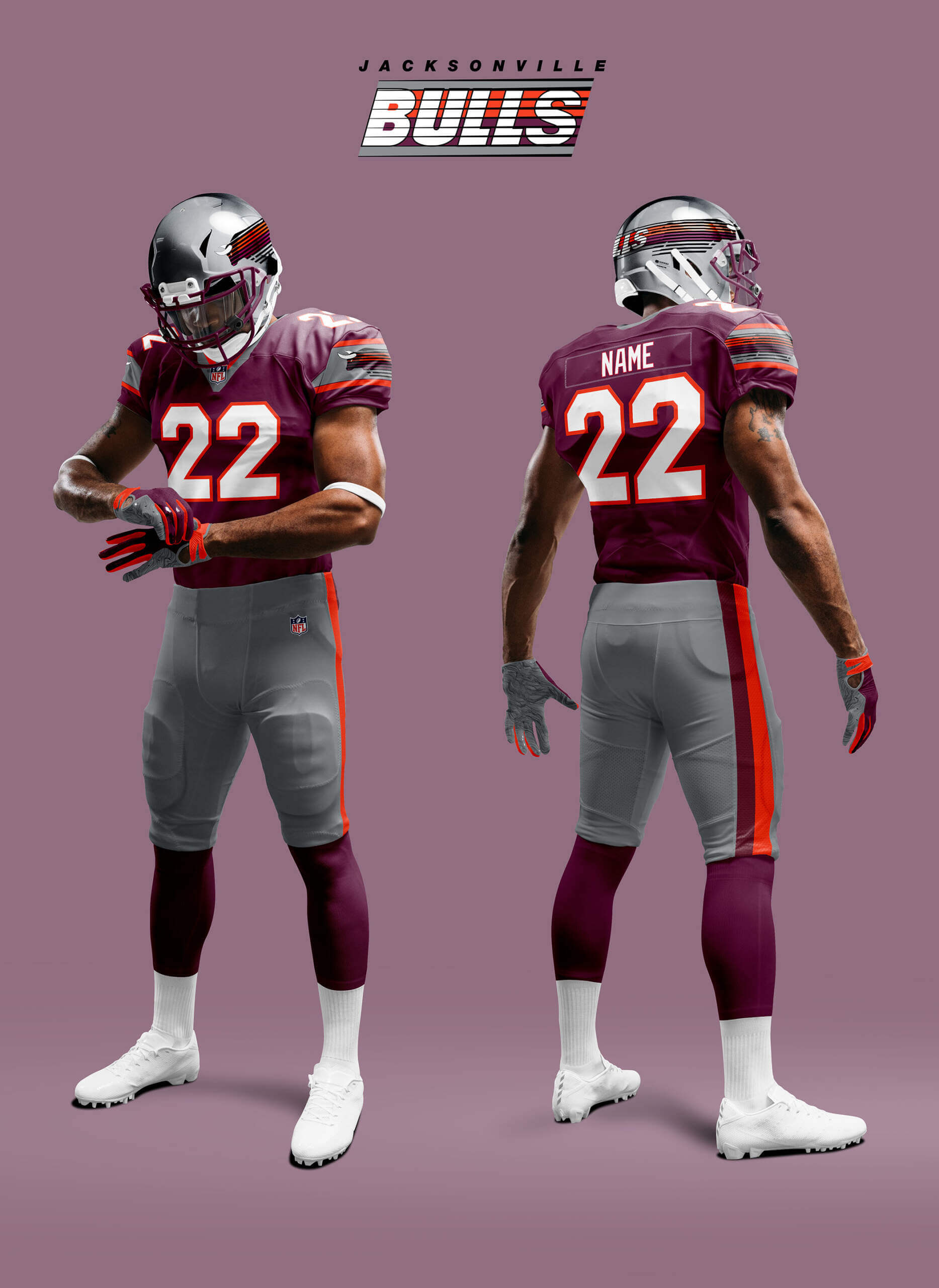
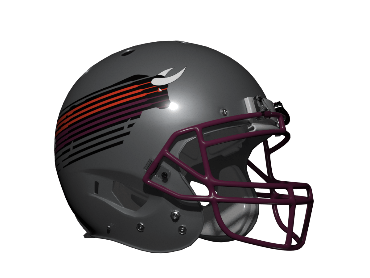
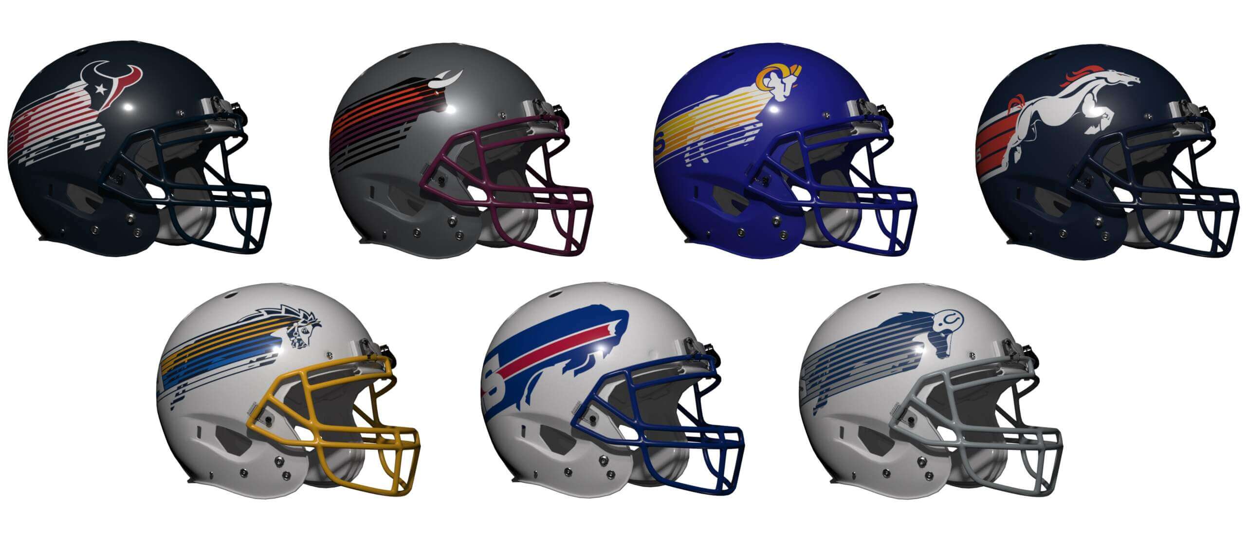
Like with the Panthers previously I’ve included the original for reference. I know some of you don’t like helmet logos repeating on jersey sleeves (it isn’t laziness, it’s consistent design) so look away now!
Buffalo Bills
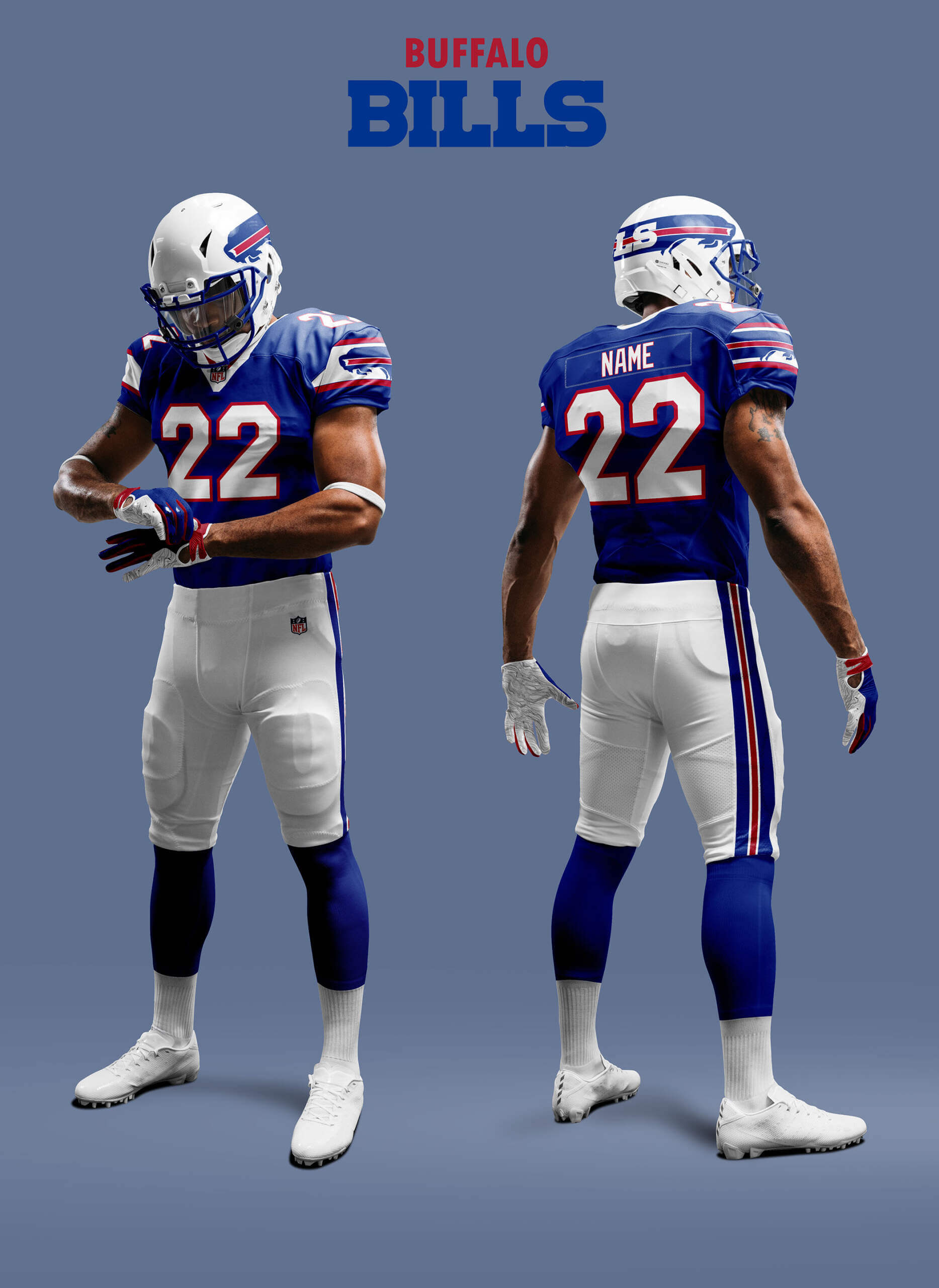
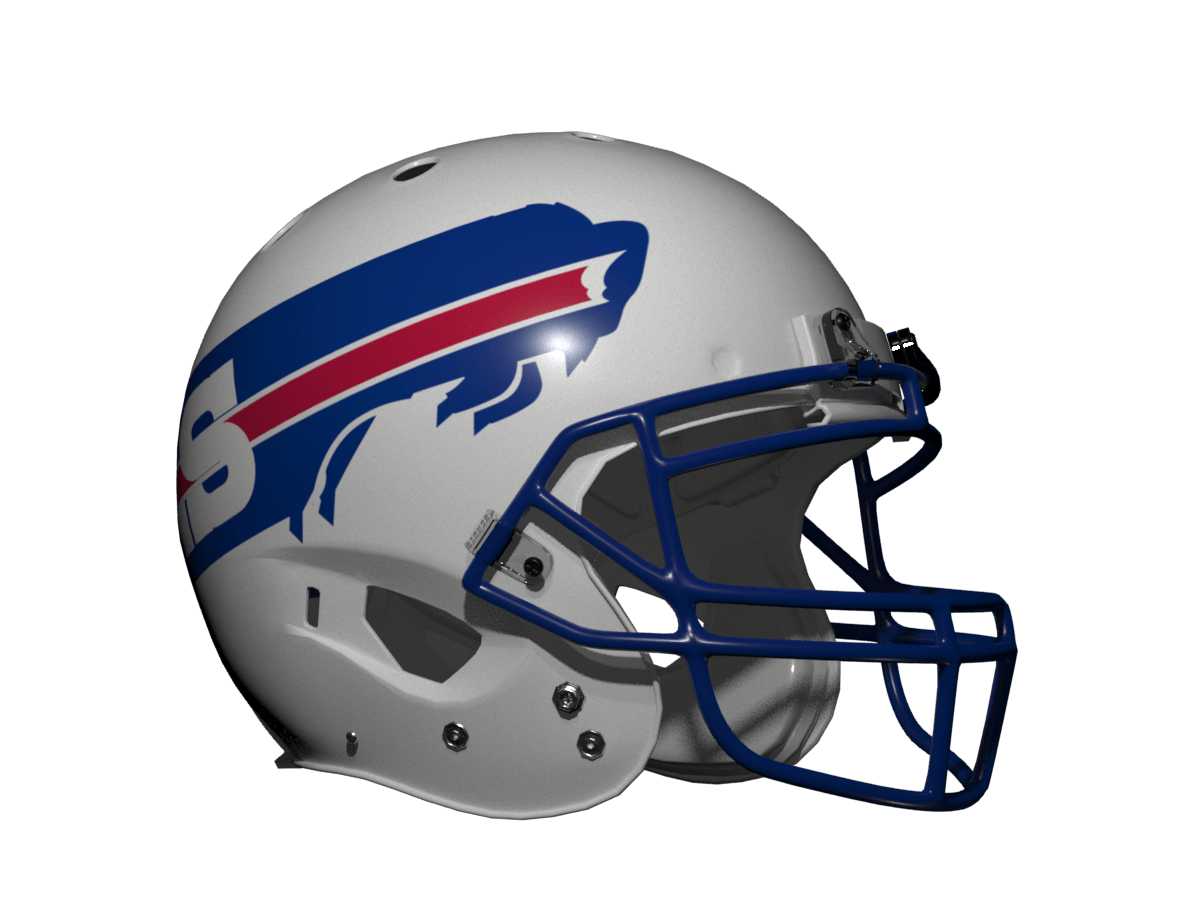
The Bills’ current logo already has a speed swoosh feel, so rather than bring in the Bulls’ style I’ve just extended the logo to make it wrap around the helmet. It still feels like a Bills uniform so a thumbs up from me.
Denver Broncos
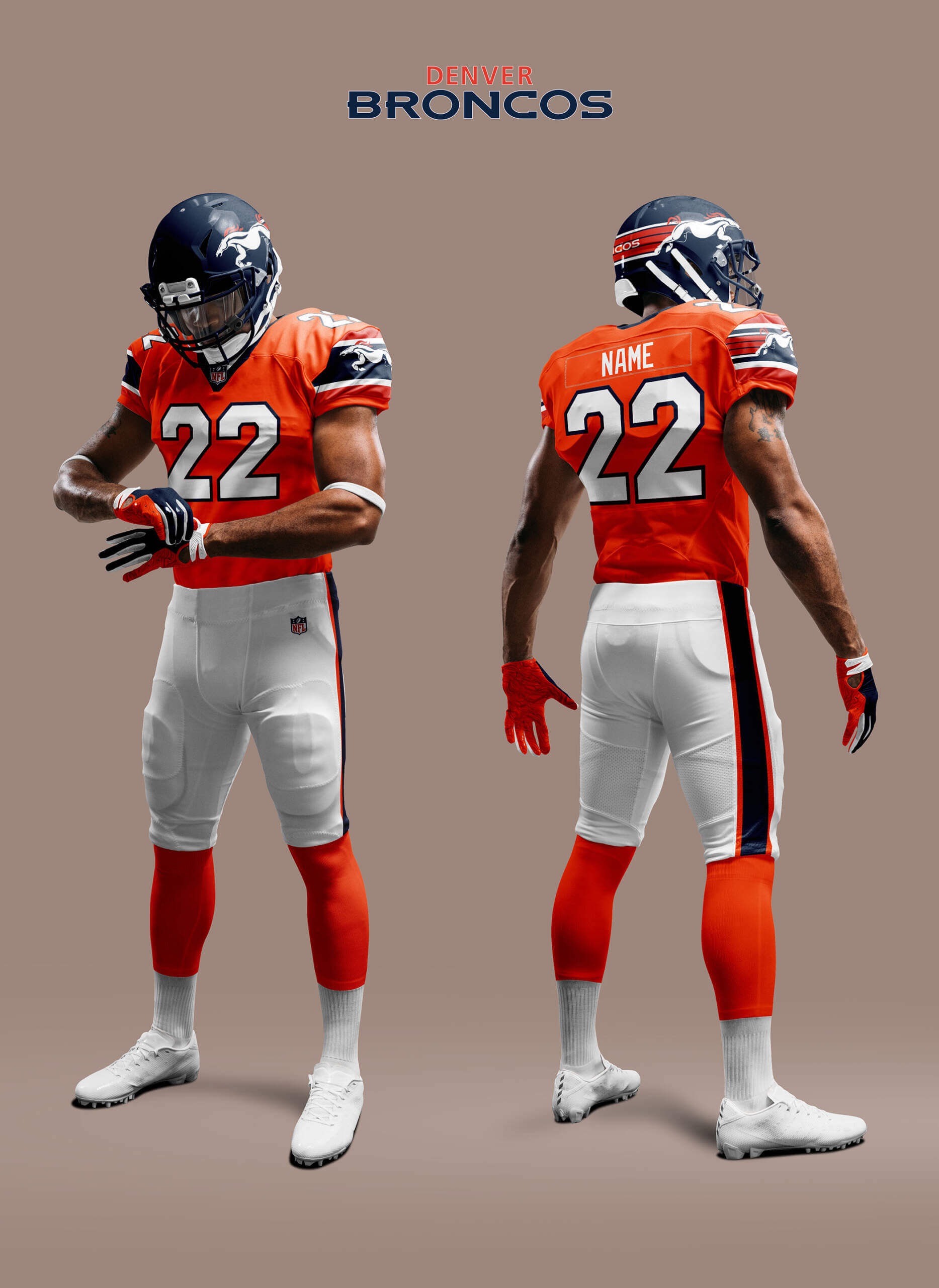
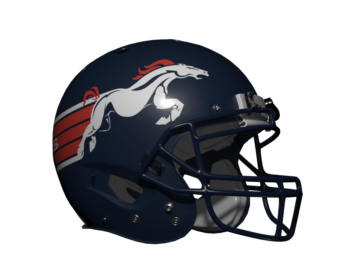
The Broncos horsehead logo has a less well known alternate version showing a full size horse. It’s a bit odd (I’ve seen it called the “Eek a mouse!!” logo) but I’ve used it as a basis for a more dynamic charging horse here. Rather than go full speed lines I’ve kept the horse body separate and just added speed lines as it’s not a true outline like the Bulls. I think it looks pretty smart and it reminds me of their 1965-66 uniforms.
Houston Texans
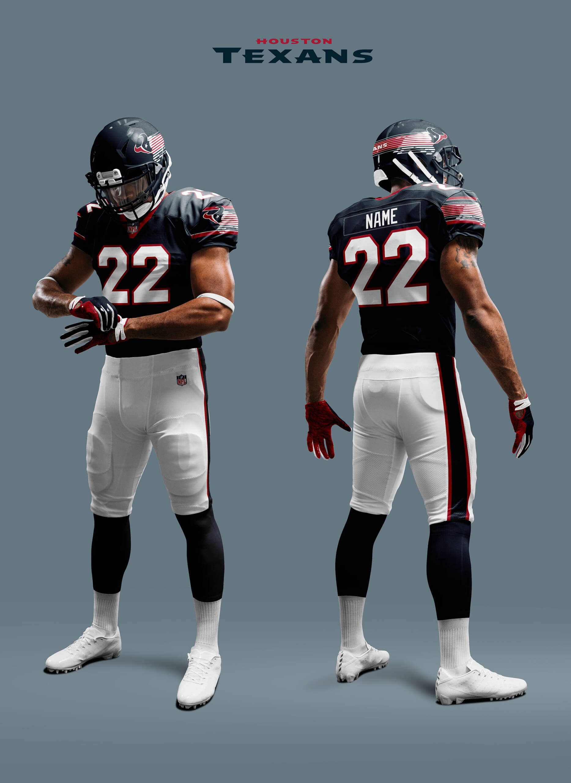
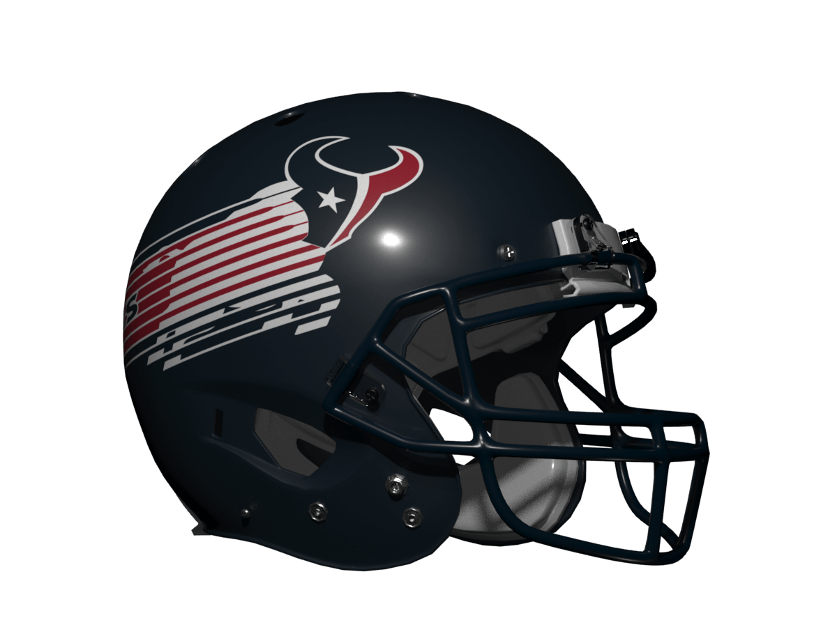
I’ve gone full speed lines with this one, but because of the dark helmet I couldn’t map the template colour patterns exactly. Because of the red/white/blue colour combo it feels like some kind of political campaign logo to me rather than a football logo!
Indianapolis Colts
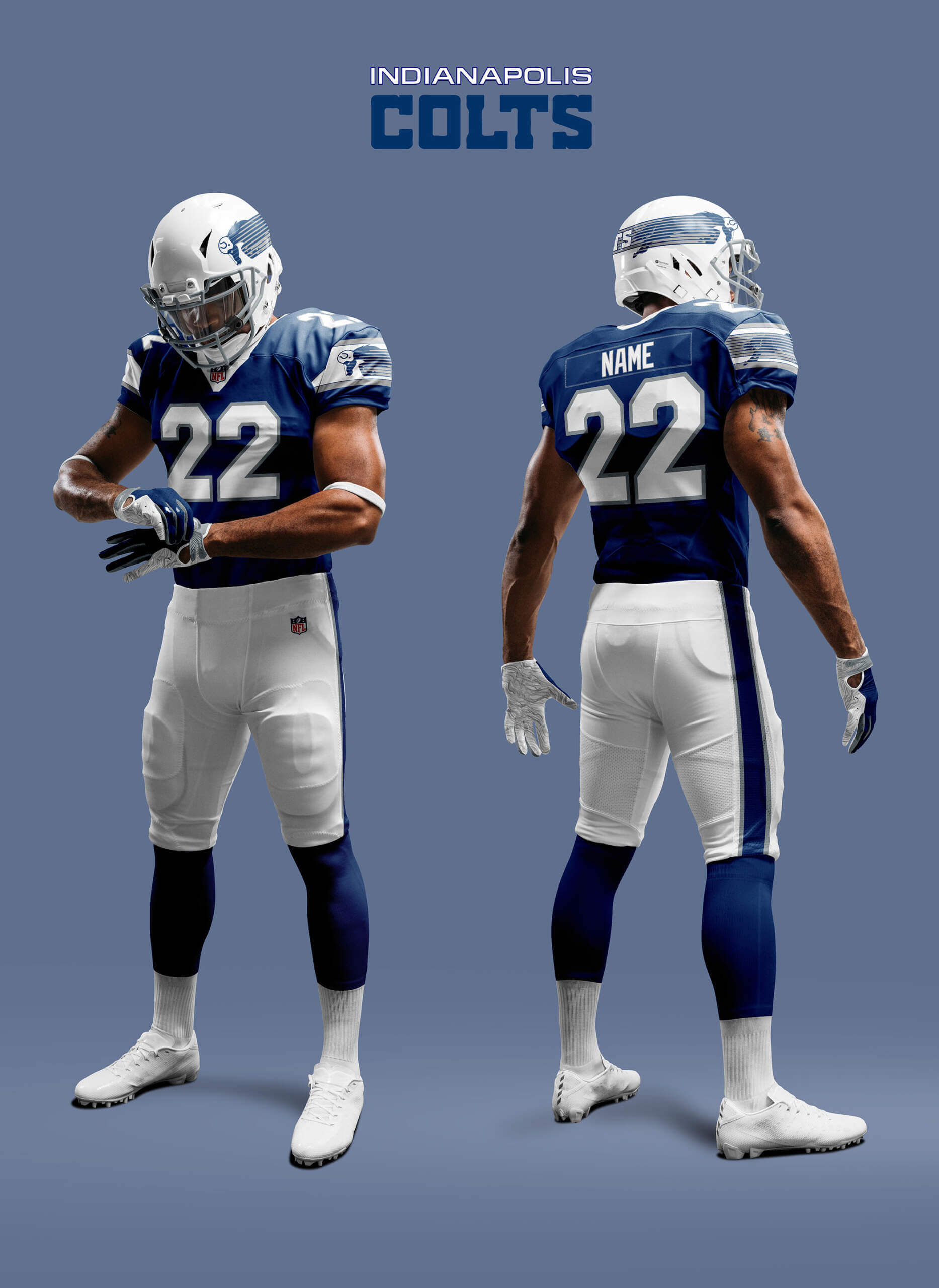
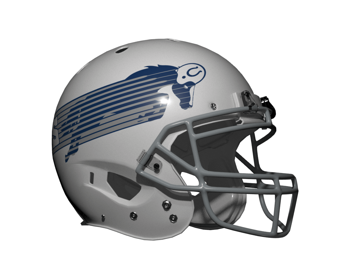
I needed to add in silver for the Colts to get the template to work at all, and even then it feels a bit sparse. I used the old bucking Colt logo as inspiration for the horse. I like the uni but it is so unlike anything the Colts have worn it seems more like something the CFL Baltimore Colts might have come up with!
Los Angeles Chargers
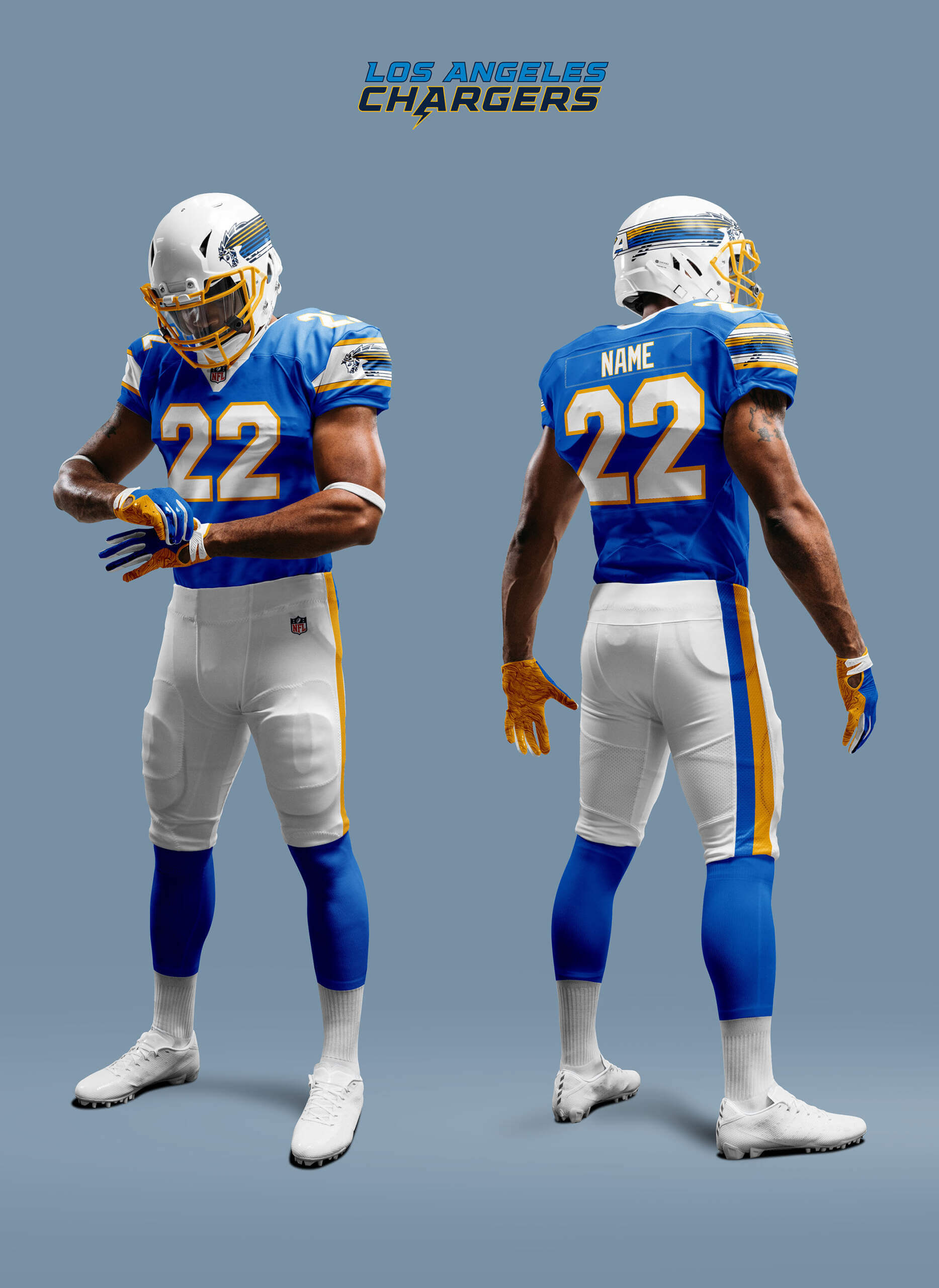
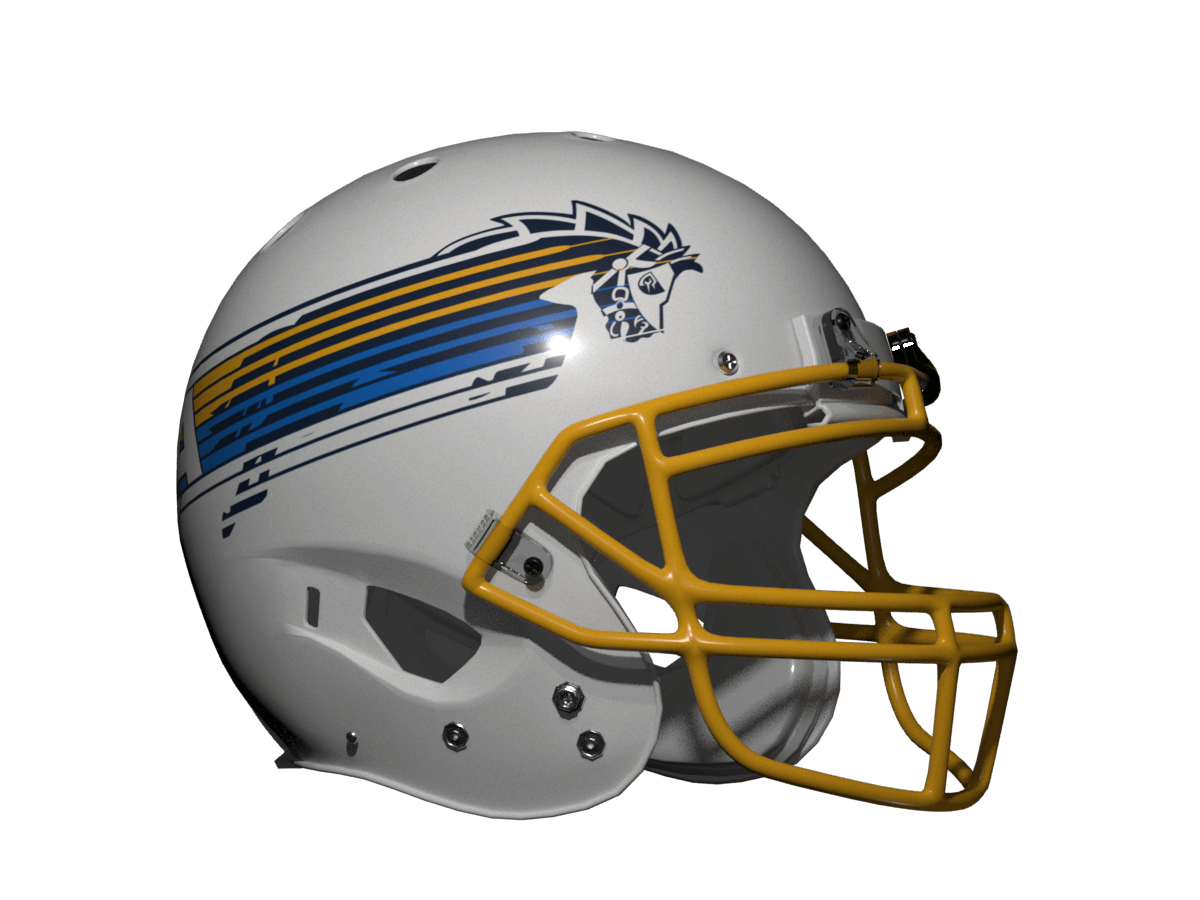
Mixed metaphors aside, the Chargers do have a secondary horse logo, one version of which I have used as inspiration. I’ve also brought navy back in as a colour to make it fit the template better. Because the Chargers colours are unique it still has a feel of them, but their bolts uniform is iconic in its own right so anything else is always going to fall short.
Los Angeles Rams
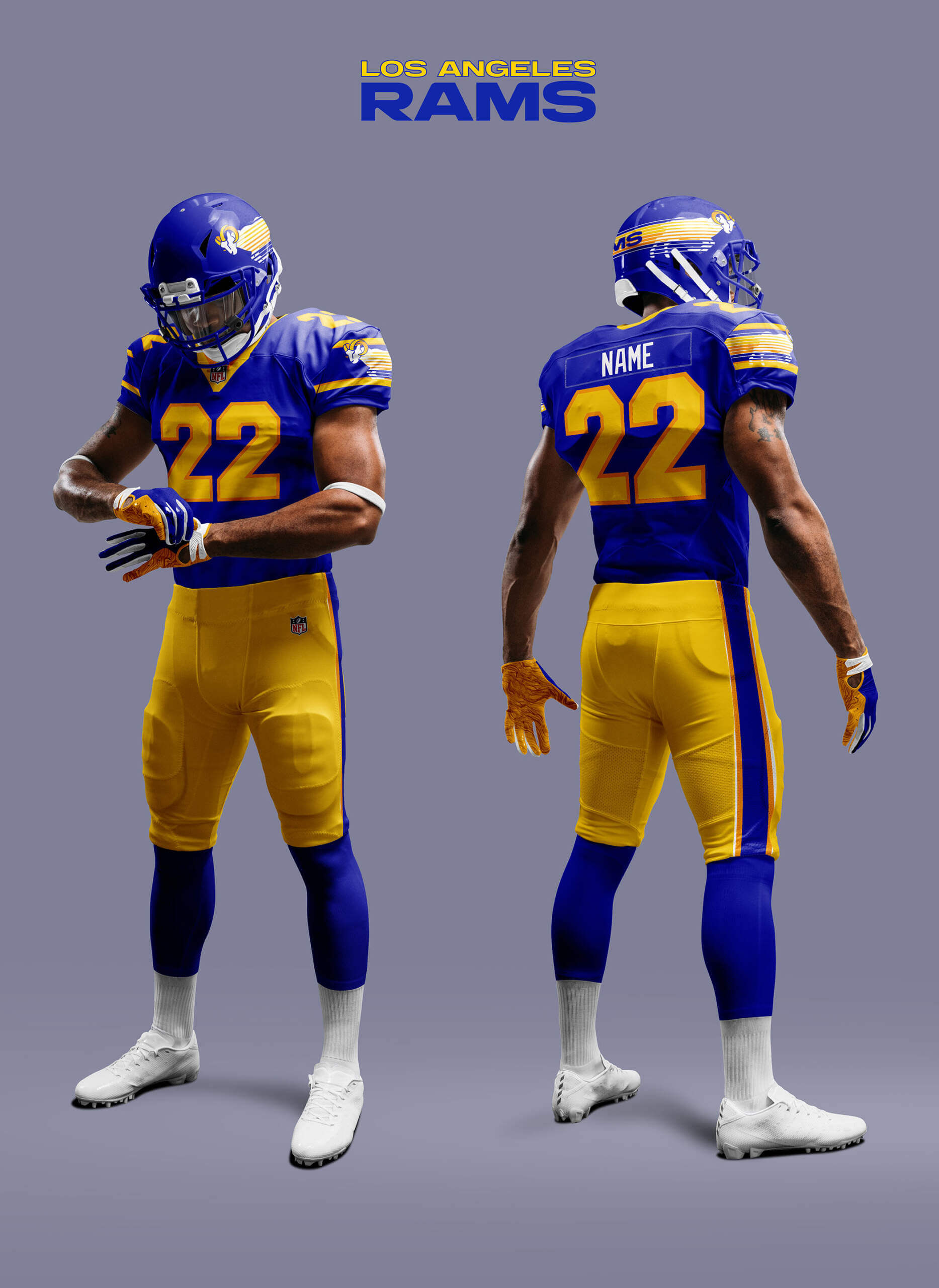
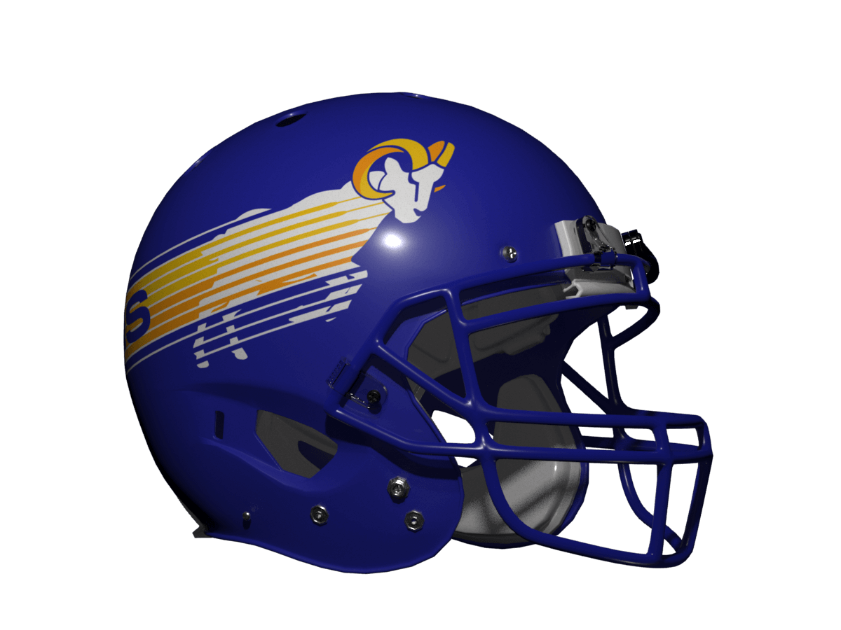
This was just a case of giving the alternate logo a body and speed lines. I really like this one, but like with the Chargers, the Rams horns uni is also iconic so this one suffers in comparison.
So what’s in store for the other NFL teams? More iconic uniforms re-imagined soon!
Thanks, Chris! Yet another very fun “What if?” segment — and it’s definitely interesting to see how non-Bulls hoof teams look when given the Jacksonville treatment. Interestingly, two of these teams (Texans and Broncos) will have new uniforms being unveiled soon. I’m sure neither will look as good your “Bulls” inspired treatments!
Readers? What say you?


That Bulls helmet is amazing. Can’t believe I’ve never seen it here – or anywhere!
Glad you like it too Charlie! The whole USFL was filled with brilliant designs and will continue to serve as inspiration for this series :)
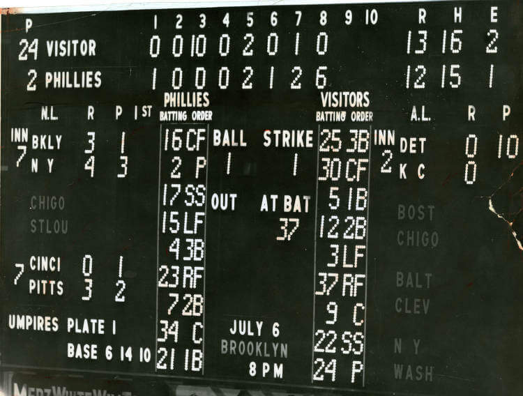
The photo is June 28, 1956 – exhibition between the Phillies and Washington Senators. Benefit for the Junior Baseball Federation. 13-12 final.
So fun, as always!
Thanks Kevin!
Enjoyed this batch of Chris Diamond’s work very much but wondered if he could make a rear helmet view available of each as it appeared he spelled out each team’s name in their respective fonts around the back of the helmet but we really don’t get to see that.
Thanks Paul! I may put in some rear-view-redux stuff if others are interested in seeing that too.
GTGFTU is Sunday, March 4, 1984 New Jersey Generals 28 vs Jacksonville Bulls 26 at Gator Bowl, Jacksonville, FL. You can tell from the Bulls socks as in 85 they wore plain maroon tops. And nice one Phil to include a Bulls game this week :)
Ha! I was AT that game! My dad and I sat in the last row before the West Upper Deck (still standing)
Great work Chris! I never paid any attention to the Bulls unis before, but now I really appreciate what they did.
Longtime Bulls fan here.
Loved that helmet so much I just made a Bulls DIY hoodie.
link
Other than the Chargers (I never saw that logo before… I prefer the AFL-era horse logo), I absolutely love these designs.
The Broncos should drop all their redesign plans and adopt this look.
Thanks Jimmer! Awesome hoodie – I’ve made a replica Bulls game jersey (I think this is in a piece I did ages ago on UW?). I’d never seen that Charger logo before either but I picked it up while doing alt logo “due diligence” for this article :)
That Bulls uniform was/is awesome. I like the versions you did for the different teams, very creative. Both the Colts and Rams should use this as alternative helmets.
Thanks Ingmar! Yes I think if the Rams wanted an alternate to their horns something like this would look great.
Colts need to bring back the gray pants for this. But only at home.
Great work again, Chris! I’ve always thought about the BILLS/BULLS similarity and thought it was a natural for that charging Bill with the built-in red stripe. And if they did it in reality, there would be a slight chance that some disgruntled Bulls ex-equipment manager who now works for the Bills* would sneak a “U” on the back of one player’s helmet, much to the delight of Uni-Watch readers.
*WARNING – Writer’s Embellishment
Thanks Christopher! Funnily enough it was the Bills who made me choose the Bulls for this part! I had done a slightly different Bills design for an earlier version of this whole concept which was “What If No Teams Had a Simple Side Logo Helmet?” I was struck by how it looked like the Bulls logo and the concept evolved in to what it is now.
Until the dark blue Seahawks helmet came along, the Jacksonville Bulls helmet was unique. The USFL could school everybody on how to design a football uniform.
Loving all of these thought experiment concepts but this one is really good. While I prefer the horns and the lightning bolts, the Rams and Chargers were my favorites.
Thanks MJ!
The Buffalo Bills need to change their helmet logo to that one, like right now. Today.
Buffalo seemed like the simplest addition, but keeping the regular buffalo logo intact, and then adding the wordmark in the back (fits so perfectly), it’s a HUGE upgrade,
The Bronco’s horse/helmet makes the horse look like it’s pregnant.
Awesome designs… love the Broncos, very different… these helmets remind me of the Jaguars original helmet, still wish they would go back to it…link
Thanks! I agree the original Jags design was awesome – I think it was one of the last gasps of that style of uniform and it’s a shame it didn’t happen.
I’ve loved this series so far, and think this concept of the Bulls helmet is great, but the execution of these feels a bit off…
I this its because the Bulls helmet flashes start from the shoulder, so the energy is all converted into the logo.
The Bills does this successfully, but the Broncos flashes from the hind legs are too far back, while the Rams, Texans heads are popping up awkwardly rather than being part of the overall feel.
Might be that a bull with a lower head lends itself more to this full frontal charge, but would love to see some of the others more at the shoulder.
Thanks Andy, that’s an interesting point about the logo style. The original Bulls logo is a simple silhouette so to get the exact same look you need to just use that. But for some of the teams, their logo isn’t a silhouette so you either have to discard that or adapt the the design. I chose the latter because I felt otherwise it would have looked too different.
Yes – not sure how you’d get a logo like the Texans more into the silhouette shape.
But that’s what this series is about – showing that some teams lend themselves to the style better than others.
The one I would like to see tweaked is the Rams… Head down charging with the speed lines straight back from shoulders. Love the Rams helmet, but they’ve never been able to nail a proper logo, and this idea could be it!
Very cool! Wouldn’t mind seeing a version of the bucking colt helmet with the colt wearing your new bucking colt helmet to create an infinite regression. Can’t wait for your next installment!
Thanks James! Haha, yes that would be a clever idea :)
Would the Detroit Lions have been a candidate for this also? And speaking of Lions, didn’t the BC Lions of the CFL also have a similar helmet? Wade Heidt, I’m looking at you. This was a fun exercise but that Denver logo looks like a carousel horse.
Great effort, Chris!
The Broncos would be wise to adopt your full horse logo.
I’d love to see how well(?) the Baltimore CFLers would look with the Bulls template.
The Bulls helmet was so iconic. Wish they had resurrected it when Jacksonville was awarded an NFL franchise. Oh well.