A good Saturday morning, Uni Watch readers — I hope everyone has had a good week. Don’t forget to Spring Forward tonight!
I’m back once again with the prolific Chris Diamond, who has another “What if?” segment for our reading pleasure. You recall Chris recently produced a similar “What if?” piece, wherein he explored giving the “Eagles treatment” to the NFL’s bird teams. Unbeknownst to either of us at the time, that was “Part One” of what will be a short series wherein he’ll explore similar concepts for other NFL teams — with the series now known as “Iconic Uniforms Re-Imagined.”
In the latest version of his ongoing think pieces, today Chris will be tackling another helmet design anomaly — there are several NFL squads who are named for cats (and one of the ursine family), yet their helmet designs vary from team to team. But what if they all followed the pattern used by the Michigan Panthers? You’ll also note that Chris has also tweaked the uniforms of his chosen squads using the Michigan uni template (several of which look better than their present iterations)!
Here’s Chris. Enjoy (click on all images to enlarge)!
Iconic Uniforms Re-Imagined Part 2: What If All ‘Cat’ Teams Were Like the Michigan Panthers?
by Chris Diamond
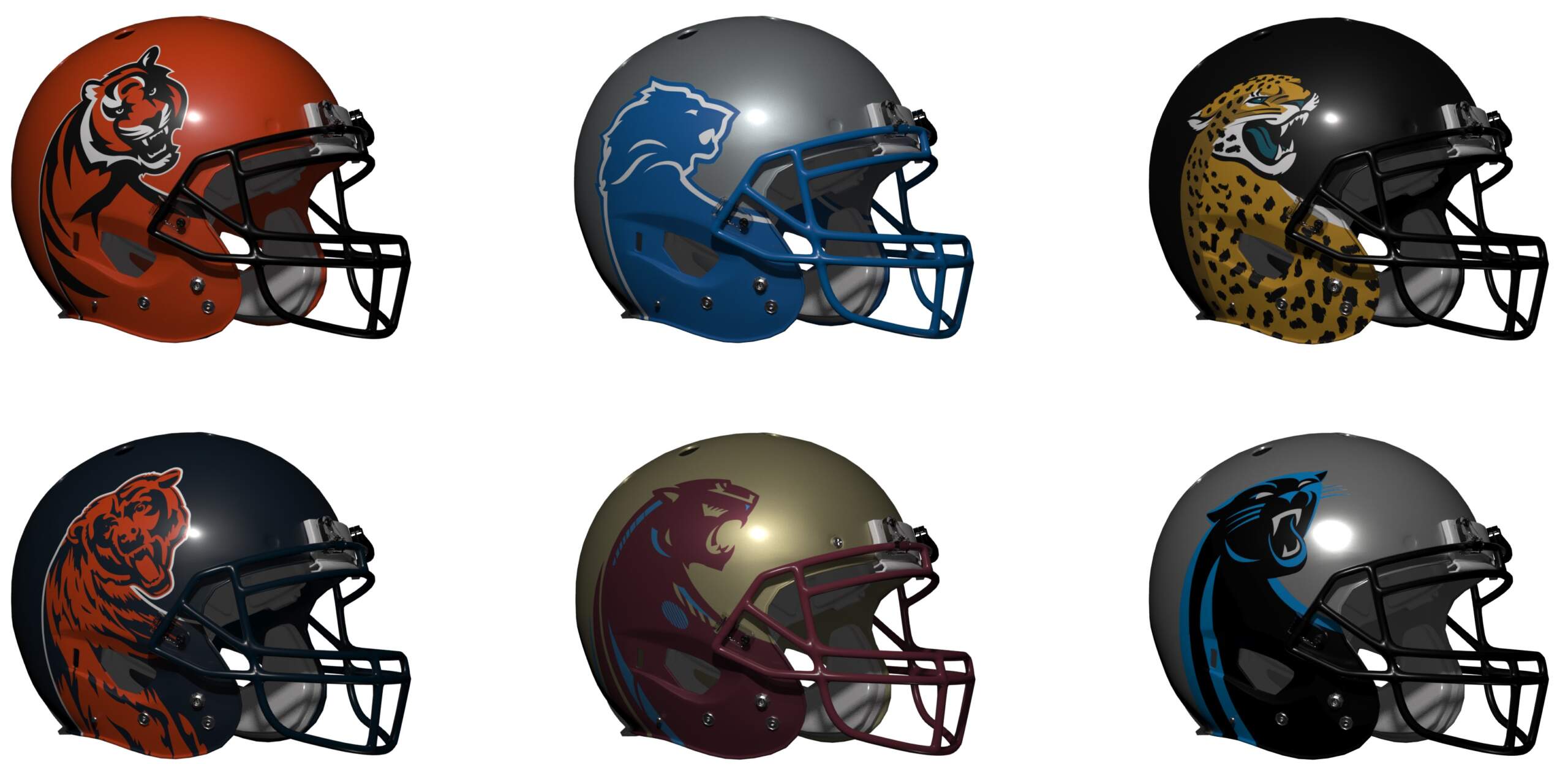
In Part 1 of this series I considered “What If All ‘Bird’ Teams Were Like the [Philadelphia] Eagles?“. I re-imagined how the NFL’s ‘bird’ teams (Cardinals, Falcons, Ravens, Seahawks) and near-misses (Titans, Jets) would look like in uniforms similar to the Eagles, most notably their iconic winged helmet. But the NFL’s other teams don’t fit into the winged helmet category very well, so what other iconic design might we look at? Well I consider the original Michigan Panthers of the USFL to have a unique iconic uniform – the helmet in particular was stunning, showing a panther from above with its head turned to the right. So what might the NFL’s ‘cat’ teams look like using the Panther’s uni as inspiration? Let’s see…
Michigan Panthers
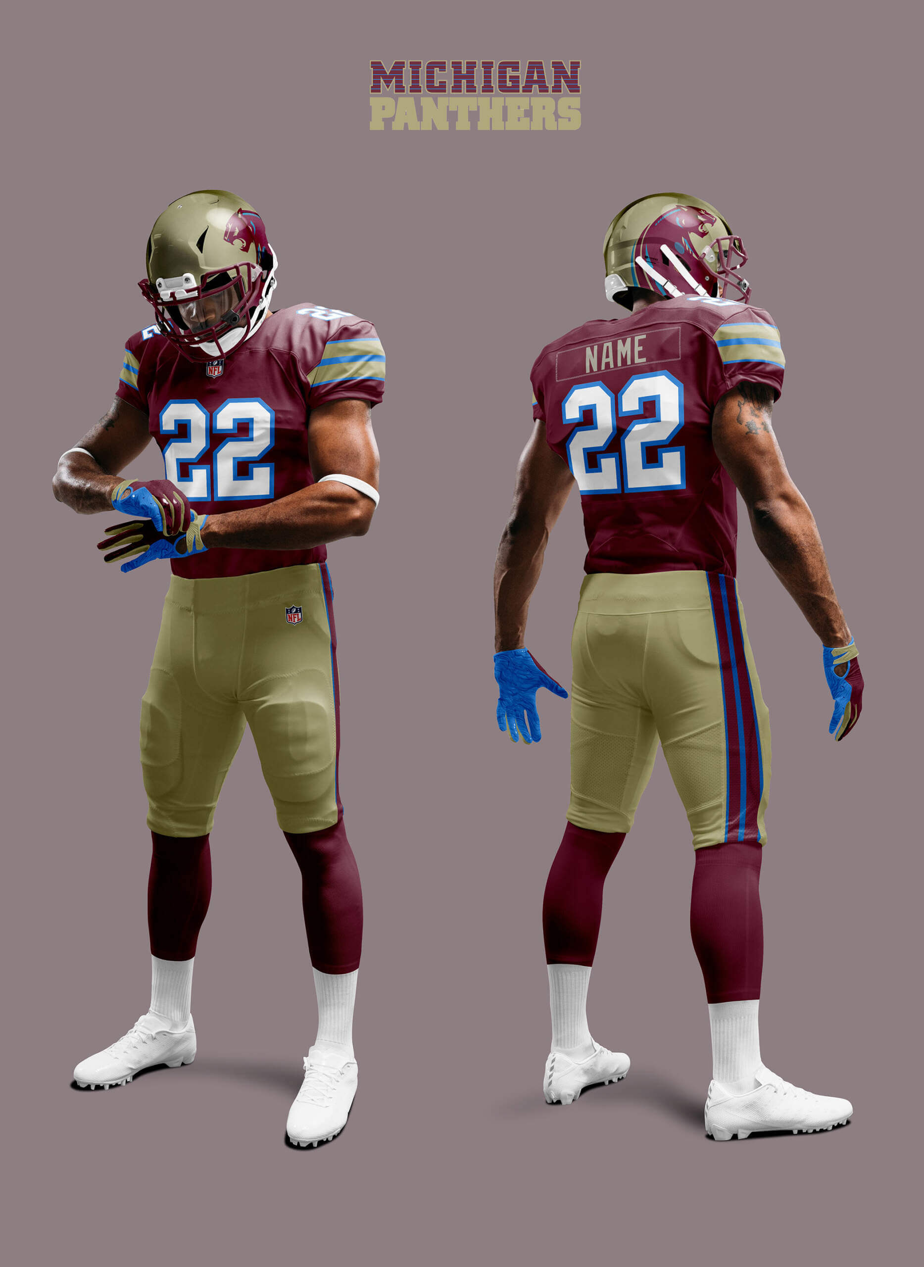
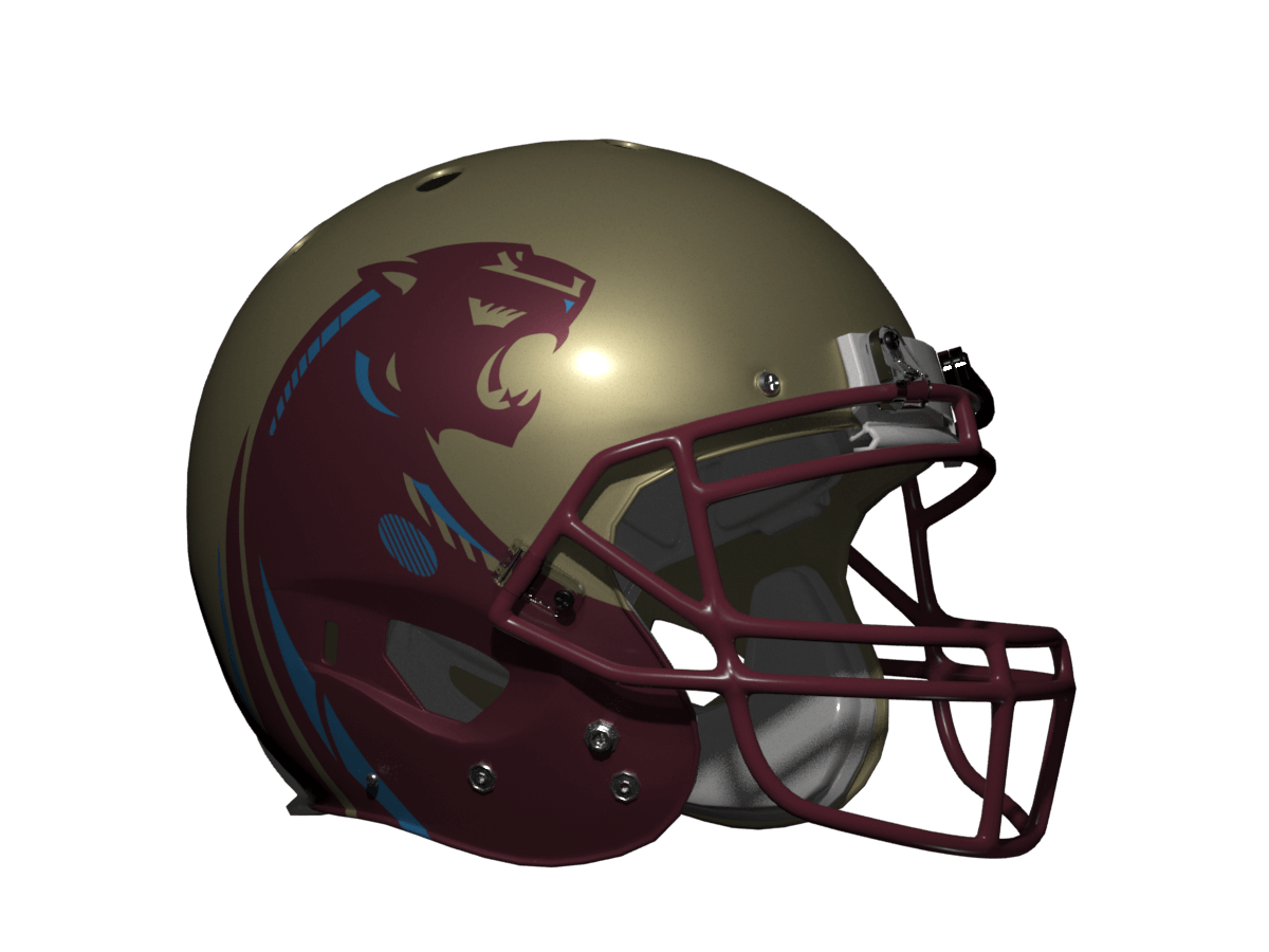
Just for reference I’ve done the Panthers themselves. The USFL was formed at the peak of ‘old-school’ uniform design and had many great unis, but I think the Panthers are probably the best!
Carolina Panthers
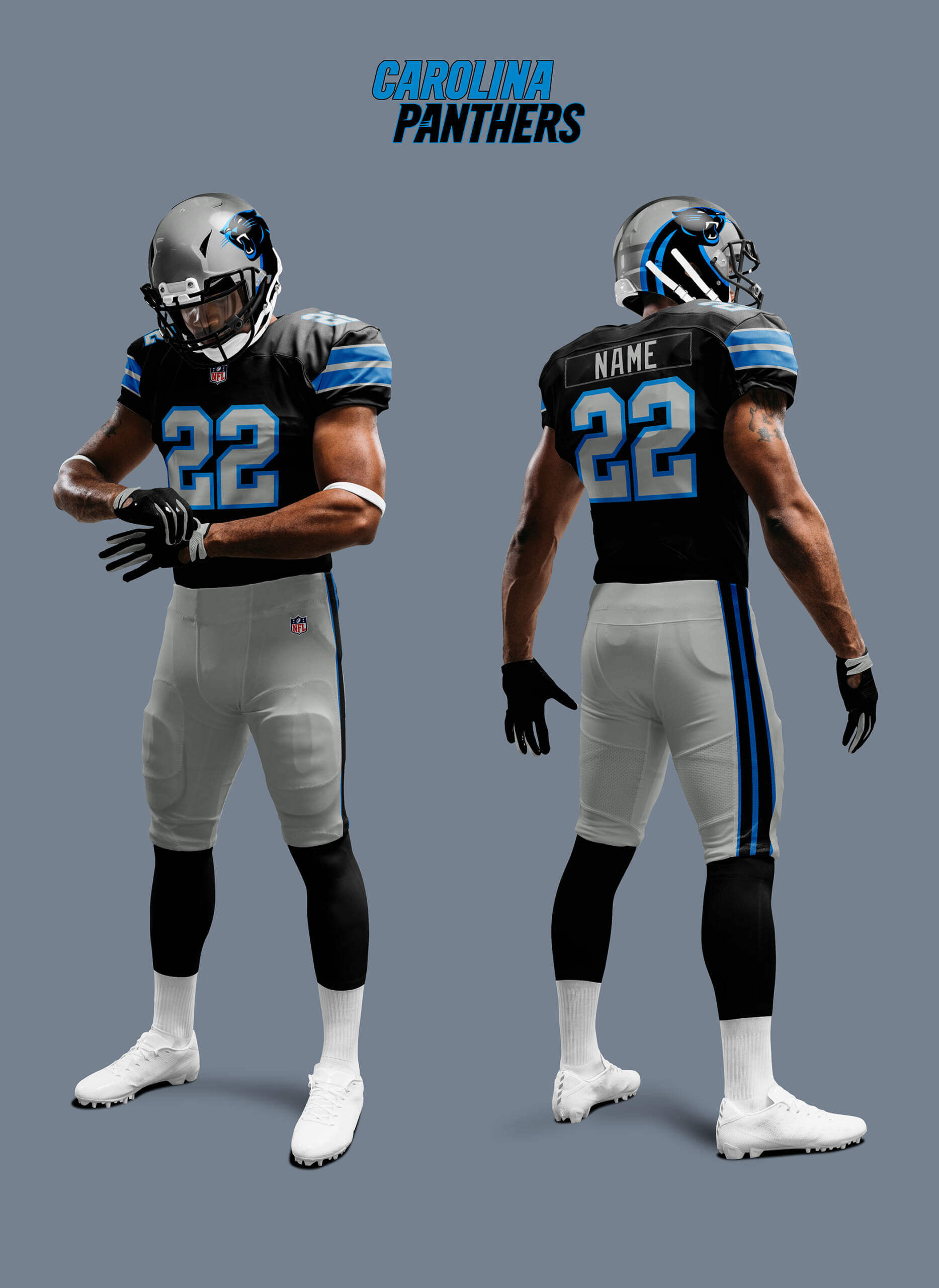
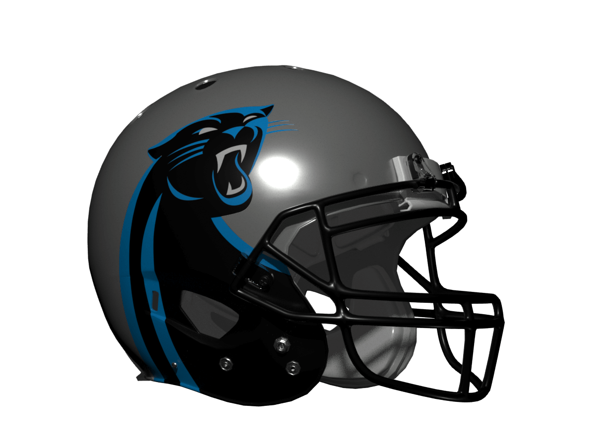
As the USFL Panthers NFL namesakes, they of course have the closest identity so are already a good fit. Their colour scheme is also a close match (metallic helmet and pants, dark colour jersey) so it’s not surprising they also look amazing in this template!
Detroit Lions
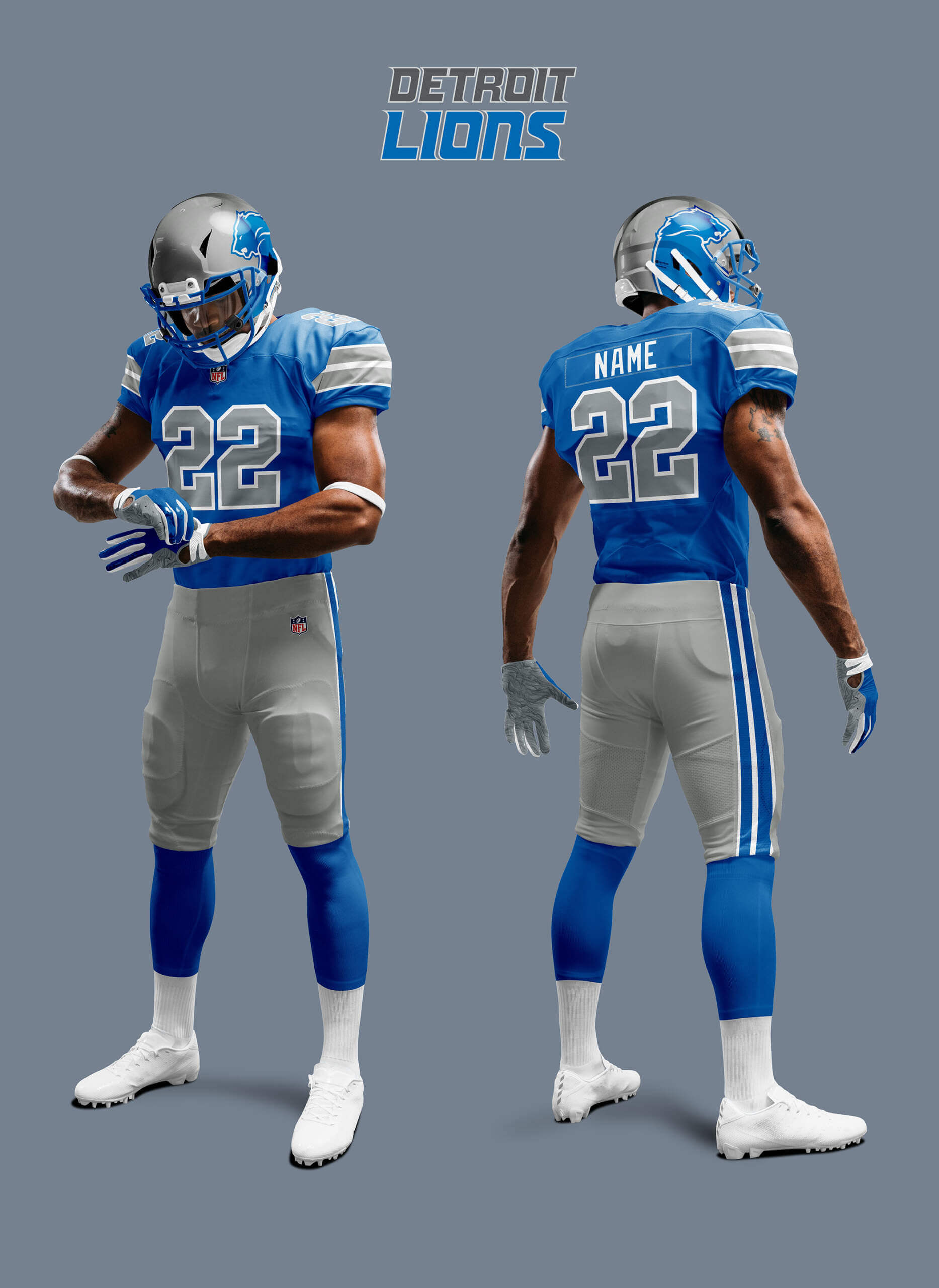
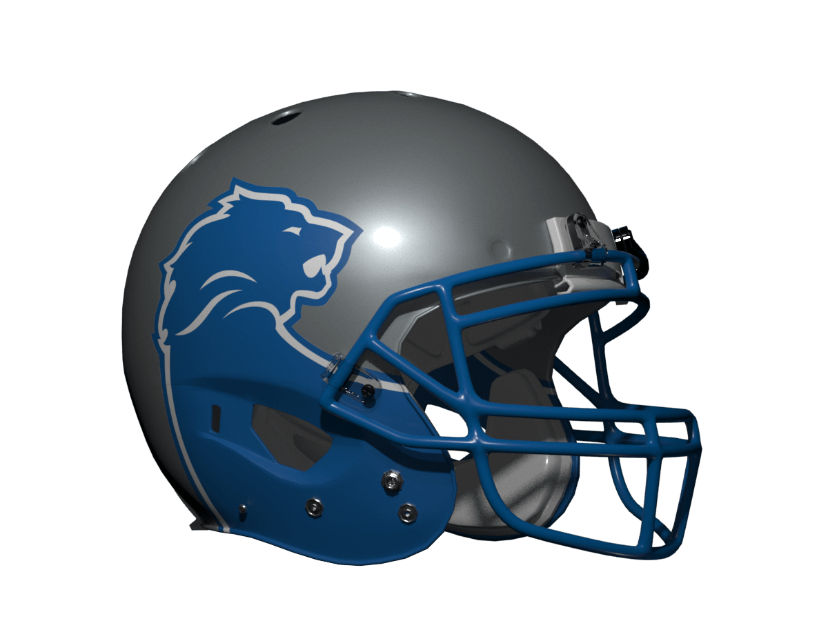
Another good fit colour scheme wise, I like the Lions in the template too, but it doesn’t quite pop as much as Carolina. Part of this is because the Lions logo is fairly 2D so the whole effect is a bit flat.
Jacksonville Jaguars
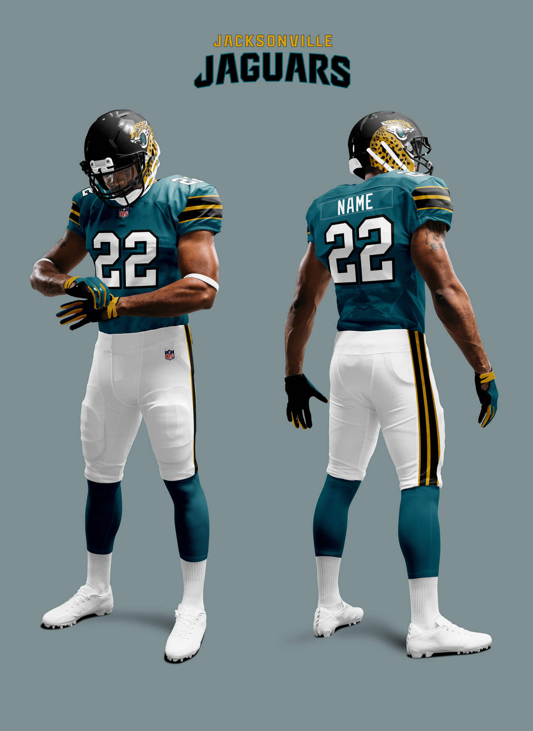
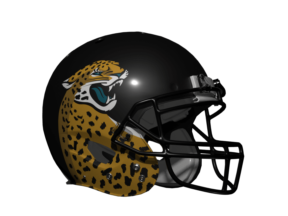
Now if such a thing were possible, I think this looks even better than the original USFL Panthers! The teal, black and gold seem to be just in the right proportions – I love it!
Cincinnati Bengals
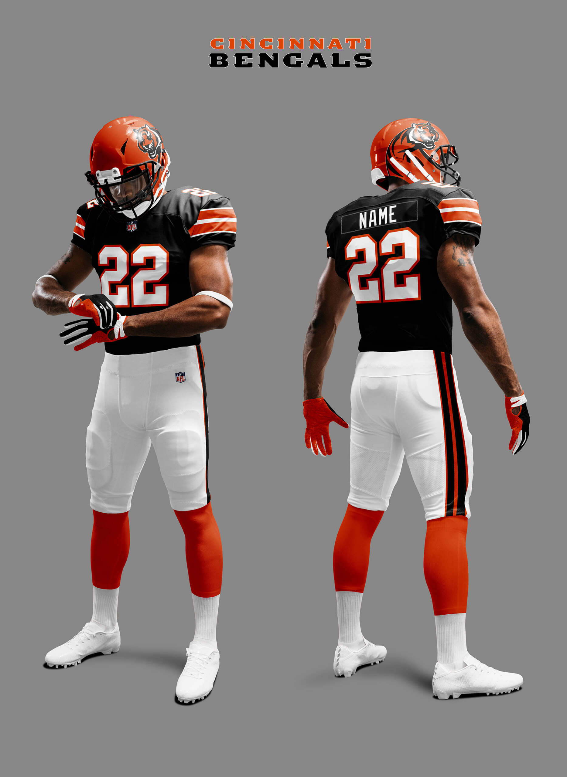
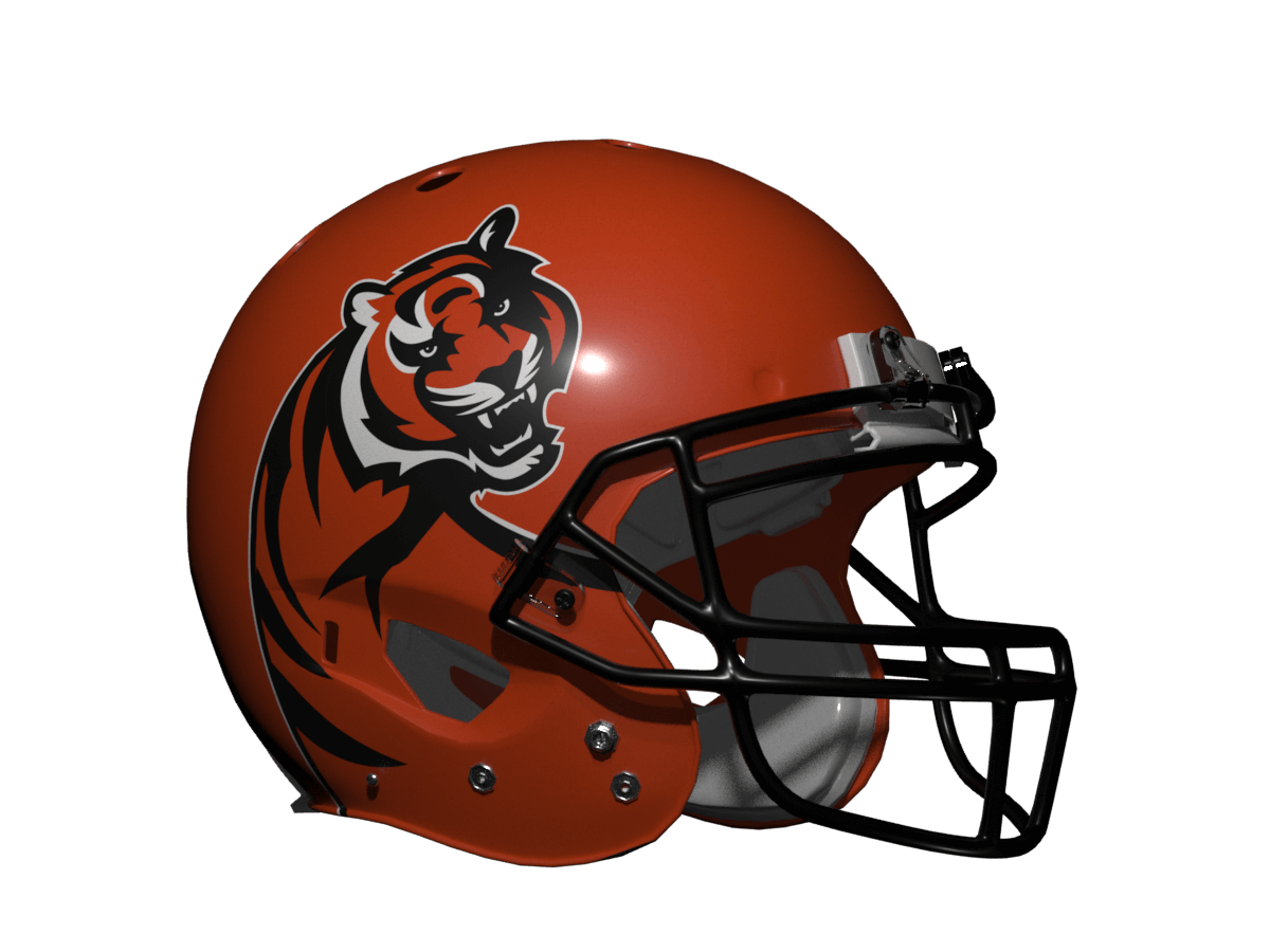
I like the Bengals in this look but they feel the weakest of the big cats in this template. Part of the problem is their actual uniforms are so unique anything else is going to be a comedown.
Chicago Bears
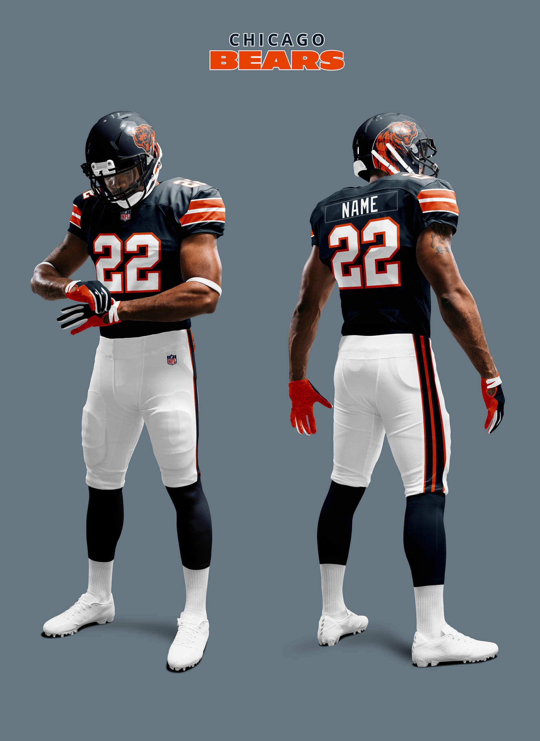
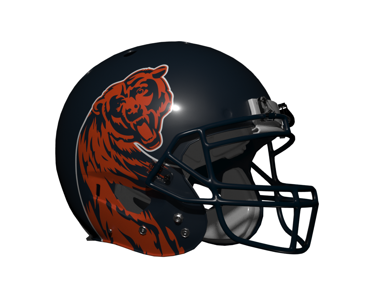
Bears? Hang on… they aren’t cats! Yes that’s true, but the Bear fits better into this category than any of the others coming up so I’ve snuck them in! The real Bears unis are so timeless that imagining anything else is hard and so it is with these and they suffer from sharing similar colours to the Bengals so the results are very samey. So probably a no for this one.
So what’s in store for the other NFL teams? More iconic uniforms re-imagined soon!
Thanks, Chris! Yet another very fun “What if?” segment — and it’s definitely interesting to see how non-Panthers cat teams look when given the Michigan treatment.
Readers? What say you?


Can’t wait for more from the series!
Thanks Kevin! There are three more Iconic Uniforms I will be doing and by the end every NFL team will have been covered.
Love these “what-if” uniform concepts. No five year rule to be concerned with if they don’t go over well :). I liked the era of Lions unis with the silver numbers, in spite of the fact that they were probably a play-by-play announcer’s nightmare to identify from afar.
The GTGFTU pic makes me long for the “sleeve” era of NFL uniforms.
Please, please, please, bring back MLB ASGs where the player wears his team uniform!
Thanks Jeffrey! Yes I too prefer the Lions with silver numbers, but I think this would also look good with white numbers with silver trim.
The original-but-one (champagne shell, plum facemask) Michigan Panthers is one of the great helmet designs of all time, so this is a great idea; if I had to pick one (since they can’t all do this) I’d probably pick Carolina.
I think these all look good but I think the Detroit Lion needs its forepaws.
Thanks GZ! I agree that the Lions need *something*, but I didn’t want to stray too far from the Panthers look and that doesn’t have paws.
Love these fun designs Chris and look forward to seeing more!
Of course, there was a cat team in the CFL that turned this what-if into a reality. The BC Lions adopted this design on their helmets for 2016 uniform redesign. Both a home and road helmet. The black one at home and the unconventional for them just orange and white road uniform from 2016 to 2018.
link
link
The experiment ended in 2019 when they put their primary logo back on the helmets and got rid of the orange helmet.
My apologies Wade, once again I have neglected Canada! I rather like that BC Lions helmet and you can definitely see it took inspiration from the Michigan Panthers.
Hamilton Tiger Cats were almost tailor made for this exercise
Exactly. Speaking of what-ifs. You know what my first order of business would be should I run the Tiger-Cats. The yellow helmet is coming back.
Now do this with the Patriots, Broncos, and other profile logos!
Ahhhh… not so fast Ron, I have other plans for those teams ;)
But the Bills in this design? With the red stripe? {chef’s kiss}
GTGFTS
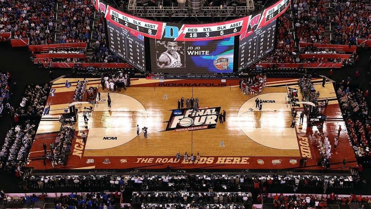
6 Apr 2015
Halftime of the 2015 Men’s Championship game.
Score tied 31 all, Duke wins eventually over Wisconsin 68-63
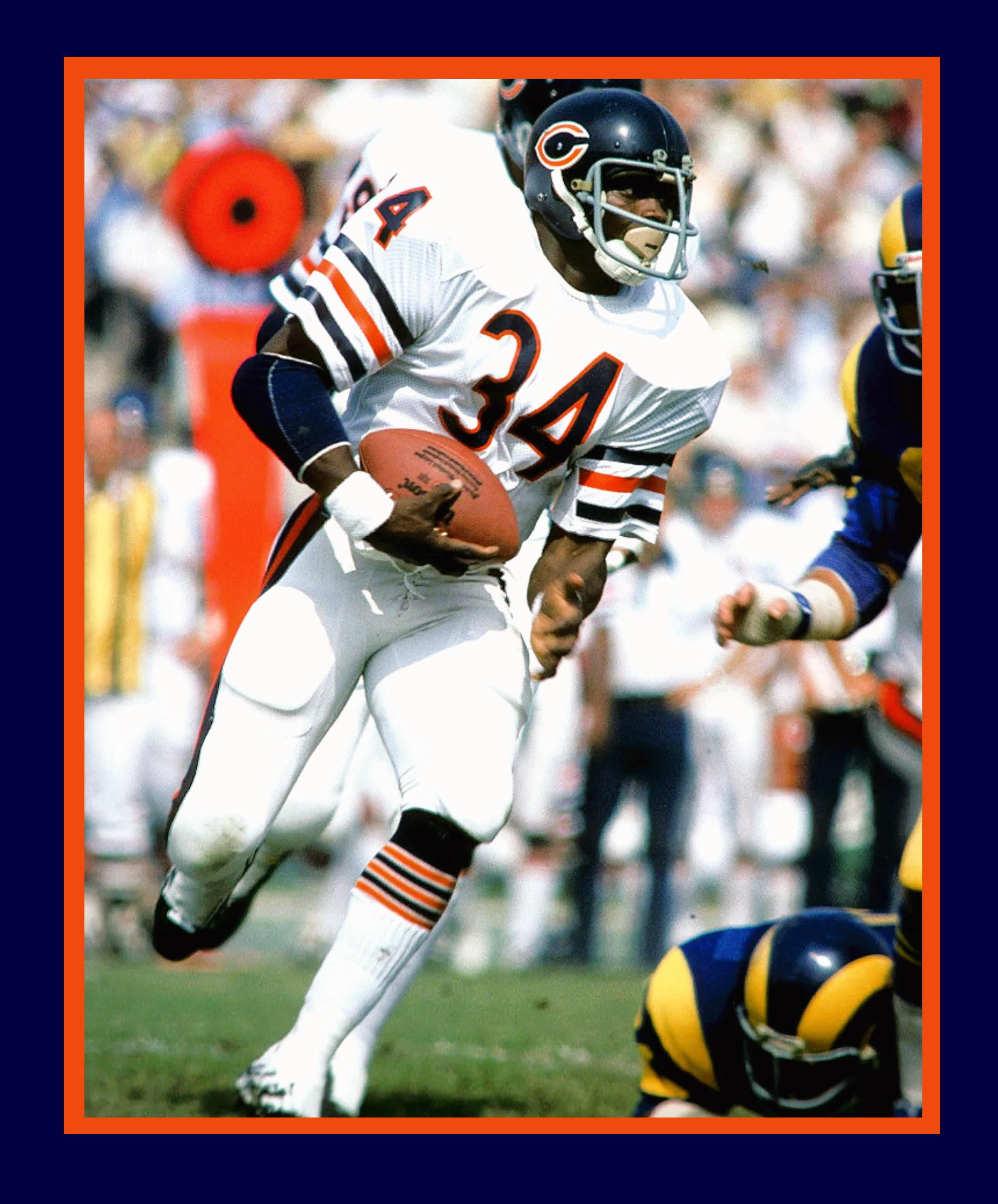
GTGFTU
6 November 1983
Sweetness with the ball in Anaheim in a battle of legendary RBs
Dickerson doubles up Payton on the ground 127-62 and overall 144-96, but Payton throws a TD pass to McMahon in the 3rd quarter.
link
Rams beat the Bears 21-14
Third best look for Chicago.
Second is the early 70s with the white C and gray facemask.
Best is the 60s white C, white facemask… and NNOB.
I’ve come around to admire the toilet seat, err….white wishbone, Jim.
But the gray grills are not for me.
When da Bears are on the road – gimme the standard dome, white over white (of course!) and the ‘Chicago’ stripe socks…a look which is near perfection, since the pants stripes don’t sync up with the sleeves and socks.
The Bears did not wear gray facemasks in 1983
In November they Bears would have had a Halas memorial patch
link
Actually looking at the auction listing that’s the game worn jersey from that very game!
I don’t care what anyone says, there are 6 HOF players in that ASG pic.
Really loving these concepts, Chris. Very clever.
Thanks MJ!
As I mention every year, there is nothing better than DST.
And as I mention every year, you could not be more wrong.
Standard Time Forever.
I’m calling it Daylight Shifting Time.
Because you’re not saving anything.
Why not Daylight Delaying Time?
Oh, wait, that would be DDT.
Agree with this fully. Shocked but not surprised how many people think that permanent DST is some kind of “solution”. Manipulate work and school schedules all you like, but that’s not how the planet works.
I was one of those kids walking to school in the dark in 1973 during the failed experiment of permanent DST. Wouldn’t want to see history repeat itself.
Bears? Hang on… they aren’t cats!
How about doing a helmet for the University of Cincinnati Bearcats?
I have to agree that Jaguars treatment is the best of the bunch. Carolina would be a close second.
Lions fans probably wouldn’t go for this. They’d probably say “make the Panther look like the Lions logo instead.”
A Bearcats helmet would be interesting, but the problem is they don’t have a suitable logo to work with like the other teams so I would have to invent one. The Lions *do* have a classic uniform (not the one they are currently wearing) and doing the other cat teams like that would be another interesting What If!
You could use the Bearcats’ mascot:
link
Great stuff Chris! I really enjoy these “what if” concepts.
How about a horned version featuring teams such as the Bills, Texans, and perhaps the Vikings in a style similar to the Rams?
Thanks Mario! I did consider ‘Horned Teams’ as one of the choices, with the Rams (classic) uni being the template. But all the other teams horns aren’t really curly enough to work with that model. So I’ve gone a different route with these teams which you will see soon :)
Been thinking about doing this for a few weeks now and figured today was as good as any to post my Houston Texans tweak. Borrowed the white helmet from Creamer’s Arizona Cardinals page and tacked on the Texans’ horn. Not sure if I’ve seen other people do this already, but if I had, then I must have subconsciously come up with it. Not attempting to plagiarize anybody, and two people can definitely come up with the same idea independently. I guess it’s fine since I am not selling these; plus they are based on NFL intellectual property anyway. Hopefully this will be considered as “fair use.”
link
This treatment would also suit the Denver Broncos, Philadelphia Eagles, and Atlanta Falcons.
I think the Broncos could work for this template. For the bird teams it would really be their wing sweeping around rather than the body so I guess that could work too. But this series is a one-shot only for each team so I’m keeping the template for each team as close as possible to their identity.
Looking at the alternate helmets for Boise State and also the helmets for Western Michigan, both of which almost already execute this template, the Broncos would look awesome rendered in this template.
Super fun project today!!! Nice work Chris.
Thanks, Wafflebored!
Really enjoyed this. Fun project. But still trying to wrap my head around the bears. So bad it’s good?
Keep this up!
Thanks Matt! Yeah, the Bears… when I first did it it felt so jarringly off. But now I’m starting to like the helmet design at least!
Nice job. Now that I’ve seen it with these other teams, I also can’t stop seeing it for Michigan. It looks like these cats, and one bear, are sitting awkwardly on their bums with their front legs reaching out. Kind of looks like they could be driving a car.
Thanks Rick! Thankfully despite staring at these for hours while doing them I couldn’t then, and can’t now, really see that!
I’ve always disliked the Michigan Panthers helmets, though I can’t even say why; like my friend who hates tomatoes, I just don’t like them. I’d prefer a “What If” for the Bengals, but if you did the Iowa Barnstormers you’d nail the mic drop.
Now that’s weird Calandra because I’ve never liked the Barnstormers helmet and I don’t know why either! It’s definitely a design classic, even if the uniform itself is from the weird early 2000s period of wacky designs. link
Oh, my… a revelation!
Like hearing the actual lyrics for a song when you’ve heard it a million times thinking the lyrics were something different.
I’ve loved the Michigan Panthers helmets since watching the fledgling USFL on the fledgling ESPN with super forehead announcer Tom Mees, but I always thought the perspective of the panther on the helmet was off.
I’ve been enlightened by:
“Showing a panther from above with its head turned to the right”
Mind blown, LOL,
Yes it was only when I realised that’s what it shows that the true beauty of the design revealed itself to me.
GTGFTU probably is from 10/17/76. Bears lost to the Rams 20-12. I think that was the only year Walter Payton wore that style facemask.
You are correct Vic, I believe that may be the only game Payton wore that facemask, he wore a plain helmet with no decals on it against the Falcons later that year. The 1975 game looked about the same against the Rams, but Walter wore a white elbow pad in that game and in 1975 the Bears still wore the thin style stripes on their pants, in 1976 they switched to the thick style for the rest of his career.
Interesting concepts, Chris!
The Panthers helmet is indeed a thing of beauty…I agree it’s one of the most creative helmet designs ever. Then again, so is the Bengals – which should never be altered or changed in any way by anyone. ; )
I hate saying this, but the template just doesn’t fit for any of the feline NFLers. Heck, it doesn’t even look as good good on the USF, uhh…UFL version of the Panthers.
I’d love to see a “What If Every NFL Team used the Breakers Helmet Design” entry… since I can’t design with worth a bleep.
I am enjoying this “what if” shit.
I felt like all of the Eagles treatments worked.
These? Not so much. Carolina, though? Worked big time.
I really dig those Jags unis!!!!!! May need to be the next redesign????
I think these designs only work if you see the mascot directly from the side (both Panthers and the Lions). The more front facing mascots come off as long-necked monstrosities from my nightmares.