
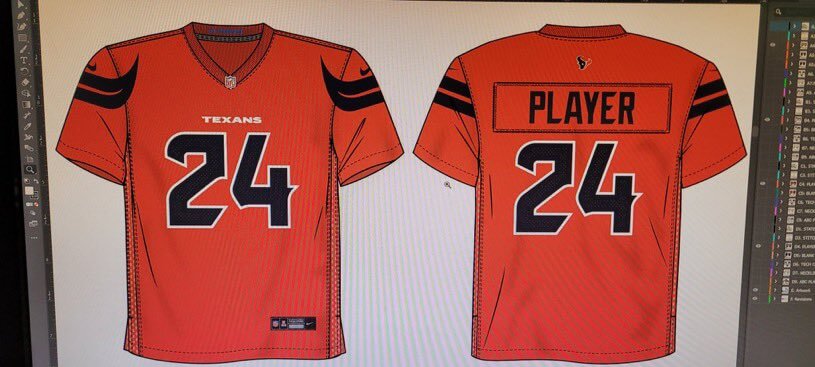
As you may recall, we’ve already seen the Texans’ new white jersey and navy pants, and they’re scheduled to unveil the rest of their new uni set next Tuesday evening. But a new leak purportedly shows all four jerseys. Take a look:
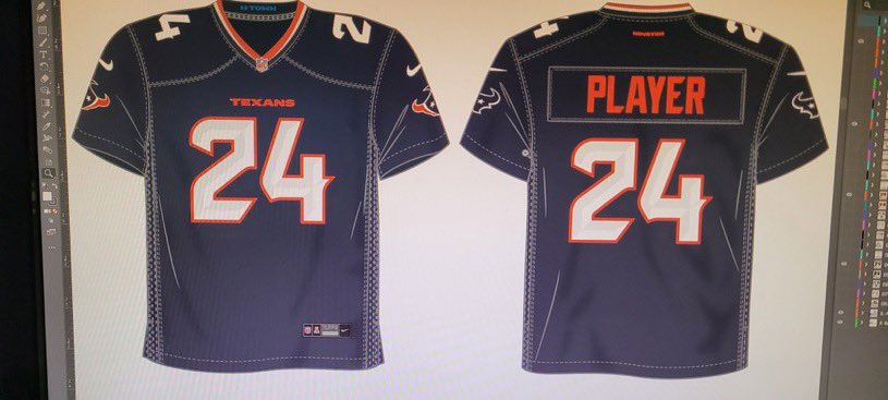
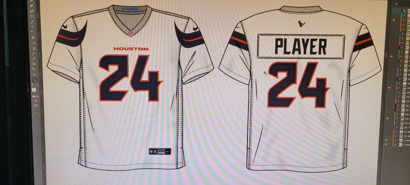
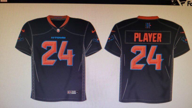
Do I know for sure whether these are legit? No. But the white one matches the official release that we’ve already seen, and the navy one’s “H-Town” on the chest (which also includes the Fanatics logo in the photo) matches the color scheme of yesterday’s purported helmet leak, which had “H-Town” on the neck bumper:
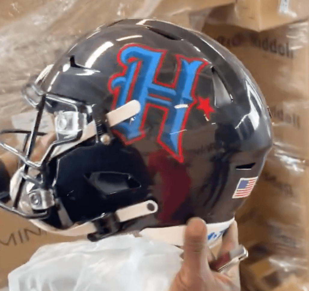
Speaking of: After that helmet leak began circulating yesterday, the Texans seemed to confirm its legitimacy last night by tweeting a photo of team owner Cal McNair wearing a hat with the same “H” logo shown on the helmet. McNair’s dog was even wearing the “H”:
Sit, Tex, sit.
Good dog 🤘 pic.twitter.com/yavgaPZJyg
— Houston Texans (@HoustonTexans) April 19, 2024
So we know the helmet is legit, and the helmet matches up with one of the leaked jerseys.
As usual, none of this proves anything, but it seems to suggest that these leaked designs are probably the real deal. If anyone knows more, you know what to do. Anonymity assured, of course.
Update: I have a source who told me a week ago that he had seen the Texans’ new set. He now says this leak is what he saw.
These…. These are bad…
The horns are backwards. Horns point away from the head not inward. The “H” is ghetto. The whole “H-Town” is played and used. “Houston” looks way better (like UH Oilers jersey). What is the checkered pattern thing on the side? Battle Red is way better.
Back to the ghetto H-Town and spray painted logo. I grew up in the barrio in inner Houston in the 90’s. This looks like an amateur kid tagging a wall from that era. You could buy a spray painted shirt like that in the hood at the corner store. Why? Why now? Who is reverting back to 1990’s barrio/ghetto Houston. Progress not regress!
Dude chill. First those are graphic design reveals which actually show up much cleaner on the jersey. 2nd, there’s no guarantee this is real leak. 3rd, I was born in ’81 and representing the H, is NEVER played out. It’s called culture. U DONT SPEAK FOR THE CITY OR THE CULTURE.
Swoopy pointy things! Booooo!
If that fourth jersey is black, it’s a textbook example of BFBS. If it’s not, why did they go with such a similar colour to their primary? How about making the main colour this “H-Town blue” they keep hyping up?
Based on the helmet, its navy
As a Texans fan… DEEPLY disappointed. I didn’t mind the white jerseys as much when those leaked, but man that alternate jersey is heinous, and the alternate H design is just a dog’s dinner. For all the hype surrounding the public feedback and input THIS is what y’all came up with? And the paltry use of the much hyped H-Town blue makes it feel like that was a gimmick now.
Hot trash. A major downgrade from their previous set. I can understand wanting to have new uniforms, but it is always head scratching to see new uniforms that are a complete downgrade from the existing ones. How does that even happen, at some point doesn’t someone involved just say “well, we are going to look worse now, why are we doing this?”
I get the existing Texans uniforms are sort of unremarkable, but that isn’t a bad thing, they are plainish, that is fine. If anything they could have just made the red jersey the primary, and pair with the navy helmet. That gives them a little more pop than the simple design rendered in a rather uninspiring shade of navy.
Interesting Cyclops Bull logo on the sleeve of the H-Town jersey. Wonder if they are going to transition from Texas-flag bull to Cyclops Bull down the line
Yikes I didn’t even notice that
That are terrible.
The navy jersey with the repeat of the logo on the sleeves is lazy as hell.
The white jersey is the only one that looks ok.
The red jersey doesn’t have enough contrast and reminds me of the previous University of Arizona uniforms. link
That navy alternate is horrendous and like another person said, a paltry use of H-Town blue
See you all in 2029 when the Texans bring back a more simple and classic design.
Oh dear God, that last jersey makes me want to punch my dog.
Things I don’t hate:
Actually a fan of the new H logo. I don’t hate the alternate helmet.
The White Jersey is actually the best of the set and should have set the precedent for everything else.
Things that aren’t horrible, but can stand an improvement:
The Red jersey needs additional white on the sleeve to break up the red/midnight steel blue.
Things that make me upset:
Why would you create a jersey that has the same logo on the sleeves as the primary helmet? Are we expecting a different helmet other than the two Midnight Navy options (I believe the one from the initial leaked photo looked more Matte, where as the Alternate H looks more glossy)
I don’t know why they couldn’t just repeat the same look on all their sets. I think the white jersey is actually very clean and a natural progression from their original look. It would have looked good in multiple combinations.
Not the worst design I’ve ever seen but a definite downgrade, especially the numeral font; ych. The red alt is just bad, and the “H-Town” alt — can’t quite tell if that’s BFBS or just a really dark navy blue — is not good either. And I still can’t abide sleeve stripes extending past the sleeve onto the jersey front.
Another thought on these, specifically about the H-Town use. Be it H-Town, ATL, or other goofy regional nicknames, I can certainly understand that they are used within the region, and you are tying some sort of local flavor to the design. But silly or stupid local monickers don’t suddenly become good for a uniform just because the local population is in on them. Being in the Philly area, I can think of merchandise that uses the Phillies script but just says “ill” or features the local slang term Jawn. Are these parts of the localized culture in someway? Sure. Are they meaningful or do the belong on uniforms? Definitely not. I think even more so because while you’ll get locals who might feel like the uniform is embracing the local scene somehow (but it really just pandering to parts of it) everyone else sees the uniform as hokey. You can say all you want about the uniform being FOR the local team, but it still exists on a national stage. Some local people may embrace silly and goofy parts of the local culture, but the rest of the country is just going to laugh at it. Wouldn’t it be better to set up a uniform with local concepts that are respected nationally?
As someone who lives in a supremely transient location and thus often has to deal with being at home games with the fans of the visiting team… or even fans of teams not playing being in our horrible stadium wearing their jersey… It would be nice if the Commies has decided to pander to the local actual fan base (racist name notwithstanding) and created a uniform (and name for that matter) that would have reflected trying to build up the local fan base.
Regular navy one is ok rest sucks. We’ll be back here in 2029 i bet
They’ve always been a boring team and this does nothing to change that.
I just barfed in my mouth seeing these new arena league-ish uniforms.
Seems like half the NFL has super fugly number fonts now.
They’re somehow both totally generic and excessively gimmicky.
Exactly my thought. And the players will love them so much because you just described the taste of the average NFL player.
Truly impossible to judge without seeing them on somebody, but these don’t leave me hopeful, these might immediately be in the running for worst uniforms in the league.
Mostly though, I just cant get over the fact that the Texans and Titans are division rivals who share a color scheme and mediocre (at best) uniform design. Too much navy in this league!
I actually liked the old set, simple but respectable. This is just full of stuff
These are awful.
You guys are melodramatic. These aren’t bad; I think they’ll look nice on the field.
I adamantly hate shoulder protrusions. Browns and Jets both got rid of theirs, but now we have to look at this.
The alternate is going to be a tragic uniform.
Couldn’t agree more. Those shoulder horn things running through to the front of the jersey just looks sloppy and is a huge eyesore.
Very much trying to be HIP, HOT and HAPPENING and failing miserably. That picture of the owner and his dog says it all. Comically uncool. And what a gimmicky uniform set, unworthy of a major pro league status. Probably my standards for what makes a cool and classic uniform are so out of touch with modern life that I should just shrug it off.
But the Texans had a good if unspectacular uniform set that just needed a little tweaking and a Columbia Blue alternate jersey to stay relevant. But look at that owner and you know: he is tacky and loves being tacky.
I go along with the prediction stated above by several other readers: this is going along the previous Jets uniform status. So much flak and nearly not enough retail movement that it will be replaced in 2029. That owner will hate it so much but it will happen. Or I have a wrong impression of Texans fans.
That H logo on the helmet reminds me of the Rangers City Connect hat logo.
That’s it! Been trying figure that out.
I hate everything in that photo except the dog. But I digress.
Yeah, I just see your usual Nike nonsense in these. If anything, these jerseys look 5 years too late. Pointy gimmick elements on the front of the jersey, awful gimmick number typeface. Have we learned nothing? Apparently not.
The number font and the H logo look bad now and will age poorly. A swing and a miss.
Overall very bad. It’s not a good sign when the bull horn stripes are what I like the most, but I think horns would make more sense on a helmet (horns on a head) instead of shoulders. Also, why did they whine about which team owns “H-town blue” and then hardly even use it in the uniforms?
I can’t ever see the reason for having two navy jerseys, both with the same number font. It just feels like “The league lets us have four jerseys, so we’re going to have four!”.
It’s nice how the Lions kept it to 3. Less merch to sell, but 3 is a good number. 4 seems too much.
That’s especially true if the red is the primary dark jersey, which I kind of think it will be. It’s the inverse of the white jersey, so that would make sense. If that’s the case, then they have two navy blue alts. Why? Just… why?
I know this has been touched on already due to the earlier photo leak of the whites but good grief that number font is dreadful. I suppose it is pointy because, you know, Steers or something…Something Texas.
But Texas… not Houston. The whole point was to be more Houston. H-town does not define Houston – maybe to rappers it does… sigh. Go Chies!
Far worse than I thought – and TWO of the jerseys have “bull” shit….
Yet another lousy reboot with bush league number fonts. More suitable for the XFL.
Cody Stoots, another source who has seen the jerseys, says this leak is fake news ♂️
link
36:15
I have a theory on leaks… I think they are on purpose so that all the really bad negative comments on the socials dies down and is not directly connected to the actual unveiling social content.
I love the H-Town wordmark. It’s nice to see a team connecting with it’s city.
It would be great if Jacksonville would add “DUUUUVAL” to one of their jerseys in the future.
I hope you’re joking.
Not a fan of there being two Navy jerseys. I wish the standard “white numbered” one used the horns on the sleeves instead of the logo to match the White and Red jerseys. Also wish the alt Navy had much more of the “H-Town Blue” either as the base color or secondary color.
You got me Nike. You win. You can stitch some cloth together better than I ever will.
But as far as making a digital mockup of a football jersey – I think I can do so much better than you. Pay me.
All the hype over H-Town blue and there’s no H-Town blue jersey? I’m not a Texans fan but I’m sure a lot of fans will be disappointed.
This looks like one of those “We have to wait 5 years until we can change back” kind of uni sets.
Just wondering how the collars are going to work with the current Nike template. Teams that don’t have solid collar colors just don’t look like they should. Overall, I’m down with each. We’ll see how it looks on the field and that could change my opinion. Let’s not forget….. We still need to see the pants. That’s what let the air out of the balloon last night with the Lion’s reveal.
How is it that none of these billion dollar clubs can keep a uniform under wraps until it’s going to be revealed? Kind of amazing.
Generally speaking, the uniforms don’t leak.
It’s the MERCHANDISE that leaks (or things connected to the merchandise, like screen shots from a Fanatics catalog).
That’s what happens when you pretend to be in the sports biz but you’re actually in the lifestyle apparel biz.
The horn sleeve striping design just irks me. I don’t quite get it. Like, shouldn’t they be facing the opposite direction so that when you look at a player wearing that the horns point outward? Or have the point of the horn on front and back as it wrapped around? Just something off about it.
From neo-Classic to garbage in near-record time.
Well, at least now they have a throwback option ; )
These are bad. From the horn stripes to the number font, every p
…part of these is a move in the wrong direction. The Texans had a great design and they ruined it.
I thought they said there would be something for people that like traditional,proper uniforms?These are all straight up garbage.
These things are certainly not ideal. I still can’t stand the Tennessee franchise for taking, changing the name, then keeping the iconic Oilers name, logo and color scheme from the city of Houston (I’m a Tampa Bay fan btw). But given this design, Nike probably would have went from “Luv ya Blue” and red to navy/black with burgundy anyhow.. you know, for a bold refresh.
As I saw elsewhere, I think just adding the lighter blue as an accent makes the H logo end up to close to TN color scheme. In 2D I think the blue jersey looks too much like a Patriots jersey.
And RWB is a difficult color scheme to work with anyway…
I’d hoped to have seen gold or amber find it’s way into the scheme. I actually think the dog’s bauble makes the case for using that stylized “H” with metallic gold/silver/white to evoke “grills” as a local reference that’s not to on-the-nose.
The same H in white, evoking the Rice “R” word be something….
I wonder if there’s not some way to use a representation of the roadway loops/interstates as a logo.
All they need now is baggy pants.
It’s the Houston TEXANS, not the Houston HOUSTONS. The H logo is pure trash. The helmet horns look like the artist forgot to adjust their MS Paint saturation settings. The numerals are clear indecisiveness, which only works well with peanut butter cups. Way to go Cal, you just alienated the rest of the state who don’t live in Houston, nor do they want to (I’m from Houston btw). Should have made red the primary with a tweak of the bull. But I guess some people just look at bulls from the rear, smh.