#Texans new helmets?? 👀👀
What do we think? pic.twitter.com/0eEAUWxJCr
— A to Z Sports (@AtoZSportsNFL) April 18, 2024
The short video clip shown above has been circulating for the past hour or so. Is it really a Texans alternate helmet? Quite possibly. Let’s start by looking at the side logo:
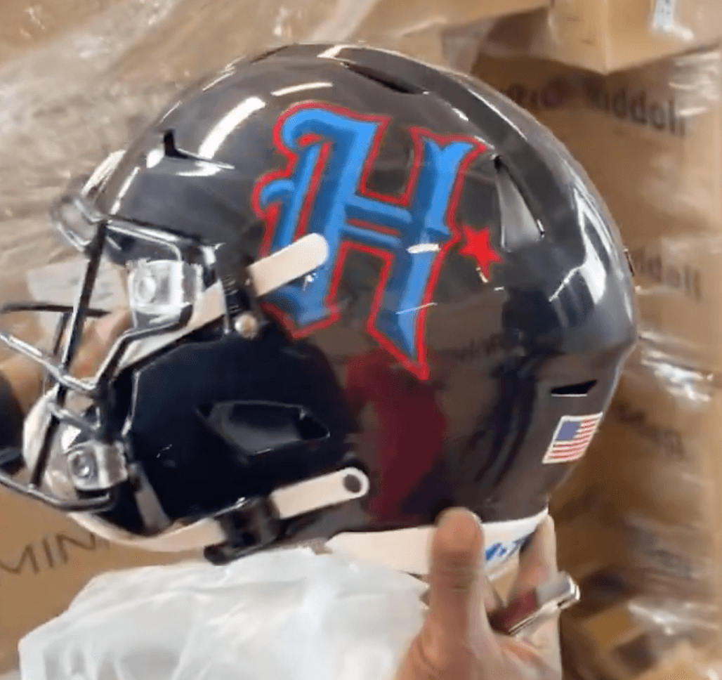
As you can see, the logo includes the shade of “H-Town blue” that the team has been touting. It also emphasizes Houston instead of Texas, which was supposedly one of the team’s goals with the new uni set. In addition, I have a source who recently got a quick look at the Texans’ alternate helmet and told me that the logo “was an H that sort of reminded me of the Hitmen H from the old XFL.” So that all adds up. (I’ve emailed my source to see if this newly leaked design matches up with what he saw and will update this post if I hear back from him.)(Update: My source has now confirmed that this is indeed the helmet design that he saw. He also says the full uniform is “worse.”)
In addition, the nose bumper has the team’s “Texans” wordmark, and the neck bumper appears to have an “H-Town” wordmark:


In short: I think this is legit. We’ll find out for sure next Tuesday, April 23, when the Texans are scheduled to unveil their full uniform set. (Meanwhile, if anyone knows more, you know what to do. Anonymity assured, of course.)
(My thanks to Jon Alvey for bringing this development to my attention.)
Who knew the Jets would have the only real update worth a damn this year? And thats going backwards as opposed to something new.
Im about ready to retire from having interest in uniforms. Its gettin lame.
Awful.
Meh. It’s OK and I am not getting a Hitmen vibe at all (a local high school here in South Jersey uses that exact logo). But it isn’t better than the cow head logo.
Agreed.
Hammonton would be better off poaching Sparky from ASU than the Hitman H.
This one’s rough. Makes more sense (to me, anyway) to give the alternate logo a try on an alternate helmet shell, not the ostensible primary one. Either swapping out the decals each time is going to be a pain in the butt for the equipment staff, or they’re going to have multiple sets of navy helmets just sitting in the equipment room, which seems super wasteful and unnecessary.
This H logo would’ve looked especially good on a white helmet, but if they’re concerned it’d look too close to the Titans/Oilers throwback (which honestly, why would that be a concern of theirs? Seems like it might be a GOAL of theirs…’we dare you to sue us’ kind of thing), then you could make the logo white or navy and put it on a LIGHT blue shell.
Names team Texans. Hey, lets not emphasize Texas.
I mean, the team is the HOUSTON Texans What’s the difference between an ‘H’ for the Houston Texans and an ‘NY’ for the New York Giants?
I agree with the Old man yelling at cloud. It’s not like the New York Giants are coming out and saying “Hey, let’s try to be less Giant-y” in your example.
It’s not as if they’re renaming themselves the Houston Houstonians. I’m okay with it.
It’s not the greatest helmet I have ever seen, but I don’t mind it. It depends what the uniform looks like.
Has the vibe of NBA City Connect uniform. That’s not a good thing. You can’t just throw anything on the side of an NFL helmet.
Gross
This looks like an airbrushing booth on the boardwalk made a pretend logo for a network TV show.
…for a fictional high school team.
Wow…how awful.
Ugly. All the shades of blue and red look too dark to me. The H looks like a weird F with all the fringe on the left. I suppose the Detroit Tigers D has some of that, but maybe I’m more used to it. As others have suggested, this would look much better on a white helmet.
H-ideous
If this were for a high school football team I would think it’s great, but because it’s for an NFL team it’s embarrassing. I bet the uniform it’s paired with is even worse. That said, this helmet is still better than the primary Texans helmet and logo. The Texans bull has always looked like clip art.
Looks great…
…For an XFL team.
For an NFL team? Looks completely amateurish.
Based on the leaks we’ve seen so far, it sounds like the Texans are going to be taking a cue from the Browns and Jets and scrapping this set as soon as the 5 years are up.
This was a great look for the Houston XFL team:
link
One that I’d say was executed better than the Brady-era Pats silver shirt set…though that’s not hard to beat:
link
Curious if the team officially releases it like they did the new white set after the Reddit leak
I like it. :) Looks cool, urban and modern. I don’t mind the “City Connect” vibe applied to football uniforms.
One of the local radio guys who has seen the full new set didn’t dispute its legitimacy. But since he works for the flagship station, he couldn’t outright confirm them either.
I actually like it! Anxious to see what jersey they will pair it with.
This has the same issue the Titans helmet has (who should never have gone away from the white version). Blue and red on a dark blue base makes everything washed out and hard to see. Texans have always had one of the blandest uniform identities in the league, all their features remind me a clip art uniform. This certainly doesn’t help.
I don’t like it. Give me 30 years and maybe it’ll grow on me.
Remember when I asked about the local Houston perspective of the term “H-town” because to this outsider, the Texans embracing it SO MUCH felt really try-hard? I wonder how they feel about it right now.
This is what I was talking about. This is some try-hard nonsense.
This is an FU to The Titans. Titans colors, Letter design, red star. Let’s guess who they play when they wear this…
The Washington Commanders?
I thought that as well. Those games have the potential of being a Navy, Lt Blue and white mess.
Do the Titans still have time to craft a road version of their Oilers throwback?
So what are we thinking here? They’ll have this navy shell as an alternate, keep the “battle red” option, and go with a white shell for the primary?
Worse still the bull head logo in the center rear of the helmet.
Seems like the only positive NFL uniform news is when it involves a team going back to an old look.
Lame. Has USFL written all over it. Another big miss.
Hey…
Do NOT equate “USFL” with “lame.”
Arena League? Can’t argue too much. XFL? Maybe a slight brushback from me.
USFL 1.0 and 2.0 weren’t perfect, but pretty darn close.
Gotta agree with Jimmer here. USFL (83-85) had, for the most part, excellent unis. USFL (22-23) weren’t as good but certainly better than a LOT of the 2011-onward Nike unis.
Arena league, XFL — sure those were pretty sucky. But don’t be putting the new Texans unis in the USFL category. And also…let’s wait until we actually SEE the unis before we relegate them to indoor football (even if that’s apt).
The Gamblers branding was one of the USFL’s best… the original being one of my all time favorites. It’s a shame the UFL kept the Roughnecks alive.
I like it but need to see how it pairs up with the new uniforms. Also, if you look closely, it has the bull logo on the back with what may be updated colors.
With this update, it seems the Texans were so preoccupied with whether they could, they never asked if they should.
That would make a good high school helmet, a so-so college one and an Inept NFL helmet. Weak sauce.
Is there a bull head on the back next to the flag?
I actually think it is a reflection from something out of frame.
One thing is for certain…. Texans fans are gonna whine about any and everything! Cry about old unis, whine about new ones… It’s 1 of 4 children, they’ve already said you probably won’t like em all (because they’re so different) but you’ll like at least 1 of em. Relax!
I surprisingly don’t hate it, that being said, a white outline would help though.
Word for word agreed.
I like it. The H-Town blue looks great on that helmet as it offers a little spice. Can’t wait for the full uniform launch.
I’m Calling It Steal Blue.
I’m not a big fan of post Revolutionary War cities using old timey, Old English or Old English-like lettering. This one is a miss for me.
I guess I’m one of the few that likes it. Major upgrade over their regular helmet, which is super boring.
This is exactly what I was thinking. Definitely not a NFL looking helmet.
On its own, the helmet is fine. However, I shudder to think of the abomination of a uniform they’re going to pair it with.
any details on what the worst uniform is, i am thinking similiar to the two towned swords of the titans but that would be an absolutely wild look to reproduce due tot eh history ? i might be crazy but i actually kind of like idea of the olde English font, at least in a vacuum. it doesn’t make sense for Houston. i think it would have looked amazing if it was just h town blue
Remove all the beveling and this isn’t too bad. It just needs to be flattened.
Weird. I do like the colors, though.
I’m normally a big fan of old script monograms, but it seems really arbitrary here, and doesn’t really make sense for H-Town.
Also, if the best nickname you can come up with for a city is “H-Town,” maybe just don’t. It’s like in 2002 when everyone’s nickname was “J-Dog.” Just don’t…it’s so freaking lame.
HaHaHaHaHaHa!
Pfft NO
On first glance I really didn’t like it. But as I observe it more in detail I don’t think it’s that bad. I’m not getting an Olde English H vibe but rather a rodeo/Tejano look. The right side of the H reminds of a cowboy boot with the star as the spur. Definitely have to see it with the whole uniform to make a better judgement.
90% of commenters: “It sucks, it looks amateurish, it’s lame”
Me: “A new look! Cool!”
I’m hoping this is actually fake because it looks horrible. Looks like a high school helmet.
I hate this less than I would have expected had it been explained to me beforehand, honestly
Like it’s not great but it’s better than the Texans’ extremely 00s primary logo which they apparently aren’t changing
That’s a lot of mileage out of using the star cutout shape from the primary logo as an accent feature too – on the side of the “H” AND it looks like it’s in the H*TOWN on the neck bumper.
just change your name to texas houstons and leave it at that…..ugh.
The players will love it as a lot of athletes seem to have no taste but for cheap looking glitzy outfits. As the players will love it, most fans will love it and the fans that do not like it will be branded as being too old, too conservative, out of touch, unimportant, not hip to these times, shouting at the clouds, whatever.
This is a nice helmet for lower level football, especially high school, but this is not a NFL design. It looks tacky, contrived, not well designed and therefore perfect for today’s pro athletes.
It’s so cringe the obsession the Texans have with the Titans.
They can not legally use this color scheme. Texans fail to understand that the Titans own the trademark and everything to the Houston Oilers. This has to be taken down or rejected or brought up in court.