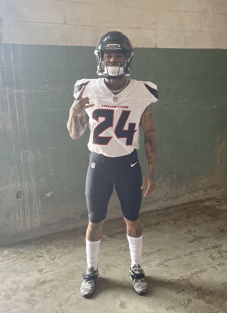
The image shown above, purportedly showing one of the Texans’ new uni combos, has been making the rounds today on Reddit. Team chairman Cal McNair, acknowledging the security breach, then created a Reddit post of his own:
Leaked pic? How about a real photo of Nico and Tank!? Way more to come in April!
byu/Cal_McNair inTexans
Here’s a larger view of the photo McNair posted:
If you look at the reflection on the right side of that photo, you can get a slightly better sense of the side view of the jersey, and also the pants striping:


Let’s shift into Q&A mode:
It’s hard to tell for sure, but that looks like the same helmet they’ve always had.
True. But we’ve known for a while that the team’s primary logo isn’t changing, so there’s no reason to think the helmet would be changing significantly.
I don’t see any “H-Town blue” (i.e, the Oilers’ old shade of blue) in these photos. Wasn’t the new uni set supposed to feature that color?
Yes, but not necessarily in every uni combo. Team insider Drew Dougherty has reported that H-Town blue “will be incorporated in some of the four uniforms the Texans will wear next season.” [Emphasis mine.]
In addition, Texans marketing director Doug Vosik gave this quote in early January:
“We said, ‘OK, if you want timeless traditional, here’s the one uniform that answers that,’” he said. “If you want to take it one step further and say timeless traditional gets refreshed, we have one for that. If you said, ‘Hey, I’m into this bull thing, let’s get wild,’ we have one for that. And if someone said, ‘Hey, I want you to pay homage to H-Town Blue,’ and if the players are saying, ‘I want something tough, I want something mean,’ we’ve got something for that.”
I suppose you could say that this newly revealed combo qualifies as “timeless traditional gets refreshed.” The shoulder horns (which look truly awful) might also qualify as “Hey, I’m into this bull thing.”
That number font is, uh, something.
It sure is. It feels quintessentially Nike, by which I mean that it looks like a comic book crossed with a video game, all designed to appeal to 14-year-old boys. I really, really dislike it.
Your overall assessment?
Major downgrade. Looks like an arena league uniform to me (or at least an arena league jersey, since we can’t really see the full helmet or pants designs). Embarrassing.
Meanwhile, if anyone has more info on the other combos that are part of this uni set, I’m all ears. Anonymity assured, of course.
This is basically their old uniforms… but much worse.
Same color scheme, same helmet, small accents on the shoulder—but everything about this uniform is truly a downgrade. What’s a shame. I know their old uniforms were a bit too plain for some people, but I thought they looked decent overall. These will be on the scrap heap in five years.
at least the socks are a contrasting color.
For now. Wait until random players switch to blue socks…then pair them with blue, red, white, green, or pink cleats.
Seems like this is change for change sake.
The old we want new uniforms but we really don’t want to really change them, let’s fool with the font and striping and call it a day.
Combine the Falcons, Broncos and the clock numbers the Bucs used to have and you get Houston. At least they’re not gradient. Of course the rest of the set. First impression isn’t impressive!
First thing I thought of when I saw them was the Falcons lol. Idk why, they just look like them.
I also immediately thought Falcons. And if Falcons/Texans is a repeatable pattern for new uniforms, I’m very nervous to see what’s next for my team, the Lions.
Same here, a NFL uniform relaunch should be an exciting event, but recently it’s seems one dud after the other
I never liked the Texans Uni’s but the font was the best bit and they’ve managed to ruin that.
Nike further taking the joy out of football uniforms. These are soooo bad.
Numb.
Lee
Looks like a 2001 XFL uniform, and that’s not a compliment.
“ looks like a comic book”
Comic book designs are usually way bette than this ;)
That doesn’t look any different to me.
As a former 14 year old whose love for sports team uniforms blossomed at that age, I can only hope that the Texans’ fans will see their team’s “McDonald’s = we got something for everybody” approach as a doomed and abject failure. -C.
Milktoast.
Self-inflicted downgrade!
Pointless pointyness – From neo-Classic to woof…can’t wait to see what a mess the rest of the sets are.
Can a team tell nike no? Can they go with their own design? This is football, not a fashion show.
Yes, teams can hire their own designer. In fact, maybe that’s what happened here — we don’t know for a fact that Nike designed this.
Thank you for clarification.
Based on the design it has the Nike hallmarks:
1. Getting rid of TV numbers
2. Designing the sleeve to draw you eye to the swoosh. There isn’t a great look in these photos, but it definitely appears the horn stripe thing is set up perfectly to make room on the sleeve for the makers mark to be a design element rather than an add on.
Thank heaven for teams like the Packers, Raiders, Giants, Steelers, etc. With the exception of Tampa and Chargers, every non traditional team that has changed looks in recent years has been a downgrade. We should stop wanting teams like Atlanta and Denver to change, because we keep assuming it will be an upgrade.
Yeah, though Tampa is essentially just wearing a throwback, so it wasn’t a new design, sort of like Cleveland going back to what worked before.
I’d argue that the Chargers are a downgrade from past designs, and it is the worst design they have had, even though it isn’t a bad look.
I’d say the Cardinals’ and Bengals’ new uniforms were upgrades over their prior uniforms, even if they aren’t the greatest designs. I like the Dolphins’ current look better than the drop shadow from the 2000s as well (but I wish they’d go to their classic look full time)
Would it kill them to put stripes on their “socks”?
I know players wear leggings now instead of actual socks, but stripes on the hosiery would help make this mediocre uniform look somewhat passable.
For so many years teams like the Charger and Patriots wore striped socks with their navy pants, and then somewhere along the way stripes apparently became verboten.
Absolutely agreed. Sock striping would improve so much. I hate this monochrome leggings look they have nowadays.
I’ve always wondered why Nike doesn’t make leggings to mimic the color and design of the pants and the socks. That way there isn’t that jarring difference between the end of the pants and whatever is worn beneath, especially the players who hike up the bottoms of their pants above the knee. Seems easy enough! The mismatch of sock style and color between players on the same team really annoys me.
Absolutely hideous. Perhaps worse than before, if that is possible.
What the? You kidding me? I thought my ‘Skins had the worst uniforms in the league. Texans have somehow outdone them.
I personally don’t think that this is terrible, at least from the 2 pictures we have. It’s not great, but it’s a fine uniform. More a lateral move so far. Hope the pants have stripping of some sort.
That being said, that number font, especially #3, is terrible.
Horrible decisions all around, truly shocking.
Not shocking at all.
And the “no TV number” trend continues. Bleh.
Another embarrassment. Really stupid number font and overdone stupid pointy-swoopy things on the shoulders.
Who likes this crap?
Right on, and I’m just hoping this “bullhorn” themed uni is the worst of the 4 that are supposed to be new for next year…
Maybe there is still a classic yet to come…. : -}
It took me a while to notice it because I was looking at the jersey the whole time, but you can see the thick red stripe with a thin white stripe on the pants in the back reflection. At least the pants aren’t solid blue. Striped socks would help a ton though.
Here’s a link to a close up of the pants stripe.
link
The only excuse is the nfl wouldn’t want y
To walk on oiler groun, idiotic. Let the Houston’s be baby and navy, or whatever.
That number font is heinous
I have to imagine the shoulder horns terminate at the back of jersey; but, based off the reflection and not being able to see the “end,” I wouldn’t be too surprised if this pattern actually extends all the way across, shoulder-to-shoulder. Of course, name would go in the box it creates.
Not saying it would be a good look by any means… but, seems like something Nike would do.
Holy shit. Fucking terrible.
One of my biggest gripes with the modern NFL uniform and the unveiling of them is how un-uniform they seem to be.
Tank Dell already looks sloppy with a huge t-shirt untucked and hanging out. He’s wearing compression tights with what looks to be a quarter length white sock over top.
Nico Collins is wearing biker pants that look to go half way up his thighs. He’s ankle length leggings with bare ankles.
It just looks sloppy to me.
100% agreed. I can’t stand this sloppy look so many guys wear these days.
The Texans were one of the modern classics. Their initial set worked.
This gets rid of what worked and replaced it with something worse.
If the new set isn’t an improvement on what it is replacing, it isn’t worth doing.
Yea, the Texans uniforms, while nothing spectacular, were just steady with a great color palette, pants stripes, contrasting team socks, and a decent variety of mix and match options. All they really had to do was make their red helmet and jersey their standard set and call it a day. There are far too many dark teams in the NFL.
44% of the NFL wears black or navy blue as their primary home uniform. Then you add in the Eagles, Commanders, Jets, Cardinals, Colts with their black alternates and you have 60% of the NFL in some shade of navy or black.
Making red or some new shade of blue their primary color should have been one of their 1st priorities. Now they are just lumped in again with all of the other dark colored teams.
Should have switched to white helmet navy facemask.
Disappointed they didn’t add baby blue as accent color. I thought it would look cool if they did it like the new clippers uniforms
That’s what we were all waiting for?? Wow. Nike continues to underwhelm. Boring. Uninspired. And a silly superhero numbers font.
I think they are supposed to resemble a Bullhorny font…kinda…sorta….
Looks like the theme for this uni….
Guess we’re waiting for the 3 other “themes”….
It looks like an early 2000s design. Like the Bengals had?
Late to this party, but just about everything is a downgrade from a solid, if unspectacular, current set. I suppose we should be grateful for two things:
1) At least it’s not mono (although that will assuredly be an option); and,
2) It looks like the pants will have stripes — although they look like some type of bespoke striping pattern, and not a traditional r/w/r pattern.
But after the Commanders and Cardinals, with their three distinct solid mono sets (and the Cardinals have still yet to mix/match), at least the Texans aren’t going that route.
Disappointing, but it could be worse.
Phil, I think these may not be as bad as everyone thinks. If they incorporate the “horns” to the shoulder stripes, it may actually look pretty good on the field. The pants are my biggest concern. But, I also am glad to see no solid pants and mono-tard uniform. But, that’s yet to be seen.
What in the NCAA is this?
That helmet looks Gray-Blue, probably just the terrible lighting in the photo set-up…
Somebody said they look like Falcons, Yep, with bullhorn font numbers….sheesh
Guess it can only get so “different” before it goes bonkers…
And are they also entering the Tour de France, with those weak biker shorts….?
Honestly, I’m pretty intrigued to see what the whole set looks like. It may be one of the best re-designs that Nike has come out with.
Texans fan here.
While I don’t love the numbers, I think the rest is fine.
When you put these with the red helmet, though, they are a top 10 away combo in the league.
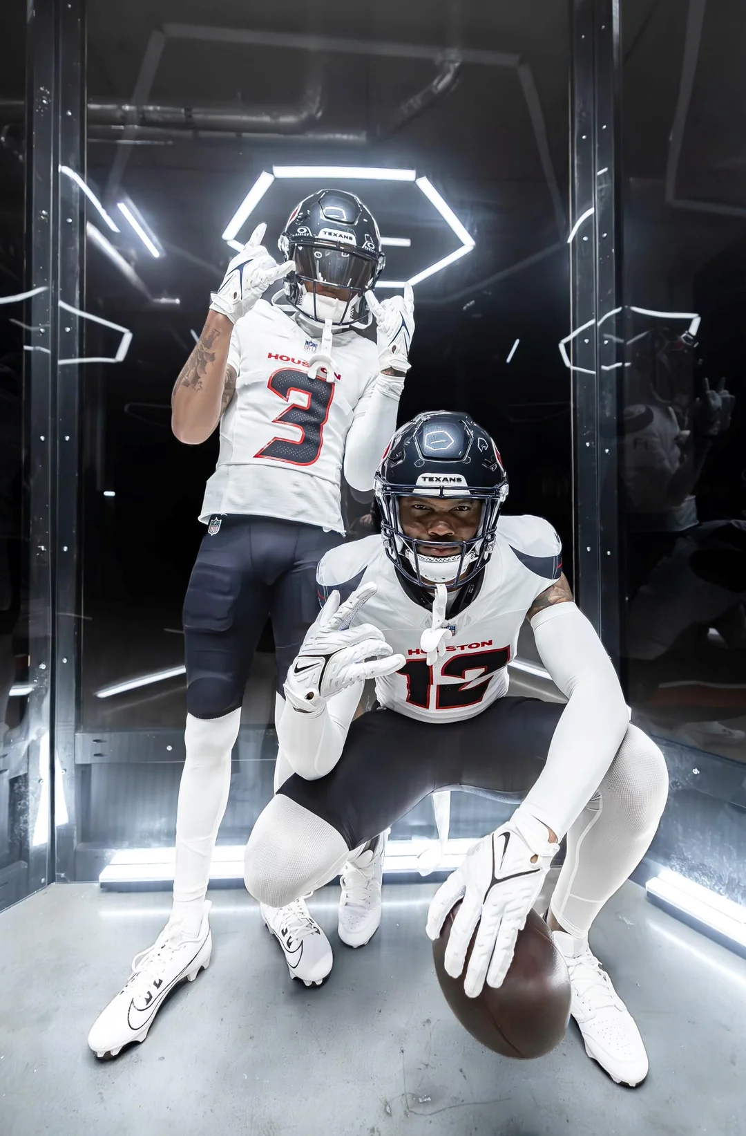
Remember, there’s still two more helmets and three more (and supposedly uniquely different) jerseys to come.
And what was so bad with the old uniforms?
Just makes me miss the Oilers even more.
Thanks. I hate it.
All I can say is that this is better than the Steelers Bumble Bee uniforms.
Maybe there is a set based on the Astro’s stripes.
At the distance to the field, these will look pretty plain.
Nothing special about this. The old uniform was better. And there no substitute for Oilers uniform. In fact, the Houston Roughnecks look better than this. Significantly better.
Failure snatched from victory here…
– Where they could have nailed it – stripe sleeve turns into horn – pretty great if nailed. Heck, it could stretch across the back and incorporate the nameplate on the back, bringing contrast, and work.
– While we all can go ‘NO’ on the number typeface, I am going to focus on the shoulders and the lack of TV numbers. On the leaked photo I thought ‘are there TV numbers there’ but I think it’s the shoulderpad shape making an illusion. Some slick TV number wrapped by those horns could have been special, but nope
It’s exactly what you’d expect if someone told ChatGPT to make a Nike version of the current Texans uniform.
Once again Nike leads another team down the primrose path. This a clear downgrade probably with an oilers fauxback mixed in which, after a bunch of positive responses, likely become the primary. Disappointing but same ol’ story. Nike needs to a long look at its in house design team and make changes/get an outside agency.
Honestly, why do I even care anymore. Why do these teams think Nike knows what they’re doing? The shoulder horns and numbers are absolutely horrendous.
For all the talk of the bad new MLB Nike template, it’s kind of weird how no one (outside of this site) is talking about how badly Nike has been ruining NFL unis for years now. It’s just team after team every new design is so amateurish and overwrought. Fully expecting the Broncos design to be as hideous when it’s leaked/revealed.
I guess I am too old now to understand what these teams are going for, and Nike always does their part in coming up with horrible designs. This looks like a generic uniform you see in a football movie. I thought the Texans had average uniforms at best, but these are a downgrade. they are below average. I would take the 1974 Houston Texans uniforms over these, yes, the “Uni Watch” green and gold Houston Texans. I guess they could be worse, at least they didn’t go with that horrible gradient look the Falcons went with. These were so unimpressive looking that I thought it was a fake when I saw them earlier today. Those number fonts look brutal.
My least favorite part of this set is the navy numbers outlined in red. The current red outlined in navy add some color. These are washed out and dull.
Here we go again: practice gear minimalist sloppiness elevated to game uniform status. If they could have sneaked in black as the only contrasting hue with the white and get rid of the red and navy they would have done it to please the players. That number font is horrible but the players will feel it looks slick and sharp: the angular, chopped off font is easy to reproduce by jewelers for diamond and gold necklaces for him and pendants for the ladies. It must be a generational thing that I do not understand.
This could wind up being a nice refresh to their outgoing road uniform when we see it on the field. At least it’s not another mono look with no stripes on the pants. Having a look for everyone scares me about what’s to come.
Just wait until we see the Denver unis. From the descriptions we have seen on this site, the Broncos will look like an absolute clown show.
What a shame. It’s harder to see the numbers now.
Unpopular opinion but I like the change, it’s small but it’s clean. For some reason everybody seems to want a boring plain uniform with no personality the the number font is solid along with the horns on the sleeve
Of course they had to put the team name above the numbers, like every other team now. Kind of wish they could have found a way to add TV numbers to the shoulders. But, may have been too much clutter with the horn shaped stripes.
Of course they had to put the team name above the numbers, like every other team now.
Well, they already had that with the previous uni set, so it’s not like they’re suddenly joining that trend — they were already part of it.
Good call! Don’t guess I really ever noticed before….. :)
Imagine they’re the first team to make some crappy mocks to “leak” before blowing our minds with the actual good ones…. imagine :'(
Probably the same blue as ever for them, but these photos are triggering my blue/black color-blindness. For the first time, a Texans uniform looks black to me
The helmet in both photos seems to be a gun-metal gray…but I’ve noticed at certain stadiums that their “old” helmets look gray-blue sometimes…
Just the lighting I’m sure…
According to many people, Houston has returned to their original shade of Midnight Blue and no longer the Navy Blue team they’ve been.
I think they’re alright. The number font is a little weird but they look sharp and clean. Excited to see how the other sets look.
Oddly, I like the tweaks – especially the number font. I usually hate the Arena League look, but these are now interesting whereas the former set was safe and boring.
It’s almost comedy at this point.
I have no remaining interest in seeing what the Jets, Lions, or Broncos trot out.
It’s just whatever now.
The Good: I like what slivers we see of the pant stripes. I never cared for the old pants’ striping with the thin red strips on the thick white stripe. I think a “red-forward” approach is better.
The Bad (ish): The font… while I think that a “classic” font would be better, I’m gonna withhold judgment until I see all the numbers, and how they fit together. It’s not inherently bad just because it’s a custom font.
The Ugly: switching from red numbers to navy numbers is a COLOSSAL downgrade. I’m sure that Uni Watchers who’ve spent decades agonizing over the confusing red/blue divide among the Texas Rangers disagree, but I think the Texans look their best when serving nearly equal parts navy and red.
All in all, I think it’s a downgrade.
I don’t mean this as a personal attack, but I really dislike the “arena league” criticism. I think it’s kind of an amorphous criticism, that is really hard to pin any solid meaning onto. Also, when I think of Arena League football, I don’t think of unique if slightly bland uniforms, I think of the over-engineered monstrosities that Kurt Warner wore with the Iowa Barnstormers or the Kentucky River Monsters uniforms, not this, nor the Jets last uniforms (which I’ll admit are bad, just not ‘Arena League’)
Again, all of that is personal opinion, I just think that “Arena League” isn’t really a great criticism of these.
XFL?
Conference USA?
It reminds me of those things too.
Conference USA… best comment ever.
So…Not that the Texans’ current set (or their friggin’ name TBH) is anything unique or special but these are a serious downgrade. What a disappointment – At least the number font does not mimic a digital alarm clock; so, I suppose that is something at the very least.
This is definitely a April fools joke that has leaked, right?
The Texans had started pulling me back in a bit with Tank and CJ. But now all I can say is Go Chiefs! Dated Razorback horns from 2006 college unis… It is just so embarrassing. And the deep steel blue (the only other identity we had) is gone. At lease there is a pants stripe. Texans unis were never much – and the whole bull theme was just dumb from the start. But the Texans number font was just about the ONLY nike-fied font that looked good. And it was its own identity somehow in the flood of stupid fonts.
Temporarily passing the Broncos for the worst uniform in the league. Let’s see what Denver pulls off to retain the crown in a couple of weeks.
*Need to see it on the field* but I don’t mind these. The recent Arizona and Washington sets were far too boring, so I’d rather see teams at least try and push the boat out and create a uni element that they can own – so I like what they are trying to do with the horn on the sleeve – it is unique and links to the brand, and might look very good looking along the line of scrimmage if it plays off the horns on the helmet. It works much better than the Jet’s ridiculous lines across, and while similarish to the soon to be abandoned Broncos side panels, this is just one element rather than overtaking the whole uni, so from afar and watching on TV, it will still look like the Texans.
The contrasting numbers/pants on the old set was a part of the best part of the uniform. Now that is taken away, at least from this photo.
at this point it feels like the person at nike in charge of uniform updates for sports teams is having their 6 year old kid doodle an idea and then subjecting us all to it as actual uniforms
Perhaps too plain on the whole from this first look – but I wouldn’t call it a MAJOR downgrade by any means. That feels like a bit too harsh of a knee jerk reaction. Let’s see how the full set looks together, so I’ll reserve full judgement for now. Right now these feel “fine,” but not the chance for something iconic we were holding hope for. Not the worst refresh we’ve seen so far, but it must be said: would it kill ANY of these teams to put in some traditional striping for once?
Eh…I don’t mind them. The font is thick and legible which is good.
They went from red numbers to navy? That was one of the unique things about the old set – they were a navy AND red team. Now, all navy (aside from pants stripe).
The horns looking from the front look good. The horns looking from the side do not.
My biggest question: If they were doing an unveiling next month, how did these leak? How many people had access to these images? This really wasn’t a “security breach” as there wasn’t any security.
They say you never get a second chance to make a first impression…and I am not impressed. Paul, if you have any Uni-Watch cycling jerseys left please send them to Houston. They’d go well with those cycling shorts they’re wearing.
I didn’t think Nike could come up with a worst number font than the previous Tampa Bay Buccaneers uniform and the current Atlanta Falcons uniform. I’m a Seattle Seahawks fan and I have never really liked their Nike number font either. This is just bad design. The horns on the shoulder might be OK, but I can’t really tell from the pictures. The lack of striping on the pants (I can’t see on the side of the pants. There might be stripes.) and socks just makes this uniform look plain and uninspired. Why can’t they look at uniforms from mid-to-late 20th century – 50’s, 60’s, 70’s and use that as a template?
Well…
I like that they didn’t change the helmet. I like the idea of the horns, but I don’t think it really works out.
That looks like a pants stripe, which is good…but it looks weird and gimmicky, so that’s not so good.
The number font is silly, but that’s a given these days. The navy looks a little too dark, but it could just be the pictures. I think it looks a little too much like Atlanta.
Houston’s outgoing set was a little generic, but I don’t think they should have changed it (except maybe to add some LYB). I liked that it just looked like a football uniform, and was obviously Texas if you saw the helmet.
The texans find a way to stay a team that should be in the usfl, those uniforms take the from irrelevant to worse….who makes these decisions, just wow!
Everybody kept complaining about how “bland” their old uniforms were…
Well…here you go. They changed them. Now what?
I kept telling people their old uniforms were just fine and to be careful what they wished for…
Horrible uniform. I’m not a Texans fan, but those are not good at all. Not even an upgrade from the previous season.
Asides from the look of the jerseys, this has to be a first. Owner going to Reddit for a jersey reveal?