
Good Saturday morning, Uni Watchers. I hope everyone has had a good week (and your bodies have recovered from any Daylight Saving Time fatigue).
About a year or so ago, I began a series entitled “Gone But Not Forgotten,” which looked at two defunct teams which lived short lives: the 1991 Raleigh-Durham Skyhawks and the 1974-5 Southern California Sun. Today the series returns with another short-lived professional football team you may remember: the 1991-2 Orlando Thunder.
For those of you not familiar — the Orlando Thunder were one of the founding franchises in the WLAF, which is an acronym for the “World League of American Football” — and the same league in which the Raleigh-Durham franchise played for one season. The original WLAF was a spring developmental American football league which had 10 teams playing a 10-game regular season. Two additional franchises were initially proposed in Paris and Mexico City. Teams were aligned in three divisions:
• North American West: Birmingham Fire, Sacramento Surge, San Antonio Riders
• North American East: Montreal Machine, New York/New Jersey Knights, Orlando Thunder, Raleigh-Durham Skyhawks (replaced by Ohio Glory in 1992)
• European: Barcelona Dragons, Frankfurt Galaxy, London Monarchs
The WLAF (as constituted above) lasted only two seasons. During the 1991 season, the American-based teams did not fare well: not a single team won more than five games (the 1991 Thunder were 5-5), but things turned around in 1992, when Orlando went 8-2, and made the playoffs. The playoff format back then was the winners of the three divisions plus one wild card. The Thunder won their first playoff game, making it to the “World Bowl,” which they lost to the Sacramento Surge. The league would technically go on hiatus after the 1992 season, eventually morphing into an all-European based league in 1995. There were a bunch of innovative differences between the WLAF and the NFL (which are worthy of further discussion at another time), but rules unique to WLAF included assigning increasing point value to field goals based on distance, and a requirement that at least one player of non-US nationality participate in at least every other series of downs. The League also featured the first use of helmet cams as well as one-way radios, enabling coaches to tell plays directly to quarterbacks.
Several of the teams in the WLAF had interesting uniforms (and I’ll probably take a look at some of those down the line), but the Orlando Thunder, for good or bad, stand out to me for two reasons: (1) they had what was probably the worst helmet logo in professional football, and (2) their uniforms — particularly their home uniform — were both groundbreaking and aesthetically polarizing: you either loved them or you hated them. Let’s take a look.
Helmet
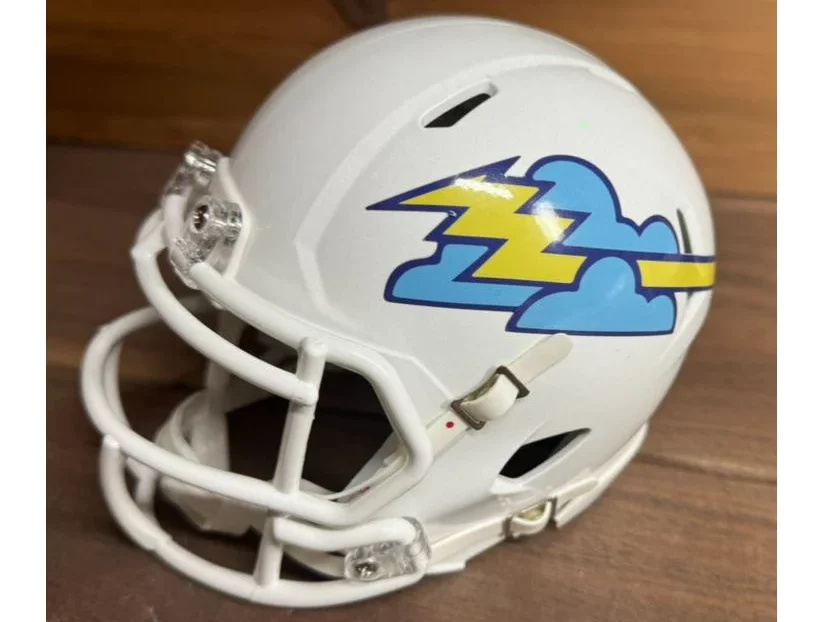
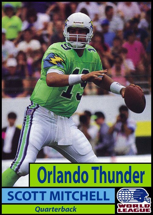
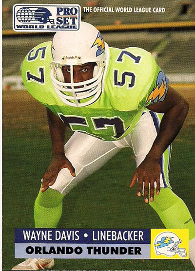
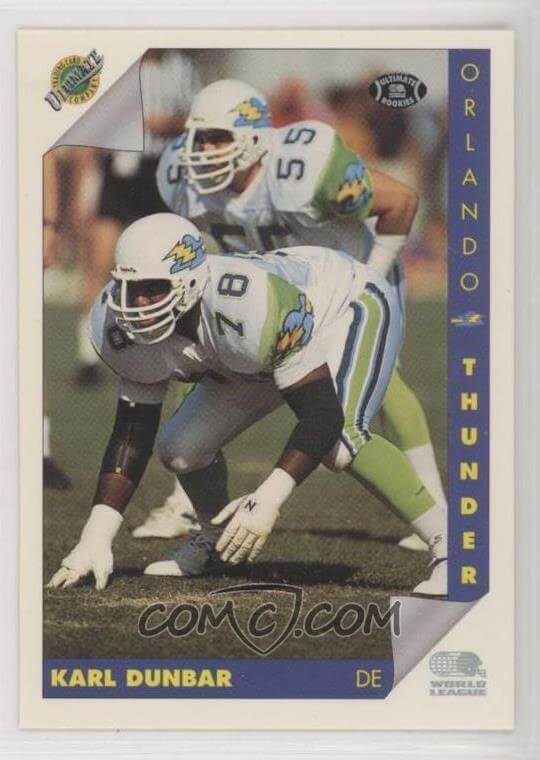
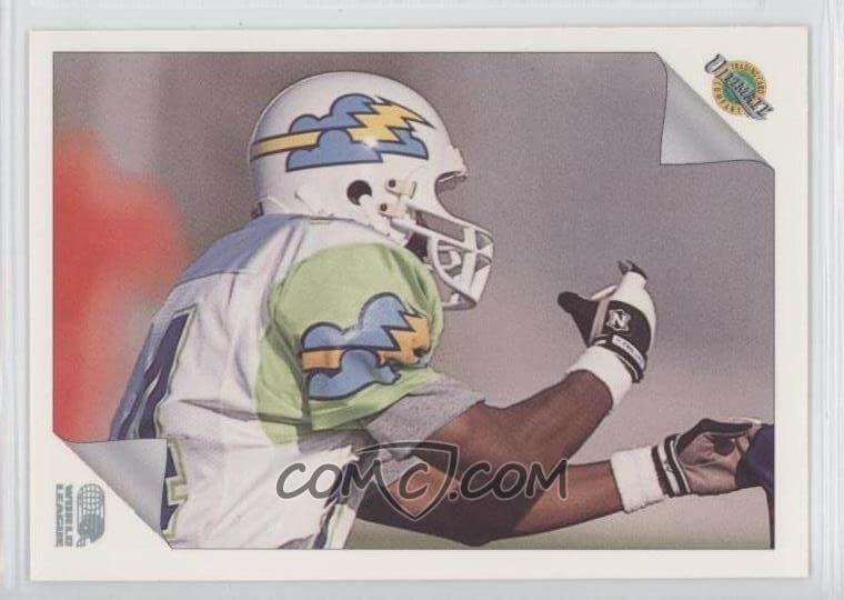
The Thunder sported a solid white helmet, with a white facemask and what can only be described as a “clip art” logo featuring blue clouds and a yellow thunderbolt. There have been some bad football helmet logos over the years, but this one may have been the worst. The logo on the helmet was a modified version of the team’s official logo:
As you can see, the logo, which faces rightward, is used to create the “T” in Thunder, taking the horizontal cue from the lightning bolt and adding a perpendicular yellow extension. The wordmark and base of the “T” were removed to create the helmet logo. For those of us of a certain vintage, this logo literally looks like it was lifted from a page of lightning clip art from the early 1990s. Perhaps that makes it endearing to some. I always thought it looked unprofessional, even if it was a product of its time. But once we get past the helmet and logo…
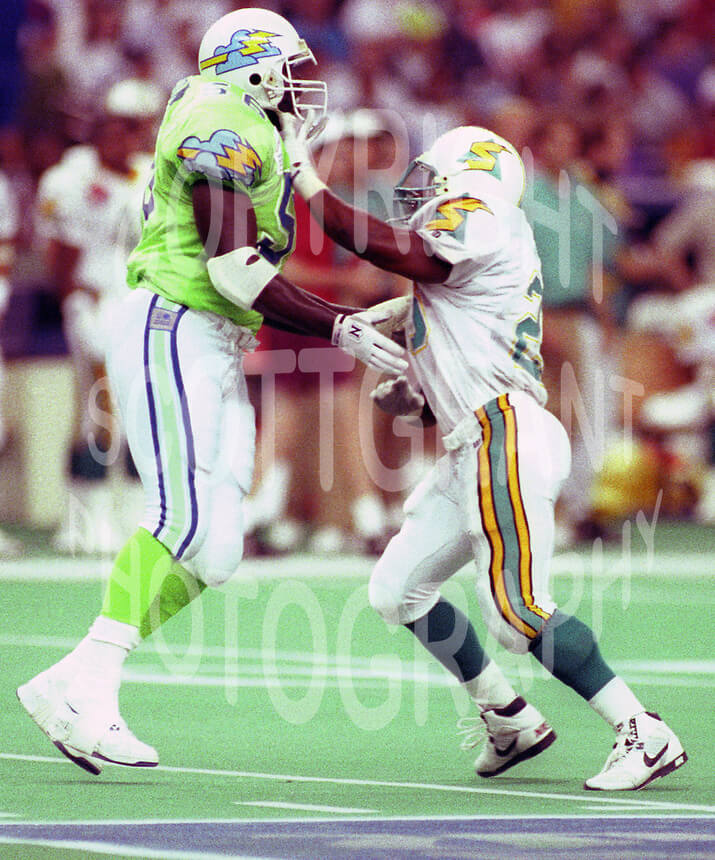
Jerseys
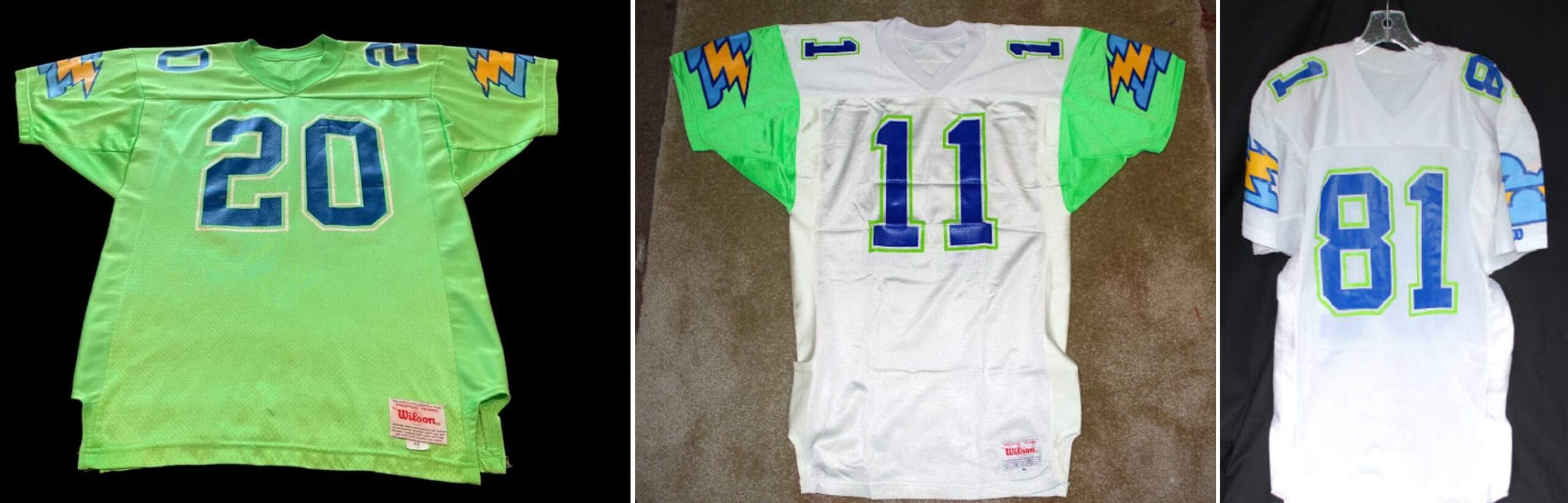
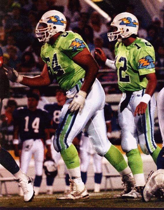
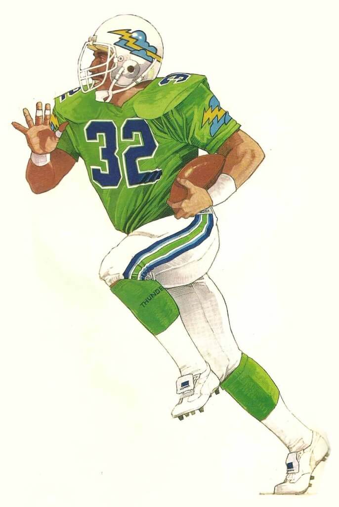
The home jersey (left) stands out for its bright, almost fluorescent green color. Today this might not seem like such a big deal, but back in 1991 it was pretty groundbreaking for its bold presentation. While the color may have been bold and bright, it’s actually a pretty basic jersey otherwise — no stripes anywhere, with helmet logos on both sleeves, and fairly standard block numbers. Numbers on both home and road jerseys were screened-on in blue, with the home having a green/white outline, and the road having a white/green outline. Both jerseys featured TV numbers on the shoulders. The backs of the jerseys were similarly plain, featuring numbers in the same style, with screened-on NOB on nameplates. Both home and road jerseys had NOB rendered in blue serif block font. The solid white jersey (on the right) was worn in 1991. In 1992, the team added the neon green sleeves, for that extra bit of color.
Pants
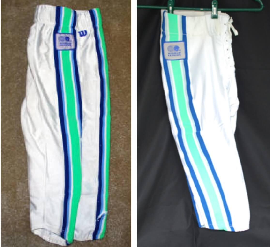
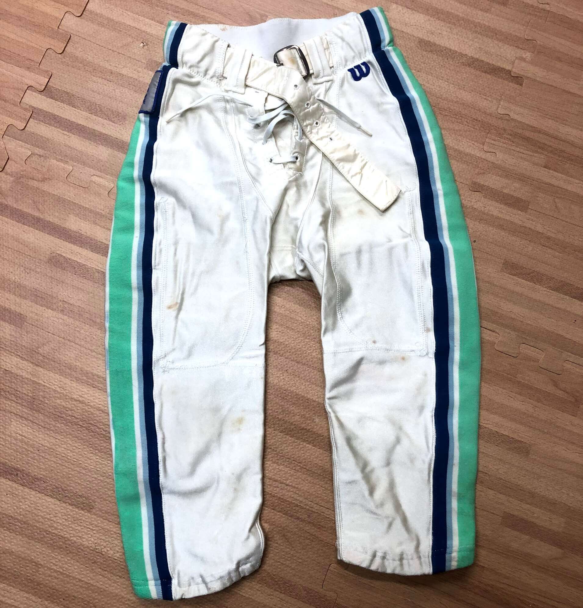
The Thunder wore white pants for both of their seasons, but they actually had two separate pairs — one set featured a dark blue stripe, a lighter blue stripe, a thin white stripe, and a neon green stripe, while the other set simply had a more royal blue stripe, thicker white stripe, and neon green stripe pattern. It’s not clear to me if the pair on the right were worn in game play, as every photo or trading card I’ve seen shows the seven-stripe (seen on left) pattern. Here’s a better look at a set of game worn pants:
Socks
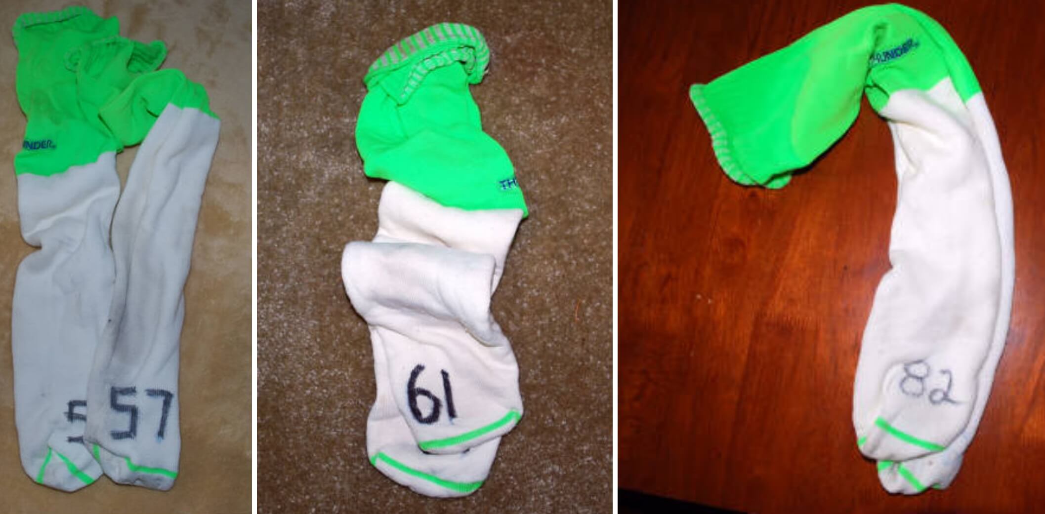
While most players ended up wearing low whites on top of the team-issued socks, these were actually a one-piece with neon green at the top over a white base.
While there may not be as much visual history of the Orlando Thunder as we’d like, fortunately YouTube has some archival footage should you wish to relive the sartorial splendor of that franchise.
You can check out a March 1991 game against the San Antonio Riders here:
For a look at their plain white 1991 road uniforms, here they are in action against the Barcelona Dragons:
And although it wasn’t known at the time, here’s the 1992 World Bowl featuring the Thunder against the Surge, in what would turn out to be the final game of that League’s short history:
The 1991-92 Orlando Thunder may be no more, but one can certainly argue their then-unique uniforms had an influence upon a certain Northwest-based NFL team (who wore this as a one-off jersey in 2009), which itself would serve as a predecessor to the more recent “Color Rush” uniform the team still wears.
Impossible to look at the Seahawks’ Thursday-night uniform without thinking of the Orlando Thunder of the old World League. pic.twitter.com/httrwhdy5b
— Paul Lukas (@UniWatch) December 13, 2016
The Thunder are long gone…but they’re certainly never going to be forgotten.


As a former resident of Detroit, that Scott Mitchell card is triggering
I must say I was a bit shocked to hear you say the Thunder helmets were the worst of all time. I think the Jaguars two tone might have something to say about that. But I’ve always thought that helmet was pristine. It’s a simple and bold logo that’s easily stands out and can be seen from a distance.To each his own I guess.
I said it was the worst helmet logo of all time, not worst helmet.
Hold my beer while I research all the teams with helmet logos worse than the Thunder.
For starters, I’d take it over the Broncos and Titans.
Even worse: the Memphis Maniax, Orlando Rage, Las Vegas Locomotives.
Don’t get me started on the colleges.
As far as the lighting bolt motif goes – The Thunder decal is just a good as the Oakland Invaders … both had terrific uniforms BTW…and marginally better than the DC Defenders, Birmingham Bolts, Chicago Blitz.
But for worst of the worst: San Antonio Gunslingers:
link
And TBPH, the Broncos Crazy Horse ain’t all that good. YVVM.
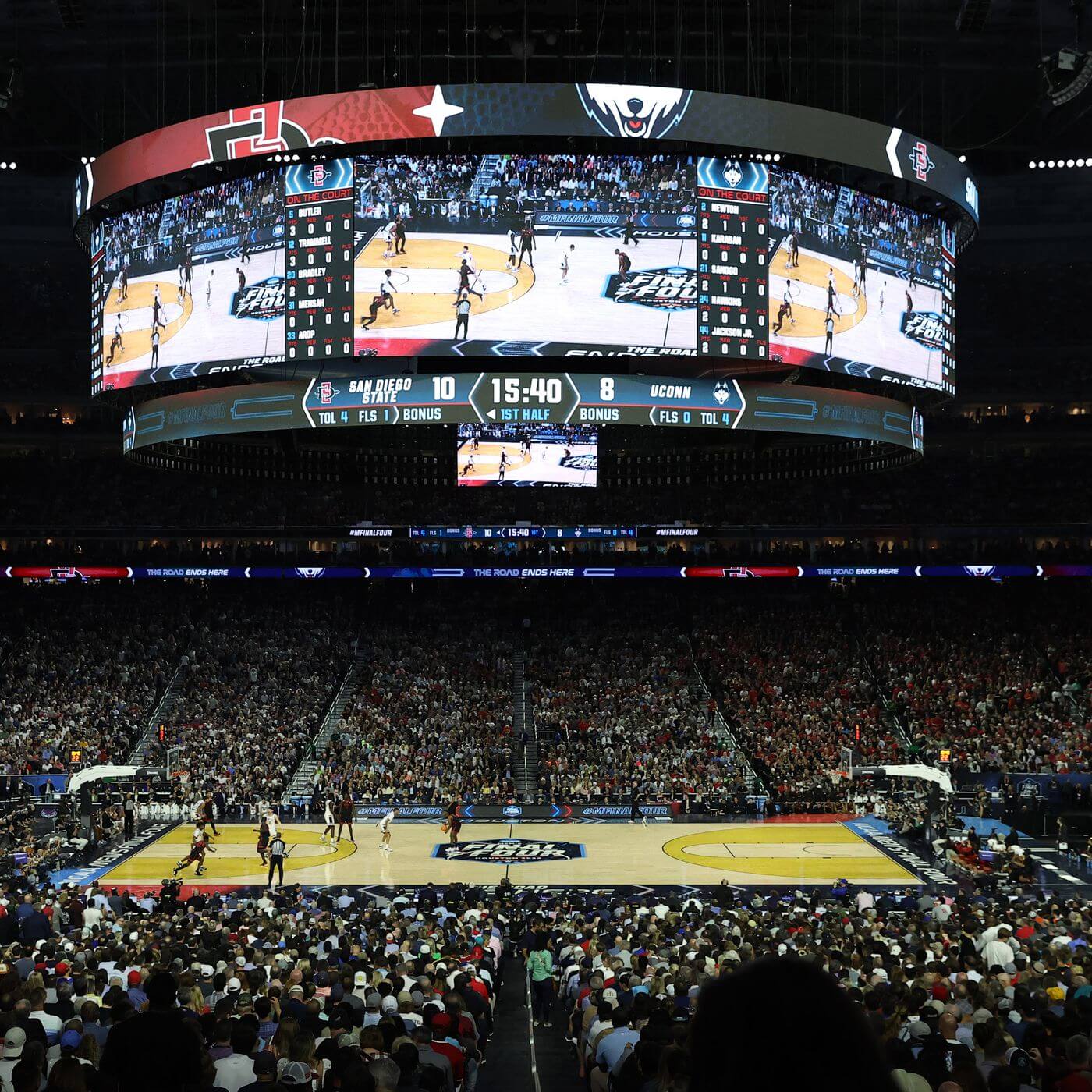
GTGFTS: 3 April 2023, NRG Stadium, Houston, TX.
UConn defeats SDSU 76-59.
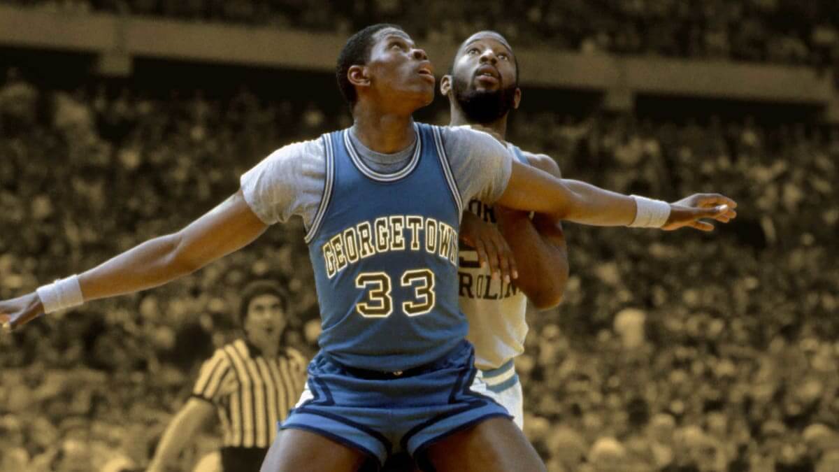
GTGFTU: 29 March 1982, New Orleans Superdome.
UNC defeats Georgetown 63-62. Dean Smith wins his first natty. Go Heels!!!
Also, those Thunder helmets don’t make the Top 5 worst pro football helmets. That highlighter green though… yikes.
GTGFTS
3 Apr 2023
NCAA Men’s Championship
Texans Stadium
San Diego State is enjoying its last lead of the night.
GTGFTU
29 March 1982
NCAA Men’s Championship
Louisiana Superdome
Freshman Patrick Ewing and Junior James Worthy proofreading each other’s Hall of Fame speeches.
Tar Heels beat Hoyas 63-62 on last minute jump shot by the other Hall of Famer on the floor.
I’m pretty sure the Thunder had a color vs. color game against the NY-NJ Knights at the Meadowlands once.
GTGFTU:
March 29, 1982
NCAA Men’s Championship Game
North Carolina 63, Georgetown 62
North Carolina’s win was sealed when Georgetown guard Fred Brown threw a pass to a wide open James Worthy (of UNC). Georgetown had worn their white uniforms for their other tournament games but was wearing blue that night as UNC was a higher seed. The next year Georgetown switched from white home/light blue road uniforms to grey home/navy road uniforms.
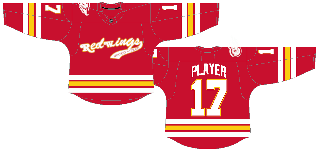
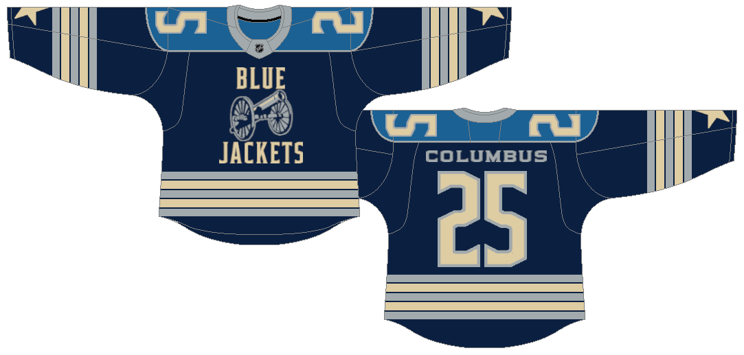
Hi!
I’m the creator of the concepts featured today, and I would love to hear the thoughts of the community! Please let me know what you like and what you think I could change.
My reservations concerning your designs have less to do with the ultimate result than the imperfections in the source material. Michigan suffers from using a typeset script logo; they should always be done by hand. The detailing of the Ohio State uniform is poor. The stripes really need to be bumped up. You hamstrung yourself by attempting to copy MU/OSU instead of improving on them. If I’ve learned anything designing uniforms, its that tradition cows a designer into being afraid to do something bold.
I’m not a huge hockey fan and am not a Michigan guy…
That said, I like both of the designs you made with the yoking.
The D is a fun play on their logo.
Thanks for sharing with the world!
:-)
I had always kidded that if there was ever a power failure at an Orlando Thunder home game, the the Thunder would have a great advantage as their jerseys would probably glow in the dark.
Or a huge disadvantage! The other team could move in the dark, unseen, with a dark brown ball concealed in the darkness while Orlando can’t hide.
Thanks for the memories! I had a bunch of those Pro-Set cards back in the early 90s. Always loved the unis of the Thunder, Galaxy, Dragons, etc.
I used to have the entire set. I think I Vilkmas-ed them several years ago.
First: Were the thunder the first/only team not to have its principal color appear on its helmet? Second, what I refer to as Wasabi or Highlighter Green usually is called “Snot Green”, much the same way Brown, as a team color, is rarely compared to beef or chocolate, but usually as “Shit Brown”. Shall I just chalk this up to gamesmanship? Or is it simply a race to the bottom?
I don’t understand why this helmet logo has clouds that have a flat straight bottom? This wouldn’t have been bad if they had a lightning bolt more like the Chargers, with better shaped clouds. Also, make the helmet light blue, and the clouds white. Then this uniform would be pretty good. Unfortunately, we know if they were still in existence they’d have a mono green uniform they’d wear almost exclusively.
Oh man. The World League of American Football. They had some GREAT helmets – especially the Frankfurt Galaxy and Barcelona Dragons. That league folded the same year I started college at UCF. It was really hard to find merchandise for UCF outside of the campus bookstore; the school was just entering what was then called division 1-AA. I went into some random sports store and there was a hat that just said “Knights” in silver on a black cap. It was for the NY/NJ Knights, but nobody knew that. I remember multiple people on campus asking me where I got it. We all knew the hats offered at the bookstore, and mine wasn’t one of them.
“The World League of American Football. They had some GREAT helmets”
True, but they all suffered by-and-large from using that clunky plastic-y Riddell grill.
The thing I remember most from the WLAF is that the VAST majority of the players wore Kra-Lite facemasks. That always seemed weird to me, because outside of Lomas Brown, Anthony Munoz, and a few other linemen, you rarely saw them in the NFL.
Again… how can you have four colors (including white) helmet and not include your jersey color. That makes zero sense.
Hard to tell since there are no rear photos, but did the logo wrap around the back of the helmet? The logo seems like it would e been designed for it
Almost, but no.
link
Several of the teams in the WLAF had interesting uniforms
Several? EVERY team had interesting uniforms!
Not all the names were great. I could have done with different names for the Machine and the Glory, but everyone looked great.
Absolutely loved the Thunder home uni, and the ’92 away set.
My favorite uni was either the Skyhawks or the Riders. The Surge were close behind them.
Sacramento would make a great Gone But Not Forgotten piece, since they moved to the CFL and became the Gold Miners, then moved to San Antonio and became the Texans. Three different unis…all of them fantastic.
Expansion 1993 Sacramento Gold Miners the only U.S. team in the CFL that season. The only team that did not need to abide by play import ratio. They were Public Enemy No. 1 for Canadian football fans. Man, did we love to see them lose. And they lost a lot that first season. Nice uniforms though.
I kinda like the whote/green/white/green look tbh. Aside from replacing the logo on the jerseys with some striping and maybe tweaking the logo, these are pretty decent imo.
The League also featured the first use of helmet cams
Didn’t like it then and I don’t like it now. Only worse was the USFL’s drone cam because it was so noisy and it actually interfered with a play early in the first season.
Give me the vastly superior and extremely underused SkyCam instead.
Always a big fan of the Thunder unis. Actually the whole WLAF went pretty hard in the uni department – the Sacramento Surge remain one of my favorites of all time (the teal and yellow combo really does it for me).
My favorite Georgetown uniform was that 1981-82 set.
I always thought that the Thunder logo looked like it came from Schoolhouse Rock.
Never heard of this team before, but I have to say I love these Uni’s.
Any of the recent Univ. of Maryland helmets would be worse than that Orlando helmet.
Helmets? Yes. But not the helmet logo.
Something notable about today’s post. The head coach for the Orlando Thunders’ first season was Don Matthews. Matthews left after one season to take the head coaching job of the Saskatchewan Roughriders.
Matthew was also the head coach of the Baltimore CFL team making an appearance in the post today.
Though he was head coach of the Thunder, Matthews did not coach the American game much. He is mostly known as a legendary coach of the Canadian game. 2nd in all-time CFL regular season coaching wins (231). 5 Grey Cups as head coach. 5 CFL coach of the year awards. Canadian football hall of famer.
Kinda funny reading the old Page 2 article. I remember, as a kid in the nineties, having a similar sentiment to what Paul expressed about the Bucs, but now opinion seems to have flipped on them (including mine). I wonder how many of the items listed there would still make a “bottom 10” and how many have become nostalgic favorites.
I was in middle school when the WLAF was around. I would make up fake leagues for baseball, football, basketball…anything, really. Teams, then expansion teams, players, high school, college, pros.
Oddly, the Orlando Thunder, London Monarchs, and Barcelona Dragons were three logos that served as the base or the inspiration for way too many made-up teams.
Those Thunder uniforms were not bad but my favorite WLAF/ NFL Europe uniforms will forever be the Barcelona Deagons. Dark green and red.
I was in my teens when the WLAF debuted, and I was already a Uni Watcher before I knew there was such a thing. I remember being very excited about checking out all of the uniforms, because since I started following football around 1986 or 87, there hadn’t been very many changes to NFL or major college uniforms, so this was a whole league worth of new uniform designs for me to check out (which I largely did thru the aforementioned ProSet cards, which also included a team card for each franchise. Those team cards featured a close up of the team’s helmet). I remember being particularly partial to the Barcelona Dragons and Frankfurt Galaxy uniforms. Although I’m not a huge fan of purple uniforms (my hatred doesn’t run quite as deep as Paul’s though!), what I liked about the Galaxy uniforms is that they paired purple with orange. Although there are definitely other examples (Phoenix Suns come immediately to mind), I feel that orange is a much less frequent color to pair with purple, compared to white, silver, and yellow/gold.
Those helmets scream Yacht Rock
I had no idea that there would be a WLAF team here in México. Do you know where can I find more information about It? Thanks.