Greetings and a good Saturday morning. I hope everyone had a good week, and our American readers had a festive Thanksgiving (and hopefully a four-day weekend too)!
Unless there is breaking news, this will my only post today (Paul has given Anthony the day off so there will be no Ticker today — but I’ll have one tomorrow). However, Paul will have another article this morning. As you may have noticed, last weekend on both Saturday and Sunday I had not just the lede article, but several other articles as well. I expect tomorrow I will have SMUW, a Ticker and at least TWO additional pieces.
Now then.
Last weekend I introduced the “2+3+2 (+2)” project. You can see the: AFC East here and NFC East here. If you want to see the genesis of how this project came about, please refer to the AFC East post.
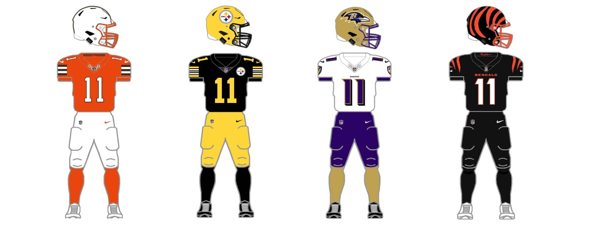
Today we’ll tackle the AFC North (Bengals, Ravens, Steelers and Browns).
To sum up, the project parameters are the following:
• All teams will have 2 helmets, 3 jerseys, 2 pants and 3 socks
• All uniform elements will be “interchangeable” (any combinations can be worn)
• Some teams will be given two options: current uniform and throwback (or fauxback)
• Opposing teams will wear different color elements (helmet/jersey/pant/socks)
• Home team will select its color combo, and away team will then select its combos. No elements can match opposing team
• To the extent possible, uniforms will be based on a team’s current available options. Where no such options exist, they will be created such that every team has 2/3/2/3 options.
• Where present home and road (and/or alternate) uniform template designs differ, they will be “streamlined” to have one single format/style in the 2/3/2/3 parameters
• Color vs. color will be permitted. The only exception is only one team can wear its “dark” jersey (the opponent can pair their color “medium” jersey vs. opponent’s “dark” jersey)
• The 2/3/2/3 gives each team 36 different possible combinations, although I would hope most teams limit that. I would strongly recommend NO team wears same color socks and pants, or full-mono (with the exceptions of mono-black or mono-white), even if the option exists.
AFC North
CINCINNATI BENGALS
The Bengals introduced their current set in 2021, and added a “white tiger” alternate helmet last season. Their current set fits the 2/3/2/3 guidelines right now. We’ll keep the black, white and orange jerseys (and b/w/o socks) for each set. The team has three sets of pants (black and two white sets).
Current uniform
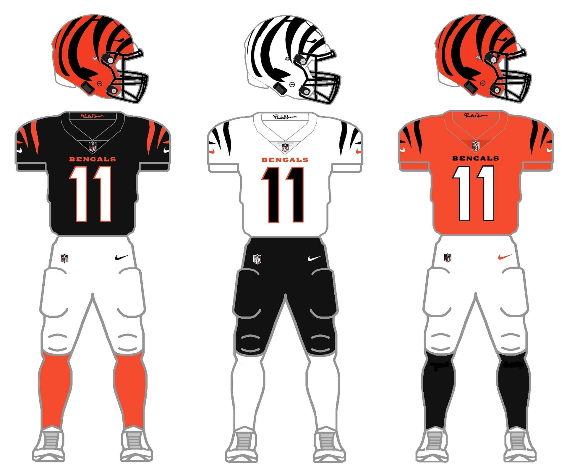
The Bengals only current restriction is pairing their white helmet with anything other than their designated all-white CR uniform. That change occurred in 2023. In 2022, they created the “white tiger” look by using their old CR tops (note the different striping pattern and block numbers). Prior to the single shell rule being lifted, the Bengals paired their orange helmet with their all-white unis. Under 2/3/2/3 the team could wear the new white shell with any additional uniform elements. The team also has three sets of pants (black and white with black stripes, and white with orange stripes). We’ll eliminate the white with orange for this project.
Current uniform with new helmet
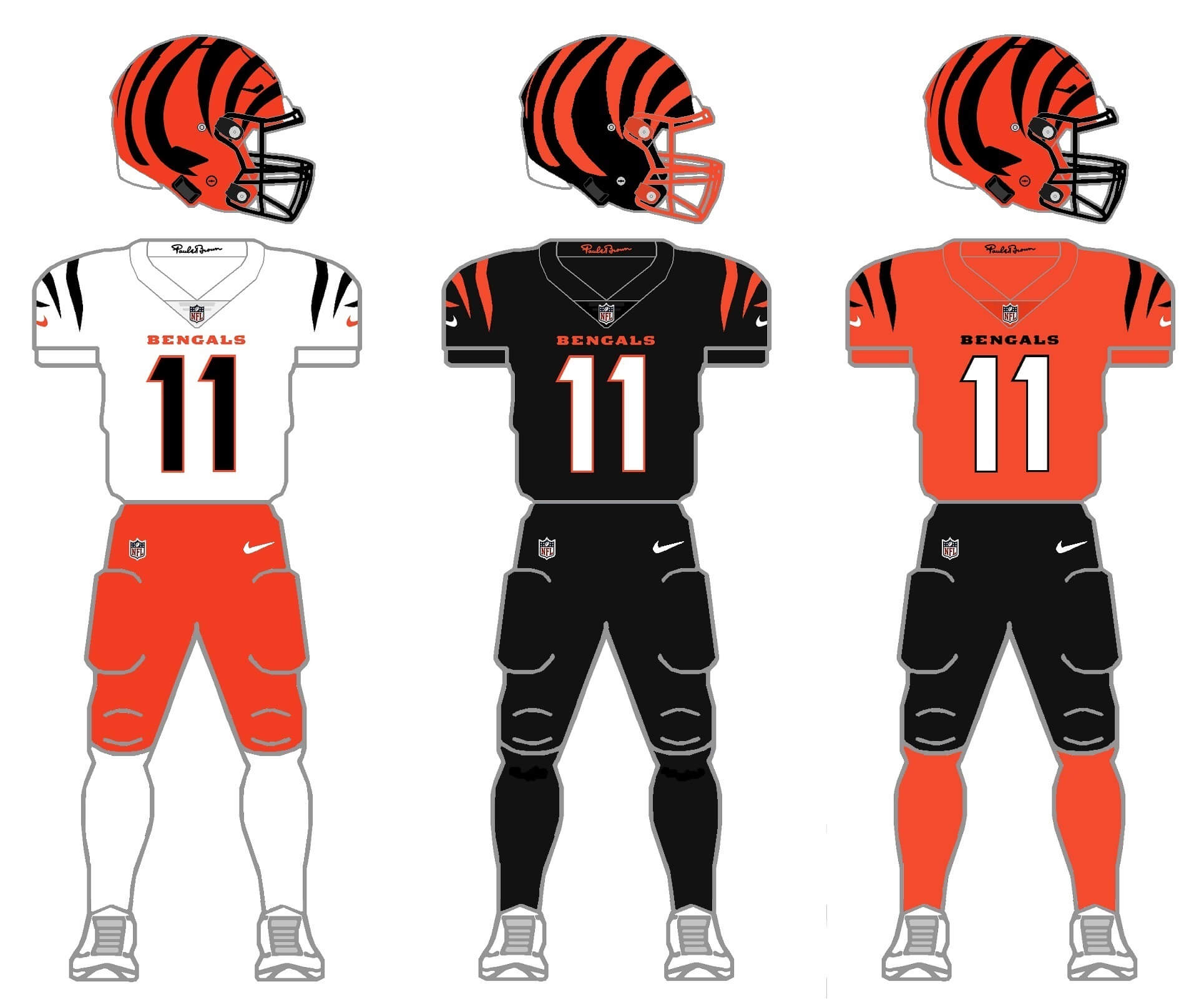
I really like the white shell, so I’m not advocating for this alternative, but here I’ve added a black helmet with orange stripes, similar to this concept (the inverse of their current orange shell/black stripe bucket). I’m also not a fan of almost any team going mono-black (there is one, which you’ll see shortly), but for this I’ve paired the new alternate helmet with the black jersey/pants/socks combo which I think looks pretty good — there’s enough orange on the helmet and the stripes to give good contrast, but still retains the mono-black which it seems most players continue to love. In this set, I’ve eliminated the white pants, opting instead for an orange set. The elimination of the white shell will also limit the team to only white jerseys and socks.
PITTSBURGH STEELERS
Like many teams, the Steelers have both their current uniform set as well as a throwback, with block numbers (meant to be a throwback to the Immaculate Reception). The only difference is the throwbacks have black masks, rather than gray. The team also has a block-numbered CR uniform. In all cases the Steelers have only one helmet shell (black), two jerseys (white, black) and two sets of socks (white, black). To fit the 2/3/2/3, the team will need an additional color helmet and jersey.
Current uniform
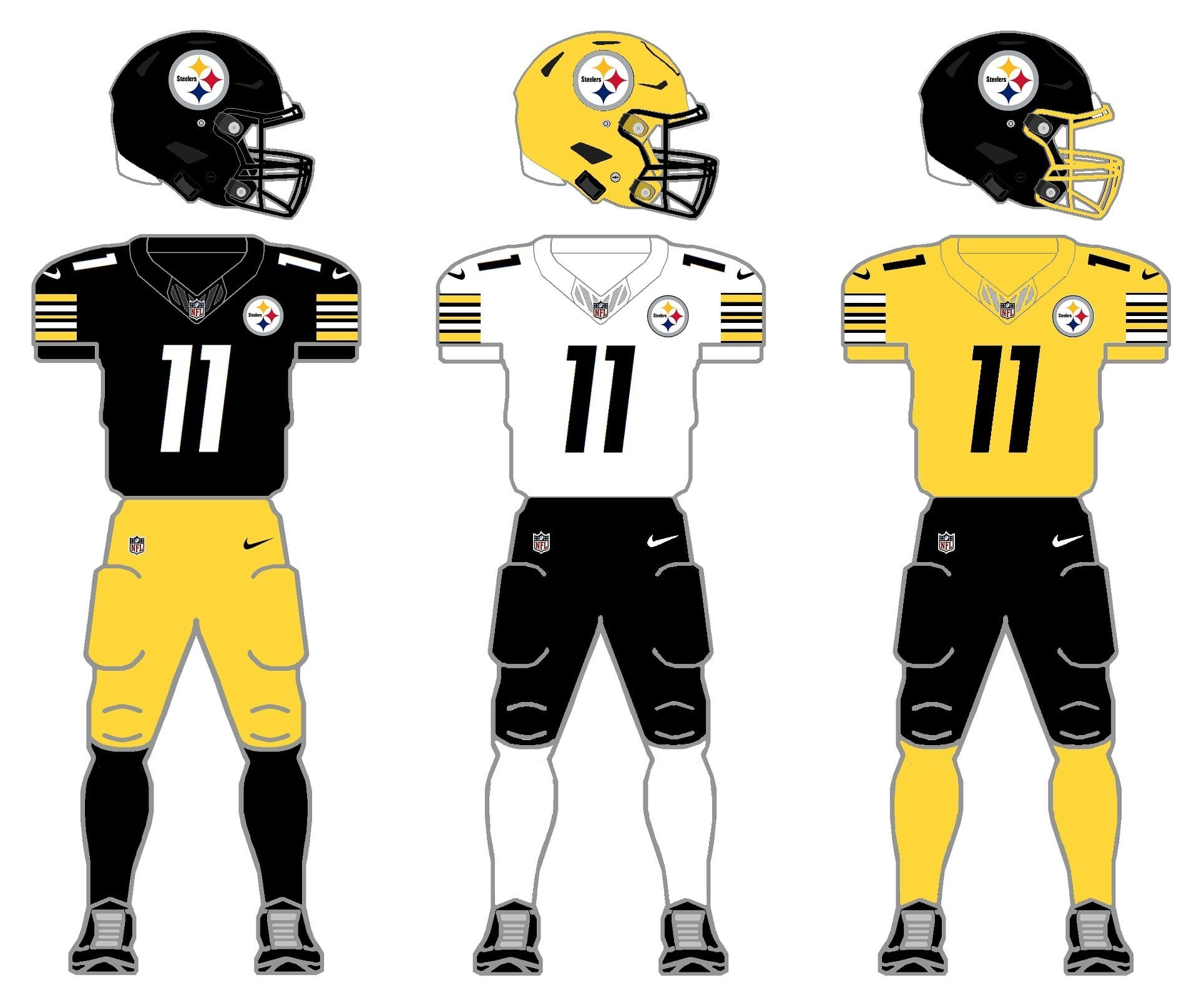
For the current uniform, we need to add an additional color jersey and socks. That’s easy enough: the Stillers are the “black and gold,” so I’ve created a gold third jersey and gold socks, all with interchangeability. The team has a history with gold helmets, even wearing one as part of a throwback uniform from 2007-2011. I’ve added a gold facemask option for the black helmets as well as gold socks.
Throw/fauxback uniform
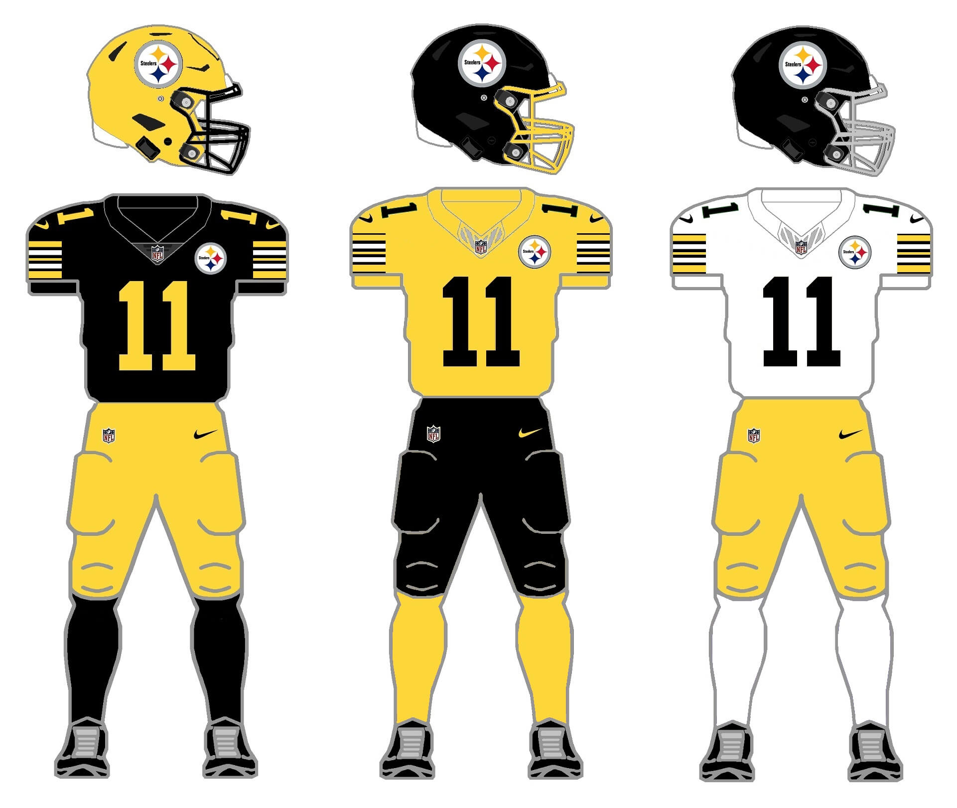
The Steelers have actually worn gold helmets with black jerseys and gold pants way back in their history (the last time they did so was 1959-1960). In addition, the team also has a gold jersey from its very distant past, and that was worn in 1933-35, and again from 1940-42, but the gold shirt has stayed out of their rotation since then. And none of those uniforms were worn with the “Steelers” logo worn on the right side of the helmet — so these are technically fauxbacks. Helmet/jersey/pant/sock colors are all the same as in the “current 2/3/2/3” pattern. I’ve given the gold helmet a black mask, and have both gold and gray cage options for the black helmet. The classic sleeve striping is used on all three jerseys.
BALTIMORE RAVENS
The Ravens currently meet all the 2/3/2/3 criteria (and then some), but only have one helmet shell color: black. So I’ll need to create a second shell color.
Current uniform
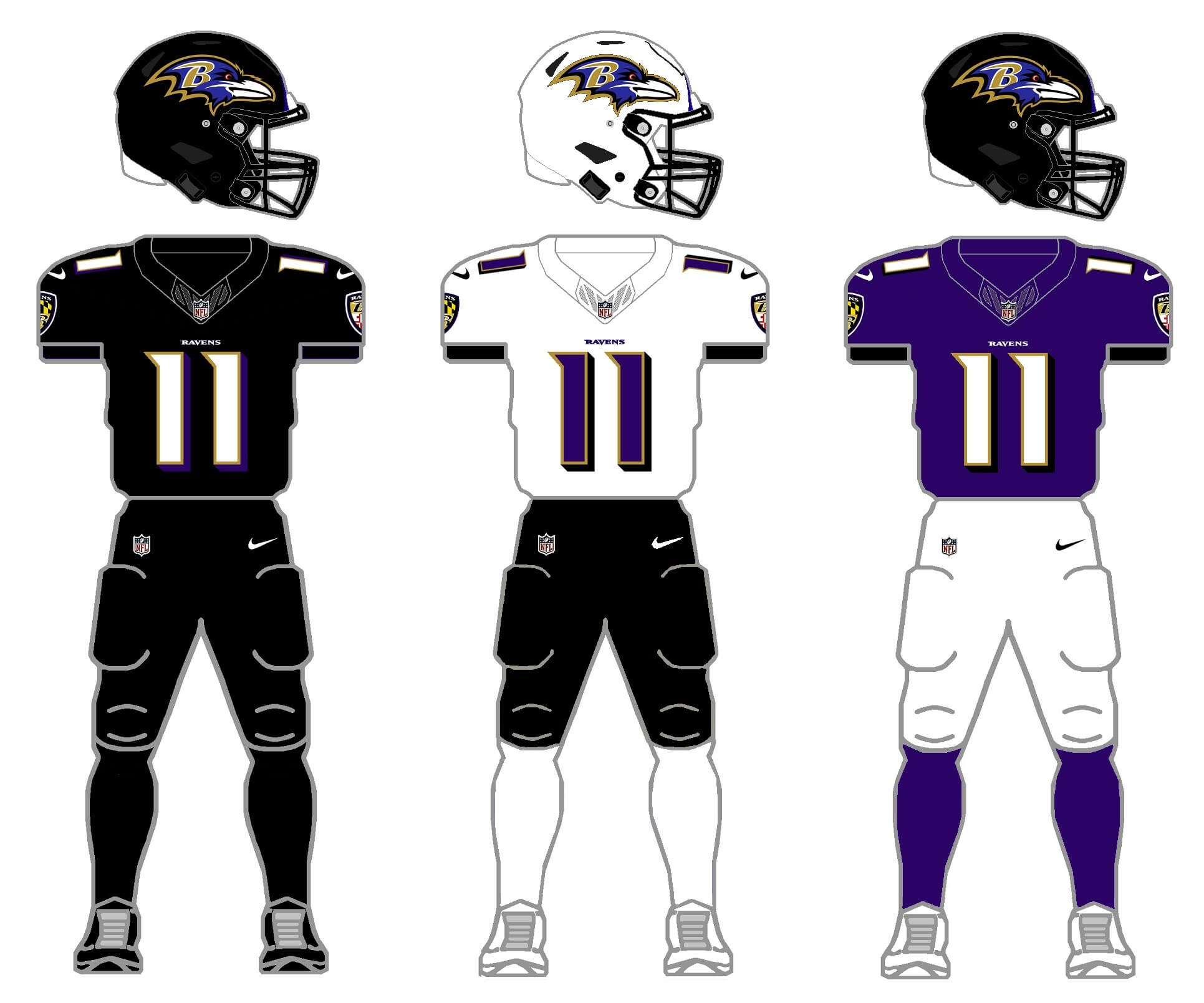
Remember above in the Cincy proposal where I said that there was one team besides the Bengals who look good in all-black? That team is the Ravens. We’ll keep the team’s current black, white and purple jerseys, as well as the black and white pants, for this 2/3/2/3. The current purple pants are eliminated here. For a second shell, I originally tried a purple one — but it’s too close to the black hat, so I went with a white shell.
Current uniform with new color options
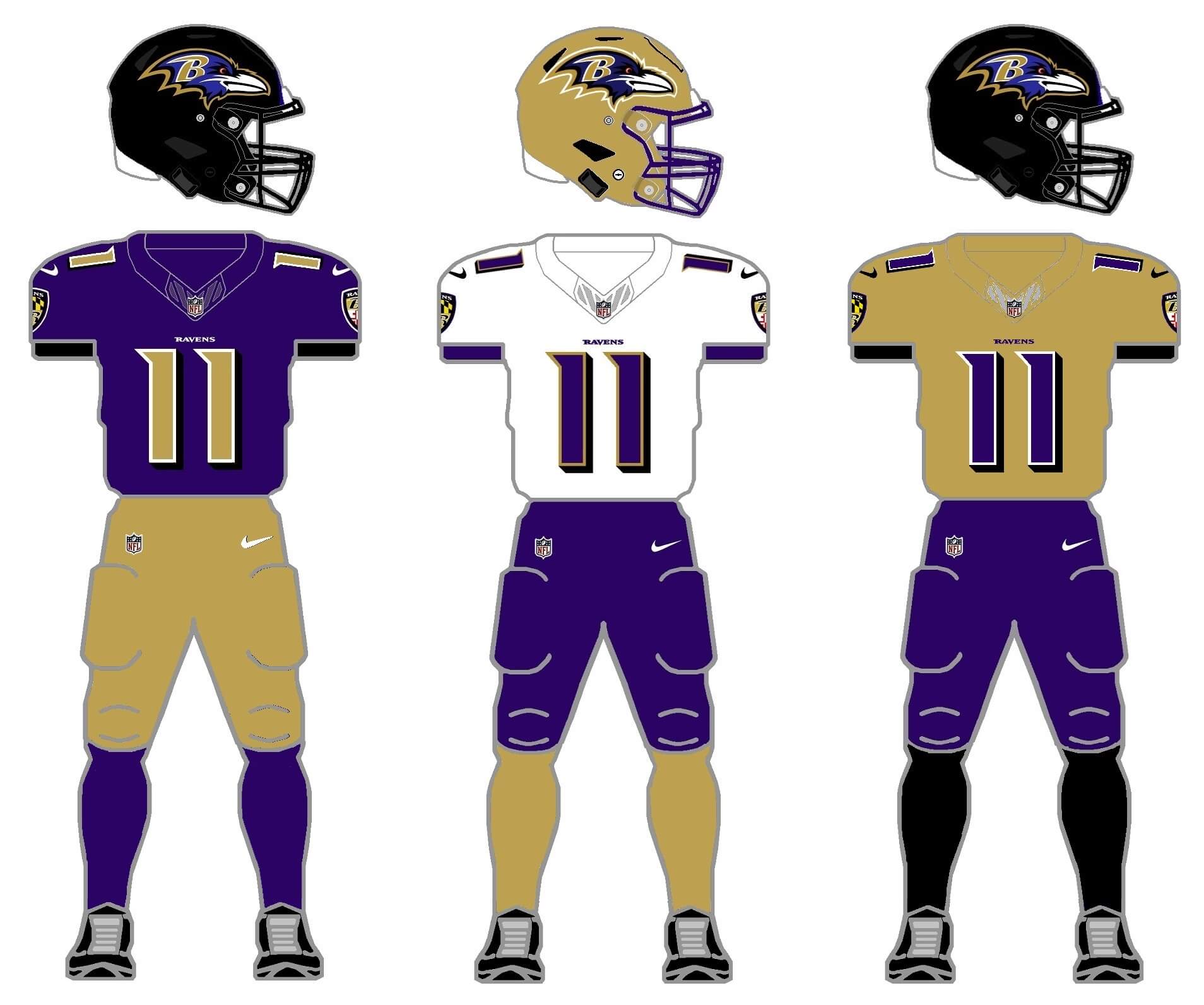
Remember way back in 2015, when the Ravens broke out a new pair of gold pants, completely unannounced? Unfortunately the team lost wearing them, and they were mothballed and never worn again. I thought it was a great look, so in this 2/3/2/3 option, I decided to make greater use of the gold as an option (and ditched both black jersey and pants). I went with gold numbers on the purple jersey (they’re currently white), and created a new gold jersey, as well as gold pants and socks. The AFC North is currently black heavy with both the Steelers and Bengals, so the “gold option” keeps their jerseys and pants in different colors. Here, white socks are eliminated to make room for gold socks.
CLEVELAND BROWNS
The Browns are yet another team with a throwback, and this year they introduced a white helmet shell to make it more authentic. They originally debuted the throwback uniform in 2021, with an orange helmet, to celebrate the team’s 75 anniversary of its 1946 debut. The single shell rule was still in effect then, and this season they added the white shell, debuting it in a road game against Pittsburgh. The team currently wears a brown, as well as two white jerseys (one of which is the 1946 throwback), so an additional jersey color will be needed. Solid socks in white, orange and brown will also be added.
Current uniform
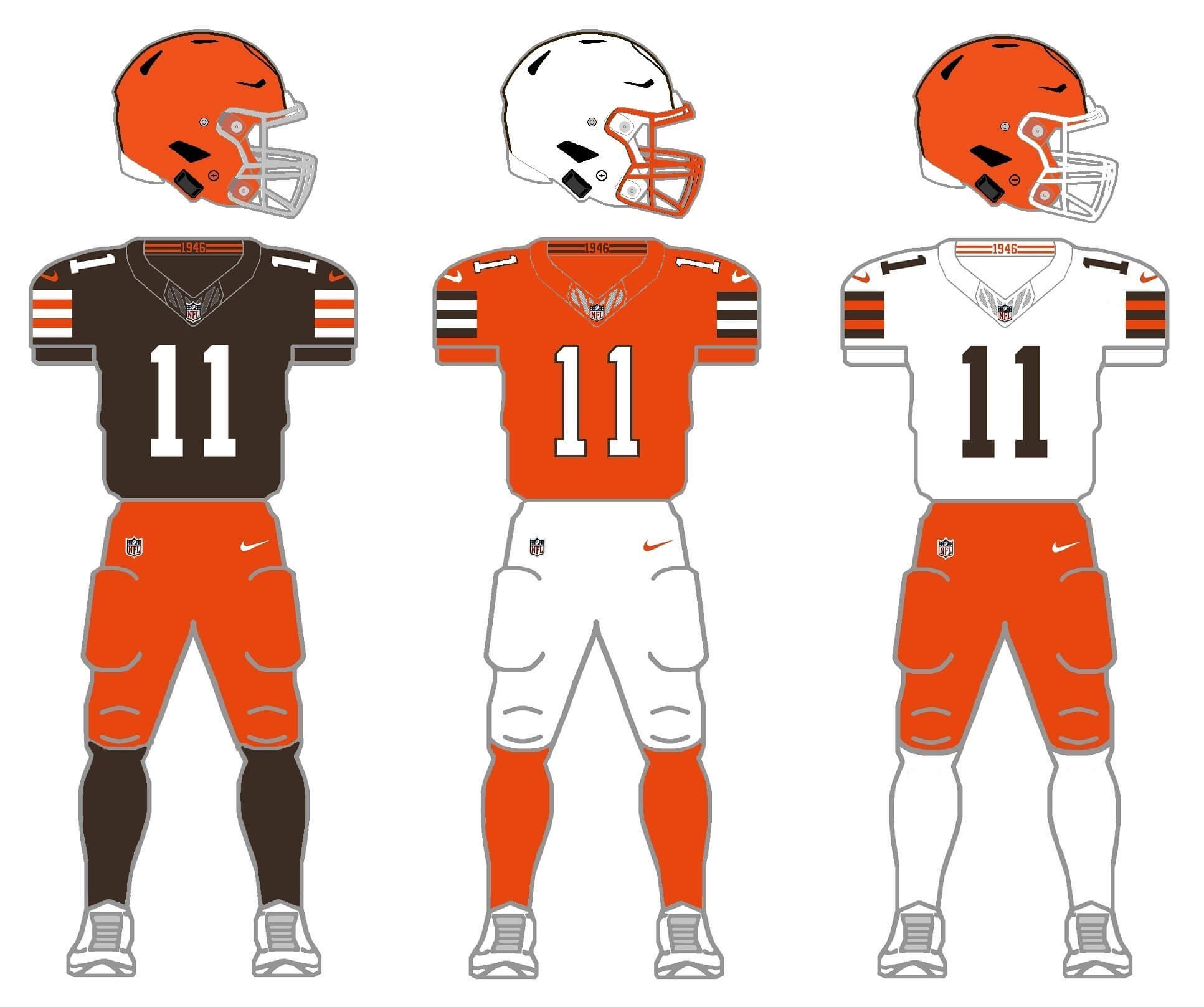
Although the Browns don’t currently have an orange jersey, they’ve had one in their recent (as well as distant) past — wearing one with their ill-fated 2015 redesign, as well as in the early 2000s. So we’ll add an orange jersey to the current set to make the 2/3/2/3 a combination of orange and white helmets, orange, white and brown jerseys, orange and white pants, and brown/orange/white socks. Both the new white lid and the orange helmet have brown cages. I personally hate the brown facemask, so I’ve given the team gray and white options for the orange topper (the team recently added a white mask option). For the white helmet, I gave the team an orange mask.
Throw/fauxback
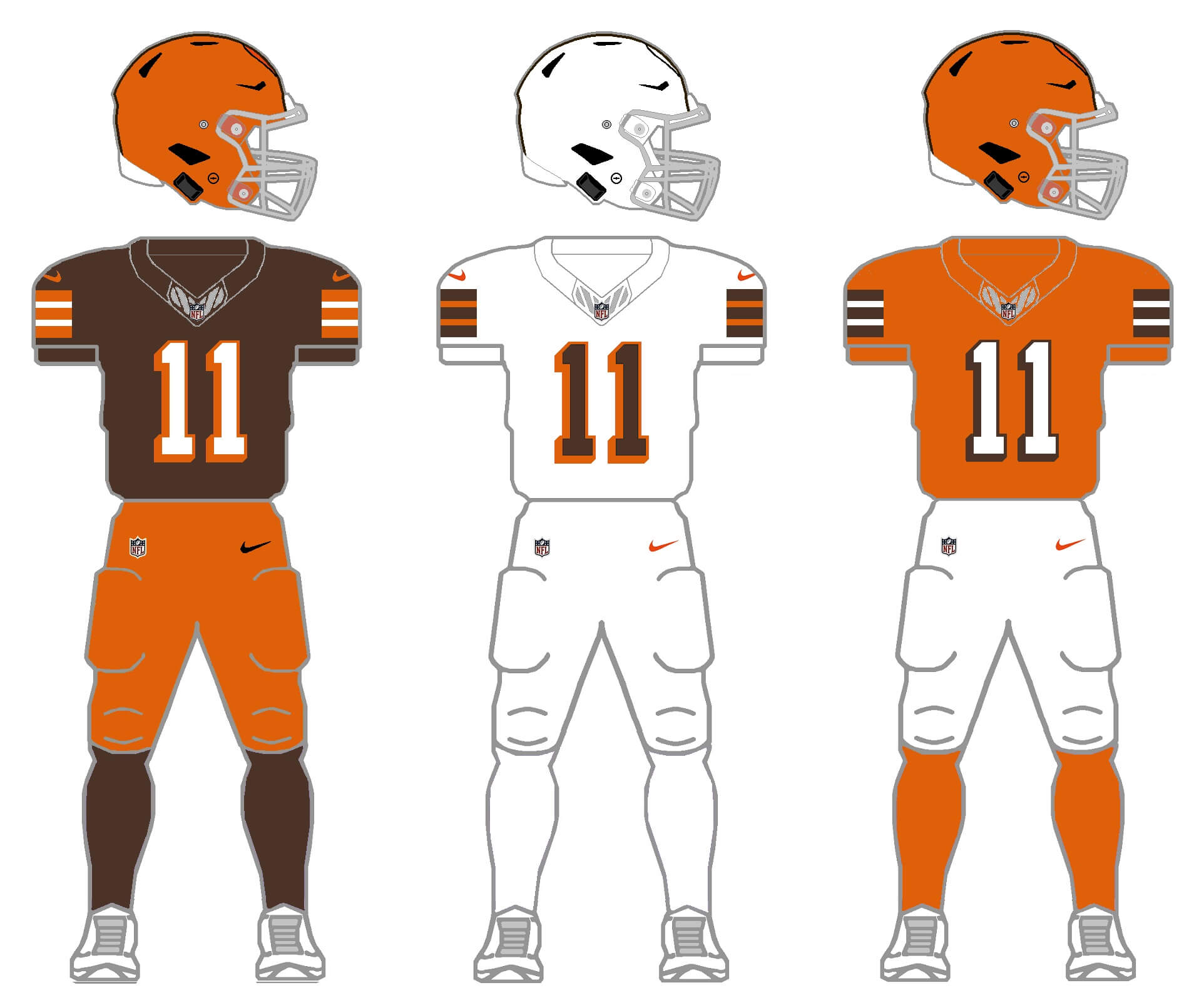
Since the team currently wears a white throwback from 1946, I kept that style for the full fauxback. My first tweaks were to lighten both the brown and the orange, which were made darker over the past decade. The team also wore a brown jersey in 1946, and for the first two wearings, it had orange numbers and block shadow (which went in the opposite direction from the white jersey’s block shadow!), but later changed to solid white numbers. For my fauxback, I gave them white numbers with orange block shadow, with the same pattern as the white jersey. Although the team would not add orange pants until 1975, to keep the 2/3/2/3 protocol, I gave them orange pants. I also gave the team an orange jersey (which the team actually added in 1953), and brown, white and orange socks to round things out.
Thanks for indulging me, and I hope you at least enjoy the concept of 2/3/2/3. I’ll tackle the remaining five divisions in separate posts. Please leave any comments/suggestions/critiques in the comments below!

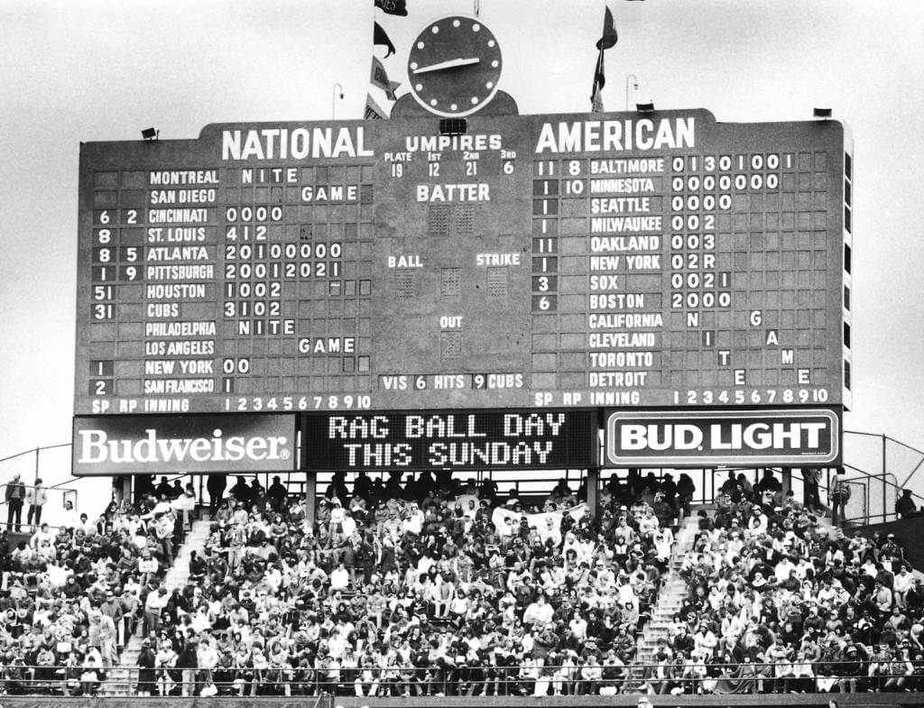
I always found it fascinating that the Wrigley Field scoreboard shows everything but… the scores. You get starting and current pitchers, inning-by-inning run totals (up to 10 innings!), current NL division standings by flags, hits per team and current count and outs for the game being played in front of you, but no total scores anywhere.
The Oakland-New York game has an “R” posted in the bottom of the 3rd. Must be for a rain delay. I’ve never noticed “R’s” in the Cubs scoreboard! Btw, the Cubs list the scores of completed games in the 10th inning box.
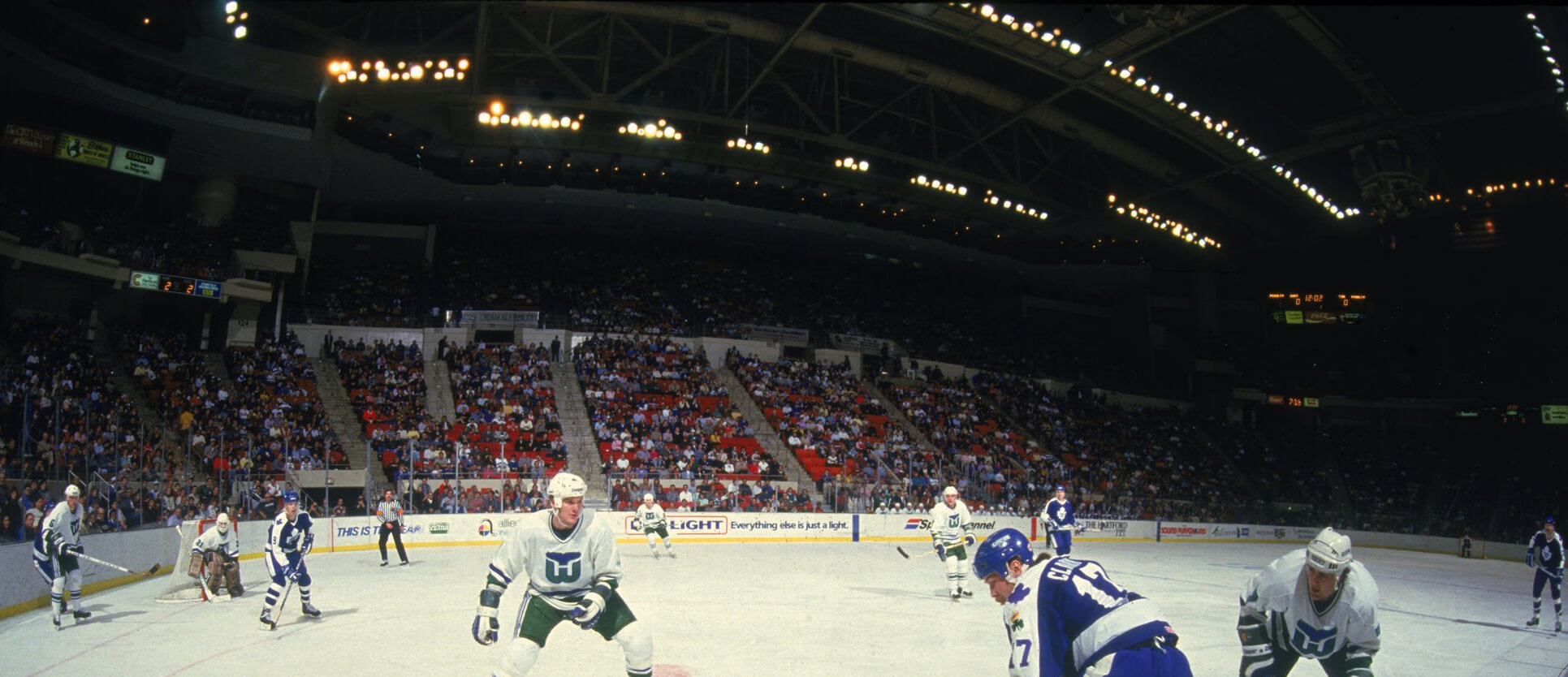
GTGFTU: January 4, 1987. Hartford Whalers beat the hell out of the Toronto Maple Leafs in Hartford, 8-3. Wendel Clark in the foreground with the King Clancy memorial patch on his left sleeve. Ulf Samuelsson to the left of the net, and, most importantly for IDing the game, Steve Weeks in goal.
Stewart Gavin on the right and I think that’s Dana Murzyn with no stick
Daniel, you whale, err…nailed it!
The only matchup between these 2 played in Hartford that season and that involved #17 Wendel(l) Clark.
Was wondering if this was ‘too soon’ a submission since the news broke that the Hurricanes will once again be dressing in their Whalers uniforms…this time, the white version! Then again, it’s been decades since the franchise left Hartford.
2/3/2/3 project: nice work here! All 4 teams have 3-color palettes, which m
2/3/2/3 project: nice work here! All 4 teams have 3-color palettes, which makes the mix & match easier and avoids reaching for a third color. My only 2 cents would be keeping the white tiger helmet for the Bengals (the black shell and orange stripes don’t look right and if we’re using actual tigers as the inspiration, I have never seen a black tiger) and choosing a purple shell over gold for the Ravens.
Thanks!
“choosing a purple shell over gold for the Ravens”
I did try a purple shell, and not only did it look too much like their black shell, the logo basically got lost (even when I added a thick outline). That’s why I chose the gold shell. Obviously there will be some teams for whom it is a stretch to create a 2/3/2/3 (such as the East Divisions where I had to force the Jets into a color that wasn’t green or gold, or the Dolphins in anything but a white helmet).
The other (unstated) goal of the two helmets was also to create a helmet that is a contrasting shell, in case one team has a similar helmet. For example, if the Ravens play the Steelers (which they do at least twice a season), both teams currently have black helmets. If the Steelers were to stick with their black shell, the Ravens in either black or purple wouldn’t provide enough contrast. So that is why I created the white and gold shells for the Ravens.
I agree with you on the Bengals as well. I prefer they stick with what they currently have (although they don’t need two different sets of white pants). I much prefer the white tiger look to the black helmet with orange stripes.
The GTGFTS is the May 30, 1983 day game between the visiting Houston Astros and the homestanding Chicago Cubs. Cubs Hall of Famer Ferguson (Fergie) Jenkins (Number 31) would face off against Astros pitcher Mike LaCoss (Number 51). The Cubs lead 6 – 3 lead going into the top of the 5th (as shown by the Wrigley scoreboard), but the Astros would put 4 runs on the board to take a 7 – 6 lead. The Cubs would tie it, but then Cub reliever Bill (Soup) Campbell would surrender to 2 runs in the 8th to allow the Astros to win by the final margin of 9 – 7. A disappointed crowd of 26,487 saw the Cubs blow another game in 1983. This game occurred almost one month after Cub manager Lee Elia’s famed tirade against the home fans. He would be fired in August 1983.
Loving this project, Phil. This is thoughtful work and it’s turning out wonderfully. I too really thought the Ravens gold pants look was an instant classic; I thought I was alone in that. Each team looks classic and consistent with their history but have an extra pop. Well done.
Thanks Jason!
Nice work again, Phil!
Bengals: the black shell/orange stripe helmet is a subtle yet excellent improvement…the orange pants have got to go though.
Ravens: I’m with you in that they look great in mono-black…one of the few that do. However, they would also work as a purple/gold team (with black helmet) as you demonstrate here.
Your Browns and Steelers treatments are not all that different than what they have in stock now…those orange and yellow tops would be a welcome addition to their sets.
Thanks Chris! If you don’t like orange pants, you’re not gonna like my Denver concepts.
YVVM
Orange pants are fine…actually, great… for Cleveland. Just Cleveland.
Orange pants on Cleveland draw attention away from the helmet, so I prefer the brown britches with the two orange stripes.
Or Tampa Bay.
I’ve seen his Broncos already and I don’t like them.
I LOVE them.
Of all the concepts he shared with me, there were only maybe two or three where I had quibbles. Most were very good and some are flat-out great.
For years I’ve wondered how the Steelers would look if they flipped the jersey/pants colors. It would not look good if they subbed white elements. The only acceptable white article is the jersey when worn with the gold pants.
“For years I’ve wondered how the Steelers would look if they flipped the jersey/pants colors.”
Wonder no more :)
But if you look at the GUD history of the team unis, the gold/black/gold combo WAS worn in the past. Just never with the US Steel logo. So this fixes that.
The gold/white/black looks splendid.
Instead of the US Steel logo, I’d rather see the gold/black/gold with the old kicking Steely McBeam logo.
link
That would be sublime.
I really don’t like the white shell, so I’m
notadvocating for this alternative, but here I’ve added a black helmet with orange stripesBetter.
GTGFTS: May 30, 1983
Houston Astros 9 – 7 Chicago Cubs
Fergie Jenkins started for the Cubs in the last season of his Hall of Fame career, and Bill Buckner hit two home runs.