On Monday the NBA unveiled the 30 new court designs that they’ll be using for their In-Season Tournament, which begins tonight. Yesterday, they released all 30 City Edition uniforms, which the home teams will wear for the In-Season Tourney games.
But here’s the thing: After the In-Season Tournament is over, teams will still wear their City uniforms for assorted games throughout the rest of the season (just as they’ve always done since 2017) — and it turns out that most teams also have a City-specific court design for those games. That’s in addition to their In-Season Tourney court designs. With all of the City uniforms being officially revealed yesterday, those City-specific non-Tournament court designs suddenly appeared on the league’s LockerVision site.
By my count:
- Seven teams are not using City-specific court designs this season: the Bulls, Celtics, Grizzlies, Lakers, Pelicans, Timberwolves, and Trail Blazers. Those teams still have In-Season Tourney courts, but they’ll use their primary court designs for City games after the tournament ends.
- The Mavs have a City-specific court design that is “Coming Soon” but is not yet shown on LockerVision.
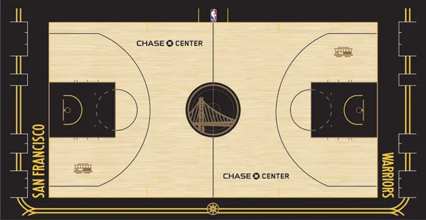
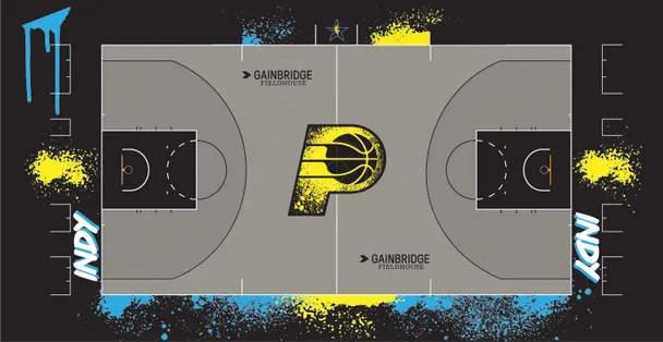
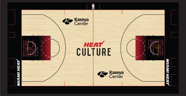
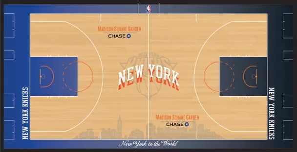
- The remaining 22 teams have released their City-specific courts, which I’m about to show you.
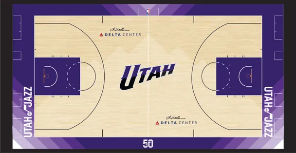
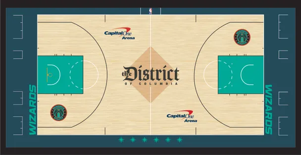
For each of those 22 teams, I’m showing the LockerVision mockup of the City uniform, followed by the In-Season Tournament court design (since the City uniforms will debut on those courts), and then the City-specific court design.
Remember, the In-Season Tournament courts all have the contrast-colored runway stripe running down the center of the floor, while the City courts don’t have that striping, so that’s how you can tell which court is which.
Ready to have your head spin? Here we go.
Atlanta Hawks


———
Brooklyn Nets


———
Charlotte Hornets


———
Cleveland Cavaliers

———
Denver Nuggets


———
Detroit Pistons


———
Golden State Warriors

———
Houston Rockets


———
Indiana Pacers

———
LA Clippers


———
Miami Heat

———
Milwaukee Bucks


———
New York Knicks

———
Oklahoma City Thunder


———
Orlando Magic


———
Philadelphia 76ers


———
Phoenix Suns


———
Sacramento Kings


———
San Antonio Spurs


———
Toronto Raptors


———
Utah Jazz

———
Washington Wizards

———
Phew!
A few thoughts on all this:
- That Rockets City court is pretty awesome!
- At least one team — the Jazz — has four different courts this year: primary, City, tournament, and throwback/anniversary. That’s nuts! (I assume they’re not the only such example, but they’re the only one I can think of off the top of my head.)

- Considering the Pelicans’ City uniform, we should be glad they’re one of the teams without a City-specific court.
I think — I think — this marks the end of the NBA’s new uniform and court designs for this season.
Update: Looks like I spoke too soon about the Pelicans. According to this article, “The team will also debut a City Edition-themed alternate court in the second half of the NBA season.” Yikes.
(My thanks to Lenny Vangilder for that Pelicans article.)


Most of the uni’s look forced and forgettable, I do however like Atlanta’s, interesting color combo
I hope the kitten photo of the day stays as a regular feature.
That Houston court is fantastic. Can we go ahead & make that their primary look, jerseys and all?
As a Rockets fan, I am all for this.
Is that what passes for “H-Town” blue?
link
It nicely balances out that horrific red court. Can’t imagine watching that on TV for more than a few seconds, like most of those tournament courts.
The dunking astronaut that Houston has rules.
The more I see it, the more I adore it. Dunking in zero-G…
I love it! They need to start using it more.
Best thing to come out of this year’s city editions.
I’m just wondering:
Who’s getting rich off of these custom courts? Sounds like an awful lot of outlay for little return.
Watch: someone is going to slip on one of the over-painted City Courts and be out for 12 weeks.
The lumber company is getting richer.
The rest of us are poorer for seeing this waste.
Hate to think about how many trees are sacrificed for this continuing garbage.
Companies making/selling paint?
All these courts and designs just reek of trying too hard to sell us something they’re not putting a lot of heart into so I can’t take anything the NBA does seriously.
NBA stopped being a serious league since Adam SIlver took over
The Cavs court was also released yesterday:
link
Thanks! Now added.
Is the dunking astronaut a new logo? I don’t recall seeing that before.
It’s part of the new City uniform. On the shorts.
Can’t prove this- but my theory is that teams were encouraged to go with black/dark gray or white city jerseys so that they could use bright colors for the gimmicky courts and still have contrast with the uniforms. Only a couple teams (Hornets and Jazz are two examples) have courts and unis that are similar colors (though they still went with different shades).
This would be noteworthy for two reasons: (1) the uniforms may have been influenced by the court designs, and not vice versa, for the first time ever, (2) the gimmicky court marketing for the in-season tournament was prioritized over merchandising of these jerseys
Thank goodness for the score ticker. Going to be even more difficult to tell who is playing with all this excess garbage.
A random question:
How would you describe the predominant color of the San Antonio Spurs’ courts?
I think I’d call it sage.
Too many uniforms coming and going. Too many court designs. NBA has taken it too far. It is getting to the point I cannot tell you what the actual colour scheme is anymore for some teams.
With all these court designs, the Los Angeles Clippers still manage to wear blue and red uniforms and play on a court painted black when at home.
They have to be trolling us at this point. They have gone so far beyond reasonable that the only answer can be trolling.
Fans don’t buy courts. Most don’t buy shorts. Many don’t buy jerseys.
I miss the days when the Bucks played on the MECCA floor, which didn’t have any Bucks logos and the colors weren’t necessarily forest green and red… but you knew the game was being played in Milwaukee.
The great thing about these and past city/statement/icon/cash grab uniforms and court designs is that if you remove the team name, you would have no idea who’s playing. For that matter, you would have no idea this is the NBA. It has diluted each team’s brand so much that it’s white noise. Can we please go back to home and away so that at a glance we know which teams are playing? So that there is some shred of recognition? Do fans really care at this point about a 7th alternate color or a “[insert dumb phrase] City” on the chest of the jersey? Nike is ruining the identity of every team in the league.
This… Just this
The great thing about these and past city/statement/icon/cash grab uniforms and court designs is that if you remove the team name, you would have no idea who’s playing. For that matter, you would have no idea this is the NBA. It has diluted each team’s brand so much that it’s white noise. Can we please go back to home and away so that at a glance we know which teams are playing? So that there is some shred of recognition? Do fans really care at this point about a 7th alternate color or a “[insert dumb phrase] City” on the chest of the jersey? Nike is ruining the identity of every team in the league.
CoTD:
In case you are as curious as I was about propyl gallate:
link
The NBA has officially Jumped The Shark.
OK Boomer ;)
PLEASE fix the UniWatch plus logout issue!
Why is it the non tournament courts look way better than the tournaments courts.
Keep the dunking astronaut. Get rid of everything else.
Very telling that out of all the designs, people like exactly ONE of them. I am also pro-dunkonaut.
Sixers’ City-specific court is a nice design, though I associate the Liberty Bell more with their MLB team and dearly-departed WFL entry…kinda wish the loop of the 6 was centered over the restraining circle – even if that would make the logo a touch higher/off-center.
The faux-neon sign numbering/lettering on the uniform is surprisingly nice.
I dunno why, but the countless NBA court designs every year triggers my, “this has gotta be terrible for the environment” feelings more than anything else in sports. Not a fan!
I guess the Knicks’ 4 is to honor the Tom Seaver statue’s iconic place in NY Sports. What is up with that stupid court gradient though?
According to Forbes, these courts cost from $75,000 to $150,000 each. Including the the announced Pelicans court, between the in-season tourney and the rest-of-the-season City versions, that’s 53 courts. That’s a lot of wood to waste with a cost somewhere between $3,975,000 to $7,950,000. A drop in the bucket, one assumes for the NBA. Four to eight mil, though, could help a lot of people if the NBA wanted to.
If they wanted to help ppl, they wouldn’t have created an extra tournament for gamblers to gamble on.
Any insight into why the paint in the right-side key on the Thunder court doesn’t extend to the baseline, as it does on the left side? Just a mistake in the mock up?
I wanna be in the basketball court business!
Hot take- the nets CCs are awesome
I really noticed this with the tournament courts, but the thing that most bothers me is when the in-bounds and out-of-bounds areas are the same color. Having that contrast should be a #1 requirement for a court design.
I know the UW team spends a lot of time saying things like, “I’ll want to see it on the court/field” or “I wish we could see it with the shorts/pants” before making a judgment. And so there you are with a couple of these uniforms. The Milwaukee jerseys were one of my favorites at first, but with the swim-trunk shorts it’s a horrible uniform. On the flip side, I was “meh” on the San Antonio jersey, but the shorts would appear to elevate the set. Let’s see it on the court first, though.
All the courts are “meh.” I am glad the Celtics aren’t joining this silliness.