It looks as though the Philadelphia 76ers are making a slight tweak to their blue (“Icon”) jerseys heading into the 2023-24 NBA Season.
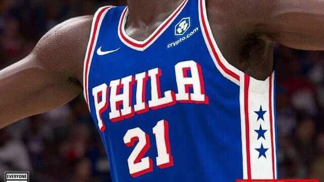
Here’s how the current jersey looks:
Notice how the red block shadow on the “SIXERS” wordmark and the number is beneath and to the left of the number.
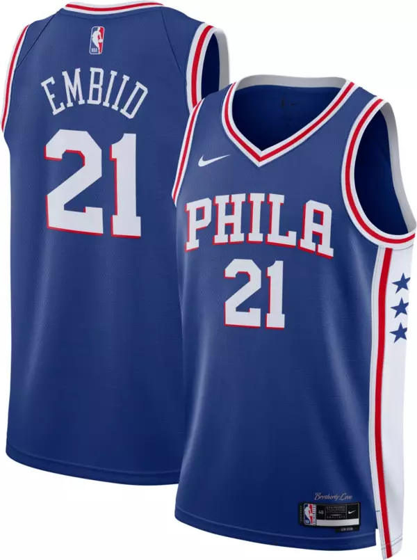
The just released Fanatics jersey shows a much thicker block shadow, and the angle has also changed to below and to the right of the number.
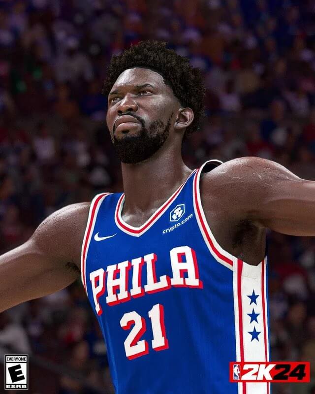
The new version also appears in the NBA 2K24 trailer:
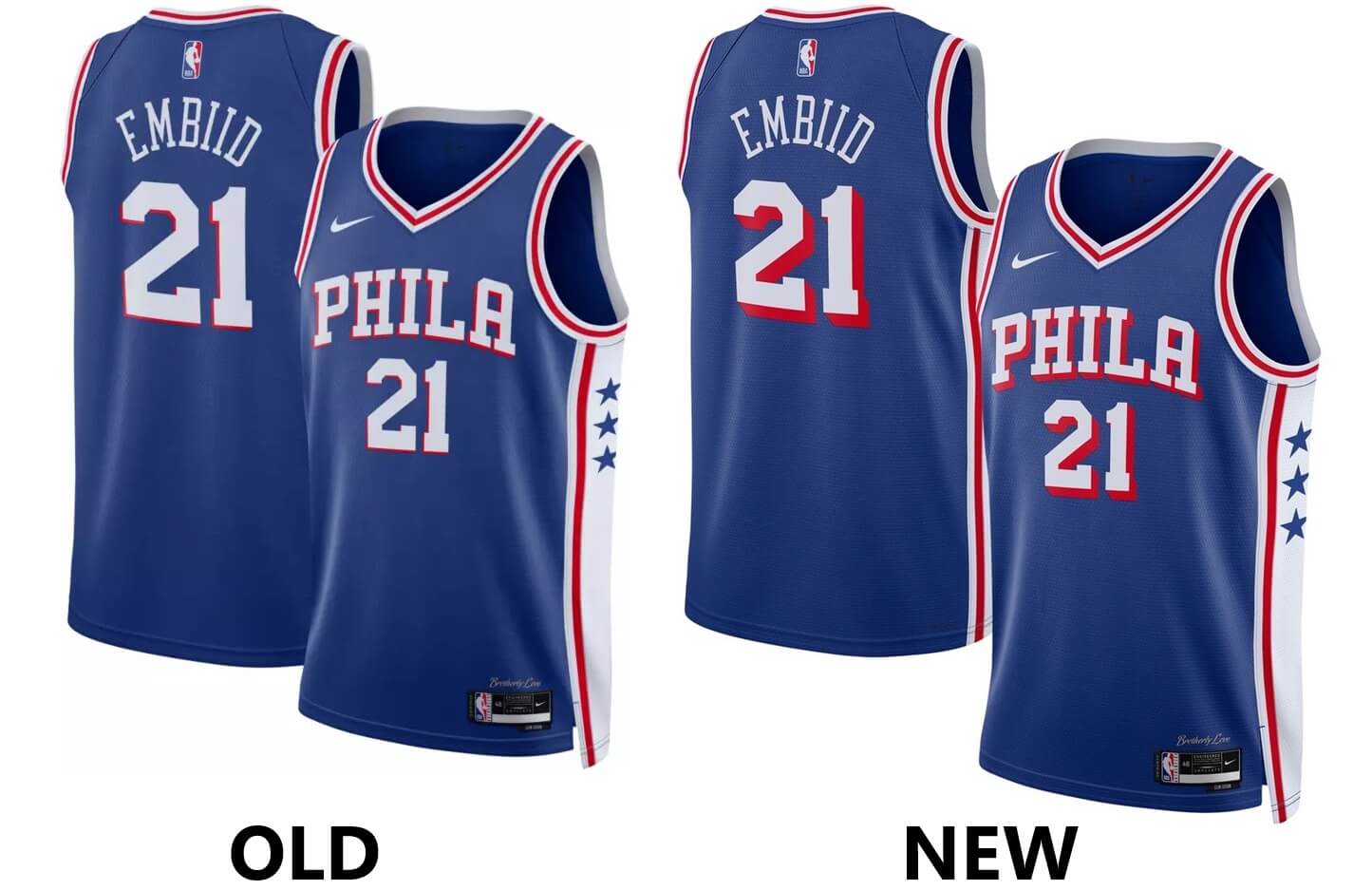
While subtle, this is a definite change to the jersey shadowing. The direction and thickness are very apparent in the side-by-side:
The Sixers also have a white jersey in the identical style, so it would logically follow the white jersey will also receive these changes. There does not appear to be a new white version as yet on the Fanatics site, but we’ll keep an eye out for any changes.
[Big thanks to Reader/Twitter-er Jack Connell for noticing the change to the jersey!]
A great look either way, can’t go wrong…
More red around the number looks much better.
And when you compare, the old block shadow angle looks weird.
It might just be me, but a left shadow looks “wrong,” probably because I read from left to right, so I guess this is an improvement? Still better than the black/gold swimming basketball logo.
Agreed! I have always thought that any shadow other than down and to the right just looks off. Lakers and Heat numbers from their 80’s/90’s uniforms are perfect.
Having the shadow at the bottom left makes it look like the letters are jumping upwards and forwards, so I think it looks fine either way.
Whats the deal with the way the side panel interacts with the shoulder loop? The 2K24 picture does not match up with the other mockup of the new version in that regard. Which one is right?
I would guess 2K got it wrong in this instance
The replicas are wrong. 2k24 is showing what the authentic looks like.
I think the drop shadow on their red jersey is thicker than on the blue or white jersey. I have never liked the thin drop shadow. Then again, I don’t like the “PHILA” wordmark, preferring “SIXERS”. I don’t like abbreviations or airport codes in place of the place name.
Much improved. Now it mirrors the old Warriors jerseys too!
link
Wow. This is so much better. Hate to brag but here in Philly we almost always have top-flight unis. Those Shawn Bradley nightmares from the ’90s being the rare exception.
Why have drop shadow at all? It’s the one uniform element I despise :-)
Love the change! Down and to the right is the best look for a drop shadow.
Really wish the team would go back to the Sixers wordmark, at least for the jersey they’ll wear at home most often. Most seasons, they don’t have their team nickname on any of their jerseys, which is odd for a pro team.
Their red alts ABSOLUTELY should say Sixers, especially since the red is most associated with the 80s teams.
The subtle detail in the shadowing is a nice touch. I never thought it was missing anything.. Philly always has nice uniforms across the board (MLB, NFL, NBA, NHL)