Good Saturday Morning, Uni Watch. I hope everyone has had a good week.
You may recall I’ve had the pleasure of sharing the various NBA concepts of Casey Vitelli over the years — sometimes solo, and sometimes in collaboration with other graphic designers. This includes his NBA “Earned” Edition Concepts, an “NBA Refresh” series (Part I and Part II), as well as a more recent set of concepts modeled on the “Reverse Retro” theme, and a collaboration with 15 other graphic designers to create still more “Earned” Edition concepts.
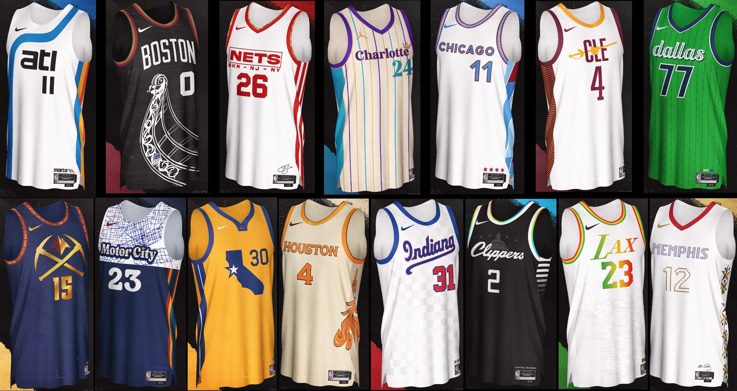
Casey returns today with perhaps the most ambitious project to date: 30 designers (including himself) each creating a “City” edition jersey for a different NBA team! There’s a lot to get to, so this will be a two-parter, with Part I running this morning. Let me now turn it over to Casey as he brings you the …
by Casey Vitelli
We had so much fun with the “Earned Edition Concept Series” that we wanted to bring it back, bigger than ever.
I went and grabbed 29 designers (yes… 29…) and we each designed a “City Edition” jersey and battled it out in a follower vote to crown the champion, bracket style.
One small bit of info, though: We didn’t announce who designed which jersey to make things interesting.
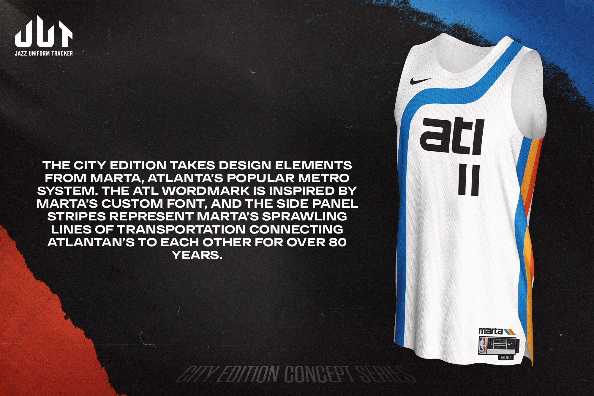
The City Edition takes design elements from MARTA, Atlanta’s popular metro system. The ATL wordmark is inspired by MARTA’s custom font, and the side panel stripes represent MARTA’s sprawling lines of transportation connecting Atlantans to each other for over 80 years.
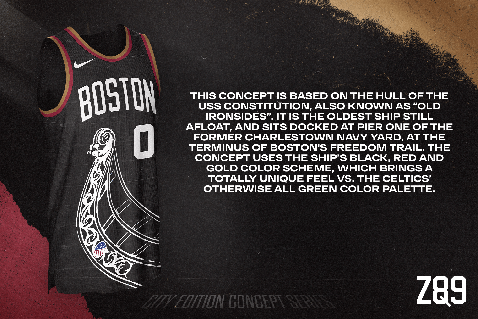
This concept is based on the hull of the USS Constitution, also known as “Old Ironsides”. It is the oldest ship still afloat, and sits docked at Pier One of the former Charlestown Navy Yard, at the terminus of Boston’s Freedom Trail. The concept uses the ship’s black, red and gold color scheme, which brings a totally unique feel vs. the Celtics’ otherwise all green color palette.
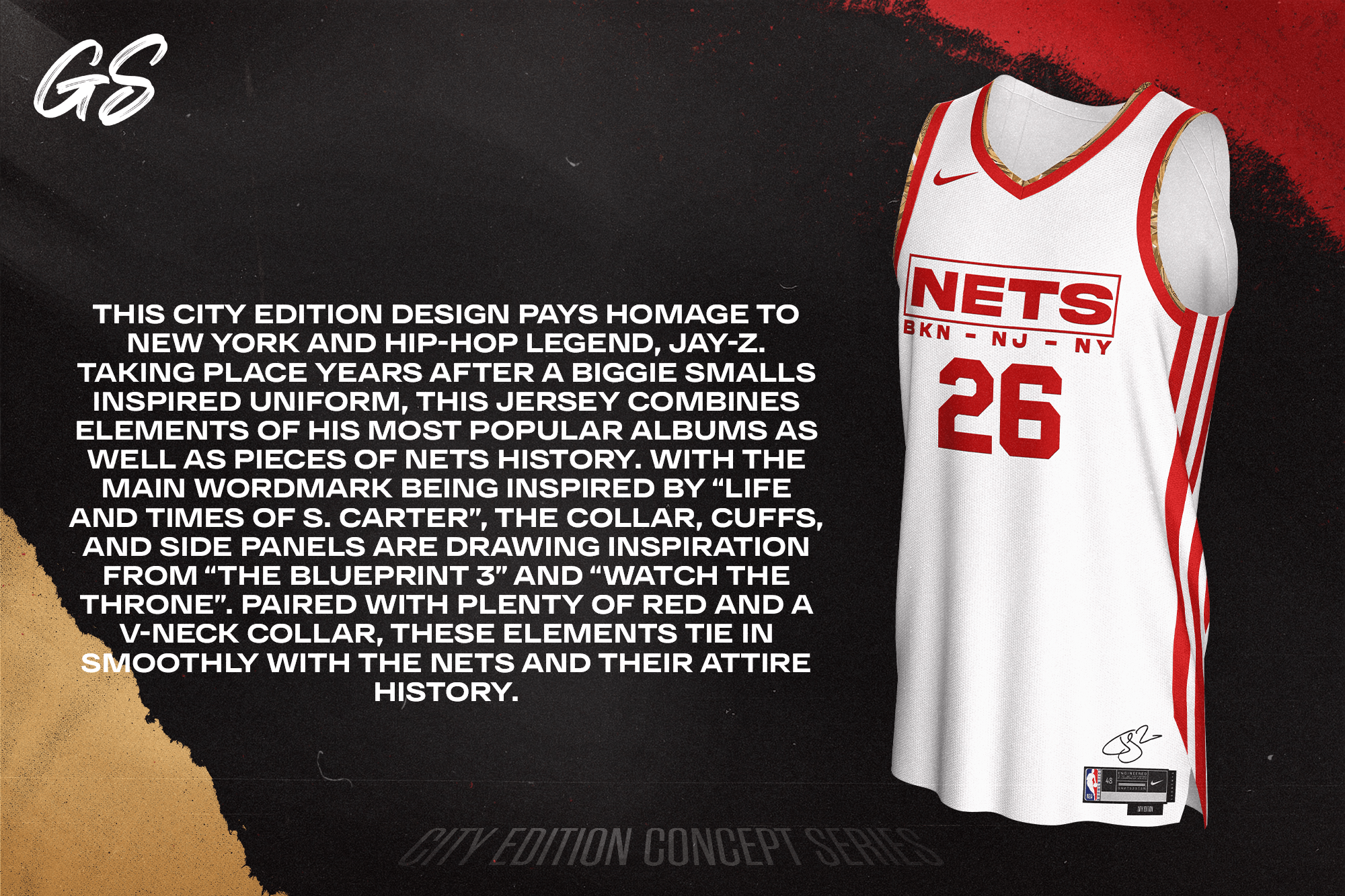
This City Edition design pays homage to New York and Hip-Hop legend, Jay-Z. Taking place years after a Biggie Smalls inspired uniform, this jersey combines elements of his most popular albums as well as pieces of Nets history. With the main wordmark being inspired by “Life and Times of S. Carter”, the collar, cuffs, and side panels are drawing inspiration from “The Blueprint 3” and “Watch the Throne”. Paired with plenty of red and a v-neck collar, these elements tie in smoothly with the Nets and their attire history.
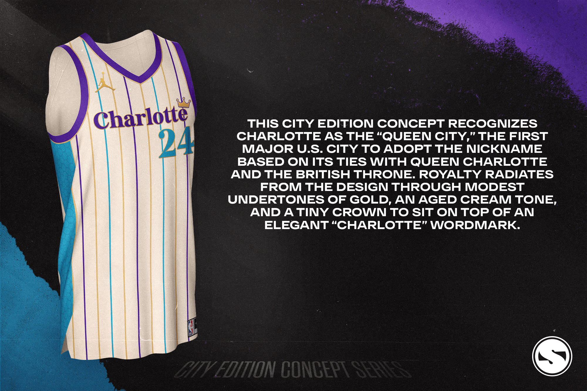
This City Edition concept recognizes Charlotte as the “Queen City,” the first major U.S. city to adopt the nickname based on its ties with Queen Charlotte and the British throne. Royalty radiates from the design through modest undertones of gold, an aged cream tone, and a tiny crown to sit on top of an elegant “Charlotte” wordmark.
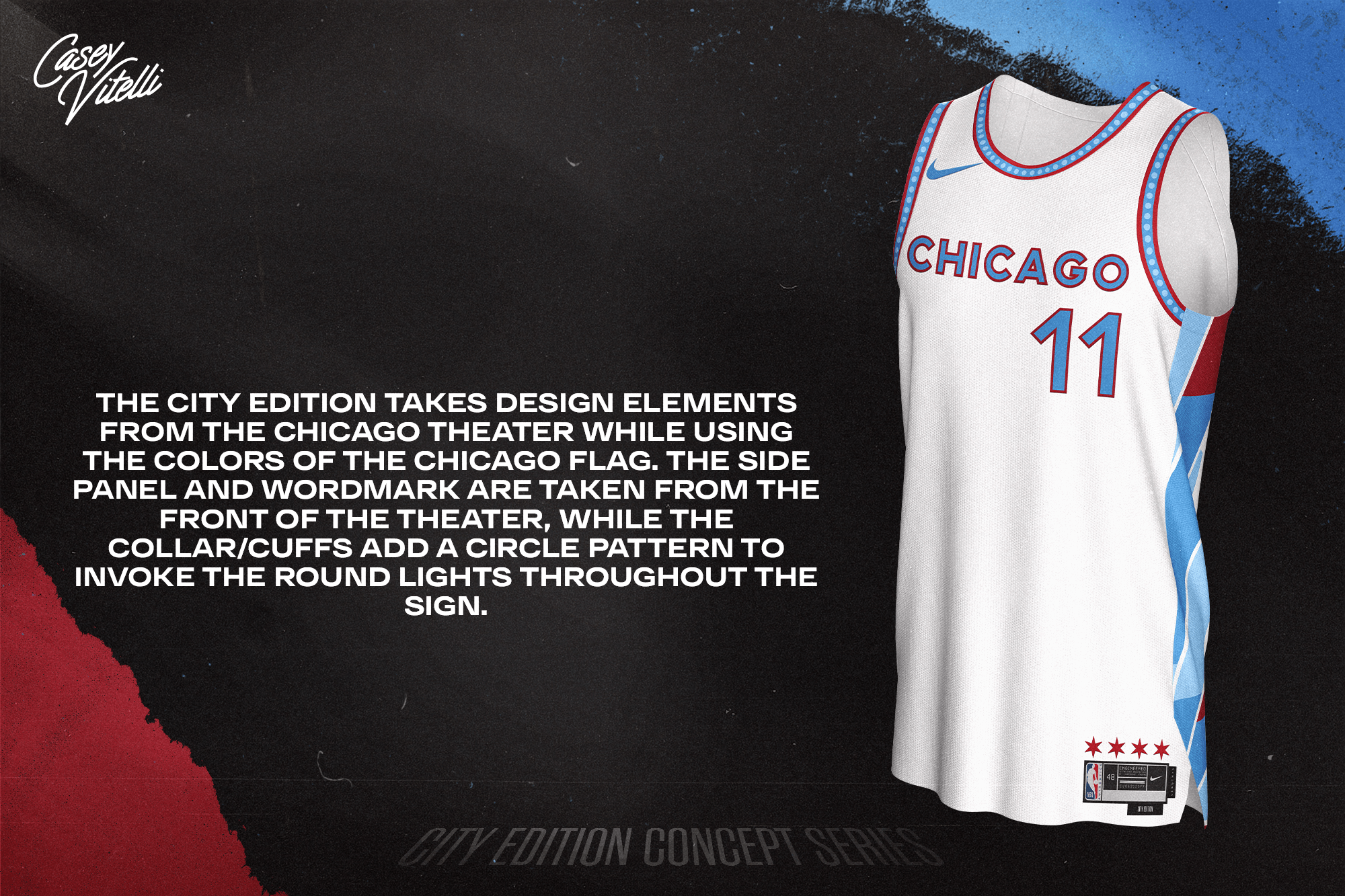
The City Edition takes design elements from The Chicago Theater while using the colors of the Chicago flag. The side panel and wordmark are taken from the front of the theater, while the collar/cuffs add a circle pattern to invoke the round lights throughout the sign.
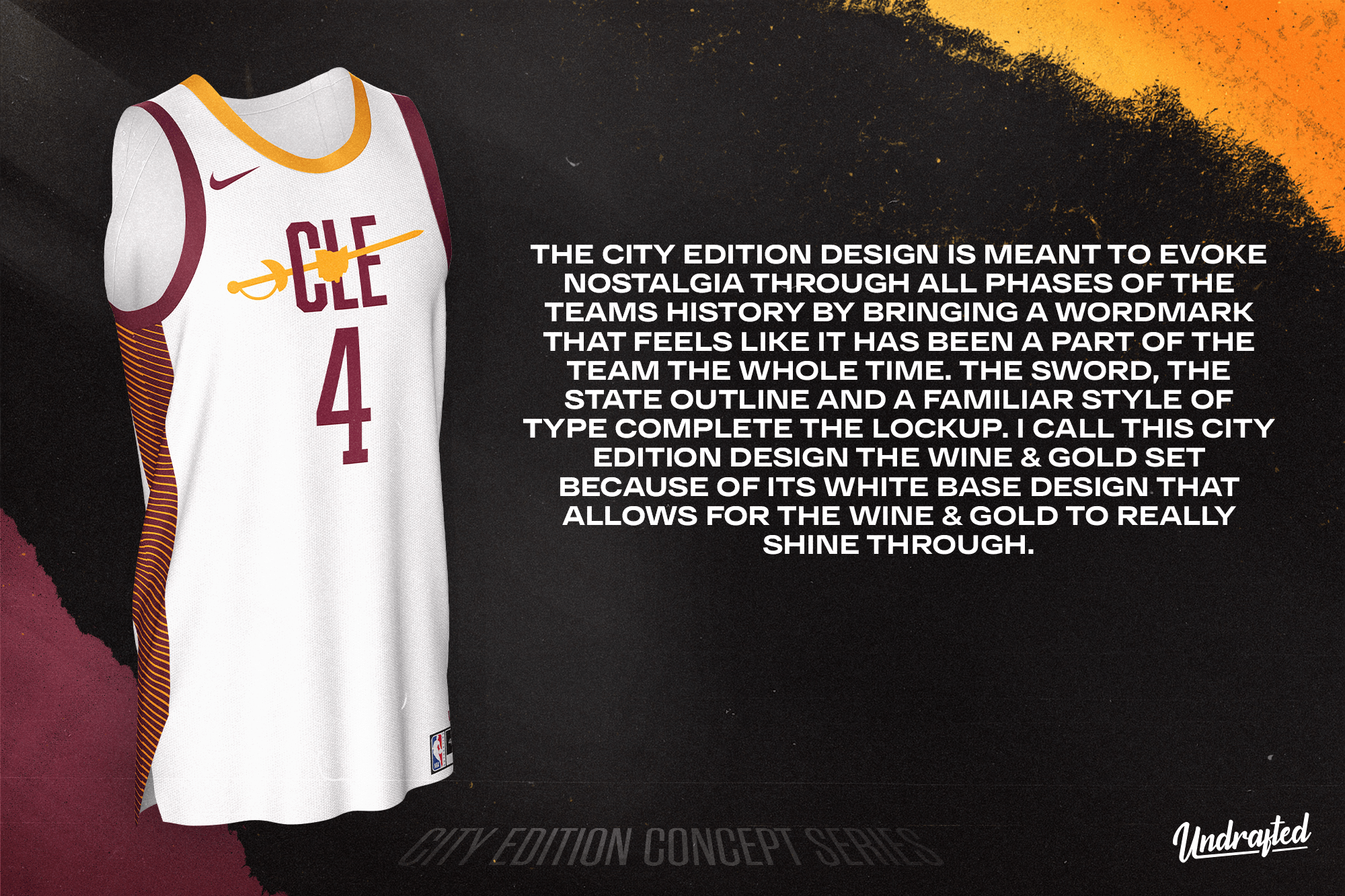
The City Edition design is meant to evoke nostalgia through all phases of the teams history by bringing a wordmark that feels like it has been a part of the team the whole time. The Sword, the state outline and a familiar style of type complete the lockup. I call this City Edition design the Wine & Gold set because of its white base design that allows for the Wine & Gold to really shine through.
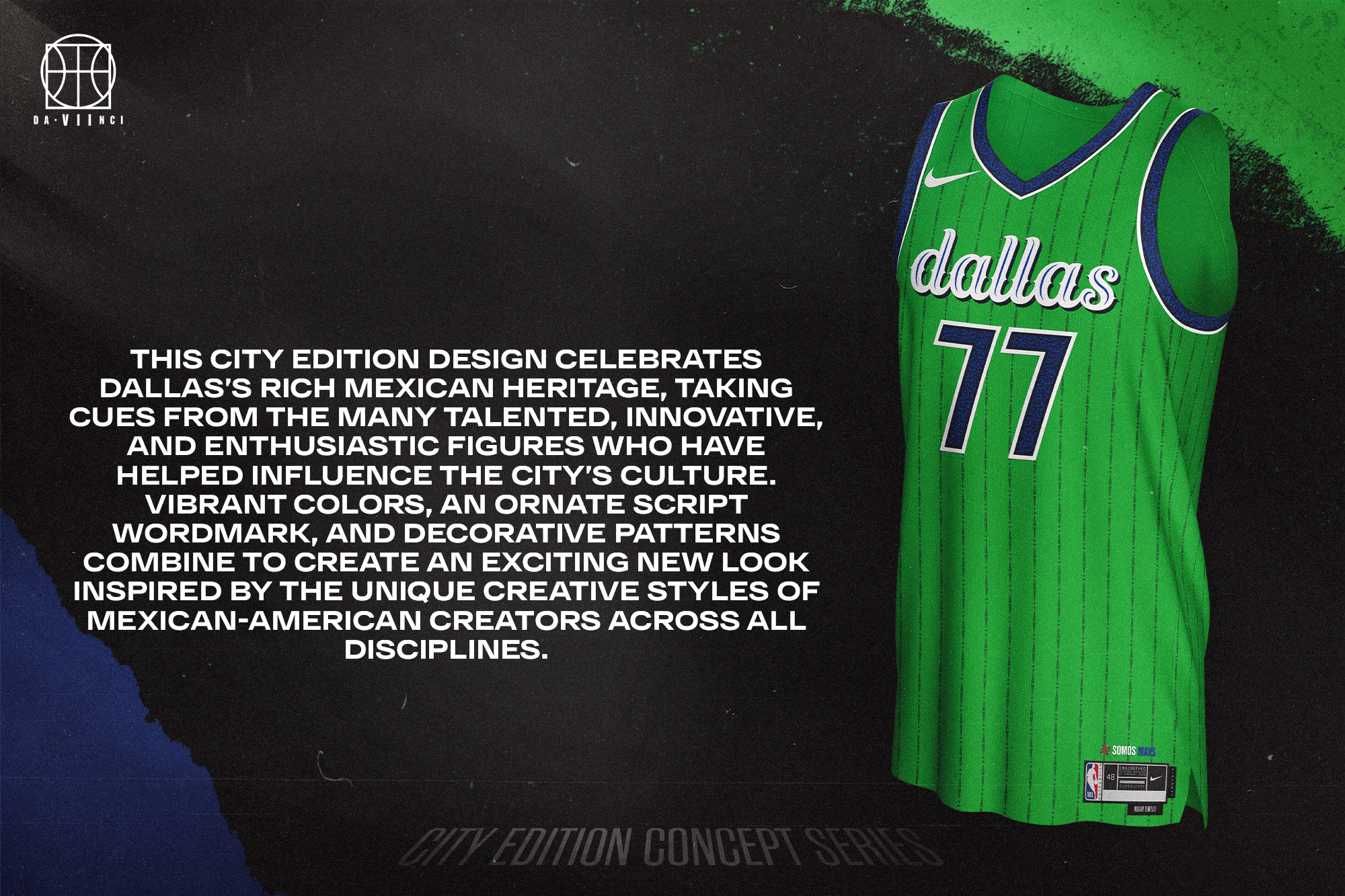
This City Edition design celebrates Dallas’s rich Mexican heritage, taking cues from the many talented, innovative, and enthusiastic figures who have helped influence the city’s culture. Vibrant colors, an ornate script wordmark, and decorative patterns combine to create an exciting new look inspired by the unique creative styles of Mexican-American creators across all disciplines.
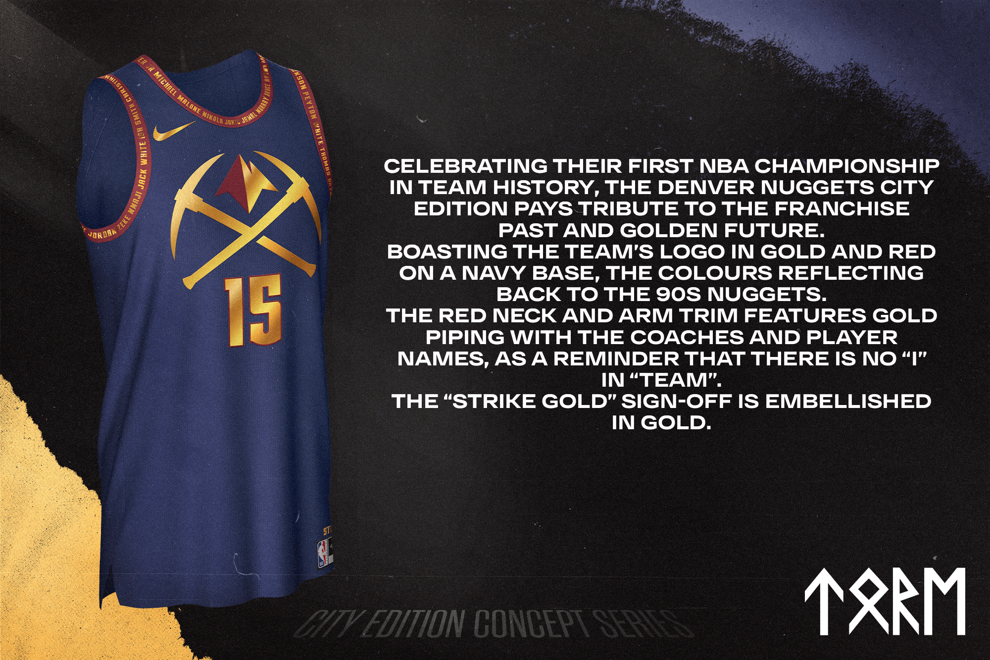
Celebrating their first NBA Championship in team history, the Denver Nuggets City Edition pays tribute to the franchise past and golden future. Boasting the team’s logo in gold and red on a navy base, the colours reflecting back to the 90s Nuggets. The red neck and arm trim features gold piping with the coaches and player names, as a reminder that there is no “I” in “TEAM”. The “Strike Gold” sign-off is embellished in gold.
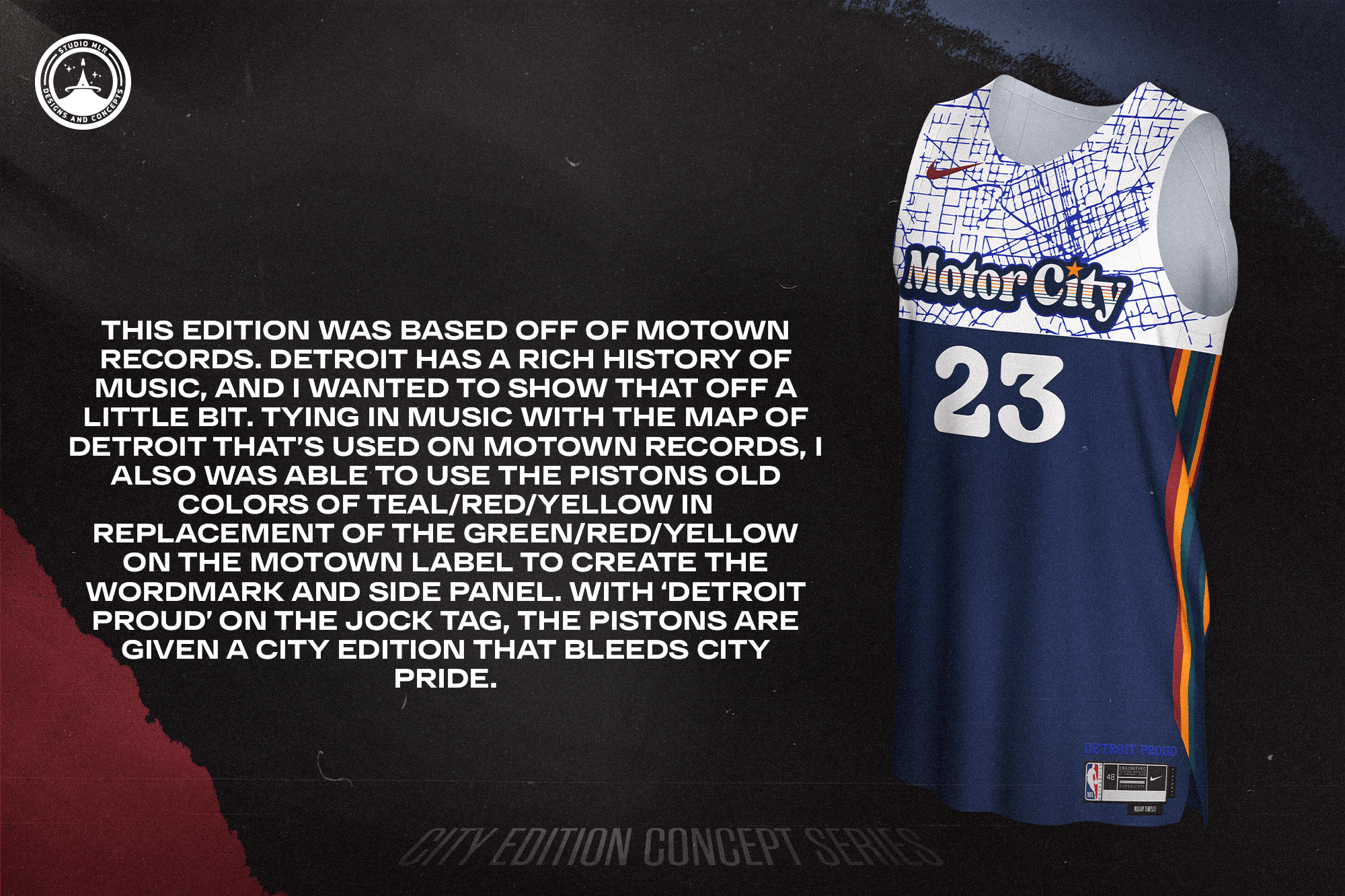
This edition was based off of Motown Records. Detroit has a rich history of music, and I wanted to show that off a little bit. Tying in music with the map of Detroit that’s used on Motown records, I also was able to use the Pistons old colors of teal/red/yellow in replacement of the green/red/yellow on the Motown label to create the wordmark and side panel. With ‘Detroit Proud’ on the jock tag, the Pistons are given a city edition that bleeds city pride.
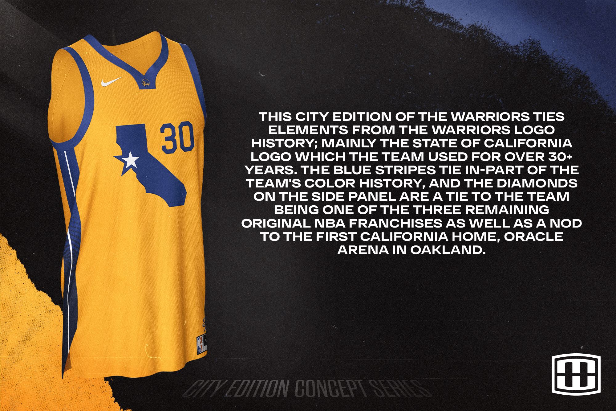
This City Edition of the Warriors ties elements from the Warriors logo history; mainly the State of California logo which the team used for over 30+ years. The blue stripes tie in-part of the team’s color history, and the diamonds on the side panel are a tie to the team being one of the three remaining original NBA franchises as well as a nod to the first California home, Oracle Arena in Oakland.
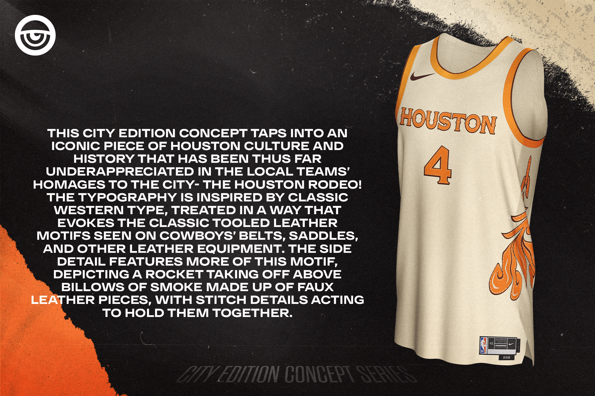
This City Edition concept taps into an iconic piece of Houston culture and history that has been thus far underappreciated in the local teams’ homages to the city — the Houston Rodeo! The typography is inspired by classic Western type, treated in a way that evokes the classic tooled leather motifs seen on cowboys’ belts, saddles, and other leather equipment. The side detail features more of this motif, depicting a rocket taking off above billows of smoke made up of faux leather pieces, with stitch details acting to hold them together.
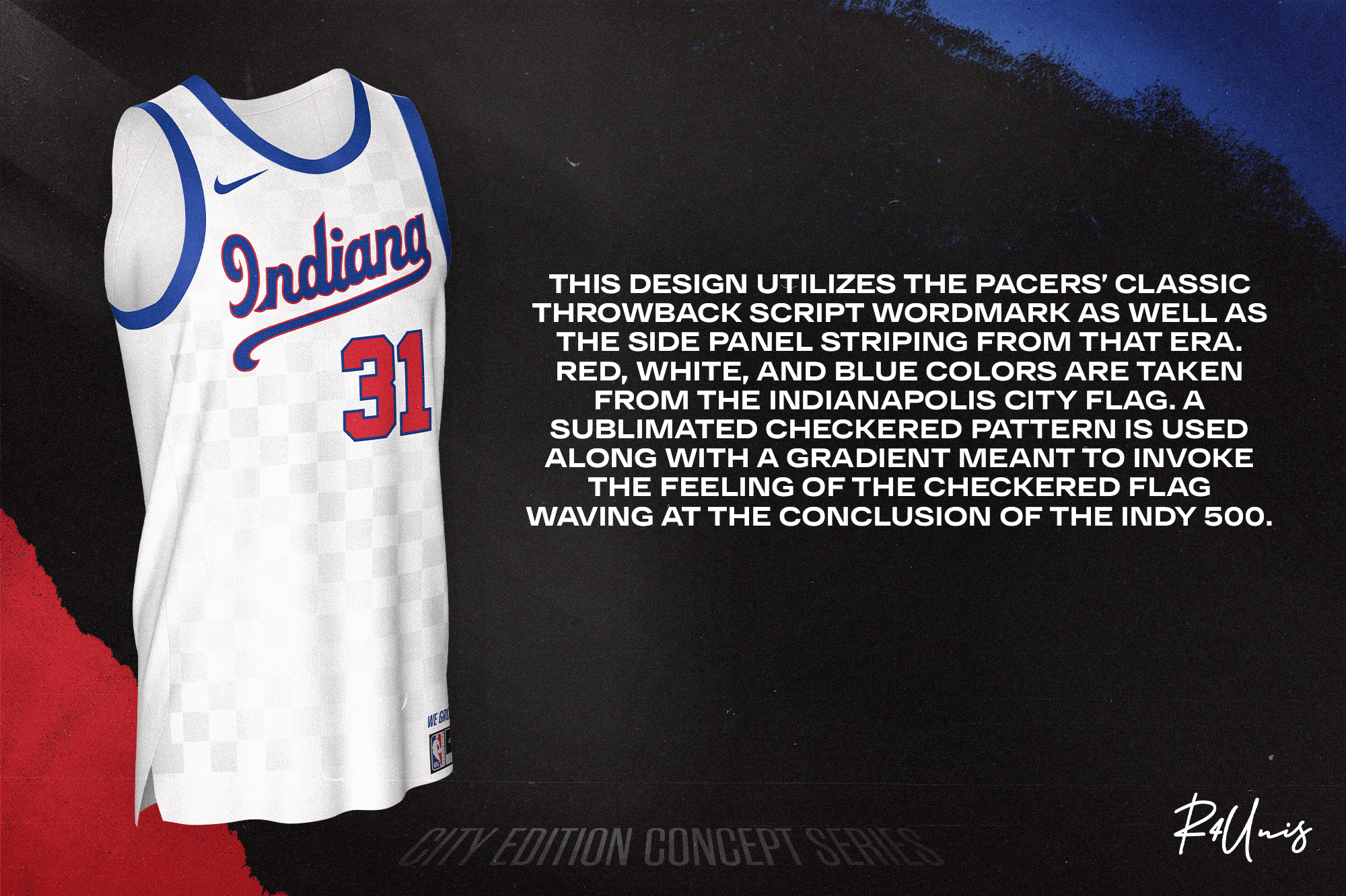
This design utilizes the Pacers’ classic throwback script wordmark as well as the side panel striping from that era. Red, white, and blue colors are taken from the Indianapolis city flag. A sublimated checkered pattern is used along with a gradient meant to invoke the feeling of the checkered flag waving at the conclusion of the Indy 500.
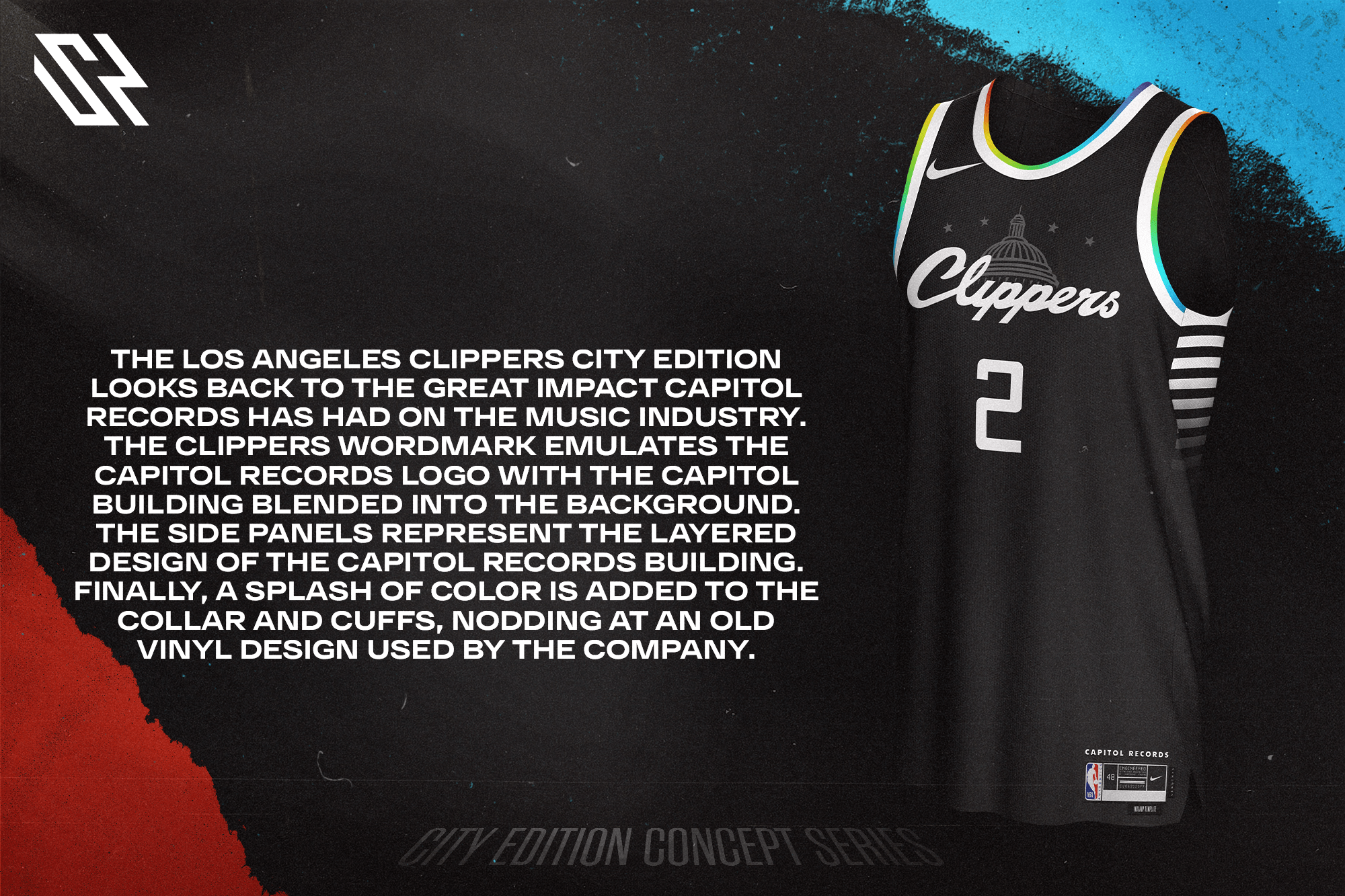
The Los Angeles Clippers City Edition looks back to the great impact Capitol Records has had on the music industry. The Clippers wordmark emulates the Capitol Records logo with the Capitol building blended into the background. The side panels represent the layered design of the Capitol Records building. Finally, a splash of color is added to the collar and cuffs, nodding at an old vinyl design used by the company.
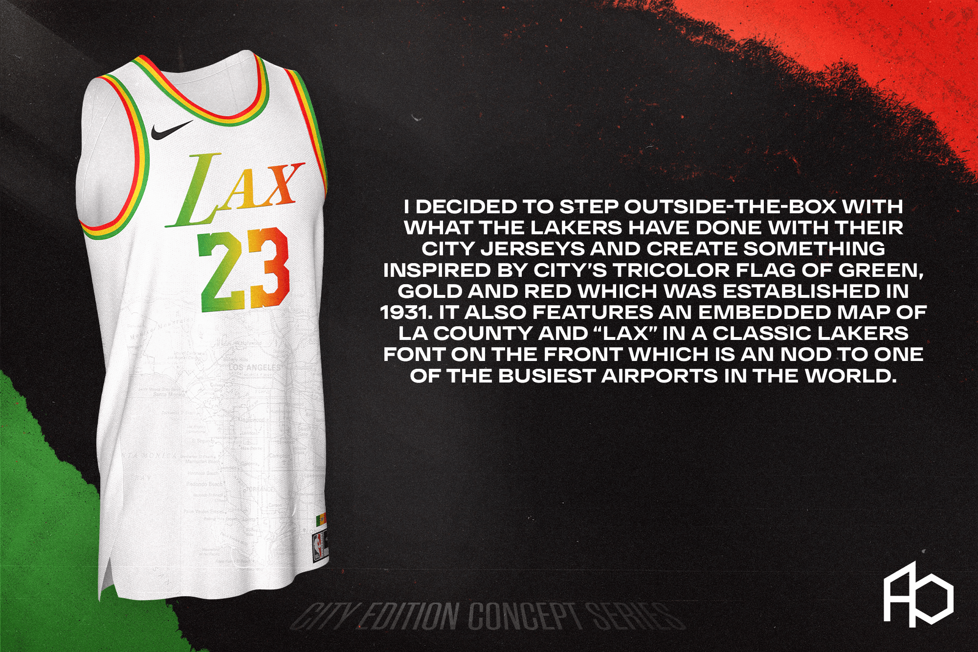
I decided to step outside-the-box with what the Lakers have done with their city jerseys and create something inspired by city’s tricolor flag of green, gold and red which was established in 1931. It also features an embedded map of LA County and “LAX” in a classic Lakers font on the front which is an nod to one of the busiest airports in the world.
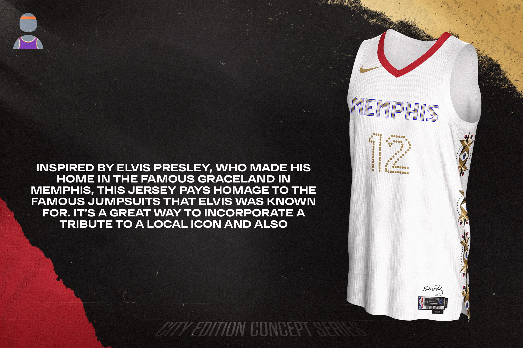
Inspired by Elvis Presley, who made his home in the famous Graceland in Memphis, this jersey pays homage to the famous jumpsuits that Elvis was known for. It’s a great way to incorporate a tribute to a local icon.

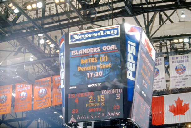

GTGFTS is the April 24, 2002 NHL Eastern Conference Quarterfinal Game 4 won by the New York Islanders 4 to 3 over the Toronto Maple Leafs. Shawn Bates of the Islanders scored the game-winning goal on a penalty shot at 17:30 of the 3rd period. This win enabled the Islanders to tie the series at 2 – 2 although they would go on to drop the series to the Leafs 4 to 3.
Light the Lamp – correct, Mike!
Your comment…and that series…ended on a downer for Isles fans – but oh what a goal that was!
Anyone one one of these?:
link
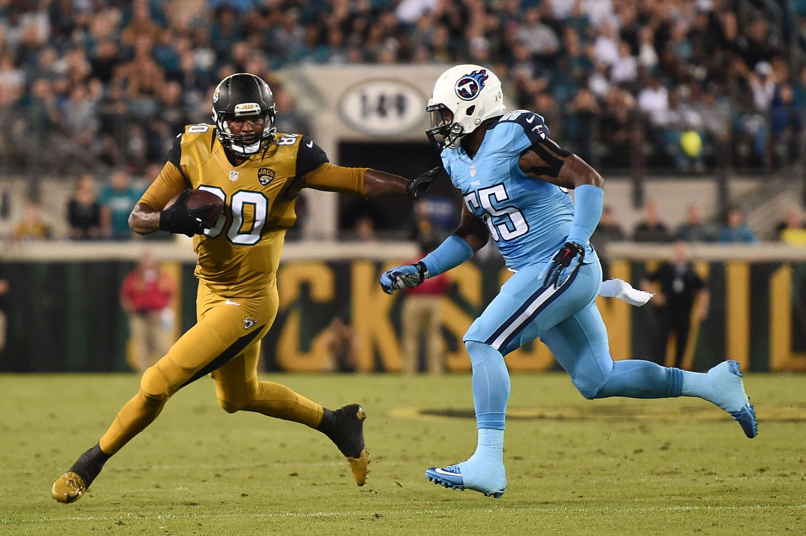
GTGFTU: November 19, 2015, Tennessee Titans @ Jacksonville Jaguars
The Jaguars only wore that monstrosity twice, so I thought it’d be easy to find the game. Unfortunately, both of those times it was against the Titans wearing the exact same combo. One was in Tennessee, one in Jacksonville. I had to use the background details, namely the large “Jacksonville” in the background, and the logo on the field to determine which of these matchups it was.
GTGFTU is the Titans at Jaguars Color Rush game from November 19, 2015. It was the second Color Rush game. They wore the same uniforms the following year for a Color Rush game but that one was in Nashville
GTGFTU is the November 19, 2015 Thursday Night Football game between the visiting Tennessee Titans and the home Jacksonville Jaguars which was won 19 – 13 by Jacksonville. These teams played Thursday night games in these wretched Color Rush uniforms for 2 consecutive years (2015 and 2016 with 2016 played in Nashville). Jacksonville is spelled out on the end zone wall pads in the background of the photograph which gives away the 2015 date. The Jacksonville uniforms are so bad that the Jaguars have not had a Color Rush uniform since this time.
Thanks for the baseball playoff tracker, Alex! I enjoy it every year.
Dallas, Houston, and Golden State came out nice; the rest, back to the drawing board. Also, there’s no excuse for not also designing the shorts.
Atlanta, Dallas, and Indiana were the winners for me. And although I don’t quite care for the look, special kudos for using the jumpsuits of Elvis as inspiration for Memphis.
Loved Atlanta’s.
The Clippers one just confused me. Why would the LA Clippers be honoring Capitol Records? If there was an Inglewood tie-in, maybe, but there’s just no real connection for me there. The team’s roots in LA are not nearly as old as the Lakers, so that would be a better choice for something as old as Capitol. A miss for me.
YES!: Hornets, Hawks, Pistons, Mavs, Rockets, Pacers, Clippers, Grizzlies, Nets
MEH…: the rest
Specifically: apostrophe catastrophe in the write-up for the Hawks (Atlantan’s)(?!); too many airport codes on jerseys, specifically the Lakers (there’s a second LA team!); that Nuggets jersey won’t age well as players shift teams, and it is corporatespeak that names on the collar mean “there’s no I in TEAM”, there’s no I in Denver Nuggets as well…; other than wine/gold, nothing about the Cavs’ varied uniform history is here, the font and abbreviation are new; I don’t see any diamonds on the Warriors’ side panels; there are 8 teams in the NBA whose roots go back to the 1946 BAA-NBL merger (Knicks, Celtics, Warriors, Sixers, Kings, Hawks, Lakers, Pistons), not 3, and only 2 haven’t moved).
Additional issue – the Nets’ uniform numbers are mismatched – the 6 has squared corners at the top of the negative space but the 2 has 45-degree edges at the top.
Calling my own foul before anyone else has to… the merger was in 1949, and I guess that they’re saying the Celtics, Knicks and Warriors are the 3 surviving teams from the original BAA in 1946, with the Lakers, Pistons and Royals/Kings joining the BAA before the merger in 1949. I learned something this morning. Apologies.
Disagree there bud, the Hawks looks fantastic! Nuggets is a tad boring however I do think it is quite sentimental in a way to include the players and coaches at the collars. Thinks it would age quite nice.
The I in TEAM certainly is a bit Nike talk.
Indiana and Dallas are the best of the bunch, with the Hawks, thus far!
Peter McManus Cafe is where Elaine Benes inadvertently caused the death of Russel Dalrymple.
Minor nit for the playoff tracker – the Phillies throwback sleeve patch is gone this year as a casualty of future ad space.
These are all cool. Charlotte , Denver, and Goldan State really stand out as great to me.
Saved the best for first on those unis. Almost all were disappointments after Atlanta. I did like Charlotte, Dallas, and Detroit. Indiana and GS were okay. My Celtics were a monstrosity!
Just chiming in. Seems like there’s a lot of consensus about Atlanta. I love it, too. Indiana, Memphis and Chicago are the next tier for me. With that said, I really appreciate the effort made by all of the designers and enjoyed reading about their thought process.
I liked the Hawks but for the “atl”. Airport codes are overplayed and getting cliché. “atlanta” would work well here.
Thanks for sharing this and bringing all those designers together, Casey!
Partial to the color scheme you used for the Bulls – nice!
gavswaps word mark and use of red reminds me of a Philly newspaper logo:
link
These should just be called music edition jerseys
The Los Angeles Laxatives?
The City Editions are already pretty well established for using airport codes, and LAX is known everywhere, so I doubt many people would be making that connection.
That was not only Manny’s only HR in a Chisox uniform, it was his final HR as a major leaguer, I believe.
As someone who considers Atlanta her hometown, I love the color scheme of these! I’ve always been drawn to MARTA’s color scheme. I also like how it hearkens back to the 1970 jerseys. I just feel like there’s *something* missing that I can’t put my finger on.
Anyway, excellent work all around!
As a diehard Lakers fan, that design is uniquely terrible.
The Lakers look the best when they’re directly honoring team history. Their colors are iconic (even if a certain someone dislikes purple), and have been present in some way shape or form in their past designs.
Deviating too far the norm doesn’t work, in my opinion.
Good intentions on the jerseys but only Atlanta, GS and Dallas work for me.