By Phil Hecken
Follow @PhilHecken
Good Saturday morning, Uni Watch crew. I hope everyone has had a good week!
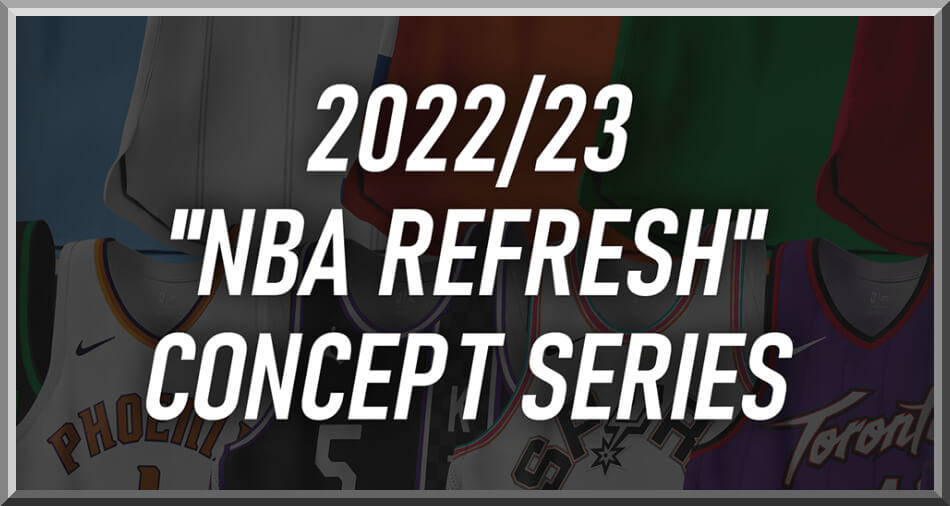
Got a fun one for you today. As you’re all aware, I love to feature concepts from uniform designers occasionally, and today I’m pleased to re-introduce Casey Vitelli, whose work has been featured on Uni Watch before, most recently last summer, when he brought us a look at several NBA “Earned” Edition jerseys for sixteen clubs. Casey is back today with Part I of an entire leaguewide set of jersey and court concepts, featuring a white and several dark designs (all of which have cringeworthy names given to them by Nike), and none of which have any annoying uni ads. Some are quite traditional but with a slight historical twist, while others are a bit more out there. Enjoy!
2022-23 “NBA Refresh” Concept Series, Part I
by Casey Vitelli
A refreshing look to the NBA through my eyes. As a fan of basketball, and their jerseys, I always have had ideas on how teams could do designs differently. This project has taken 3 months to complete. I am extremely proud of this project and I hope you appreciate the effort put into this.
Atlanta Hawks
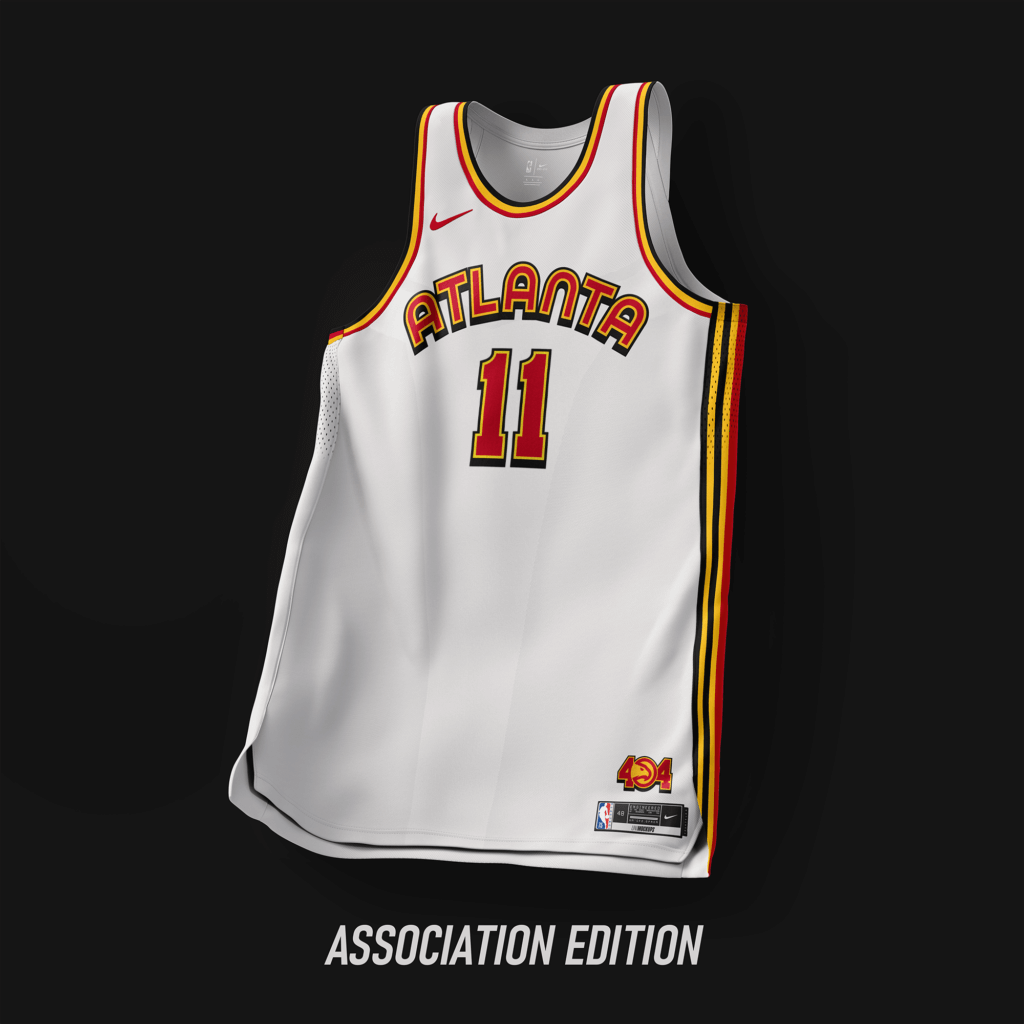
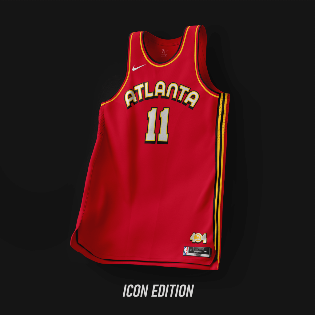
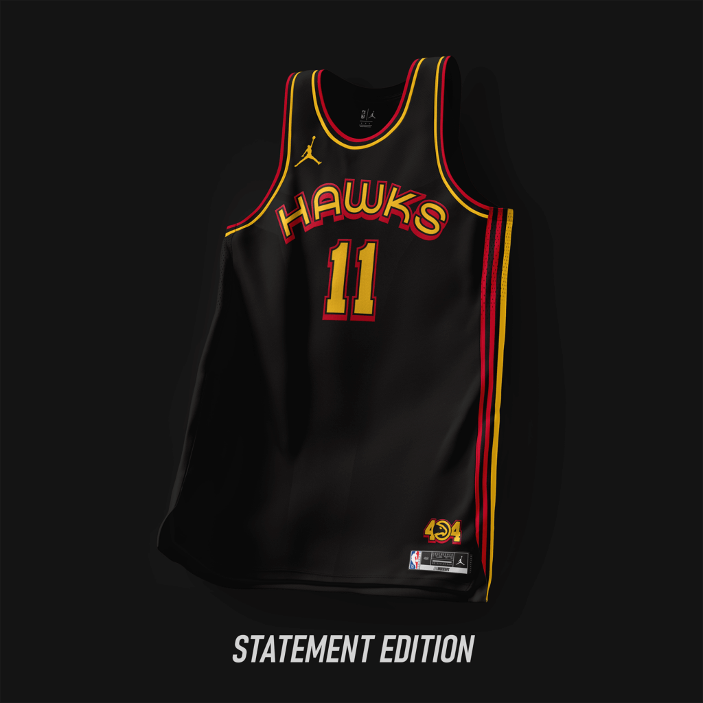
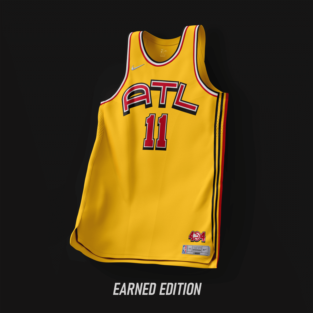
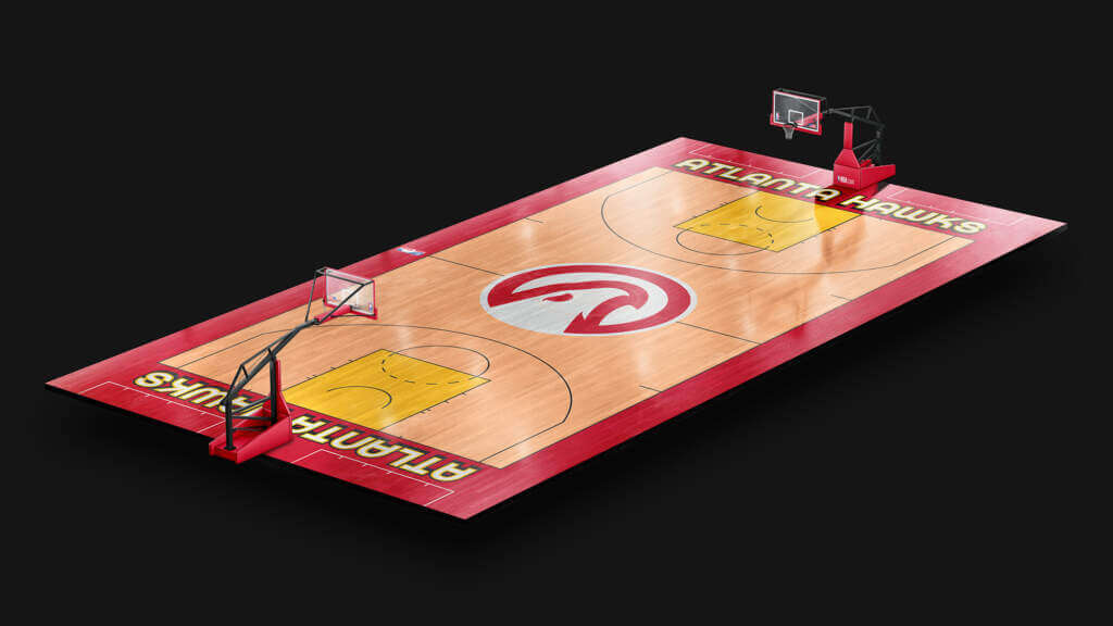
Keeping with the Red/Yellow/Black color scheme. Wordmark font is pulled from ’70-’72 with the stroke/shadow mimicking the jerseys from ’99-’07.
Boston Celtics
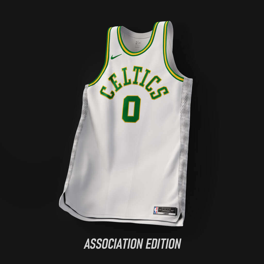
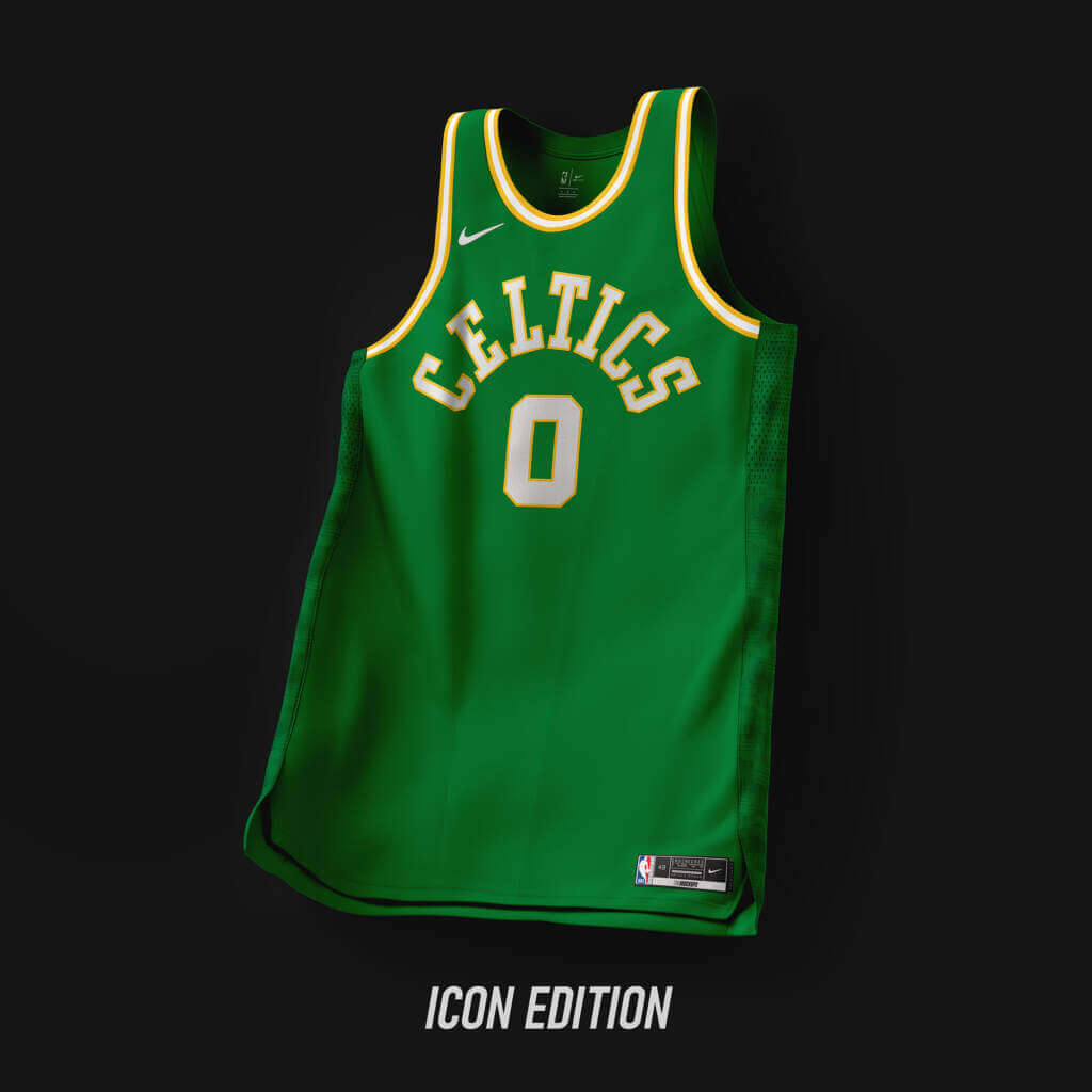
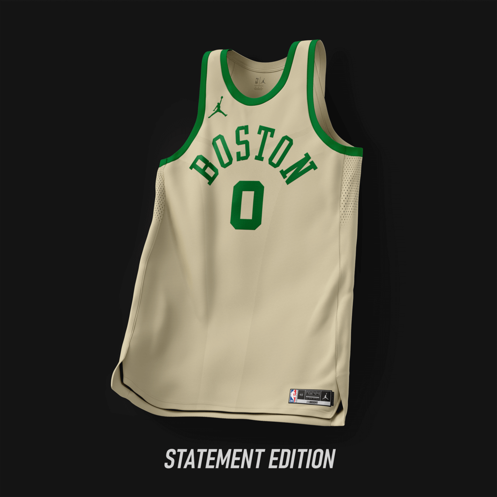
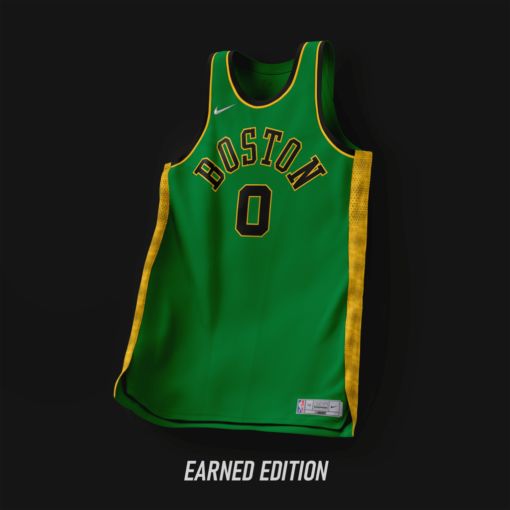
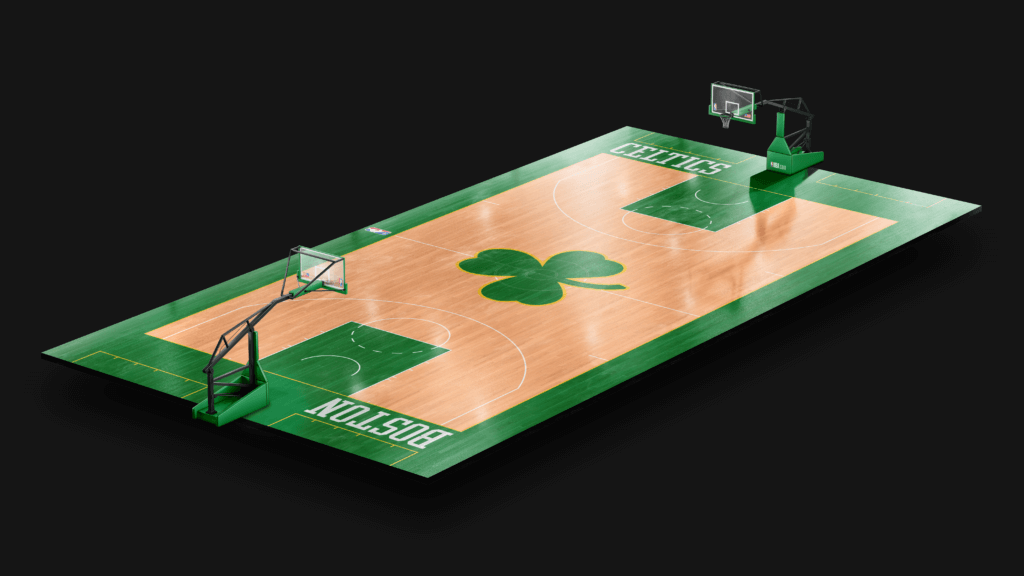
Keeping with tradition, with a subtle hint of parquet on the sides. Wordmark style pulled from ’47-’69, with yellow added as an accent color.
Brooklyn Nets
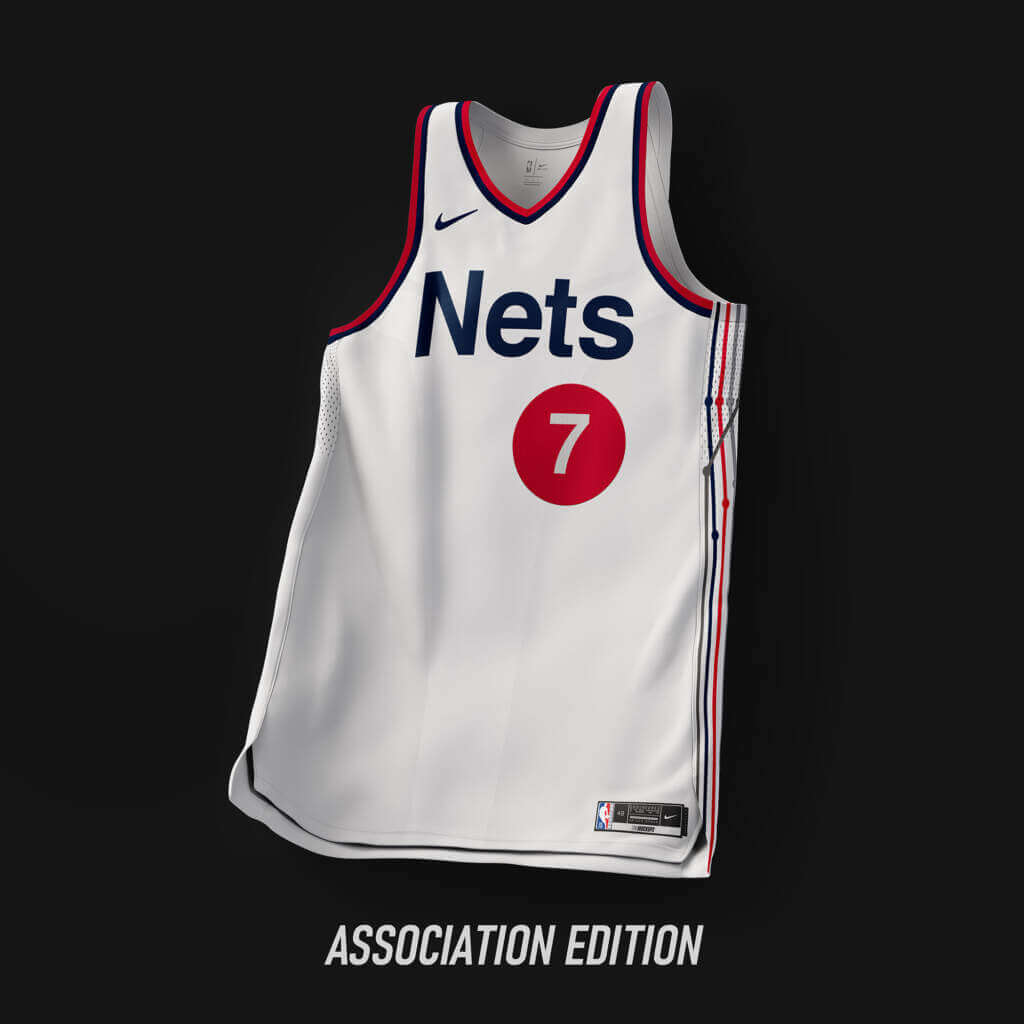
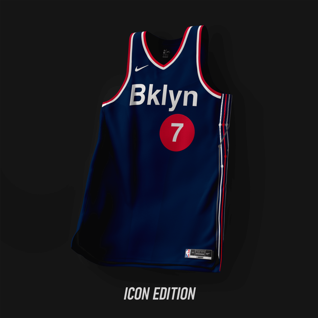
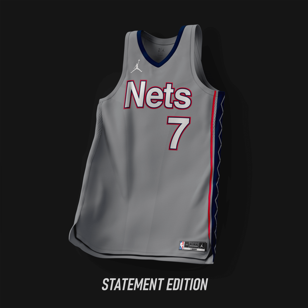
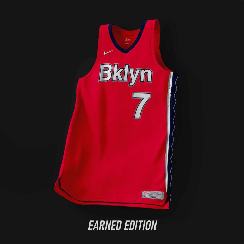
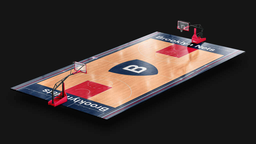
Back to navy/red/silver while keeping the subway style. Added nods to the ’97-’12 set on the Statement/Earned editions.
Charlotte Hornets
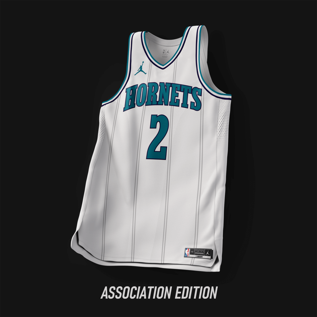
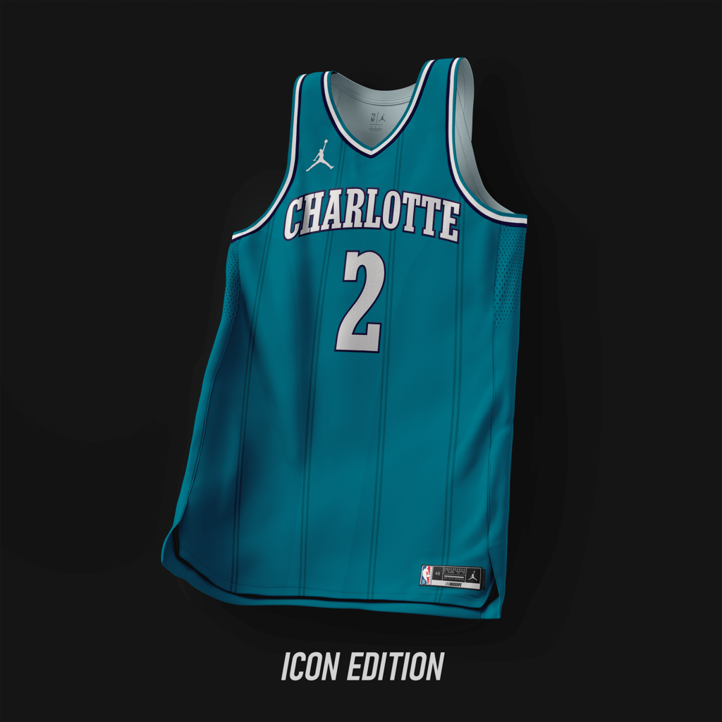
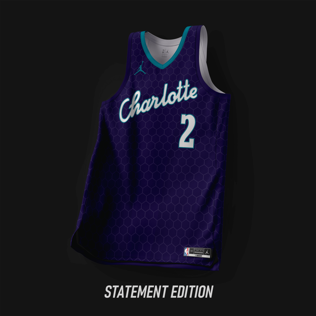
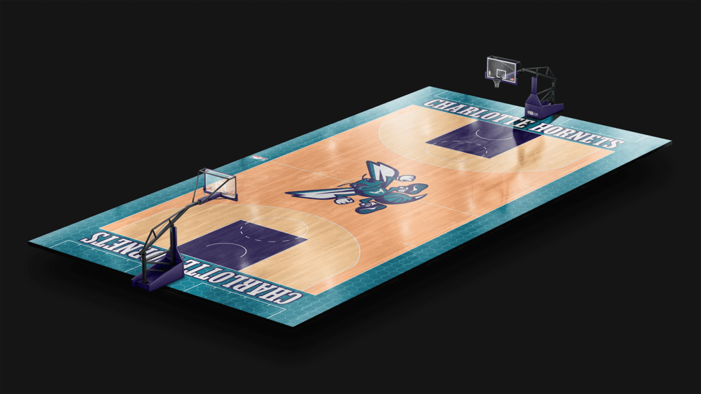
Keeping with the classic Hornets look. Custom font, similar to that of Hornets’ past.
Chicago Bulls
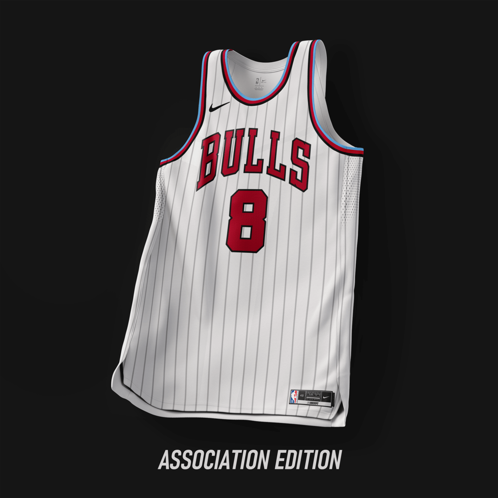
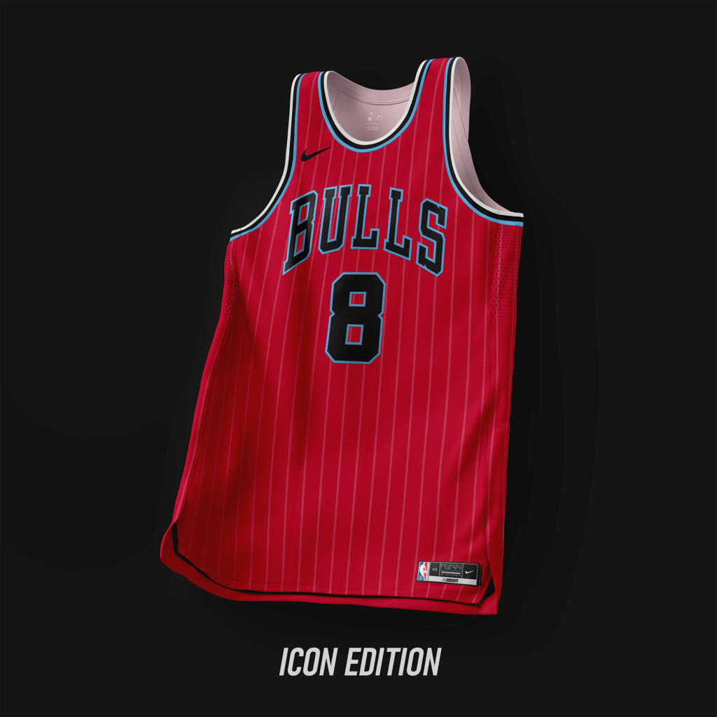
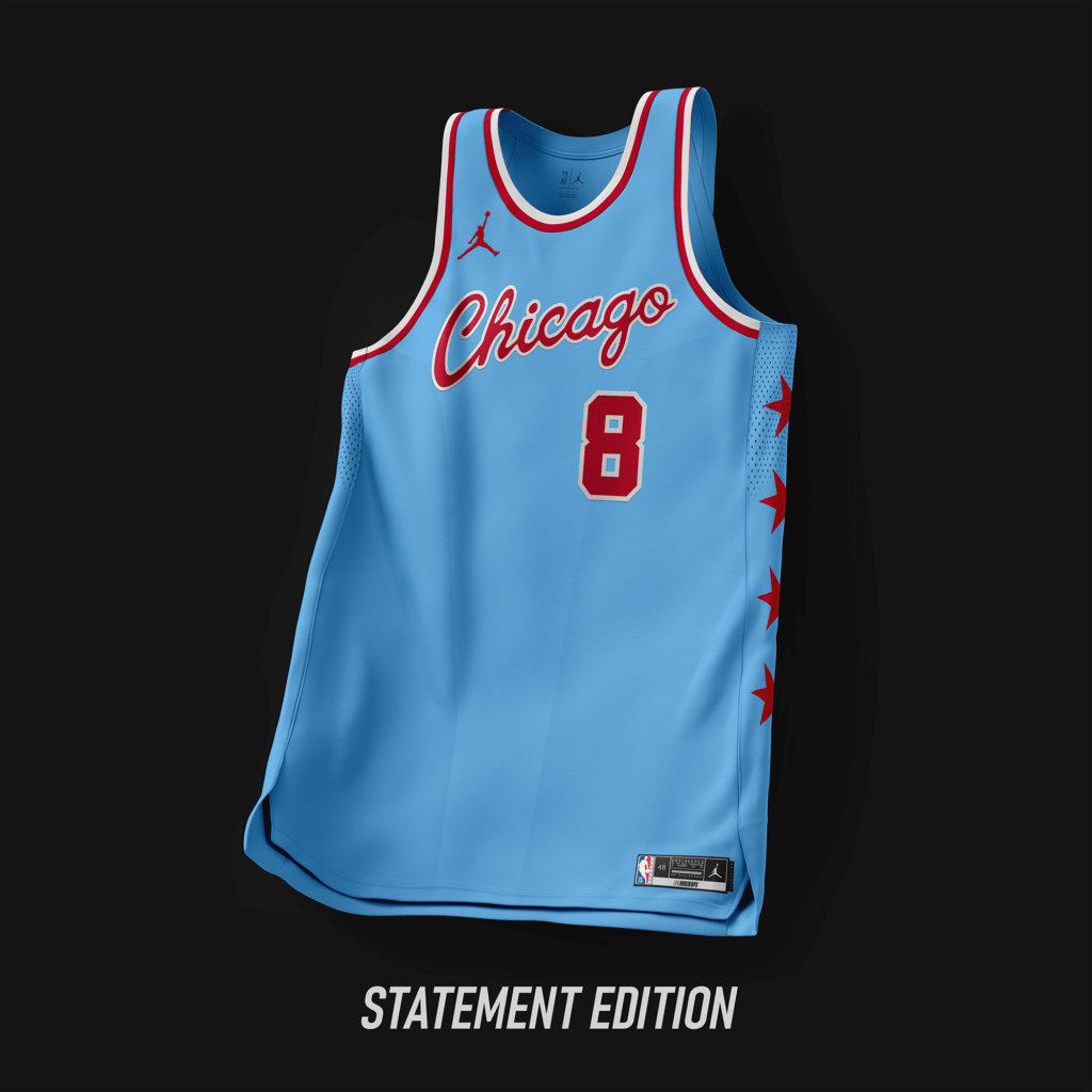
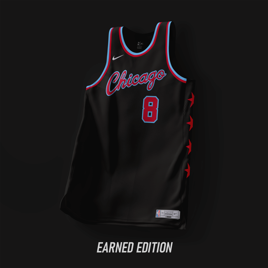
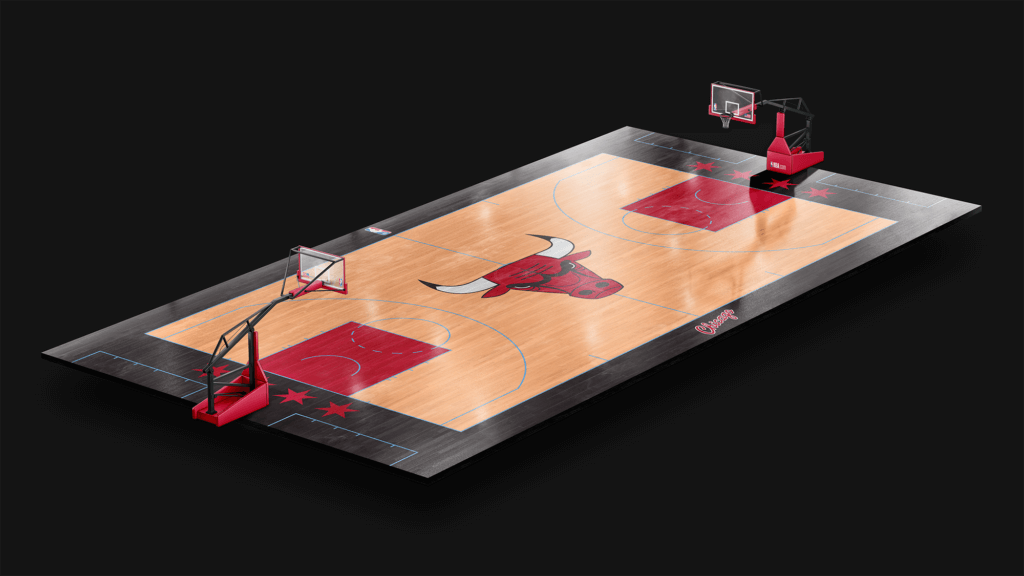
Adding sky blue from the Chicago flag. Keeping with the traditional Bulls’ look.
Cleveland Cavaliers
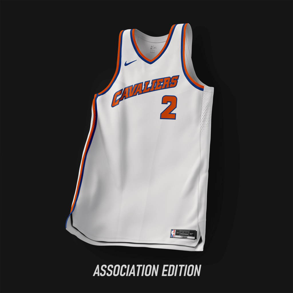
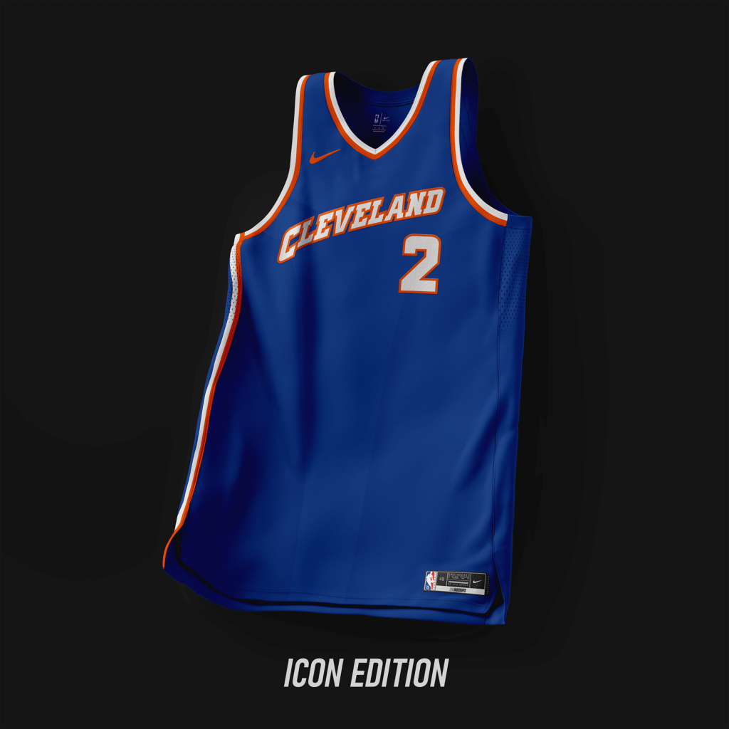
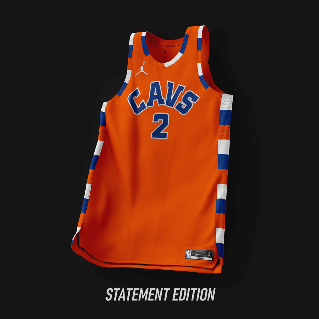
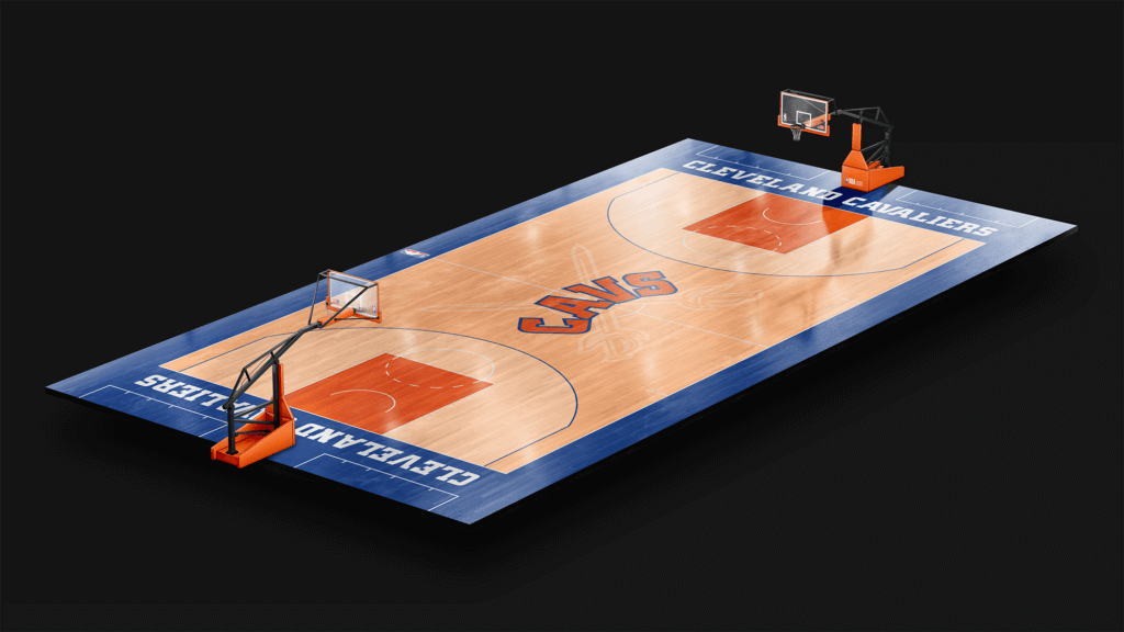
Back to Royal/Orange. Font based off the jerseys from ’94-’03.
Dallas Mavericks
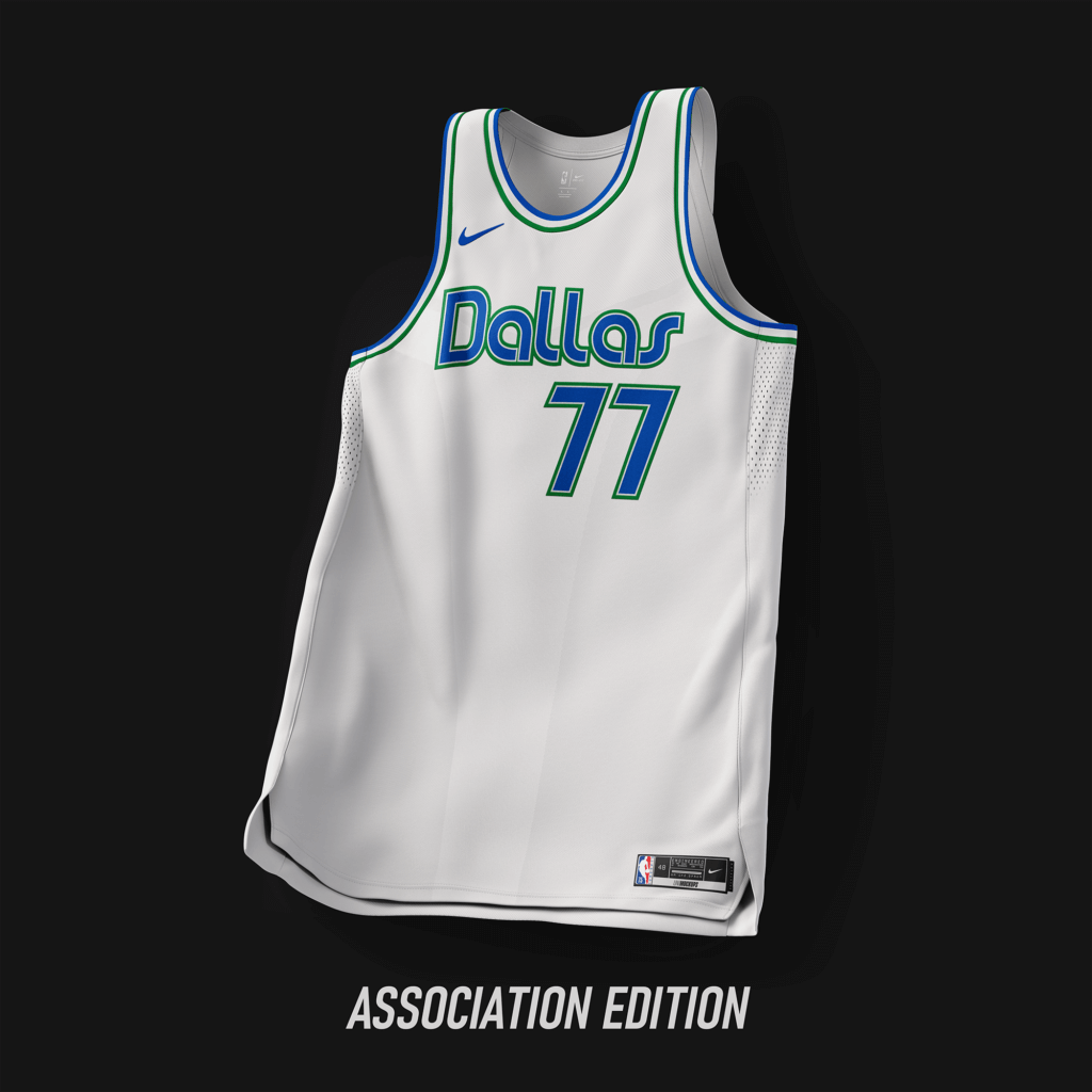
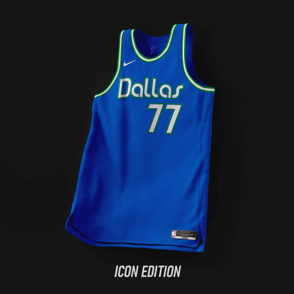
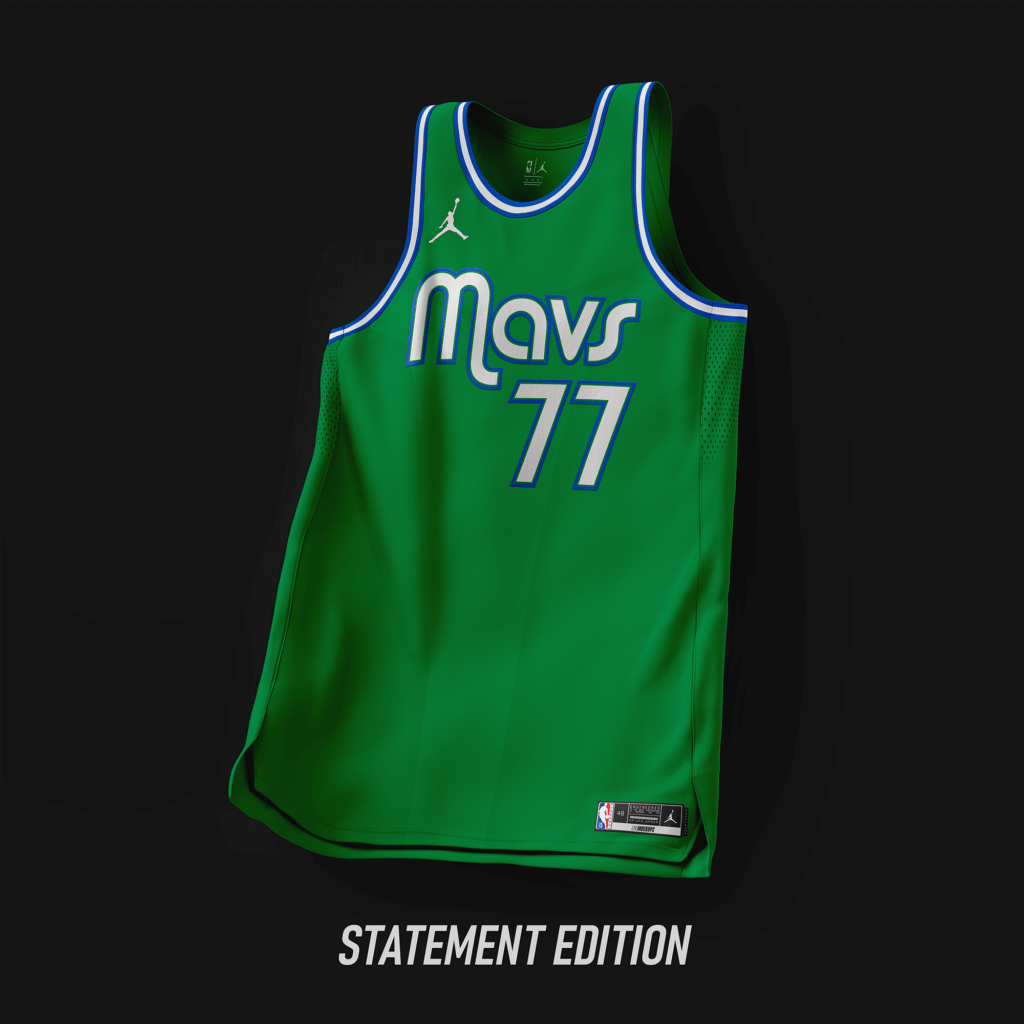
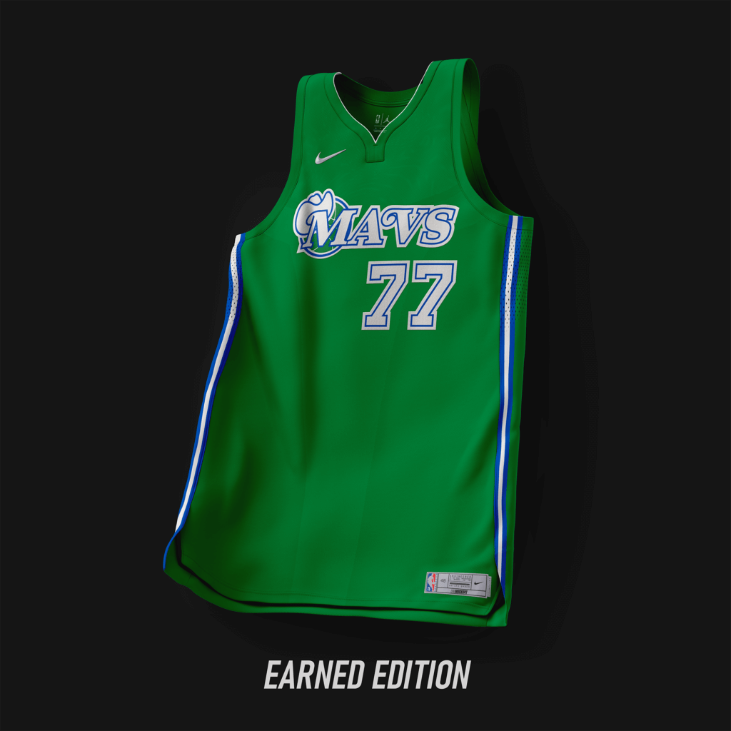
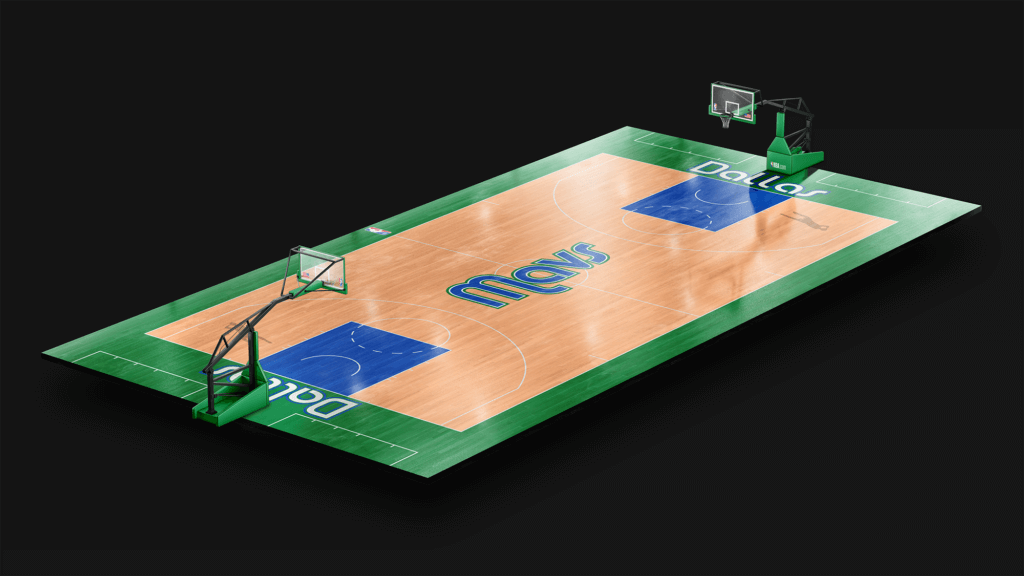
#GreenItBack. Number from the original team set worn in ’80/’81. Wordmark from the Diddy sets from ’04-’15.
Denver Nuggets
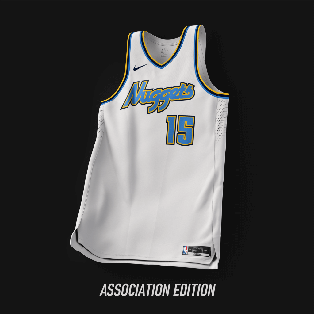
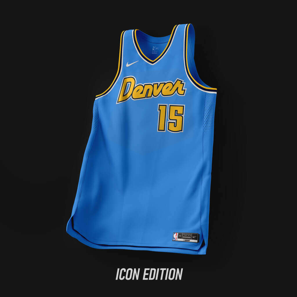
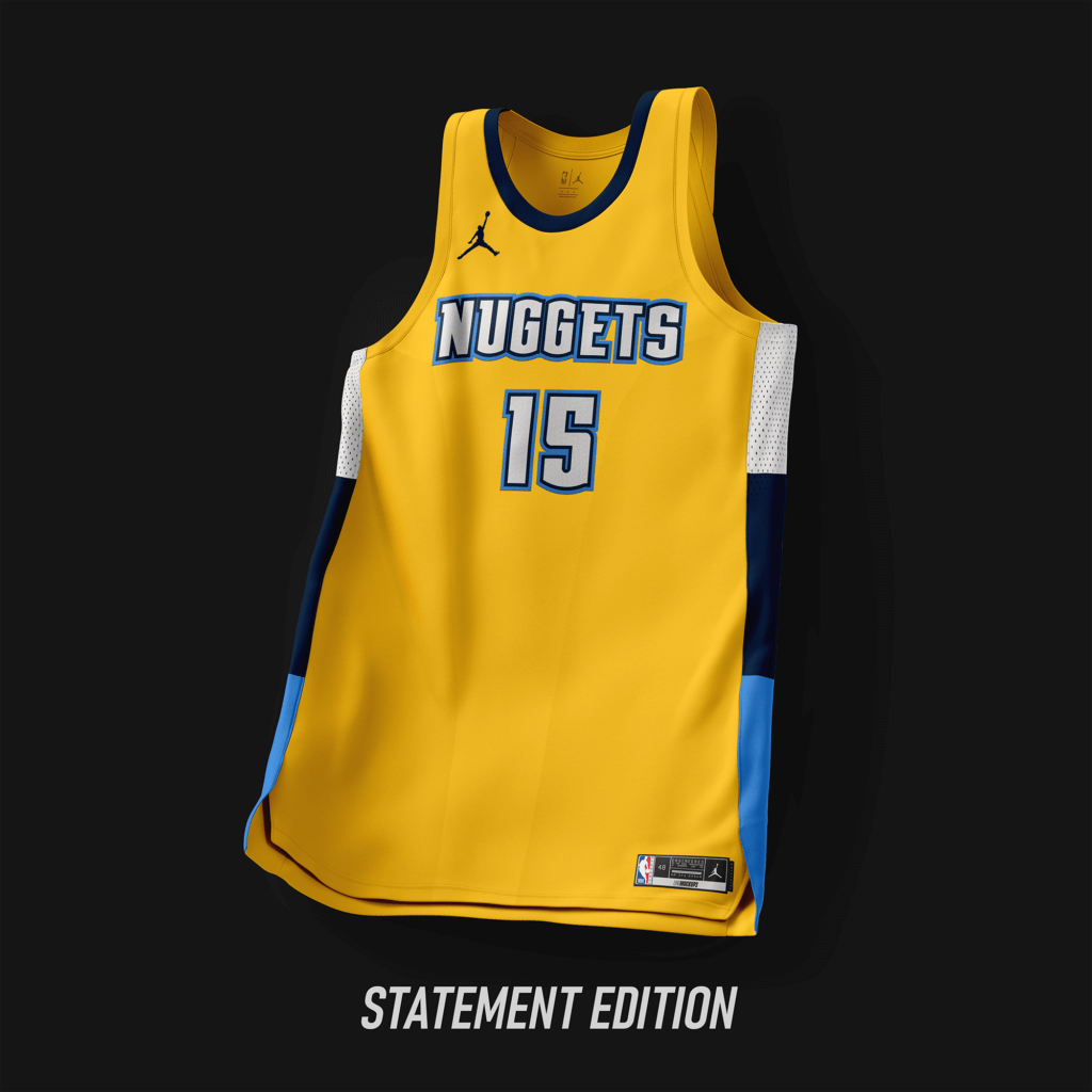
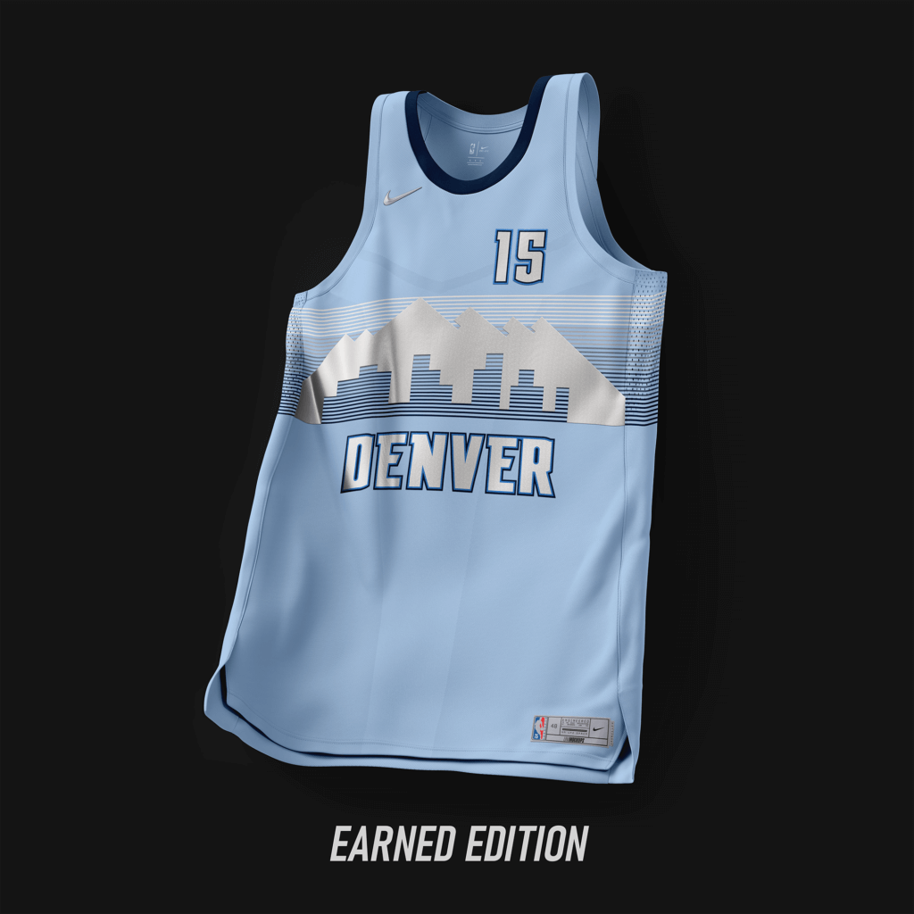
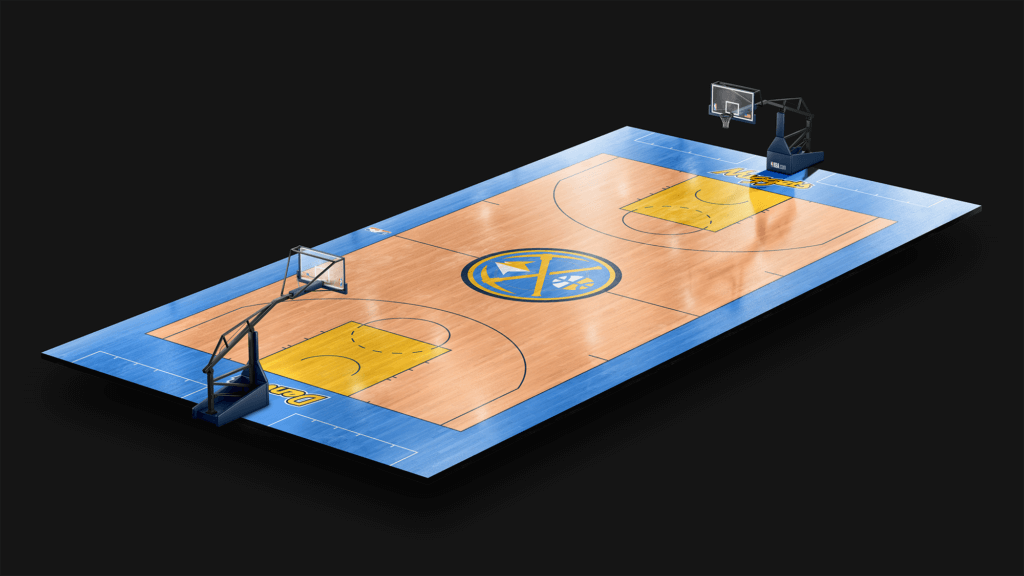
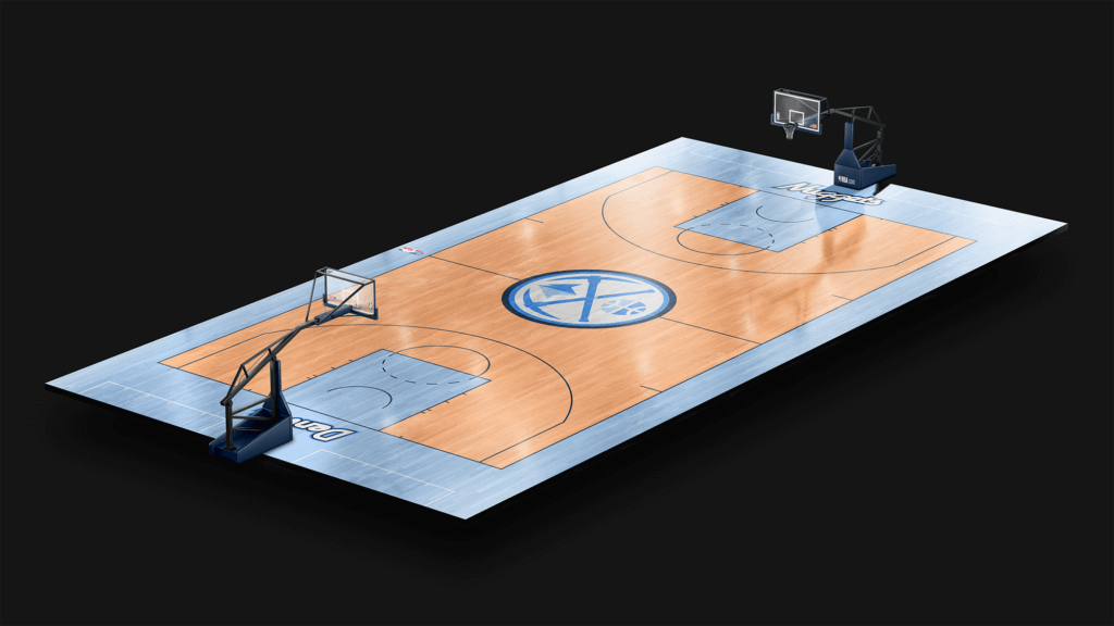
Wordmark taken from the jersey worn from ’05-’12. Colors taken from ’03-’18.
Detroit Pistons
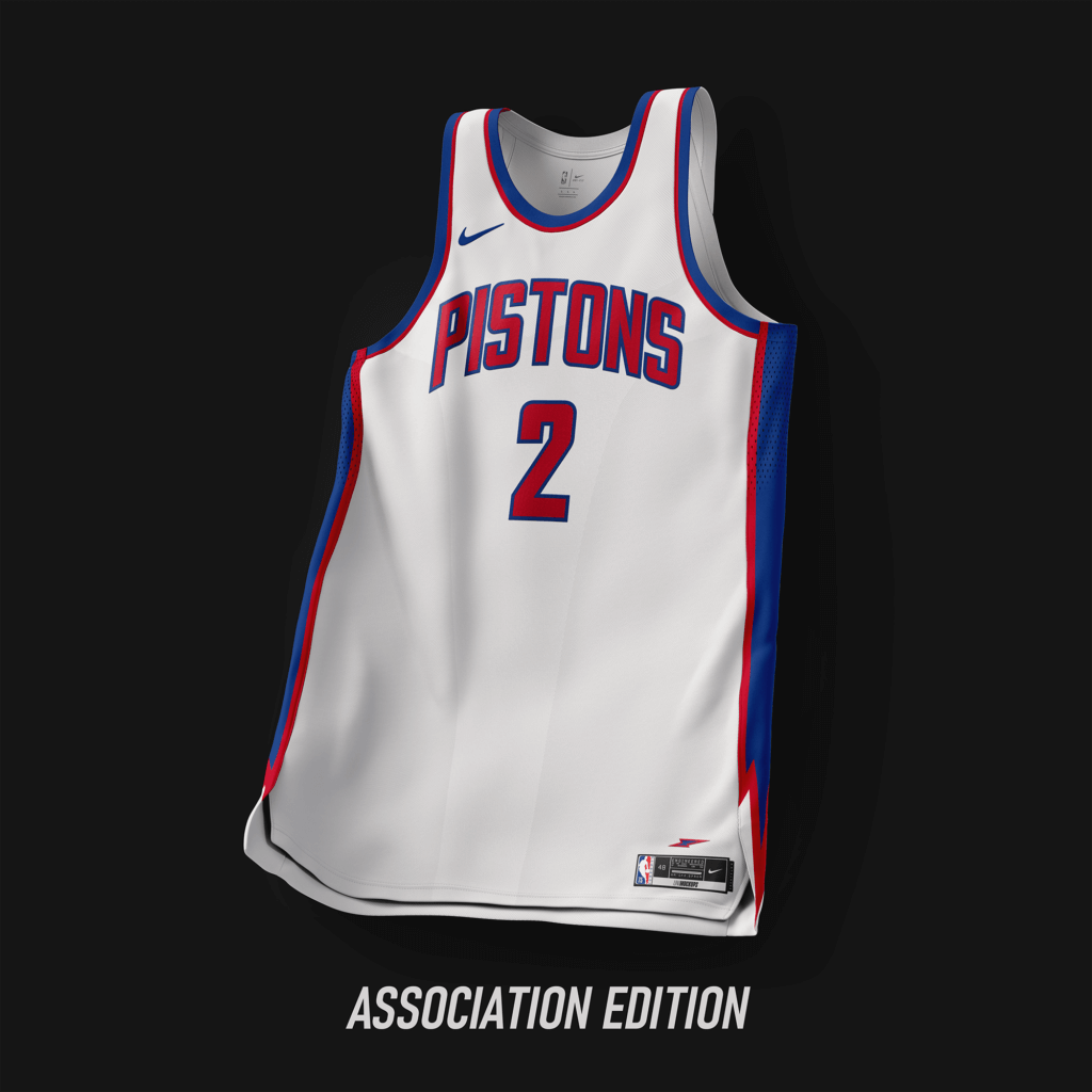
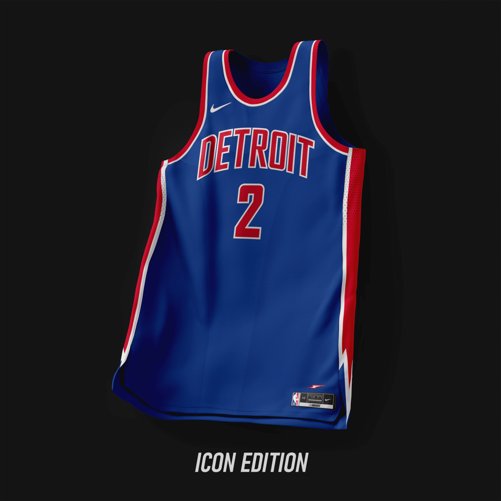
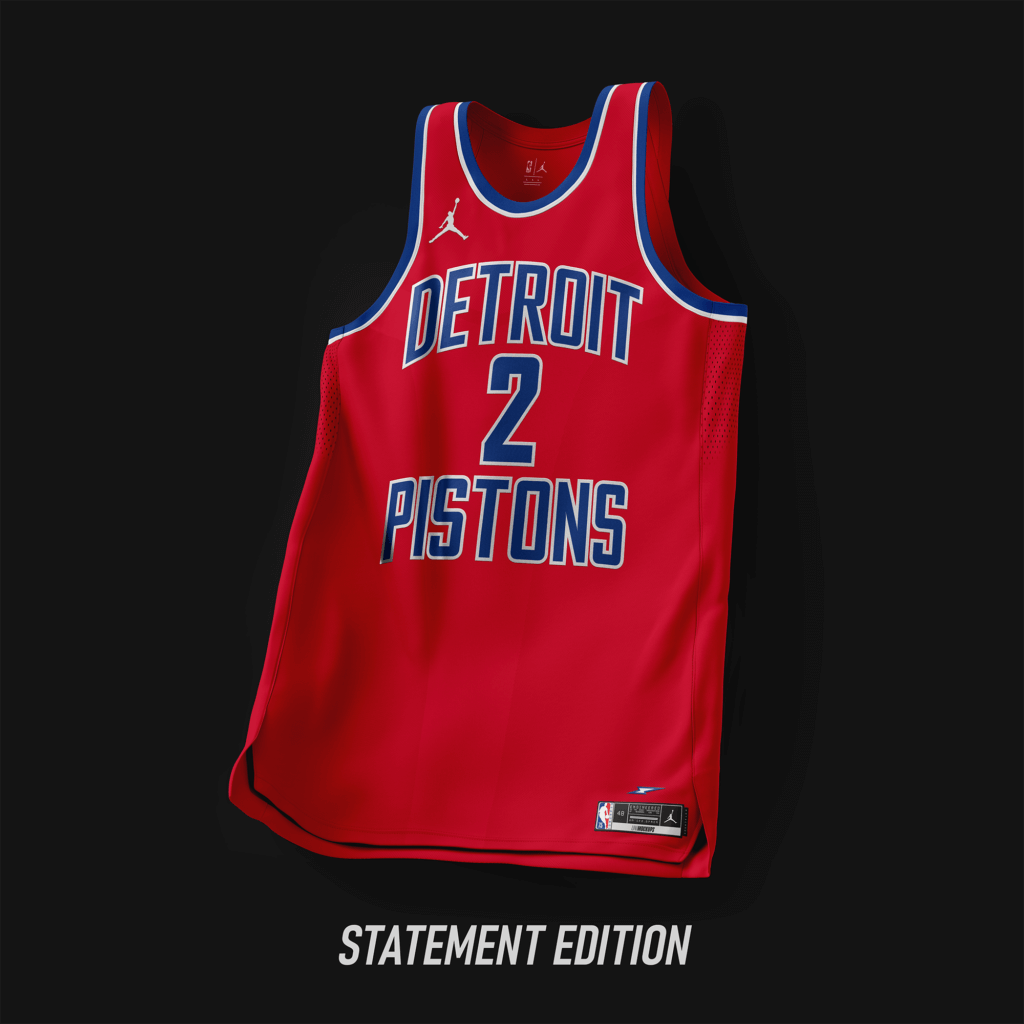
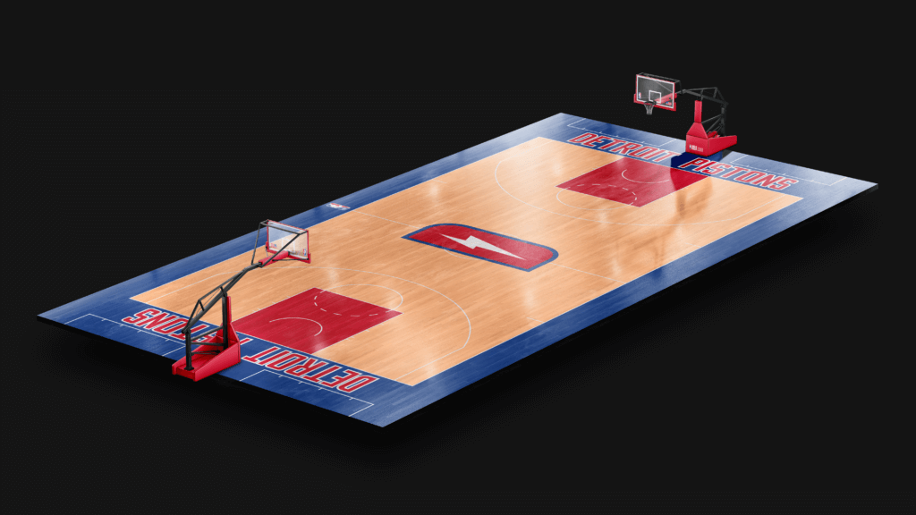
Classic font taken from ’81-’96. Thunder Sides taken from the jerseys from ’78-’81.
Houston Rockets
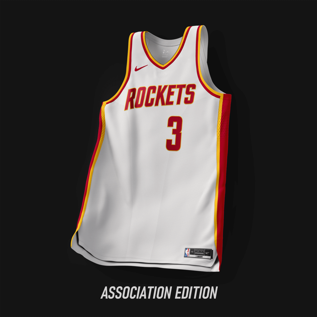
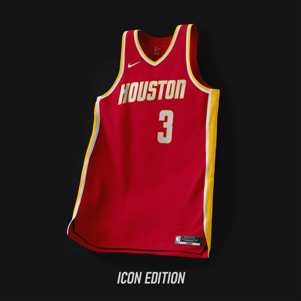
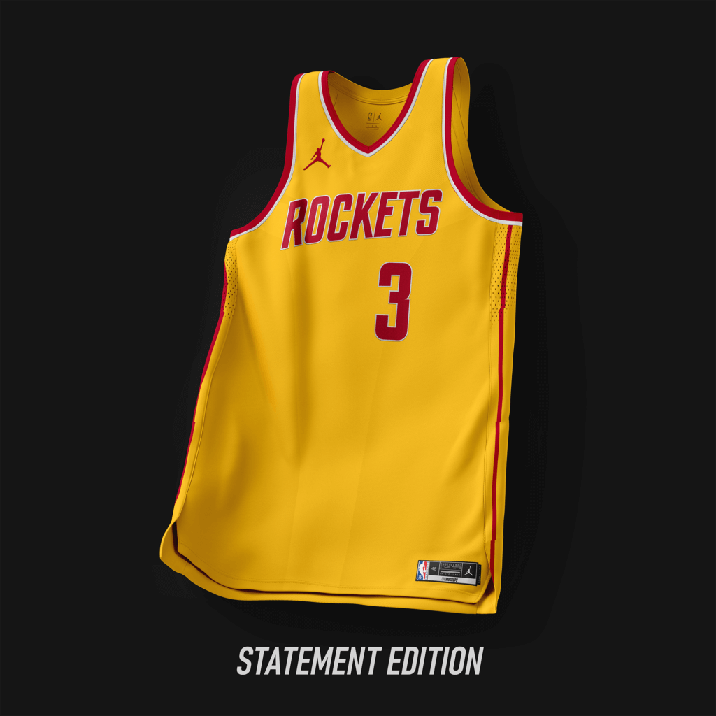
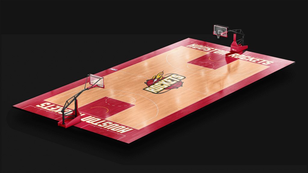
Based off the look from ’72-’95. Font similar to the current look.
Indiana Pacers
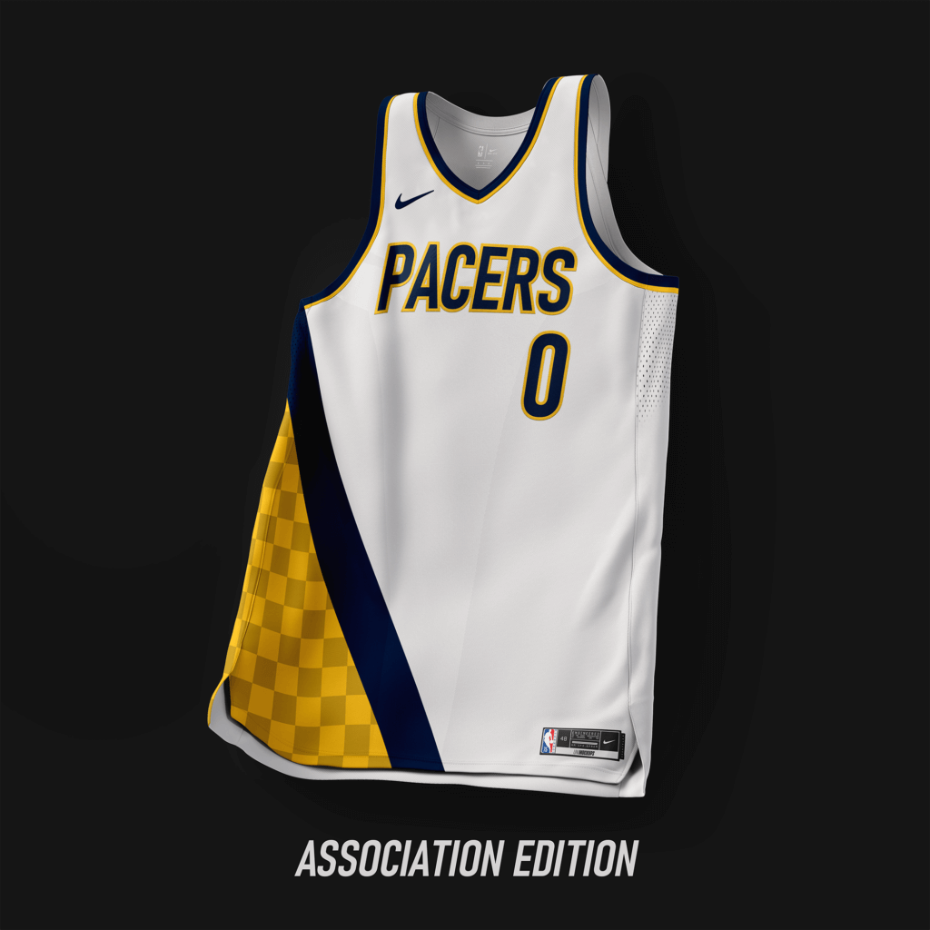
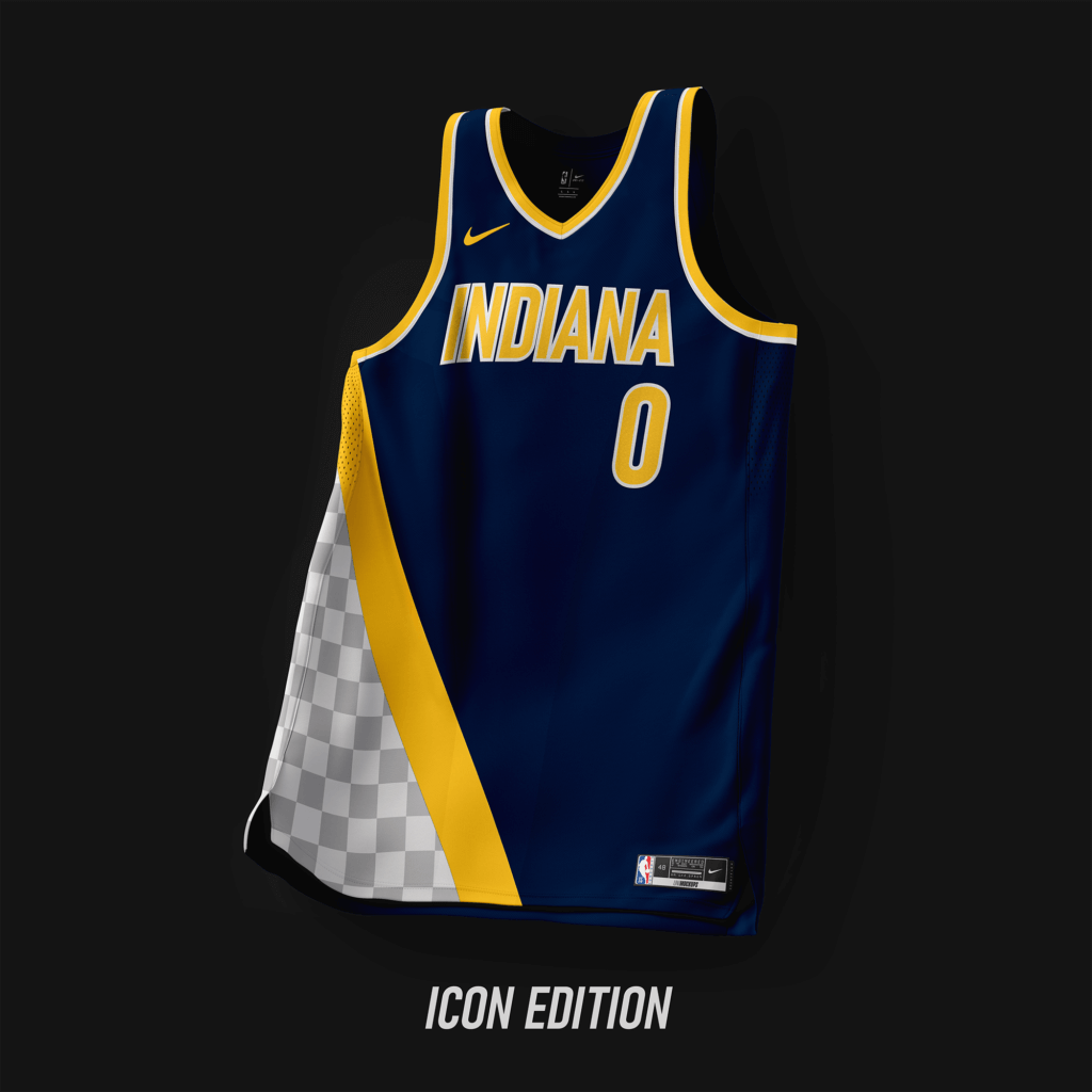
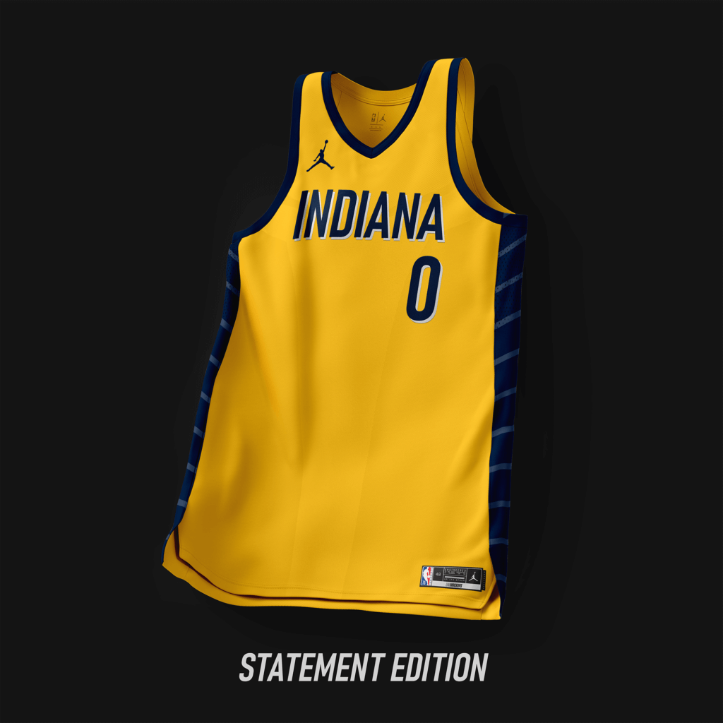
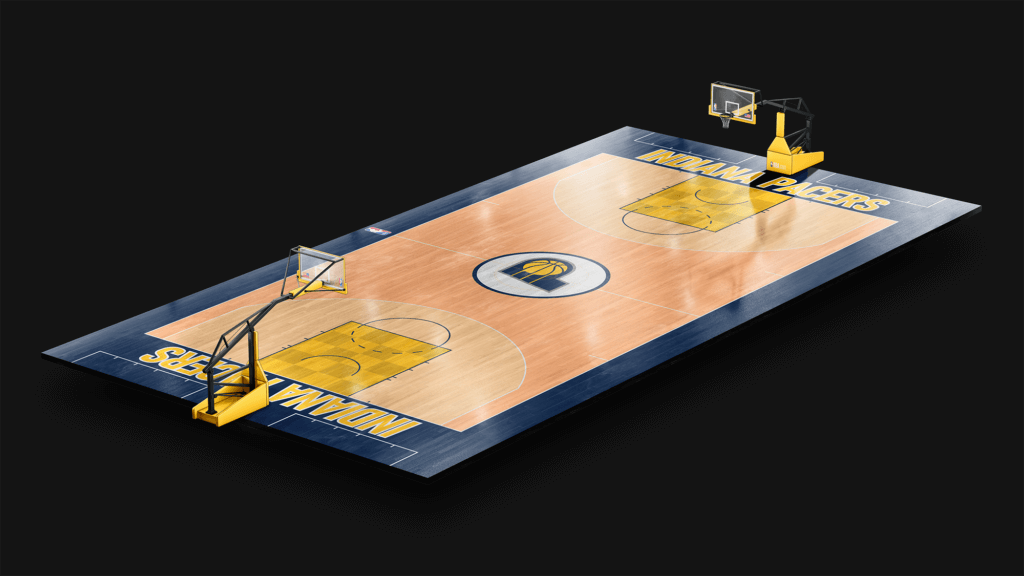
Design based off the look from ’90-’97 with the checkerboard added.
Inglewood Clippers
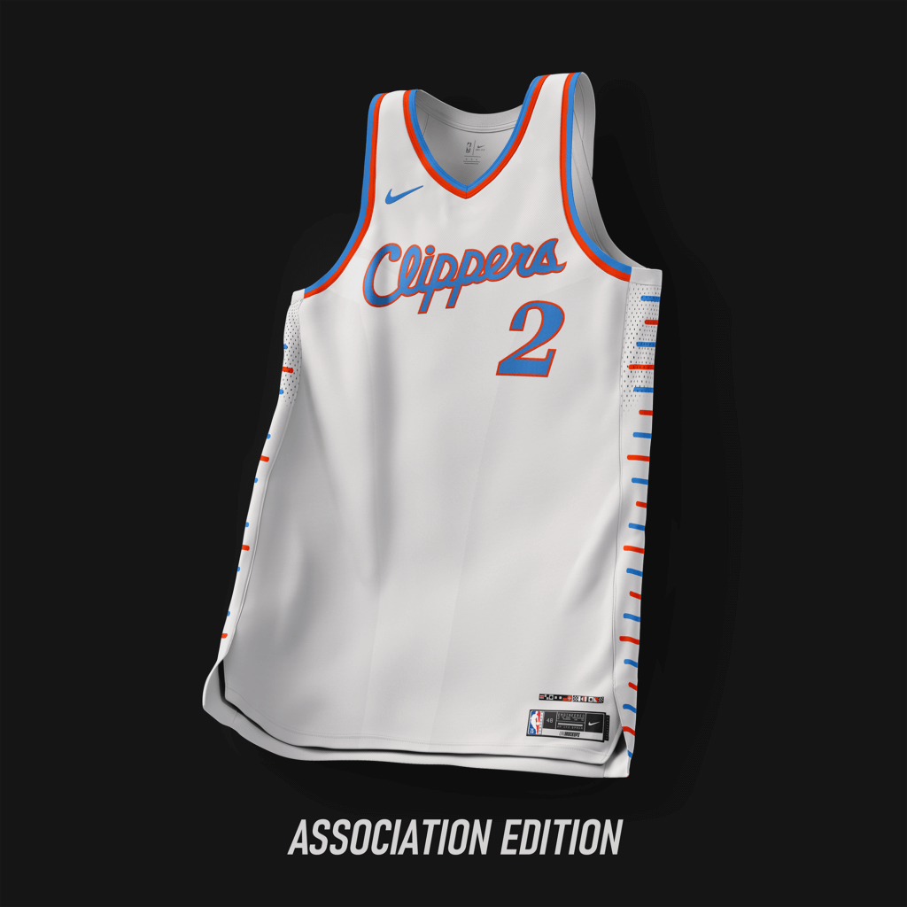
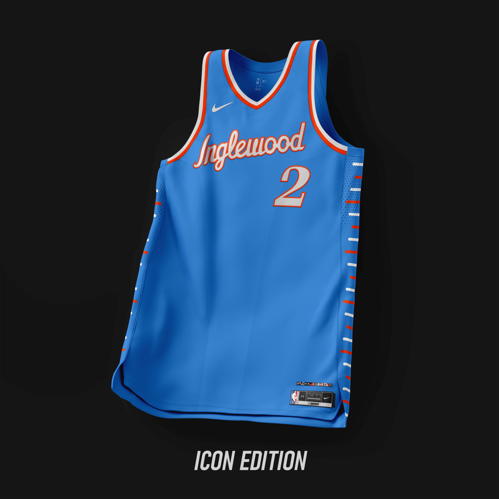
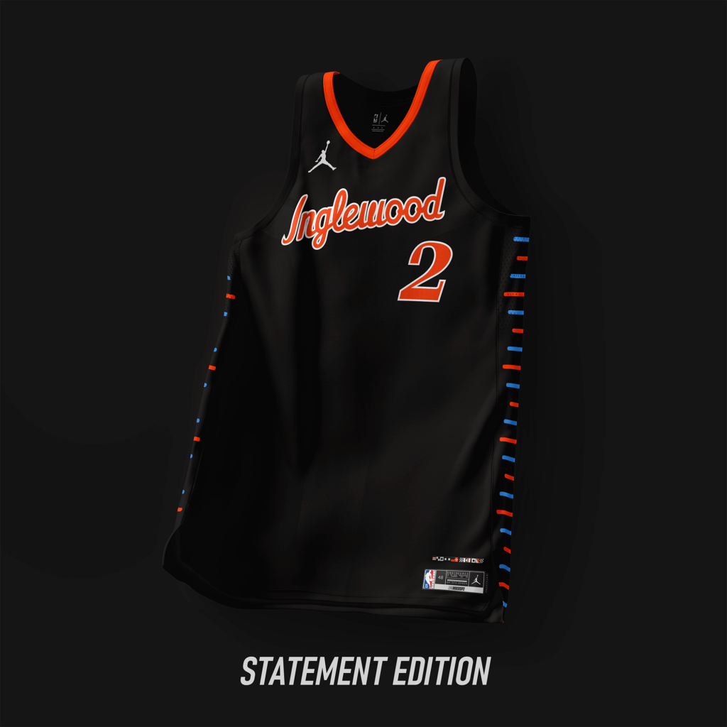
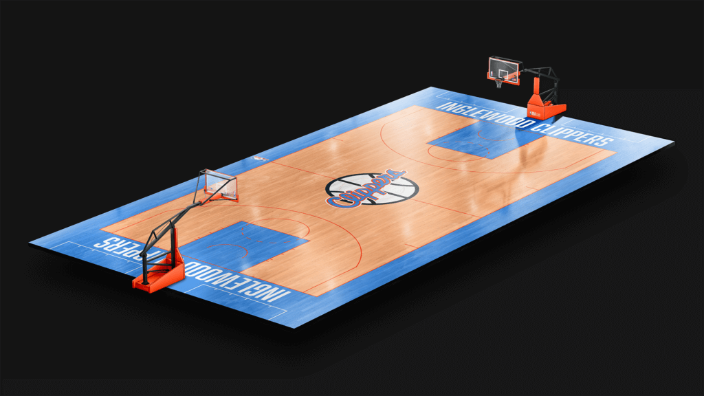
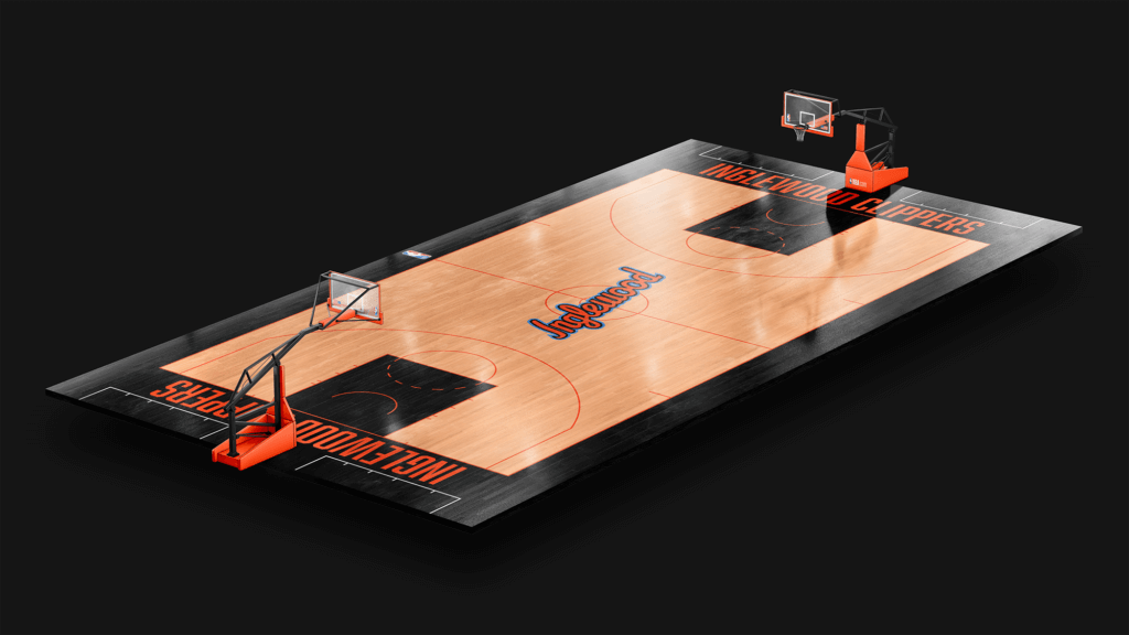
Wordmark used from designs worn from ’87-’15. Colors based off the San Diego Clippers.
Los Angeles Lakers
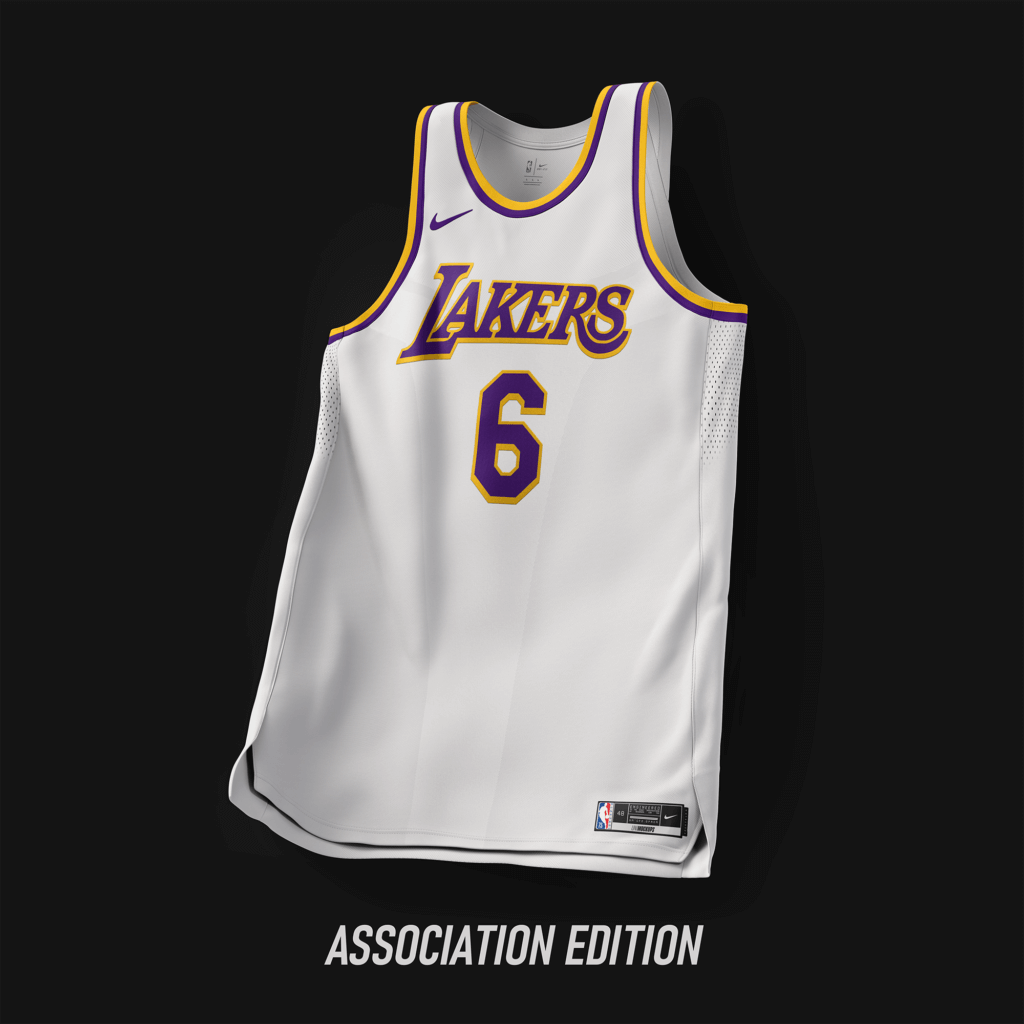
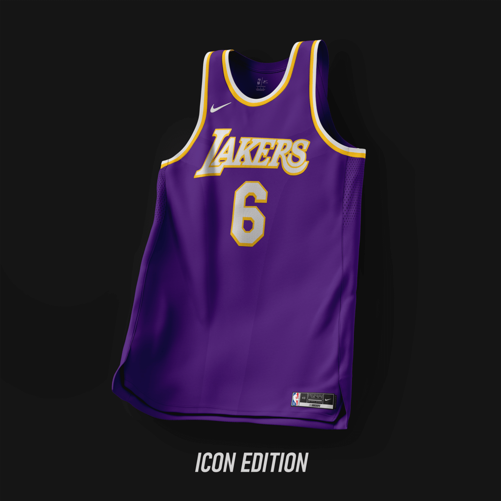
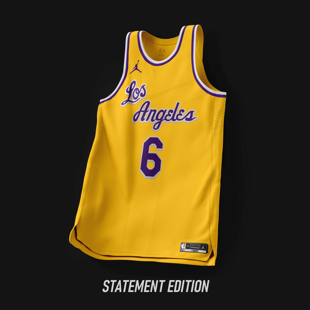
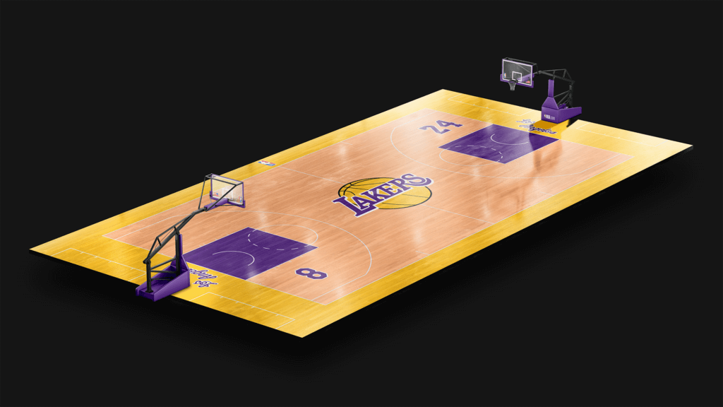
Classic look. Los Angeles wordmark pulled from ’60-’66.
Memphis Grizzlies
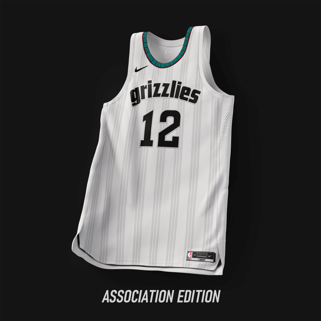
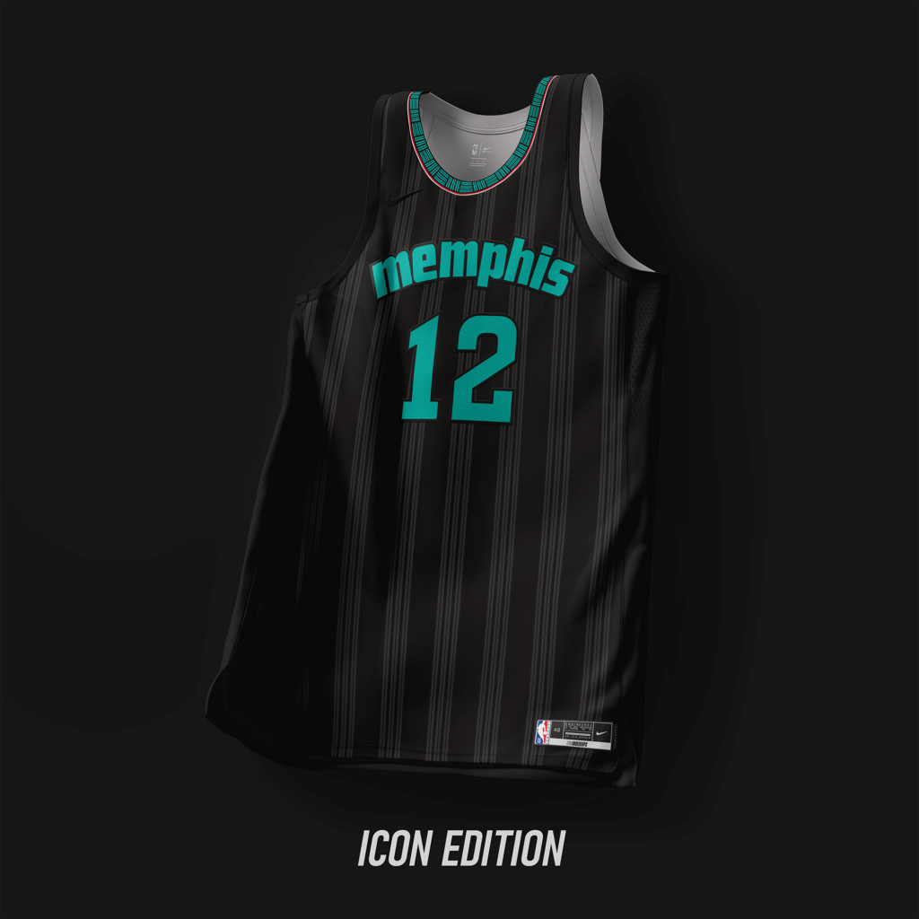
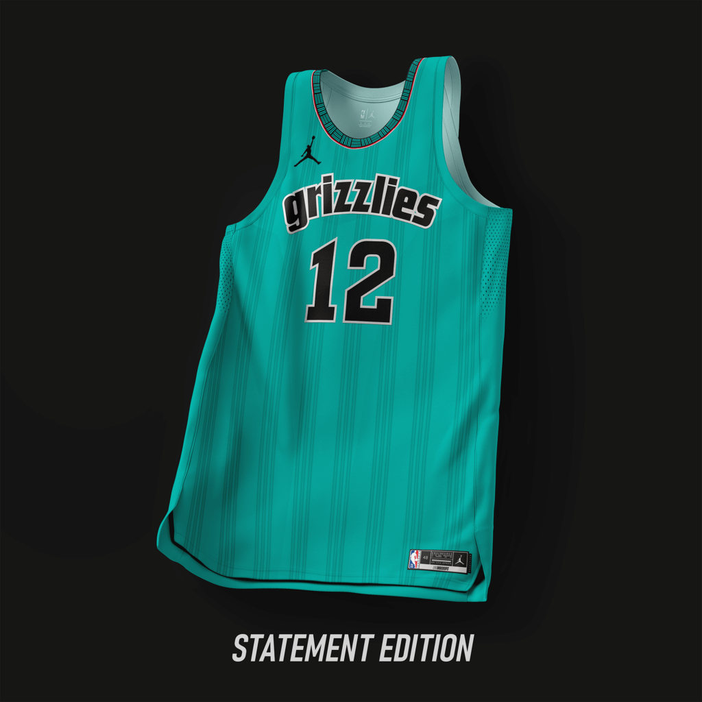
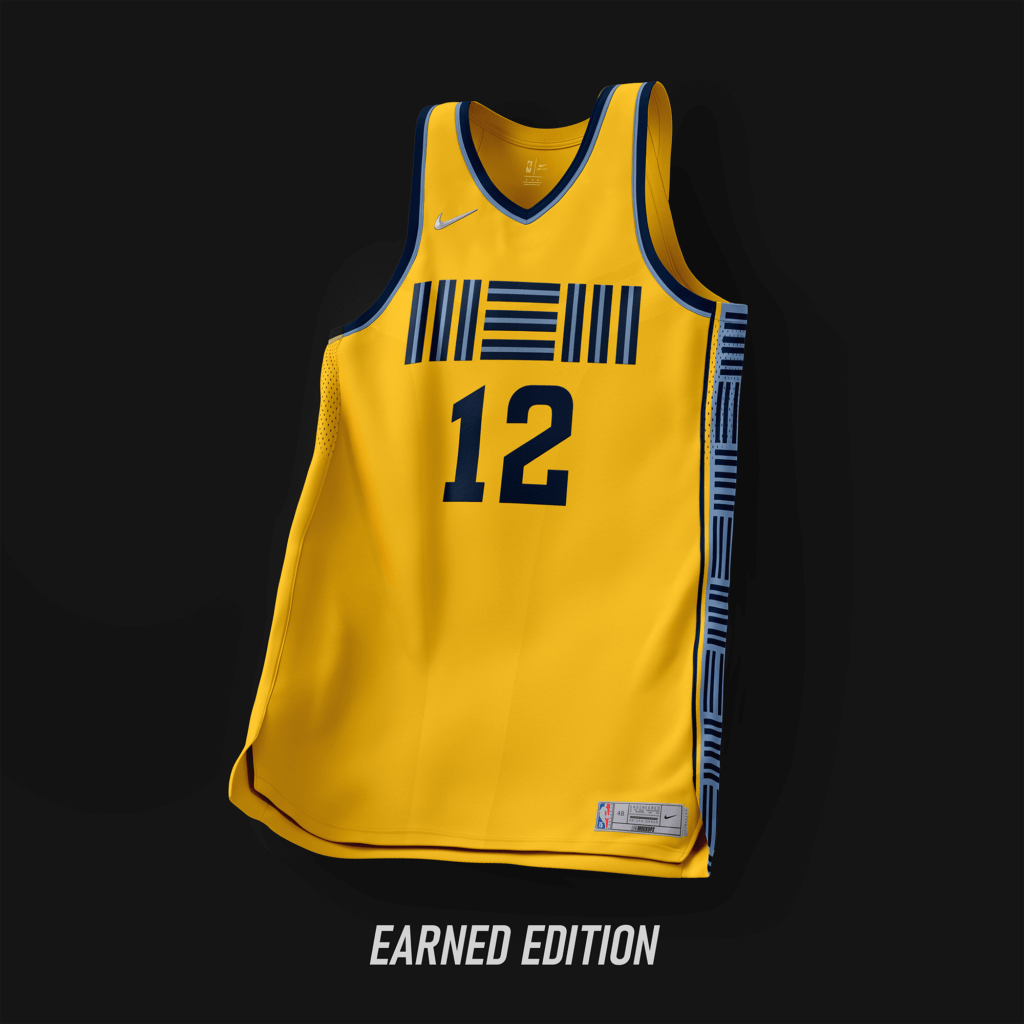
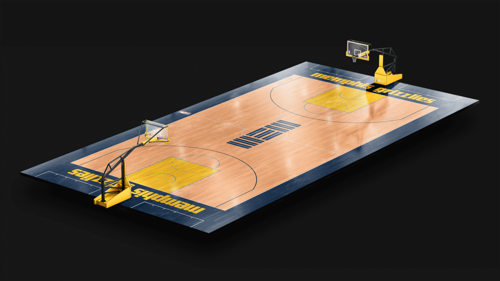
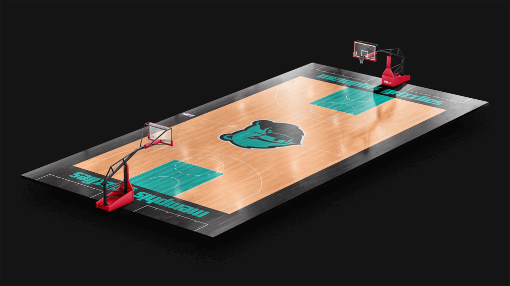
Inspiration from the Vancouver era, with a simple design. Earned using colors from the current set.
Miami Heat
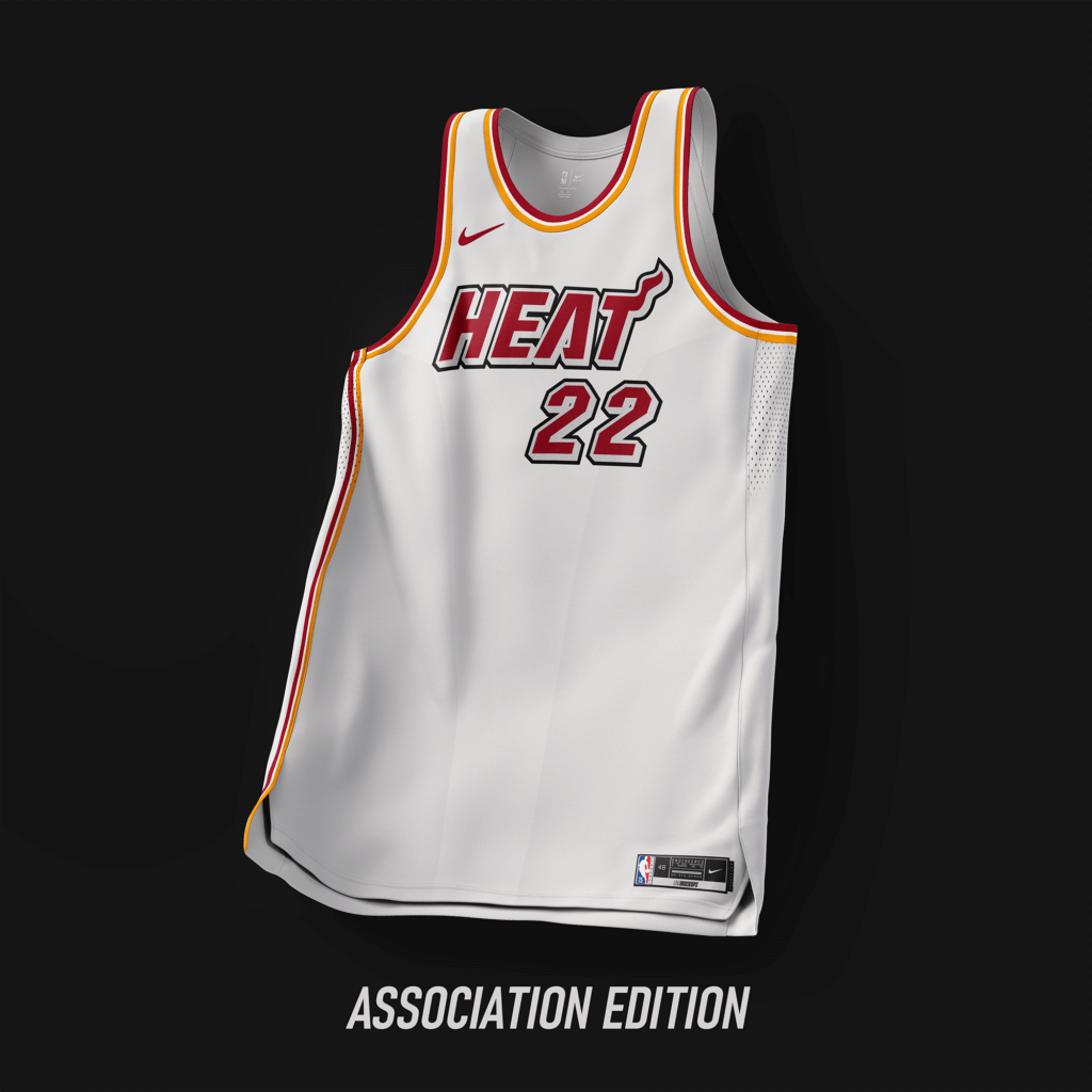
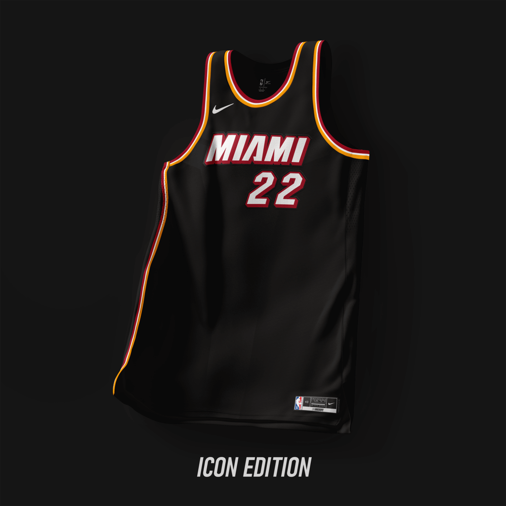
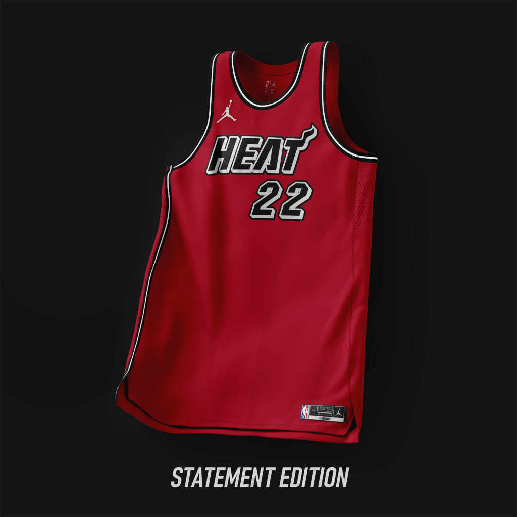
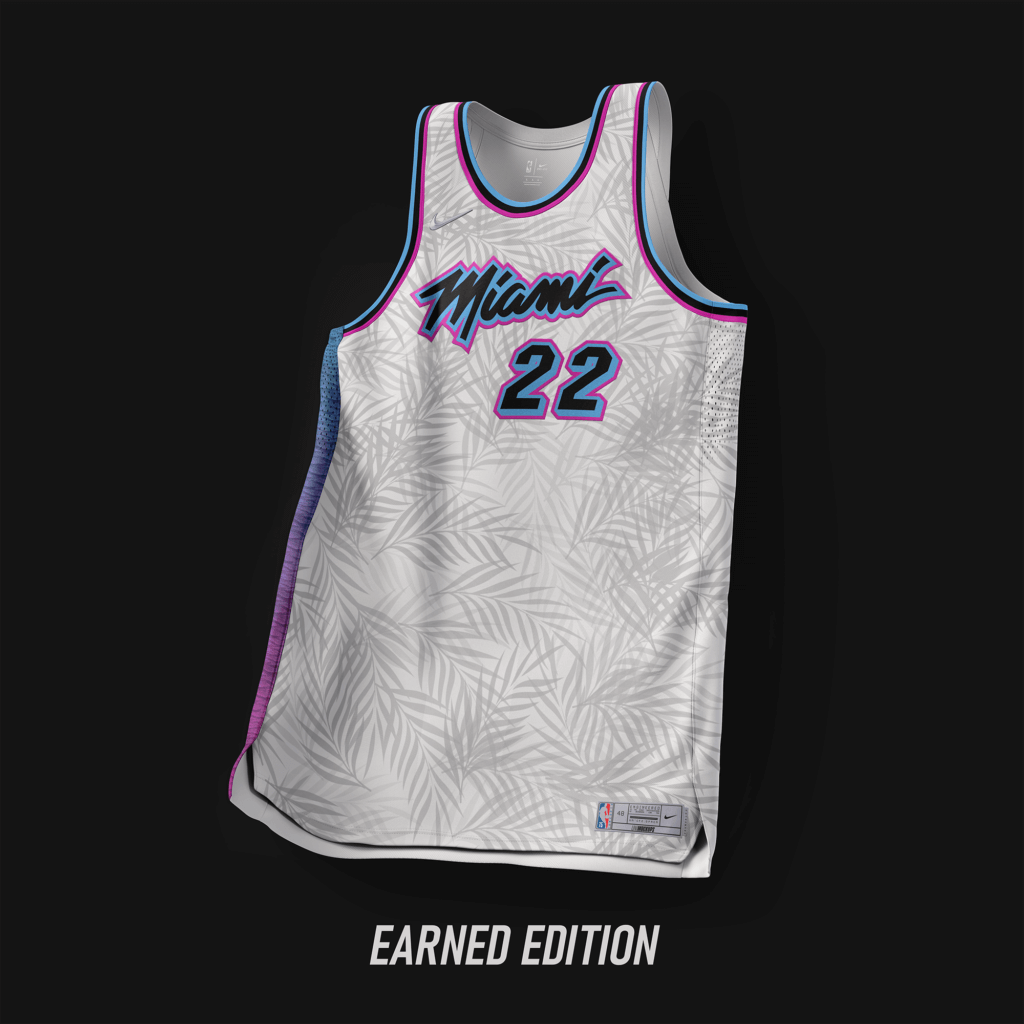
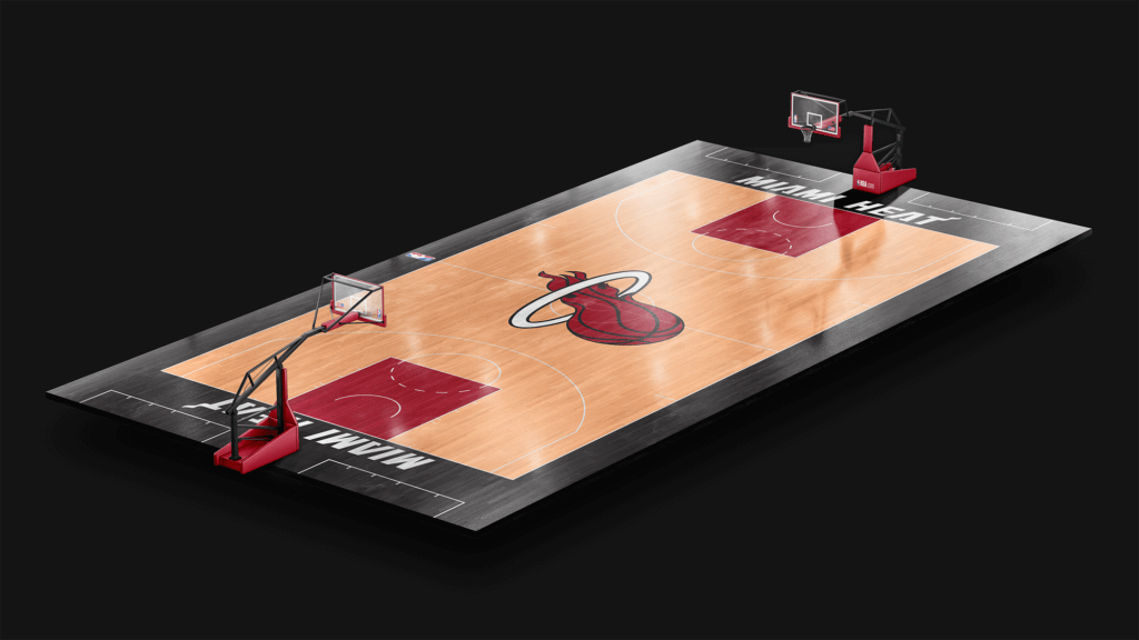
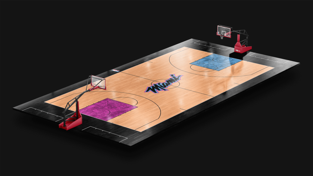
Modern version of the set from ’88-’99. Earned edition using palm tree elements to bring a new twist to the Vice color scheme.
Thanks, Casey! Lots of interesting concepts (and courts!). Looking forward to seeing what you have in store for Part II.
Readers? What do you think?

When Black Friday Comes…
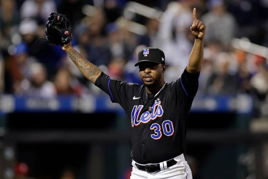
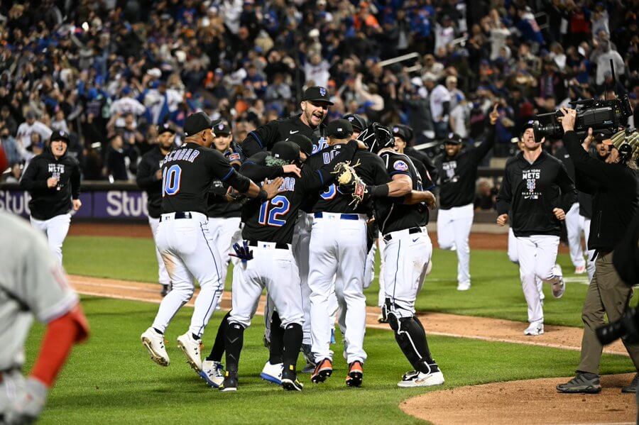
Yes, I know the Mets threw a combined no-hitter (only the second no-no in their history) last night, and yes, I am still ecstatic…but they did it by breaking out their new BFBS jerseys and caps against the Phillies. Unlike last season, when the return of the black jerseys began the Mets eventual downfall…
…this time around the Mets did something historically great.
But take a look at the jersey at the top of this article, and then look at last year’s photo of Francisco Lindor giving the now infamous “Mets fans” salute. Notice anything different? Yes, this season, with the full-time introduction of the black alternate, the Mets have removed the headspoon. I honestly think it looks better (though despite the outcome, I’d have much preferred it be done in pinstripes) than the prior iteration.
Notice also that in 1998, the team wore the “hybrid” (black crown/blue brim) cap. They would not introduce the solid black cap until 1999, which they paired (I think almost) exclusively — so what the team wore last evening was a hybrid-throwback: black, headspoon-less jersey with solid black cap/helmet. If you’re interested in how the Mets first came to wear black, Paul wrote a fantastic piece for ESPN back in 2011 (highly recommended).
So, how did the Mets look last evening?
If you take away the BFBS element, it’s not a terrible look: Solid black cap, black jersey (with “Mets” script in royal blue, outlined in white, with orange drop shadow; same treatment for the front numbers) and solid white pants with thin blue piping.
NOB was royal blue letters outlined in white, while numbers got the same treatment as the “Mets” script:
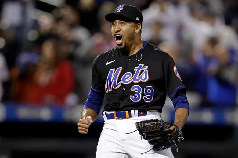
I watched all of this game, and a few players (as you can see above) wore solid black socks, and every player who wore full sleeves went with solid black and black belts. Only closer Edwin Díaz seemed to buck the trend, going with a blue belt and blue sleeves:
Only Mets skipper Buck Showalter wore actual stirrups (that I saw anyway). Black stirrups (*spits on ground*).
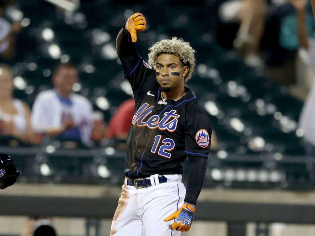
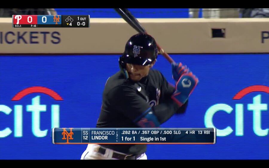
There was even a bit of uni-shenanigans last night, when Mets SS Francisco Lindor came up to bat in the bottom of the first wearing a helmet without the “NY” decal:
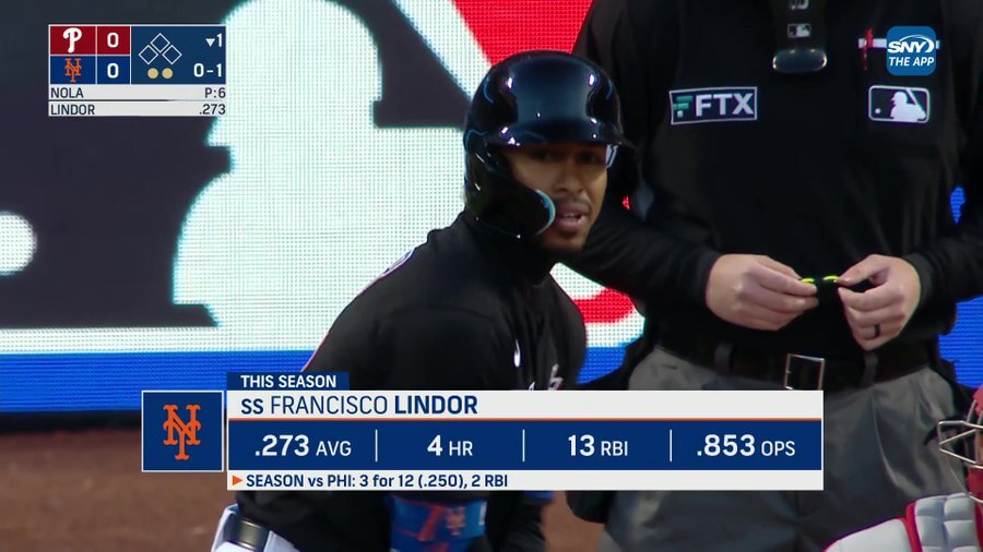
The funny part is Lindor didn’t even realize he was logo-less until he reached first base after a single, when the Phillies Rhys Hoskins let him know:
Francisco Lindor you ARE a free agent pic.twitter.com/BulYUQ6efs
— Talkin’ Baseball (@TalkinBaseball_) April 29, 2022
Luckily the equipment staff had his helemt all logoed up by Lindor’s next AB:
You can see lots more photos here.
I hate that the Mets got their second no-hitter in 60 years wearing the BFBS (as this game will now live in infamy), and I hope the team doesn’t veer from its current plan to wear the black jerseys on Fridays only (both home and some road games is the “plan”).
One thing I’d like to see changed about the Mets uniforms: as you see, the team wears solid white pants (with blue piping) with the black jerseys. However, when the team wears their alternate blue jerseys, they wear their blue pinstripe pants at home. This combination, to me anyway, looks like they forgot their regular pinstripe tops and had to wear their BP jerseys for the game. Since they now obviously have the set of plain white pants, I wish they’d pair those with the alternate blue jerseys, as to me this would look more like a uniform. I personally detest when pinstriped teams wear a solid jersey with them.
Anyway…the Mets are Back in Black. So far I can’t argue with the results.

Guess The Game…
from the scoreboard
Today’s scoreboard comes from Martin Nash.
The premise of the game (GTGFTS) is simple: I’ll post a scoreboard and you guys simply identify the game depicted. In the past, I don’t know if I’ve ever completely stumped you (some are easier than others).
Here’s the Scoreboard. In the comments below, try to identify the game (date & location, as well as final score). If anything noteworthy occurred during the game, please add that in (and if you were AT the game, well bonus points for you!):
Please continue sending these in! You’re welcome to send me any scoreboard photos (with answers please), and I’ll keep running them.
And now a few words from Paul: Hi there. In case you missed it, my Bulletin article this week is a worst-to-first Uni Watch Power Rankings assessment of MLB road uniforms. My premium subscribers can check it out here. If you haven’t yet subscribed, you can do that here (you’ll need a Facebook account in order to pay). Don’t have or want a Facebook account? Email me for workaround info.
Also: I’ve been running a sale on Uni Watch pins this week. Here are the discounted prices:
- • One pin
• Any two
• Any three
• Any five
• Any 10 for $30
A few designs have sold out this week, and a few more are running low. Full details here.
That’s it from me. Now onto the ticker.
Uni Watch News Ticker
By Anthony Emerson

Baseball News: Here’s a great look at the Worcester Red Sox’s sign-language unis for last night’s Deaf and Hard of Hearing promotion (from Daniel Towbin). … The Wei Chuan Dragons of the CPBL will wear these black jerseys for the month of May (from Jeremy Brahm). … K-Pop group BTS is collaborating with MLB on a merch line (from Scott M. Barrett).

Pro Football News: Whole bunch of draft pick uni numbers were revealed yesterday, including: Pats G Cole Strange wearing No. 69 (from Peter J. Clark), Commies WR Jahan Dotson wearing No. 1 (from Dell Michaels), Vikings S Lewis Cine wearing No. 6 (from Cam Erikson), Steelers QB Kenny Pickett wearing No. 8 (from Phil) and Eagles DT Jordan Davis will wear #90 (also from Phil). … Check out this playing card-style art used to decorate the draft site (from Nathan Haas and James Behan Jr.). … The Montreal Alouettes Twitter posted an excellent video showing the application process for graphics and facemasks on helmets (from Moe Khan).
College Football News: Steelers QB Kenny Pickett’s dad, Ken, played linebacker for Shippensburg in the early 90s. Here’s a picture of him wearing a helmet with “100” as the logo. The college was founded in 1871, the football team was founded in the 1920s, so reader Gerry Dincher asks, what was the 100 for?

Hockey News: The Swedish Ice Hockey Federation is celebrating its 100th anniversary with a very nice throwback for the men’s and women’s national teams. A sublimated design feature is the name of every member of the Swedish Hockey Hall of Fame (from Brandon Weir and Andrew Walsh). … The Hurricanes will once again be wearing their black alternate jerseys throughout the playoffs (from multiple readers), ,,, One thing that we don’t usually think about when teams overhaul identities, especially if they do it frequently: how incongruous it makes championship banners look, as exemplified here by the Sabres (from @The_Big_GB).

Soccer News: New fourth kits for French club Lyon (from Kary Klismet). … Also from Kary, Manchester City is collaborating with Puma to create a soccer kit recycling initiative. AC Milan and Puma are doing a similar thing (Milan from Phil) … The previously leaked Chicago Red Stars kit has been formally released (thanks, Jamie). … New kit advertiser for Scottish second-tier side Ayr United (from Ed Zelaski).

Grab Bag: The “City” jersey promotions are now moving to Major League Rugby (a league where Nike is not the equipment partner). Austin Gilgronis and Dallas Jackals will debut them for their games against Seattle and San Diego respectively.
Uni Tweet of the Day
Truth.
Let these banners be a lesson to all teams: Don't change your uniforms every handful of years. Pick a good one at the start and stick with it. pic.twitter.com/doCHaxPmYz
— Mark Lazerus (@MarkLazerus) April 29, 2022
And finally… that’s all for today. Big thanks to Casey for sharing his vision for future NBA jerseys. Looking forward to part II.
Big hugs to Jimmer Vilk. He knows why.
Everyone have a great Saturday, and I’ll catch you back here tomorrow. Till then…
Peace,
PH
Gerry Dincher: Shippensburg University was founded in 1871 – 100 years prior to that photo being taken.
If they wear the BFBS jerseys on the road, I shall be very put out…
BTW, the 1998 BFBS alternate did have the headspoon; see Bill Henderson’s Game-Worn Guide, 8th Ed. (2017) at 1796. The jersey shown in the Piazza photo is a BP jersey; see id. at 1827.
1998 BFBS w/ headspoon:
link
link
link
link
Thanks Jay. I did check out Bill’s guide — and should have double-triple checked the headspoon thing. Now removed from the text. I also searched many 1998 BFBS photos — such as this one of link (and yes, the headspoon is there, but BARELY visible), and also this guide with link (no spoon), so I misremembered that fact. Thanks for catching it. I honestly didn’t even realize they had a black BP jersey in addition to the home and road BFBS versions.
I’m 99.999999999% sure that from 1999 onward they never wore any other cap with the BFBS, home or away. (They did occasionally wear the BFBS cap with the white alts and pinstripes, but I think that stopped after ’99.) They also wore only the two-tone/hybrid cap with the road greys from 1998-2011 except for link, the first game of a doubleheader at Yankee Stadium on June 27 (the link).
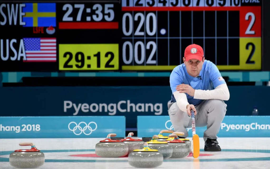
Scoreboard: Team USA’s Phil Hecken surveys the ice during the fourth end of a match against Sweden at the 2018 PyeongChang Olympics.
Gold medal match. USA Skip John Shuster is calling a hit and run back for vice Tyler George. You can see the shot, which Tyler makes nicely, here:
link
USA would go to win the game 10-7, and with it the gold medal.
1. The Mets BFBS jerseys needed to stay in the dustbin of history. I have no love for the Mets but royal and orange always looks good. They pandered to a craze decades ago and everything old is new again. But even making some history last night doesn’t cement this as “the look”, though another collapse would help eliminate this. The Eagles won their only Super Bowl in midnight green but it’s still an inferior look to kelly green and silver.
2. Ironically, the Sabres made the right choice with logo and uniform the first time. Like the Mets, they also pandered to the design craze of the day. And the results speak for themselves in the banners.
Love the Steely Dan and AC/DC references!
Don’t like that they altered the traditional black uni. How would Paul and/or Phil like it if they removed the headspoon and changed the sleeve patch on the grey road uni?
“traditional black uni”
There is no such thing.
Well, there’s nothing “traditional” about the BFBS jersey, and the original did have the standard Mets sleeve patch.
Moreover, they “changed the sleeve patch on the grey road uni” (and the home pinstripes as well) in both link and link.
All that being said, and I can only speak for myself, given the choice I would prefer the BFBS with the headspoon vs. without, and I’d be very upset if they made any changes to the current grey road uni, which IMHO is the best-looking uniform in all of baseball. I certainly was not pleased with the addition of black drop-shadows to the graphics in 1998 and the exclusive pairing with the two-tone caps and black accessories from 1999-2011 (except for one game in 2008). But a new [unsightly] alternate being made slightly different from a recent-past [unsightly] alternate, vs. modifying (or abandoning) a [flawless] design that dates to link, is a false equivalence.
Since this *is* Uni-Watch, did you have an opinion (or even notice) the Mets added blue soutache to the sleeve ends in 1995? I wasn’t even aware there was such a thing as sleeve braids until 1990, when Boston added it to their road jersey. The last team to have such decoration predates the polyester era.
If you’re referring to the blue piping added to the road jerseys in ’95 when they revered to the original 1962-73 style (see Bill Henderson’s Game-Worn Guide, 8th Ed. (2017) at 1792), then yes, I did notice, and I recall liking those jerseys very much at the time, but I didn’t and wouldn’t have known it was called “link”
What I somehow didn’t notice until you just mentioned it, and I checked out Henderson’s guide to confirm, is that the 1962-73 jerseys did not have the piping there; only the collar/placket. (See id. at 1773, 1775.)
Oddly, there was no shortage of the 3-color braided trim (1969 Expos, 1972 Angels, 1972 Giants) at the sleeve ends until teams got used to the fatter knit stripes (1972 Pirates). But every team who used the Detroit Tigers home uniform for a template checked the “no” box on sleeve trim. Like vertically-arched player names in the 21st Century, there just seems to have been a drought of that particular detail. Which led me to wonder: If you asked for it, would the makers say it was unavailable?
I am aware that this likely makes me the lone dissenting voice here, but I don’t mind the Mets black uniforms. Definitely not as an all the time thing, and I’m glad the black elements were removed from the white and gray unis, but as an alternate I think they work.
Objectively, it’s not a bad design; Mets colors on a black canvas. My problem with it was always less about aesthetics — and really, less about the fact that black was never a Mets color, and that it was adopted in order to jump on an already-outdated merchandising bandwagon — than about how its adoption allowed black to infect the other uniforms, allowed the ugly two-tone cap to become the de facto primary cap (home and away) for over a decade, and resulted in the abandonment of what I think is the best look in all of baseball, viz., the Mets’ 1962-73/1995-97/current road greys.
I agree—the trouble for me is not these alts, it’s how they bled into the Mets (and other teams) primary color scheme and became way overdone. Black has to be used sparingly.
The only reason I can think of for Shippensburg University to have the College Football 100 logo in Ken Pickett’s era of the 1990s would be the team wearing a 1969 throwback uniform. As to why they were wearing a 1969 throwback when that photo was taken I have no idea.
I personally really like the color alternate top/pinstriped white pants look. I’m still annoyed the Rockies created solid white pants just to avoid it.
Best left to the pullover/sansabelt era. I’d rather see monochrome color on baseball uniforms.
With Kenny Pickett joining the Steelers, I’d like to see the Pitt number font on the Steelers’ jerseys.
Cavs should be wine and gold
alwaysmost of the time. I absolutely love the orange alt with tiled striping though!Is “Inglewood Clippers” going to be the name? If so I’m more than OK with that and with these unis.
Love the Pacers.
I wish the Nuggets would have gone with actual gold instead of canary gold (or whatever that shade is) back in ’03. I don’t like the combination they chose but I like what Casey did with them.
Thanks, Phil.
“Inglewood Clippers”; that’s a good one. Let everyone know I’m henceforth referring to the Football Giants’ division rivals as the “Arlington Cowboys”.
I wanted to start a whole line of “Suburb Connect” shirseys on Teespring, including the Arlington Cowboys, Santa Clara 49ers, etc..
I could do a throwback Irving Cowboys as well!
That’s the East Rutherford Giants.
Inglewood always up to no good.
Who shot ya?
Theres almost nothing bad to say about those NBA concepts. What an amazing job. I love nearly all of them.
The Nuggets skyline jersey should be the dark blue rainbow one.
The Nets blue jersey should be the ABA Dr. J era one.
To be fair I did say ALMOST. But the light blue Nuggets set is one of my all time favorites.
Thank you, Casey. Enjoyed the thought you put into your designs and am looking forward to Part 2. My only note would be that I wish the armhole stripes overlapped the side panels .
So we’re downgrading no hitters based on the specific UNIFORM that the team throwing the no hitter wore?
Could you possibly be more infantile?
Not in the least. A no-no is still a tremendous accomplishment, no matter what uniform is worn.
My problem, if you can call it that, is my belief link, is that fans equate “success” on the field with the uniform worn. In this case, it’s the Mets BFBS (or in my article, the racing stripes on the pinstripes) — objectively (or perhaps just IMO) — I don’t think the Mets belong in BFBS, and now, this uniform will forever be linked with a no hitter. More jerseys will be sold, fans will *love* them more, simply because the team had success while wearing them. The Mets have now thrown a grand total of two no-hitters in their entire sixty year existence. NEITHER of them has been when wearing pinstripes, which has been their signature look for all of those sixty years.
I’m taking nothing away from the no-no … but I am expressing my regret that it wasn’t accomplished wearing their best, and normal, pinstripe uniform.
Okay, let’s be REALLY optimistic and say there are 80,000,000 people who call themselves fans of mlb. How many of them do you think will remember or care what specific uniform Nolan Ryan wore for each of his 7 no hitters? I PROMISE you the number is under 1,000. A 1,000 out of 80,000,000.
It’s a no hitter. I could give a damn if they pitched it wearing nothing but a g-string with the team logo over the crotch.
You’re not a Mets fan, I take it.
Trust me. With our (mostly) tortured history, no one will forget the no-no in BFBS…at least not for the foreseeable future.
If anything, the Mets’ success (or lack thereof) seems to have nothing to do with what they wear.
PRE-ZACTLY!
But the problem is fans (often) equate success with uniforms. Just look at the Patriots. I think most of us would agree the red Pat Patriot kits were MILES better than the subsequent Flying Elvises, but there are still many fans who “hate” the red jerseys because they equate those with mostly on-field failure, but love the blue/silver mess because they won 6 rings in them. Obviously the unis had nothing to do with on-field success, but the perception is their reality. And it’s not just the Pats, but those are an obvious example.
I feel like the Mets still don’t have a true no-hitter.
The collective no-hitters just don’t have the same feel as a pitcher doing it solo. Not even close.
Historians will likely always attach an asterisk to their “first” one since there was a big time botched call on the foul line.
I can’t imagine any Northeast Ohioan wishing for a Cavs return to any facsimile to ’90’s gear – Gross! Buffalo’s uniform guffaws for both hockey and football are renown: Buffalo School of Art, Design, and the Nearsighted…
Magnificent work by Casey Vitelli. You clearly put a ton of time, thought, & talent into these designs, & the results are spectacular.
So being someone that’s been pretty anti black Mets uni, here’s where I stand with it
1. One of my least favorite Mets looks but I’m not going to deny that removed from the Mets it’s a sharp look. It’s not objectively bad like the Jets BFBS.
2. I do not want to go back to the black era. Although I’m not against the snow white’s returning
3. I’m very upset they took place of the New York blue and silver unis that I really did like.
4. Ultimately as long as they stay a Friday night special deal and don’t bleed into the regular uni rotation I can live it. Additionally if they are actually done in place of the odd ball city connect jerseys then I am more than okay with keeping them.(although I would have preferred to see the Henley’s lol)
I normally look at re-branding concepts with a tolerant eye for the one or two that might be good, but Casey’s NBA work today surprised me in a great way. Really nice work! I have to say I’m blown away! Major thumbs up, can’t wait for the next round. Don’t do my Sixers dirty! ;)
Does anyone know about the jacket Buck Showalter is wearing in the linked picture? It’s not the Nike dugout jacket. I don’t like the black, but overall it’s a better model than the regular Nike version
I’ll be honest, Casey: I want to see the shorts, too.
Inglewood Clippers
Arlington Cowboys
Santa Clara 49ers
E. Rutherford Giants
E. Rutherford Jets
Brooklyn Islanders
Cumberland Braves
Arlington Rangers
etc. etc.
PUUUHHHHLEEEEEZe
Bronx Bombers.
Yeah, the Islanders don’t play in Brooklyn any more (and haven’t for a couple years).
There is a new college lacrosse league featuring six historically-black colleges … Morgan State, Coppin State, Lincoln University, Delaware State, Bowie State, and the University of Maryland-Eastern Shore.
Morgan State’s uniform is quite interesting. They have white numbers on the front and back of their orange top, but the “television” numbers on the sleeve is 75 for every player. Presumably that’s in honor of the 1975 team at Morgan State. This was the “Ten Bears” team that beat No. 1 Washington & Lee.
I don’t understand why this great site, with all that it’s stood for, allows concepts to be posted with ads in them
I really like that Brooklyn Nets concept jersey with the Helvetica font and NYC subway theme. Is the number inside a circle on the back, too? I hope so.
Regarding the Mets in black: those shadowed numbers look so much better when there is no name on the back; NOB letters look terrible with multiple layers and shadows. (See: Texas Rangers) See link; doesn’t it look great?
Spotted while searching for pictures of the circa 1999-2000 Mets NNOB black home jerseys: link. The number 11 has the digits closer together on the NOB jerseys, and today’s Majestic jerseys kern them even more. I like the old spacing better.
The Cavs have a bit of the same deal as the Sabres with their link. It’s probably gonna get worse when they add the LeBron/Kyrie/KLove designs