Tired of seeing annoying ads (like this one!) on Uni Watch? There’s a simple solution: Join Uni Watch Plus. You’ll get an ad-free site experience, plus exclusive access to our UW+ discussion forums, push notifications whenever a new blog post has been published, a special UW+ badge accompanying all your comments on the blog, and a 20% discount on our Teespring merchandise.
A good Saturday morning, Uni Watchers. I hope everyone has had a good week. Happy Kentucky Derby Day!
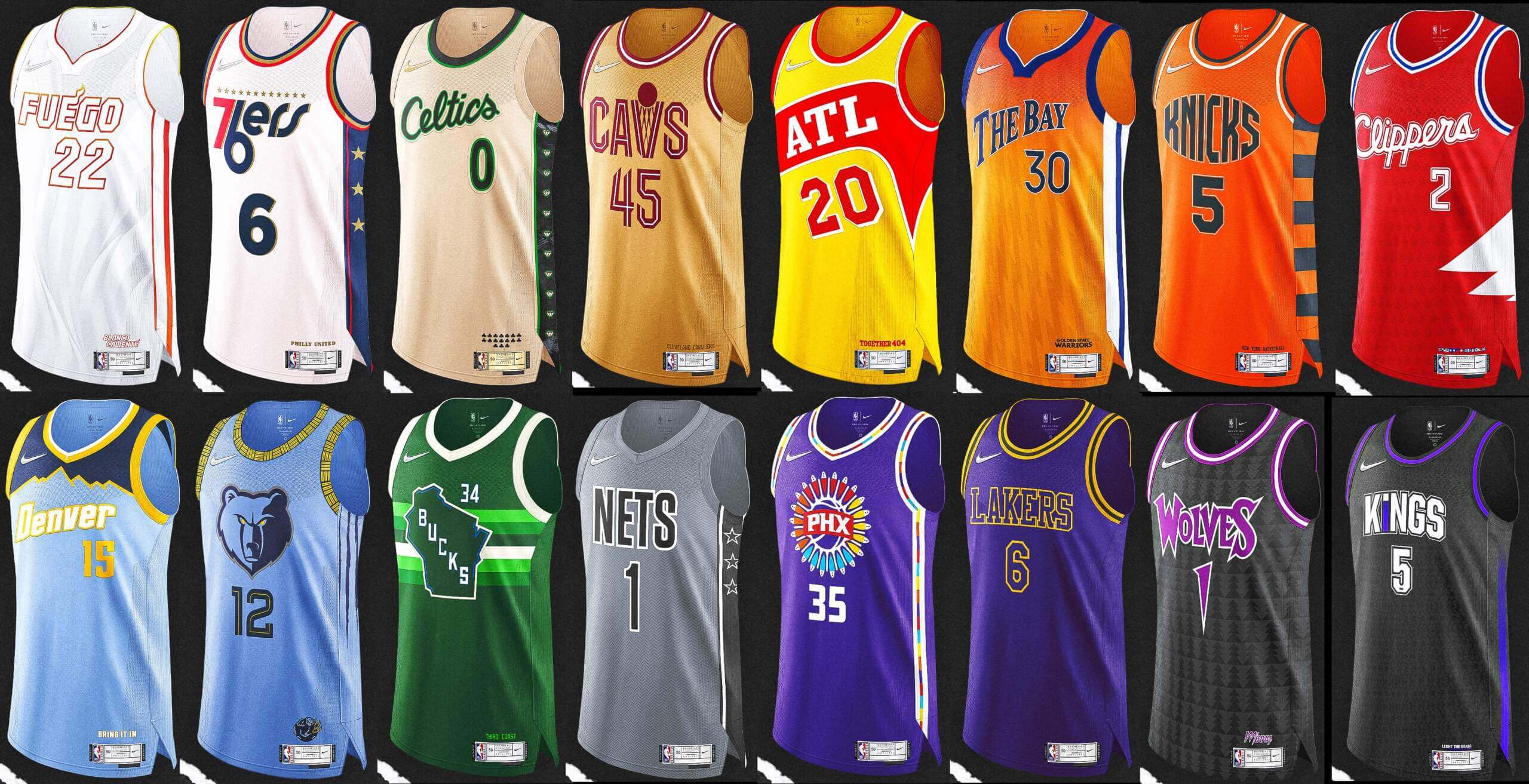
A couple weeks ago, I featured two of today’s featured artists, Casey Vitelli and “Gav Swaps” as they concepted some “Reverse Retro” jerseys for the NBA. Those two gents were concurrently working on a project involving an additional 14 collaborators, which I’m pleased to bring to you today. The designers had some fun running a contest to pick the top jersey — in the same format as the regular playoff tournament — over on the Twitter, but I asked if each one could share his design with us and to give us a brief explanation of the thinking behind the jersey, now that the EE Tourney has ended.
“Earned” Edition jerseys were last featured in the NBA in the 2020-21 season. So what if the Earned Edition jerseys would make a comeback for the 2022-23 NBA season? Here’s a look at what the designers came up with (team by team), along with each designer’s Twitter handle. I’m sure you’ll recognize several of the names, as their work has been featured on UW over the years from time to time.
Enjoy and here’s Casey!
• • • • •
NBA 2023 Earned Edition Project by Casey Vitelli and friends
I wanted to do an “Earned Edition” project, but I have done the same thing multiple times. I wanted to try something different.
I grabbed 15 other designers, randomly selected teams, and we each designed an “Earned Edition” for the 16 playoff teams. We mixed it up and kept each designer anonymous and had followers vote for their favorites in a playoff style that matched the current NBA bracket.
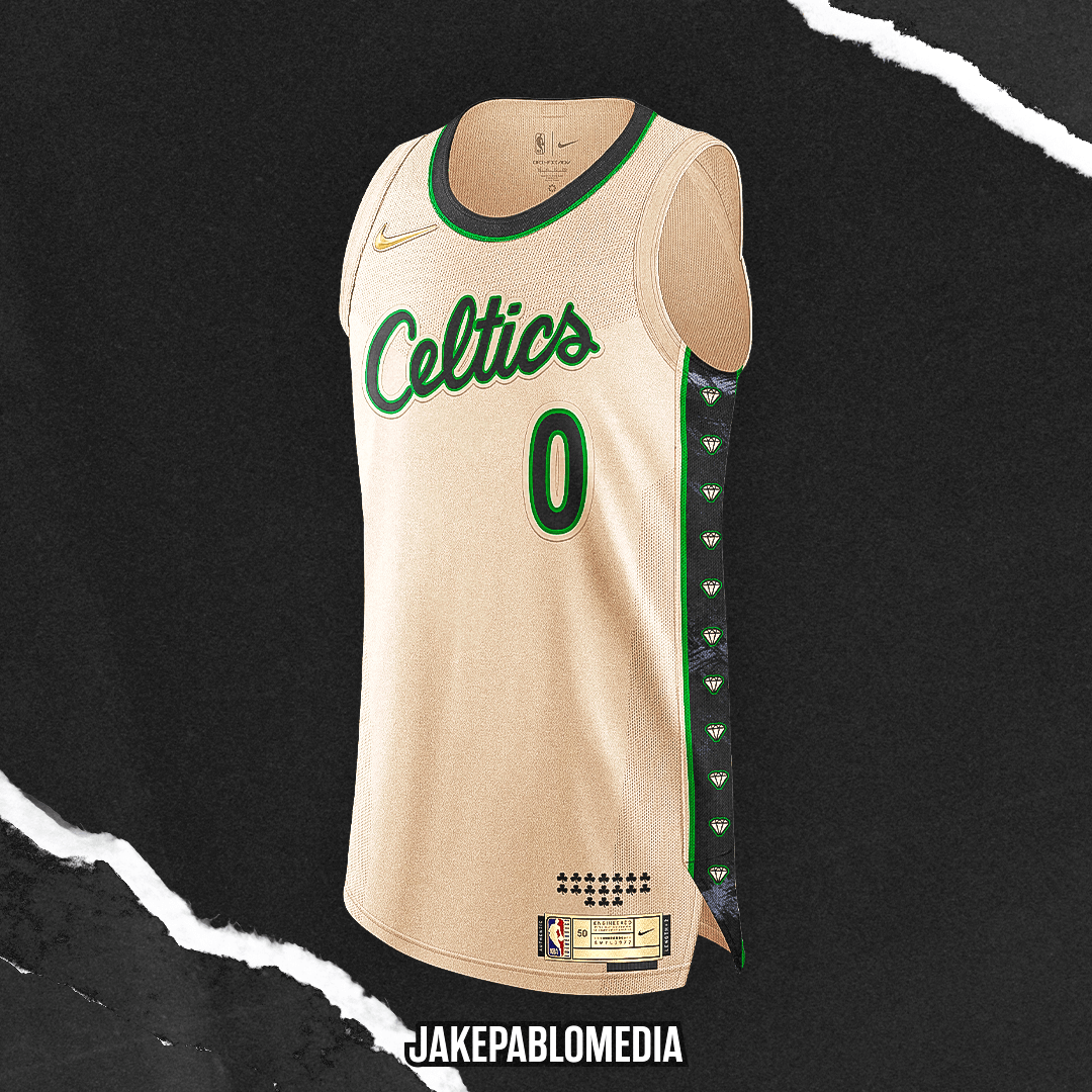
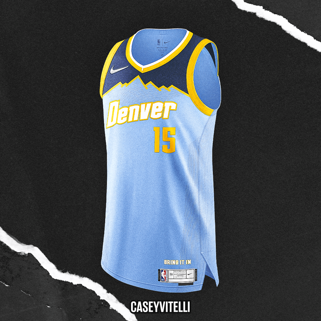
Combining many eras in Denver Nuggets history. Brought back the light blue, modified the wordmark to be something new, and doing something different with the mountain silhouette.
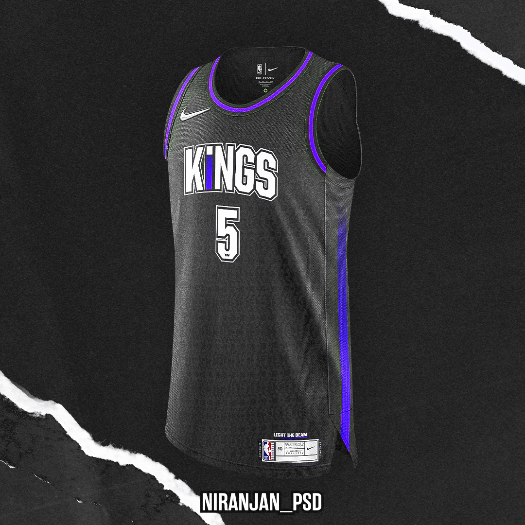
This jersey is designed to celebrate the Kings’ historic postseason appearance inspired by their victory beam. It also features a soccer-style logo inside the numbers and an intricate background pattern to signify the depth and cohesiveness of the Kings’ roster.
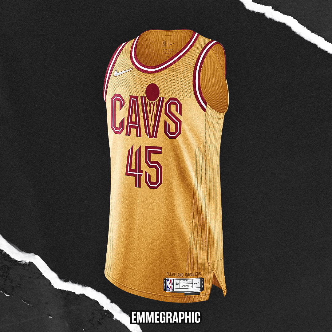
Gold, the third color in this year’s revised Cavs palette, is used only as a secondary color in the current uniforms. This concept makes it the protagonist.
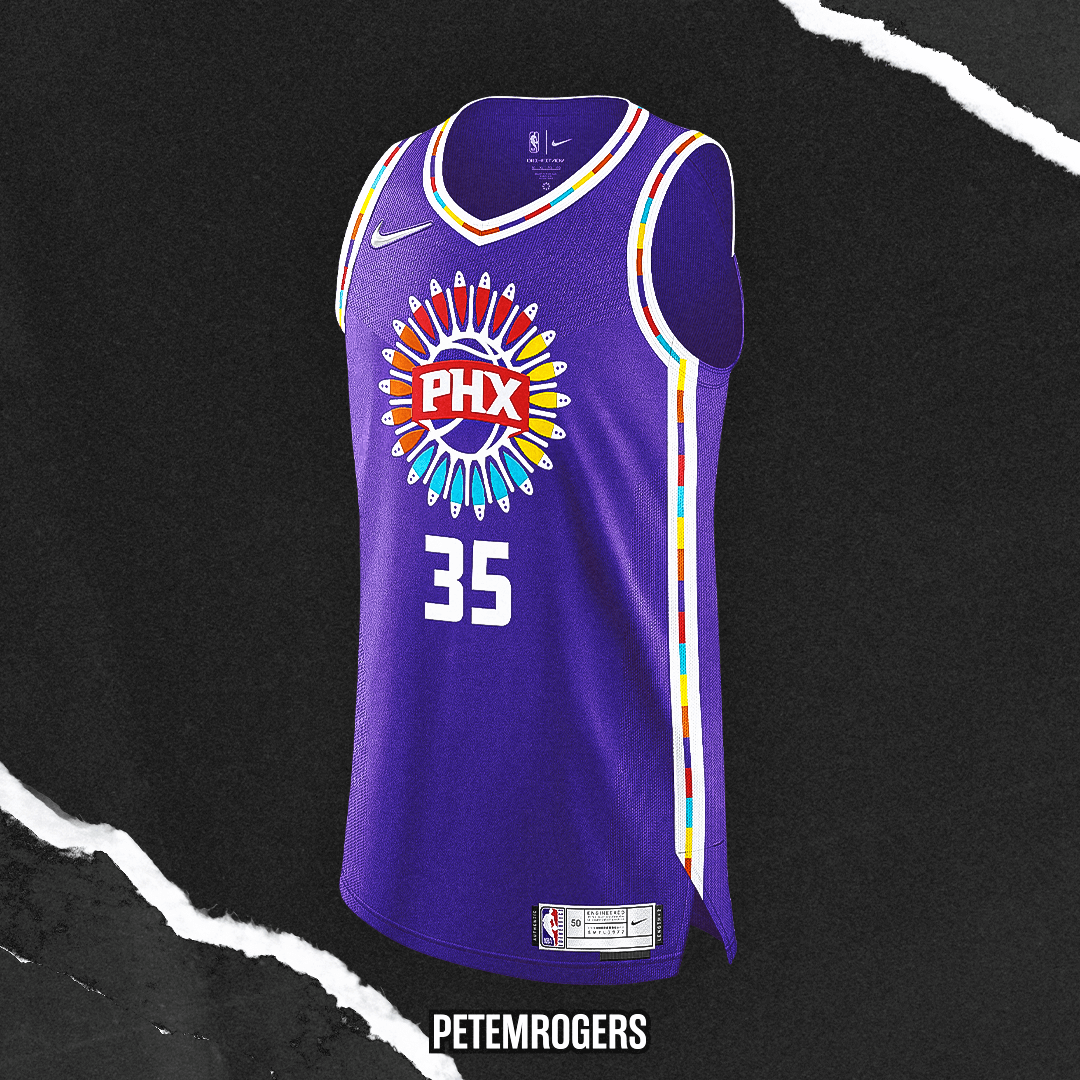
I was inspired by the Suns latest city jersey, wanting to build a full design around their Native American logo. Also wanted to highlight all the beautiful colors the Suns have in their repertoire.
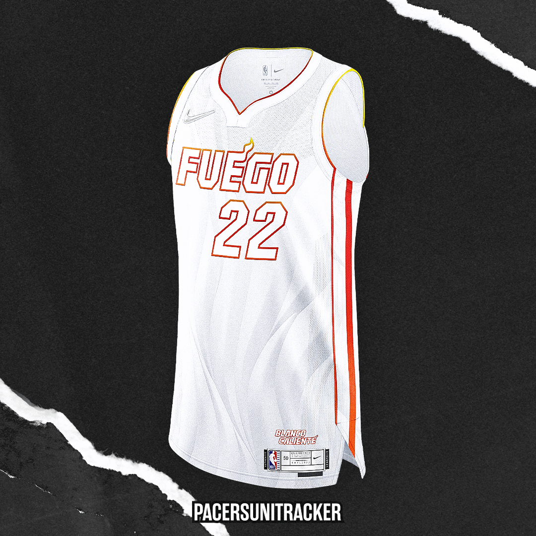
Pulling inspiration from the Miami Heat’s longstanding “White Hot” playoff campaign, this ‘Blanco Caliente’ design pays homage to the rich Latino culture woven through the fabric of the city.
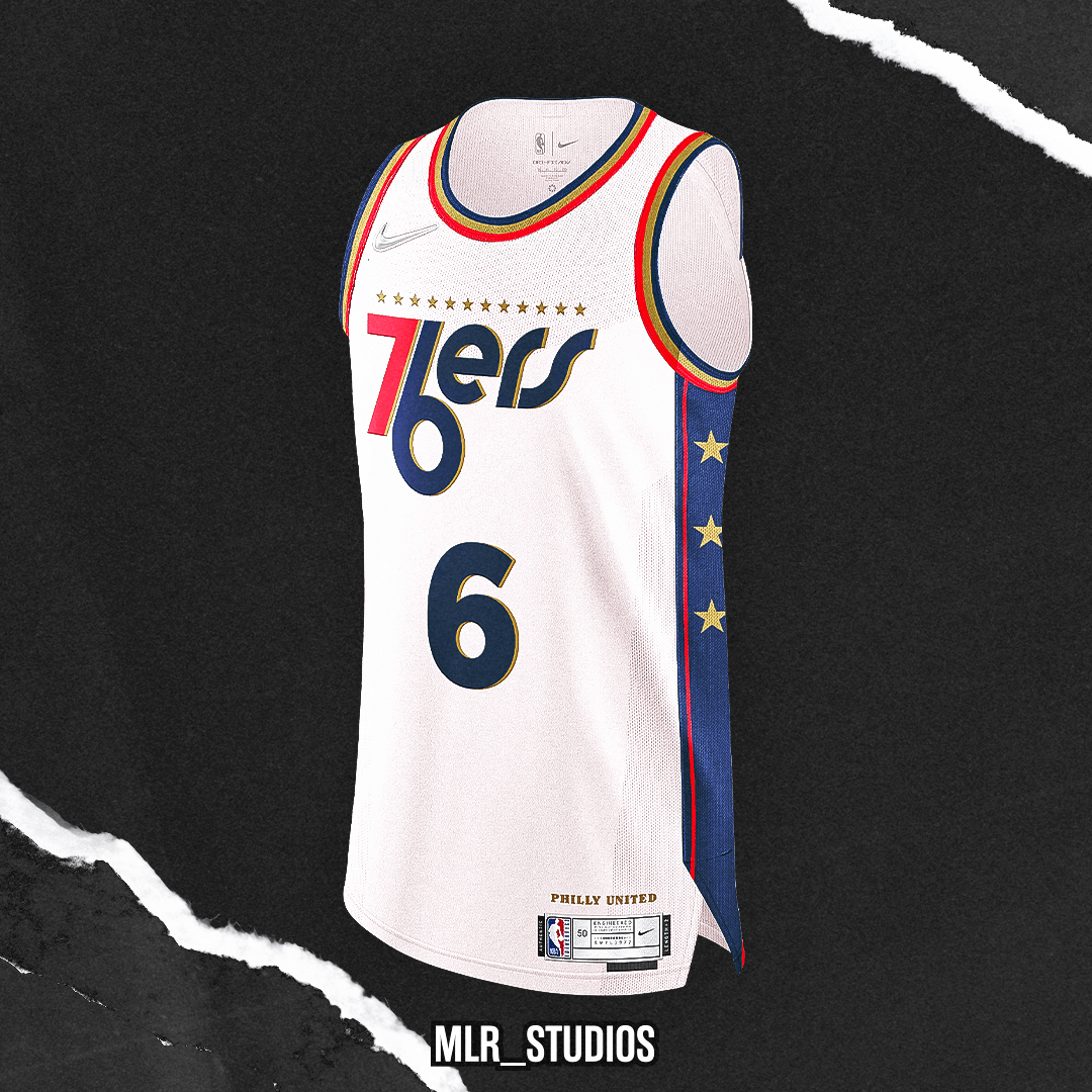
The main idea behind this was going back to the Dr. J days with those uniforms, and giving it a little twist influenced by the Sixers ‘Spectrum’ City Edition from 2021. Adding the off-white, and a gold drop shadow (nod to Iverson era) rounds out the uniform!
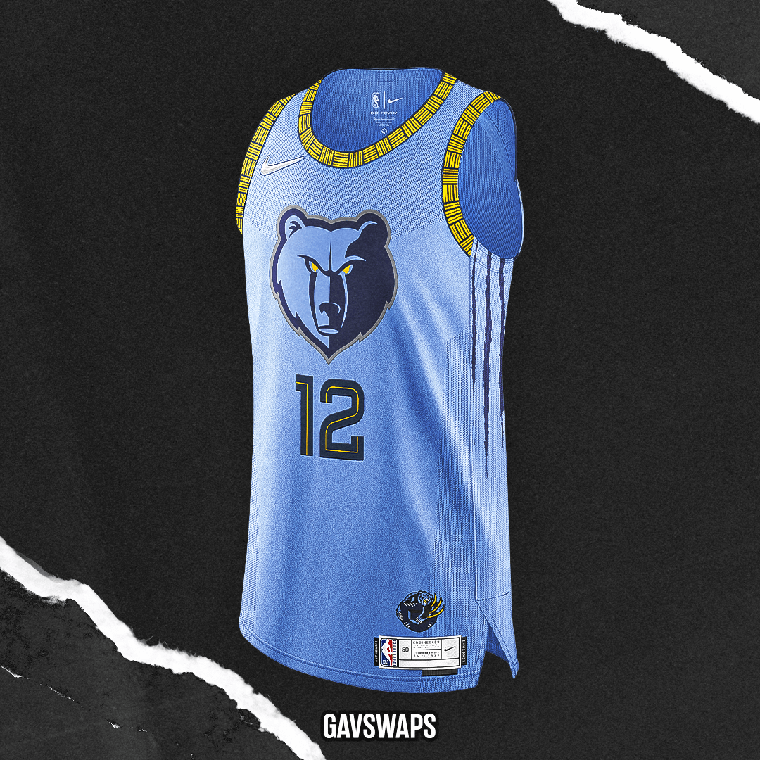
For this Earned Edition design, I realized the main Grizzlies logo had not been used as a centerpiece before, so I decided to let it have its moment. Accompanied by more usage of yellow and claw scratches down the sides, I wanted to stick to their current aesthetic while expanding it as well.
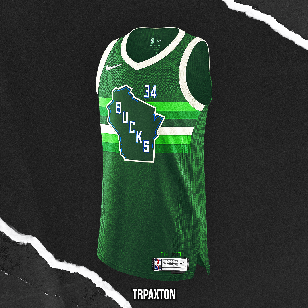
My take on the Milwaukee Bucks’ Earned Edition was inspired by the “Irish Rainbow” design element the team used from the late ‘70s until the early ‘90s, but fused with the modern-day look and typeface. This concept was meant to be timeless and classic, something the team could easily wear on the court, and a nod to the Bucks’ stories past and bright future.
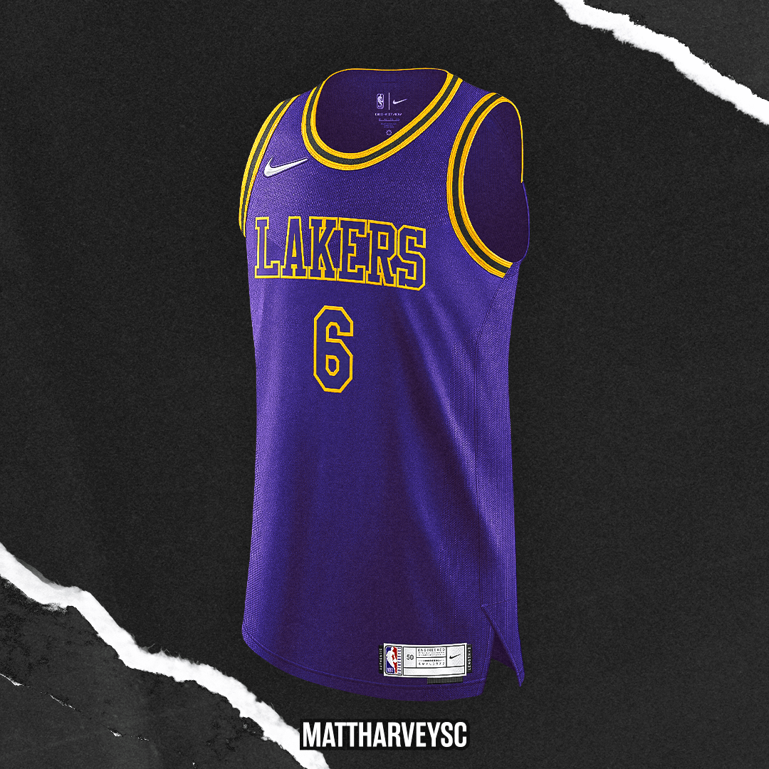
My Los Angeles Lakers “Earned Edition” uniform is based off a mixture of the team’s “Black Mamba” uniform, with the reverse coloring for the collar and cuffs, and the team’s “Minneapolis Lakers” home uniform, which we saw as their Classic Uniform this past season.
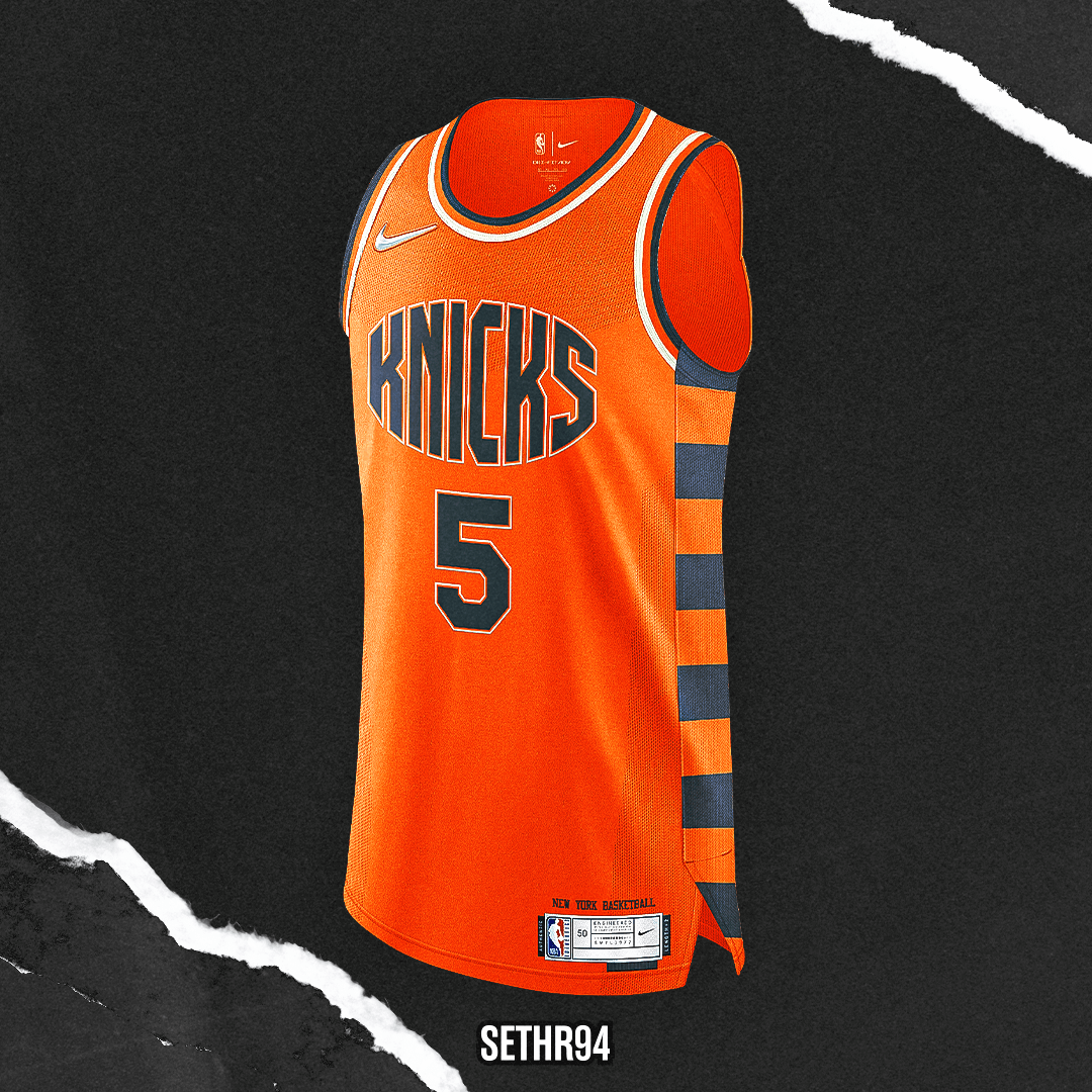
Directly inspired by their 70th anniversary logo, this Knicks earned edition jersey celebrates one of the NBA’s most decorated franchises by giving them a more vintage look. The earned edition assembles some of their most iconic jersey elements throughout the team’s history, while adding a new “Knicks” wordmark and color scheme to give the jersey a refreshed look.
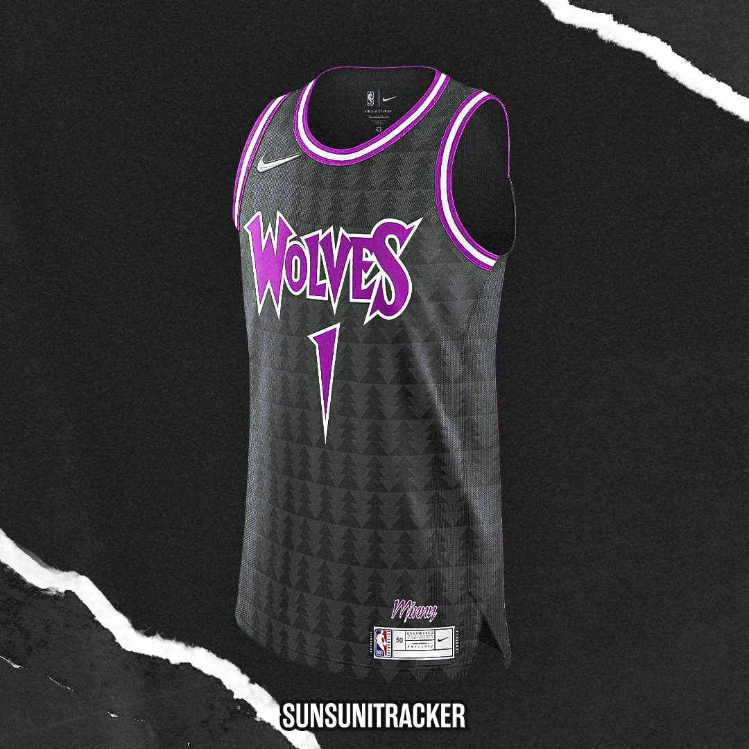
A mashup of eras, this design merges the KG era trees with the Purple Rain era. Minny above the jacktag was another option for the main wordmark but I didn’t want it to read like a City Edition.
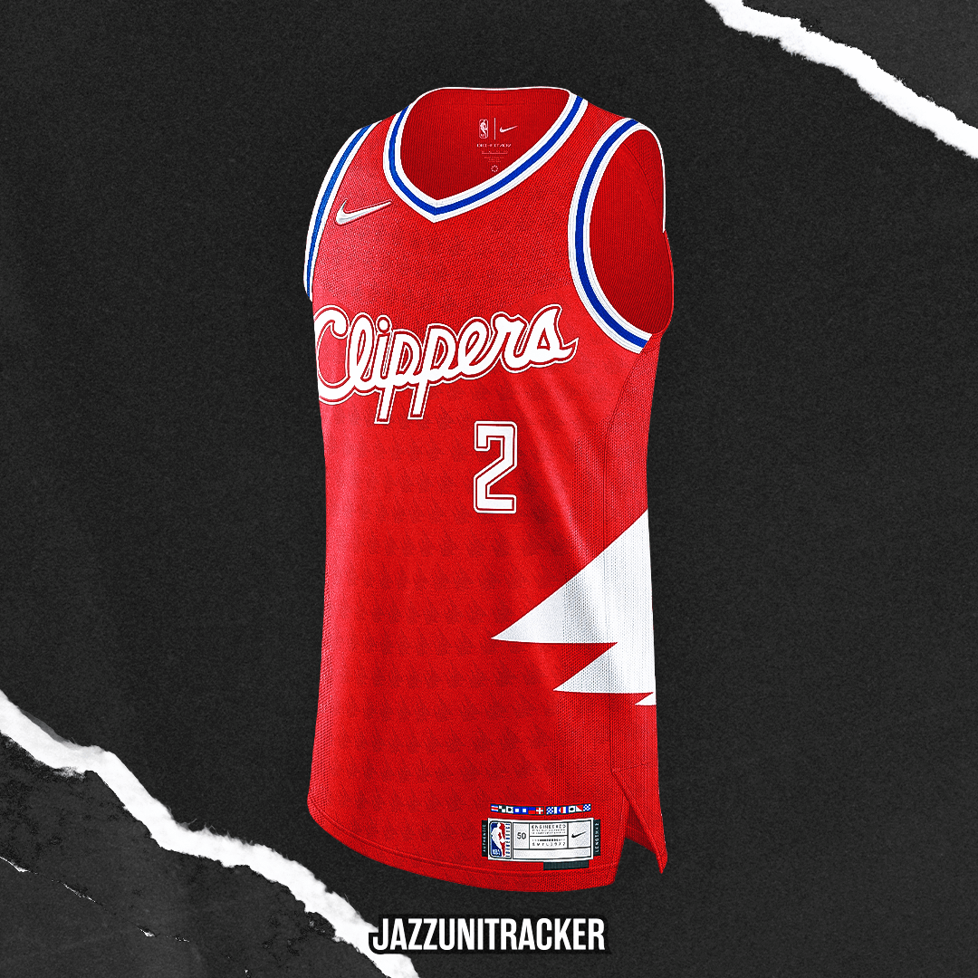
The Clippers Earned Edition features fan favorite “Clipper Red” as the base color and is accompanied by the iconic ’90s Clipper word mark. The side panel represents the sail design also seen in recent City Edition uniforms.
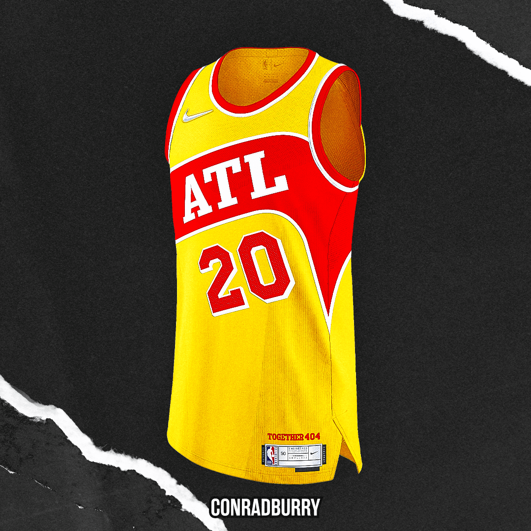
For my Earned Edition jersey, I did an era-combination of the current branding + the Pacman 1980s jersey. The Hawks 3 main uniforms currently lack an ‘ATL’ wordmark, so that was necessary, for one of the few towns that colloquially uses its NBA-designated abbreviation.
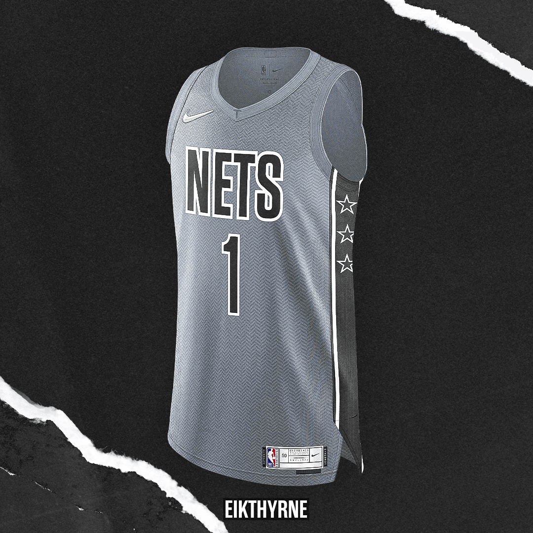
Slightly breaking away from the usual black/white, the Nets Earned edition is based on the current statement edition. Grey base with herringbone pattern to add depth to the uniform.
• • • • •
Cool stuff! Thanks for sharing, guys. I’m sure all most of us feel the NBA probably already has way too many jerseys/uniforms, but the Earned Edition (bequeathed upon a team who makes the playoffs) was always kind of a fun alternate.
Readers? What do you think?
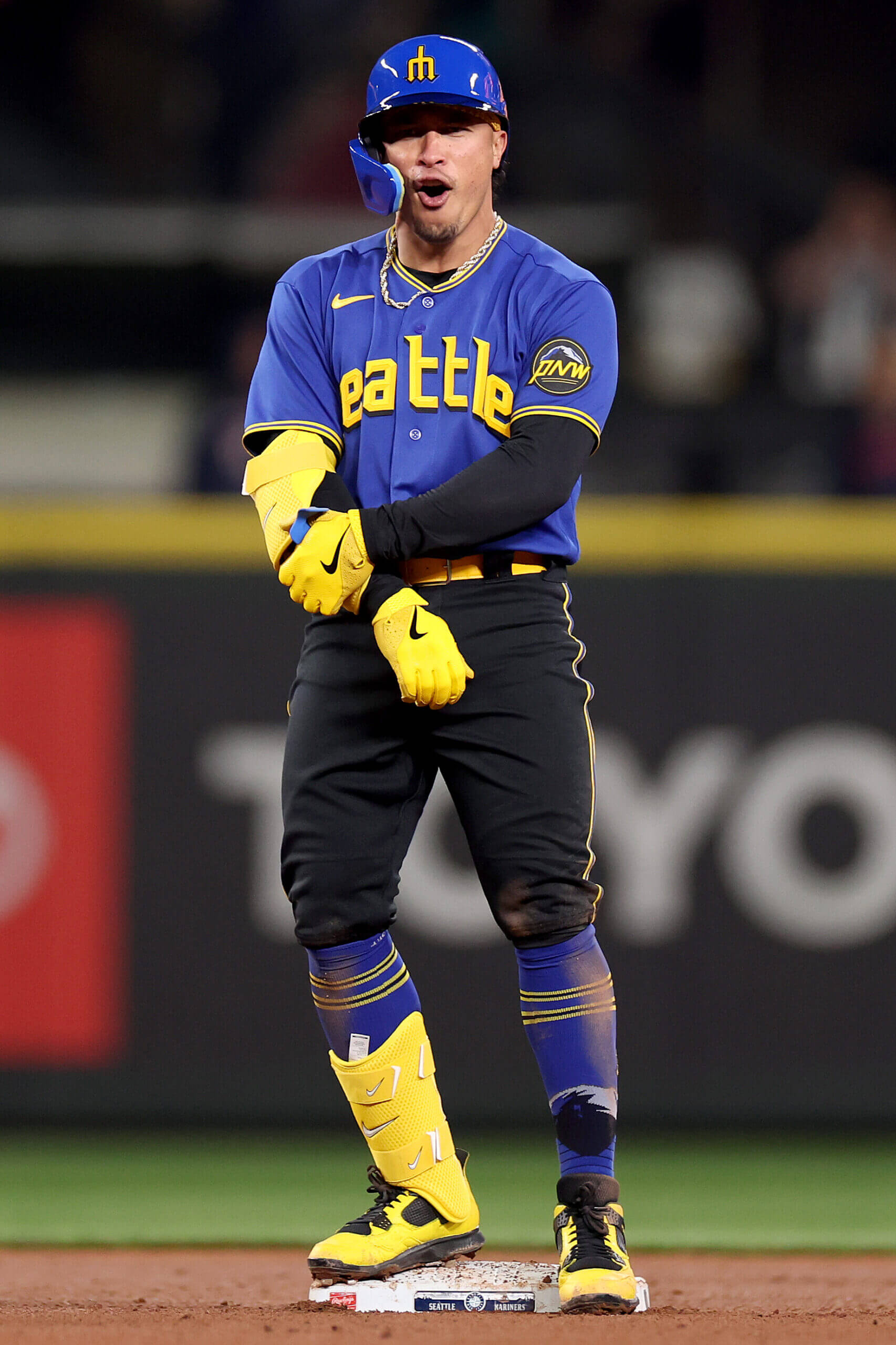
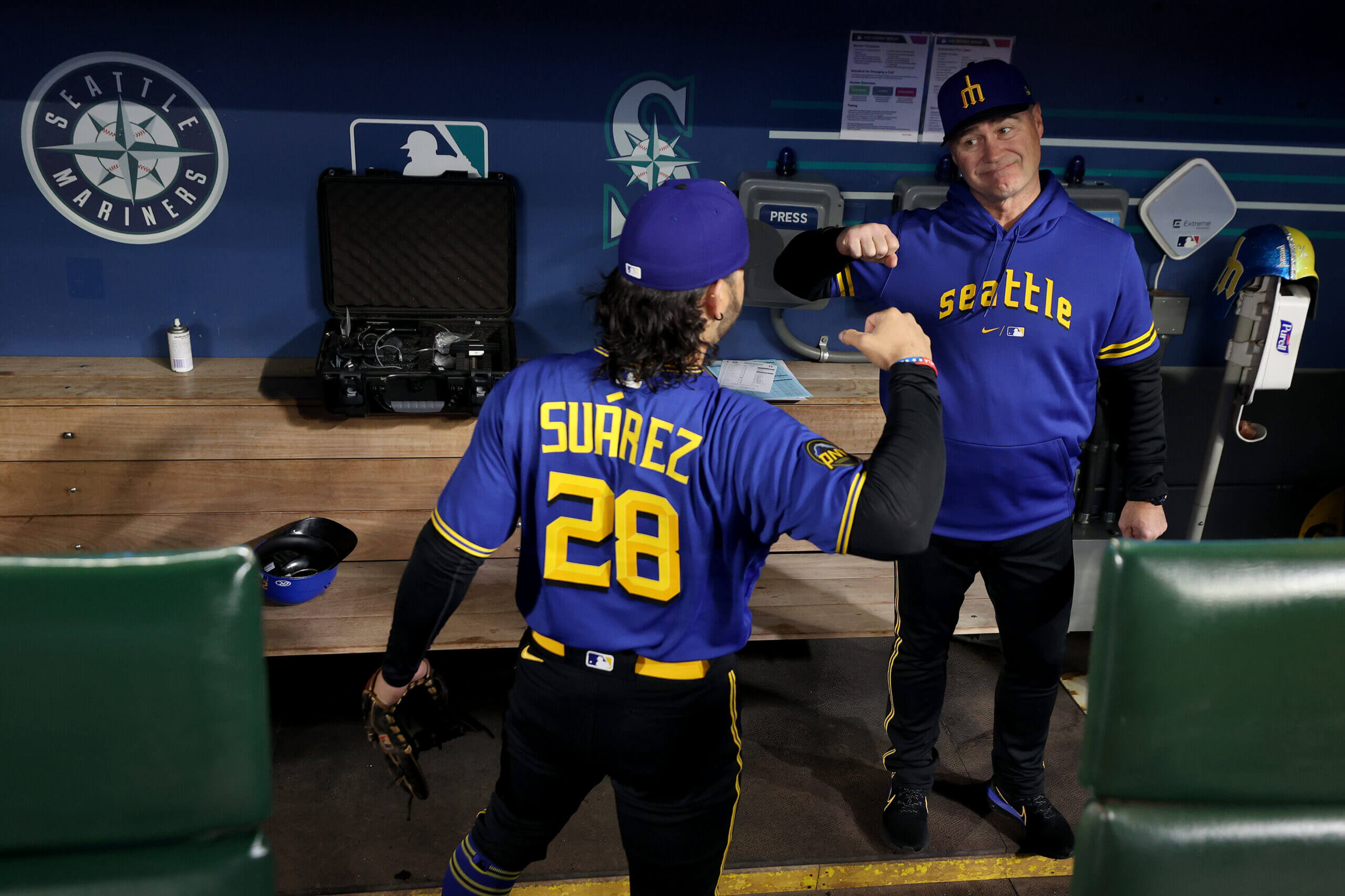
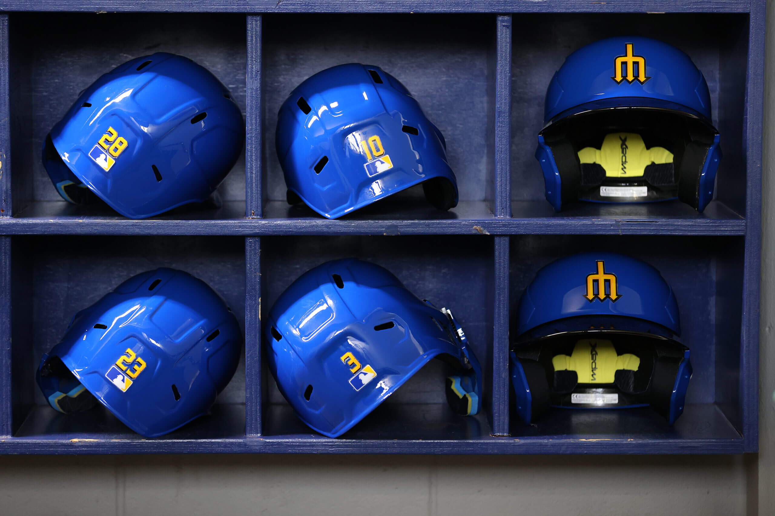
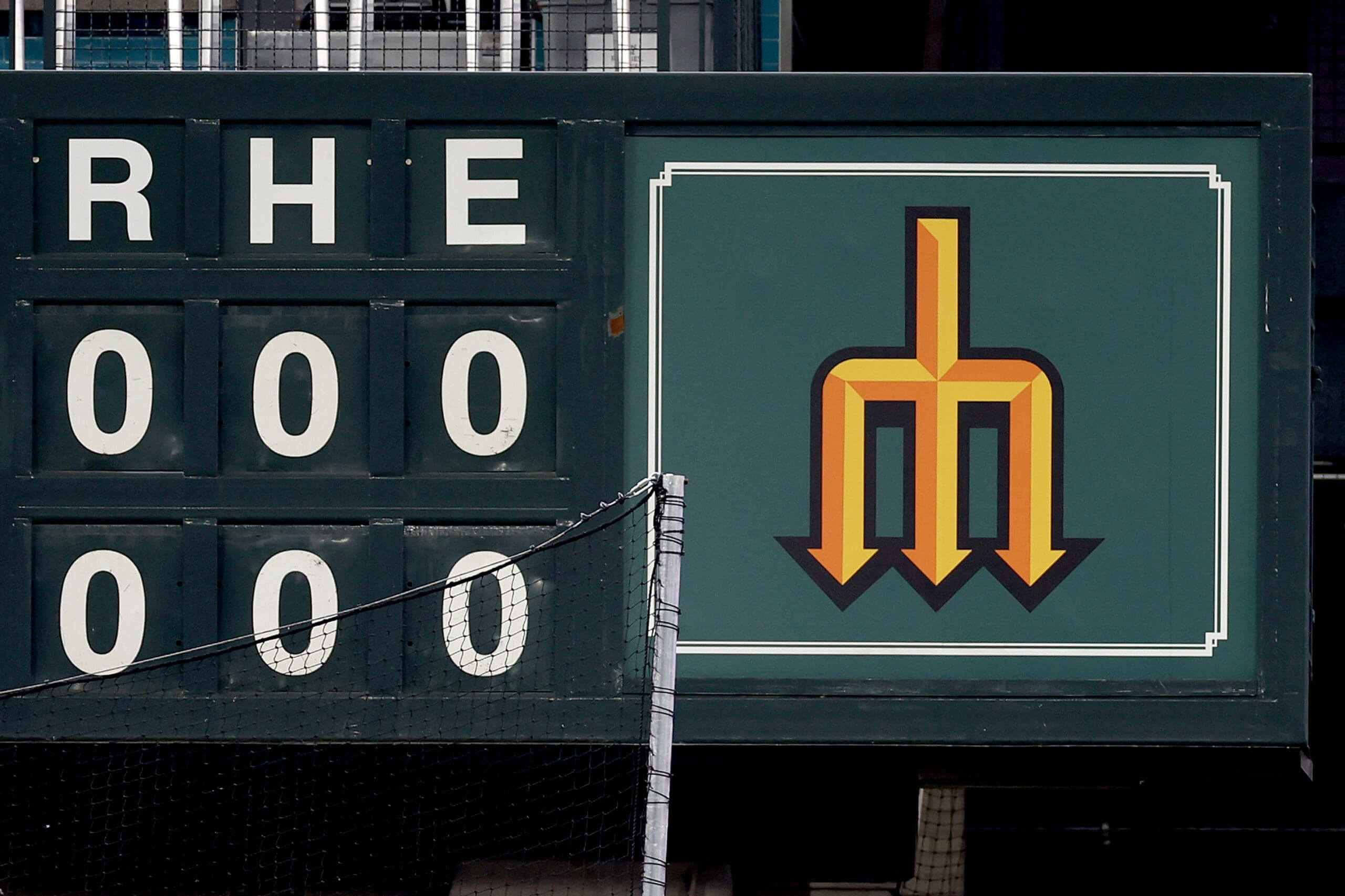
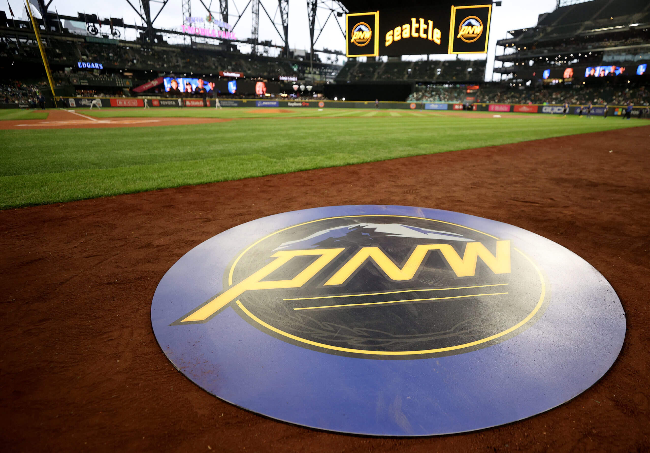
Seattle Mariners Debut Their City Connect Uniforms
The Seattle Mariners debuted their City Connect (CC) uniforms last evening. In case you missed it, Paul did an amazing preview of the uniforms when they were released last week. If you haven’t read that, I highly recommend that you do (and even if you did, it’s good for a refresher).
I really liked these when they were released, but as always, I said I would need to see them on the field and in action before I could render a final verdict. Prior to these being released, I mentioned that it was rare (at least IMO) for black and royal to pair well together, and most of the recent pairings (BYU Football, NY Mets and KC Royals being examples) haven’t quite worked. But the Mariners, by using gold judiciously, managed to pull it off.
My other concern was how the pants would look: players who went with proper cuffing and showed the CC socks looked really good, while those wearing their pants “pajama style” did not. The difference was almost night and day.
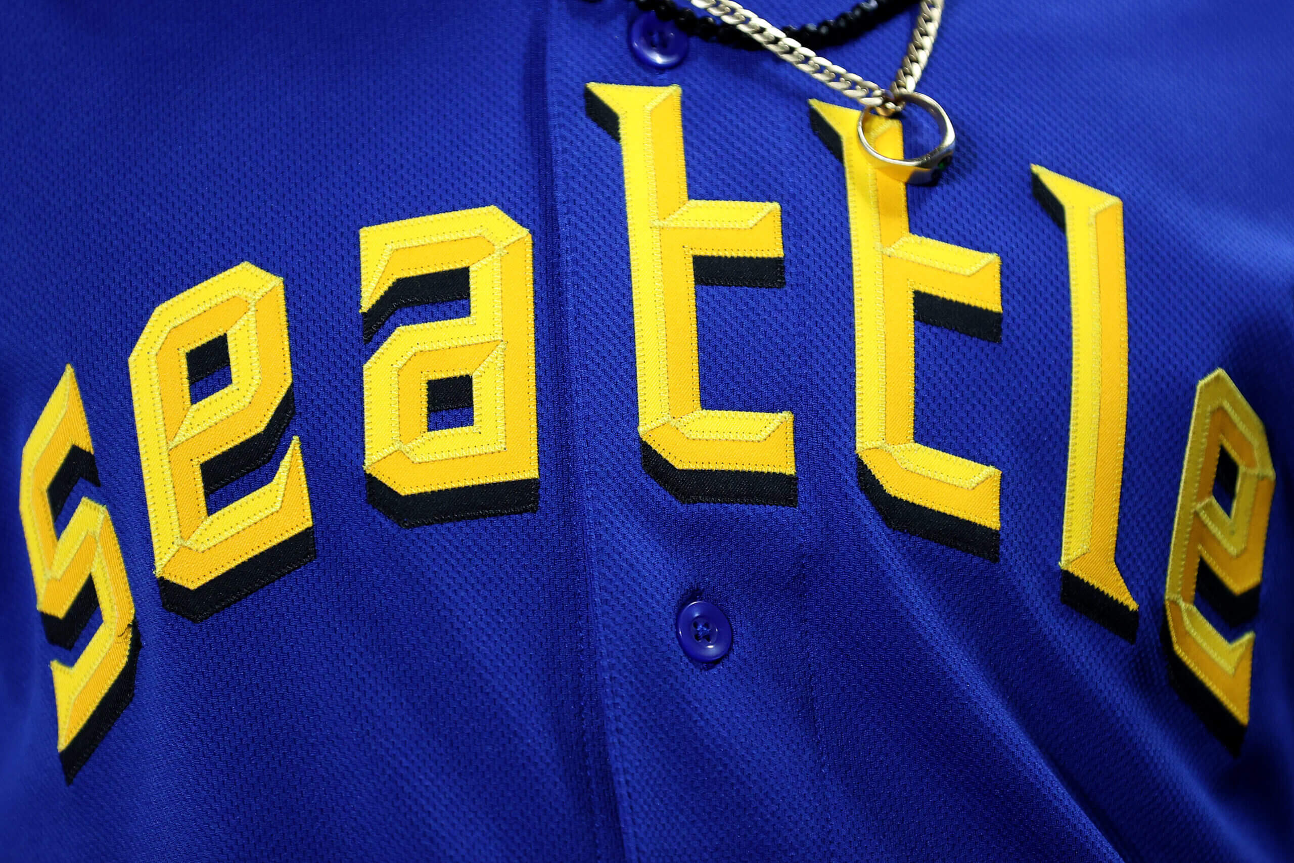
I thought the arched “seattle”, reminiscent of the 1969 Seattle Pilots roadies, looked tremendous, even if the “3D” effect was only seen at close range.
The jersey/pants looked sharp together, and I think this is due in no small part to the gold tying everything together, combined with the very limited use of black on the jersey (seen only in the block shadow) and royal on the pants (seen only bisecting the double gold stripe down the pants leg).
The back of the jersey had a big, legible NOB, and the numbers were crisp and gold. And that gold belt really ties everything together!
In fact the only uniform element of which I wasn’t particularly fond was the cap, which featured a royal crown and a black brim. The near 50/50 mix of the colors didn’t work well. I think the cap would have looked even better if it were solid royal, with the only black being found on the outline of the trident logo.
As with all CC uniforms, the team created a special helmet to be worn with this uniform.
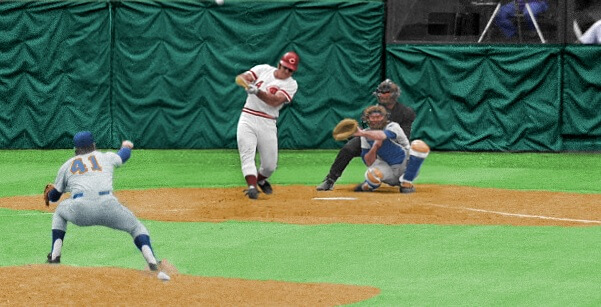
The premise of the game (GTGFTS) is simple: I’ll post a scoreboard and you guys simply identify the game depicted. In the past, I don’t know if I’ve ever completely stumped you (some are easier than others).
Here’s the Scoreboard. In the comments below, try to identify the game (date & location, as well as final score). If anything noteworthy occurred during the game, please add that in (and if you were AT the game, well bonus points for you!):
Please continue sending these in! You’re welcome to send me any scoreboard photos (with answers please), and I’ll keep running them.
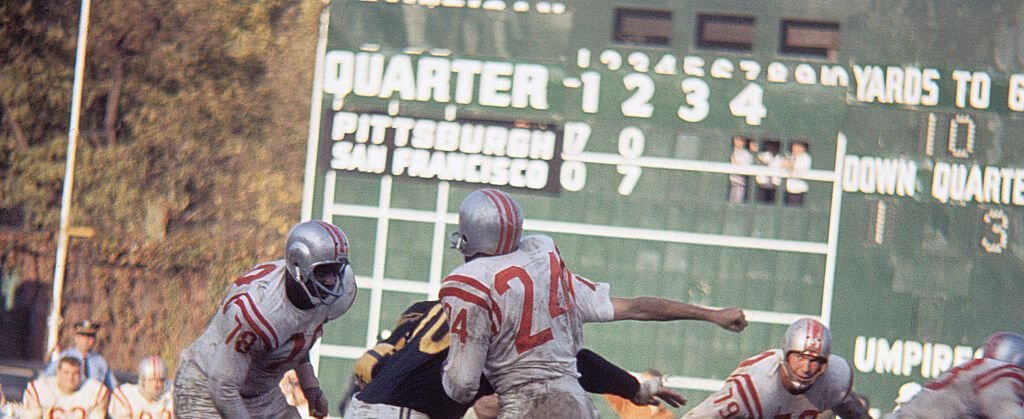
Guess the Game from the Uniform
Based on the suggestion of long-time reader/contributor Jimmy Corcoran, we’ve introduced a new “game” on Uni Watch, which is similar to the popular “Guess the Game from the Scoreboard” (GTGFTS), only this one asked readers to identify the game based on the uniforms worn by teams.
Like GTGFTS, readers will be asked to guess the date, location and final score of the game from the clues provided in the photo. Sometimes the game should be somewhat easy to ascertain, while in other instances, it might be quite difficult. There will usually be a visual clue (something odd or unique to one or both of the uniforms) that will make a positive identification of one and only one game possible. Other times, there may be something significant about the game in question, like the last time a particular uniform was ever worn (one of Jimmy’s original suggestions). It’s up to YOU to figure out the game and date.
Today’s GTGFTU comes from Charlie Schick.
Good luck and please post your guess/answer in the comments below.
Uni Tweet of the Day
Don’t love the number font/nickname, but the rest of this is suh-weet
If the Ms went with white pants, this would be one of the better uniforms in the Majors. I like light colored pants. Some of the CCs are incredibly good (Marlins, Mariners, Angels, Dbacks) and some are hideous (Padres, White Sox, Astros). I just hope my team (Mets) won’t be hideous, but I expect a subway theme with black pants and tops and numbers in colored circles.
I really like the Earned Edition designs! I think the Phoenix and Minnesota designs are my favorites. My only critique is the format. They look like physical screenshots from a tv screen or computer monitor. The sublimation patterns toward the tops of the jerseys get “washed out” that way. Oddly, when I click the image to view larger or magnify that goes away – but the resolution at that point is lower. But, overall a fun project!
GTGFTS may as well be a second GTGFTU, given the prominence of the uniforms of the 49ers and Steelers in that shot, and given the unique combinations thereof, meaning it can only be their 1961 Week 7 game at Forbes Field (10/29), which the Steelers won, 20-10. It was also the Niners’ last ever game at Forbes, as when they next played in Pittsburgh in 1968, they played at Pitt Stadium.
Correct!
When I submitted this one, I referred to it as “GTGFTS&U”.
“It was also the Niners’ last ever game at Forbes…” – Interesting. I did not know that.
GTGFTS: Pittsburgh and San Francisco are tied at 10 in the third quarter.
i think the M’s look great, but not as great as they could. i know i’m not alone in wishing the hat was all royal, but i’d actually prefer royal top and brim with yellow squatcho and/or vents. i am fine with the black undershirt, but i think actually a yellow or royal undershirt would look better. the black pants are a big win in my book. again, the socks… i really want stance to just stick to discount sporting goods stores, and tourist souvenir shops. not only are their designs way too busy for a uniform of any kind, the quality (or lack thereof) is visually apparent even from a distance.
Especially enjoyed the Clippers, Nuggets, Wolves, 76ers and Bucks. Well done!
some of these eared editions are pretty nice, but the concept has always eluded me. i get the idea of a team making the playoffs being awarded something for their success, but then it’s just an arbitrarily designed uniform. i aways felt like the “earned edition” moniker and prompt lent itself to something like MLB teams using gold trim when they win the world series. not that it should be as simple as their regular uni but with gold trim, but maybe like the christmas unis used to be (also bring those back), where the league has a theme each year and the teams that “earn” a uniform, have their unis designed within that theme.
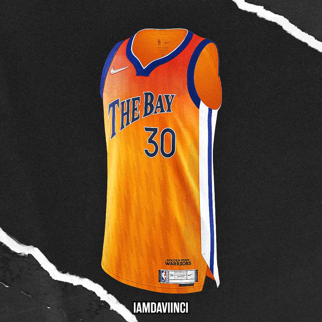
Has anybody else noticed that the warriors don’t have a yellow uniform in their rotation this year? This is (1) almost unimaginable with the number of uniforms each team has (how did anyone okay them getting a navy jersey without the iconic circle logo but no yellow jersey) and (2) a huge miss considering one of the best NBA uniforms of all times is their yellow “The City” uni.
So I’d love to see a yellow earned uniform for them rather than the orange one depicted above.
Yes, noticed when the season started, they have 3 blue unis, no gold/yellow, kind of absurd, they should always have a gold uniform, don’t care if it’s a classic, or an Oakland homage, or just a gold version of their standard uniform, there should always be a gold uniform.
GTGFTU:
I’m gonna say…
Mets/Reds Game 1 of the ’73 NLCS, 10/6. Rose homered off Seaver in the 8th to tie things up, Bench went yard off Seaver in the 9th FTW.
Rose only hit 4 HR’s off Tom Terrific:
1 in ’69 – the Reds were still in button fronts and played at Crosley.
The other 2 (’73 regular season and ‘ 75) were both hit at Shea, so this ’round-tripper may be the only
one Pete hit off Seaver at Riverfront…in the white polyester pullovers, of course.
The Heat “Earned” uniform should actually read “Calor” (translation of “Heat”) rather than “Fuego” (translation of “Fire”).
It’s not always a direct translation. Looks like there might be some precedent for Fuego:
Either way it’s better than when they did “El Heat”
Yeah, I always thought “calor” was more like feeling hot. Not literally “heat”. However, I see what is meant in that “fuego” is fire not heat (traditionally that is). But no doubt at ALL that “El Heat” was beyond lame!
Heat, Lakers, and to certain degree the Nets…NO.
Stealth or near stealth letters/numbers should be for fan gear only. Keep that stuff off the court.
Everything else looked good. Especially the 76ers, Knicks and Hawks.
The M’s looked incredible last night! One of my favorite CC uniforms, along with Boston and the White Sox. The trident is one of baseball’s best insignias.
You may be the ONLY one whose top 3 CC unis are Seattle, Chicago (AL) and Boston besides me!
For me it’s Miami, Seattle and Boston in that order. 2 outta 3 ain’t bad.
Some really great Earned Edition designs though as an Atlantan I think we are done with anything “ATL.” Would be nice to get some color back in the uniforms instead of BFBS. I wonder if someone here could do a percentage of teams that wore a BFBS uniform during the playoffs. Could it be 50%?
Sorry, but I found that to be a pretty rum bunch of basketball jerseys; the only satisfying element was the patterns in the fabric.
Live the Earned concepts but one quibble: I don’t think the Sixers can wear “76ers” as the team name. The only numerals they have ever had on the fronts of their jerseys are the player number. That aside, great job!
I know I am in the minority on the M’s uniform but I absolutely loathe this look. I hate black & blue as a combo to begin with, especially with the darker black on the bottom. I also hate UK’s black and blue football uniforms I think dark black jerseys with lighter blue pants is more pleasing to the eye. The black & blue hat is awful and there’s way too much going on with the clownish stance socks. Overall, a sloppy, thrown together look in my opinion. It’s a shame because the jersey is top notch and would look great with white pants and proper stirrups.
I’m impressed with the Saints City Edition concept -losing the white and making this a black/gold only uniform is an appealing take.
A small suggestion: move/resize? the fleur-de-lis and drop it over the approximate location of New Orleans.
Remember when the Saints had maps of Louisiana on the sleeves with a fleur-de-lis over Shreveport and a star over New Orleans? There was way too much going on in that uniform.
I like the Denver Nuggets version of the “earned” jersey but didn’t the Utah Jazz do that mountain profile first?
I’m super not interested in anything twitter. I have an account so I can see shit. But I’m kind of refusing to even be involved.
Mariners: ditch the drop shadow on the name; it gets lost in the darkish blue of the jersey and just looks messy. Lose the black pants. Lose all the black.
Sorry if this has been asked and answered before, but is there some part of Stance’s agreement with MLB against a player wearing socks and stirrups, and not the Stance socks, with a City Connect uniform? I’m also curious if there would be some conversation about the color choices (like blue socks with yellow stirrups), and coordination between multiple players.
I’m not 100%, but I don’t believe players are required to wear Stance socks, either with a CC uni or a regular uni, but I do believe non-Stance socks would have to be logo-free.
On another note, it’s hard to believe Stance has been the official sock “partner” since 2016. link
Thanks, Phil! That’s what I was thinking too. Although, as much as I’d love to see stirrups, I’d be slightly conflicted by the lack of uniformity.
Also, holy shit, has it been that long?? What year is it??
The T-Wolves and Hawks look very nice as do the Clippers, Phoenix and the Cavs. Sixers wth the number logo plus a player number in a different font looks awkward, the small number of the Bucks is als a no no. The other ones are forgettable in my opinion. Pilots, I mean Mariners look nice, except for the pants. The black brim of the hat did not bother me that much but if we replace the black pants with gold ones the brim should be gold. White pants? Blue brim.


If the Ms went with white pants, this would be one of the better uniforms in the Majors. I like light colored pants. Some of the CCs are incredibly good (Marlins, Mariners, Angels, Dbacks) and some are hideous (Padres, White Sox, Astros). I just hope my team (Mets) won’t be hideous, but I expect a subway theme with black pants and tops and numbers in colored circles.
I really like the Earned Edition designs! I think the Phoenix and Minnesota designs are my favorites. My only critique is the format. They look like physical screenshots from a tv screen or computer monitor. The sublimation patterns toward the tops of the jerseys get “washed out” that way. Oddly, when I click the image to view larger or magnify that goes away – but the resolution at that point is lower. But, overall a fun project!
GTGFTS may as well be a second GTGFTU, given the prominence of the uniforms of the 49ers and Steelers in that shot, and given the unique combinations thereof, meaning it can only be their 1961 Week 7 game at Forbes Field (10/29), which the Steelers won, 20-10. It was also the Niners’ last ever game at Forbes, as when they next played in Pittsburgh in 1968, they played at Pitt Stadium.
Correct!
When I submitted this one, I referred to it as “GTGFTS&U”.
“It was also the Niners’ last ever game at Forbes…” – Interesting. I did not know that.
GTGFTS: Pittsburgh and San Francisco are tied at 10 in the third quarter.
i think the M’s look great, but not as great as they could. i know i’m not alone in wishing the hat was all royal, but i’d actually prefer royal top and brim with yellow squatcho and/or vents. i am fine with the black undershirt, but i think actually a yellow or royal undershirt would look better. the black pants are a big win in my book. again, the socks… i really want stance to just stick to discount sporting goods stores, and tourist souvenir shops. not only are their designs way too busy for a uniform of any kind, the quality (or lack thereof) is visually apparent even from a distance.
Especially enjoyed the Clippers, Nuggets, Wolves, 76ers and Bucks. Well done!
some of these eared editions are pretty nice, but the concept has always eluded me. i get the idea of a team making the playoffs being awarded something for their success, but then it’s just an arbitrarily designed uniform. i aways felt like the “earned edition” moniker and prompt lent itself to something like MLB teams using gold trim when they win the world series. not that it should be as simple as their regular uni but with gold trim, but maybe like the christmas unis used to be (also bring those back), where the league has a theme each year and the teams that “earn” a uniform, have their unis designed within that theme.
Has anybody else noticed that the warriors don’t have a yellow uniform in their rotation this year? This is (1) almost unimaginable with the number of uniforms each team has (how did anyone okay them getting a navy jersey without the iconic circle logo but no yellow jersey) and (2) a huge miss considering one of the best NBA uniforms of all times is their yellow “The City” uni.
So I’d love to see a yellow earned uniform for them rather than the orange one depicted above.
Yes, noticed when the season started, they have 3 blue unis, no gold/yellow, kind of absurd, they should always have a gold uniform, don’t care if it’s a classic, or an Oakland homage, or just a gold version of their standard uniform, there should always be a gold uniform.
GTGFTU:
I’m gonna say…
Mets/Reds Game 1 of the ’73 NLCS, 10/6. Rose homered off Seaver in the 8th to tie things up, Bench went yard off Seaver in the 9th FTW.
Rose only hit 4 HR’s off Tom Terrific:
1 in ’69 – the Reds were still in button fronts and played at Crosley.
The other 2 (’73 regular season and ‘ 75) were both hit at Shea, so this ’round-tripper may be the only
one Pete hit off Seaver at Riverfront…in the white polyester pullovers, of course.
The Heat “Earned” uniform should actually read “Calor” (translation of “Heat”) rather than “Fuego” (translation of “Fire”).
It’s not always a direct translation. Looks like there might be some precedent for Fuego:
link
Either way it’s better than when they did “El Heat”
Yeah, I always thought “calor” was more like feeling hot. Not literally “heat”. However, I see what is meant in that “fuego” is fire not heat (traditionally that is). But no doubt at ALL that “El Heat” was beyond lame!
Heat, Lakers, and to certain degree the Nets…NO.
Stealth or near stealth letters/numbers should be for fan gear only. Keep that stuff off the court.
Everything else looked good. Especially the 76ers, Knicks and Hawks.
The M’s looked incredible last night! One of my favorite CC uniforms, along with Boston and the White Sox. The trident is one of baseball’s best insignias.
You may be the ONLY one whose top 3 CC unis are Seattle, Chicago (AL) and Boston besides me!
For me it’s Miami, Seattle and Boston in that order. 2 outta 3 ain’t bad.
Some really great Earned Edition designs though as an Atlantan I think we are done with anything “ATL.” Would be nice to get some color back in the uniforms instead of BFBS. I wonder if someone here could do a percentage of teams that wore a BFBS uniform during the playoffs. Could it be 50%?
Sorry, but I found that to be a pretty rum bunch of basketball jerseys; the only satisfying element was the patterns in the fabric.
Live the Earned concepts but one quibble: I don’t think the Sixers can wear “76ers” as the team name. The only numerals they have ever had on the fronts of their jerseys are the player number. That aside, great job!
I know I am in the minority on the M’s uniform but I absolutely loathe this look. I hate black & blue as a combo to begin with, especially with the darker black on the bottom. I also hate UK’s black and blue football uniforms I think dark black jerseys with lighter blue pants is more pleasing to the eye. The black & blue hat is awful and there’s way too much going on with the clownish stance socks. Overall, a sloppy, thrown together look in my opinion. It’s a shame because the jersey is top notch and would look great with white pants and proper stirrups.
I’m impressed with the Saints City Edition concept -losing the white and making this a black/gold only uniform is an appealing take.
A small suggestion: move/resize? the fleur-de-lis and drop it over the approximate location of New Orleans.
Remember when the Saints had maps of Louisiana on the sleeves with a fleur-de-lis over Shreveport and a star over New Orleans? There was way too much going on in that uniform.
I like the Denver Nuggets version of the “earned” jersey but didn’t the Utah Jazz do that mountain profile first?
I’m super not interested in anything twitter. I have an account so I can see shit. But I’m kind of refusing to even be involved.
Mariners: ditch the drop shadow on the name; it gets lost in the darkish blue of the jersey and just looks messy. Lose the black pants. Lose all the black.
Sorry if this has been asked and answered before, but is there some part of Stance’s agreement with MLB against a player wearing socks and stirrups, and not the Stance socks, with a City Connect uniform? I’m also curious if there would be some conversation about the color choices (like blue socks with yellow stirrups), and coordination between multiple players.
I’m not 100%, but I don’t believe players are required to wear Stance socks, either with a CC uni or a regular uni, but I do believe non-Stance socks would have to be logo-free.
On another note, it’s hard to believe Stance has been the official sock “partner” since 2016. link
Thanks, Phil! That’s what I was thinking too. Although, as much as I’d love to see stirrups, I’d be slightly conflicted by the lack of uniformity.
Also, holy shit, has it been that long?? What year is it??
The T-Wolves and Hawks look very nice as do the Clippers, Phoenix and the Cavs. Sixers wth the number logo plus a player number in a different font looks awkward, the small number of the Bucks is als a no no. The other ones are forgettable in my opinion. Pilots, I mean Mariners look nice, except for the pants. The black brim of the hat did not bother me that much but if we replace the black pants with gold ones the brim should be gold. White pants? Blue brim.