[Editor’s Note: Paul is on his annual August break from the site. Deputy editor Phil Hecken is in charge from now through the end of the month, although Paul may be popping up here occasionally.]
By Phil Hecken
Follow @PhilHecken
Greetings and a good Wednesday morning to all!
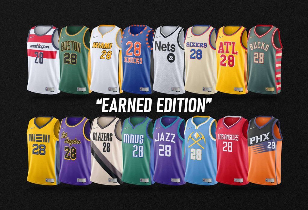
Weekend readers know I like to occasionally feature graphic designers creating new uniforms — whether they be tweaks, full-blown new uniforms, fauxbacks — some even create entire leagues with fictional teams and uniforms. Today I’m pleased to again feature the work of Casey Vitelli (and some of his collaborators), who have created 16 new “Earned” NBA jerseys, for the 16 teams that made the playoffs this past spring.
As most of you are aware, this season the NBA will be celebrating its 75th anniversary, so Nike’s usual program for introducing new “City” edition uniforms, as well as creating “Earned” uniforms for playoff teams, has been altered. Instead, the three “original” NBA teams (Warriors, Knicks and Celtics) will be wearing “Classic” editions (basically throwbacks). Those were announced last week, and I wrote about them here. The remaining teams (with the exception of the Suns and Jazz) will get one new uniform this year — and reports are that the new unis will be some sort of throwback/mashup to replace the “City” edition uniform (those have yet to be unveiled). The Suns and Jazz will continue to wear their “City” edition from the previous season. The three other uniforms teams wear (“Statement,” “Icon,” and “Association”) will remain unchanged from this past season. I literally cringed just typing all those names. But this is the Nike Basketball Association, and it is what it is.
The NBA defines the “Earned” edition as “exclusively available to the teams who earned a spot in the 2020 playoffs and celebrate each franchise’s colors, logos and more.” So Casey worked within those vague parameters to come up with his vision of what could have been, had the NBA released “Earned” uniforms for the 2021-22 season.
Enjoy!
NBA “Earned” Edition Concepts
by Casey Vitelli
Celebrating the teams whose success brought them to the playoffs, these designs were curated with the team’s/Nike’s design style in mind. Each design represents the teams with their storied pasts.
Collaborators:
Pete Rogers, Graphic Designer – @petemrogers
Lance Hinesman Jr., Graphic Designer – @Lance_Hinesman
Denver Gravitt, Graphic Designer – @DenverGravitt
Jazz Uniform Tracker, Graphic Designer – @JazzUniTracker
Chris Newsome, Professional PBA Player – @New11New
SunsUniTracker, Graphic Designer – @SunsUniTracker
Nick Mueller, Graphic Designer – @MLR_Studios
Washington Wizards
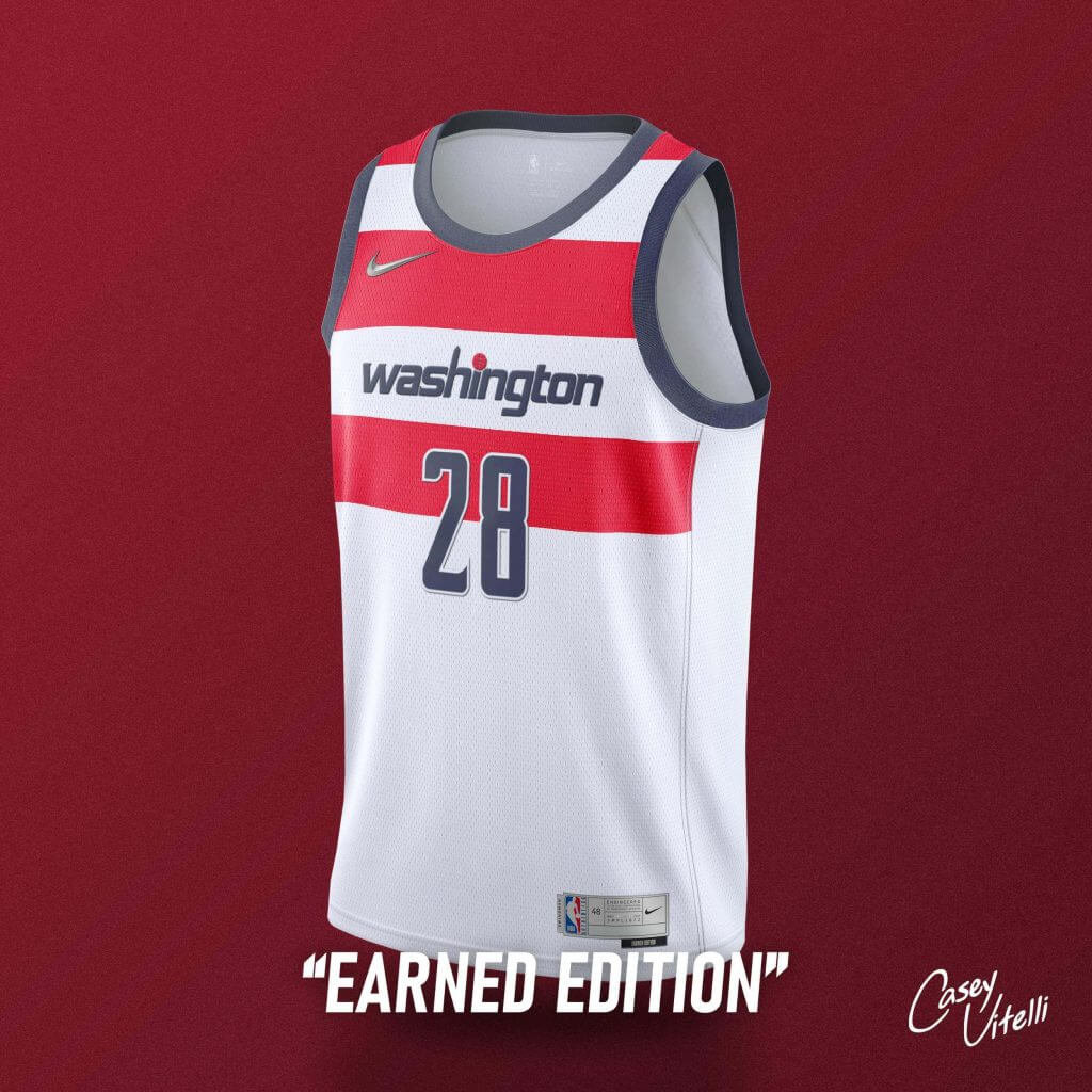
Based off the jerseys worn from 1974-1987, ‘Washington’ adorns the front in the current style with the current iteration of colors.
Boston Celtics (Collab w/ Pete Rogers)
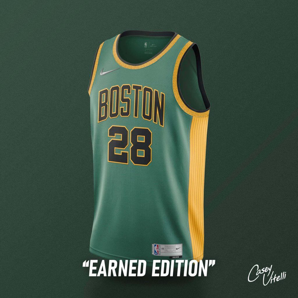
Celebrating history, sprinkled with gold. 17 stripes adorn the side of the jersey to represent the number of championships in team history.
Miami Heat (Collab w/ Lance Hinesman Jr.)
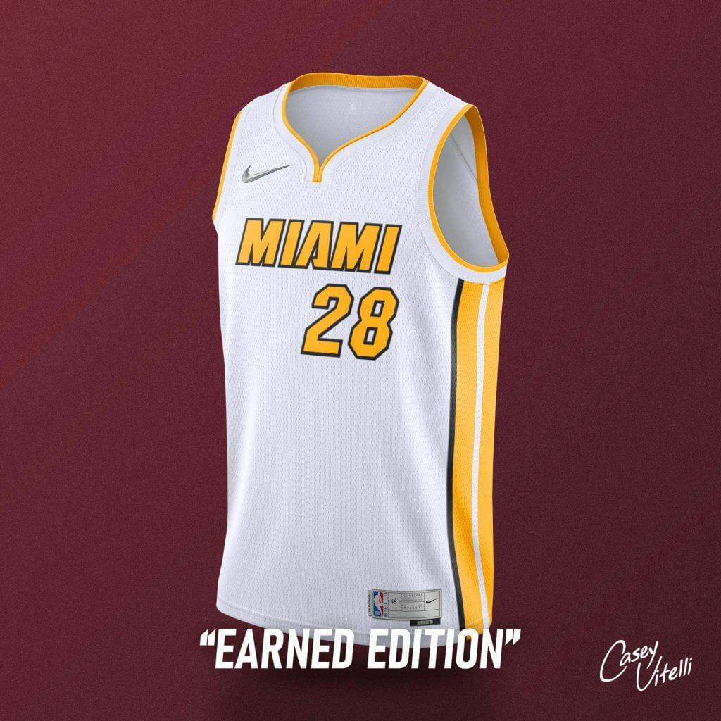
Trophy White. White iteration of the “Earned Edition” worn by the team this past season.
New York Knicks
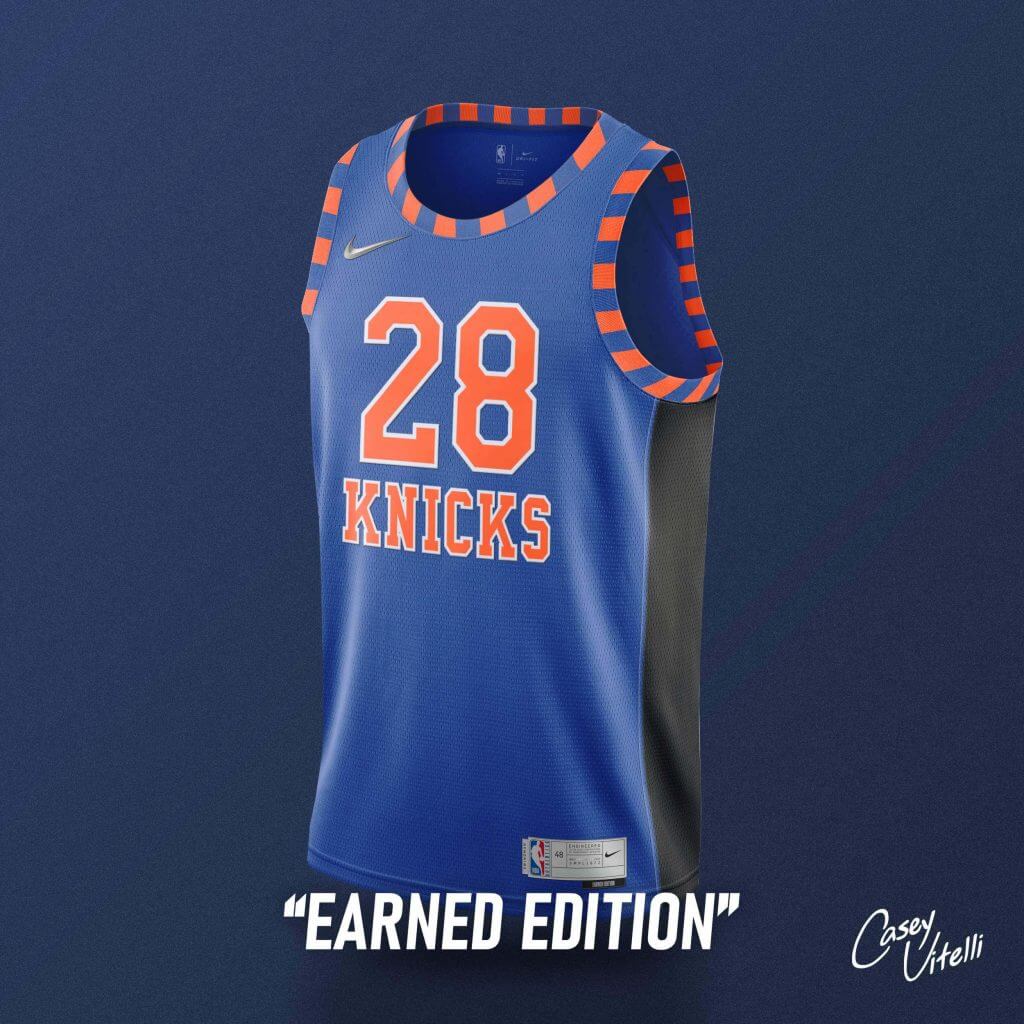
‘KNICKS’ returns to a uniform for the first time since 1983, which the design is based off. Including elements from many jerseys worn in the past, in the famous Blue/Orange with hints of black.
Memphis Grizzlies
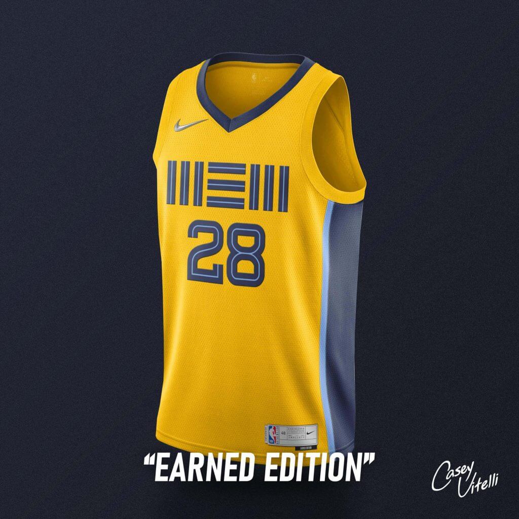
Jersey in ‘Grizzlies Gold’ with the special “MEM” wordmark, meant to resemble shipping crates. A nod to Memphis being a commercial hub for shipping by road/rail/river/run-way.
Los Angeles Lakers
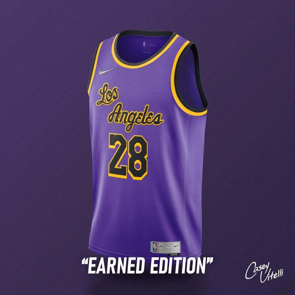
Purple design, with the old-school “Los Angeles” wordmark in black. A nod to the famous photos of Kobe Bryant with the champion trophies in a black version that never made it to the court. RIP Bean.
Portland Trail Blazers
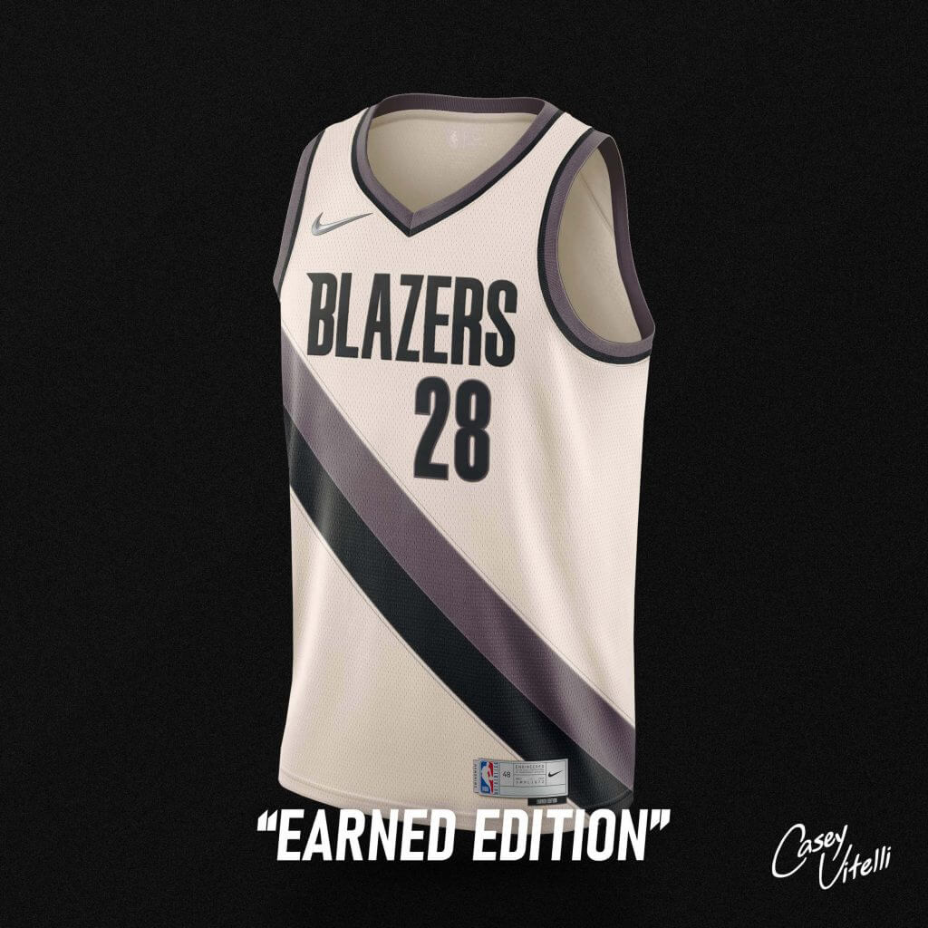
Current template in crème/brown tones. A nod to the team and its long history in Portland.
Dallas Mavericks (Collab w/ Denver Gravitt)
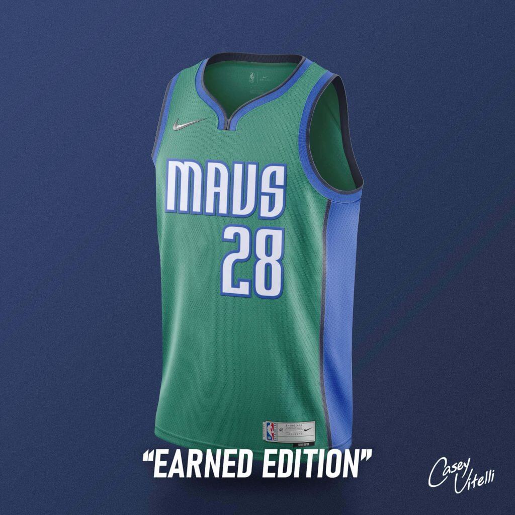
#GREENITBACK. Current royal/navy blue colors mixed with green to bring a familiar, but different, color palette to the organization.
Philadelphia 76ers
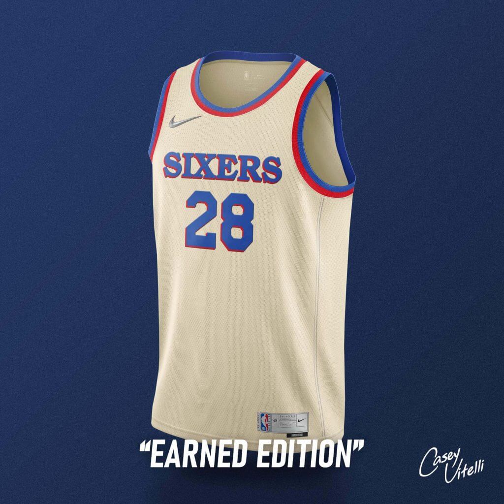
On a simple crème colored jersey, “SIXERS’ adorns the front of the jersey in the same font used in the team’s primary logo.
Brooklyn Nets
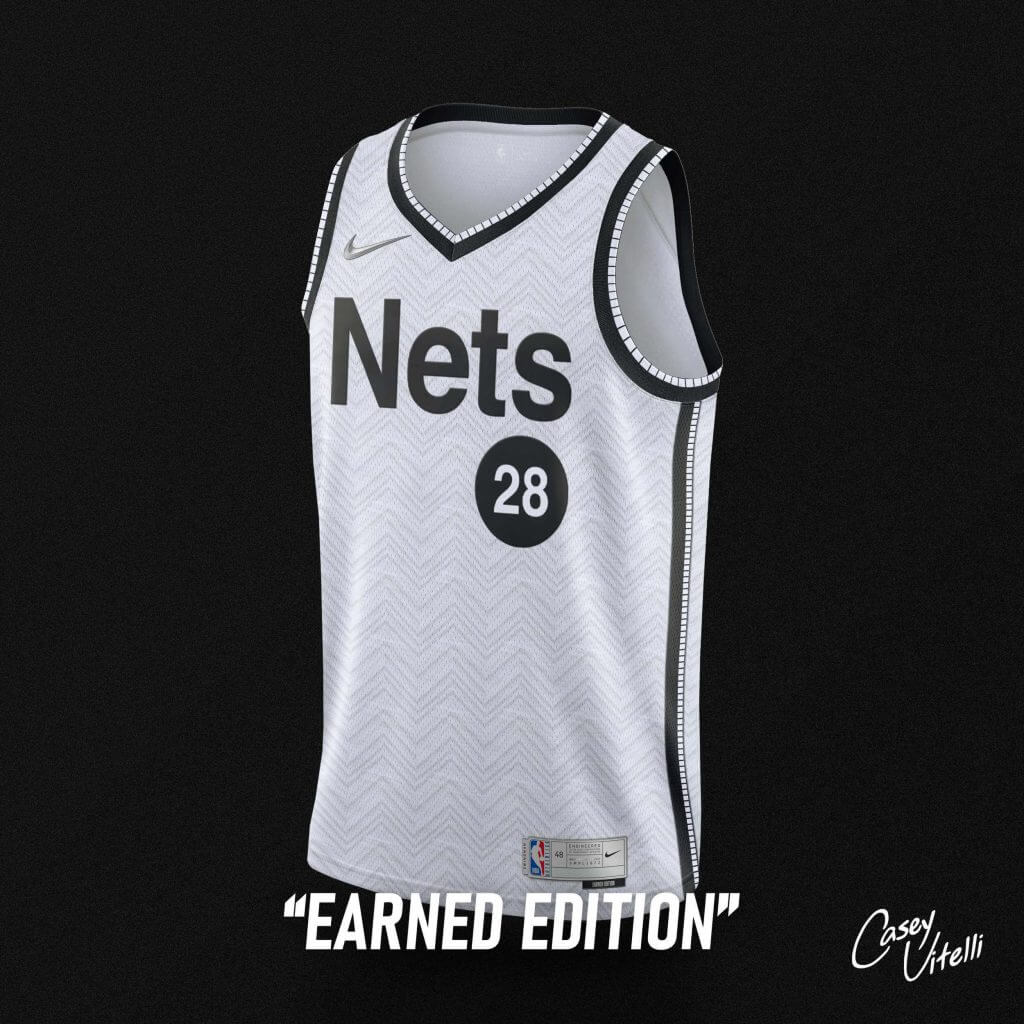
White version of the subway style jerseys worn by the team this most recent season. Meant to represent the famous subway system that connects New York, and it’s its many boroughs.
Utah Jazz (Collab w/ Jazz Uniform Tracker)
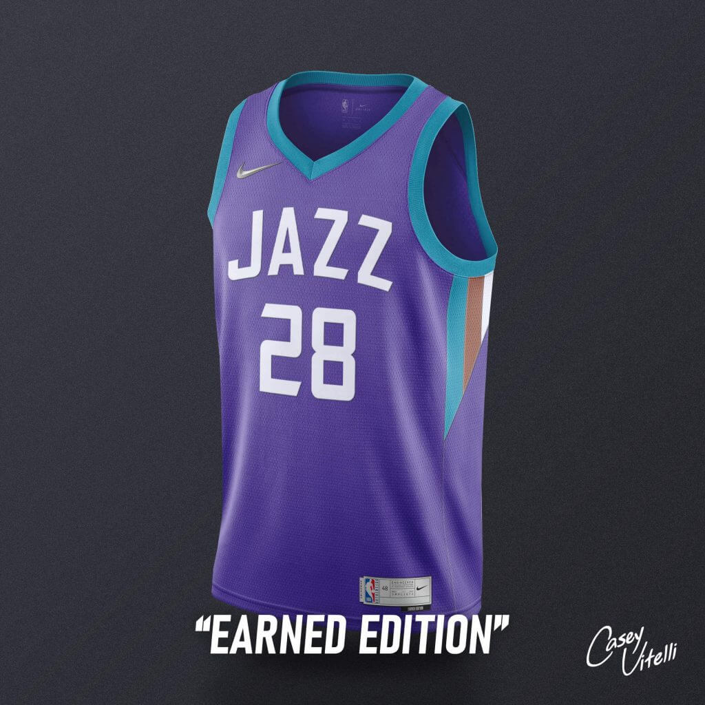
Current template, in the famous mountain throwback color scheme. “JAZZ” adorns the front of the jersey in the current font, matching “UTAH” from the 2 iterations of their ‘City Edition’.
Denver Nuggets (Collab w/ Chris Newsome)
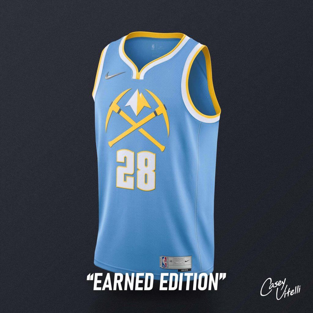
Bringing back the sky blue used from 2003-2018. The double pick-axe logo adorns the front to combine many different designs from recent years.
Atlanta Hawks
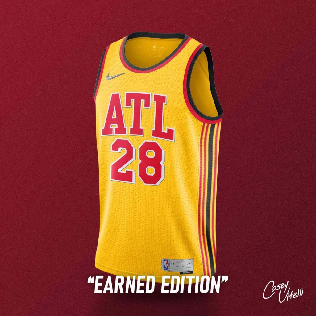
“ATL”, in the current font, adorns the front of a yellow colored jersey. This is the first appearance of gold as a primary jersey color, since 2007.
Los Angeles Clippers
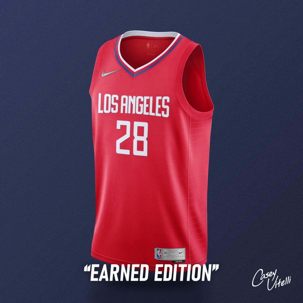
“LOS ANGELES”, for the first time since 2015, adorns the front of a red jersey. The team hasn’t sported a red jersey since 2017.
Phoenix Suns (Collab w/ SunsUniTracker)
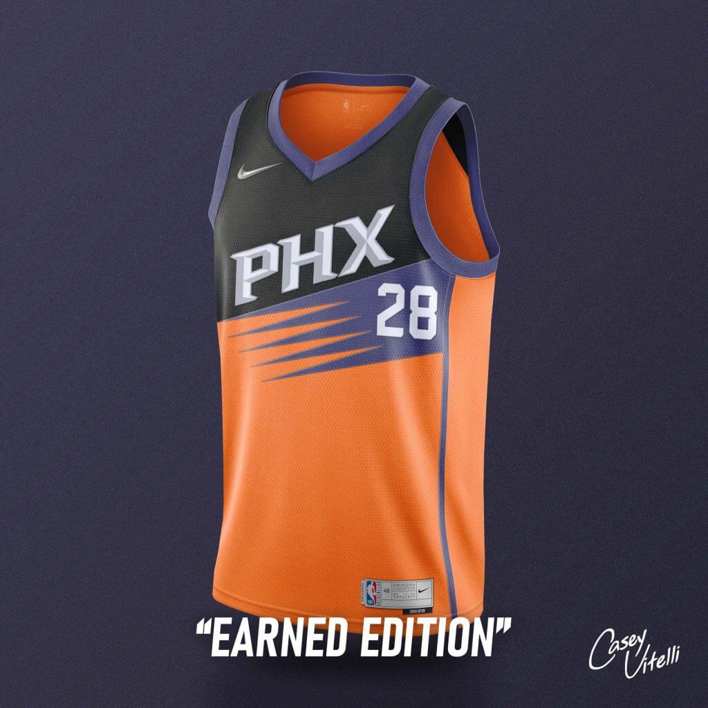
Based off the leaked “Earned Edition” design that would have been used if the Suns were eligible, the orange primary is marked with a purple sunburst, which splits the addition of black.
Milwaukee Bucks (Collab w/ Nick Mueller)
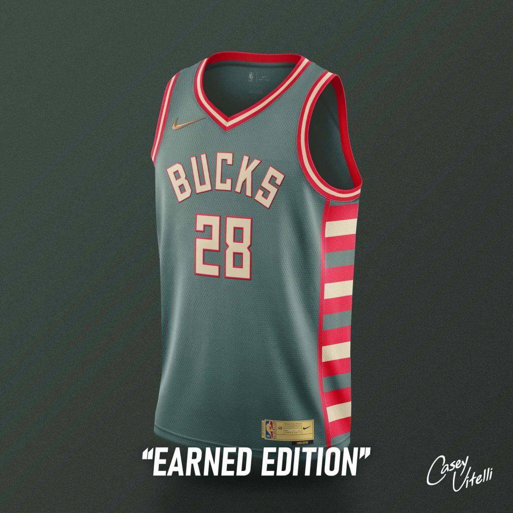
The Champs! Celebrating history, the design brings back elements used since the team’s inauguration, in 1968.
Thanks Casey! Nice job with the presentation — I do wish there were shorts shown along with the jerseys, but half the time Nike unveils a new “uniform” they only show the jersey (and cap, if applicable), so I see what you did there.
Readers, what do you think of Casey’s (phantom) Earned Edition concepts?
A Quick Look at Vandy’s New Unis
Although it was a ticker item yesterday, I wanted to take a minute to look at the new Vanderbilt Commodores football uniforms, which were unveiled on Monday, since there didn’t seem to be any chatter in the comments about them.
Like Arizona, who unveiled gorgeous throwback-ish uniforms last week, Vanderbilt has for probably more than a decade had really crappy uniforms. That’s about to change.
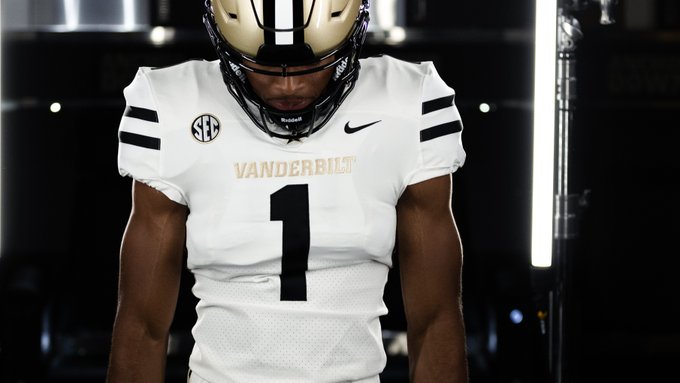
Unfortunately, there haven’t been many still photos of the new unis floating about, but the hype video gives a good look at what the team will be wearing this fall.
Allow us to reintroduce ourselves.
Team 1⃣ dressed. Ready for Sept. 4.#AnchorDown pic.twitter.com/zrrPIz0hab
— Vanderbilt Football (@VandyFootball) August 9, 2021
While I can’t say for certain, it looks like Vandy will start the season with just a single, gold helmet, adorned with a block “V” — and a black/white/black center stripe that is just a solid look. In that video, you’ll see a new white jersey featuring two black stripes on the shoulder caps, and black, block numbers. “VANDERBILT” appears in block gold letters across the chest. The black jersey is not quite an inverse, as it has two gold stripes on the shoulder caps. Numbers are in big block white and the Vanderbilt wordmark appears in gold across the chese. Both jerseys were shown paired with both white and gold pants. The white pants have a black/gold/black stripe, while the gold pants have a black/white/black stripe mimicking the helmet striping.
Here’s a look at the black/gold combo:
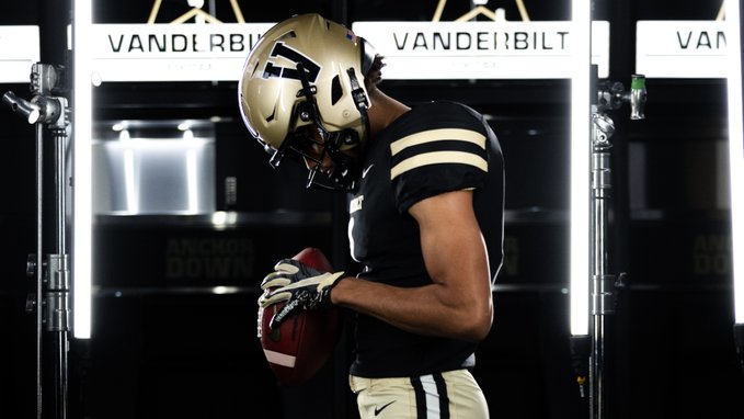
I love this look (if only the Saints could take a cue from these). My only complaint — and it’s minor — is that I wish the white jersey could have had a black/gold/black shoulder cap stripe (matching that on the white pants). But other than that, these look might-tee-fine. While no black pants have been shown (or announced), it would not surprise me if they are added to the possible combos at some point.
I’m certainly not going to say that college football design has (or will) taken a turn towards the more traditional or classic — after all Nike, adidas and UA are still in the game — but if some of the recent reveals are any indication, we’ll have some pretty good looks on the gridiron this fall. Well done, Vandy!

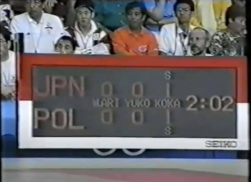
Guess The Game…
from the scoreboard
Today’s scoreboard comes from Michael Vagnetti.
The premise of the game (GTGFTS) is simple: I’ll post a scoreboard and you guys simply identify the game depicted. In the past, I don’t know if I’ve ever completely stumped you (some are easier than others).
Here’s the Scoreboard. In the comments below, try to identify the game (date & location, as well as final score). If anything noteworthy occurred during the game, please add that in (and if you were AT the game, well bonus points for you!):
Please continue sending these in! You’re welcome to send me any scoreboard photos (with answers please), and I’ll keep running them.
Reader Created Tee Needs an Update
In case you missed it, last Friday’s post (scroll down), I wrote a bit on the Arizona Wildcats’ new (retro) uniforms.
That prompted reader Rocky De La Rosa to shoot me an e-mail which reads as follows:
Created this shirt to show all the main helmets Arizona had used since my dad attended the school in 1974. Looks like I’ll have to add the (new) throwback helmet to the shirt and very VERY happy about it.
Here’s a look at the shirt created by Rocky (and what I believe is a photo of the design he created on his computer). I guess his new shirt will have 10 helmets on it now:
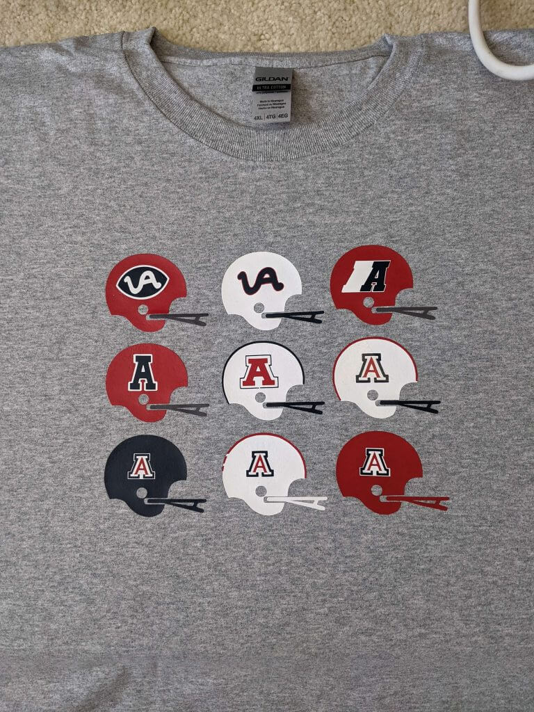
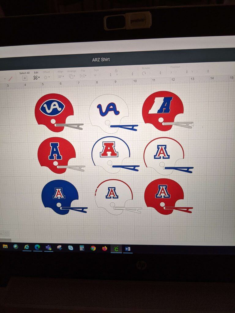
Thanks Rocky — that’s a neat looking shirt!
The Ticker
By Lloyd Alaban

Baseball News: Blue Jays DH Vladimir Guerrero Jr. gifted Vanessa Bryant, widow of Los Angeles Lakers PG Kobe Bryant, with Kobe- and Gianna-themed cleats (from Andreas Papadopoulos). … Here are some shots of the Field of Dreams ballpark the Yankees and White Sox will play at on Thursday (from our own Phil Hecken). … The New York Times has an in-depth look at the branding work of Minor League graphic design stalwarts Brandiose (from multiple readers). … The Portland Pickles of the West Coast League have released cream jerseys based on the Negro League team Portland Rosebuds. … The Pensacola Blue Wahoos, affiliate of the Marlins, have a story behind what they call the worst uniforms ever (from Phil). … BFBS for the Brooklyn Cyclones, affiliate of the Mets (from Robert Brashear). … The Tennessee Little League World Series team wore near replicas of Vanderbilt’s unis (from @lukedevoe21).

Football News: Off-center helmet stripe for Colts QB Sam Ehlinger (from Rich Fuller). … Michigan has some new helmet stickers—a lot more detailed than just football stickers (from Ben, who didn’t give his last name). … Someone caught Nebraska recording their hype video for their new flag-desecration-themed unis (from Alex Kidwell). … New player-designed unis for Johnson C. Smith University (from Kary Klismet). … Also from Kary: Mike VII, LSU’s live tiger mascot, is now fully vaccinated.

Hockey News: The latest 3-D wall art from reader Kevin Cearfoss is the Sabres’ logo. … New numbers for some Bruins (from Anthony Emerson).
.

Basketball News: NBA TV used the Lakers’ black alternate to introduce PG Russell Westbrook—a uniform that he will never wear (from Ju Sim). … Reader Etienne Catalan has the latest NBA uni number updates. … Cross-listed from the baseball section: Toronto Blue Jays DH Vladimir Guerrero Jr. gifted Vanessa Bryant, widow of Lakers PG Kobe Bryant, with Kobe- and Gianna-themed cleats (from Andreas Papadopoulos). … PK85, a tournament celebrating coach Phil Knight’s 85th birthday, will take place next year. In the PK80 Tournament in 2017, which celebrated Knight’s 80th birthday, players received an alternate jersey as a gift (from our own Phil Hecken).

Soccer News: Lionel Messi will wear No. 30 with Paris Saint-Germain. No. 10 is currently used by Neymar (from multiple readers). … New third kits for Arsenal (from Kary Klismet). … Three Hummel-outfitted clubs, Everton, Southampton, and Denmark’s Brøndby, are wearing Pride-themed warm-up shirts next weekend (from our own Jamie Rathjen). … New third shirt for AFC Bournemouth (from Sam Williams).

Grab Bag: Here’s the National League Lacross Draft logo (from @PhillyPartTwo). … New nickname for Valparaiso University (from multiple readers). … The next three items are from Kary Klismet: New logos for South O’Brien (Iowa) High School. … The New Bern, North Carolina, Police Department has introduced new pins that officers who are military veterans can wear on their uniforms. … Kalama, Washington, High School has unveiled a new team name and logo. … Pebbles cereal has a 50th-anniversary logo (from John Cerone).
Uni Tweet of the Day
OK, this was the laugh I needed today… (yes, it’s fake)
Source: @QB1TATT00 |
🎈Nebraska to unveil “Lil Red” alternate uniforms vs Oklahoma September 18th. #Huskers #GoBigRed pic.twitter.com/93i9dpvfba— CFB Home (@CFBHome) August 11, 2021
And finally… that’s it for today — big thanks to Casey for sharing his NBA concepts! That was fun.
Everyone have a great day today and I’ll catch you back here tomorrow.
Peace,
PH
That Nebraska tweet is a joke right? Right?
What does it say about the NBA uniform program when I cannot even tell concepts from actual designs, or be sure if the team already has / had a uniform like that. Casey definitely nailed it on “these could be new NBA jerseys” and whether intentional or not, nailed “is there really a point to these alternates” that seems to be the case with most real alternates.
>That Nebraska tweet is a joke right? Right?
One would hope so. But here’s the thing. As a childhood follower of the Big 8 not living in Nebraska, I was among the “Huck the Fuskers” crowd. Nothing has validated that stance more than Nebraska’s move to the The B1G, which pretty much exposed the football program as a culture of personality. If the coach’s name isn’t Devaney or Osborne, the team uniformly loses and is reduced to gimmicky uniforms year after year as a diversion. So, while the uniform *should* be a joke, it’s existence is plausible.
One would think Texas and Oklahoma would have learned from Nebraska (and Texas A&M and Missouri) and realize that leaving for a more marketable conference just means cash from tv contracts, while never being in the conversation for conference championship / playoff appearance.
I had a relative who played at Nebraska during the championship years in the 90s. It is pathetic to watch them get stomped in the Big 10 ever since they moved.
In less than a decade in the SEC, Missouri has played in two conference championships. They hung around with Auburn in 2013 and they got smoked by Alabama in 2014. Not great, but it’s better than their their Big 12 years. The cash grab is a bonus.
Not exactly. While in the Big 12, in particular the last 7 years or so, they contended regularly and won their division 3 times. The two SEC championship games were early (’13 and ’14 as you stated) and they really haven’t challenged for a title since. I completely agree that their move, while profitable, didn’t improve their competitive situation. It likely won’t for OK or TX either, and as has already been pointed out Nebraska has been irrelevant in the Big 10.
Yes. The Lil’ Red uniforms are a joke – based on a mock up that is 3-4 years old.
Although, given some of the other things Adidas has put Nebraska in, I can see why there is some skepticism.
Just checked out Vandy’s twitter and they do indeed have black pants link.
Pretty sure that Vandy video shows the top of black pants (White jersey/black pants) at the 0:19 mark in the video.
Great job on those concepts! There’s a few I would prefer to see on the court than some that have already made an appearance already, especially that Bucks one!
Please let that that Nebraska pic be a joke… just gross.
GTGFTS – 1972 Munich Olympics – Judo gold medal match – Nomura of Japan defeated Zajkowski of Poland.
I think the scoreboard is a little later than 1972. Based on one of the spectator’s shirt, having the Barcelona Olympics logo, this would have to be 1992. I’ll have to do more research to find out what event this is.
Agreed – its Barcelona. Another indicator that it is not Munich is the inclusion of the Koka – that wasn’t added to judo scoring until 1977, and later dropped in 2008.
There were 3 bouts between judokas from Japan and Poland in 1992. This is likely the QF bout in which Toshihiko Koga defeated Wiesław Błach on his way to the gold.
Wow those were some damn good NBA concepts. Good job Casey!Z
Enjoying a banner day on the Uni Watch blog where Vanderbilt gets mentioned in the post AND the ticker!
Consensus feedback to this point is panning the Commodores for steering away from the star-V on the helmets. Don’t mind using the Block V from the baseball caps personally, and the star is still tront and center on the jersey neck and undoubtedly at the 50 and in the end zones. Think we can survive the star being off the helmets, or maybe that is just the anti-Cowboy in me.
Vanderbilt has out-Purdued Purdue! Good job.
Great job on the Arizona helmets Rocky! I didn’t even try to cover the uniforms from the snake style A of the early 70’s. I was a kid then and knew nothing about that era? When I first got to Arizona some of the older players had red sweatshirts with Arizona football on them in white. I asked my friend Charles Webb why didn’t he have one? He told me they were 5th year seniors, who came to Arizona in 1980 when they still had the red uniforms. I knew nothing about the uniform history at that time.
Love where Arizona and Vandy are going with their new unis. Are we seeing the start of a trend back to simpler uniform sets and away from the hype, BFBS, GFGS, etc? Single helmets would seem to infer that team quartermasters are getting weary of maintaining multiple helmets. I’m all for a unique uniform when justified (such as a rivalry game) but liking this trend back toward a single classic, simple look.
Yes, I’d say we’re not just at the start of a trend of college football teams either going back to traditional looks but well in the middle of it. I think that schools are starting to realize that a radical new design can get you a bit of attention at first but for the long term fans, coaches, and even players want a look that ties into tradition. I think that wearing the same or a similar uniform to teams in your school’s past helps to feel like the current teams are “part of something bigger than themselves” so to speak.
Look at the recent preseason coach’s poll. With the exception of maybe Cincinnati and Iowa State, all members of the top 10 wear what most of us consider “traditional” looks, if not the exact same thing they’ve always worn. That may also play a role in it, the idea that the true powers in football don’t need gimmicky uniforms to draw fans and top recruits.
Arizona fan here! Might be cool to add our copper helmets to the shirt! Even though they are not a primary, they are very recognizable and look freaking awesome!
Arizona fan here! Might be cool to add our copper helmets to the shirt! Even though they are not a primary, they are very recognizable and look freaking awesome!
Any idea why they chose the nunber 28?
Also, Etienne has reported that Ariza will wear number 1 with the Lakers, however ESPN has him wearing number 8 on their Lakers roster page. Any idea if Ariza changed his mind or perhaps ESPN just had the wromg information?