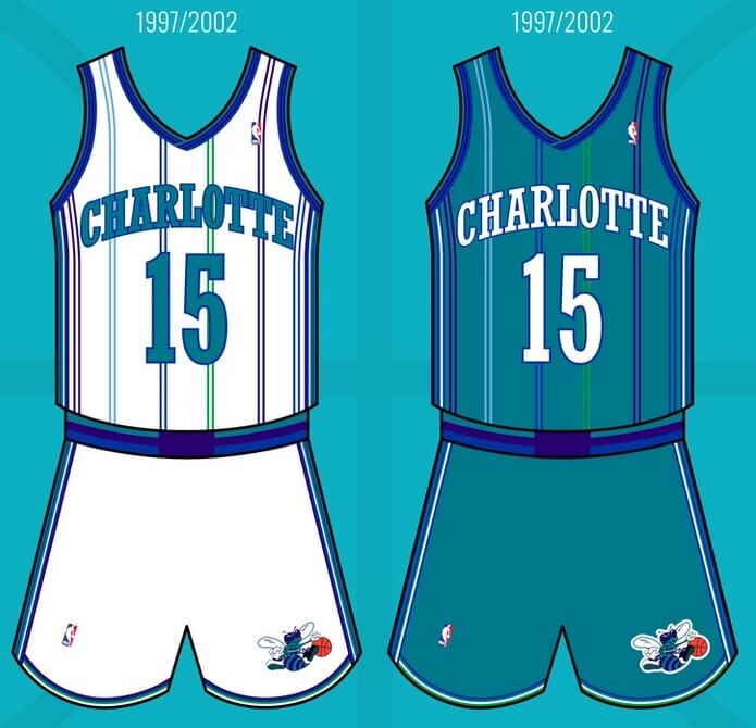
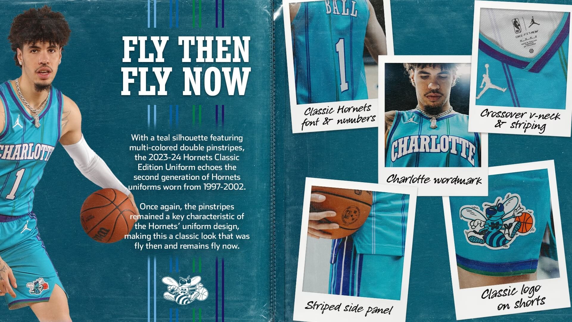
The Charlotte Hornets unveiled a new uniform today, which is referred to as a “Classic” edition. The uniform is in celebration of the 35th Anniversary of the team’s first season (1988-89), but will mirror their second uniform set. “With a teal silhouette featuring multi-colored double pinstripes, the 2023-24 Hornets Classic Edition uniform echoes the second-generation Hornets uniforms from 1997-2002,” according to the NBA’s press release.
While the original set was a classic in its own right, the ’97-’02 set was a bit more daring with its narrower, double stripes.
And now let’s take a look at the new “Classic”:
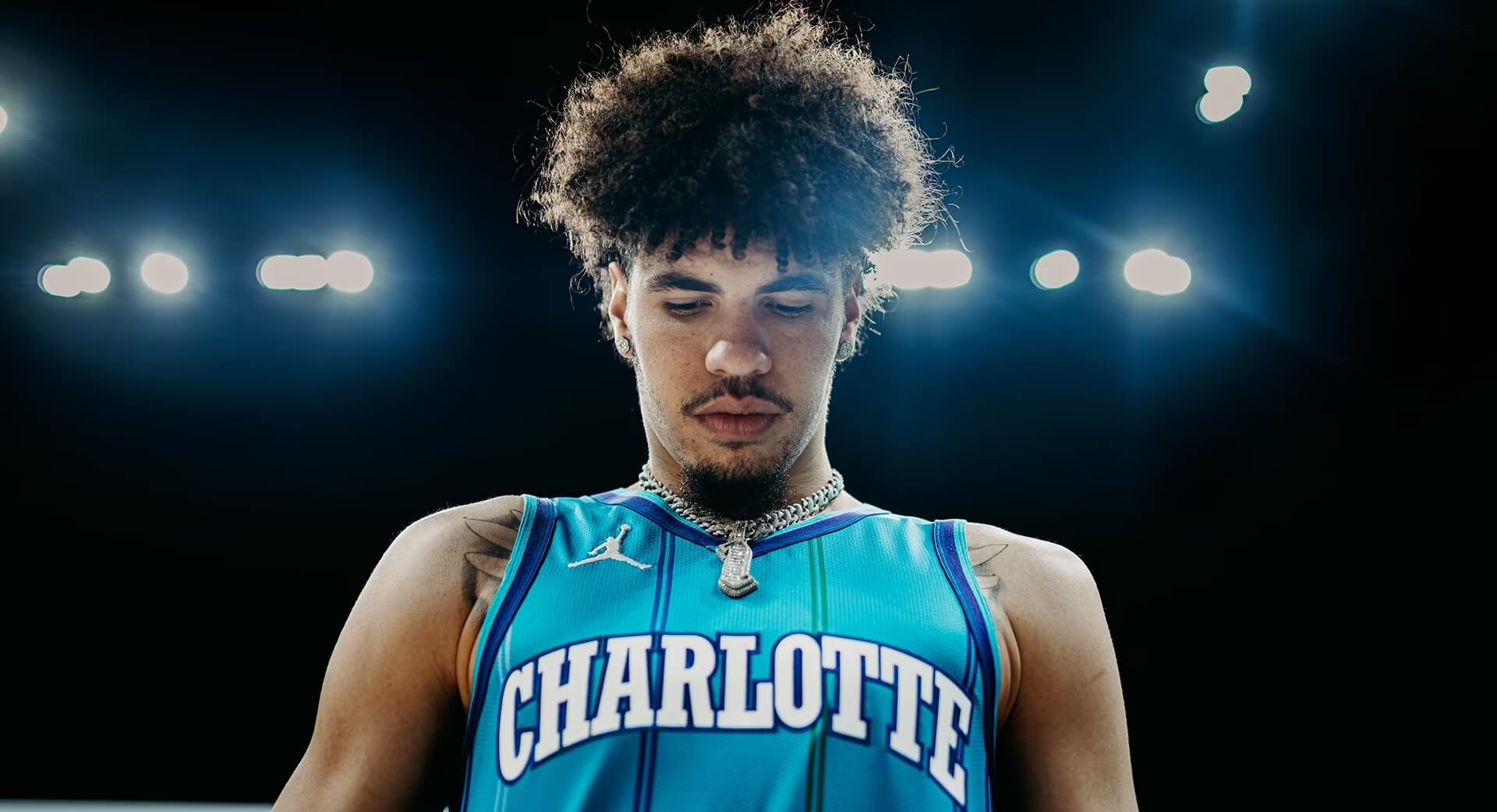
The team has chosen to go with the “teal” version for their Classic Edition.
JERSEY
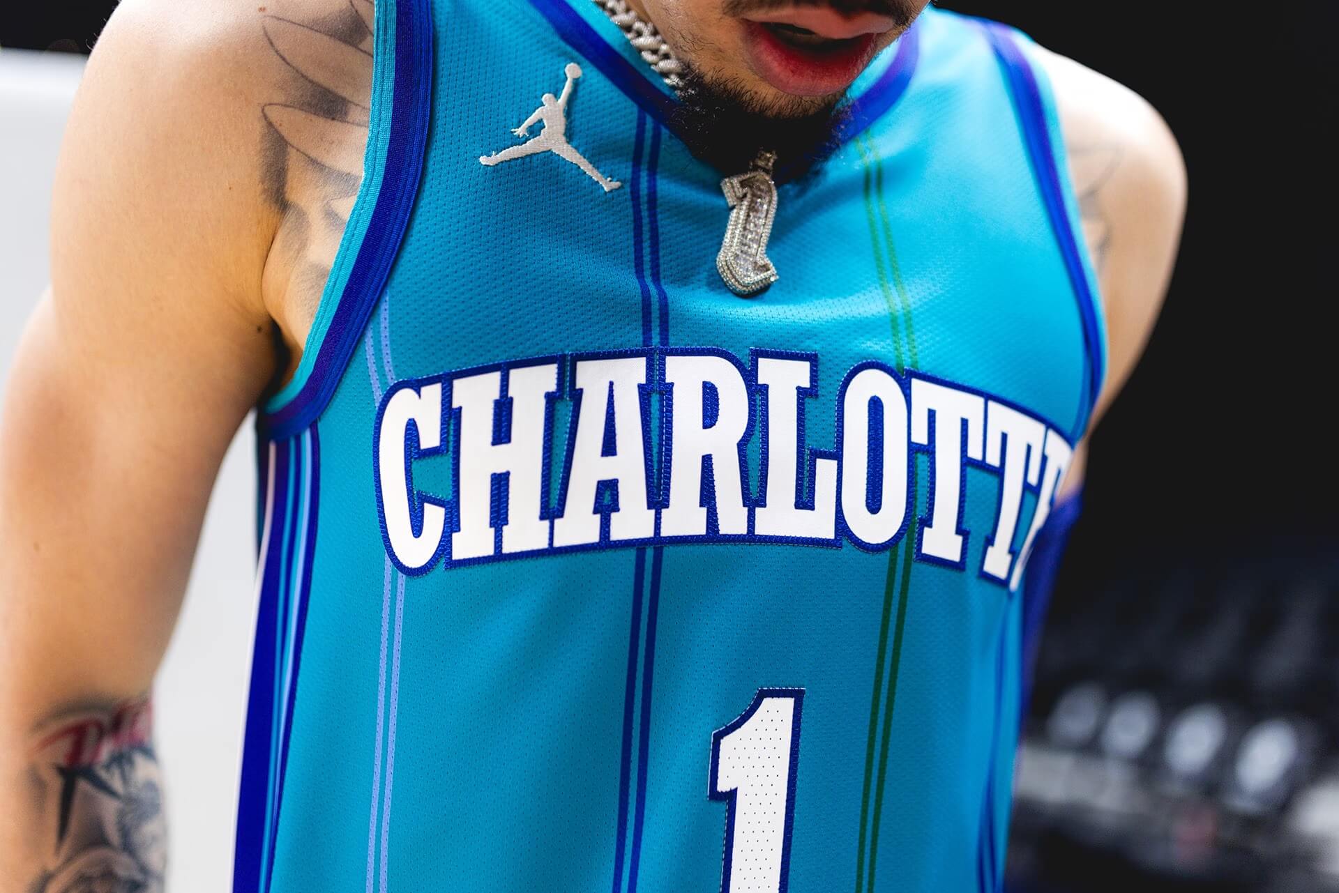
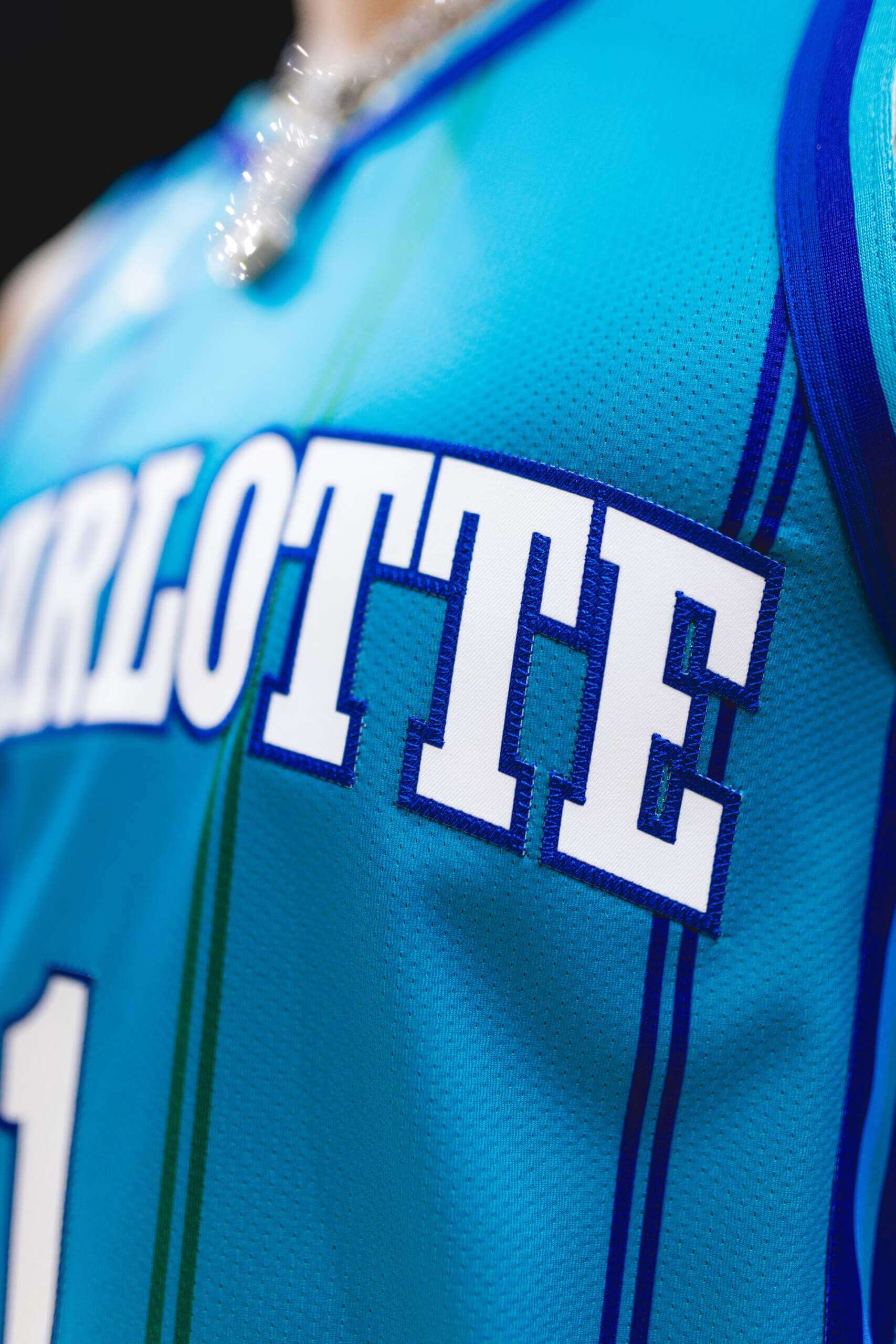
FRONT:
BACK:
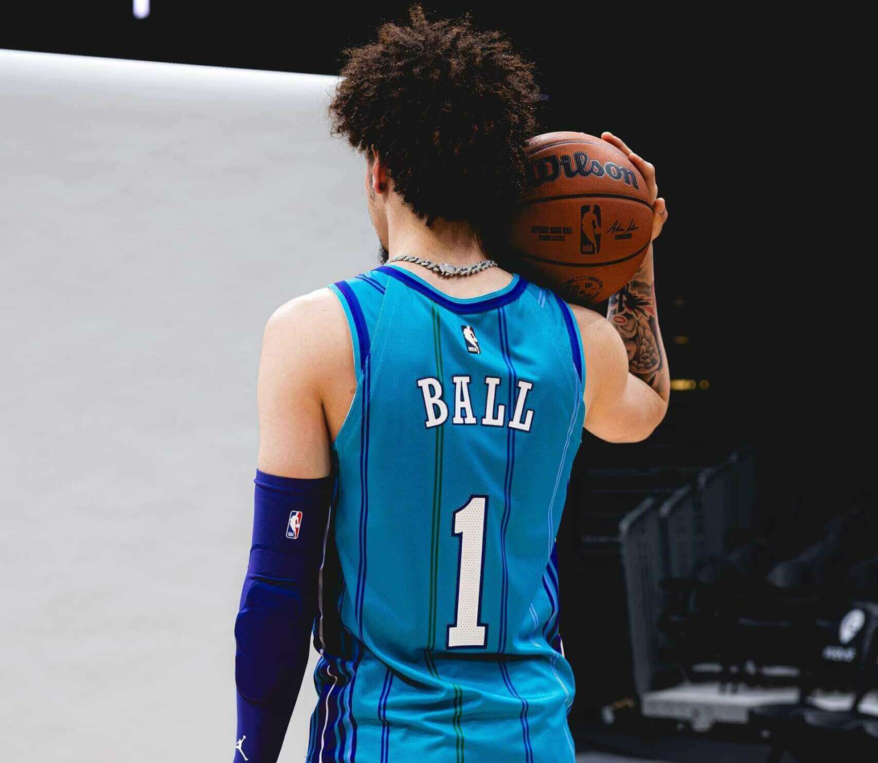
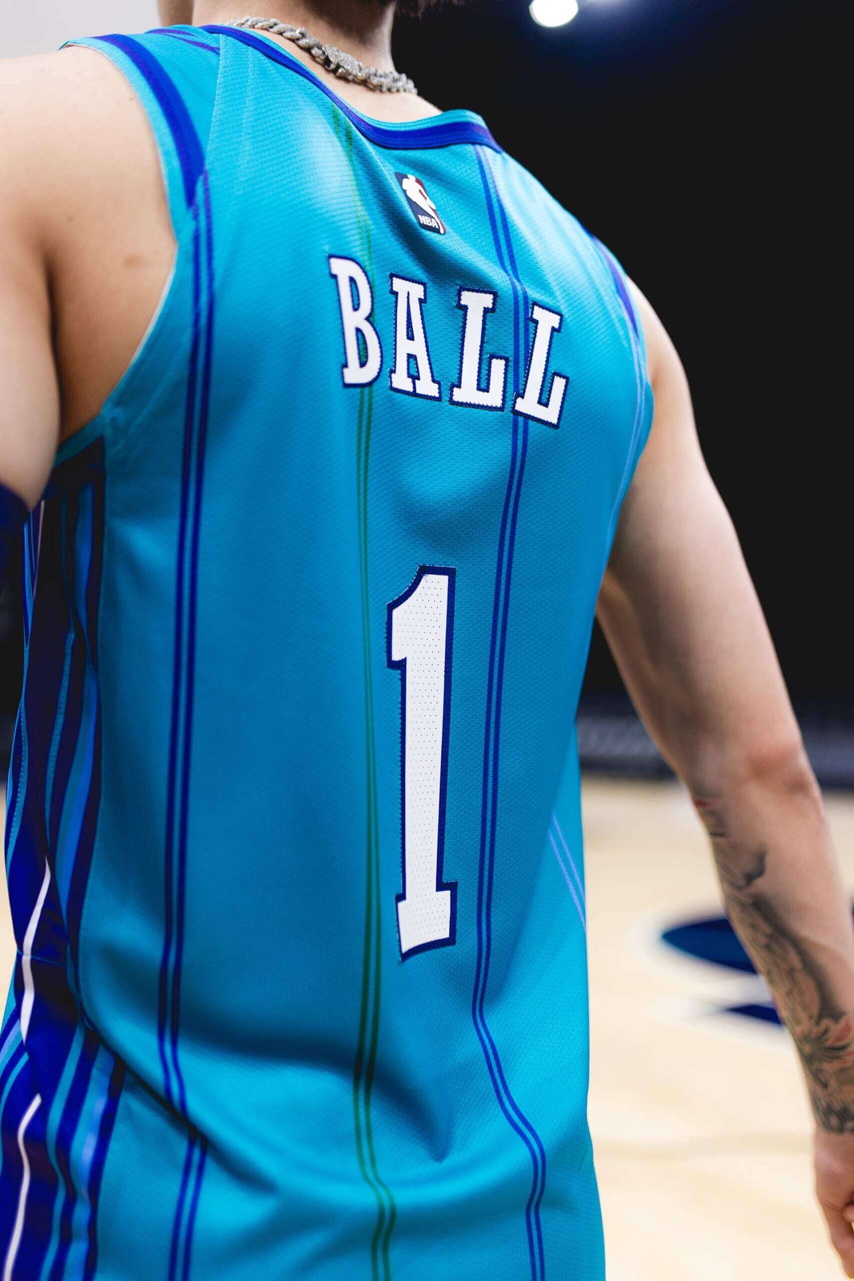
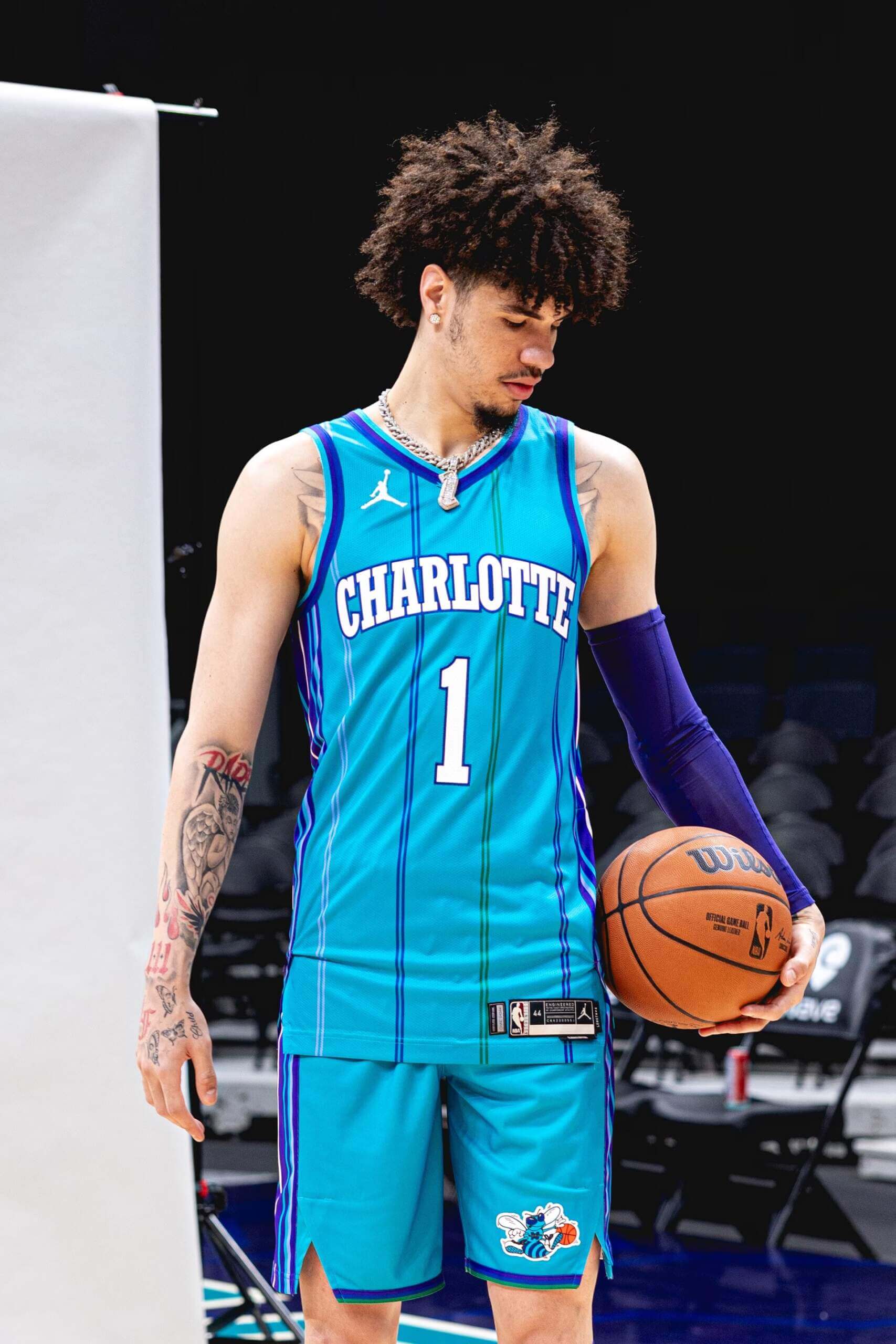
“The jersey features the classic Hornets font for the ‘Charlotte’ wordmark on the chest, the player’s name on the back and the number on both sides,” notes the NBA. “Along with the multi-colored double pinstripes in royal blue, light blue, purple and green, the design includes a crossover v-neck, along with purple striped side panels on both the jersey and shorts.”
SHORTS
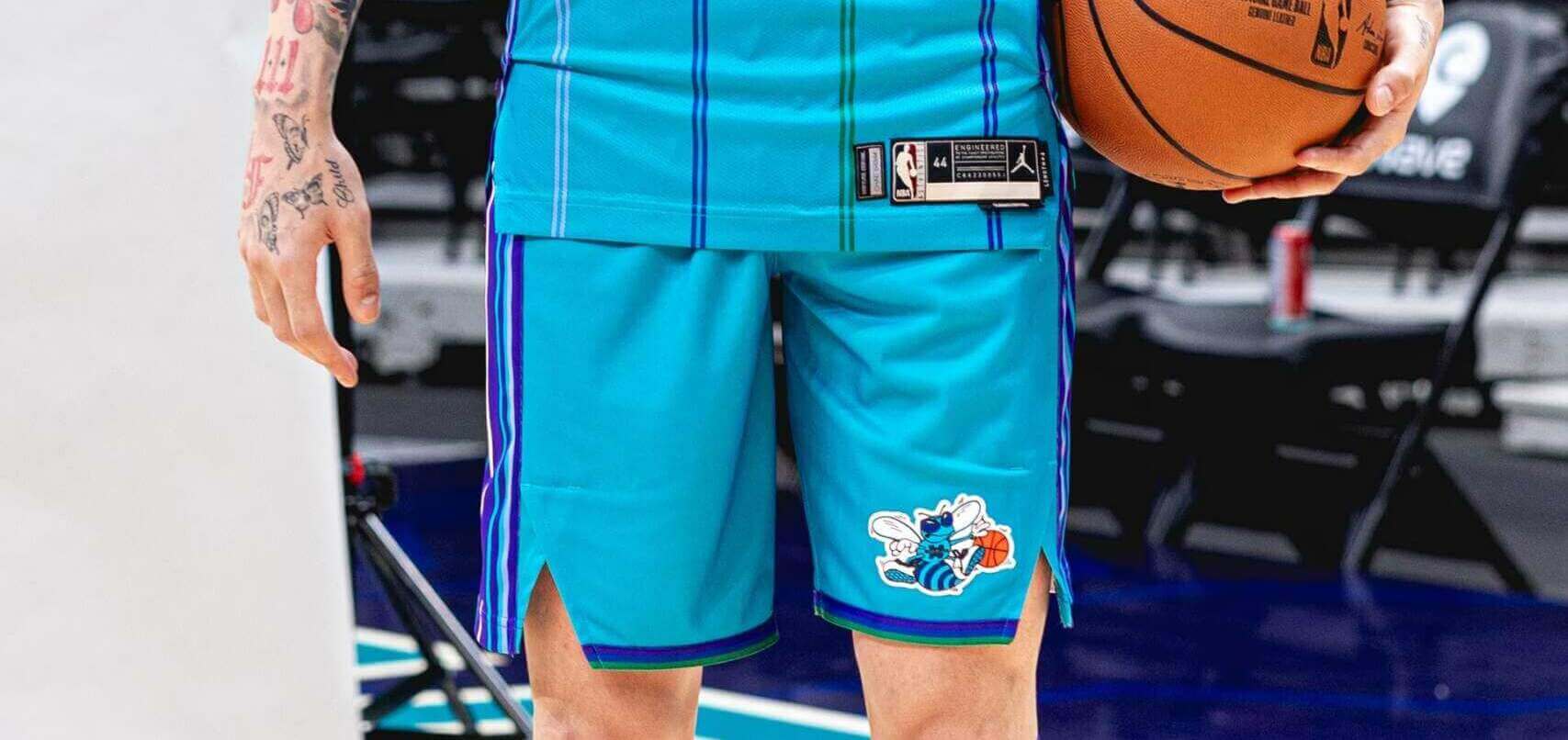
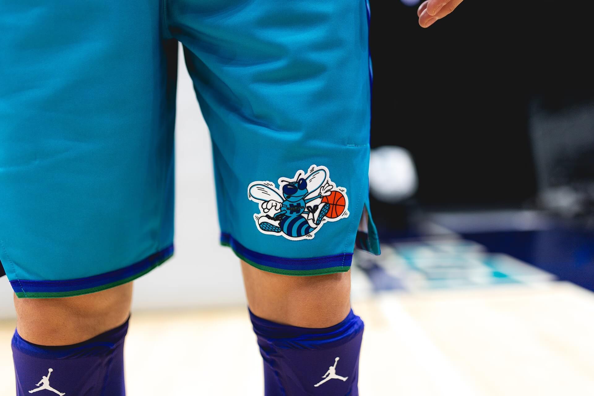
The shorts are highlighted by the classic Hornets logo on the left thigh. Like the side of the jersey, the pants have a multi-stripe panel running down the sides.
The team was nice enough to include their own set of uni-highlights…
While the team has not announced the dates they will wear this fauxback, “The Hornets are expected to wear the Classic Edition uniforms for eight home games this season, during which the evolution of the franchise from 1988 to the present and on into the future will be celebrated as part of the 35th Anniversary.” Once the Hornets Lockervision schedule has the Classic uni, we should know on what dates these will be worn.
“Once the NBA schedule comes out in September, we should learn the specific dates on which this will be worn.”
NBA schedule is already out, it was released a week ago.
My bad. I should have said the “Lockervision” schedule for the Hornets with the Classic Edition updated. Changed wording for article.
link
Kind of awkward for them to keep the Jumpman logo with new ownership.
Yeah, right? Other than that, these are kind of perfect.
I thought so, too, but apparently, while is he’s no longer majority owner, MJ still owns a piece of that team.
I still prefer these to their current set. Something about the multiple colors in the striping here (and in their first uniforms) just does it for me.
Also interesting they’re using their second set because Orlando is also using their second set for their own 35th anniversary.
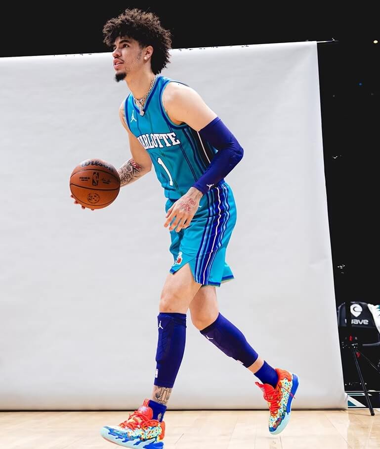
Ball looks like he’s wearing adaptive shin guards. As a soccer player I am curious if that is a vulnerable spot for contact in basketball? I always assumed knees and elbows
my guess is that they are knee sleeves that he has pulled down a bit for some reason. Guy I played basketball wore them to keep from wrecking his legs diving for any lose ball he could see. I’m guessing Lamelo has them lower to cover up his dumb 2k looking tattoos
thank you Matt
The number 1 is waaaay too far down Ball’s back. Other than that, I love these uniforms.
Very nice uniforms, I would proudly wear these as a player or a fan. But without the jewelry.
Love the concept, but Nike’s godawful template fails here in 2 specific places.
1. The unnecessary truncation of the shoulder trim. Look how at the back of the left shoulder, a thick purple stripe becomes two purple pinstripes.
2. The unnecessary frontward offset notch at the hem of the shorts looks even more off-center with the double purple stripe running down the actual middle of the hip.
For all of Nike’s corporatespeak to justify their nonsense, these two aspects of the template do not improve performance in any way. Nobody jumps higher or runs faster because a few inches of trim are cut off or a notch is moved forward; it’s a way for Nike to scream “IT’S NIKE!!” without another swoosh. And it looks dumb.
Totally agree. It is a mixed message, come to think of it: you fans want a return to a traditional uniform, we also want it if it sells really good but we have to put our mark on it that it is a Nike product that you are buying and we allow you to do so on our terms…
I hate the truncated shoulder trim on all of the Nike jerseys, but it’s especially heinous on throwbacks. They already get to slap enormous logos on both the shorts and jerseys, but apparently that’s not enough for them.
Another thing I noticed: no ad. I hope it stays this way.
Love this! It’s been a long time since I’ve made it a point to watch an NBA game, will have to make sure to catch these back in action.
“35th Anniversary” is interesting, considering the original team moved to New Orleans, and this team was initially the Bobcats. How many seasons has Charlotte had a team thought out this span of 35 years?
33 years. The original Hornets from 1988 to 2002, then the Bobcats/Hornets Mk.II from 2004.
These need to be permanent, ASAP. Absolutely incredible.
As a Hornets fan, this was IMO always their best look. It was a far more refined version of the original expansion uni.
This (specific version) is arguably one of the most perfectly done NBA uniforms of all time.
In headline, is “Harksback” a new verb and/or a synonym for throwback?
It should probably be *two words* but we often refer to something that’s not quite a throwback as a fauxback or a harkback. So I kinda made a new word up there.
Haven’t watched the NBA since 2002 when the original Hornets left. First team I ever decided I liked without my father’s influence was the Charlotte Hornets back in 1991. These are absolutely beautiful. Haven’t bought a basketball jersey since high school and I’d look like an absolute dunce wearing one but I may just buy this, if I really can’t bring myself to wear it I’ll frame it and put it on my wall. Absolutely beautiful.