Good Sunday morning, Uni Watch readers. I hope everyone had a pleasant Saturday.
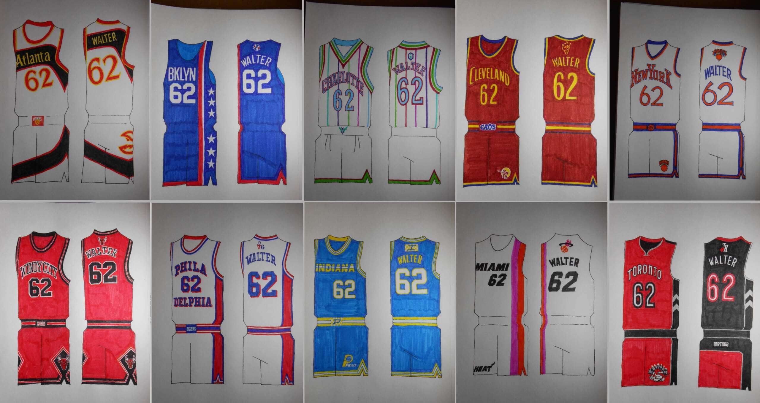
I’m joined today by Uni Watch stalwart Walter Helfer, who is back today with what I think is a really fun set of concepts. You may recall Walter had re-envisioned MLB’s City Connect uniforms a while back, and has contributed a number of articles I’ve hosted on the site over the years. Today, Walt will take a look at “NBA Tournament” uniforms. As you’ll recall, this year, the NBA introduced an “in-season” tournament, which featured new court designs and new “City” edition uniforms (which were designed to be worn on the tournament courts). Walter has concepted what he calls “Tournament Uniforms” which he feels — and I agree — would have been much better designs than those the NBA foisted upon teams. Not only has he done concepts for the Eastern and Western Divisions, he’s also created a set of “vintage” uniforms for defunct teams. We’ll look at the Eastern Conference today in Part I, and the remainder in additional articles.
Enjoy!
NBA Tournament Uniforms Redux: Part I
by Walter Helfer
Frequent visitors to Uni-Watch know I’m not one to suffer in silence when professional leagues who ought to know better foist misguided and ugly uniforms on consumers of its product. I took on the City Connect project of Major League Baseball some time back, and now I turn my attention to the NBA’s in-season tournament. I tried to draw on what I find to be team’s trademarks, as well as their appearance when they enjoyed their greatest success. A hefty chunk of B-ball teams have never grabbed the brass ring, which gave me a degree of freedom not found in football and baseball. And, for your pleasure, I included the shorts and the backs; I’m nothing if not thorough. I can’t wait to read your input, and when necessary, correct my mistakes.
Eastern Conference
ATLANTA HAWKS
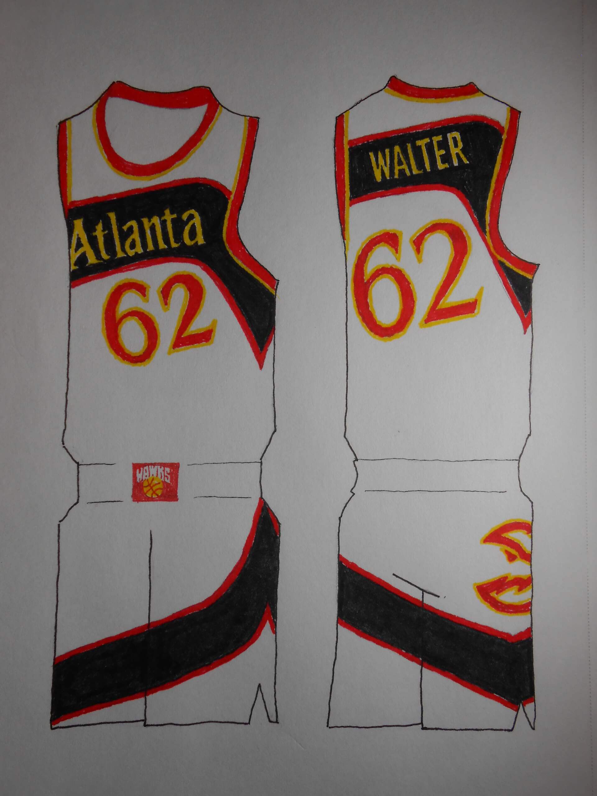
From a graphics’ point-of-view, the Dominique Wilkins-era uniforms are utterly crazy. But they have an undeniable following. The 2024 colorway adds more pep.
BOSTON CELTICS
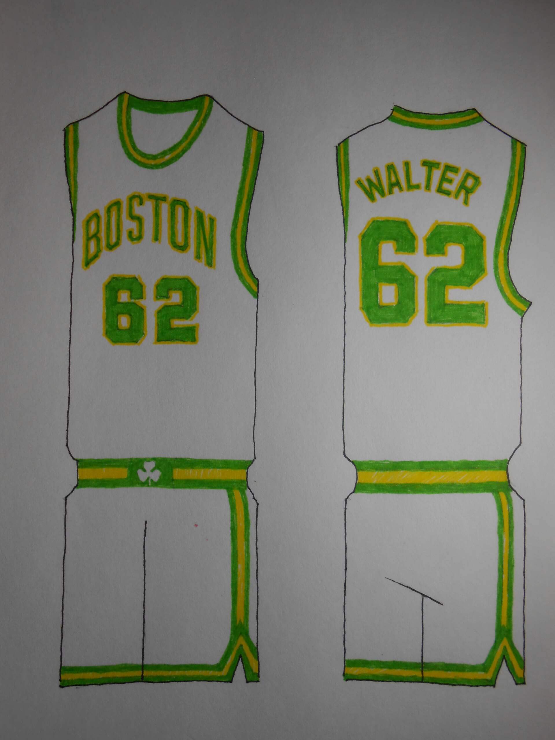
At a kiosk in Hampton Beach, we sold Celtics’ jerseys with color trim (perhaps a way to not tread on their intellectual property?) Some used yellow (gold), and others used lima-bean green. I’ve seen gold on some of their warm ups and apparel.
BROOKLYN NETS
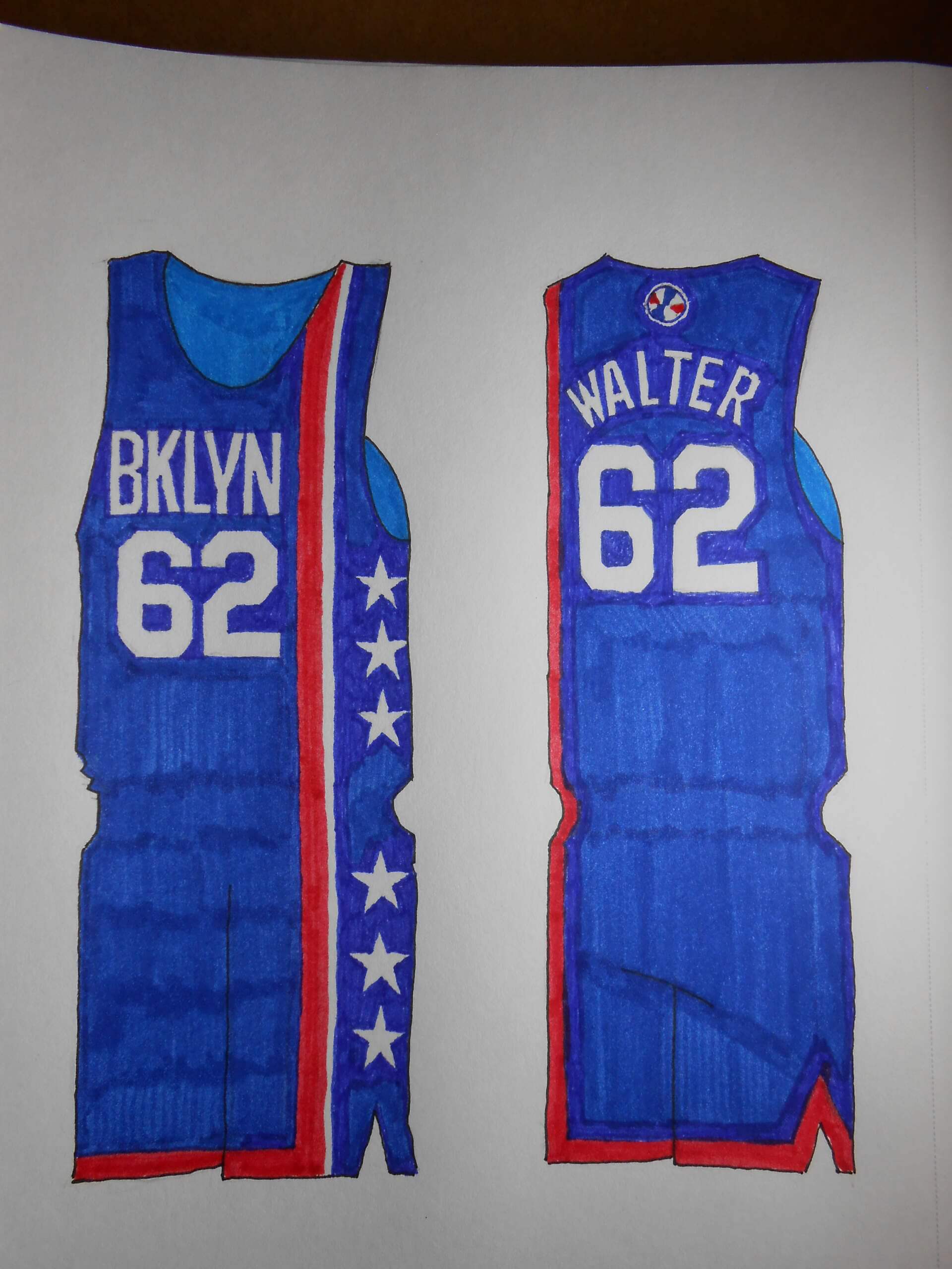
It was always going to be about the Dr. J uniforms. You knew that. I stopped short of using the spaghetti-strapped jerseys.
CHARLOTTE HORNETS
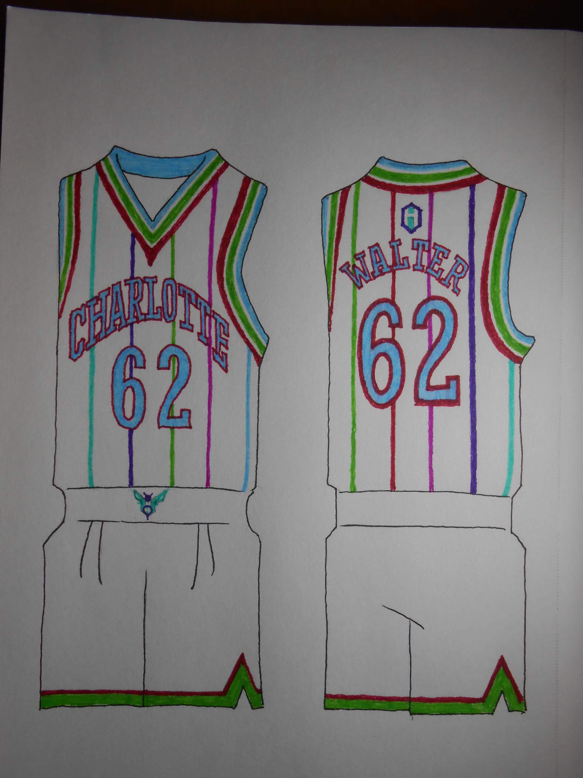
Alexander Julian is that rare clothier who “Gets It”. I especially like his use of multiple accent colors: On a lark I swapped the role of the accents and the team’s colors, and played up the resemblance of the jersey to a cricket sweater. And being the man of letters I am I fattened up the chest script.
CHICAGO BULLS
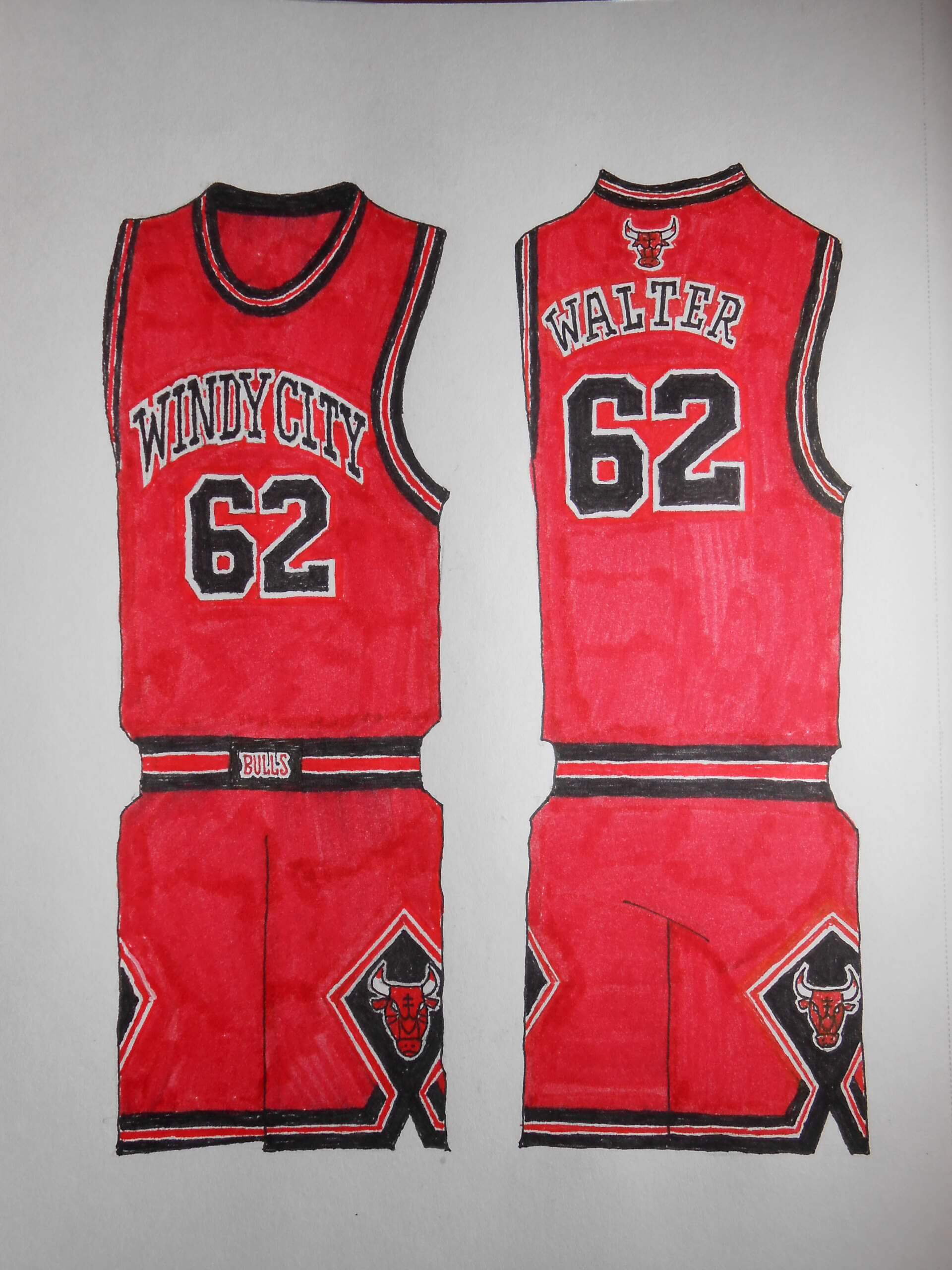
One of my favorite uniforms so I tried combining the colors in a new way. The heavy black against the red lends an industrial flair to the tried and true… and Chicago’s nickname is well-known.
CLEVELAND CAVALIERS
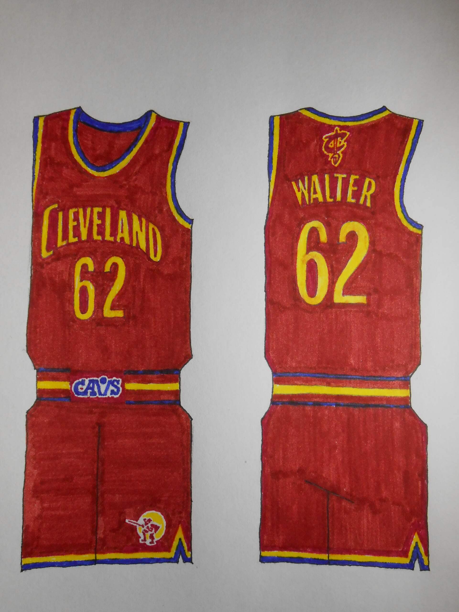
The Cavs have had more looks than I’ve had hot dinners. They also have a championship, which is one more than I have! Wine and gold are the most enduring colors of the the Cleveland palette. Had they not brought home the trophy in 2016, I was prepared to utilize their stripey 1976 uniforms; the team was enjoying a modicum of early success and the look was memorable.
DETROIT PISTONS
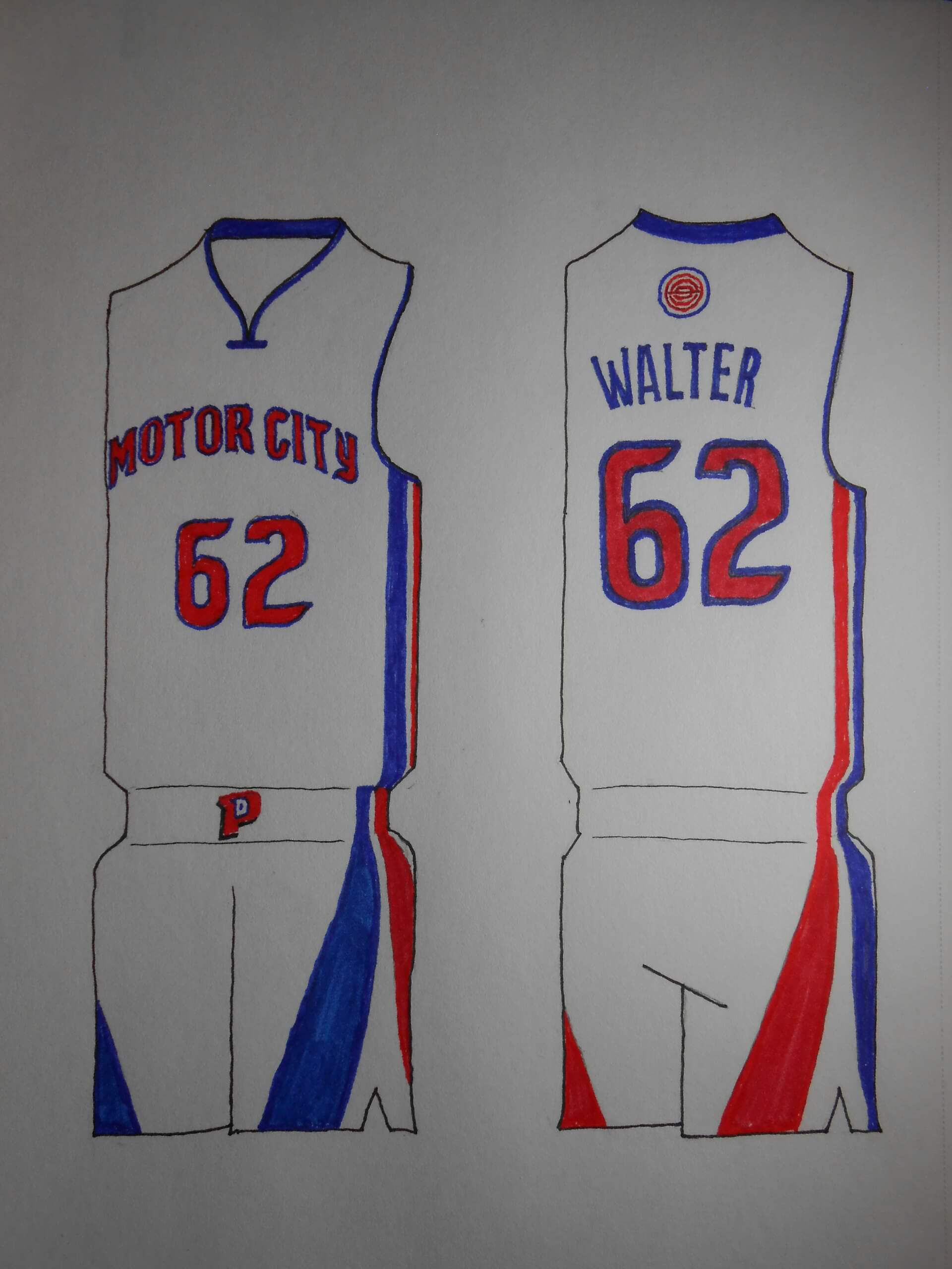
The “Bad Boys” years had to be respected, but I liked the flaring stripes that appeared on their mid-’70s shorts. “Motor City” is one of the few nicknames that doesn’t make me cringe.
INDIANA PACERS
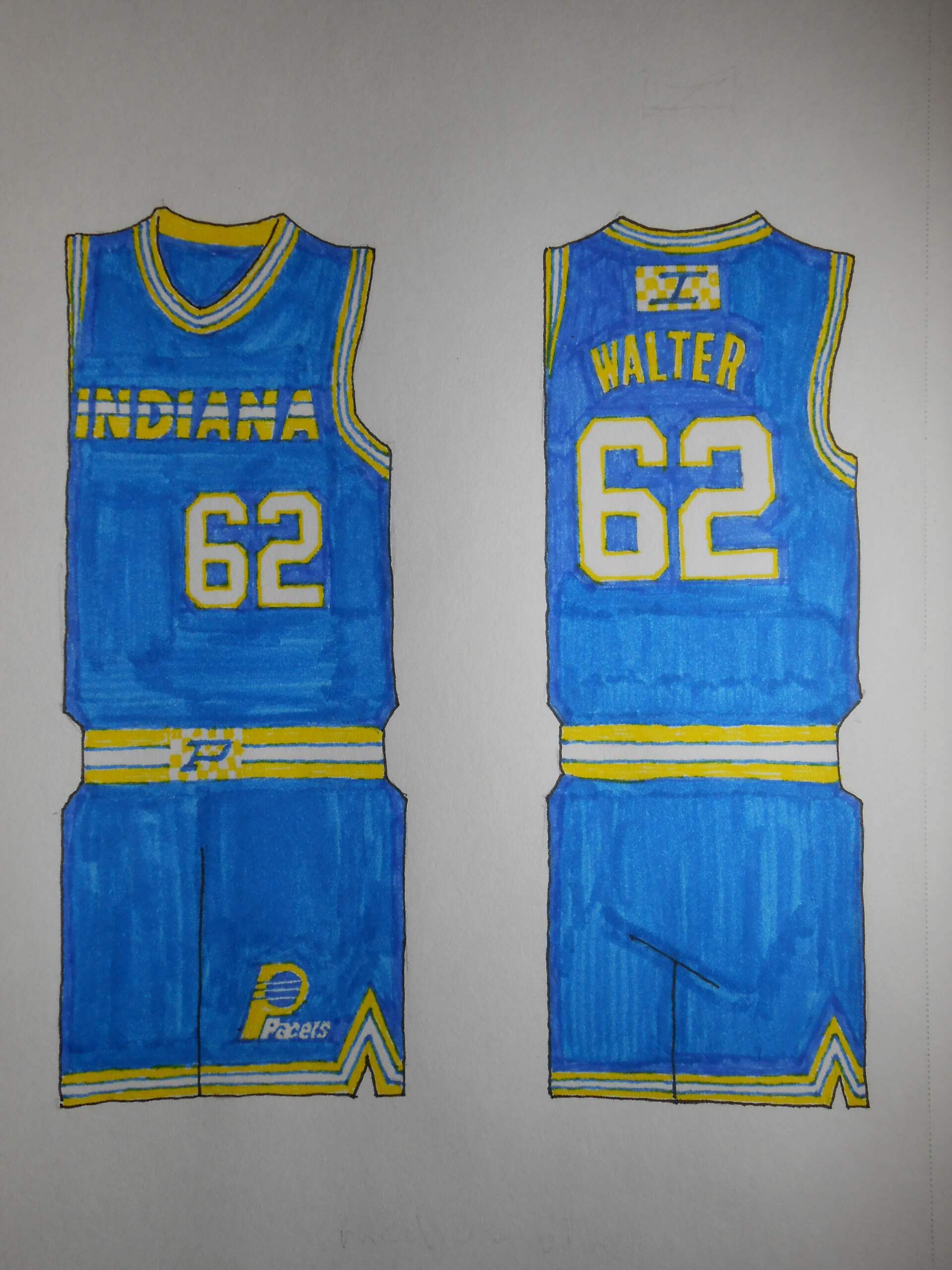
I went with a lighter shade of blue to represent Reggie Miller’s rookie year. I also whipped up a checkered flag logo to add some flair. Their logo game could use some punching up.
MIAMI HEAT
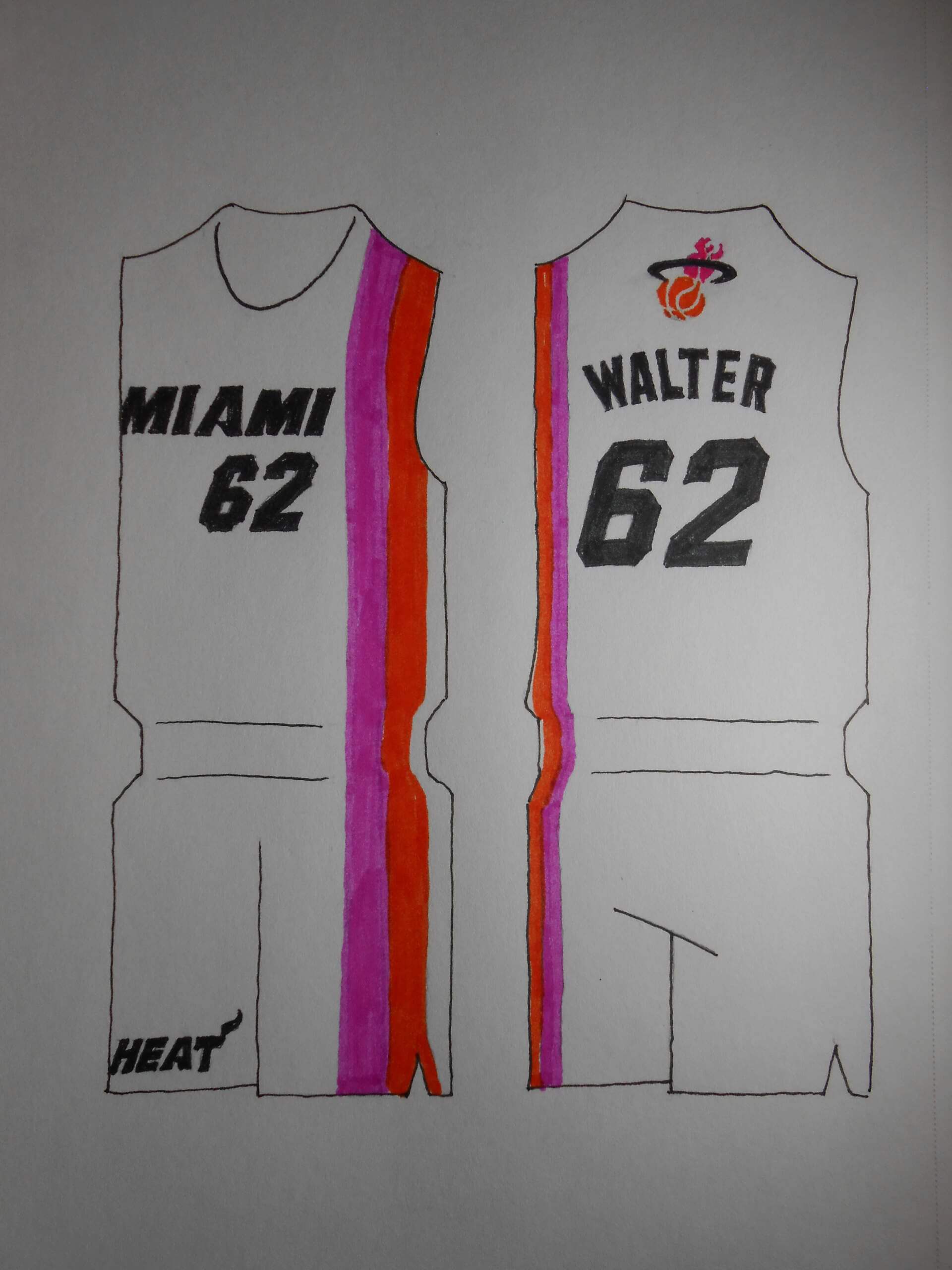
Okay, so I show my true colors as a Floridians fan. The Heat play fast and loose with their color scheme constantly, so let’s go full-neon. A rare expansion team with repeated successes.
MILWAUKEE BUCKS
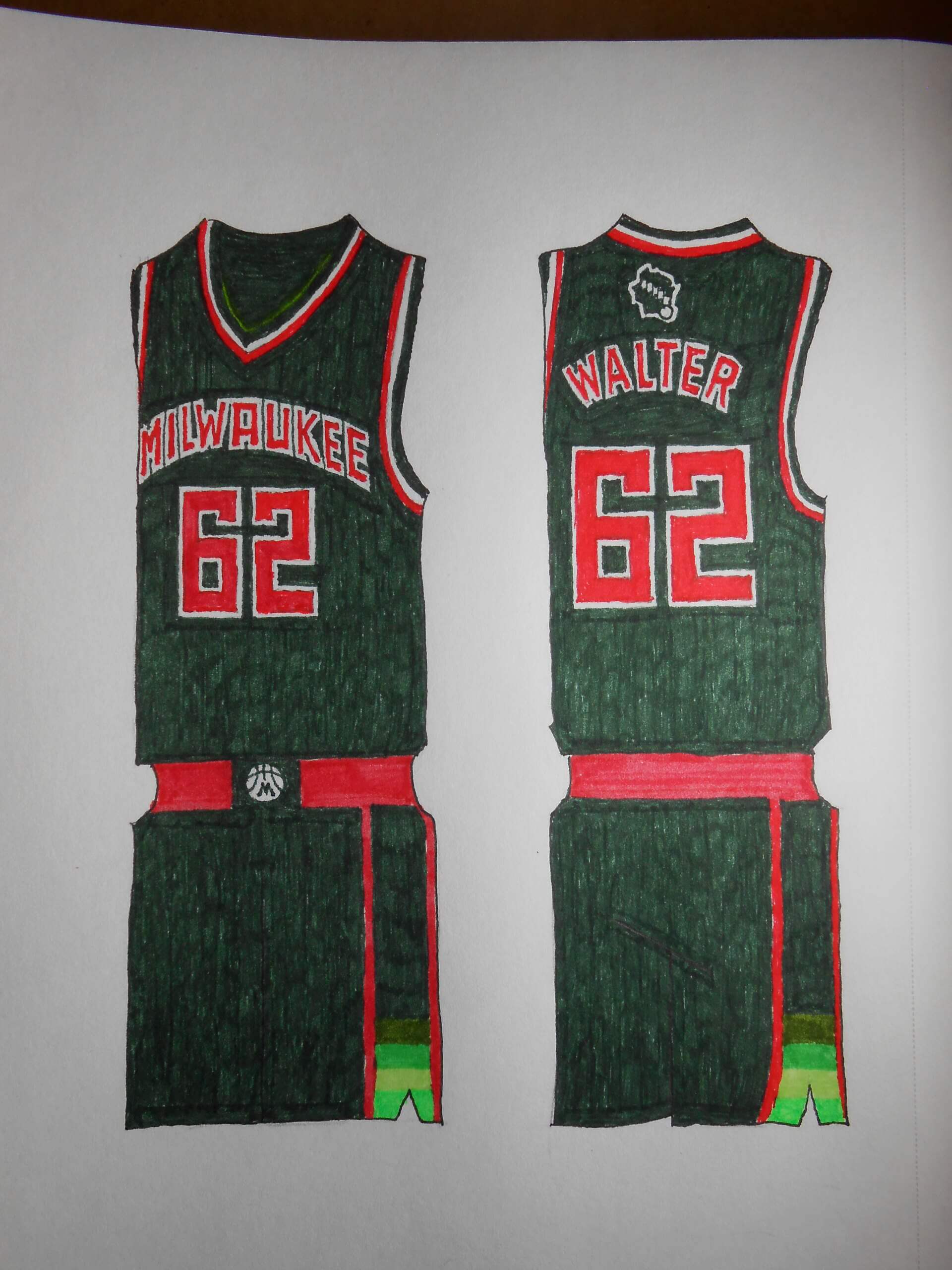
I’m not a fan of the “Cream City” sobriquet (Milwaukee is a *beer* city!) so I married their angular graphics to the original green+red colors.
NEW YORK KNICKS
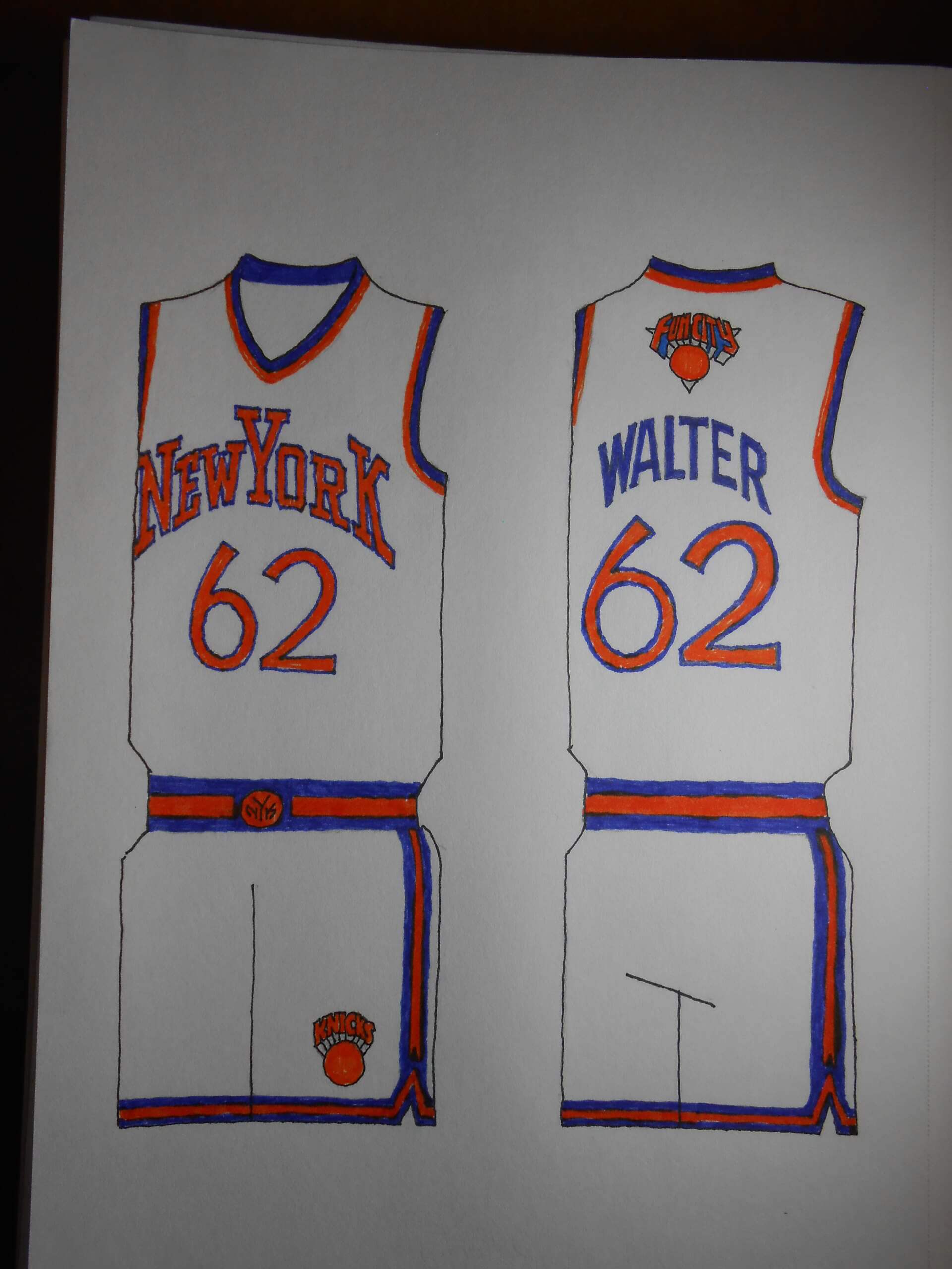
When’s the last time you heard the Apple referred to as “Fun City”? Okay, so it’s more ironic, now. Take a close look at the insignia over the player name. The arrangement of the “NYK” score bug in “New YorK” is a gift.
ORLANDO MAGIC
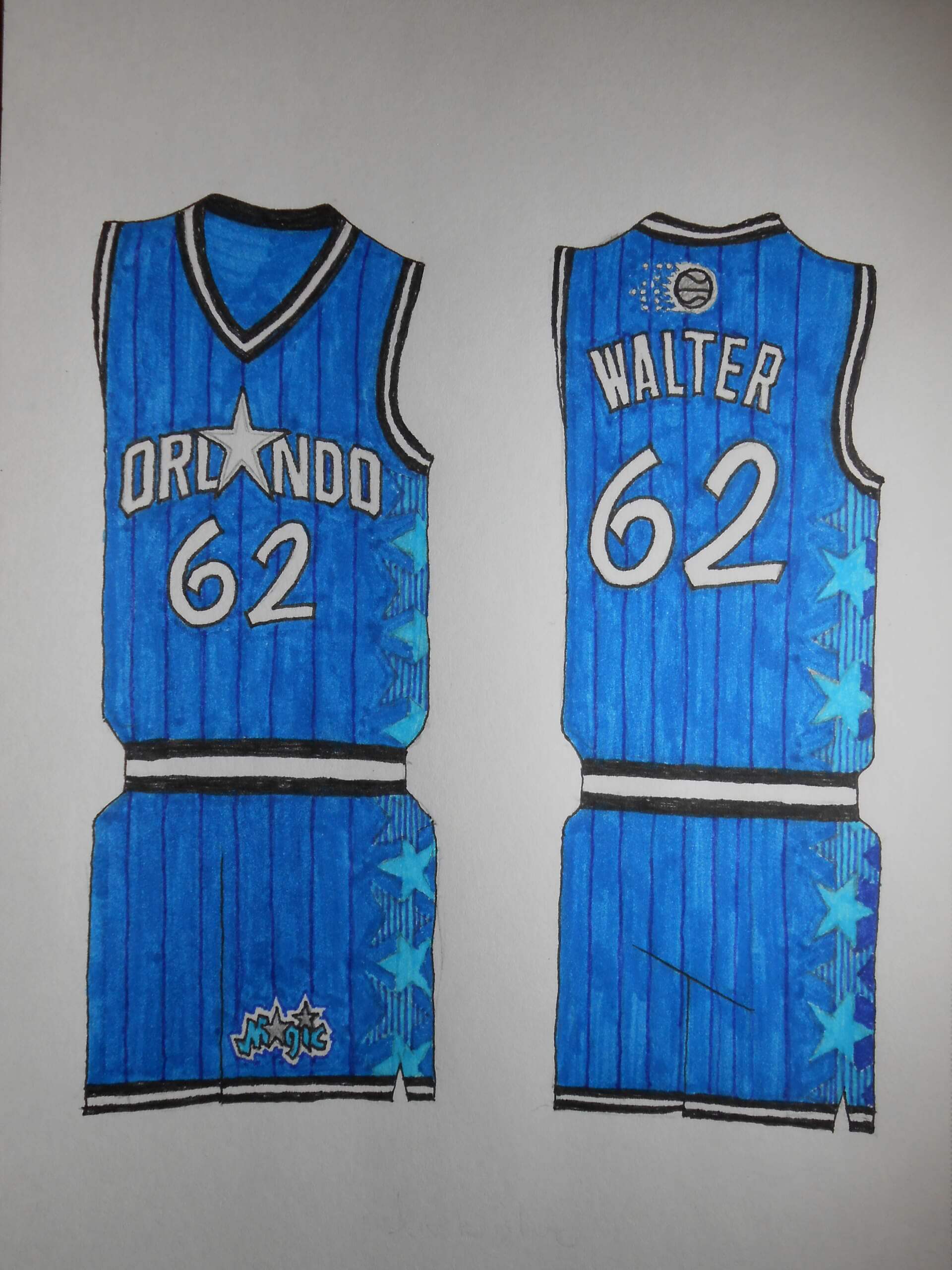
The closest this team has to Glory Days is early success with Shaquille O’Neal. Pinstripes are obligatory, but I also liked the uniforms with the sublimated star graphics.
PHILADELPHIA SEVENTY-SIXERS
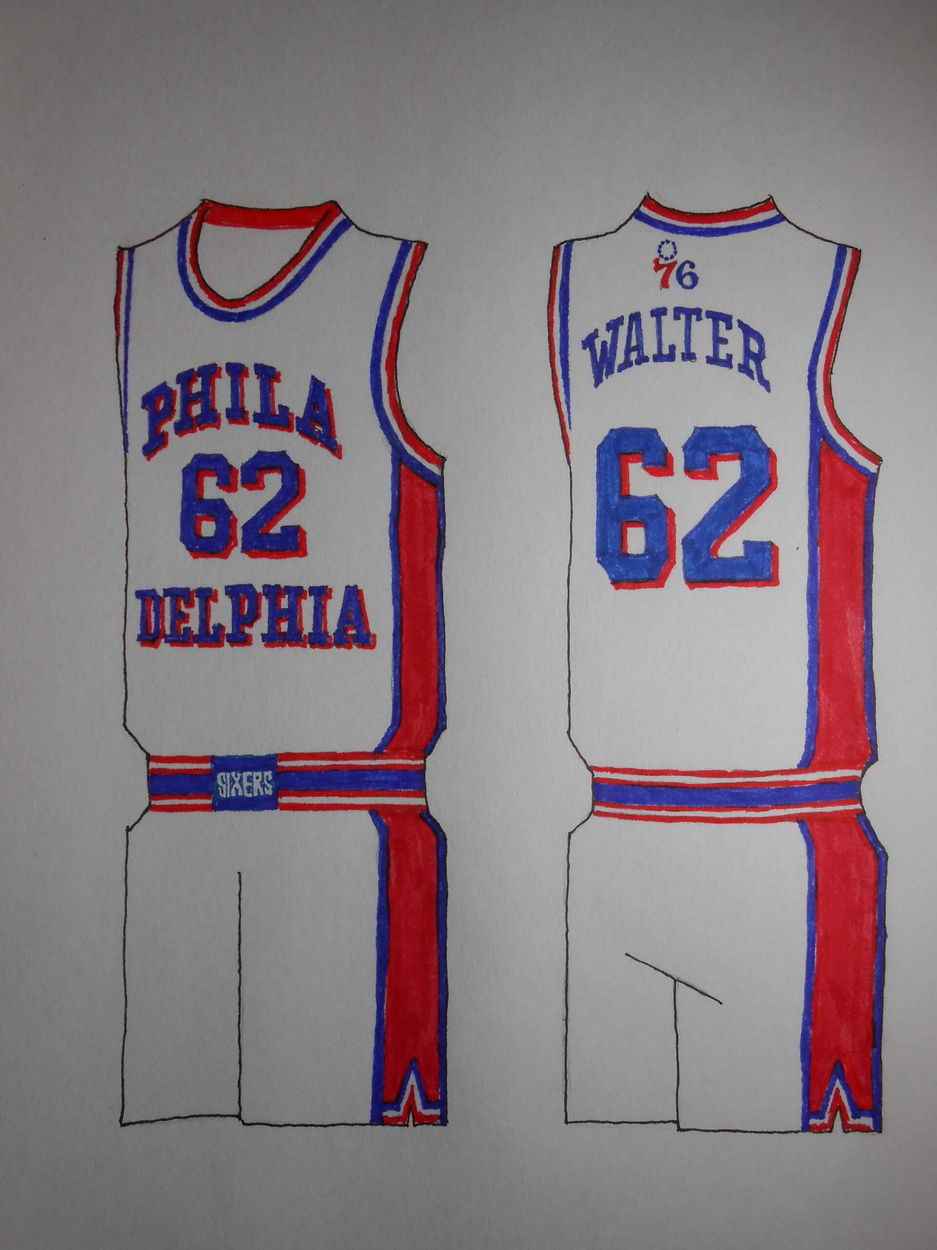
I’ve wanted to do a uniform like this for years! The red oblongs on the sides are a callout to the 1983 uniforms, when Philadelphia was a powerhouse.
TORONTO RAPTORS
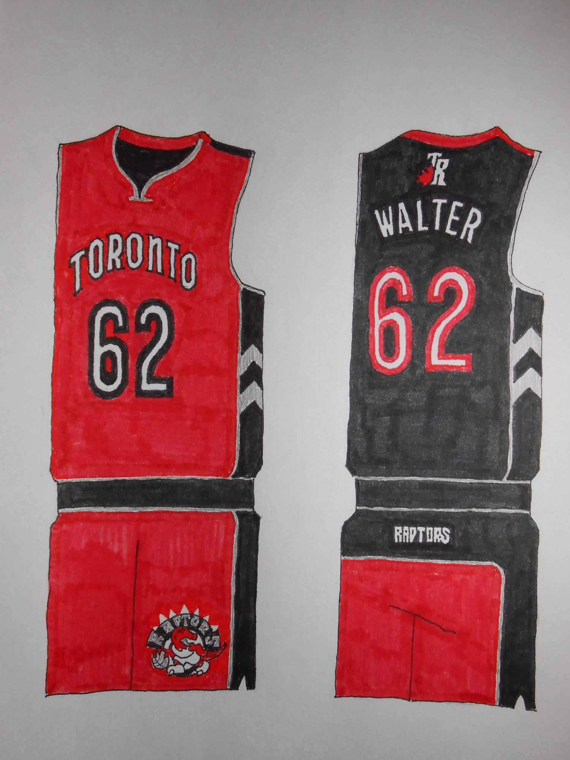
Torontosaurus briefly had a two-toned uniform which I quite liked. Not really a representation of their championship year, but the Raptors have a bit of an identity crisis.
WASHINGTON WIZARDS
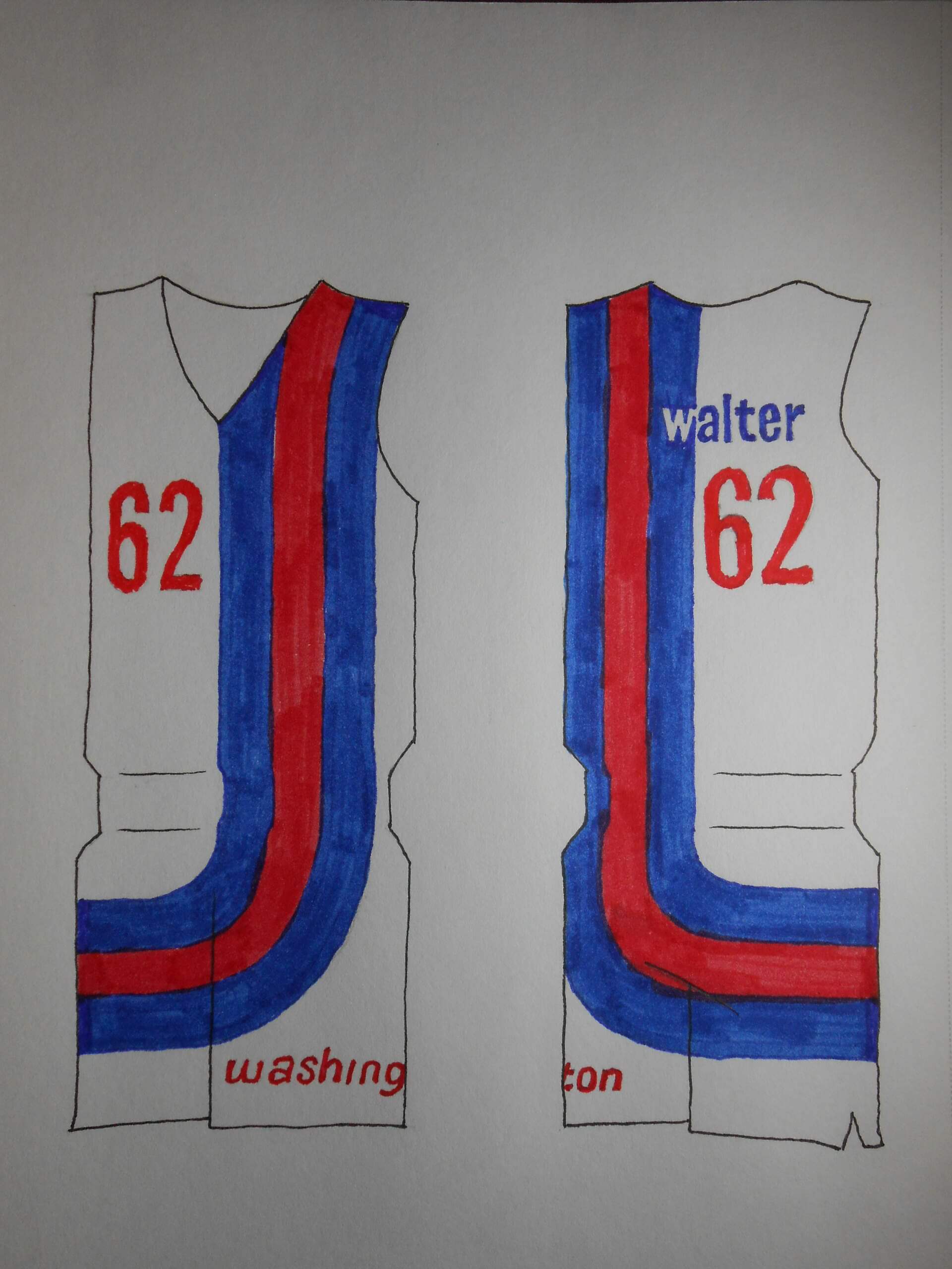
Admittedly, this is a Baltimore Bullets design, but it’s irresistible.
Thanks Walter! Fantastic set of designs, and they’re arguably ALL better than any of the City uniforms the NBA trotted out this season. We’re all looking forward to Parts Two and Three.

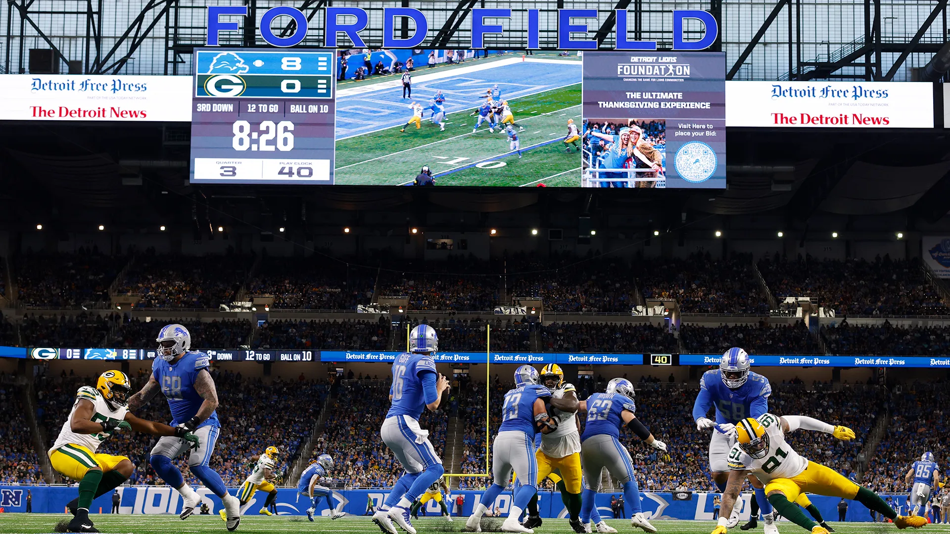

The GTGFTS is Lions-Packers (obviously) from November 6, 2022 at Ford Field in Detroit. The Lions won 15-9.
I was in downtown Detroit for Youmacon that weekend. As the Sunday afternoon schedule was light, I ended up having lunch at the Applebee’s on the first floor of the Millender Center (across Jefferson Avenue from the RenCen) and caught the touchdown and 2-point conversion at the end of the first half. I think I ended up staying through the third quarter before I left to return to the convention.
Love the 1/2 second difference between the on-field action and the scoreboard monitor in this photo.
This was only the 4th NFL game to end in a final score of 15-9. @Rob S….I ate at the Applebees just a couple of months ago.
Walter: great stuff, all of them!
Tweet of the Day: other than ranking the Bears’ throwback at #2, no other real argument. Dolphins, Eagles, Seahawks, Bucs, Titans, Patriots, Vikings, Falcons and Saints all look better by looking back.
Thanks, MJ! It was a thrilling project to work on.
No way that beautiful throwback of the Saints is #23.
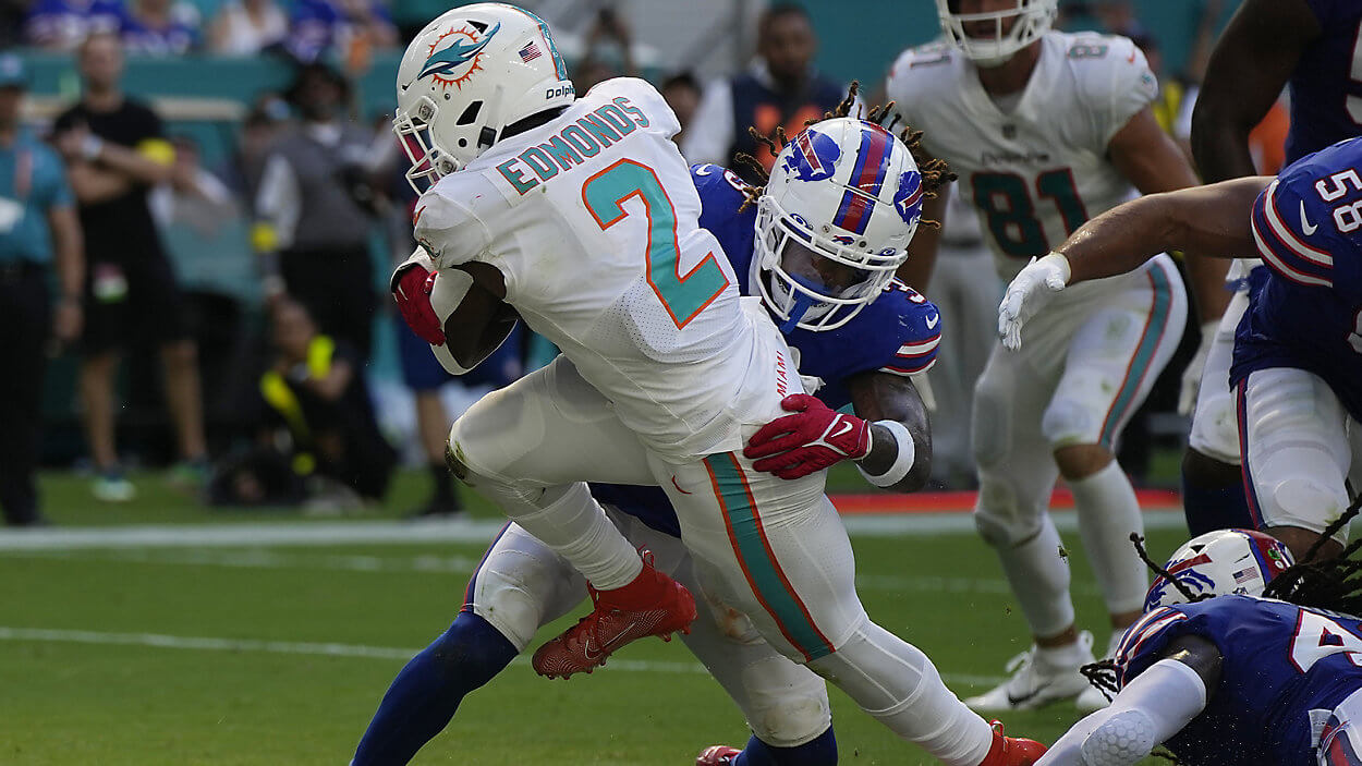
GTGFTU
25 September 2022
Dolphins 21 Bills 19 in front of 66,206 at Joe Robbie Stadium
Chase Edmonds scores his second TD of the game to give Miami the lead for good.
Walter’s stuff is so much better than anything a swooshketeer has put out in living memory.
Thanks, Marc! I wish the NBA thought so.
I am truly sad about the direction of college football. I’m 48 years old and have seen the game consistently change since I was a kid (first game I recall watching in its entirety was Flutie vs Miami). While change is inevitable, it feels that the latest developments are the final blow that separated the NCAA model from the NFL. There always been that distinct and special feel to Saturday football.
Phil nailed it on the head-32 teams in two conferences with 16 teams qualifying for the playoffs. That sounds rather familiar.
1-5 – Oilers, Buccaneers, Dolphins (aqua), Eagles, Seahawks
The Dolphins, Eagles, Seahawks, Buccaneers, Titans, Patriots, Vikings, Falcons and Saints would all be better off changing back to the ones represented here (just make the helmet color match next time Saints!).
Pats Number 12 is too low (even if it is the GOAT’s number). Obviously a big upgrade over the awful monochrome garbage they wear at home.
And Falcons at 18? Way better than the current unis.
Only throwbacks that aren’t better are Niners (not enough gold), Lions, Browns (both too plain), Raiders, Colts and Cowboys (just don’t look like the team I love to hate).
Way to go Walter!
You’ve shown how easy it should have been for the NBA to not foist ugly crap upon us!
Really nice job!
Thanks for the kind words. I’ll admit one thing in my favor is not being compromised down by a client who “wants a bigger logo.”
The NBA concepts are pretty great. The only one that feels a bit off to me is the Sixers one, because breaking up “Philadelphia” like that just seems weird. I like the various nods to team histories, such as the INDIANA wordmark taking a cue from the mid-80s Pacers. And as for the Hornets’ uni… it might be the only NBA design that could pull off a decorative vegetable!
Perhaps I ought to research the longest word ever to appear on a basketball uniform; I have a few sketches of the jerseys of a fictional college in Truth or Consequences, NM. But your decorative vegetable comment is cryptic. Does it have something to do with the shade of green I used?
Great stuff Walter! I like a lot of these. Many would make good primary uniforms for the NBA teams.
From your mouth to God’s ear, Wade!
Wow! I love these illustrations so much! Thanks for sharing them, Walter! So much better than anything that Nike has foisted on us the last several years. And I also love the hand-drawn aspect of them. For all the advancements provided by design software, you can’t beat the organic feel of pen-to-paper.
Drawing involves some caricature, so I can home in on details I choose to exaggerated and make them more in-your-face.
So basically, all that was done here was to take concepts teams have already used and copy them. I agree that every team doesn’t need a redo, but this is just copy and paste.
A 5 year old could do the same thing.
“M.,” there are people who make our conm-uni-ty a better place, like Walter, and then there’s you. The only thing more repellent than your comical ignorance of the design process is your toxic attitude toward those who actually do contribute something to this website. If this small sample of your “writing skills” is indicative of what you are like in real life, I consider it my great fortune that I have never met you and have no idea who you are.
With Motor City on that Pistons jersey, I would have gone with #5.
Kick out the jams, motherfuckers!!!
This exchange made my day!
I stopped short of using the spaghetti-strapped jerseys.
And for that, Walter, I thank you.
Great concepts all around. Can’t wait to see Part Two!
In 1976, a popular motif was basketball uniforms that looked like American flags. With the contemporary tailoring, the flag theme looks somewhat anachronistic. There’s just too much fabric to cover!
What’s the NBA tournament? I’ve not paid attention to the NBA since Magic/Bird.
Nice work Walter.
Minor nit to pick about Milwaukee’s ‘Cream City’ nickname: it’s referencing the cream-colored bricks found in buildings around town, not cream the dairy product.
Love the Irish rainbow touch, though.
But they do play in Wisconsin; I hope you see where I got that impression. By the way, New Rochelle has plenty of yellow brick schools. Is there a conspicuous difference?
No idea, it’s been a while since I visited the New Rochelle/Mamaroneck area. The Milwaukee brick is more off-white than yellow, like the Phillies home unis.
But yeah, totally agree that beverage-wise, beer is Milwaukee’s choice, closely followed by the brandy in Old Fashioneds.
Beautiful artistry, Walter!
Just the compliment, no critique.
Basking in your praise warms my heart, Chris.
Three different Knicks logos? No, no, no. Pick one. Same with Cleveland.
Why go with a relatively accurate throwback Bullets and Heat uniform, and alter the Nets (in the original, the panel with the stars was blue on the white home uniform and white on the blue road uniform)?
On the whole, not terrible.
There is only one team where I threw out the baby and the bathwater; you’ll see it next Saturday. I didn’t see the need to use a less-is-more approach. A lot more teams than you cited have multiple patches. I was confounded by the Elvin Hayes-era Bullets uniform. There wasn’t more that I could do than swap colors. I don’t really care for any of the Wizards’ uniforms. The Heat will wear just about anything in any color. Kind of hard to surprise anybody with an approach like that. Several years ago I made a fauxback for them with gold (yellow) home uniforms and orange road uniforms. I suppose a red Nets’ uniform was an approach I could have pursued, but that’s another project for another day.
Some very good NBA designs Walter. I love the hand-drawn aspect!
That, along with the many 70s/80s influences, really brought me back to my youth. Thank you.
Walter, these are fantastic! Can’t wait for the rest. Was so taken by the designs I had to search your name in the site archives and was delighted by your MLB concepts. Hope you keep doing stuff like this, really enjoy it!