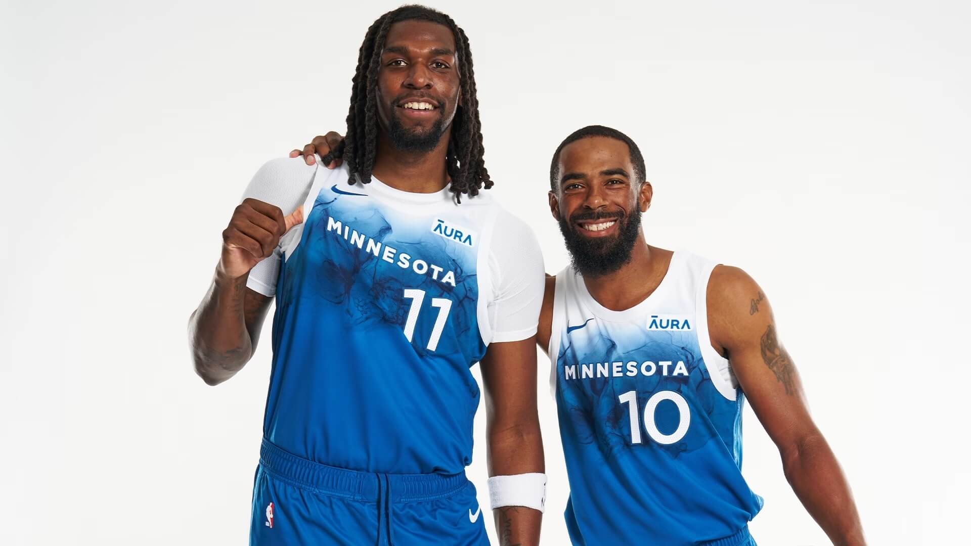
The Minnesota Timberwolves yesterday unveiled their “City” alternate uniform for the upcoming season.
These being “City” editions, there is of course some storytelling behind the look. According to the team, “Celebrating lake life in Minnesota, this season’s City Edition uniform is inspired by the summertime fun that can only be found in the ‘Land of 10,000 Lakes’.”
Also, “Lakes are an integral part of life in Minnesota. From the way they shape and support the state’s landscapes to the way Minnesotans embrace and celebrate lake life all summer long, this season’s City Edition uniform represents a specific culture of fun with family and friends on the water.”
OK then. Lets take a closer look.
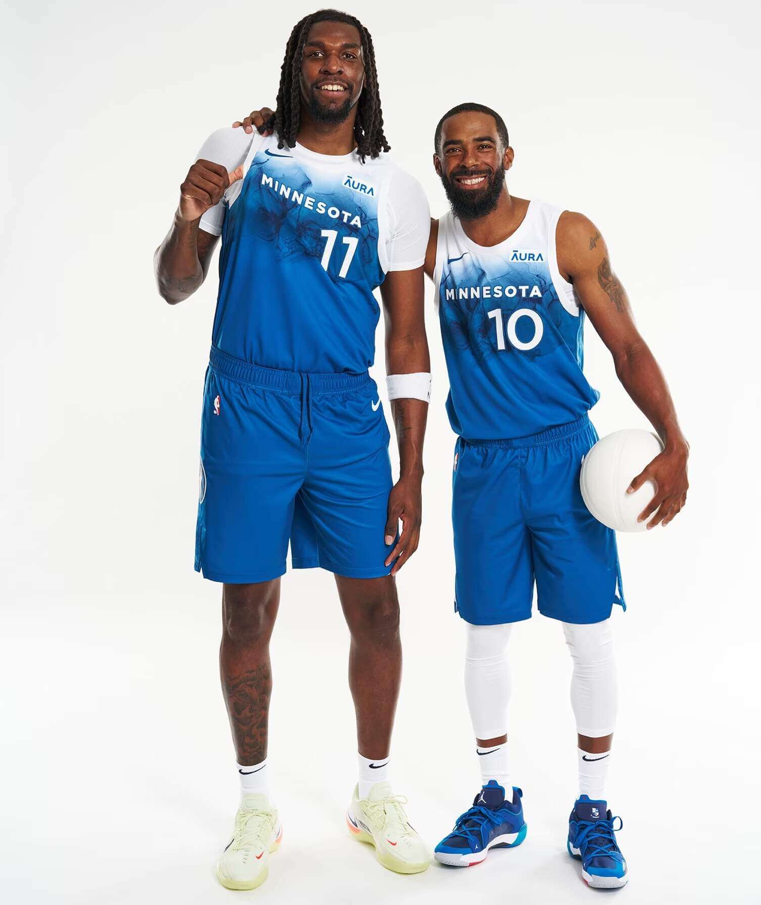
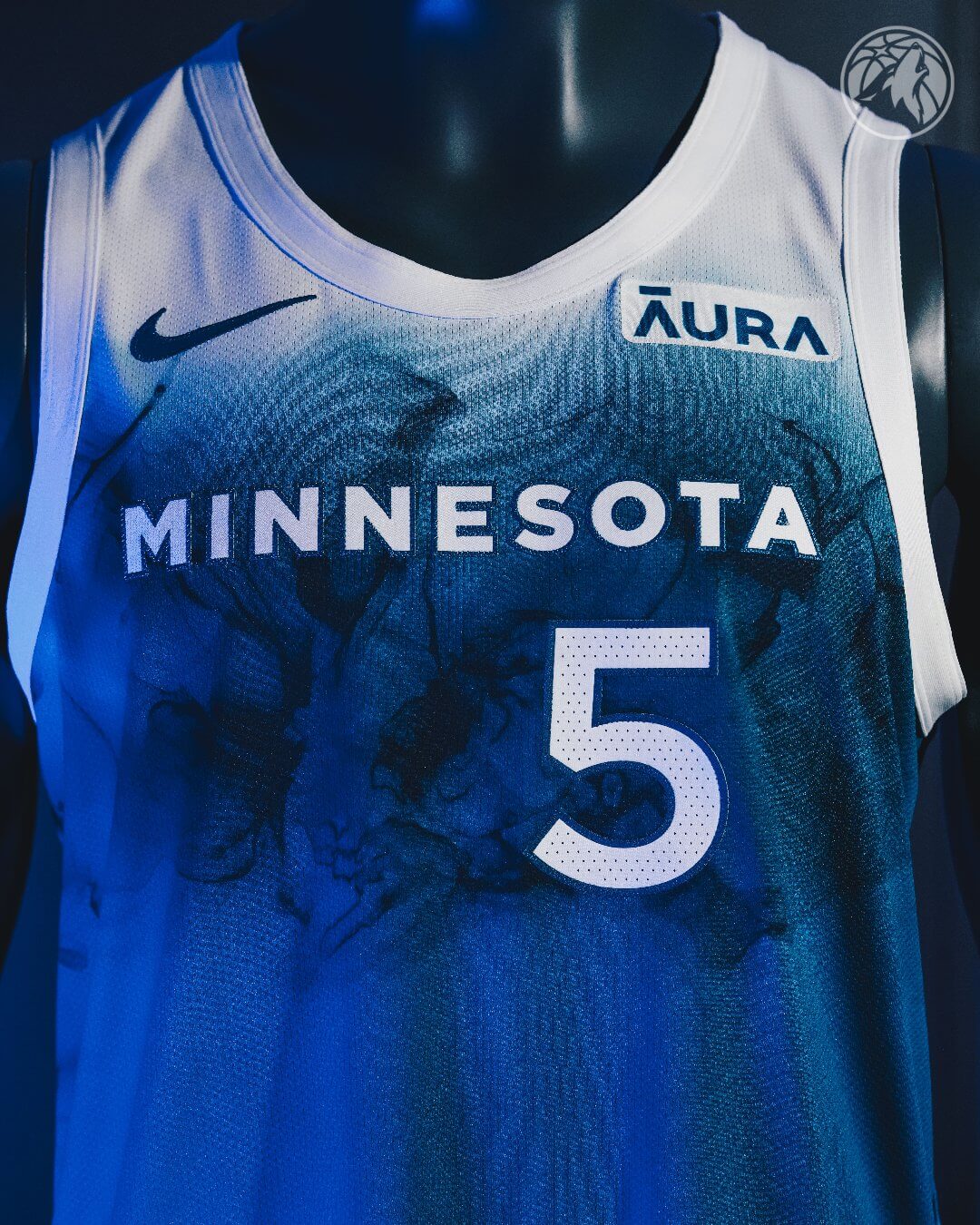
As you can see the jersey is white at the very top, quickly changing to “Lake Blue” which is also seen on their “Association” and “Icon” editions. The sublimated pattern seems to evoke water. “MINNESOTA” is rendered in a small, sans-serif font in white, with a blue outline. The number is slightly larger, also in white bordered by blue. There is a white border around the collar and sleeve openings. The shorts are solid blue and stripeless, although there is a faint white piping at the hem, approximately the same width as the white collar.
Here’s a look at the back:
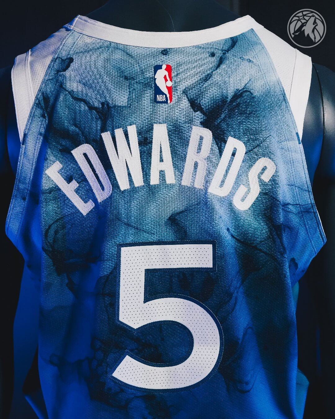
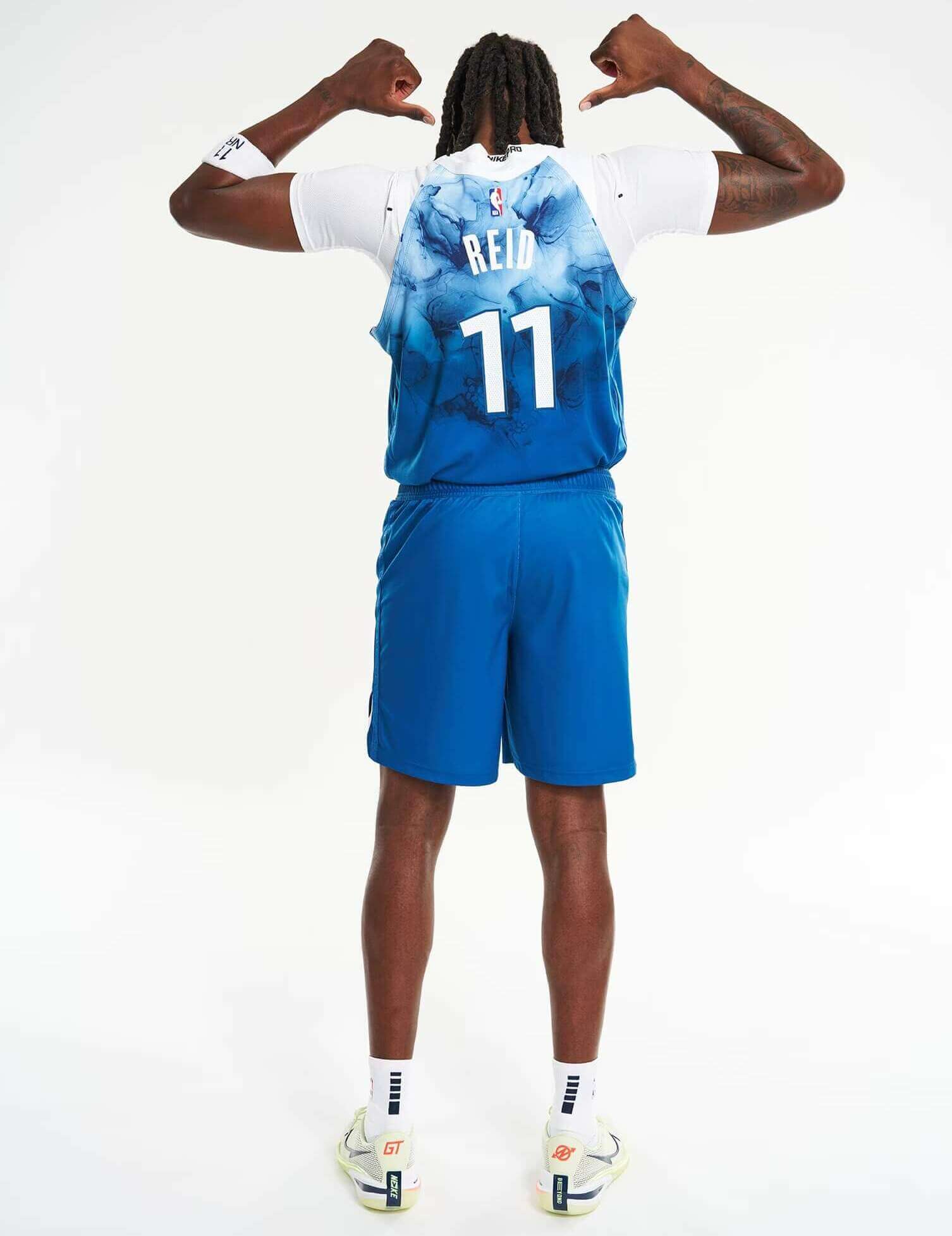
NOB is rendered in solid white, and the “water” pattern is different (with more white than blue towards the top). This makes the NOB somewhat hard to read. There are also no white stripes on the rear arm hems. Numbers are in white with blue outline, like the front.
Here’s a closeup of the shorts, which features a logo rendered in blue and white:
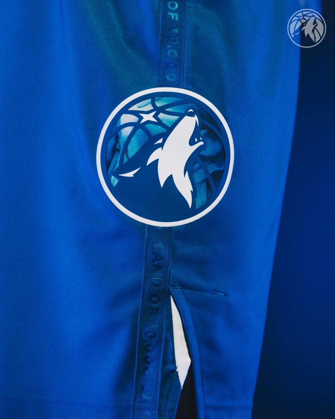
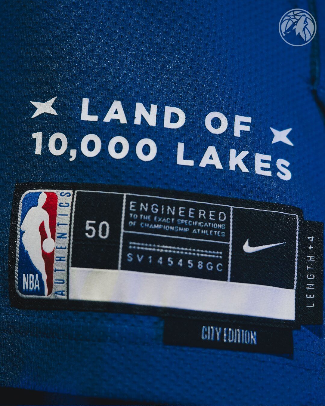
The Timberwolves also produced a hype video, which gives some additional looks at the uniform. You’ll note there is a blue silicone Minnesota logo on the waistband. The team notes, “The custom crafted artistic pattern features a vivid lake water texture that was handmade in Bloomington, Minn.” The bottom of the jersey and the side of the shorts are emblazoned with “Land of 10,000 Lakes.”
The team has not yet announced when the “City” alternate uniforms will be worn.
Here are some additional photos:


If you’d like to know more about the uniform, click here.
I’ve got nothing nice to say about this.
Reminds me of the gradient NFL pro bowl unforms from the early 2000s. And that is not a good thing.
I always enjoy hearing from UW staff regarding their opinions on uniforms, but in this case it’s refreshing that there’s no discussion lamenting the “storytelling” BS that is so prevalent in modern sports.
“OK then” is the perfect way to deal with it.
Just the facts, ma’am!
Well, I thought I’d just let *their* storytelling suffice.
Also, I *usually* hold of on giving opinions on newly released unis (not always, but more often than not) until I see them on the diamond, gridiron, court, ice, pitch, etc. before rendering a final judgment.
The amount of alternates the NBA churns out (and our complaints about them) is well known and documented. Just add another alternate onto that piling heap.
“Just add another alternate onto that piling heap….”
…of……
A. Historic Fails
B. Obscurity
C. Incompetence
D. Sh!t
100% agree. You can make a point about how stupid you think it is with a simple phrase like “ok, then” as opposed to fifty words on your distain for corporate jargon.
Why do NBA teams bother to have identies at all? Just change the colors and unis every game and let people try to figure it out.
They don’t do that already? I thought that’s been policy for a few years.
I’ll confess I have no idea what the regular Timberwolves uniforms look like. But I can’t believe they look any better than this. I like it! It’s a little too busy in the area of the NOB, but that’s my only beef.
It’s not too busy in the area of the number on back, and that’s the only part that concerns me.
OK then…not bad.
it’s an ok jersey but you can tell they’re running out of ideas
Garbage.
Historically, have gradients ever looked good on sports uniforms? Even the original Devil Rays fall more into the “so bad they’re good” category and reminiscent of a very particular time, like the White Sox going with shorts and wide collars or the Phillies’ “Saturday Night Specials”.
So why do they keep trying this?
Yuck. Looks so minor league.
Solid concept but awful execution. Could have easily done something similar to the Jazz’s desert nights gradient uni but with white to increasingly darker blues (ya know like the depths of a lake or something) but instead they went with this half-assed jersey and practice shorted combo. Disappointing.
Looks like a copy of FC Cincinnati’s “River” home kit.
They are the Lakers again.
No, don’t! Next they’ll also change their color to purple and gold (neon yellow, at that) and pretty they’ll be Utah 2.0. Ever seen a purple wolf?
Ever heard jazz in Salt Lake City?
Call me nuts, but I actually like this. Wish the shorts had a little more contrast and the wordmark is underwhelming, but it does feel local.
Oddly this is the 2nd nautical idea Nike’s made in a year. The Wizards Cherry Blossom has a tidal basin motif at the bottom. I didn’t really like that execution as much as I do this one.
Woof.
Feels to me like “look what we can do with printing now!” Lord help us when this makes its way into MLB…
It’s, um…
already there
link
Instead of tackle twill, embossed, heat-pressed or glued-on team names, NOB, jersey numbers (front and back), NBA Logo and patches (ads and/or to commemorate a deceased player/owner), can they sublimate them at this time yet? In other words, have they found a way to do it (the technology) efficiently and able to be as legible as if it were sewn on, as well as “CAN THEY” in case they need league approval?
Weren’t the Chicago Cubs made to change their road uniform after the 1990 season because the “CHICAGO” lettering on the front was deemed too small? Isn’t this lettering slightly smaller?
They were made to do that? I always wondered why they did it… the 1990 font is Lubalin Graph, seen here:
link
…which they had been using on programs and scorecards for several years in the ’80s, so they were expanding on that look, and then they distorted the letters with the ’91 version. After that they couldn’t settle on anything, moving to the “Cuba” font and then only in 1997 to a variation of what they have since stuck with for a quarter of a century.
And in ’97 they moved away from Lubalin Graph on the scorecards, never to bring it back. Today’s scorecards have better photographs, but they’ve been using generic fonts ever since then.
So to go back to Minnesota, I really like that letter/number font they’re using right now and would hate to see problems with the letter size cause them to move away from it and take on a whole different look.
Different time, different type of jersey, different league, different sport… not sure what the relevance is.
Aesthetics…..its the reason this site exists…..and I Get It
But it’s not simply aesthetics that M was trying to compare. What happened with the Cubs back then is completely unrelated to what’s going on with NBA uniforms today. MLB uniform regulations of the early 1990s do not apply to NBA uniform regulations of the early 2020s.
Of course it’s ridiculous to “celebrate…summertime fun” with a uniform for basketball, a winter sport, but is anything Nike does NOT ridiculous?
Basketball is only a winter sport by arbitrary convention. There’s nothing inherent to cold weather about the sport like, say, hockey or bobsled. Notice that basketball is played in the summer Olympics, not the winter games.
Not to get too in the weeds, but James Naismith invented basketball to have a sport that could be played in the gymnasium during the cold winter months.
Reminds me of the 2020/21 Bucks blue unis.
This is some “boys and girls club regional invitational skills competition sponsored by crystal pepsi” level nonsense. Between these and the wrinkly MLB all star unis, someone with decision making power at Nike is being duped by those social media ads for sublimated tshirt designs. What’s next? Unis with giant glamor photos of dogs and cats on them? Unis with optical illusions that make it look like the shirt sinks into an infinite void? Oh wait… that’s minor league baseball. Teams and leagues need to stop spending minimal money on maximum variations and start spending the maximum money on a few un options. Maybe then the unis would at least look like they belong on professional athletes who get paid millions of dollars for their skills, rather than looking like highschool kids who won a raffle to try a trick shot at halftime.
They should change their name to the 10,000 Lakers!
Wolves have just never had the unis fully dialed in. Yes, the trees collar jerseys have strong nostalgia appeal and the Prince editions were great, but overall the history here is bleak. It’s a bummer that no one has been able to truly figure out something that can stick and is timeless.
These newest ones are just Nike being Nike, we can all move on quickly.
Why do they have a player like Reid be a model with that terrible t-shirt on? And why do they allow players to wear these t-shirts?
Not bad but I would not want to buy one: it looks too tacky. At least the 10.000 lakes thing is accurate for the region of the team. NBA uniforms are a buckshot: hundreds of pellets and just see which ones hit home with fans. A sad state of affairs. As stated above: invest in high quality design, materials and overall product quality instead of releasing piles of gaudy, tacky stuff with a very short lifespan.
Well, it’s… blue. The storytelling is getting in the way of “making a good looming jersey.” Tires neither classic not distinct, my 2 categories for a good uni. I’ve forgotten the details by scrolling down to the comments. It’s the stand-in for a “create-a-team”. Bah
Between this and the Warriors’ flower uniform, I really hope photorealistic graphics aren’t going to become a uniform trend.