
Good morning, Uni Watchers. I hope everyone had a good Saturday (even if you “lost” an hour overnight).
We’ll begin this morning with the second in a series called the “ProLine NBA Refresh Series,” which is described below. Unlike some of the past offerings, this one includes full uniforms (well, not socks) for the Eastern Conference teams in the NBA. Last weekend, we looked at the concepts for the Western Conference. If you missed the set up for this series (and the “System of Dress” each team receives), click that link. Now, let’s take a look at the Eastern Conference!
Welcome to Part II of the ProLine NBA Refresh Series, a conceptual journey through a total transformation of the NBA uniform landscape, concluding with the Eastern Conference. For this series, we’re embracing “maximalism” with bold, audacious designs and a spectrum of vivid colors, reimagining each team’s visual identity – even if only through minimal tweaks to already great uniform sets. Central to this evolution is the introduction of a new “System of Dress.” This innovative approach ensures a dynamic aesthetic landscape, allowing classic fan favorite designs to reemerge with freshness alongside core styles. While iconic teams like the Lakers and Celtics might seem beyond the need for dramatic changes, we’ve playfully explored updates for them too, underscoring our commitment to refreshing every team in some manner. In this second part of the series we’re also showing a few ideas for Champions and Christmas Editions, which we may revisit in a future series for the entire league. We hope you enjoy viewing this series as much as we enjoyed creating it. And remember (before you react too strongly) — this is just for fun.
Celtics
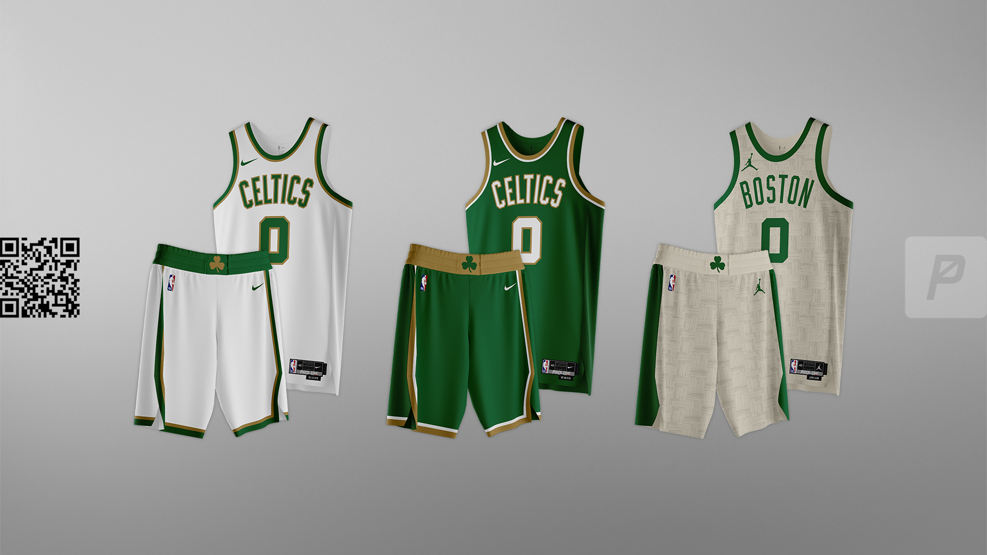
Gold is a part of Celtics culture. Champions wear gold, and the Celtics have earned the title of a championship team.


Pistons
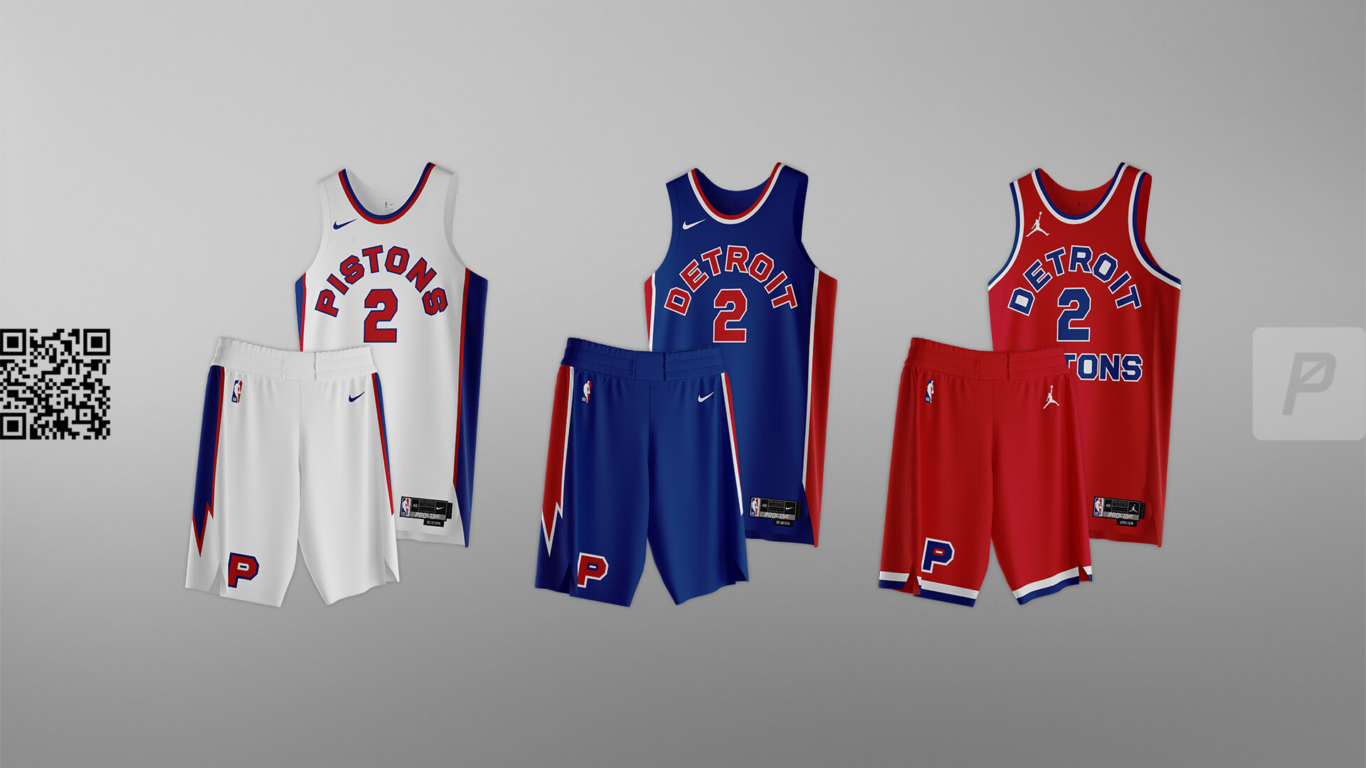
A mashup of old and new. The new font from the “Statement Edition” is set to the style of the Zollner Pistons jerseys design with a lighting bolt down the sides.


Wizards
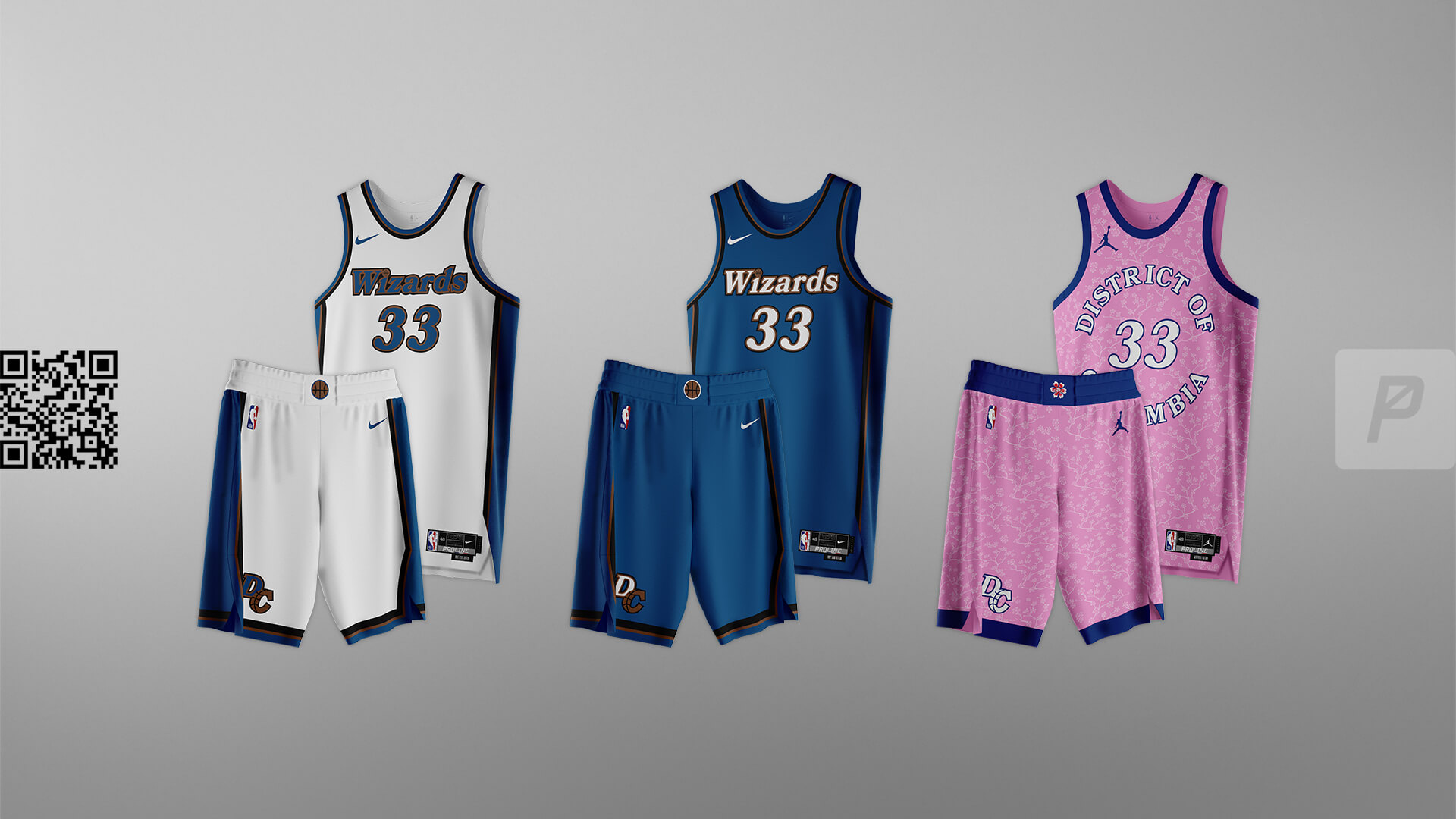
Throwing it back to their original color palette with a “modern classic” look for the Core set. The Alternate leans into the pink/cherry blossom vibe.


Cavaliers
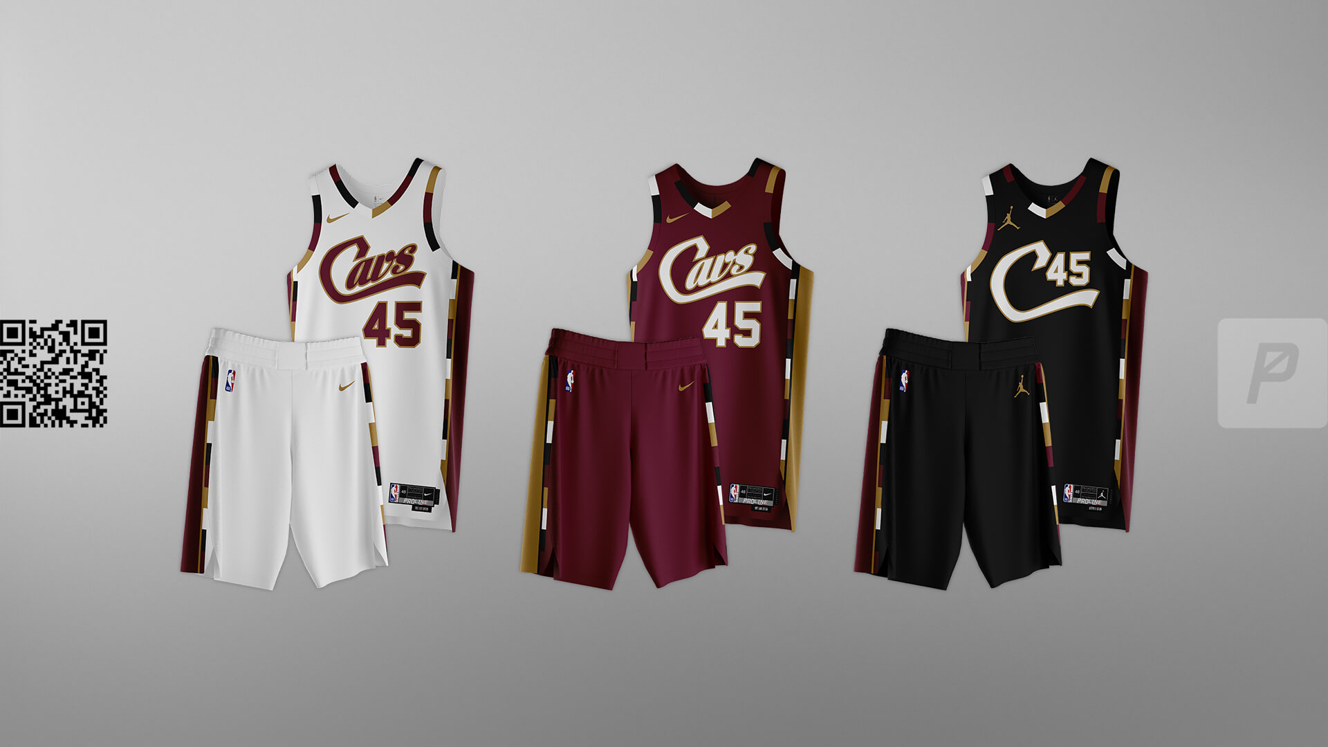
Combining the famous ‘Cleveland’ landmark in Edgewater Park, the fan favorite alternate used from 2005-2010, and the current color scheme.


Hornets
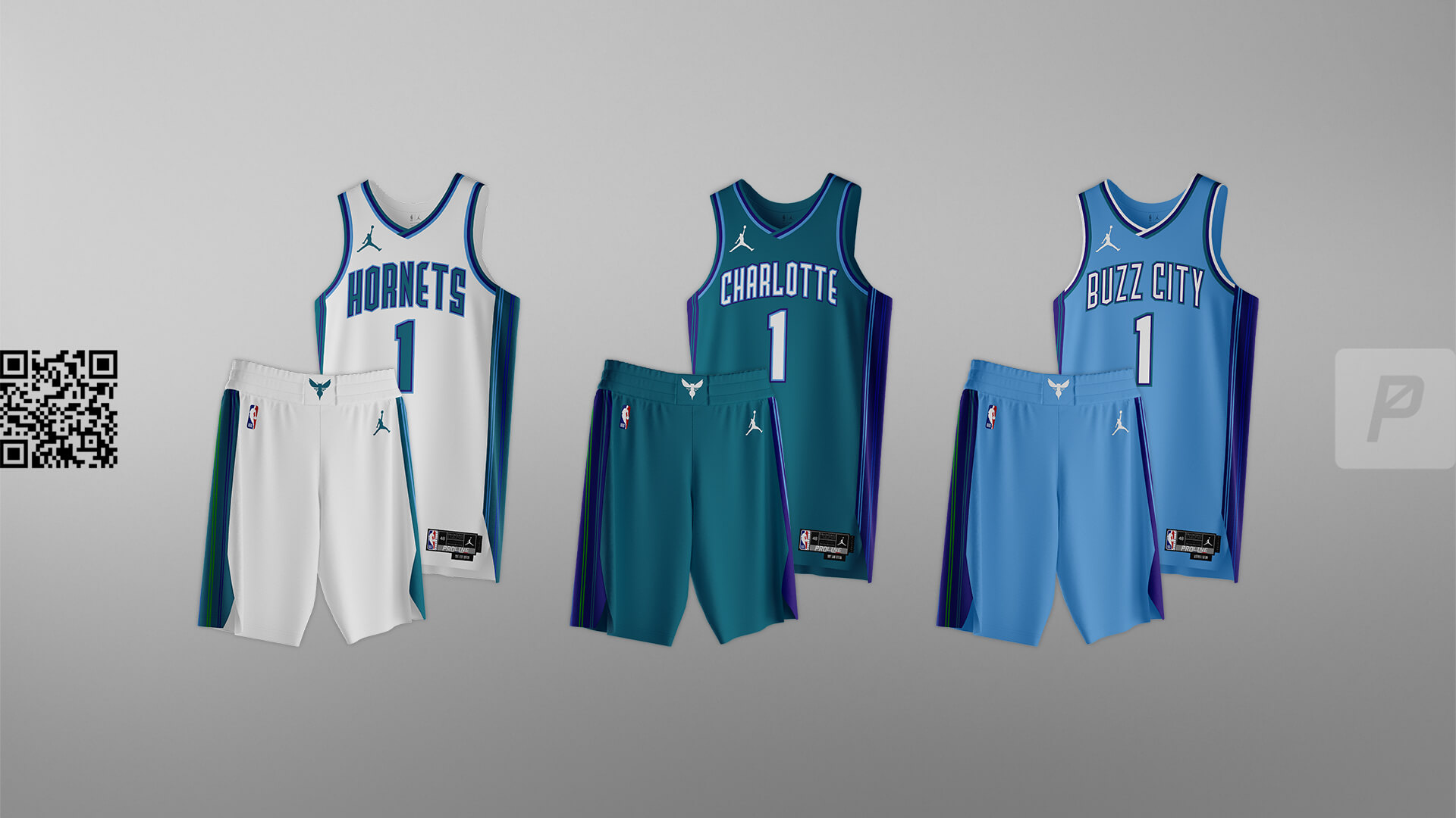
Bridging the current Hornets with the original with the use of the font used in the early 2000’s.


Heat
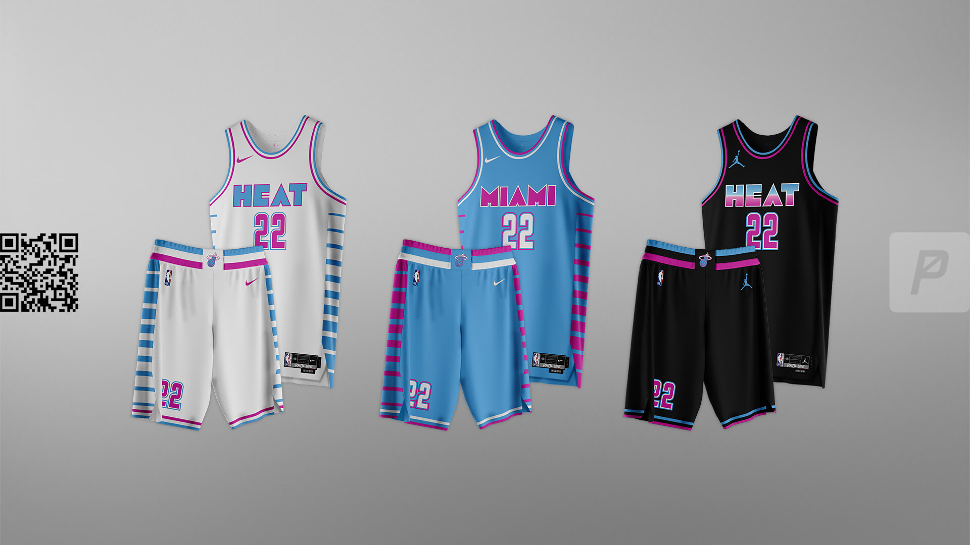
Another team that has a “thing” of their own, the Vice theme just screams “Miami” at the top of its lungs. A step away from the muted reds and yellows to a bold set that would be unique and instantly recognizable.


Bulls
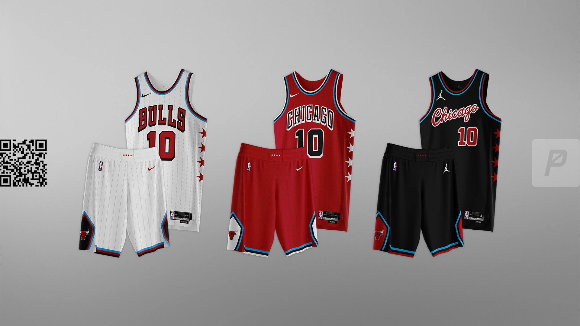
.
Not trying to depart far from the classic look with the addition of the stars and light blue from the Chicago flag. Another team that doesn’t necessarily “need” change but for the sake of this series we made some adjustments that could work.


Hawks
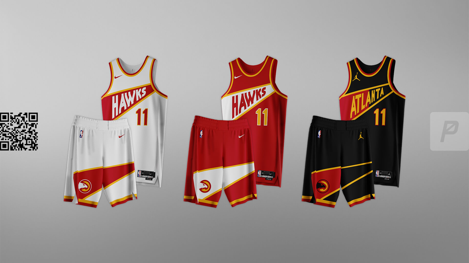
A blend of eras, this set harkens back to the Dominique Wilkins era with a modern vibe. Curves are replaced with sharp angles to create a unique template that still looks like the Hawks.


Knicks
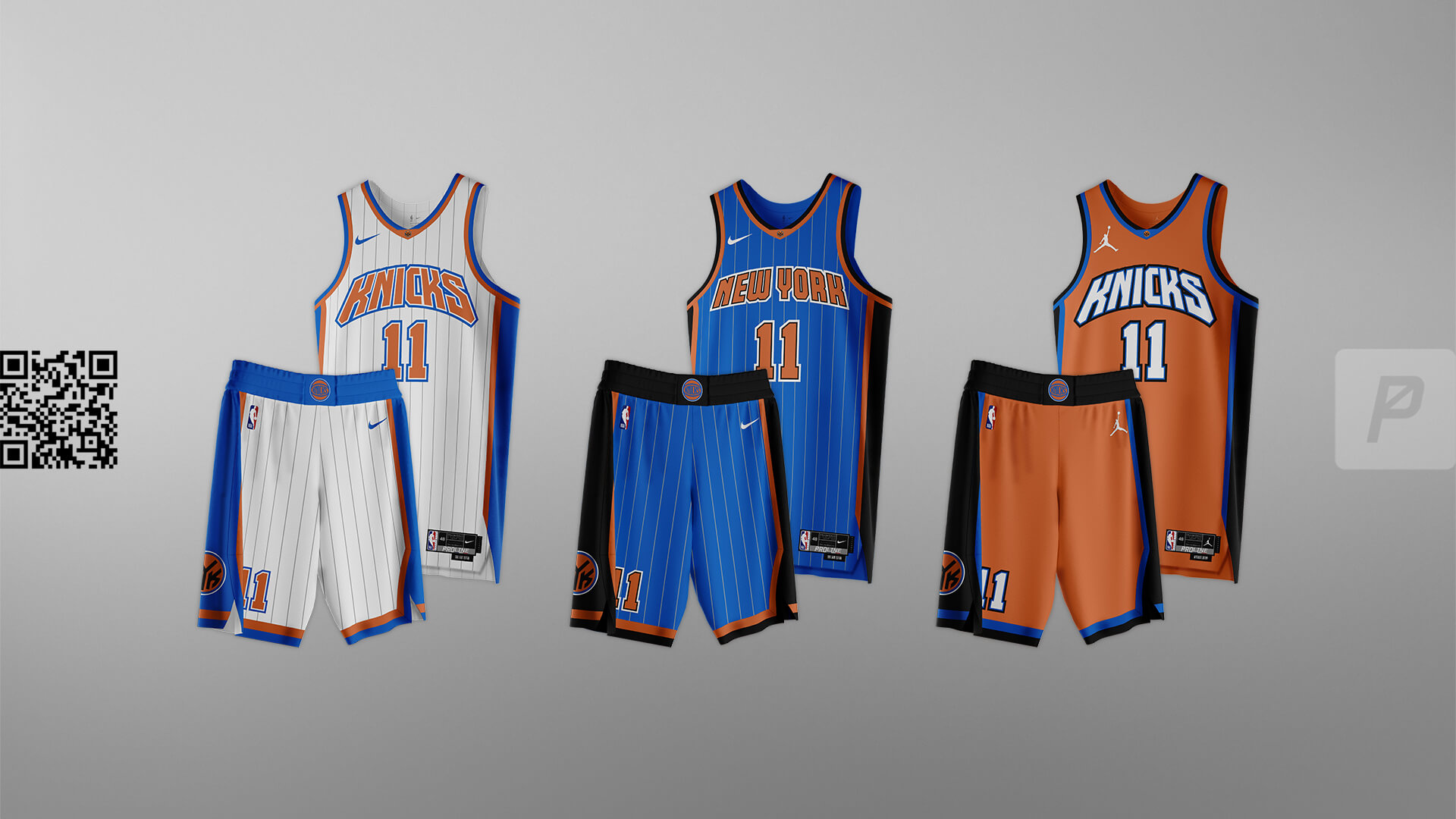
We took their awesome color palette and classic 90s uniforms and just gave them some updates – added pinstripes on the Core set, wordmarks from existing logosets – and an orange Alternate with a ton of pop via the bold, white wordmark and numbers.


Nets

A nod to public transportation. The Core set uses the subway map to Barclays Center on the sides, while the Alternate uses elements from public taxis and roads.


76ers
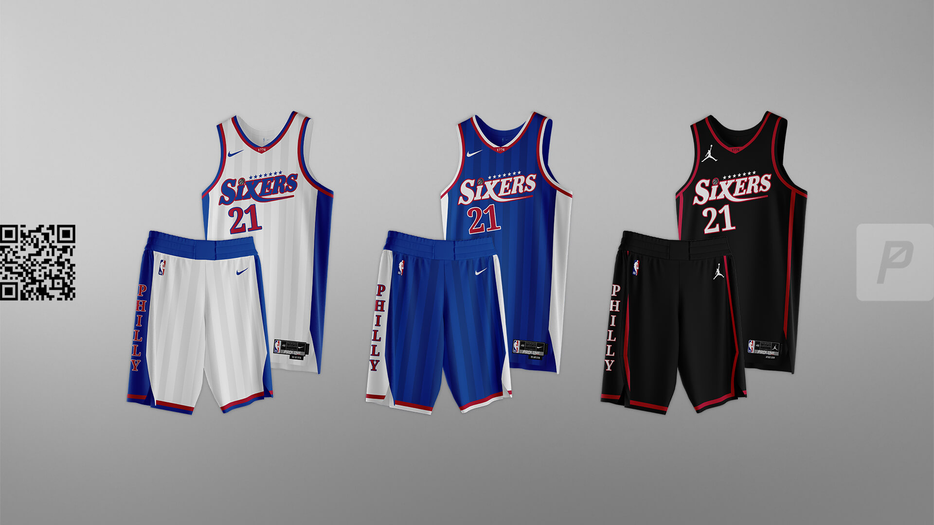
Our tribute to the wide-shouldered Iverson era, we created a custom wordmark for this set with “Sixers” on all of the jerseys and “Philly” on the shorts. Subtle two-tone striping on the Core set adds a unique element not seen elsewhere in the NBA.


Bucks
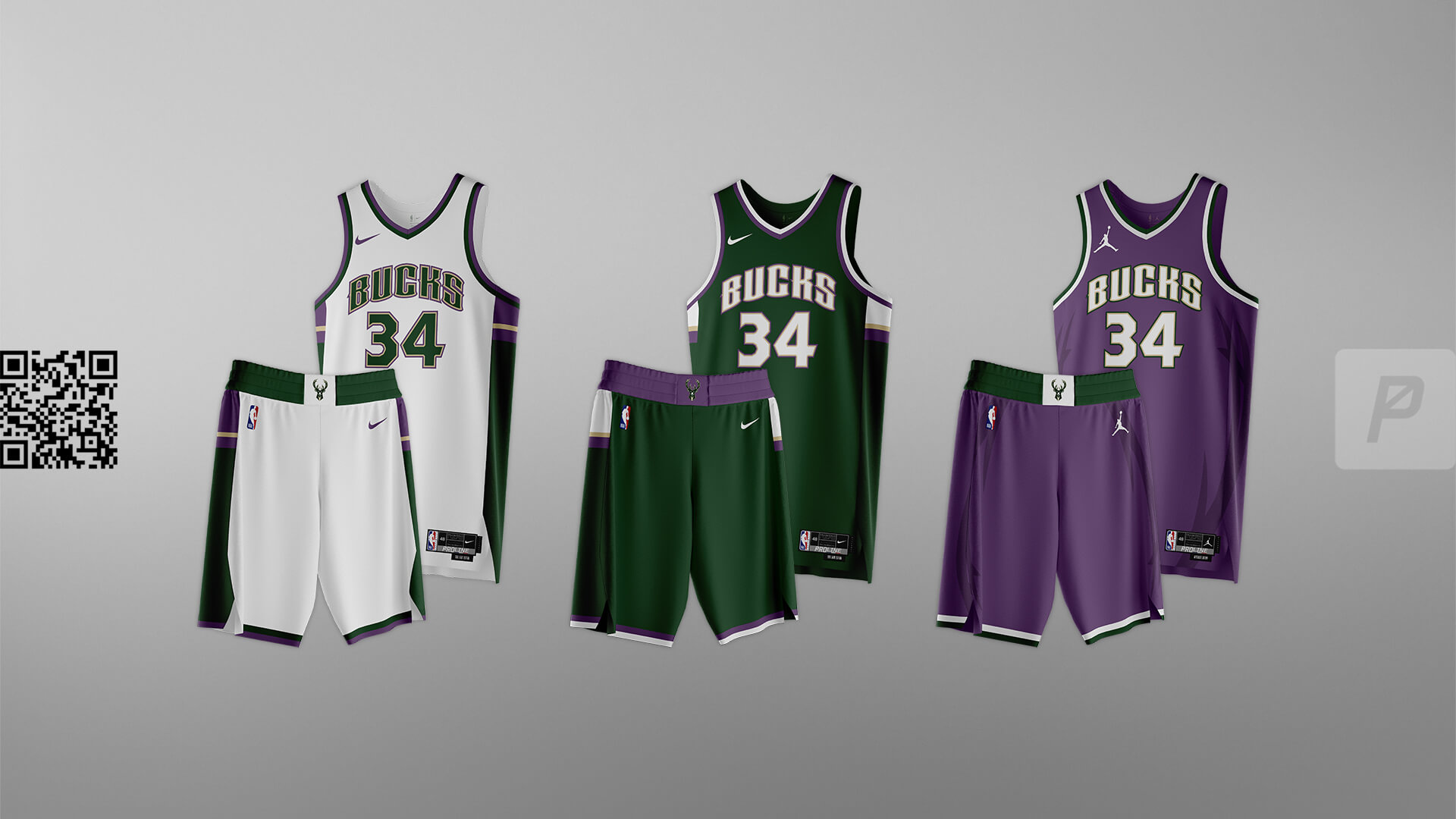
For this set we went back to the purple and green because it’s such a unique combo in basketball and feels woodsy – like it’s meant to invoke thoughts of deer and the outdoors. The Alternate includes sublimated antlers that the team has used recently.


Pacers
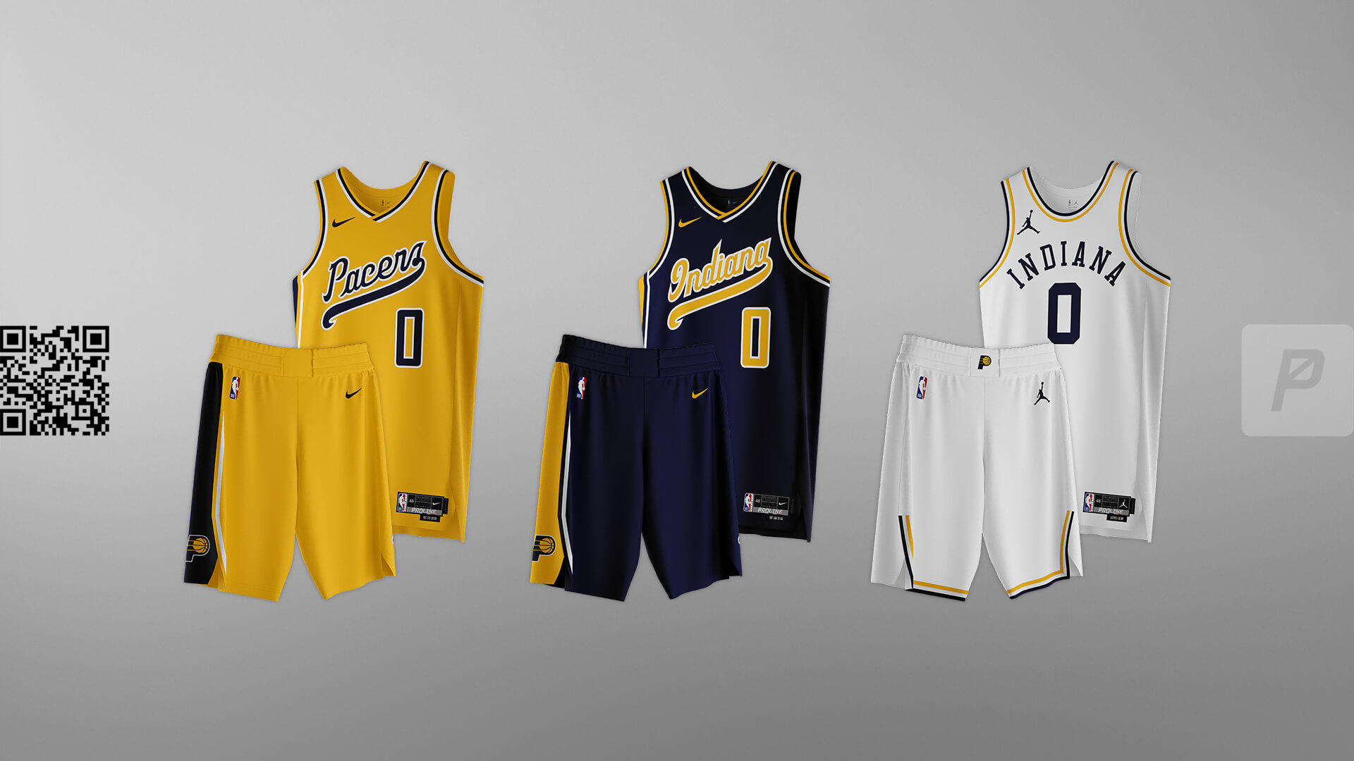
The classic script has been slightly updated and returned to the front of the uniform. The “Alternate” is a fauxback design to represent a classic style of Indiana.


Raptors
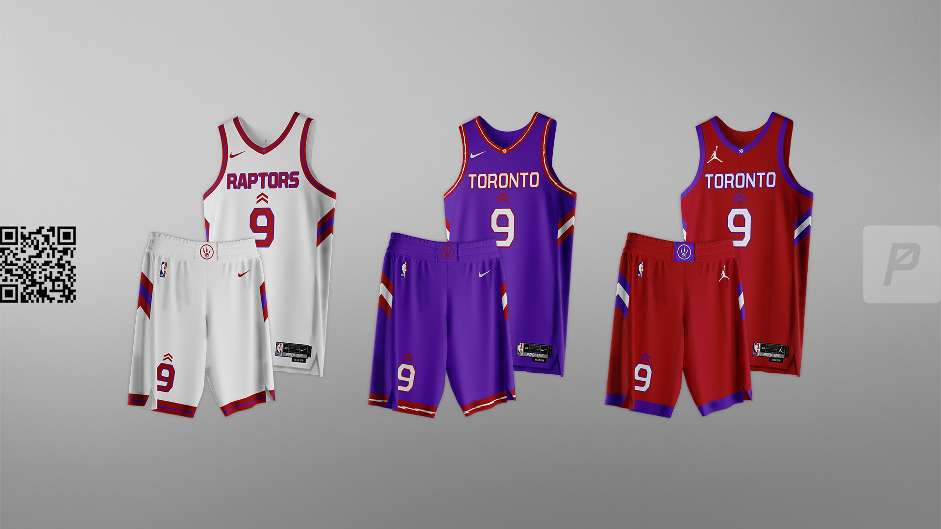
The Raptors need purple. It’s part of their heritage and works so well with red when done right. This set brings purple back and incorporates it with the team’s use of chevrons. The chevrons on the front of each jersey point north, either to the “T” for Toronto or the “O” for Ontario. Dino style striping appears on the trim.


Magic
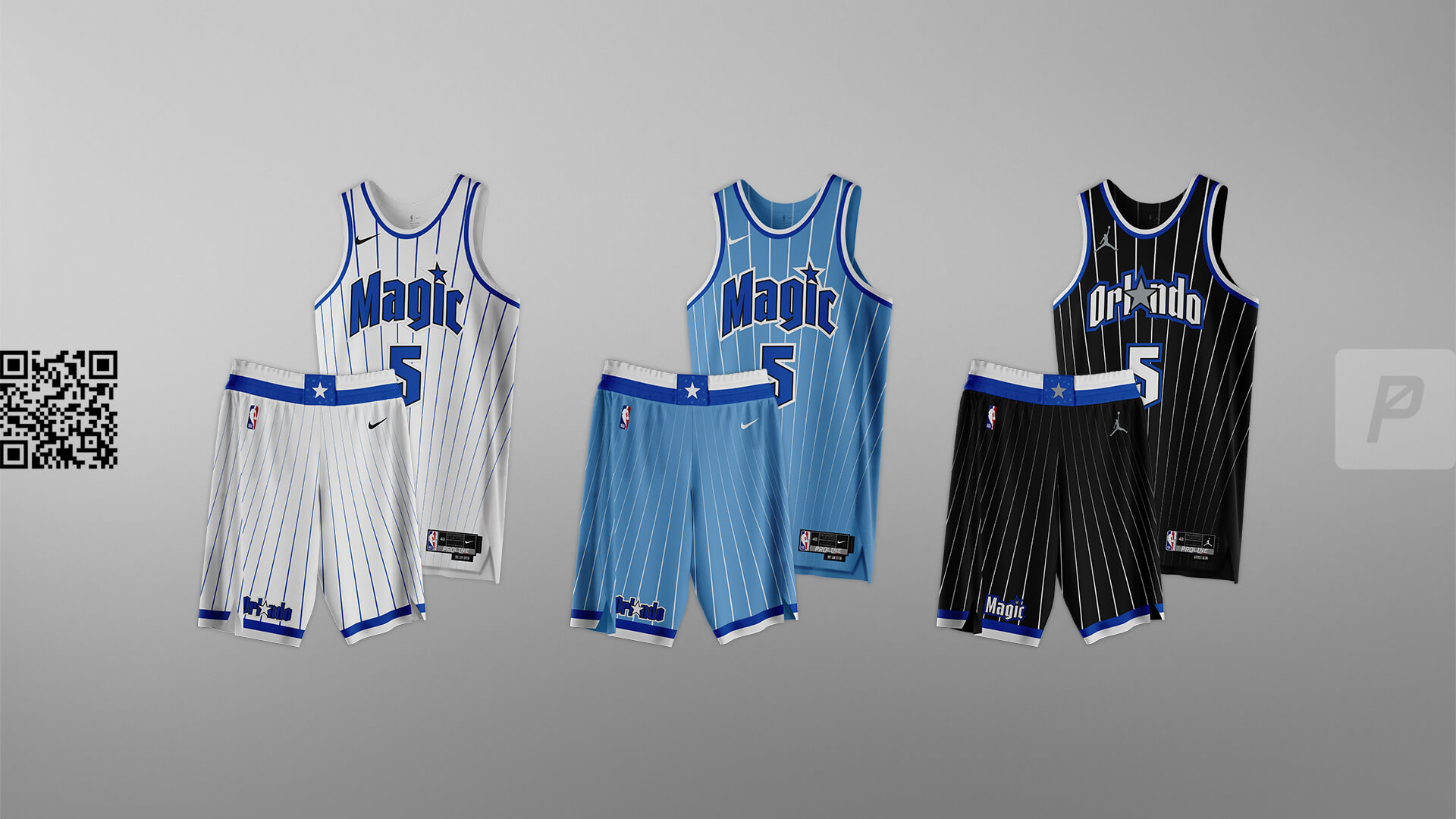
Another team with a “thing” of their own, the Magic should always have stars in the wordmarks and pinstripes. This look blends the past with modern styling, for a sleek yet bold look.


For the NBA Refresh Series:
Follow ProLine Mockups on Twitter and on Instagram.
Thanks, guys! Great second part of a very cool new series — and looking forward to the Champions and Christmas Editions. Let us know your thoughts in the comments below!


GTGFTU: 2019 Thanksgiving (11/28/2019): Chicago Bears 24, Detroit Lions 20; Ford Field.
GTGFTS
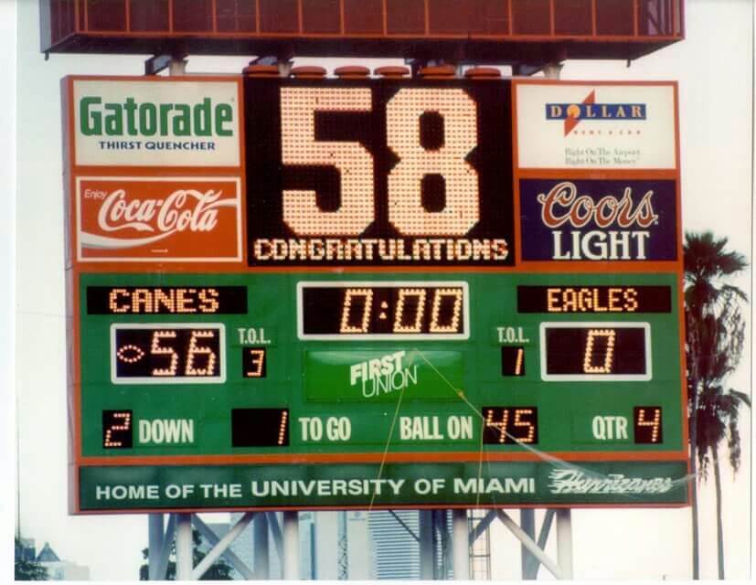
3 Sep 1994
Miami Hurricanes 56, GA Southern Eagles 0
The 58th consecutive win for The U in the Orange Bowl (RIP)
Three weeks later, Washington came in and beat the Canes 38-20 in “The Whammy in Miami,” ending that streak, where it remains unbeaten to this day.
Happy Daylight Saving Time!
The only reason I’m not responding grumpily to this is because I woke up to snow on the ground. Happy It’s Still Winter Time!
Love the Raptors and Magic concepts. Cavs and Knicks have one color too many. Overall, a very nice set today.
A lot of these are marked improvements for me. I wish Nike could understand that it’s often better to do ONE clever idea excellently, then mash in ALL the clever ideas haphazardly. The Chicago uni here is a great example. A full redesign would never fly for the Bulls, but the flag stars down the side are a simple and excellent addition without changing the fundamental look of a classic. Simplify quality of design and minimize quantity of uni sets.
These concepts combined a lot of elements in a way that generally worked.
I get what you were going for with the Pistons, but the extra white in the negative spaces of the letters on the red set attracts the eye but not in a good way.
I HATE “PHILLY” on Philadelphia uniform concepts. I get it, the city has a long name. But it looks wrong.
Not sure how a Carolina Blue Hornets set would sit among the Hornets fans who aren’t UNC fans (but why would anyone not root for the Heels?!). To paraphrase Michael Jordan, “State fans buy jerseys too.”
Love the Bucks, Hawks, Nets, Knicks, Cavs and Raptors especially. Nice stuff!
Never ceases to amazing me how someone outside the league can create fantastic uniform designs yet the teams and NBA themselves typically fall flat.
I realize from looking at many of these that I’m usually not a fan of teams that can’t figure out what their primary color is. For me the Pistons are a blue team with red trim, the Knicks are blue with orange trim, the Bucks are green with purple trim. However, since I’m not consistent with my “rules”, I do like the Suns having both purple and orange as a primary color, and don’t ask me to explain why that is any different than the Knicks. I also realize that some BFBS I’m not against, but the 76ers being a blue & red team should never wear black. Also, I like yellow as an option for uniforms like the Pacers. Since I grew up with the Lakers, I consider using yellow as a replacement for white uniforms.
Another 60 some odd uniforms for the NBA. Yawn.
Really cool ideas…especially like the take on the Magic and the less-stellar 76ers.
Missing the lack of pinstripes on the Hornets, and the Heat font has me longing for my old neighborhood movie house:
link
I’m not an NBA fan anymore so maybe my opinions don’t count as much but I really like these. I think I like all of them. Echoing some of what was said by others, but going with a style and then replicating it across all three Uni’s is refreshing.
I was fully prepared to hate what you did with the Celtics. But I actually like these.
Agreeing with most other comments. Overall, Very nice. These are good designs. Some “mash-ups” but a nice use of creativity and staying within the team or city branding.
I’m a Celtics fan and agree their correct accent color is gold not black. The old St Paddy’s Day uniforms are their best alternate. I liked the 2019 “Irish Pub” City Edition (the font was bad, but the green & gold were great). Also, the Celtic knot style basketball/shamrock from that set was beautiful and it should be one of their full time logos.