Good morning, Uni Watchers. I hope everyone had a good Saturday!
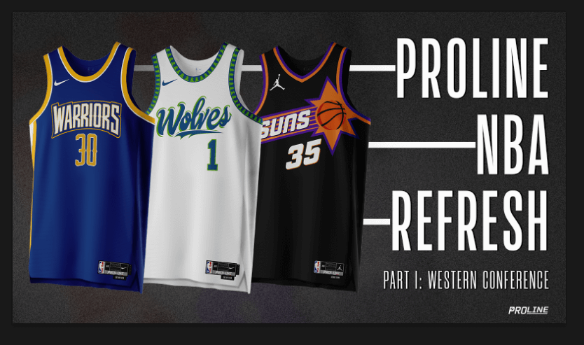
We’ll begin this morning with the first in a series called the “ProLine NBA Refresh Series,” which is described below. Unlike some of the past offerings, this one includes full uniforms (well, not socks) for the Western Conference teams in the NBA. Enjoy!
Welcome to Part I of the ProLine NBA Refresh Series, a conceptual journey through a total transformation of the NBA uniform landscape, starting with the Western Conference. For this series, we’re embracing “maximalism” with bold, audacious designs and a spectrum of vivid colors, reimagining each team’s visual identity — even if only through minimal tweaks to already great uniform sets. Central to this evolution is the introduction of a new “System of Dress.”
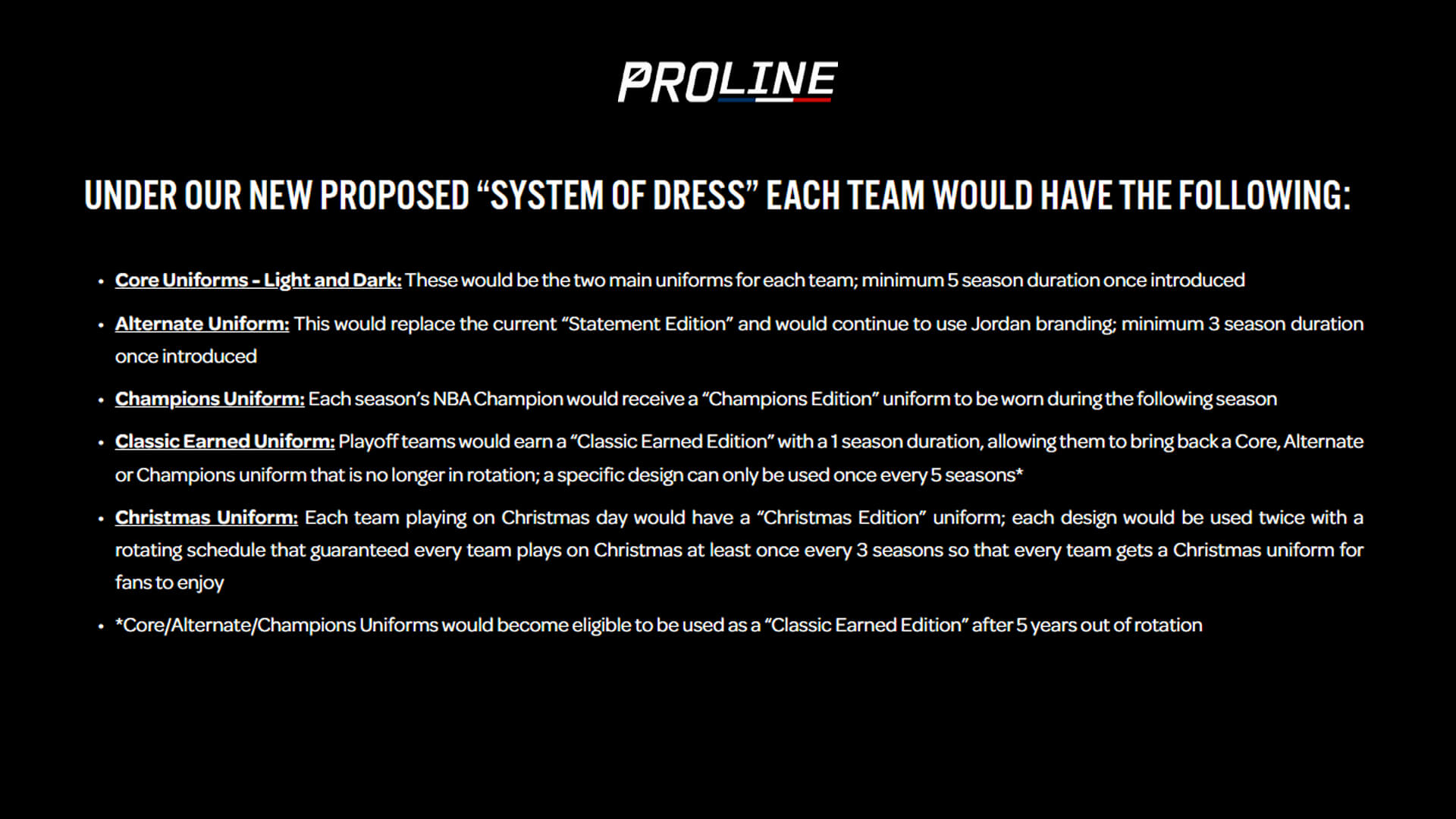
This innovative approach ensures a dynamic aesthetic landscape, allowing classic fan favorite designs to reemerge with freshness alongside core styles. While iconic teams like the Lakers and Celtics might seem beyond the need for dramatic changes, we’ve playfully explored updates for them too, underscoring our commitment to refreshing every team in some manner. This project leans into the distinct identities of each team, setting the groundwork for the exclusive Christmas and Champions Edition uniforms, which will be unveiled in Part II of the series. We hope you enjoy viewing this series as much as we enjoyed creating it. And remember (before you react too strongly) — this is just for fun.
Lakers
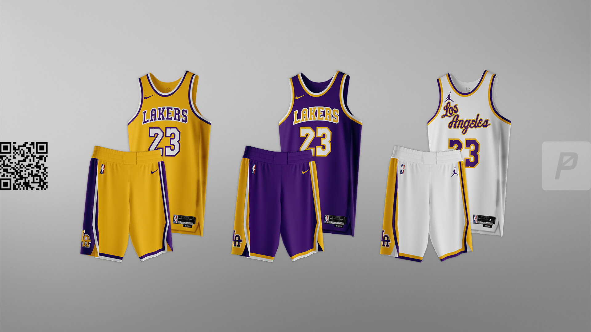
A fresh take on the Lakers that leans into a richer “gold” color. We created a custom wordmark based off the number font used for many years. This is more of a “if we had to” approach because the Lakers have such an iconic look.


Thunder
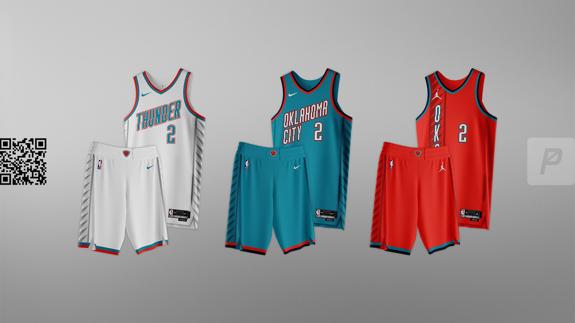
Bringing back the style of the previous “Earned Edition” wordmark and combining it with the color scheme from the widely popular Native “City Edition” – this set brings a bold pop that aligns with the team’s name and exuberant fan base.


Trail Blazers
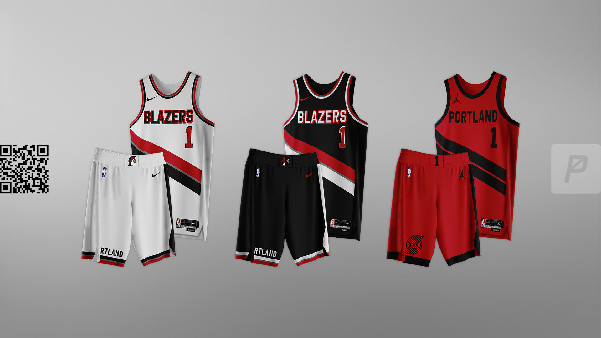
When you have a “thing” that is instantly associated with your brand, you lean into it. That’s the swash for the Blazers. Nothing too drastic here. Just a simple, clean update to create that sought after “modern classic” look.


Jazz
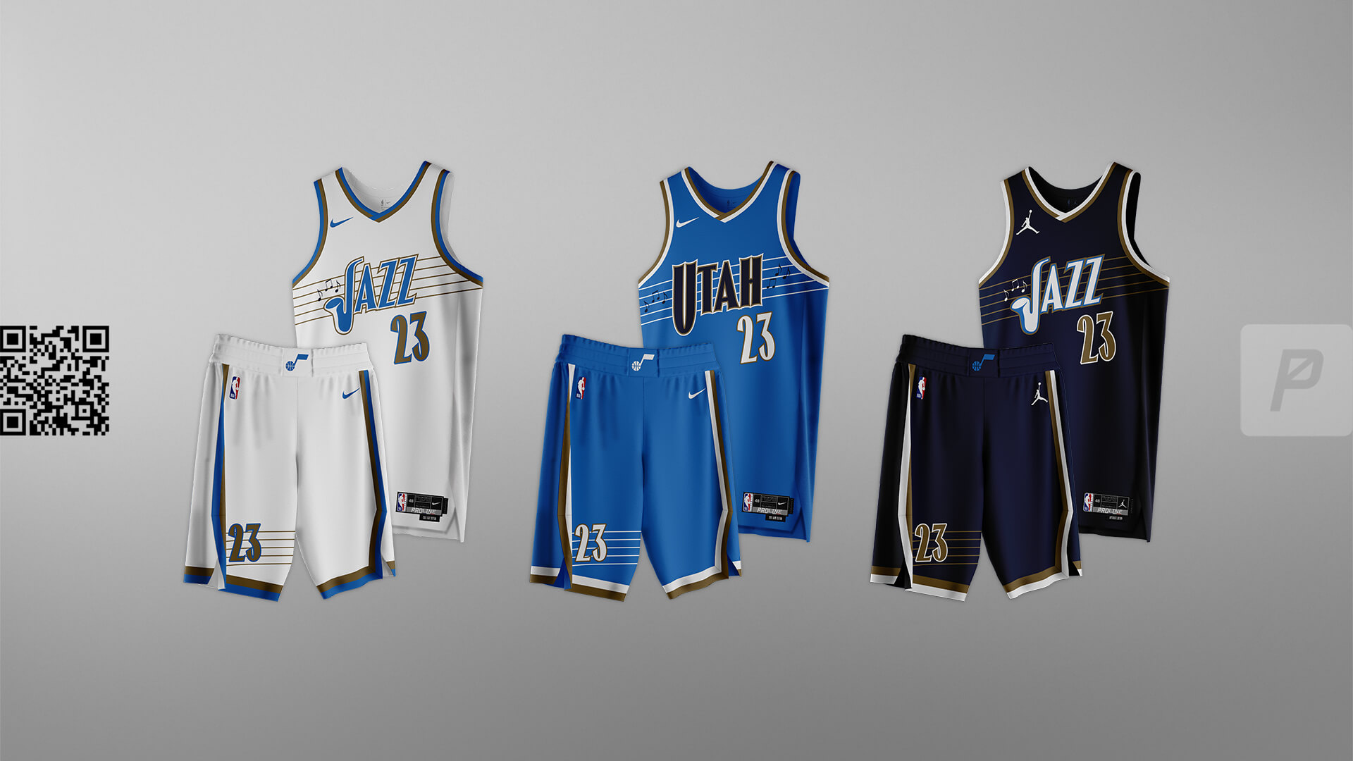
If you’re going to be called the “Jazz” you’ve got to embrace it and have a musical theme. Jazz is music, not mountains (we’ll show your our ideas for a name change later). This set it a playful take on a musical theme, creating a unique color palette and eye-catching designs.


Warriors
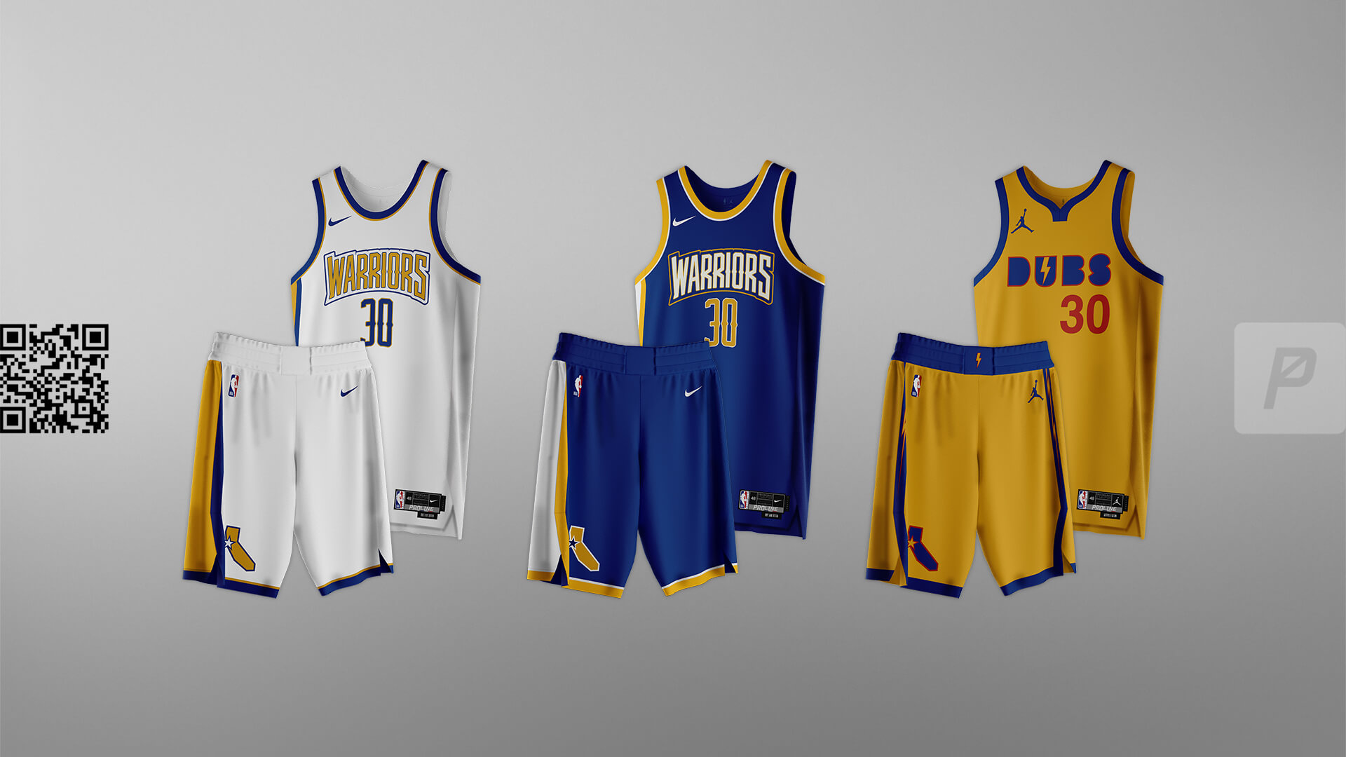
We wanted to do something original for a team that has had so many different uniform sets from different eras, all with some sentimental value to the fans. The Core set leans into the bold stylings of 90s NBA that remain popular to this day while the Alternate is a super-modern take meant to be visually distinct from anything else in the NBA.


Kings
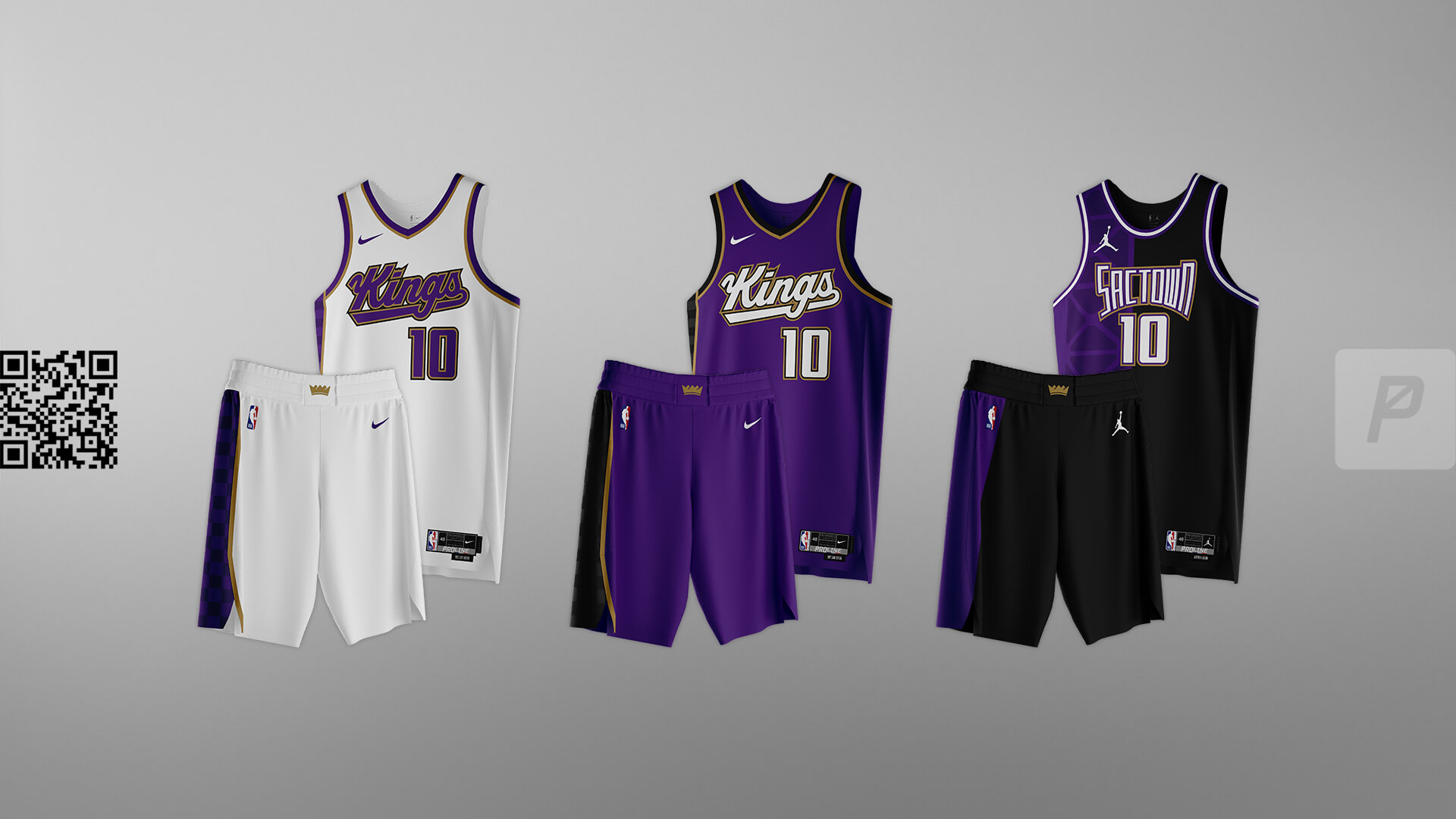
We did not want to fully depart from the team’s latest rebrand, because they nailed it. We added a light touch of gold and added ‘SACTOWN’ full time on the alternate. The alternate also adds elements of Tower Bridge which is located downtown near Golden1 Center.


Spurs
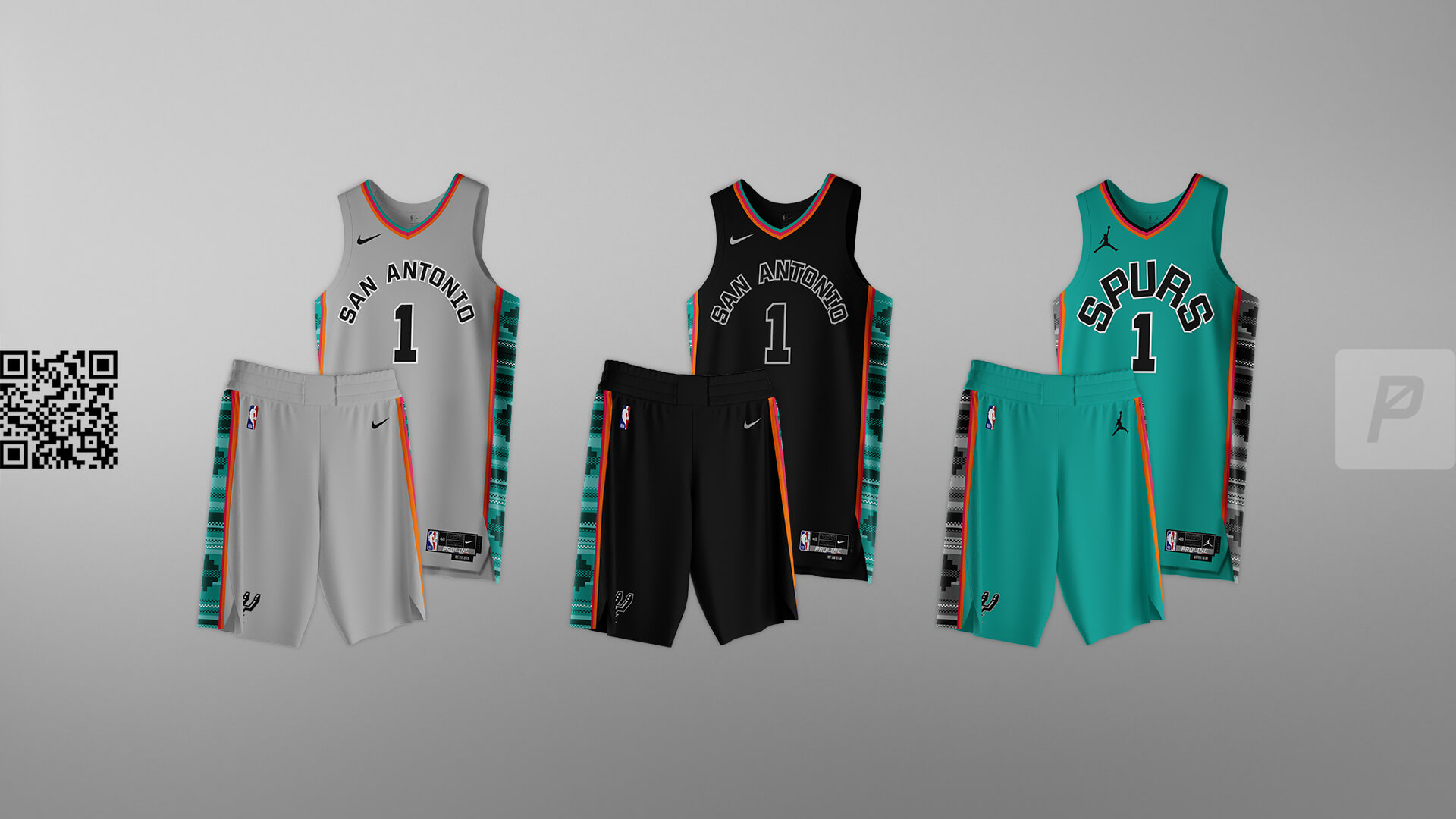
Wemby is unlike anything we’ve ever seen. He needs uniforms that pop like he does. For this set we used the current font, styled like the old ABA set while bringing the pattern from the recent “Statement Edition” and Fiesta colors full-time.


Clippers
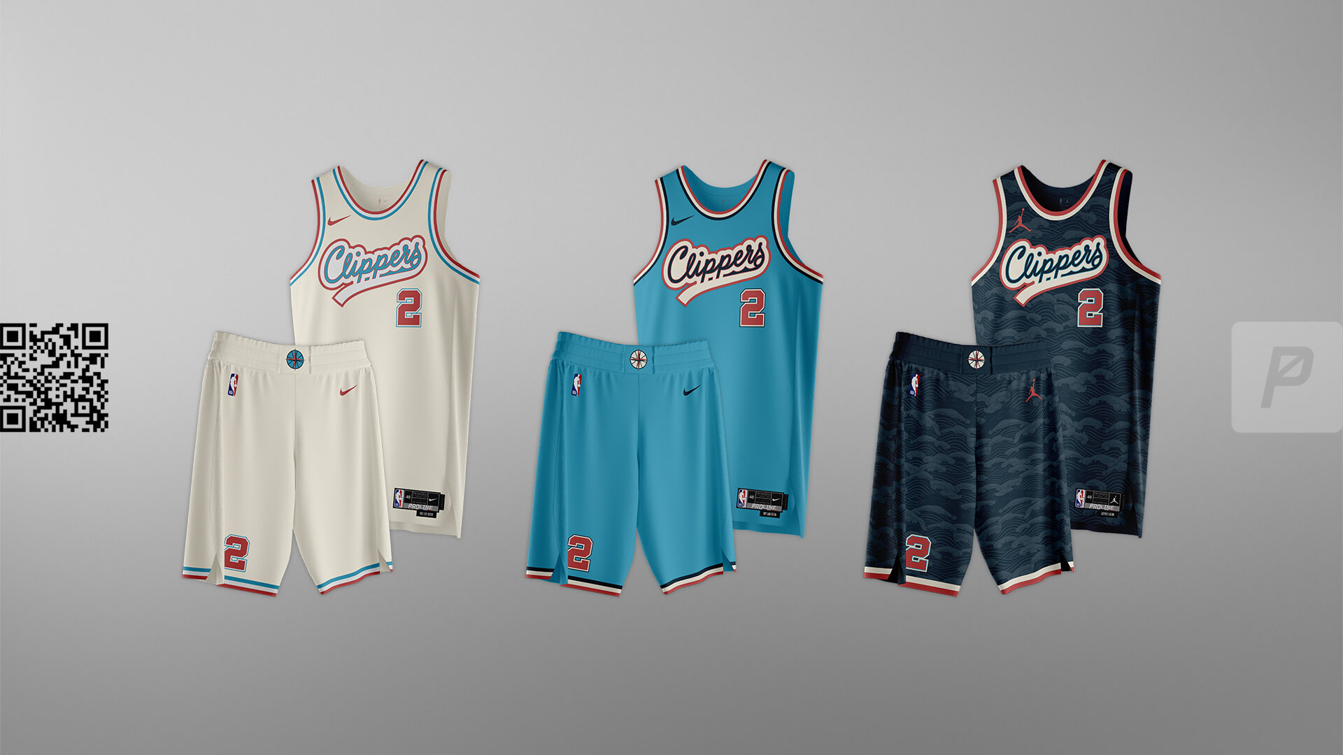
We finished this set about one day before the Clippers officially unveiled their upcoming branding changes and uniforms. We were pleasantly surprised to see that we had some similar.


Pelicans
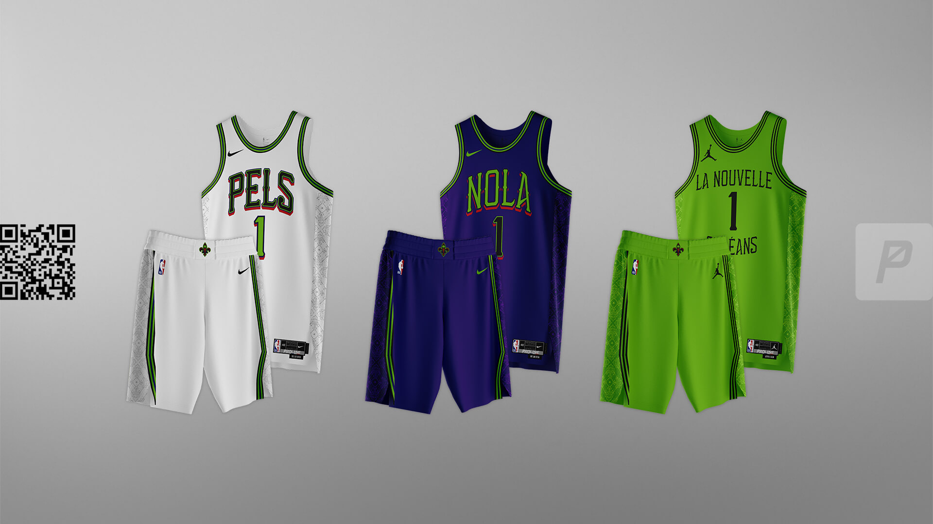
These design uses the font and color scheme from the newest ”City Edition” to bring a new and vibrant look to the league. The “Alternate” uses the French translation for ‘New Orleans’.


Mavericks
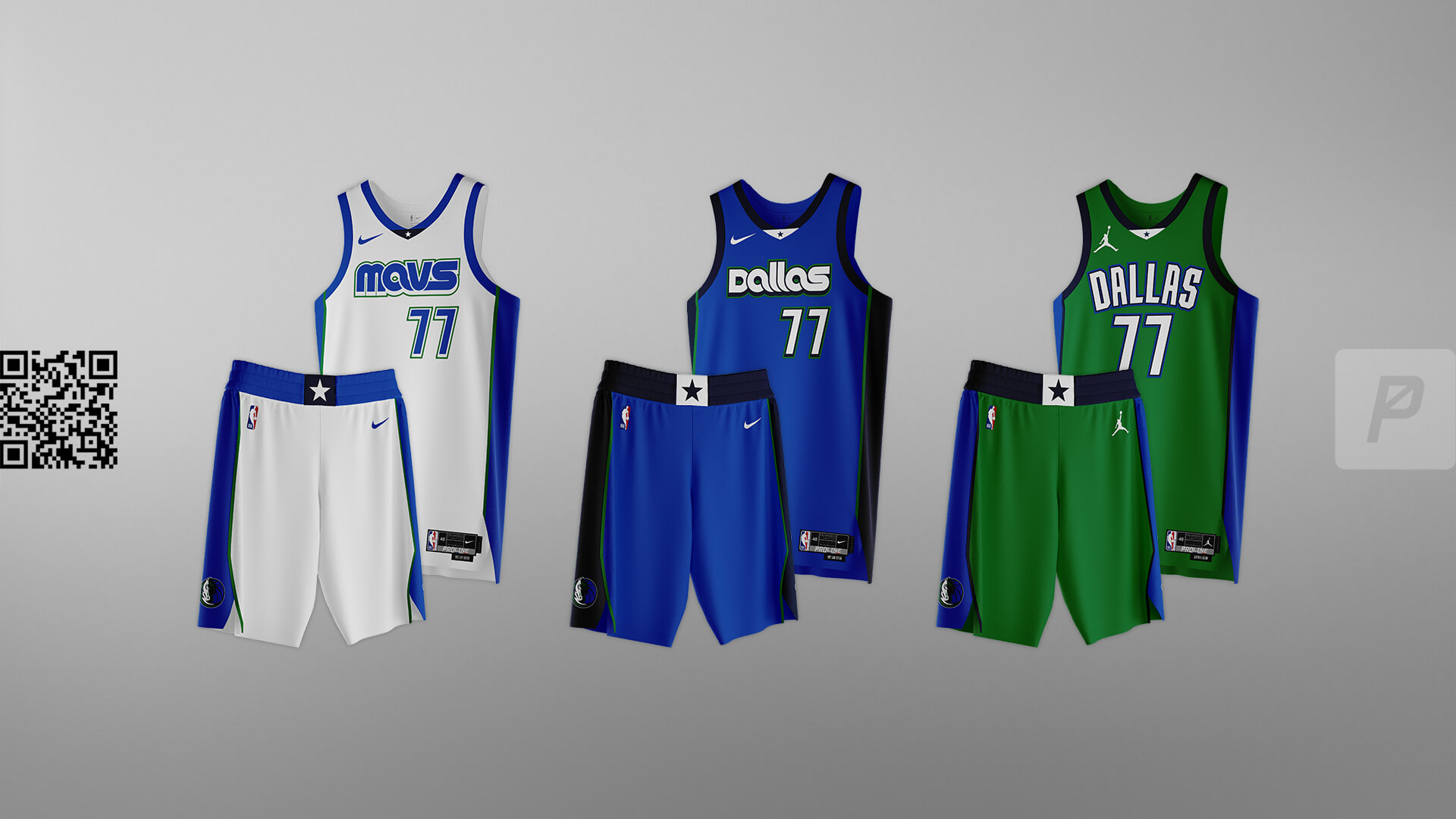
A retro inspired look with green returning full-time to add a much-needed pop. Luka needs a fresh and bold uniform to pair with his game.


Suns
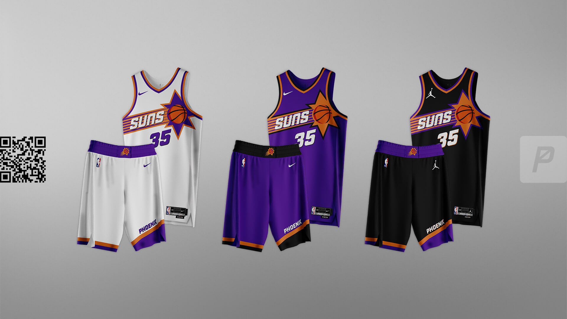
Their newest set is quite good, so just some subtle adjustments here. Show the full ball, modernize the 90s look and move away from the super-angled font they currently use. A black alternate is almost certainly coming, so we created one here.


Timberwolves
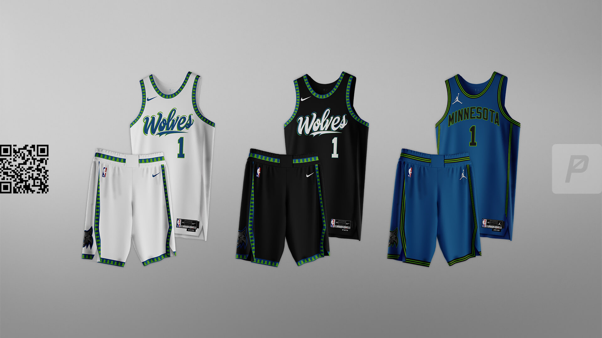
Much like the Blazers, the Wolves have a thing – and that thing is trees on the trim. Bringing the trees back and pairing with a scripty wordmark provides a unique look that would set them apart in the league.


Nuggets
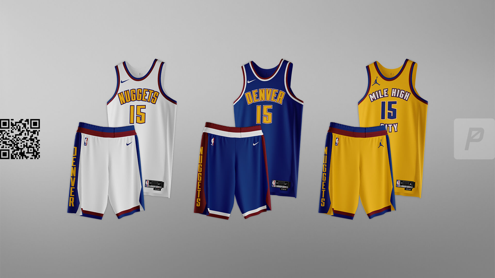
For this set we’re bringing a slightly updated font with the overall design similar to the set used from 1975-77. This set shows that a uniform can still pop when minimalist, just by using the right color combinations and values.


Grizzlies
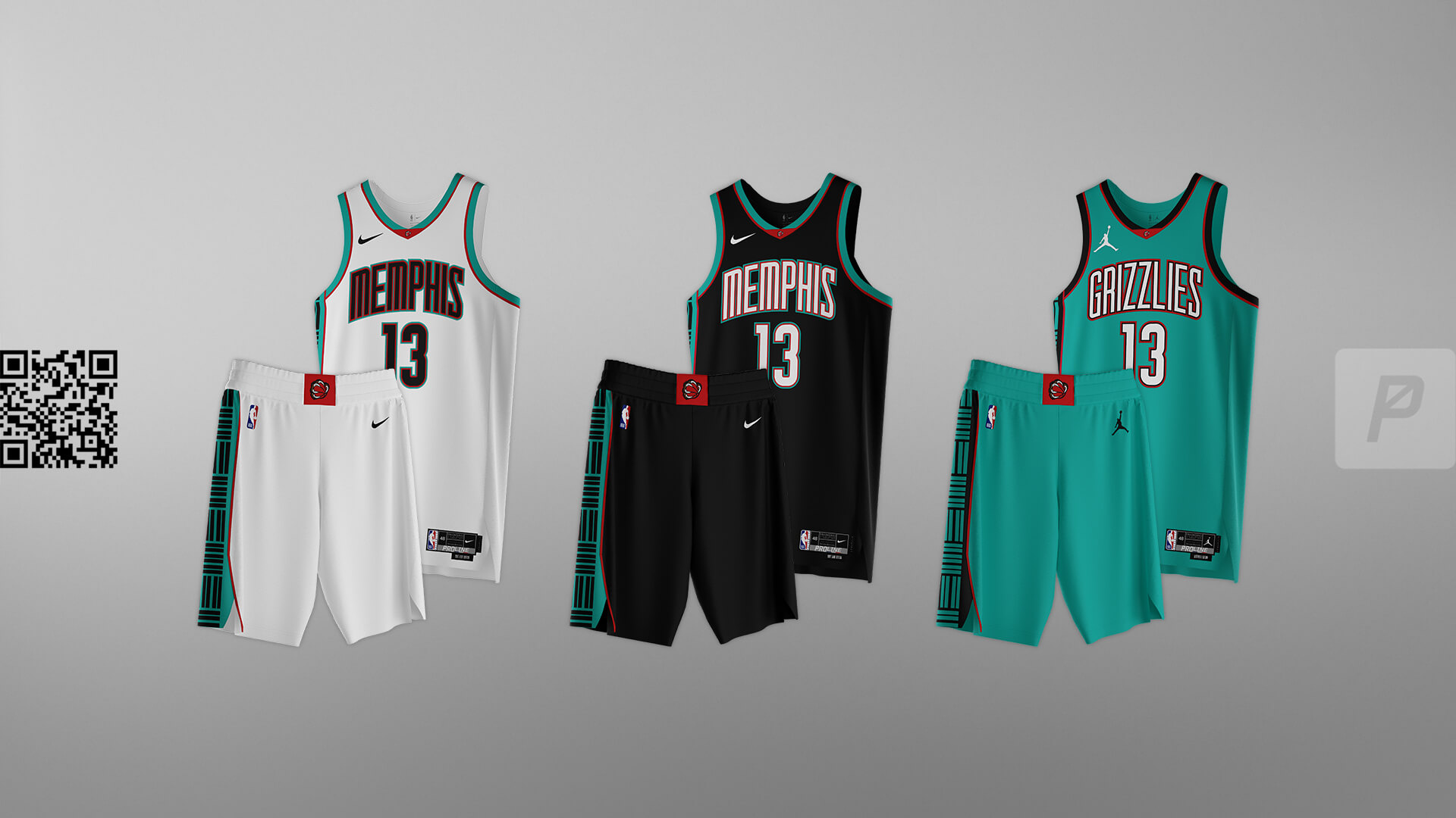
The Grizz have a perfect color palette in their arsenal. This set leans into it, bringing back the teal, red and black. The design uses the current font in the style of the set used from 1997-2004.


Rockets
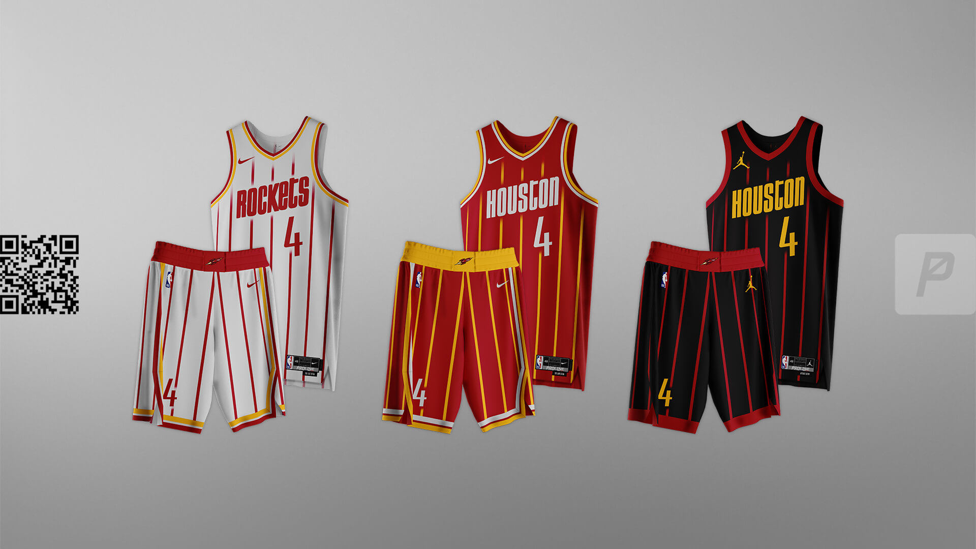
Ketchup and mustard all day, baby. The Rockets have some of the boldest colors available when yellow is included (think Kansas City Chiefs). A modern convergence of their multiple iconic uniforms is the perfect blend of past elements with modern styling for a completely unique and unmistakable look.


For the NBA Refresh Series:
Follow ProLine Mockups on Twitter and on Instagram.
Thanks, guys! Very cool new series — and looking forward to the Eastern Conference. Let us know your thoughts in the comments below!


Wordmarks are horrible on those NBA concepts. Just awful.
Ooof, yeah… had the same thought.
The ProLine concepts are hit and miss, imo. They explore some fun ideas and they’re fairly cohesive (major issue with the current NBA, imo), but the execution is very amateurish, especially many of the wordmarks.
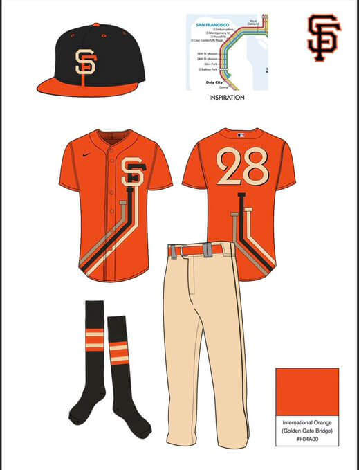
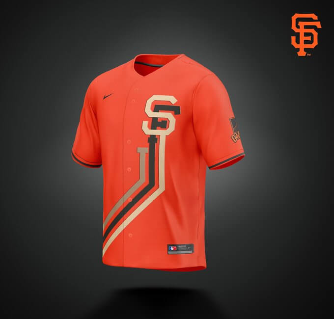
That Giants concept on the other hand is a beauty. Would love to see that on the field!
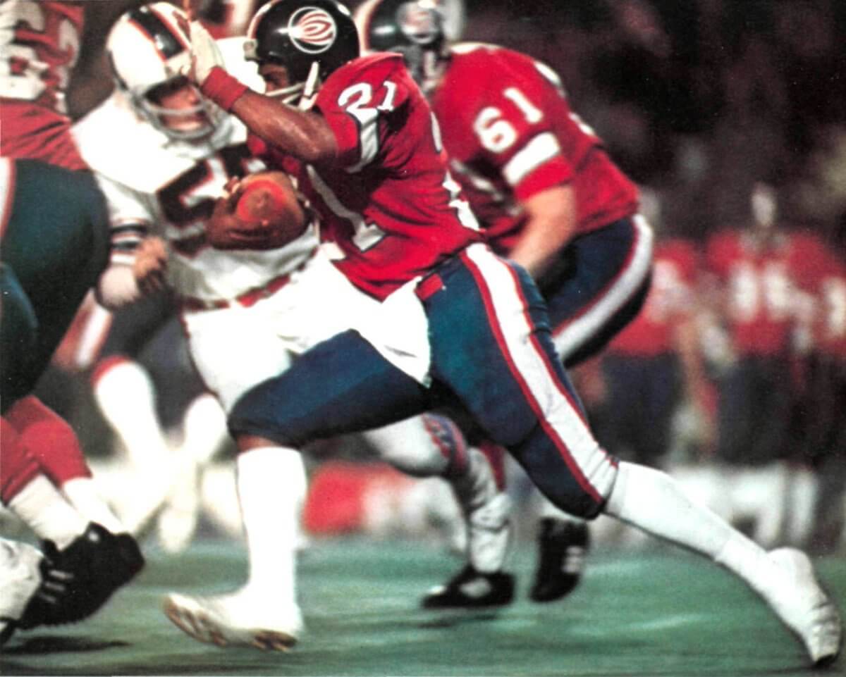
GTFTU is World Bowl 1 : Florida Blaze v Birmingham Americans 12/5/74
I enjoyed looking at the ProLine series. These are way better than most re-dos, although a couple of the dark-on-dark jerseys — Portland and Minnesota — are probably too hard to read from any distance.
Also, when I lived in Sacramento many years ago, the locals — and certainly the city leaders — generally did not like the various nicknames for their city: Sacto, Sactown, Sacratomato, That Place Halfway between San Francisco and Lake Tahoe. I don’t know if that stance has softened.
People from the Bay will call it Sacto, but “Sactown” is cringe everywhere.
Damn that Jazz uni looks sharp.
GTGFTS
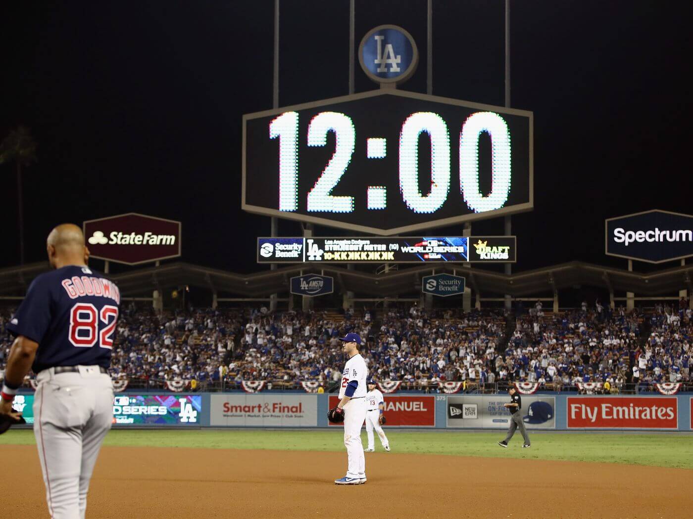
Game 3 of the 2018 World Series
26-27 Oct 2018
Julio Urias pitching to Eduardo Nunez with one out in the top of the 17th
GTGFTU
World Bowl I
5 December 1974
Birmingham outscores Florida 22-0 in quarters 1-3.
Florida outscores Birmingham 21-0 in quarter 4.
Tommy Reamon is the running back featured in the photo.
Like how the Suns jersey has an orange ball instead of a white volleyball.
Lots of great designs in here. I’ll agree with Marc that the Jazz uni looks sharp. I’d love to see that design rendered in their traditional purple, green, and gold team colors. If given the choice between continuing the NBA visual program as-is or adopting these Proline designs en masse for every team, I’d choose the latter!
Second Giants City Connect in two days that is better than the original, really like the use of the transit map, very clever
This is what the Suns new uniforms should have looked like. Not having an orange basketball, especially since orange is one of their colors, makes no sense.
I prefer the current Warriors uniforms with the circle and the bridge.
The only ProLine I really disliked was the Clippers – there is so much white space in the wordmark that it just looks like a blob that takes up too much room. That aside, some of these are really good. Not crazy about city nicknames but whatevs – it is too much already that teams need 6 jerseys to make it through 82 games but these at least have a fairly consistent color palette.
Those Warriors Uni’s are horrible.
This is fun, looking forward to the East!
Leading off with a uniform that replaces the Lakers iconic wordmark with generic block lettering might not have been your strongest opening.
I was so excited to get to my city Houston and then my eyes burned hahahah. NO!!!!! hahahah.
Never expected to say this but there is not a single ProLine uniform that I actually really like. There is something in every set that throws me off, either the wordmark or the striping, the colors, the lack of logos on the shorts. Not a single one that I like. I hate to say it as I know a lot of effort has been put into this. Hopefully the Eastern Conference has some better concepts.