[Editor’s Note: Paul is on his annual August break from site (although he’s still writing his weekly Substack column). Deputy editor Phil Hecken is in charge from now through the end of the month.]
Good morning everyone!
As I have in 2021 and again in 2022, I’m back today to bring you my rankings for the 2023 MLB City Connect (hereafter referred to as “CC”) uniforms.
As in previous years, I’ve ranked them from first to worst, and tried as much as possible to divorce the uniforms from the team and Nike’s “storytelling,” and to judge them on how they look as uniforms alone. Obviously, some of the storytelling is key to certain uniform features, which explains why they were incorporated into the designs, but my rankings are almost entirely predicated on how the unis look on the field.
The past two years featured seven CC uniforms (totalling 14 teams), and it was originally anticipated the CC rollout would be accomplished over three seasons (meaning sixteen teams would get CC’s in 2023 if that schedule held). That’s been changed, obviously, with only six teams being outfitted with CC’s this time around. That leaves ten teams (1/3 of the league) still to come. Will MLB/Nike push for all ten next year? Let’s worry about that when the time comes.
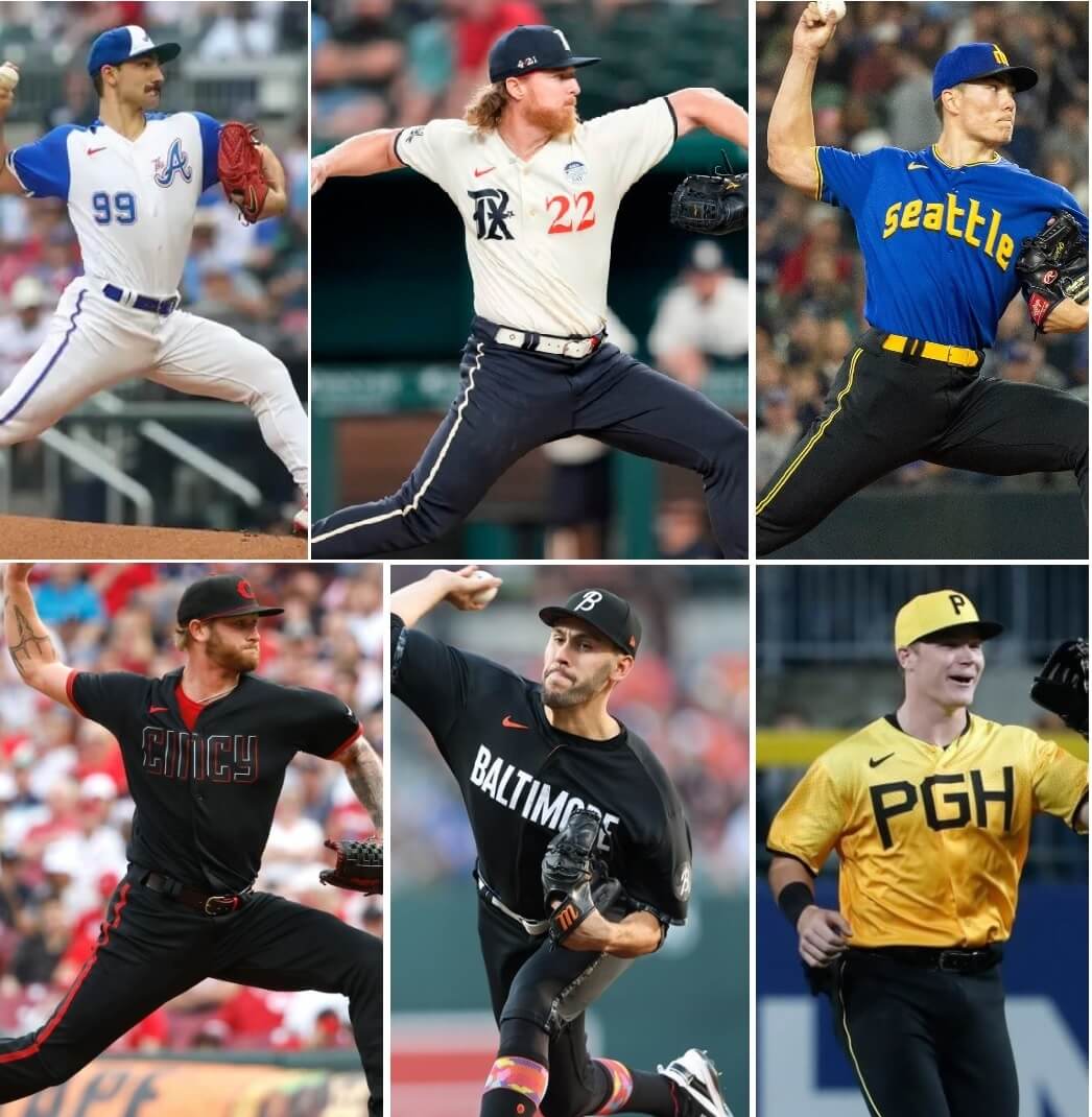
One interesting note: perhaps by chance and perhaps by design, four of the six teams to get CC’s this year have black pants, and a fifth (Texas), has blue pants so dark they look black.
With that said, here we go — your 2023 CC’s ranked:
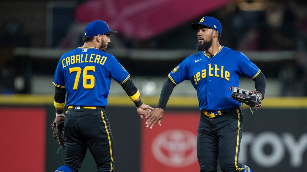
When these first leaked, I figured the pants might be white, or gold, or maybe even royal — never would have guessed black. And given my disdain for combining royal and black, I’m absolutely pleasantly surprised how good this uniform looks. Somehow the M’s pulled it off. Part of it is the black and royal are almost perfectly balanced, the gold nicely pairs with both, and the gold/black/gold piping is perfectly balanced on the sleeve hems, pants, and socks. It just works! This might be my favorite of all the CC’s unveiled so far. It’s between these and the Southside ChiSox.
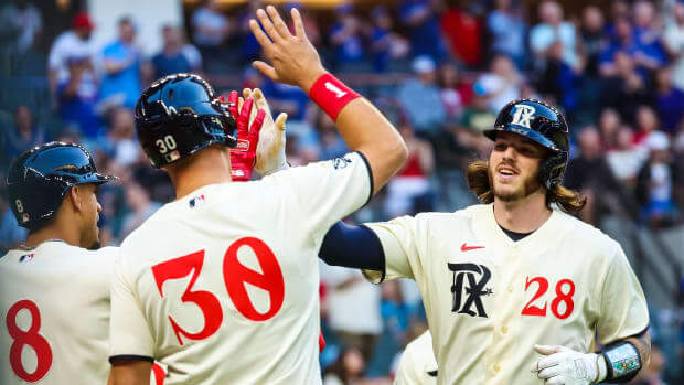
I’m usually not a fan of teams pairing different color tops and bottoms, but somehow the Rangers do it surprisingly well. I like the cream/off-white jerseys (in fact, I’d love to see this worn with cream pants), and even the logos and stylish number font play nice — not too many teams use different color numbers and logos on the front of their jerseys, but this looks good. Just enough style to keep it from being boring, but with enough restraint to not be gaudy. That’s a tough balance, but Texas manages to do it.
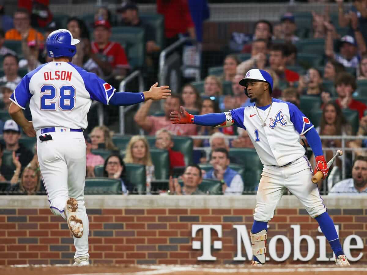
For someone who came of age during the royal and white era, these are a nice harkback to the Henry Aaron years. I could do without The A, but that’s still better than the team’s current nickname. It’s got enough similarities with the 74-75 (and their slightly different 72-73) unis to remind us the real Home Run King broke the Babe’s record wearing something close to this, but just enough differences to stand on its own.
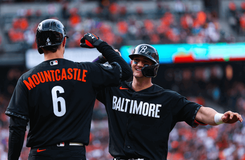
This CC, and the one that follows, are ranked where they are for one reason: I like where these are going, but the execution is poor. The head-to-toe black, despite the little bits of flourish on the sleeve ends and socks, combined with the other plainness of the uniform (let’s face it, you can’t get much more basic than this), is just crying out for more Oriole orange. It’s a problem that could be remedied with some simple pairing of their current alt with black pants (you’ll be seeing that concept uniform again in a different article). This one had potential, but I’d rather the team jettison their CC in favor of an all-black alternate with lots of orange.
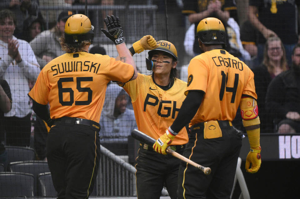
Like the Orioles with an all-black uniform, I like the idea of the Pirates going gold over black — which itself is a look the team occasionally sported in the “We Are Family” days. And like the Orioles, I was hoping the Pirates wouldn’t go this route with their CC. The “PGH” in yuge letters and the unattractive thin fonts for NOB and numbers really downgrades the overall look. Pittsburgh should absolutely have a gold/black (or black/gold) alternate set, but the CC doesn’t do that well enough. A few changes would really improve the overall look.
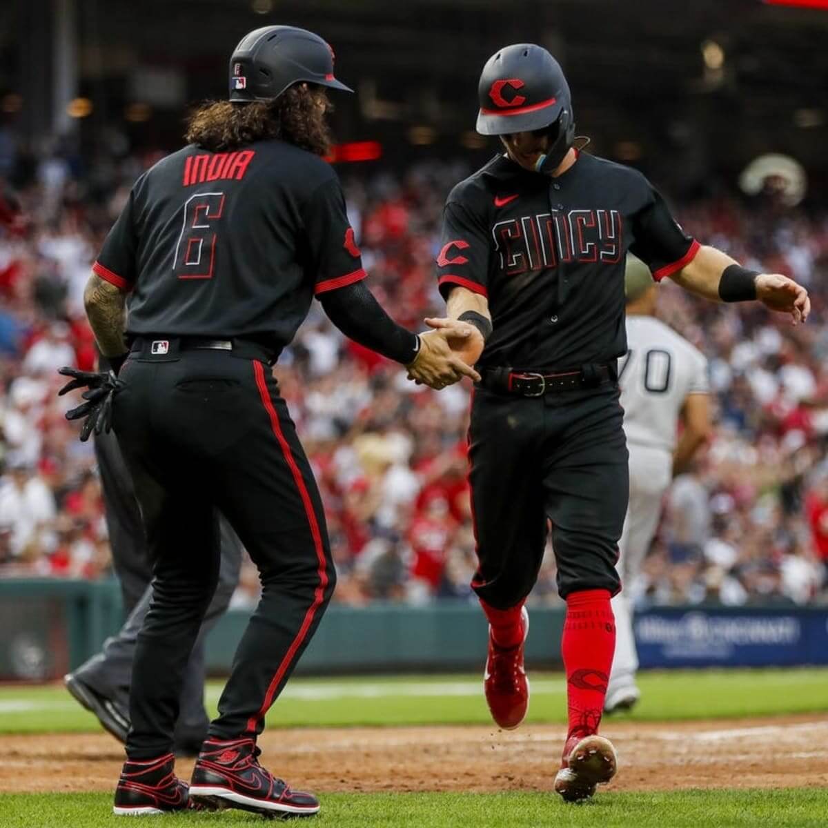
Poor CinCy. I wanted to like these. I really did. But it’s not just that CinCy doesn’t belong in mono-black; the ghost lettering and numbers make both almost impossible to read at any distance. Yes, baseball may be the one sport where players don’t require numbers or NOBs, but this is a design failure from almost any perspective. Even if we were to say this one isn’t BFBS (especially if we consider black to be a neutral color), this one lands on the bottom of this year’s CC crop.
How would you rank this year’s crop of CCs?


Cities are supposed to connect with their teams, not the other way around. This is an ass-backward cash grab.
It’s a cash grab, no argument, but connections by their very nature are bidirectional. I get the concept, and in some ways approve of it, especially for residents publicly funded stadia, but the ham-fisted Nikefication of this program has been wanting aesthetically, to say the least.
*residents of
Get over it.
I’m really getting sick of all these arbitrary rules about how things are “supposed” to be.
You and me both charlie.
Big same, Charlie. Big same.
Here here.
GTGFTU: Packers at Saints, August 28, 1999. Preseason
This was a hard one – the Saints installed grass in the dome for one preseason game that year as a “proof of concept” that they could host events requiring grass, like soccer.
Great job! These two images are stills from Hi8 video I shot from the sideline, thanks to the media credential I had via my SAINTERNET website / TV show. It’s weird to see the grass stain on Ashley Ambrose’s hip juxtaposed with his helmet halo of reflected Superdome roof lighting. The grass surface actually held up pretty well, to my eye.
Thanks – I didn’t notice the lighting, it was all about the N.O. grass at home which also could have been 2005 in Baton Rouge. This was a tough one.
Honestly pretty much agree with all of this. Would maaaybe personally move Cincinnati a bit higher, i think its neat on its own – but at the same time i understand the visibility issue too.
Still absolutely adore the typography on Rangers’ CCs. God the TX logo and the numerals are *so* good imo.
I’d rank the Pirates higher for 2 reasons.
1. I just think it looks good. I’ve always loved the color combo, it’s a clean shirt, not too busy.
2. It actually connects to the city in unique ways. First off it keeps the Pittsburgh specific color combo. That’s been a cool unique thing the city’s teams have been able to do. If I am not mistaken it’s the only city in which all of its teams have the city’s color scheme. Second I like that it uses PGH which seems to be a very local abbreviation for the city. I remember when it was first leaked, non-Pittsburgh people were like what is PGH that’s stupid, then every local Yinzer was like “nope, we use this abbreviation for the city all the time.
So it really seems to hit the mark for what this program *should* be about. I understand it’s just a cash grab in reality, but this one seems to have stumbled into a genuinely unique connection to the local community.
Great points, Alex — but my “rankings” weren’t based (at least to the extent possible) on how well the uni “connects” to the city. I used my best judgment to rank them as standalone uniforms. You are free to disagree with my thoughts — but they’re where they are (IMO) based on how the CC looks strictly as a uni.
It’s impossible to completely divorce the storytelling from the final product, but I tried to do that as much as possible.
YMMV
I really appreciate the rankings. I always love to see people explain “why” they like or don’t like things. And this year’s crop, for me, was quite a bit better, on average, than the last years.
I understand all the complaints about Cincy, both logistical, and sentimental/principled, but I personally think it’s a fantastic uni all around (could have been made better with white or red text/numbers and a single drop shadow of the complimentary color, but legibility is not a complaint I have with these, though it is logistically an issue). Texas has a great CC uni that I think only falters in 2 places: it’s overdesigned by about 10% (a few too many logos and subtle “hidden” things), and it’s not the standard home uni, with a navy blue top version as the roadie (I’d be happy to see an all cream set at home and all navy on the road, or cream pants with navy top on the road). Seattle has one fault but it’s a big one for me: the black. They look like the country’s most fun-loving police force with the black brims and black pants. The revision of the trident logo is flawless, the Seattle wordmark is stellar, I love navy and teal, but the M’s always look great in royal and yellow. The PNW logo is outstanding, but please give me this with royal pants and a royal or yellow brim. Baltimore is a nothing burger. Make this exact design but swap out literally any team’s hat logo and location and it’s just as connected/disconnected as it is with Baltimore. PGH? Forget it. This is uninspired. The pirates have a yellow top, black pants set already and this doesn’t do anything but crap on that other uni.
But as you say, YMMV.
Thanks, Dave!
My rankings of 2023’s CC uniforms are based strictly on first impressions: 1. Cincinnati 2. Seattle 3. Baltimore 4. Atlanta 5. Texas 6. Pittsburgh.
I currently live in DFW, and the Rangers uniform looks even better in person. Regardless of the reasoning behind it, I will say that Nike and the Rangers succeeded. The people down here LOVE that design and rock it.
I live a little south of you in the Waco area and I see a lot of these jerseys around here. I’m not particularly fond of them myself, but they are pretty popular, that’s for sure.
Baltimore’s CC unis would look less generic if they said “BASEBALL” across the front. What a pointless design…
Atlanta is the only bearable one for me. I dislike Seattle the most. No amount of money in the world will get me to wear royal blue with black. They look like Cub Scouts getting docked points at the Blue and Gold Banquet for wearing the wrong pants.
Love your comment. You’re spot on. The only thing missing is the neckerchief.
The one thing I like on the Seattle jersey is the Pilots-style lettering.
Generally, I do not like it when teams help themselves to ‘left-over’ identifiers of departed franchises, but this is an exception. Sure, it’s Pilot-esque…yet distinctive enough that it can’t be considered a poach. The wordmark matches so well with the modernized trident, too.
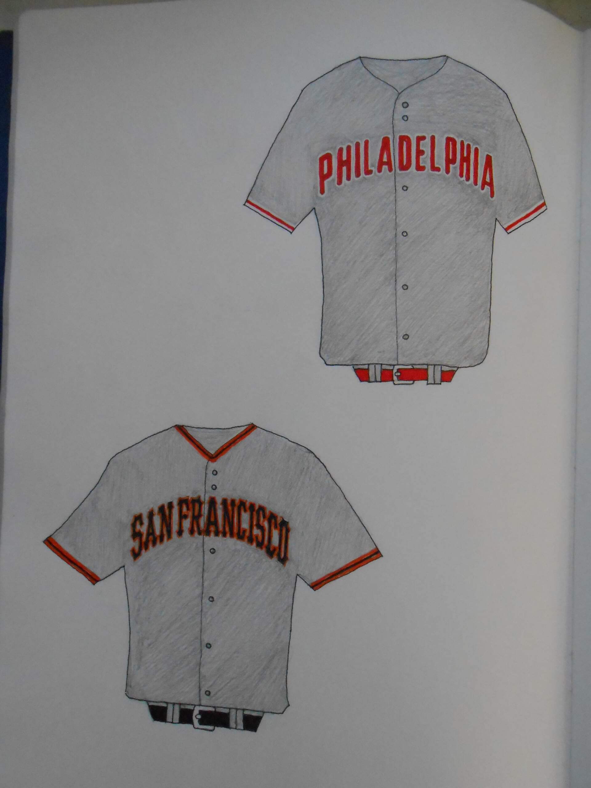
Love the way the placket is respected on this Phillies concept, Walter!
Seems more akin to the ’50-’69 road look in its’ simplicity – a good thing.
I don’t pine for the IRL blue touches, but I do miss the sleeve numbers…in reality and on your concept.
Did you choose to omit them since they are no longer present?
My first impulse was to center them under the second “P” in PHILDELPHIA, but I paused, knowing the sleeve number might go over better. Since, I couldn’t make up my mind, I left it off.
1. Atlanta
2. Seattle
3. Pittsburgh
4. Texas
5. Baltimore
Infinity. Cincinnati
Great stuff today, everyone! Phil, I love the thought process behind your CC uniform rankings. I might come to slightly different conclusions, but you always give me something to incorporate into my own thinking when I evaluate these uniforms. Walter, great concepts, as always! Looking forward to seeing more throughout August!
Thanks, Kary! Totally agreed about Walter’s concepts too!
Thanks, guys!
To my eye, Cincy’s CC jersey is an objectively terrible design. Ghosting major elements that are supposed to be visible to fans in the stands is a fundamental failure of design. And while black works well as an accent color for the Reds, the team’s attempts to make black-dominant uniform elements have rarely worked, in that they haven’t looked good to me and don’t seem to have connected broadly with fans.
So I was surprised when I went to a Reds game in Cincy last month to see so many fans wearing CC caps, t-shirts, and jerseys. This is anecdote, not evidence, but the presence of CC merch being worn by fans in the stands seemed akin to, though visibly not as high as, CC merch among Brewers fans hereabouts. Anyway, the CC stuff seems to be connecting with Reds fans, which is the point of the project.
6) Texas: From a pure aesthetic standpoint, these are the ugliest CC uniforms so far. Cream and (almost) black absolutely do not go together. The “TX” logo looks like an illegible Chinese letter. The number font is horrendous and the red looks completely out of place. The “TX” on the front being noticeably taller than the numbers on the front is incredibly awkward.
5) Cincinnati: Ugly, illegible. I even hate the font of “C” on the cap, which appears to try to be futuristic and retro at the same time and fails at both.
4) Baltimore: The very definition of boring and unnecessary. The floral pattern is a distracting eyesore. If their was a baseball version of the Burt Reynolds-classic “The Longest Yard,” maybe the prison team could wear these. Maybe.
3) Pittsburgh: I’ve said it before, under the lights for a Sunday night softball team, these would be kinda cool. The yellow and black are a classic look, the giant “PGH” would be the company sponsoring the team. But when I see them on TV, I’m left wondering why a Sunday night softball team is playing at PNC Park.
2) Seattle: The tops are beautiful. Royal and yellow look great together. The old Pilots font looks as good today as when it premiered in 1969. The trident on the cap is as original as it was in 1977. And then they pair the top with black pants. Royal, yellow, and black do not look great together, especially when white, yellow, or even royal pants would have been sooo much better.
1) Atlanta: The “The A” logo looks kinda dumb. And the Hank Aaron-era unis of this style are far and away better. But from a pure visual standpoint, these uniforms are beautiful, all the colors pop, the cap is gorgeous (though not as good as the lower case “a”) and it’s the rare CC set that looks better than the regular home or away uniforms of many MLB teams
Although it reminds me of a time when the Braves played awful baseball, I would rank them first this year, simply for not using black. I would rank the Pirates second for reminding me of the We are Family days! I am not crazy about these but at least they’re team colors. The rest are just terrible! In my opinion, dark pants don’t belong in baseball.
I’m just now noticing that on the Texas City Connect uniforms, the zero has a slash through it. Is that a first in North American sports? I really like it.
If the Seattle CC had a white shirt, it would look like an Airline pilots uniform….at that stage they should have placed the scrambled eggs on the caps…
I have to rank the Braves at the top just for the fact that they somehow avoided dark pants.
Yeah, the Texas uniforms aren’t even close to being No. 2.
1. Atlanta 2. Pittsburgh 3. Texas 4. Seattle 5. Baltimore 6. Cincy
I almost went with a last place tie because both being mono black and not really digging that look. But B’more’s hat and the trim design give it a slight nod.
Not sure why Seattle’s gets so much love. It looks like a jersey tucked into jeans.
Not sure why Pittsburgh’s gets so much hate. Gold over black was one of the more popular combos of the mix-and-match days (and they don’t still wear the throwbacks as was suggested in a comment above). The hat is gorgeous and the details are really neat on it… and the blacked out MLB logos on the hat and back of the jersey are one of the coolest details of the entire design.
And I can tell you from being at the park this past Tuesday, they are selling like hotcakes. Before you tell me it’s a cash grab, well of course it is, I don’t think there would be a run on ugly merch just because it’s new. There’s a reason those red vests are hard to find, because no one wanted them then!
Ah, Douggie…love ya.
Good points (even if I disagree with you at least on Seattle and Pittsburgh). We can have differing opinions on Seattle: I like the look, you don’t. All good.
But I was ranking the unis overall — not just on colors. I love Pitty in gold over black (and in fact, in a future post I will not only argue for it, but offer up a newold take on it). But that giant “PGH” on the front and the overall bad custom font dropped them down. In fact, if all the unis were blank and I was picking solely on color, they’d be #2 for sure, and possibly even #1.