Good Saturday morning UWers. I hope everyone had a good week.
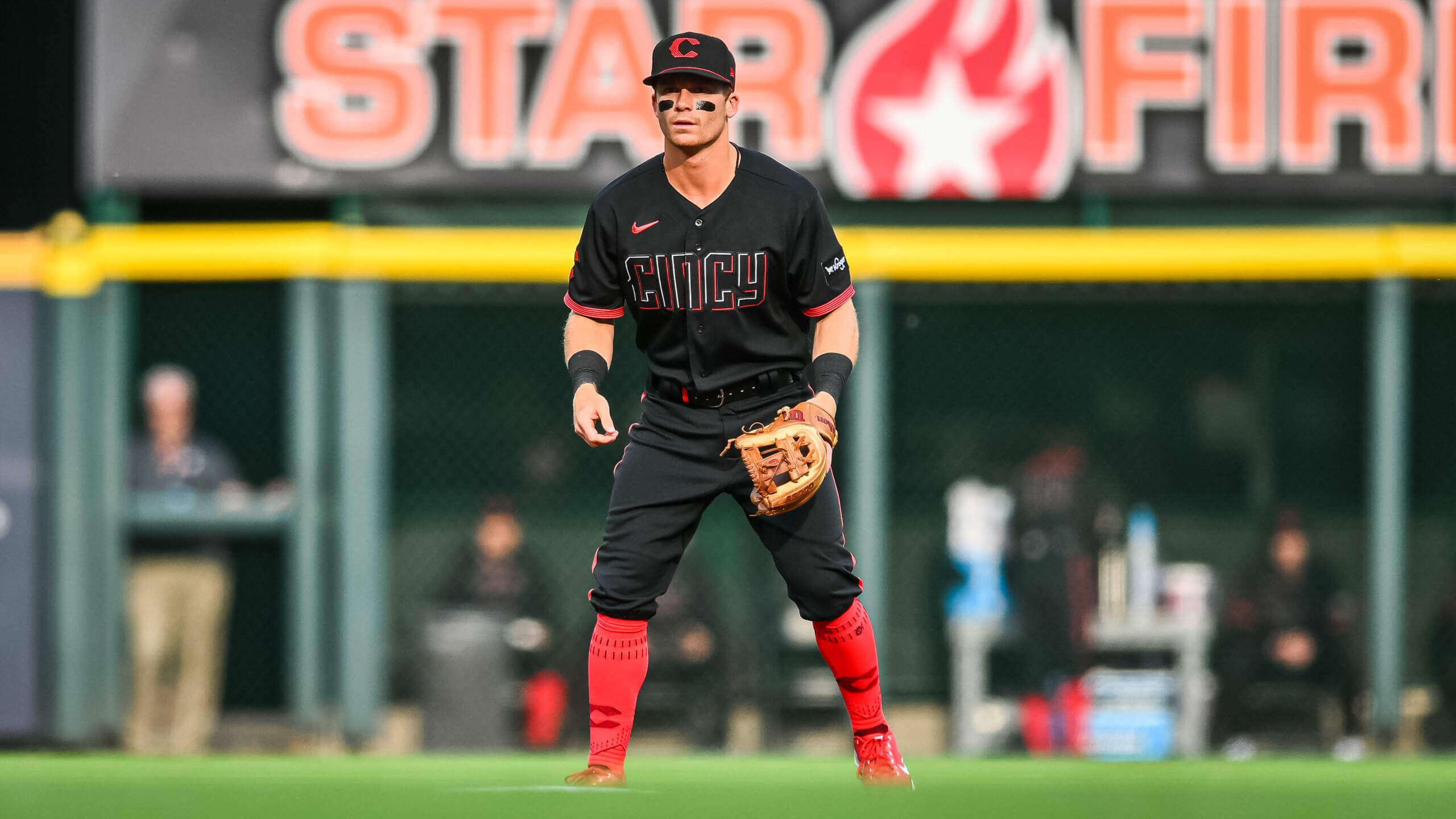
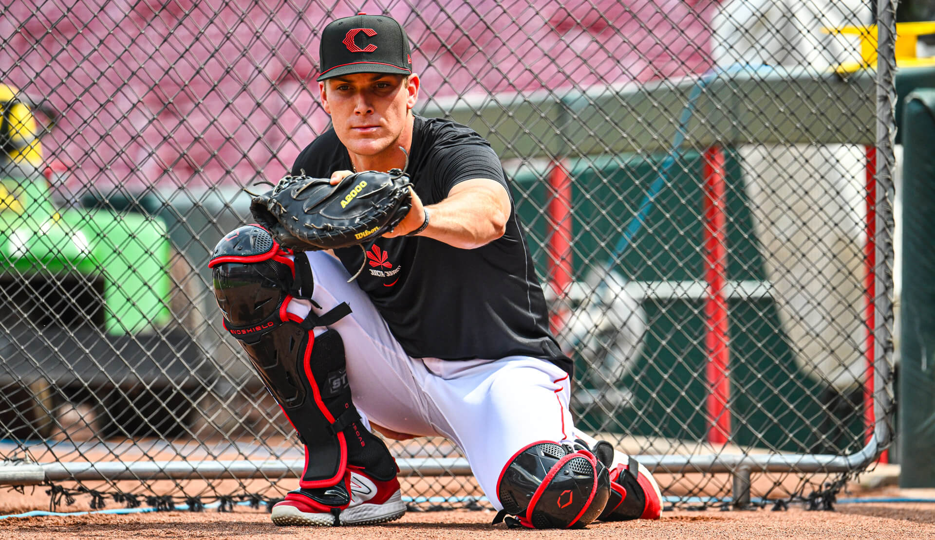
Last evening, as expected, the Cincinnati “CInCy” Reds debuted their new City Connect (CC) uniforms. As you can see from today’s splash, they have a lot of black elements — cap, jersey, pants. Only the few who chose to show hosiery by going high-cuffed added any color to an otherwise all-black uniform. Unlike many other CC uniforms, these weren’t too heavy on storytelling, but there was some. In case you missed it, last Sunday I wrote about the new unis, so I won’t go too heavy on the descriptions since they’re covered there.
As I said in that article, and every time a new uni is unveiled, I always wait until seeing them on the field before rendering any final opinions. And my biggest fear was the “CInCy” wordmark and numbers, which were both rendered in a “ghost” font with multi-directional blockshadowing, would be difficult to read at any distance. Since the Reds were hosting the Yankees last night, I was able to watch almost all of the game. My fears, unfortunately, were mostly confirmed about the legibility factor.
But first, let’s take a few looks at the uniforms in action:
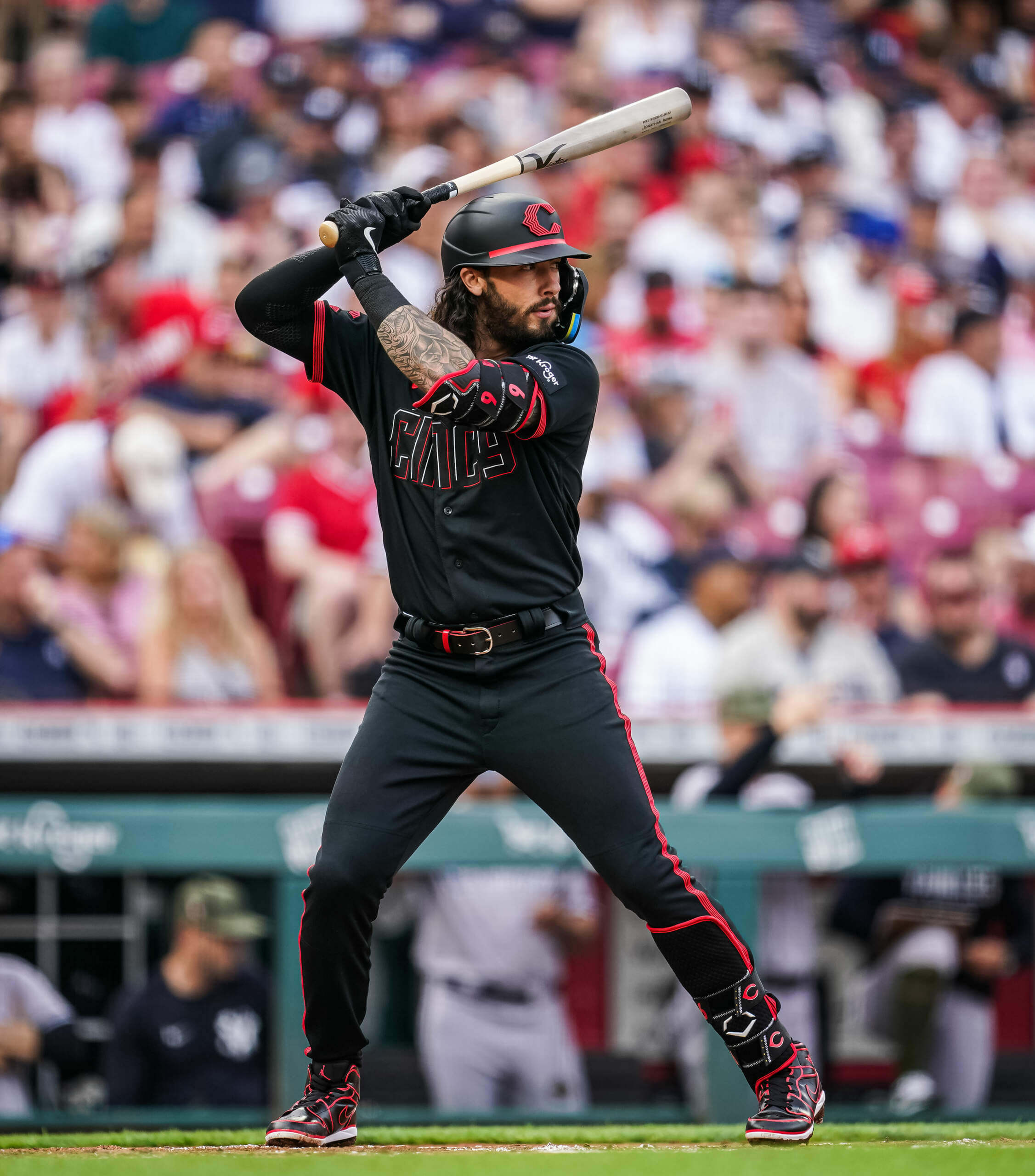
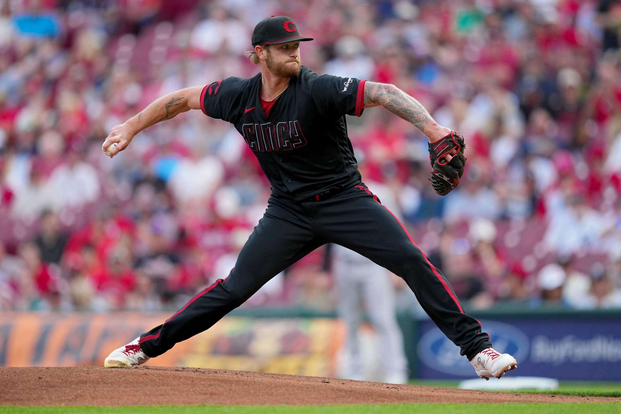
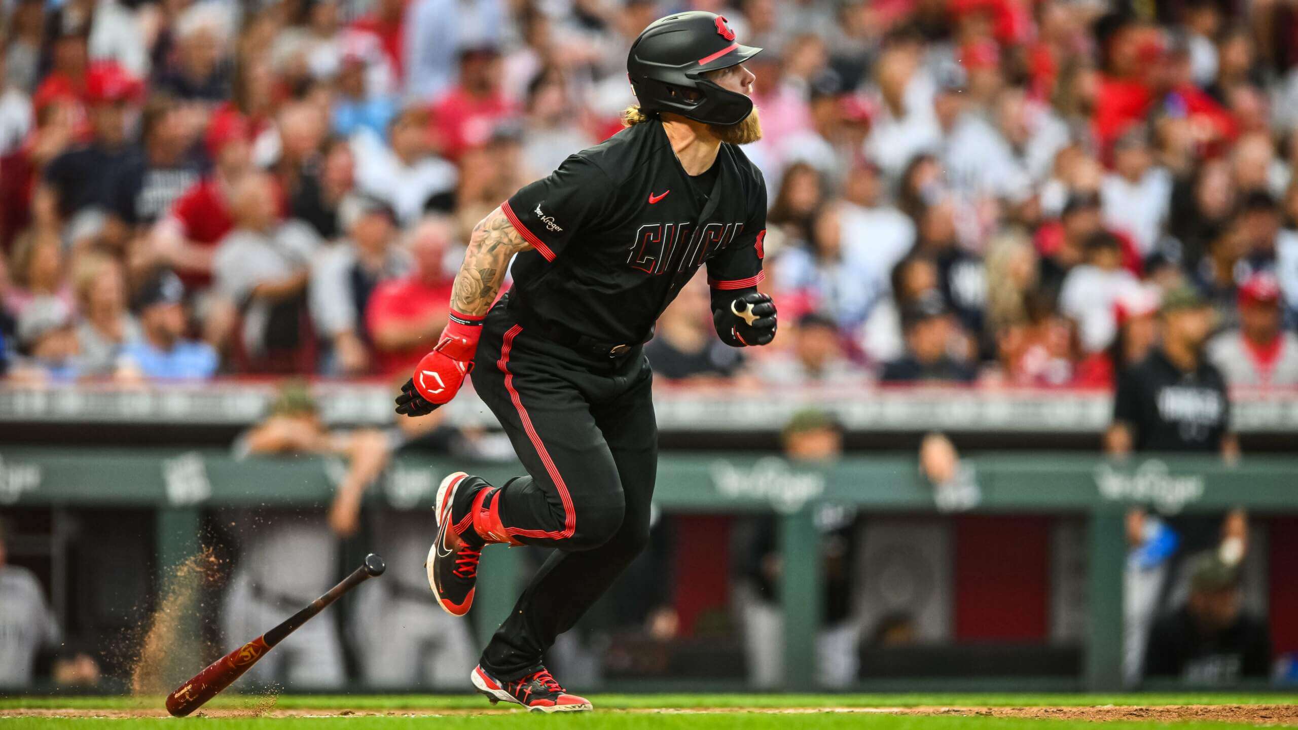
OK. Obviously there is a lot of black — not something we’re really used to in baseball. But that doesn’t automatically make this a terrible uniform. I actually like some of the elements, including the cap, and the five thin red stripes that adorn the sleeve hems and run down the side of the pants. The red lines are so close together they almost appear as one thick, solid stripe. I’m not a huge fan of the cap logo being repeated on the “dominant” sleeve (determined by handedness, as the team also sports an ad), but even that isn’t a deal breaker. The big problem with the unis are the basically unreadable wordmark and number, AND the fact that so few players chose to go high-cuffed. As I said in the first piece, if there was ever a uniform that calls out for hosiery, this is it.
The difference is night and day:
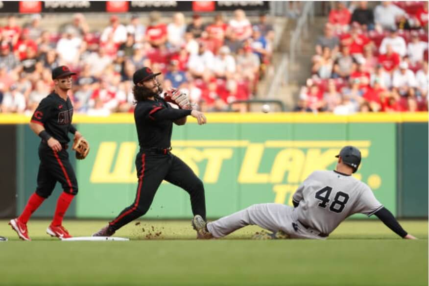
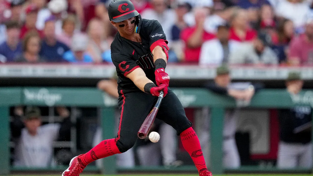
The on-field debut looked about as expected — and there didn’t seem to be any last minute changes or surprises. Like all CC unis now, the team created special matte-finish, black helmets to try to match the caps.
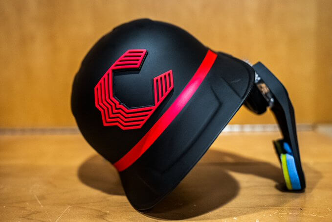
Note the helmet number was created with the same “infrared” font as the uni numbers (and actually seemed a bit easier to read than the actual jersey numbers). The new “C” logo was also rendered in a raised 3-D attachment. The thin red soutache which encircles the brim of the cap was recreated with thicker tape, but only on the front of the helmet.
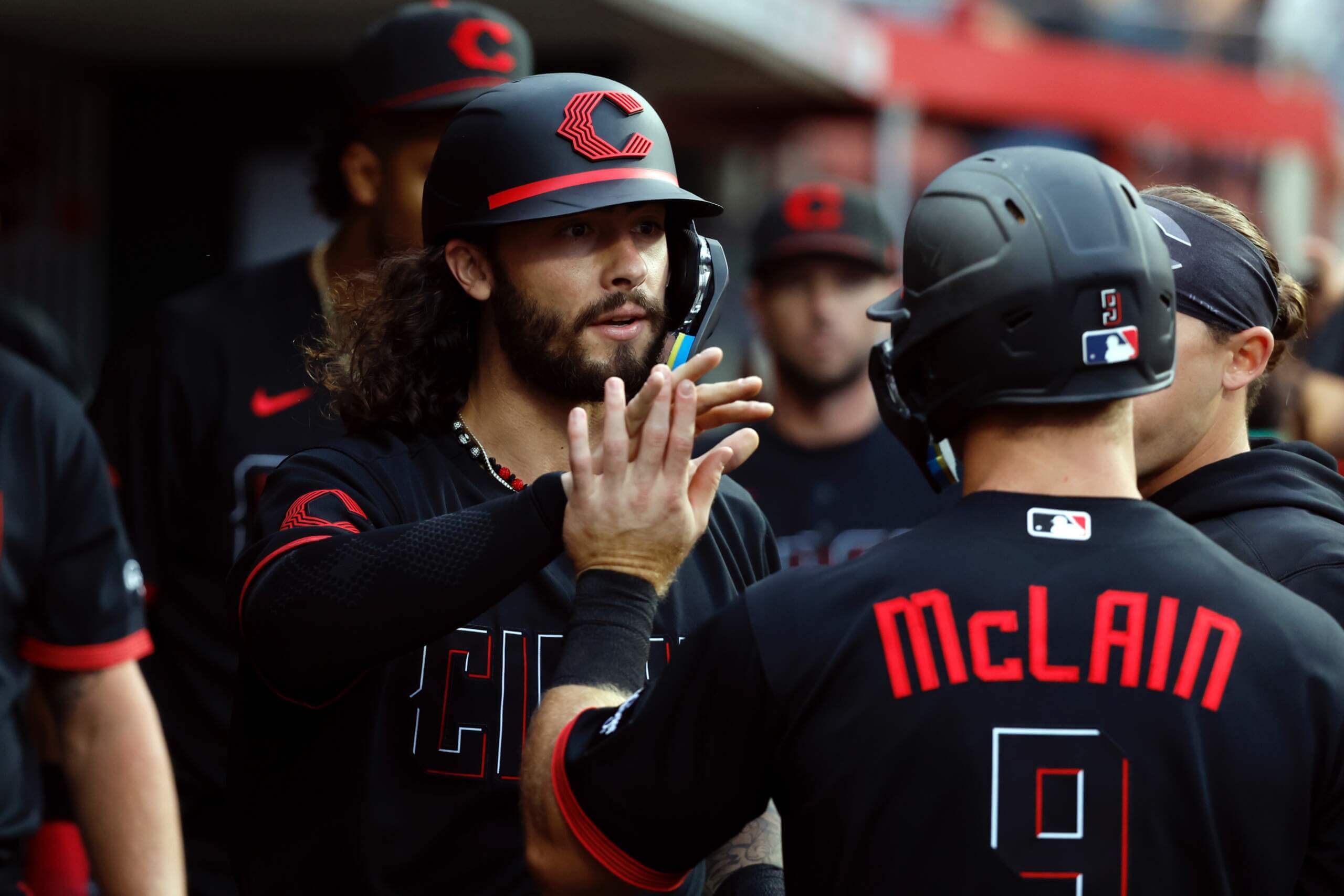
NOB were a bespoke font style, in bright red, and used mixed-case lettering (as is used in the “CInCy” font). Even up close, numbers were difficult to read.
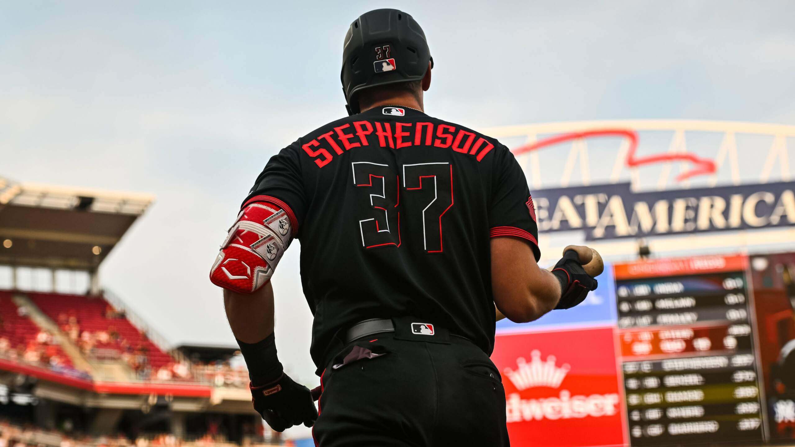
Unfortunately at almost any distance, wordmark and number were unreadable. At certain angles, they were almost invisible.
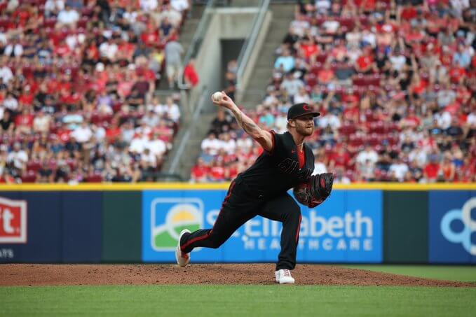
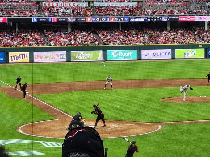
There are not two CInCy players near third — one is an umpire, though you’d be hard-pressed to tell from the above.
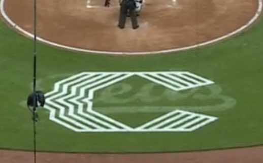
If you look at that last screen grab, you’ll note the Reds placed their new stylized CC logo behind the plate. Unfortunately, they didn’t really remove their regular logo completely, so the result was less than aesthetically-pleasing…even sloppy looking.
Gametime temperatures were in the 70s yesterday, so I didn’t really see anyone wearing long sleeves — I was hoping at least a few players would have worn red sleeves, which would have injected a bit more color. The few players who wore compression sleeves wore black ones, further adding to the blackness of the uniform.
As the Rockies and Dodgers have done, some have speculated that at some point the Reds will swap out their black CC pants for white ones. That remains to be seen, but in pre-game warmups, the team actually did mix some elements of the CC uniforms with their regular home white pants…so if they do decide to go that route down the line, here’s a kinda-sorta preview:
Here’s a look at the unis in action:
Rake being Rake@jfral_23 pic.twitter.com/X3v3FIBBgT
— Cincinnati Reds (@Reds) May 20, 2023
And if you want to see more photos, there are lots here.
OK, despite my criticisms, I still don’t hate these uniforms. There is really a LOT of potential, and I’d love to see some team adopt an all-black uniform to be worn very sparingly. There is historical precedent (1901 Orioles, 1905-6 Giants, 1977-84 Pirates, for example) for all-black uniforms. But I can’t get behind this CC because of the legibility issues. Had the team simply gone with something along these lines…
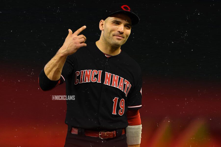
…even with the funky “CInCy” wordmark and bespoke numbers…I would have been much happier with the result. As it was, the wordmark/number were even less legible than the universally-panned all-black “Players Weekend” uniforms from a few years back.
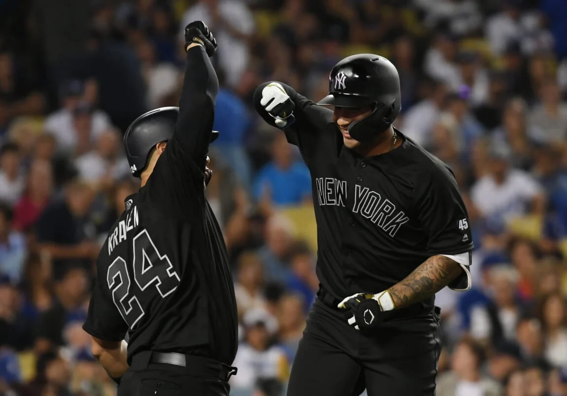
Rather than learn from that debacle (and the all-white PW uni was worse), the Reds seemed to say, “Hold My Beer” with these. Rather than crafting what could have been a really neat all-black uni, they got too cute by half. Too bad.
We still have two more CC uni sets to be revealed this year: and both are for teams for whom black is an actual team color: the Orioles and Pirates. Either or both of those would have been perfect candidates for an all-black uni. But after seeing the direction in which CInCy went, I won’t be getting my hopes up.

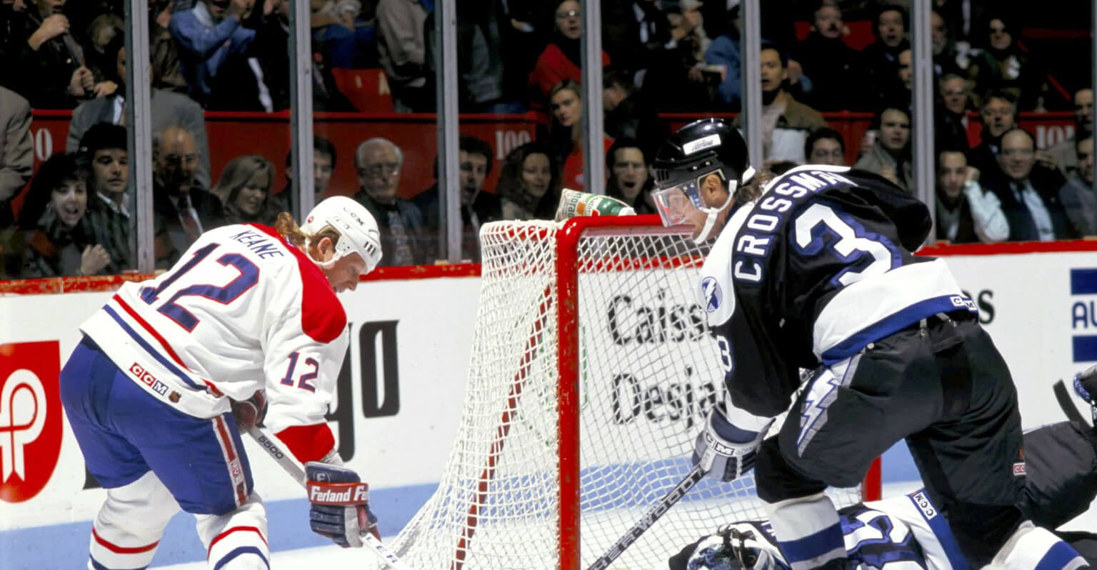


GTGFTU is the Tampa Bay Lightning’s first game at the Montreal Forum, October 26, 1992. Montreal won 4-3 on the strength of a three-point night (2G, 1A) by Brian Bellows. Interestingly enough, neither of the skaters pictured, Mike Keane and Doug Crossman, factored into the scoring.
I miss the light blue kickplates. Everyone having yellow is so boring.
Well yes, yes it is!
I have to do a better job when it comes to researching/observing…had no idea this was the Bolts 1st ever Forum appearance, and didn’t see the kick boards were light blue. Shameful!
When I was a kid my older brother had a #3 NNOB Flyers sweater – a Tom Bladon fan was he! I guess that when he passed it on to me, Doug Crossman was in that number, so I became a de facto fan of his…yet I had not realized he lasted it the league so long after he left Philly, and had no memory of him playing for the Lightning. Thanks, Rob
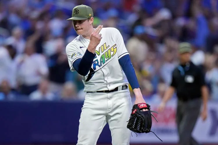
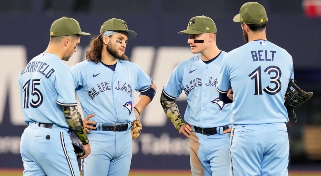
I actually think the military green goes good with the light blue. Thats definitely a color combo you don’t see a lot.
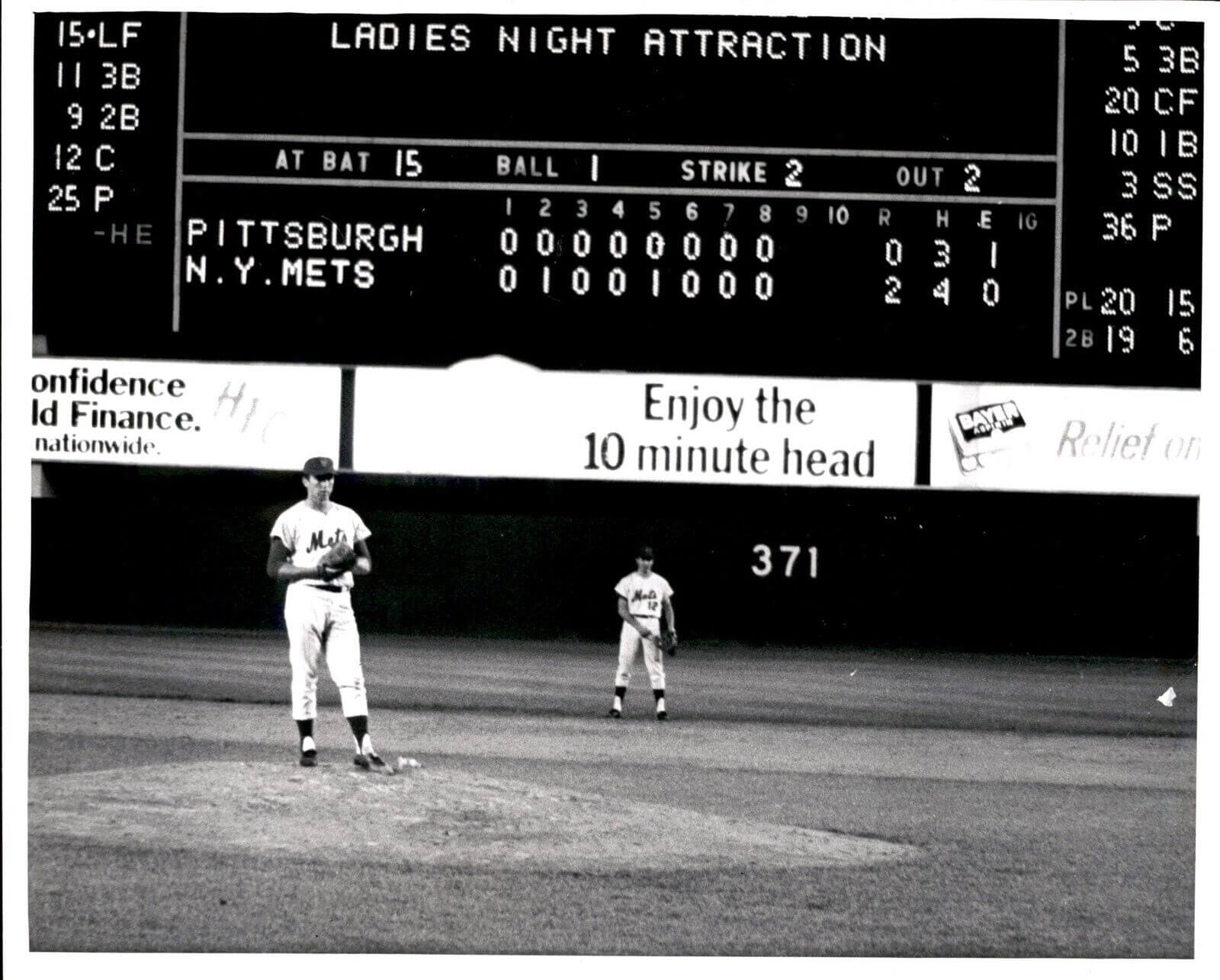
GTGFTS is September 13, 1968 as NY Mets beat Pittsburgh Pirates 2 – 0. Jerry Koosman of the Mets is pitching Manny Mota of the Pirates. Mota is about to groundout to end the game.
GTGFTS: Don’t leave us hanging, what was the “Ladies Night Attraction?”
I think it has something to do with “the 10-minute head”.
Re Cincy:
One immediately wonders, What’s the point?
The answer, of course, is that there is no point.
Call it what it is. A shameless cash grab. Along with all the other jingo/pandering to holidays based on greeting cards. Not a nickel going to those who serve or anything resembling a cause.
This is what we have come to expect from middle aged white executives with no training in graphic design working with angst ridden swooshkateers who wanna be the next Paul Rand.
A Mess that breaks the basic rules of uni-design.
Can I see the brand?
Does this reflect the best of the brand?
Is the design memorable?
Why do age and color of skin have to be included in this??
ANYONE who approves this is to blame. Do we actually know the age and ethnicity of every single person involved in the decision making process?
In my experience (working in HR, deeply involved in hiring and always with a pretty wide view of any org I’ve been in), marketing tends to be a very young person’s game, even through to director levels, and very diverse too. I highly doubt the marketing folks at Nike are abundantly middle aged nor uniformly white. Young, non-white people almost certainly, some step of the way had a hand in the MLB City-Connect program.
If the CinCy wordmark, and the number were actually legible, I think they would work.
Red letters and numerals would infinitely upgrade the uni. For the life of me, I cannot understand the ridiculous and pointless concept of ghosting.
For the longest time, the only team with ghosted numbers and letters was the San Antonio Spurs; and they looked GREAT, because the audience is courtside or pretty close. From 1,000 feet away, not so much.
I have a similar feeling about the Reds CC’s as you do, Phil. A few minor tweaks and these could be really good: white pants and a more legible number font mainly. But I love the hat logo.
Re: the Armed Forces Day promo being three days—I think we all know the reason. There are a lot more people who will be excited to buy the GI Joke hats than will buy the pink or light blue gear, so it’s getting a bigger push by MLB/New Era.
I’ll never be able to consider the Rays’ uniforms throwbacks. Faux-backs, close-backs, or even almost-backs, but the term throwback should be designated for uniforms that are trying to be as faithful to the original as possible. Uni Watch has criticized teams in the past for have throwbacks with such inconsistencies as “slightly different striping pattern(s)”, helmet decals with different production techniques, and the type of tackle twill used for the team name, but the Rays continue to get a pass. I agree – it looks better with navy than it did with black, but it is not a throwback.
That scoreboard though. Interesting juxtaposition of phrases.
Seeing those Cincy unis in action didn’t make them any better. When the CC program began, the uniforms actually connected to the city. Miami, White Sox and Colorado were probably my faves. Not so much with the Reds however. The only thing I liked about it was the cap, even though that new-gen wishbone C doesn’t match the wordmark on the jersey. Sorry Reds. Do not pass go. Do not collect $200.
These CC uniforms have to automatically go to the bottom of the list, right? Just awful.
Honestly? I’d still keep Space City as the worst. YMMV.
They’re terrible, but at least the numbers/wordmark are legible…
Houston should have done a variation on Rainbow Guts and got on with it.
But nooooooooo, they had to get in bed with this City Connects concept.
What looks better than the old shooting star unis and why do the Astros refuse to wear them?
The scoreboard was Sept. 13, 1968.
link
Also, why does a Canadian team have to shill Armed Forces Day?
Those Reds CC unis look more like a second stab at Turn Ahead The Clock than something that connects them to the city. And since they wore the CC hats instead of the Armed forces hats, one cash grab gimmick took precedence over another cash grab gimmick.
“C’mon, MLB. They’ve toned down Mother’s Day, Father’s Day, Independence Day, Memorial Day — those special caps are now just worn ON that actual day; why is the league forcing the camo on us for three days and nights?”
Because $, of course! I’m not sure if MLB has a largely under-the-table deal with the U.S. armed forces like the NFL has had (and may still have). Or maybe wearing these olive drab caps a few extra days gives them that much more exposure for the merchandise market (I’m quite certain these are bigger sellers than the caps for Mother’s Day and Father’s Day). In any event, the cynic in me is certain it works out to someone’s financial advantage.
It’s Armed Forces Day. The day we show support for those on active duty. Personally I’d rather have 3 days of a camp cap than just one day of that ugly, awful Reds getup.
I’d rather have every day be regular uniforms vs regular uniforms. No nothing added for any reason.
But who knows what is a regular uniform is these days. In any sport.
Phil repeatedly refers to those caps as camo—am I missing something? That appears to be olive drab, not camo. Shouldn’t camo have more than one shade?
I hate ghosted lettering and numbers on uniforms. The Reds unis are egregious examples. As Phil says, if they just made the letters and numbers red (or, better still, white), I think these would be fine.
Although the Yankees have worn the same road uniform since 1918 (with the exception of 1927 to 1930, when the arched “NEW YORK” was replaced by the word “YANKEES”), a radical change was proposed in 1974. Marty Appel, in his book Now Pitching for the Yankees, describes the proposed uniforms:[8]
In 1974 I walked into (then-General Manager) Gabe Paul’s office to find samples of new Yankee road uniforms draped across his sofa. They were the opposite of the home pinstripes – they were navy with white pinstripes. The NY logo was in white. Gabe liked them. I nearly fainted. Although the drab gray road uniforms were not exciting, with the plain NEW YORK across the chest, they were just as much the Yankees’ look as were the home uniforms. I think my dramatic disdain helped saved [sic] the day and saved the Yankees from wearing those awful pajamas on the field.
What struck me about the Cincy uniforms is:
Numbers aside, this is the look Cleveland should have adopted when it became the Guardians. There was no way they were going to make anyone happy by just taking the Indians’ current uniforms and substituting a slightly-offbeat font everywhere. Make a clean break. Change the team colors to red and black while you’re at it (leaving Cincinnati strictly red and white for obvious reasons).
Mono-black uniforms are likely to look bad as long as pajama pants are allowed so they should be avoided at all costs.
The Cincy “C” logo is kind of cool! It should stay as an alternative logo. The cap and batting helmet are okay. Ditch everything else.
I’ve never understood why the team called Reds uses so much black. All red would have looked horrible too but at least fit with the nickname.
Mid-60s era, around when Bench and Rose first arrived, those were the best Reds unis. Like 1964-1968ish. Just red and white, no black accents, very simple. Pin strips on the home jerseys. They were very nice.
Fears of a recession must be overblown if folks have the money to blow on those gawdawful uniforms. Can’t imagine spending a dime on that garbage. No ties to Cincinnati or the team’s history. The ultimate in BFBS.
Mono-black is definitely the shade you’d want to pick for a game played outdoors at a height of summer…
The Reds CC uniforms look as bad on the field as in the studio, especially with the pants worn low. The wordmark, numbers and NOB are nearly impossible to read. I do like the hat and the 5 in 1 stripe but this is overall a lazy design executed poorly. I will not waste any words on the olive hat festival (and by writing this sentence I already did).