With Cleveland currently enveloped by smoke from wildfires driven in part by climate change, the Guardians somehow decided that today was the right time to announce that they are selling space on their jersey to a petroleum company. Nicely done.
The new sleeve ad will make its on-field debut next Monday, July 3, and will remain on the team’s jerseys through 2026.
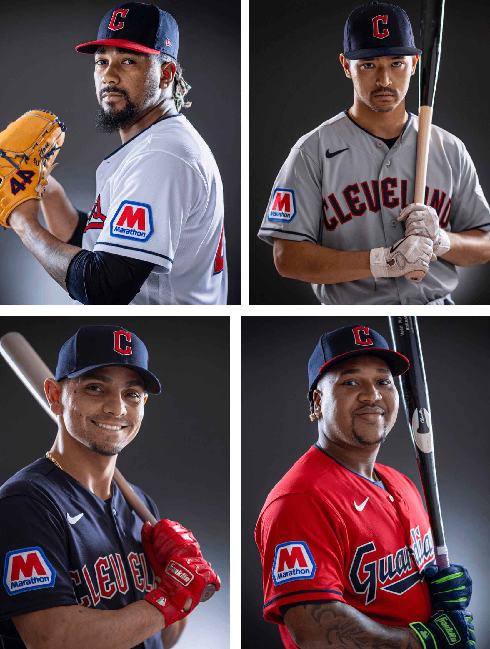
Cleveland is the 12th MLB team so far to whore out their uniform to an advertiser. The other 11 are the Padres, Red Sox, D-backs, Angels, Astros, Reds, Marlins, Mets, Cardinals, Tigers, and Atlanta. Several additional teams have said that they’re actively searching for a uni advertiser, so we’ll probably see more in-season announcements in the weeks and months to come.
Great timing… clowns!
Absolutely hate it. I knew it was only a matter of time but I still loathe it. It’s indescribable how much I hate ads on uniforms.
This makes the jerseys look the promotional give away jerseys they have throughout the year.
Yes! That’s a perfect description. The size of these I find especially egregious. Shove it in our face!
I mean, if we’re all going this route, at least the colors (sort of) match. Ugh, but could be worse.
I, too, loathe uni sponsor patches. This one is particularly obnoxious, as the letter “M” appears to be larger than the “C” on the cap. Just Awful.
No it doesn’t?
Pretty damn close
First soccer, then the NBA, now MLB. You know NFL owners are licking their greedy chops over what they can make by defacing game jerseys with ad patches. The only question is how much and how soon.
Instead of speculating and catastrophizing, how about if we deal with what’s actually been reported: link
Is “Ewww” going to be used in the title for all MLB sleeve ad announcements?
Quite possibly.
If it’s not aready, EWWW should be a tag for such content.
Horrible…The Official Worst Uniform in MLB
But people have a tendency to think just because they’ve never seen something before that it’s unprecedented…
They should wear Guardian gas station foam caps with the new patch.
While I don’t like or support ads on jerseys, keeping the winged G patch is the greater evil.
Still view the Guardians unis as upper-echelon…the ad takes them down a peg or 2.
The Guardians really did it right with the name change. Is it the best name, no. Is is the worst, no. Getting right to it with no transition and limited changes in uniforms and branding, just a job well done. The anti-Washington Football team in the approach.
I am always surprised when I see them on a ticker or a game how quickly I got used to it.
Long-time reader, first-time commenter. Just have to applaud that intro paragraph. The world is upside down.
I wonder if they’ll wash our windshield with a fill up
They should add these name patches as well:
link
I understand how the timing is yucky.
And how having companies take over the sleeves is yucky.
I am not expressing approval of the practice.
Yet, as a uni nerd and a Cleveland/Northeast Ohio native, there are some other ways in which it feels okayish, perhaps not like some of the other teams on the list.
The colors aren’t a match, yet it still feels like the lighter blue can be there. It’s very similar to the outfield walls at the old stadium, and that’s where my dad and I went to games together.
The ad is not fancy or new wave. It looks old-fashioned and, besides the size, isn’t trying to stand out or ruin the look of the jersey.
The company has a long history in the state and in the city. That company has been connected to the team before, and it is not all profit driven or a brand new relationship. Some other sleeves have felt like money-grab when I’ve seen them. This one does not.
The Cleveland Cavaliers had an auto-industry company patch too, and the business was also founded and longtime connected in the northern regions of the state.
And Cleveland is not proud of many things in its history, specifically the pollution and oil troubles that came in the 1950-1990s, what that has done to the Cuyahoga and to Lake Erie. Mayor Stokes did leadership to help beyond locally, including working with federal government on environmental work that has made a difference over decades.
Thank you for reading and letting me share things here. ✌️
Wow, I wore a similar patch on the uniform for my first after-school job. The Guardians should consider embroidering the player’s first names on a chest patch to complete the look.
Grand Rapids Rippers (1894-1899)
Cleveland Lake Shores (1900)
Cleveland Bluebirds (1901-1902)
Cleveland Bronchos (1902)
Cleveland Naps (1903-1914)
Cleveland Indians (1915-2021)
Cleveland Guardians (2022-2023)
Marathon Baseball Club (2023-present)
Why do you have to ruin an already terrible moment involving the, “Indians” uniform with misinformation regarding smoke from fires? These fires, per the Canadian government were started by Eco-terrorists. And, by the way, the red, white and blue Marathon patch is better looking than the stupid Guardians on the front.
Have a wonderful July 4th. God Bless the USA
Hey a guy who uses “eco terrorists” seriously in a sentence who preferred the Indians name. That’s a shocking twist.
Not really
Guardians*
Can’t look much worse than that horrible font some well paid graphic designer saddled those uniforms with.
Looks totally like a local company team: the Marathon Guardians. And there is nothing wrong with fun-filled weekend recreational leagues. Oh, wait, this is MLB…
And what causes the wildfires and wildfire season to be longer and more severe?