
Click to enlarge
It’s time to take a look at another vintage sports merch catalog from Kevin “Gashouse” Cearfoss’s collection. We’ve already examined his 1970 and 1971 NFL catalogs, and today we’re going to look at the 1973 NFL gear. (If you’re getting sick of NFL merch, don’t worry — the next catalog from Kevin’s collection is from MLB.)
Like all of Kevin’s catalogs, this one was intended for retailers looking to stock their stores, not for consumers. As you can see from the cover, shown above, the league was starting to embrace a pretty trippy aesthetic, probably due to both color TV and the psychedelic design movement. Here’s some of what’s inside:
• I’m happy to report that this cover aesthetic was also used for the section openers, beginning with the “Special Promotions” and “Apparel” sections:


• Continuing what we saw in the 1971 catalog, there’s greater intermixing of White and Black models in this edition:

• Hard not to like the belt buckles shown on the right-hand side of this spread:

• Ever notice that rain gear is usually photographed on really nice, non-rainy days? As seen here:

• I’ve seen lots of NFL helmet-patterned neckties before, but I don’t think I’ve ever seen dress shirts quite like the ones shown on the right-hand page — yikes:

• Gotta love this spread, which features a pre-schooler’s uniform (start ’em young!) and another great section opener:

• Speaking of starting ’em young, how about this:

• I flipped when I saw this next one, because I’ve never seen it before or even heard of it — a flock-by-numbers set! I’m willing to bet that this was then quickly abandoned (it almost certainly left tons of colored powder getting spread around the house), but I’d love to see the flocked art that resulted from it:

• You say flocking by number isn’t your thing? We also have color-by-number sets:

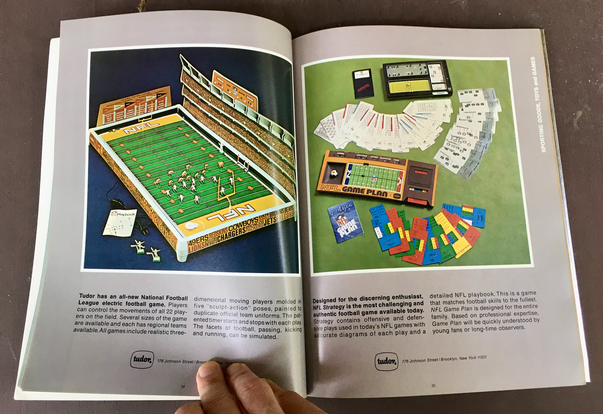
• You want some Electric Football? Check. Want a football game you don’t have to plug in? Double-check!
• I kinda miss the days when mouthguard manufacturers had names like “Brimms Plasti-Liner Co. Inc.”:

• Bobbleheads + another section opener = happiness:

• Nearly half a century after this catalog was published, the posters, helmet plaques, gumball helmets, and buggies are showing up in our own Brinke Guthrie’s “Collector’s Corner” column:


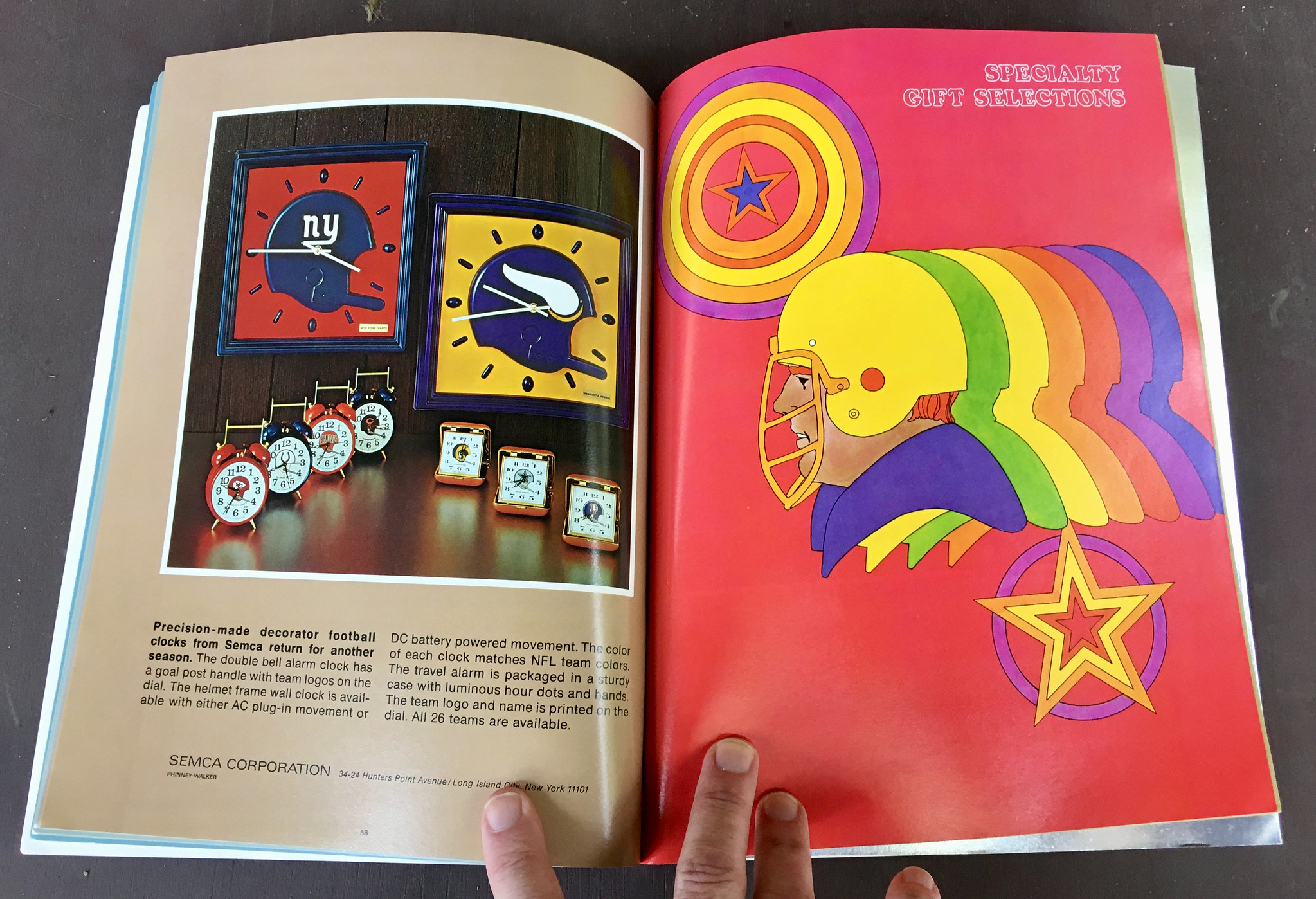
• What time is it? Time for “decorator football clocks” … and another great section opener:
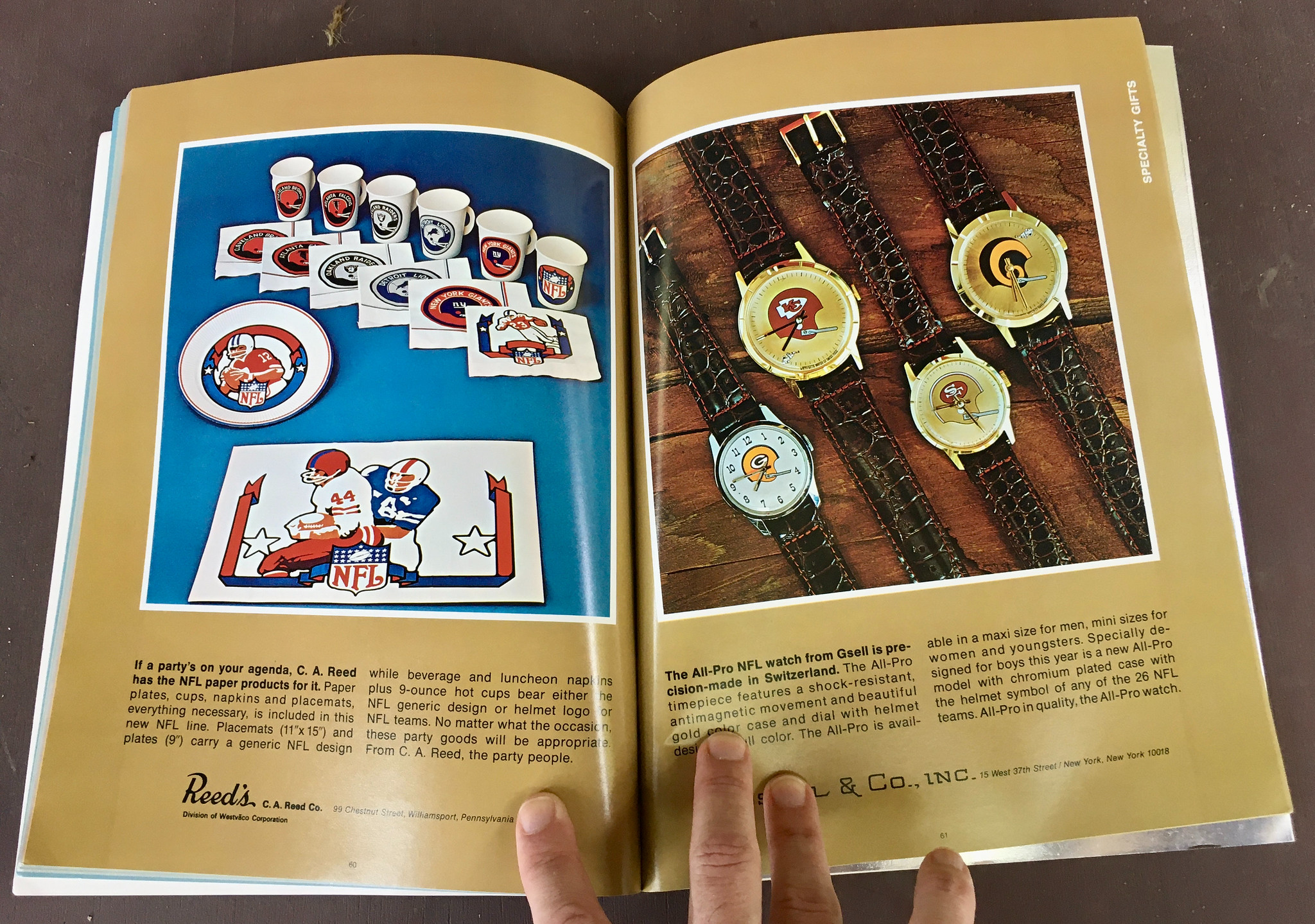
• Not sure I’ve ever seen little Dixie-style NFL cups like the ones shown on the left-hand page here:
• I believe this is the earliest catalog in Kevin’s collection in which classic NFL bedding appears. I never had any of this in my own bedroom, but several of my friends did:


• Less famous than the sheets, but with a similar design motif: NFL towels! Dig:

• Hey they were actually hawking books in this catalog! The one on the left-hand page, The NFL’s Official Encyclopedic History of Professional Football, is easily obtainable on eBay:

• And we wrap up with the inside back cover, which, like we’ve seen in previous catalogs, has a fold-out showcase of the league’s helmets (only this time the facemasks have been upgraded from single-bar to two-bar):

———
There’s a lot more. Want to see it? Photos of the entire catalog are available here.
Next up: MLB 1974. I’ll have that for you soon.
(My continued thanks to Kevin Cearfoss for sharing his catalog collection with me and allowing me to share it with you.)
Bulletin reminder: In case you missed it yesterday, my latest Bulletin article is an interview with the great Etienne Catalan, who has emerged as the premier authority on NBA uniform numbers. You can check out our conversation on my Bulletin page. Enjoy!
🚨 VAZOU!
Aqui está a primeira imagem do novo uniforme alternativo do MEMPHIS GRIZZLIES.
Ela reúne elementos da história dos Grizzlies em Memphis, não em Vancouver. Portanto, há poucas referências pra destacar. Mas eu te mostro se você seguir esse fio… pic.twitter.com/jLN9zn0Bun
— Camisas da NBA (@camisasdanba) September 30, 2021
Another day, another NBA leak: Brazilian NBA leakmeister Igor Coelho’s latest scoop is the Grizzlies design shown above. He’s also provided a write-up of it on his new website.
(My thanks to Phil for alerting me to this one while I was busy working on other stuff.)
Too good for the Ticker: Here’s something I don’t think I’ve ever seen before: The Pitt basketball team (or at least I assume those are basketball players in those photos) has added a sneaker memorial for Dr. Freddie Fu, an orthopedic surgeon who died last week after many years working with Pitt athletes. It’s not yet clear to me whether the memorial will be retained for the regular season, but it’s certainly an interesting uni detail!
(Big thanks to Chris Weber for this one.)
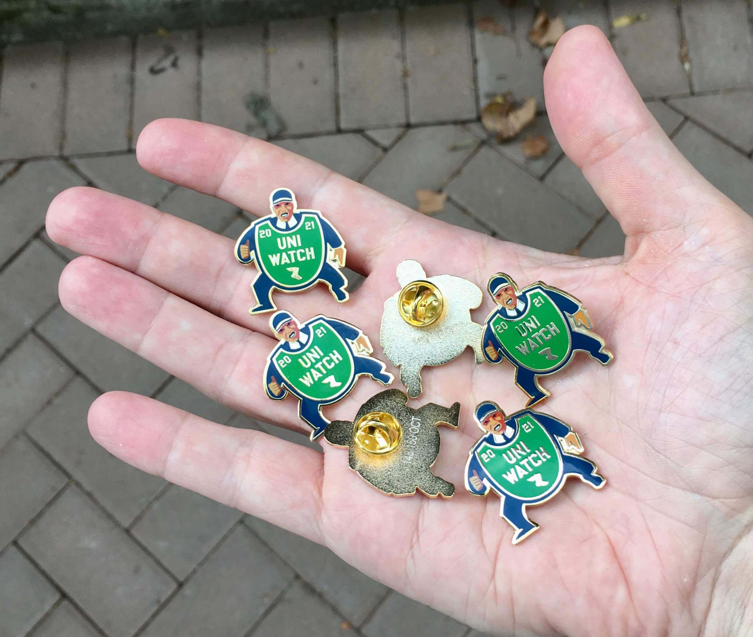
Click to enlarge
ITEM! New October pin: Today is the first of the month, so it’s time for our latest Uni Watch Pin Club design — a fantastic depiction of a baseball ump with an old-fashioned balloon-style chest protector. You can almost hear him yelling, “Yer out!”
Here’s a closer look (click to enlarge):
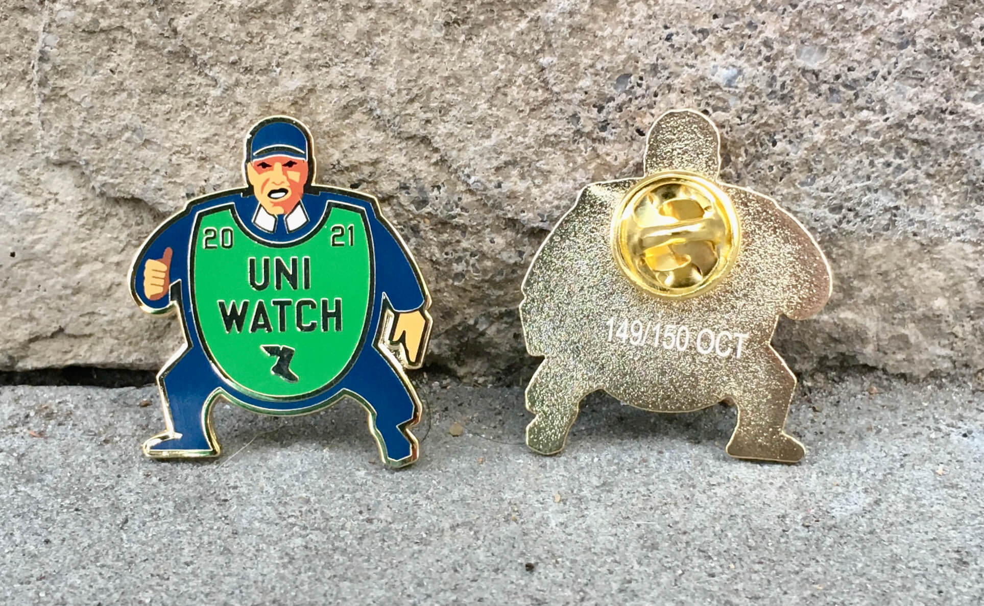
Sensational, right?
This was produced in a numbered edition of 150. You can order yours here.
My thanks, as always, for your consideration of our products.
The Ticker
By Anthony Emerson

Baseball News: Tigers IF Jeimer Candelario has been wearing the Fourth of July arm sleeve for the entire second half simply because he thinks it looks cool (from David Raglin). … Giants IF Evan Longoria has bat knob decals with the Pokémon Charizard on them (from Carlos Montalvan).

NFL News: Former Jets lineman Nick Mangold has been appearing in ads for Bud Light Seltzer wearing the Jets’ current unis. Mangold retired after the 2016 season, a full three years before the Jets adopted their current set (from Kyle Barry). … The Ravens will wear white jerseys and purple pants in Denver on Sunday (from Andrew Cosentino and Marcus Hall). … The Falcons will go mono-black against The Football Team this weekend (thanks, Phil).
College/High School Football News: Here are this weekend’s unis for South Dakota State, Florida, Troy, Stanford (in throwbacks), Mizzou, North Carolina, Northwestern (including mental health awareness decals), Oregon, Memphis, GT, Duke, Appalachian State, TCU, Tennessee, Maryland, WVU, Boise State and Ole Miss (thanks to all who shared).

Hockey News: Last night we got the debut of the NHL on TNT score bug, and it’s surprisingly minimalist (from Steven Schapansky). … Also from Steven, last night’s Golden Knights/Kings game, which was played in Utah, had the old-school 44-inch deep nets rather than the current 40-inch nets. … The Golden Knights have a new helmet ad (thanks, Phil). … The NHL is the only major North American pro sports league whose collective bargaining agreement stipulates that players must wear jackets and ties while traveling to and from games “unless otherwise specified by the head coach or general manager.” But now the Coyotes are relaxing their dress code, and several other teams are rethinking theirs (from Kenneth Traisman and Brinke Guthrie). … A character on Grey’s Anatomy wore an authentic Kraken cap during last night’s season premiere (from Johnny Garfield). … ESPN has collaborated with Icethetics to rank the five teams most in need of new unis in the NHL (thanks, Phil). … Domenic DiVincentiis, a goalie for the OHL’s North Bay Battalion, has new pads designed to look like armor plating on a tank (from Wade Heidt).

Basketball News: The NBA will not allow betting ads on unis, at least for the time being, citing the outcry in Europe over the proliferation of sports betting ads on soccer kits. The NBA’s stance differs from that of the NHL, where the Capitals will wear a sportsbook ad next season (thanks, Phil). … New unis — including a BFBS one — for Troy men (from Ben Whitehead). … New unis for Rutgers men as well.

Soccer News: This column in Forbes does a deep dive on the story behind Puma’s controversial “crestless” jerseys unveiled this season for several of Europe’s biggest clubs (from Kary Klismet). … Also from Kary: Cristiano Ronaldo famously prefers long-sleeved kits, but he had been wearing short sleeves since his move to Manchester United, until Wednesday’s Champions League match against Villarreal. Footy Headlines speculates that Adidas did not produce a player-issue long-sleeved jersey for United until Ronaldo’s surprising late-August arrival. United CB Raphaël Varane also wore long sleeves against Villarreal. … One more from Kary: Nike’s World Cup template jersey may have leaked. … Polish side Legia Warszawa apparently had T-shirts ready for their 1-0 win over Leicester in the Europa League. Which begs the question: why? What if they had won 2-1? … Very interesting new kits for the Maldivian national team (thanks, Phil).

Grab Bag: English rugby union club Exeter Chiefs have a one-off kit honoring the National Health Service, Britain’s national healthcare system. The rainbow motif has been used since the start of the pandemic in Britain to celebrate NHS workers. If you’re wondering how their kit advertiser feels about losing jersey real estate to the NHS, well, Exeter is currently without one as businesses are boycotting the team due to Native American imagery appropriation (from Hunter Sewell). … Here’s an article about how British pole vaulter Holly Bradshaw successfully pushed to wear a modified rowing unitard at the Olympics instead of the usual bikini (thanks, Jamie). … On a similar note, the governments of the five Nordic nations have jointly called upon the International Handball Federation to review women’s handball uniforms “in accordance with gender equality” after the Norwegian women’s team was punished for not wearing bikini-style uniforms during the European beach handball tournament this past summer (thanks, Phil). … Also from Phil, the National Lacrosse League will support the National Day for Truth and Reconciliation with a season-long helmet decal honoring the victims of Canada’s residential school system. … Cedar Rapids, Iowa, has a new flag, replacing one of the worst in the country (from Kary Klismet). … The Ruby Tuesday restaurant chain has a 50th-anniversary logo (from John Cerone).
By the time you read this, I’ll already be on the road, heading upstate for a long weekend. Won’t be back in front of a computer until 1:30pm-ish, so play nice while I’m away (and please forgive the inevitable typos that I won’t be able to fix like I normally do each morning). Have a great weekend and I’ll see you back here on Monday. — Paul
Great design on the pin this month.
Last night’s game again confirmed the Bengals should wear orange full time. Throw some tv numbers on the shoulders, and adjust the pants striping a bit and that would be a great look (aside from the tiger stripe helmet, but that seems here to stay).
Maldivian – I had no idea what the demonym was for a person from the Maldives. Learn something new! Thanks, Anthony!
As a native-born Cedar Rapidian, I dig the news city flag. My first reaction to the green shape was to see it as a leaf from the city’s longstanding five-season tree icon, but once I read the explanation of intent as representing the city island, I can’t un-see it as such.
I agree with your assessment of the new flag, Scott. It’s a sharp design. I’m glad they took Mays Islands as their inspiration and didn’t just slap the City of Five Seasons tree on the flag and call it good. The tree is fine as a logo and symbol, but would not have worked as a flag.
Pin now available:
link
— Paul, checking in from a diner in NJ
Does Nike coordinate the graphics packages for school’s weekly uniform announcements? I live in Tampa but went to school in Gainesville and the saw nearly identical photoshoots in my Facebook feed yesterday to announce their digs for tomorrow.
Nevermind, I see that USF isn’t a Nike school. But damn they were similar. They must have the same marketing company or these things are just getting so cliche.
These 1970s catalogs are a great trip down memory lane, thanks Paul. I was 15 in 1973, my brother was 9 so we were the prime target audience. We couldn’t get our favorite team jerseys (Vikings, Packers) in upstate NY, so we had to order from the Penneys’ catalog, and they came with some random number and of course, no NOB. Great memories nonetheless, thanks again.
Might want to note that the ESPN/Icethetics article is an Insider article and thus paywalled.
Love that new October pin! Great job Paul & Todd!!!
I was watching that Chicago Aunt show last night and I noticed that the C on the Bears helmet is backwards.
Also, the Bears helmet has a white face mask.
Also, I’m going by full name now.
Heyoh!
I’ve joined the ranks of the LI Phills going to the Phil Heckens
Wait, did you move out of St. Louis or something? :^O
Granted, I don’t watch much network television, but for me, the most shocking information in today’s post is that “Gray’s Anatomy” is still on television.
Really? I thought it was the Ruby Tuesday 50th anniversary logo – as in, I didn’t even know they were still around.
They are actually Pitt volleyball players.
For reference: link
Oh wow.
Those ties. I have a green version for the old St. Louis Cardinals. I wore it to my first Uni Watch party in St. Louis (2007).
It was featured the first time I was featured.
Marty, that was literally the first thing I thought of when I saw that page in the catalog!
That first NFL catalog photo, the cheerleader, and the one that says Novelties-School Supplies; those are the reason I got into NFL merch and design back then.
I had the NFL sheets on my bed growing up. Mom made them into rags long ago…As well as some generic Football themed wallpaper in my bedroom.
Any info out there on Tudor electric football games with other companies’ brands? I ask because for Christmas 1971 I got a Tudor 610 or 620 model game like the one shown, with the scoreboard and standings board, with three teams (Vikings in white, 49ers in red, Colts in blue). Except that my folks (sorry, I meant Santa) got it from the Montgomery Ward catalog, and there was a Wards logo in the place of the Tudor logo on the sides of the game, and the box was Wards-branded. I haven’t seen any photos of this in all my occasional googling of any Wards-branded games. (I also got an AFX set the next year, or the year after, which included a Wards logo on the box, so Wards apparently did this quite a bit.)
link
Had a similar electric football game, but the team names were the official wordmarks in their proper colors, and they came with cards (again, each team’s wordmark and colors) that fit in the end zones.
I have some old sheets that my mom ordered from the Sear catalog in the early 1990s with all the MLB logos on them. My grandma turned the sheet into a quilt. I should take a picture and send it in.
I’ve never done a deep dive on Electric Football, but I would find a complete lack of coverage on department store-rebadged games a bit surprising.
Has anyone ever noticed that, in the graphic representation of the Cincinnati Bengals that the NFL used for much of the 1970s:
link
…the wordmark appears much larger on the side of the helmet than it did in real life? Compare:
link
That’s always bugged me. Other teams’ logos, even ones with letters on them like the Giants, Jets, and Broncos, appear to be properly proportioned. Why couldn’t they get it right for the Bengals?
Yeah, I’ve noticed that in the past as well. It’s not even close, and you’d think it would have been an easy fix.
Okay, something screwed up on my phone, because the above was supposed to be in response to Fran Fried.
Urgh… apparently I can’t post any reply comment correctly on my phone today. Sorry…
NFL catalog is great, thanks for sharing. That baby looks like it is about to vomit all over the Dolphins bib. In the case of this item, should you really buy a bib of your favorite team, if it is going to be puked on? Or do you buy one with your rival’s logo?
That is not an “old school” hockey net. This is an “old school” hockey net, with the inner “peak”/divider between two half-circle back ends and droopy top shelf:
link
From the catalog picture of the belt buckle set, I have only one missing buckle to complete the set.
Which one??
Pretty notable uni story here: link
I am watching the Arizona @ Utah club hockey game. Some of the Skatin’ Utes are NOB, some are NNOB.
From the NFL Catalog, I had one of the color-by-number sets, the Raiders vs. Jets electric football, the Game Plan game, a pennant from my home team the Vikings, the Vikings art poster, I also had 5″ x 7″ (or so) mini jigsaw puzzles of the Bears and Packers posters, the full blown NFL helmet collection with four goal post display stands and the team wordmark bedding set with matching curtains. The funny thing is, if you asked me in 1973 what my favorite sports were, I’d have said baseball and hockey, so I think the NFL did a pretty good job of merchandising back then!