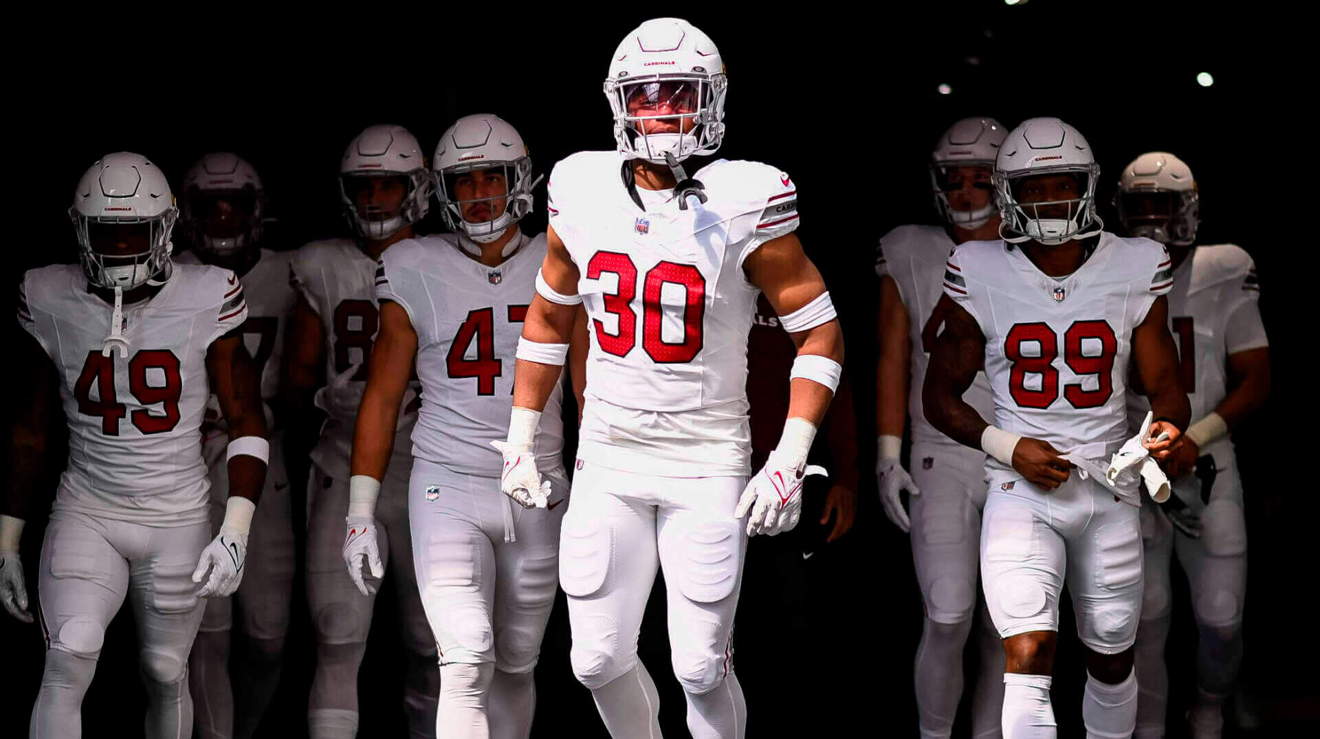
This afternoon the Arizona Cardinals debuted their new, all-white uniforms in a pre-season game against the Minnesota Vikings.
After debuting their all-red (bloodclot) uniforms two weeks ago, the Cards went full-on Stormtrooper today. If you want to know the deets on these uniforms, Paul had an excellent post back in April, shortly after the team unveiled them.
At the time the new sets (mono-red, mono-white, BFBS) were released, the feeling was generally that the all-white was ever-so-slightly better looking than the all-red, due to the fact that the all-white set at least had some striping on the sleeve caps and the pants.
How’d they look on the field?
They’re uh…very white.
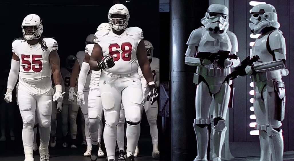
I really hate the use of the word “stormtrooper” to describe football uniforms, but in this case, it’s appropriate. Here’s a look at the team coming out of the tunnel before the game:
And Here We Go. pic.twitter.com/oC1GS5yJbv
— Arizona Cardinals (@AZCardinals) August 26, 2023
I mean, c’mon — didn’t you get just a bit of this vibe?
OK, on a serious note — the new Cardinals uniforms, especially when worn with white socks and shoes, are seriously white.
But at least those uniforms have stripes, right? Yes. Unfortunately, they’re not the most highly visible stripes, lending again to a very-white overall appearance.
Instead of going with a cardinal/black/cardinal striping pattern on the sleeve caps and pants, the Cardinals opted instead for cardinal/silver/cardinal, and as expected the silver pretty much fades into the white. The only black on the striping is the superfluous “CARDINALS” wordmark.

The same effect occurs on the pants stripes, giving them the appearance of two thin, widely-spaced, red stripes. The silver middle stripe is almost invisible.
I’m not sure that was the intended effect of the striping, but that’s what’s happening.
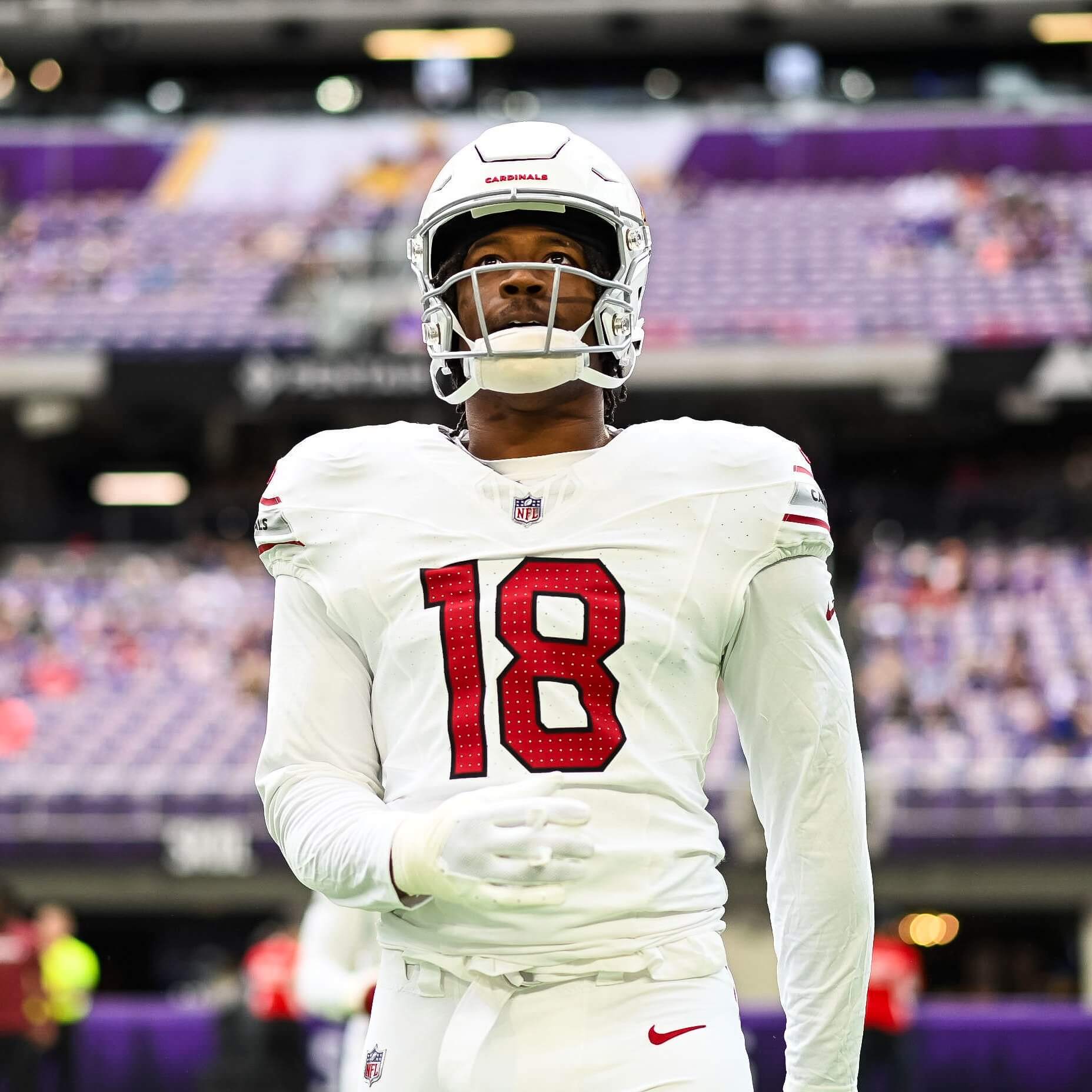
Now, the most important part of the uniform — the legibility of the numbers — is fine. The cardinal red with black outline shows up quite well. Even with the little perforations…
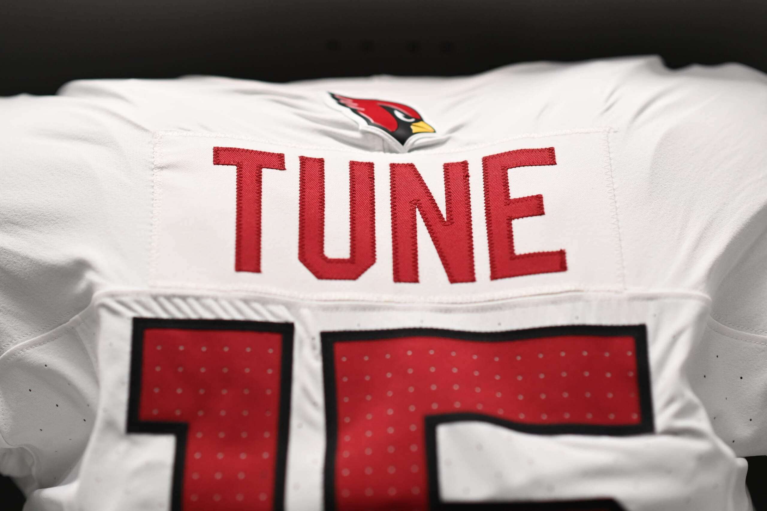
Of course, if you look at the above photo, you’ll notice the Cardinal head logo is located above the NOB, pushing it down towards the number (a similar problem exists on the red jersey). It’s not a deal-breaker, of course, but it does have the effect of placing the NOB a tad too close to the number, when it needn’t.
Now, I’m one of those who doesn’t mind white-helmeted teams wearing white jerseys and pants, but for the love of all that is holy, they NEED cardinal socks with this. Or a mix/match with their red pants. But they need something to break-up the otherwise all-white uniform. It’s one thing for teams to dress like this for their “color rush” uniforms — but there is a big need to at the very least don some red socks with this kit.
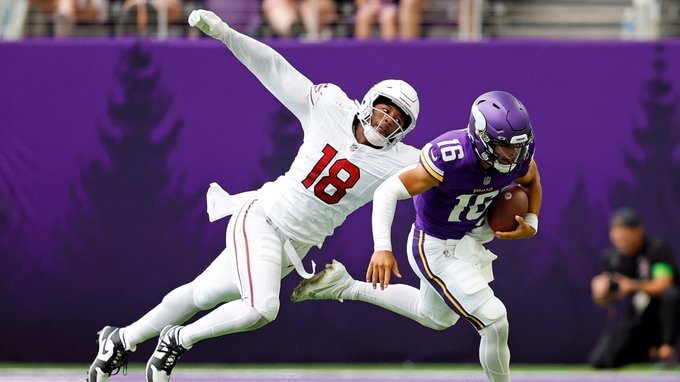
On the field, the uniforms looked fine enough, but their opponents — the Minnesota Vikings — also chose to wear white pants with white socks. It’s not a great matchup when both teams do this (and with NFL trends, I can see this happening for a LOT of Cardinals road games).
OUR BALL!!! pic.twitter.com/9ljlCHGI1H
— Arizona Cardinals (@AZCardinals) August 26, 2023
Three games in (two mono-red, one mono-white) and the Cardinals uniforms look as bad on the field as they did when the team unveiled them. The solution is simple: simply wear different colored pants (or at least socks). When the Commanders unveiled their uniforms last year, we were worried they’d go mono-burgundy and mono-white (and of course, mono-black), but they realized that wasn’t a good look, and began to mix and match. We can only hope the Cardinals will do the same.
You can see more game photos here.
The silver stripes would look much better in black, but these are soooo much nicer than the stupid mono red crap. I particularly don’t love the silver when yellow is part of the bird logo. Something about yellow and silver on the same uni doesn’t work for me.
Stripe should be Cardinal flanked by two black stripes. A white face mask would also be fine.
It’s total ****. This franchise simply can’t figure out a good look.
I am definitely getting a Stormtrooper vibe with that look. It looks like the Cardinals are on their way to Docking Bay 94 to stop the Millennium Falcon from taking off!
Two words:
Ohio State
Agree with many others. This shouldn’t be this hard.
Send them back to St. Louis?
I still don’t get the stormtrooper analogy.
How many football teams wore all white before Star Wars came out?
Wouldn’t it be fair to acknowledge the fact that stormtroopers looked like the St. Louis (Big Red) Cardinals?
But the teams that went all-white (Oilers, Bucs, Colts, Jets, Dolphins, Cards, Patriots, to name a few) had thick, bright striping on the helmets, jerseys and pants, and wore socks with colored tops. The “stormtrooper” look is because there is relatively little color to break up the monotony of white other than uniform numbers.
MJ nailed it exactly, Martay…
White/white/white is a classic look. One I explained in my writeup that I do like — but the lack of almost any color on the uniform (numbers are really it, as the stripes are basically muted), AND the solid white socks make this a stormtrooper look.
Past teams who had white hats and went white/white for jersey and pants almost always had much more color on the uni-elements, and never wore solid white socks.
Alas, the superhero style (pants & socks one solid color) is all the rage now — it’s certainly not a problem unique to Arizona — and will only get worse before it gets better. I’m sure the kids love it (“this is not your daddy’s NFL uniform!”). Hopefully it too is a fad that will pass with time.
Is this what it feels like to get old? I remember the neon phase a few years ago. That seems to have been replaced by this mono/superhero look. I’ve hated both of these most recent phases, and most people I know hated them. Yet because some kid on Twitter talks about how “clean” it looks, they keep putting it out there. Is it ever going to get better?
I usually really like an all white look with white helmet except for white socks. However, even with red socks this would look like practice uniforms. I watched this game and thought the same thing, that the red stripes were too thin, and the gray stripes were too light. Not sure why they went with gray, when black works well with the bird logo having black in it. I know they’re stuck with the jersey and helmet for 5 years, but could they come out with new pants sooner? Thicker red stripes, and maybe no white between the red stripes and the gray stripe, would be an improvement. Or just go with one thick red stripe.
I don’t get the hate for these. I think the mono-looks are awful but once they wear red/white combos it’ll be fine. This is just a modernised version of what the Cardinals have always looked like pretty pre-2003.
“once they wear red/white combos it’ll be fine”
*IF they wear the red/white combos.
Hopefully the blowback will be swift and they’ll jettison this mono look ASAP.
If it were just them doing it, there might be hope. Unfortunately, the hideous mono-look has spread all across the league like a plague. When the socks got dragged into it, things got so much worse. I don’t see it improving for a while.
MY EYES!
MY EYES!!.
Too much white!!!
Everyone moans about teams going all neon, but nothing is more eye-searing than a plain boring all-white uni.
Give them some red pants, pronto!
If I had to choose 1 set from the revamped Cardinals uni-lineup to not hate…this is it.
Actually, I like it (white-over-white road looks being my preference), but it’s far from perfect.
Could it use a tweak (like red/silver/red stripe pattern on the hose)? Yes.
Is this better than a red pants option? Heck yes.
Chris, I hear ya about the red pants — the best solution is to wear red socks with white pants. I do not like dark pants with white helmets, no matter what the rest of the uniform is (and the worst is what they wore the past two weeks: white hats/cardinal shirts, pants and socks.
It works better with the Commanders, because they have a dark helmet, so they can go burgundy/white/burgundy/white. I think white/white/red/white would be preferable to the mono-white because it’s just *too* white. But my preference would be white/white/white/red. Wonder if we’ll ever see that.
I don’t get the hate either – this a good look. No one has an issue with the Colts in all-white, and honestly this might be a little better
The Colts have more and better striping, along with properly sized numbers. The white doesn’t overwhelm the details the way it does with the Cardinals.
This is the key distinction between mono-white looking good and full stormtrooper. Teams can wear all-white and set it off with contrasting stripes on the helmets, jerseys and pants. When paired with colored socks, it can look really good; look at the many teams from the 1980s who pulled it off.
I was surprised by just how *white* these looked in action. The silver is far less visible then I expected.
The NFL is in a mono-white crisis right now. Somehow over the last 3-5 years, all white socks with extremely plain white pants has become all the rage. Nearly EVERY team has a mono white look. The Broncos have joined the club and stopped wearing their blue socks with the orange stripe in order to wear all white. Every team now has a practice uniform look. I know players wearing leggings is a part of this but Nike is creating new uniforms to have plain white socks now.
There needs to be a pants and sock stripe revolution. Contrast is so important too. The Browns and Chiefs played today and even though players on those teams aren’t consistent with how they wear their socks, the game showed how striped socks make such a huge difference. This trend is creeping up on BFBS faster than I imagined it would.
Here’s a great graphic posted by an account I follow that shows how many teams have ughhhhh “icey white”
link
Desperately need to add some visible stripes…especially on the socks. I’d say redo the stripes on the sleeves, except NFL jerseys no longer have sleeves. Yet another problem. It can’t be that hard to create a decent uniform set for the Cards, and yet, here we are. Uninspired trash churned out by some talentless design interns at Nike.
Madden ’98 custom uniform default setting vibes…
Temple garment vibes
I like ‘em.
The solution to this uniform might be an alternate red shell helmet.
How do they continually not get this right. Arizona teams should be the easiest of any of them.
The numbers are outlined in black, but the stripes are silver and red. Using silver as the number outline would make more sense. But wait – the stripes have a black “Cardinals” in plain block font. They come up with a unique, simple striping pattern, then, “Btw, we’re the Cardinals!” Yeah, we know.
The easiest fix would be to put stripes of some kind on the red pants.
But then they wouldn’t have superman costumes
Cardinals white unis looked awesome. Stop being negative just because they didn’t do the design you would’ve envisioned. The logo on the back looks great. The silver striping blends in beautifully. These look better than the Chargers’ all-whites, and I’m a Bolts fan
I was looking for Neil Lomax out there!
I am surprised that I don’t hate it. Then again, hard to mess up the all white look since it always looks fresh and crisp. Their last set of uni’s were atrocious.. and the previous set (Larry Fitz rookie years) looked like park district uniforms, so those don’t really even deserve a mention.
The new jersey’s as a full set, don’t love them, don’t hate them. The white is definitely my favorite out of the bunch.
Forgot to mention, I wish they would’ve done something with their jerseys when Larry Fitz was suiting up. One of the best WR’s in this generation and never had a nice looking uniform to match his talent. These would’ve settled.