Welcome back to the “2+3+2 (+2)” project.
Click here to see the AFC East.
Please go to the AFC East link to see the full description of how this project came about.
Today we’ll tackle the NFC East.
To sum up, the project parameters are the following:
• All teams will have 2 helmets, 3 jerseys, 2 pants and 3 socks
• All uniform elements will be “interchangeable” (any combinations can be worn)
• Some teams will be given two options: current uniform and throwback (or fauxback)
• Opposing teams will wear different color elements (helmet/jersey/pant/socks)
• Home team will select its color combo, and away team will then select its combos. No elements can match opposing team
• To the extent possible, uniforms will be based on a team’s current available options. Where no such options exist, they will be created such that every team has 2/3/2/3 options.
• Where present home and road (and/or alternate) uniform template designs differ, they will be “streamlined” to have one single format/style in the 2/3/2/3 parameters
• Color vs. color will be permitted. The only exception is only one team can wear its “dark” jersey (the opponent can pair their color “medium” jersey vs. opponent’s “dark” jersey)
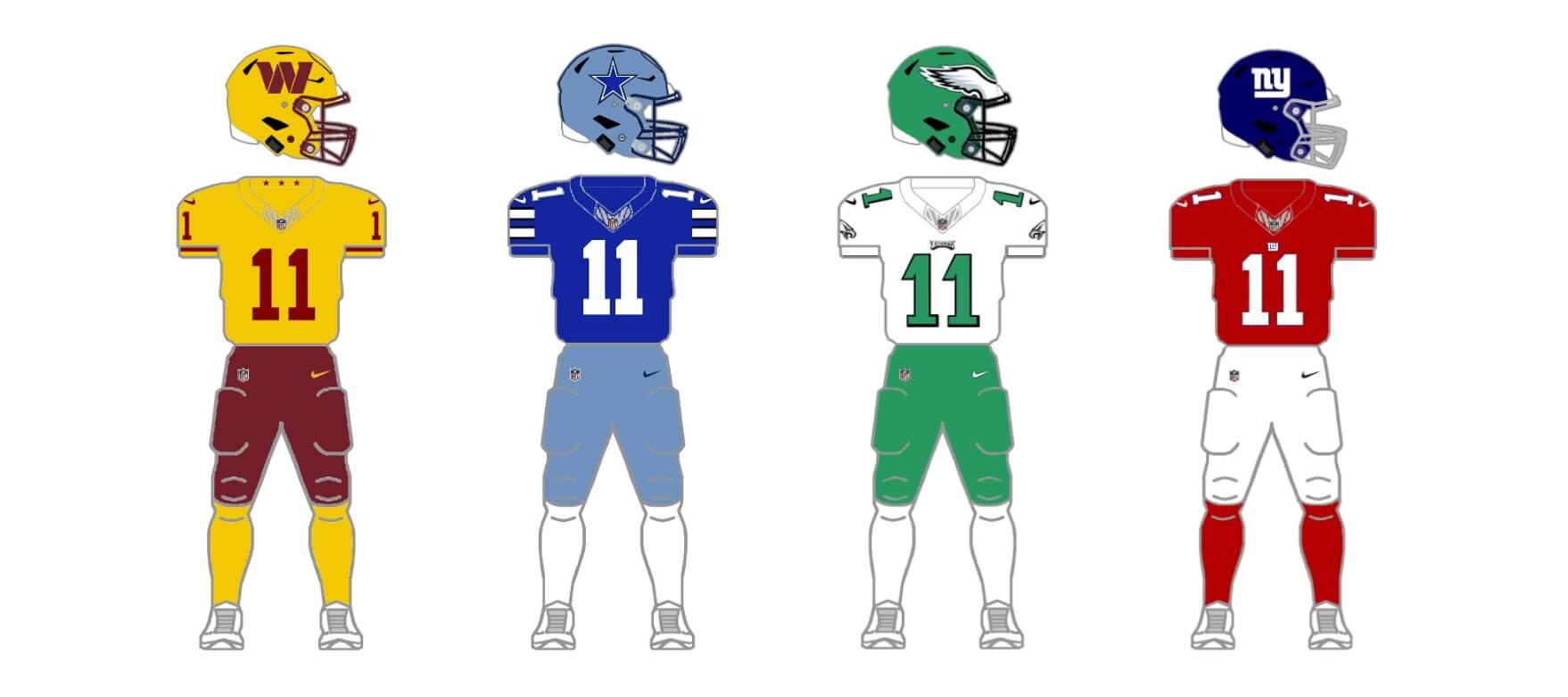
NFC East
WASHINGTON COMMANDERS
The Commanders only introduced their uniform set last season, including a BFBS alternate. Many fans are upset the team does not have a gold pants option, and jersey template styles differ across the burgundy, white and black options.
Current uniform
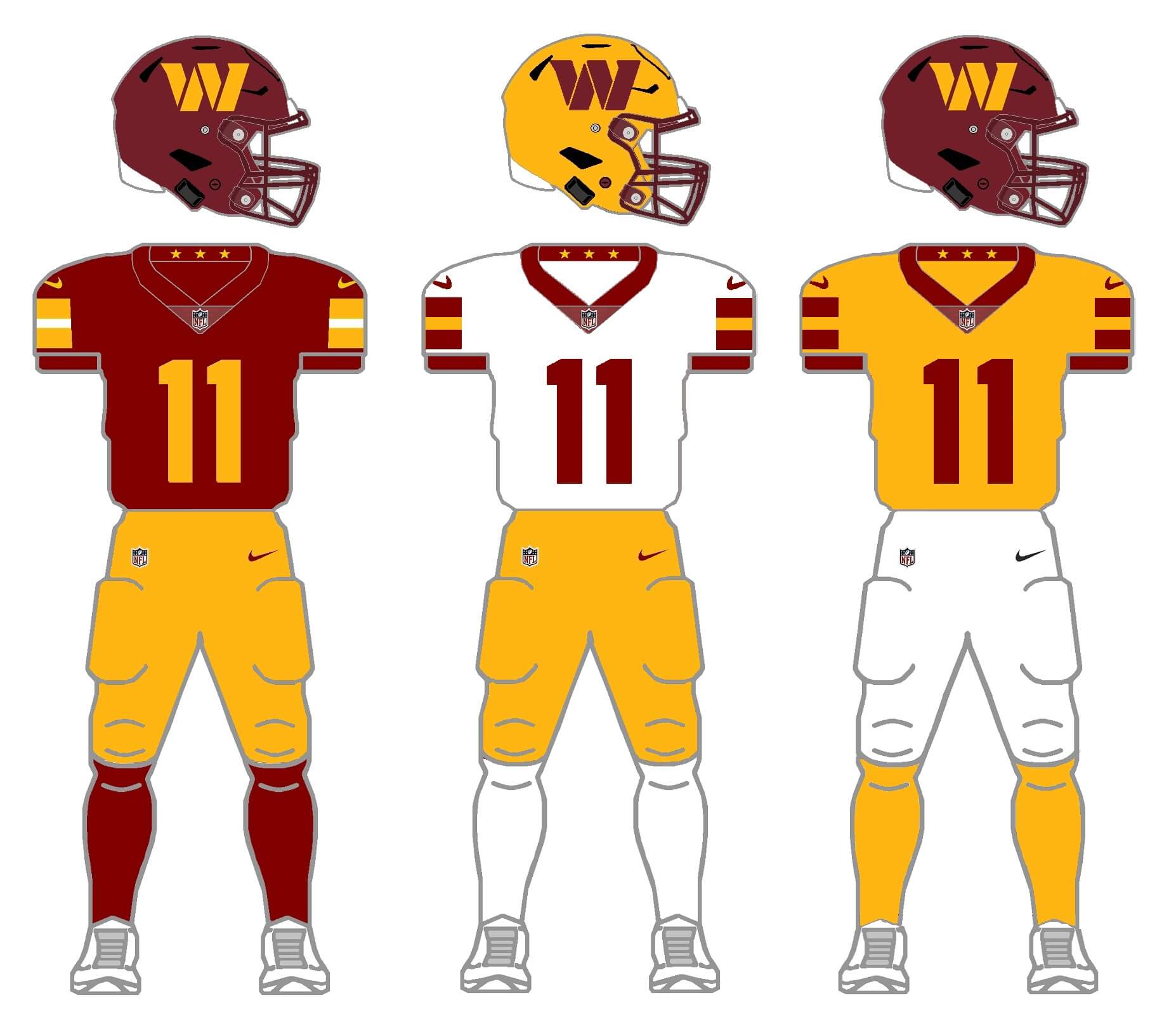
The first thing I did with the Commanders was to ditch both their burgundy and black pants, adding in a gold and white set. Next I jettisoned the black alternate helmet, and created a gold helmet. I think most of us can agree they best part of the Commanders set is their helmet logo. Finally, because their jersey template/striping is inconsistent across their three jerseys, I used the burgundy jersey as a template for the white and gold versions. I got rid of the gradients for the number fonts, and the giant wordmark on the jerseys as well.. What we have is, I think, a consistent looking set (for mix/match) in their classic colors. You may not agree, but I think I was able to turn an otherwise disjointed (and almost universally panned) new set into something much more fitting. I flirted with keeping the burgundy pants, but that would allow them to go mono-burgundy, and that’s a terrible look. (I did, however, add burgundy pants in a fauxback, which you’ll see below.)
Fauxback uniform
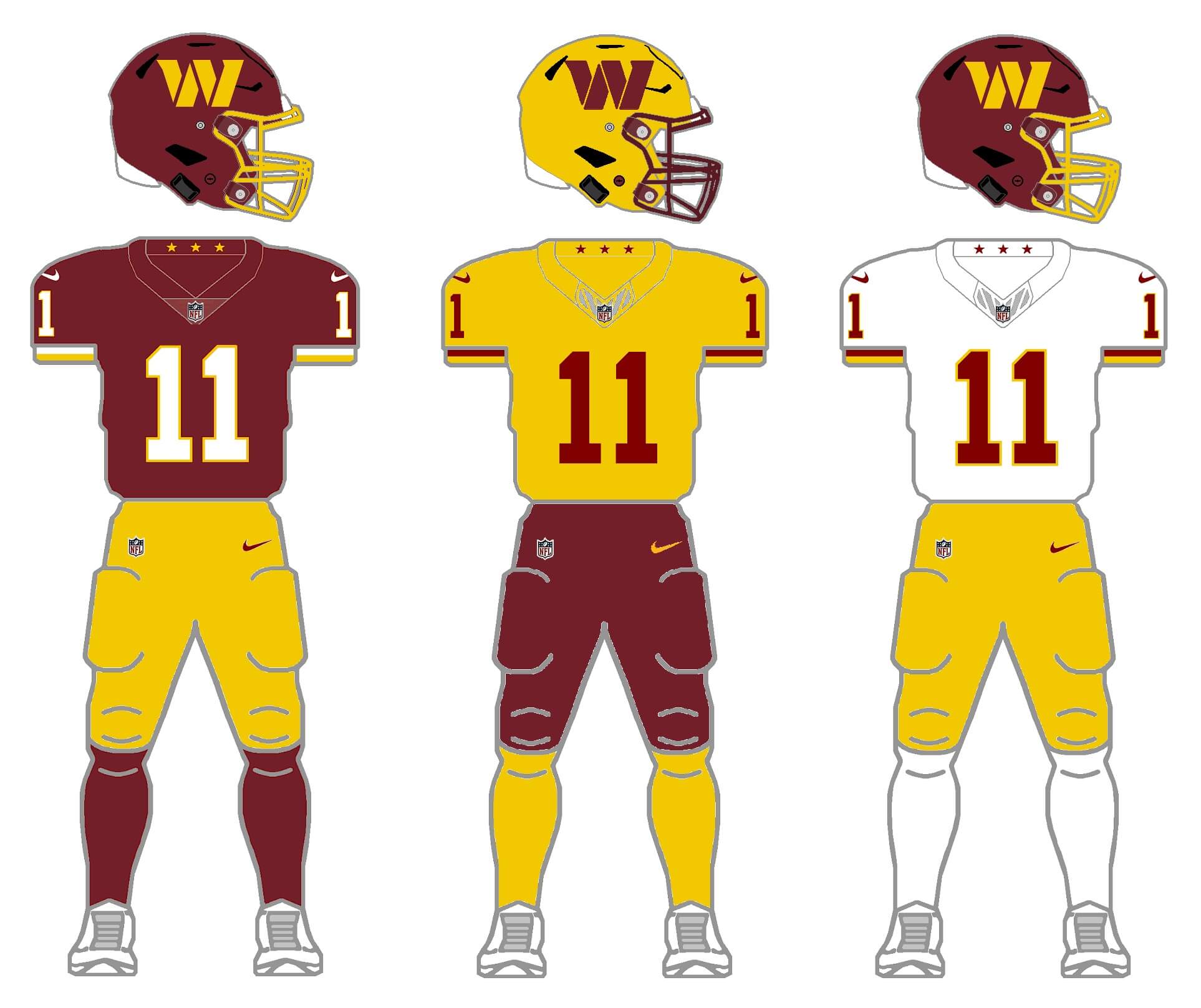
When the team transitioned from its prior name to just the Washington Football Team before rebranding to Commanders, the biggest change was removing the old logo and putting numbers on their helmets. It wasn’t a bad look at all, and many fans liked it. So, I decided to create a fauxback for the team, combining the new helmet (and new gold shell) with an ode to prior uniforms worn by the team. For this set, I added burgundy pants (removing the white pants I added in their current setup). I also gave the burgundy shells gold masks, and the gold shells have a burgundy cage. The burgundy and gold are the shades used for the WFT uniforms (if you’re curious as to why the colors are different between the two proposed sets).
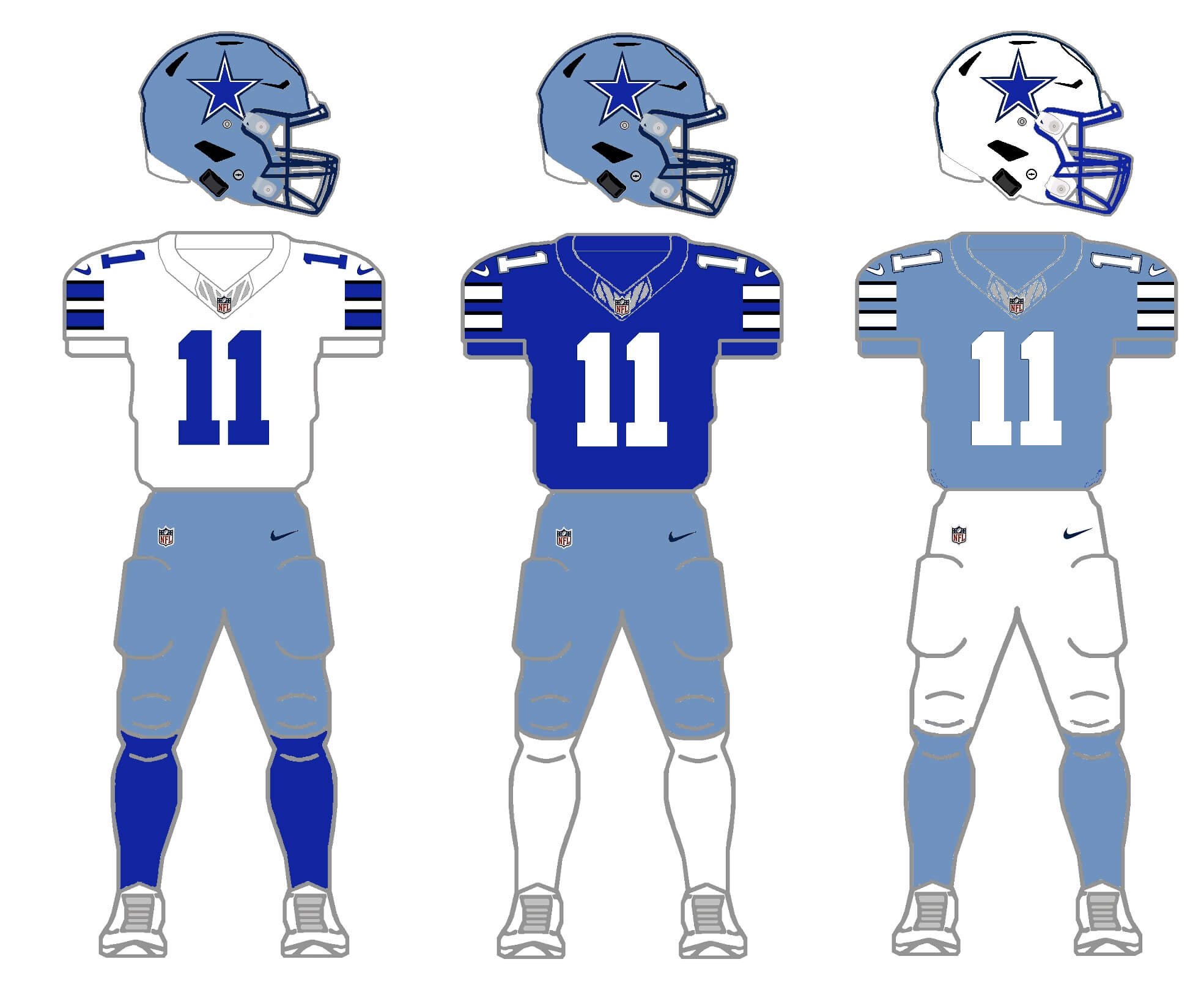
I strugged more with the Cowboys than any other team trying to make them “fit” into the 2/3/2/3 model. For decades, the team has been incredibly inconsistent in jersey styles and colors. One of my favorite ESPN stories Paul ever wrote looked at some of these annoying quirks. Moreso now than ever, the Cowboys have different templates AND colors for their home, road, throwback and CR uniforms. Should I go royal or navy? Which jersey template to use? Ugh. Finally, I decided to go with the template used on the white jersey, and I eliminated all navy (including changing the color of the star on the helmet). For the colors, I tried to approximate their 1974 look. The silver helmet thus has a more blueish hue to it. Second shell (which they have already) is white. For the silver/blue helmet, I did keep the navy facemask (for contrast), and for the white, I added a royal cage. Jerseys are therefore white, royal and silver/blue, and sock options are the same. The pants options are silver/blue and white. I realize there are some (many?) who like all the uni quirks — so this concept isn’t for you. But for the purposes of the 2/3/2/3 project, I think this keeps the current “classic” home (white) uniform mostly in tact, and brings back the beautiful 1974 look as well.
The Eagles introduced gorgeous throwbacks this season, complete with a kelly green helmet (giving them two, along with their midnight green topper). But it’s not great for the 2/3/2/3 to have two green lids. And while some fans love the midnight green the team has worn since the mid-1990s, others love the kelly green look.
Current uniform
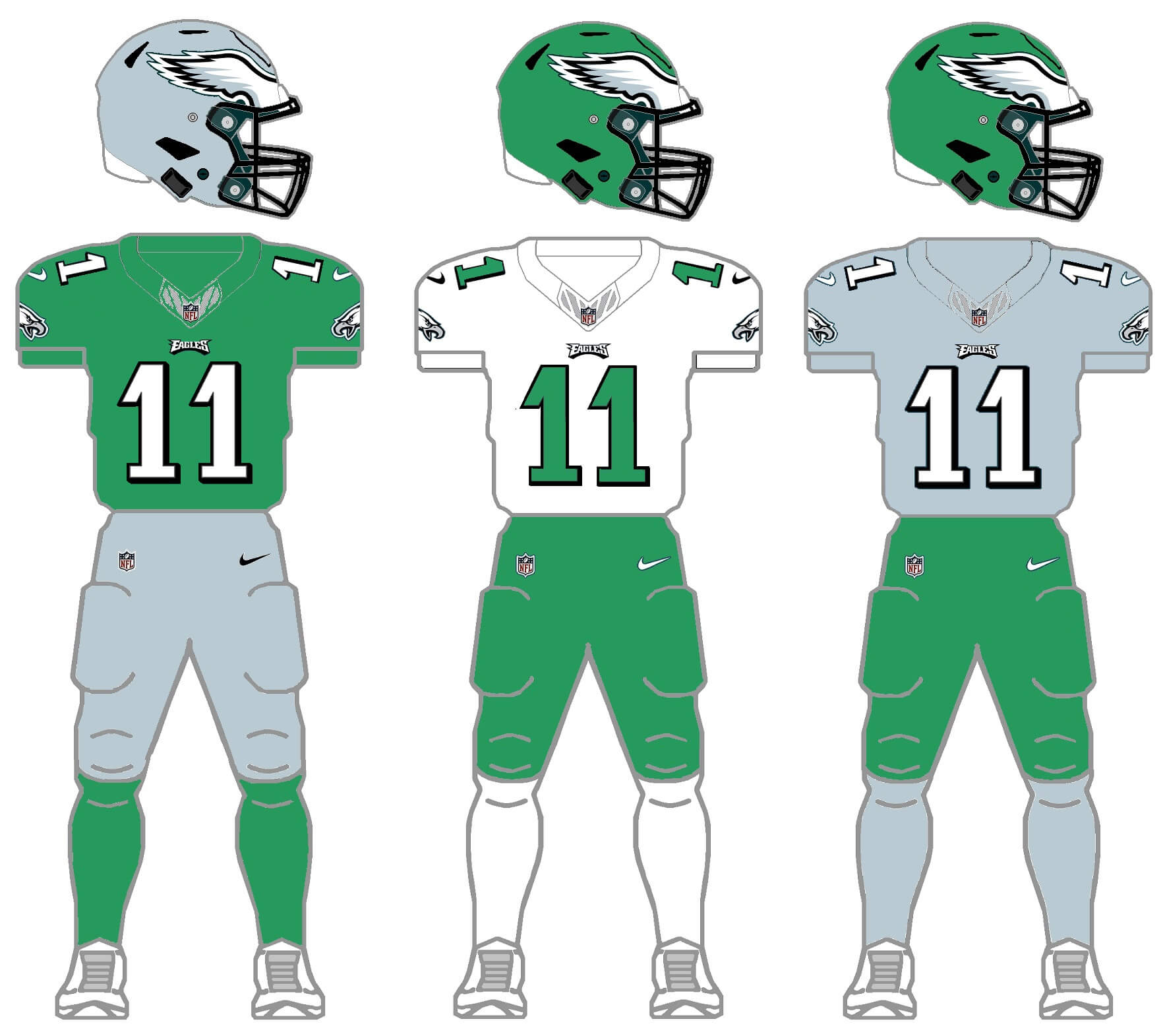
I made the executive decision to slightly deviate from protocol for this one, swapping the midnight green for kelly green. The helmet options will be kelly green, and a new shade that takes the silver/gray from the eagle wings on the helmets. I also replaced the white pants with silver/gray, giving two options (kelly and silver/gray). Jerseys will have kelly, white and silver/gray options (same with socks), and everything is rendered in the current uniform template. I realize this may be jarring at first, but I think these colors work well. (Let Philly OWN kelly green!) And despite the current uniform template being introduced in the 1990s, it’s held up surprisingly well and should be a considered a modern classic. Normally I would swap out the black cage, but with the blockshadowing on the numbers, the black masks work across all three jerseys.
Throwback uniform
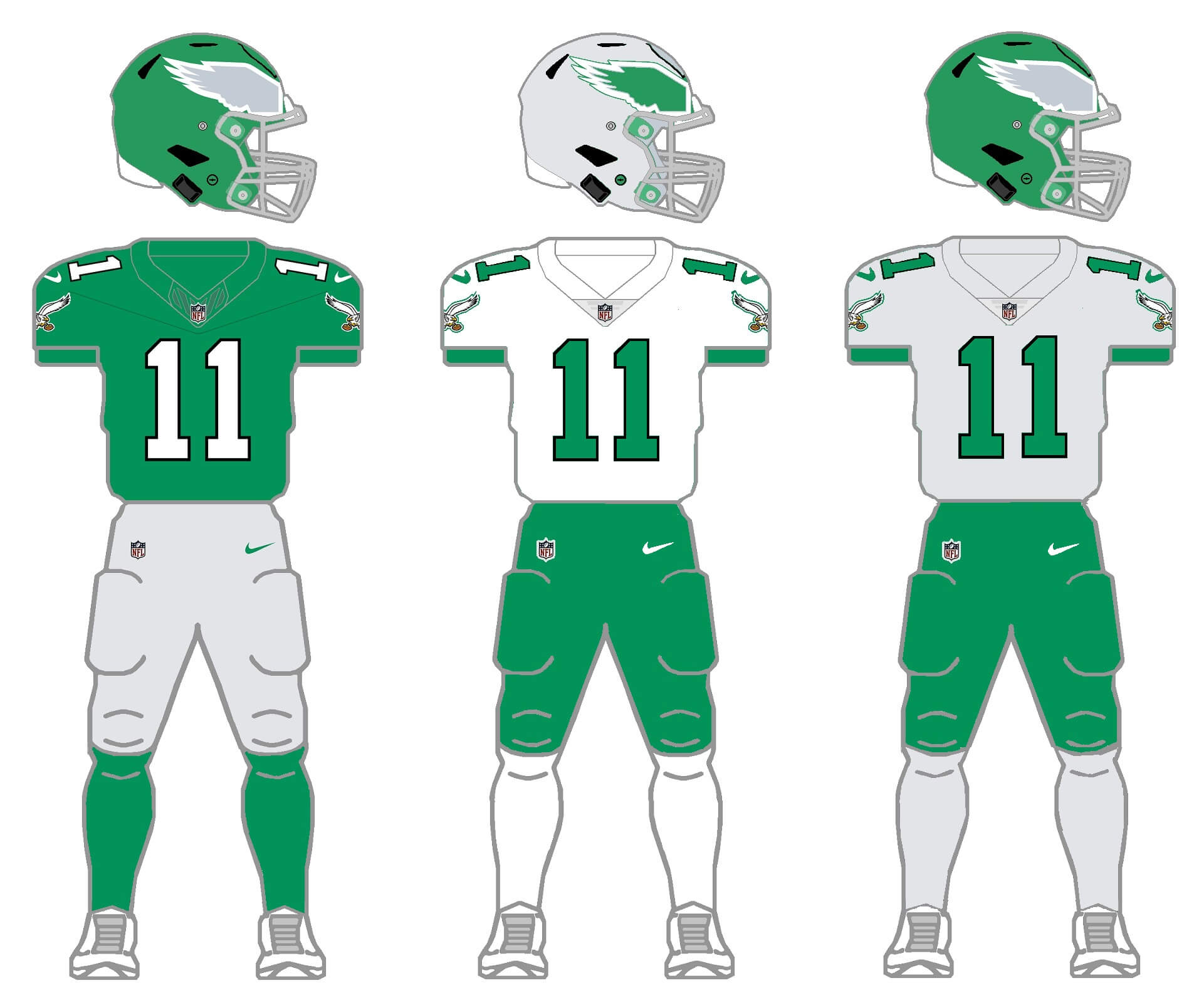
The team introduced an absolutely gorgeous home throwback uniform this season, so I kept that unchanged. The second shell is a silver/gray, again taking the shade from the eagle wing on the helmet. I debated whether to add white or kelly green pants, but in the end went with the green, and gave them a white (light) and silver/gray (medium) jersey (socks too) to round out the set.
The Giants added a second shell last season (dark blue, as opposed to their more royal blue helmet), but they’re too close in color for the 2/3/2/3, so I’ve created an additional red helmet shell. The Giants are another team that wears a true throwback, and a fauxback (“CR”), so I’ll do a set of both here.
Current uniform
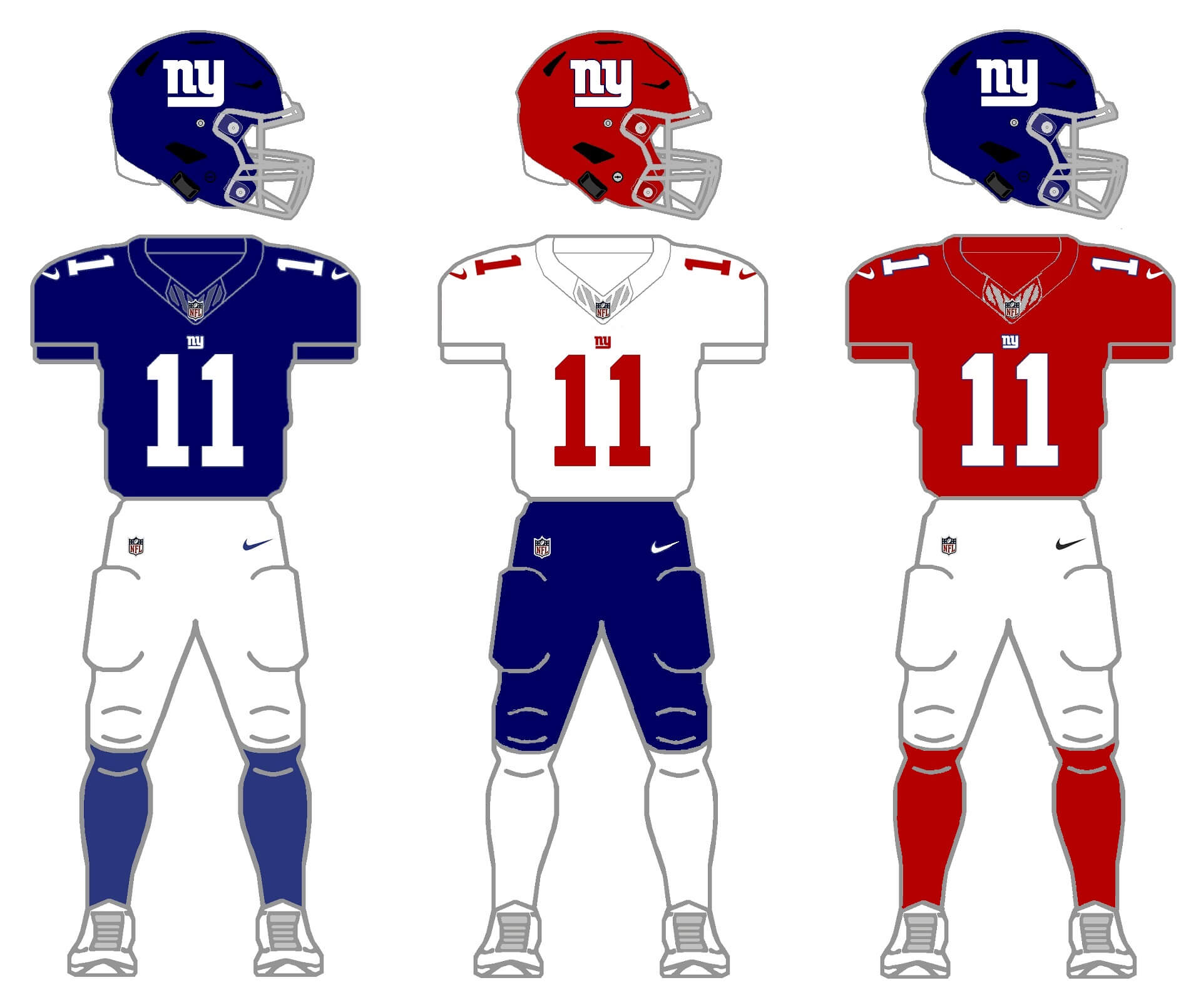
I think the G-men have one of the nicer home uniforms in the game, so they’ll remain as is. Since the team’s primary road has Northwestern striping, I’m going to eliminate that for symmetry. A third jersey is required, and since a) their colors are blue and red, and b) the Giants have a long history with red jerseys (including a recent one), we’ll make that the medium. And while the Giants have a long history in gray (or white) pants, I’m giving them a set of blues, which is a part of their past. Although not shown, pant stripes will not follow the pattern on the current home white pants, but rather use the three-stripe pattern found on the throwback and CR pants.
Throw/fauxback uniform
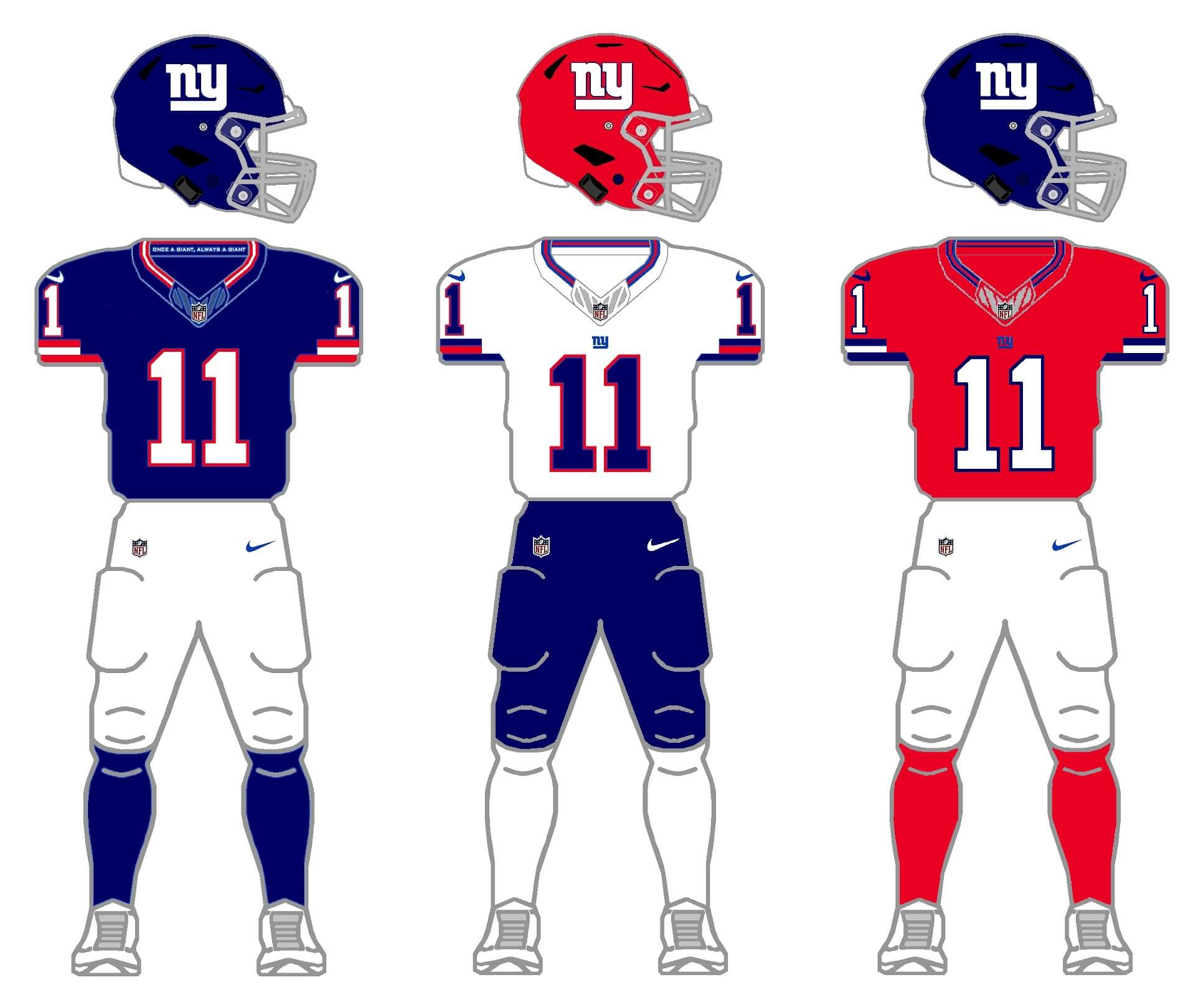
Pretty much the same scenario with a throw/fauxback uni. We’ll use the tempate of the home uniform throughout (but use the present “ny” logo rather than the throwback “GIANTS” and use a lighter color shell). The royal and red are both a bit lighter than with the current home uni, so we’ll use those here. Same red/white jersey and red helmet criteria as above. I’m also using blue pants for their second pair. In all cases face masks remain gray.
Love the concept and this division, even if I hate 3 of the teams in it (GO BIRDS!!)
WSH: this is it, they could adopt this now and be fine. I am even OK swapping out the white pants for burgundy. This also eliminated everything wrong with the current set. Nice.
DAL: I would go white, royal and navy as the 3 jerseys. They use both colors, moreso than a pale blue jersey.
PHI: a third jersey is tough and there is a disturbing portion of the fan base who love the black jerseys. As a nod to them and the merchandise they crave, I would go throwback kelly green, white and black (ugh) jerseys, silver pants with all (white if you need a second pair… but you don’t), kelly green and white throwback helmets.
NYG: having a tough time seeing so much red for Big Blue. Maybe this is another case where you do royal blue and navy blue like the Cowboys?
Great concept. Lots of work went into this.
My favorite of these is, surprisingly, the Washington Commanders. When you get rid of some of the stupid things they’re doing with their current uniform set and put the focus back on the burgundy and gold, the uniforms really pop! Nicely done with this, Phil!
You have perfected the Cowboys look. That mid 70s home and road was perfection and they never should have deviated from it. I hate Dallas. But I love the look you came up with.
This was a tough division to tackle!
WAS: Phil’s artistry demonstrates that they aren’t a lost cause. I’ll say it – give me a gray facemask with that yellow hat.
DAL: Not much to work with here, but graying the silver and adding a royal top gives some uniformity while still retaining some of their quirks (I have no problem with their current look).
PHL: Not including a white helmet and instead going with silver was disappointing. I like the LuriEagles much more than the Braman Birds, but nice effort.
NYG: Bold choice going with red helmets – and it works! But those blue britches don’t even if they are a nod to their uni-past.
washington’s looks great,,,,,,fauxbacks too. not a big fan of the black unis. also, being the “commanders” they should have a camo set, it only makes sense. dallas looks great too. however, a regular silver jersey with the white helmet might work.
As a Commanders Fan, I have to say you can never remove the Burgundy pants, A.k.a. Winning Pants (Every Super Bowl win in the Franchise history took place with White Jerseys and Burgundy Pants).
It’s just Blasphemous.
Personally, The White Jersey should never be worn with anything other than Burguny pants. Looks severely unbalanced with the gold pants (gold helmet would be the only saving grace) and I hate white tops and bottoms, thought I get it.
Well, with the Fauxback option (2nd shown), they could go burgundy/white/burgundy (and any of the three color socks) — it’s “mix and match”. I’m only showing three of … gets phone, opens calculator … 36 possible combos.
2 x 3 x 2 x 3 = 36
You mentioned that you eliminated the burgundy pants from Washington so that they couldn’t go mono burgundy. But with the options you have them, they could go mono gold. One of the 36 possible options is gold helmets, jerseys, pants, and socks, which I think would be worse than doing burgundy head to toe.
Well, I’d argue mono-gold is less bad than mono-burgundy. ;)
Obviously this is just a concept and would never be adopted, but if one of my “rules” is that every uniform element is mix/match, then there are going to be some combos that would look awful (including mono anything, including all white or all black, which to me are slightly more acceptable than mono-color). I’d *hope* the Commanders would never go the mono-gold route, but yes, it would be an option. That goes for all teams.
Unless I want to have three jerseys and two pants that are all different colors, there will always be a potential for at least mono jersey/pants/socks with every team.