John Gordon, who in 1961 designed the Green Bay Packers’ original “G” logo while working as an equipment assistant, died on Sunday. He was 83.
The short video embedded above, which I definitely recommend watching, tells the story of how Gordon is believed to have created the symbol. There’s also a good article about him here. At the time of that article, Gordon had not yet been acknowledged by the team as the logo’s creator, but his contribution to the team’s visual history has since been showcased in the Packers Hall of Fame:

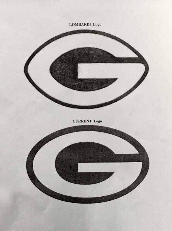
The logo has been modified a bit over the years. It was originally football-shaped, per Packers coach Vince Lombardi’s instructions, but over the years it has been softened into a true oval (or, if you prefer, more like a rugby ball):

The University of Georgia began using an extremely similar version of the “G” logo, with the Packers’ permission, in 1963. About a decade later, Grambling State University also began using a similar mark, again with the Packers’ permission.
Bring back the football shaped logo!
YES!
And while the Pack is at it – go back to being a gray facemask team.
I may have turned a corner ; )
Thank you, Mr. Gordon. RIP
“while the Pack is at it – go back to being a gray facemask team”
Where is Christopher Hickey and what have you done with him?
AMEN!
I was all set to post “The ‘G’ Stands For Greatness!” but Paul beat me to it.
From ESPN’s article about Gordon’s passing:
“Despite the popular belief that the “G” stands for greatness, it in fact stands for Green Bay, Packers team historian Cliff Christl wrote in a 2015 article on the Packers’ website.”
It’s also right there in the photo from the Hall of Fame that’s included in this post.
I appreciate how designers back in the day were untroubled by details such as, “where’s the ‘B’ for ‘Bay’?”
IIRC, In North Dallas Forty, they couldn’t use real logos, so the team from Wisconsin wears a logo that has the left half of the oval as a G and the right half as a B. And it is not terrible. too lazy to go the googles on that,
I wonder if he was inspired by the wishbone C. That’s what I’m seeing if the ligature (?) of the G is removed. And I do agree that the original football shape was better.
I love this story, all kudos to the late mister Gordon, the G looks great on the helmet but I prefer the coaches wearing the interlocking GB intead of the G. Just like the Bears B and the Washington W worn in the 70s and 80s by Washington coaches. I just love that GB.
Not to throw water on all this, but I never thought that this logo is all that clever or interesting. It seems pretty pedestrian to me.
As a former tour guide and now alum of UGA, a quick tidbit on what the Dawg faithful refer to as the “Power G”:
Designed in 1964 at the behest of Coach Vince Dooley by the backfield coach’s wife, who had a BFA in commercial art, the ovular G logo did bear resemblance to the football-shaped logo of the Packers. In order to avoid a potential suit, Dooley asked Green Bay if it was cool, and they said it was. A few years later, 1969 if I remember correctly, also after Grambling State had co-opted the logo, Green Bay adjusted their logo to be more ovular as well. And while all three logos look essentially identical from afar, they are all still slightly different as well. Link for logo overlay here: link