Good morning, Uni Watchers, and a Happy St. Paddy’s Day to one and all. I’m back again with UW contributor/pal Kary Klismet, continuing with his “Dressed for the Season” (“DFTS”) series. DFTS is a series on uniforms appropriate for particular holidays. The series began with Easter, and moved on to Independence Day, then to Hallowe’en, Thanksgiving, Christmas (Part I and Part II), and finally, Valentine’s Day.
Today, he’ll give us his take on St. Paddy’s Day-themed uniforms.
There’s a lot to get to, so here’s Kary. Enjoy!
by Kary Klismet
Maidin mhaith, my fellow uni-watchers, and happy St. Patrick’s Day! We’ve come to that most sacred of days on the calendar when those of us in the United States and around much of the world celebrate our Irish heritage (real, imagined, or temporarily claimed) in the most solemn and contemplative way possible – by donning whatever green things we can find in our closets and drinking cheap adjunct lagers dyed to look like lime-flavored jello!
However you observe the holiday (even if it’s, ahem, less authentically), St. Patrick’s Day presents the perfect opportunity to explore the intersection of Irish culture with sports uniforms. There’s plenty to get to, so let’s be movin’ along!
As an initial clarification, today’s edition of Dressed for the Season is not a ranking of green uniforms. Paul already put together the definitive ranking of green uniforms a couple of years ago. (And if you haven’t subscribed to Paul’s Substack account yet, the price is worth it for that article alone!) The focus of this piece is on the uniforms that best convey a sense of “Irish-ness” – or at least those tropes, customs, and yes, even stereotypes that we associate with being Irish.
While wearing green was not specifically a requirement to make this list – and to be sure, I considered several teams that don’t wear green – it just so wound up that every team to make the final cut does indeed incorporate green into their color scheme. Green is just so intertwined with Irish identity that all the teams with the best Gaelic garb in the sports world use it.
This installment of the series was quite possibly the most difficult to compile because of all the strong contenders I left out. I capped myself at seventeen entries (in honor of March 17th) because the list could have ballooned to fifty or more (truly!), and yet I still ended up with eighteen when a couple of teams tied for seventeenth (understandably, I think you’ll agree).To acknowledge a few of those teams that just missed the cut, let’s give out a few honorable mention hors-d’oeuvres before we move on to the main course. First, in the non-green category, the sports teams at Iona University in New York deserve affirmation for generating a grand Gaelic guise with their logos and team name, if not their colors.
Next up, there are so many teams (in Great Britain especially) historically founded by Irish expatriates that I couldn’t include them all. The “best of the rest” includes the London Irish, an English rugby union team nicknamed the Exiles. I also feel compelled to mention the enormous number of minor league and junior hockey teams that have called themselves the Shamrocks over the years, my favorites of which were from Chicago, Pittsburgh, and San Francisco.
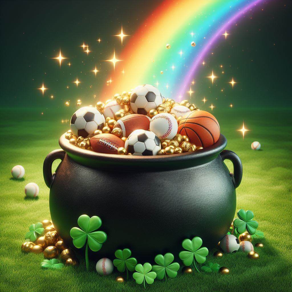
Finally, my sister Loni, who’s been a tremendous cheerleader and sounding board for my work on this series, suggested that no survey of Irish-themed uniforms would be complete without a rainbow. One team in the rankings below does have a rainbow alternate but it’s not the reason they made the list. The University of Hawaii’s football teams from the 1950-90s, with their green jerseys and rainbow trim, come close to perfecting the theme and might have made the rankings if they’d worn those unis in support of a specifically Irish-themed identity!
Now that we’ve checked the rainbow reference in place, let’s see what kind of uni treasures we’ll find at the end of it! Here are, in my humble opinion, the finest uniforms of Irish persuasion that the uni-verse has to offer:
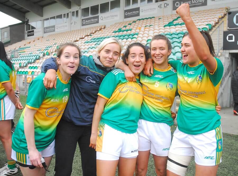
17. (tie) Republic of Ireland Men’s and Women’s National Soccer Teams, Home Kits
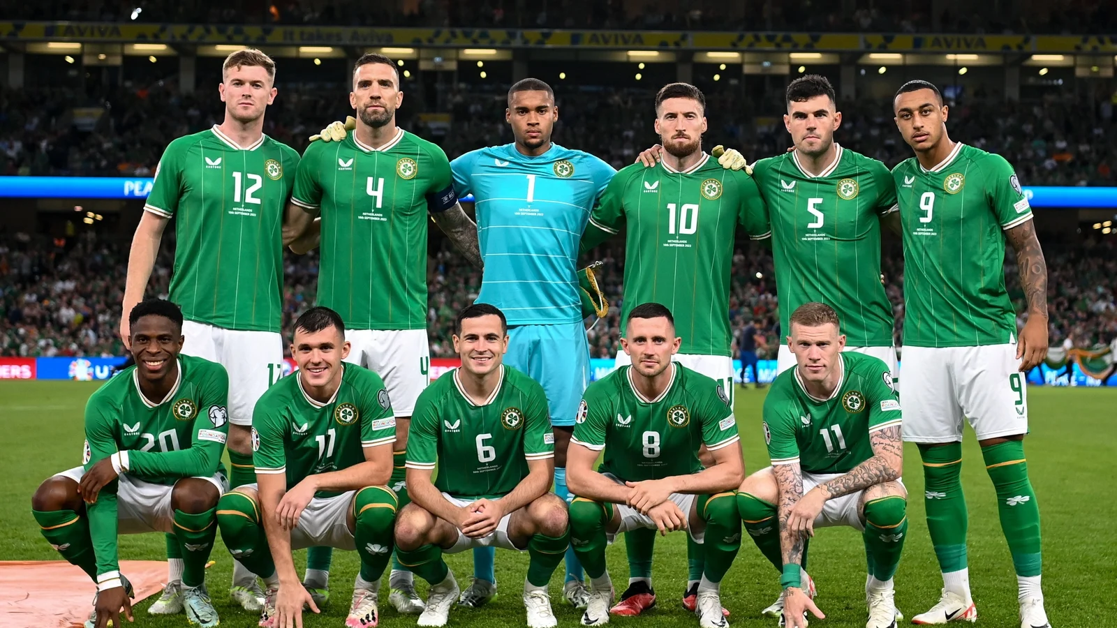
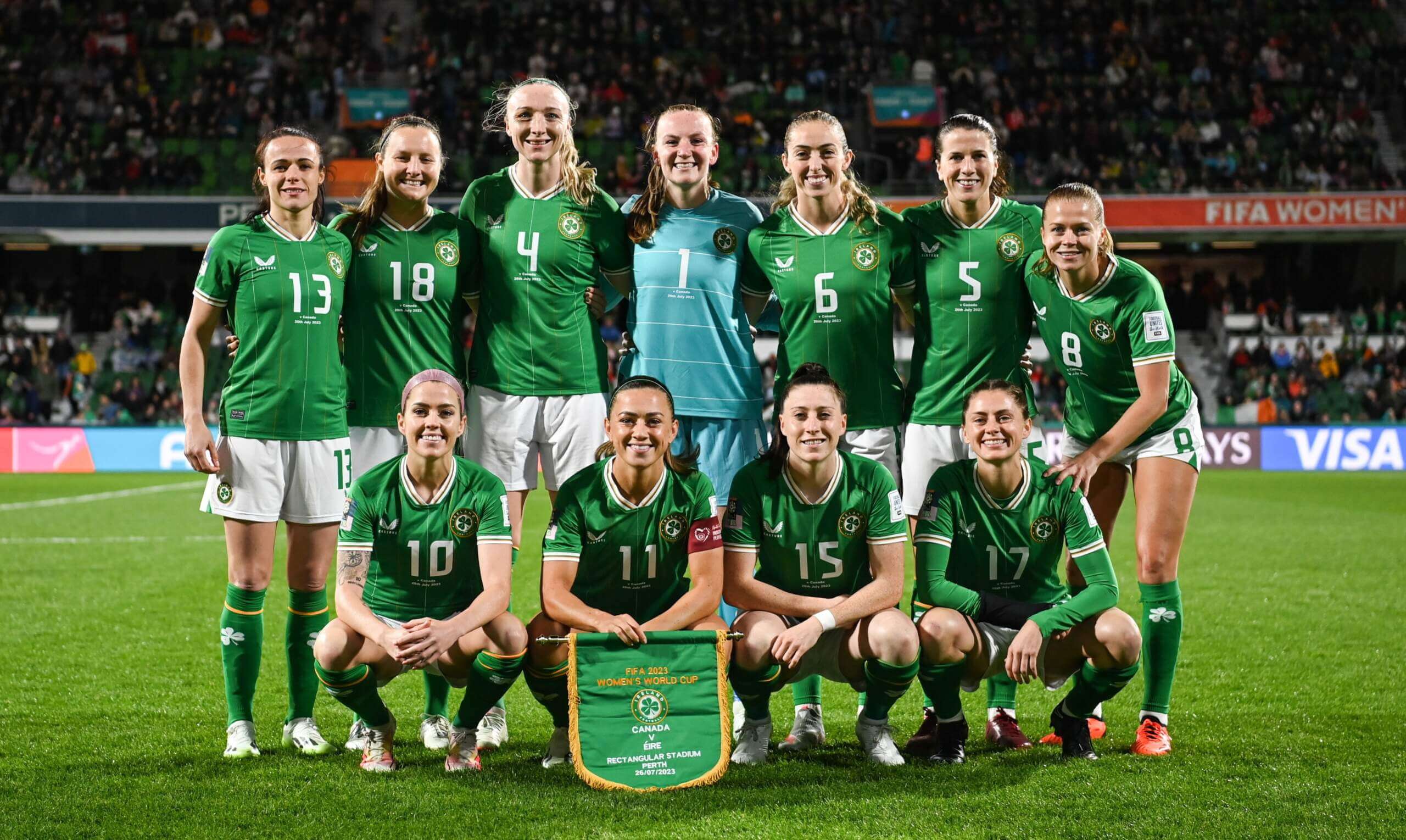
When I released the Independence Day edition of this series last July, I received blowback from some corners objecting to my inclusion of a few United States national team uniforms in the rankings. They said it was “cheating” to include such obvious choices. I disagreed then with the notion that national teams have no place in these rankings, and after giving it some additional thought as I made my selections for this list, I still disagree with it. Put simply, how can one tell the story of Irish identity through sports uniforms without including a team representing Ireland?
Our first entry is just such a team (or rather, teams, if you count the men’s and women’s sides separately). The Republic of Ireland has fielded a men’s team since 1924 and a women’s team since 1973. Even so, they might have fallen out of these rankings altogether if they’d stuck with the jersey crest they wore, with slight modifications, from 2004 to 2023 – an inscrutable and abstract concoction that looked vaguely Irish at best.
Thankfully, the Football Association of Ireland switched to a much more straightforward shamrock design last year. The result is that the Republic of Ireland’s soccer teams are right where they should be – in the rankings of the most Irish-looking sports teams in all the world.
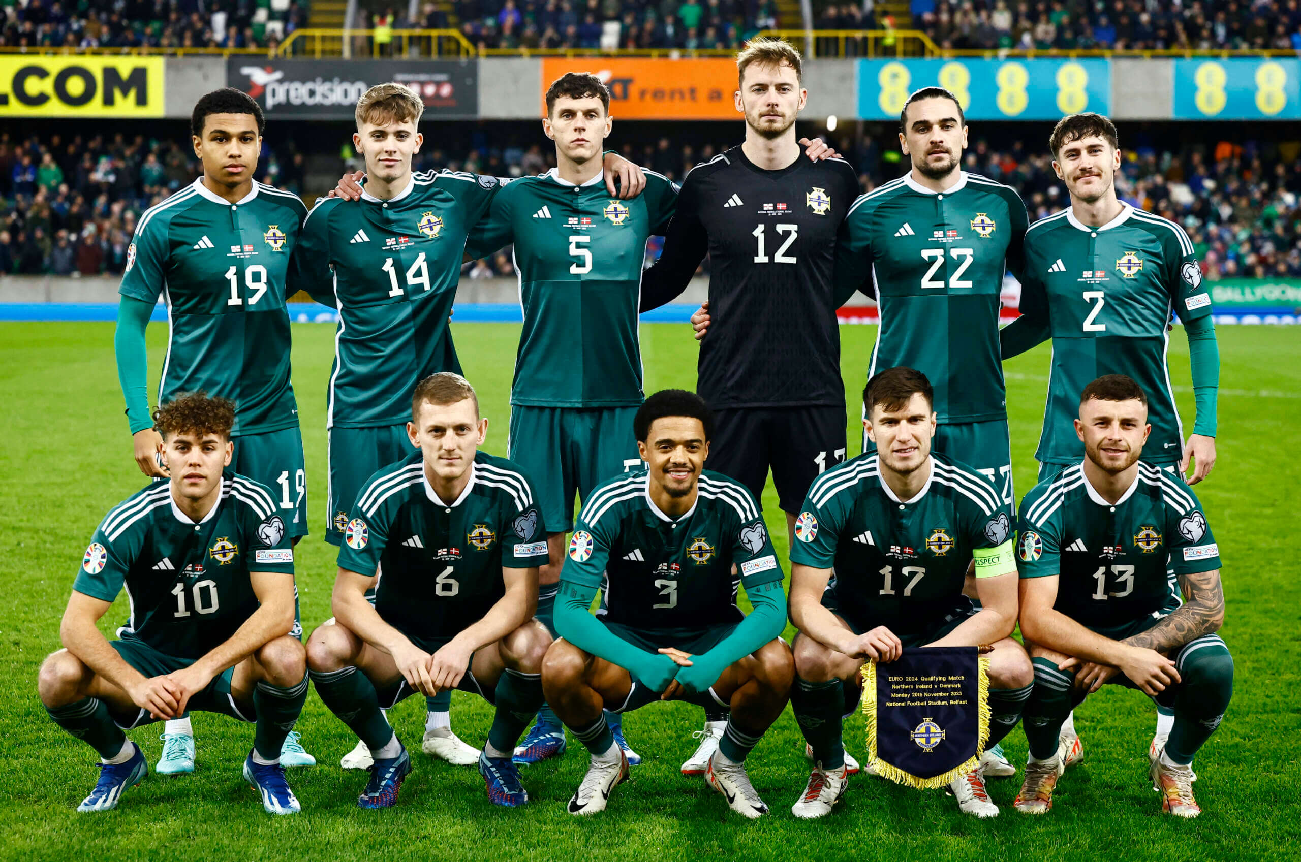
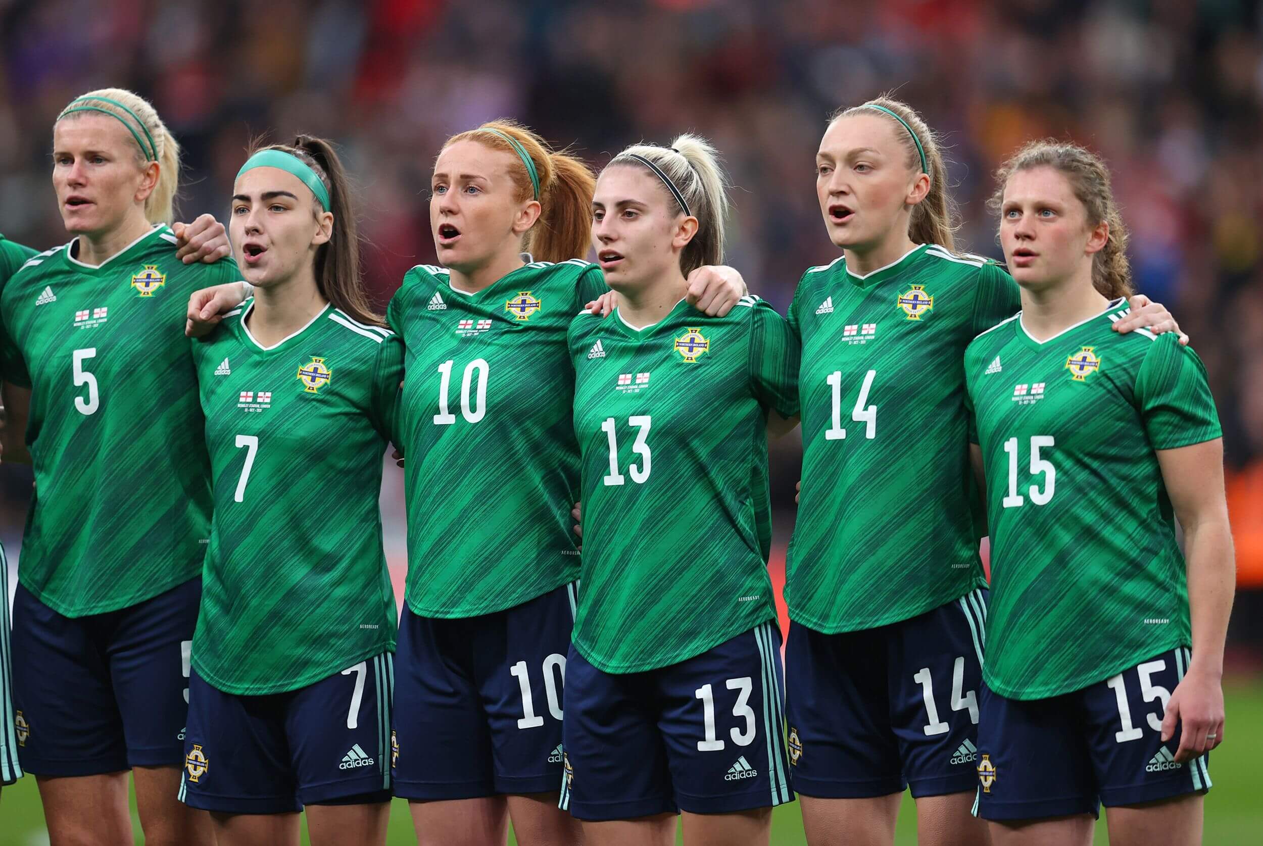
There are two nations that call the Emerald Isle home, so it’s only right that they both take their turn in the spotlight (or at the end of the rainbow, if you will). We covered the Republic of Ireland’s soccer teams just above, so we’ll give Northern Ireland their due here.
Northern Ireland’s teams make their case as full-fledged caretakers of Irish culture with home uniforms in green and a crest that features a Celtic cross, one of the most recognizable symbols of the Irish people. Without delving too deeply into the fraught political history of it all, these Northern Ireland soccer team uniforms have convinced me that the national soccer teams on either side of the border are wholly and equally Irish.
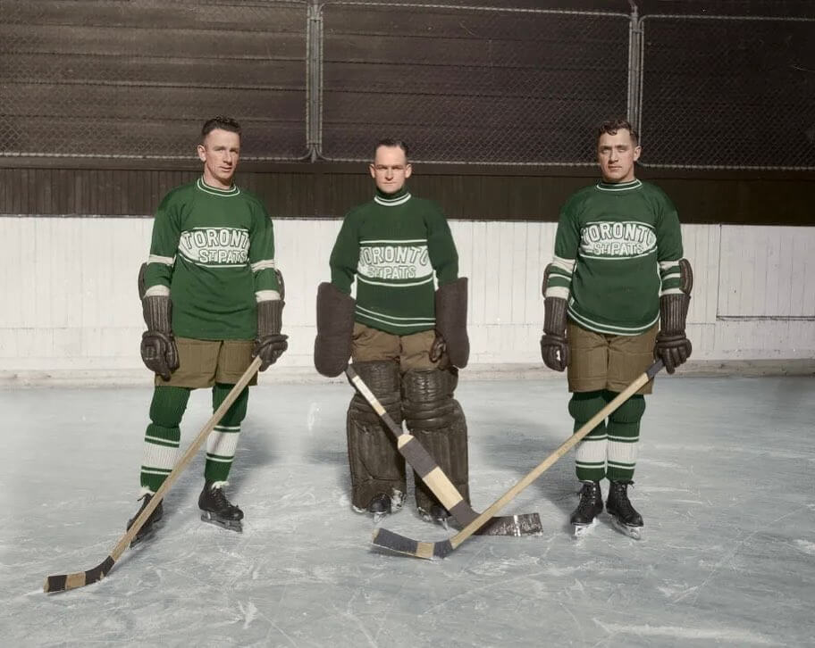
As you make your way through these rankings, you’ll spot plenty of visual symbols that pay homage to Ireland and teams’ and communities’ Irish heritage. There’s plenty of the wearin’ o’ the green, and shamrocks as far as the eye can see. The St. Patricks, the forerunners of today’s Toronto Maple Leafs, stand out on this list not because of such a crest or logo, but rather because they’re the only team that has worn the actual namesake of the holiday (you know, “St. Pat” himself) on their uniforms.
Granted, most of the pictorial evidence we have of the St. Pats comes from black and white photos, but in addition to the colorized photo above, we have contemporary artwork and modern-day uniform databases to give us a hint of what the originals looked like in all their green-drenched glory. And the Maple Leafs have revived their erstwhile Irish identity for throwback uniforms on several occasions. It’s just too bad team ownership opted for merchandise sales over historical accuracy with Toronto’s recently unveiled St. Pats fauxbacks. Don’t the Leafs remember from the Leprechaun movies series what happens to those whose greed for gold overcomes their compulsion to do what’s right?
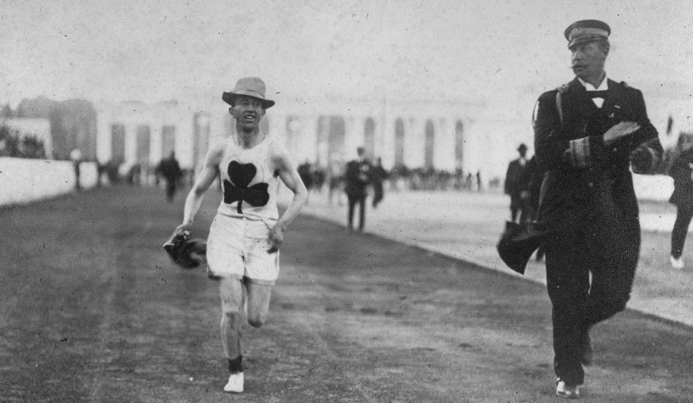
Not every “team” in our rankings is exactly a team, as we see here in the fifteenth slot (as well as a few more to come). Never heard of Billy Herring? Neither had I before I started my research, but he merits a spot on this list if for no other reason than his long-lasting visual influence on the uni-verse.
A Canadian distance runner of Irish descent, Sherring gained acclaim for winning the marathon at the 1906 Olympics in Athens while wearing a large green shamrock on his chest. His accomplishment was so renowned, especially by the host nation, that he inspired Greek soccer powerhouse Panathinaikos to adopt a green and white color scheme and a shamrock as its logo, all of which are still mainstays of the team’s look. There’s no question that you have some serious Irish bona fides when you can Gaelicize the Greeks!
Most of today’s rankings consist of teams that have adopted Irish names and identities while playing sports of English or North American origin. Ireland itself, however, has its own rich sporting customs, and we would be remiss if we didn’t give a nod to at least one of the clubs who compete in the Gaelic Athletic Association. Traditional Irish sports include men’s and women’s Gaelic football (sort of a cross between rugby and Australian rules football) along with hurling and camogie (men’s and women’s variants of the same sport that share similarities to field hockey and lacrosse).
Of all the counties that field GAA teams, the one that strikes me as the best representative of Irish culture, visually speaking, is County Leitrim in north central Ireland. What moves Leitrim to the forefront, besides their green and gold color scheme, is their crest featuring a fiddle – a key emblem of Irish culture used by surprisingly few other Irish teams. Listening to a fiddler crank out some Irish folk tunes while watching a hurling match? That sounds like a perfect way to celebrate St. Patrick’s Day to me!
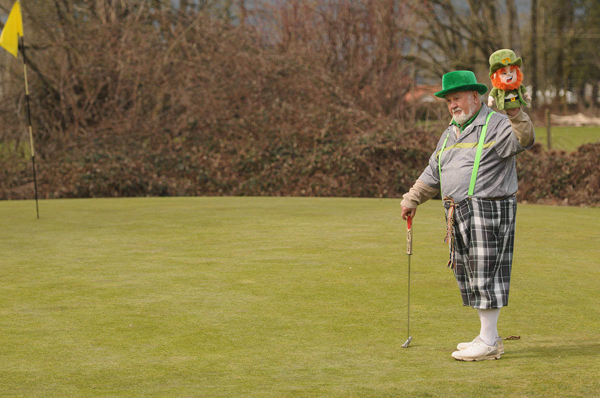
Considering that John Daly secured a second-place ranking in our Christmas installment of DFTS by occasionally donning a Santa suit, there has to be room on our list for an Irish-Canadian golfer who’s been doing his best leprechaun impersonation on the golf course every St. Patrick’s Day for more than 40 years, right? Patrick O’Shea emigrated from Dublin to Canada in 1957 and settled in Chilliwack, British Columbia, in the early ‘80s. He’s been sporting his Gaelic green on the links each March 17th ever since.
O’Shea’s signature look includes a green top hat and plenty of verdant vestments. What really seals his place in these rankings, however, are his leprechaun golf headcovers, which he uses as hand puppets to greet his fellow golfers during his St. Paddy’s Day sojourns. O’Shea may not be a “team” by himself, but you have to admit, he and his fabulous fabric faeries would make for an awesome foursome!
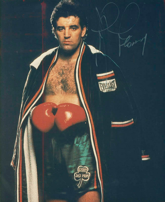
Known as “Gentleman Gerry” for his sportsmanship in the ring and friendly demeanor outside of it, Gerry Cooney was equally known for his Irish heritage – in no small part because of his boxing attire. Cooney’s trademark was a shamrock that he wore on both green and white boxing trunks and that he also incorporated into his robe and the jackets worn by his cornermen. He may have never won the world heavyweight title, but he remains a champion in the hearts of many Irish-American boxing fans.
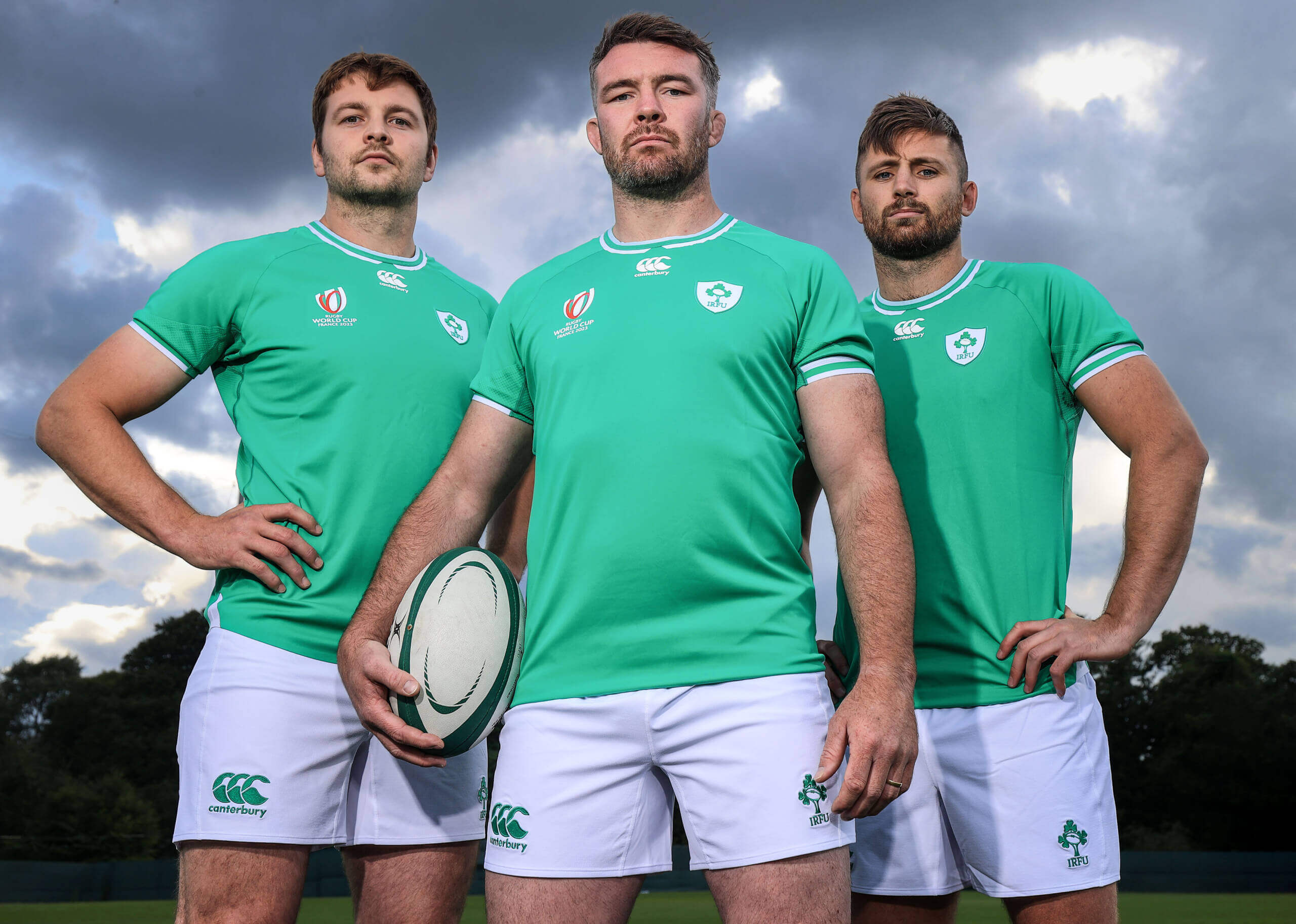
I like emphasizing the word “Union” in the name of Ireland’s rugby union teams for a couple of reasons. Not only does it describe the sport they play (the rugby union variant of this particular code of football, as opposed to rugby league), but it also represents the union of both countries occupying the island of Éire – Northern Ireland and the Republic of Ireland – into a single, unified side. It’s one of a number of sports (outside of soccer and the Olympics) where the two compete together internationally.
Ireland’s rugby teams own the distinction of having what is likely the longest association of any sports organization with the shamrock as a uniform element. The men’s team wore them on their caps as far back as 1875, while later adding a multi-headed sprig of shamrocks to their shirts by 1895.
The crest took on its more familiar form by the 1920s when it was framed inside a shield, and it’s evolved since then to include a rugby football in the forefront. Whatever form it takes, the crest has always looked spectacular when framed by Ireland’s gorgeous green jerseys – a fitting sporting fashion statement for the entire island!
10. Kerry F.C., 2024 Home Kits
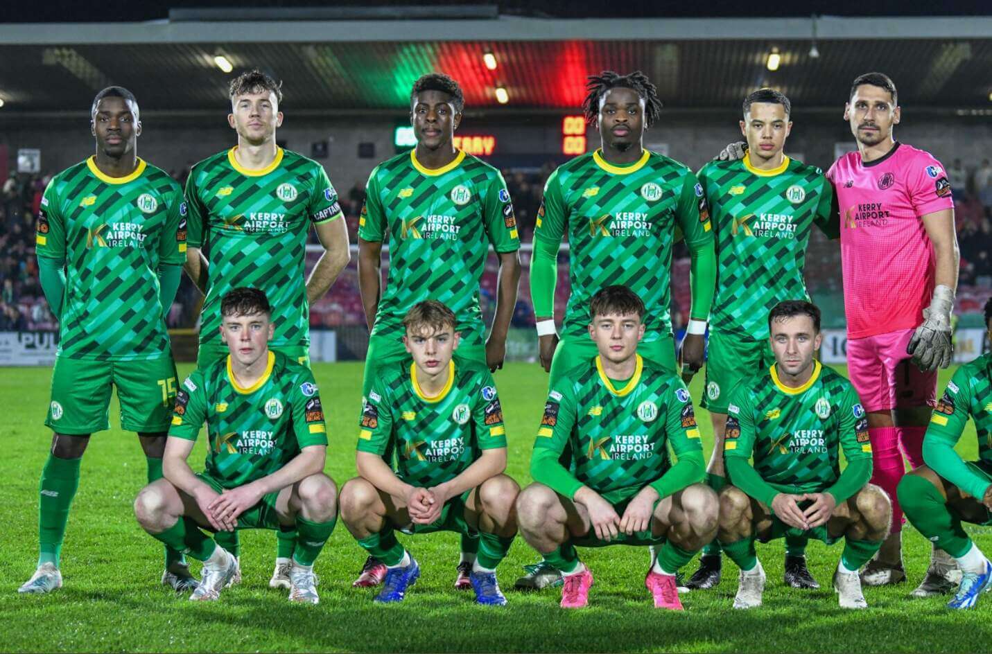
Taking the pitch for the first time in 2023, Kerry F.C. is quite the newcomer compared to most of the teams in these rankings. This soccer team in Ireland’s second-tier professional league has nevertheless made a strong impression on a couple of different fronts.
For starters, their crest features one of the great symbols of Irish identity – the Celtic harp. Additionally, their home kits for the current season do perhaps the best job of any team in these rankings showcasing an impressive variety of shades of green. It almost looks like they’re covered in confetti thrown during a spirited St. Patrick’s Day parade.
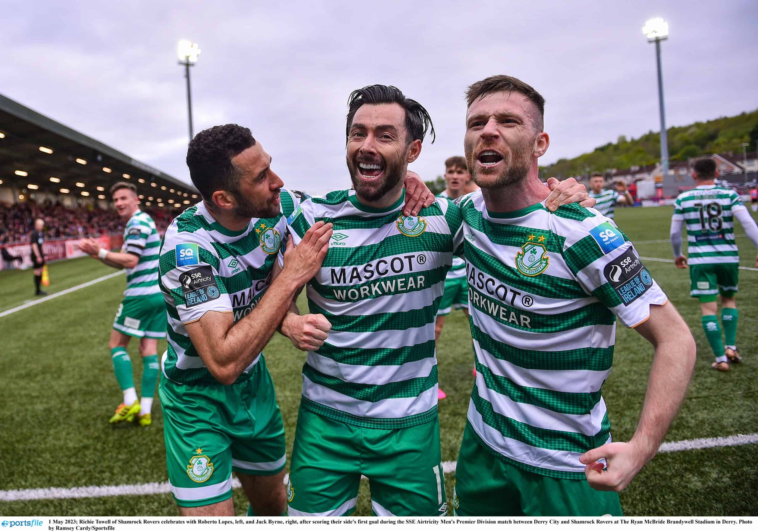
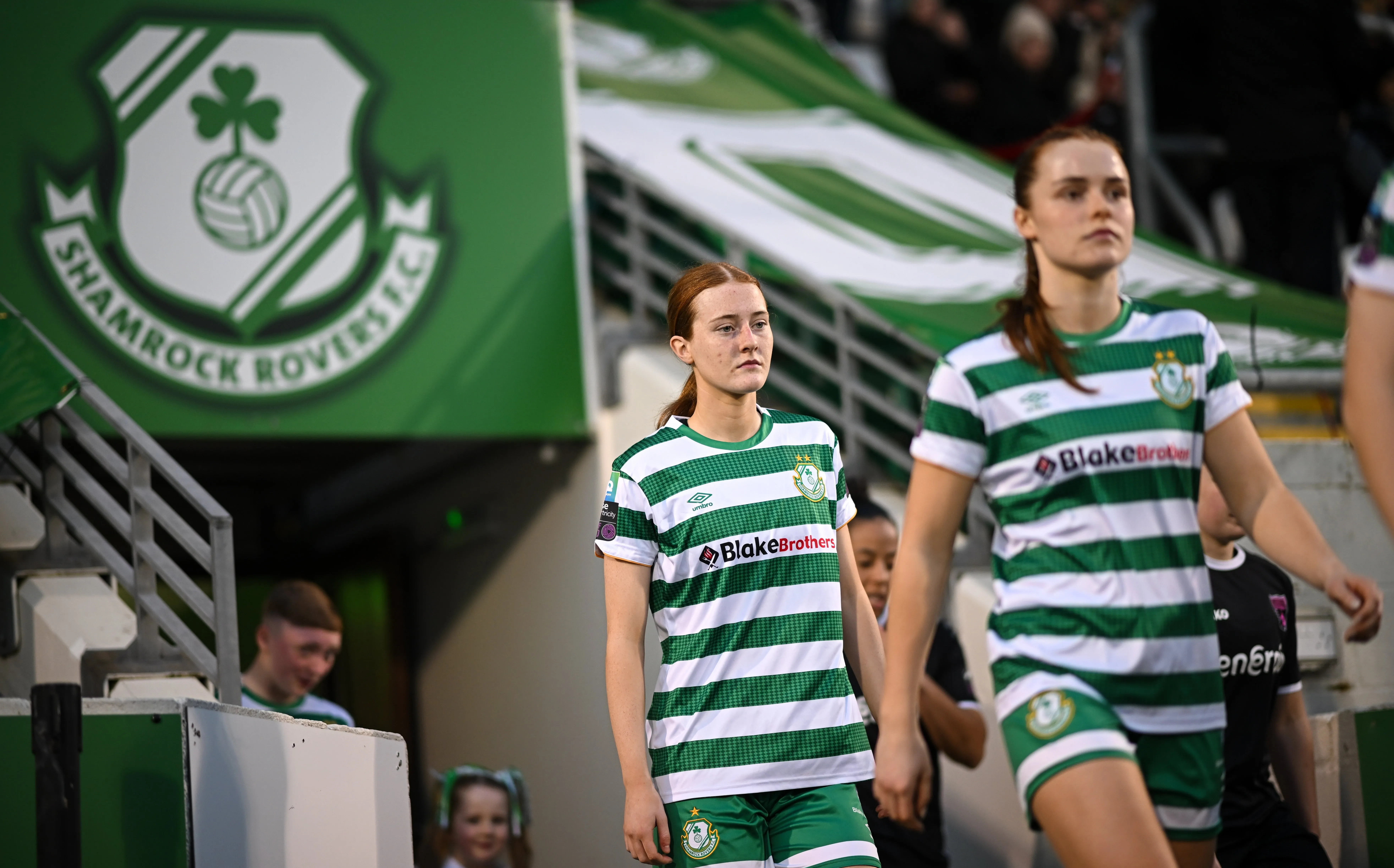
It was inevitable that a large cross-section of this list would include teams that use shamrocks as part of their names or visual identities (or both). What’s unique among the teams in these rankings is the Shamrock Rovers’ placement of “Shamrock” as their club moniker rather than as their mascot.
Regardless of where they place it in their name, Ireland’s most successful professional soccer team is unmistakably linked with the shamrock. It’s integral to their crest, and it serves as the focal point of glorious green-and-white hooped garb that extends not only to the jersey, but to the socks, too. No one’s going to pinch these Rovers for not wearing enough green on St. Patrick’s Day!
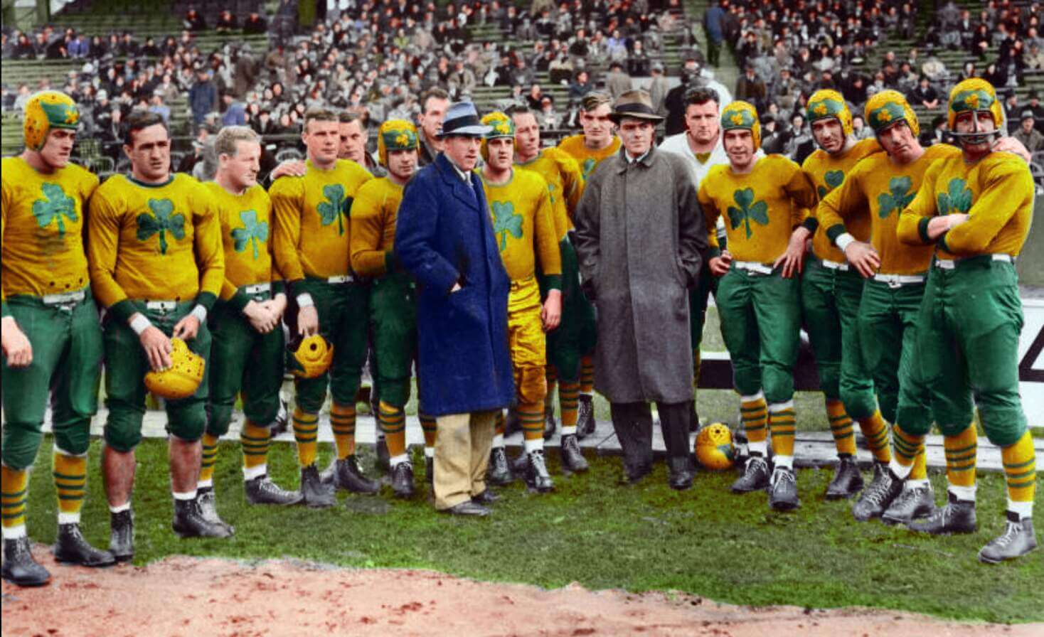
No city has milked its connection to its Irish heritage for sports team names better than Boston, Massachusetts. We already mentioned among our honorable mentions that a myriad of teams use “Shamrocks” as their mascot, and many of them have come from the Boston area. The best of them all, undoubtedly, was a pro football team from the 1930s who played in one of several defunct circuits to call themselves the American Football League.
The Shamrocks wore green and gold, although with only black and white photography to serve as evidence of their existence, the precise shades seem to be open to interpretation by colorizers and replica jersey creators. Even so, the shamrock logos on their jerseys and helmets make these uniforms look sharp, no matter what colors they’re paired with.
Scotland has a surprising number of teams with Irish-themed names. (Don’t be surprised if you come across another before we’re done.) Maybe it’s the kinship the Scots feel for their Gaelic cousins.
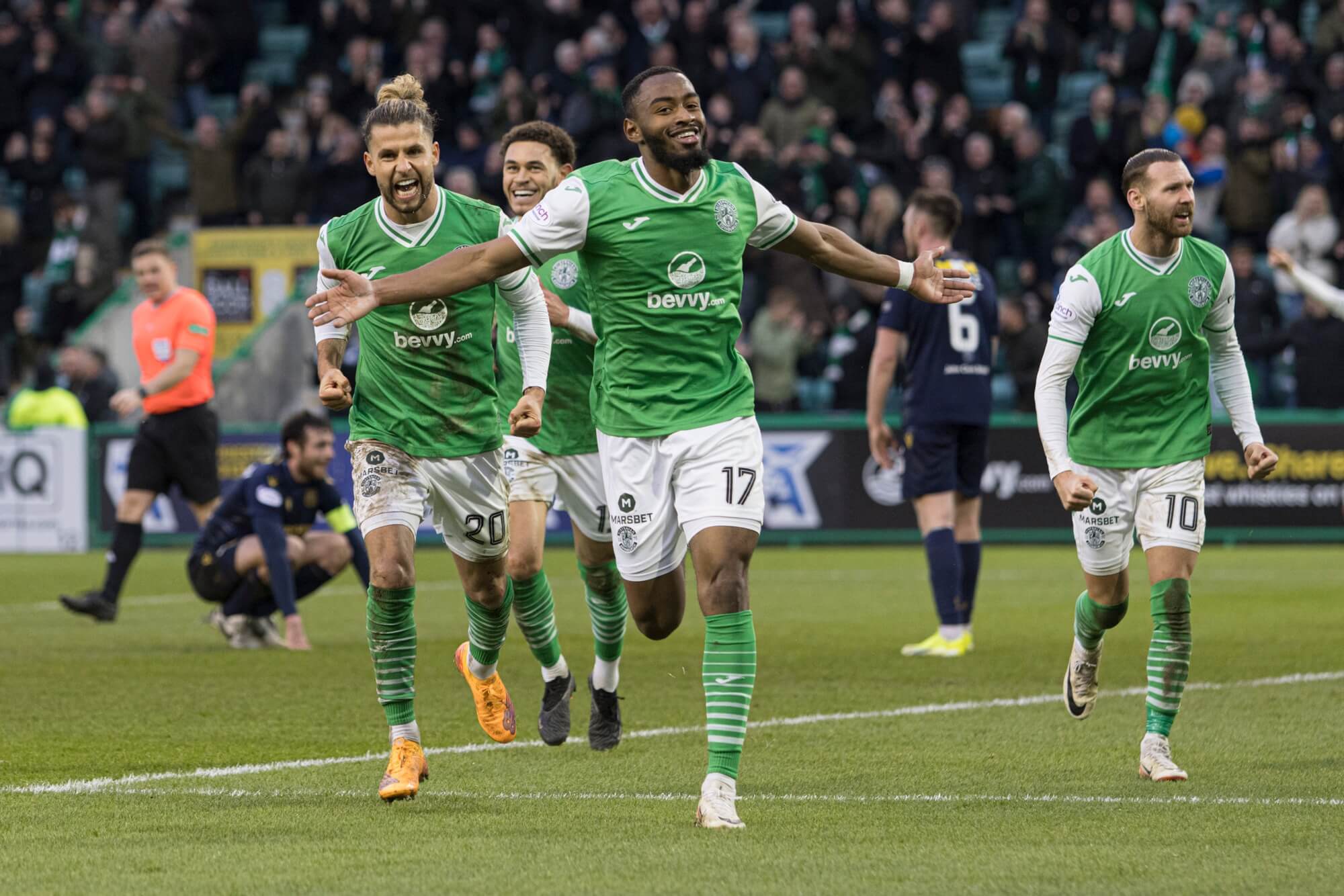
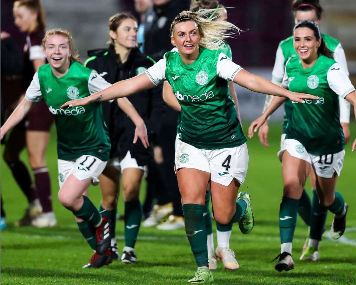
Hailing from Edinburgh, Hibernian takes its name from the Latin term for Ireland. It’s the lovely lilt of that name that places them firmly in these rankings, alongside a crest that includes an Irish harp and kits with some of the best socks on the list. They’d look spectacular paired with a traditional Irish kilt! And yes, I know that kilts are originally Scottish, but they have a place in Irish culture, too. And what better way to salute both sides of Hibs’ identity than to find that convergence?
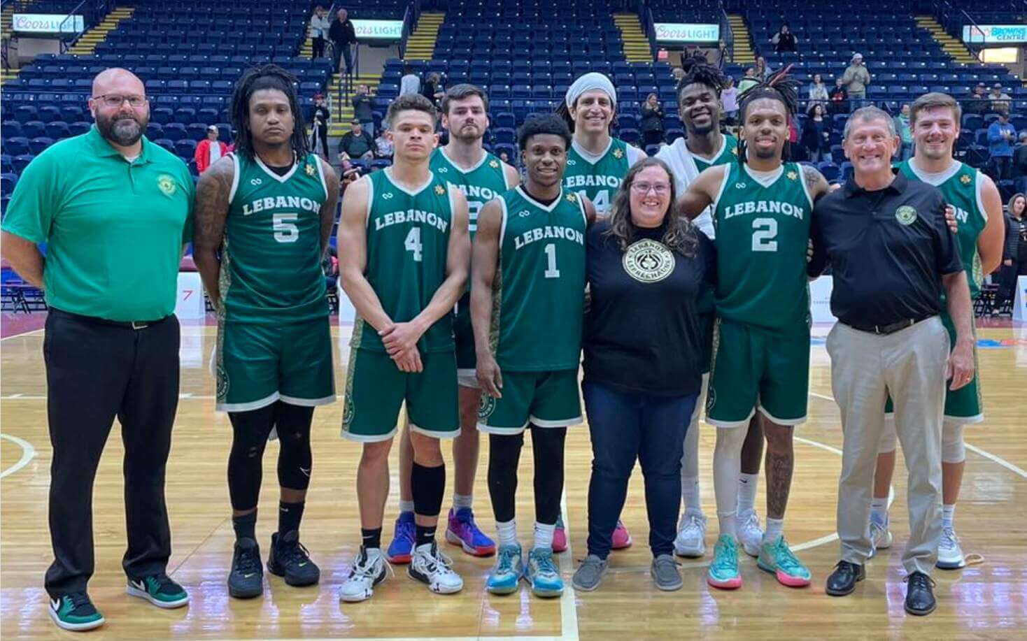
I know you’ve all been waiting for a green-clad basketball team with an Irish-themed identity, so here you go! Not who you were expecting? Well, try to give the Leprechauns, a Lebanon, Indiana-based semi-pro team in The Basketball League, a fair shake of the shillelagh anyway.
The Leprechauns earn points not only for their solid logo, but for their shamrock-inspired wordmark and uniform trim that evokes a Celtic triquetra design. They even have rainbow alternates (although the base of the uniform is, unfortunately, BFBS). All things considered, we haven’t seen such well-dressed leprechauns since, uhh… Patrick O’Shea in the thirteenth slot on this list!
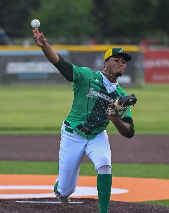
Sticking with the leprechaun motif, let’s hop the Indiana-Michigan border to Royal Oak, a suburb of Detroit, to visit the only baseball team on our list. The Royal Oak Leprechauns are a summer collegiate team in the Northwoods League who fully embrace their Irish namesake in a way that easily earns them their top 5 ranking.
Whether wearing home whites with sublimated shamrocks, green road jerseys, or either version of their very dapper alternates, the Leprechauns always look like, well, leprechauns! With caps, logo, and mascot to match, all Royal Oak needs to do is sell Lucky Charms at their concession stand to complete the theme.
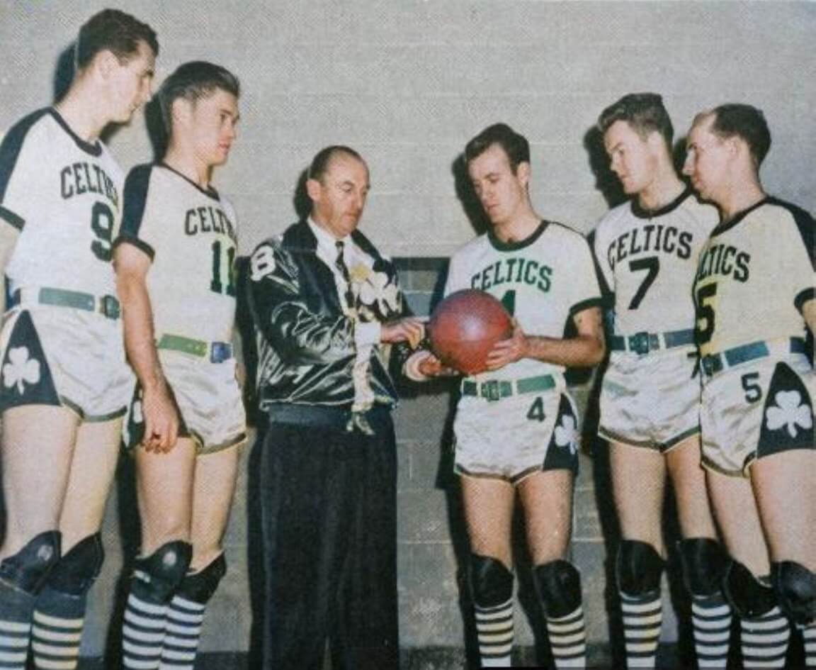
With their on-the-nose team name and logos, their green and white color scheme, and a history of success that has made them one of the biggest brands in pro sports, there was little doubt that the Boston Celtics would find their way onto this list. The only question was which variation of their classic uniforms would represent the franchise.
For my money, the most “Irish” of all the Celtics’ uniforms were the ones they wore for their first three years of existence. Whether worn with sleeves or tank tops, the shamrocks on either side of the shorts are what put them on top (o’ the mornin’). (Sorry, I couldn’t resist!)
Boston revived these as City Edition Earned Edition Statement Edition, err, throwback uniforms for the 2021-22 season, and they still look timeless to my eyes. Now if only we could convince Nike to quit fixing what’s not broken and adopt these as part of the Celtics’ regular rotation instead of all those other tiresome alternates they’ve trotted out in recent years…
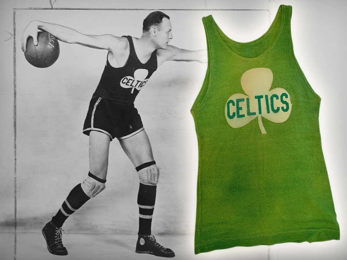
Boston may be the basketball team everyone thinks about when they hear the name “Celtics,” but another team from an East Coast city with a large Irish population beat them to the pot of gold by a good 30 years. A barnstorming team that played all over the country from 1914-39, the Original Celtics nonetheless considered New York home and frequently played in Madison Square Garden when not on the road.
They wore several different versions of their uniforms over the years, all centered around a large shamrock emblazoned across the front of their jerseys. The original photos are largely black and white, of course, but fellow comm-uni-ty member Jorge Cruz snapped some color images of the team’s jerseys at the Basketball Hall of Fame that are too good not to share.
The prominence of the Irish symbolism on their uniforms gives the Original Celtics a slight edge over their Beantown-based successors, even if they do get a demerit for adding singer Kate Smith’s initials to their logo in an early example of uni advertising (#nouniads). Kate’s stirring renditions of “Danny Boy” and “When Irish Eyes Are Smiling,” though, help to earn them back their Celtic cred.
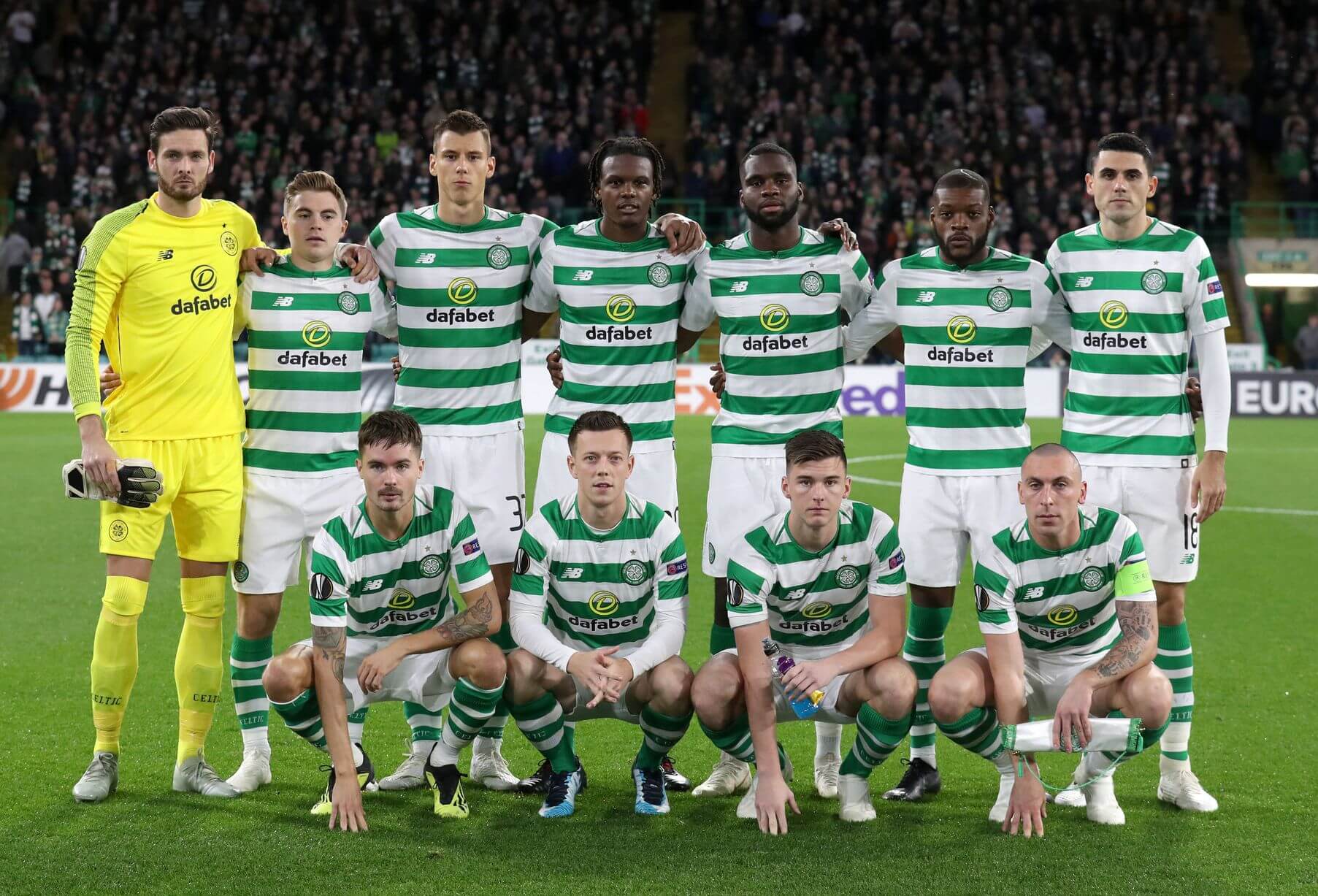
If we’re talking about teams with Celtic-themed names (and, for the third entry in a row, we clearly are), one organization moves to the front of that line – the Celtic Football Club of Glasgow, Scotland. Founded by a Catholic priest in 1887 to improve the lot of Irish immigrants in the city, Celtic has earned a devoted following not only in Glasgow, but among the Irish community worldwide.
Famous for the green and white hoops on their home shirts for most of their history, Celtic pairs their classic look with a crest featuring a four-leaf clover – a unique look among the myriad teams that use the more common three-leaf shamrock to assert their Irish character. But the four-leaf clover has its own place as a symbol of the “luck of the Irish,” and few teams have enjoyed the good fortune that Celtic has, with the storied success of the men’s side encompassing 53 Scottish league titles and the first European championship won by a British-based team in 1967.
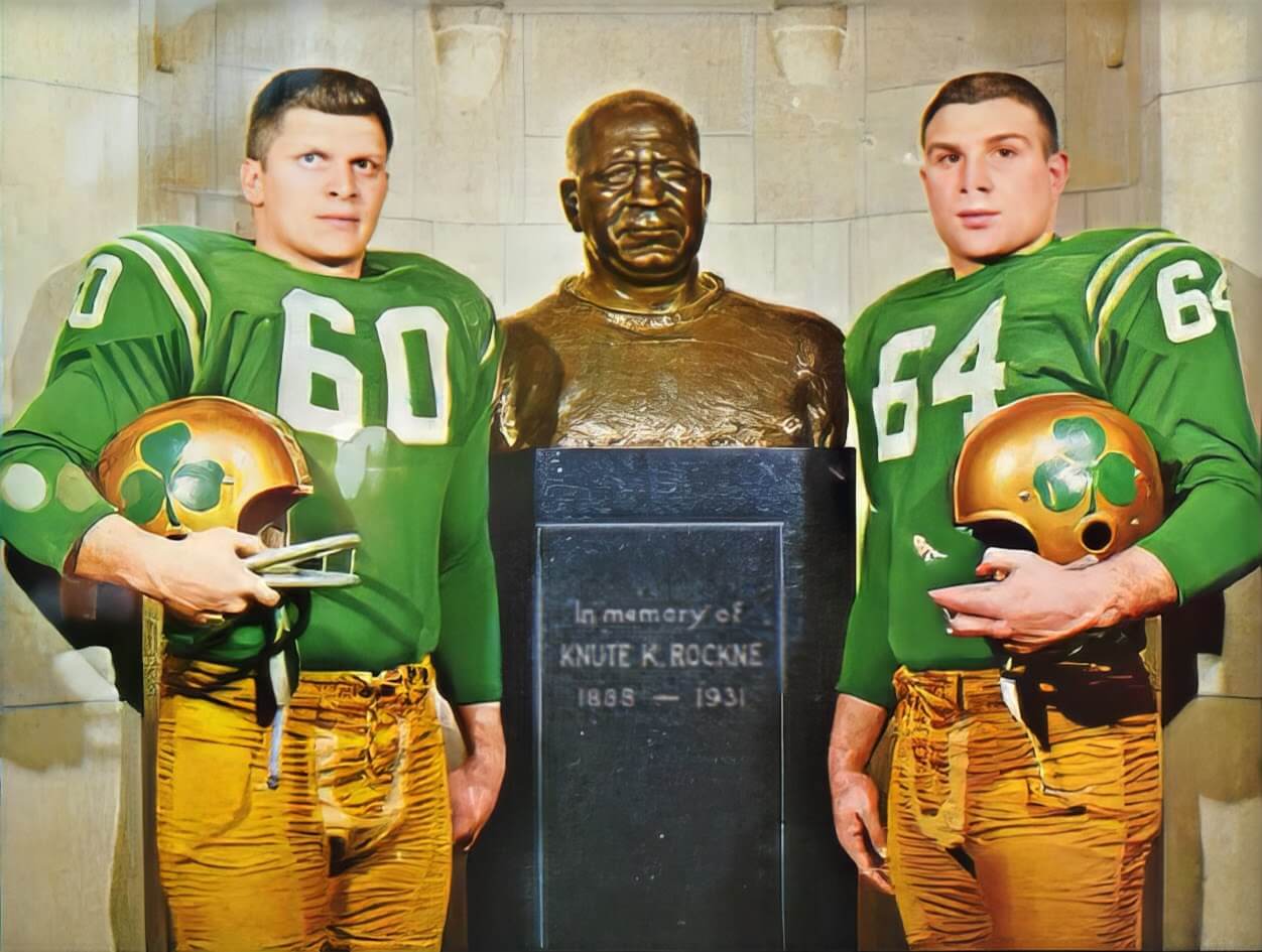
When I started my research for this list, I figured a certain Catholic school from South Bend, Indiana, would land on it somewhere. With a logo that personifies their team name almost a little too perfectly and a sideline mascot that brings it to life, Notre Dame’s sports teams have carved out a well-established position as the flagship athletics program of the Irish-American community, even in their official school colors of navy blue and gold. But it’s when they add green to their uniform mix that the Fighting Irish most emphatically wear their allegiances on their sleeves – figuratively and sometimes literally!
I could have chosen any number of Notre Dame’s sports teams to represent them in this spot and they all would have made a strong case for the top spot. Heck, the football team alone, with its history of incorporating green uniforms into its rotation dating back to 1921, had plenty of uniform options to choose from. None of their uniform sets, however, captured that bold Irish pride quite like the ones they wore from 1960-62, when the shamrock on the sides of the helmets wasn’t just an occasional gimmick, but their standard look.
Joe Kuharich introduced shamrocks to Notre Dame’s helmets when he returned to his alma mater as head coach in 1959. The odd upside down shamrock decal used in his first year gave way to a more conventional design the following year, kicking off these lovely lids’ three-year run, accompanied by either navy blue home jerseys, white road jerseys, or green alternate tops.
Unfortunately, Kuharich’s ouster after a lackluster 17-23 record relegated these uniforms to little more than an historical footnote. But for a brief stretch in the early 1960s, the Fighting Irish looked as Irish as they ever have.
And with that, we’ve come to the conclusion of a journey that started last Easter, completing a full cycle around the sun covering uniforms that best fit the seasons and holidays we commemorate here throughout much of North America. Is there more of the series in store? After I take a much-needed break… perhaps. I’ve already heard from a few readers with suggestions for future installments, so if you have an idea, let me know.
For the time being, though, I think I’ll take a moment to enjoy St. Patrick’s Day myself. Here’s wishing the luck of the Irish to you all! Now if you’ll excuse me, I’m going to go drink a half and half while I listen to the Pogues and the Dubliners play “The Irish Rover.” Sláinte!


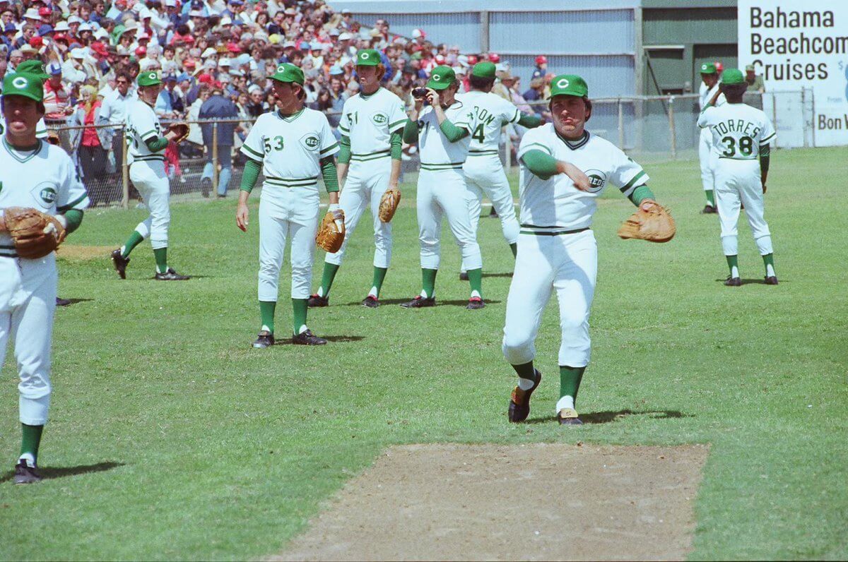
GTGFTU: Spring Training, March 17, 1978, Yankees v Reds (first time wearing St. Paddy’s Day uniforms) at Al Lopez Field in Tampa, FL. Not sure about the score.
GTGFTS
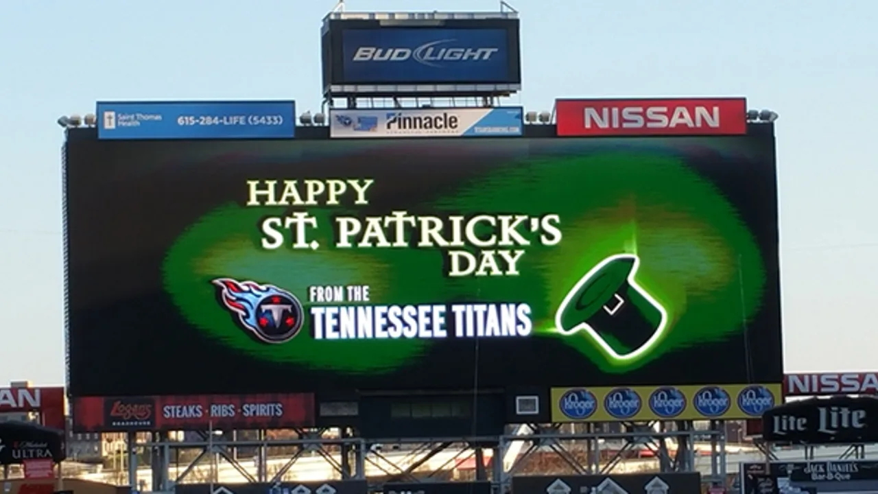
No game, just the Titans changing the colors of the stadium to green in 2016.
Great list! But the Republic of Ireland national teams should have ranked much higher, since they make the most prominent use of light blue alongside the green. Sky blue was the original “signature” color of Saint Patrick and of the pre-occupation Irish kingdom. (A matter of much historical debate, but a 13th century French heraldic record points to blue preceding green as an Irish national color and as a symbol of Saint Patrick.)
By “should have” I just mean “I would have.” I didn’t mean to suggest anything was wrong or mistaken with this excellent list!
Thanks, Scott! I appreciate the kind words and the thoughtful response. And no worries! I interpreted the “should” as a point of discussion and not a criticism.
It’s a point well-taken, too! I tried to figure out a way to work a broader color palette into these rankings – in particular because I love the gold harp on the gorgeous blue field used in the Irish coat of arms (link) and the blue centenary kits they wore a few years ago (link). But since these rankings were, as I mentioned in the intro, were to some degree about the tropes and even stereotypes we associate with being “Irish,” I leaned a bit more on the Republic of Ireland’s standard green kits as what they’re “supposed” to look like.
One other thought on St. Patrick’s blue: I often associate that color with the Church of Ireland’s veneration of St. Patrick (link), which felt a bit more “English” (i.e., originating from the Anglican Communion) than “Irish.” Not to limit what Irish identity is too narrowly (since I realize not all Irish are Catholic), but I didn’t want to open the Irish nationalism can of worms any more than I already did with the “fraught political history” allusion I made in the Northern Ireland writeup.
Good acknowledgement that there were a number of teams named the Shamrocks. There is a team that has carried on the tradition.
Senior “A” Western Lacrosse Association is a summer league that features pro players who play winter in NLL. Whether it is today or all the way back to the 1950s, the Victoria Shamrocks dress like it is St. Paddy’s day every game.
link
link
Thanks, Wade! I can always count on you to bring up some interesting teams for consideration! Great additions! Maybe I should do a list of the best “Shamrocks” teams for a future installment of DTFS…
Great piece Kary! I loved the info on Billy Sherring and how his performance inspired a Greek team’s identity to this day. Way down the rabbit (err Leprechaun?) hole. That was all new to me! Great read.
Hard to disagree with the top 3 as they are the most iconic and well known (and dare I say good looking) Irish themed teams.
Thanks, Matt! It was a lot of fun doing the research for this article, and it was exactly during one of those deep dives into a leprechaun hole that I uncovered Billy Sherring. He wasn’t even on my radar when I made my preliminary list of teams for this piece, but his story was just too good to leave out once I learned about him.
OT but things I will never understand is when the NBA was in the midst of its sleeves thing that the sleeved Celtics jersey never got revived. Instead they got a horrible grey long sleeve.
I couldn’t agree more, Patrick! I almost used a photo of that awful grey sleeved uniform (link) as my example of bad Celtics alternates, but that came out on Adidas’ watch rather than Nike’s, so that (almost equally awful) Nike-designed BFBS alternate worked better for my narrative.
(Trying this again, hopefully without messing up the hyperlinking this time.)
I couldn’t agree more, Patrick! I almost used a photo of that awful grey sleeved uniform (link) as my example of bad Celtics alternates, but that came out on Adidas’ watch rather than Nike’s, so that (almost equally awful) Nike-designed BFBS alternate (link) worked better for my narrative.
Kary, you plainly put more research into your project than I would have. Mine would just have been a rundown of green+yellow teams I happen to like, the Celtics, Jets, and University of Miami Hurricanes. Slainte!
Thanks, Walter! I appreciate the recognition of the work that went into it. You wouldn’t believe the copious notes I took during the research process!
The Chicago Shamrox indoor lacrosse team only last two seasons, but had some solid unis. Using the X at the end of the name still seems kind of silly, but the logo wasn’t too bad. They even had the Shannon Rovers bagpipe team at the inaugural game.
link
Thanks, Jonathan! I was wondering if someone might bring up the Shamrox. They were one of the many team I considered for the list. I like their logo, their use of orange in the color scheme to emphasize the flag of Ireland, and the way they play up the Irish culture they’ve adopted for themselves. Ultimately, though, the “x” on the end of their name was earned them a demerit from me. It didn’t eliminate them as much as knock them down in the order to the point where other teams moved ahead of them.
Kary, you taught me something new with the Billy Sherring/Panathinaikos connection. (I guess I would have known if I read their Wikipedia article more closely, but oh well).
I went to Ireland about a year and a half ago, and there were Gaelic games pitches, like, everywhere (since football and hurling/camogie use the same one). For people who might not know, even random small towns have clubs that can and will produce county-level players.
After I came back, I got a blue DC Gaels shirt (link), which I like to say is St. Patrick’s other color. I’m zero percent Irish and have no connection otherwise, but at least I can sort of participate.
Great story, Jamie! Thanks for sharing it! Denver has a GAA club, too, so I should see if they have jerseys for sale. I’d love to go to a county-level hurling, camogie, or gaelic football match if (hopefully “when”) I travel to Ireland.
You’re in luck. link
(Since the GAA has a rule that equipment has to be Irish-made or something like that, everybody at a high level is outfitted by O’Neills.)
Nice! Thanks, Jamie! I love the design along the bottom with the mountains and the Colorado “C.”
Roughly a year ago, I saw a guy at a park not far from my house practicing hitting a sliotar with a hurley. It was pretty amazing how far he could make the ball travel. I heard some people walking by trying to figure out what he was doing, but I think I just confused them more when I told them that he was practicing hurling!
Re the 1946-1949 Celtics, some of you may have noticed a familiar face. That’s Chuck Connors (of “Rifleman” and “Branded” fame, among many other roles), #11 for the Boston Celtics.
Good pull on that, JD! I knew Connors had been a professional athlete before switching to acting, but I didn’t remember that he’d played for the Celtics. I knew that he played baseball, but it makes sense that he tried his hand at basketball, too, since he was 6’6″, which was quite tall for his era.
Kary touched on it, but Chuck Connors was also a professional MLB player (not particularly good, but still…)
link
link
link
Great list! Those Boston Shamrocks unis are gorgeous. The one omission I’m surprised to see is the Milwaukee Bucks’ Irish rainbow duds.
Thanks, kl! Glad you liked it!
Funny you should mention Milwaukee’s “Irish rainbows!” They were never going to make the final cut because they’re simply highlighting the Bucks’ green-forward color scheme and were never meant as a promotion of Irish identity (a prerequisite for inclusion). But I actually had included a nod to them among the honorable mentions in the intro of an earlier draft of the story – right alongside the reference to the Hawaii Rainbows – but cut it out at the last minute as a concession to the length and readability of that paragraph.
Don’t cry to many tears for the Irish rainbows, though. I’ve already mentioned them in two previous editions of this series: the Thanksgiving edition (see the section on the Wyoming basketball uniforms – link) and the Christmas edition (see the top spot – link).
Nat Holman of the Original Celtics was my great-grandfather’s brother. Very cool for me to see some pictures of “Uncle Nat” show up in a Uni-Watch post!
Very cool, Brian! I love that you have that connection. I knew who Nat Holman was before I began my research for this project, but it was interesting to learn more about what a pioneering superstar he was in the early days of basketball.
Great list and great explanations, Kary! I just read it and Billt the runner is my new hero. That picture of the two ND players posing next to the bust of Rockne is also very good. Fun fact: the current Boston Celtics leprechaun logo was originally designed by the younger brother of Red Auerbach, Zang Auerbach.
I mean Billy, my fingers were typing too enthousiastically.
Thanks, Ingmar! I appreciate the kind words! And I did not know that about Red Auerbach’s brother designing the Celtics logo. Interesting!