Good morning, Uni Watchers, and a Happy Valentine’s Day to one and all. Phil here, with a rare weekday appearance, because today we have a very timely article from UW contributor/pal Kary Klismet, continuing with his “Dressed for the Season” (“DFTS”) series. DFTS is a series on uniforms appropriate for particular holidays. The series began with Easter, and moved on to Independence Day, then to Hallowe’en, Thanksgiving, and finally, Christmas (Part I and Part II).
Today, he’ll give us his take on Valentine’s Day-themed uniforms. Paul will be back later this morning with some additional content, so be sure to check back later.
There’s a lot to get to, so here’s Kary. Enjoy!
by Kary Klismet
Hello, my fellow lovers of all things athletic and aesthetic! Is it February already? I could swear that it was just a few days ago that we were discussing the 386 best Christmas-themed uniforms (or some number close to that).
With Christmas well behind us now and the new year in full swing, it’s time to turn our attention to our first installment of Dressed for the Season for 2024 – Valentine’s Day! Why do we celebrate Valentine’s Day? If the legends are to be believed, it started with an early Christian bishop who gave out paper hearts as a symbol of love for God. But it might actually have been two bishops, and they were apparently both martyred by the Romans on February 14th, a pagan fertility holiday called Lupercalia. When the Catholic Church canonized the bishop (or bishops), it placed their feast day on the existing holiday known for love and, uhh, other activities associated with fertility, and the rest is (romance) history.
How does one go about finding the most Valentine’s Day-appropriate uniforms? It’s not easy! Sure, a few minor league teams occasionally wear special jerseys as a way to draw fans to the stands, but it’s not a holiday that enjoys the full force of major league-level sports marketing like the Fourth of July or Christmas do – or even Mother’s Day and Father’s Day, for that matter. Instead of just pulling together a list of those Valentine’s one-offs, I decided to explore the colors, symbols, and nomenclature that inform our ideas of what Valentine’s Day looks like and see where I could find some overlap in the uni-verse.
One of the colors most obviously associated with Valentine’s Day is pink, and you’ll see it in many of the uniforms below. However, it wasn’t enough for a team simply to have pink in its color scheme. Several soccer teams wear pink, but when paired with heavy doses of black or blue or some other color not typically thought of in connection with the holiday, it doesn’t scream “Valentine’s Day” to me, at least without some other Valentine-specific visual cue.
I likewise did not select any teams who swapped out their regular colors for pink as part of breast cancer awareness. Nothing against the cause – breast cancer has touched the lives of my friends and family and I’m certain many of yours as well – but I think of those promotions as distinct from Valentine’s Day.
As always, I tried to give more weight to teams and uniform combinations that had some longevity over uniforms worn just once. That, however, proved more difficult for Valentine’s Day than for other installments in this series. A few one-offs made the cut, but not many. The ones that missed the mark mostly felt contrived or boilerplate (to say nothing of how terrible the designs were). I did, however, include a few short-lived or one-off designs that seemed organic and tailored to the team.
With those parameters in place, let’s explore the best in Valentine’s Day-appropriate athletic apparel. Who knows? Maybe you’ll even fall in love with a few of these fabulous frocks…
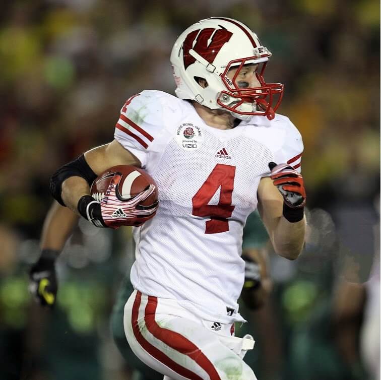
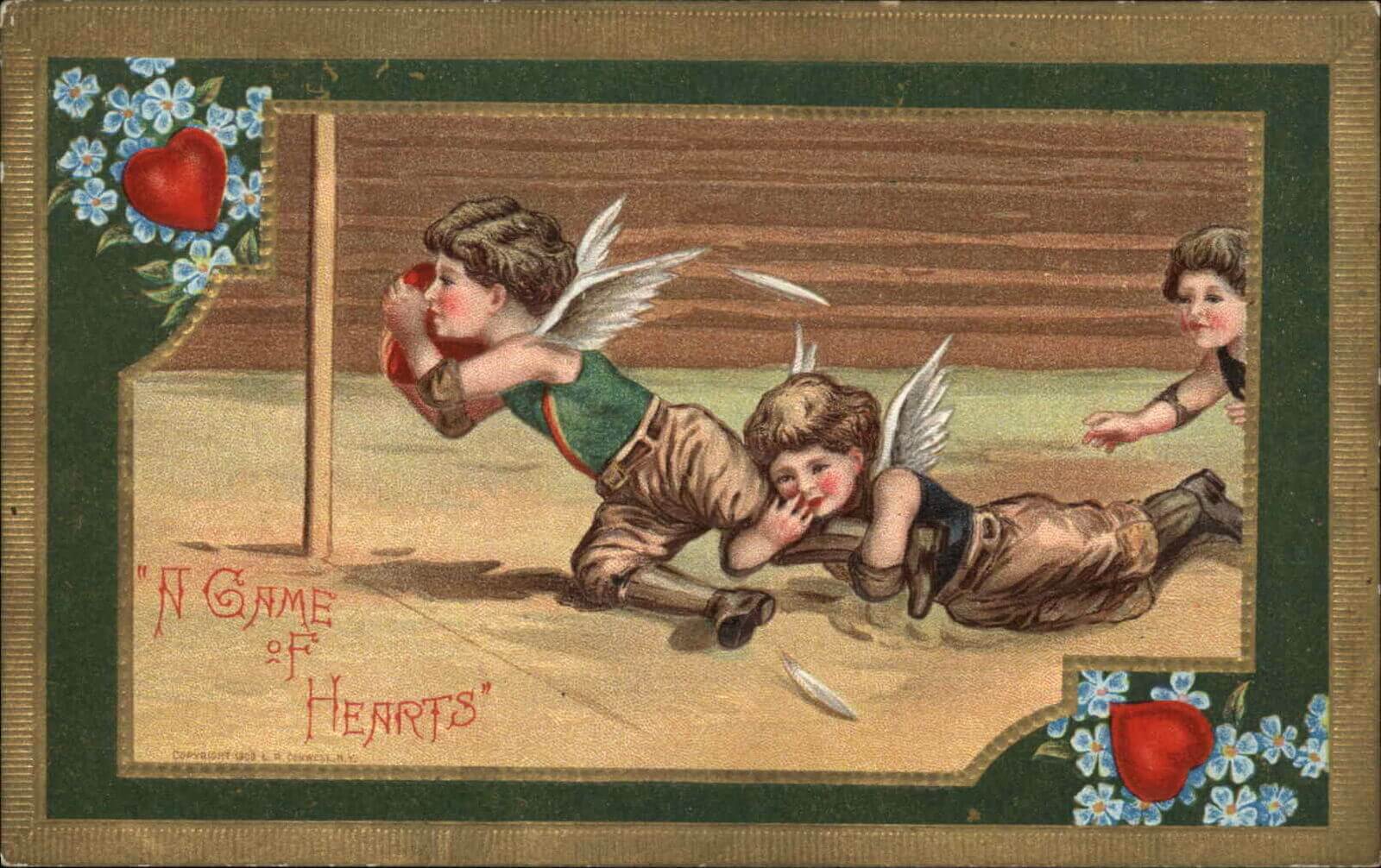
Outside of hearts and perhaps boxes of chocolates, roses are the most ubiquitous of all indicia of Valentine’s Day, so don’t be surprised if you see a few teams on this list that incorporate them into their visual programs. To that point, let’s kick off this edition of Dressed for the Season with just such a selection: Wisconsin’s rosebuds, err, rose duds worn in the 2012 Rose Bowl.
The Badgers weren’t the first team to add roses to their uniforms for “The Granddaddy of Them All.” That honor goes to Washington in 1978, and it’s become an almost annual tradition since then. But no team has integrated the rose trope into its look as thoroughly as Wisconsin did.
While most teams just add a rose to their jerseys, or occasionally their helmets, the Badgers turned their uniform numbers and helmet decals into virtual bouquets with a subtle yet unmistakable sublimated rose pattern. If only they could have played the game under Canadian rules with the extra player so we could have appreciated a dozen roses on the field at once.
16. (tie) England Men’s and Women’s National Rugby Union Teams, Away Kits
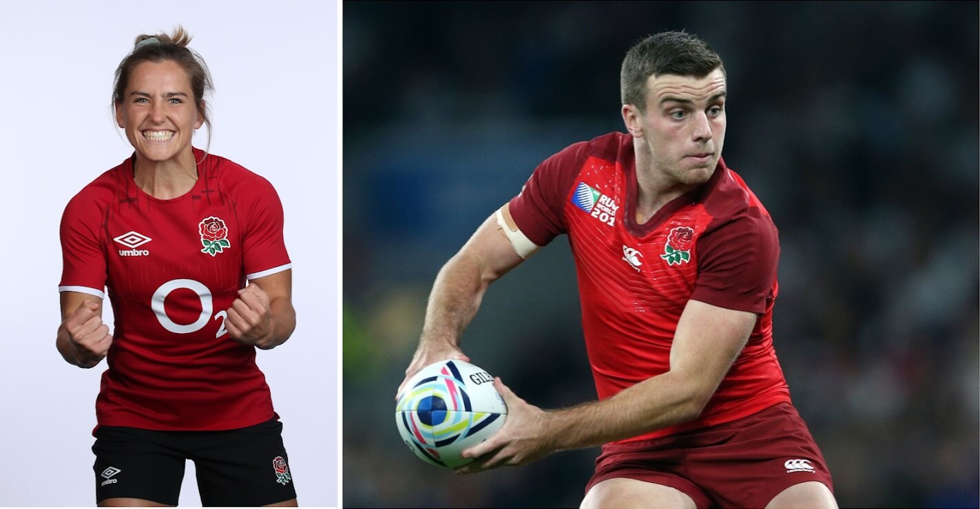
While Wisconsin wore their floral masterpieces for only a single game, England’s national rugby union teams have adorned their uniforms with roses for over 150 years. You can trace the imagery back almost 500 years if you count how long the Rugby School (the progenitor of “the carrying game”) has used the Lancaster Rose in its coat of arms, a gift from Queen Elizabeth I to the school’s founder.
The women’s team (often called the Red Roses) and their male counterparts may be better known for their solid white uniforms. (And, to be sure, the rose really pops on them.) But for this list, I prefer their away kits, which feature a bolder splash of Valentine’s Day-appropriate red. A Rose by any other name may still smell as sweet, but it also packs just as much of a wallop!

In our sixth edition of this series, we finally have our first race car to enter the rankings. (I would never have guessed that it would be for the Valentine’s Day installment!)
Porsche gave its participant in 1971’s 24 Hours of Le Mans the nickname “Pink Pig” because of its porky proportions, then painted it pink to match the moniker. Although a mechanical failure prevented it from finishing the race, its unique livery has endured in the hearts of endurance racing fans to the point that Porsche revived it for the 2018 Le Mans race. (It won its class this time.)
The pink paint scheme with the red lettering makes these cars look like oversized conversation heart candies – all the more so since I can’t read the German phrases that refer to the cuts of meat you’d see on a butcher’s diagram. Either way, really, it makes for a delicious entry onto our list!
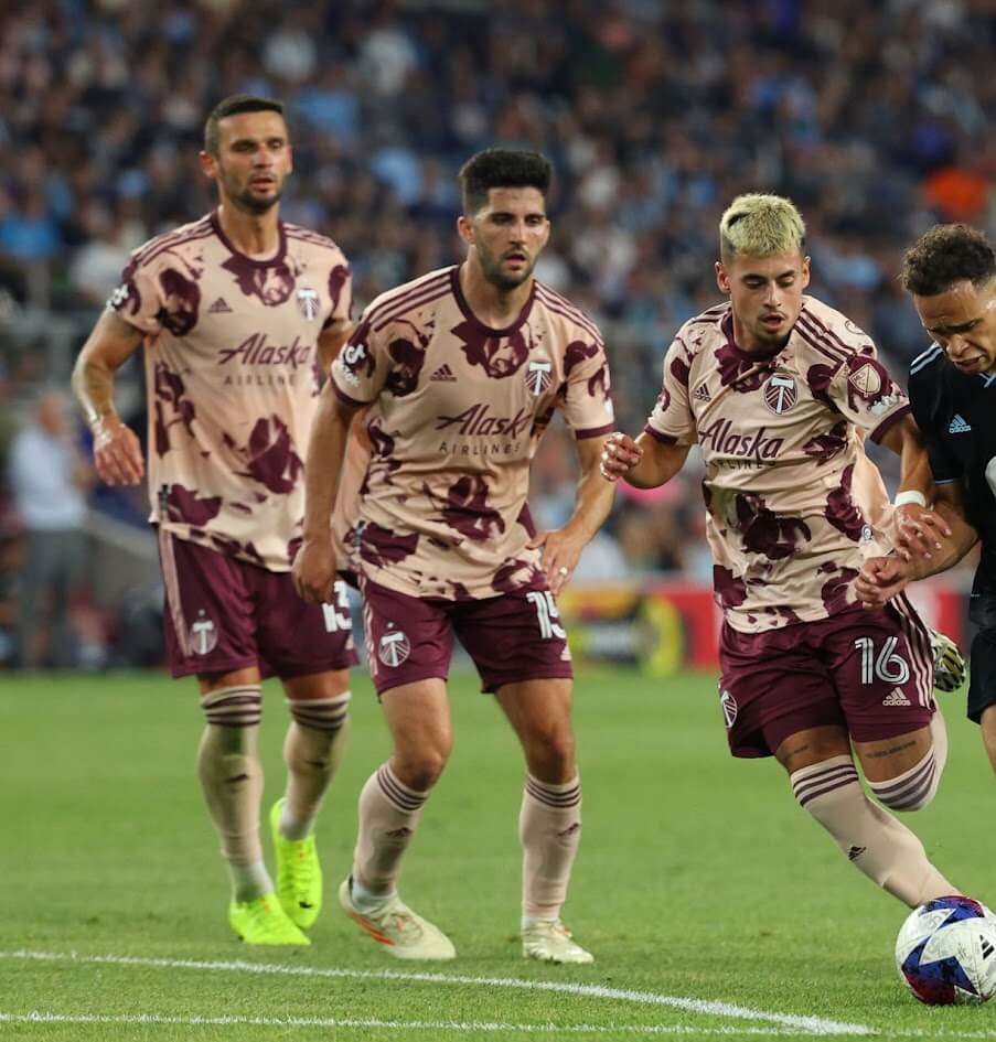
With their willingness to experiment with more adventurous color choices than most of their American pro sports counterparts, it should come as no surprise that you’ll see several soccer teams on this list. The first of those is St. Louis City SC, an expansion MLS team that made its debut in 2023.
St. Louis City provides a good example of how teams needed to bring more than just a single shade of pink to the table to crack these rankings. In fact, if you ask the team’s ownership, they’d tell you they didn’t bring pink to the table at all. The official color of their uniforms is “City Red.” I’ll concede red as the darker shade of their two-tone look, but I’m calling the lighter shade pink. And pink and red is just about the ultimate color combination for Valentine’s Day, is it not?

Barcelona’s 2018-19 third kits had a similar two-tone theme to St. Louis City’s uniforms above, but they used more contrast between the lighter pink and the darker magenta shade. The square-ish patterns featured on the jersey are supposed to represent the city’s historic Eixample district, but to me, it gives off the vibe of a hand-made watercolor Valentine’s Day card. I’m sure plenty of soccer-loving significant others would be thrilled to receive either.
The team in the twelfth slot – the Portland Timbers – represents the convergence of a couple of early trends in our rankings: (1) wearing uniforms featuring a prominent rose design, while (2) combining a couple of quintessentially Valentine’s Day colors. The Timbers couldn’t be more aptly dressed for their hometown, which is known as the City of Roses for its ideal rose-growing climate.
While they’ve leaned into their rosy roots with several red-themed away kits over the years, their most recent away kits take it to another level, with sublimated roses blooming all over the pink and burgundy shirts. And if a Timbers player ever collided with the goal post while wearing that jersey, it would give new meaning to putting the petal to the metal. (I’ll show myself out now…)
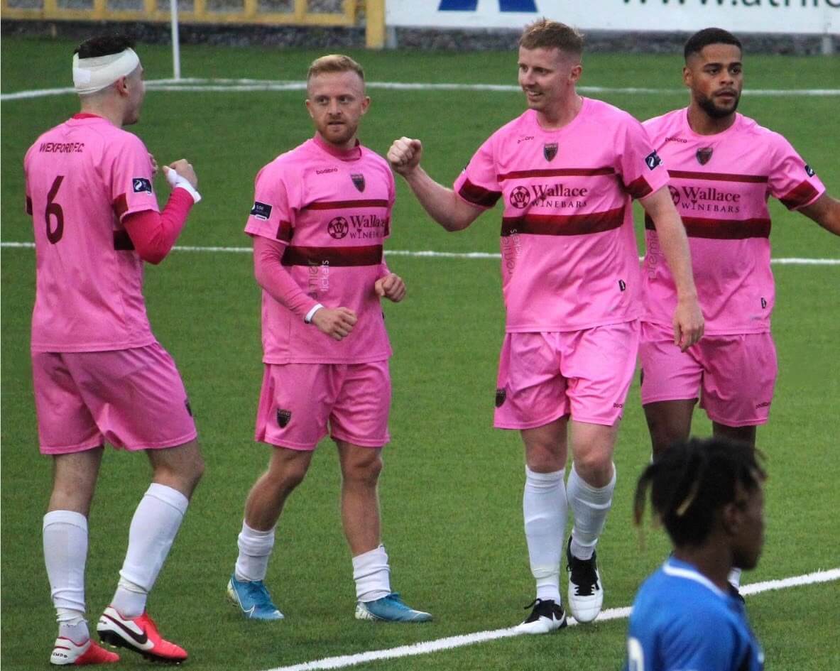
A team in the second tier of Ireland’s soccer league system, Wexford frequently wore pink, variably for either their home and away uniforms, every year from 2008 through 2022, until they completely rebranded to purple and yellow in 2023. The kits that clinched their spot on this list, though, were worn during a three-year stretch from 2017-19. Not only did they pair their pink uniforms with lovely burgundy/claret trim, they also wore the only uniform ad that actually enhanced rather than detracted from a team’s positioning in these rankings – a plug for Wallace’s Wine Bars in Dublin.
Now, I remain staunchly opposed to turning sports uniforms into mobile billboards (#nouniads), but what’s more romantic than sharing a bottle of wine at a cozy bistro with your sweetie on Valentine’s Day, especially after taking in some exciting action on the old football pitch? Who wouldn’t raise a glass to that? (Seriously, though, #nouniads.)
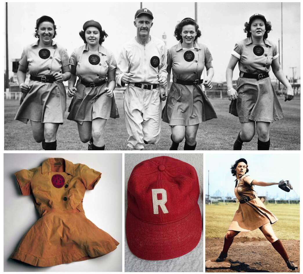
Before we dive into the rich uni history of our next team, we need to answer an important question: does peach qualify as a shade of pink? You can find all kinds of opinions about this on the internet (I know; I looked), but with a range of at least 75 different shades of color referred to as peach, you can definitely find ones that fall on the pink side of the spectrum.
The movie A League of Their Own, along with a recent streaming video series of the same name, have generated an explosion of renewed interest in the Rockford Peaches and the All-American Girls Professional Baseball League, making their uniforms a staple of the trick-or-treating circuit and even grown-up cosplay. While the fictional versions of the uniforms and the fan costumes usually differ slightly from the real Peaches’ uniforms, most of them share a few commonalities: a blending of red caps and trim with a peachy pink dress that’s just as much at home on Valentine’s Day as it is on the ballfield. (I’m suddenly craving peaches to go with my wife’s and my traditional Valentine’s Day dessert of champagne and strawberries.)
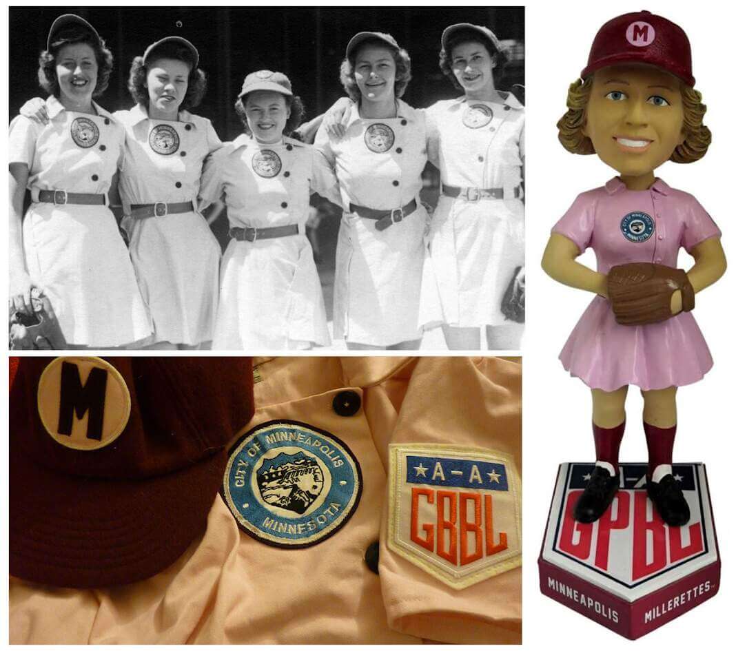
The Rockford Peaches may be much better known, but the Minneapolis Millerettes edge ahead of their AAGPBL contemporaries by sporting a bright pink and maroon color scheme that leaves no doubt about its Valentine’s Day bona fides. Color photos from the era are, typically, almost nonexistent, but a few preserved relics, some colorizations, a bobblehead or two, and some modern artwork give us a sense of what they looked like.
Those pulchritudinous pink playsuits may have been just the right hue for Valentine’s festivities, but don’t be fooled into thinking the ladies who wore them were just a bunch of sentimental romantics. Like the rest of their fellow ballplayers in the AAGPBL, the Millerettes proved that the diamonds some girls consider their best friends are dirt and grass rather than set in jewelry.

Remember how the Christmas edition of this series included a high school that was so reluctant to use its holiday-appropriate logos that it almost got left off the list? We had a similar situation with our eighth-place entry – the Flaming Hearts of Effingham High School in Illinois – but they nonetheless managed to give us enough material that they cracked the top ten.
The Hearts derive their name not from anything associated with romance, but from an early 20th-century tourism campaign referring to their hometown as the “Heart of America.” Even so, their logo inspires plenty of tropes that fit in with Valentine’s Day. It’s just too bad that some of their most prominent sports teams like football and baseball have opted for an underwhelming “E” logo rather than that beautiful heart (not to mention their green and red color scheme, which would have been a better fit for our Christmas list).
Still, the co-ed wrestling team has made a point of wearing their hearts on their chests and on their legs (I guess since singlets don’t have sleeves). And the volleyball, boys’ golf, girls’ basketball, and competitive cheerleading teams have all shown some love for the heart. So congratulations, Effingham Hearts! You don’t have full buy-in across your athletic department, but enough of your teams have Valentine’s Day spirit to put you firmly in these rankings.
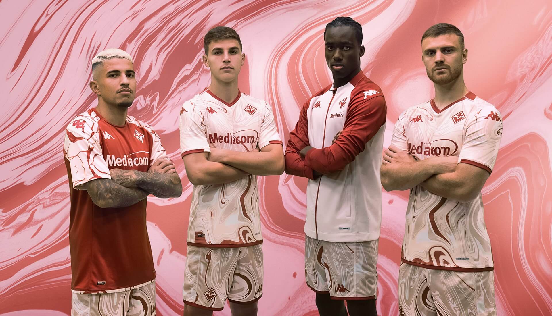
The normally purple-clad Serie A side from Florence, Italy, is in a very Valentine mood this season with these trippy togs. Indeed, they’ve done a better job of evoking the spirit of the holiday with nothing besides their color scheme than anyone else on this list.
The swirling red and pink design is apparently supposed to evoke the idea of a red garment being inadvertently washed with a load of whites, but I see it more as an abstract heart-inspired art print. Or maybe a finger-painted Valentine from a child to their parents. However you frame it, Fiorentina will be looking particularly artful this Valentine’s Day.
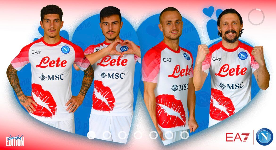
We have our first entry in these rankings of a team with a uniform designed specifically for Valentine’s Day. Another squad from Italy’s Serie A, Napoli earns the distinction of having the uniform that most explicitly recalls the romantic aspect of the holiday, thanks to the larger-than-life lipstick imprint on the right side of their jerseys.
That alone would have likely earned them a spot on our list, but the pink gradient sleeves add another Valentine’s Day-appropriate tweak to the ensemble. These uniforms generated strong reactions among fans when they were unveiled. But love them or hate them, Napoli’s cheeky (and lippy) design ultimately achieved its purpose of arousing passion on Valentine’s Day.
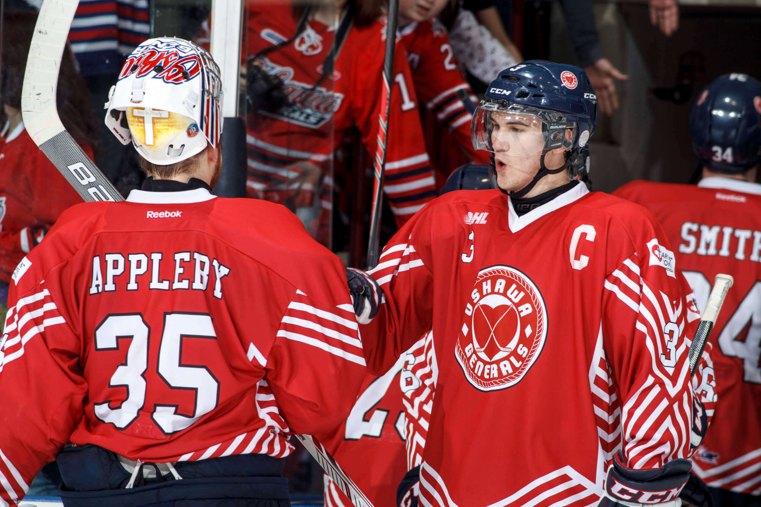
A major junior team in the Ontario Hockey League, the Oshawa Generals wore these special uniforms once a year from 2013 to 2016 as part of a promotion for Canada’s Heart and Stroke Foundation called “Pucks 4 Heart.” The highlight of the look was a prominent heart logo on the sweaters that perfectly fit the Valentine’s Day timeframe when they were normally worn.
You’d think that the heart logo would have inspired the Generals to be lovers instead of fighters for a change, but old habits die hard. Even so, since they were helping to promote a charity, I still think you could call them “bleeding hearts.”
The face of Valentine’s Day is (curiously enough) not Saint Valentine (either of them), but a god from Roman mythology named Cupid. He’s traditionally been depicted as a winged boy with a bow and arrow, and somehow we’ve conflated that symbology with childlike angels called cherubs. (It’s a long story, but you can read about it here and here.)
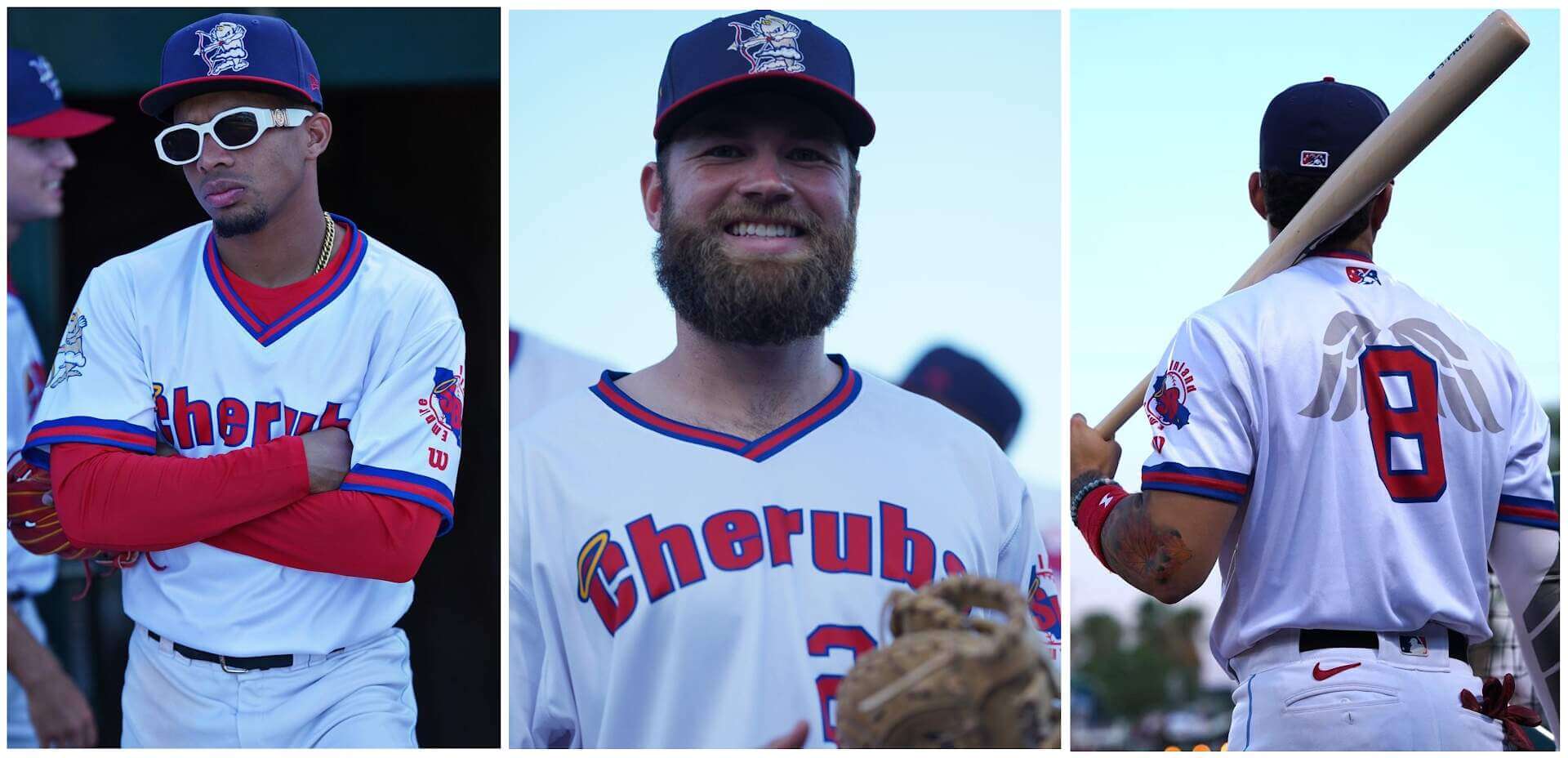
Never mind that the cherubs depicted in the sacred texts of several religions look nothing like the chubby little creatures we see in Renaissance art. As far as Western culture is concerned, Cupid and cherubs are practically interchangeable, and the Inland Empire 66ers, the Los Angeles Angels’ Minor League affiliate in San Bernardino, California, agree wholeheartedly.
Since 2021, the 66ers have hosted an annual “What Could Have Been Night,” recalling how they almost rebranded in 2014 as a play on their parent club’s identity. (Cherubs = “Baby Angels,” get it?) And, by their own admission, the cherub they’re channeling in their alternate look is Cupid.
You have to admit, with the cap logo, the wings on the back, and the way they play up the Cupid connection, the Cherubs’ look couldn’t be a better fit for Valentine’s Day. They’ve tried out a few different uniform combinations over the course of the promotion, but my favorites are the 2022 editions (an homage to the California Angels’ threads from the late ‘70s and ‘80s). Here’s hoping these Cherubs get a chance to try their hand at archery once their baseball careers are over.
If a team called the Cherubs is going to a secure a high position in these rankings, then a team called Cupids has to earn similar consideration, right? Unfortunately, there weren’t many teams to choose from, so the one I did find earns its place here almost by default. An amateur team at roughly the seventeenth level of the English soccer league system, Cupids FC derived its name from Cupids Country Club in Essex where they played their matches.
It’s hard to tell exactly what became of them. The scant traces they left behind on the Web suggest they folded sometime after 2007, perhaps along with the rest of the lowest division of their league. Those traces include an old GeoCities webpage that may or may not have been infected with malware (I’ll spare you the link), a couple of team photos, a distant action shot of what appears to have been their women’s team, and not much more.
I tried to find a more detailed image of their team crest in hopes that it would propel them even further up these rankings, but the best I could do was a clip art Cupid that was somewhat similar. I even dusted off the AI image creator I played around with for the Thanksgiving installment, and it generated some… serviceable (if not overly accurate) interpretations of the logo. They may be gone, but Cupids FC are not forgotten – at least not by a slightly (okay, very) obsessive uni-watcher searching every corner of the internet for the best Valentine’s Day uniforms ever!
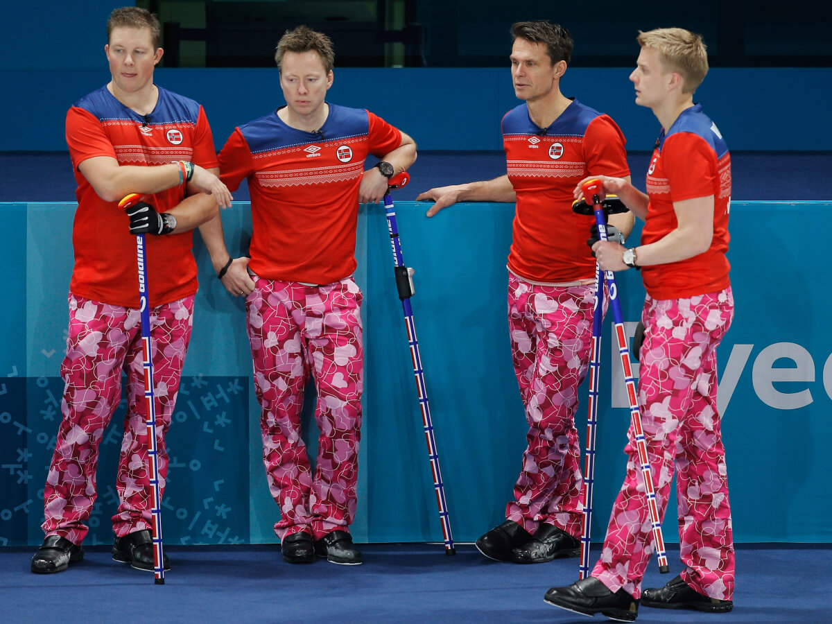
From 2009 to 2021, Norway’s men’s curling team made a big splash internationally, as much for their choice of legwear as they did for their competitive record on the ice. In addition to a number of medals in major tournaments (including silver in the 2010 Winter Olympics), they won the hearts of fans all over the world for the variety of wild pants they’d pair with their national team shirts. Their pants proved so popular that they still have their own Facebook page with over 400,000 likes.
For our purposes, the best pants the Norwegians ever wore came on Valentine’s Day 2018 – an, ahem, understated affair, demonstrating a nuanced nod to the holiday. Oh, who am I kidding? They were about as subtle as a curling stone being dropped on your foot! But then again, it’s not like subtlety wins you points on a list like this.
The players behind that dozen-year run of pants preeminence retired in 2021. But their spirit lives on in one of our own: none other than the great Phil Hecken! I love how Phil salutes those Scandinavian superstars with his bold britches when he takes to the sheet with his rink for a bonspiel. (That’s curling-speak for “takes to the ice with his team for a tournament.”) Well played, buddy! I hope you’re planning on wearing those beauties this Valentine’s Day!
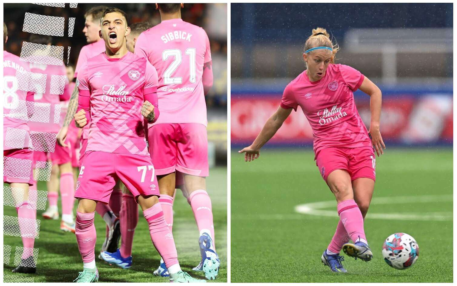
With their name (they’re colloquially known as “Hearts”) and logo, Edinburgh’s Heart of Midlothian Football Club and Women’s Football Club already stood a decent chance of topping this list in their standard home uniforms (a lovely shade of maroon). But when they chose a two-toned pink kit for the current Scottish Premiership and Women’s Premier League seasons, they cemented their status as the most Valentine’s Day-appropriate sports teams on the planet.
Hearts’ classic crest (a reference to a local landmark street mosaic) takes on a whole new holiday identity when rendered in pink. And their commitment to the color scheme – from the jersey to the shorts to the socks – is the icing on the cake heart-shaped cookie.
Am I saying I prefer these pink getups to Hearts’ traditional look? No, but if I’m doubling down on duds for a Valentine’s Day victory, I want them to check all the boxes. Uniforms in colors that are unmistakably associated with the holiday? Check! A logo that corresponds to the universally recognized symbol of Valentine’s Day? Check! And a team identity with a long history that fits perfectly with a Valentine’s theme? Check, and checkmate! (Or, considering our champions’ team name, maybe I should say “royal heart flush.”)
As soon as I opened this, I knew Hearts had to be on there. I wasn’t expecting first, though (I don’t know what I expected).
I will add the Iron Dames endurance racing team, a bright pink car (link) that is teammates to bright yellow and bright green cars. You’d think it’d be easy to spot, but no, especially at night.
Also, the Portland Thorns would be a good fit, even though the Timbers were already there.
Thanks, Jamie! “Great minds” and all that on your intuition about Hearts. :^) And I love the Iron Dames suggestion! Thanks for including it.
As for the Portland Thorns, I gave them serious consideration for this list. I wanted to include them, but they lean way more heavily on the “Thorns” aspect of their name than on any reference to roses. And black is a much more prominent part of their color scheme than red or any other Valentine’s Day-specific color. Even their kits from last season (link), which included their most prominent use of red roses in the design than any other kit they’ve worn, was still more tattoo-like – and thorn-heavy in the design – than rose-like. At the end of the day, they just didn’t have enough of the Valentine’s Day elements I was looking for to make the list.
All hail the Pink Pig!
Rock on, Ron! link
I love this concept and appreciate the work, but not having Inter Messi…err…Miami on the list is a whiff IMO.
Hi, Marc. Thanks for the feedback, I did reference Inter Miami in the article, which you would have noticed if you’d clicked on the links I included. Here’s there specific paragraph (with the link in question included), for your convenience:
One of the colors most obviously associated with Valentine’s Day is pink, and you’ll see it in many of the uniforms below. However, it wasn’t enough for a team simply to have pink in its color scheme. Several soccer teams wear pink , but when paired with heavy doses of black or blue or some other color not typically thought of in connection with the holiday, it doesn’t scream “Valentine’s Day” to me, at least without some other Valentine-specific visual cue.
So that explains why I didn’t include them in the rankings. With their single shade of pink, black trim, and lack of other visual cues, they weren’t quite “Valentine’s Day” enough to make the cut. Also, Inter Miami has already been in these rankings, prominently featured in the Easter installment last year [https://uni-watch.com/2023/04/08/dressed-for-the-season-vol-i-easter/]. So I felt comfortable giving other teams the spotlight instead of recycling Inter Miami.
Weird! I don’t know why those URLs didn’t turn into hyperlinks. Let’s try it again:
First link (to Inter Miami photo): link
Second link (to last April’s DFTS Easter article): link
Ah, social media is blocked on this computer, so I did not see that.
Not having the New Orleans/OKC Hornets Valentines Day red uniforms from 2007 is an all-time miss
link
I couldn’t disagree with you more, Jonny. I considered those New Orleans/OKC uniforms, and they fell far short of inclusion. What was particularly “Valentine’s Day” about them? That the team added red to its color scheme? Whoop-de-do!
Lots of teams wear red, Red, by itself, is far from a sure-fire indicator of Valentine’s Day. every team on this list that has red in its uniforms also includes at least one other detail that adds more layers of visual interest. The OKC uniforms did none of that. I’d say the only “all-time miss” here is how badly the Hornets missed on coming up with something better for Valentine’s Day than those lame uniforms.
I still call it Arizona Statehood Day
I call it Ash Wednesday.
It doesn’t really matter, but all of the jerseys shown in the link “more adventurous color choices” under St. Louis City are counterfeit.
Given the prevalence of soccer teams on here, I’m surprised Juventus didn’t get a mention.
They have a history of wearing pink, and in one year combined it with a more red shade for a very Valentines-y look: link
Maybe the black disqualifies it?
HI, Charlie. If you can find a better collage of bold-colored jersey to use instead of the one you have complaints about, please feel free to add a link here in the comments and I’ll ask Phil to swap it out.
As for Inter Milan, I recall seeing those uniforms and considering them at an early stage of my research. They wound up getting beat out by Barça and Fiorentina in the “multi-toned red/pink” category.
D’oh! I thought “Juventus” and typed ‘Inter Milan.” I realize the evidence isn’t strong, but I assure you, I know the difference.
Definitely not complaining, I’m just hyper sensitive to that sort of thing as I’m an avid soccer jersey collector.
Despite the prevalence of black jerseys (at least one of which is textbook BFBS), I think that collage does a great job of illustrating your point. Maybe this one would do the same? link
Updated!
Yours in commitment to jersey accuracy,
-Kary
(And thanks, Phil!)
Nice listing, Kary – another great installment in a really fun series!
Lancaster, PA is the Red Rose City…so I suggest that the minor league baseball team that used to play there deserves a mention:
link
HoFers Nellie Fox, George Kell, Willie Mays, Robin Roberts, Brooks Robinson and Juan Marichal all donned a Red Rose uniforms.
And speaking of Red Rose(and Hall of Famers) :
link
Thanks, Chris! I appreciate the kind words! I had spotted the Lancaster Red Roses during my research and wanted to include them, but all I could find were images of their uniforms with a script “Red Roses” on the front. If I’d been able to find that photo you sent, with the rose logo on the jerseys, that might have put them over the hump. Great pull on that!
As for Pete Rose, remind me again which hall of fame he’s in? Because it’s not the Baseball Hall of Fame. :^(
I’m gonna listen to Loveless.
Quite possibly the Prairie Rose 3rd jerseys of the Iowa Heartlanders (ECHL).
link
Maybe the Calgary Hitmen’s (WHL) jerseys from the later 1990’s?
link
Thanks, Will! Both of those are fun choices! I gave those Heartlanders jerseys some serious consideration, but ultimately I left them off because I felt like I had enough rose teams, and the the prairie rose they use is a little less “rosy” in how it looks (link) compared to the cultivated roses we most commonly see on Valentine’s Day (link). I love those jerseys, though! The Heartlanders generally have a good look, and that jersey might be their best.
As for the Hitmen, I think I missed that one! It probably wouldn’t have made the list against to many pink-and-red-heavy teams, but I like that little pop of pink trim against the gray and black. It has a bit of a “kiss with a fist” appeal to it (link).