Good Sunday morning all. Hope everyone had a good Saturday and our friends up north enjoyed a Happy Canada Day.
A couple months ago, I introduced a new series, created by none other than UW friend and contributor (and Ticker-submitter extraordinaire!) Kary Klismet, which we’re be calling “Dressed for the Season.” We began with Easter, and today we’ll look at American Independence Day.
Kary’s brainchild went like this: “I recently had the idea to do a series on uniforms appropriate for particular holidays, called something like ‘Dressed for the Season.’ The pieces would likely be in the format of a top ten list (perhaps with a few honorable mentions) [and] I’m thinking of additional pieces in the series for the 4th of July, Halloween (focusing on scary uniforms more than orange and black), Thanksgiving, Christmas, and possibly into next year with Valentine’s Day.”
With that, let me turn this over to Kary as he brings you…
by Kary Klismet
Our second edition of Dressed for the Season looks at that most American of holidays – Independence Day. With so many teams that wear the red, white, and blue of the United States flag, there was an abundance of teams to consider for this ranking of the top twelve teams whose uniforms most effectively capture that spirit of America and pride in our country that, for many of us, peaks on the 4th of July. Because of that, it was not an easy list to choose, and plenty of very patriotic uniforms just missed the cut.
Much like the Easter edition of this series, I adhered to some specific criteria in making my selections. For starters, there were no hard requirements as to colors, but because our society so closely associates the date we celebrate the nation’s birthday with the colors of our flag, if the uniform didn’t include all three of the obligatory red, white and blue, its chances of making this list were negligible. Put simply, only the uniforms that might have won the “most patriotic” prize if worn to a rousing 4th of July backyard barbecue were in the running to make this list.
My strictest rule, however, was that all the uniforms had to be a team’s regular, standard garb. No specialty or alternate uniforms were eligible, especially if they were obviously conceived of as merch dumps or were the type of design that Uni Watch has long considered “pandering.” So you won’t see any MLB 4th of July caps, stars-and-stripes laden football helmets, or tacky minor league one-offs here (other than, you know, the ones I just used as examples).
And finally, only one entry per team or program. We don’t want certain clubs with seasonally appropriate color schemes to dominate these rankings.
Now that those ground rules are out of the way, here are my picks for the twelve most “American” of all sports uniforms:
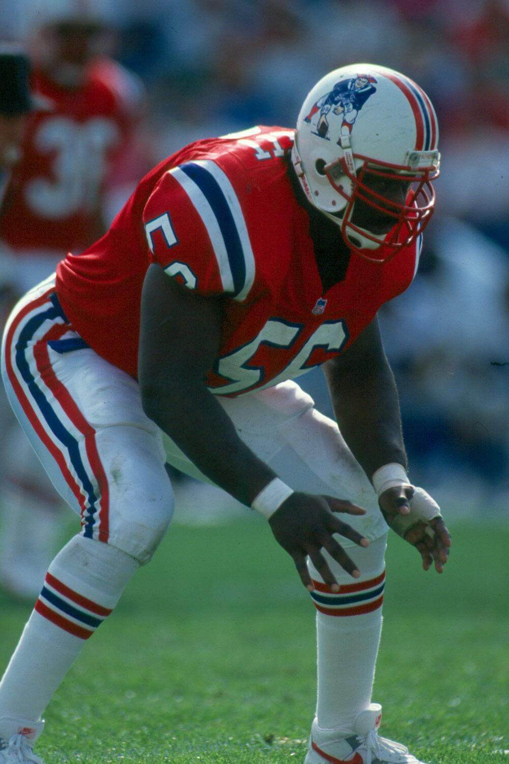
When your team is called the “Patriots” and you sport a classic red, white, and blue color scheme, you’re almost entitled to a spot in rankings like these. New England’s classic “Pat Patriot” uniforms were an easy choice over any iteration of the team’s “Flying Elvis” threads. The overreliance on silver/grey in the latter just muddles the “all-American-ness” of the look.
Of all the slight variations to the “Pat Patriot” unis, the prominent UCLA stripes on the ones worn from 1984 to 1992 provided the best balance to the red/white/blue color scheme. And although this may be controversial with Patriots die-hards, I prefer the way the red facemask, worn during two dismal seasons on the field from 1991-92, makes the rest of the helmet design pop compared to the white facemask worn previously.
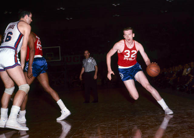
The Sixers, with their name alluding to the nation’s very founding, are another team that seemed almost compulsory to include on this list. They’ve had several uniforms that play upon the patriotic theme of their name, some more successful than others. For my money, though, none have been better than the simplicity of the road uniforms worn for the 1965-66 season.
The different-colored jerseys and shorts provided equal pops of the red and blue you’d expect from a quintessentially American color scheme, while the wide waistband and lettering injected the right amount of white. And the detail that puts these over the top is the logo on the sides of the shorts, which evokes the Bennington Flag (aka “Spirit of ‘76 Flag”) made famous during the American Revolution.
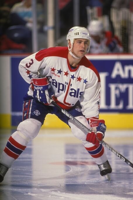
Of all the sports teams that call our nation’s capital home, none does a better job of conjuring a patriotic feel to their identity than the Washington Capitals. And among the Capitals’ various ensembles, their home uniforms from 1974-95, with an abundance of stars all over the jerseys, pledge their allegiance to the American flag the most boldly.
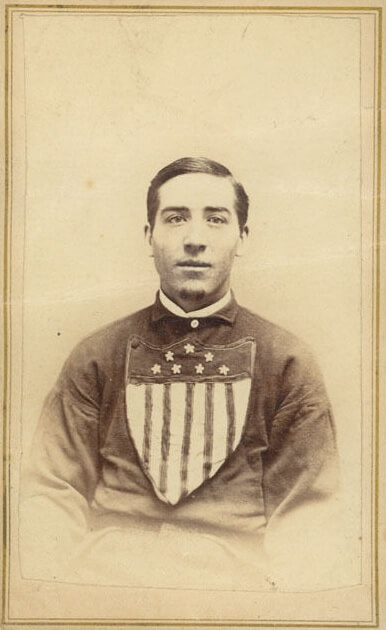
For a sport that bills itself as “America’s pastime,” remarkably only one baseball team cracked this list – and it’s one I knew virtually nothing about before I began my research for this project. But after scouring the internet for images of baseball clubs with uniforms that felt sufficiently patriotic, I found a dearth of good examples. Even the U.S. national team uniforms all felt just a little too generic or a little too contrived.
The one uniform that stood out as organically and quintessentially “American” was this beauty from the early days of professional baseball worn by the Union Base Ball Club of Lansingburgh, New York. The gorgeous shield on the jerseys – inspired by the Union Shield at the center of the Great Seal of the United States – puts these in a class by themselves.
Sadly, no color images of these unis exist. Thankfully, however, two stalwarts of the comm-uni-ty – Craig Brown, who runs the exceptional “Threads of Our Game” website, and Graig Kreindler, historical baseball painter extraordinaire – have given us their expert takes on what the Union club may have looked like in all their full-color glory.
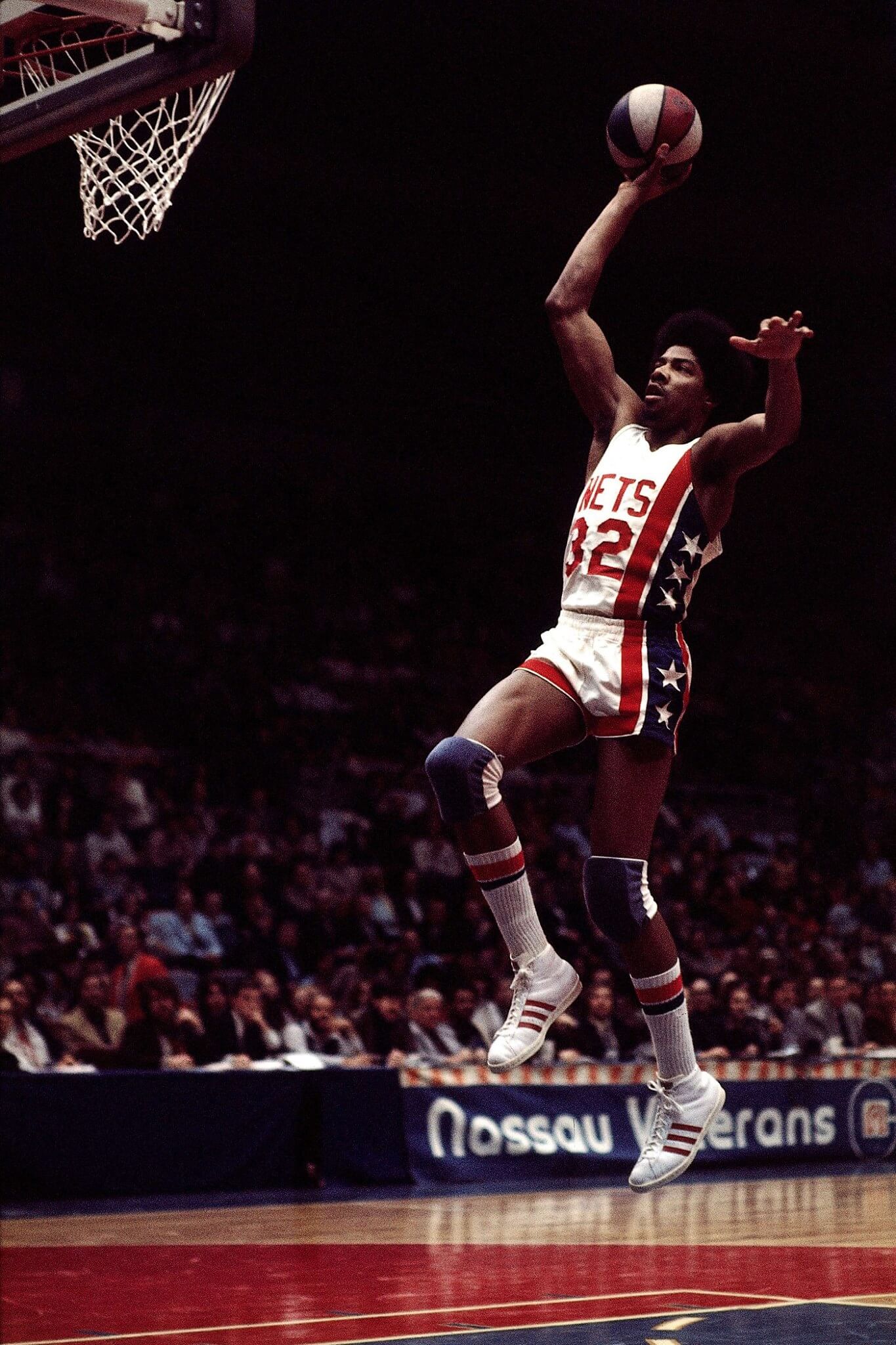
A team called the Nets has no business upstaging the likes of the Patriots and the 76ers in the rankings for the most patriotic uniforms, does it? Well, that’s just what the New York Nets did by introducing their memorable stars-and-stripes duds during their American Basketball Association heyday in the early ‘70s.
The look was so timeless that they wore it all the way to 1990, spanning moves across leagues (the ABA to the NBA) and the New York metro area (Long Island to the New Jersey suburbs). Switch out “Nets” for “USA,” and you could make an argument that these would have been the best uniforms that the U.S. national team would have ever worn. A true American classic, the Nets have never looked better than when they wore this uniform.
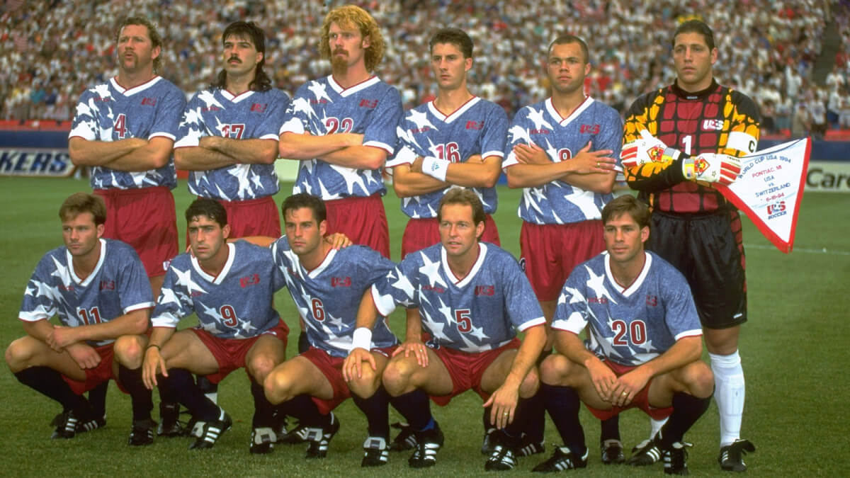
The jersey sublimation craze of the 1990s arrived just in time to help outfit the U.S. Men’s National Team for the 1994 World Cup in the loudest, most unabashedly American uniforms they’ve worn before or since. Was the denim effect on the star-adorned blue jerseys an irreverent, Grunge-inspired nod to members of Generation X who made up the bulk of the team and the sport’s emerging fanbase in the country? Perhaps. But by paying homage to the nation’s status as the birthplace of blue jeans, it just added to the kit’s Americana allure.
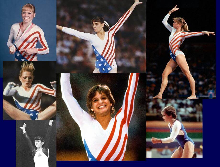
After decades of being overshadowed by the Soviet Union and Romania’s stranglehold on the sport, Mary Lou Retton almost single-handedly put the U.S. women’s gymnastics team back on the map with her gold medal in the individual all-around competition at the 1984 Summer Olympics. And she was resplendent while doing it, wearing a leotard that resembled an American flag stretching diagonally across her frame. It was a look that sold millions of boxes of Wheaties (several of which I recall making their way to my household when I was a kid).
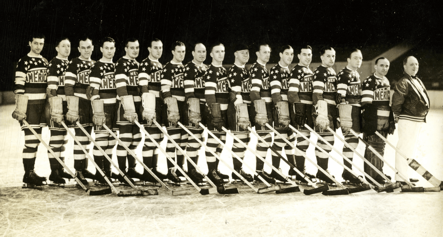
While New York has a current hockey team that’s no slouch in dialing up the patriotic imagery as part of its visual identity, a rival to the Rangers in the NHL – the erstwhile New York Americans – had a look so well-suited to their name that not even the Blue Shirts could top it. Featuring a virtual explosion of stars and stripes across the sweater, there was no mistaking which country the Americans called home.
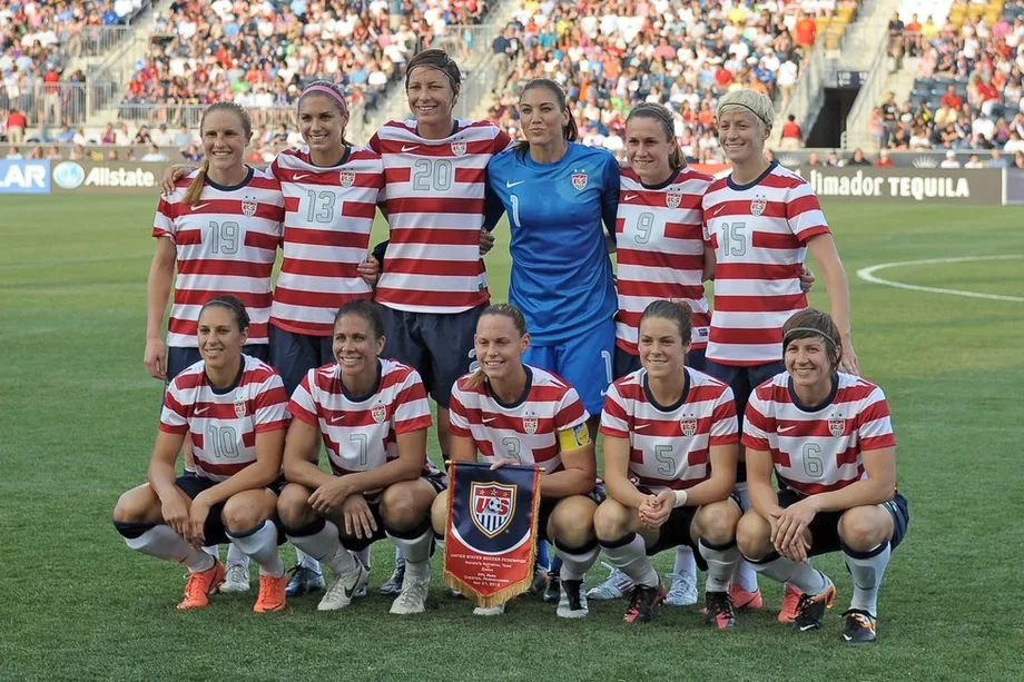
The United States Women’s National Team’s unparalleled success on the international stage has elevated several of their uniforms to prominence among soccer fans. The most “American” of them all, in my opinion – and arguably the best-looking uniform a U.S. soccer team has ever worn – is the 2012 “Waldo” uniforms (so nicknamed, of course, because of the red and white hoops’ resemblance to the shirt worn by the popular children’s book character). Several pundits have called for U.S. Soccer to adopt a version of these as the national teams’ permanent uniforms, which strikes me as a great idea to give them a more cohesive – and instantly recognizable – identity.
The uniform itself is fine if unspectacular. It has the requisite red, white, and blue color scheme and one elaborate star incorporated into the chest lettering to give it a hint of American symbolism. But the cultural significance of this uniform gives it gravitas far beyond its otherwise understated design.
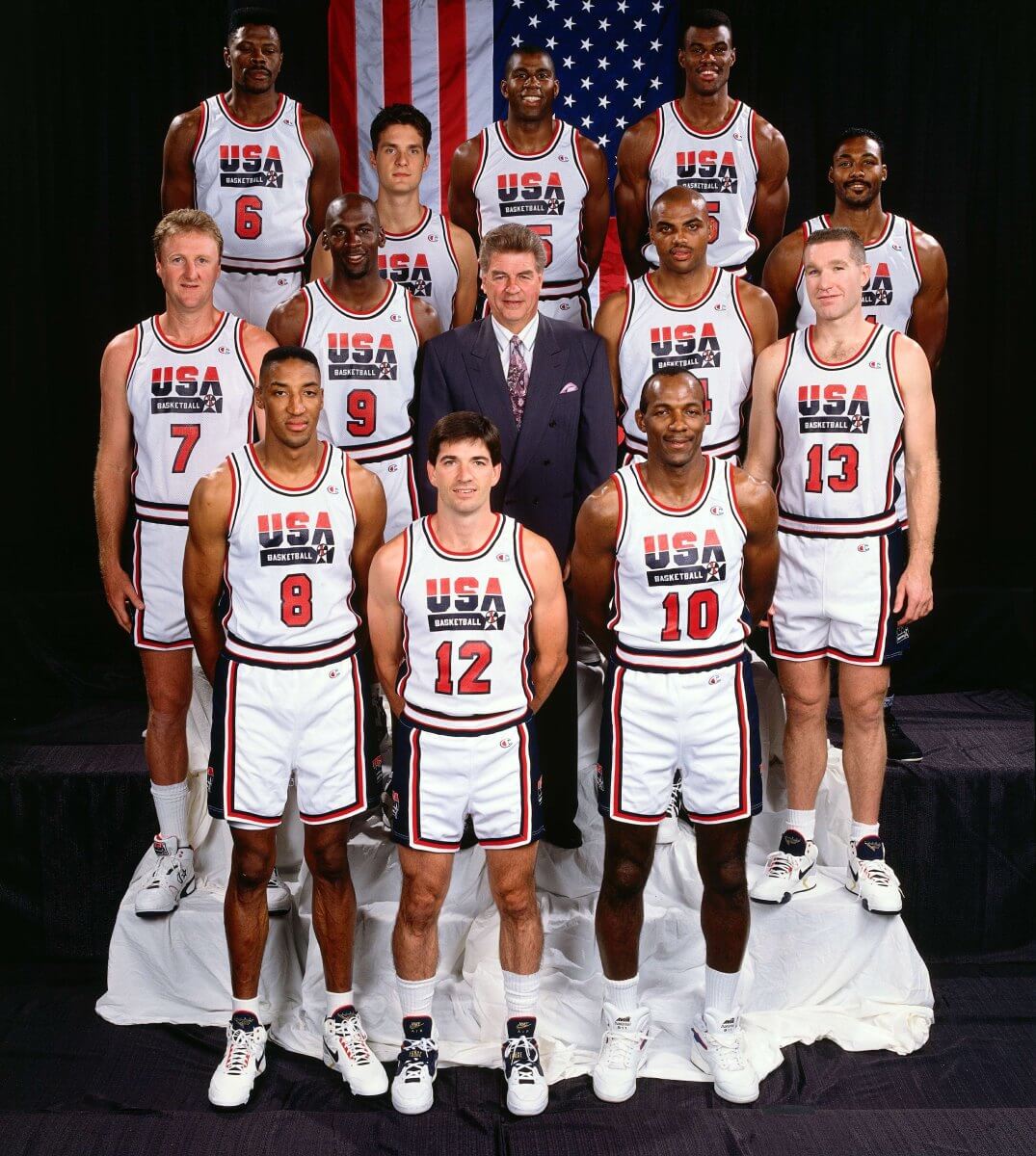
Four years after the last team of American amateurs lost out on the gold medal in men’s basketball to the Soviet Union, USA Basketball assembled the greatest collection of NBA talent ever seen into the 1992 Dream Team. The team’s exploits – and domination of its competition – are now legendary, as is the uniform. Whenever discussions come up of the greatest teams to represent the U.S., images of Michael Jordan, Magic Johnson, et al. in these duds are sure to follow.
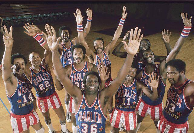
Having spent nearly a century touring as an exhibition basketball team and entertainment draw, the Harlem Globetrotters are an established institution as ambassadors of American culture. And the team’s uniforms, with their red and white striped shorts and star-festooned blue jerseys, are perfectly befitting of that role.
The yellow trim on the jersey deviates slightly from the strict tri-color scheme of most of the uniforms on this list. But for me, it just adds extra embellishment, like the fancy fringe you see on some flags in courtrooms or other government buildings.
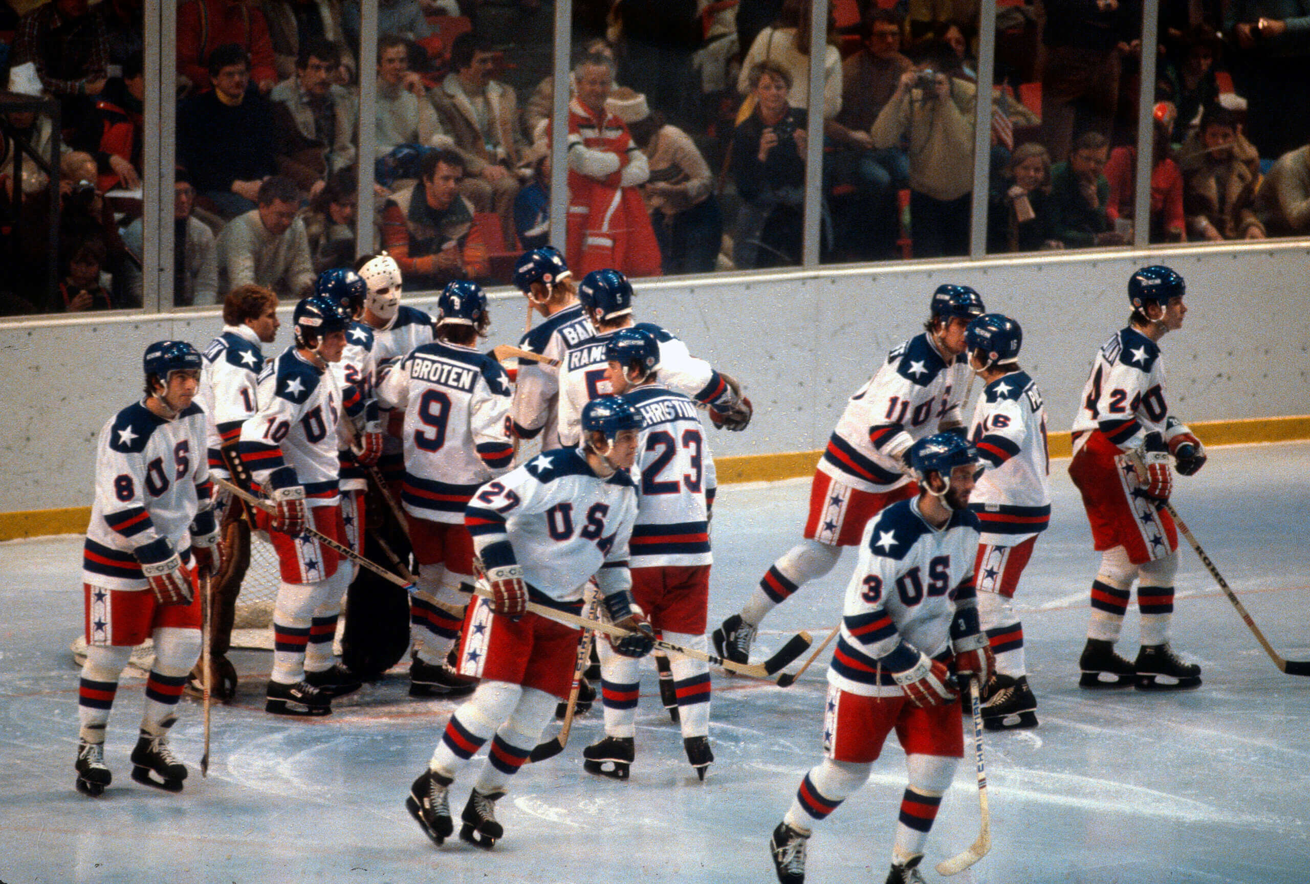
No moment in American sports history has captured the imagination of an entire nation like the U.S. hockey team’s upset of the Soviet Union (and subsequent victory over Finland to capture the gold medal) at the 1980 Winter Olympics. At an international and economic low point for the nation, the hockey team’s out-of-nowhere success gave Americans a psychological boost that still resonates today.
Fittingly, the team’s uniforms have achieved iconic status in a way that few have. Other uniforms in the hockey team’s history have had more “rah rah, America!” bells and whistles (like these stunners worn for the 1976 Canada Cup, for which I admittedly have a soft spot). But as with the 1992 Dream Team’s uniforms, context matters. And as a testament to our national resilience and determination, the 1980 U.S. hockey outfits have stood the test of time as the most “American” of all uniforms.


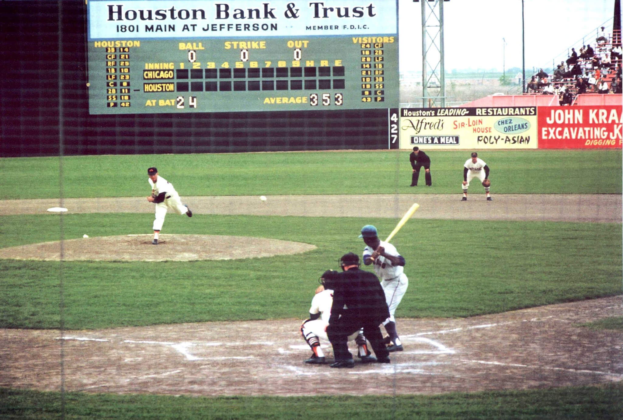
Scoreboard: First game in Houston Colt 45s history?
Lou Brock batting lead off for the Cubs.
First pitch in first game of Colt .45 s
Re MLB All Star Game unis: Does MLB really think people are going to run out and buy one of this year’s boring generic jerseys? They can’t possibly believe this, right? So, giving them the benefit of the doubt, what the hell is the point?
It’s so stupid. Pretty much like me futilely complaining about it.
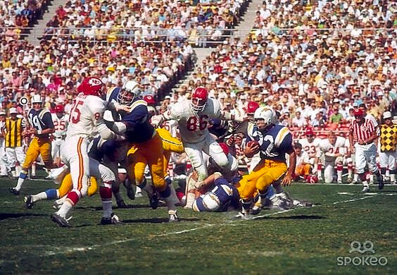
The GTGFTU is the October 15, 1967 game between the visiting Kansas City Chiefs and the home San Diego Chargers, which was won by the Chargers 45 – 31. Chargers HB Dickie post is rushing the ball against KC as Chiefs Hall of Fame DT Buck Buchanan and Chief DE Chuck Hurston give chase. Visible on the Chiefs sideline is DE Gene Trosch (74).
1967 was the only year in the 1960s that San Diego wore dark blue jerseys, and the had unique lighting bolts on them that were thicker and didn’t have outlines.
Also there is a uniform oddity – Lance Alworth (19) is wearing his 1967 helmet with the solid blue lightning bolts – that was another one-year look for the Chargers but you do see a few players wearing the 1967 helmets in 1968.
Since I can’t edit – Alworth is wearing his 1966 helmet in 1967, as did a few other players.
1967 is also the only year in which the KC Chiefs (with Dickie Post playing against them) wore white pants with white jerseys. The next season, the club began wearing red pants with the white jerseys.
Purple Mountain Majesties! How can you leave the Colorado Rockies off this list?
Related to GTGFTS… Lou Brock was also the first player ever to step up to the plate in Canada, leading off for the Cards in the first home game in Montreal Expos history, April 14, 1969.
You know I love the Rockies, Ron, but that’s just one line in the song! Now if you can find a uniform to represent the fruited plain, let’s talk… :^)
Wichita State Shockers… Golden shocks of wheat. They’ve even had anthropomorphic wheat as logos over the years.
Well played, Ron! Maybe we can throw in the Brush Beetdiggers as well to give the Rockies an in-state companion to complete the couplet
Just an addendum to the Nets stars and stripes uniforms – the team dropped them for 2 seasons (1981-1983) before returning to them for 1983/84 through 1989/90.
The 1981-1983 uniforms were kind of generic, but they did use the script “Nets” logo with a tail that they used prior to the stars and stripes set.
A good bit of history there, John! Thanks for enlightening me on this!
As a Patriots die-hard, I have no problem with you switching to the red facemasks. While I came around to the Flying Elvis, the classic Pat Patriot red has always been my favorite(even through the lean years).
Thanks, Keith! Glad I didn’t offend the Patriots’ faithful too much!
I think most like the Pat Patriot better, but because of the success of the team while wearing Flying Elvis they’ll never go back to the better uniforms as their main uniforms. This is probably why the Eagles won’t go back to the Kelly Green as their main uniform after winning a Super Bowl in the dark green. Wonder what other teams were stuck with inferior uniforms because of success while wearing them?
link
I know I’ll get mauled here, but pat patriot has its place, and for me, that place is no longer as the primary logo. I think it’s a rough drawing and the angle and the pose somehow make a person in a soldier’s outfit, posed to snap into football action look stagnant and boring.
That aside, I’m thinking of a few teams that switched unis then were successful, and did not switch back, at least for a good period of time: the broncos, cavs, and the Seahawks come to mind. Keeping with Seattle, the sonics come to mind. And as a personal opinion, the current warriors set (which I find to be a lazy, slapdash, insult to one of the best unis in NBA history). But I do think this happens quite often, and often big success doesn’t even need to follow a uni change. I think sometimes it’s a matter of landing a big time franchise player and projecting potential success.
No mauling from me! Even though I chose the “Pat Patriot” uniforms for this list, I can understand why some people may not love them. Quit honestly, I don’t completely love them myself as much as I felt like they fit a certain patriotic ideal that works well for this list.
Even though I have a certain nostalgic feel for Pat Patriot based on what New England wore when I was growing up, there are some ways that the Pat Patriot logo doesn’t work extraordinarily well as a helmet decal. For one thing, it has too much fine detail that’s hard to make out from a distance.
I think I’d be more amenable to the “Flying Elvis” logo if the Patriots had stuck with more of a red, white and blue theme for those uniforms and minimized the use of silver. It’s possible that such a uniform would have overtaken Pat Patriot on this list if that had been the case.
Agree with you there BvK. They are certainly among the most patriotic uniforms and they belong on this list. I find that Pat was of a certain time for sports design. I see those old unis and I think they look pretty good for that era, (particularly when compared to the lions old “I don’t know how to draw a lion” logo) but I don’t need him to come back. At least not as a primary logo. Unfortunately he doesn’t exactly jive with flying Elvis from a design perspective so I guess my solution is to relegate him to either throwbacks or memory lane.
I’m a stodgy old school Pats fan. Love that look, but it’s gotta be the white cages for me. Just a cleaner look to me.
One person’s “clean” is another person’s “washed out.” There are very few instances where I prefer a white face mask on a white helmet. In almost every instance, I think the contrasting face mask provides more visual interest and breaks up the monotony of the white. Obviously, YMMV, but that’s why I chose the way I did.
Shocked that the 1974-86 Washington Bullets’ stars-and-stripes unis didn’t make the cut, they were basically the US flag in the form of a uniform.
That was a tough one for me to leave out. The Bullets’ road uniforms from that era were very much in the running for this list and would have likely made it if I’d expanded it beyond 12. Maybe we’ll consider them the 13th entry in honor of the 13 original colonies/states. Here’s a great image of those uniforms to accompany their entry: link
Great list! One that I am pretty much in agreement with – though I am not a fan of the Waldo soccer jerseys at all. USA Hockey’s 1980 uniform may well be the greatest look, but the 1960 uniform is pretty dang nice too and the USA World Jr. team continues to wear that jersey – it is the original classic! And it is so much better a look than the bunk that has been foisted on the last few Olympic teams. The 1996 Canada, er, World, Cup team is my third favorite USA hockey look – pretty much a companion piece to the 1994 World Cup soccer team. And I agree that the 1974-1995 Washington Capitals jerseys is their best look, and is miles ahead of their current sweater and everything they’ve worn in between. But no mention of the Rochester Americans AHL team? Now there is a team and a look that has stood the test of time!
Thanks, Rob! I appreciate the feedback. There were so many good “American” uniforms that I had to leave out several that I really like. (I mean, I guess I could have made the list 20 or 30 uniforms long and bored you all with all the extra prose, but I felt like I had to make a reasonable cut off somewhere.)
The Anerks were definitely on my radar and were another tough team to leave out of the rankings. Ultimately, they missed the cut for a couple of key reasons. The list already includes a team called “the Americans,” and I just happened to like the NHL teams’s old-timey uniforms better.
And speaking of uniforms, I think the Anerks’ look is good but not great. I like the shield they wear as a chest logo, but I think the script “Americans” across it makes it look muddled – and makes the word mark hard to read. In my opinion, it’s a classic example of good intentions, but less than ideal execution. So Rochester is another team that just missed the cut. If I’d included more teams, they certainly stood a good chance to be on a longer list.
I meant to include a photo of the Rochester Americans’ uniforms to illustrate my point. Here’s a link.
I love Kary’s list, and there were a few on there I *never* would have considered, but are great nonetheless.
Almost exactly a year ago, I put together a list of the four most “Patriotic” major sports uniforms (link), and I had a couple Kary didn’t include — so even with R/W/B it’s a tough decision. Kary made some great choices!
Thanks, Phil! I appreciate the support and kind words!
Thanks for reviving that article you wrote last year! I love that at the time, but it had slipped my mind while I was creating my current list. Interesting to see that we had overlap on two of the teams.
I also considered the Cowboys’ 1976 helmet stripes for inclusion, but ultimately felt like they might have fallen on the wrong side of my “regular/standard uniform” criteria. A tough call, for sure, since they were it for an entire season. Ultimately, though, I felt like the Patriots were a little more fitting for this list.
I had forgotten about the 1917 White Sox World Series uniforms. I wish I had remembered them, because it’s a gorgeous look! But this is another example of a uniform that might be an alternate rather than standard uniform. In any event, I’m certainly glad to get another look at it!
Wheaties are/were the worst.
…And THAT’S why you could never hang with Michael Jordan on the basketball court. link
Wheaties are the RC Cola of cereal. Yuck.
I like RC Cola! Apparently, we just wouldn’t get along
Should players wear their own uniforms playing in the MLB-ASG? YEEEEEESSSSSS PLEASE!!!!
Love when then NBA and NHL did this too!!
When did the NHL let players wear their own uniforms for the all-star game? For the skills competitions, yes, but not for an actual game. The 2020 jerseys had team crests but it was not all different team jerseys – the jerseys shared the same template.
The last time NHL players ever got to wear their own jerseys in an All-Star Game was in 1968, and that was because the format was still the defending Stanley Cup champions vs. the rest of the league’s All Stars. That last team? The Toronto Maple Leafs.
I kind of feel like USA Olympic uniforms are kind of cheating, or at least too obvious, to be on this list.
I carefully considered, before compiling the list, whether US national teams uniforms should be considered. Ultimately, I felt like there were too many uniforms involving teams that represent our country that people think of as uniquely and iconically American and very much part of the national consciousness – uniforms like the 1980 hockey teams’. I felt like it would have been unfair to the expectations of what many of us think of as patriotic to leave out some of those uniforms from consideration.
And I would like to point out that when going up against other uniforms under consideration, the US national teams hardly dominated the list – with only four of the 12 selections. There were plenty of other national team uniforms I could have considered, but I felt like plenty of professional teams head designs that were more “American” and more embedded and people’s memories. So it certainly wasn’t like I took some “easy” route in just choosing Team USA all the way through. Truth be told, there were plenty of national team uniforms that just weren’t that good and weren’t that patriotic, and didn’t stand up when evaluated against designs across the sports spectrum.
Finally, and candidly, Rick, I take exception to your use of the word “cheating.” I put a lot of time, effort, and good faith into compiling this list and I find that characterization of my work to be demeaning and insulting. Frankly, if you think you could do better, then feel free to create your own list. I’m sure Phil would be happy to publish it if your writing is good enough.
Sorry, didn’t think you’d take this so personally. It wasn’t meant as a criticism of your character, just would have enjoyed more teams that weren’t USA teams.
Good job on this, Kary. I also thought of the Rochester Americans but I think the NHL team has them beat on the “Americans” part of the name…
Exactly! I just responded to RobYaz’s post above on this very point about the Rochester Americans, so I’ll refer you to that as my response would be the same.
And thanks for the kind words, Jamie! I always appreciate feedback from someone whose writing and analytical skills. I respect so much.
Not sure if this is an unpopular or a common opinion but I always thought the prominence of the red and blue on the Pat Patriot throwbacks should be reversed. The jersey should be blue to match the coat that Pat is actually earing. Not mention the whole “Red Coats” being the Brits thing all…it has just always felt wrong to me that their primary color was red on those unis.
Had never thought about it that way, but I have to agree, it is odd that red was the primary color from a historic POV.
That’s a fair point, and probably one of the reasons why the Patriots wound up in the 12 spot on this list instead of higher. I thought about including the Patriots current uniforms: link (with the navy blue jerseys and the red and white UCLA stripes on the sleeves), but I still don’t love the silver helmets (at least for this exercise), nor do I care for the way that the navy pants create the dreaded unitard effect.
I still think of red as a prominent enough color in the American color scheme that the Patriots’ old uniforms still feel sufficiently patriotic to me. Also, for what it’s worth, there are still some elements of the United States military without wear red ceremonial uniforms. To wit: link
“…there are still some elements of the United States military *that wear red ceremonial uniforms.”
(Please forgive the talk-to-text translation error.)
This critique is fairly common. I never understood why some teams get called out for not being ‘true enough’ (ex.: AZ/STL Cardinals – “cardinals don’t have yellow beaks”, CIN Bengals – “tigers don’t have orange stripes) while others are seemingly immune from criticism even though they don’t brand themselves literally (ex.: PHL Eagles, MIA Dolphins).
In the original AFL (link), four other teams wore blue (including the other three Eastern Division teams), while one wore red. So putting the Patriots in red made sense from a league standpoint.
The Bills should have been red and the Patriots should have been blue. That would have made even more sense.
A truly well-considered list …Thanks, Kary!
I would have included the Birmingham Americans – and would have ranked them fairly high:
link
link
…but that’s just me (and possibly 1 other UWer/WFL aficionado!).
And I’d give Dale Jarrett’s 1999 NASCAR Cup-winning paint scheme an Honorable Mention as well:
link
Great suggestions, Chris! I admittedly didn’t have the Birmingham Americans on my radar. They’re absolutely worth an honorable mention at the very least!
And I hadn’t really thought of race car liveries for inclusion but I love the outside-the-box thinking. It’s hard to question NASCAR’s patriotic bona fides.
Jarrett met your “regular, standard” rule…I think he ran that all season long. Sadly, most teams switch their schemes week to week these days…especially when there’s an opportunity to pander.
If you had allowed one-offs, this get-up worn by Flo Jo is an all-timer!:
link
Chris, you’re totally making me wish I’d added another dozen entries to these rankings! I looked through a ton of old US track and field uniforms trying to find any that had that perfect patriotic look that would merit inclusion in this list. There were some close calls, but none that overtook the 12 entries that made the final cut. That FloJo outfit might have been the one to do it. And I think it might have qualified as “regular/standard” since she wore it at a major s sanctioned event (and before the era of the one-off as a merch dump/promotional exercise). Great find on that one!
Where were the Apollo Creed shorts?
In a fictional movie.
Where were the Apollo Creed shorts?
I loved the 1994 WC kit, but I am also Gen X, so I guess mission accomplished.
And, yes, the Waldos should be our kit.
Thanks, Marc! I, too, am guilty of the Gen X charge, which I’m sure influenced my picks. But those 1994 World Cup kits are what the USMNT was wearing when I first started following them closely, so, to some degree, that’s how I always feel they should look.
Thanks Kary for the list. It is a lot of fun. I know this would never qualify (since it’s a defunct Indoor Football league team that lasted only one season), but here is where my head went as soon as I saw the headline:
Salt Lake Screaming Eagles
link
Thanks, Matt! Much appreciated! Those Salt Lake Screaming Eagles uniforms are really… something! They very well might win someone the prize at a backyard barbecue! Thanks for sharing!
Wow. Just…Wow.
Gotta mention the Utah Stars – when the Stars and Nets played in ’73, it was a stars & stripes, red-white-and-blue, bicentennial, America the beautiful, flag-fest!
Good call on the Utah Stars! They’re definitely worth a mention. I think they might have had some equally patriotic looks when they were in Los Angeles, too.
Great feature. Really enjoyed that.
Thank you, Greg! I really appreciate that!
As an original NYC kid who did most of his growing up in Troy, NY and a large part of that in what is now the Lansingburgh section (it was a separate city until 1898), the #9 ranking of our ancient ballclub is infinitely cool. Thanks!
Thanks, Joe! I was pretty much blown away by their uniforms when I came across them during my research. I knew almost instantly they deserved a spot on this list. I’m thrilled to hear you enjoyed their inclusion so much!