
[Deputy Editor’s note: Today we have the second half of reader/contributor/pal Kary Klismet’s recurring “Dressed for the Season” series, this time taking a look at Christmas-y uniforms. If you missed yesterday’s Part I, click here. — PH]
by Kary Klismet
Welcome back for the second part of the Dressed for the Season series’ definitive (as far as I’m concerned) ranking of the best Christmas-appropriate uniforms in the uni-verse. We covered Slots 25 through 16 in Part I, and we’ll finish up by looking at the top 15 here in Part II. There’s plenty to get to, so let’s make like those Ten Lords in that one song and a-leap right into it.
We left off with a team from a Portuguese-speaking region that wears vertically-striped red and green jerseys, so let’s pick up with… a team from a Portuguese-speaking region that wears vertically-striped red and green jerseys. (I promise you, they’re different teams!)
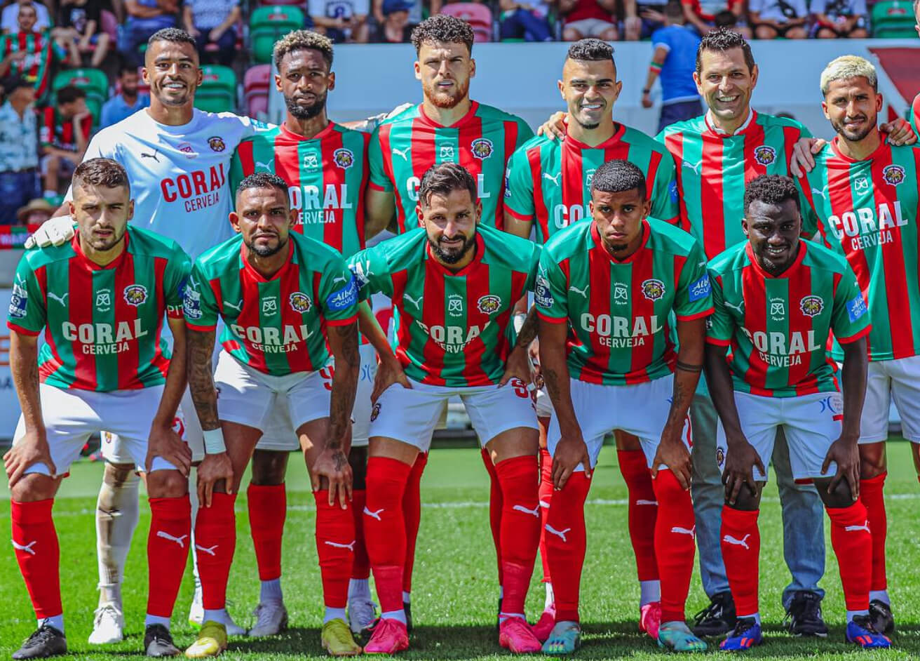

C.S. Marítimo hails from Madeira, an island chain that forms an autonomous region of Portugal. It’s not unusual for Portuguese teams to wear green and red (more on that later in these rankings), but where Marítimo stands out is with the vertical stripes on their shirts (differing from their Brazilian counterparts at Number 16, Fluminense, by dispensing with the white trim between the red and green stripes).
Marítimo has been known to mix up their shorts from red to green to white, all of which make the grade for this list. And when you throw in their stadium with its alternating red and green seats, I think we have the perfect location for a comm-uni-ty Christmas party.

We have a late addition to this list, whom we’ll slot in at the 15th spot along with Marítimo. That technically means that our Top 25 is now a Top 26, but the Halifax Mooseheads’ uniforms are too good to leave in the “others receiving votes” category.
You can thank (or blame) longtime Uni Watch contributor and pal Wade Heidt for this last-minute disruption of the rankings. He made a cryptic mention in yesterday’s comments about a team from the Quebec Maritimes Junior Hockey League that he thought would be a good fit for Part II, and in a panic, I googled the QMJHL to see who I missed. Sure enough, these magnificent Mooseheads jumped right out of the computer screen at me!
They combine a striking shade of forest green with red and white in a variety of combinations on their sweaters. And, as is probably already apparent and will become more obvious later in this list, I’m a sucker for anything with antlers, so that clinched their inclusion. Yes, the logo brings a noticeable pop of yellow to the jerseys, but we’ve seen (and will see) teams on this list who add small amounts of other colors to their red and green, so it wasn’t a disqualifier.
Welcome to the list, Mooseheads! I think my Christmas is going to be just a little merrier because you’re here!

A green and red color scheme just feels right for a team from a place called The Woodlands. This high school team in suburban Houston, Texas, may not get a lot of white Christmases where they live, but they don’t lack for holiday cheer when it comes to their uniform combinations.
The Highlanders can rock looks that include white jerseys with red and green sleeve stripes over red shorts, long-sleeve red shirts with green shorts, and green jerseys with red sleeves and red shorts. Their most unique ensemble, however, is their uniforms with detached sleeves featuring a shifting green-to-red gradient. It looks like they covered their arms with glittery, color-shifting wrapping paper. I’m not sure it’s a gift their opponents on the volleyball court are looking forward to getting, though.

The boys’ and girls’ wrestling teams that represent Boone High School in Iowa have a few different singlets to choose from. The ones they chose as their new main competition singlets in 2020, however, are what secured them a spot in these rankings. With a nice blend of green and red on a white base, they’re the wrestling singlet equivalents of those Brach’s peppermint nougat candies.
The girls’ team deserves an extra nod for their warm-up robes, which look like special deliveries straight from the North Pole. Seriously, Santa, you could have just told me I wasn’t getting any presents this year. You didn’t have to pin me!


Portugal has worn the colors of its flag on its uniforms for longer than most of us have been alive. When they hit the balance of colors just right, they look ready for the Christmas party. But they’ve had a penchant for emphasizing yellow – a perfectly reasonable choice from a national identity standpoint but a downgrade for a list focused on the best Christmas-appropriate getups.
That’s why my favorite Portugal uniform is the one the men’s and women’s national teams both wore during the 2021-22 season. They swapped out the yellow seen on many of their other kits for a rich metallic gold. Gold is a familiar color in the Christmas palette and can create a refined aesthetic for the season, especially when combined with red and green.
With the most understated hint of black trim and the bold accents of gold standing out against the rich red and dark green, Portugal’s teams look like they’re adorned in the soccer equivalent of formalwear. They’d be the best-dressed guests at many a holiday event (especially if it involved kicking a soccer ball).

A professional men’s volleyball team based in Siberia, Lokomotiv Novosibirsk checks several boxes that place them squarely in the top half of these rankings. The obvious starting point is their uniforms, with their well-balanced blend of red and green. Another is their logo, with the stylized Cyrillic character El (written as “Ʌ”), functioning as a stand-in for a Christmas tree.
The train below the El has a firm place in Christmas imagery itself, the most obvious being the iconic image of the toy train set beneath the tree on Christmas morning. But it also evokes the popular holiday pastime of Christmas train rides and the enduring classic children’s story, The Polar Express. (The book, that is. The movie’s creepy.)
Lokomotiv also knocks down the kill with a wonderfully antlered costumed mascot. Technically, I think it’s a moose, but moose and reindeer overlap across much of their respective ranges, so I’m sure they’d be, like, total bros in the wild.
On top of all that, all you have to do is look at Lokomtiv’s social media to know that they dig Christmas. Their red and green colors aren’t just incidental, they’re woven into the team’s culture.

Is it sacreligious to include teams called “Devils” in a list of uniforms celebrating a holiday with religious origins? That’s a toughy! Since we’re focusing on the elements of Christmas that everyone can enjoy, let’s open up the celebration to even… *shudder* New Jersey Devils fans. (I kid! Of course you’re welcome to drink wassail and come caroling with us, Devils fans. Even if you did steal the original Colorado Rockies away from us here in Denver back in 1982. All is forgiven, especially after the 2001 Stanley Cup Final.)
The good thing about devils and Christmas is that we can just think of this guy (the unimaginatively named “NJ Devil”) as following in the tradition of the Krampus, that delightful product of German folklore who devours bad little boys and girls before Christmas. (And here I thought getting a piece of coal in my stocking was bad!)
But enough with the “Christmas as a horror story” schtick. The only horror story here is that the Devils spent the first eleven years of their existence in New Jersey wearing a unique set of red and green uniforms before reverting to the mean and adopting a much more conventional (and much less memorable) red and black color scheme.
This story has something of a happy ending, though. The Devils have revived their old uniforms as throwbacks on several occasions, and they also debuted a near-perfect Reverse Retro uniform last season that swapped out the red and green elements based on the originals. I hope they bring that back again rather than those Colorado Rockies-inspired alternates they’re wearing this season. Thanks for the salt in the wound, Devils! That’s one jersey I won’t be adding to my Christmas wish list.

We conclude our devilish duo with Mississippi Valley State University. Most famous as the alma mater of all-time football great Jerry Rice, the Hall of Fame wide receiver helped put the program on the map and bring attention to their red and green uniforms.
The uniforms have taken some… interesting twists and turns since (and perhaps even during) the halcyon days of Rice and his equally prolific quarterback, Willie Totten. But the Delta Devils have never dressed better than they do now, especially when wearing their red helmets with green jerseys (paired with either red or white pants).
They look so thoroughly in the Christmas spirit that I’m inclined to reinterpret that cute devil mascot of theirs for the Yuletide season. Maybe we can say he’s just an elf with a lingering sunburn from the Summer Solstice at the North Pole or something.

We typically think of Christmas trees as being evergreens, but oak trees – with their solid trunks and long limbs perfect for decorating – have their own established place in the holiday tradition. And the Oakland Oaks, a stalwart in the old Pacific Coast League from 1903-55, tapped into those traditions when they adopted a red and green color scheme in the late ‘30s and early ‘40s.
Unfortunately, it’s hard to find images of these Oaks’ uniforms in their full glory because of the dearth of color photography from the period. We’ll just have to rely on an old uniform in a museum display, well-crafted replicas (in a variety of colors), and a few black and white photos (with the odd colorized one thrown in for good measure).
The Oakland Athletics paid homage to the road version of those Oaks uniforms with throwbacks in 2009. Here’s hoping that the new Pioneer League team that’s set to debut in 2024 will break out the even nicer home versions of those Oaks uniforms sometime in the near future after the A’s and their dollar-chasing ownership group slink off to Las Vegas. (Where’s Krampus when you need him?)

As the only major professional sports team in North America currently wearing green and red as their everyday color scheme, perhaps the Minnesota Wild should be higher on this list. The only thing holding them back is a slight over-reliance on cream and yellow (aka “Minnesota wheat” and “harvest gold”) as trim colors.
Even when accounting for those deviations to our chromatic Christmas archetype, the Wild still score a hat trick with three heaping helpings of holiday hockey haberdashery at its finest. Topping this trio is the combination that included red sweaters with green helmets and pants. The Wild wore two versions of this jersey from 2003-17, with my nod going to the earlier iteration used through the 2006-07 season (which lacked the cream piping on the shoulders).
The second of the Wild’s three best sets of Christmas-appropriate apparel are the green alternates they wore from 2009-17. Although red plays a reduced role in this design, the font used on the front wordmark looks like it was lifted straight off of a Christmas card.
The third and final uni set of this trio is the Wild’s current road uniforms. The white jersey serves as a snowy canvas for a more prominent use of red on the numbers and trim, and even more so as a way to showcase their fantastic logo, which evokes a mysterious “woods of the wintry North” vibe. And, as one blog points out, with the way those trees are shaped, they could double as holiday cookies. I don’t know about you, but I consider that a Christmas bonus!

Before the New Jersey Devils and the Minnesota Wild dazzled in their daring duds, the Seattle Metropolitans pioneered the green-and-red look at the highest levels of professional hockey in North America. Active in the Pacific Coast Hockey Association from 1915-24 back when it was a major league, the Metropolitans won a Stanley Cup in those gorgeous getups in 1917.
As with the Oakland Oaks a couple spots back, it’s impossible to find anything but black and white photos of the Metropolitans in their heyday. But thankfully, through a combination of hand-tinted photos from the era, nostalgic artwork, and a few vintage uniforms, we can get a sense of just how spectacular those striped sweaters were.
With such a rich visual history to draw from, it’s a shame that the Metropolitans’ look hasn’t served as a stronger inspiration for the teams in Seattle that have succeeded them. The expansion Seattle Kraken have given their predecessors’ color scheme a solid forecheck rather than embracing it (although they have effectively claimed the Metropolitans’ Stanley Cup title as their own, to which this longtime Colorado Avalanche fan rolls his eyes).
To their credit, the junior-level Seattle Thunderbirds wore Metropolitans throwbacks for a game a few years back, giving us a taste of what a modern version of the jersey would have looked like. Note to the Kraken: I might move you from my naughty to nice list if you’d follow the Thunderbirds’ lead and revive these verdant and vermillion visions yourselves. I’m writing a letter to Santa right now…

The Raleigh-Durham Skyhawks may be one of the few professional (gridiron) football teams to have worn green and red, but they do have company. Historically a red and white team, the Canadian Football League’s Montreal Alouettes dabbled with subtle bits of green trim as far back as 1966 before going all in on a uniform refresh in 1970 – just in time to win a Grey Cup in these tremendous togs.
What really puts Montreal high on this list, though, is their helmet from this era. Sure, you can think of the logo as an alouette, the French word for lark. But to me, the pair of logos on either side of the helmet are the spitting image of two turtle doves. (Definitely not a partridge in a pear tree, though.)


What do you get when you color-block red, white, and green, in almost exactly equal measure? Christmas-themed bomb pops, for one thing! But you also get one of the best-looking soccer uniforms on the national team circuit.
Hungary’s men’s and women’s teams both wear their familiar red jerseys, white shorts, and green socks as their primary kits in international competition. That perfect balance of colors makes for some holiday haute couture that few teams can match.


The one national program that can match Hungary, color block for color block, is Mexico’s men’s and women’s teams. Just flip Hungary’s version of the bomb pop upside down and you have El Tri’s classic combination of green shirts, white shorts, and red socks.
Mexico has experimented with adding all three of its famous colors onto their jerseys in prominent fashion at various times in the past. But the look just works best when they let each article of clothing stand out in a color of its own. When they wear their three colors just the right way, our neighbors to the south show that everyday could (and maybe should) be Christmas.

Okay, okay. John Daly isn’t a “team,” but he has enough of an outsized personality to fill out a foursome all by himself. And, let’s face it, there’s not only a lot of years, but some serious mileage behind Daly’s transformation from a young, brash golfer who crashed the PGA’s party back in 1991 to the guy who looks so much like Santa Claus that he dresses the part at the Tour’s holiday dinner.
But it’s not just when he dons the red suit that Daly comes across as Saint Nick’s doppelganger. On the links, I’d swear he looks like Kris Kringle enjoying some well-earned time off after making his annual global 24-hour toy run.
I guess I didn’t realize, though, that Santa smoked like a chimney in addition to traveling down chimneys! John Daly’s hard-living reputation may peg him as a Bad Santa, but with a look that’s just about perfect for Christmas, he’s a good fit for this list.

As we reach the top spot on this list, we’ve come full circle. We started out with a team (or rather several teams from the same school) that could have won the prize if they’d just bought into their deer-themed identity more fully. Now we have a team that has come as close as any team has to the holiday ideal in their everyday uniforms by leaning into their deer-themed identity while also embracing the quintessential Christmas color scheme for much of their 50-plus years of existence.
The Milwaukee Bucks were the debutants of the Christmas ball in their inaugural season in 1968 with their green, white, and red uniforms that prominently featured a deer head logo on the front of the shorts. It’s that uniform combination, worn during their NBA championship season in 1971 and for a couple of years beyond, that clinched their championship in these rankings, too.
While they’ve never bested that look, the Bucks have placed a slew of red and green uni gifts under our tree over the years. These Christmas confections have included green road uniforms with red wordmarks in both script and block styles throughout much of the ’70s, the initial versions of their “Irish Rainbow” classics with plenty of red trim, and various sideline warm-ups that could have doubled as the perfect leisure suits for an office disco holiday party. Just look at that logo on the back! (Yes, Clarkton, we’ll concede a point to you for having your logo on the front of your shooting shirts. The Bucks’ are still better.)
Although they’ve tried pairing their base of green with various other colors (and other shades of green) in the past and with their current uniform set, the Bucks still have a bit of Christmas in their DNA. They revived red and green as their main colors from 2006 to 2015, and they’ve used that combination for various throwbacks and alternates.
Providing the proverbial cherry on top is their mascot, Bango. Whether represented as a logo or performing on the sidelines, Bango looks sprightly enough to pull Santa’s sleigh all by himself. He may not technically be a reindeer, but you’d be hard-pressed to tell otherwise when he gets dressed for the season (pardon me while I pat myself on the back for working the title of this series into today’s piece).
With their reindeer-evoking, Christmas color-conjuring duds from the late ‘60s and early ‘70s serving as a focal point, the Bucks have staked their claim as the team whose uniforms I would most want as my stocking stuffer. Especially if I were using one of their gorgeous socks from that era as my stocking!
Everyone had a very Merry Christmas and I’ll catch you back here next weekend!
Ahh…the too-often over-looked MVSU Delta Devils-excellent selection.
There are those who would love for the Wild to lose the Christmas colors and go full-on North Stars…I’m not one of those folks; they have good branding and terrific looks, as Kary discusses above.
Thanks, Chris! Glad you enjoyed it and that you approve of the choices! The Mississippi State Delta Devils were a fun team to research because they’ve had all kinds of crazy red and green uni combinations over the years. It’s just a bit tricky to find photos of all of them.
I agree that the Wild should stick with the Christmas colors. If the fans want a few games in the Reverse Retros in old North Stars colors, that’s fine. But they’re different teams, and the Wild should be able to stand on their own identity. I don’t see Baltimore fans clamoring for the Ravens to adopt blue and white as the team’s color scheme, for instance…
I too was hoping to see the Delta Devils on the list. “Overlooked” is definitely a term that applies here.
The one thing I want to point out, and I’m sure none of you have ever been to Leflore County or Itta Bena, Mississippi, is that MVSU is the ultimate red-and-green team, and should be number one, because that place is almost entirely red and green. The buildings are red brick, and the dirt is bright red, and the flora (aka jungle), which is everywhere, is bright green. There has never been, and never will be, a team and a place better suited to these colors. Anyway, Merry Christmas.
Kary, my apologies for creating the extra work :)
Great decision to do it and include the Mooseheads!
About the Montreal Alouettes briefly wearing green and red. Labatt Breweries was a main advertiser for the team at the time. Rumour has it the colour change tied in with the colours of the Labatt 50 brand.
link
link
The CFL sells retro gear every year. It is call Turf Traditions. The coaches and sideline staff wear the gear for a couple weeks during the regular season. However, Alouettes Defensive Coordinator Noel Thorpe continues to wear his Turf Traditions sweater as the season continued.
link
Which means he was wearing the red and green when he lifted the Grey Cup in November.
link
Great stuff, Wade! Thanks for the additional color! And thanks (not blame) for alerting me to the Mooseheads. I would have been disappointed if I’d left such a great red-and-green team out of the rankings, so I’m glad you jogged my memory.
Speaking of brewery tie-ins, which came first: Mooseheads hockey logo or Moosehead beer logo? The previous beer logo seen here is awfully similar to the team logo
link
Great question, Patrick! I noticed that similarity, too. (That is, of course, when I wasn’t busy forgetting about the team’s very existence and almost denying them a very deserving spot on this list!)
When you compare the various logos the Mooseheads have worn (link) with the beer logo you shared, the similarities are too uncanny to be a mere coincidence.
Checking out the Mooseheads’ Wikipedia page (link), it came as no surprise to learn that the team is financially backed by Moosehead Breweries. I’m normally not a fan of corporate backers foisting their identities on sports teams (here’s looking at you, Red Bull!), but in this case, it works. The fact that both the hockey team and the brewery are based in Canada’s Maritime Provinces I’m sure helps with that.
Wow, Kary!! I like to think my contributions to the site are as enjoyable as yours, but you completely kick my butt when it comes to research. Comprehensive and entertainingly so; I was hanging on every word. Five stars!
Thank you, Walter! That’s one of the finest compliments I’ve ever received about my writing. I appreciate your thoughtfulness.
But please don’t sell your own contributions to this site too short! I’ve thoroughly enjoyed every bit of writing and artwork you’ve done. In particular, your MLB drawings from the early ’80s that you shared several years ago (link) were the impetus for me to dig up my own uniform drawings from my youth (link). It took a few years of (far from constant) digging in storage boxes in my garage to find them, but I’m glad we’ve both found an outlet where we can connect with like-minded people who Get It(TM)!
“…heaping helpings of holiday hockey haberdashery…” made my day. Thank you, Kary!
Thanks, Jeremy! Sometimes, the alliteration just comes out and I almost can’t control it! I’m glad a few others can appreciate that quirk of mine!
Hungary national team combination is perfection.
Seriously, right? That’s why I ranked them so highly. Love that look!
From Rugby
Wales
link
Nice one! They certainly rival the Hungarian soccer teams’ look. I usually go with just one team per school or national program, and the Wales cricket team got the nod in these rankings. But these uniforms make a compelling case for the rugby team.
What’s the story behind the Bucks NBA photo? Exhibition, intrasquad or did the visiting team lose/forget their uniforms?