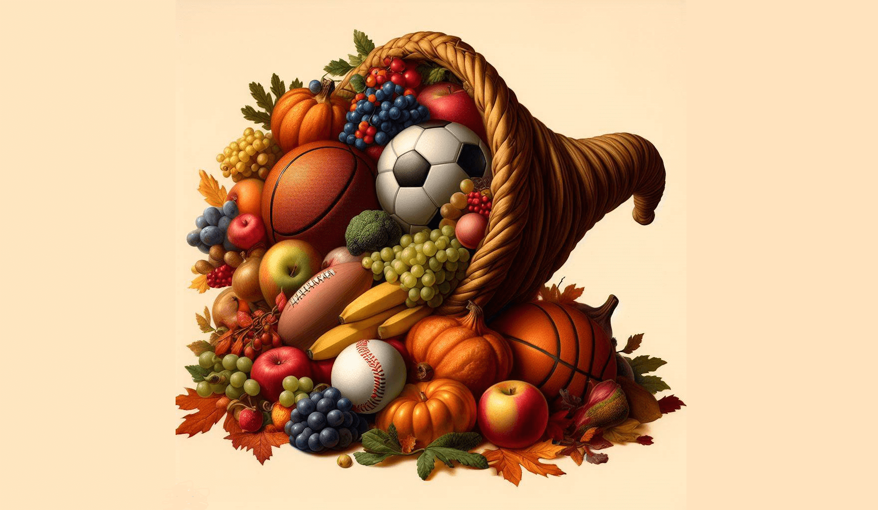
[Deputy Editor’s note: With Thanksgiving coming this Thursday, today we have another guest entry from UW contributor/pal Kary Klismet, continuing with his “Dressed for the Season” series. “Dressed for the Season” is a series on uniforms appropriate for particular holidays. The series began with Easter, and moved on to Independence Day, and finally last month progressed to Hallowe’en. This is Pari IV in the series. Enjoy! — PH]
by Kary Klismet
Happy fall, fellow uni-watchers! We’re even deeper into my favorite season of the year than we were just three weeks ago, when we explored the best uniforms for that other holiday pillar of autumn – Halloween.
As much as I loved putting that list together, I’m even more excited to share what I’ve uncovered for this piece because Thanksgiving is the holiday I love the most on the calendar. It provides a moment to pause and reflect on our blessings, it always includes an abundance of football, and it revolves around the one activity I think of myself as an expert at – eating! But most importantly, I was born on Thanksgiving, so it’s always felt like “my” holiday. And this list (indeed, the entire series) feels like my way of giving a gift back to the comm-un-ity.
Keeping with the previous editions of Dressed for the Season, I laid out some ground rules for myself as I examined all the sports uniforms that might make our menu of visual Thanksgiving goodies. For starters, I took a holistic approach to the teams I considered. I put some weight on teams with Thanksgiving-appropriate identities, but such teams were few and far between (unlike the plethora of candidates for Halloween). But with Thanksgiving being so thoroughly associated with the autumn harvest season, I expanded my search to include teams with color schemes that reflect the imagery of fall, particularly the changing of the leaves.
As always, I gave more weight to uniforms a team wore with some frequency as opposed to specialty or one-off getups. That’s not to say that a few alternate outfits might not get a nod or two in the upcoming rankings, but all things being equal, I stuck with a team’s regular garb whenever I could (in no small part because they’re usually easier to find photos of).
When all was said and done, I came up with a group of sixteen teams for this list (the same as with the Halloween rankings), And I had to make some tough cuts to keep it from growing any larger (like me grabbing another serving of stuffing at the Thanksgiving buffet).
But we’re not here to talk about my (annual and inevitable) expanding waistline during the holidays. Let’s clear the hors-d’oeuvres and get to the main course!

We dig into this feast of Thanksgiving-themed uniforms with a triple helping of Pilgrims. Yep, we have a three-way pie – err, tie – for the fourteenth spot! The holiday is synonymous in America with Pilgrims, so we simply couldn’t have this list without a team so aptly named. The problem was, while several teams use “Pilgrims” as a mascot, there wasn’t one that separated itself so thoroughly from its peers that it earned a solo spot on this list.
I was hoping to find a team out there called the Pilgrims with just the perfect look. Unfortunately, no such team exists (except in the results of my ill-advised decision to dabble into AI image generation, which yielded some… curious creations). Instead, there were three teams that brought distinctive enough elements to their visual identities that they separated themselves from similarly named teams, but without pulling ahead of the other two.
Our first of the three are the Pilgrims of Lansing (Mich.) Christian School. They warrant mention on this list with a logo that conveys a fairly traditional representation of the Thanksgiving Pilgrim (although the cross on the Pilgrim’s hat is perhaps a bit of an embellishment, aesthetically speaking). And their color scheme earns mixed reviews. The black is on point for their identity, and the yellow could fit in with any number of autumn-oriented combinations (as we’ll see later). But together, the combination feels less than Pilgrim-y.
Even so, Lansing Christian’s coed cross country and track teams make the medal stand by emphasizing black (always popular with the Pilgrim crowd) in their uniforms and by featuring the Pilgrim logo prominently on their jerseys. It’s almost like Myles Standish, William Bradford, and their fellow Plymouth colonists themselves are sprinting to the feast on that first Thanksgiving Day! (Sorry to drop another one of those weird AI images on you, but I couldn’t resist!)

It’s no surprise that a college in New England would choose “Pilgrims” as its team name, given the region’s history. New England College, of Henniker, New Hampshire, earned its place in this three-way tie by having a logo that comes closest to the visual archetype that most Americans associate with Pilgrims – except, that is, for the color scheme.
Pilgrim apparel in red, white, and blue? Come to think of it, it wouldn’t be the first time that Puritanism has been conflated with patriotism, so I guess I’ll allow it. And it gives us the chance to highlight these great uniforms worn by the New England College’s women’s hockey team. The big, bold pilgrim graphic on the front of their jerseys make them feel like something you could wear on Thanksgiving and look appropriately adorned for the festivities. (Just don’t spill any cranberry sauce on those gorgeous sweaters!)

An English soccer team? On an American Thanksgiving uniform list? Didn’t the Pilgrims flee the tyranny of England for, like, religious freedom and all that? Well, yes, but because the city that launched their transatlantic journey enthusiastically celebrates their erstwhile ancestors, this team has managed to claw their way into a tie with a couple of their American counterparts.
Plymouth Argyle, of the English Football League Championship (the country’s second-tier competition behind the Premier League), have called their side the Pilgrims as far back as their founding in 1886. They traditionally wear green kits at home, occasionally accenting them with gold, as they have done to nice effect this season.
And Plymouth Argyle enhances their identity well with the Mayflower featured prominently on their crest and the coolest costumed Pilgrim mascot out there! If they’re willing to cross the pond, these Pilgrims are welcome at my Thanksgiving table any time!

Pumpkins may take top billing at Halloween, but they’re equally at home as part of Thanksgiving decor. As such, an orange-clad team that calls itself the Pumpkins simply had to be on this list, especially when taking their heartwarming story into account.
Founded in 2006, the Pumpkins are the first female youth soccer team in Namibia. They earned their nickname from the orange hand-me-down jerseys donated by a team in suburban New York. Facing an uphill battle in a culture where many considered girls’ participation in sports inappropriate, they persevered by playing boys’ and women’s clubs, gaining their opponents’ respect and establishing a place for themselves in Namibia’s sporting landscape. Their story is told in a children’s book that can still be found for purchase online.
As you make your way through this list, you’ll notice that most teams mentioned have more than one fall-oriented color incorporated into their uniforms. But the combination of one of the most celebrated fall colors, coupled with a quintessentially autumnal team name, was more than enough to propel the Pumpkins into these rankings. Besides, it gives us a chance to celebrate their courage and pioneering role in gender inclusion in African sports, and that’s something that’s worth giving thanks for!

The Maples of Seaholm High School in Michigan are another team whose color scheme includes just one color associated with fall – in this case, a deep, rich maroon. Perhaps maroon doesn’t trigger thoughts of autumn for some the way brown or orange might, but it’s not hard to find maple leaves in precisely this shade dotting the landscape during the peak of the season.
And with a maple leaf logo on their helmets that looks like it could have even been plucked from a fall wreath, Seaholm has found a look that captures the Thanksgiving spirit splendidly. Now if only they’d bring back their old maple leaf sideline mascot, it might improve my attitude about having to rake leaves this time of year.

Let’s jump from the pile of maple leaves we were just in to a pile of oak leaves – or Oak Leafs, I guess! In this case, we’re talking about the Des Moines Oak Leafs, a competitive high school-age hockey travel team celebrating their 25th anniversary this season.
The Oak Leafs use a name that can be traced back to an old minor league team that played in Iowa’s capital as far back as 1961. Their color scheme includes blue and green, perhaps not everyone’s cup of tea for Thanksgiving decorations. But I’ve seen it pulled off well before, so it’s not unprecedented.
What really stands out, though, is the gold oak leaf at the center of their logo, rendered in a shade akin to beige that looks all the world like an oak leaf one might see blanketing the ground near the State Capitol on a brisk November day. It would be a worthy companion to the maroon maple leaf we already have in our fall wreath.

Is there a color combination that evokes a feeling of fall better than burnt orange and yellow? (Well, yes, now that you mention it, seeing as how we have nine more entries to go on these ratings. But, hey, the combo’s no slouch!)
The University of Montana’s official colors are copper, gold, and silver – a tricky palette to pull off on football uniforms. That has led the Grizzlies to use maroon and silver as their “spirit colors” on sports uniforms for much of their history. But for a glorious stretch of nearly 30 years, they tried to replicate the mineral wealth of the Copper State on their football uniforms.
The Griz settled for “Texas orange” in place of copper and yellow as a substitute for metallic gold. The end result might not have confused anyone with the output of the United States Mint, but the team could have blended in well with the vibrant fall colors on campus.
Even after reverting back to their old maroon and silver colors in 1996, the autumnal awesomeness of those orange and yellow uniforms has proven popular enough to be revived as a throwback option from time to time. A crisp fall day in Missoula simply couldn’t feel more fall-like than when the Griz break out these beauties!

If red, orange, yellow, and brown are the four colors most closely associated with fall decorations, and we explored two of them (orange and yellow) in our previous entry, is there a team out there that can cover the other two (brown and red) for us? Indeed there is! And they proudly use their school’s moniker – Brown University – to proclaim allegiance to their namesake hue in all its mahogany magnificence.
Across Brown’s athletic department, the Bears’ baseball team does the best job of balancing the school’s ubiquitous shade of brown with a splash of red to round out the fall feel to their uniforms. And in the process, they remind us that Brown is always stylish this time of year.

With our autumnal color spectrum firmly established, let’s explore some of the other ways that teams have intermixed them. Brown and yellow? Check! Denver’s franchise in the upstart American Football League was one of the first in professional football to experiment with that chromatic combination. And with those infamous vertically striped socks, it’s no surprise that it’s a path that few have followed!
Nevertheless, with hosiery harkening to the harvest season serving as the foundation for a well-balanced blend of brown and yellow throughout the rest of the uniform, the Broncos galloped through their first two seasons looking like wild horses dashing through a Rocky Mountain aspen forest in the fall! They famously burned the socks after switching uniforms to their more familiar orange and blue color scheme in 1962. But a new generation of fans got to see the old duds (pun intended!) when the Broncos wore them as throwbacks for a couple games in 2009. I, for one, would love to see them once a year around Thanksgiving (if only the NFL’s helmet rules would allow it).

A pro football team that wears brown and orange? I know who you’re thinking of (and we’ll get to them soon enough), but did you know there was another pro football team that wore brown and orange? This one flipped the script by wearing orange jerseys with brown trim. And by using an earthy shade of burnt orange that fits flawlessly within our range of fall colors, they distinguished themselves just enough from other orange and brown-clad teams to earn a spot on this list.
In case you’ve never heard of them, we’re talking about the Memphis Southmen of the old World Football League. Also known as the Grizzlies (it’s a long story, but you can read about it here), they rocked this rustic-tinged regalia for the entirety of their short-lived existence from 1974-75. It’s a look that not only recalled the fall foliage, but also the colors you might see on a Memphis Thanksgiving table when they bring out the barbecued turkey. (That’s not the bear on the Southmen’s helmet you hear growling. That’s my stomach!)

So now we get to that other brown and orange pro football team I was mentioning! Does anything conjure the iconic feeling of football on a fall day more than images of the late, great Jim Brown tearing through the opponent’s defense in old Municipal Stadium, or Brian Sipe leading the Kardiac Kids on another come-from-behind victory?
Cleveland has had a wide variety of uniforms throughout its history that I could have chosen for this slot (okay, just kidding on that last photo!), but the combination that strikes me as the most fall-like is the home set they’ve worn since 2020, with orange pants and the brown facemask. I may like the white facemask better (it’s what I grew up watching them wear), but dang if that helmet with the brown facemask wouldn’t work spectacularly as a centerpiece on a Thanksgiving table somewhere along the shores of Lake Erie!

How does a team take its brown and yellow color scheme and make it feel even more fall-like? By using multiple shades of brown and yellow! That’s what the Wyoming Cowboys did with the side panels of their uniforms for much of the 1980s.
Some might consider it a ripoff of the Milwaukee Bucks’ famous “Irish Rainbow” uniforms, but I prefer to think of it as more of an homage. Maybe we can call it a “Thanksgiving Rainbow!”

From the lofty 7,220-foot elevation of Laramie, Wyoming, we travel next to an unlikely destination for autumn adornments: the lush Pacific shores of the Aloha State! No, it’s not a road trip in the Mountain West Conference. Rather, we’re traveling back in time, too – back to 1974-75, when Honolulu was home to a WFL team whose location name and team name were rolled into one.
You might not expect a team from a tropical paradise to outdo the likes of the Cleveland Browns and Wyoming Cowboys on a Thanksgiving-themed list like this, but just look at that color scheme – the dark brown, the rich yellow, and the red! It’s like a whole forest’s worth of autumn leaves fell out of the trees and stuck to the Hawaiians’ uniforms!

Yes, the differently-shaded stripes on the Utah Jazz’s fan-favorite alternates from a few years ago were meant to invoke images of the sedimentary layers of the state’s red rock landscapes. But what if we thought of them as different shades of fall leaves, instead?
You could probably find a leaf to match each and every one of those uniform stripes while on a November hike in the Wasatch Mountains just east of Salt Lake City. And that scenery is just about as breathtaking as anything else the Beehive State has to offer, with the finest-looking uniforms the Jazz have ever worn just a slight step behind.
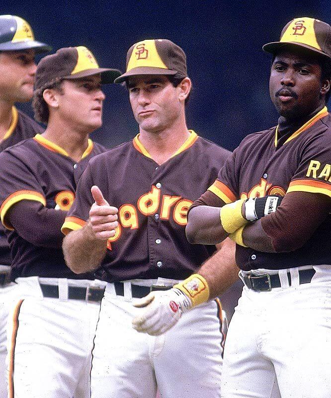
A fall classic, best known for an appearance in the Fall Classic, this uniform deserves its high ranking on this list with a triple Thanksgiving treat of brown, orange and yellow. The Padres, with their deep history of wearing brown uniforms, were pretty much assured of a spot on this list from the beginning. The real question was whether to choose a uniform from one of their brown-and-yellow eras or from their stint as a brown-and-orange team from 1985 to 1990.
The answer? Neither! Why select from one two-color set or the other when you can have all three fall colors on the same uniform? The Padres have never felt more ready for Thanksgiving than they did during that early ’80s heyday.

It takes a special uniform to top this cornucopia of contenders, and, to their credit the Virginia Tech’s baseball team has delivered with a 100 mph fastball right down the middle of the plate. Not only did they beat out the rest of the teams on this list, but they also had to fend off plenty of challenges from within their own athletic department – particularly the football team – to claim the title.
Besting all comers, the Hokies ballplayers have claimed the crown with this ensemble that took the St. Louis Cardinals’ familiar bird-on-bat trope and gave it a wonderfully Thanksgiving-appropriate twist. I mean, has a bat ever looked more like a Thanksgiving accessory than it does as part of this uniform? (Well, there was that one time a guy grew a gourd that looked like a baseball bat, but I still think these jerseys have that beat.) Combining a maroon and burnt orange color scheme ideal for fall with imagery of the one species of fowl that’s always the star of the holiday – the HokeBird – err, turkey – the Hokies have easily gobbled up the competition.
I love those Denver Broncos brown and gold uniforms even if a lot of people don’t.
Thanks, Ray! I agree with you about those old Broncos uniforms. It’s an underutilized color scheme, it has some unique and memorable design elements (some might say “too memorable!”), and it has (at least in my opinion), a well-balanced aesthetic. For all of the grief they have received over the years, I feel like these uniforms have aged surprisingly well.
Absolutely agreed on the Broncos! They’ll never return (never say never??) to brown and gold, but they were awesome than, and were equally fun to see during the “AFL 50th Season” of 2009 when they wore both the gold and white tops with the brown pants. As much of a product of the time as the original Broncos socks (stirrups, actually) were, and I’m glad they brought them back in 2009. Too bad the players decided to style instead of wearing them as intended
link
But the gold and brown would work as an NFL colorscheme and I love the look of the brown/gold/brown (when I publish my AFC North 2/3/2/3, I have a very similar vibe for one of my Steelers concepts)
(There’s a repeated paragraph in there…)
fixed
Really enjoyed the pithy and punny article, especially all of the links! I would just like to suggest an edit that *WE* were born on Thanksgiving Day! ❤️
Thanks, Twin Sis! Glad you enjoyed it! And yes, I should say, I think of Thanksgiving as “our” holiday. ❤️
Loved it!! Thanks Kary!
Thanks, Minnyapples! I’m curious to know if you had a favorite entry among the 16 that made the cut?
Paul Warfield and Jim Kiick!!! Memphis Dolphins lol! Would’ve been cool if Csonka was in the shot. Thank you great article and pics. Love Da Hawaiians photos too!
Thanks, Glenn! I appreciate the kind words! Here a couple of additional Southmen and Hawaiians photos as a bonus just for you!
It might help if I didn’t hit “Post Comment” before adding the links!
link
link
link
link
I’m pretty sure you know this, but that famous photo of Kiick/Warfield/Csonka … link
…was actually a recreation of an almost identical shot featuring Csonka and Kiick a couple years earlier
link
Notice that in the Dolphins shot, Csonka is very subtly giving the finger to the photographer. Too bad he didn’t recreate *that* in the Southman spread!
Notice that in the Dolphins shot, Csonka is very subtly giving the finger to the photographer. Too bad he didn’t recreate *that* in the Southman spread!
He didn’t exactly give the photographer the finger in that Memphis shot, but he still found a way to have some fun with the photo. If you all notice, he has two fingers extended on his right hand, indicating that this was his second Sports Illustrated cover.
link
Just came here to say that I’m shocked there was no Jimmy Corcoran story associated with that photo…ditto for the Hawaiians shot with Sonny Sixkiller.
There’s still time for Jimmy to chime in! Jimmy, anything?
Glad to see my beloved Padres on this excellent list. I give an edge to the 1980-83 teams who had the beautiful pullover and three-color sansabelt.
Thanks, Walter! I appreciate the kind words. Also, I should give you special mention because your piece on orange and athletic gold uniforms from a few years ago served as an excellent reference for me when putting this list together. (I might not have remembered about The Hawaiians but for an offhand reference you made to them in that article!)
As for the Padres, you might be right! I’ve always been most familiar with that 1984 set because that’s what really brought their overall look to my attention during their run through the playoffs that season. And I put it on equal footing with the 1980-83 uniform in this list in large part because of that. But now that you mention it, the ’80-83 set might get its own billing if I had to do it over again. Those subtle details, especially the multi-colored sansabelt, might have edged it ahead of the ’84 set.
For what it’s worth, I did include a photo of Garry Templeton in the ’83 uniform in the inline images. But here’s one more shot of that classic pullover look, just as a nod to you: link
You are quite welcome, Kary! Definitely among the top two or three looks for the Friars. As I am fond of saying, put your baseball team in fall colors if that’s when you want to see them playing.
While they might not align with the color scheme, sad to see there was no love given to the Cuero, Texas GOBBLERS.
Hi, Michael. I did give some consideration to the Cuero Gobblers. They were one of the “tough cuts” to the final list that I mentioned in the story above.
The color scheme was one of the main reasons they missed the cut, but the other was that most of the photos I could find of their sports teams suggested they don’t often wear much turkey-related imagery. Most of the time, they just wear their school name and/or a wishbone C.
After you posted your comment, I did go back and take another look. It seems I was right that they don’t wear much in the way of turkey-related imagery on their uniforms, but one of their football helmets in use as of this year does have a turkey inside the wishbone C: link. That might have inched them up a little on the list, but probably not enough to overtake any of the teams that made it. The lack of sustained usage for that logo, coupled with a color scheme that doesn’t really fit the fall season, probably still leaves them just outside.
All that said, I love the originality of the team’s name! I fully support something a little outside the norm, and “Gobblers” definitely fits that bill.
A pro football team that used to wear orange and brown was the BC Lions (CFL) in the late 70’s and 1980’s.
link
link
Here’s a reference to their logo and colour change in a December 1977 newspaper article:
link
Nice find, Will! I gave some consideration to the BC Lions – including some (possibly unintentionally) multi-toned orange uniforms they wore in the late ’50s: link. And I think I might have even noticed a couple of photos of those late ’70s uniforms similar to the ones you poste, but I wasn’t sure if they were black or brown, so I moved on to other teams. They might have earned at least a tie with the Memphis Southmen if I’d had a bit more information about them. That ’70s newspaper article is a great bit of sleuthing!
Chiming in with a late Honorable Mention – the San Antonio Riders of the WLAF:
link
Terrific choices, Kary – Happy Thanksgiving!
Oooh! I love those! Definitely worth at least an honorable mention. Thanks for the suggestion, Chris – and for the kind words! Happy Thanksgiving to you, too!
Western Michigan University used to have some great brown and gold (maize perhaps?) uniforms back in the 1980s. The colors are even mentioned in the alma mater.
Good call on Western Michigan, John! I considered then for inclusion on the list, and they were another “tough cut.”
Their current set with the white helmet (and which also deemphasizes yellow/gold) was a nonstarter for me: link. But their old 1980s look was definitely in the running: link.
Ultimately, since I already had a couple of other brown-and-yellow teams on the list (Wyoming and the Denver Broncos). And I’ll admit that my status as a Denver fan influenced which Broncos I chose. But it’s fun to see the old WMU unis from that era again, which are definitely worthy of another look: link.
Whoops! The link I used for one of those photos looks wonky. Let me try it again: link.
Dang! Still not working! Here, let me try it this way: link.
Where’s that picture you used for the Browns from? The striping matches the mid 2010’s unis, but those had orange numbers.
Hi, Grant! It’s a long story about how I chose that photo and where I got it. I was looking for a splash image to use with that entry and was having a surprisingly hard time finding one at just the right angle. It was late at night and I was trying to wrap up this article in time to get it to Phil, so when I came across this photo from a Google image search, and it had the composition I was looking for, I just grabbed it quickly and added it to the article.
It wasn’t until after I had handed it off to Phil that I noticed there were several things about it that were odd. First off, the jersey collar has the old flywire Nikelace. That uniform template was phased out for most teams by 2018 or 2019. The Browns didn’t ditch those awful Nike uniforms they introduced in 2015 until 2020, so their current uniform set, with more traditional white numbers (instead of orange with white drop shadows), were never rendered with the Nikelace (at least to my knowledge).
Also of note, the players behind the running back (who I assume to be Isaiah Crowell from 2017) are wearing orange numbers and the large “CLEVELAND” wordmark across their chests, both hallmarks of that 2015-19 Nike set. So what game would have featured one player wearing a different uniform than the rest of his teammates? The answer is none! That uniform is someone’s photoshopped mockup.
After sending the article on to Phil, I looked up the source of that photo I’d found on Google. It came from this post on (I Still Call It) Twitter: link. I could have (perhaps should have) switched it out for a more accurate photo, but I decided against it for the following reasons: 1) It was late in the game before the article was set to be published, and I didn’t want to make any more demands on Phil, and 2) I thought it would be fun to see if anyone noticed. And you did! So kudos to you for catching that “Easter egg.”
Anyway, there’s another Easter egg in the article for really sharp-eyed readers who know the uni-watching comm-uni-ty really well. I’ll give you a hint: it’s in one of the “Pilgrims” entries. If you notice something peculiar about one of those photos, you’ll earn my eternal admiration.
HI, Kary.
The Wyoming basketball uniforms and the Milwaukee Bucks of the era were supplied by Medalist-Sand Knit. Note that these were the same folks who made the uniforms for the Houston Astros.
link
Great stuff, Mr. Guts! (Or can I call you “Rainbow”?) Thanks for posting this!
I wasn’t aware of your blog until you posted this, but I absolutely love it and have now bookmarked it! I wish I’d known about it sooner, as there are some amazing “rainbow guts” uniforms in there, including some that would have been a good fit for this list. Thanks in advance for ruining my productivity the rest of Thanksgiving Week while I peruse your blog instead of get ready for the holiday…
You are welcome! You’ve probably already noticed that the intersection of food and special uniforms have also become a trend — bacon, peppers-n-oil, and the Runza. No turkeys yet …
Seems like the biggest omission would be the glorious and infamous Vancouver Canucks Flying V. Besides the innovative design, the colors were not only perfect fall colors but also apparently selected for their “cone and rod” ability to induce anger and aggression.
link
I gave those old Canucks uniforms (which I love!) a long look, but the black wound up knocking them out of the running. If it has been brown instead, they probably would have earned a spot alongside the Padres. But as it was, I already had another orange-and-yellow team (the Montana Grizzlies) in the mix without black taking away from the fall feel of the uniforms. It was a tough omission, but the other uniforms I included just felt more “fall” or more “Thanksgiving” to me than these Canucks unis.
What about the Bowling Green State Falcons in brown and orange? I know Falcons does not have a Thabnksgiving ring ro it, but they do play in orange and brown. Wonderful list and great writing, by the way, Kary!
Thank you, Ingmar! I really appreciate the positive feedback!
Good call on Bowling Green! They were on my radar, but were another of those “tough cuts” I mentioned. I felt like they occupied a similar niche to the Cleveland Browns, who essentially made the list over the Falcons.
If I had chosen the Falcons for inclusion, though, I probably would have gone with this uniform combination of theirs: link. I’m not a fan of the odd diagonal sleeve stripes, but I appreciate the way the metallic finish to the helmet brings something a little different to the table.
Another one to consider, with orange and brown, is the Quebec Caribous of the NLL (National Lacrosse League) of the mid 1970’s
Some rare colour video in a link there.
link
Here’s a modern reproduction of a Quebec Caribous jersey:
link
Wow, Will! That’s a spectacular pull! I love everything about this team! I just wish there were more photos available of them.
Since we are talking about caribous, I feel like I should mention another team with an equally appropriate color scheme: The Caribous of Colorado from the old North American Soccer League: link. Their dark brown road uniforms in particular: link , were close to making these rankings.
Ultimately, they missed the cut largely because I had already included a brown- heavy denver-based team in the rankings (tre early ’60s Broncos). But you are reference to the similarly named Blue Cross team from Quebec reminded me just how good (at least for a rating of Thanksgiving-themed uniforms) those old Caribous of Colorado duds were!