Welcome back to the “2+3+2 (+2)” project.
Click to see: AFC East
Today we’ll tackle the NFC South.
If you want to see the genesis of how this project came about, please refer to the AFC East post.
To sum up, the project parameters are the following:
• All teams will have 2 helmets, 3 jerseys, 2 pants and 3 socks
• All uniform elements will be “interchangeable” (any combinations can be worn)
• Some teams will be given two options: current uniform and throwback (or fauxback/alternate)
• Opposing teams will wear different color elements (helmet/jersey/pant/socks)
• Home team will select its color combo, and away team will then select its combos. No elements can match opposing team
• To the extent possible, uniforms will be based on a team’s current available options. Where no such options exist, they will be created such that every team has 2/3/2/3 options.
• Where present home and road (and/or alternate) uniform template designs differ, they will be “streamlined” to have one single format/style in the 2/3/2/3 parameters
• Color vs. color will be permitted. The only exception is only one team can wear its “dark” jersey (the opponent can pair their color “medium” jersey vs. opponent’s “dark” jersey)
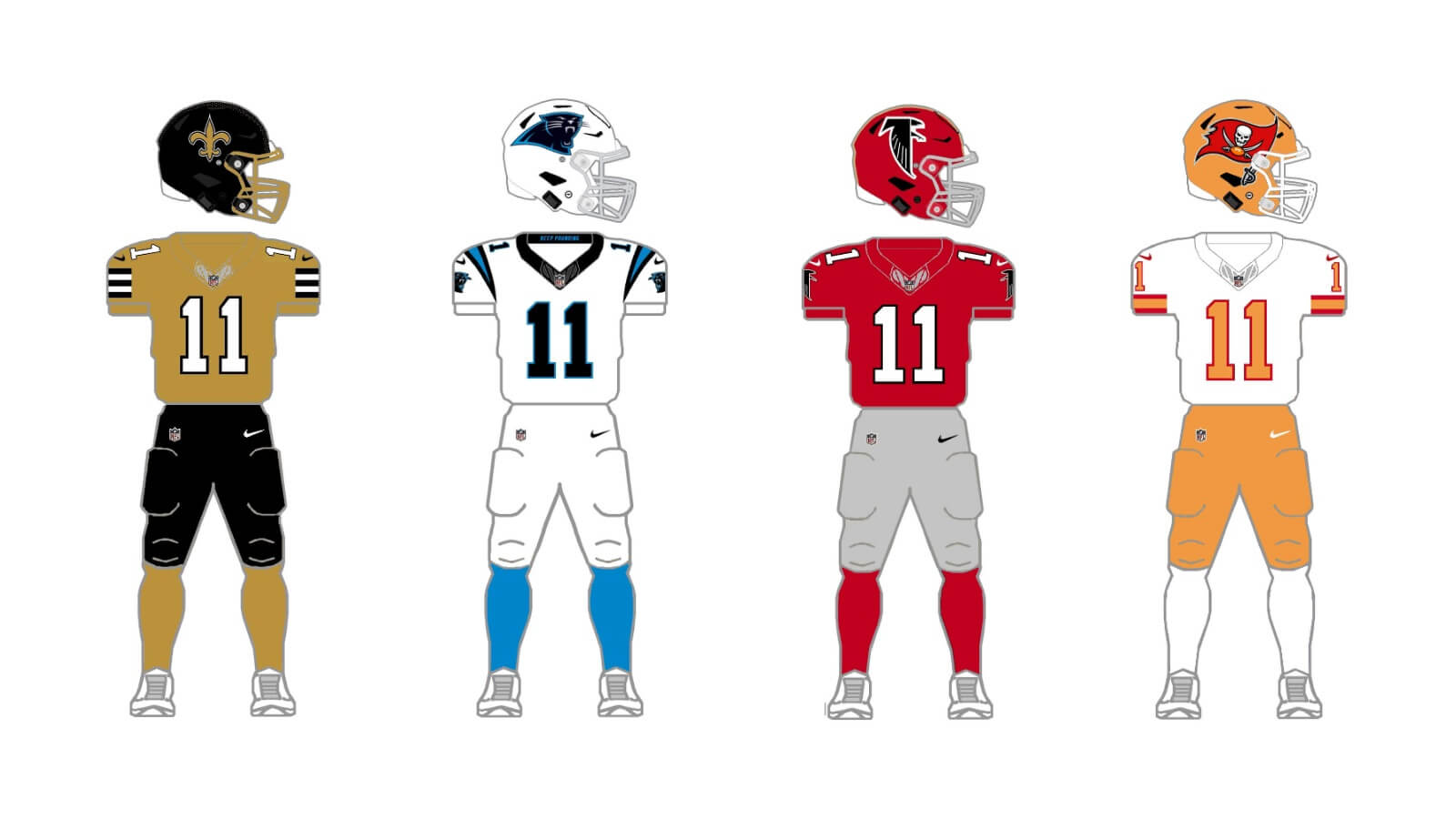
NFC South
TAMPA BAY BUCCANEERS
Like several other teams, the lifting of the single shell rule has allowed the Bucs to bring back their glorious throwbacks to their “Bucco Bruce” days. This gives them two helmets (pewter, white) and with three jerseys (red, white, “pewter”) and two sets of pants (white, “pewter”), they would fit the 2/3/2/3 model as is. But lets face it, the so-called “pewter” they currently wear is more of an anthracite-brown color.
Current uniform
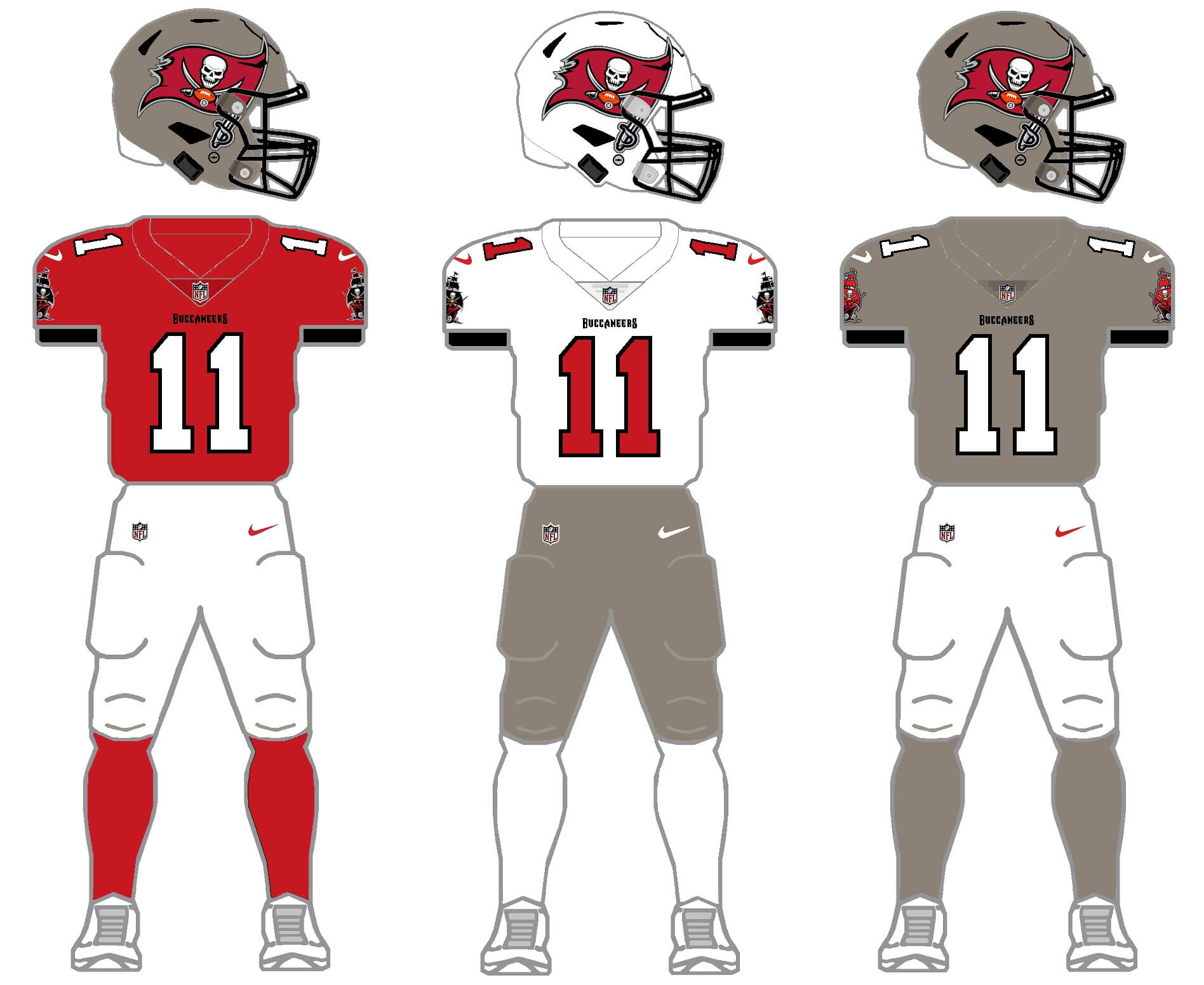
The simple solution here is simply to return the uniform to more of an actual pewter, which would be more in line with their second generation uniforms that followed their original Bucco Bruce set. The white helmet from the throwback can be used with this set simply by swapping the current logo for Bruce. While this colorscheme is unique (and the Bucs found immediate on-field success after adopting the new colors), almost everyone loves the throwbacks. Which leads us to …
Throw/fauxback uniform
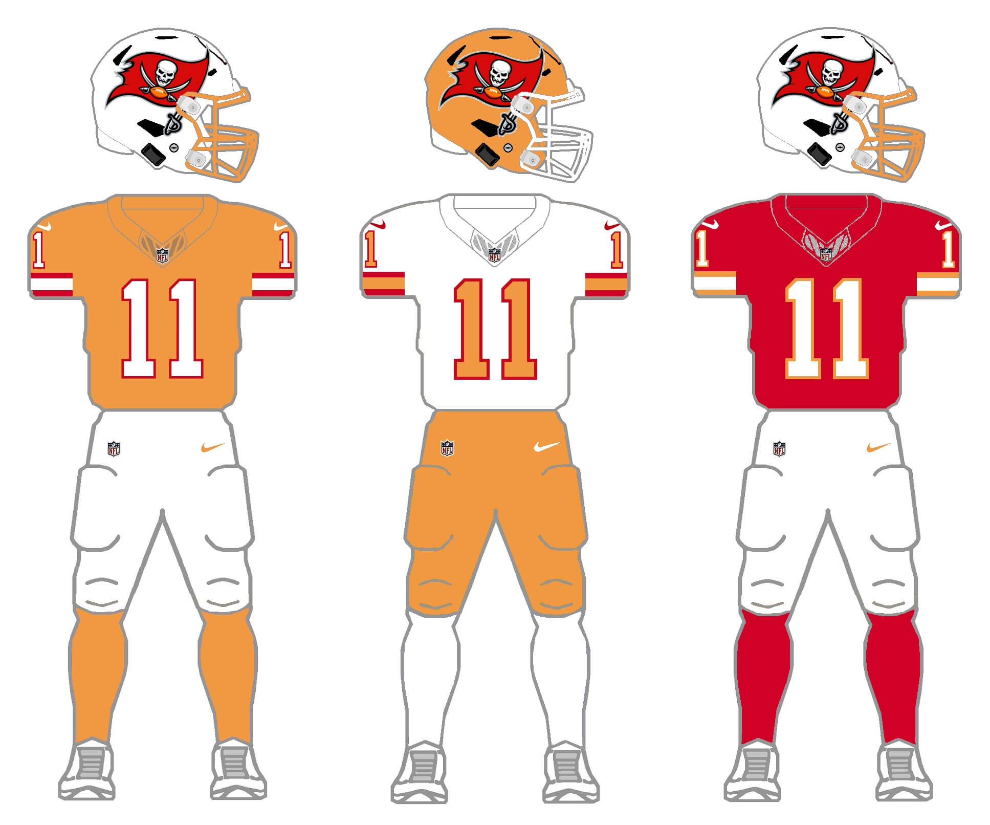
The only thing wrong with this uniform is the team’s (perceived) lack of on-field success while wearing it. For this throwback to be turned into a modern classic, I swapped the throwback logo with the team’s current logo. The original 1976 set didn’t have orange pants, but they did add those later, so those will be part of this set. I will need to create a second shell color (orange being the obvious choice), and create a new third jersey — also an obvious choice in red (which harkens to their current jersey and uses the red accent color from the original Bucco Bruce unis). Some might argue their current uni set is fine, but creating this new throw/fauxback is all kinds of awesome, and would still keep a unique look for the team. It’s a win/win. Who wouldn’t want to see these on the field full time?
ATLANTA FALCONS
The Falcons are another team that reintroduced throwbacks with the scrapping of the one-shell rule, so they currently have a red and black helmet. They also introduced a new uniform set in 2020 that included three new jerseys (one of which, a red-to-black gradient, has been scrubbed from their rotation). So a new third jersey would need to be created to meet the 2/3/2/3 parameters. While some love the new “modern” uniform, others do not.
Current uniform
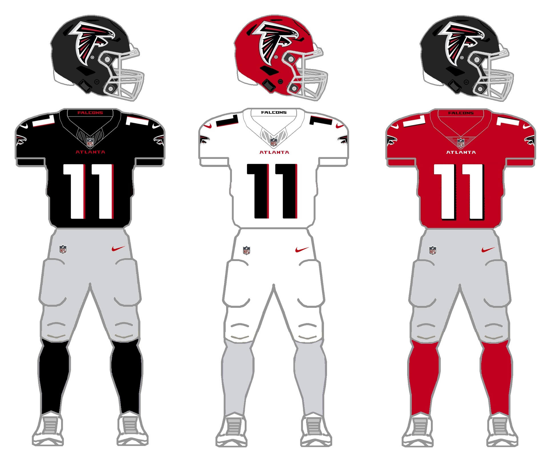
Like I did with the Tennessee Titans, I couldn’t quite leave the new uni-set be. I tried to keep the modern feel, but eliminated the giant “ATL” wordmark on the chest (instead substituting a much smaller “ATLANTA” wordmark), and although you can’t quite see it on the graphics, eliminated the odd, elongated tringular stripes found on the jersey side panel and pants (picture a solid stripe on the pants only instead). I replaced the dearly departed red/black gradient jersey with a solid red one. The other big change was to eliminate the black pants and replace them with gray, a color the Falcons have used with white, black, and red jerseys throughout their history. But let’s face it: every time the Falcons wear their throwbacks, most us simply note, “these should be their regular uniforms”.
Throw/fauxback uniform
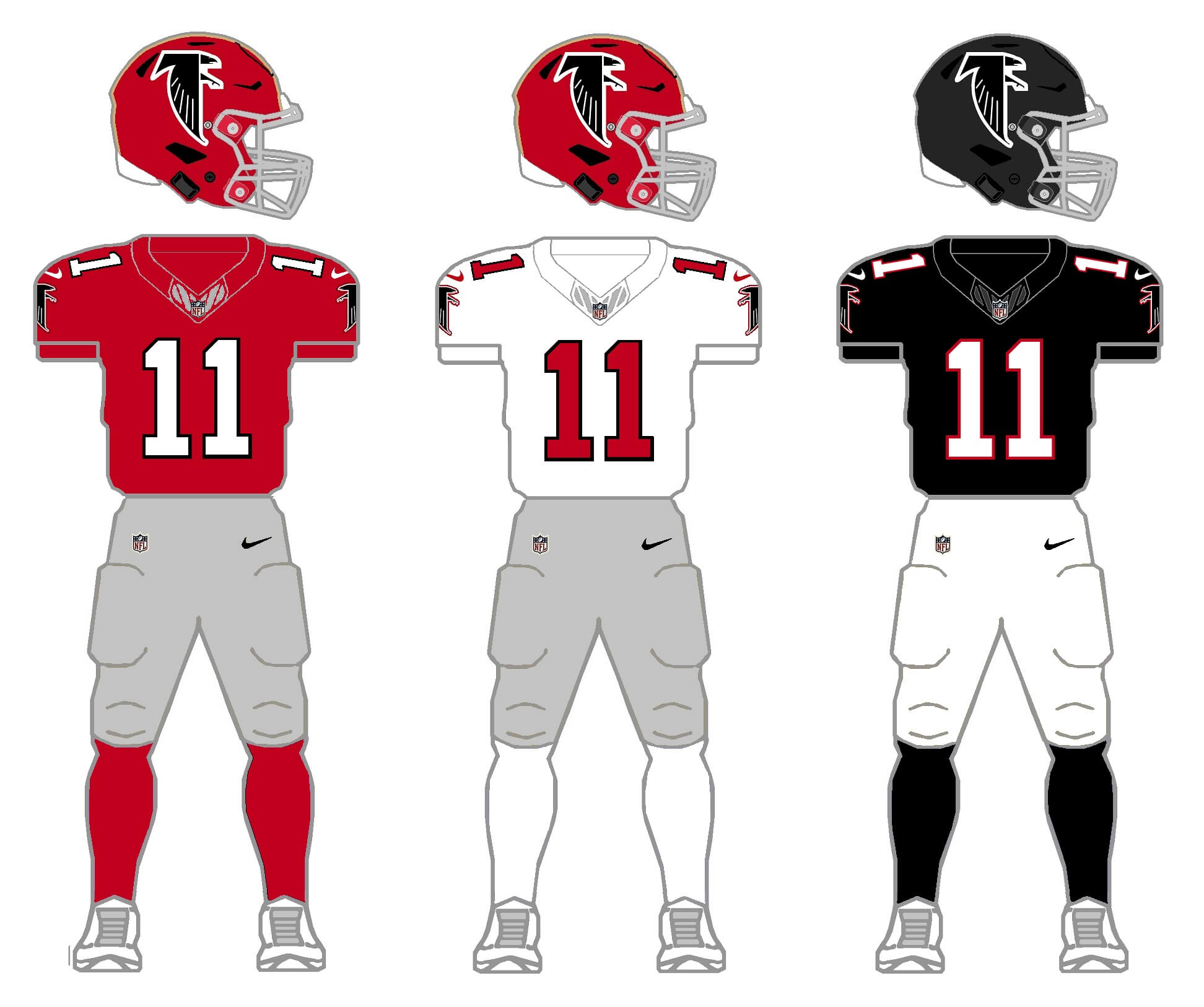
This proposal is an easy fix. The team would be given a red throwback jersey option, along with a gray pants option. This not only covers their current throwback, but could span multiple eras as well, such as when they wore red or white over gray, as well as red or white over white, in addition to black or white over gray. This one is a no-brainer!
CAROLINA PANTHERS
Except for a few tweaks over the years, the Panthers’ uniforms have remained largely unchanged since they were first introduced in 1995. Last year, the team introduced a black alternate helmet, and they have more than enough jersey and pants options to meet the 2/3/2/3 project parameters. However, I’m of the mind that the team should de-emphasize the black, and instead highlight their Process blue and silver options.
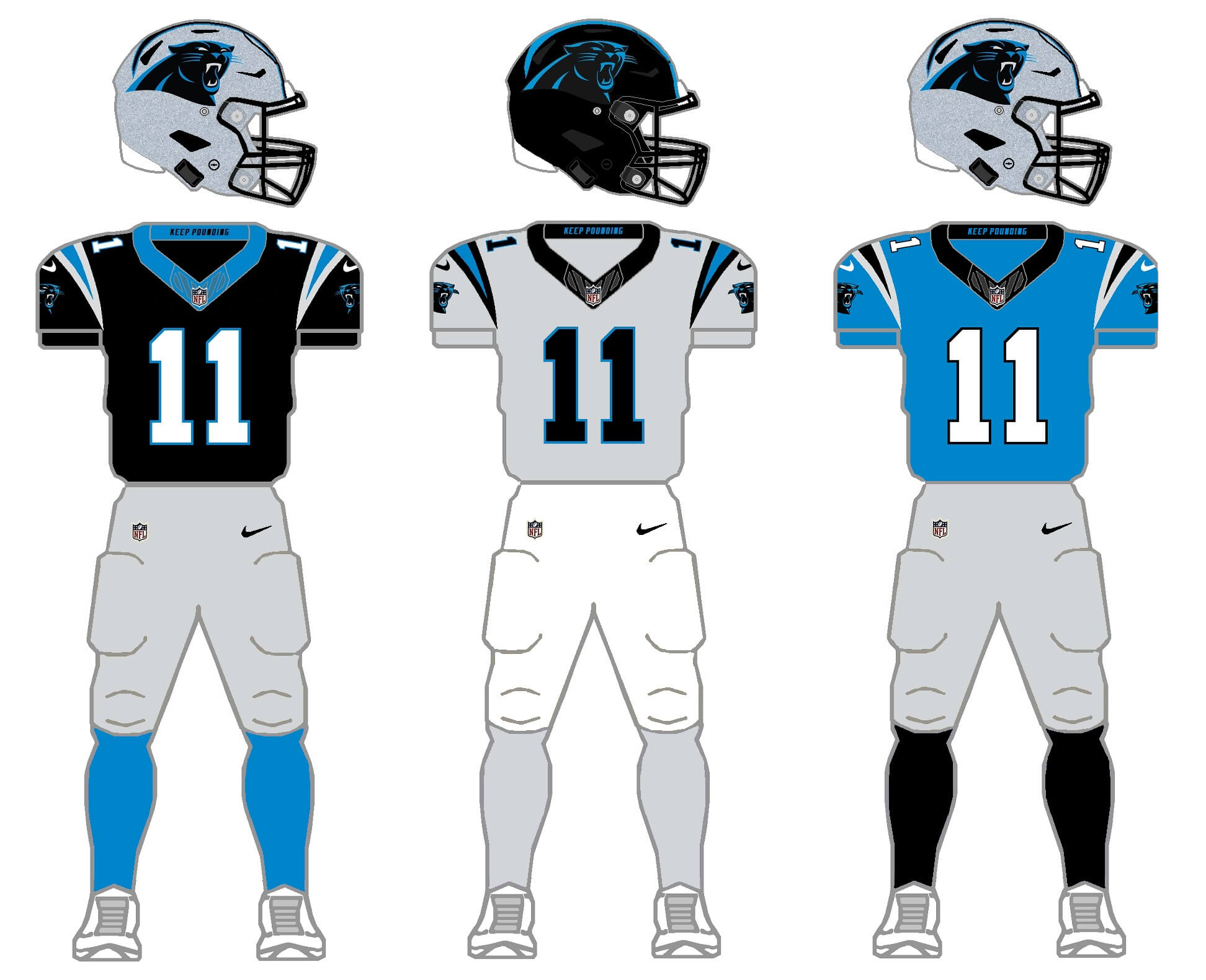
Here, I’ve given the team a silver-gray jersey to replace the white, and gone with both white and silver-gray pants. With the alternate shell, there is still plenty of black in the set, just not as much as is available to them at present.
Current uniform new option
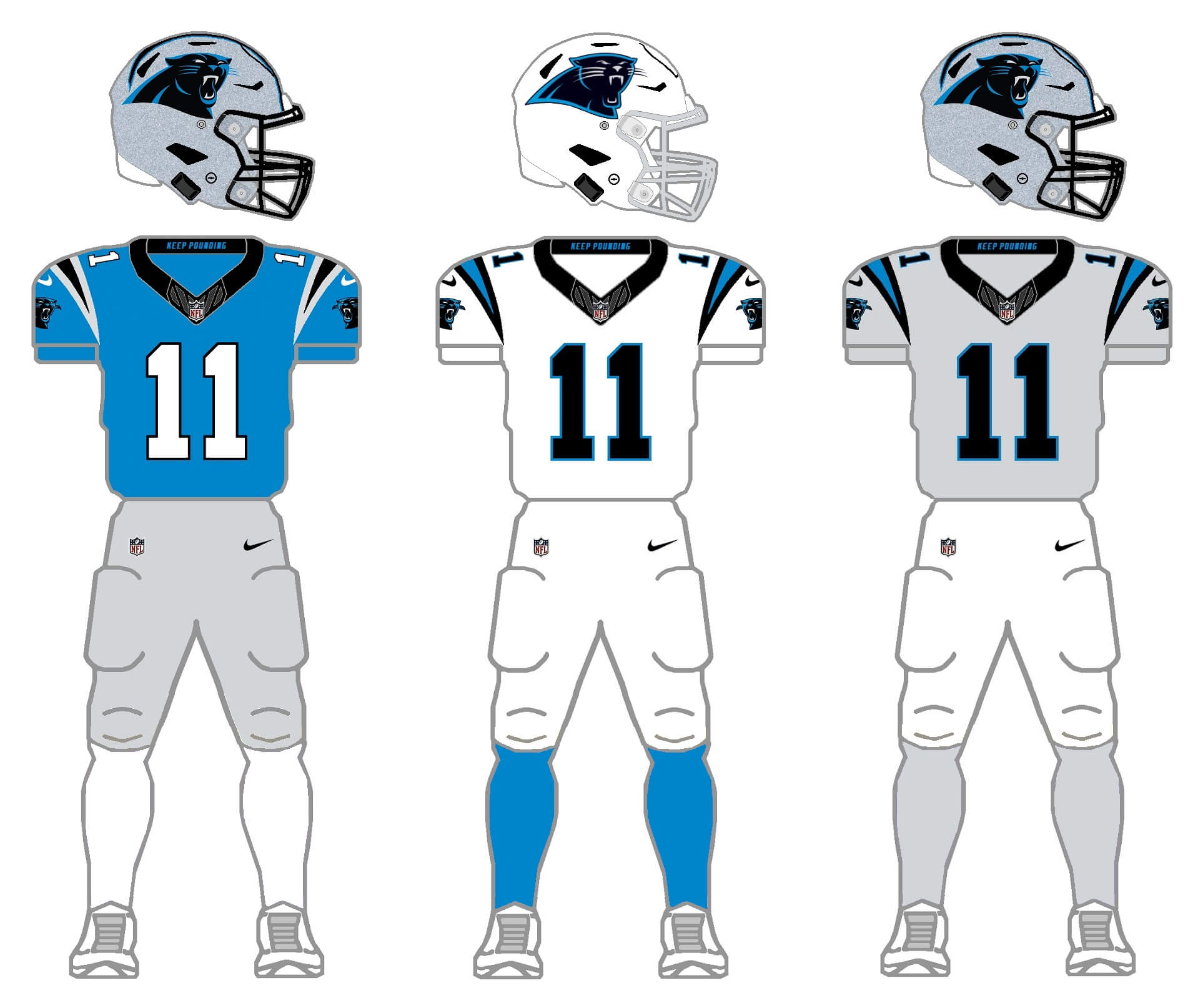
This option includes a new white helmet, and relegates black to an accent color. It’s not that the Panthers shouldn’t wear black — it’s just that the league has many black-clad teams, so this would serve to emphasize the unique Process blue and silver colorscheme (which IMO is better than the black-heavy alternatives). Yes I know that actual Panthers are usually black, but that doesn’t mean we need the team to be — after all, we don’t see many Honolulu blue and silver lions in the wild, do we?
NEW ORLEANS SAINTS
With the introduction of a black alternate helmet last season, the Saints almost meet the 2/3/2/3 criteria, lacking only a third color jersey. Gold will be the obvious choice here.
Current uniform
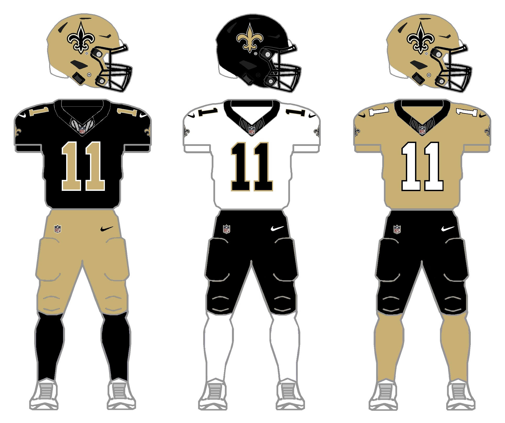
Some of you might not know this, but for one single game in 2002, the Saints wore a gold jersey. The problem even then — as now — the team had a hard time matching the golds. With this set, I’ve taken care of those mismatches (hopefully).
Throwback uniform
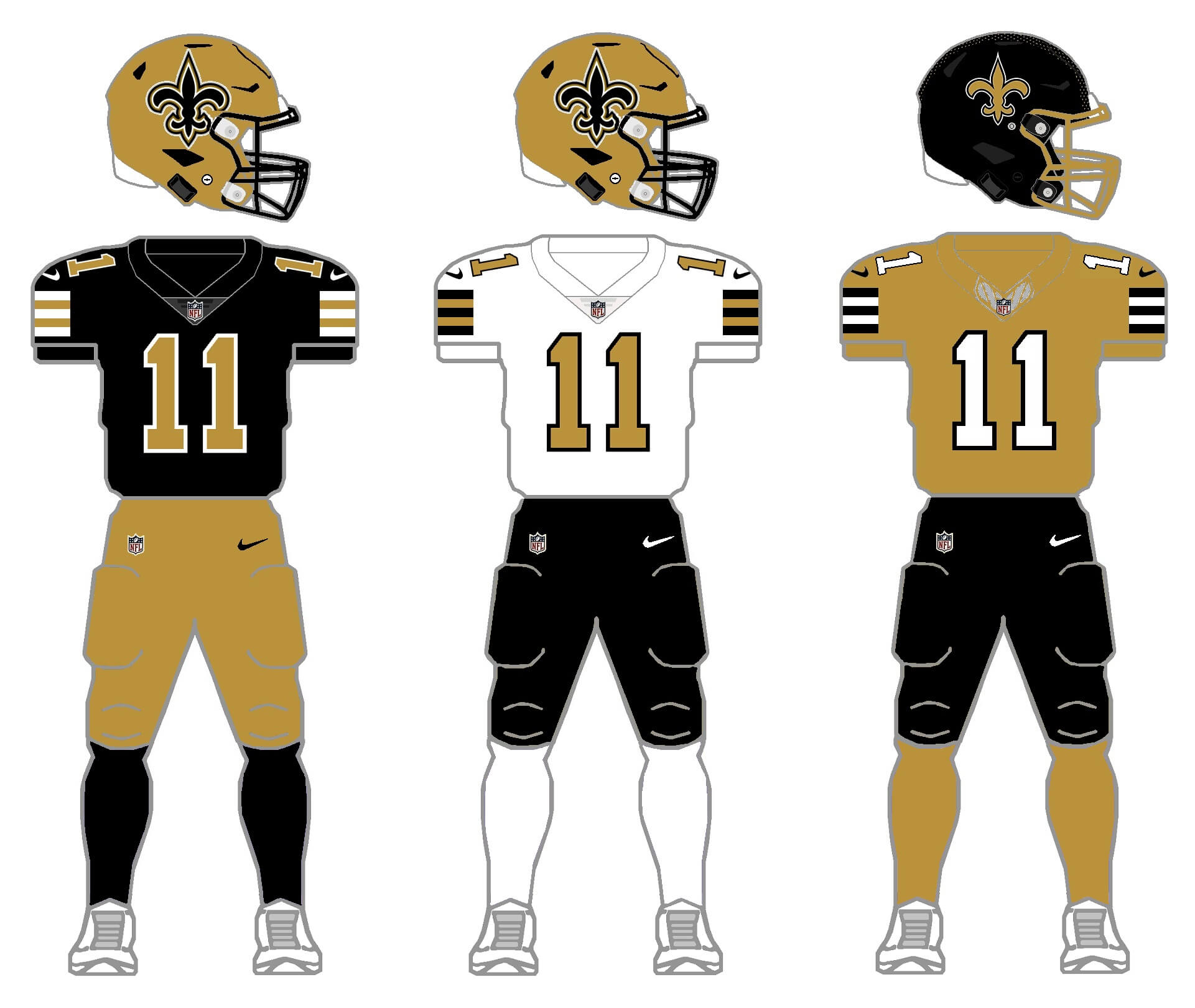
With their CR set, the Saints are sort of throwing back to their original look. They also have, periodically, thrown back with their black jersey as well. Once again, the glaring mis-match between shades of gold are apparent. I’ve fixed that here. Nike has shown us they can make an old gold (as they did this year with Vanderbilt). Now it’s time to give that same treatment to the Saints. And, most of you likely know the Saints did introduce a black helmet back in 1969, but the NFL wouldn’t allow it and it was only worn for preseason games. The throwback option now includes that wayward black helmet, and adds an old gold jersey option. While not present at their inception, the black pants were once an option (with proper stripes!) in the past. Should the Saints somehow go with these for throwback options (and especially FIX THE GOLD), they might be one of the top 5 uniforms in the game.
Thanks for indulging me, and I hope you at least enjoy the concept of 2/3/2/3. I’ll tackle the remaining two divisions in separate posts. Please leave any comments/suggestions/critiques in the comments below!
Hey, Phil, Happy Sunday to you and all the Uniwatchers, as well. Got a few observations on these unis…
-Those Bucs “pewter” (quotation marks for jersey color, LOL) unis are about perfect, very clean…only one adjustment: smaller helmet logo (their current uni needs this, too). The fauxbacks are classic, even with the Flag logo update. But looking at that white-red-white-red combo, I think an orange flag with a red football (again, smaller logo) would complete that look.
-On the fauxback-old Falcons uni, I’ve always thought that black helmet would be much sharper with a red logo. Their current set would benefit from this, as well.
-The Panthers should wear the blue jerseys as often as possible, it’s their best look.
-I’m guessing that you gave the Saints pants-stripes, hopefully close to what Archie’s wearing in that pic. Love that thick stripe look. And I was wondering if the throwbacks have the new logo as an updated fauxback look, like you did with the Bucs. It’s a subtle thing but the old one gives more of a nostalgic feel to their uni. Here’s hoping their next makeover looks like these throwbacks. Awesome.
Thanks for the feedback!
Yes, ALL pants in my 2/3/2/3 project have stripes — and the pattern would be old gold/white/old gold for the black britches.
That matches the helmet logo progression, works so well…
I gotta do some research (google) and see if they are “due” for a redesign.
Your Buc’s red “throwback” top with white pants and red socks looks too Chief-sy.
Thanks — I agree with you. I’ve said before and I’ll say again, some of the uniforms (combos) I created for this 2/3/2/3 will appear forced (even I wouldn’t want to see some of them on the field), but were done so that every combo would have 2 helmets, 3 jerseys, 2 pants and 3 socks. This wouldn’t work for a few of those third jerseys and I’d hope they’d never be worn. Some teams would definitely be better served with *just* two jerseys, but for the project, everyone gets 3.
Love the saints i think what you’ve done is perfect. One underrated thing that’s annoying about the saints new uniforms that gets overshadowed by the awful mismatch of the colors and weak gold they use is the outline of the logo. It doesn’t need to be wite-gold-black-white. That’s too busy! The old version just had one white outline of the black logo and that was enough. Alternatively, i think a white saints’ helmet could be cool over the black (think colorado’s this year) with a black facemask. Thanks as always great stuff.
Thanks, Dillon! I’m particularly pleased with the Saints throwback options. They’re *soclose* to having a decent uniform set. But their desire to go monoblack and monowhite (like they will be today) ruins it all. Good suggestion about fixing the current logo too!
There are white replica Saints helmets online-for-sale that are pretty cool…Wouldn’t mind a real one.
The logo is cool Old-Style or new, at least for me…If we could see both every year, that would be great.
Hard to believe but in seven years, the “updated” logo will have been in use as long as the original.
Who Dat
Not sure where to start. Fantastic.
I guess I’ll say first that I am thoroughly surprised how much I like the current Falcons logo on the red helmet. Makes all the difference. A move they should consider in real life. Of course, like most of us, I prefer the look teams trotted out in my youth.
The Saints look so much better with the stripes. They’ve become the most drab team in the league with the emphasis on head to toe black with a stripeless template. I will never understand why they don’t revert to the use the gold.
I can take or leave the Panthers. Their base original home uniform is always the best to me and I think there is something kind of charming about wearing colored pants and colored jerseys at home and all white on the road. I’ve always appreciated that.
The NFC South has always been the least aesthetically pleasing division to me. A lot of black and what colors remain aren’t that appealing. But this entry makes a huge improvement.
Regarding yesterday’s entry-I really loved the Colts alt jersey and certainly miss the unique “number in the horseshoe” on the grey pants. What an awesome look. The caveat to that though is the single stripe on the pants doesn’t match the shoulder stripes. Additionally, I really like the look but something has always seems a bit off to me about a team wearing a white helmet and colored jersey and colored pants; whether they are different colors or not. It just seems unbalanced. But I’d be willing to deal with it to see that unique uniform element.
Thanks Jason!
I agree the NFC South is kind of brutal in terms of aesthetics, but it also has so many possiblities. Even if clubs just made a few tweaks (maybe not what I’ve suggested, but just a couple additions by subtraction and such), we could have a much better looking division. Appreciate the kind words.
Great stuff, as always in this project.
TB – if we can’t throw the pewter into Tampa Bay and go full creamsicle, the lighter pewter is a good step toward better. I have little faith that Nike could make metallic pants, let alone jerseys, but as a concept, I am fine with it. (ironically, all 4 teams in this division would look great in metallic britches…) I also got a Chiefs vibe from the red faux back but it passes within the bounds of this concept.
ATL – again, ditch the modern and go for the throwbacks, and you’re set. Silver britches would be ideal but gray would also work here.
CAR – I know they were born in the 1990s but with panthers being black, I don’t think that this is BFBS. I would prefer a heavier dose of black more than bringing in a light silver for the jerseys, but silver pants would pair well with white or black jerseys.
NO – for the 3rd time, the throwbacks are the answer. Any combination of black, the darker metallic gold and white will work well here.
Thanks, MJ!
Appreciate all the feedback (and I think most of the UW audience — though perhaps not the wider sports-watching audience on the whole — would prefer to see most teams in some form of more traditional uniform). I’m not opposed to the more “modern” unis, but some of them need to be stripped of their superfluous bells and whistles.
With regard to Carolina. Yes, I know they were born in black, panthers are black, and it’s definitely NOT BFBS here. I don’t foresee them wearing less black any time soon, but I wish they’d make the Process blue jersey the standard home, rather than alternate. But fair points on all!
Call me crazy, I am one of those that kind of tolerate the nike disaster unis (bad Jaguar unis, BFBS, etc.), at least so that we appreciate the good-looking ones (classic Green Bay and Chiefs, well-done throwbacks, etc.) even more….
I am all for a modern classic. The Texans and Chargers are 2 very nice uniforms that are not stodgy but not garish. The Jets did a nice update if you ditched the BFBS. I didn’t mind when the 49ers had the black drop shadow (TO/Steve Young Era). But too many teams changed for the sake of change (Seahawks, Cardinals, Lions, Vikings, Broncos, Falcons, Dolphins…). My feeling on redesigns is that it should be an improvement over what you had. Too many teams fail that criterion.
A daunting division to re-envision!
TB: I’ll say it – add a black helmet and the currents would look really – I’ll say it – badass! Not triggered by the citrus britches on the throws, the KC-esque 3rd option is, as you put it, “forced”.
ATL: Gimme those Bartowski’s and Glanville’s today! These sets tie up the team’s color history really well-high marks, Phil.
CAR: The Panthers have all the tools they need to look great now – just dump those silly helmet stripes already! As I said yesterday, it’s tough to design a good looking gray/silver top…your concept makes a decent go of it though.
NO: The Saints should be a ‘throwbacks-by-Hecken’ team right now! Beautiful blend of black and gold, the striping is sorely missed on the day- to- days.
Thanks, Chris! Appreciate the comments. Other than your suggestion to give TB a black helmet, I love your other points. If you play in southwest Florida in an outdoor stadium, you should have as little black as possible (IMO), even if you go white-at-home a lot in the hotter months. I just think a black hat would not work as long as they have a pewter dome.
As a Panthers fan, it bothers me that you used our old logo on the white helmet despite the team changing logos over 10 years ago.
I think some of these are “fauxbacks”, such as the Bucs uni (maybe even the Saints combos here, love them)….combining positive elements from old and new generations of unis (my take)…
I wish either the Lions or Panthers changed colors a bit. Both being cats, silver helmets and blue/white/silver/sometimes-black accents seems so redundant.
Since the lions were first, guess it oughtta be the panthers that should change…
Maybe do maroon and blue like the michigan panthers!