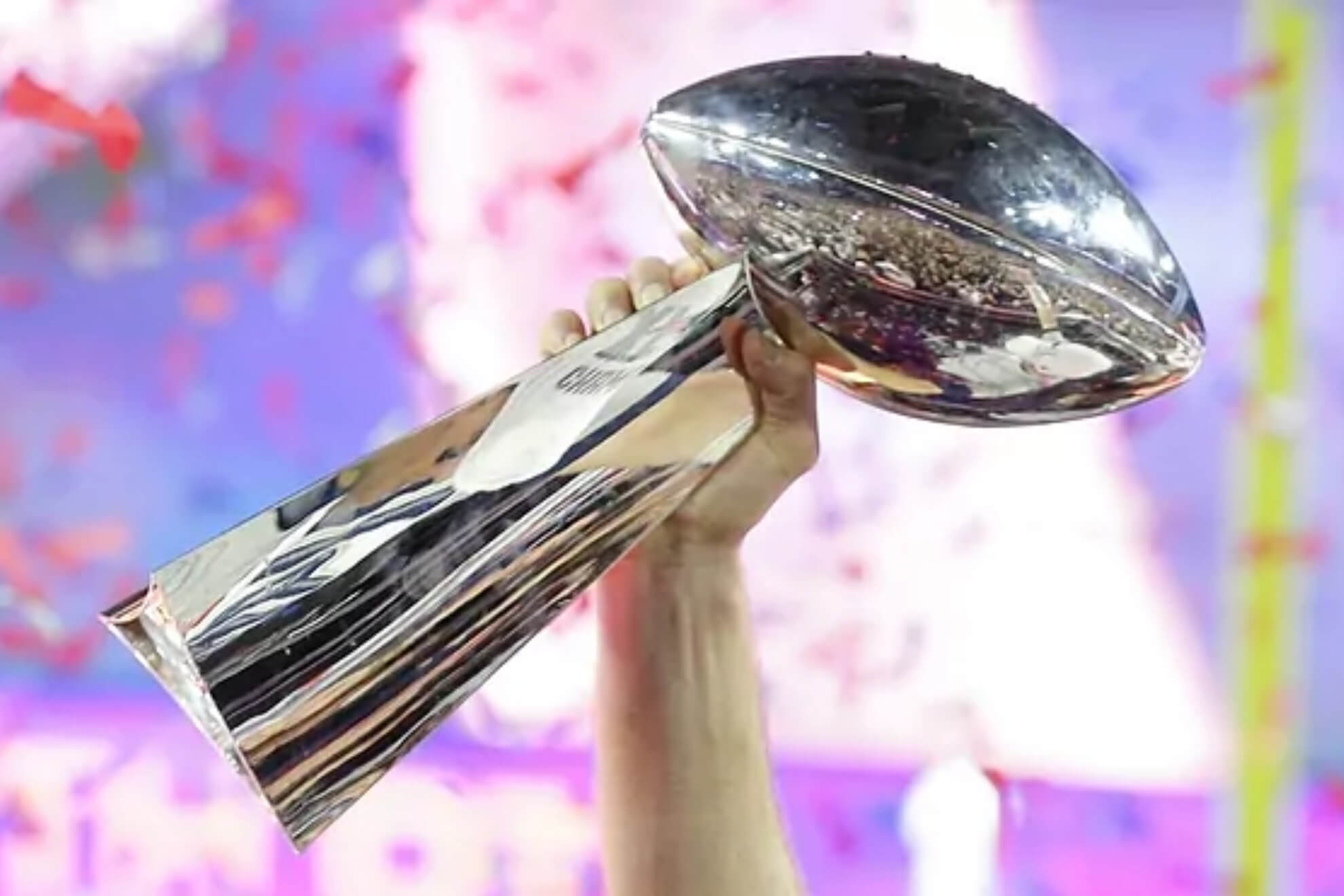
As we approach Super Bowl LVIII (aka Supe 58), it’s time for a ranking of every SB uniform pairing ever played, going from worst to first. Of course, these rankings are largely subjective, and I’m sure you won’t agree with the order of my selections. After literally hours of finding and grading all 57 games played to date, I’ve come to the conclusion that ranking games ain’t easy — sure, there are some stinkers and some absolute all time glorious-looking games, but the middle-of-the-pack uni matchups can be a bit tricky.
For my rankings, the most important criterion is how both uniforms look together; we can have games where one of the two uniforms is fantastic, but the other is not. By and large, two good uniforms opposing one another will rank higher than just a single great uni. But there are times when both uniforms may look tremendous individually, but when paired together, the matchup as a whole isn’t as good as the individual parts. Where a game was played (as well as time of day) also factor into it: dimly lit dome games are likely to rank lower than games begun in sunshine, with all other factors being equal. Colors also play a part: if two teams have essentially the same colors, that may either work for or against the overall matchup, depending on where they appear (helmet, jersey, pants). Finally uniform styles — be they classic or modern — will affect the rankings. Two things that are not considered in the uni matchups will be the quality (or final score) of the game (close games and blowouts are factored equally), nor will a team’s success in a uniform be considered. For example, the Patriots’ “Flying Elvis” uniforms of the Brady years may have been successful in terms of Super Bowl appearances, but that factor alone does not for a good uniform make. Conversely, many Broncos fans may consider the orange jersey “cursed” but that will not affect their rankings in terms of being a good or bad uniform.
The Rankings will be divided into four parts, in ascending order — today we’ll look at the 14 “worst” matchups, with tomorrow and next Saturday tackling the third- and second-best 14. On Super Bowl Sunday, I’ll finish up with the Top 15 best uni matchups in SB history.
Remember, it’s all subjective, so feel free to disagree in the comments below.
New England vs. Seattle
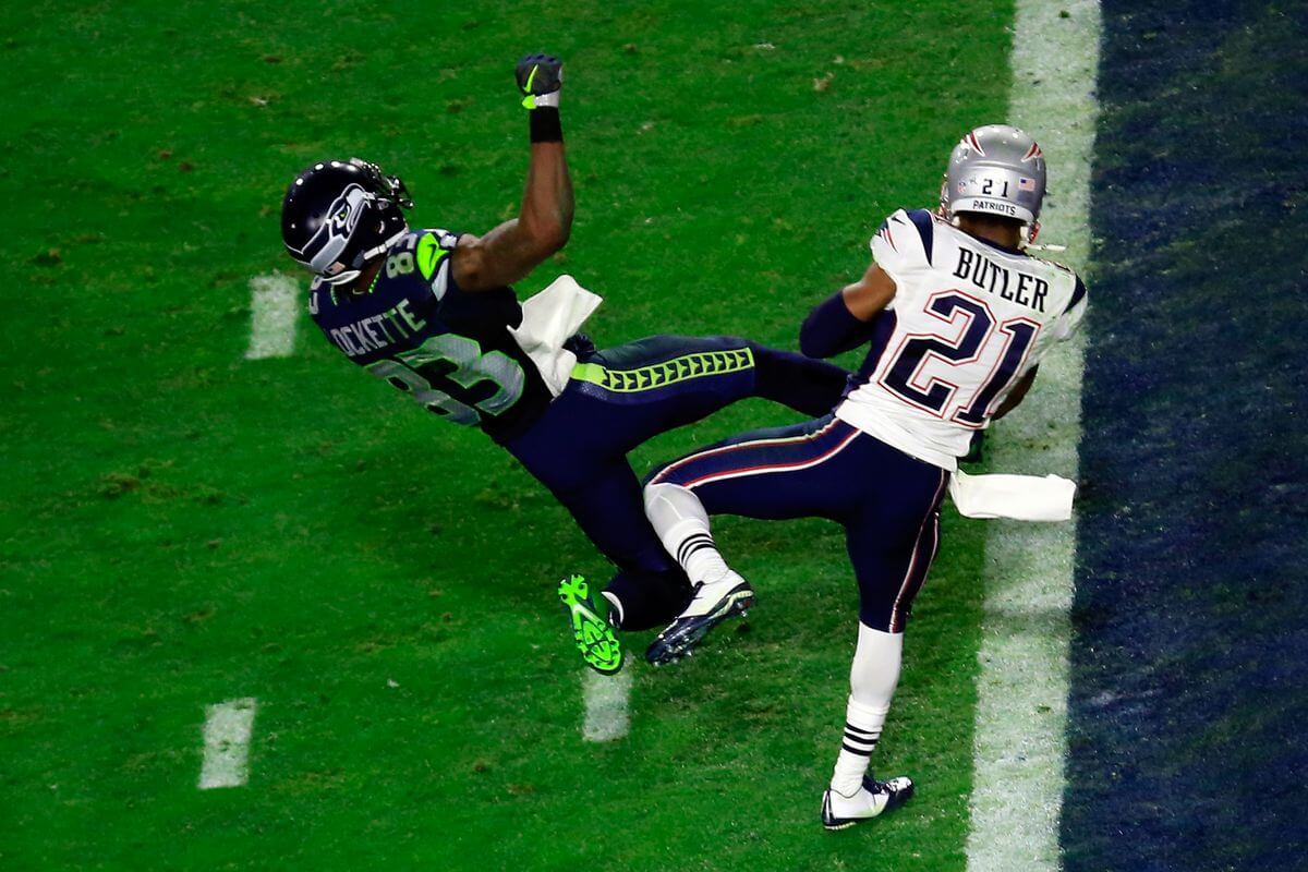
Nike’s first redesign when they took over the NFL uni contract in 2012 was for the Seahawks, and while the mono-blue look has somewhat grown on me over the years, mono-dark unis (particularly with neon accents) never look good. Throw in the Patriots wearing similar navy blue pants, and you get a recipe for the worst Supe look of all time.
New England vs. Atlanta
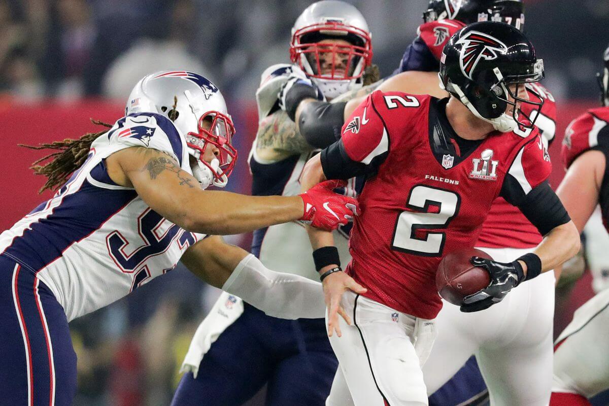
I hate to make it look like I’m picking on the Patriots, but I’ve never particularly liked the Flying Elvis unis — and with as many SB appearances as the team has, they’ll make some appearances on the “good” side too. But those giant side panels, and non-synched pants stripes going up against the truly awful Falcons uniforms, and you have another terrible uni matchup.
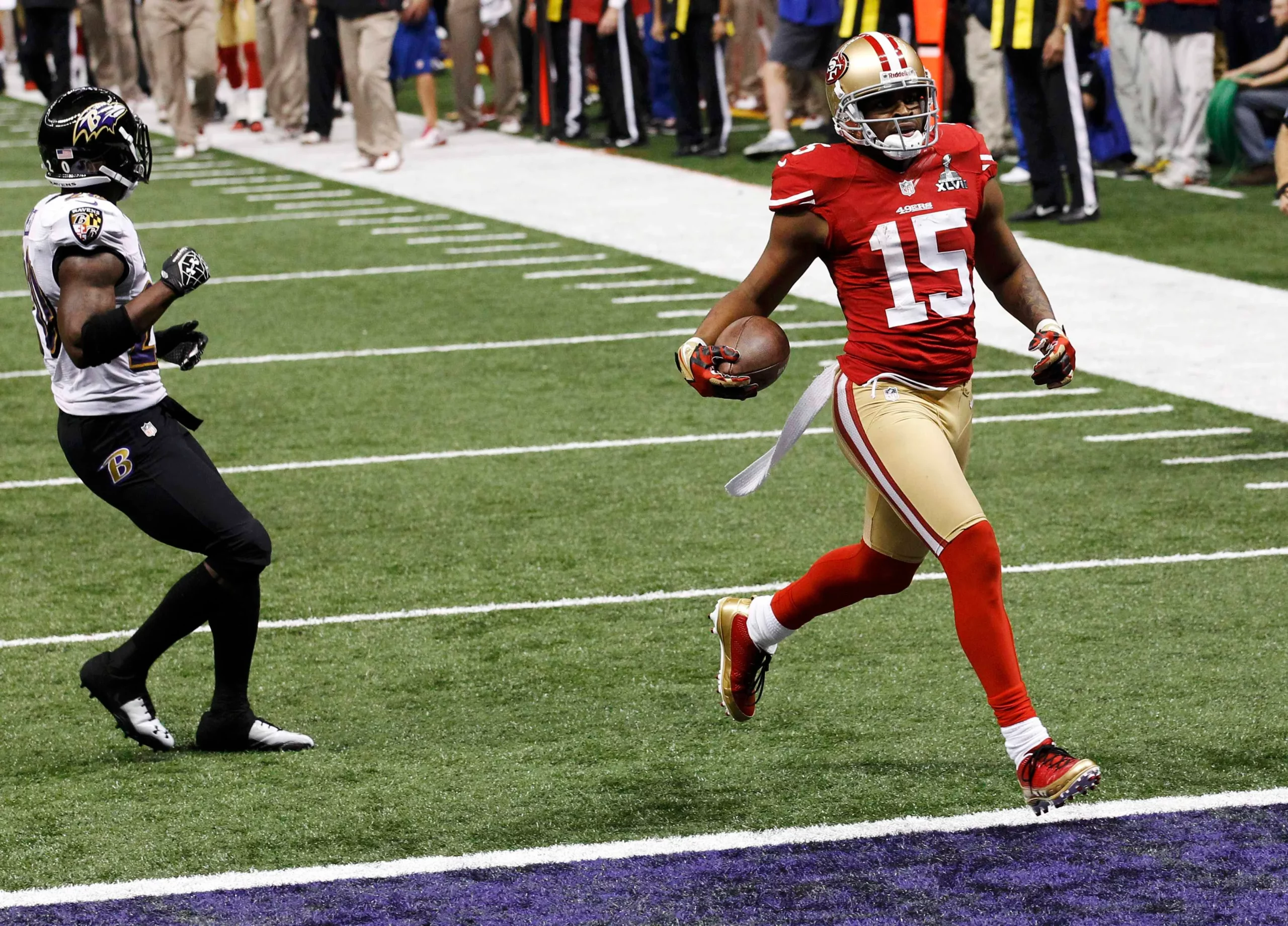
Pittsburgh vs. Arizona
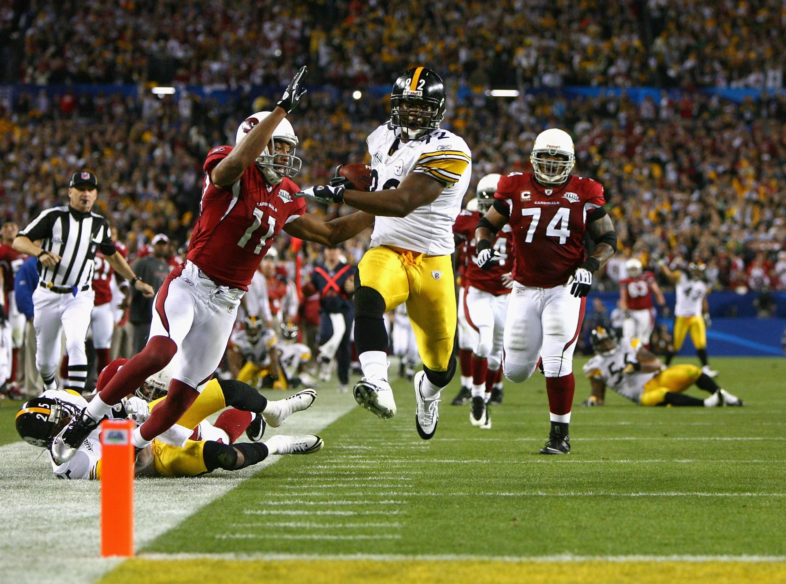
Of all the individual unis that have appeared in the big game, I’ll proffer that the Cardinals had the worst uni of all. It feels like I’m penalizing the Steelers, but even their solid black/white/golds can’t overcome Arizona’s sartorial disaster.
Carolina vs. Denver
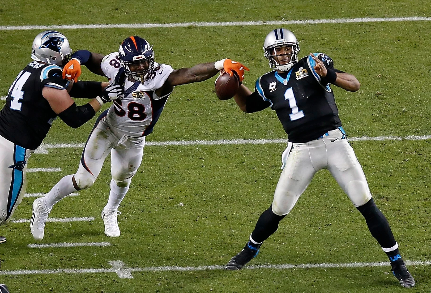
The only non-Roman numeral Supe was another visual cacophony, featuring the “first” modern uniform (the Broncos with their parentheses striping) which didn’t match up well against Carolina’s silver, black and teal elements. Contrast wasn’t the problem here, but taste is certainly in question.
Seattle vs. Pittsburgh
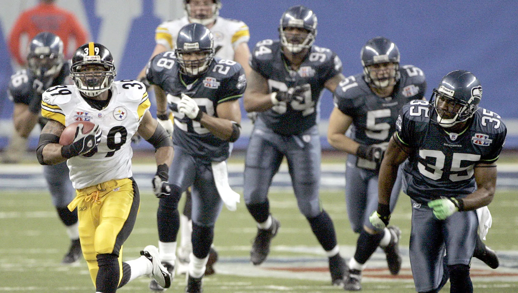
Poor Seattle. Their 1976-2001 silver/royal unis were really nice, but the 2002-11 unis were a real step down. The mono-Suicide Blue unis just never looked good, and even Pittsburgh’s black/white/gold couldn’t save this matchup.
St. Louis vs. New England
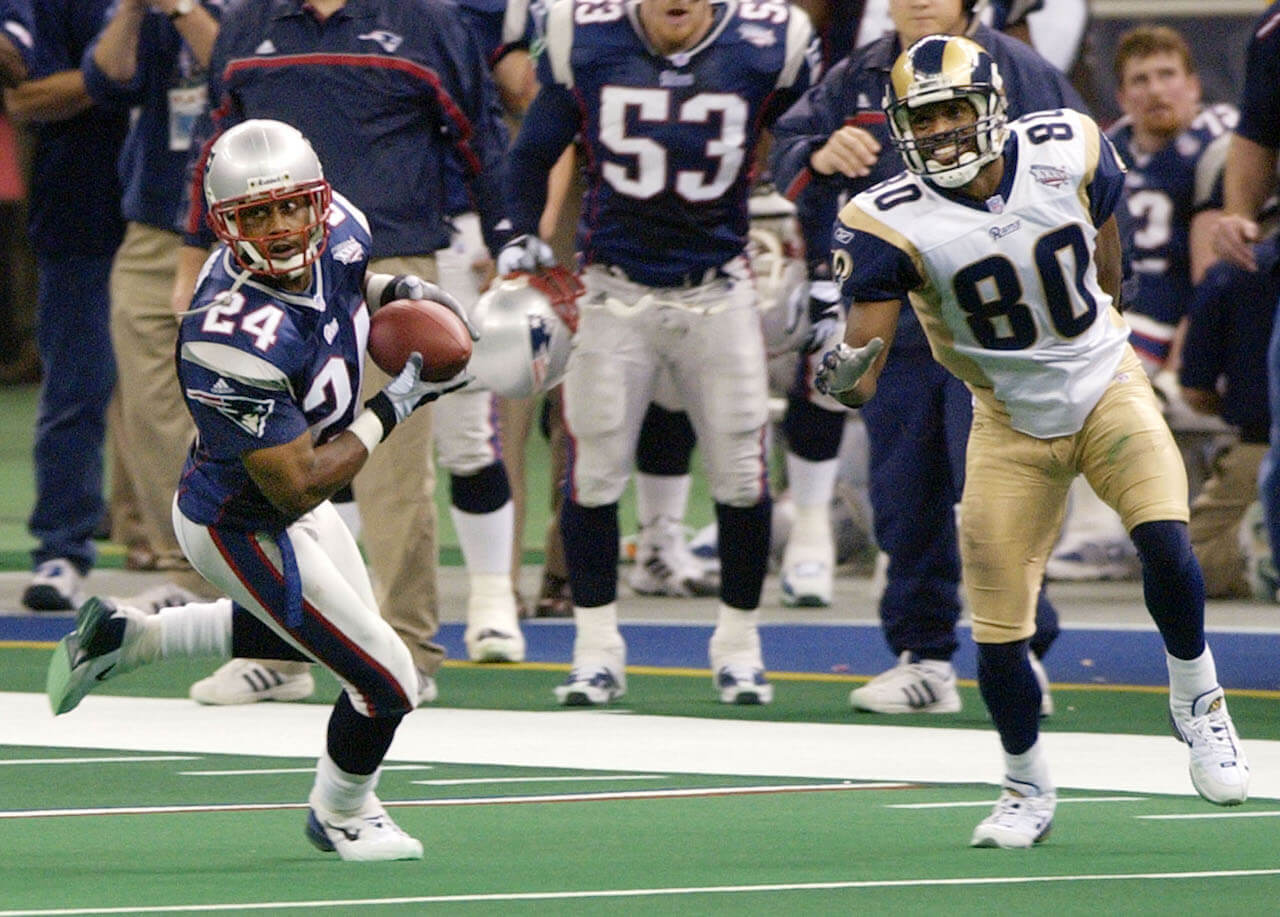
With the move to St. Louis, the Rams wanted to differentiate themselves from their LA look, switching from athletic gold to a light-metallic gold in 2000, and for their first two seasons in that shade of gold, they also had gold side panels on their white jerseys. Top it off with stripeless shiny pants and it’s just not a very good look, and add in the Patriots and it’s just an unattractive game.
Oakland vs. Philadelphia
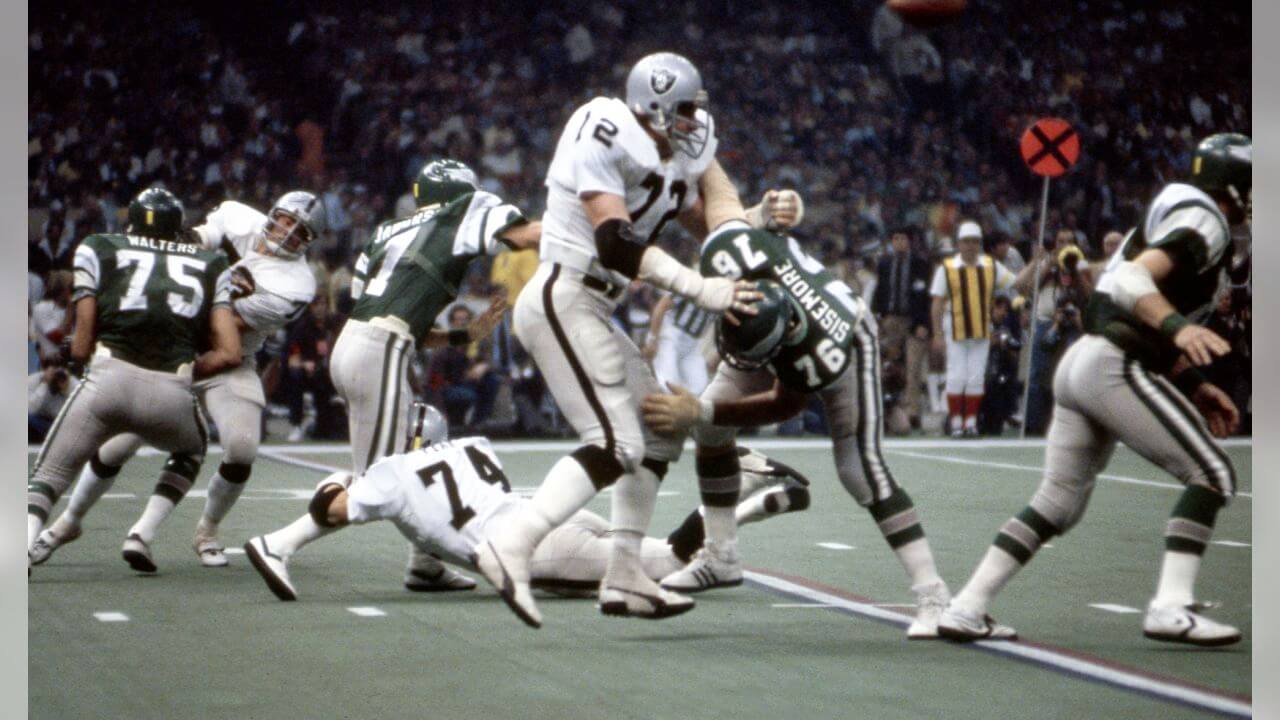
Generally I’m a big fan of the early Supes, but the Raiders/Eagles from 1980 was definitely the worst of the first 20 games. Both teams wore silver pants, and in the poor lighting of the Superdome, da Raidahs looked washed out, and the Eagles didn’t look much better. Oh, and the miniature golf carpet over poured concrete didn’t help either.
Baltimore vs. San Francisco
Here’s a case where one team’s bad look cancels out another team’s good look, and that’s the case here as the Ravens went with the black yoga pants. Add to that the toilet seat collar that was Nike’s signature back then, and you have a look that’s definitely in the bottom quarter.
Seattle vs. Denver
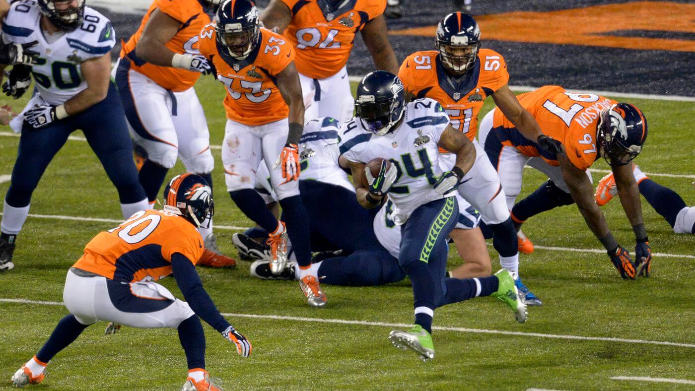
I’ll say one thing for this game: it didn’t lack for contrast. But those bright orange jerseys were the only bright spot for this matchup, as the Seahawks’ navy pants and socks, with both teams in navy hats, marred what might have been one of the more colorful games. Both separately and individually, the modern uniforms keep a great color matchup from being ranked any higher.
San Diego vs. San Francisco
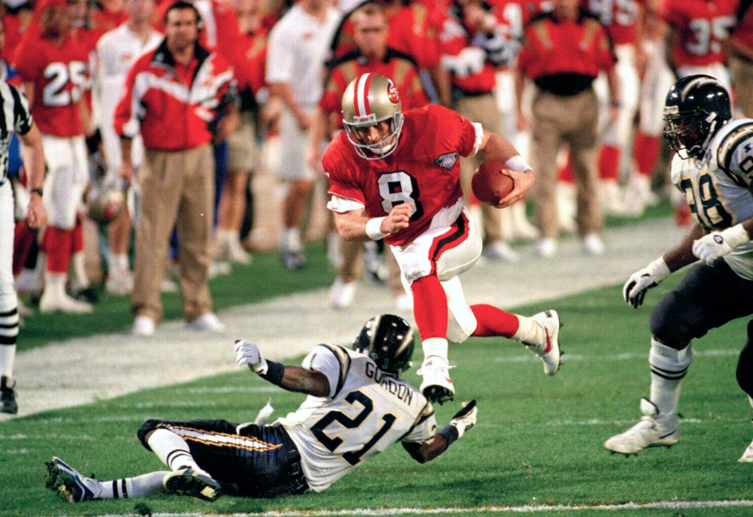
The 1994 season was the NFL’s 75th anny year, and most teams wore throwbacks throughout the season. The Niners decided to wear theirs on the game’s grandest stage. Those unis were supposed to be a throwback to 1955, but like many of the 1994 throwbacks, they weren’t. And any time you have San Diego in anything but gold pants, it’s not a Super look. It wasn’t a terrible looking game, but neither team wore their Sunday best.
New England vs. Green Bay
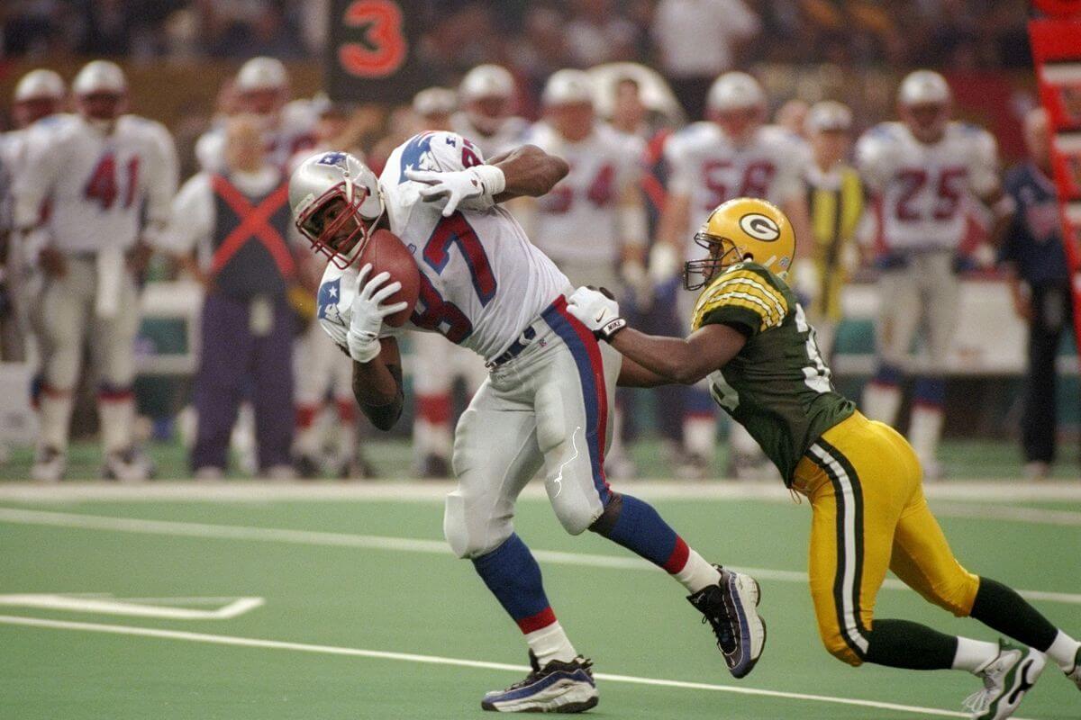
I know there are some of you who like the original Flying Elvis uniforms, but I wasn’t one of them. And while I consider the Packers home uniforms to be the tops in the NFL, the clash of modern and classic (again, with the terrible Superdome lighting) puts this one lower than you probably thought it would be.
Denver vs. Atlanta
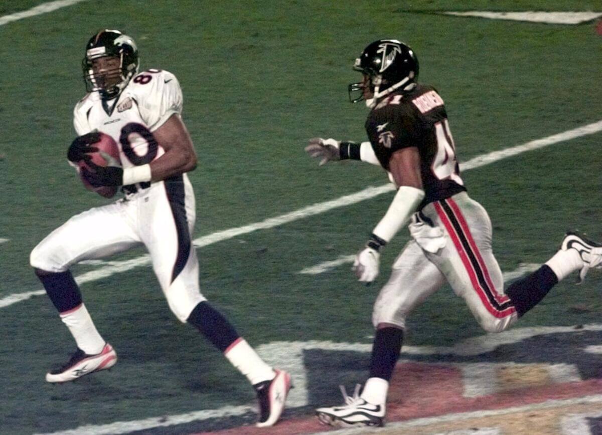
We’re getting to the point where we have Super Bowls that don’t look terrible, but still don’t look all that great, and that’s what we have here between Denver — still in the early years of their parentheses unis — and the Dirty Birds in their black/black/silver kits. Colorful it was not.
New York vs. New England
Despite my being a Giants fan, I’m not particularly a fan of their road look where the helmet is blue, but the jerseys are completely devoid of that color. If your nickname is “Big Blue,” you better have more than just a single blue stripe on everything below the waist. This is the lowest of the “rematch” looks we’ll see going forward.
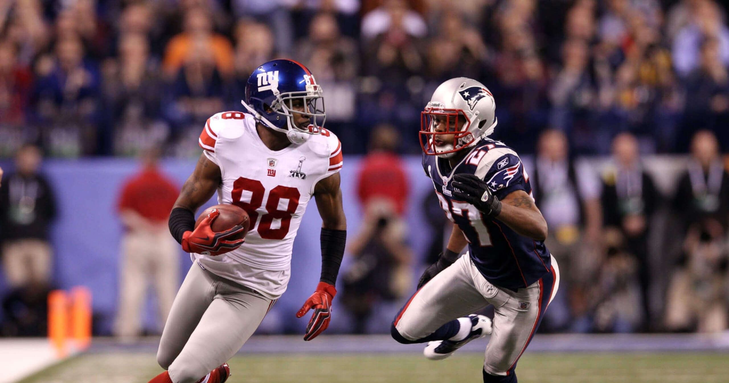
New York vs. New England
If this looks familiar, it’s because in both Supe 46 and Supe 42, the Patriots and Giants wore basically the identical uniforms. And in both of those games, the Giants defeated the heavily favored New England team. In the greatest upset since Namath over the Colts, the Patriots entered the game 18-0. They left with 18 wins and one Giant loss.
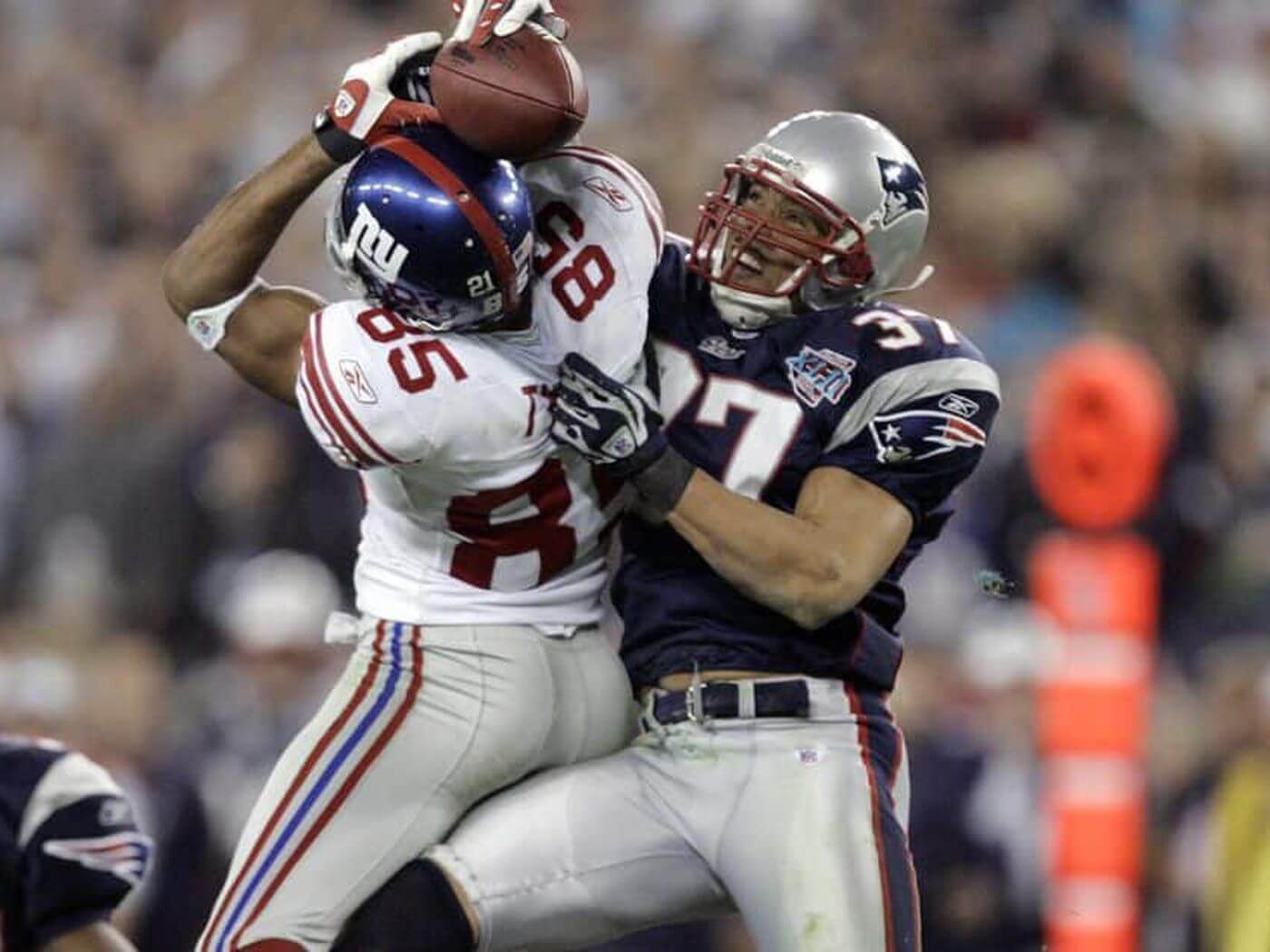
Great stuff. Just a heads up though, you used pictures from the same game/same play for SBs 42 & 46.
Gah! Yes. Now switched. (As you can tell, the unis are pretty much identical — save for the patch)
(again, with the
terribleintimate Superdome lighting)The only time the lighting was bad there was when the lights went out during XLVII.
i’m with phil on this one ~ superdome lighting looks like a smoky pool hall
You say that as if it’s a bad thing…
As a Patriots fan, I can’t argue with their inclusion in the shame-list. The 90s, 00s, and 10s, -era uniforms were pretty bad. The newest one is fine, but not great.
Small point: the Patriots were not big favorites in 46. The line was -3.
link
33 and 50 are my worst.
33 because it should have been blue/white/orange vs red/red/sliver. But noooooo.
50 because Denver was too cowardly to wear the orange jerseys. They’re not cursed.
As a lifelong Broncos fan, I can’t argue with you on either of these. I really wanted to see the Broncos win a Super Bowl in their orange jerseys, and they denied me that opportunity in 50. (Not that I’m eager to return the trophy or anything.) But maybe they cursed themselves by eschewing the orange jersey in that game, considering how lousy they’ve been ever since then.
While it’s sad that two Pittsburgh games are on the list due to their opponents, er, bad choices, I don’t think it’s a surprise that in both of those cases it was the Pittsburgh away unis that couldn’t cancel out the opposing teams sartorial suckitude.
Some of my favorite Super Bowl memories as a fan have come in the worst-looking games. ¯\_(ツ)_/¯
I’m detecting the tiniest hint you don’t like New England’s uniforms…
That Cardinals/Steelers SB looked so good to me I had to double-check whether you had started the list with number one!
totally agree ~ the cardinals unis by themselves stink but that game had great contrast.
SB XXIX is the greatest what if in SB uniform history.
What if the Chargers threw back to their white helmets?
What if the powder blue Chargers and 49ers went USC/UCLA in a glorious color vs color match up?
What if the Steelers had completed their comeback in the AFC Championship to give us a “First to 5” Super Bowl?
Alas…
Those early 2000’s Seahawks unis were horrible. The Cardinals and Falcons uniforms were just too busy and made no sense. Now, I always liked the Giants road uniforms until they started wearing the white pants with just the red stripes. Those white jerseys paired with the gray pants were pretty sweet. I never did understand the Pats side panels. Were they supposed to at least mimic the pants stripes?????? I did like the look of the Flying Elvis unis with the gray pants. Not so much the crazy vertical stripes on the jersey. Wish they would pair their new set of white jerseys with the silver pants. But, who makes that call? Is it Kraft? Is it the players? Is it marketing? The mono blue has got to go. Especially after seeing the new jerseys with the silver pants.
“The miniature golf carpet over poured concrete didn’t help either.”
Encapsulates every game I can think of in the SuperDome.
In a perfect world those Philly uniforms would be their throwbacks and they’d revert to their Cunningham era uniforms full time.
I’m glad the world is an imperfect place – neither of those Eagles uniforms are particularly good (I’ll add the current “Kellys” are quite sub-par due to the off-color appearance of the helmet and dull gray pants). The currents are keepers, and I’ll take the ‘70-‘73 sets as a throwback option since the blue/.yellow beauties will never be again.
On the January 31, 2022 post “What Will the Rams and Bengals Wear in the Super Bowl?” I wrote about this very idea for a post in the comments. I even stated that Super Bowl 49 was, in my opinion, the worst.
No one is a prophet in their own land.
I hated the Cardinals uniforms, but this wasn’t that bad for this game. The red jersey wasn’t nearly as bad as the white one with the red shoulders. Also, when they paired this red jersey with white pants and not the red, it wasn’t awful. And the color contrast with the Steelers was actually very good. What is disappointing is that they didn’t improve much at all with their new uniforms. The red jersey with red pants is awful, and the BFBS is equally bad. The all white is actually not a bad look, however I wish they would have used black accents instead of gray/silver.
Concur. We give a lot of hate to this Cardinals look, and I think it’s mainly because they stuck with this low-effort, crummy look for so long. Not even close to the train wrecks in Seattle, Denver, New England, Tampa Bay, and Atlanta. Tone down the wacky side striping and it would be a timeless, if unimaginative, look.
I still maintain that the Seahawks’ 2002-2011 kit would have been a great look if they’d worn white pants with the gunmetal-blue jerseys. (link) And Super Bowl XL would have been a much better-looking game had the Steelers not elected to wear white. (link)
I also think SB XLIII (Steelers-Cardinals) was not as bad as all that; had the Cardinals worn white it would have been a lot worse. I certainly wouldn’t rank it below any of the Broncos games on this list.
And I think SB XV (Raiders-Eagles) probably suffers more than any other game from the venue’s poor lighting, as that’s a great uni matchup on paper.
Super Bowl XL would have been a much better-looking game had the Steelers not elected to wear white.
Totally agree.
I went to the 2007 Seahawks/Steelers game in Pittsburgh and enjoyed it immensely. Had they recreated the look of XL, I may have had to ask for a refund.
PROOFREADING: On the main page, this is referred to as the “definite” ranking. I think you mean “definitive “.
Good catch — I was too quick. It should say “definitive” (will make correx on this, not sure if it will show up, and all future descriptions of this series).
Superdome lighting a common theme. Can’t disagree. Also, of the ones listed, imo the broncos-falcons and pats-rams look the worst. Broncos in that all white is just brutal. I think the seattl-broncos one isn’t really all that bad, and is certainly better than seattle-pats. I mnow people don’t like seattle’s new unis, but do people really think they’re worse than the 02-11 set?
Much, much worse.
The 2002-2011 set was actually a very good design, sabotaged by the inexplicable decision to pair the gunmetal-blue jerseys with the gunmetal-blue pants (which was not the original plan, as I understand) instead of the white pants (which was) (link).
I seem to recall that was the plan as well, Jay. But the team never wore the blue/white combo during the regular season. It was worn in both the 2002 and 2003 pre-season, but never — even on the road — during the regular season. The mono-suicide blue quickly became a favorite of the Seattle 12th Man, and basically became their signature look (and probably one of the reasons, until this season, the team almost always still goes mono-blue at home with the new set).
link
IMO, 50 was the worst. Be curious to see where XLV ends up; I think it’s one of the least pleasing uni matchups, with two much yellow and dark colors. Also, the JerryWorld field looked like shit that day. I’ve thought about this a lot over the years, and I have strong opinions about my personal top 10. This is a fun exercise. Thanks, Phil.
*too much
46 is easily the worst.
Any particular reason for this choice? (42 was almost identical, save for the Lombardi patch in 46)
Can’t really argue with any of the rankings, but I will point out (for what seems like the thousandth time) that teal has never been a part of any Carolina Panther uniform.
Please don’t suspend my UW+ subscription, but I think the SeaHawks blue helmet, white jersey, and blue pants look sharp! My friends and I always are happy about it when they wear this – and we comment to each other. To us, the unique “stripe” down the leg pops in a good way.
I also find Denver’s orange unis, even with the wonky mistake down the sides, provide a fun contrast that keeps this game from being a worst of the worst.
(FYI -From Seattle. Root for Hawks.)
It’s their best look, for sure. To me XLVIII was the best possible uni matchup of the available options.
48 is probably what is consider the low-point of SB games.
Very surprised the Birds/Raiders game is ranked in this installment – yeah, the lighting in the dome was crap and Oakland in white pales in comparison to the black tops no matter the game, but Phil’s a classicist through-and-through, so I didn’t expect to see a low-numbered SB game listed so high. The Vermeil Eagles looked tight but were wound too tight too that day.
“I know there are some of you who like the original Flying Elvis uniforms, but I wasn’t one of them”
I’m one of “them” , but the Pats didn’t wear the original FE’s in a SB…they tweaked them after their ‘93 debut, and wore the 3rd iteration in 31.
This ranking just gave me an uni-project idea. “What Could Have Been: The Best Uniforms for the Worst-Looking Super Bowls.”
Please don’t post this idea to the comments. I’m going to write it and submit (unless someone else already thought of it) as soon as I can! (I have two kids under 4, so might be a week or two.)
Add me to the list of the people who think Pit/AZ should be much higher. Just compare the two photos for the Pittsburgh games – the AZ matchup pops so much nicer. Bad unis, yes, but a good-looking game.
2002-2011 slate blue Seattle Seahawks would have looked better if the stuck with the original plan. It was blue jerseys over white pants as the primary dark look when the uniforms were unveiled. Then they quickly started to wear the monoblue and there was no turning back. Looked better slate blue over white.
I agree with most of the comments, but, of course, would tweak the rankings. Of these 14, my top two are 43 (colorful, good contrast), then 15 (Raiders are classic, Green!), My bottom five: 40 (mono-gunmetal), 47 (Ravens ruin it), 29 (there were far better choices), 51 (both bad), and the worst, 50 (both even worse). Looking forward to the other installments! Thanks!