
As you probably recall, the Patriots unveiled a new uniform set in 2020, including a mono-navy home uniform that was very similar to, but not quite the same as, the Color Rush uni that the team had been wearing for the previous few seasons. One difference between the CR uni and the new 2020 home uni was the typography: The 2020 had a different number font and a different NOB font.
As you may also recall, Nike and/or the Pats’ equipment staff apparently had a hard time telling the fonts apart, because New England had all sorts of typographic mishaps in 2020. Sometimes a player would have the old CR number and NOB fonts:
At other times, the old and new number/NOB fonts would be mixed and matched:
This problem continued in 2021. And prior to the start of the 2022 season, the Pats were still using the wrong number font on some players’ locker nameplates. Come on, people — get your shit together!
It is now 2023. We’re about to start New England’s fourth season in their current uni set. With their roster now set, yesterday afternoon they tweeted some pics of their new players for this year. See if you can spot the problem:
— New England Patriots (@Patriots) September 5, 2023
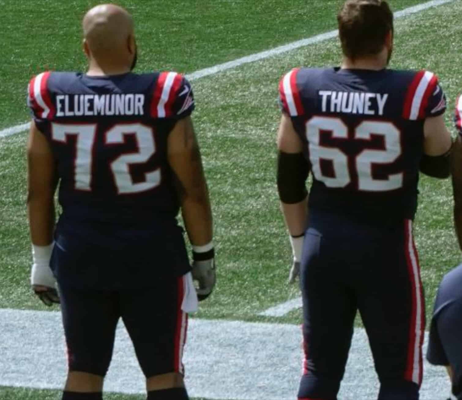
That’s right — rookie punter Bryce Baringer (No. 17) is wearing the old pre-2020 number font! Can you fucking believe it? Here’s a comparison showing punter Michael Palardy, who wore No. 17 for the Pats last season, alongside Baringer’s promo photo:

Although it’s less obvious, rookie kicker Chad Ryland (No. 37) was also wearing the pre-2020 font in yesterday’s promo tweet:

Of course, these photos of Baringer and Ryland are just promo shots. It’s also worth noting that their jerseys are in the old template. I’m assuming they’ll have the new template with the correct font when they appear on the field this Sunday. And yes, you can make the joke that we’re just talking about the punter and the kicker here, so it barely counts. Still, at the very least it’s a sloppy move by the Pats. Pretty amazing that they still have old jerseys (or at least old numbers) floating around.
And there’s more: Baringer didn’t wear No. 17 during the preseason — he wore No. 9 (rendered in the proper font). No. 17 was worn by tight end Scotty Washington, who was waived last week (allowing Baringer to claim No. 17). And here’s the thing — Washington’s No. 17 had the proper font! Check it out:
Similarly, Ryland didn’t wear No. 37 in the preseason — he wore No. 38 (with the proper font). No. 37 was worn by running back C.J. Marable, who’s since been waived, but I haven’t been able to find a preseason navy-jersey photo of him.
For what it’s worth, I always liked the pre-2020 number font, so I kind of enjoy seeing it, even though we shouldn’t be seeing it anymore!
(Big thanks to Twitter-ers @inthatleague and @Tileeom for sending me down this rabbit hole.)


The old Pats font is far superior to the one their trotting out now. Never understood or heard an explanation for why they switched in the first place.
Agreed! Should have never changed fonts. Plus the old font was unique to them and not to mention synonymous with winning!
Totally agree on the new font being much worse. Also anytime we talk Pats, quit going mono navy!
100%
Yeah there were things they needed to fix but the old number font was not a problem.
I’m going to agree to disagree with all of you.
Love the new font, didn’t like the old.
Like the new font, absolutely hated the old.
Now, if we could just get them to reverse the shoulder stripes from red/white/red to white/red/white.
I agree with you.
I generally like custom fonts, they can be a cool part of a teams identity, but the Pats’ font looked like a cheap OCR font
At what point do these become the RIGHT uni numbers? Heh.
Paul, just wondering if anyone has done a study to how much healthcare has gone up since the pharmaceutical companies have been able to advertise on television? My friend’s wife used to be a pharmaceutical rep about 10 years ago. She used to get HUGE bonuses based on her sales.
One of 2 things needs to happen with health care in the US.
1) The government pays for everything.
2) The people pay for everything.
There are pros and cons to both approaches, and this is not an endorsement of either, but the absolute worst is the medical industrial complex that we have now with no transparency of where costs come from or where the money goes.
Sadly the lack of transparency does not make the problems as invisible as the industry would like. My wife and I both hold jobs in various sectors of healthcare and I can attest to providers (at certain levels of the hierarchy) basically making up insane numbers knowing insurance will cover. For example a service that should reasonably cost $250 is gouged to $1500. They “run it by insurance” who says they’ll cover anything above $250. The provider gets their reasonable price guaranteed because getting money from patients is much easier than getting it from insurance. Now whether they get the remaining balance becomes the problem of their collections agents who are incentivized to deal with this pain in the butt with a meager commission of sometimes a fraction of a percent of what they collect on. If insurance settles on only paying $1000 of the balance, the provider still gets that bonus $1000 on top of the reasonable cost of the service. Then they hassle the collections agent about why they aren’t collecting at 100% efficiency and threaten to reduce their commission if they can’t produce better. And the whole time the situation is being driven not by “increasing costs”, “skyrocketing inflation”, “mandated wage rates”, “supply chain issues”, or anything other than the upper echelon only ever wanting to see their income go up.
Whether the people pay for everything, or if the government pays for everything, it’s still the people paying for everything, since the people fund the government. And, when you factor in the fact that the government has to pay its employees, it’s no wonder the cost of healthcare has gotten higher since the government has gotten involved. That’s just simple math.
Which makes 2 the more palatable option. But it will be difficult to do.
But something has got to change to stop the price fixing.
You’re right, the costs are borne by taxpayers, but if those costs are paid from taxes then the system would be progressive by income.
And that, for some, is the rub.
Belichick wears that crappy ripped-up hoodie just to tweak the uniform-marketing police, so I wouldn’t be surprised if he does this number thing on purpose.
Where exactly does this uni problem come from? Nike? The sub Nike has to make actual on field gear? The equipment staff of the Pats? Seems strange that we are this many years into the new uniforms and they still have the old number design sitting around to be mistakenly sewn on.
This is a company that is absolutely worthless to any team that wants to wear green. No surprises here.
Paul, sorry for your continued headaches with healthcare insurance. You seem to live a far healthier lifestyle than the average American, it is crazy that affordable healthcare plans would be so difficult to attain.
It is beyond negligent that our leaders don’t live up to their responsibilities to hold the pharma, insurance, and medical industries up to the light. They really need to be treated like regulated utilities, with rates and products that are heavily scrutinized, transparent, and approved by oversight boards. If regulatory boards make sure the water companies are charging fair rates for water based on the transparent costs of maintaining that infrastructure, the healthcare industries should be the same.
And yes, you can make the joke that we’re just talking about the punter and the kicker here, so it barely counts.
You can, but not around me.
These guys are just as much a part of the team, and if anyone thinks it’s easy…go try it.
It is odd that a rookie got the old font. Oh well, it still looks better than the old uniforms with the old font.
Totally agree about the punter/kicker, Jim. I was just trying to pre-empt that argument.
I thought as much, Paul. No worries.
You better not watch Larry David’s October 2021 appearance on The Rich Eisen Show then!
As long as they continue to call it “football,” I will continue to consider the kickers and punters an indispensable part of the game.
I’d been on COBRA insurance from my last job. One week before payment was due, they raised my premium 10%. Then, 5 days later, they raised it another 10%. I didn’t see the 2nd increase until after I paid, so I figured I’d pay the extra 10% with the next month’s payment to square it.
Well, they considered that first month an incomplete/late payment, and the next month’s check must have gotten lost in the mail or “lost” by someone there because they canceled me without telling me – found out when I tried to pick up a prescription.
The only reason I send checks is they charge a ridiculous $20 “online payment fee” each month, I told them indeed sent the money and I’d happily pay right now if the check got lost, they said there was nothing they could do, plan is canceled and they make no exceptions for late payments.
Sure enough, a couple weeks later, the check I sent was cashed. I emailed them and said “phew, looks like someone found my check and you can reinstate my plan” and they said no, still pending approval. They were still more than happy to cash my ~1000 check though.
All the while, turns out if it doesn’t get approved, I’m not eligible to get new insurance through the marketplace because it’s been “too long” without having insurance. All I want to do is pay someone for insurance. Main point is the system is beyond messed up and companies have no shame in how they treat people. Hang in there, everyone.
That health premium is *nuts*. It’s well over half of my full-time monthly take-home pay, for what that’s worth. Fortunately where I live, there is a national health system in which hospitals and the doctors’ association negotiate standard rates for medical procedures, so even if you aren’t on the national plan in which you pay 30% of that rate, you’re still better off than in the US.
American exceptionalism, indeed.
You are so right about how the U.S. treats proper medical care as a privilege that each of us have to “earn” — perhaps as a benefit of employment (which you still have to pay for).
The entire current Pats uniform set was a major downgrade from what they had before. But the font thing is just crazy after four years. Just one more reason why they should scrap the whole thing and start over.
I am in the minority and prefer the new Pats number font. The old one may have been unique but looked out of place on a football jersey, more for soccer or baseball. But the fact that they keep mixing it up must be due to some problems over at the equipment staff.