
Paul here, making a rare Sunday appearance because something potentially big appears to be brewing in the NFL.
Now, we know that the Broncos, Texans, and Lions are planning new uniforms for 2024. We also know there are unverified claims about the Seahawks getting a makeover, although I remain skeptical of that.
But what about the Jets?
As you’ll recall, the Jets began wearing their current arena-esque uni set in 2019. That means they’ve now worn them for five seasons and are eligible for a much-needed redesign if they so choose. Until a few days ago, I hadn’t heard any rumblings about that happening, but a lot of chatter and unconfirmed reports have developed in the last few days about the Jets supposedly promoting their “Sack Exchange” throwbacks to primary status next season (which, if true, would obviously be a huge upgrade).
This chatter began on Thursday and Friday, when fans started noticing that Jets jerseys are on clearance at the NFL’s online shop. Or, rather, most Jets jerseys are on clearance — the throwbacks are still full price. That’s what a team would do if it was planning to scrap its primary uniforms and keep its throwbacks.
Now, you might be thinking, “What about the other teams that are getting new uniforms for 2024?” Excellent question! Let’s go one team at a time (I’m including the Seahawks here, even though we don’t actually know whether they’re getting new uniforms):
- Broncos: Their jerseys are on clearance. That makes sense, because all that inventory will be obsolete in a few months.
- Lions: Their jerseys are not on clearance. But that also makes sense, because they’re still active in the postseason. Basically, it’s too early to apply this merch test to them.
- Texans: As of this morning, their jerseys are not on clearance. But they were only eliminated from the postseason last night, so it’ll be interesting to see if their jerseys are marked down in the next day or two.
- Seahawks: Their jerseys are not on clearance, but all we had for them was a sketchy Reddit post. If anything, their jerseys being full price just makes me even more skeptical about that Reddit claim.
Getting back to the Jets: As fans on social media began noticing the price cuts on Jets jerseys, a guy named Jake Asman weighed in with this on Friday afternoon:
I’ve been told by several people that the #Jets are going to make the legacy jerseys permanent this offseason now that the 5 year rule is up. Plus, Chris Johnson told @Bklyn929 at the HOF ceremony last summer that this was the plan too.
It’s a done deal. ✅ https://t.co/WRv05sbNvX
— Jake Asman (@JakeAsman) January 19, 2024
Just to decode that tweet a bit:
- Asman is a host on ESPN’s New York-based radio station, which is the Jets’ flagship radio station. He also has a popular YouTube channel where he hosts a daily Jets show.
- Chris Johnson is co-owner of the Jets. (His brother Woody Johnson tends to get more media exposure.)
- @Bklyn929 is one of two Jets fans who run an online fan space called the Jets Lounge.
- The Jets played in the 2023 Hall of Fame Game last August, plus former Jet Darrelle Revis was getting inducted, so Jets execs and lots of Jets fans were there in Canton.
After Asman tweeted about Chris Johnson telling @Bklyn929 about the upcoming uniform changes, @Bklyn929 confirmed the story:
Yes sir @JakeAsman Heard it from both in person. Chris actually said I know don’t blame me for them! “I get a lot of crap about them” wasn’t me. Woody said “I am the lord of uniform updates”. As we left.. Don’t worry you will like them was uttered. #TakeFlight https://t.co/ltDLZECN6Z
— Sack Exchange (@Bklyn929) January 19, 2024
Now let’s decode that one. What @Bklyn929 appears to be saying there, in Twitter-ese, is this:
Yes sir, Jake Asman, I heard it in person at the Hall of Fame last summer from both Chris Johnson and Woody Johnson. Chris Johnson actually said, “I know the current uniforms suck, but don’t blame me for them. I get a lot of crap about them, but they weren’t my fault.” And Woody said, as we left, “I am the lord of uniform updates. Don’t worry, you will like the new look.”
Yesterday I reached out to both Asman and @Bklyn929. I heard back first from Asman, who was happy to talk with me. Here’s a transcript of the phone conversation we had, edited for length and clarity:
Uni Watch: In your tweet yesterday, you said several people told you that the legacy uniforms would be made permanent for next season. Just to clarify, when you say they’ll be “made permanent,” do you mean they’ll be re designated as the team’s primary uniforms?
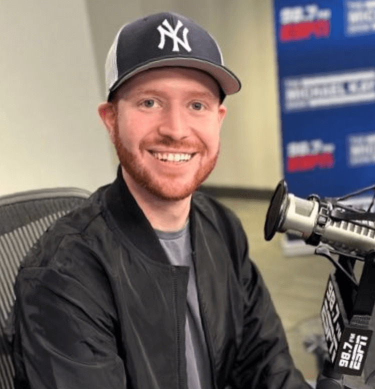
Jake Asman [shown at right]: Yeah, so my understanding on it is that the current jerseys they have now will not be active for next season. I was told since last summer by a couple of people that the Jets have wanted to change the current jerseys and that they want the throwback that they introduced this year to become their new primary jerseys. They’ll add a Kelly green jersey to complement the white ones that they already introduced.
UW: The people who told you that, are they people with direct knowledge of it, or did they just hear it from someone else?
JA: I was told by a couple people. One is actually a team employee who told me last year that they were going to have the legacy jerseys introduced as a throwback [for 2023]. He was right about that, so I figure he’s right about this as well.
UW: If you heard about all this last summer, or over the course of however many months it’s been since then, why didn’t you speak up then? And what led you to speak up yesterday?
JA: I’ve actually spoken up a lot! I’ve said it on my YouTube show lots of times, that the Jets’ plan is to make the legacy jerseys their new permanent uniforms, and then they’ll add a green one to it. I just never tweeted it until now. But when I saw the jerseys were priced at half off, I’m like, “That kind of backs up everything I’ve heard, so I’ll put that out there.”
If you actually go back to when they introduced the legacy jerseys last year, the catchphrase on their website was “Rep What’s Next,” which seemingly implies that this is what’s coming next — like, they already had this plan in place. And that matches up with what the owner, Christopher Johnson, said to my buddy at the Hall of Fame ceremony last year.
UW: You’re referring to the guy you tagged in your tweet, @Bklyn929, right?
JA: Correct. I was standing right next to him when he spoke to Christopher and Woody Johnson. I didn’t actually hear the conversation, but I definitely saw him talking to them, and then he told me what they said, which is basically that they’re going to make the legacy design permanent.
UW: As you mentioned, if this happens, they’d have to add a green jersey to the mix. Do you know if they also have any plans to add a black alternate version with that same basic design?
JA: I have not heard anything about that. All I was told was that the current jerseys are gone and that they’ll introduce a green one to complement the current white legacy.
———
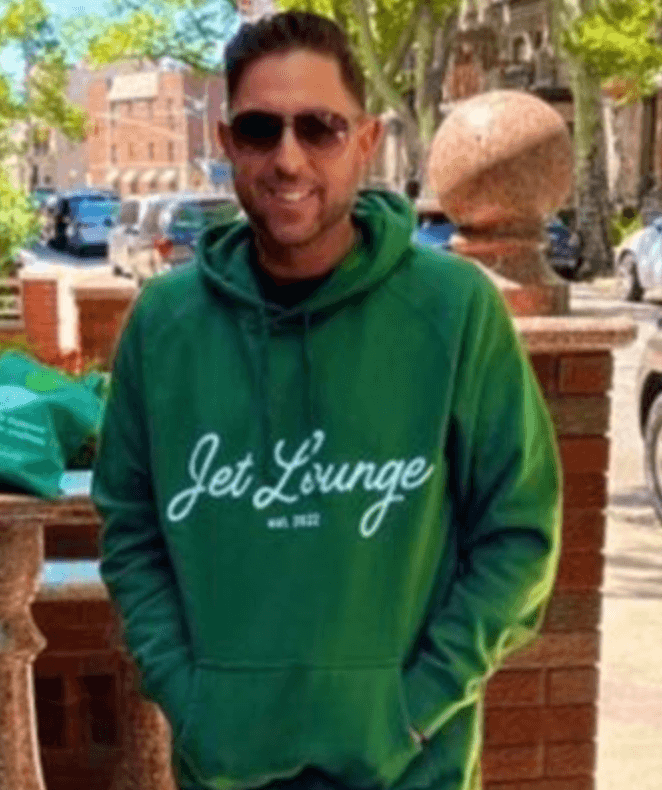
So that’s Jake Asman. Shortly after I spoke with him, I got a call from @Bklyn929, whose real name is Steven Berkowitz. Here’s a transcript of our call, edited for length and clarity:
Uni Watch: Could you tell me what happened in Canton last summer, and how you found yourself talking to Chris Johnson and Woody Johnson?
Steven Berkowitz [shown at right]: Me and some other friends, including Joe Benigno [a longtime NYC radio personality and big Jets fan], we all drove out together to Canton. Revis was about to get inducted, and Joe and I walked through this one entrance, and there’s Chris Johnson and Woody Johnson with a couple of security guys.
UW: So you basically just bumped into them?
SB: Correct. So Joe introduces himself to Woody, but Woody knew who he was. Meanwhile, I’m talking to Chris. Now, I think the current uniforms are disgusting — it’s like a high school uniform or something. So I’m thinking, I’m never gonna get this opportunity again to voice my displeasure for these uniforms to the owner. So I point to someone standing near us who’s wearing one of the current jerseys, and I say, “Hey, Chris, these uniforms — these are not good.”
And he says, and I quote, “Yeah, I know, I get a lot of blame for these.” So he clearly knew the current uniforms were a mistake. He says, “It wasn’t me. I didn’t make that decision.” And then Woody kind of jumps in, sort of defending his brother, and he says, “I’m the lord of the uniform updates.” So Woody is basically saying, “If you’re gonna blame anybody, blame me.”
So then I look at both of them, and I say, “Well, guys, the five-year rule is up, and people love these,” and I’m pointing to the Gastineau throwback that I’m wearing. And they were like, “We know, we know, we know that.” And then they smile and Woody says, “Don’t worry, don’t worry, you’re gonna like ’em.”
So they didn’t specifically say the throwback will be permanent. But they pretty much acknowledged that the current ones are bad, that the throwbacks are better, that the five-year rule is up, and “You’re gonna like ’em.” That pretty much confirmed it for me.
And I’ve made it clear on Twitter, I said listen, they didn’t confirm legacy as the permanent. But they definitely confirmed that there will be a change, and they liked the legacy.

———
And there you have it. While none of this proves anything conclusively, it certainly provides a lot more context.
Speaking of which: A bunch of Jets blogs have run with these rumors, but not a single one of them bothered to track down Asman or Berkowitz for an interview (just like nobody else bothered to interview the guy behind the Broncos rumors). I’d like to think this is part of what sets Uni Watch apart — we actually do additional reporting and analysis, instead of just stirring the rumor pot.
As for the Jets, I hope all of this turns out to be true, because their current set is an embarrassment. The one thing that doesn’t quite add up for me is that the Jets’ throwbacks, true to their original era, don’t have the team name or city name on the chest. I find it hard to imagine the Jets — or most NFL teams, for that matter — making a uni change that didn’t involve a chest wordmark or patch, but stranger things have happened.
Meanwhile, if anyone knows more, feel free to contact me here. Thanks.
• • • • •
Phil will have at least one article later this morning, so come back for that, and then I’ll see you back here tomorrow. Enjoy your Sunday! — Paul
I have been a Jet fan since 1975 and, although I still prefer the Joe Namath era uniforms, I will gladly accept the 1980″s style as a major improvement. Perhaps a Joe Namath throwback twice a year. One green, one white.
I prefer the Namath era fauxbacks that the current set replaced, but if this is true, it’s great news. The Jets look awful.
I was thinking, if the Lions won the Super Bowl would they scrap the new uniforms. Not superstitious but it would be hard to ditch the set you just won in especially after the drought Detroit has faced. Are the Rams the last team to get a new set the season after winning (99)?
Yes; they’re the last, and only, franchise to do that.
The Houston Rockets won back to back NBA titles in their glorious ketchup and mustard uniforms…then came out the next season with those awful blue pinstriped angry rocket unis.
Yes! And a more offensive spectacle I cannot recall!
Those pinstripes made Charles Barkley look like a zeppelin instead of a rocket……..
link
Different league of course, but I believe the Cavs also had their uniforms overhauled following the 2016 championship.
Paul, It might be interesting to see a list of how many times this has happened across all major leagues. On the other hand, are there any known cases of teams scrapping a redesign that was to be released the next season because of winning a championship in the planned last year of their current design?
Cavs were the season after that (2017-18). What’s interesting about the Cavs though is that the 3 updates before the most recent one all happened either the season before or after LeBron joined the team.
Clarification: before or after Lebron joining or leaving the team.
Also a different league but the Pittsburgh Penguins won 2 consecutive Stanley Cups wearing the skating penguin uniforms and changed to the robo-penguin the following season.
I’m no fan of a lot of recent attempts to modernise unis, but am getting fed up with teams just reverting back to throwbacks as full time.
Not just football, but the likes of Calgary Flames, New York Islanders etc, where teams go down a blind alley, and rather than try and find another way, they just go for the retro look completely making every game looks like a throwback event.
I welcomed the Jets attempts to modernize 5 years ago. Yes – they missed the mark (the bad logo, the wings, the text on the jersey) – but I’d rather they had another go. Save the Sack Exchange for a couple of throwbacks, but try and create a new take that could be thrown back to in 30 years time.
A couple of people have mentioned soccer – I hate new kits every year, but it does force teams to try and do different things. Some years it works, some years it doesn’t, but you see kits and brands evolving. As a fan, I won’t buy a shirt every year – just when there is one I like. They are out of date within a year, so I’d rather wear a classic than try and keep current!
“I’d like to think this is part of what sets Uni Watch apart — we actually do additional reporting and analysis, instead of just stirring the rumor pot.”
Absolutely 100%…this!
Great follow-up Paul – and terrific news if this is true.
Great reporting. Paul…a Sunday blockbuster. I agree with others that while this is a big improvement, Namath era would be best. When I remember the Sack Exhange, I always remember the version with thicker stripes…you can see both in this photo. Is this really inspiring design though? The Jets have set the bar real low.
link
The Namath (1965-77) and Parcells (1998-2018) kits have always been a vastly superior design; this one is about as plain and simple as you could get, but then again, so is the Raiders’ design and it may be the best in the NFL.
The biggest issue with the Namath/Parcells design is the shoulder/sleeve treatment, which was designed for 3/4-length sleeves in 1963. Both Nike and Reebok struggled to replicate it with modern tailoring; Reebok moved the shoulder stripes up way too high (link), and Nike just couldn’t squeeze in its maker’s mark and TV numerals on many players (link).
That said, I’ll join the chorus here in saying that although I’d prefer the Namath/Parcells design be the primary, I can deal with it being the throwback/alternate behind the 1977-89 design. And NO BFBS!!!!!
My thoughts exactly, the striping just doesn’t work on the current templates. I also prefer Parcells Namath style but this 1a so I’m pretty happy.
I don’t think they were trying to make the shoulders to be exactly like the Namath ones anyways…
Great interviews, Paul! You 100% correct, the extra work you put in is why I’ve been reading Uni-Watch for 20 years. Thank you.
This is one rumor I hope is right.
Completely agreed. This story typifies why Uni Watch has been my #1, go-to site for information and entertainment for a long time. Which raises a point that I’m sure has been on the minds of many of us readers since Paul’s announced pretirement.
Paul, are Phil and Jimmer going to have the time/ability/access/desire to research, write, and publish in-depth articles of this quality? Are you introducing them to your contacts within the uni-industry? Teaching them the ins-and-outs of how to churn out the caliber of investigative writing for which this site has become synonymous? Inquiring minds want to know.
^THIS^ Paul, any interest in commenting?
I haven’t yet had time to do any direct training (although Phil and I frequently talk about how to approach things, how to maintain standards, etc). It’s difficult to do that while still, you know, turning out stories like this one.
But look: I’m a professional journalist with a decades-long résumé that includes writing for the NYT, WSJ, lots of national magazines, etc., etc. I’m not saying that as a way of boasting; I’m saying that Phil and Jim don’t have that same kind of background, so some things may change after I’m gone. But I’m pretty sure that they, in turn, have other strengths that I don’t have. Will those things balance out? I suspect everyone will have their own answer to that question. In short: We’ll see!
I should add, though: While this article took a bit of time to put together (on a Saturday, no less), it didn’t require any inside contacts or special investigative skills. I saw the tweets that the rumors were based on, reached out to the people who tweeted them via their publicly available contact info, had a short phone chat with each of them during which I asked them very simple questions based on my own curiosity, and shared transcripts of those phone chats.
It’s not really that hard — which makes it all the more pathetic that all those Jets blogs were too lazy to do it themselves.
To add to what Paul said.
First, there is (as I frequently tell him) ONLY one Paul Lukas, with his amazing abilities and a way to dive deep into the athletic aesthetic. I have watched and learned him hone his craft over the past 15+ years as Deputy Editor (well, first as Bench Coach, then Weekend Editior). I will endeavor to meet Paul’s highest standards and continue to provide quality uni-related content. But there is only one Paul and all I can do is hope to approach the same level of excellence that attracted all of us, including me, to Uni Watch.
I *do* have graduate school experience in Journalism (although unfortunately remain 3 credits short as my original final thesis/project did not meet expectations, and discouraged, I did not complete the degree. I also have a Masters in Library Science and Information Services (and while not uni-related, focused deeply on research and attaining information). For about a year, I also wrote for The Sporting News. And, obviously, I’ve worked under Paul’s tutelage for more than a decade and a half.
I don’t 100% know Jimmer’s professional background, but I know that he, too, has experience in journalism and sports broadcasting. And he’s been a reader, writer and major contributor for almost as long as I’ve been Paul’s BC/WE/DE.
Over the next several months I’ll be working closely with Paul to make the transition as smooth as possible and I’m confident he’ll provide me with the tools to maintain UW’s high standards.
Paul has built an incredible community, one of which I am extremely proud to be a member. Together we can continue Paul’s legacy as he passes the reins.
“(well, first as Bench Coach, then Weekend Editior)”
– Uh oh. The Weekend Editor doesn’t know how to spell “editor.” We’re screwed. ; )
HAH! Touche. Should always proofread my comments before I hit submit!
Paul, I remember reading your pepperoni article in WSJ years ago, but now, even googling what you wrote for WSJ, have I realized that was yours!
Jets, Jags, Browns: all Nike-era flops. Hoping they pick up on the fact that fans prefer a traditional looking uniform, but they probably won’t.
You hit the nail on the head. Any modern take on a uniform will eventually look outdated. That’s what makes a classic standard look so clean. Not sure why these teams get so antsy with their look.
I also believe too often success is associated with how good a club looks. Sims/Sanders era Lions looked great but didn’t win much. Browns (in their classic duds) in the last 30 haven’t either. But those teams have always looked great. But we don’t always tend to regard them as we do Green Bay, the Raiders, Chicago, etc.
I’d argue even a uniform like the Bledsoe era Pats uniforms with the vertical soccer stripes might have a nostalgic feel for their fans as a throwback; but I’d be surprised to see anyone clamor for them to go back to those full time like we see with Pat Patriot.
Bucs too. Maybe the Titans are next.
It’s pretty stunning how many of these Nike efforts have fallen flat on their face. They really need to take a look at their design team.
I think this documentary from a few months ago really shows what the problem is. Towards the end there’s a segment on how nike designs new uniforms, and it really seems like design by committee / too many cooks / formulaic process / trying to be different for the sake of being different / showing off new Nike things / etc. Sort of similar to how I envision the disney star wars movies were written. I’d guess most of the classic uniforms from the past were designed with a very different process, by far fewer people.
link
Also, today’s uniforms are designed using super-powerful software, rather than “by hand” as it were. Oftentimes, what looks good on a monitor doesn’t translater particularly well to the real world. Even when a new jersey (uni) is produced, we’re not shown how it will look on the field, but rather some type of hype video with quick shots and partial looks. Not that the design of the uniform wasn’t tested on a field (indoors and out), but that was probably one of the last parts of the process, after any major glaring errors or difficult-to-read numbers/designs were already baked into the pie. While I’m sure designers want their designs to look good in live action, I’m sure there is also a small part of them that want to be sure it looks good “for the fans” who will be paying huge sums to wear said products.
Just my $.02. YMMV
To Phil’s point, the Jets’ tapered bicep-collar stripes are a good example of this; something that might make sense in 2-D but doesn’t work in 3-D. Those just don’t look good from any angle and often get twisted out of shape on their way around the shoulder. Just a bad idea from the get-go. .
What is this “5 year rule” bullshit? Teams should be able to shitcan a turkey of a uniform at any time. Someone is in charge who should not be in charge.
Fans, distributors and retailers don’t want to be stuck with outdated merchandise…
If Euro soccer teams can change annually, so can the NFL
It can, but it doesn’t since it’s so reliant on merch sales, which I don’t think Euro soccer teams are. Euro soccer teams also have ads on their jerseys, which the NFL [still, mercifully] doesn’t (apart from the NFL shield and maker’s mark). Given the choice, I’ll take the “five-year rule” and no jersey ads vs. a new jersey every year with ads.
Nike hates us all and wants us to suffer under their oppressive visual tyranny with the league cashing the checks and colorushing us into uniform oblivion……
But what the hay, that’s just one man’s opinion….
Maybe the current jerseys are on clearance because nobody wants to buy them. Seriously though, this would be a very positive change. When the current set was introduced I almost thought it had to be a joke. Even the worst NFL redesigns showed more effort. Bad unis, bad football.
“plus former Jet Derelle Revis was getting inducted”
Edit: Darrelle
Thanks. Fixed.
I’ve never been a fan of wordmarks on football jerseys.
IMO even more so than the black and the logo this is the worst part of the set. It really makes the Jets look like a D3 school. Honestly losing that that would have made the set tolerable. Still glad it’s going away.
Great job as always…I too also hope this means a Namath-era throwback is coming.
I actually like the shade of green they use right now, especially on the green helmets. I would hope they keep the colors, ditch the design.
Also, Stephen Ross, are you listening??? Go back to the classic Dolphins uniform and ditch the AquaFresh Dolphin!
Another likely change for next year, the Eagles *should* be updating the wordmark under the collar. When they changed a couple of years ago, they said that even that small change was subject to the 2-year-lead-time rule, so we wouldn’t see change till 2024.
Haven’t said anything since, and I don’t think it’d trigger any large discounts since it’s so minor (to everyone besides us.)
I feel the so-called “Sack Exchange” uniforms are the dullest, most uninspired set in NFL history. They look like something the opposing team wears in a Gatorade commercial. I can’t think of a uniform that better exemplifies how in the uniform world everything old is considered better looking than anything new, regardless of how boring or generic it may look.
Which is why the 1998 uniform change was so welcome.
SI didn’t deserve you Paul. Better reporting than any AI could possibly accomplish.
…and this is why I trust this site over just about anything else I see out there! You guys are the best at getting down to the real story! As a Jets fan, I really hope this is true, though I’m a big fan of the Kelly green uniforms from the late 90s that also incorporated black outlines on the numbers, but if I can get this logo back (the only logo I wear on my various Jets hats), I’m a happy camper!
Since I don’t think we are totally dumping the black this might be where we end up. Still an improvement.
This is great news, but the Jets are getting this wrong. The Namath/Parcells era uniforms should be brought back as their primary uniforms with the white helmet. The sack exchange uniforms should be their throwback/alternate with the green helmet as their “alternate helmet.”
As a result, the Jets retain their classic look while sprinkling in a memorable era a few times a year.
Yeah, hopefully it will have white helmets for the new design, since it sounds like a hybrid is coming, not just a full “sack exchange” return…
So in summary:
– Ownership agreed that the current jerseys are bad
– Suggestion was given to Ownership to go back to the throwbacks full-time
– Ownership said “Don’t worry, you will like the new look” (referring to new uniforms)
How did that turn into a definite statement that the Jets are using the throwbacks full time next year (“It’s a done deal”). This is why you can’t trust any twitter feed as real news (even for someone in Media).
I bet they have a “Throwback inspired” uniform set that won’t be as good as the current throwbacks.
That’s just the story from Steven Berkowitz.
But you’re ignoring the part where Jake Asman said he was told by a team employee that this is happening. Asman is the one who said it’s a done deal, not Berkowitz.
That doesn’t mean it’s definitely happening, but it means there’s more to the story than the part you’re dismissing in your comment.
I think, also, the fact that the 2023 throwbacks (“legacy white” or whatever) are not marked down on the team shop website, strongly suggests that these are sticking around.
Obviously, most of us would prefer that the Namath/Parcells kit be brought back as the primary and the Klecko kit be the alternate/throwback, rather than vice-versa, but for now we’ll take what we can get. Getting rid of the BFBS alone is a huge improvement.
Personally I felt the Namath era jerseys had become very stale and antiquated, and more than anything else-DULL! I appreciate what they represent, but they ran their course after the second iteration which came in late 90s under Parcells.
The redesign of 2019 tried to do too much, had they simply brightened the shade of green (Gotham Green), incorporated a contemporary, but clean number font (well executed) and typography and reintroduced green helmets without that Ridiculous oval logo and stopped there they would have been more well received. However, the large “New York” over the numbers, BFBS, and ridiculous “wings” extending from shoulders to front of jersey was simply too much. Beside the actual JET plane with the word “Jets” written inside of it, the only JETS logo that matters is the JETS wordmark logo with Jet wing logo extending from the J over the wing. Says a lot that prior to 2023 this logo has not been used in an official capacity since the mid 90s, yet JETS fans have never let it go and it still found resonance with players and coaches from every Jets regime since that time. It’s perennially contemporary without being unnecessarily loud. That old oval drew me nuts, a non-football shaped football like oval with NY and Jets with another football like, but not quite football shaped oval inside of it-what a terrible convoluted uninspiring “logo!” Please don’t ever return again!
tommwatkin, That is what I interpreted from all the interaction, quotes and speculation from all involved…
….that a new uni, based on “throwback” or “sack exchange” designs, will be coming this year, not just a straight return of any era…
maybe it will have too much of an Nike “update” angle, like you (and many others) may fear….
…hoping the helmet is white with a jersey/pant set that has a classic feel…..
Noticed Chris Johnson’s hat in the pic had the 1963 Jets helmet logo with the airplane. Could that be a hint that along with making the Sack Exchange uni the primary they’re also going to bring out a 1963 throwback uni? Hmmm…
I hope they keep the current helmet and face mask. I don’t like white face masks. The helmet looks clean and professional while incorporating most of the Namath era logo minus.
The Namath unis are so very obviously the correct choice if they’re going to wear a throwback. The Sack Exchange unis are an improvement over the current set but they would still leave a lot of people wishing that they would have gone with the tried and true Namaths.
I used to like the Namath era uniforms better than the “Sack Exchange”, but I realized that it wasn’t the uniform I liked better, but the nostalgia of that being my favorite Jets team. I also like an all white uniform, including helmet. However I love this green helmet, along with this “Jets” logo, better! And there are 5 white helmets in the NFL, 2 in the AFC East, whereas only 2 green helmets. And I prefer the Jets green over the Eagles dark green. So what I’m saying in a rambling way is that I now like this “Sack Exchange” uniform best for the Jets. I hope this happens.
I would love that. They’ll still draft crappy, throw a 40-year-old behind a crap offensive line, come into the year with big expectations, then completely crap the the bed, but they’ll look great doing it.
I agree. I love the metallic green on the helmet.
I agree – with me ; )
Don’t forget, the Broncos were the team that changed their uniforms to much chagrin of Broncos fans in 1997, and went on to win the next 2 Super Bowls. I don’t see the Jets or Broncos doing that with a uni change this offseason into next year, but very possible for the Texans and Lions.
I, for one, would welcome the full Sack Exchange unis back (even with white face mask), as their “modern” unis are in the minds of many, an unmitigated disaster.
As others have opined, the Namath-era unis would be preferable, but as Rbk & Nike have both shown, they can’t figure out how to force a template designed for three-quarter sleeves onto today’s minimalist canvas. But the “Sack Exchange” uni — as we saw with last year’s throwbacks — doesn’t suffer from this same limitation.
The second iteration of the Namath unis featured a green that was far too dark — basically olive/hunter, and didn’t look as good as they could have. Had they gone with the more kelly green (link) shown on the Color Rush uni, I would have preferred it.
The ONE thing I liked about the new Jets unis was the beautiful green helmet (and this is coming from someone who generally prefers matte or satin finishes), but it’s a glorious shade of green. If they do indeed make the SE unis permanent, this helmet should stay.
So long as the Jets are committed to the SE green/white ONLY (the unis went downhill once the team started adding black link), I’d be 100% behind this news.
The best thing about bringing the Klecko kit back is that there would be no green pants, and thus no mono-green option. And, hopefully, no white socks. The 2023 throwbacks looked fantastic with green socks; I expect a green-jersey variant would look even better. The Jets could suddenly become one of the NFL’s best-dressed teams week-in-week-out.
Klecko Kit…love that!
They wore it from 1978-89, which covers Klecko’s whole career off by one (1977-88), and I’m pretty sure he’s the only Hall of Famer to ever wear that uniform.
Good news. The huge “New York” on the front was awful. Just like the huge “ATL” and “Arizona”. No reason for any font to be that large.
This is what sets Uni Watch apart. Yet, this is not what we will get after May 26. Are you sure want to retire? You are Uni Watch.
Sorry, but I can’t stay. I think you’ll be in very good hands with Phil and Jim, though.
There’s absolutely no reason Phil couldn’t do this same story. As I’ve noted in another comment thread, it wasn’t hard: I saw the tweets that were at the source of the rumors, contacted the two tweeters via their publicly available contact info, had short phone conversations with them in which I asked very simple questions, and then shared the transcripts of those conversations. Simple!
The fact that the Jets blogs couldn’t be bothered to do this very basic reporting, and that this type of fairly obvious due diligence sets Uni Watch apart, really says more about those other blogs than it does about us. Doing a story like this *shouldn’t* be remarkable. I’m confident that Phil will still be able to do this type of thing (and lots of other types of things) after I’m gone.
“this is not what we will get after May 26”
Indeed — and I’ve privately said the same thing to Paul many times. I’m not him. No one is. But I have learned at the feet of THE BEST and I can assure you I’ll give you 100% in maintaining the high standards Paul has set. That, plus the fact that I share Paul’s journalistic ethics (and the support of an OUTSTANDING commUNIty) should help ensure the site he literally built with his hands will continue to produce high-quality reporting on the athletic aesthetic.
“…plus the fact that I share Paul’s journalistic ethics (and the support of an OUTSTANDING commUNIty) should help ensure the site he literally built with his hands will continue to produce high-quality reporting on the athletic aesthetic.”
And have a helluva time, eh?
link
5 years ago the Jets were about to go with a version of the legacy throwback, and it was being tweeted by Jamal Adams, both a green and white version.
The problem was that the Jets Atlantic Health training facility walls are COVERED in murals using the current typeface. Woody Johnson did not want to authorize a complete update of the signage and decor package both at the stadium, locker rooms, and training facility, and wanted Nike to find a way to incorporate the aesthetic style of the legacy uniforms but utilize the current typeface.
The result is the zero character template uniforms the Jets currently have, where the logo is essentially the typeface front and center.
Interesting. Do you have a cite for this?
I can provide the images that Jamal Adams had tweeted over 5 years ago, I remember being very excited about them then.
I can also send you numerous pictures from the Jets facility, they are extremely tied to the current word mark and type face. They actually commissioned the design of the font, Nitro Bold, and I can’t imagine Woody Johnson discarding it.
I have a source within the organization who I’m not sure would be willing to elaborate.
This is the same source who told me that one of the reasons the Jets explored new uniforms initially is that Nike has been unable to replicate the green Reebok used on the previous uniform set. Reebok used a hunter green that had a pearlized/shimmer effect in the fabric. Nike couldn’t replicate this and would render the Jets in a dull, almost military esque shade of green, very dull, and did not show up well on tv. It’s why the Jets began to experiment with Kelly/gotham green in the later iterations of the Color Rush uniforms.
“Nike has been unable to replicate the green Reebok used on the previous uniform set.”
I always figured it had something to do with that. What the Jets should have done is opted to use the Reebok template and fabric like the Packers did, which happens to be the exact same shade of green. It’s too bad because Nike did a better job with the shoulders/sleeves than Reebok did, and I’ll give Nike credit for coming up with a gorgeous shade of green (“Gotham green”) and a not-terrible numeral font (intentionally or otherwise, resembling the tail numbers on military jets), but there’s no excuse for the overall crap design they saddled us with for five long years.
“They actually commissioned the design of the font, Nitro Bold”
I believe that was part of the Parcells rebrand in 1998. .
Hey MG…sorry for the delay in replying; I had a curling Board meeting plus Sunday night league.
I’d LOVE anything you have on this and if you’re at all interested in working on an article with me, I think this would make for a fantastic deep dive/post.
LMK (phil.hecken@gmail)
Cheers!
Graf Zeppelin, you are right about when the font was commissioned, take a look at images of the Atlantic Health Jets Training Facility though and you’ll see how married the Jets and Woody are to the typeface. It really is everywhere, and would likely cost a fortune to completely renovate the decor package there.
This is what I mean when I say Woody would be hard pressed to discard it
I don’t think they’ll discard it, nor do I think they’ll need to, even if this (link) becomes the primary logo. Especially if they bring back the Namath/Parcells-era kit as a throwback. Plenty of teams use different fonts for alphanumeric primary logos and other wordmarks; see, e.g., Giants, Commanders, Kansas City.
I think the issue is that then the Jets will have 2 conflicting typefaces. I don’t see why they couldn’t update the 1980s era logo with the Nitro Bold lettering, I actually think it would make for a good update. I actually always thought the 1980s logo looked like it said SETS not JETS
Typefaces aren’t “conflicting”; they complement each other.
Again, the “KC” typeface on Kansas City’s primary logo/helmet decal (link) is a different typeface than the team’s wordmark (link). The Giants’ “ny” primary logo (,a href=”https://www.sportslogos.net/logos/view/919/New_York_Giants/2000/Primary_Logo”>link) is a different typeface than their “GIANTS” secondary/throwback logo (link).
One thing the Jets could conceivably do is continue to use the “NEW YORK” wordmark in the Nitro Bold typeface, whether combined with the “JETS” wordmark or on its own; like, for example, this logo which uses different typefaces for “TAMPA BAY” and “BUCCANEERS” (link). Or this: (link).
There’s no reason why a team can’t use more than one typeface in its branding.
How I wish this site had an “Edit” button……….
Those bygone days…
link
Great article, great comments. Really feel like a lot of people where my number 1 is the Namath/early Parcells era but this is basically 1a. Hopefully the black will be dumped as well but really looked like a different team when they wore these last year.
If the Jets go back to the “Sack Exchange” jerseys, then IMO they need to go back to the 80’s helmets, as the new helmets will not match.
As a lifelong Jets fan, I’ll chime in here:
The only good elements of the Jets’ current set: The helmet finish and the shade of green (“Gotham green”).
The legacy set is basically perfect. The biggest element is the ’80’s logo, which is by far and away the Jets best logo. I actually prefer this set to the Namath-era set, but that may be because I grew up in the late ’80’s and ’90’s.
I’d love: Sack Exchange set in both white and green. Third jersey: Namath era set in kelly green, with the second helmet being a white shell to match that set. Then their fourth option could be the ’80’s logo in green on the white shell to be paired with the white legacy set when they need to be “icy” or whatever.