Welcome back to the “2+3+2 (+2)” project.
Click to see: AFC East
Today we’ll tackle the AFC South.
If you want to see the genesis of how this project came about, please refer to the AFC East post.
To sum up, the project parameters are the following:
• All teams will have 2 helmets, 3 jerseys, 2 pants and 3 socks
• All uniform elements will be “interchangeable” (any combinations can be worn)
• Some teams will be given two options: current uniform and throwback (or fauxback/alternate)
• Opposing teams will wear different color elements (helmet/jersey/pant/socks)
• Home team will select its color combo, and away team will then select its combos. No elements can match opposing team
• To the extent possible, uniforms will be based on a team’s current available options. Where no such options exist, they will be created such that every team has 2/3/2/3 options.
• Where present home and road (and/or alternate) uniform template designs differ, they will be “streamlined” to have one single format/style in the 2/3/2/3 parameters
• Color vs. color will be permitted. The only exception is only one team can wear its “dark” jersey (the opponent can pair their color “medium” jersey vs. opponent’s “dark” jersey)
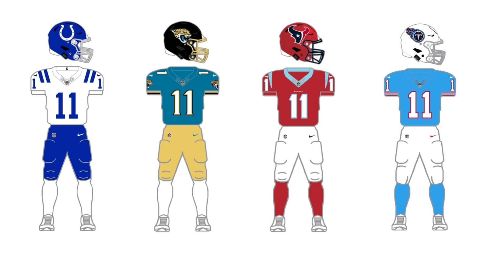
AFC South
INDIANAPOLIS COLTS
The Colts have a long history, and for the most part their uniforms have remained unchanged for decades. They are also one of the few teams in the NFL to just have two colors: white and blue. Until this past season, when the team introduced a new helmet and uniform, with the cringe-inducing nickname of “Indiana Nights,” the Colts were a jersey and a helmet away from the 2/3/2/3 project parameters. We’re just going to forget the new helmet and uniform were introduced (does anyone really think the Colts should have a black helmet as their alternate?).
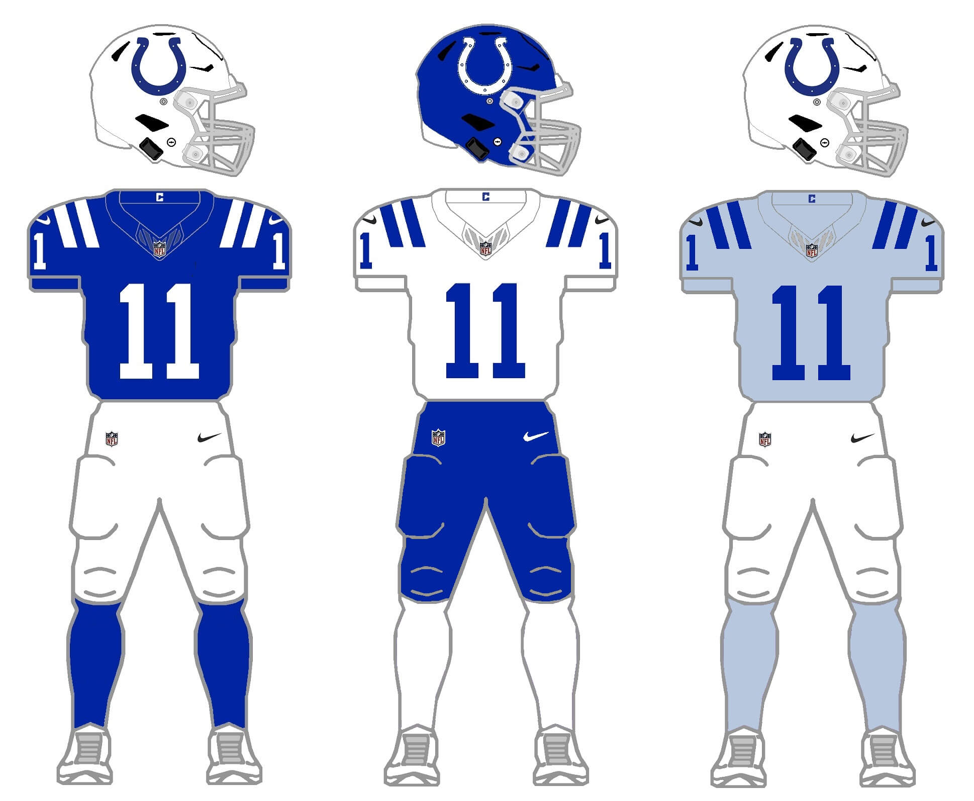
For my 2/3/2/3, I therefore needed to give the Colts a new helmet, and the obvious choice here is blue. It’s simply the inverse of their current helmet. Like the Jets (for whom I only had two colors, green and white) I needed to “create” a third color for a jersey and socks. Rather than go with basic gray (the team does have a brief history with gray pants and gray stripes), I decided to create blue-gray jersey and socks for their alternate color. I’d LOVE for them to add a blue helmet, but not the blue-gray so much.
JACKSONVILLE JAGUARS
The Jags have introduced more uniforms in the past two decades than any other team. In 2009, they replaced their (somewhat) classic uniforms with a new set that featured new fonts, odd jersey and pants striping, and — perhaps the best thing they ever did: introduced a new color-shifting helmet). Five years later, under Nike’s “artistic direction”, they introduced a very much reviled modern set that was pretty much universally disliked. Five years after that, they introduced their current set, a rather plain mix/match of black, “teal” and white, with a black helmet. So, if we keep them in their current uniform, all we need is a second color shell.
Current uniform
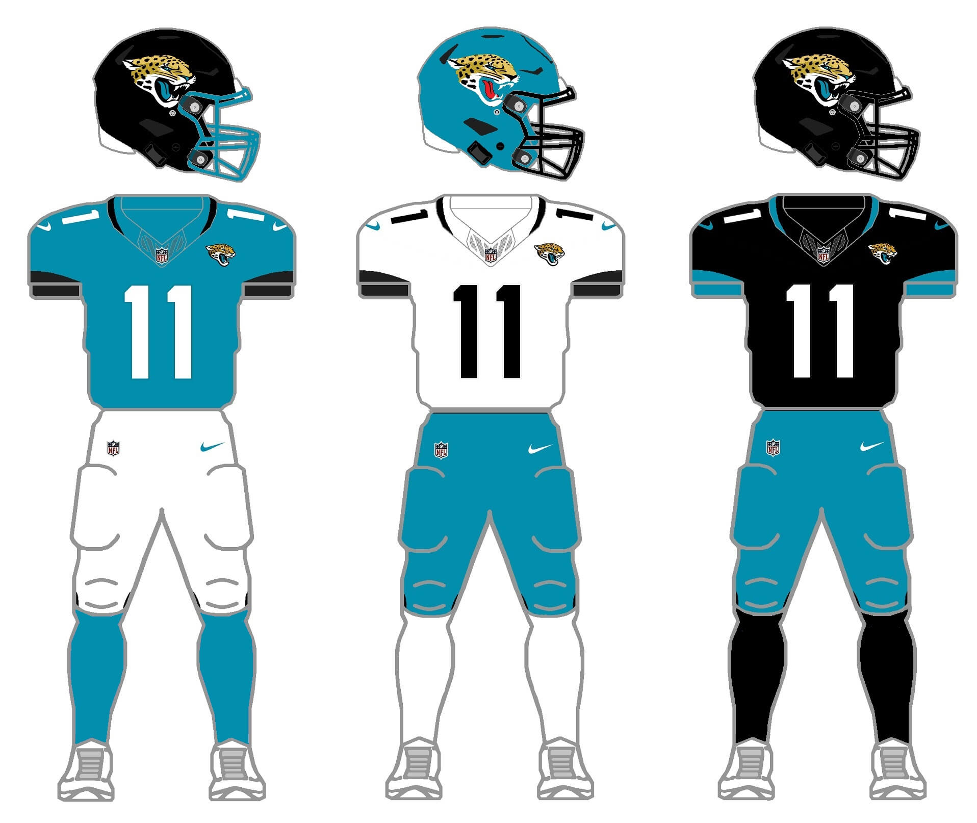
I added a teal helmet to mix/match with all their current combinations. That set was created for the 2018 season, meaning it has already outlasted the two prior iterations by a full season. So, it’s time for a change right? (I also got rid of the teal tongue on the Jags logo on the teal helmet, since real jaguars don’t have teal tongues.)
Throwback option
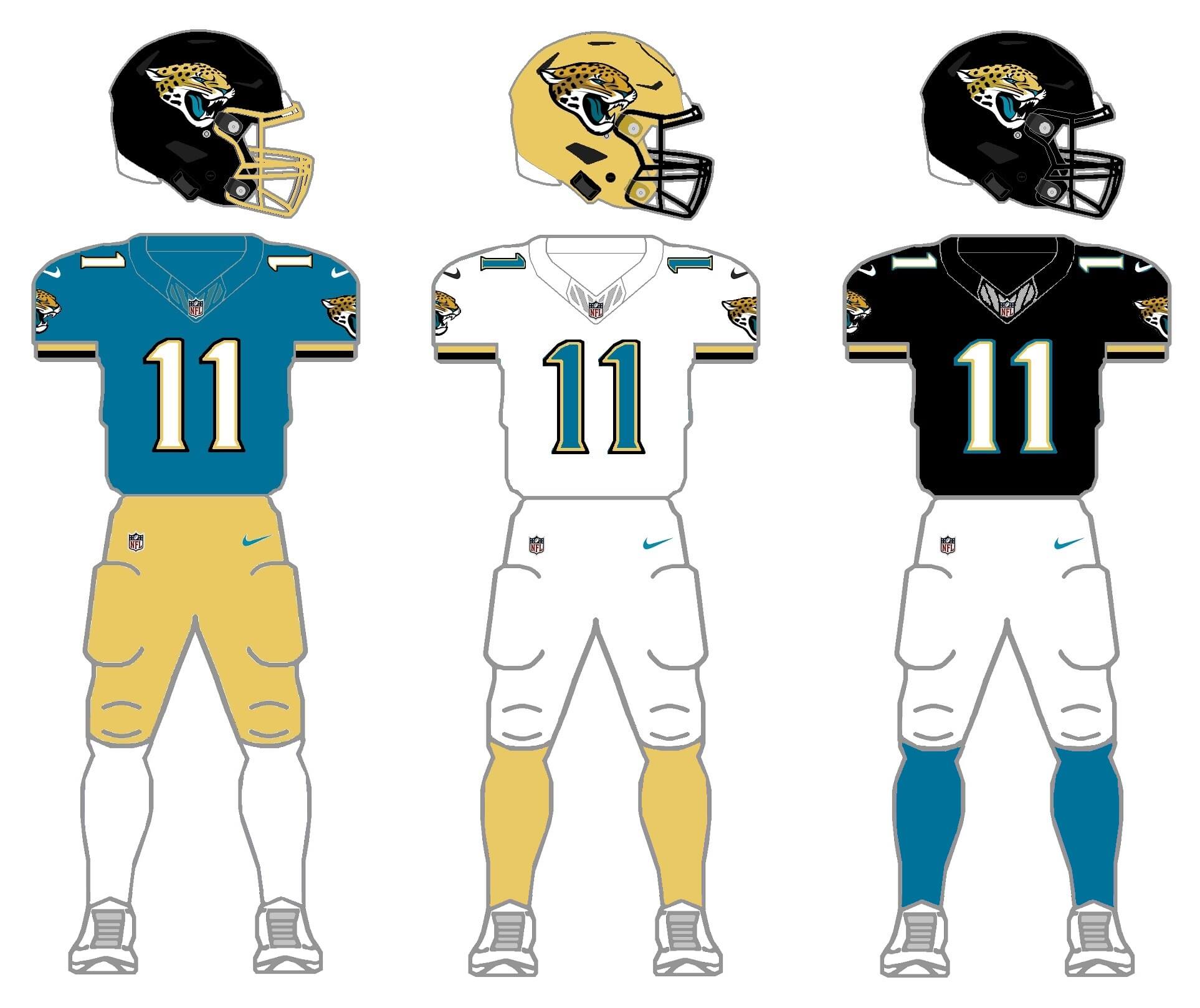
The team doesn’t currently have a throwback option, so I created one that’s based on their uniform circa 2000. They’d keep that template for a few years after 2000, eventually adding a black jersey and pants, and becoming a very black-heavy team. But I decided on an alternate path for them, emphasizing their more gold/tan alternate color found in the helmet… and well, the animal. (Incidentally, the team actually did make use of that alternate color with their universally reviled CR alternate). So for their secondary helmet I chose this slightly lighter gold color and created a new pair of gold pants. I stuck with teal, white and black for their jersey options, and went with white, gold and teal for the socks. The helmet would also have a gold mask option.
HOUSTON TEXANS
Despite being the youngest franchise in the NFL, the Texans have been surprisingly consistent and conservative over their life in terms of uniforms. In fact, they are basically wearing the uniforms they were born in today, but adding a red alternate uniform, CR uniform and an alternate shell (red helmet added last season). So they meet the parameters needed for the 2/3/2/3 right now.
Current uniform
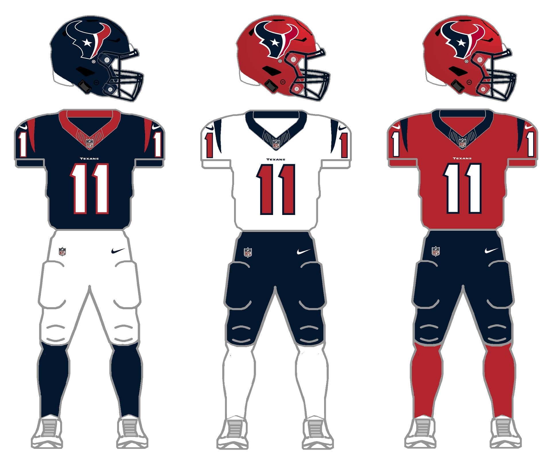
While I’ve never thought the Texans uniforms were great by any measure, they’re more than adequate, and when the team doesn’t go full mono- they actually look pretty good. And this past year they’ve really expanded their uni combos by wearing the red helmet with both the CR uniform as well as their all red alternates. If only the city of Houston could have left the Oilers colors behind, even as they moved the franchise north. Which leads us to…
Proposed alternate
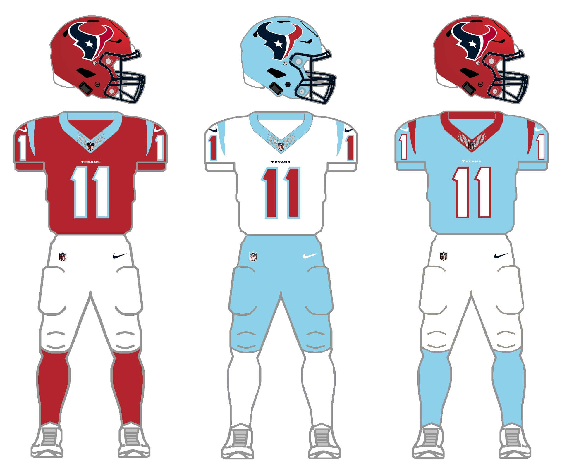
But what if the Oilers (Titans) had left their baby blues and red colors behind? Just for shits and giggles, I imagined what the team would look like in their current uni template but with those colors. It’s basically a swap of their current navy for powder blue. I kept the white and red jerseys the same (save for the powder blue->navy blue color swap), and replaced the navy jersey and helmets with light blue. There’s talk of the team redesigning for 2024 — and as we’ve seen recently, Houston still loves its baby blue. Perhaps something like this could be in order.
TENNESSEE TITANS
The Titans were another team to introduce a new uniform set in 2018, keeping their navy, light blue and white colors, but changing from a white helmet to their current blue lid. So, they’re due for a new uni set soon (I hope). And this past season, after years of fans begging for it, they brought back their Houston Oilers throwbacks to everyone’s delight. So — they technically have all the ingredients needed for a 2/3/2/3 project.
“Current” uniforms
For this entire project, I’ve tried to keep a teams current uniform (at least one of them) as it is. But this is one instance where I have to change their current uniforms.
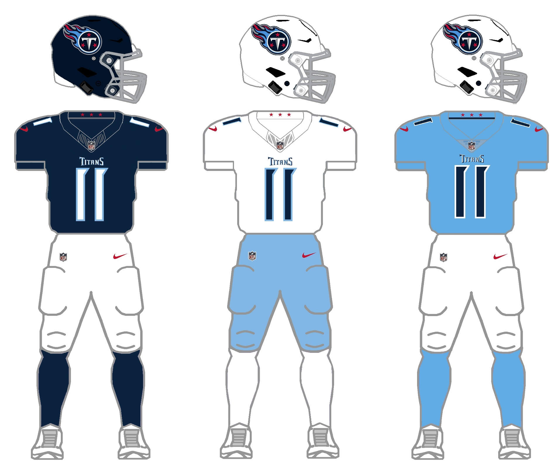
I have kept their current uniforms mostly in tact, but I have removed their ridiculous “sword yoke” on the shoulders, and (although it’s not easily seen in the mockups), their contrasting jersey panels, (and also — not shown — removed their two-color block “stripes” on the pants). I don’t love the uniforms with these slight modifications, but they look a lot better without them. But what about those throwbacks?
Throwback uniforms
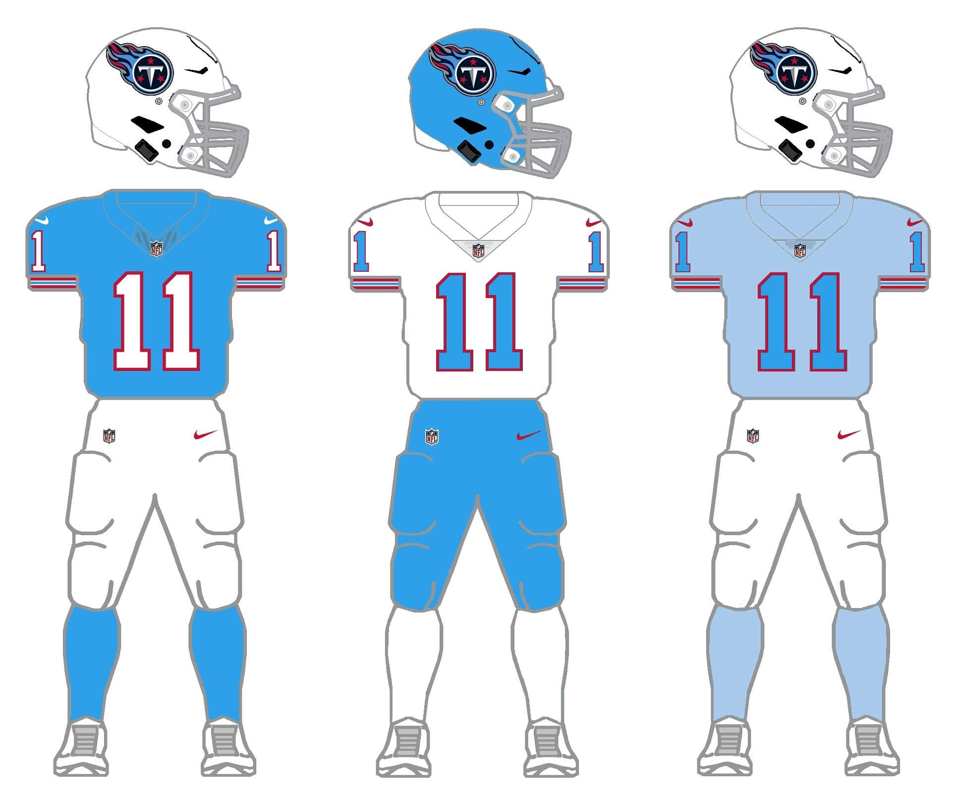
You know they need to do this. The throwback is currently just a home uniform, so I’ll give them white jerseys and blue pants, plus a blue helmet (which itself would be a throwback). All that’s needed is a new helmet and sock option. I could have gone red (as I did with the Texans, above), but instead I went for a combo of the blue and white jerseys, creating a jersey in a slightly lighter hue. I kept the current helmet logo, since they’d still be the Titans in this — just wearing the colors they wore when they moved to Tennessee. And if the Titans don’t want to embrace the baby blue, then the Texans should.
Thanks for indulging me, and I hope you at least enjoy the concept of 2/3/2/3. I’ll tackle the remaining five divisions in separate posts. Please leave any comments/suggestions/critiques in the comments below!
I actually like the sword yoke (and yes, I do pronounce the w in sword) on the Titans. There’s something about the two shades of gray, and it’s nice to have at least one uni in the league that harkens back to the yoke’s yesteryear. I typically don’t like yokes on dark jerseys as much, but this one works for me.
I like yokes too, including Tennessee’s. I think the jersey templates make rendering them properly more difficult, though I thought Dallas’s TX day jerseys were done well.
Thanks Marty. To each his/her own. I don’t like yokes in general, and the forced, gimmicky “sword” yoke is awful.
Count me as another member of the sword-yoke fan club. That and the navy helmet are the good things about their current design.
And of course I’d love that middle throwback option, Phil!
As to the question people ask, “Who should wear the Columbia blue: Houston or Tennessee?” I say, let them both have it. Multiple teams wear black, multiple teams wear gold, etc. No one owns Columbia blue…just make sure both teams don’t look identical.
Sword yokes and side panels on teams that have them need to go away they don’t really add anything and then depending on uniforms you might not be able to mix and match. Phil I love what you did with Tennessee that uniform looks so clean and 1000x better then the current one
Thanks, Christian! I find most of the NFL’s “modern” (2012-and-later, after Nike took over the contract) are overdesigned and try to be too clever by half. But just a couple tweaks here and there (as you’ll see tomorrow with the Falcons) and you can retain the essence of the new, modern look, but it still looks good. That might be an entire project for another day (“fixing” the modern sets), but I just can’t stand the Titans unis as is. If they ditch the superhero costume (mono head to toe) look, wearing contrasting socks, and ditching the little extras (shoulder yoke, side panel, pants “stripes”) can make a modern uni look good while keeping the modern feel.
This is a pretty tough division in terms of aesthetics. One team has only 2 colors (IND), one has been lost in the wilderness for 15 years (JAX), and one (TEN) looks best in the uniforms of the team now playing in the city (HOU) they abandoned.
IND: no real thoughts, although maybe this is a gray team, since light blues of various stages are all over the rest of the division.
JAX: I would love to see more gold in the mix. Other than the helmet logo, there isn’t any on the current set. Their best look (Brunell/Taylor/Boselli) had prominent gold trim. So where does the gold go? Well… in 1981, the Bengals shook up football aesthetics with the tiger stripes all over the helmet, but also big swatches of tiger stripes in the areas where stripes traditionally go on football uniforms: down the sides of the pants and around the shoulders (UCLA-style). How about some gold leopard/jaguar spots in a similar distribution?
HOU: pretty straightforward, either navy or Houston blue is fine by me.
TEN: Once the Tennessee Oilers ditched the derrick, they have always had a shoulder yoke, double blue, and unusual numbers. These elements are as much their calling cards as anything else. It doesn’t need to be a sword, which is gimmicky and does not translate well on TV, but a yoke would work. As far as the alternate goes, instead of Columbia blue and lighter light blue as a 3rd choice, how about a red jersey, white numbers and Columbia blue trim? For one, the Tennessee state flag is mostly red, so it isn’t out of nowhere. Also, call it “Battle Red” just to make the people in Houston lose their minds. But a red jersey would pair with either set of pants and either helmet.
Keep it coming, these have been great!
Thanks MJ!
I appreciate the critiques and thoughts — and I’m largely in agreement with everything you said. The Colts (forced) third color was done only for the purposes of fitting the 2/3/2/3 parameters; maybe regular gray is the better way to go with the Colts. Honestly, I want Tennessee to readopt the Luv Ya Blue kits or to let Houston have the powder blue. One team in that division should wear that color. Jax needs to return to something approaching the Brunell-era unis. Great analogy that they’ve been in the wilderness for 16 years. Appreciate the feedback. NFC South tomorrow.
Seeing you go blue grey for the Colts now makes me want to see them try baby blues. I know football doesn’t have the same tradition of just doing baby blue randomly, but I think the Colts could pull it off.
I do have a quibble on the Jags teal helmet, the red tongue really sticks out. Maybe just color flip and do it in black?
Thanks Rick
If the Titans and/or the Texans won’t incorporate baby blue…then maybe it’s up to the Colts to do so!
first throwback jags need black socks, then youre literally and figuratively golden
Yeah I thought about that (and actually tried it), but I’m trying to get rid of as much black as I can, and that includes socks.
Bring back the Jag’s gradient helmet /sarcasm
Another terrific installment, Phil!
Colts: “Rather than go with basic gray … I decided to create blue-gray jersey and socks for their alternate color.” Wish you would have trusted your gut instinct here and revived the gray, even though I loathed that period – save the horseshoe hip #’s. Can’t say I hate the blue helmet and pants option…Hmmm.
Jaguars: I thought it wise to eliminate the gold after the gradient experiment went awry, but your throwback makes me wish for its’ return. The teal helmet though? Pass.
Texans: It is a darn shame that they plan on blowing up their current neo-classic uniforms. But Phil Phil Phil Phil – dressing them in the colors of the decades-departed Oilers hues is just wrong-headed and wrong looking, particularly on their chassis. Grrrr! Think harder ; )
Titans: The thumbtack/Oiler mashup is some of your best work! Even the gray masks work here, especially on the baby blue bucket. However, the primaries suffer when Titan Blue is used – always have IMO. The ‘addition-by-subtraction’ with regard to the shoulder yolks was a good choice, but since I never liked the way the Titans use light blue I think the use of silver for the 3rd color may have been worth exploring – helmet and pants would harken back to franchise history, but it may be tough to craft an attractive jersey in that color.
Teal helmet and teal pants…YES and YES.
Always thought the Jags would look great with gold pants! Nicely done.