Welcome back to the “2+3+2 (+2)” project.
Click to see: AFC East
Today we’ll tackle the NFC North.
If you want to see the genesis of how this project came about, please refer to the AFC East post.
To sum up, the project parameters are the following:
• All teams will have 2 helmets, 3 jerseys, 2 pants and 3 socks
• All uniform elements will be “interchangeable” (any combinations can be worn)
• Some teams will be given two options: current uniform and throwback (or fauxback/alternate)
• Opposing teams will wear different color elements (helmet/jersey/pant/socks)
• Home team will select its color combo, and away team will then select its combos. No elements can match opposing team
• To the extent possible, uniforms will be based on a team’s current available options. Where no such options exist, they will be created such that every team has 2/3/2/3 options.
• Where present home and road (and/or alternate) uniform template designs differ, they will be “streamlined” to have one single format/style in the 2/3/2/3 parameters
• Color vs. color will be permitted. The only exception is only one team can wear its “dark” jersey (the opponent can pair their color “medium” jersey vs. opponent’s “dark” jersey)
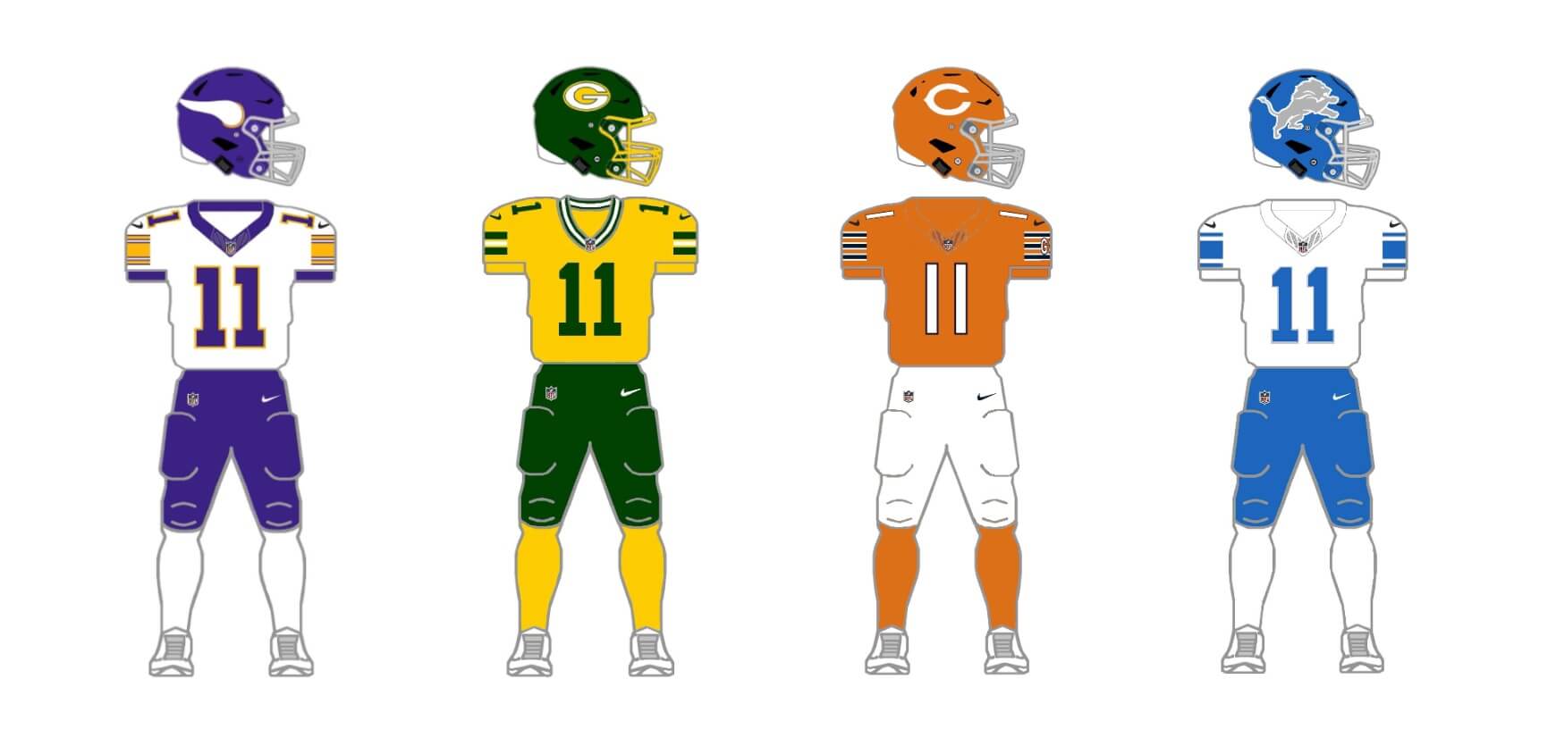
NFC North
CHICAGO BEARS
Da Bears have one of the more classic uniform sets in the NFL, yet actually meet the 2/3/2/3 criteria with their current helmet/uni wardrobe.
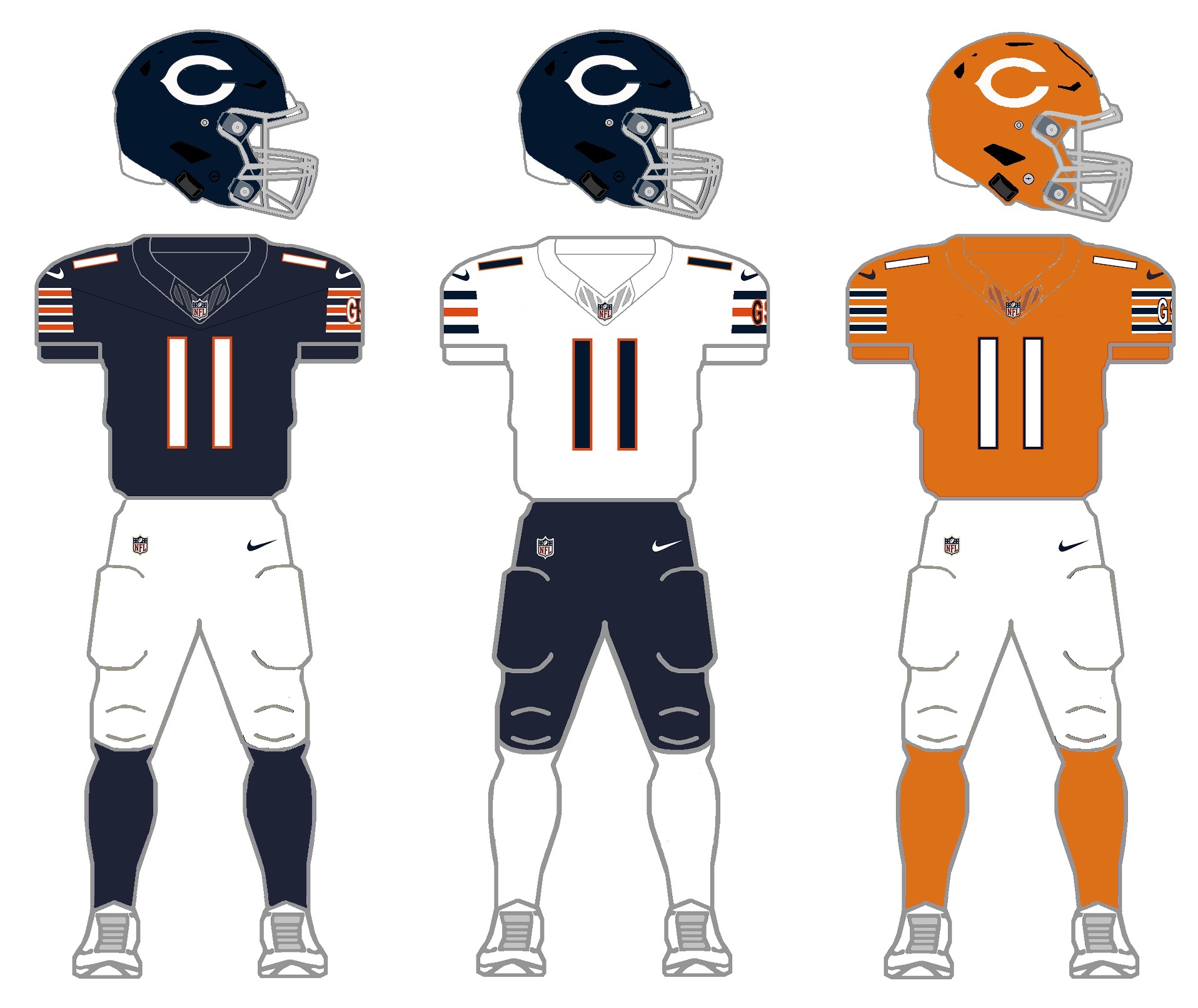
There aren’t many changes here — as noted the Bears already have the full compliment of gear to meet the project guidelines, with a midnight blue and (introduced last season) orange bucket. That helmet currently is restricted to use with their alternate orange jersey, (although the jersey can also be paired with their blue helmet). While there is nothing wrong with the orange helmet and jersey, per se, some feel the shade is too bright (and too reddish), and the wishbone “C” logo also gets lost. For the 2/3/2/3, I have slightly lightened the shade of orange on the helmet/jersey/socks, and on both the blue and orange helmets, the wishbone C has been changed to solid white (which is a harkback to the 1962-1972 era).
DETROIT LIONS
The Lions already meet the 2/3/2/3 parameters, after adding a new blue shell this season. There’s serious talk that the team will be redesigning their uniforms for 2024, but for this we’ll stick with their current sets. The team also has a throwback uniform, a very plain Honolulu blue and silver outfit with a logo-less helmet that goes back to the 1950s.
Current uniform
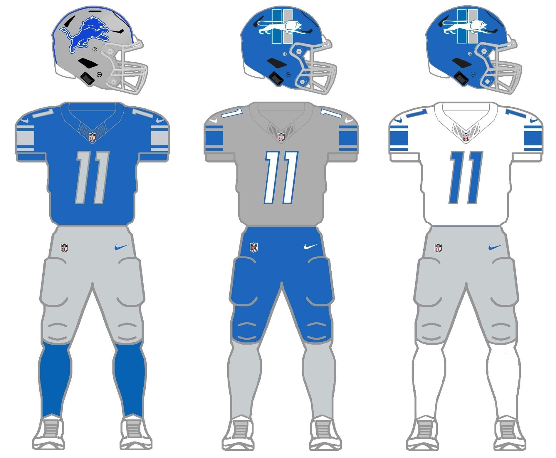
For this set, I eliminated the white pants the team currently wears, sticking with blue and silver/gray. The 2/3/2/3 therefore is silver/gray and blue helmets, blue, white and silver/gray jerseys and socks, and silver/gray and blue pants. The most annoying thing about this set are the “LIONS” and “WCF” (for William Clay Ford) wordmarks on the sleeve caps, which interrupt the striping pattern. In this concept, I’ve eliminated those, as well as the “90” seasons patch on the chest.
Throwback uniform
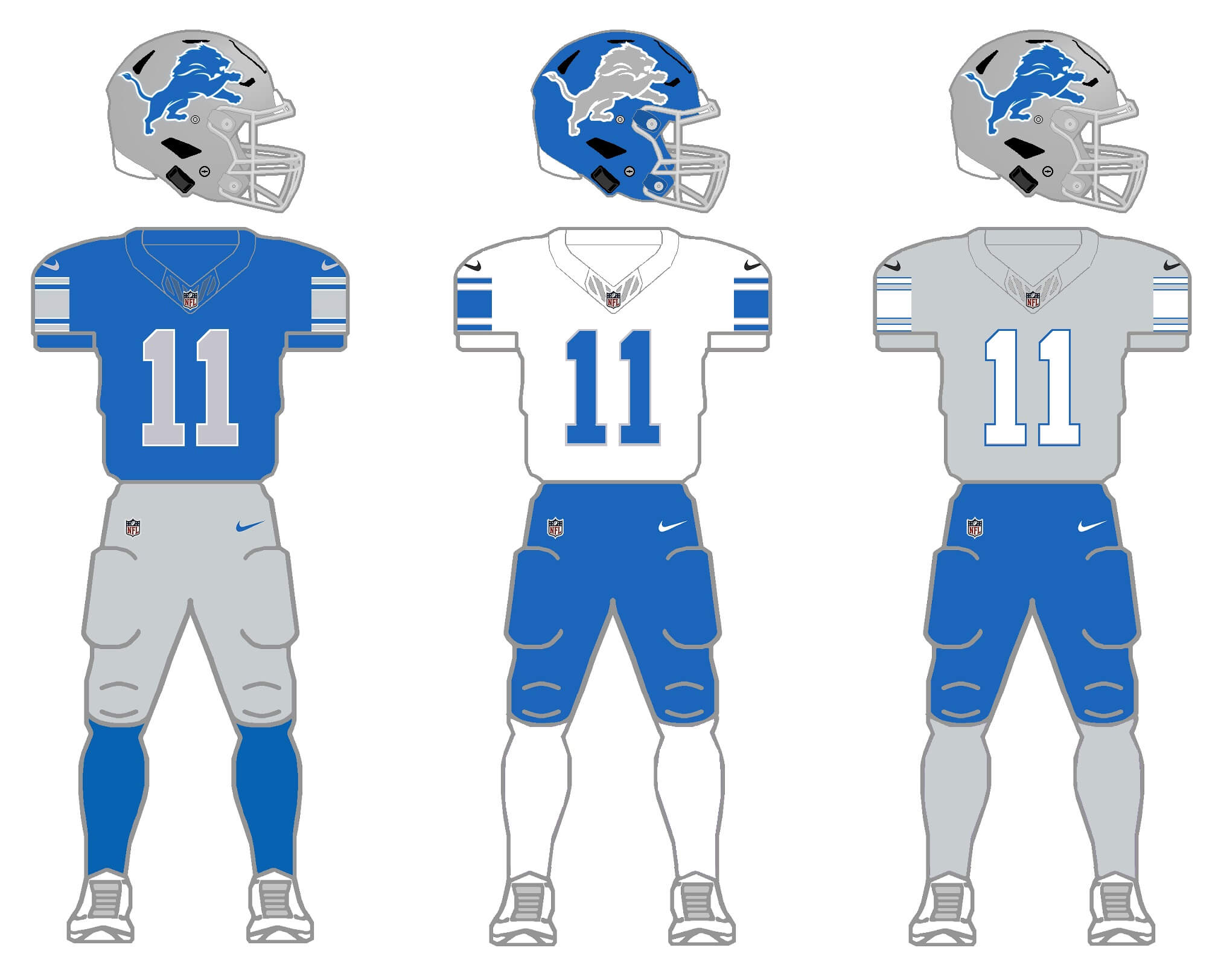
No, this is not their current throwback, but it should be. I created this to throwback to the Barry Sanders era. During Sanders’ time with the Lions, the team did have a blue pants option, so we’ll keep that here. To satisfy the 2/3/2/3 protocol, I added a blue shell (complete with a silver/gray logo) and a silver/gray jersey. When the Lions do introduce a new uniform set, this is how it should look.
GREEN BAY PACKERS
It almost feels wrong to shoehorn the Packers into the 2/3/2/3 parameters, as their classic home and road uniforms have, except for a few minor tweaks, remained basically unchanged for decades. Yes, they do have a throwback uniform, and at one time sported white pants (to fulfill their CR ‘obligation’). But for the most part, the Packers are gold/green/gold at home, and gold/white/gold on the road.
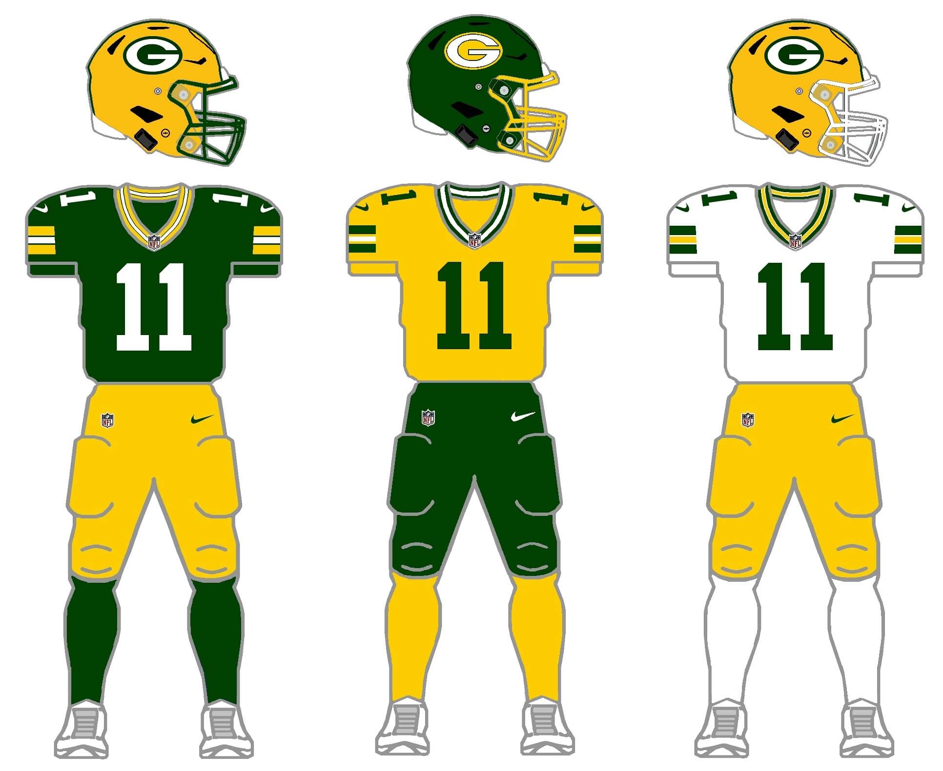
For this project, I need to add a second shell and a third jersey (as well as, technically, non-throwback pants). Amazingly, through their entire history, the Packers have never worn a green helmet. But we’re going to add one here, which will be basically the inverse of their current gold helmet. From 1947 through 1955, the team did have a gold jersey as an option — so that will be the “medium” color jersey in this set. Finally, a set of green pants, and a gold jersey to match the style of the white and green shirts. To spice things up just a tad, I’m giving the gold helmet a white cage option, and the green helmet will have a gold facemask.
MINNESOTA VIKINGS
In addition to their current set, the Vikings introduced a throwback uniform this season, to which they added a “Bud” (Grant) patch after his passing prior to the season. The team has only had a purple helmet (so a new one will be needed) as well as either purple or white jerseys, also necessitating a new third color.
Current uniform
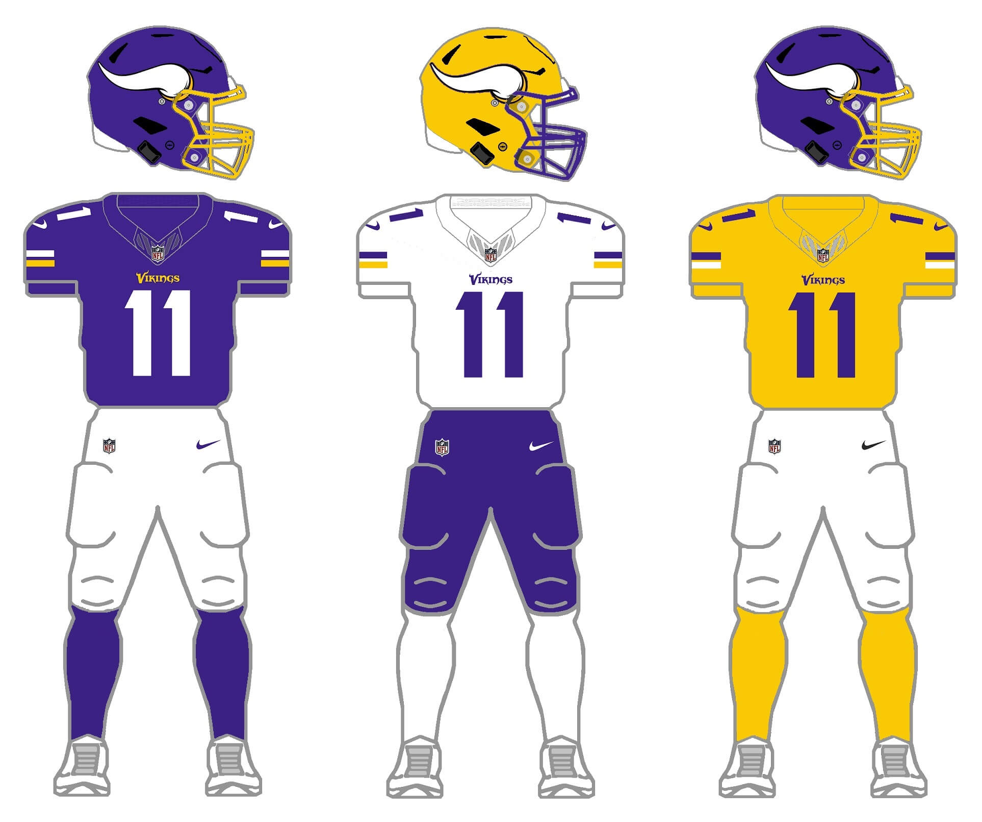
Unlike many, I think the Vikings current uniform is pretty good looking, with one glaring exception: the absolutely terrible font which is used for the first number of a two digit uni number. Single digit players and those with second digits get a more traditional rounded font (as seen on the top line). So, for this, I’m ditching that “sail” font. I also need to add a second color shell and third jersey. Besides white and purple, the only other color in the Vikings’ palette is gold, so we’ll use that for helmet/jersey/socks. For some reason, the current helmet uses a black mask, so I’m changing that to gold. For the alternate hat, the facemask will be purple.
Throwback uniform
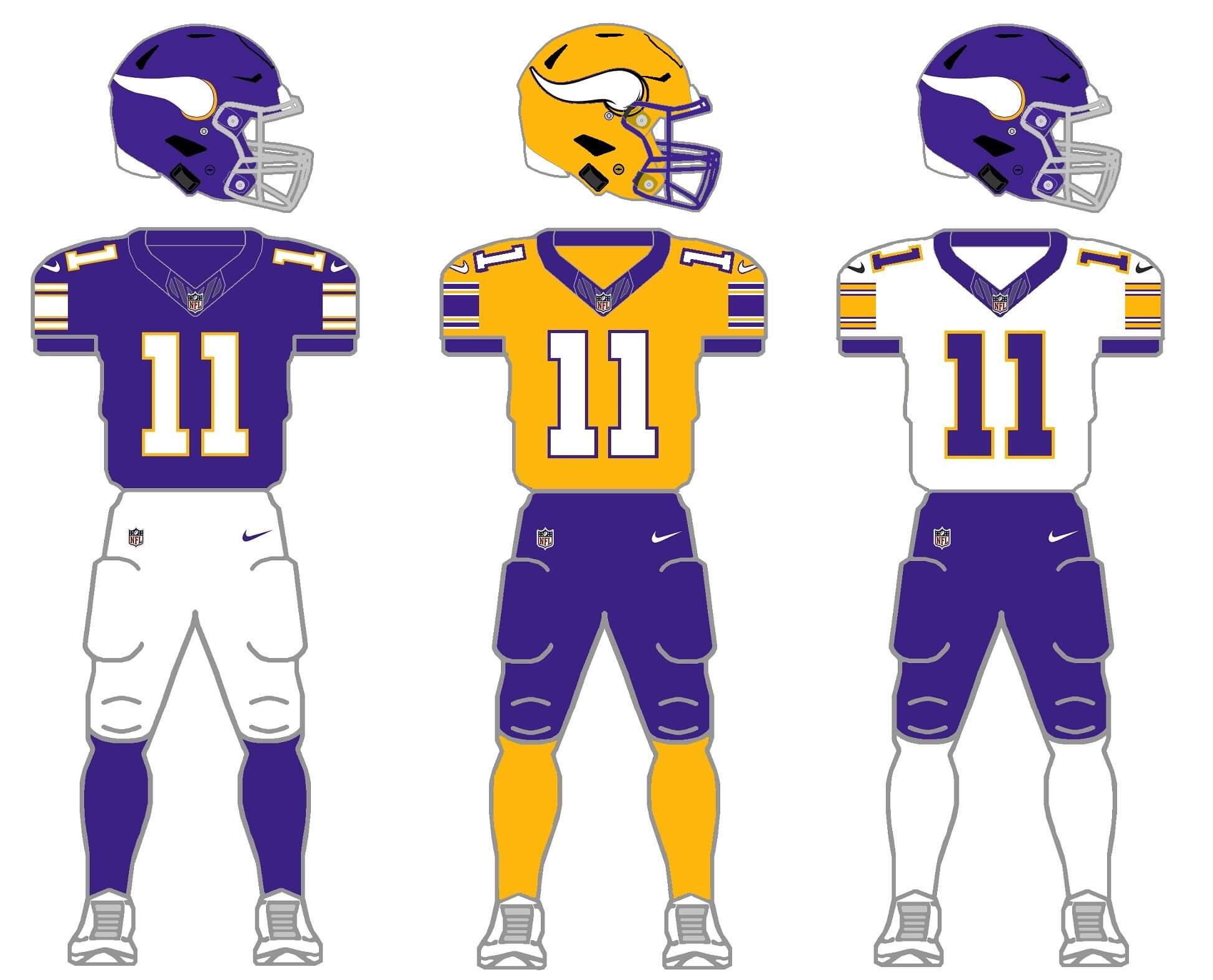
The throwback uniform is gorgeous, but it too has only a single helmet color and two (purple and white) jersey colors. I’ll add the slightly darker athletic gold from the throwback for the new helmet and jersey (as well as gold socks), and give them a set of purple pants (the team did have a set of purple pants from 1962 through 1965, before adding them to their 2006 redesign). I’m not sure the world is ready for a gold Vikings helmet or jersey…but for the 2/3/2/3 project, they get one.
Thanks for indulging me, and I hope you at least enjoy the concept of 2/3/2/3. I’ll tackle the remaining five divisions in separate posts. Please leave any comments/suggestions/critiques in the comments below!
The green Packers helmet is hideous, ahistorical, and frankly lazy. A much better answer lies in Curley Lambeau’s Notre Dame roots and the handsome navy of the old ACME Packers uniform.
Thanks for the feedback.
As noted in my writeup, “It almost feels wrong to shoehorn the Packers into the 2/3/2/3 parameters” and “Amazingly, through their entire history, the Packers have never worn a green helmet (emphasis mine)” …
So, yes I’m well aware the helmet is ahistorical. I also would never want to see them wearing a green helmet. This is just a fun project where I attempt (even to my own mortification sometimes) to give each team the 2/3/2/3 parameters.
Other than their Acme Packers throwback, where they created a “faux” leatherhead look by introducing a brown shell (link:format(jpeg)/cdn.vox-cdn.com/uploads/chorus_image/image/12773597/129357484.0.jpg), the team never wore a brown helmet
Listing of all Packers uniforms in their history here: link
The GUD does show a leather helmet which does look brown (although I doubt it was painted brown) which is kinda-sorta the look the team was going for with their throwback link
As far as other color shells in their past, in the 1950s (still the leather helmet era), from 1951-53 (link) the team had leather helmets in a tan color, to match their pants. And from 1956-58, which coincides with the era when the NFL mandated teams have a white jersey (for TV purposes), the Packers briefly had a white shell (the beginning of the plastic era): link
But since 1954, the Pack have always (and only, other than the Acme fauxback) had a gold helmet. And they switched over to their classic look in 1959, which remains, with a few concessions to modern technology and fabric, pretty much the same to this day.
So…yes, the Packers have never had a green helmet (as I noted), but the only true other color options would be brown/tan (to mimic leather) or white, or possibly blue which would match the color they painted the leather helmets in 1932-33: link).
The green hat was created to “fit” with the 2/3/2/3 protocol. There was really no other practical choice. White, brown or blue wouldn’t have worked with the green/gold colorscheme.
Wonder how good/bad a white Packers helmet (Swiss cheese head?) with green oval and a yellow G would look. Ditto with a green Packers helmet with white oval and a yellow G (with and without a green outline). Would a green helmet with just a white or a yellow G (sans oval) look too much like your Bears helmet?
Thought about a white helmet. (These are not my mocks but examples:
link
link
link
The reason I didn’t go with white is because it’s fairly close in color to the current gold helmet; I’ve tried (not always successfully) to create helmets for teams that are both “light” and “dark” so the green (which I agree is heresy) was more to have a dark option than necessarily better than the white helmet would be
Thanks for the reply and for the links. The first one looks “okay” but wonder how it would look with a yellow oval and a green G. The second one looks yucky; is that black or just a super-dark green? The third one looks weird to me but acceptable (and better than the first one). Wish the green was a bit lighter, though. Wonder if the third one would look better or worse with a gold facemask.
Thanks again. Fun project.
Another triumph. I was surprised how much I liked the gold helmet for Minnesota. Wow. Not something we’d want to see every week but a few times a year-absolutely. Always wish the Vikings would return to the white face masks. The contrast is great.
I also really miss the numbers on the side of the Packers pants (along with the Colts and Cowboys). That was a unique niche when I was a kid.
I think you nailed Chicago as well. The return to the white wishbone C keeps the overall look from appearing over saturated.
I’ve come to the conclusion that a handful of teams can and should use a custom number font; but overall it’s overdone. It should be reserved for alt/CR/etc. I’ve gotten font fatigue over the years. I mean this is the gridiron game. Block numbers should be standard.
Bit of a rant. I apologize. But still loving the project. I hope you have the stamina for the Big Four!
Thanks Jason!
Agreed, these are fun! The only thing I completely disagree with is a bears orange helmet over the orange jersey. We’ve seen it look pretty bad on the field, and while the white C helps, I still think a blue (or even white) helmet would look much better.
Thanks Jeremy — to be clear, the orange helmet over the orange jersey in my mock up is just there to show options, not to necessarily advocate for the orange/orange/white combo. I’d like to see the orange helmet with the white or blue shirt, and we’ve already seen how the blue hat looks with the orange jersey. But the 2/3/2/3 is all mix and match so any of 36 different combos (helmet/jersey/pants/socks) are possible.
Makes sense to me, thanks again Phil!
Barry Sanders-era Lions had white numbers on the blue jerseys.
Yep — so it’s not quite a true throwback (let’s face it, almost no throwback is a “true” throwback anymore, due to new jersey cuts and far leess real estate to work with). I wanted to use different color numbers on the different color jerseys. So, silver numbers on the blue, white numbers on the silver jersey, and blue numbers on the white jersey. (Kind of an OCD thing at work here). It’s also the pattern the team uses on their current uni set.
But totally correct on the white numbers for the Sanders-era.
Another difficult division to re-design.
Bears: “While there is nothing wrong with the orange helmet and pants, per se,…” – Oh yes there is! The striped socks are sorely missed. “…wishbone C has been changed to solid white,…” – a change which works here, just ask Jim Vilk!
Lions: Ok, for the sake of the project you had to go with blue pants. Glad to see the perma-memorial go and the ‘silver’ socks retained- and the throwbacks are just wonderful!
Packers: I don’t hate the G/Y/G/Y combo, but it’s too ‘out there’ for them – maybe a look best suited for the CFL Elks?
Vikings: Yellow domes was a bold choice. I think maybe white may have worked too (with the Norseman logo or the pointy V, perhaps). They 100% should adopt your throwbacks, as – is, permanently!
Keep up the great work!
Thanks Chris.
And you ended up catching a mistake I totally missed: that Bears sentence should have said “While there is nothing wrong with the orange helmet and jersey, per se” (not pants). Now fixed.
I really have nothing to add. Well done with a traditional division. Plenty of great color palettes, you eliminated a lot of the current uniform mistakes and everything more or less works. Nice work.
Thanks.
There are definitely a few looks (Packers green helmets, Vikings gold) that I did solely to meet the 2/3/2/3 concept parameters. Definitely not something I want to see on the field (ok, maybe *once*)
Just all wrong with the Bears —
the white wishbone C was dropped because the University of Chicago had the trademark to it; it needs to be orange and white.
Gray facemasks are stupid if gray is not a team color.
Solid socks for the Bears are ahistoric and not an ideal design choice. Broadly speaking, socks should evoke the jersey sleeves.
“the white wishbone C was dropped because the University of Chicago had the trademark to it; it needs to be orange and white.”
Wait, what?
First I have ever heard of that — not saying you’re wrong, I’d just never heard it (do you have a cite?)
They wore the white C for 11 seasons…did it take UC that long to realize it? And didn’t they abolish football in 1933 (I know it returned as a club sport decades later, and they now compete in Div III — I think they reestablished that in the early 1970s). Sounds like a long time WITHOUT playing football to complain about a team wearing the white C. I don’t know how trademark law applies here, but they’re seriously grasping if they can protect the white “C” only.
Throughout history, the Bears, Cubs, Reds, Cleveland (and probably others I’m forgetting) have worn the wishbone C — how is UC able to trademark the “white C” (and wouldn’t this cap: link be subject to infringement too?).
Again, I’m not saying you’re wrong. But it seems ridiculous the Bears can use a wishbone C, but they can’t use a white wishbone C.
To accommodate a green Green Bay helmet (which I do NOT find heretical, by the way), would simply float a white or yellow “G” on the green helmet.
I like the project and The Vikings would look cool with a golden helmet just once (or a white one with the Viking head or V as was suggested), and I know silver in this division belongs to Detroit, but what about an once and never again silver Vikings helmet to mimic a real Viking warrior? With silver or white facemask over any of the uniform options you propose.
Maybe for Green Bay a white helmet with the green G outlined in gold. Maybe, for another idea, put the old logo of a player on the map of Wisconsin with a football in the back of the helmet.
Thanks for the feedback!
I thought about a white helmet, but I mean, c’mon, they’re GREEN Bay and they wear green and gold. Obvoiusly the best solution would be to not subject them to the 2/3/2/3 project rules, and I’d never advocate for a green helmet. But for the purposes of giving every team 2 helmets (and 3 jerseys, 2 pants, 3 socks), I had to go with something…and the obvious choice was green.
As far as a logo, with one or two exceptions (not including throwbacks), I’ve tried to keep every team’s logo the same as it is — but if I were completely redesigning them, I’d definitely think about that logo — I love that!
Cheers!
I think the Lions should do as the Raiders and add a patch to the back of the helmet for WCF.