Today I have an update on a storyline that’s been developing step by step. Here’s a quick recap: A few weeks ago I posted an entry about some 1963 home movie footage that seemed to show the Indians wearing their home whites, instead of their road greys, for a game in Kansas City against the A’s. The A’s wore gold uniforms for all of their games that season, so having the road team wear white would have been fine from a visual standpoint, although it seemed odd that a team would pack its home uniforms for a road trip. Several readers insisted that the Indians’ uniforms were actually grey and that they only appeared white because of the lighting and the limitations of home movie film.
A few days later I posted an update with info from reader Jim Wagner, whose father told him that the A’s invited visiting teams to wear their home whites in 1963, and that teams often did so for one of their visits to KC. I had never heard that before, and I wondered if we could turn up any additional photographic confirmation.
Jim was so intrigued by all of this that he went to the library and began looking at microfilm of Kansas City newspapers from 1963 — and sure enough, he hit paydirt. Here’s a photo that ran in The Kansas City Times on April 23, 1963. It’s from this Tigers/A’s game, which took place the previous day in Kansas City. Look what the Tigers were wearing:
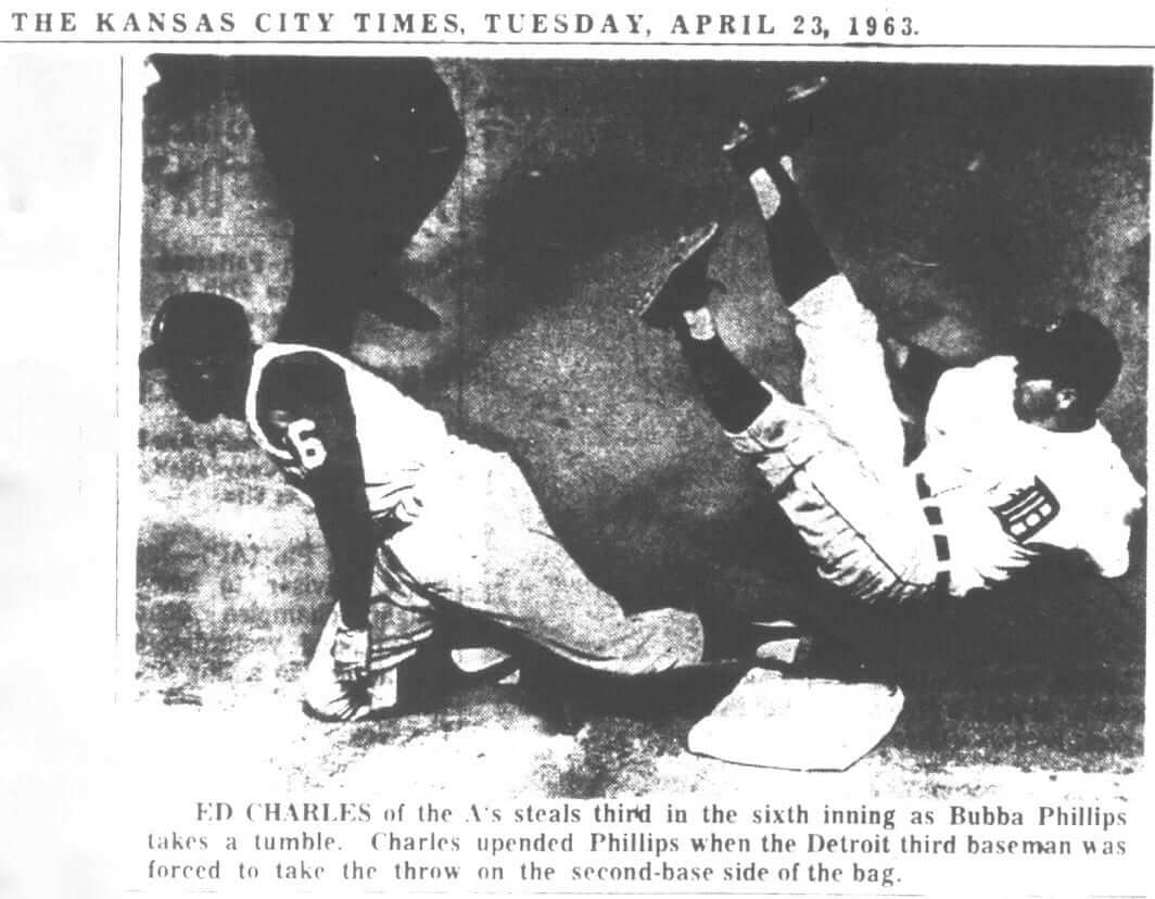
Although the image quality isn’t ideal, that’s definitely the Tigers’ home uni, because they wore “Detroit” on their road greys in 1963. That’s amazing! It confirms Jim’s dad’s recollection of visiting teams wearing their home whites in KC in ’63. I’ve been writing about uniforms for almost 20 years now and had no idea.
And there’s more. In 1963, the Angels wore “Angels” on their home whites and smaller “Los Angeles” lettering on their road greys. It’s hard to be sure from this next photo, but the size of the lettering and the uniform color both suggest that the Angels were wearing their home whites for the first game of a doubleheader in Kansas City on April 19:
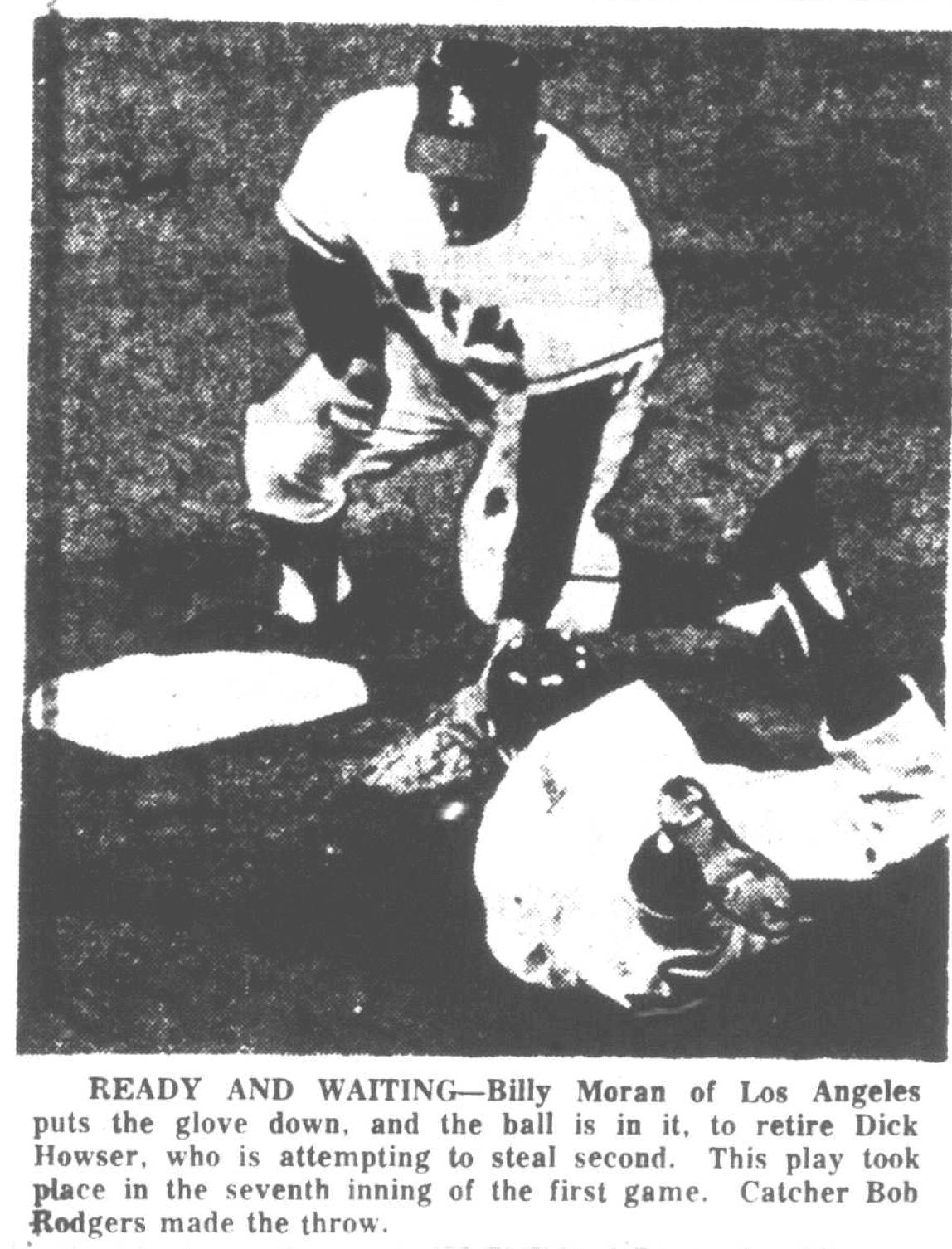
It also looks like the Angels wore their home whites the following day, April 20:
Jim says he’ll go back to the library for additional microfilm research when he has time to do so. In the meantime, let’s give him a standing O for his efforts in highlighting this previously unknown chapter in uniform history.
Sweet 16 uni rankings: With the NCAA tournament’s Sweet 16 round due to tip off today, I have my annual Sweet 16 uniform rankings over on ESPN. Look here.
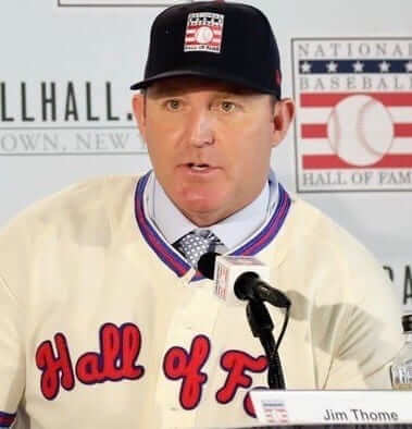
Hall of Fame puts kibosh on Wahoo: Newly elected Baseball Hall of Fame inductee Jim Thome said last month that he does not want Chief Wahoo on his Hall plaque. Now the Hall has confirmed that Wahoo will not be appearing on Thome’s plaque — or on anyone else’s.
A statement released yesterday by the Hall reads like so:
When Jim Thome’s Hall of Fame plaque is unveiled in July, it will feature the “Block C” logo as opposed to the “Chief Wahoo” logo that the Cleveland Indians have displayed on team caps in many seasons since its introduction in 1947.
In January, Major League Baseball announced that the Indians will remove the “Chief Wahoo” logo from uniforms after the 2018 season, deeming it no longer appropriate for on-field use. As MLB Commissioner Rob Manfred explained, “Major League Baseball is committed to building a culture of diversity and inclusion throughout the game.”
The National Baseball Hall of Fame and Museum concurs with the Commissioner’s sentiment and acknowledges the shifting societal view of Native American logos in baseball.
Although examples of the “Chief Wahoo” logo can be found in our Museum exhibits, and on Early Wynn’s 1972 Hall of Fame plaque, the Hall of Fame will no longer use the logo in the creation of new plaques.
There probably won’t be any future Hall inductees who played for Cleveland during the Wahoo era (maybe Manny Ramirez, but I’d say he’s now considered more Bosox-associated), so the “We won’t use Wahoo again” part of the statement is largely moot. But still.
A Hall employee followed up by telling me the following:
It is also worth noting that the Hall of Fame Education Department has a lesson on Native Americans that it teaches to children when they visit the museum. There’s also a Virtual Field Trip available on the same topic for those schools situated too far away to visit the museum. Both lessons are part of a larger unit that teaches the history of Native stick and ball games, Indian boarding schools and their sports teams, and Native pioneers in baseball, as well as the controversial use of native imagery today.
The program contrasts the ChangetheMascot.org approach to imagery with that of the Spokane Indians Baseball Club, who have partnered with the Spokane Tribe of Nations to use approved imagery, incorporated the Salish language into their uniforms and their stadium, and instituted the Red Band Rally program, which helped increase the population of red band trout.
Slowly but surely.
The Ticker
By Kris Gross

Baseball News: South Korean baseball team LG Twins of the KBO have released a Black Panther-themed uniform (from Max G). … A great spot by Greg Ukman, who noticed some changes in the MLB Independence Day socks from 2017 to 2018. “The star placement moves from the inside of the right calf to the outside. There’s also a subtle change with the leg stripes moving up,” Greg adds. … The video game RBI Baseball 18 has apparently given us a look at this year’s All-Star BP jerseys (from JK). … Rays catchers will use quarterback-style wristbands to help with pitch calling and situational planning — a response to the new rules that limit mound visits (thanks, Brinke). … Pirates OF Jordan Luplow uses teammate Jung-ho Kang’s bat (from Jerry Wolper). … The Albuquerque Isotopes will play under under four different names this season (thanks, Phil). … Chipper Jones is celebrating Chipper Jones Day with a Chipper Jones suit jacket lining (from Chris Howell). … Here is the very loud Hawaiian shirt the Cubs are giving away on July 3 (from Phillip Santos). … It was a beautiful matchup between LSU and Tulane last night (from DG). … New road uniforms from Louisville last night (from Rich Calabrese). … BYU unveiled a new navy jersey (thanks, Phil). … Stirrups are looking good for Purdue softball and Wahoo High School in Wahoo, Nebraska (from @ssgmahoney, John Benal). … Reader Steve Johnston was browsing his son’s high school (Lockport, IL) baseball website, and came across a collection of team photos dating back to 1926. … Georgia Tech coach Danny Hall got his 1,000th career win on Tuesday. Before Wednesday’s game, he was presented with a jersey commemorating the milestone (from Michael Rich). … Rare shot of Bob Feller wearing No. 14 instead of his more familiar 19.

NFL News: In a video from his Packers days, new Cowboys LB Joe Thomas tackled the logo off a Bears player (from Frank McGuigan). … Pitt players wore modified NFL logos in school colors (from Robert Hayes). … As a follow up on yesterday’s Ticker item about the Rams wearing red-striped pants in the 1978 movie Heaven Can Wait, Willie Gabel has solved the mystery. He emailed Todd Hewitt, the Rams equipment manager from those days, who said the “pants were from the movie prop department, but they wanted to use the Rams helmets and practice uniforms.” Great work! … Good shot of Lions placekick holder Wayne Rasmussen going without a facemask in 1969 (screen shot by Tom Farley).

Hockey News: Here’s a good article on the Penguins’ equipment preferences. Among other revelations, it turns out that RW Patric Hornqvist uses a skate model that’s more than a decade old (from Jerry Wolper).

Basketball News: Here’s a history of players who write on their shoes (from Mike Chamernik). … Here’s a good piece on how grey jerseys became a trend (from Iain Landon).

Soccer News: The Croatia, Poland and Greece team kits have officially been unveiled (from @DanGrimm3 and Ed Żelaski). … In case you missed any of them, you can see all of the 2018 World Cup kits here, and vote on your favorite (thanks, Phil). … Here’s an article on the difference between the technology of Nike’s authentic and replica jerseys (from Josh Hinton). … Also from Josh, the Pittsburgh Riverhounds of the USL unveiled their new badge and kits. … Not sure if we’ve seen this before, but just in case: Premier League-themed F1 livery concepts (from @waynetm41). … New kit for Costa Rica (from Mark Higgins).

Grab Bag: Yale lacrosse is using “head sleeves” as a way to block out peripheral vision (from Griffin Smith). … Canada goes BFBS at the World Women’s Curling Championship (from Wade Heidt). … Here is an interesting piece on the connection between typography and the human anatomy (from Gil Neumann). … Cross-listed from the soccer section: Here are some Premier League-themed F1 livery concepts (from @waynetm41).
My thanks to everyone who sent me birthday greetings yesterday. It was a great day, in no small part because of all your kind words. — Paul
Paul, I know you’ve talked about the Hall of Fame jersey before, but who designed it? It looks identical to the Phillies cream alternate, right down the the lettering font.
Also, neat little quirk that teams wore white on the road… neat but blasphemous!
Possible reason for teams wearing home whites when playing at Kansas City could be television. More black & white TVs than color in those days and the road gray and home gold unis may have been too hard to distinguish in black & white.
That explanation would only make sense if teams *always* wore their homes whites in KC. If distinguishing the teams was a problem, you’d want to solve that problem for every game, not just occasionally.
That and why do we need to distinguish uniform colors in baseball?
Technically, I don’t think you do. Reminds me of cricket where you often see white uniforms from both sides.
Of course, if we’re going that far, you really don’t need numbers (or especially NOB), either.
“That and why do we need to distinguish uniform colors in baseball?”
Because a baserunner could pretend to be a fielder and motion for an opposing player to throw the ball to him… then duck out of the way and run to the next base!
Paul, that argument doesn’t hold. Perhaps the A’s wanted teams to wear white for TV reasons, but teams either refused to, or didnt have the capacity to, bring two uniform sets on the road.
Today we have baseball games that are red vs. red or navy vs. navy. Teams will purposely wear a different color than their opponent to solve this problem, but not always
I have a personal recollection of the Red Sox wearing home whites for a series in KC, but haven’t found the proof.
I think the contrast for black and white television is an entirely plausible explanation for the “road whites.” But how many games were televised during 1963? My guess is not as many as people may surmise. Another equally and/or supporting conclusion is that white uniform are cooler to wear during day games particularly during the dog days of summer. There were many more day games played then than now. The visiting teams were likely happy to accommodate the A’s offer for comfort reasons.
Again, there is and never has been never any need or reason to distinguish uniform colors in a baseball game, So I don’t think it’s a plausible explanation at all. The offensive and defensive teams are clearly distinguishable just based on the rules of the game. I think we’re overthinking things here. We all know Finley was a gimmicky guy, that’s all this was and he gave the visiting teams the opportunity to participate if they so chose.
As for uniform numbers, they are necessary to track players for scoring purposes.
…sorry for that first sentence. I meant to type “there is no need or reason to distinguish uniform colors in a baseball game.”
Given that the major leagues didn’t have uni numbers until around 1916, I don’t think they’re technically necessary for keeping score.
As Winter noted, uniform numbers are designed to make it easier to keep score, but not necessary for it. One can easily keep score without the numbers, just by paying attention to the lineup when announced at the beginning of the game, and to announced substitutions.
Care to compare the accuracy of scoring in the pre-number and post-number eras?
I suggested this back in the original post a few weeks ago…and pointed out that Cleveland in particular would be hard to distinguish on black and white TV as they also wore vested jerseys…
Anyone know why it would benefit a lacrosse athlete to block out peripheral vision? I’m not familiar with the nuances of the sport, but can’t fathom how the “head sleeves” would be helping performance?
I’m with you. I’m no LAX expert, but it seems odd at best.
Just speculating, but possibly to force the players to look around more? Makes them see the field instead of just a quick peripheral glance.
This is exactly it. It’s so the keep there head on a swivel at all times. Think about how much better you’ll be at a fast pace if you train with a smaller vision tunnel and open that up to allow peripheral vision to work again. Just training the eyes and the brain.
Yeah this makes no sense. Don’t you want good peripheral vision to see both teammates and opponents? Hope someone here can enlighten us.
What a sad day for chief wahoo he’s going to be missed by me
Agreed – a sad day indeed – long live Chief Wahoo. I was able to get some good Wahoo merchandise before it becomes available only in Cleveland.
I knew Paul would use his cheesy “slowly but surely” line as soon as I heard this news.
Paul, had Kentucky used the check board solely on the waist band, would we crack the top 5?
*checkerboard
Probably, yeah.
As to the Rams’ practice pants in Heaven Can Wait, those look an awful lot like the pants worn by the team Burt Reynolds and Kris Kristofferson played for in Semi-Tough, which was filmed in the same era – I’d bet they’re the same pants.
The clunky, incredibly boring, block C was Thome’s choice. Nice to see the HOF go with the player’s choice as opposed to when they wouldn’t let Gary Carter or Andre Dawson go with theirs.
I agree 100%. Gary Carter wanted to go in as a Met, but the Hall told him “We have no Expos in, so you have to.”
And I guarantee you just because Wahoo leaves the official unis, fans will still be wearing it en masse. I was watching an Indians Spring Training game last night and the fans had Wahoo all over the place. That’s unlikely to change next year and beyond.
Gary Carter wanted to go in as a Met, but the Hall told him “We have no Expos in, so you have to.”
Actually, no, that is not what the Hall said.
First, Carter wanted a Mets logo on his plaque specifically because he thought it would be better for his marketing opportunities. Since the Expos no longer existed (or were about to no longer exist), he thought being associated with the Expos would be of little use to him financially. Not exactly the most honorable reason for wanting a certain logo on one’s plaque.
The Hall looked at his entire body of work and decided that the reason he was inducted was primarily due to the Expos portion of his career, so that’s the logo they chose for him.
As for fans continuing to wear Wahoo: Yes, of course some of them will. Nobody ever claimed otherwise.
Why is LSU wearing powder blue helmets?
Prostate cancer awareness night.
I’m stunned (and disappointed) you ranked Florida State’s BFBS uniform as No. 3 in a ranking of 16. They should be in the bottom fourth of that ranking just for the BFBS.
Pssst — I’ll let you in a little secret: Uniform rankings are pretty stupid to begin with. Feel free to ignore them.
Hmmm… White pants with red stripes from the Hollywood prop department? Could it be reused pants from the film “Semi-Tough” which was released one year before “Heaven Can Wait?” They seem to match.
link
It may be time to retire “BFBS” from the Uni Watch lexicon if Team Canada wearing a black and red uniform is considered BFBS. A team with black as an already established primary color wearing a black uniform is precisely the opposite of what the words “black for black’s sake” mean. If that Canada curling uniform is BFBS, then the functional definition of the term has become, “Any uniform that includes a lot of black.” Which is not a useful concept for describing or understanding athletics aesthetics.
I agree. I think that “BFBS” term gets thrown around a bit too much. I’ve seen clubs that list black as one of its primary colors (not an officially unlisted accent color, mind you) have alternate uniforms with a black base and some people lose their damn minds over it. I’ve never understood that at all.
WRT Team Canada, I’ve watched its various teams (not just hockey) in various sports for years and I don’t remember any of its uniforms not having at least a little bit of black on them.
The black uniform for Jennifer Jones rink is really an alternate to their mostly red and white primary tops. Was worn in 1 draw on March 20.
Here is the red one:
link
Here is the other white one:
link
As a Canadian, it annoys me that our country wears primary black jerseys in international competition. I have come to accept that black is a trim colour in our uniforms due to how long it has been used. The flag colours and our colours are red and white. It is adding a black uniform though it is not one of the national colours.
I feel the same way about Canada using black as the main uniform colour – just wrong. As a starting point I wish we would go back to at least red helmets for hockey, looked much better. Also Switzerland has the same look with the exact same black and red combo so it’s not even a unique design.
I would consider Canada’s uniforms BFBS though. I mean the flag is red and white, and clearly red is their color, black really only seems there for contrast. It is not like say the US, UK, or France, who’s colors are red, white and blue, and could at any time decide red or blue is the primary. Red is obviously the primary for Canada. I mean, it may not be quite the same level of BFBS as team USA wearing black, but Canada in a black jersey still seems BFBS to me.
Canada never used to have black in their national team uniforms. Always just red and white. link
I remember their olympic hockey teams using royal blue as a tertiary color in the late 80s-early 90s for whatever reason, but the first evidence I can find of a Canadian team using black as a major uniform color is the 1995 World Juniors, when they introduced the black breezers they’ve pretty much been wearing since as well as the red/white/black Hockey Canada logo: link
So yeah, they started incorporating black in the mid-90s when it was a massive trend. A classic case of BFBS.
Gotcha – a quarter century of official, prominent, consistent, and nearly ubiquitous use of black by Team Canada is insufficient to regard black as a team color.
Which raises the question: What is the exact number of years of consistent use of a color that makes that color an actual team color? For it to be a true statement that “since 1995” is insufficient, there must be some actual integer higher than 23 that renders a team’s use of a color legitimate. So, what is the number? 25? 28? 30? 50? 100?
For continuous use, I would consider the Philadelphia Eagles to be in the 30+ club depending on when black became an official color (’85 or ’96?). They even used black trim on their jersey numbers in the early ’70s FWIW.
“Gotcha – a quarter century of official, prominent, consistent, and nearly ubiquitous use of black by Team Canada is insufficient to regard black as a team color.”
Canada’s incorporation of black into its uniform schemes began during the first wave of the BFBS craze in the early to mid-’90s. What’s more important in determining whether the use of black in a uniform is “black for black’s sake”? The length of time that black has been used or the circumstances surrounding its adoption?
The Eagles black alternates are BFBS because it is not as though the Eagles are associated with that color. They have green as the primary, and they are known for green, not for green and black. As opposed to a team like the Ravens, who are clearly a purple and black team. Or, for non-black, the Packers a green and yellow, the Dolphins are aqua and orange, etc.
They were green and silver, and used black for trim. When they changed things up in the 90s black became more prominent, so that green was still the obvious primary, and silver and black were roughly equal as secondary colors. And this all happened with BFBS became a thing.
Teams that don’t have a secondary color sometimes choose black as a default. Both Rutgers and Princeton, who each have a single school color that dates from the very first football game and long predates modern marketing schemes, have used black as an accent color. Harvard has one color and has used black, though they have also worn gold pants. Columbia has used black though I think they’ve also used navy blue.
Canada’s use of black has never bothered me for this reason. When you’re a one-color country (or school), sometimes you need a bland secondary color.
In the case of Georgia Tech (Ramblin’ Wreck gold when adidas takes over this summer) and Syracuse (orange), they use navy.
I admittedly decided to try to stop using “BFBS” about a month or two ago. In my view, you come here for Paul’s opinions, not mine, so I don’t want to sound judgemental. I’m just a reporter, and as we’ve said sometimes it’s hard to tell without context.
“BFBS” is arguably descriptive, not judgmental. But there always seems to be controversy over its use….
Seeing those pictures of the old Angels “halo” caps made me think about the concept of “meta” headgear, that is to say, caps and helmets that aren’t just a medium for a logo or symbol, but themselves become the symbol. The best example is the Bengals tiger stripe helmets and the halo caps. The Chargers might also fit into that category and you could make a case for the Seahawks, but those are the only other ones that come to mind.
How do the Seahawks fit this? I would say the Rams, Bengals, Eagles, and Vikings. Those are teams not using their primary logos on the helmet. The Seahawks use their primary logo, they just extended the end of the logo to make it more dynamic.
Yes – Seahawks would be described as having the wraparound helmet logo. Which I like but is not seen often. Also notably was used by the USFL Jacksonville Bulls:
link
And by the CFL Saskatchewan Roughriders for about 22 seasons:
link
Yeah, I think the point though was using the design of the equipment as more than just a place to slap a logo. Whether it is the Angels with a halo around the entire cap, or the Vikings with horns on the helmet like viking helmet. Those are creative ways to evoke your mascot without just slapping on a logo. A logo that wraps around is still just a logo. If the Seahawks helmet looked like it was actually trying to mimic the head of a hawk, that would be more in line with what the Angels did and Vikings do.
Until the Angels bring back the halo caps, they’re dead to me.
I, too, love the halo cap. I also loved their red/navy uniforms. Their current uniform has way too much red and I’ve disliked it from day one.
10000% agree.
I call these “skeuomorphic” design elements. In part because a cap or helmet designed to look like the head of the team’s mascot is a dictionary-definition example of skeuomorphism. But mainly because it’s just fun to say “skeuomorphic.” All of my favorite football helmets are skeuomorphs: Vikings, Rams, Bengals, feather-stripe Redskins, Eagles, Barnstormers. Aside from the Angels and maybe the Pilots, it’s not something we’ve seen much in baseball.
Sorry, did not see your post re the Pilots.
Would the Seattle Pilots “scrambled eggs” caps fit that description?
WRT the ESPN.com article, I have no issues with Kansas State’s uniform at all and I don’t mind the trim on Clemson’s dark uniform. Purple is one of Clemson’s primary colors after all. The only thing about Clemson’s uniform that I didn’t like was the purple trim being deleted from the jersey’s typography.
Love the Man City F1 car and hate the United one….but I may be a tad biased.
In truth, the only ones that I personally dislike are Man United, Tottenham, West Brom, Newcastle
Kind of weird that the THFC one gets the giant swoosh on the side. Like, it’s okay, it can just be plain white, or put the crest there as with some of the other ones.
The Swansea one has the wrong number as well – the numbers are based on a player from each team, but Tom Carroll switched to No. 14 this season from 42.
Yeah, I didn’t understand that either , especially since it’s Spurs’ first year with Nike. I don’t watch Swansea much; do they not have a #42?
They do, but it has a new occupant. (Most of the liveries have an F1-style abbreviation of the “driver’s” last name on the side, unless it’s just the full name. Swansea’s is CRL.)
“Good shot of Lions placekick holder Wayne Rasmussen going without a facemask in 1969 ”
No chinstrap either.
Yankee pinstripes in KC would be amazing to see. They wore pinstripes as the designated “road” team while playing in japan in 2004, and until now that was believed to be the first and only time they wore their home unis away from home.
I’d bet that Omar Vizquel sneaks into the Hall eventually, and he obviously played for the Wahoo-era Indians.
Thome at least briefly played for the Indians during the block-C era so I understand his cap depicting that. Vizquel on the other hand did not. As a Cleveland native, I’m all for the discontinued use of Chief Wahoo. I think it’s long overdue. However, I think it’s a bit disingenuous to try to alter history by depicting a logo that a player never wore on their Hall of Fame cap.
If Vizquel were to get in, his cap should display the logo he wore, unless he chooses to wear the block-C. If he decides he doesn’t want Wahoo that’s fine with me. Yes, Wahoo is a shameful part of history, but denying it ever existed by altering cap logos is not great either. We learn from mistakes. If we deny they ever happened then how can we learn from them?
There are many inductees (including recent honorees Greg Maddux and Tony LaRussa) whose caps have no logo at all. If Vizquel gets in — an eventuality I’d consider unlikely but conceivable — maybe they’ll go that route.
Looking at the HOF website, I see that almost all of the inductees with pictures who spent a majority of their time with Cleveland have the wishbone C (Feller, Lajoie, Boudreau, etc). They don’t show the placques on the website, however.
Would be nice to see the wishbone C make a return.
Yes they do show the plaques on the website:
link
link
Look in the upper right side of the page.
“If Vizquel were to get in, his cap should display the logo he wore, unless he chooses to wear the block-C. If he decides he doesn’t want Wahoo that’s fine with me. Yes, Wahoo is a shameful part of history, but denying it ever existed by altering cap logos is not great either. We learn from mistakes. If we deny they ever happened then how can we learn from them?”
As the Hall of Fame representatives themselves point out in their statement, they aren’t attempting to erase Chief Wahoo from history. Historical displays in the Hall of Fame and Early Wynn’s plaque still depict Chief Wahoo.
A player’s Hall of Fame plaque is about far more than just accurate historical depictions of uniform elements. It’s about honoring that player in a way that is accessible now and to future generations. Putting Wahoo on the hats of future honorees would distract focus away from the player in furtherance of the cause of rigid historical pedantry.
If Omar Vizquel goes into the hall of fame then it would be as a Cleveland Indian.
No inductee goes in as a member of any team. Inductees go in as themselves. Their plaques may or may not depict a team uniform.
Paul: I was listening to last week’s Mr. Fine Wine show on WFMU (podcast). The station was having their fundraiser, and one of the donors was announced as Paul Brannock Device from Brooklyn. Sounds like Mr. Device (or is it Mr. Brannock Device or Mr. Brannock-Device?) has the same interest in foot measuring tools as you do. Perhaps you two should set up a group?
;-)
Happy belated Birthday!
Mr. Fine Wine is one of my best friends. We also have the same birthday (same year, even). I donate to his show every year.
I remember that you two are pals. I just about did a spit take when they announced Mr. Brannock Device.
Downtown Soulville is one of the best shows on WFMU.
The Hall of Fame should have started the trend years ago of putting no logos on the hats at all. Look at Canton. The busts don’t have the players’ helmets on.
I like the look of the plaques with no logos on the headwear – kind of anachronistic, but it feels more timeless that way. The newer guys kind of match the older style.
A partial answer regarding televised games from Kansas City in 1963–the A’s has one (opening day), the Angels had three, Cleveland 4 or 5 (one date was a DH) and the Twins seven.
The Hall employee mentioned two contrasting approaches. I am more inclined to have a relationship with tribes that celebrate the culture on the tribe’s terms, rather than outright ban.
The problem with my inclination though is that the tribes are not monolithic, and sometimes the tribes approve things that I disagree with, such as the Tomahawk and chant at Florida State games.
Your guy’s thoughts?
The Spokane Indians Baseball Club claims to be named after the Spokane Tribe. Thus why it works for them. But, in general I would agree that the monolithic issue does cause issues between nations regarding what is or is not appropriate.
This eBayer could be making things up, but link.
It suffers from not having a good way to place the school name or player’s number because of the rainbowness, but it’s still pretty nice.
Why doesn’t the Hall of Fame use the cursive “I” logo hat that the Indians used during Thome’s prime? It wasn’t their primary hat during that time, but it seems more fitting to me than the block “C” (which, admittedly, I truly hate).
Wow, so I just looked it up and the Indians only used that hat starting in 2002, which was Thome’s last year of his first stint with the Indians. I could have sworn that hat was used before then. Never mind, I guess!
Good to see the HOF get rid of chief Wahoo. If only the Redskins would do the same with their racist moniker.
Also: Re on your Sweet Sixteen uni ranking Paul-
I absolutely love FSU’s uniforms, even though I am usually opposed to Black for Black’s Sake. The garnet and gold feather side panels really work well with the black and minimal rest of jersey.
I also love Purdue’s unis, but that’s more due to the wordmark than anything else. The Purdue word is perfectly evocative of a train grill thing, which is what they were going for.
One thing I don’t understand is the sublimated designs on the backs of jerseys that are so prominent in the tournament this year. Any insight on to who started this trend and how it came to be so popular?
Nike started it several years ago. I don’t think it was any one school in particular; more like a bunch of Nike-outfitted schools all at once.
I feel like that style has been around for 10 years or so – I’m surprised it’s lasted this long, since it seems like such a gimmick.
Thanks for the answer! Can’t say I like the sublimated patterns, as you cant really see what the designs are supposed to be. On some it’s more obvious than others, as with Butler it’s pretty obvious that it’s an outline of their logo. On Purdue’s, however, I had to look up a picture of their jersey to see that it’s a train.
Ephraim, I’m a die hard Kentucky basketball fan. I can tell you that I’m 99% certain that Nike gave the Kentucky’s, Duke’s, etc. the mesh on the back before everyone else, then they rapidly expanded it a couple years ago.
Didn’t we used to refer to those designs as “sweatbacks” around here because they created the illusion that they players’ back were drenched in perspiration?
Yes.
Canada’s Curling didn’t go BFBS, black is a traditional sporting colour for Canada.
BFBS or not, those were some awfully damn sharp looking unis.
Something that I’ve noticed over the past few years, and maybe it’s just because my team (Kentucky) puts theirs on the left-hand side of chest (so on-screen it appears on the right) is more and more bowl patches and NCAA/Final 4 patches on the right-hand side of the player’s chest, so when watching a game, it looks like it’s on the left side. Any thoughts on this or is it just me?
There’s an interesting photo of Miggy Cabrera in this article today on Bleacher Report:
link
The colors aren’t right for a Padre cap, so I’ll assume that’s from some minor league affiliate unless someone has a better story.
That’s a Tigers spring training hat.
Nevermind, just read the whole article and realized you weren’t talking about the Tigers hat. The hat you were asking about is a Stoneman Douglas hat, honoring the shooting victims.
Thanks, Pedro – that makes sense.
Paul, enjoyed your Sweet 16 uni rankings. Mostly agree with your rankings, but I feel there are two big missed opport-UNI-ties from teams on the list. I’m pulling out my Uni-Watch magnifying glass here…
Villanova: its standard shorts with the big V on each side might be the best in college basketball — it’s a rare case where the logo is naturally integrated into the shorts design and also succeeds as a unique design element in its own right. Too bad they’ve been wearing the mostly-bare white alternate shorts with asymmetrical logo in the tournament.
Kansas: agree that individual elements are clean and simple, but the overall uniform fails because of the shorts — the KU logo is redundant (given the chest wordmark) and lazy. Why not use the awesome Jayhawk logo instead? And, I’d actually prefer the UCLA/Clarendon-esque font (used in alts from past years) over the standard Trajan font. And while I’m being picky, go cream instead of white!
Both teams have great elements to work with, but they aren’t coming together as a whole.
I love that Pitt pro player shirt and would buy one. Most shirts have a giant “Pitt” on them and overpower the look.
I remember the Bears C getting knocked off. It was so bitterly cold that day that even the uniforms couldn’t handle it.
Anyone who subscribes to newspapers.com can help with the A’s search as the Kansas City Times is in their archive…