Here's New Boston being introduced … in Ohio uniforms? Due to a mixup, the Tigers are wearing Bobcats jerseys in the game. Both New Boston and South Webster brought white jerseys to The Convo. An interesting sight! (Love the handshakes in the intro!) pic.twitter.com/oSwJUmhgvI
— Ben Spicer (@BSpicerTV) March 4, 2018
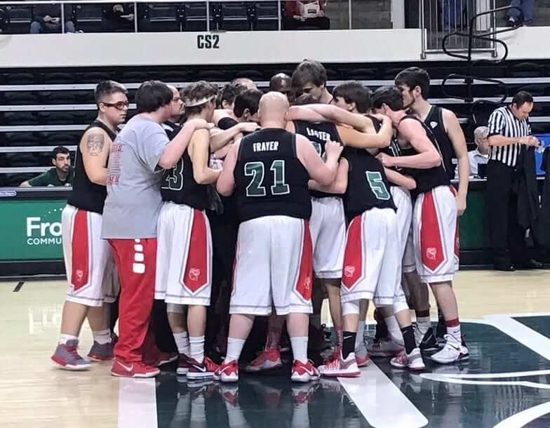
Bizarre scene last night in Ohio, where the state’s Division IV basketball tournament was being played. Due to a miscommunication, two schools that were scheduled to play each other — New Boston and South Webster — both showed up with their white uniforms. Since the tournament is being played at Ohio University’s arena, the decision was made to have New Boston swap out their white jerseys for Ohio U.’s black ones. The video embedded above shows the New Boston squad being introduced prior to the game. (As a bonus, New Boston’s team is called the Tigers, and Ohio is the bobcats, so there was a feline connection.)
If you look closely at the video on full-screen, it appears that the Ohio jerseys all have a Russell Athletic maker’s mark, which means they’re from last season. Ohio has switched to Adidas this year. Interesting that they had the old jerseys lying around. (New Boston’s uniforms are made by Nike, so the jerseys and shorts had mismatched logo creep in addition to mismatched colors.)
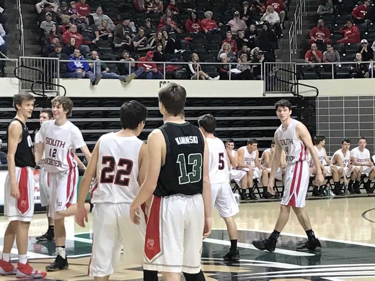
In addition to the mismatched jerseys and shorts, most of the Ohio jerseys had NOBs, so the New Boston players were wearing the Ohio players’ names on their backs. In this next photo, for example, you can see one of the New Boston kids wearing the jersey of Ohio forward Sam Frayer, and another one wearing the jersey of Ohio guard Mike Laster. It’s worth noting that Frayer is 6’8″, 240 pounds, and Laster is 6’5″, 200 pounds, so their jerseys were a bit big on the New Boston kids (click to enlarge):
Since the jerseys were from last year, some of them were for Ohio players who are no longer active. Here, for example, is a kid wearing the jersey of former Ohio forward Kenny Kaminski, who graduated last year and reportedly went off to play pro ball in Spain (click to enlarge):
Obviously, the mix-up could have been avoided with some basic due diligence and preparation, but I love it when this type of thing happens. It makes for a good story, and it was probably a thrill for these kids to wear college uniforms, even if only for one game. Most of them will never play D-1 ball, so this may be as close as they ever get. (Insert obligatory Russell Athletic joke here.) Seriously, good for them.
One final note: The opposing team, South Webster, is called the Jeeps. I mentioned them in my recent piece about Lou Gehrig’s Jeep pin. Unfortunately, as you can see in that last photo, their uniforms do not include either the word “Jeeps” or a depiction of a jeep. Dang.
(Video by Ben Spicer; still photos by Lukas Moore; my thanks to Jake Young and our own Alex Hider for letting me know about it.)
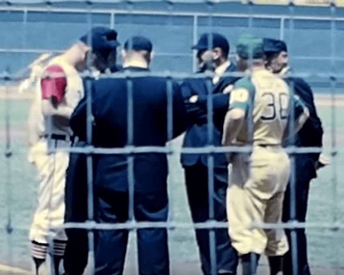
A’s/Indians update: In Friday’s post about some 1963 home movie footage, I mentioned that it looked like the Indians may have been wearing their white home uniforms, rather than their road greys, for a game in Kansas City (or maybe it just looked that way because of the lighting, and/or because of the limitations of home movie film, etc.).
Now we have some new info from reader Jim Wagner, who checked in with the following:
I sent Friday’s entry to my dad, who grew up in Kansas City rooting for the Athletics. I wanted to pass along his response, which might help clear up the white-or-grey mystery:
“Thanks, that did bring back memories. The Indians were wearing their home uniforms. With no interleague play, teams came for more than one series each year. The A’s would invite the visitors to wear their home uniforms for one of the series. They did this for a couple of years.”
Faaaascinating. I’ve never heard that before. If it’s true, then there are presumably photos out there showing other visiting teams wearing white in KC in 1963 or ’64. Let’s see if we can find any!
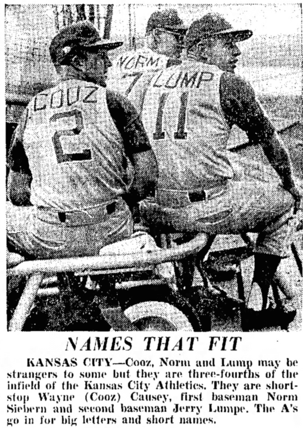
Meanwhile, speaking of the ’63 A’s, for several years I’ve been linking to this newspaper clipping showing some of the team’s nickNOBs and FiNOBs. Now reader Bob Gassel has provided a much cleaner version of the photo:
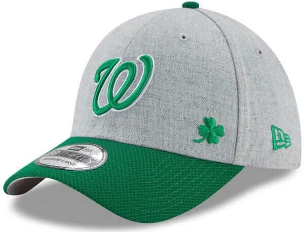
Clover watch: Reader Bryan Martin Firvida notes that a lot of MLB’s St. Patrick’s Day merch from New Era (shown at right) and Under Armour is saddled with a common but important error:
They used a four-leaf clover in their designs (a general symbol of good luck and has nothing to do with Ireland) instead of the three-leaf shamrock, which is a symbol of Ireland because St. Patrick, Ireland’s patron saint, is said to have used the shamrock to explain the Holy Trinity.
It would be great if these big companies spent a little more time learning and researching instead of just kicking out anything green and calling it “Irish.”
For the record, the on-field caps that will be worn for spring training games on March 17 have the proper three-leaf symbol.
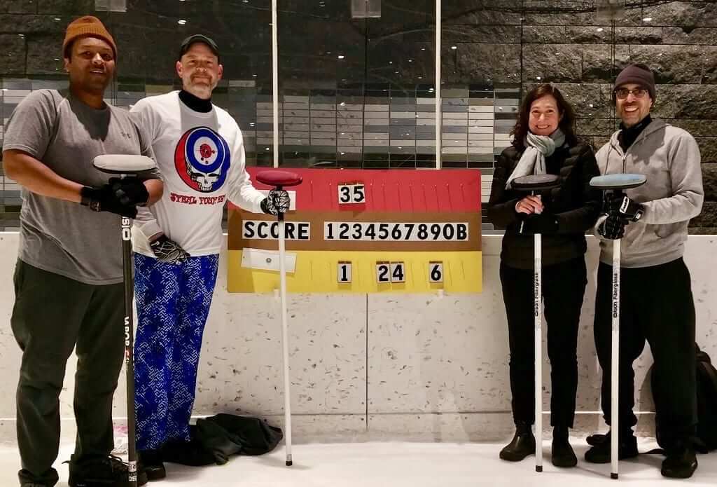
Curling update: My curling season ended in January, but Phil’s team needed a sub last night, so I stepped in. As is often the case, Phil wore some eye-catching pants, but this time they were overshadowed by his shirt. Here’s a closer look:
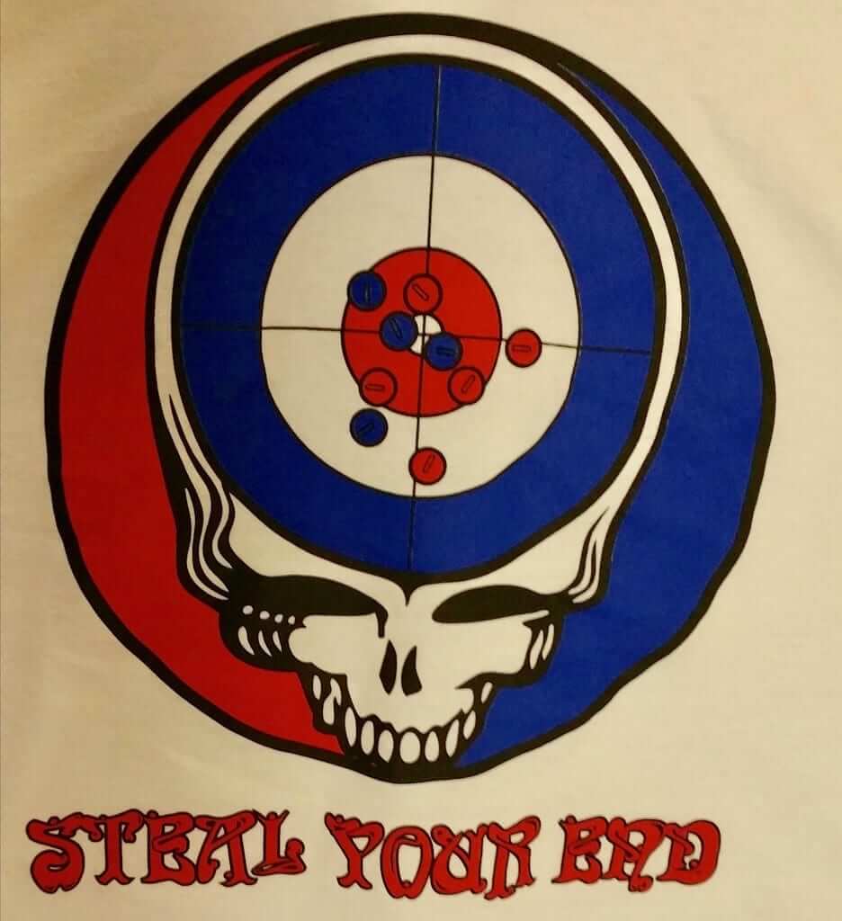
That’s a reference, of course, to this Grateful Dead album (and to the curling move of “stealing” an end by scoring points despite not having hammer). I’m not sure how many Deadheads besides Phil are into curling, but it’s still a cool design!
NBA Uni Tracking: Collin Wright’s usual Monday report on the latest NBA uni tracking numbers has been delayed. We should have it tomorrow. Thanks for your patience.
The Ticker
By Jamie Rathjen

Baseball News: New pinstriped uniforms for Florida (from @ChristophersZen). … Southeastern Louisiana wore camouflage yesterday against LSU (from Trevor Wilson Patton). … ESPN anchor Chris Berman was an honorary manager for the Giants yesterday and wore No. 83 in honor of his late wife (thanks, Brinke). … New logo, colors, and uniforms for Korean team Lotte Giants (from Dan Kurtz).

Hockey News: The Moncton Wildcats (QMJHL) threw back to the AHL’s Moncton Hawks, who played in the city from 1987-94 (from Wade Heidt). If the logo and jerseys look kind of familiar, the team was indeed an affiliate of the Jets for its entire existence. More video here. … The podcast Super 70s Sports recently did an interview with Peter Good, the designer of the Whalers logo (from K.C. Kless). … A Calgary boy who was spotted wearing a makeshift DIY Flames jersey was given a real jersey after a photo of him began circulating on social media (from Ted Arnold).

Basketball News: Color-on-color between Cincinnati and Wichita State (thanks, Alex). … Alabama F Donta Hall wears mismatched shoes (from Mike Barnes). … Scotland’s team for the upcoming Commonwealth Games played a blue-on-blue game against British Basketball League team Glasgow Rocks. The Scotland number font is borrowed from that formerly used in the country’s soccer leagues.

Soccer News: German team 1. FC Köln have worn a total of seven different kits this season. Kits four through seven are a special shirt for Europa League games, a throwback, a black/neon/neon combo featuring last season’s third shirt, and a second black kit last week, the latter two because of color clashes that couldn’t otherwise be solved. … Mexican teams have a practice of giving their youth team players three-digit numbers that, as we can see, don’t fit on the substitutes board (from @g_malcs). The practice starts with a range of 281-305 or so for under-20 teams, as with Club América midfielder Aldo Cruz here, while lower age groups wear numbers in the 300s and 400s. … New York City FC striker David Villa honored Spanish striker Quini, who passed away last week, before the team’s game in Kansas City (from @BandaBear15). Quini played in his homeland for Sporting Gijón and Barcelona from 1968 to 1987. … Cross-posted from basketball: The number font used in Scotland until the end of the 2014-15 season is currently worn by the country’s basketball team.

Grab Bag: UK bookmaker Ladbrokes says it may have to cut the amount it spends as a naming-rights advertiser if the country’s government limits how much can be bet on betting machines. … Two Australian Football League items from @TheBigJamesG: There was a color-on-color preseason game between Gold Coast (in red) and Geelong. That’s referring to their shorts: AFL teams tend to wear colored shorts at home and white away, with a change of guernsey as third choice. In the same game, Geelong wore sleeved guernseys, rather than sleeveless. … Staying in the Gold Coast, with the Commonwealth Games to be held there next month, South Africa unveiled field hockey uniforms and other athletes’ gear for the competition. … The NLL’s Colorado Mammoth became the the latest team in the state to wear state flag-colored uniforms (from Wade Heidt). … Among the Americans at last week’s track cycling world championships in the Dutch city of Apeldoorn, Chloé Dygert appeared to have Red Bull as an individual helmet advertiser, which set her apart from the rest of the women’s team pursuit team.
We expect this NBA tracker on Mondays. This is the kind of stuff that CANNOT happen if you’re expecting us to pay
This kind of stuff will always happen, because people (including Collin Wright, who does the NBA tracker) are human, and humans have complicated lives that sometimes include family emergencies. I’ll pass along your best wishes to Collin.
But paid sites realize these things happen and cover them, if newsday has a missing editor or headline writer what do they do? just give up?
I’m not trying or claiming to be Newsday. If you don’t want to pay for Uni Watch, with all its admitted flaws, that’s completely up to you.
Apparently you are only charging angry readers thus far. Keep up the great work Paul!
You angry folks are pitiful. I pity you and your lives.
I get it that there are going to be some that will complain and nitpick about any error or perceived slight with a paid site, but geez….
Haha. Well handled Paul. There is certainly some merit to the idea that you expect high quality when paying for content. But you’ve already indicated what that content would be, the same excellent work you and your team have been putting out for years. I find the complaint about the uni tracker to be almost comical. As if this data is essential to someone’s livelihood, like earnings reports to base investment strategy on. This is nothing more than fun data for people who are interested in sports uniforms, if it shows up a day late it changes nothing.
“Obviously, the mix-up could have been avoided with some basic due diligence and preparation, but I love it when this type of thing happens.“
Loves to point out other people’s errors, but don’t you dare say anything about his own.
We pay for Uni-Watch?? This is news to me.
Re: the guy whose tweet you embedded in the lede, I didn’t understand why he was calling “New Boston” by that name. That’s the name of the town, but the name of the high school was definitely Glenwood when I went looking for it in the tournament brackets: link
I was confused when there was no “New Boston” to be found, so I think he was mistaken.
Re: the four-leaf-clover hats, a certain bar in Charlottesville put a piper on their balcony every year on the 17th and it drove me nuts because bagpipes are a lot more Scottish. Same thing with St. Patrick’s merch that has tartan on it, of which I think the NHL has been guilty in the past.
Yeah, the way that OHSAA refers to teams whose school name doesn’t match the city name is causing the confusion here. They put the school’s mailing address city/town in front of the name of the school. For instance “Zanesville Maysville,” “Dresden Tri-Valley,” “New Concord John Glenn,” “Gloucester Trimble,” and of course, “New Boston Glenwood.”
It doesn’t help that Glenwood was listed in the official program for this tournament as “New Boston.”
The Scottish and Irish both got the pipes from the Romans. See link. The instrument subsequently died out in Scotland; and was reintroduced to the Scotland Highlands by Irish Colonists and Missionairies (i.e. St. Columcille). The Scottish later added a 3rd drone to the 2 drone Irish warpipes, becoming the Highland Bagpipes seen today.
Too bad New Boston lost. I would have been cool to see if they continued to wear the Ohio jerseys for the rest of the tournament. (Like a ‘good luck’ thing.)
I used to cover high school sports in the area, and it’s rare for anyone in southern Ohio to refer Glenwood as anything other than “New Boston.” Probably stems from the fact that New Boston is a tiny town completely enveloped by the town of Portsmouth — I believe New Boston broke away from Portsmouth at some point and made its own municipality. Lots of pride in that little town, and they want it to be known that they’re independent from Portsmouth. This applies to a few other school districts in the area (East instead of Sciotoville, etc.).
Did you do stuff for WOUB (Gridiron Glory/Hardwood Heroes) or the Post or what outlet? And I’m just a freshman here at OU, so I didn’t know about that. Why call it Glenwood if it’s the only high school in New Boston? (not expecting you to know, but if you do, that’d be great)
I wrote for Speakeasy in college, and then worked for the Portsmouth Daily Times for a little over a year after I graduated.
The old high school building was located on Glenwood Ave., so I assume they began calling the old high school “Glenwood” to distinguish it from the elementary/middle school. When they opened a new building nearby in 2012, they carried over the name. That’s just a guess though.
Enjoy OU! Don’t ever graduate.
If we are paying for something the quality should be better than current uni watch
If you don’t want to pay, then don’t pay. Completely up to you.
I would disagree with this. IMHO the thoroughness of this site, along with daily posts, is pretty damn good. If anything the other option would be to keep it free but back way off on the content and support staff. Kind of like Chris Creamer’s Sports Logos site, which is very good but has less content and doesn’t always have daily posts. I still haven’t decided if I’ll pay, or at what price would make sense for me, but it definitely isn’t from the lack of content or quality.
Not sure if it’s that common for Prep schools that are/were affiliated with Universities, but I attended Georgetown Prep School in DC, and at least when I was there in the mid 2000’s, our basketball uni’s were the previous season’s Georgetown University uniforms. They would replace the NOB with our GP logo.
That scoreboard is messed up. It shows both teams scoring in the second end.
(Yes, I’m a little frightened that I spotted that.)
No it doesn’t. Red scored points in the 3rd and 5th ends; yellow scored in the 1st, 2nd, 4th, and 6th ends.
Curling scoreboards are confusing. The numbers in the center are the points, not the ends; the hanging tags are the ends.
The idea behind doing it this way is that you only need one numbered tag for each end (instead of having lots of “1” and “2” and “3” tags for the various point totals that teams might be scoring in each end).
Yeah, I remembered two minutes after I posted. Typical.
Curling scoreboards are confusing if you’re used to baseball line scores. If you take a baseball line score and break the data into two axes, inning and score, then flip the axes, then flatten it back to a one-dimensional display, you get a curling scoreboard. Which probably makes sense to nobody but me, but realizing that was key to my own ability to make reading curling scoreboards intuitive.
They’re especially confusing now that all the big curling tourneys use the “baseball” type scoring. So if you just watched the Brier or Olympics, you’d see scores akin to a baseball game with each team having it’s own “scoring” line.
Easy mistake to make, but the wooden boards with hanging numbers are old school!
(I know you know this Scotty — more for Matt).
Cheers
link provides a decent explanation of the difference in scoring styles.
Wait, that’s not what it says, is it?
When you start charging, you should do like a 7 day free trial before you charge.
We’re currently in the midst of a 12-year free trial.
;)
link and it’s not even 10a.
(In case you can’t tell, I’m applauding Paul)
Except for the cold, curling would seem to be ideally suited for Deadheads.
I know several curlers who are deadheads, and even more who would wear that shirt. If Phil is reading comments, perhaps he’ll share his source, or if he’s responsible for the shirt, make it available?
I’m not, Scotty – but shoot me a tweet and I’ll @ the gentleman responsible for making them. There are quite possibly some copyright issues, so the one I had is from a very limited run, but perhaps he can get more made if the interest is there.
In fact — I link. The creator is named in the tweet — just reply to it and ask him!
Dave if you’re reading this link.
Thanks, Phil!
With the “blue-on-blue” Commonwealth Game we have a great example of what a Duke-UNC blue-on-blue game would look like.
And I always thought the Tar Heels could wear their light baby blue for practically every game, away or home. Color-on-color is all about contrast, and their light blue would contrast with practically every other opponents uniforms.
Manchester City and Chelsea played blue on blue in the English Premier League yesterday. Looked great
Re: the Mammoth’s Colorado flag jerseys: I wouldn’t say they’re the latest team to wear them. They started the trend, debuting these Colorado pride jerseys a few years ago. And I’m glad they did; it’s a great look!
I think it was intended to mean the latest being they wore them just on Saturday. Yes, they do have the history of wearing Colorado pride jersey. Also, impressive attendance turnout in Denver for NLL. I tip my hat.
Unfortunately, once people pay for something, they become much more critical and expect way more. Human nature is ugly. Hope everything works out well for you, sir.
Unfortunately, once you create a product, which is now what Uni-Watch will be, some people may become much more critical and expect more in the way of consistent quality, because they are now spending their hard earned money on it.
That’s the nature of exchanging money for something, now people aren’t going to keep quiet when certain expectations aren’t met.
While technical issues, or delays, or life are going to continue to happen, when you’re charging people for you product, the trade-off is now having to listen to you customers grumble when they effect the consuming of their product.
Anyways…
Lee
I grew up in the Boston area and, of course, am a Red Sox fan. I do vaguely remember the Red Sox wearing their home unis in KC for a series, at least once, in the 60’s. Wish I had the photo proof.
Want one of those 1963 A’s jerseys? Here’s link. I don’t think they can get any more than four letters on there.
(And if you love that color and love that vestness, but hate NOBs and also would prefer the McAuliffe font, check out Wayne Causey’s #2 jersey from the very next year.)
Both pretty steep at $700, but if you’re a nickNOB aficionado, that Rakon jersey *is* a piece of history…
I’m at the point where I’m ready to pay for Uni-Watch just to filter out the comments from the miserable complainers. Seriously people. Seek help.
Lol maybe you should seek help for your narcism? Seek help for what? For having a different opinion than yours?
Narcism? I assume you meant narcissism. And how exactly am I being more narcissistic than those complaining about someone having a family emergency get in the way of their precious content? How entitled are you? How can you lack even an ounce of empathy?
I’M GOING TO HIDE BEHIND A PSEUDONYM WHILE I BITCH ABOUT A BLOG RABBLE RABBLE
Unrelated to today’s post, but do we have a timeframe on when we may see the Jag’s redesign results? Sorry if that was covered somewhere else. Thanks in advance!
Sometime this week — possibly as soon as tomorrow. Piece is done, but it’s up to my editor.
So, it’s possible that the Yankees wore their home pinstripes in Kansas City. Well, considering that the A’s were, in essence, a farm team for the Yanks at the time…
link
Re: wearing white in KC. This clears up a life-long mystery for me. I used to own the Street and Smith’s baseball yearbooks when I was a kid. In one of the early ‘60s editions, there was a picture of a Detroit Tiger in his home whites vs. KC. The backdrop was obviously not Tiger Stadium. Nor was it from Lakeland, Florida. It looked very much like the stands fencing from Municipal Stadium. Never did figure that out until now. If anyone has old copies (sorry, I can’t remember the exact year) then you’ll see what I mean.
That’s interesting information about the A’s suggesting teams bring their home uniforms to Kansas City for a series. It makes sense, since going all-gold, all the time was a radical challenge to the white vs gray status quo of the period. Having the road team in white added to that upheaval. When the A’s added gray and white sets in 64 they may not have continued to encourage road team whites, but why not? They still had the golds.
Finding mentions of road teams in white will be tough, but not as tough as finding color photos of games played in Kansas City in 63 or 64. Almost all easily accessible photos would have been taken in New York or during spring training. “That’s My Boy” had photos of the A’s during not only this period, but a number of sleeveless red and blue 62 pics as well. Pretty sure they were all from spring training. Too bad his site has disappeared from the web.
Even black-and-white game photos should suffice for most teams, since most clubs’ home and road uniforms had design differences that went far beyond white vs. grey.
As a manager for a college baseball team, I can assure you that we have full sets of jerseys, from an array of years, at our disposal.
I guess it’s cool that Adidas doesn’t have some sort of clause in their contract with schools that any and all leftover stuff that isn’t Adidas must be launched in to the sun. Or, if they do, they don’t work as hard to enforce it with everyone.
Is there any truth to the rumours of a Nuggets redesign?
We had a similar situation when I was AD at a high school and we were hosting the regional final. In Wisconsin, they alternate who wears white based on which is first alphabetically. This year, the last alphabetic team wore white.
Both teams start warming up in white. The one coach who was told he had the wrong color was pissed. Fortunately, they had their darks on them do it wasn’t a big deal, but the coach said they were lady alphabetically so should wear white. His team was Washington HS out of Milwaukee. The opponent was Rufus King. He thought the game was Rufus King vs Washington. the WIAA listed Washington as Milwaukee Washington in their guide book (but not Milwaukee Rufus King … they were just Rufus King), so it was actually Milwaukee Washingtonvs Rufus King.
It did make for some pregame antics, but fortunately, they had both sets of jerseys so it wasn’t a big controversy.
Maybe it’s just me, but lately I’ve noticed so many NCAA basketball uni sets that can’t be deciphered on a TV screen. The unis are either too dark with dark numbers and names, or the colors are just not crisp enough for the tube, etc. And this worsens when both teams wear color. I gather these unis are supposed to be “cool” or something, but unless you are standing courtside you just can’t make out the details. An announcer made the comment a few nights ago that he couldn’t make out the players’ numbers.I’d like to see Uniwatch start putting some pressure on the NCAA to correct the issue.