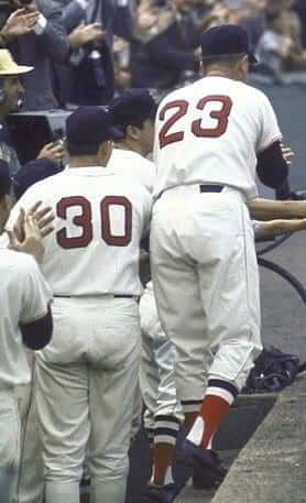
Many fans refer to the Red Sox number font as “the Red Sox font.” But as serious uni-watchers know, the font is actually called McAuliffe, and was created by the Tim McAuliffe sporting goods company. Although the Red Sox are the only team currently using the font (well, except for the Cubs, who’ve used it for years on their helmets), it’s been used by lots of other teams over the years, including the Angels, Astros, A’s, Brewers, Dodgers, Reds, Senators (see player at far left), Tigers, and Yankees, plus maybe a few others I’m overlooking.
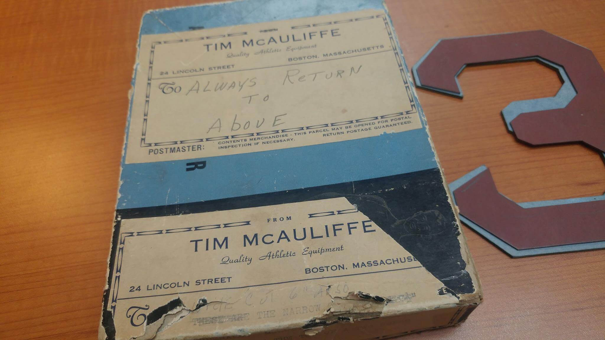
Nowadays, of course, the McAuliffe font has been digitized. But back in the day, the flannel and tackle twill for McAuliffe numerals were cut from a series of die-cut cardboard masters. Those masters were the subject of a very cool Facebook post yesterday from the good folks at Ebbets Field Flannels, as follows:
In the 1950s and 1960s, Tim McAuliffe supplied uniforms for several MLB teams, including the Red Sox, Dodgers, A’s, and Giants. We have had his original Red Sox cardboard number templates in our possession for a number of years. They were stored in an athletic supporter box with McAuliffe’s hand-written notes.
This was accompanied by the following photo (click to enlarge):
The Facebook post then continued like so:
We recently worked with the Red Sox on making uniforms for the 1967 “Dream Team” and used the original die-cuts for the numbers. How cool is that?
The “Dream Team” mention refers to an upcoming reunion of Boston’s 1967 “Impossible Dream” pennant-winning team, which is scheduled for next month. Here’s another photo that the Ebbets folks posted (click to enlarge):
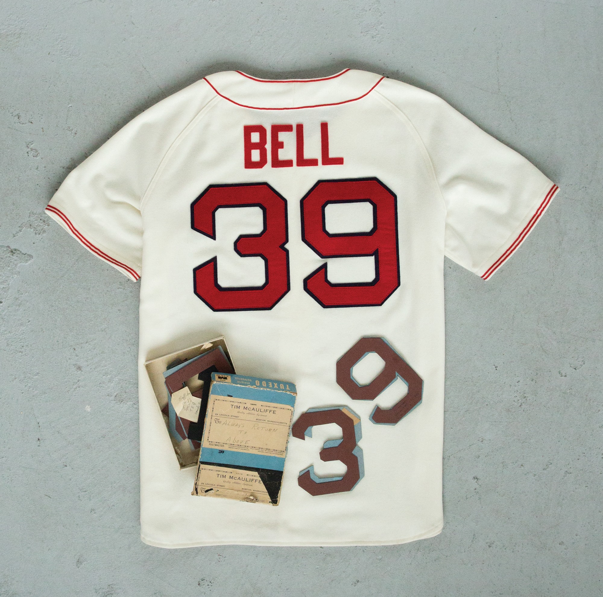
Too bad about the NOB, but the Sox apparently requested that for the reunion event. (They did the same thing for a ’67 reunion event 10 years ago, but that time the lettering was radially arched.) Still, not even the NOB can dim the awesomeness of those original McAuliffe numeral templates. Very cool of Ebbets to post those pics online.
(Special thanks to Will Shoken for bringing this one to my attention.)
Collector’s Corner
By Brinke Guthrie
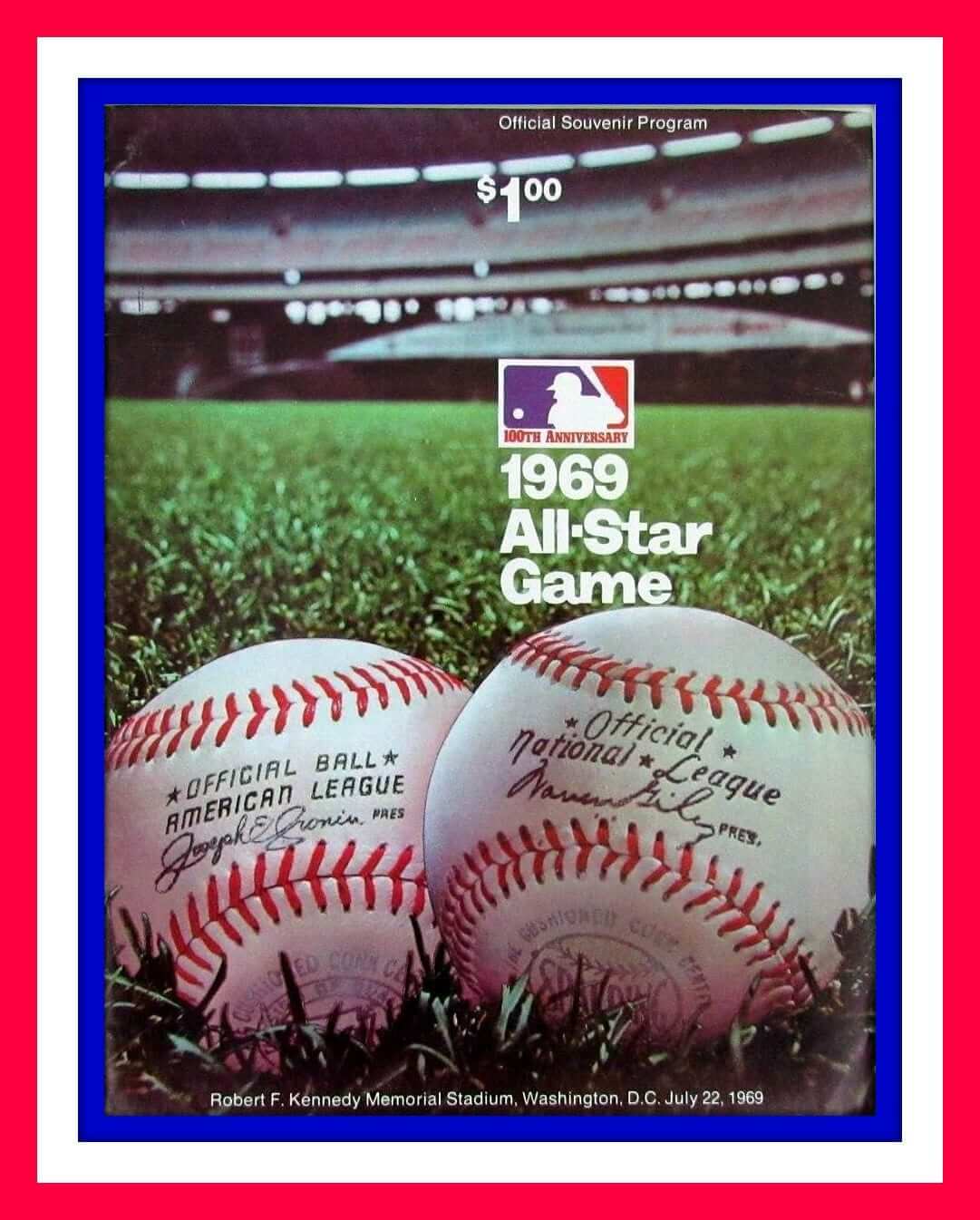
The annual Midsummer Classic takes place tonight in Miami, so we’re all All-Star Game today on Collector’s Corner, beginning with this 1969 ASG program. The cost back then? Just a dollar.
My favorite ASG memories are watching Reggie Jackson gong the light tower at Tiger Stadium in 1971 while I was babysitting next door, and the year(s) Dave Concepcion and the other Reds wore white or red cleats. Cincy used to have solid-black shoes as a team mandate, but the ASG wasn’t a regular game, so the participating Reds players were allowed to bend the rules a little. And in the 1970s, there were a lotta Reds in those games. (More on white cleats from Phil in 2011 here.)
Okay, enough of my reminiscing. Here are the rest of this week’s picks:
• Here’s a 1969 “National League All-Star Squad” baseball guide. This must have been a media guide.
• One more from 1969: a mini-plate brought to you by the Chrysler Corporation.
• Just a year later, the ASG moved to Cincinnati’s brand-new Riverfront Stadium (like, two weeks old, cuttin’ it close), and the program featured that other MLB logo on the cover. Is that in use anywhere? [Nope. Pretty sure it was discontinued after 1975. ”” PL]
• Here’s a press pin for the 1980 game at Dodger Stadium.
• I may be biased because I live in San Francisco, but I think one of the cooler ASG logos was when the Giants hosted the game in 2007. See it on this hoodie.
• The 1979 ASG, which took place at the Kingdome in Seattle, was the 50th edition of the game, as commemorated by this Mariners pennant.
• Look at this 1966 All-Star Game ad from Louisville Slugger. Some big-time players on that ad.
• This 1990 All-Star Game jacket from the Chicago Cubs is, er, rather colorful.
• The 1974 ASG was held at another “state of the art” stadium — Three Rivers, home of the Pirates. Players didn’t wear a patch for the game in those days, but a retail patch is nonetheless available.
• Also from Pittsburgh: Check out the terrific artwork on this game program. Whoa, the $1 price from 1969 had doubled to $2 in just five years! Hey, it was the mid-1970s, inflation city.
The Ticker
By Mike Chamernik

Baseball News: Rapper and Miami native Pitbull performed before last night’s Home Run Derby, and he wore a women’s-cut National League BP jersey (note the deep V-neck and the buttons on left side with “305,” the city’s area code, on the back. … Tonight’s All-Star Game jerseys will have a patch on the left sleeve showing how many times the player has been an all-star (from Nick Curley). … The ball for tonight’s game will have blue-and-orange Marlins-color seams, and Bryce Harper will wear pink and aqua Miami Bryce cleats (from Ted Schwerzler). … Looks like Justin Upton wore a standard road jersey, and not the Tigers ASG edition, for a press event yesterday. He didn’t have an All-Star patch on his sleeve (from Pete Butera). … On a related note, you can see that the Tigers moved the Mr. I patch for the game. The Phillies did something similar, moving the Dallas Green memorial patch from the sleeve to the chest. This has been standard practice in recent years, as memorial patches move from the sleeve to the chest for the ASG (from Mike Paolucci). … Before becoming a star QB, Tom Brady was a good baseball player. When the Mariners hosted him and a group of other high school prospects for a try-out before the 1995 draft, Brady snuck away to the M’s clubhouse and tried on Ken Griffey Jr.’s jersey. Brady was eventually drafted by the Expos (from Brinke). … The Fireside bar in San Francisco adopted the Giants’ SF logo, but reversed the S and F (from David Gadd). … In 1981 the Giants had warm-up jackets with numbers in cable cars, much like what the Warriors had in their “The City” unis (from Andres Cardenas).

Football News: Former Broncos RB Terrell Davis was thrilled to receive his gold Hall of Fame jacket. I like how it was shipped to him in an unassuming box and Haggar zipper bag (from Kary Klismet). … Virginia Tech will have commemorative soda cups for each home game this season. They were designed by Uni Watch reader Clark Ruhland (from Andrew Cosentino). … New unis for Walnut Hills, a high school in Cincinnati (from Brian Henke).

Hockey News: The Kalamazoo Wings are holding a jersey design contest for fans. The winning concept will be worn for a game in December (from Phil). … 3M bought the naming rights to Mariucci Arena, the home of Minnesota’s hockey program [and yes, I’ve added this to the list of upcoming Naming Wrongs shirts ”” PL] (from Mark Wilkes and Brian Kerhin). … New Predators acquisitions picked their jersey numbers. Nick Bonino will wear No. 13 and Scott Hartnell will have No. 17, which he wore during his first stint in Nashville from 2000-07 (thanks, Alex).

NBA News: For the 2001 Rookie Game during NBA All-Star Weekend, players on the sophomore team swapped warm-up shirts with each other for the pre-game intros. Jason Terry wore Elton Brand’s Bulls top, Baron Davis wore Lamar Odom’s Clippers shirt, and so on. … A Bulls player at Summer League didn’t have a name or number on his jersey yesterday (from Tommy Thiel).

Soccer News: Málaga CF, a Spanish club, has new uniforms inspired by Pablo Picasso, who was born in the city (from Edoardo Salvati). … TSV 1860 München, a double-relegated German soccer team, unveiled new jerseys at a recent fan event, but misspelled Aaron Berzel’s NOB. “Brezel” is the German word for Bavarian-style pretzel (from Jim Westrich). … New shirts for Sandecja Nowy SÄ…cz”, a Polish club (from Ed Å»elaski). … A designer created a neat racing-themed logo and uniform concept for the proposed Charlotte MLS club (from John Horne). … Here’s a breakdown of the kit changes made by the major English clubs for this season (from Ted Arnold).

Grab Bag: Metro, the transit system of Washington D.C., is considering a plan to sell the naming rights to some of its stations. The agency floated the idea back in 2012, but negative feedback pushed it to scrap the plan (from Mike Rosenberg). … Spotted on Reddit: A hotel that displays the room numbers using a downlight that casts a shadow. … This may have been in the Ticker before, but once more can’t hurt: Varvara Stepanova, a Russian artist who was part of the Constructivist movement, designed some amazing sportswear concepts in 1923 (from @vaaralehto). … Nicholas Rodriguez spotted a house in Baltimore that uses the same colors as Uni Watch. … New logo for the New York Racing Association. … New logo for Sky Sports, a UK television station.
Missing an o in National in the Pitbull entry.
(Which occurs to me after the fact that this might be very fitting for next year’s All Star Game.)
Fixed.
The NOBs from the reunion 10 years ago were pretty clearly radially arched, not vertical.
Yes, that’s what I meant. (Was thinking too much about vertical arching after yesterday’s Bill Henderson post.) Now fixed.
Except, you just put in “radically”.
Fixed.
… and I meant to reply, not add a new comment thread. Guess I need my morning cuppa.
In the picture posted the Red Sox template numbers appear to be much smaller than the numbers on the jersey. Is it an issue of perspective, or were the numbers not actually cut from the dies?
All Star appearance number patch is on the LEFT sleeve in the photo.
Fixed.
Phillies ought to keep the Dallas Green patch on the front of the jersey. The shoulder patch looks off-center to me, as it’s positioned more “forward” of the center-line of the sleeve.
link
Dick McAuliffe played for the Tigers and the Red Sox. Did he wear the McAuliffe font? Looks like he did!
link
Terry McAuliffe, Governor of Virginia, is considering a run for President in 2020. Maybe the Red Sox will win the World Series and give him a McAuliffe jersey with McAuliffe.
A key problem with the Charlotte MLS uniform concept… 3 stripes along with a jumpman logo?!
Rookie mistake. That design wouldn’t fly with either Jordan brand or adidas.
PS, how is Pitbull popular? Everything about him screams goofy tackiness.
RE: Pitbull….
I know virtually nothing about him, but it seems he is a moderately *safe* TV performer but has a “menacing” name to add hipness to family television–thus his multiple appearances on shows like Dancing With The Stars, American Idol, and the like.
I was thinking the exact same thing when I saw those Charlotte uniform mock-ups. It looks like the designer started with Adidas in mind, plastering it with three-stripes and then switched out the logos and added the jump-man.
I get how the stripes tie into the badge design – but I agree that they wouldn’t allow a jumpman logo next to three stripes.
Simple fix, use 2 racing stripes like a lot of cars do.
The Racing Carolina crest is almost too close to Kingston Stockade too. Especially the look of the crest on the hat and shirt.
link
From a distance they look similar, but the similarities disappear as soon as you can see any level of detail.
“…displays the room numbers using a downlight that casts a shadow”
Or they could have simply mounted the room number flat and saved some money on their electric bill.
…And not gotten their picture in Uni-Watch.
Those will get snapped off and create havoc for customers.
RSB
As if people didn’t already have enough reasons to dislike / poke fun at Pitbull… how is this guy still getting gigs?
He puts on a pretty good show. He’s mostly harmless and his music is catchy. From what I understand he does a lot for the community in Miami. I can understand not liking him but as far as pop stars go he’s not so bad. I’m not a fan but I think he’s entertaining and better than say Katy perry.
Also he calls himself Mr 305, after the area code, hence the jersey number.
Metro stops in DC naming rights……
Great! More words for the driver to MUMBLE as he approaches the station!
“Jlly Blly Ronld Rgan Wrshngtn Natinal Arrprt”
I love that McAuliffe font. Glad to see that Ebbets Field has the templates.
Hopfully they can fix the link they just link. They use a link on the reverse, but it should be link.
Proofreading:
“the Tim McAuliffe sporting good company.”
I’m assuming they had more than one good.
Fixed.
To Brinke from the Collector’s Corner, the buying power of a 1969 dollar is equivalent to $6.65 today. I bet the programs today aren’t $6.65.
Now, get off my lawn.
$15, with four different covers available.
link
“and the program featured that other MLB logo on the cover. Is that in use anywhere? [Nope. Pretty sure it was discontinued after 1975. – PL]”
Actually, it was on the outfield wall at Three Rivers Stadium from 1976 until at least 1979. I don’t have a screen grab nor time to make one right now (I’m at work) but there are a few 1979 Pirates home games floating around YouTube, and you can probably see a shot in there.
link
link
I don’t doubt that it lingered in some corners. But was it added after 1975, or did they just not bother to take the old logo down?
It’s at the 1:55 mark of this shorter video
link
Speaking of the Pirates, they wore the McAuliffe font in the early 40s.
link
That alternate “baseball” logo actually hung in quite a while internally within Major League Baseball. One of the latest uses for the “baseball” (which I could find) logo was from 1984. It appeared on Gary Carter’s All Star Game trophy (The Commissioner’s Award).
link
Scroll to :22 seconds in video
I could have sworn that the logo was also on a backdrop at MLB headquarters when newly elected Peter Ueberoff reinstated both Willie Mays and Mickey Mantle in 1985. Long story short, former MLB commisioner Bowie Kuhn had forced both Mantle and Mays out of baseball for taking jobs at casinos primarily as greeters. That clip, I think was in a video about baseball in the 1980’s. I don’t have it with me right at this moment.
Come to think about it, I wonder if that logo is sort of a personal logo for Bowie Kuhn during his stay as Baseball commissioner? Kuhn was elected in 1969 shortly before the “baseball” logo was used on the 1970 All Star Game program, and Kuhn left office (forced out by the owners) late in 1984. We may have to ask MLB or people who worked for them during that period about this.
I wish I saw where the Picasso inspiration was on the Malaga shirt. The blue on the shirt seems a little too light to match Picasso’s blue period. I was expecting some funky lines at the very least.
My sentiments exactly. Another example of a major corporation (Nike in this case) throwing out the same old template to everyone (pretty standard body / different coloured raglan sleeves combo) but somehow claiming this one is unique by trying to shoehorn some cultural distinction in their BS marketing text.
RSB
Agreed. They used some Picasso-esque imagery in their graphic, but I don’t see ANYTHING on the jersey that would be considered Picasso inspired.
In fairness, they mention that they play in his hometown, but nowhere in that link do they say that the kit was inspired by him.
Paul, your Yankees McAuliffe pic is from a counterfeiting site. Might I suggest link?
Ah, thanks — will swap that in now.
Interesting differences in the AL and NL balls on the featured program. Though both made by Spalding, the stitching is “reversed” between balls. Is this just a anomaly, or is this how they were/are made?
Also, the “Official Ball” stamping is different.
It looks like the American League ball is actually made by the link.
you are correct. my bad
Not ‘your bad’ at all – it was an excuse to look closer at the balls and lead me down a fun rabbit hole. Didn’t even know that company existed.
Reach was actually sold to Spalding back in 1934. So, technically, both balls were made by Spalding, it was just that the AL balls continued to use the Reach brand through the 1975 season.
1969 was the last season of that distinct National League stamp, as they switched to match the AL stamp the following season. 1970 was also the first year Spalding’s name was added to AL balls, at the bottom of the Reach stamp.
Interesting… I’m getting conflicting sources now. Some sources say Al Reach himself sold his company to Spalding in 1889, while others suggest 1934 as the sale date (years after Reach’s death). Curiouser and curiouser!
If they were sold to Spalding in 1889 or 1934, I wonder why they continued using the Reach logo through the 70’s? Did Reach just become a subsidiary of Spalding and Reach products were still widely available? Or did the AL insist on having different balls than the other league?
Interesting – The Wiki for Reach says he sold it in 1889, but the page for Spalding says they bot Reach in 1892.
The 1892 data cites a February 1929 edition of Time.
Another McAuliff: the Seattle Pilots but home whites only.
Some of their home whites, link. Some players wore McAuliffe, others wore link.
In fact, I think Wilson might have supplied link of their uniforms, but Mitchell and Ness’s reproduction link used McAuliffe so that seems to be the font most associated with the Pilots.
Interesting how the American League and National League baseballs have different lettering / fonts.
Some quick googling this morning revealed that the NL ball is made by Spalding and the AL ball is made by the A.J. Reach Company.
Second sentence of the second paragraph reads a little funny. Looks like an added “it” in there.
Fixed.
Another McAulliffe:
Sand Diego Chargers mid-1960s/Lance Alworth era uniforms used the McAullife font. Also for a time used a complicated three or four color number scheme with very complicated trim on the numerals. Sorry no screen grab …..
And yet another one (somebody bring in a Bill Henderson cutout):
The SF Giants wore an all black NY throwback that didn’t have numbers back then, but for modern convenience in the scorecard, they specifically ordered McAuliffe font for the old school look.
3M Arena at Mariucci. That’s just disgusting.
“at Mariucci”
Where exactly is “Mariucci”?
Mariucci Arena got a new name Monday. The Univeristy of Minnesota Gophers will now call their men’s hockey shrine 3M Arena at Mariucci.
Nanne played under John Mariucci, one of the most iconic names in Minnesota hockey history. Mariucci was an All-America for the Gophers in 1940 and went on to coach the team for 13 seasons, while working with communities around the state to build arenas and grow the game.
Herb Brooks, another of Mariucci’s former players, helped lead the charge to have the hockey side of Williams Arena renamed “Mariucci Arena” in 1985. The team moved across 4th Street into a new building in 1993 and had always called that “Mariucci Arena.”
link
Lee
Yes, as someone born and raised in MN I understand all that. I was asking a rhetorical question as a critique of the name.
In other words, the arena used to be named Mariucci. Simple enough. Now that they’ve renamed it “3M Arena” and claimed 3M Arena is “at Mariucci” – it begs the question: where is “Mariucci”?
I wonder if 3M will use the Minnesota “M” for the stadium logo. That would look… tolerable.
How can you have a building be *at* a person? Particularly one who’s been dead for 30 years and is presumably not buried on the arena grounds?
Loved those SF Giants numbers inside the cable car! Just one question: were they able to fit “Hargesheimer” on the back or did they go with NickNOB? In the pic it looks like H-A-R-G reaches the middle of the jacket.
Fairly common for warm-up jackets to have nickNOBs instead of more traditional NOBs.
I was wondering the same thing, there’s no way the name fit. My guess would be HARGY.
Strange picture for a baseball card… Hargeshiemer is a pitcher but is holding a bat.
A look back at the 1980 All Star Game.
1980 National League photo link
1980 All Star Game program cover link
1980 All Star Game ticket stub link
I found a video of the game and wanted to see your conversation with Garner. Then I stuck around to watch you strike out the side.
Anybody else notice from this year’s MLB Celebrity All-Star softball game that Tim Raines was wearing a 2017 All-Star cap with Montreal Expos emblems? Cap is not available on MLB or New Era websites.
Imagine – a player wearing something that isn’t available for retail sale. What’ll they think of next….
Really surprised more teams don’t use “McAuliffe”. The symmetry makes it look so great.
At this point it would also make you look like you;re trying to be a BoSox wannabe. No thanks!
Once it fell into disuse, it sort of became the Red Sox’ intellectual property. Fine for throwbacks, but if you go forward, you’re placing yourself in Boston’s shadow. In much the same way, the leather-pattern striping on the Delaware and Princeton football helmet is typically referred to as the “Michigan helmet”, no matter how actual history might have played out.
How about for teams in other sports?
I’m of the mind professional sports would like their teams to use custom fonts, for the sake of making the counterfeiters’ jobs that much harder. But the McAuliffe template is hard to beat for legibility and style.
Another cool McAuliffe example: BU and BC had a hockey game at Fenway around the Winter Classic where the Flyers came in. BU normally has the word Boston (not University) arched up front over a number. So they had special jerseys rendering Boston in the Red Sox font (what do they call that, Tiffany?) and McAuliffe for the numbers.
Re: Racing Carolina MLS
The possible owners are the Smith family, owners of NASCAR teams including Charlotte Motor Speedway. The colors would include Petty Blue, no doubt about it.
No pics but they are on ESPN’s front page, Harper’s cleats were painted to honor Jose Fernandez, and both Marlins players wore the Jose memorial patch on their jerseys.
Regarding Neshek’s ASG jersey, I was annoyed MLB took the sleeve numbers off for their stupid patch. It’s part of the Phillies jersey and shouldn’t be tampered with like that.