Good Saturday morning, Uni Watchers, I hope everyone has had a good week. The bout of the flu I had last weekend really did a number on me, and I was pretty much out of commission this whole past week. I’m definitely on the mend but this was brutal. I hope you guys all were smarter than I got a flu and/or COVID shot this winter.
Now then.
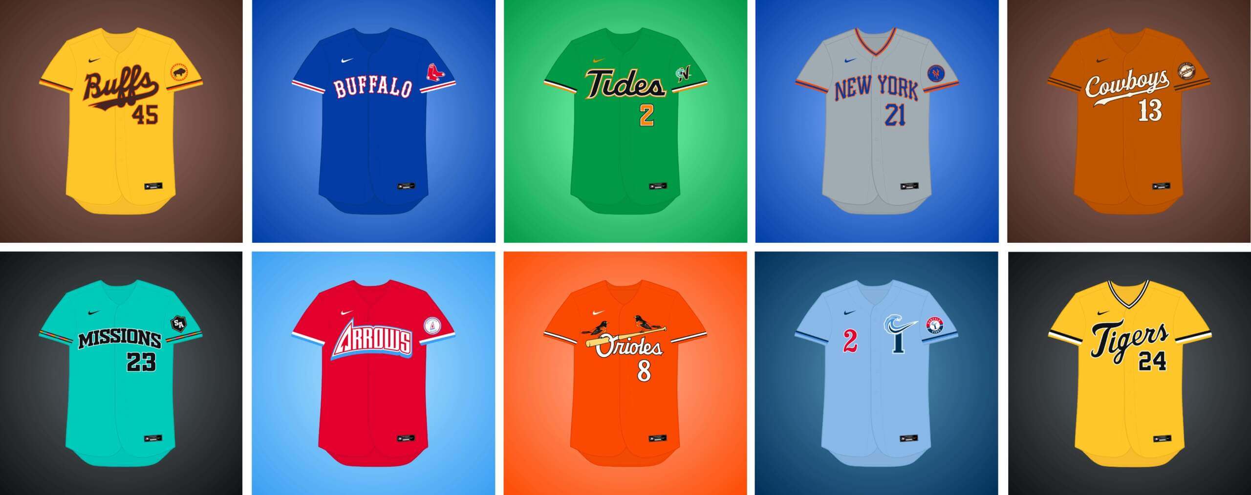
Today, I’m joined once again by Matthew Drake, who has embarked on a project he’s calling the “MLB Multiverse,” which is now entering its seventh part. If you missed any of the first six posts, you can click here for Volume I, click here for Volume II, click here for Volume III, click here for Volume IV, click here for Volume V, and click here for Volume VI. As in previous posts, I’ve included Matthew’s introduction from his introductory post below, so you don’t have to click on Volumes I through VI for an explainer. And as in previous volumes, for each “what if” I’ve included the new “home” jersey inline, with road and additional alternates in the gallery beneath. Enjoy!
You can follow Matthew @MJD7Design on the Twitter/X.
Here’s Matthew:
by Matthew Drake
I call this series “MLB Multiverse.” It’s essentially a collection of “what-ifs”: either relocations of MLB teams that very nearly happened, or what certain teams would possibly look like if they never relocated in the first place.
Obviously referential of Marvel’s recent cinematic dealings with the concept of the “multiverse,” another way of thinking about this is that these teams do in fact exist in an alternate universe, where their respective relocation deals followed through to completion.
The series was heavily inspired by user @SFGiants58’s legendary “MLB: The Defunct Saga” series on the sportslogos.net boards, as well as logo/uniform legend Todd Radom’s “Phantom Franchise” segment on Buster Olney’s podcast.
I created over 60 (!) different alternate-universe teams in this series, my biggest series ever by far. It was fun and exciting to try and flex my creative muscles a bit more beyond simply fixing up the 30 big league teams. I hope you enjoy seeing these designs as much as I enjoyed creating them!
What if… the Cardinals relocated to Baltimore?
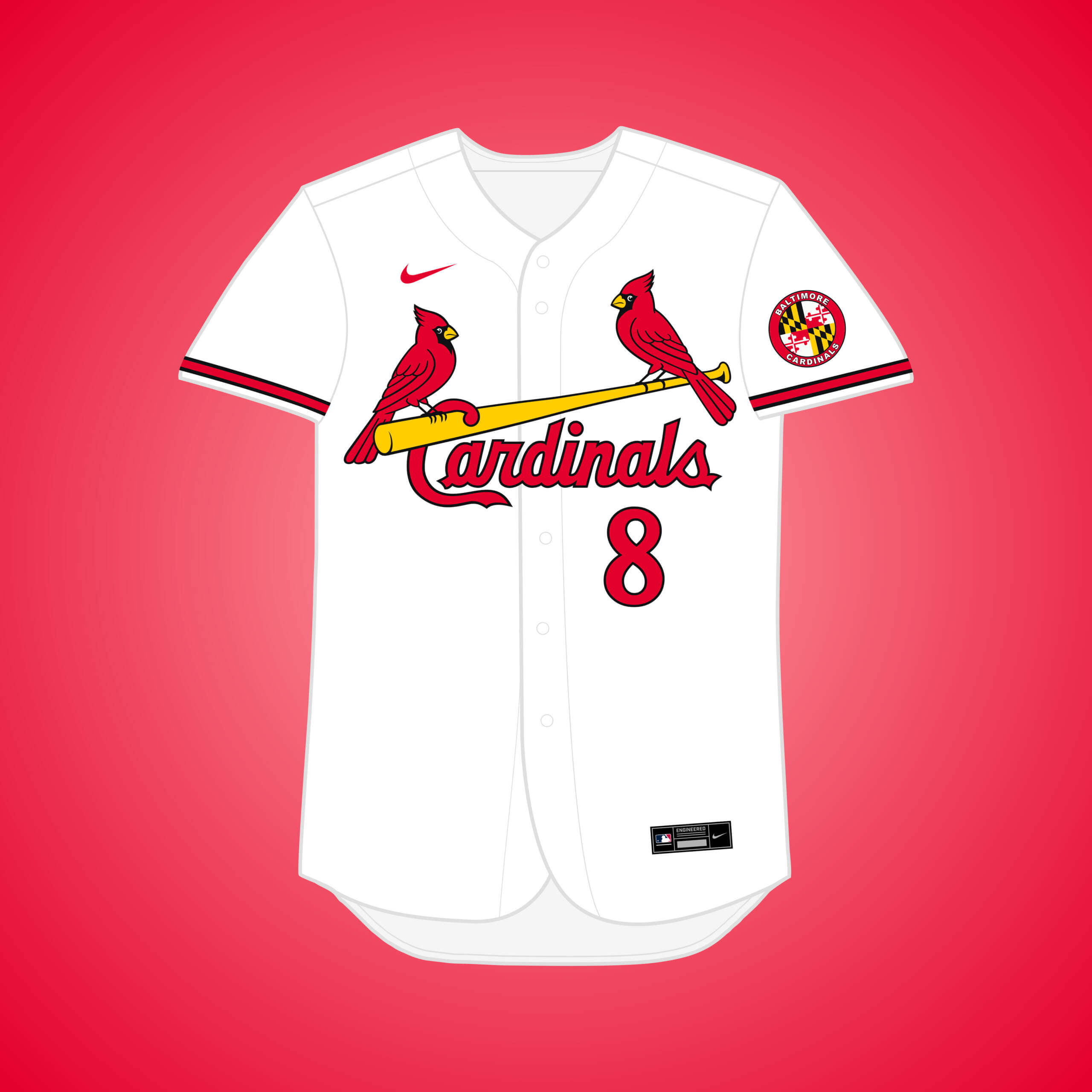
After the Federal League collapsed in 1916, Baltimore Terrapins owners tried to purchase the Cards, but the deal was rejected. I went with a red, black, & gold scheme inspired by Maryland’s flag.
What if… the Cardinals relocated to Baltimore (and changed their name)?
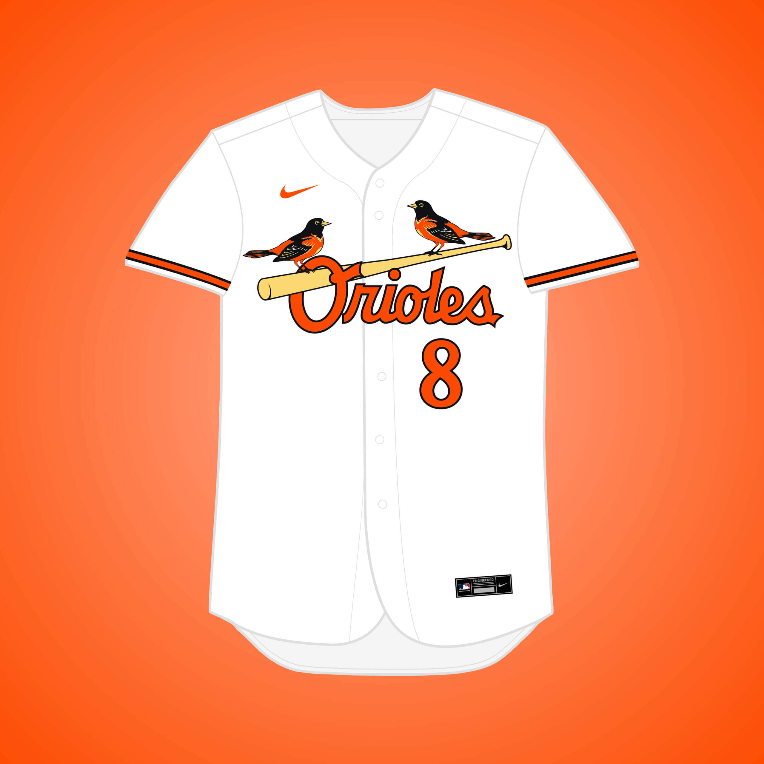
This is the same Cardinals → Baltimore premise, but if they changed the name to the Orioles, which would have historical precedence, with the team that eventually became the Yankees.
What if… the Red Sox “remained” in Buffalo?
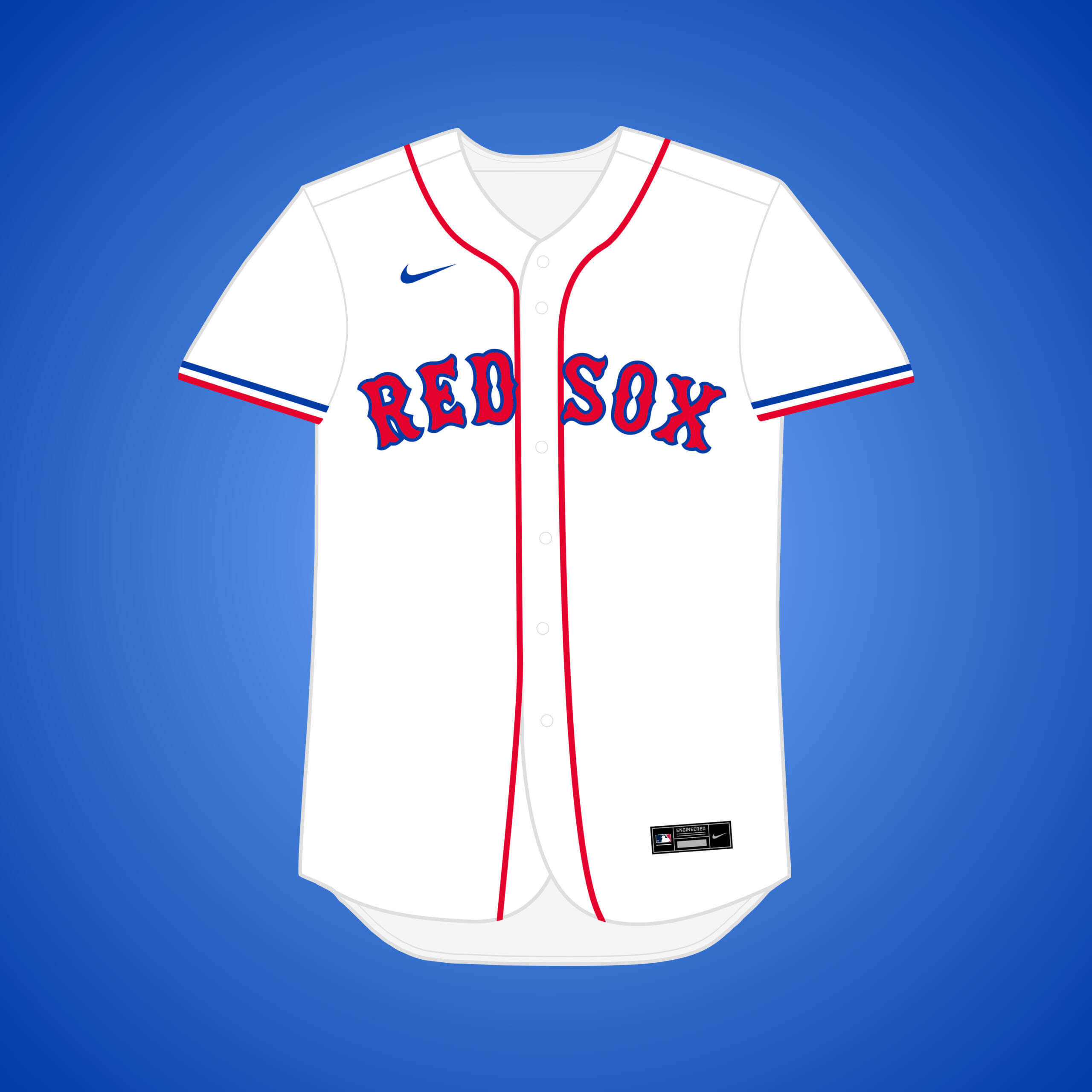
In 1901, AL founder Byron Johnson had promised Buffalo a new franchise before snubbing the city and awarding Boston a second MLB team instead. The red, white, & blue scheme recalls the Buffalo Bisons & the city’s NFL team.
What if… the Cardinals relocated to Houston (and changed their name)?
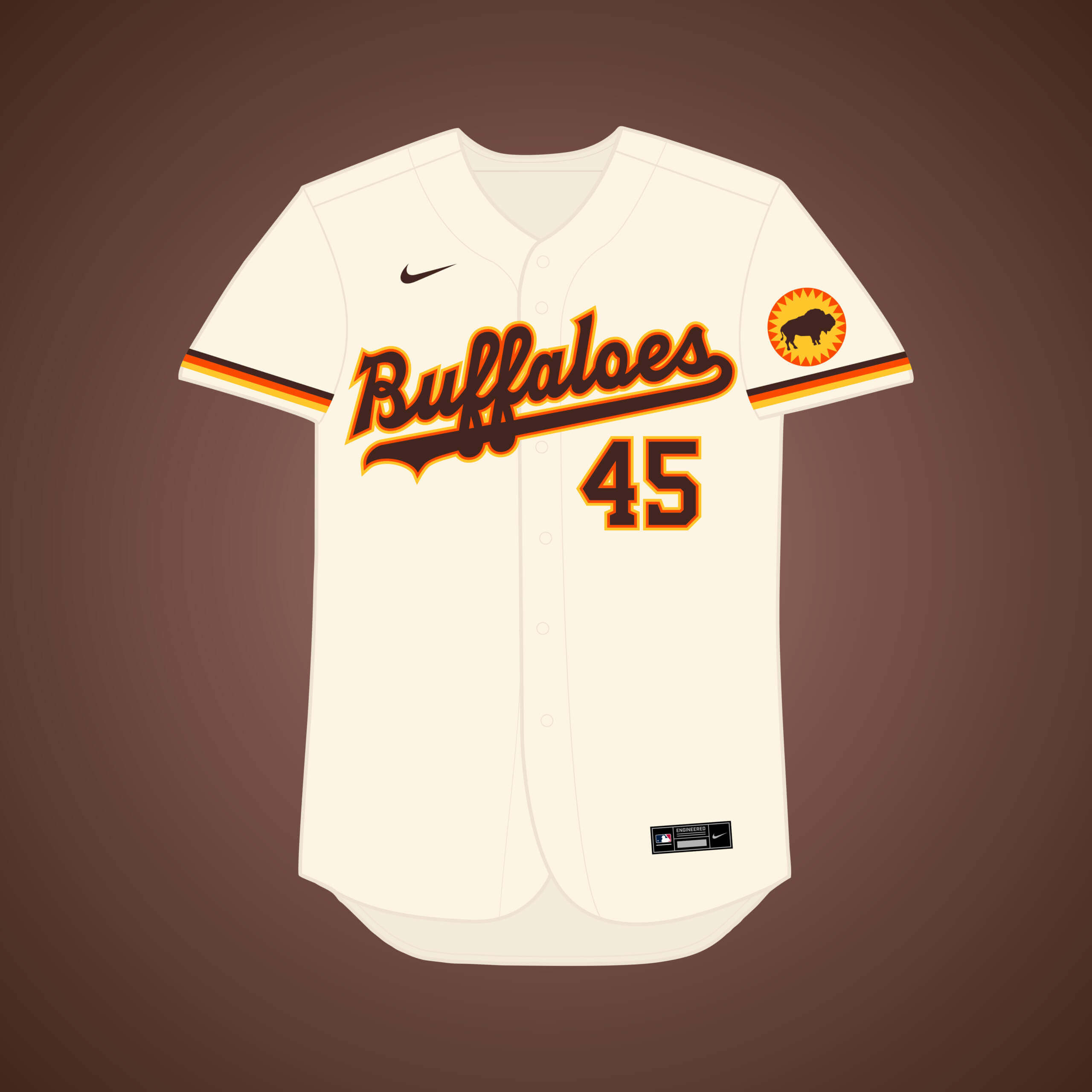
This is the same premise as my original Cardinals → Houston design, but if they instead kept the name of their Minor League club, the Houston Buffaloes (or “Buffs”).
What if… the (Athletics, Pirates, or Twins) relocated to Indianapolis?
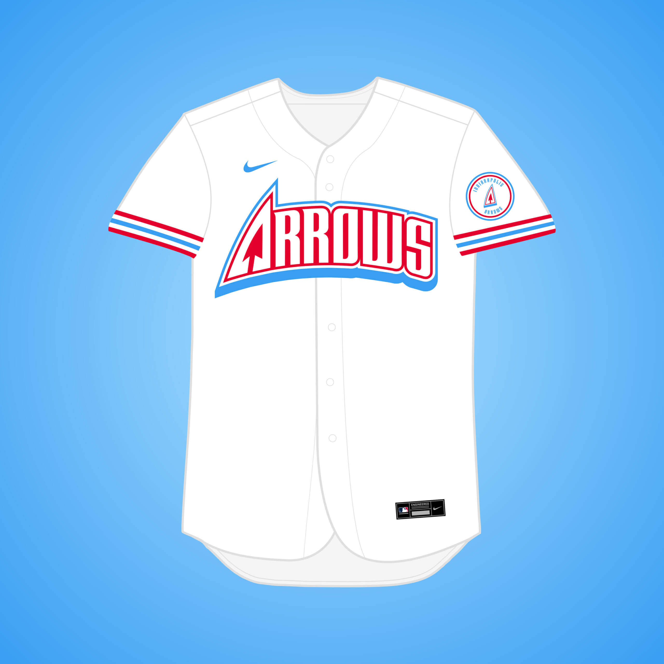
Arthur Angotti led a group working to bring MLB to Indy in the mid-80’s: the A’s, Pirates & Twins were up for sale. They would’ve been named the “Arrows,” & had the benefit of prototype logos & uniforms.
What if… the Cowboys remained in Kansas City?
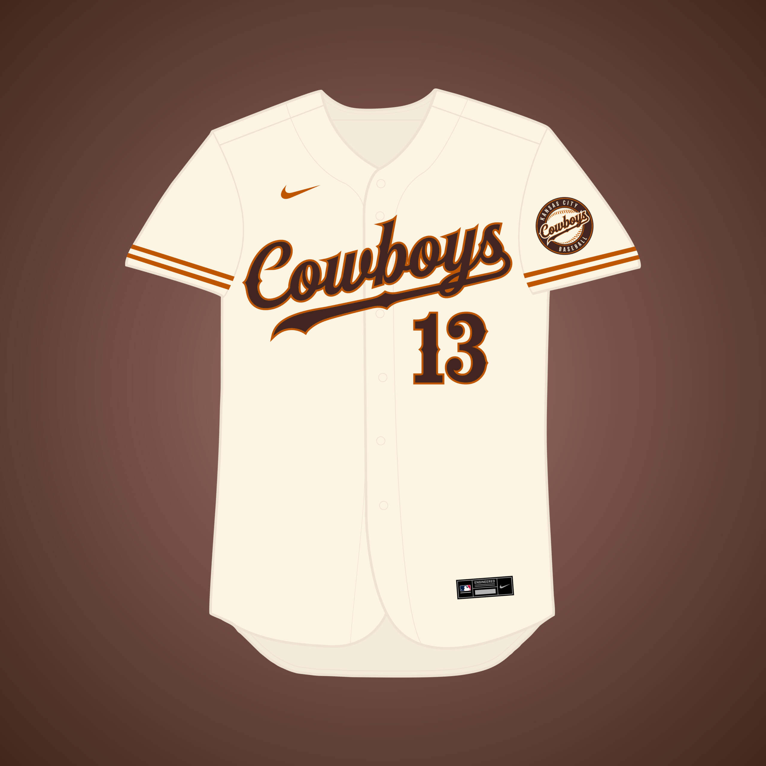
The Cowboys (or “Blues”) existed until 1901 when they moved to Washington and became the Senators, who eventually became the Twins. Brown & Longhorn burnt orange felt like a fitting color scheme for this team.
What if… the Cardinals relocated to Milwaukee (and changed their name)?
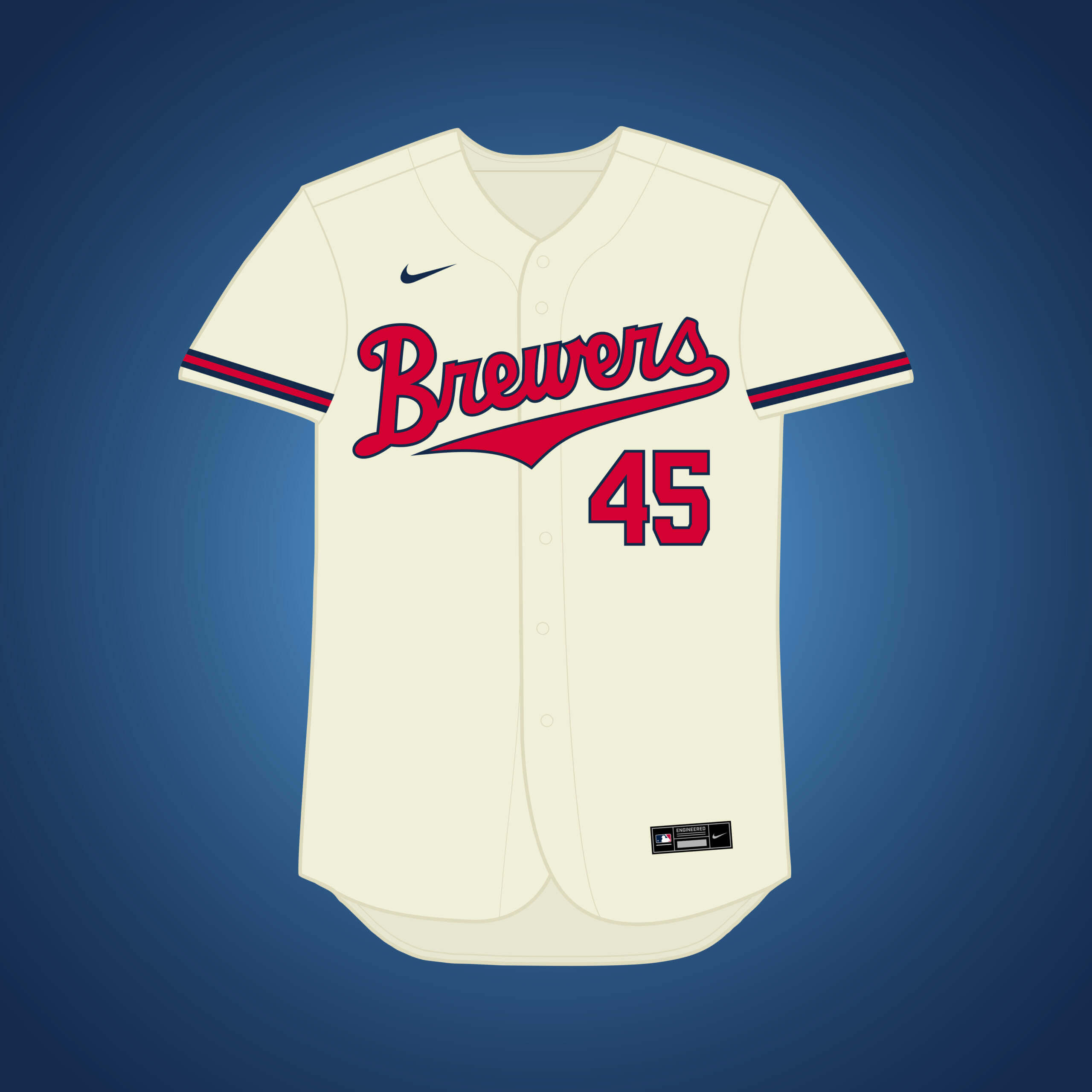
This is the same premise as my original Cardinals → Milwaukee design, but if they changed their name to the Brewers. The uniforms are inspired by the American Association team.
What if… the Expos relocated to Milwaukee (and changed their name)?
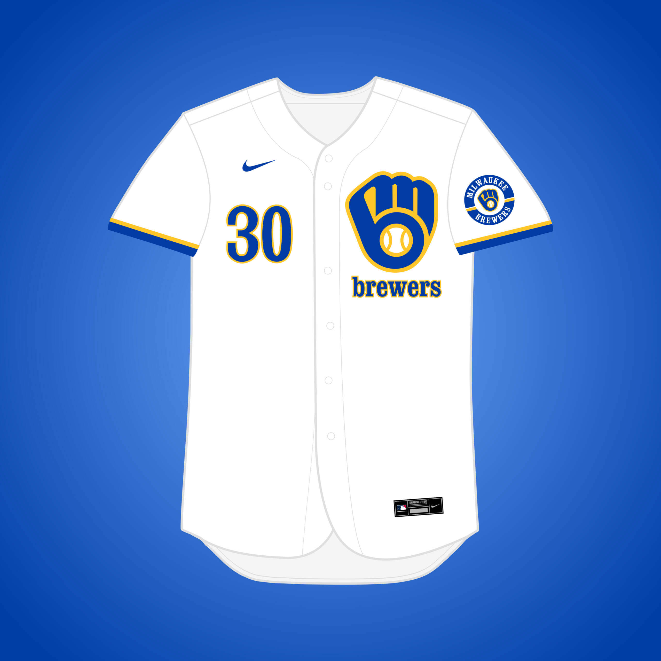
Along with Buffalo, one of the backup cities if Montreal didn’t work out was Milwaukee. The “ball-in-glove” logo was a fitting substitute for the Expos’ logo.
What if… the White Sox relocate to Nashville?
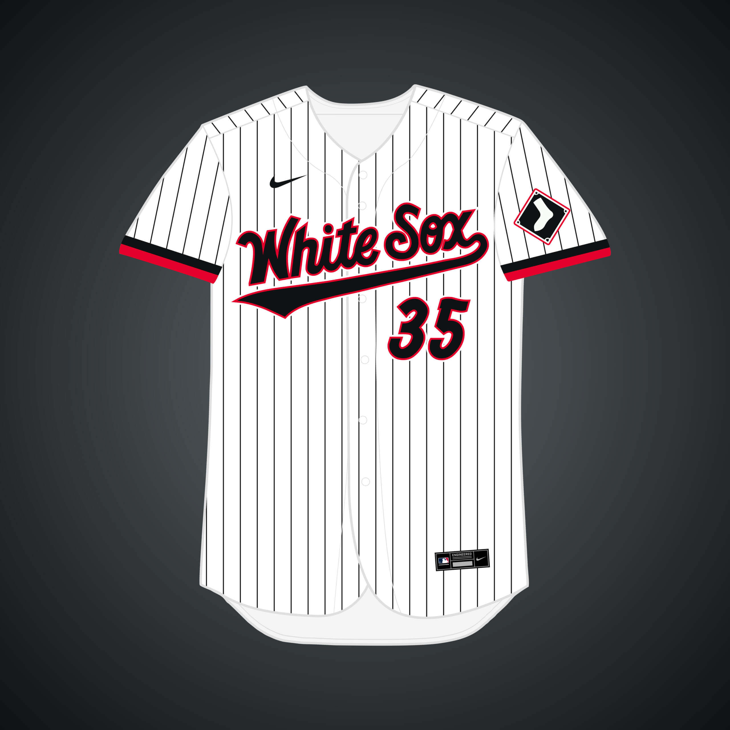
The city & the team haven’t had discussions, but the two have been linked due to the Sox’ stadium lease expiring in 6 years and Nashville being a prime candidate for a team. I added red to harken back to previous Sounds’ looks.
What if… the Pirates relocated to New York?
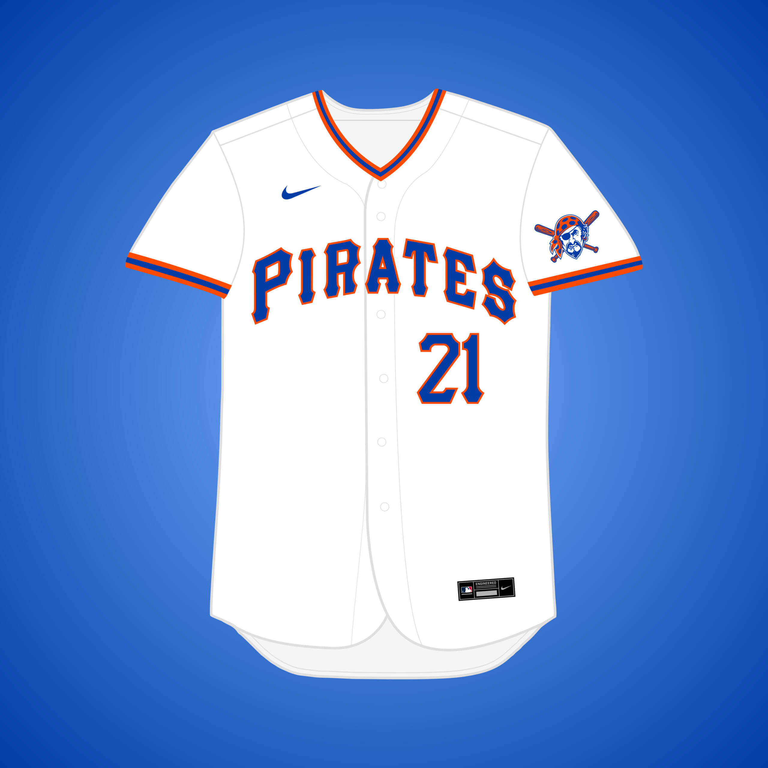
After losing the Dodgers & Giants in 1957, NY lawyer William Shea tried to lure the Pirates to move, but was rejected. Since the Pirates use the colors of Pittsburgh’s flag, it made sense to switch the colors to NYC’s flag.
What if… the Expos relocated to Norfolk (and changed their name)?
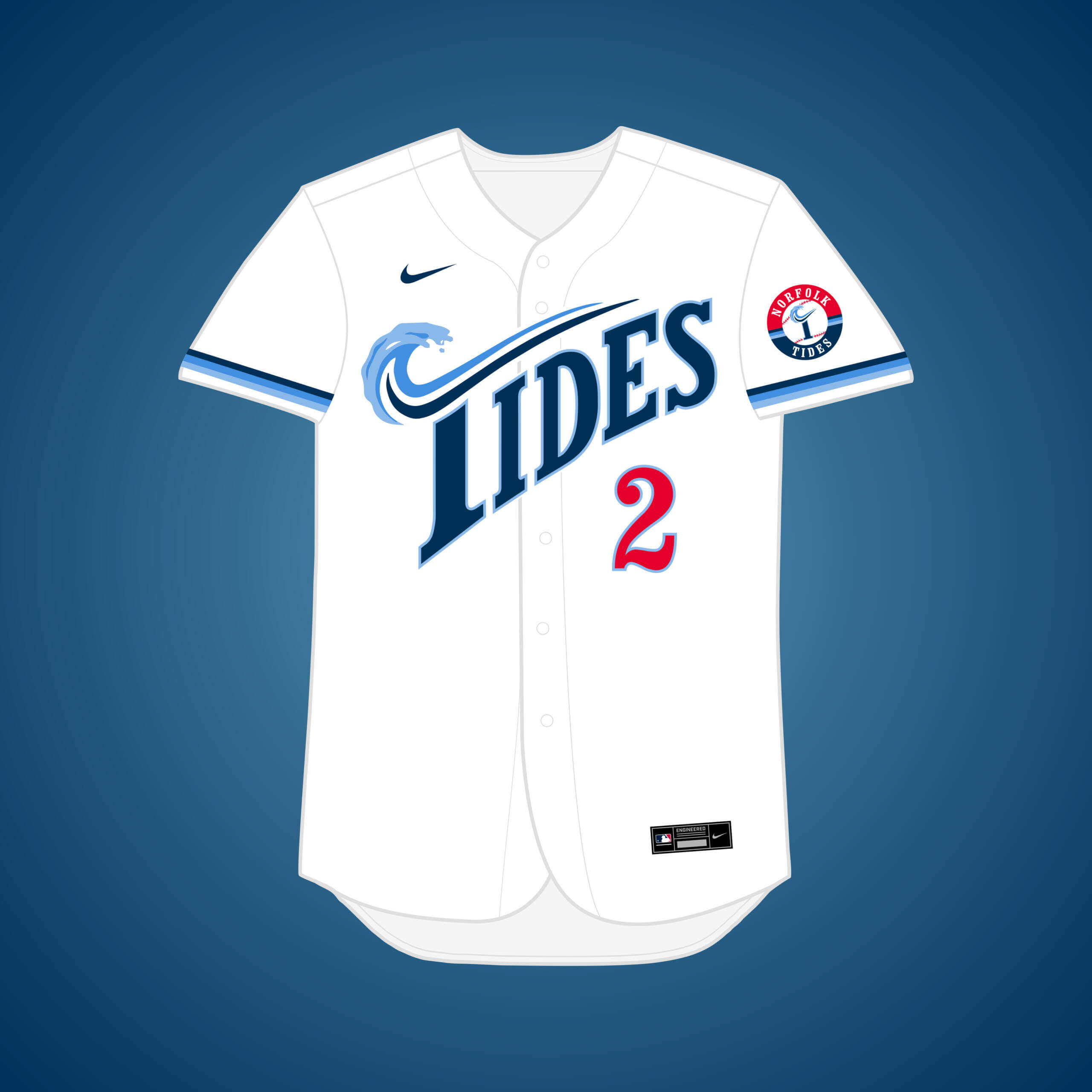
Before settling on DC, the Expos also considered Norfolk for their relocation. I combined the Tides’ 1993-2006 identity with the current color scheme and Expos-inspired fonts and logos.
What if… the Marlins relocated to Norfolk?
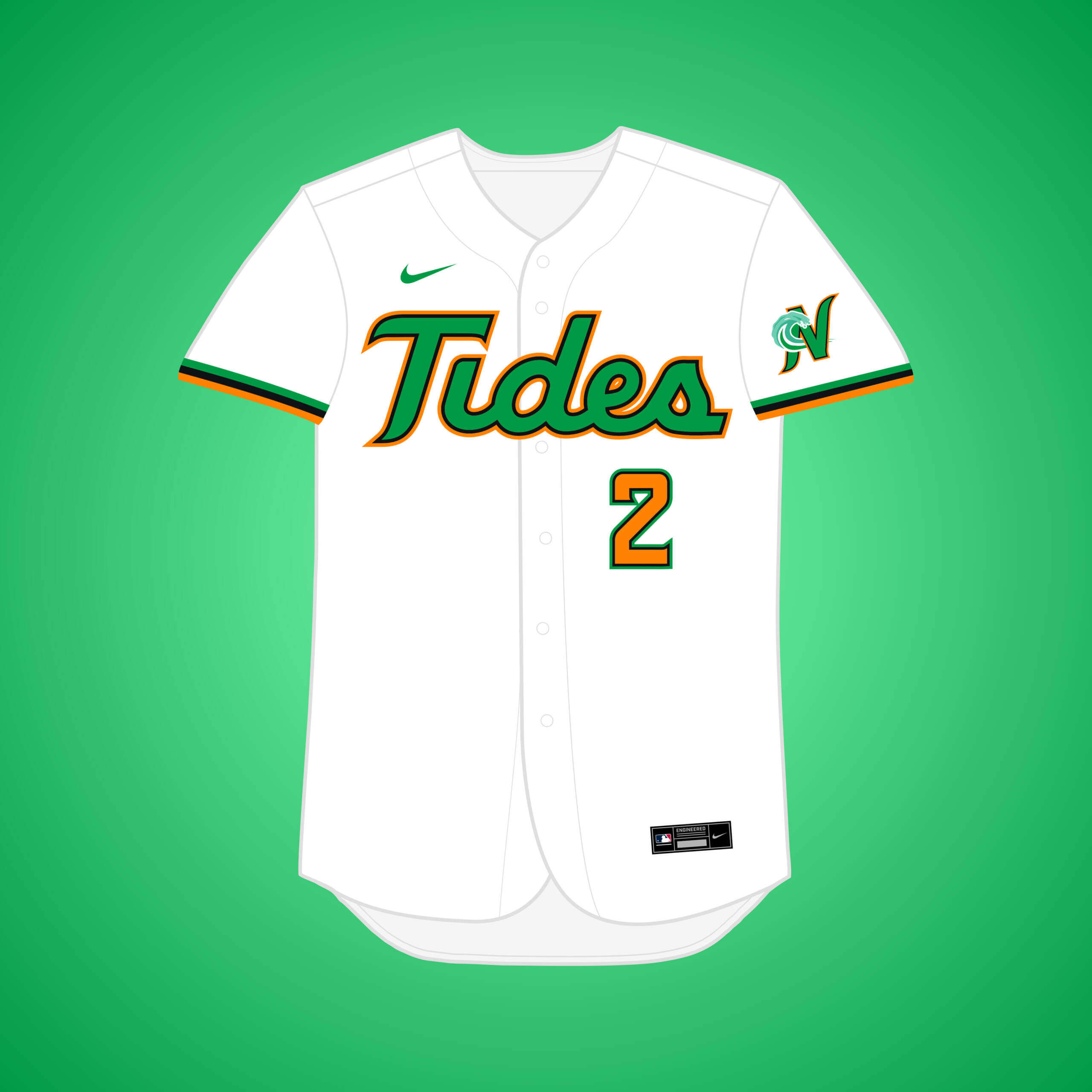
Along with Vegas and San Antonio, the Marlins looked at a possible move to Norfolk in 2006. I went with the Minor League “Tides” name, which worked well with the aquatic theme & shares a similar color scheme.
What if… the Tigers relocated to Pittsburgh?
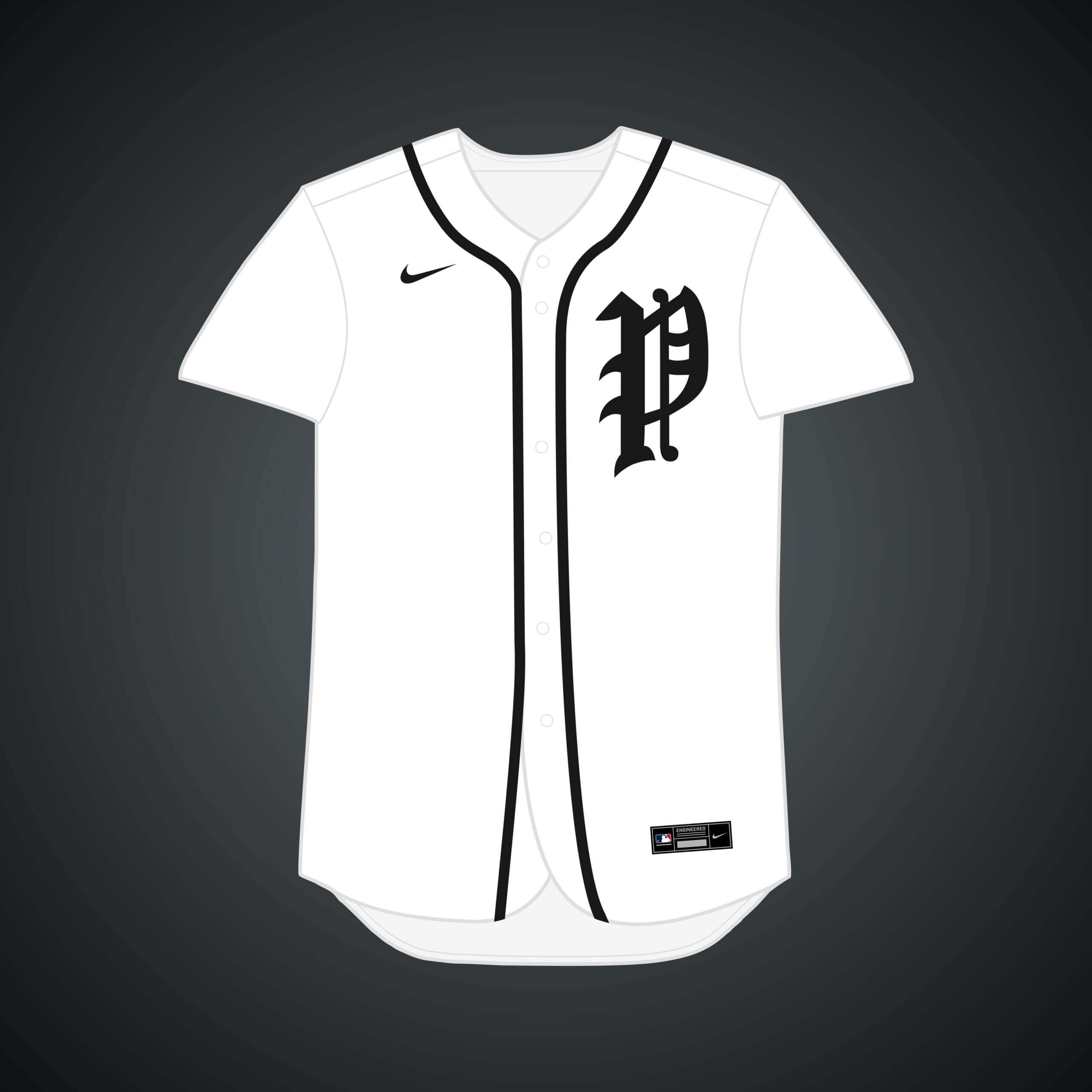
After the Western League became the American League in 1901, the Tigers were rumored to move to Pittsburgh before a new National Agreement was reached in 1903. The Pittsburgh black & gold translates well to a team named the Tigers.
What if… the Marlins relocated to San Antonio?
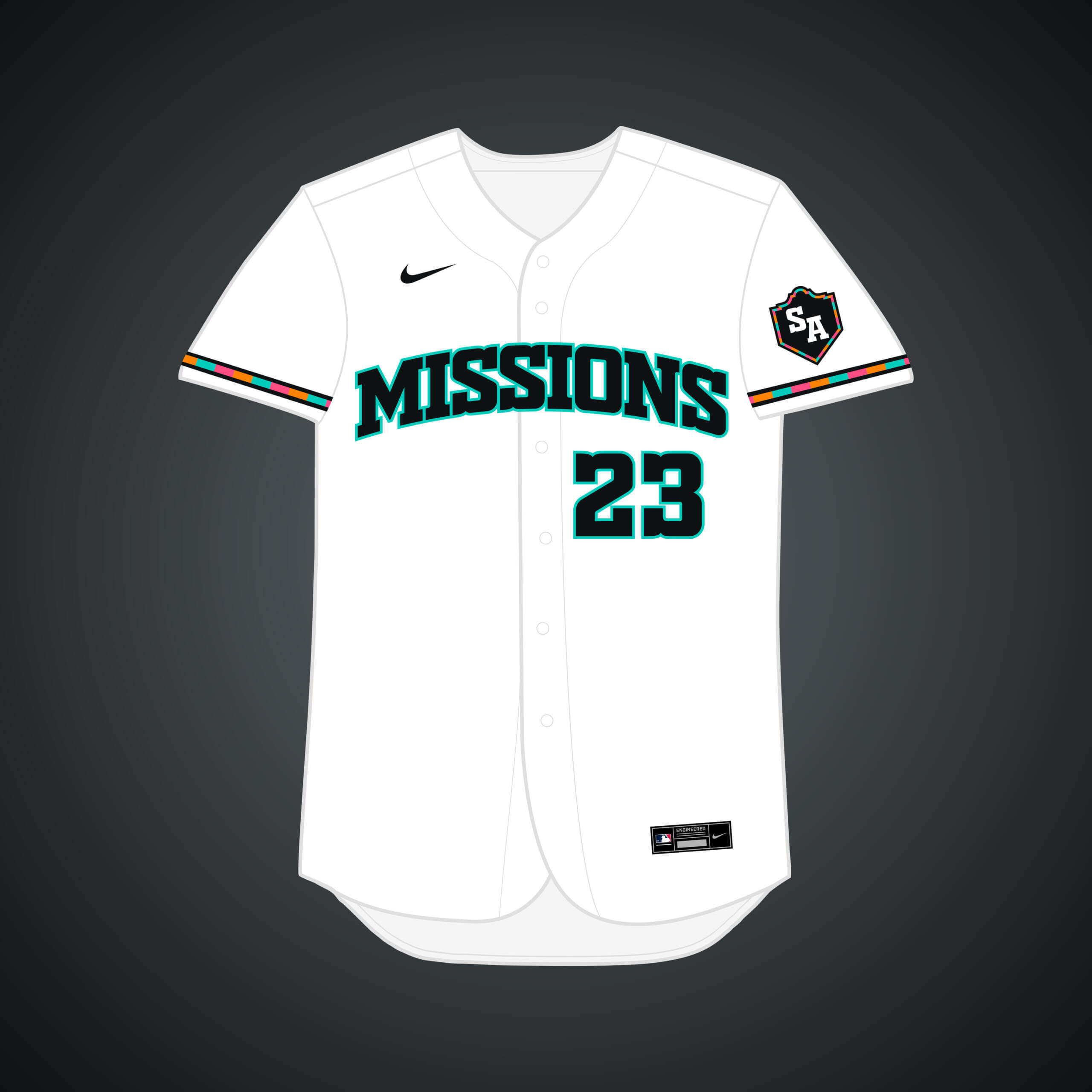
Marlins owner Jeffrey Loria said publicly in 2006 that talks with San Antonio were “serious,” but it was still likely a ploy to get a new stadium in Miami. Using the “Missions” name & combining it with “Fiesta” colors made sense.
What if… the Athletics relocated to Washington?
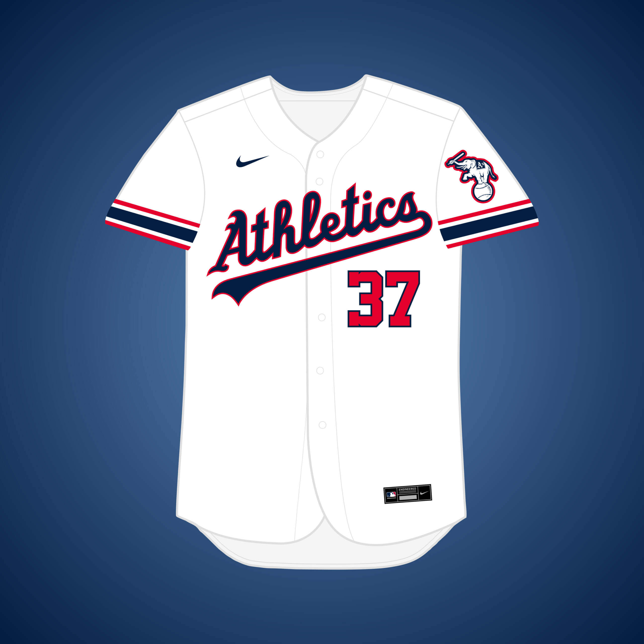
In 1977 Charlie O. accused the Commissioner of plotting to switch the A’s to the NL and move them to DC, which he admitted had been considered. The red white & blue of the Kansas City A’s would work well in the nation’s capital.
Once again, thanks Matt! Yet another fun series of “what if’s” — it’s hard to believe there have been so many of these. And there will be a Part VIII coming, as Matthew has received a bunch of recommendations for other teams to do. He adds, “I have since finished the series, but I have 1 volume left.”
Readers? What say you?



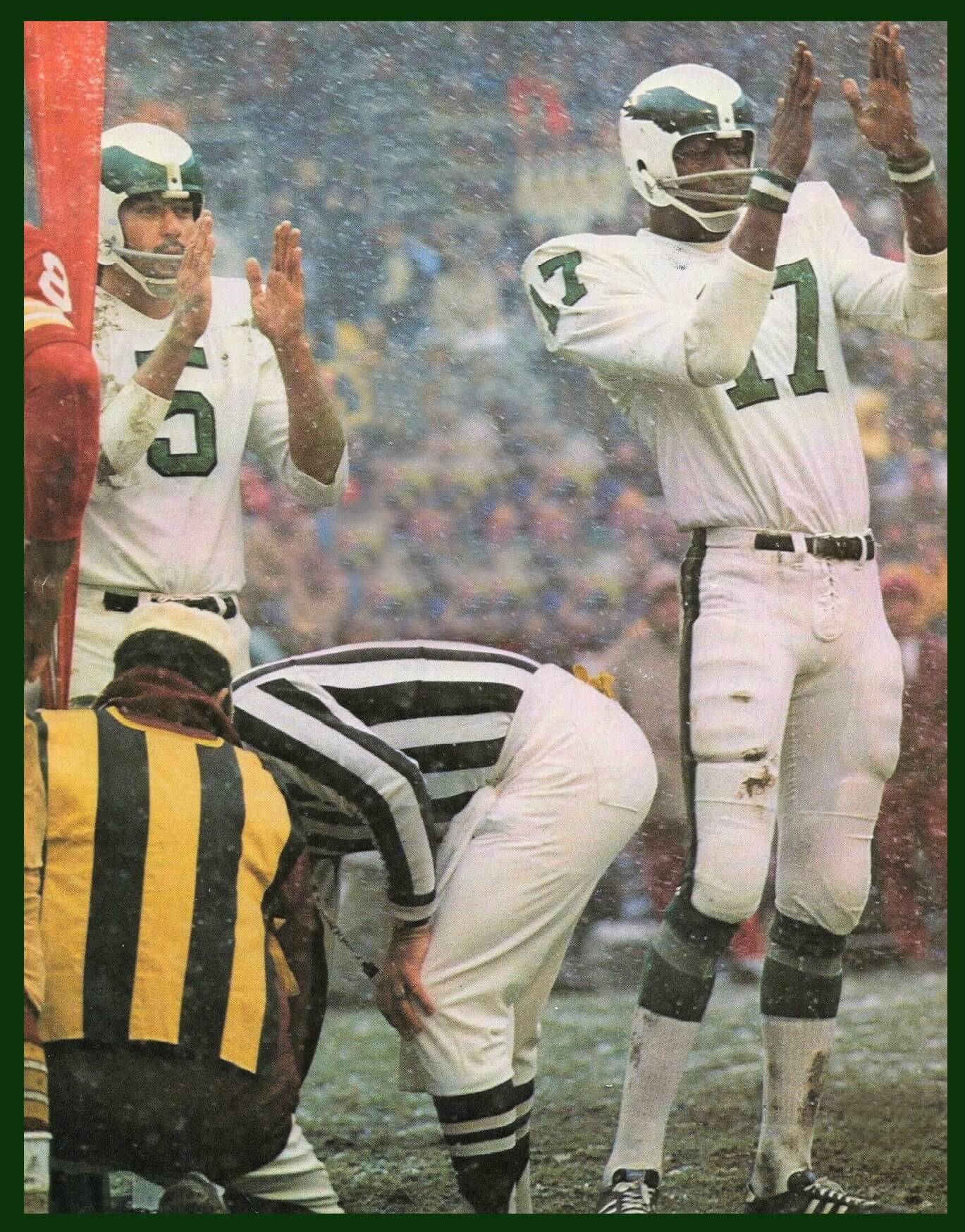
I’ll have a guess and say Steelers at Browns, 1977. I couldn’t tell if it’s at Cincinnati or Cleveland
If memory serves, old Municipal Stadium in Cleveland had a grass hill run-up to the center field bleachers, which were in one end zone of the football layout.
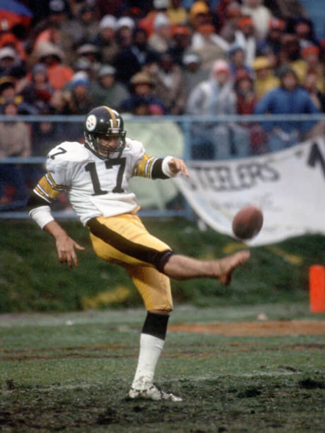
GTGFTU is the Steelers at Browns on December 15,1982. The player is John Goodson, a barefoot punter from the University of Texas who only played for the Steelers in 1982, the strike shortened season. Also you can barely see the Steelers’ 50th Anniversary patch on the left shoulder.
You beat me to it, John!
One thing that is best left in the 80s: barefoot punters/kickers. I don’t miss that phase at all.
Correct – o, John!
Spot – on analysis.
Cheis?
Oh boy-you’re going to have fun with that aren’t you?
YVVM…now this!
OOF.
I had never heard the A’s to DC and NL story.
The NFL Cardinals considered moving to Baltimore, but went go Arizona instead. link
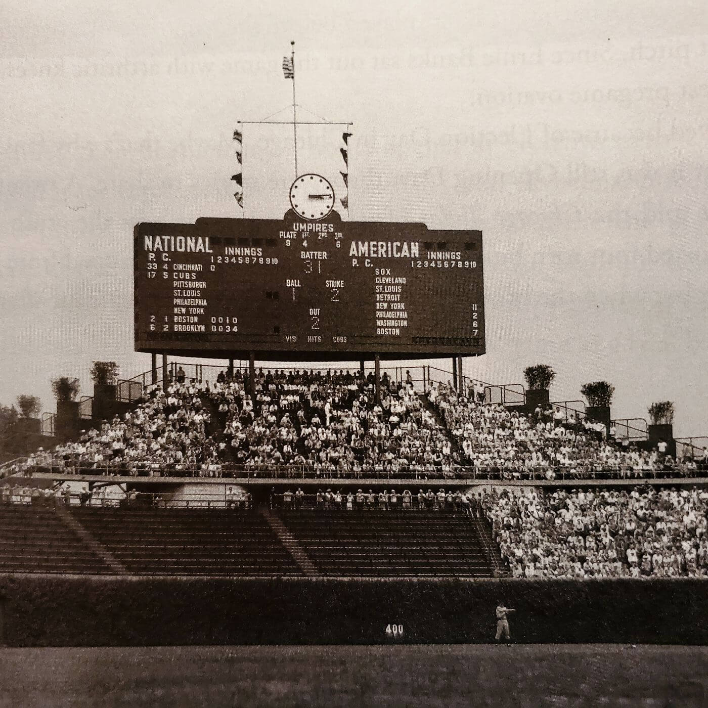
GTGFTS is the Sunday August 10, 1941 game between the visiting Cincinnati Reds and the home Chicago Cubs, which was won by the Reds 3 – 1. The Cubs battery is pitcher Charlie Root (17) and catcher Clyde McCullough (5j while Reds went with pitcher Johnny Vander Meer (33) and Hall of Fame catcher Ernie Lombardi (4). Both teams were well behind the league leading Brooklyn Dodgers in the standings. Charlie Root would retire at the end of the year.
I loved the Houston Buffaloes and the Kansas City Cowboys. The Brewers also looked great in Expos-inspired uniforms. Buffalo and Phoenix are the only big league cities where the locator adjective can also be the mascot noun. In the minors, St. Paul has the Saints. Should the New Orleans Saints move to St. Louis (which I don’t recommend) or NBA grant a team to the Gateway City, they’d be the third.
GTGFTS
10 August 1941
Reds 3 Cubs 1
18,739 Cubs fans waiting for Dom Dallessandro to hit a flyball to Harry Craft in center to end the first inning.
Both pitchers go the distance in a crisp 1:51 and are notable in baseball history, as Johnny Vander Meer (the only pitcher to pitch consecutive no hitters) outduels Charlie Root (the man who gave up Babe Ruth’s called shot).
On this day there were 6 double headers played (this was not one of them). The Yankees have already beaten the A’s 11-2 and the Red Sox have beaten the Nationals 7-6. New York completes the sweep, but Washington earns a split.
The Braves’ day goes from bad to worse as they will give up 3 more in the bottom of the fifth and sixth to lose 14-4, then get shut out by the Dodgers in the nightcap 4-0.
As for the other games that have not started:
Cardinals sweep the Pirates 3-2, 4-2
Giants win game 1 5-4, Phillies win game 2 4-3
White Sox sweep Cleveland 5-2, 2-1
Browns beat the Tigers in the only other non-DH 7-3
We need to see the “Buffaloes on a bat” option.
I think my favorite was the Buffaloes with the tequila sunrise-esque sleeve trim. Also, I enjoyed the pop of red in the White Sox uni. They need to go back to that stat! And seeing the Brewers/Expos unis makes me want to see a mashup of the ball-in-glove logo and the MEB Expos logo.
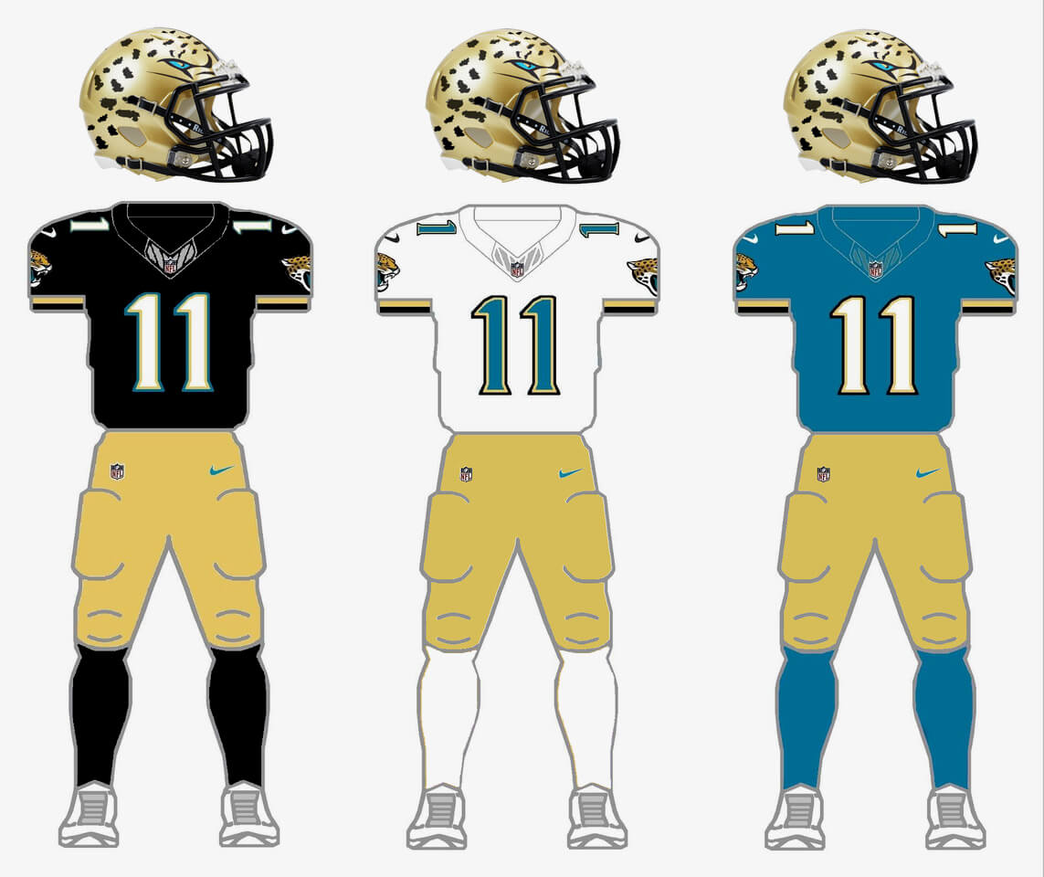
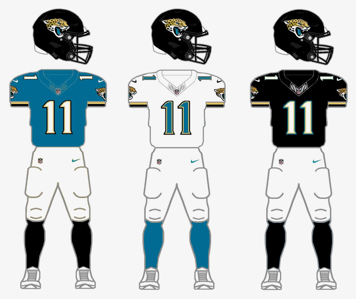
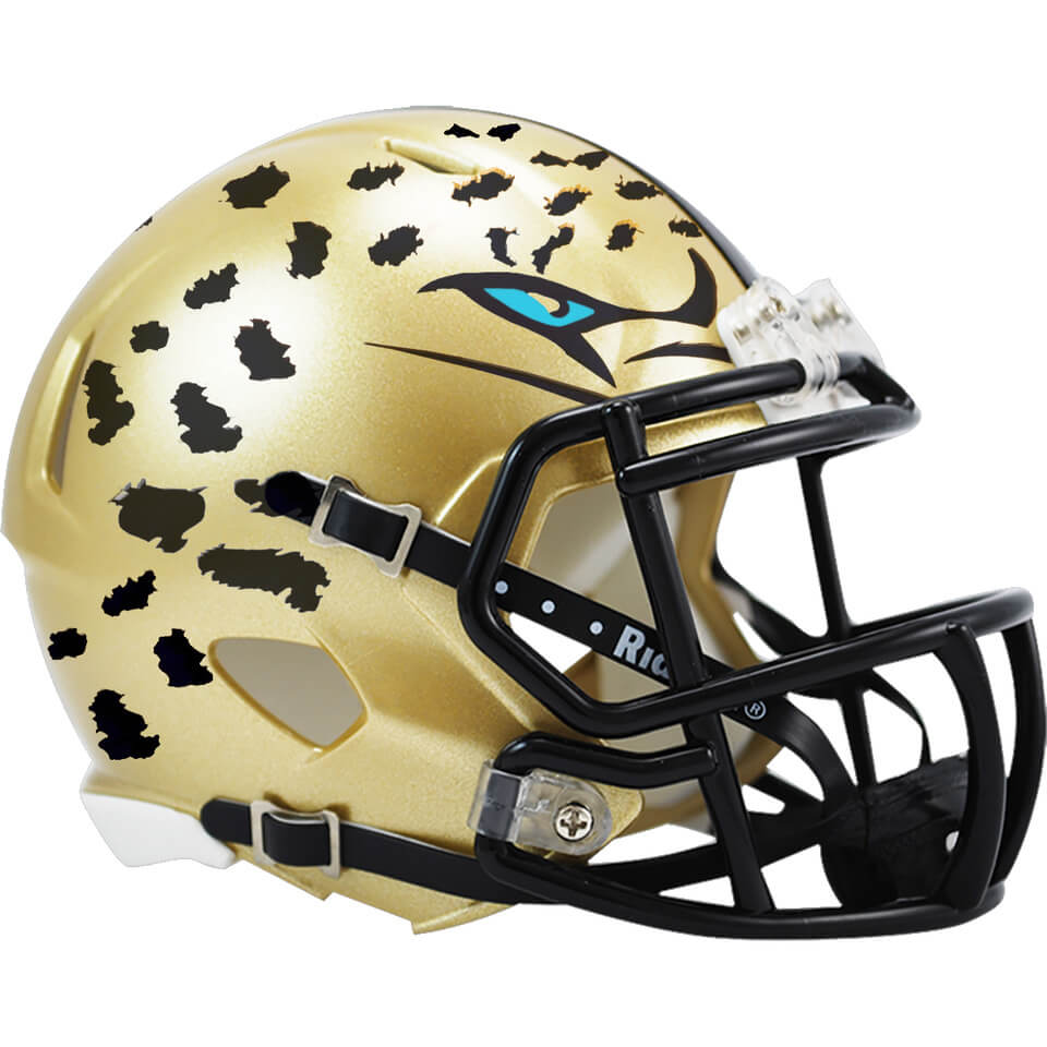
I’m really digging that Jags helmet tweak. Especially with the eyes on it!
With or without eyes, that helmet is brilliant and the reintroduction of gold is long overdue for the Jags. Nice work.
My favorite is the Norfolk (Marlins) Tides. Those jerseys are better than anything the Marlins have worn in 15-20 years.
Cool to learn about the Indianapolis Arrows. I grew up going to Indy Indians games, but I was a kid so it’s really cool to learn that the MLB almost made it Indy before my time.
Really fun stuff, Matthew! I’ve thoroughly enjoyed your work on this series
Great stuff from Matthew once again. I love those orioles on a bat. That Jaguars helmet is a winner to me. The Jags need more gold and teal to go with the black.